🏛️ Research Notes
There are known phenomena in physics that continues to remind me about markets, which partially influenced my perception of price action and reflected in topology.
There are known phenomena in physics that continues to remind me about markets, which partially influenced my perception of price action and reflected in topology.
- In space, speed itself doesn’t cause discomforts — only acceleration does. In markets, trend direction isn’t what stresses traders, it’s the rate of change (volatility spikes, momentum surges). A slow, constant uptrend can feel comfortable, but sudden thrusts (news shocks, liquidity squeezes) presses them against the seat.
- No matter how hard you accelerate, you can’t exceed light speed. Markets also have practical velocity limits such as liquidity constraints, margin requirements, volatility halts which contribute to proportions in movements). Beyond certain speeds, moves become self-limiting because liquidity providers back away or exchanges impose breakers.
- Aberration of Light → Focus Shift in Market Attention
As you accelerate, stars seem to shift forward in view. In markets, as momentum builds, your perception of what matters narrows. What I mean is liquidity, news, and setups ahead dominate, while the “sky behind” (past fundamentals or long-term signals) fades. The market narrative contracts into a single front-facing beam: what’s next, not what’s past. - Doppler Effect → Price Action Distorts Information
Moving away from Earth, you see time slow down behind you; moving toward something, time speeds up. In markets, when price runs away from fundamentals, old data feels stale and irrelevant (red-shifted). In fast rallies or panics, information feels accelerated and urgent (blue-shifted) — traders act as if the clock is ticking faster. (Has nothing to do with the color gradient I use on chart.) - Terrell–Penrose Rotation → Illusion
At high speed, objects don’t look contracted, they look rotated due to delayed light arrival. In markets, patterns rarely appear exactly as the textbook shows because we’re always looking at “delayed” sentiment. What looks like a simple breakout might just be a rotated perspective of deeper structure. - Time Dilation → Compression of Trading Horizon
Travelers age slower, as from their view, a distant journey seems shorter. In markets, when immersed in high-frequency movement, traders experience time compression (dozens of opportunities in minutes). From outside (a swing trader’s view), that same period looks like a small blip in a larger trend. - Length Contraction → Path Shortening During High Momentum
Near light speed, distances shrink in the direction of travel. In markets, when momentum is extreme, the “distance” to a target level (Fibonacci, prior high) feels shorter, so price reaches it much faster than normal expectation.
Note
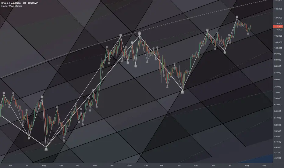
PSThese metaphors highlight what made my charts look so distinctive, so it's not a market coverage in its full context.
I need these raw layers to be studied accurately without much indicators to sharpen charting skills to the point of having full dominance over the chart. Since, I treat price as some kind of matter and has its probabilistic field, I'm required to be able to express the price as function of trading time at least geometrically.
Note
❖ It's also important to draw analogy between the Heisenberg Uncertainty Principle in physics and the inherent unpredictability of markets, especially when conventional technical analysis tries to pin down exact levels in a system that is fundamentally probabilistic and multi-scale.• Physics: The uncertainty principle says we can’t know position and momentum with infinite precision — the act of measuring one distorts the other.
• Markets: The more a trader focuses on nailing down one exact target (the “position”), the less reliable their understanding of how price might get there (the “momentum/context”), because they’ve narrowed their scope to a single frame instead of a dynamic system.
Trying to define a market level with pinpoint precision is like freezing a wave mid-crest — the wave’s behavior is shaped by multiple overlapping cycles that can’t be isolated without losing the bigger picture. In TA, when you zoom in too much, you may get “local accuracy” but sacrifice global validity — the next move may be influenced by cycles well outside the chart’s current frame. In trading, measuring one tightly distorts the other’s predictive power, because the act of focusing narrows your inputs and distorts your perception of the whole structure.
This is why common TA often misses the mark — it assumes deterministic cause-effect from a small set of signals, ignoring that the market state itself shifts depending on your measurement scale.
Looking at multiple cycles and scales at once (like observing position and momentum in “blurry harmony” instead of trying to nail one perfectly).
Treating levels not as fixed points, but as nodes in a probabilistic interference pattern — extended forward, interconnected across scales, and allowed to shift dynamically.
Unlock exclusive tools: fractlab.com
ᴀʟʟ ᴄᴏɴᴛᴇɴᴛ ᴘʀᴏᴠɪᴅᴇᴅ ʙʏ ꜰʀᴀᴄᴛʟᴀʙ ɪꜱ ɪɴᴛᴇɴᴅᴇᴅ ꜰᴏʀ ɪɴꜰᴏʀᴍᴀᴛɪᴏɴᴀʟ ᴀɴᴅ ᴇᴅᴜᴄᴀᴛɪᴏɴᴀʟ ᴘᴜʀᴘᴏꜱᴇꜱ ᴏɴʟʏ.
ᴘᴀꜱᴛ ᴘᴇʀꜰᴏʀᴍᴀɴᴄᴇ ɪꜱ ɴᴏᴛ ɪɴᴅɪᴄᴀᴛɪᴠᴇ ᴏꜰ ꜰᴜᴛᴜʀᴇ ʀᴇꜱᴜʟᴛꜱ.
ᴀʟʟ ᴄᴏɴᴛᴇɴᴛ ᴘʀᴏᴠɪᴅᴇᴅ ʙʏ ꜰʀᴀᴄᴛʟᴀʙ ɪꜱ ɪɴᴛᴇɴᴅᴇᴅ ꜰᴏʀ ɪɴꜰᴏʀᴍᴀᴛɪᴏɴᴀʟ ᴀɴᴅ ᴇᴅᴜᴄᴀᴛɪᴏɴᴀʟ ᴘᴜʀᴘᴏꜱᴇꜱ ᴏɴʟʏ.
ᴘᴀꜱᴛ ᴘᴇʀꜰᴏʀᴍᴀɴᴄᴇ ɪꜱ ɴᴏᴛ ɪɴᴅɪᴄᴀᴛɪᴠᴇ ᴏꜰ ꜰᴜᴛᴜʀᴇ ʀᴇꜱᴜʟᴛꜱ.
Disclaimer
The information and publications are not meant to be, and do not constitute, financial, investment, trading, or other types of advice or recommendations supplied or endorsed by TradingView. Read more in the Terms of Use.