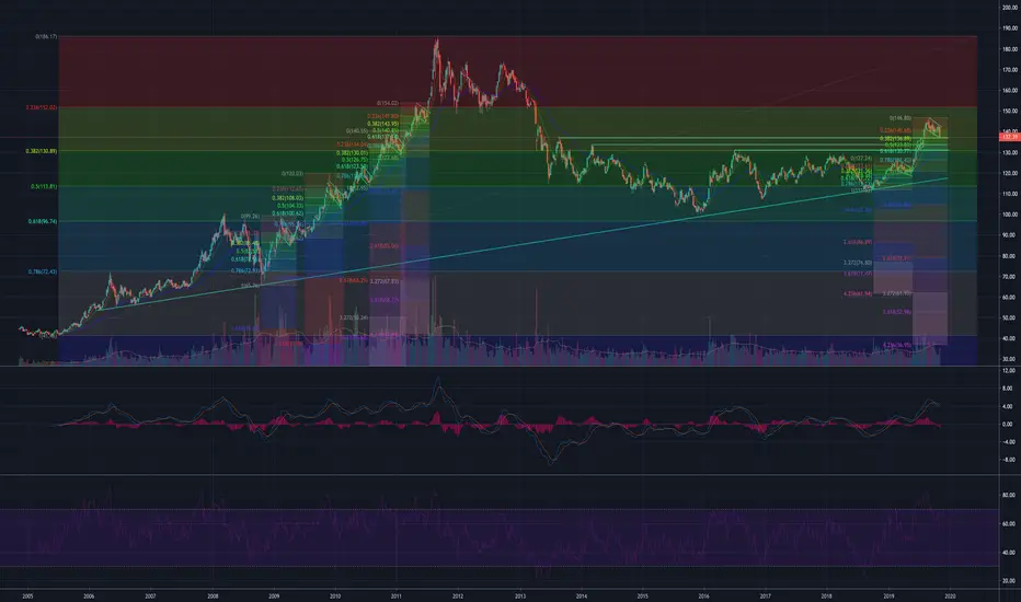
This is a historical chart of GLD since inception of the ETF. It is my favorite long term chart pattern on the board right now. With markets all over the world making new highs and the almost singular focus on equities, gold is quietly doing some amazing things. If you look at the historical run it had after the 2008 flash crash, it made a methodical climb to its peak. I have marked the impulse legs and the corresponding flags with FIBs that show corrections were never deeper than .5 with half only .382. The current FIBs show a similar pattern emerging. The first earlier in the year to .5 and now we are at .382. Note that the impulse leg that began in June cleared three prior peaks validating the strength of the upcoming move in GLD. MACD after the flash crash stayed above the even line throughout the entire run to the summit. I expect a similar pattern this time. RSI during the run never came down to the bottom of the channel and stayed around 50 during corrections. I expect the same this time around. I believe the macro FIB shows we are doing the work necessary to make it into the .236 red zone. Could we sell off a little more from here...sure can. But I think we are less than $20 away from the beginning of a new move up. Somewhere between FIB .5 and FIB .382 would be a nice place to start. Let's see what next week has in store for us. Happy Veteran's Day out there to all of you that served.
Disclaimer
The information and publications are not meant to be, and do not constitute, financial, investment, trading, or other types of advice or recommendations supplied or endorsed by TradingView. Read more in the Terms of Use.
Disclaimer
The information and publications are not meant to be, and do not constitute, financial, investment, trading, or other types of advice or recommendations supplied or endorsed by TradingView. Read more in the Terms of Use.