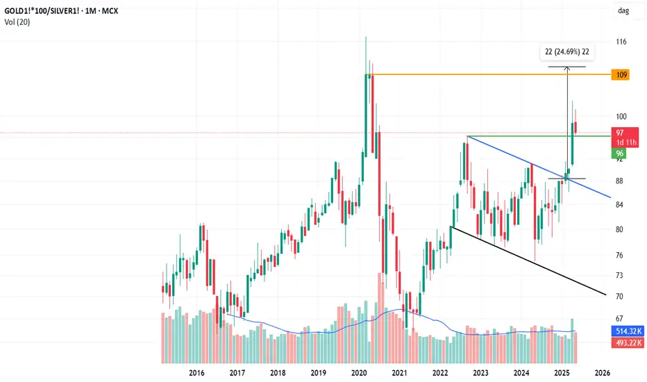
This is a Ratio charts ... Which Shows Outperformance of One asset over other ... You have to Buy one and Sell One to full reflect what it is showing ... so Things may not workout It you trade one only ...
It Can be Clearly Seen Gold is outperforming Silver ....
What it is indicating is the main point ...Silver being a industrial metal more demand for Gold could be safe haven buying which means less demand for silver implying less industrial activity bad for economy ... or impending recession in US ... Recently Yield Curves 2s10s inverted in US so ... that would also signal a impending recession which lags by at least by 12 months ...
When reversal comes Chart may change Currently or can be seen on lower time frame it is what it is ....
Similar Things on International/COMEX Charts or Dollar based charts can be seen
Disclaimer
The information and publications are not meant to be, and do not constitute, financial, investment, trading, or other types of advice or recommendations supplied or endorsed by TradingView. Read more in the Terms of Use.
Disclaimer
The information and publications are not meant to be, and do not constitute, financial, investment, trading, or other types of advice or recommendations supplied or endorsed by TradingView. Read more in the Terms of Use.