Long
HYCKRW
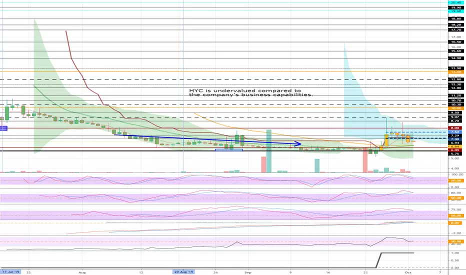
Where is the bottom of the chart?
Many people are curious about this.
If you know it, you will be the one who adjusts the prices.
If you want to analyze HYC's charts with these charts, the time periods are so short that you can do the wrong analysis.
You must look at the HYC / USDT chart on the OKEX exchange.
The HYC / USDT's weekly chart shows that the current position is about to hit the bottom and rise.
The current chart is a daily chart.
This chart shows the flow that occurs before the ascent.
In the uptrend, which has seen short-term profits, both will make enough profits.
Note
twitter.com/BbiKkuMi/status/1179350548362989572/photo/1HYC / USDT chart of the OKEX exchange is described.
Changes in direction are likely to occur around October 9-13.
Other content (coins, stocks, etc.) is frequently posted on X.
X에 다른 내용(코인, 주식 등)이 자주 게시.
◆ t.me/readCryptoChannel
[HA-MS Indicator]
bit.ly/3YxHgvN
[OBV Indicator]
bit.ly/4dcyny3
X에 다른 내용(코인, 주식 등)이 자주 게시.
◆ t.me/readCryptoChannel
[HA-MS Indicator]
bit.ly/3YxHgvN
[OBV Indicator]
bit.ly/4dcyny3
Disclaimer
The information and publications are not meant to be, and do not constitute, financial, investment, trading, or other types of advice or recommendations supplied or endorsed by TradingView. Read more in the Terms of Use.