MINIMA - Technical Analysis. Are we entering a bull market?
Hello!
I am returning to an analysis of MINIMA. This market is remarkably interesting in both its structure and behavior. Today, I will review the latest structure and place it in the broader context, including the history observed on the Wrapped version. Unfortunately, TradingView does not allow overlaying two charts outside their native ranges, so I will refer to data from both Wrapped and MINIMA. Let’s begin.
I do not have formal education in this field. I am self-taught and place strong emphasis on Technical Analysis as the core of my decision-making process. While charts are difficult to read, I think they allow one to infer, to a meaningful extent, the hidden intentions of so-called “Smart Money.” The views below are strictly my own and may be incorrect. This publication does not constitute investment or educational advice as defined by any applicable regulations.
I will rely solely on Technical Analysis based on the Wyckoff methodology, VSA, and footprint analysis.
Background
As background, I use the WMINIMA chart supplemented by current MINIMA quotations. WMINIMA data show periods of distribution and accumulation on the higher timeframe. A key observation for me is the strong breakout around March 2024: price surged sharply and then printed a new, deeper low. The downtrend subsequently stalled at a higher low and transitioned into a range. On the charts, I mark accumulation/distribution structures relevant to the analysis.


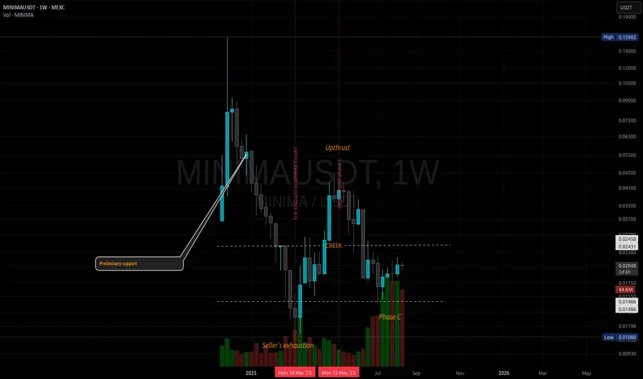
Technical analysis and interpretation
For this study I created a composite view to capture the full history. The composite lacks full volume because WMINIMA does not provide it. For context, one of my archived screenshots shows the last visible candle at roughly 1.4 million in volume; based on bar height I estimate the highest volumes to be around 6 million.
https://pbs.twimg.com/media/GkOrRAnWoAAkFkG?format=jpg&name=large

I annotate events in line with Wyckoff. In Phase A of accumulation, I label the Selling Climax as “Seller’s Exhaustion,” as in my view the bar structure does not fully match a classic Climax Bar known from VSA; however, the message is the same - significant accumulation.
I first consider the highest-order, global structure marked in red. I observe rising volume on the advance that builds what I mark as an Upthrust. The next area of elevated volume begins around July 2024 - a demand response to declining price within the price zone that preceded the breakout. Both high-activity zones are in comparable price areas.

I then move to the current MINIMA chart.
On MINIMA, I see a local volume spike during the formation of the ATL (all-time low). I also note declining volume on the drop from a local top I labeled an Upthrust - this is a lower-order structure than the red one; I mark it in orange. Following this path leads to the area with the highest volume, which I interpret as Phase C of the orange structure. It is characterized by very high volumes(1W ~50kk to 6kk volume from 1W WMINIMA) and minimal spread. In my view, this indicates strong absorption by smart money - behavior consistent with “Bag Holding” in the Williams/VSA framework - similar to the candle that halted the decline at the ATL.
To validate this, I zoom in with a 1-month footprint. The 1-month view shows the last two candles with very large volumes. The three most recent candles all have negative delta, and delta represents a significant share of total volume. The buy/sell relation suggests aggressive, dominant selling. However, price does not fall despite repeated attempts to push it lower. I analyze where volume clusters within one standard deviation. The candles have lower wicks- particularly in June - suggesting a Shakeout. Given the negative delta and the price response, I conclude there is a lack of result relative to the effort: aggressive supply has been absorbed, with the largest market orders printing within a narrow price band.

In my interpretation, the orange structure is a lower-tier structure functioning as Phase C of the red, global accumulation. Considering the above, I judge it highly probable that these observations confirm ongoing accumulation. I place particular weight on the footprint: the activity occurred at the right place and time. The asset recorded the highest volumes in its history at what I think is Phase C of the global accumulation. Moreover, the market’s failure to decline under heavy selling reinforces this view.
At this stage, I consider the possibility of an accumulation spring that could push price once more lower - potentially below the ATL - taking out the structure; I justify this by the still elevated volumes. I also note prior resistance and consider that a potential shakeout low could terminate around 0.0138 USD. All in all, I think this market is worth monitoring. Confirmation of my thesis would be successful supply tests resolved in favor of the bulls, followed by development consistent with Wyckoff: Last Point of Support (LPS) leading to a Sign of Strength (SOS) and a Jump Across the Creek (JAC).
Thank you for reading. I wish you good health, effective analyses, and successful trades.
CatTheTrader
Hello!
I am returning to an analysis of MINIMA. This market is remarkably interesting in both its structure and behavior. Today, I will review the latest structure and place it in the broader context, including the history observed on the Wrapped version. Unfortunately, TradingView does not allow overlaying two charts outside their native ranges, so I will refer to data from both Wrapped and MINIMA. Let’s begin.
I do not have formal education in this field. I am self-taught and place strong emphasis on Technical Analysis as the core of my decision-making process. While charts are difficult to read, I think they allow one to infer, to a meaningful extent, the hidden intentions of so-called “Smart Money.” The views below are strictly my own and may be incorrect. This publication does not constitute investment or educational advice as defined by any applicable regulations.
I will rely solely on Technical Analysis based on the Wyckoff methodology, VSA, and footprint analysis.
Background
As background, I use the WMINIMA chart supplemented by current MINIMA quotations. WMINIMA data show periods of distribution and accumulation on the higher timeframe. A key observation for me is the strong breakout around March 2024: price surged sharply and then printed a new, deeper low. The downtrend subsequently stalled at a higher low and transitioned into a range. On the charts, I mark accumulation/distribution structures relevant to the analysis.
Technical analysis and interpretation
For this study I created a composite view to capture the full history. The composite lacks full volume because WMINIMA does not provide it. For context, one of my archived screenshots shows the last visible candle at roughly 1.4 million in volume; based on bar height I estimate the highest volumes to be around 6 million.
https://pbs.twimg.com/media/GkOrRAnWoAAkFkG?format=jpg&name=large
I annotate events in line with Wyckoff. In Phase A of accumulation, I label the Selling Climax as “Seller’s Exhaustion,” as in my view the bar structure does not fully match a classic Climax Bar known from VSA; however, the message is the same - significant accumulation.
I first consider the highest-order, global structure marked in red. I observe rising volume on the advance that builds what I mark as an Upthrust. The next area of elevated volume begins around July 2024 - a demand response to declining price within the price zone that preceded the breakout. Both high-activity zones are in comparable price areas.
I then move to the current MINIMA chart.
On MINIMA, I see a local volume spike during the formation of the ATL (all-time low). I also note declining volume on the drop from a local top I labeled an Upthrust - this is a lower-order structure than the red one; I mark it in orange. Following this path leads to the area with the highest volume, which I interpret as Phase C of the orange structure. It is characterized by very high volumes(1W ~50kk to 6kk volume from 1W WMINIMA) and minimal spread. In my view, this indicates strong absorption by smart money - behavior consistent with “Bag Holding” in the Williams/VSA framework - similar to the candle that halted the decline at the ATL.
To validate this, I zoom in with a 1-month footprint. The 1-month view shows the last two candles with very large volumes. The three most recent candles all have negative delta, and delta represents a significant share of total volume. The buy/sell relation suggests aggressive, dominant selling. However, price does not fall despite repeated attempts to push it lower. I analyze where volume clusters within one standard deviation. The candles have lower wicks- particularly in June - suggesting a Shakeout. Given the negative delta and the price response, I conclude there is a lack of result relative to the effort: aggressive supply has been absorbed, with the largest market orders printing within a narrow price band.
In my interpretation, the orange structure is a lower-tier structure functioning as Phase C of the red, global accumulation. Considering the above, I judge it highly probable that these observations confirm ongoing accumulation. I place particular weight on the footprint: the activity occurred at the right place and time. The asset recorded the highest volumes in its history at what I think is Phase C of the global accumulation. Moreover, the market’s failure to decline under heavy selling reinforces this view.
At this stage, I consider the possibility of an accumulation spring that could push price once more lower - potentially below the ATL - taking out the structure; I justify this by the still elevated volumes. I also note prior resistance and consider that a potential shakeout low could terminate around 0.0138 USD. All in all, I think this market is worth monitoring. Confirmation of my thesis would be successful supply tests resolved in favor of the bulls, followed by development consistent with Wyckoff: Last Point of Support (LPS) leading to a Sign of Strength (SOS) and a Jump Across the Creek (JAC).
Thank you for reading. I wish you good health, effective analyses, and successful trades.
CatTheTrader
Trade active
Disclaimer
The information and publications are not meant to be, and do not constitute, financial, investment, trading, or other types of advice or recommendations supplied or endorsed by TradingView. Read more in the Terms of Use.
Disclaimer
The information and publications are not meant to be, and do not constitute, financial, investment, trading, or other types of advice or recommendations supplied or endorsed by TradingView. Read more in the Terms of Use.