Not a fan of TA and think its just making excuses to draw lines and pretend that how life works....
but here are some doodles I came up with...it was too cluttered so I left the simplest one up and the rest follow just in a closer view...
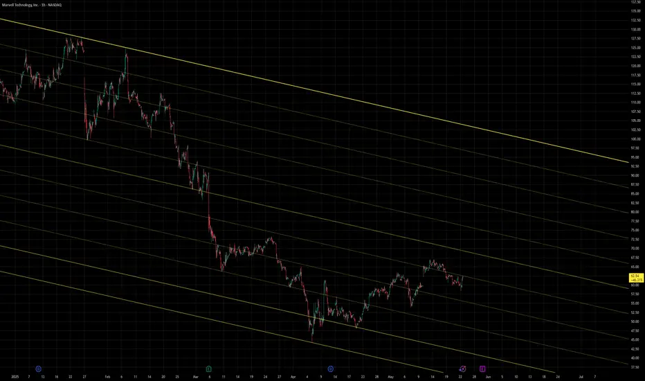
Just top to bottom at the first two pivot peaks and then parallel channel to the bottom and use decimals for each line to replicate.
The others here are low to low bow connects with their equal reversal lines attached to their peaks, in between the bows.
And the dark blue is the same line from above but it is attached to every high peak thats important down the whole fall.
Blue lines:

Green lines:

Teal lines:

All together up close:
1hr chart....


but they are super secret
and the indicators I use with them
but here are some doodles I came up with...it was too cluttered so I left the simplest one up and the rest follow just in a closer view...
Just top to bottom at the first two pivot peaks and then parallel channel to the bottom and use decimals for each line to replicate.
The others here are low to low bow connects with their equal reversal lines attached to their peaks, in between the bows.
And the dark blue is the same line from above but it is attached to every high peak thats important down the whole fall.
Blue lines:
Green lines:
Teal lines:
All together up close:
1hr chart....
but they are super secret
and the indicators I use with them
Disclaimer
The information and publications are not meant to be, and do not constitute, financial, investment, trading, or other types of advice or recommendations supplied or endorsed by TradingView. Read more in the Terms of Use.
Disclaimer
The information and publications are not meant to be, and do not constitute, financial, investment, trading, or other types of advice or recommendations supplied or endorsed by TradingView. Read more in the Terms of Use.