Potential 8.6% gain in RAREUSD pair for the following reasons:
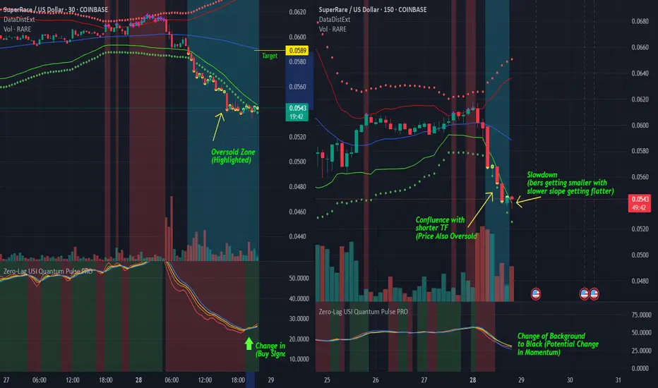
Longer-term Chart (150min)
-As seen in the longer time frame (150min), we can see that the price of RARE is overextended to the downside (Using custom Data Distribution with Extreme Clusters indicator showing yellow dots and highlighted background)
-Custom indicator below (Zero-Lag USI) has changed background from red to black, meaning that there is a potential reversal in momentum coming.
-Technically, we can see that there is a slowdown in slope of the move, and the bars here are getting smaller with the tails at the bottom, showing strength to the upside.
Shorter-term Chart (30min)
-Custom Data Distribution with Extreme Clusters script is also showing oversold levels in agreement with the 150min chart, showing confluence.
-Custom Zero-Lag USI script is showing a green background (shown here by the green arrow), which means that the strength is already potentially shifting here. We hope that this potential change in momentum will eventually shift/spill over to a larger time frame. Thus, the USI on longer time frame should eventually also change from the black background to the green background, showing a gain in strength and potential reversal to the upside on the 150min chart.
Disclaimer
The information and publications are not meant to be, and do not constitute, financial, investment, trading, or other types of advice or recommendations supplied or endorsed by TradingView. Read more in the Terms of Use.
Disclaimer
The information and publications are not meant to be, and do not constitute, financial, investment, trading, or other types of advice or recommendations supplied or endorsed by TradingView. Read more in the Terms of Use.