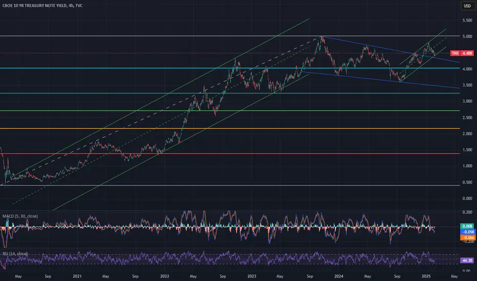
Is it just me or is it weird that even the yield of treasury notes trades within channels and diagonals like stocks and oil ?
This chart pattern could be described as a bull flag.
Rising yields don't necessarily lead to lower stock prices:

But the bigger picture issue could be the interest payments of the US government, which reached a record of 4.4 trillion USD in 2024.
This chart pattern could be described as a bull flag.
Rising yields don't necessarily lead to lower stock prices:
But the bigger picture issue could be the interest payments of the US government, which reached a record of 4.4 trillion USD in 2024.
Note
Seems like the entire financial market is at a crucial point currently. Stock indices and BTC might have created a longer term top and are showing signs of a downtrend, gold is going up....and if we look at a monthly chart of TNX with the MACD slightly positive and potential move for this bull flag (conservative): Note
went down a bit, but still within the channel: Note
could still be a bull flag. RSI is low, looks like a retest and might start going up againNote
retest from below. Let's see if this can go up again. With all the stupid tariffs inflation will go UP. Note
three weeks later. The blue line has been crossed:Disclaimer
The information and publications are not meant to be, and do not constitute, financial, investment, trading, or other types of advice or recommendations supplied or endorsed by TradingView. Read more in the Terms of Use.
Disclaimer
The information and publications are not meant to be, and do not constitute, financial, investment, trading, or other types of advice or recommendations supplied or endorsed by TradingView. Read more in the Terms of Use.