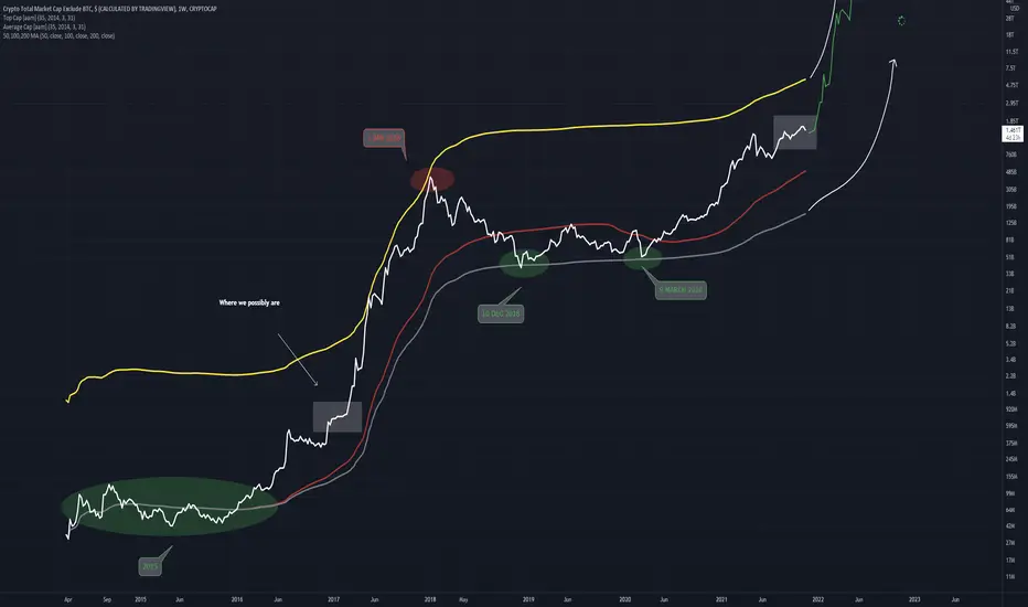
Using the TOPCAP indicator and the AVGCAP indicator this chart is produced
Will we see another huge increase phase that was seen in the previous bullrun? Or will it be different
In Green is the best entry points possible
In Red is the best exit point possible
Red line in between Topcap and Avgcap is 200MA
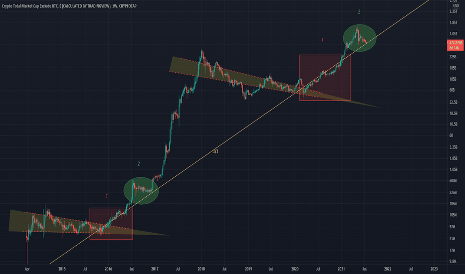

Will we see another huge increase phase that was seen in the previous bullrun? Or will it be different
In Green is the best entry points possible
In Red is the best exit point possible
Red line in between Topcap and Avgcap is 200MA
Disclaimer
The information and publications are not meant to be, and do not constitute, financial, investment, trading, or other types of advice or recommendations supplied or endorsed by TradingView. Read more in the Terms of Use.
Disclaimer
The information and publications are not meant to be, and do not constitute, financial, investment, trading, or other types of advice or recommendations supplied or endorsed by TradingView. Read more in the Terms of Use.