This kind of looks confusing but "bull" with me.
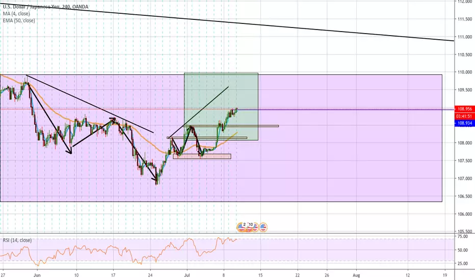
Basically, I was practicing the top-down analysis to mark up the graph and so far its currently looking like a buy.
The Larger purple box represents the weekly candlestick that I had highlighted, from them we zoomed in on the hour 4-time frame and highlighted the most recent candle in green and began identifying the structure of the highs and lows with the orange boxes.
Currently waiting for a good entry with the M15 time-frame
Disclaimer
The information and publications are not meant to be, and do not constitute, financial, investment, trading, or other types of advice or recommendations supplied or endorsed by TradingView. Read more in the Terms of Use.
Disclaimer
The information and publications are not meant to be, and do not constitute, financial, investment, trading, or other types of advice or recommendations supplied or endorsed by TradingView. Read more in the Terms of Use.