Identifying support and resistance levels helps pinpoint potential points of price growth or decline for an asset.
I’ve tried various methods, such as Fibonacci levels and Gann fan, but they tend to be inconsistent—sometimes they work, sometimes they don’t. In practice, marking previous highs and lows on the chart and using them as reference points has proven to be much more effective.
If the price confidently breaks through a previous peak, it strongly suggests a trend continuation. However, it’s important to understand that support and resistance levels are not impenetrable barriers but rather guidelines indicating where the price might move. These levels are useful for:
setting stop-losses,
calculating the risk-reward ratio,
providing additional confirmation for entering a position.
When the price approaches a previous high, it’s crucial to observe market reactions. Jumping into a long position expecting a breakout or shorting in anticipation of a pullback isn’t always the best approach. It’s more rational to wait, see how the price interacts with the level, and then make a trading decision.
I mark key levels retrospectively, using data from several decades if available.
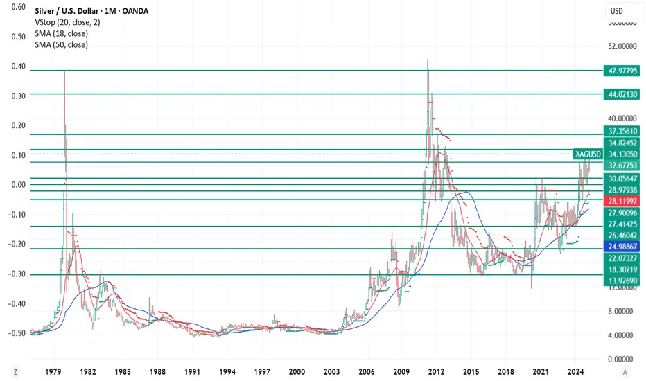
Example: Silver
Let’s see how this method works with silver.
In January 1980, the price peaked at $47.97, followed by a global decline.
In May 2011, 30 years later, the price approached $47.97 again, slightly surpassing it but failing to reach $50. After that, a major downtrend began.
This example clearly demonstrates the strength of support and resistance levels—even without considering inflation. And it's not the only one.
How to Apply This Method?
Open a chart of your chosen asset on higher timeframes (1D, 1W, 1M), study historical data, and mark key high and low levels. This will help you better understand the market and make more informed trading decisions.
I’ve tried various methods, such as Fibonacci levels and Gann fan, but they tend to be inconsistent—sometimes they work, sometimes they don’t. In practice, marking previous highs and lows on the chart and using them as reference points has proven to be much more effective.
If the price confidently breaks through a previous peak, it strongly suggests a trend continuation. However, it’s important to understand that support and resistance levels are not impenetrable barriers but rather guidelines indicating where the price might move. These levels are useful for:
setting stop-losses,
calculating the risk-reward ratio,
providing additional confirmation for entering a position.
When the price approaches a previous high, it’s crucial to observe market reactions. Jumping into a long position expecting a breakout or shorting in anticipation of a pullback isn’t always the best approach. It’s more rational to wait, see how the price interacts with the level, and then make a trading decision.
I mark key levels retrospectively, using data from several decades if available.
Example: Silver
Let’s see how this method works with silver.
In January 1980, the price peaked at $47.97, followed by a global decline.
In May 2011, 30 years later, the price approached $47.97 again, slightly surpassing it but failing to reach $50. After that, a major downtrend began.
This example clearly demonstrates the strength of support and resistance levels—even without considering inflation. And it's not the only one.
How to Apply This Method?
Open a chart of your chosen asset on higher timeframes (1D, 1W, 1M), study historical data, and mark key high and low levels. This will help you better understand the market and make more informed trading decisions.
Disclaimer
The information and publications are not meant to be, and do not constitute, financial, investment, trading, or other types of advice or recommendations supplied or endorsed by TradingView. Read more in the Terms of Use.
Disclaimer
The information and publications are not meant to be, and do not constitute, financial, investment, trading, or other types of advice or recommendations supplied or endorsed by TradingView. Read more in the Terms of Use.