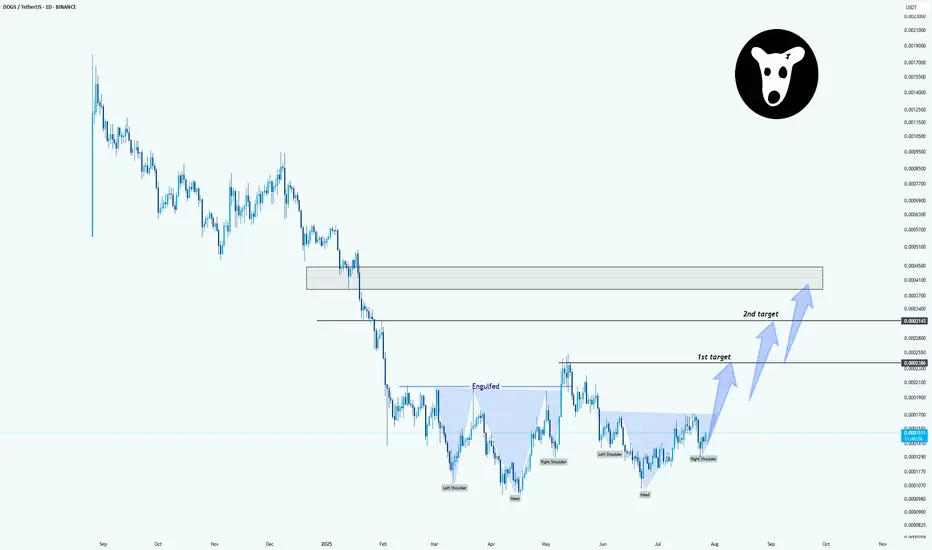
DOGSUSDT: Inverse Head & Shoulders Pattern in PlayHello.
The chart clearly shows an inverse head and shoulders formation. Price has now formed:
Left Shoulder
Head
Right Shoulder (recently completed)
The neckline was engulfed after a strong move, which adds confidence to the breakout potential. If the price continues to hold above the right shoulder and gains momentum:
First target is around the 0.0002280 area
Second target is marked near 0.0003430
If volume increases or we see continuation candles, this setup could offer a good bullish opportunity.
Invalidation: Breakdown below the right shoulder lows would weaken the pattern.
Beyond Technical Analysis
USOIL Analysis : MMC Bullish Setup Building on USOIL – Target🧠 Introduction & Trade Philosophy
In today’s 4H USOIL chart analysis, we are at a critical decision-making zone, where price action is preparing to make a major move in either direction, based on the response to a central demand zone. We are applying the MMC Rule, which emphasizes mirroring supply-demand behavior and validating market moves through structural confirmation.
The current price structure presents a classic MMC scenario, where price must either confirm a bullish double demand reaction or invalidate the setup by breaking the key zone and moving bearish.
📍 Chart Structure Explained
🔷 1. Central Reversal Zones (CRZs)
There are two CRZs highlighted:
The upper CRZ around 65.90–66.20, where price was previously rejected.
The lower CRZ, where price is currently consolidating, is around 64.80–65.50.
These zones are liquidity-rich areas where big players react—either by absorbing positions or driving directional moves.
🟢 2. Bullish Scenario – MMC Rule In Play (Path 1)
"If we want it bullish, we want 50% supply and demand will be double according to MMC Rule"
According to MMC, a bullish move must be confirmed by a strong reaction from demand, showing double the pressure of the last bearish move. Here's how that plays out:
Price respects the lower CRZ, bouncing near the 65.00 mark.
If this bounce gains momentum and breaks above the trendline resistance, the first target is the minor resistance at $69.00, followed by the major resistance zone near $70.50–$71.00.
A retest of broken structure, followed by bullish continuation, is expected. This is marked with the white zigzag projection labeled as “1” on the chart.
Watch for a clear higher high formation, which would indicate a shift in structure and validate bullish momentum.
🔻 3. Bearish Scenario – Breakdown Confirmation (Path 2)
"If it breaks, USOIL will go bearish"
If price fails to hold the current demand and closes below $64.80–64.50, it signals that demand has been absorbed, and MMC reversal has failed. In that case:
A clean breakdown below the demand zone will confirm bearish control.
The next downside target becomes $62.00, as labeled “2” on the chart.
The downward move is likely to follow a steep path as marked with the sharp downward trendline extension, especially if supported by volume and news catalysts.
🔄 Mirror Concept Highlight – Ellipse Area
The ellipse shape on the chart marks a previous compression zone followed by a breakout. This area represents an imbalance in supply that led to a sell-off. The MMC principle suggests the market tends to mirror these zones—if that was previous supply, and the current demand zone mirrors its positioning and structure, we can anticipate a similar reaction, but to the upside.
This is where the "50% double reaction" rule comes in—demand needs to show twice the strength to overcome the previous sell-side pressure.
🔧 Technical Levels Summary
Zone Type Price Range Notes
Major Resistance 70.50 – 71.00 Final target if bullish scenario plays out
Minor Resistance 68.80 – 69.20 First bullish checkpoint
Upper CRZ 65.90 – 66.20 Key structure to break for bulls
Lower CRZ (Support) 64.80 – 65.50 Demand base for bullish setup
Bearish Target Zone 62.00 – 61.80 Projected zone if support breaks
🧭 Trader’s Mindset & Risk Notes (MMC Style)
Wait for clear confirmation and price behavior near the CRZs before entering.
Use trendline breaks, candlestick confirmation, and volume to validate direction.
Avoid guessing the direction—let price tell the story.
Stick to MMC rules: No confirmation, no position.
✅ Bullish Criteria Checklist:
✔️ Price respects lower CRZ
✔️ Breakout above trendline
✔️ Closes above $66.20
✔️ Higher highs + strong bullish candles
✔️ MMC Double Demand Reaction Confirmed
❌ Bearish Breakdown Triggers:
❌ Breaks below $64.50
❌ Weak bounce + lower highs
❌ Volume increases on downside
❌ Clean breakdown structure
🚀 Trade Plan & Outlook
We’re now at a critical zone where market sentiment will soon be clear. Based on your MMC analysis, the bias remains bullish as long as price holds above $64.80. Be patient and let the setup complete with structure confirmation.
This is not just a technical play—it's a psychological zone, where institutional traders also make decisions. Follow the MMC logic and react with confirmation.

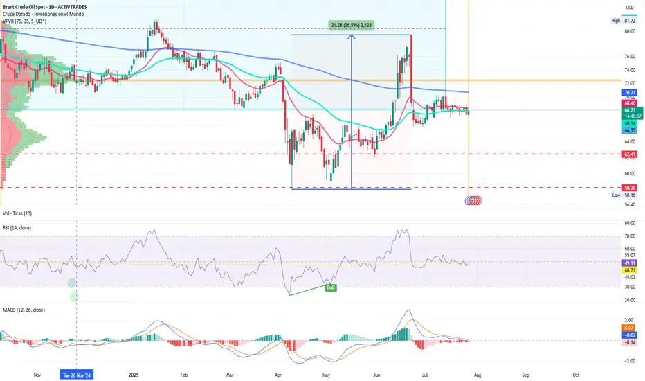
Brent: Crude Loses Its Shine Amid Mass Selloffs and Global FearsBy Ion Jauregui – Analyst at ActivTrades
Bearish pressure is intensifying in the oil market, with Brent crude leading the liquidation among major investment funds. The expiration of U.S. tariff exemptions on August 1st, combined with a global economic slowdown, has triggered a wave of risk aversion across energy commodities.
Funds Exit Oil: Alarming Figures
According to the latest data from the CFTC and ICE, hedge funds cut their net long positions in Brent by 11,352 contracts, bringing the total down to 227,393, the lowest level since April. For West Texas Intermediate (WTI), the decline was even sharper—over 10,000 contracts, reducing the net exposure to 86,088.
The bearish trend extends to refined products. U.S. diesel net positions fell to 38,945 contracts, although pure long positions reached 54,053, the highest level since February. In contrast, European gasoil showed relative strength as a safe haven, with long contracts increasing by 7,632 to 132,133—the highest level in more than three years.
Brent Technical Analysis: Critical Zone Under Pressure
From a technical perspective, Brent failed to break through the key $80 resistance level on June 23rd, which intensified selling pressure. Throughout July, prices have consolidated within an accumulation zone around $68, close to current levels. The year’s lows, recorded in May at $58.16, suggest a structural support around $62.41.
The loss of the 50- and 100-day moving averages reinforces the bearish bias. Should the current support break, Brent could swiftly move toward $64, a key technical support zone. Conversely, if prices hold above this level, a rebound toward the control zone around $72 could follow.
Technical indicators support the pessimistic outlook: the RSI stands at 48.32, in neutral territory but lacking upward momentum, while the MACD shows a bearish expansion, potentially signaling further downside unless strong buying emerges in the short term.
Valuations in Question
Despite the recent correction, the energy sector within the S&P 500 maintains an estimated P/E ratio of 15, above its historical average of 11–12, though still below the broader index average (~26×). This raises the classic dilemma: is this a value opportunity or a value trap in a structurally weakening demand cycle?
Conclusion
The oil market is facing a double challenge: weakened fundamentals and bearish technical signals. With institutional flows pulling back, macro uncertainty rising, and momentum indicators flashing red, caution is warranted.
The current levels may mark a strategic inflection point—or simply the prelude to deeper declines.
*******************************************************************************************
La información facilitada no constituye un análisis de inversiones. El material no se ha elaborado de conformidad con los requisitos legales destinados a promover la independencia de los informes de inversiones y, como tal, debe considerarse una comunicación comercial.
Toda la información ha sido preparada por ActivTrades ("AT"). La información no contiene un registro de los precios de AT, o una oferta o solicitud de una transacción en cualquier instrumento financiero. Ninguna representación o garantía se da en cuanto a la exactitud o integridad de esta información.
Cualquier material proporcionado no tiene en cuenta el objetivo específico de inversión y la situación financiera de cualquier persona que pueda recibirlo. La rentabilidad pasada y las estimaciones no sinónimo ni un indicador fiable de la rentabilidad futura. AT presta un servicio exclusivamente de ejecución. En consecuencia, toda persona que actúe sobre la base de la información facilitada lo hace por su cuenta y riesgo. Los tipos de interés pueden cambiar. El riesgo político es impredecible. Las acciones de los bancos centrales pueden variar. Las herramientas de las plataformas no garantizan el éxito.
Price Stability Signals Long OpportunityCurrent Price: $65.45
Direction: LONG
Targets:
- T1 = $67.25
- T2 = $68.50
Stop Levels:
- S1 = $64.15
- S2 = $63.25
**Wisdom of Professional Traders:**
This analysis synthesizes insights from thousands of professional traders and market experts, leveraging collective intelligence to identify high-probability trade setups. The wisdom of crowds principle suggests that aggregated market perspectives from experienced professionals often outperform individual forecasts, reducing cognitive biases and highlighting consensus opportunities in Crude Oil.
**Key Insights:**
Crude Oil prices are showing signs of stability around the $65.45 mark, creating opportunities for upside potential. Recent consolidation indicates underlying strength in the market, supported by solid demand forecasts and tight global supply, making a long position viable for the near term. However, traders should remain cautious, as any unexpected geopolitical or macroeconomic developments could trigger volatility.
**Recent Performance:**
Crude Oil has seen moderate fluctuations over the past week, with prices swinging between $64 and $66. The commodity appears to be recovering from recent dips, supported by stronger-than-expected inventory reports and OPEC's cautious stance. Overall trade volumes remain healthy, reflecting a gradual return of confidence among investors.
**Expert Analysis:**
Market sentiment among analysts leans bullish for the upcoming week. Experts point to various bullish indicators, including declining global stockpiles and expectations of stronger winter demand across major economies, particularly in the U.S. and China. Meanwhile, technical charts reveal sustained support near $65, suggesting room for an upward breakout.
**News Impact:**
OPEC+ members have reiterated their commitment to production cuts, alleviating fears of oversupply. Additionally, easing recession concerns and a potential rally in the broader commodities market further support the case for higher Crude Oil prices. However, traders should watch for Federal Reserve statements and potential shifts in interest rate policy that could impact demand dynamics.
**Trading Recommendation:**
Considering Crude Oil's current stability and positive outlook, traders should enter a long position targeting $67.25 and $68.50 while placing stop levels at $64.15 and $63.25 to manage downside risk effectively. The interplay of favorable supply-demand dynamics and technical indicators presents an attractive risk-reward scenario for upside participation.

Uptrend Intact: Price Pullback Offers New Long Entry OpportunityThe upward structure of the chart remains intact, and I believe the growth will likely continue in the near future.
At the moment, we’re seeing a price pullback, which provides new opportunities to enter a long position.
I will place a wide stop at the 37.35 level.

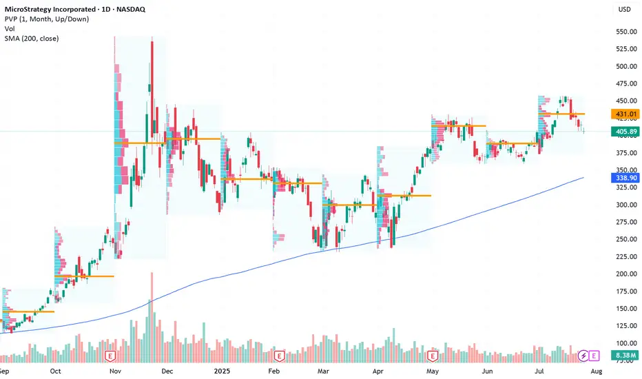
Long-Term Bitcoin Proxy Positioned for Next Upside RallyCurrent Price: $405.89
Direction: LONG
Targets:
- T1 = $418.50
- T2 = $425.99
Stop Levels:
- S1 = $399.50
- S2 = $386.20
**Wisdom of Professional Traders:**
This analysis synthesizes insights from thousands of professional traders and market experts, leveraging collective intelligence to identify high-probability trade setups. The wisdom of crowds principle suggests that aggregated market perspectives from experienced professionals often outperform individual forecasts, reducing cognitive biases and highlighting consensus opportunities in MicroStrategy.
**Key Insights:**
MicroStrategy is uniquely positioned as the largest corporate Bitcoin holder, meaning its stock price is closely tied to Bitcoin's movements. The company holds over 68,000 BTC, making it a favored choice for investors aiming to benefit from Bitcoin's potential breakout. Recent bullish market sentiment and positive institutional positioning in cryptocurrency-related equities add strength to the Long scenario.
Short-term price metrics also confirm a bullish bias, with options flows targeting calls and aggressive price strikes above current levels. However, flexibility is required as Bitcoin remains highly volatile ahead of macroeconomic shifts and Bitcoin-specific technical resistance levels.
**Recent Performance:**
MicroStrategy's stock has gained momentum over the past month, trading in tandem with Bitcoin's recent stability in the $27,000-$28,000 range. Last week, MicroStrategy saw increased interest among institutional investors, as options targeting a sharp rally were opened at key resistance levels. This suggests confidence among professional traders about crypto recovery prospects.
**Expert Analysis:**
Analysts argue the stock could serve as a leveraged play on Bitcoin’s trajectory, especially during bullish setups like MicroStrategy’s upcoming quarterly reports. Some experts point to Bitcoin’s struggle to break above $30,000 as an immediate risk, yet highlight MicroStrategy’s firm association with Bitcoin as an advantage. Beyond crypto exposure, MicroStrategy’s operational restructuring and debt management efforts further bolster its appeal as a dual-tech and crypto equity.
**News Impact:**
MicroStrategy’s long-term strategy continues to blend Bitcoin maximization with tech-driven operational focus. Recent comments from management emphasize continued cryptocurrency accumulation despite market fluctuations, securing its place as a pro-Bitcoin institutional equity. The upcoming earnings report could provide deeper insights into strategic moves for 2024, driving a post-earnings rally.
**Trading Recommendation:**
MicroStrategy presents a compelling buy opportunity for investors betting on Bitcoin-led equity rallies. Technical setups align with improving sentiment and disruptive news catalysts around macroeconomic policies supporting crypto stability, triggering higher upside potential. Long setups above $405.89 show bullish targets to $418.50 and $425.99, while flexible stop placements provide downside protection amidst broader Bitcoin resistance risks.
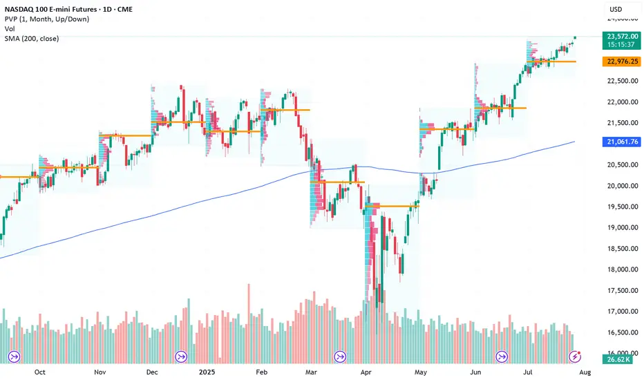
Approach Next Resistance Amid Cautious OptimismCurrent Price: 23272.25
Direction: LONG
Targets:
- T1 = 23480
- T2 = 23720
Stop Levels:
- S1 = 22990
- S2 = 22770
**Wisdom of Professional Traders:**
This analysis synthesizes insights from thousands of professional traders and market experts, leveraging collective intelligence to identify high-probability trade setups. The wisdom of crowds principle suggests that aggregated market perspectives from experienced professionals often outperform individual forecasts, reducing cognitive biases and highlighting consensus opportunities in NASDAQ Futures.
**Key Insights:**
NASDAQ Futures exhibit strong recovery potential but face technical resistance at $23420. The market momentum suggests short-term bullishness despite concerns about seasonal reversals in late August to October. Traders are advised to focus on breakout scenarios while employing risk mitigation strategies including hedges.
**Recent Performance:**
Over the past six months, NASDAQ Futures have displayed substantial volatility. After a steep drop of 27%, the index staged an impressive 40% recovery. Such swings highlight heightened risk yet underscore resilience, bolstered by strong inflows into technology stocks.
**Expert Analysis:**
Analysts caution against overcrowded positions in mega-cap tech stocks dominating NASDAQ Futures. While the rally has offered compelling returns, seasonal risks suggest potential reversals during late summer and early autumn. Diversification strategies into less-crowded sectors may enhance portfolio robustness.
**News Impact:**
Recent announcements around AI adoption, earnings beats by key technology firms, and federal monetary policy stabilization have bolstered sentiment in tech-heavy indices, including NASDAQ Futures. Continued interest in growth stocks adds fuel to the bullish narrative despite looming risk factors.
**Trading Recommendation:**
Traders should consider a LONG position based on strong bullish sentiment and favorable technical setups. However, risk factors such as seasonal reversals and crowded trades in large-cap technology stocks require prudent stop levels and diversification strategies to protect against downside vulnerabilities.
Ye Chart Kuch Kehta Hai - Paradeep PhosphateWhat an amazing and clean chart this stock has got. Few perspective -
Stock Price Momentum:
The stock is trading above its 5, 20, 50, 100, and 200-day moving averages, showing strong upward momentum.
Volume & Performance:
Past 1 month: +26.58%. Past 1 year: +125%–137%.
Outperforming the Sensex, especially in 2025.
Breakouts:
Currently consolidating between ₹190–₹205. Technical breakout above ₹205 could move it towards ₹296 in 3 months, if broader market conditions support and volumes confirm the move.
Volatility:
3.7x as volatile as Nifty, indicating high risk and high reward.
Position in Sector:
Outperformance within a strong fertilizer theme.
Business Model:
Second-largest private phosphatic fertilizer company in India, with a broad manufacturing and distribution presence.
Return Metrics:
ROCE: 13.9% | ROE: 14.4% (but 3-year average only 9.6%).
Growth:
3-year compounded sales growth: 21%.
3-year compounded profit growth: 11%.
TTM profit growth: 376% (driven by recent performance rebound).
Profitability:
Net Profit Margin (TTM): 3.99% | Gross Margin: ~26%.
Balance Sheet:
Debt/Equity: 106.5%—relatively high, though not uncommon in asset-heavy fertilizer industry.
Valuation:
PE is above market average, indicating some overvaluation vs. long-term average.
PB ratio significantly above book, dividend yield still modest.
Risks:
High volatility, cyclical earnings potential.
Returns on equity are improving but still modest for long-term holding expectations (Buffett style).
Institutional ownership and low insider ownership suggest broad investor interest, but not heavy inside conviction.
Momentum/Technical:
Positive: Strong technical momentum, recent breakouts, all moving averages showing uptrend.
Actionable: Watch for breakout above ₹205 with volume, as it may target ₹296 in 3 months.
Note: As a trend/momentum investor, position sizing and risk management are crucial due to elevated volatility and the stock’s sharp run-up.
Value/Long-Term:
Positive: Largest domestic fertilizer player, steady profit growth, improving operating margins, scale in an essential industry.
Cautious: Valuation is somewhat elevated (high PE & PB). Margins (ROE/ROCE) are decent but not exceptional. High debt and sector cyclicality are notable risks. Dividend yield is low.
Actionable: "Buy only at a fair price"—the current valuation seems a bit rich relative to its book and historical earnings multiples. Consider accumulating on dips, or if you have a very long-term horizon and conviction on sectoral tailwinds.
No investment is risk-free—conduct your own due diligence and consider your own risk appetite before making a move.

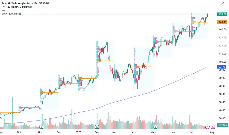
Long Setup for Continued Growth Potential Next WeekCurrent Price: $158.80
Direction: LONG
Targets:
- T1 = $162
- T2 = $166
Stop Levels:
- S1 = $157
- S2 = $153
**Wisdom of Professional Traders:**
This analysis synthesizes insights from thousands of professional traders and market experts, leveraging collective intelligence to identify high-probability trade setups. The wisdom of crowds principle suggests that aggregated market perspectives from experienced professionals often outperform individual forecasts, reducing cognitive biases and highlighting consensus opportunities in Palantir Technologies.
**Key Insights:**
Palantir Technologies has demonstrated remarkable resilience and strong market momentum, reflected in its substantial surge since early-year lows. Significant investor enthusiasm, coupled with robust fundamentals, has propelled the stock to all-time highs, suggesting further upside potential. Traders should monitor key levels at $160 (resistance) and $155 (support) to identify promising entry and profit-taking opportunities. Additionally, consistent earnings growth and strategic partnerships continue to enhance Palantir's attractiveness as a long-term play.
**Recent Performance:**
Palantir closed its last trading session with positive upward momentum, gaining +2.54% and marking a new high close. Its performance outpaces broader indices during the same period, demonstrating technical strength and sustained investor confidence. With steady gains and consistent returns through volatile markets, Palantir remains a compelling trade for growth-oriented investors.
**Expert Analysis:**
Analysts remain cautiously optimistic about Palantir’s near-term trajectory, emphasizing its resilience and growth-driven attributes. Predictions suggest potential sideways movement in the coming sessions, making pullbacks attractive for entry ahead of further bullish momentum. A strong earnings pattern and investor-driven rallies underpin expert calls for sustained upside potential, aligning it with other high-growth equities in the technology space.
**News Impact:**
Recent developments, including key advancements in Palantir's technology initiatives and strategic partnerships, have fueled market enthusiasm. Strong retail interest, coupled with favorable earnings updates, reinforces the stock's position as a favored choice among traders and investors seeking high-growth opportunities. Continued focus on innovation and expansion has added further confidence to Palantir’s trading outlook.
**Trading Recommendation:**
Given Palantir's recent price action, technical strength, and positive growth narrative, a long position is recommended. Monitor pullbacks to support levels for entry opportunities while maintaining stop losses below support at $153 to mitigate downside risk. Holding through potential resistance at $160 could lead to gains toward established targets at $162 and $166.
Go Long on PayPal Amid Strategic Stability and Earnings Catalyst Current Price: $77.98
Direction: LONG
Targets:
- T1 = $80.50
- T2 = $83.00
Stop Levels:
- S1 = $76.00
- S2 = $74.50
**Wisdom of Professional Traders:**
This analysis synthesizes insights from thousands of professional traders and market experts, leveraging collective intelligence to identify high-probability trade setups. The wisdom of crowds principle suggests that aggregated market perspectives from experienced professionals often outperform individual forecasts, reducing cognitive biases and highlighting consensus opportunities in PayPal.
**Key Insights:**
PayPal continues to benefit from strong free cash flow generation, which has enabled the company to commit to shareholder-friendly initiatives such as buybacks. Despite the challenges posed by increasing competition in the fintech sector and modest near-term revenue growth expectations, PayPal's position as a trusted global payment platform supports its long-term growth narrative. Additionally, its popular Venmo service continues to bolster consumer engagement. With earnings season right around the corner, there is an elevated probability of upward price movement depending on reported performance and guidance updates.
**Recent Performance:**
PayPal has faced considerable margin pressures, leading to a prolonged decline from its all-time highs. However, recent price action at $77.98 suggests stability is returning, with the stock entering a consolidation phase ahead of key developments, such as its earnings report. Despite weaker year-to-date performance, short-term recovery signals have emerged as investor sentiment remains cautiously optimistic.
**Expert Analysis:**
Analysts continue to project PayPal's rebound potential thanks to diversified business lines and reliable financial execution. In spite of competitive threats, EPS growth expectations for the next fiscal year range from 12% to 23%, contributing to attractive investor confidence metrics. From a technical perspective, PayPal shows signs of recovery momentum supported by improving market breadth within its fintech sector peers.
**News Impact:**
PayPal's upcoming quarterly earnings report will serve as a major determinant for its near-term trajectory. Analysts will be focusing intently on user engagement metrics, revenue growth rates (projected to be 2.5%), and management's forward-looking statements on growth drivers. Additionally, current economic headwinds impacting consumer spending could provide crosswinds, although PayPal’s share buyback strategies may mitigate downside risks and strengthen the stock's appeal during these turbulent times.
**Trading Recommendation:**
Based on strong fundamentals, strategic initiatives, and potential bullish catalysts tied to the forthcoming earnings report, traders are encouraged to take a LONG position in PayPal. Near-term targets include $80.50 and $83.00, offering reasonable upside from the current price level. Maintain disciplined risk management by positioning stops at $76.00 (primary) and $74.50 (secondary).

Roblox Set for a Potential Rally Ahead of EarningsCurrent Price: $118.82
Direction: LONG
Targets:
- T1 = $122.50
- T2 = $129.00
Stop Levels:
- S1 = $116.00
- S2 = $113.00
**Wisdom of Professional Traders:**
This analysis synthesizes insights from thousands of professional traders and market experts, leveraging collective intelligence to identify high-probability trade setups. The wisdom of crowds principle suggests that aggregated market perspectives from experienced professionals often outperform individual forecasts, reducing cognitive biases and highlighting consensus opportunities in Roblox.
**Key Insights:**
Roblox Corporation (RBLX) is strategically positioned as a key infrastructure leader in metaverse development, making its equity an attractive play for investors anticipating major tech adoption trends. The company’s focus on innovation and user engagement has allowed it to maintain steady revenue growth, despite macroeconomic pressures. Metrics such as Daily Active Users (DAU) and average revenue per user are expected to drive momentum during earnings week. Analysts are watching how Roblox navigates rising costs and inflationary challenges without compromising product innovation.
Further, Roblox's partnerships with video gaming and enterprise brands to define the metaverse market promise continued growth opportunities. However, its reliance on younger demographics poses inherent risks in a downturned technology landscape, something traders should keep in mind before going long.
**Recent Performance:**
Roblox stock has maintained impressive strength with its current price moving around $118.82. Despite market-wide fears around rate hikes and restrictive Fed policies, Roblox has hovered firmly above major support levels. Growing institutional participation and favorable user trends are reinforcing its bullish narrative, though last week experienced modest pullbacks from its previous high near $120+.
**Expert Analysis:**
Market experts emphasize studying competitor earnings to gauge broader industry scaling trends before committing to Roblox. Profitability ratios remaining mixed but sustained DAU represents strong coverage from Gen-Z content loop metrics. Aggressive flexibility statements concerning expense shifts also provide Q2/Q3 transitional long market entries opportunity.
News outlets highlighted key underperformance talks over crowded report spending some files investor conviction across price target first low consolidation weekending around $124 scenario prices mismatch rules impacting.
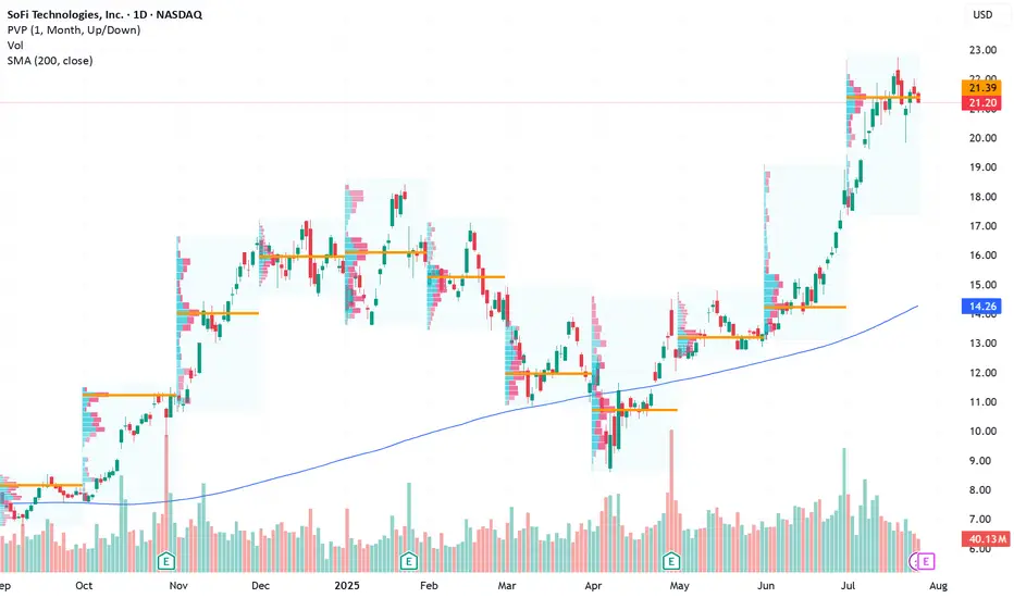
Positioned for an Earnings-Driven Upside Opportunity Current Price: $21.20
Direction: LONG
Targets:
- T1 = $22.80
- T2 = $23.60
Stop Levels:
- S1 = $20.60
- S2 = $19.90
**Wisdom of Professional Traders:**
This analysis synthesizes insights from thousands of professional traders and market experts, leveraging collective intelligence to identify high-probability trade setups. The wisdom of crowds principle suggests that aggregated market perspectives from experienced professionals often outperform individual forecasts, reducing cognitive biases and highlighting consensus opportunities in SOFI.
**Key Insights:**
SoFi Technologies has demonstrated impressive momentum recently, gaining 34% over the past 22 trading sessions. However, it’s essential to consider the technical risks posed by a rising wedge pattern, which can indicate potential bearish reversals. The firm’s upcoming earnings report represents a critical market driver, likely to weigh heavily on stock volatility and direction. Fintech stocks remain resilient and favorable due to macro-level growth trends and technological adoption patterns.
**Recent Performance:**
SoFi's stock price surged 34% in just 22 trading days. This remarkable performance highlights growing investor confidence, fueled by the company's solid fundamentals and broader enthusiasm within the fintech sector. Rising technical patterns, however, warrant caution as wedge formations can signal a near-term ceiling for price acceleration.
**Expert Analysis:**
While SoFi’s stock has benefited from impressive bullish strength, traders are closely monitoring its response to earnings, set to release early next week. Analysts highlight that SoFi shows favorable alignment with sector trends, supported by increasing consumer adaptation of innovative banking service platforms. Earnings surprises could invalidate historical market patterns, offering strong upside if the figures exceed expectations.
**News Impact:**
The anticipated earnings report is expected to heavily influence market sentiment regarding SoFi and the fintech sector as a whole. The release coincides with major earnings updates from leading players, including Microsoft and Visa—macro-level catalysts for tech and finance stocks. Investors should prepare for heightened volatility surrounding the event window.
**Trading Recommendation:**
Given recent price action, sector resilience, and the imminent earnings release, SoFi Technologies represents a strategic long opportunity for traders targeting positive earnings performance. Targets of $22.80 and $23.60 reflect compelling upside potential, though monitoring stop-loss levels of $20.60 and $19.90 is essential to mitigate risk during volatile moves. The trade idea is grounded in disciplined entry around support levels and a focus on breakout possibilities.
A Strategic Long Opportunity Amid VolatilityCurrent Price: $316.06
Direction: LONG
Targets:
- T1 = $324.00
- T2 = $328.50
Stop Levels:
- S1 = $312.50
- S2 = $308.00
**Wisdom of Professional Traders:**
This analysis synthesizes insights from thousands of professional traders and market experts, leveraging collective intelligence to identify high-probability trade setups. The wisdom of crowds principle suggests that aggregated market perspectives from experienced professionals often outperform individual forecasts, reducing cognitive biases and highlighting consensus opportunities in Tesla.
**Key Insights:**
Tesla’s stock presents both short-term risks and long-term upside opportunities. Despite recent earnings misses and margin compression, its pivot into AI and robotics offers significant growth opportunities. Upside resistance zones near $325-$330 create favorable price targets, while support levels at $307-$310 suggest strong buying interest. This environment could favor a long trading strategy, provided disciplined risk management is maintained.
**Recent Performance:**
Tesla recently experienced notable sell-offs following disappointing earnings, attributed to compressed margins and weaker EV demand. However, the stock rebounded 3.5% from last week’s lows, signaling resilience amid uncertainty. Year-to-date, Tesla remains one of the top-performing stocks with a 54% price increase, reflecting strong underlying investor confidence in its long-term story.
**Expert Analysis:**
Market experts are divided on Tesla’s trajectory. Near-term fundamentals appear challenging with declining revenue (-12% YoY) and price cuts impacting profitability. However, bullish projections from analysts such as Kathy Wood highlight Tesla’s potential for disruptive innovation in AI and robotics. Its ambitious initiatives like robo-taxi deployment add speculative appeal but also introduce scaling and regulatory risks.
**News Impact:**
Tesla’s upcoming robo-taxi launch in San Francisco is poised to impact market sentiment significantly. While safety drivers will be required during the initial rollout, scalability and regulatory challenges could limit the project’s immediate impact. Meanwhile, recent disappointing earnings results may weigh on sentiment in the short term while providing an opportunity for potential retrishments off support levels.
**Trading Recommendation:**
Given the current setup, Tesla appears poised for long-term growth, with upside resistance levels suggesting a viable rally opportunity. Investors should consider taking a bullish position while maintaining stops near key support zones to mitigate downside risks. This balanced approach aligns well with Tesla’s speculative appeal and broader investor sentiment.

BTCUSD| XAUUSD| AUDUSDwe did a quick look on last week analysis and how price eventually went, so we try to look the direction of price as the general trend currently isa side ways move.

Positioning UPS Long Amid Global Logistics Tailwinds Current Price: $103.56
Direction: LONG
Targets:
- T1 = $106.00
- T2 = $108.00
Stop Levels:
- S1 = $101.00
- S2 = $99.50
**Wisdom of Professional Traders:**
This analysis synthesizes insights from thousands of professional traders and market experts, leveraging collective intelligence to identify high-probability trade setups. The wisdom of crowds principle suggests that aggregated market perspectives from experienced professionals often outperform individual forecasts, reducing cognitive biases and highlighting consensus opportunities in United Parcel Service Inc. (UPS).
**Key Insights:**
United Parcel Service Inc. is in a prime position to benefit from ongoing bullish sentiment in the broader equity markets. As global trade momentum gains strength, the logistics sector—particularly UPS—stands to capture value from increasing international shipping demand and rising domestic delivery requirements. The company’s strong fundamentals, coupled with bullish technical price action, present an attractive long-term growth opportunity.
UPS’s recent consolidation below a key resistance level is indicative of potentially higher breakout levels next week, provided broader economic resilience persists. Upside catalysts include favorable earnings forecasts and resolution of international trade deals, both of which may attract institutional investors toward logistics stocks like UPS. Additionally, the company could benefit from sector rotations into large-cap value plays amid market diversifications away from technology-heavy equities.
**Recent Performance:**
The stock has been consolidating near its current price level of $103.56, after experiencing a moderate recovery from earlier lows near the $100 range. This steady upward trend indicates gradual confidence among traders as UPS maintains its leadership position within logistics and freight services. With resistance levels at $105, subsequent breakout potential could lead to higher prices in the forthcoming sessions.
**Expert Analysis:**
Analysts remain optimistic about UPS’s capability to capitalize on emerging trends, including reaccelerating global trade and increased e-commerce penetration. Technical studies reveal upside divergence in recurring price movements and volume accumulation, suggesting an imminent rally back to its previous highs. Expert sentiment suggests that regular upward price action could position UPS as a prominent logistics equity benefitting from broader economic activity and capital inflows into its sector.
**News Impact:**
UPS’s role in enhancing international logistics networks places it as a top contender for benefiting from trade agreement developments between the U.S. and EU. Also, the upcoming earnings season is critical, as positive reports across the S&P 500 would likely drive sentiment and support upward progression in its stock price. UPS’s exposure across e-commerce and freight delivery ensures robust prospects amid current global volatility, further providing potential tailwinds to its long opportunities.
**Trading Recommendation:**
Given its technical consolidation near $103.56 and key resistance levels above, traders should position long with a first target at $106.00 and a second target at $108.00. Stops at $101.00 and $99.50 ensure risk management while allowing room for volatility. With positive fundamental drivers, UPS represents a high-conviction opportunity amidst macroeconomic strength and evolving logistics demand.

BTC on 4H
"Hello, focusing on BTC on the 4-hour chart, the price is currently in a bullish momentum on higher time frames. However, it is showing signals indicating a potential completion of its pullback to the $110,000 zone. In my opinion, the $122,000 zone could be a good area to consider a sell position, with confirmation on the 15-minute chart. I plan to wait for this zone and then decide on initiating a sell position. If you have any updates or alternative perspectives on this analysis, please feel free to share."
If you need further clarification or have more details to discuss, please let me know!

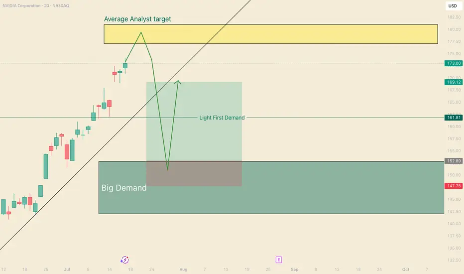
Catch the bounce on NVDAHi, I'm The Cafe Trader.
We’re taking a deeper dive into NVIDIA (NVDA) — one of the leaders in the MAG 7 — with a short-term trade setup you can apply to both shares and options.
Setup Context:
NVDA is pushing into all-time highs, and we’re now approaching the average analyst price target (around $180). While we don’t know how price will react at this level, traders should be watching for pullbacks and trend continuations — prime zones for entry.
If we get a strong move down, I see $153 as a high-probability bounce area — where buyers are likely to step in aggressively.
Price Target Outlook:
The final price target will depend on how price moves into this zone:
- If NVDA runs to $200 before pulling back, targets shift higher.
- If it tops out around $180, we adjust accordingly.
That said, an initial bounce toward $169–$170 looks reasonable.
Options Note:
If NVDA sells off hard and fast, implied volatility (IV) will spike, making options expensive and reducing your edge. This is a setup that could play out over 2–3 weeks, but the first bounce could be quick — so timing matters.
Strategy: Staggered Entry Using Two Contracts
Use two contracts — one short-term, one mid-term — to maximize reward while managing time decay.
Contract 1: Short-Term (3–5 Days to Expiry)
Trigger Entry: As soon as price taps the demand zone (~$153)
Strike Entry Price ^^Target Price
155 $2.00 ^^ $6.00
157.5 $1.50 ^^ $4.50
160 $0.75 ^^ $2.50
You’re looking for a quick reaction: get in, take profit, and step aside while the market finds new balance.
Contract 2: Medium-Term (7–10 Days to Expiry)
Timing Tip: Wait for NVDA to stall or consolidate after the initial bounce — this is when IV comes down and contracts get cheaper.
Strike Entry Price ^^Target Price
155 $3.00 ^^ $15.00
157.5 $2.50 ^^ $12.50
160 $1.80 ^^$9.00
Important: Be careful trading too close to earnings. Contracts tend to get overpriced right before and after earnings drops.
That wraps up the short-term NVDA view.
Stay tuned for more trades and setups across the MAG 7.
@thecafetrader
Take care, and happy trading!
BNB/USD at $1,000 in this cycle?The underlying uptrend in the BNB/USD token is a major barometer of the overall health of the crypto market, and more broadly, of investor interest in altcoins. In the previous cycle, back in January 2021, the bullish breakout of the all-time high (ATH) on BNB/USD was a leading indicator of the altcoin season. In our current cycle, BNB/USD is on the verge of breaking above its ATH once again. If this breakout happens, it would be a positive signal for altcoins.
1) Why tracking BNB/USD’s underlying trend is essential to anticipate the crypto market’s health
In the crypto ecosystem, some assets serve as overall market barometers. BNB, issued by Binance, is one of them. Monitoring BNB/USD is not only relevant for holders of the token but also for any investor looking to assess the general state of the crypto and altcoin markets.
Why? Because Binance is by far the largest global platform in trading volume—both in the spot and derivatives markets. The BNB token thus directly reflects the momentum of the Binance ecosystem and, by extension, a major segment of the crypto industry.
When BNB is in a sustained uptrend, it generally signals renewed activity, increasing volume, and growing investor confidence. Conversely, a prolonged downtrend may suggest progressive disengagement by market participants and broader downside pressure on altcoins.
Moreover, activity growth or contraction on Binance almost automatically leads to shifts in demand for BNB, which is used for trading fees, launchpad services, and DeFi. This makes BNB an early indicator of liquidity and vitality in the space.
Integrating BNB/USD technical analysis into your market monitoring strategy is, in essence, observing the pulse of the crypto markets.
2) From a technical analysis perspective, a bullish breakout above BNB/USD’s ATH would be a strong altseason signal
The chart below shows the weekly candlestick data for BNB/USD. Looking back at winter 2021, the breakout above the ATH coincided with the beginning of the altcoin season.
As such, I’m keeping a close watch on the current ATH of $794. If BNB/USD manages to break through this resistance, it would be a very bullish signal for altcoins and would set a technical target at $1,000.
However, as of now, this breakout has not occurred. A break below the key support at $690 would invalidate the bullish outlook for this cycle.
DISCLAIMER:
This content is intended for individuals who are familiar with financial markets and instruments and is for information purposes only. The presented idea (including market commentary, market data and observations) is not a work product of any research department of Swissquote or its affiliates. This material is intended to highlight market action and does not constitute investment, legal or tax advice. If you are a retail investor or lack experience in trading complex financial products, it is advisable to seek professional advice from licensed advisor before making any financial decisions.
This content is not intended to manipulate the market or encourage any specific financial behavior.
Swissquote makes no representation or warranty as to the quality, completeness, accuracy, comprehensiveness or non-infringement of such content. The views expressed are those of the consultant and are provided for educational purposes only. Any information provided relating to a product or market should not be construed as recommending an investment strategy or transaction. Past performance is not a guarantee of future results.
Swissquote and its employees and representatives shall in no event be held liable for any damages or losses arising directly or indirectly from decisions made on the basis of this content.
The use of any third-party brands or trademarks is for information only and does not imply endorsement by Swissquote, or that the trademark owner has authorised Swissquote to promote its products or services.
Swissquote is the marketing brand for the activities of Swissquote Bank Ltd (Switzerland) regulated by FINMA, Swissquote Capital Markets Limited regulated by CySEC (Cyprus), Swissquote Bank Europe SA (Luxembourg) regulated by the CSSF, Swissquote Ltd (UK) regulated by the FCA, Swissquote Financial Services (Malta) Ltd regulated by the Malta Financial Services Authority, Swissquote MEA Ltd. (UAE) regulated by the Dubai Financial Services Authority, Swissquote Pte Ltd (Singapore) regulated by the Monetary Authority of Singapore, Swissquote Asia Limited (Hong Kong) licensed by the Hong Kong Securities and Futures Commission (SFC) and Swissquote South Africa (Pty) Ltd supervised by the FSCA.
Products and services of Swissquote are only intended for those permitted to receive them under local law.
All investments carry a degree of risk. The risk of loss in trading or holding financial instruments can be substantial. The value of financial instruments, including but not limited to stocks, bonds, cryptocurrencies, and other assets, can fluctuate both upwards and downwards. There is a significant risk of financial loss when buying, selling, holding, staking, or investing in these instruments. SQBE makes no recommendations regarding any specific investment, transaction, or the use of any particular investment strategy.
CFDs are complex instruments and come with a high risk of losing money rapidly due to leverage. The vast majority of retail client accounts suffer capital losses when trading in CFDs. You should consider whether you understand how CFDs work and whether you can afford to take the high risk of losing your money.
Digital Assets are unregulated in most countries and consumer protection rules may not apply. As highly volatile speculative investments, Digital Assets are not suitable for investors without a high-risk tolerance. Make sure you understand each Digital Asset before you trade.
Cryptocurrencies are not considered legal tender in some jurisdictions and are subject to regulatory uncertainties.
The use of Internet-based systems can involve high risks, including, but not limited to, fraud, cyber-attacks, network and communication failures, as well as identity theft and phishing attacks related to crypto-assets.

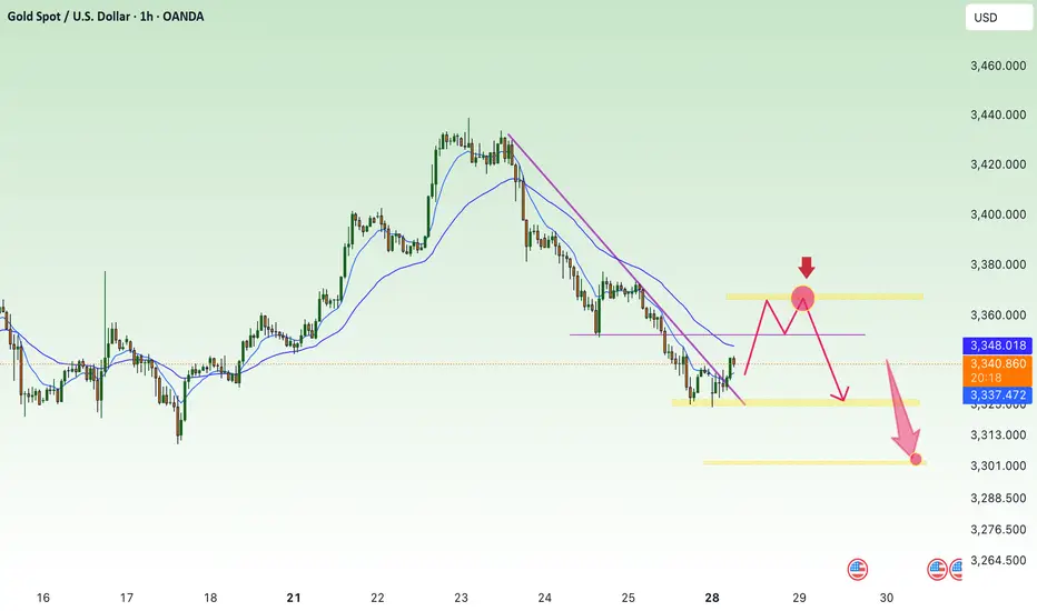
Get liquidity at the beginning of the week, continue to decrease⭐️GOLDEN INFORMATION:
Gold (XAU/USD) continues to lose ground, slipping to around $3,335 in early Asian trading on Monday. The metal is on its fourth straight day of declines as easing geopolitical tensions and trade progress weaken safe-haven demand. Investors are now turning their focus to the upcoming FOMC policy decision on Wednesday.
Market sentiment has improved following a breakthrough in US–EU trade talks, with both sides agreeing to a uniform 15% tariff on traded goods, effectively ending months of stalemate. The new tariffs will come into effect on August 1. Meanwhile, the US and China are reportedly planning to extend their tariff truce for another three months, according to the South China Morning Post. The renewed risk appetite continues to pressure gold, traditionally favored in times of uncertainty.
⭐️Personal comments NOVA:
Short-term recovery in Asian session, gold price takes liquidity and continues to accumulate below 3369
⭐️SET UP GOLD PRICE:
🔥SELL GOLD zone: 3369- 3371 SL 3376
TP1: $3360
TP2: $3350
TP3: $3340
🔥BUY GOLD zone: $3305-$3303 SL $3298
TP1: $3314
TP2: $3330
TP3: $3342
⭐️Technical analysis:
Based on technical indicators EMA 34, EMA89 and support resistance areas to set up a reasonable SELL order.
⭐️NOTE:
Note: Nova wishes traders to manage their capital well
- take the number of lots that match your capital
- Takeprofit equal to 4-6% of capital account
- Stoplose equal to 2-3% of capital account
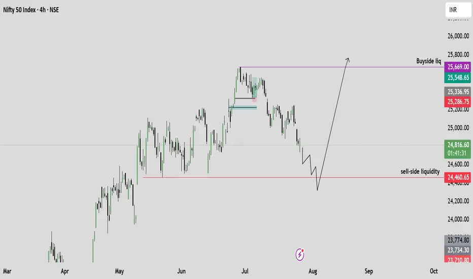
Bearish Outlook on Nifty – Based on Smart Money ConceptI'm seeing a clear downside setup on Nifty, with Smart Money indicating distribution and the market transitioning into a bearish trend.
📉 Target: 25,340
📍 Current Price: 25,474
🔍 Reasoning: Clear signs of institutional distribution and lower highs/lows forming. Smart Money is exiting, suggesting the beginning of a deeper correction.
Will monitor closely for any change in structure, but as of now, bias remains strongly bearish.
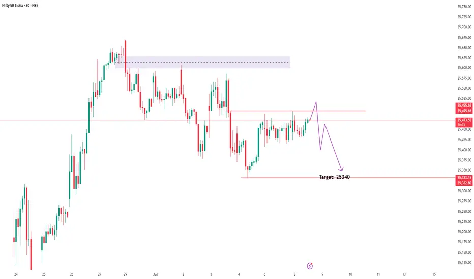
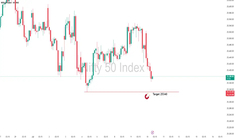
Almost There: Nifty Closing in on My Target Zone 25340In this update, I’m revisiting the setup I shared earlier that points towards NIFTY’s next potential target at 25,340. The analysis covers the key levels, price action structure, and the factors supporting this move. This setup is based on clear technical confirmations and disciplined risk management — not just speculation.
Please remember to follow your own plan and manage your trades responsibly. This is for educational purposes and not financial advice. Let’s see how the price action unfolds!
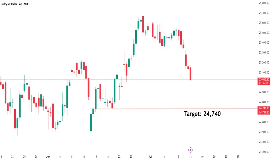
NIFTY 24740: Smart Money Signals Bearish Move IncomingThe directional bias is clear – bearish – and I'm currently waiting for a precise setup to present itself. Based on the Smart Money Concept, we could be looking at a potential short opportunity around the 24740 zone.
📍 Once the setup is confirmed, I’ll be sharing the exact entry and stop-loss levels with you.
Stay tuned – patience here is key. Let the market come to us.