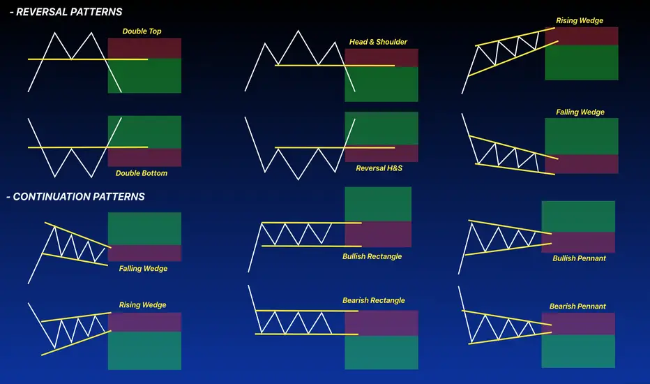
REVERSAL AND CONTINUATION PATTERNS ⚡️Chart patterns are visual representations of price action. Chart patterns can show trading ranges, swings, trends, and reversals in price action. The signal for buying and selling a chart pattern is usually a trend line breakout in one direction showing support or resistance is overcome at a key level. Stop losses are usually set on retracement back inside the previous range and profit targets are usually set based on the magnitude of the previous move leading into the pattern.
Many people think of chart patterns as bullish or bearish but there are really three main types of chart pattern groups: reversal chart patterns, continuation chart patterns, and bilateral chart patterns. Understanding the differences is important for traders to understand the path of least resistance on a specific chart based on the primary sentiment of the buyers and sellers price action.
Well in this article we will discuss the Reversal chart patterns and the Continuation chart patterns.
Reversal chart patterns
Reversal patterns happen when a chart has a strong break from its current trend and its momentum reverses course. These patterns show that a trend is coming to an end and the price action is moving in a new direction away from the previous range or direction. These patterns go from bullish to bearish or bearish to bullish. They can take longer to develop than other types of chart patterns.
Now I'll show you how the 3 Bullish and Bearish patterns shown in the picture in this Education post.
Double TOP and BOTTOM:
Well for this first pair of patterns, I have already made a very nice and detailed explanation here in Tradingview, follow the link :)
Click Below in the picture.
Head & Shoulder and Reversal H&S
A head and shoulders pattern used in technical analysis is a specific chart formation that predicts a bullish-to-bearish trend reversal. The pattern appears as a baseline with three peaks, where the outside two are close in height, and the middle is the highest.
The head and shoulders pattern forms when a stock's price rises to a peak and then declines back to the base of the prior up-move. Then, the price rises above the previous peak to form the "head" and then declines back to the original base. Finally, the stock price peaks again at about the level of the first peak of the formation before falling back down.
The head and shoulders pattern is considered one of the most reliable trend reversal patterns. It is one of several top patterns that signal, with varying degrees of accuracy, that an upward trend is nearing its end and vice versa.
and Viceversa the reversal will look like this
Reversal Rising Wedge and Falling Wedge
A wedge pattern can signal either bullish or bearish price reversals. In either case, this pattern holds three common characteristics: first, the converging trend lines; second, a pattern of declining volume as the price progresses through the pattern; third, a breakout from one of the trend lines. The two forms of the wedge pattern are a rising wedge (which signals a bearish reversal) and a falling wedge (which signals a bullish reversal).
Rising Wedge
This usually occurs when a security’s price has been rising over time, but it can also occur in the midst of a downward trend as well.
Falling Wedge
Continuation chart patterns
Continuation patterns signal that the current trend is still in place and it’s about to resume going in the same direction after a trading range has formed. These types of patterns usually form consolidations in price action to let buyers and sellers work through supply and demand before moving higher or lower like the previous trend leading into the range. These are the most popular classic bearish and bullish chart patterns.
Continuation Falling Wedge
The falling wedge pattern is a continuation pattern formed when the price bounces between two downward-sloping, converging trendlines. It will follow the impulse trend, so a Bullish trend will continue in the uptrend and Vice-versa for il downtrend.
And Vice versa the Rising Wedge
The Bullish and the Bearish Rectangle
A rectangle is a pattern that occurs on price charts. A rectangle is formed when the price reaches the same horizontal support and resistance levels multiple times. The price is confined to moving between the two horizontal levels, creating a rectangle.
Bullish Rectangle
Bearish Rectangle:
Bullish and Bearish Pennant
In technical analysis, a pennant is a type of continuation pattern formed when there is a large movement in a security, known as the flagpole, followed by a consolidation period with converging trend lines "the pennant" followed by a breakout movement in the same direction as the initial large movement, which represents the second half of the flagpole.
Some examples:
Hope this post will help you to understand the difference between some examples of the most common reversal and continuation patterns.
Chartanalaysis
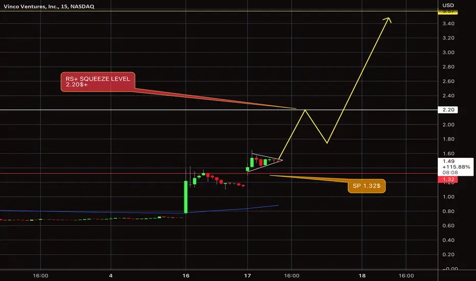
BBIG Squeeze $we have a support above the 1.32$, if we hold that support , we going to have accumulation then a test for the 2.20$ squeeze area, to go towards the 3.50$+.
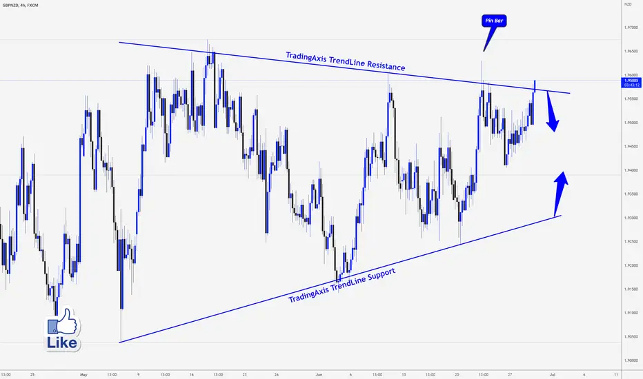
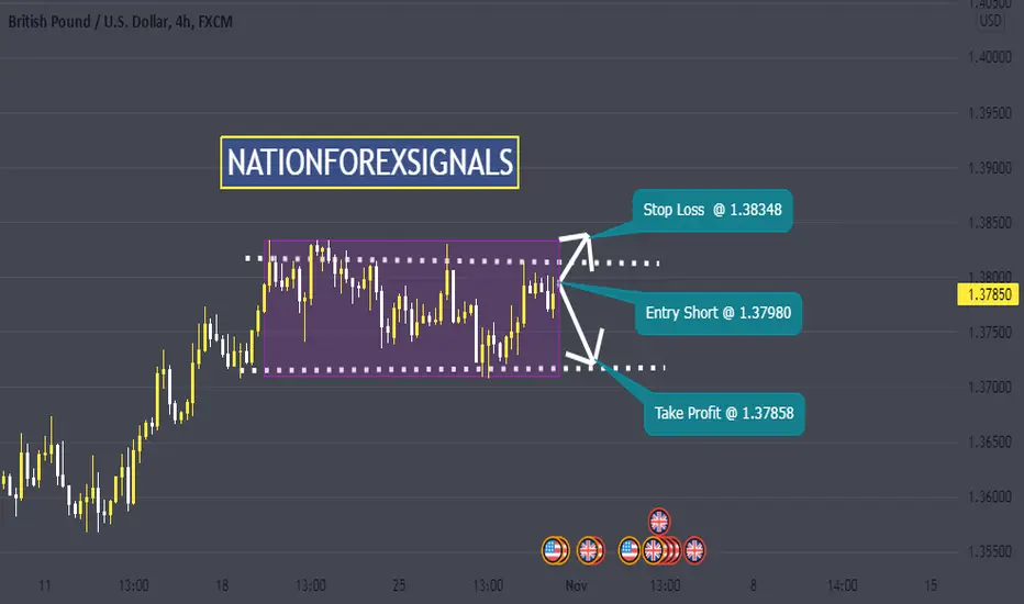
GBPNZD > Trading Plane for A Sell.Analysis of #GBPNZD
The GBPNZD is at trendline resistance now, I am waiting for a bearish signal, pin bar, engulfing candle, or double top on the lower time frame to get in a sell trade.
if you look left you will see a pin bar and if we get a similar one with confirmation I will enter a sell however we need to be careful and not enter now as this pair might extend further to the upside before it gets back and closes inside of the resistance zone again similar to what happened before, looking left.
if the market closes above structure resistance then this idea is not valid anymore
________________________________________
💭 | Comment your thoughts below, I always answer.
📥 | Feel free to message me if you have any questions.
Thanks for your continued support!
INDO $ Bottom Areawe broke our triangle down , however we seeing a strong buying pressure above our current support the 6$,now we going to retest our Resistant around the 9.455$, and if we got rejected, we will continue to go down to retest the support 6$, and if we did't hold, we will see the price go to the bottom price level for this year above the 3.40$.
and if over come the resistant 9.45, we will see a reversal in the bearish trend , and the 6$+ will be confirmed bottom for this year .
AMEX:INDO

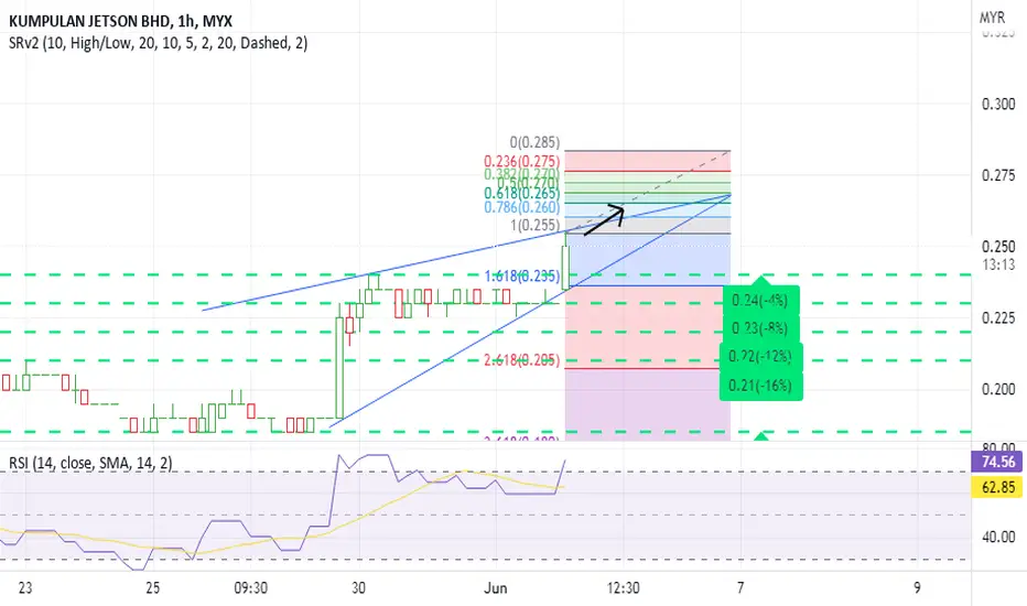
Kumpulan Jetson Bhd
Kumpulan Jetson Bhd were actively traded in early trade with over 107 million shares done, making it the most active stock on Bursa Malaysia.
The counter surged 35.04%, or 20.5 sen to 79 sen, its highest since March 2014. Year-to-date, it has risen some 216%.Kumpulan Jetson has not made any corporate announcements recently. Its last announcement on Bursa Malaysia was on its financial results on May 19.In the first quarter ended March 31, Kumpulan Jetson’s net loss narrowed to RM126,000 from RM1.67mil in the same period last year.Its revenue for the quarter rose 39% to RM49.08mil from RM35.26mil a year ago, mainly due to an increase in revenue from the manufacturing division.
This counter has Formed the ascending triangle pattern.
Support:-0.240,0.230
Can be good option for short term buying
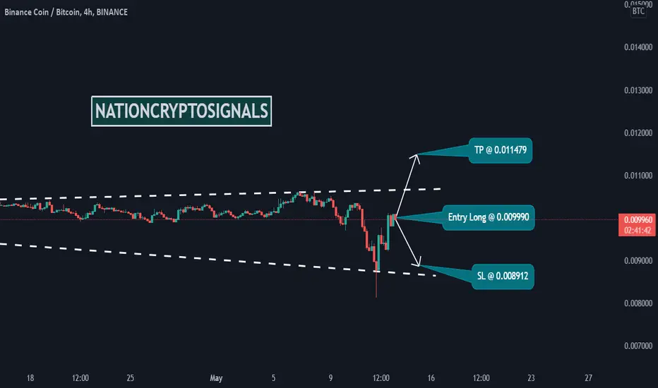
BNBBTC LongTime Frame: 4H
Symbol: BNBBTC
Entry: 0.009990
TP: 0.011479
SL: 0.008912
Bias: Long
The price pattern of this instrument is more bullish than bearish. Our goal is to find a suitable long entry here.
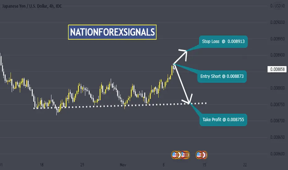
JPYUSD ShortTime Frame: 4H
Symbol: JPYUSD
Bias: Short
We are bearish for JPYUSD considering the strength of USD against its correlated currencies.
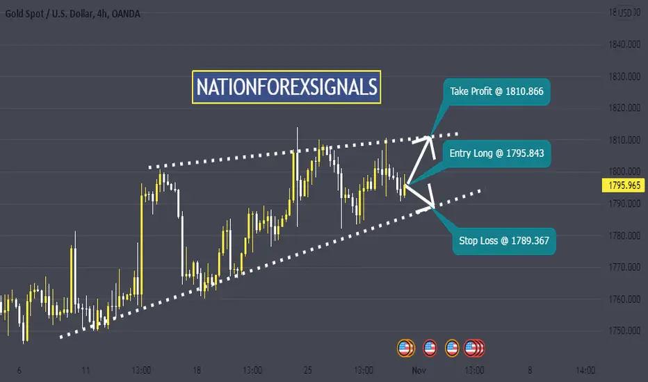
XAUUSD LongSymbol: XAUUSD
Bias: Long
Time Frame: 4H
The pair is in an uptrend. The price will retest the resistance level and we expect a nice move upward upto the take profit level as we have drawn on the chart.
GBPUSD SellSymbol: GBPUSD
Bias: Short
Time Frame: 4H
The price action will be within range and there is high probability to bounce back to the support level after retesting the resistance .
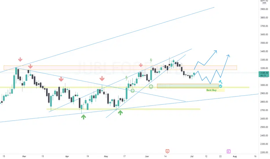
JUBLFOOD... EYE ON IT !!Looking strong support at mentioned area. Don't miss entry if comes into that zone,..
EMAMI REALTYIt is forming base and trying to breakout soon.
if breakout succeeds then one can make long position.
but it has has to sustain atleast one day then we will enter.
Entry - Above 90
Sl - 86
Target :- Minimum 125 in mid term. and more beyond 180 in long time.
Make position as per your risk reward ratio.
This is only for educational purpose, take advice from your financial advisor before taking any position.
Thank you.
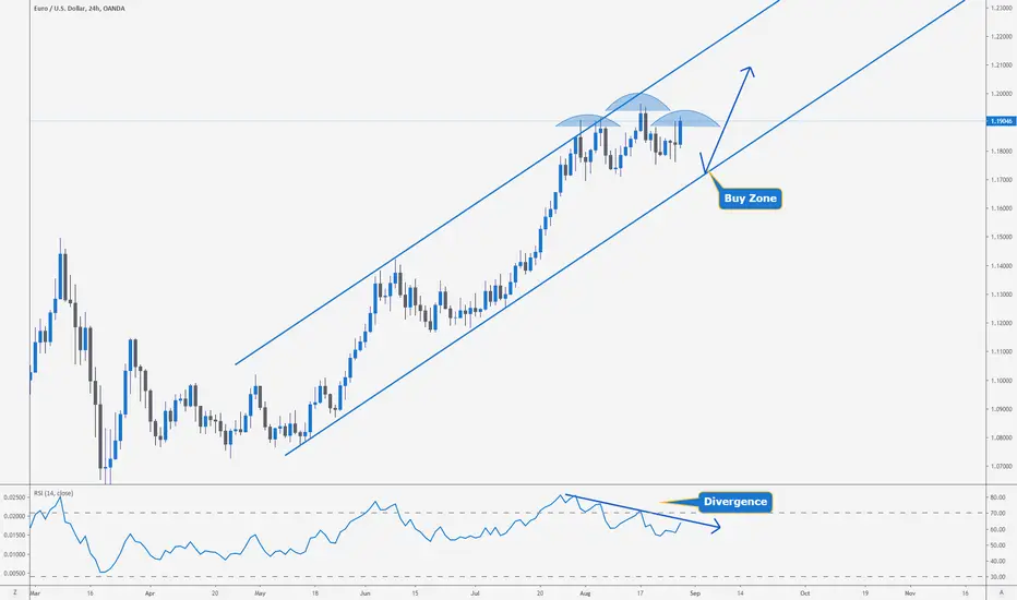
EURUSD > Comprehensive Analysis For long Entry!!Kindly like the ideas if it is helping you and leave a comment, it will support me and provide a motive to keep posting new profitable trading ideas for you 😉⠀
Analysis of #EURUSD
With the perfect rally on Friday and now that we reached 1.1900 again I think the price could fall to 1.1700 or that what I wish for as I want to buy around 1.1700 and here is why.
on the weekly chart, we have the market broke its very long term downtrend it's a bullish sign for this pair and I still believe EURUSD could go to 1.2300
The DXY index still struggling and I think we have not yet reached the bottom there so long EUR is a better option here
Why 1.1700, the market on the daily chart showing an exhaustion pattern and this to me indicates that we might see a pullback at the same time we have GBP also reached a new one year high also a pervious structure, that's why I think it's not the time to buy EUR and wait for better entry around 1.1700 which is trend line support also FIB 38 golden ratio and if you like EW, I think it clusters as wave 4 of five wave up
⠀
Check today analysis below⠀
_____________________________________________________________________________⠀
-DISCLAIMER: This Information Is Not a Recommendation to Buy or Sell. It Is to Be Used for Educational Purposes Only⠀
-⚠ Please Note This Is Just a Prediction and I Have No Reason to Act on It and Neither Should You
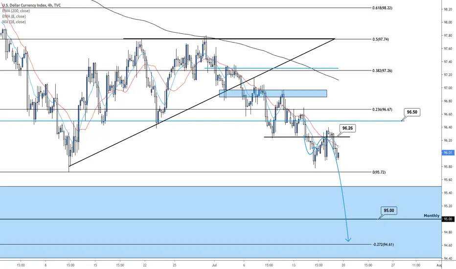
DXY (USD Index) 4hour Analysis July 19th, 2020 DXY Short Idea
Still looking for the next bearish leg toward 95.00!
Overall sentiment and structure suggest a bearish bias so we will continue looking for sell opportunities.
We can re-analyze and consider long opportunities on this timeframe if we see 96.50 break and retest!