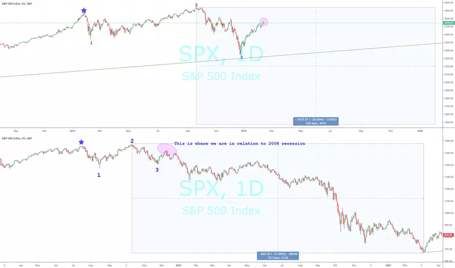
The 2019 Recession vs. 2008I have marked roughly were I believe today's market is in relation to the 'Great Financial Crisis of 2008'.
Each chart depicts:
A blue star for a top in the market
Followed by a low - marked with the number 1
Followed by the final market top - marked with the number 2
Followed by the first bottom of declines - marked with the number 3
And today's current position is the pinkish circle.
If this is true, the next will occur soon and surpass the prior lows marked with the number 3. In the current case these would be the December 24th lows.
It took about 352 trading days from top to bottom in 2007-2009 in which the market lost 57% of its value.
I only marked a 50% loss on today's chart because it would be much more costly if it occurred and I drew out the highlight for roughly 350 days from the market highs on September 21, 2018.
Mark Twain is rumored to have said, "History doesn't repeat itself but it often rhymes."
Do these charts rhyme? Are they coincidence? Or nothing close?
Let me know what you think!
Chrisguthrieusa
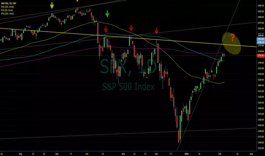
The Quad Tops Signal Steep Declines AheadThere have been 5 occurrences of quad tops in the S&P 500 since 2000. Each top bounced off a resistance trend line four times. The fourth bounce resulted in steep declines for the index. The index is about to test this theory within the next 3-7 trading days as it nears the trend line on the chart above. Could it be a coincidence? Sure, but what is keeping this market from pushing through it now that earnings are over, the Fed is sitting on their hands, Congress is yet to pass the USMCA (NAFTA 2.0), and a China deal is most likely months away (if it happens at all)?
On the positive side for technicals, we finally moved above the 100 DMA which has not happen in months, but the 200 DMA is the next test (also likely to occur within next 1-3 trading days). The break of the 100 DMA could be the real deal or a Bull Trap and a break of the 200 could be the same. The technicals are not encouraging until we move clearly above the 100, 200 and the quad top trend line for the bulls.
This is the quad tops between 2000 and 2015. The first is in Red and the second is in Orange.
The next one is below with the green arrows between 2010 and 2018.
The final two are in Blue and Yellow below from 2016 to the present. The red on here is the same as the red on the main chart above.