SPY: short term pullback after credit downgrade? In this video we talk about what's next for the coming week in the S&P 500, given how we could be setting up for a short term pullback
Community ideas

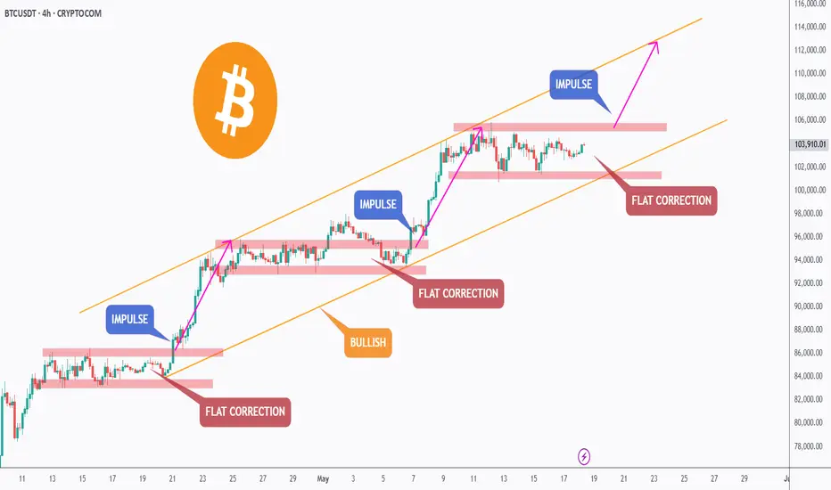
BTC - New Impulse Soon!Hello TradingView Family / Fellow Traders. This is Richard, also known as theSignalyst.
📈 BTC has been bullish, trading within the rising channel marked in orange. 🟧
In a typical trend, corrections are usually bearish. 🔻
However, in BTC’s case, the correction phases marked in red are flat — a strong signal that the bulls are in control 💪 and not allowing the bears to trigger a classic pullback.
As long as BTC holds within the rising orange channel, we expect the next impulse phase to kick off soon 🚀 — aiming for the $115,000 round number. 🎯
This move will be confirmed once BTC breaks above the current flat correction zone marked in red. ✅
📚 Always follow your trading plan regarding entry, risk management, and trade management.
Good luck!
All Strategies Are Good; If Managed Properly!
~Rich
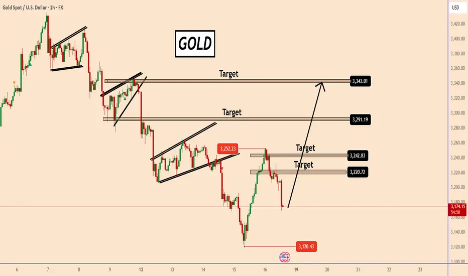
Gold Market Update: Bulls Still in Control?Gold Market Update: Bulls Still in Control?
Gold has been volatile, requiring close attention. Following our previous analysis, gold declined from its last bearish pattern, dropping from 3230 to 3120.
However, yesterday it rebounded sharply, surging from 3120 to 3251 despite the absence of any news—an indication that bullish momentum remains strong.
The predominant trend is solid, but heavy manipulation and the substantial holdings by central banks and hedge funds continue to prevent a deeper decline.
The chances remain high that this movement is part of a bearish correction. While it may look unstable, but another rise could still be possible.
You may find more details in the chart!
Thank you and Good Luck!
❤️PS: Please support with a like or comment if you find this analysis useful for your trading day❤️
Rare Platinum Setup Offers 7x Risk to RewardA breakout above 1000 in platinum could deliver a 7x risk to reward setup. In this short clip, we break down the technical pattern, timing, and trade plan.
This content is not directed to residents of the EU or UK. Any opinions, news, research, analyses, prices or other information contained on this website is provided as general market commentary and does not constitute investment advice. ThinkMarkets will not accept liability for any loss or damage including, without limitation, to any loss of profit which may arise directly or indirectly from use of or reliance on such information.

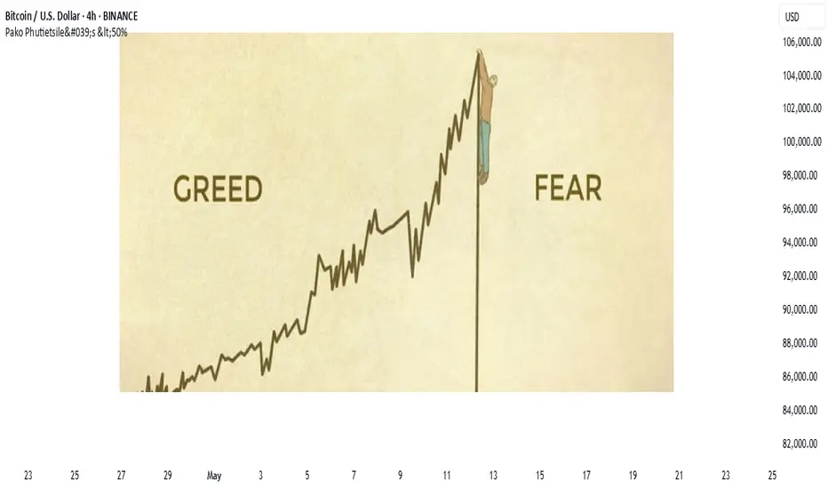
the markets are a very emotional cry babyIf you've ever asked, “Why is the market going up on bad news?” or “Why did it dump after great earnings?”, you're not alone.
Markets may seem logical—economic data in, price action out—but in reality, they’re driven by human emotion, crowd psychology, and reflexive feedback loops. The charts don’t lie, but the reasons behind the moves? Often irrational.
Let’s break down why markets are emotional—and how traders can use that to their advantage.
🧠 1. Markets Are Made of People (and People Aren’t Rational)
Even in the age of algorithms, human behaviour sets the tone. Fear, greed, FOMO, panic—all of it shows up on charts.
Fear leads to irrational selling
Greed fuels bubbles and euphoria
Uncertainty causes volatility spikes—even with no new information
📉 Example: The 2020 COVID crash saw massive capitulation. Then came one of the fastest bull markets ever—driven by stimulus and FOMO.
another example
📊 S&P 500 in 2020 with VIX, the S&P 500 crashed and the VIX went up, When the VIX (CBOE Volatility Index) goes up, it means that traders/investors expect a greater likelihood of price fluctuations in the S&P 500 over the next 30 days. This generally indicates increased fear as shown on the chart below
📈 2. Price Doesn’t Reflect Facts—It Reflects Belief
The market is not a thermometer. It’s a barometer of expectations.
When traders believe something will happen—whether true or not—price adjusts. If the Fed is expected to cut rates, assets may rally before it actually happens.
💡 Nerd Tip: Reality matters less than consensus expectations.
Chart Idea to visit:
💬 USD Index vs. Fed rate expectations (2Y yield or futures pricing)
🪞 3. Reflexivity: Belief Becomes Reality
Coined by George Soros, reflexivity explains how beliefs can influence the system itself.
Traders bid up assets, creating bullish momentum
That momentum attracts more buyers, reinforcing the trend
Eventually, fundamentals “catch up” (or the bubble bursts)
📌 Insight: The market creates its own logic—until it doesn’t.
😬 4. Emotional Extremes Create Opportunity
When markets overreact, they offer setups for rational traders.
Capitulation = Bottom Fishing
Euphoria = Caution
Disbelief = Strongest rallies
🧠 Pro Tip: Watch sentiment indicators, not just price. Fear & Greed Index, put/call ratios, or COT data reveal what the crowd is feeling.
Chart Example:
📊 Bitcoin 2022 bottom vs. Fear & Greed Index.. on the chart above the index score close to zero (RED) indicating extreme fear this was because in november 2022 crypto cybercrimes grew new level and investors lost confidence, these cyber crimes included the bankruptcy of FTX as the owners were allegedly misusing customer funds.
💡 5. How to Trade Rationally in an Irrational Market
a. Have a plan. Pre-define entries, exits, and invalidation levels.
b. Expect overreaction. Markets often go further than they “should.”
c. Use sentiment tools. Divergences between price and emotion are gold.
d. Don’t fight the crowd—until it peaks. Fade extremes, not momentum.
e. Zoom out. 5-minute panic means nothing on a weekly trendline.
🎯Nerd Takeaway:
Markets aren’t efficient—they’re emotional.
But that emotion creates mispricing, and mispricing = opportunity.
You don’t need to predict emotion—you just need to recognize it, and trade on the reversion to reason.
💬 Have you ever traded against the crowd and nailed it? Or got caught up in the hype? Drop your chart and your story—let’s learn from each other.
put together by : @currencynerd as Pako Phutietsile
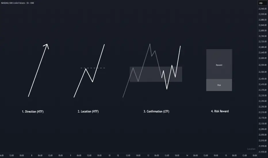
KISS Trading SystemOverview :
Trading process should be as simple as possible. One of the simple method to trade is primarily identify direction, find a good location to entry, wait for confirmation in the location, and finally execute the trade when the risk reward ratio is good.
1. Direction
To identify direction, follow the market structure. Higher high and higher low indicates price is in a bullish trend (uptrend), while lower high and lower low indicates the price is in a bearish trend (downtrend). If there is no clear structure higher high and higher low or lower and high lower low, price is in sideways mode. Best is to avoid trade under this condition until clear trend is formed.
2. Location
Every time price create a new breakout structure, mark the the structure as our potential location for entry. There are some occasion where price does not pullback to the location and continuing the trend by creating a new breakout structure. Do not FOMO, just wait for the next location and confirmation within the location to entry and minimize your risk.
3. Confirmation
Patience is the key. Wait for price to pullback at higher time frame location, and focus for confirmation in lower time frame to entry and reduce risk. Time is fractal, the structure pattern is same on all timeframes. Choosing the right timeframe pair is crucial. Refer to table in the notes below for timeframe pairing.
4. Risk Reward
This is the main essence in trading, controlling risk and preserving capital. Entry without doubt when the risk reward are good. Execute, and trust your setup.
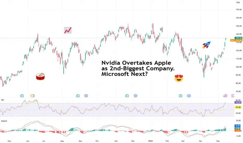
Nvidia Overtakes Apple as 2nd-Biggest Company. Microsoft Next?Well, well, well — if it isn’t the GPU-maker-turned-global-tech-Goliath lapping the iPhone factory on the market cap leaderboard . Again.
Nvidia NASDAQ:NVDA has officially snatched the second-largest company title from Apple NASDAQ:AAPL , bringing its market cap north of $3.3 trillion, while Apple sat there like a vintage iPod on shuffle at $3.17 trillion — playing the same valuation tune for days.
So, what’s powering this meteoric rise? It’s not just graphics cards for gamers — that’s 2015. And it’s not graphics cards for Big Tech — that’s 2024. It’s graphics cards paid for by Middle Eastern oil money.
😎 Saudi Chips: Not the Potato Kind
Here’s the scoop: Saudi Arabia and the UAE are ready to shell out billions to become AI superpowers. And who’s their go-to guy? Nvidia, of course.
CEO Jensen Huang, who was in Riyadh this week, announced that Nvidia will supply “several hundred thousand” of its most advanced processors to Humain, a state-backed Saudi firm tasked with building AI infrastructure across the desert kingdom. That includes 18,000 units of Nvidia’s cutting-edge GB300 Grace Blackwell chips — the stuff data scientists dream about.
Nvidia calls this initiative “sovereign AI” — governments building and running their own AI on national infrastructure. Think of it as building data sandcastles, except the sand is made of petrodollars and server farms.
The geopolitical context? President Trump’s Middle East tour is clearing regulatory roadblocks, scrapping AI export restrictions drawn up under Biden, and opening the region to top-shelf American tech.
And Wall Street is paying attention.
💪 Trump Dumps Diffusion Rule, Nvidia Pumps
One of the major tailwinds for Nvidia’s latest rally came in the form of a policy reversal. The Biden-era “AI Diffusion Rule,” which aimed to restrict exports of advanced chips, has now been tossed by the Trump administration.
According to the Bureau of Industry & Security, the rule would have “undermined US innovation” and strained diplomatic relations. Translation? Nvidia was about to have its international wings clipped — but now it's free to fly across the Persian Gulf with pallets of GB300s.
The rule reversal instantly boosts Nvidia’s global reach — and opens the floodgates for billions in international chip demand. Naturally, the stock responded positively, climbing 5.4% on Monday, 5.6% on Tuesday, and 4.1% on Wednesday.
🚂 Not Just a Hype Train (But Bring Snacks Anyway)
Nvidia’s rally isn’t just FOMO (but there is some froth every now and then ).
It’s backed by earnings, expansion, and actual demand. Every major AI player — from startups to sovereign nations — needs Nvidia chips. And there’s no clear rival. AMD NASDAQ:AMD is a step behind. Intel NASDAQ:INTC is still trying to remember how to make people excited again.
But at these levels, expectations are sky-high. Even a great quarter that’s not utterly perfect could trigger some profit-taking. After all, trees don’t grow to the sky — but apparently semiconductors are expected to .
👀 Eyes on Microsoft, But Timing Is Key
So what’s next? Can Nvidia dethrone Microsoft NASDAQ:MSFT , currently valued at just about $60 billion more, and become the biggest company in the world?
Easily, especially if Huang’s tech juggernaut keeps this pace and posts another monster earnings beat. Nvidia reports on May 28, and you can bet every institutional desk, Reddit thread, and our very own TradingView community will be glued to their multi-screen setups to get those numbers.
Microsoft still sits at the top with a $3.36 trillion valuation — within striking distance. All it would take is another ~1.8% pop for Nvidia and a sleepy session for Microsoft.
But be warned: Wall Street loves a Cinderella story until the glass slipper misses earnings by two cents.
🧐 Final Thoughts: Watch Out Everyone
Apple may have Siri. But Nvidia has the chips to build a thousand Siris — and a few Skynets while we're at it.
Whether it can overtake Microsoft depends on the next earnings report (or the lead-up hype).
So the question isn’t “Will Nvidia stay #2?” It’s: How long until it’s #1 — and what could possibly stop it?
And if you’ve got it on your watchlist, circle May 28 in red marker and don’t forget to pay attention to the earnings calendar .
Because that earnings print might just rewrite the leaderboard again.
Your move : Are you riding NASDAQ:NVDA to the top? Waiting for a pullback? Or nervously watching from the sidelines with popcorn and regret? Hit the comments with your play.
Summary of S&P 500 and some of the stock I'm invested inThis is my first video on TradingView, where I’m sharing insights on my current trades, how they're performing, and some key lessons from recent mistakes that I need to address moving forward.
Quick Summary:
S&P 500 is starting to look overextended, increasing the likelihood of a pullback.
This isn’t the ideal time to jump into new trades. Instead, I’m waiting for a pullback to the 10 EMA, which could offer better entry opportunities.
Exelixis (EXEL) turned out to be a fantastic trade, with a strong move upward.
After such momentum, it's wise to expect a pullback. I'm letting the stock breathe, with the goal of possibly catching the next leg up.
I also reviewed a few other trades and highlighted some stocks that are on my watchlist.
Right now, I’m letting the market unfold naturally and looking for clear setups before entering again.
Trading is a game of patience and positioning—it's not about forcing trades, but about waiting for the right ones.

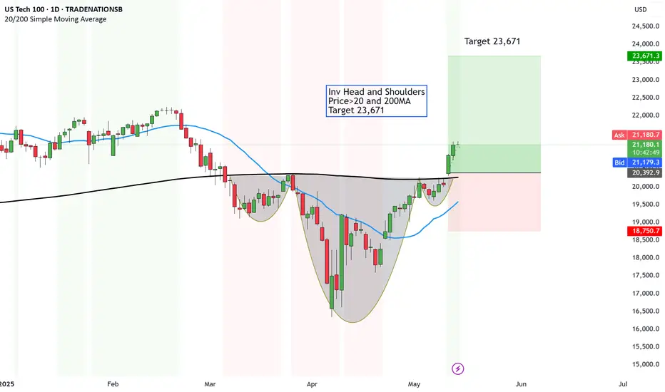
US Tech 100 setting sight for ALL time highs - Target 23,671Buy the dip. Never fails as the American markets will always recover.
The question is however, where is the bottom of the DIP and have I considered what risk to take if it continues to dip.
That is what actually causes portfolios to get blown.
However, I don't buy Dips. In fact, I don't buy low, sell high.
I buy HIGH sell HIGHER. Always have always will.
When momentum is on the way, it is better to get on the trend and ride it on up.
And that is WHAT the US Tech 100 is showing or the Nasdaq.
Technicals look great too.
Inv Head and Shoulders
Price>20 and 200MA
Target 23,671
Disclosure: I am part of Trade Nation's Influencer program and receive a monthly fee for using their TradingView charts in my analysis.
AMP Futures - How to set a date range for charts.In this idea we will demonstrate how to set a date range for your Tradingview Charts.

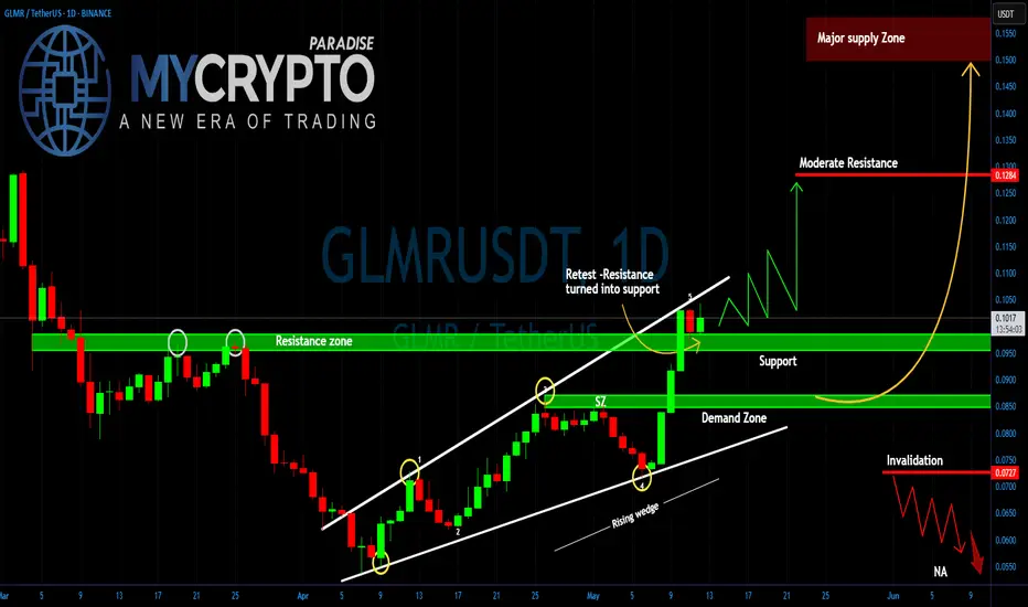
GLMR Explosion or Final Trap? Yello Paradisers — are you truly ready for one of the cleanest, most deceptive setups we’ve seen on GLMR in weeks? If you’ve been following our latest insights, you already know — this is not the moment to get distracted. A decisive move is on the horizon… but the trap is also well set. The only question is: will you be the one who catches it or gets caught?
💎#GLMRUSDT has just completed a clear 5 wave rising wedge, a classic structure that often signals the end of a move and it has now pushed directly into a key resistance zone. This level has rejected price multiple times in the past (as previously marked), and unsurprisingly, price has stalled here once again.
💎The support at $0.095 is now critical. If this level holds, this current pause could easily evolve into a bullish consolidation before the next impulsive leg upward.But just below, we’re eyeing the demand zone near $0.085. If the $0.095 support breaks and price dips into this zone, we’ll be watching for signs of aggressive buying. A fast rebound here could present a golden long entry, but only if we see clear strength returning immediately after the retest.
💎To the upside, our next moderate resistance lies at $0.1313, and beyond that, the real game begins in the major supply zone between $0.145 – $0.155. That’s where smart money will likely begin distributing their positions, and you should be ready to follow.
💎However, if price breaks below $0.0709, the entire bullish structure gets invalidated. That becomes our flip level — if breached, we will turn bearish and prepare for lower lows.
Discipline, patience, robust strategies, and trading tactics are the only ways you can make it long-term in this market.
MyCryptoParadise
iFeel the success🌴
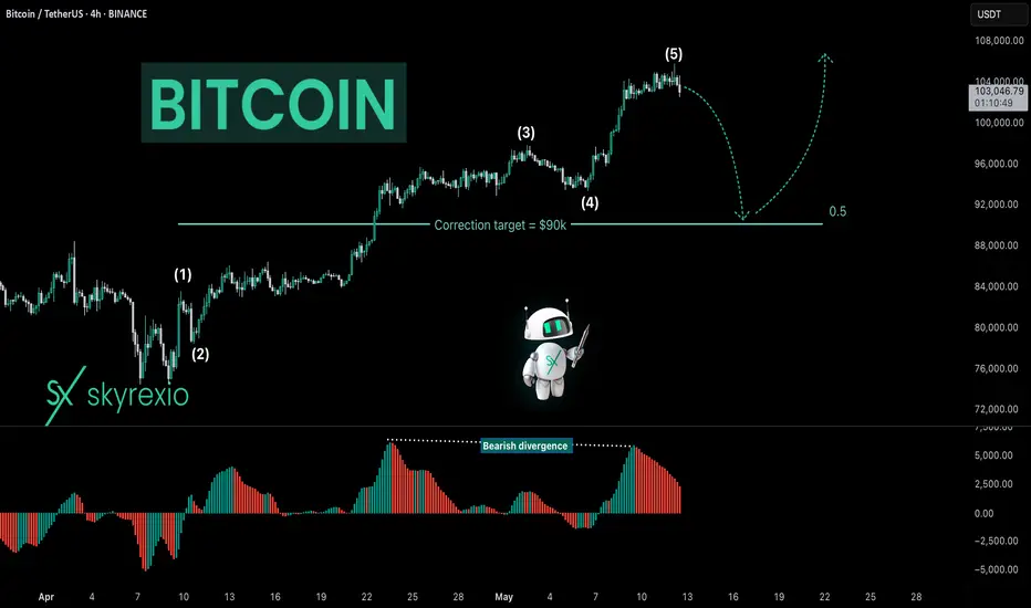
Bitcoin BTC Is Entering Into CorrectionHello, Skyrexians!
I got a lot of comments to analyze BINANCE:BTCUSDT because it has almost reached ATH and people don't understand what is happening. In my opinion last pain ahead and after that likely we see great gains.
Let's take a look at 4h time frame. We can finally notice the full 5 waves cycle which is likely to be finished. If you remember my recent analysis this is just the wave 1 inside higher degree wave 3. Awesome Oscillator has printed divergence, so there is a great chance that correction has been already started. The target for this correction is 0.5 Fibonacci at $90k. I don't recommend you to short this move if you are not experienced because this is trade against the trend.
Best regards,
Ivan Skyrexio
___________________________________________________________
Please, boost this article and subscribe our page if you like analysis!
After $105K Peak, Bitcoin May Revisit 0.382 FOB Level!CRYPTOCAP:BTC is pulling back after hitting a high of $105,800
If you look at the daily chart, we haven’t seen any healthy pullback, the price has gone straight up.
In my opinion, a retest of the 0.382 FOB level around $94K would be a healthy correction for Bitcoin. Based on the liquidation heatmap, we’re also seeing liquidity building up at lower levels.
This is one of the signs of a pullback, which is important for a sustainable and healthy market.
Stay tuned and follow for more updates!
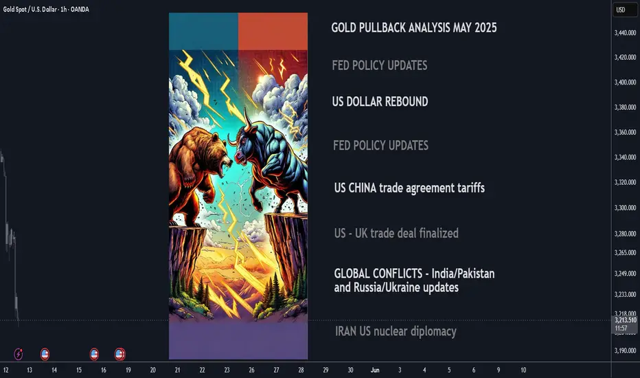
Why Gold Is Pulling Back Now – May 2025 Update⚡️After surging above $3,500/oz in late April, gold has since declined over 8%, recently breaking below key levels and now trading near $3,210. The retracement reflects fading panic buying and growing attention to fundamental drivers: U.S. monetary policy, the strong dollar, easing geopolitical risks, and completed trade agreements. Here’s a breakdown of the leading catalysts and their current impact (ranked 0–10).
1. Fed “Higher for Longer” Bias Strength: 9/10 The Fed kept interest rates at 4.25–4.50% at its June policy meeting and reiterated its cautious stance. The absence of cuts combined with persistent inflation pressure is lifting real yields and undercutting gold’s appeal as a non-yielding asset.
2. U.S. Dollar Resurgence Strength: 8/10The U.S. Dollar Index (DXY) has climbed above 101 as investors digest the Fed’s hawkish tone. A stronger dollar reduces global gold demand, especially from non-USD buyers.
3. U.S.–China Trade Agreement Reached in Switzerland Strength: 7.5/10 A formal trade deal was announced in Geneva in May, easing longstanding tariff tensions. While specific tariff rollback details are pending, markets welcomed the de-escalation, pushing investors away from gold and into risk assets.
4. U.S.–U.K. Trade Deal Signed Strength: 7/10 The U.S. and U.K. finalized a bilateral trade agreement in early May, boosting global sentiment and further reducing the geopolitical premium priced into gold.
5. India–Pakistan Border De-escalation Strength: 6.5/10 After brief clashes in Kashmir in mid-May, both sides have since released statements of restraint. The calm has helped cap gold’s safe-haven bids.
6. Iran–U.S. Nuclear Talks Update Strength: 6/10 Talks resumed in Vienna in May with cautious optimism. While no concrete deal has been signed, progress and diplomatic language from both sides have eased fears of escalation.
7. Russia–Ukraine Ceasefire Developments Strength: 5.5/10 Localized ceasefires in eastern Ukraine, brokered by Turkey and the UN, have lowered near-term geopolitical risk. However, skepticism remains around long-term stability.
8. ETF Inflows & Institutional Demand Strength: 5/10 ETF inflows slowed in May (up just 48.2 tonnes), reflecting waning retail momentum. Still, central bank buying—especially from China—offers a medium-term cushion.
Catalyst Strength Rankings (May 2025)
🔸Fed “higher for longer” bias 9
🔸U.S. dollar rebound 8
🔸U.S.–China trade agreement 5.5
🔸U.S.–U.K. trade deal signed 5
🔸India–Pakistan border easing 6.5
🔸Iran–U.S. nuclear diplomacy 6
🔸Russia–Ukraine ceasefire 5.5
🔸Global gold ETF & central-bank inflows 5
Where Next for Gold?
⚡️Current price: ~$3,210/oz
📉Recent support levels broken: $3,300 and $3,250
🎯Next technical floor: $3,150/oz
✨Upside triggers: Renewed dollar weakness, inflation surprise, or geopolitical flare-up
Gold’s recent drop reflects the market's rotation out of fear-driven trades into yield-bearing and risk assets. While the Fed and the dollar remain dominant forces, any shock—whether geopolitical or inflationary—could quickly reignite interest in gold as a hedge.
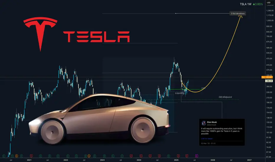
TESLA - Robotaxi will drive the price above 1000This is not a short-term trade as you know from me on FX, Crypto and Indices. This is buy and hold investment. I got already good bag of share and Im still adding without trying to time if perfectly, but now I think its time to buy bigger positions.
Tesla is my 3rd biggest position after the Bitcoin and Strategy (MicroStrategy). Many people see it only as an EV cars company, but it's not all what they do, just read bellow to see why I see a huge potential in this company.
📍Why Tesla is Considered a Top Investment
Tesla stands out as a leading player in the EV market, with a strong brand and a history of delivering innovative products. In 2024, it produced about 459,000 vehicles and delivered over 495,000 in the fourth quarter alone, showcasing its ability to meet growing demand Tesla Fourth Quarter 2024 Production, Deliveries & Deployments.
💾Financially, Tesla reported $97,690 million in total revenue for 2024, with the automotive segment contributing $87,604 million and energy solutions adding $10,086 million Tesla, Inc. Annual Report on Form 10-K for 2024. This diversification into energy, alongside investments in autonomous driving, positions Tesla for long-term growth, making it attractive for investors seeking exposure to future trends in sustainability and technology.
📍What Tesla Does Beyond EV Cars
Beyond EVs, Tesla is deeply involved in energy solutions:
📍Solar Products: Offers solar panels and solar roofs for clean energy generation.
📍Energy Storage: Provides Powerwall for homes and Megapack for large-scale projects, helping stabilize grids and manage energy costs.
📍Charging Infrastructure: Operates a network of Supercharger stations, increasingly open to other EVs.
Services: Includes vehicle maintenance through service centers and body shops.
📍Robotaxi: Plans to launch a fully autonomous ride-hailing service in June 2025 in Austin, Texas, potentially opening new revenue streams Tesla's robotaxis by June? Musk turns to Texas for hands-off regulation.
📍Tesla Optimus: Developing a general-purpose robotic humanoid for tasks like household chores or industrial work, which could lead to new markets.
This expansion into energy and services, along with unexpected ventures like Robotaxi and Tesla Optimus, enhances Tesla's role in the transition to sustainable energy and technology, offering benefits like grid stability and potential robotics applications.
The growth in the energy segment, with a 67% increase from 2023 to 2024, highlights Tesla's expanding role in sustainability, potentially attracting investors focused on long-term trends. Additionally, Tesla's commitment to innovation, particularly in autonomous driving technology, is noteworthy. The company is developing features like Full Self-Driving (FSD), which could open new revenue streams, such as robotaxi services, enhancing its investment appeal.
🤔I think Optimus and Robotaxi will exceed rapidly exceed their EV cars revenue. Elon musk is predicing over 1000% growth in 5 years. Which would be way above $2900 without stocks splits.
I m a bit conservative and I think we can go somewhere between 3 - 4 standard deviations.
Wishing you continued success on your trading journey. May this educational post inspire you to become an even better trader!
“Adapt what is useful, reject what is useless, and add what is specifically your own.”
Perfectly nailed bottom around 200 and our positions are now 50% in profit good luck
David Perk ⚔
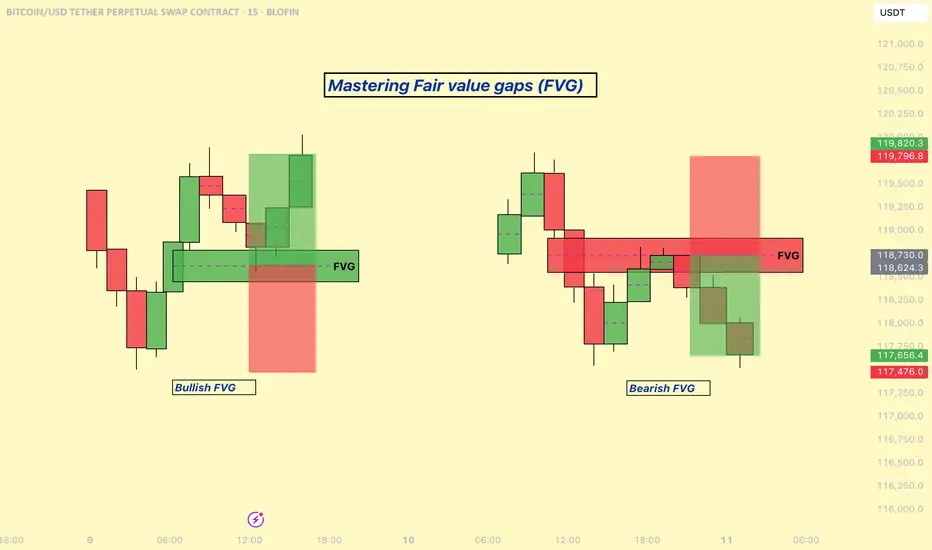
Mastering Fair Value Gaps (FVG) - How to use them in trading?In this guide, I’ll explain the concept of the Fair Value Gap (FVG), how it forms, and how you can use it to identify high-probability trading opportunities. You'll learn how to spot FVGs on a chart, understand their significance in price action, and apply a simple strategy to trade them effectively.
What will be explained:
- What is a FVG?
- How can a FVG occur?
- What is a bullish FVG?
- What is a bearish FVG?
- How to trade a FVG?
-------------------------------
What is a FVG?
A FVG is a technical concept used by traders to identify inefficiencies in price movement on a chart. The idea behind a fair value gap is that during periods of strong momentum, price can move so quickly that it leaves behind a "gap" where not all buy and sell orders were able to be executed efficiently. This gap creates an imbalance in the market, which price may later revisit in an attempt to rebalance supply and demand.
A fair value gap is typically observed within a sequence of three candles (or bars). The first candle marks the beginning of a strong move. The second candle shows a significant directional push, either bullish or bearish, often with a long body indicating strong momentum. The third candle continues in the direction of the move, opening and closing beyond the range of the first candle. The fair value gap itself is defined by the price range between the high of the first candle and the low of the third candle (in the case of a bullish move), or between the low of the first candle and the high of the third (in a bearish move). This range represents the area of imbalance or inefficiency.
-------------------------------
How can a FVG occur?
There are several factors that can trigger a fair value gap
- Economic news and announcements
- Earnings reports
- Market sentiment
- Supply and demand imbalances
-------------------------------
What is a bullish FVG?
A bullish FVG is a specific type of price imbalance that occurs during a strong upward move in the market. It represents a zone where the price moved so aggressively to the upside that it didn’t spend time trading through a particular range, essentially skipping over it.
This gap usually forms over the course of three candles. First, a bullish candle marks the beginning of upward momentum. The second candle is also bullish and typically has a large body, indicating strong buying pressure. The third candle opens higher and continues moving upward, confirming the strength of the move. The bullish fair value gap is the price range between the high of the first candle and the low of the third candle. This area is considered an imbalance zone because the market moved too quickly for all buyers and sellers to interact at those prices.
-------------------------------
What is a bearish FVG?
A bearish FVG is a price imbalance that forms during a strong downward move in the market. It occurs when price drops so rapidly that it leaves behind a section on the chart where little to no trading activity happened.
This gap is identified using a three-candle formation. The first candle typically closes bearish or neutral, marking the start of the move. The second candle is strongly bearish, with a long body indicating aggressive selling pressure. The third candle opens lower and continues the move down. The bearish fair value gap is the price range between the low of the first candle and the high of the third candle. That range is considered the imbalance zone, where price skipped over potential trade interactions.
-------------------------------
How to trade a FVG?
To trade a FVG effectively, wait for price to retrace back into the gap after it has formed. The ideal entry point is around the 50% fill of the FVG, as this often represents a balanced level where price is likely to react.
During the retracement, it’s helpful to see if the FVG zone aligns with other key technical areas such as support or resistance levels, Fibonacci retracement levels, or dynamic indicators like moving averages. These additional confluences can strengthen the validity of the zone and increase the probability of a successful trade.
Enter the trade at the 50% level of the FVG, and place your stop loss just below the most recent swing low (for a bullish setup) or swing high (for a bearish one). From there, manage the trade according to your risk-to-reward preferences—whether that’s 1:1, 1:2, or a higher ratio depending on your strategy and market conditions.
-------------------------------
Thanks for your support.
- Make sure to follow me so you don't miss out on the next analysis!
- Drop a like and leave a comment!
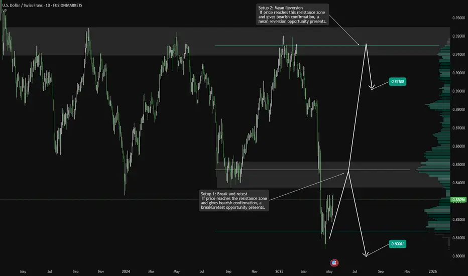
USDCHF Analysis: Break & Retest or Mean Reversion?Hello traders!
USDCHF is offering two trading scenarios on the daily timeframe.
The first scenario suggests the pair may react bearishly from the resistance zone, setting up a break-and-retest opportunity that could drive price lower toward the 0.80001 area.
The second scenario anticipates a bounce toward the 0.89100 region, where a mean reversion setup may come into play (if sellers step in and price action confirms bearish intent near that resistance).
Discretionary Trading: Where Experience Becomes the Edge
Discretionary trading is all about making decisions based on what you see, what you feel, and what you've learned through experience. Unlike systematic strategies that rely on fixed rules or algorithms, discretionary traders use their judgment to read the market in real time. It's a skill that can't be rushed, because it's built on screen time, pattern recognition, and the ability to stay calm under pressure.
There's no shortcut here. You need to see enough market conditions, wins, and losses to build that intuition—the kind that tells you when to pull the trigger or sit on your hands. Charts might look the same, but context changes everything, and that's something only experience can teach you.
At the end of the day, discretionary trading is an art, refined over time, sharpened through mistakes, and driven by instinct. It's not for everyone, but for those who've put in the work, it can be a powerful way to trade.
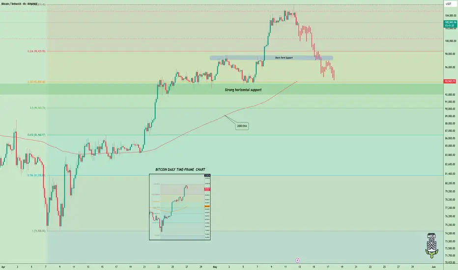
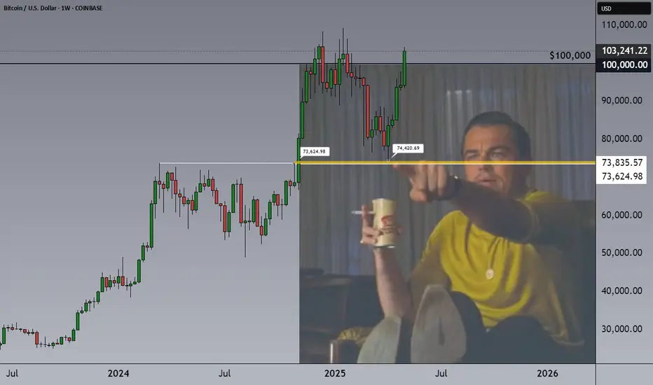
BITCOIN Has Unfinished Business Below $74K! Will It Return?Key Disclaimer: Inefficiencies Don’t Need to Be Filled
Let’s set the stage clearly: inefficiencies like the one at $73,624.98–$74,420.69 for BTCUSD do not HAVE to be filled.
They’re a TENDENCY, not a rule, an intriguing opportunity to explore high-probability zones. If Bitcoin doesn’t return to this level, no harm is done; but this is a very good opportunity to analyze the term, as such... let’s break it down.
What Is an Inefficiency?
An inefficiency, or sometimes a fair value gap (FVG), is a price range with "minimal" trading activity, often caused by a rapid move—here, a rally—creating a liquidity imbalance. On the weekly BTCUSD chart, this area between wicks spans $73,624.98 to $74,420.69, likely formed during a sharp rally around April 2025.
This untested range makes it a potential target for future price action, as markets often seek to resolve such imbalances. Notably, the price has already approached this zone, and there’s a chance it may never return. However, around $74,400, there are still some “unfinished things to do”, untested liquidity, or orders, which could draw the price back if conditions align.
Why Do Inefficiencies Attract Price?
Inefficiencies often act as magnets for price due to:
Liquidity Seeking: Markets revisit areas with unfilled liquidity (stop-loss or pending orders) to balance supply and demand.
Market Memory: Traders and algorithms, target these levels, reinforcing their significance.
Mean Reversion: After rapid rallies, the price may retrace to test imbalances before continuing. (atm we are probably too far from it but still keep this area in your minds)
Institutional Activity: Large players might re-enter at these levels, making them key zones for reversals or consolidation.
Historically, assets tends to revisit such areas, as the chart notes.
BTCUSD Context: $103,000 with Bullish Momentum
As of May 10, 2025, BTCUSD is at ~$103,200 on the weekly chart, on the way to confirm a weekly breakout above $100,000, supported by higher highs, an ascending channel, and macro factors ( for example ETF inflows), signaling quite a strong momentum.
The inefficiency at $73,624.98–$74,420.69 is 28–29% below the current price, a deep pullback that might require a catalyst like a macro correction, negative crypto news, or profit-taking. Given the price has already approached this zone, it may not return, but the “unfinished business” around $74,400 keeps it on the radar. Still, strong trends can bypass inefficiencies, and factors like time decay or adoption may drive prices higher.
Trading Approach, Short-, Mid-Term Investors Take Your Profits!
This formation of inefficiency is not a prediction to short, it’s an opportunity to monitor.
Still, if you’re a short- to mid-term investor, it might be a smart move to take some profits here and observe what unfolds next.
Right now, we’re potentially seeing a double top forming around major psychological levels. And to be honest, the inefficiency below (shown on the chart) still lingers in the back of my mind.
People often ask me: “When is a good time to take profits?”
My answer? Now. It is a perfect example and it fits to all assets.
And here's why. There are clear scenarios that help remove the guesswork:
1. You sell now, and the price continues to rally higher.
That’s not a problem. By selling, you’ve reduced your risk, and securing your profits - always a smart move.
If the price breaks above $100K, you can always buy it back after a confirmed breakout and retest.
That’s a strong sign that investors are willing to pay higher prices for BTC, and historically, after such breakouts (like with the $50K level in August 2024), the market tends to come back to retest that breakout zone.
Of course, if you’re a long-term investor with a 3-5+ year horizon, you may choose to ride it out. In that case, trying to time this might just be over-managing your position. There’s always a chance BTC won’t retest $100K again.
2. The best-case scenario if you take profits now:
You get the chance to buy back lower.
If the market pulls back, keep that inefficiency level in mind—there’s also a mid-term trendline, previous yearly highs, and other technical elements that haven’t been tested yet.
Traders’ psychology hasn’t really been pushed to the limits at this stage, and in my view, the crypto market loves to test limits.
So if you’re a short- or mid-term investor who bought in at lower levels, this is a good time to seriously consider locking in some profits.
Step back, and let the price action guide the next move.
Listen—just listen.
Conclusion
Inefficiencies like the one between $73,624 and $74,420 don’t demand to be filled—but they’re worth understanding, tracking, and learning from. Whether price revisits that zone or not, the real value lies in recognizing where the market has moved too fast and what that might mean if momentum shifts.
Right now, BTCUSD is strong. But strength can fade, sentiment can shift, and “unfinished business” below still holds weight for traders who think in probabilities, not certainties.
If you’re in profit—especially from lower levels—this might be one of those moments to pause, and make sure greed isn’t driving your next decision.
Whether this zone becomes just a memory or a brilliant case study, it’s already a valuable example of how understanding market structure helps you stay a step ahead—not a step behind.
Stay alert. Stay humble. And as said… listen.
Cheers,
Vaido
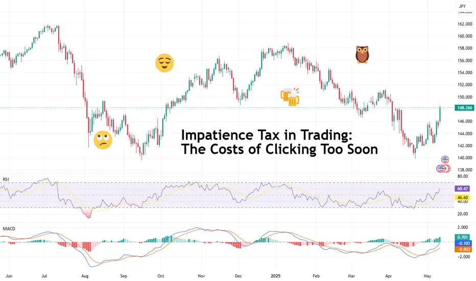
Impatience Tax in Trading: The Costs of Clicking Too SoonHave you ever thought that maybe some of your losses don’t come from bad trades? Rather, they come from good trades, timed badly?
You see the setup, the signal’s almost there, the MACD is leaning in, the candle is flirting with support — and boom, you click. Early. Too early.
Price dips a bit more and then shoots upward like a rocket. Your stop gets triggered — you just paid the impatience tax.
Welcome to the place where you get taxed for being impatient — a very real, very expensive fee traders pay when their fingers move faster than their reasoning.
🤫 The Impatience Tax — A Silent Killer Dressed as Urgency
The impatience tax doesn’t appear on your statement. You won’t see it listed in your commissions, or under slippage, or labeled in red ink like a realized loss. But rest assured, it’s there — nibbling away at your P&L every time you front-run your own strategy.
And the worst part? It feels productive. You’re taking initiative, showing conviction, being bold. Except what you're really doing is lighting good setups on fire because you couldn’t wait for one more candle to close.
🧬 The Anatomy of an Early Click
Here’s how it usually goes:
You spot a setup.
You get excited.
You skip the checklist.
You enter on the 3rd candle instead of the 5th.
The market fakes out.
You get stopped out.
The market then does exactly what you expected — without you.
Every trader has lived this story. And it hurts more than a loss from a bad trade. Because this wasn’t a bad idea. It was a good idea butchered by bad timing.
🤝 Impatience Loves Company (And Volatility)
Impatience tends to thrive in fast markets. When the price is moving, you feel like you need to act. You notice some breaking news that moves markets, charts start to jiggle and tickers flash — suddenly your FOMO glands kick in.
You’re not waiting for confirmation. You’re reacting — to price, to emotion, to fear of missing out.
It’s not just beginners either. Even seasoned traders occasionally get sucked in. Why? Because the brain is wired to avoid missing opportunities more than it’s wired to avoid losses. We want in. Now. Before it's “too late.”
But here’s a pro secret: the markets tend to always give second chances. You just have to be around to take them.
⏰ Why the Best Traders Wait
Let’s talk about patience. Not the zen-monk, meditate-in-a-cave-for-years kind. The market kind.
The kind that says: “Nope, not yet.”
The kind that closes the platform until the London session starts.
The kind that lets a trade go because it didn’t meet all the criteria — even if it was close.
Top traders aren’t paid for activity. They’re paid for precision. The entry is 90% of the battle. If you win there, the rest is just management.
🧐 How to Identify an Impatience Habit
Want to know if you’re paying the impatience tax regularly? Try this:
Look at your last 10 triggered stop loss orders: How many were within a few ticks of reversal?
Count your trades per day: Are you averaging more than your strategy demands?
Review your entry notes: Did you say things like “close enough” or “looks good”?
If the answer is yes, you’re a tax-paying member of the Impatience Society.
👷♂️ Build a Buffer: Taming the Trigger Finger
So how do you stop paying the Impatience Tax?
Start with structure:
Use time-based confirmations. Wait for the candle to close. A candle halfway formed is a lie detector test mid-question.
Have a rule-based checklist. If a trade doesn’t meet every item, you don’t take it. No exceptions.
Use alerts , not entries. Let the price come to you. Your job is to hunt, not chase.
Trade fewer setups, better. Less is more when each trade has meaning and clarity.
And when in doubt? Wait. The worst that happens is you miss one trade. The best that happens is you finally stop losing money edge by edge.
💵 Impatience Is Expensive. Patience Is Profitable.
The market is designed to reward discipline, not urgency. Speed might help you scalp news reactions, but even that requires planned execution. Unchecked impatience is just impulse with a brokerage account.
It's important to always remember that you’re not trying to win this trade. You’re trying to win this game for the long run.
And winning the game means surviving long enough to let your edge play out — with patience, not panic.
💎 Final Thoughts: Don’t Confuse Action with Progress
The financial markets are a cruel place for dopamine seekers. They offer constant motion, flashing lights, and infinite temptation to click before thinking.
But progress isn’t about how many trades you take — it’s about how many good ones you wait for.
So next time your mouse finger twitches, ask yourself: Is this the plan? Or is this impatience disguised as opportunity seeking instant gratification?
Because every early click is a donation to someone else’s P&L.
👉 Your turn : What’s your best (or worst) story of jumping the gun? How have you built patience into your process — or are you still wrestling with the trigger? Let us know in the comments!
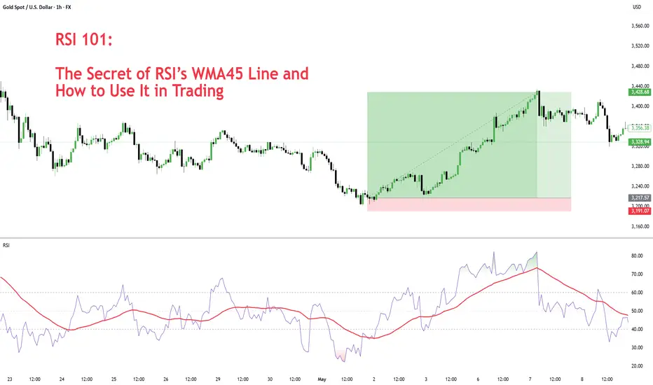
RSI 101: The Secret of RSI’s WMA45 Line and How to Use ItIn my trading method, I use the WMA45 line together with RSI to help spot the trend more clearly.
Today, I’ll share with you how it works and how to apply it — whether you're doing scalping or swing trading.
Why WMA45?
WMA (Weighted Moving Average) is a type of moving average where recent prices are given more importance.
WMA45 simply means it takes the average of the last 45 candles (could be 45 minutes, 45 hours, or 45 days depending on your chart).
Because it moves slower than RSI, it helps reduce the “noise” and gives you a better idea of the real trend.
This idea is not new — many traders have tested RSI strategies also use this line. I just applied and adjusted it in my own way.
👉 How to set it up on TradingView (very simple):
What WMA45 Tells You
Trending
This line shows you the overall direction of the market:
📉 If WMA45 is going down, the price is likely going down.
📈 If WMA45 is going up, the price is likely going up.
Also, the steeper the line, the stronger the trend is:
Looking at the example above, the WMA45 line starts from the same level in two different phases, but the slope is different. The steeper line shows a larger price range.
This happens because the price was more volatile, which caused the RSI to move more sharply, and that, in turn, made the WMA45 slope steeper.
In multi-timeframe analysis, when the trend on the higher timeframe is strong (shown by a steep WMA45 line), the RSI on the lower timeframe will usually move within a tighter range and react more accurately to key levels.
If you’re not sure what these key RSI levels are, check out my previous post here:
For example, in a strong downtrend on H1, RSI on M5 might not even reach 50:
✅ What does this mean for trading?
Use WMA45 on higher timeframes to define trend bias.
On lower timeframes, watch RSI responses at key zones for optimal entries.
When holding positions, WMA45 helps determine whether to stay in the trade.
Moving Sideways
Here’s something important to note: when WMA45 is flat, RSI will keep crossing back and forth over it.
Depending on where WMA45 is flat, RSI tends to move within that range and creates different sideways price patterns. Here are the main types:
Around 50 → price moves in a box: According to RSI theory, the 50 level is the balance between buyers and sellers. RSI fluctuating around this causes price to move sideways in a rectangular box range.
Above 50 → price goes up in a rising channel: Above 50 is where buyers dominate sellers. RSI operating in this zone will continually create bullish candles pushing the price upward.
Below 50 → price goes down in a falling channel: Below 50 is where sellers dominate buyers. RSI in this zone will consistently form lower highs and lower lows, pushing the price downward.
Trend Reversal of WMA45
WMA45 is calculated from the average of 45 candles, so it's almost impossible for it to reverse direction suddenly. When it's sloping (trending), it takes time for RSI to fluctuate enough to "flatten" it before it can reverse.
As shown in the example, after WMA45 slopes up, before it turns downward, RSI must cross back and forth through it to reduce the steepness => flatten it => then reverse.
Does this align with Dow Theory? It represents the phases: Trend > Sideway > Trend. Sideway is when the WMA45 line is flattened.
✅ What does this mean for trading?
After a trend forms, if you want to enter a counter-trend trade, patiently wait for WMA45 to flatten to confirm the previous trend has ended.
Dynamic Support and Resistance
In addition to being a trend indicator for RSI, WMA45 also serves as a dynamic support/resistance level for RSI.
You will often observe RSI reacting when it encounters the WMA45 line.
In an uptrend, WMA45 acts as support for RSI.
In a downtrend, WMA45 acts as resistance for RSI.
Notably, if the reactions occur at higher RSI values, the resulting price support is stronger. Conversely, if reactions happen at lower RSI values, the price is pushed down further.
In the above example, in the first reaction around RSI 60s, RSI dropped by 9.6 points and price dropped by 12 points. In the second reaction at RSI 40s, RSI dropped similarly, but the price dropped by 25 points.
✅ What does this mean for trading?
You can use WMA45 as an entry zone for your trade: Wait for reactions with WMA45 on the higher timeframe, then switch to a lower timeframe to find a trade entry.
Use WMA45 as a take-profit or stop-loss level: For a short trade near WMA45, you can stop out if RSI crosses above it.
When monitoring these reactions, pay attention to the number of reactions—more reactions require more caution in trading.
Some Trade Setups Using WMA45 and RSI
1. Intraday trading
Trend: Follow the trend on the H1 chart.
Entry zone: At WMA45 of H1.
Entry confirmation: 2 methods:
On M5: when WMA45 of RSI is already flattened, and RSI has crossed above WMA45.
On M5: when a divergence appears in RSI.
2. Scalping
With the RSI’s reaction to WMA45, even on smaller timeframes (M1, M5), you can scalp when RSI touches WMA45.
When WMA45 has a slope and RSI returns to touch it, you can enter a trade with SL behind the candle close (10–20 pips to avoid stop hunts and spread), and TP to the nearest peak.
As mentioned, the first touch gives the best reaction.
My trading system is entirely based on RSI, feel free to follow me for technical analysis and discussions using RSI.
#EURUSD: At Perfect Area to Swing Sell Worth 1300+ Pips! The FX:EURUSD price is currently showing strong sell momentum, indicating a potential strong bearish trend in the coming time. We’ve already taken two swing sell positions on EURUSD. There are three targets you can set according to your own plan and strategy.
The DXY index suggests further price growth in the coming weeks. Please ensure you manage your risk while trading. This is our concept only and does not guarantee the movements we’ve shown in our analysis. Therefore, please conduct your own analysis before taking any swing entry.
Good luck and trade safely!
Wishing you good luck and safe trading!
Thank you for your support! 😊
If you’d like to contribute, here are a few ways you can help us:
- Like our ideas
- Comment on our ideas
- Share our ideas
Team Setupsfx_
❤️🚀
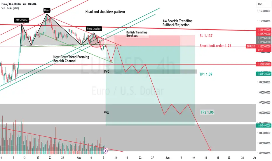
My thoughts on EUR/USDSince January 31st, EUR/USD had been in a bullish trend--a bullish channel in the 4H and 1D. I knew we were about to break out of this bullish trend. I had been anticipating a very strong reversal for a while, given we recently retested the top of another stronger Trendline. A much more reliable channel. the channel I speak of is the 3M, 1M and 1W timeframe channels, they are bearish. We once again hit the resistance of this monthly channel, while, at the same time being in a bullish trend in the 4H and 1D timeframes. So obviously I presumed the 4H bullish trend would end and reverse-which it has and did. This monthly bearish channel has been active for 14-17 years and has perfectly retested the support and resistances numerous times--making it a valid A+ setup in my book. To further this, on the 4H-1D timeframes, while we were still inside this 4H bullish channel, we saw a perfect Head and Shoulders pattern and quickly got our confirmation when it crossed the neckline. All of this indicates we will see strong selling pressure very soon.
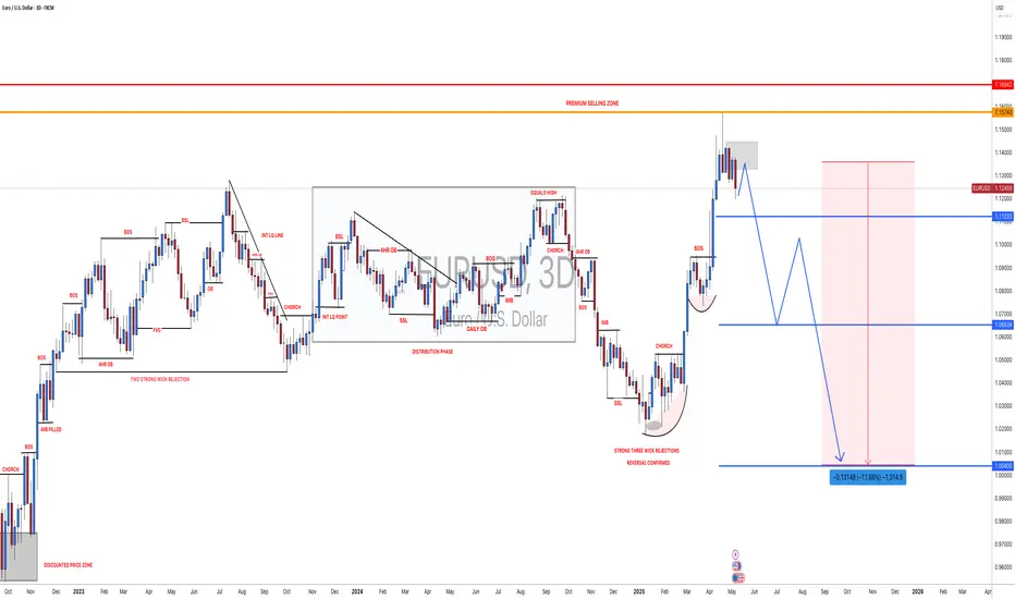
So, where are we headed exactly? Well we know that we have FVGs and strong Supports. key areas for TPs are 1.09, 1.06, and on the monthly as low as 0.82.
If you guys have any questions feel free to ask. And share your thoughts and opinions on EUR/USD--thanks :)
Example Short Orders
SL 1.137
Limit order 1.255
TP1 1.09
TP2 1.06
TP3 1.02
TP4 0.82
(Maybe i am wrong, but if I am it will be the first time in 17 years for EUR/USD.. I like the odds)
OANDA:EURUSD
BITCOIN Breaks Higher - Is $106K the Next Target?COINBASE:BTCUSD is trading within an ascending channel, signaling bullish momentum. The price has consistently respected the channel boundaries, forming higher highs and higher lows, which aligns with the continuation of the uptrend.
Recently, the price has broken out with strong momentum and may now be pulling back for a retest. This area previously acted as resistance and may now serve as support, aligning with a potential bullish continuation.
If buyers confirm support at this level, the price is likely to move upward toward the $106,000 level, which aligns with the upper boundary of the ascending channel. Conversely, a failure to hold support could signal a potential bearish shift.
Traders should monitor for bullish confirmation signals, such as bullish engulfing candles, strong wicks rejecting the support zone, or increased buying volume, before considering long positions.
Let me know your thoughts or any additional insights you might have!
