Daily Renko[500] I'll catch my bottom -> possible 76% profitI think we have a bottom (i smell it :))
my trading setup:
entry positions (ledgers):
L1: ~6'000 (double bottom + support from November) -> fill 70% position
L2: ~5'500 (wedge bottom + average between .382 and .236 by fibonacci) -> fill 20% position
L3: ~5'000 (wedge bottom + resistance from 09.2017) -> fill 10% positions
stop loss @4'690 (below .236 fibonacci + above VPVR VA + below wedge)
targets: 8'232 and 9'685
first, we go little bit down:
MACD:
RSI:
Stochastic:
Falling

XRP continuing up from its breakout from the falling wedgeXRP moving steadily upward finally getting above the 1 day 200ma with a daily candle close and continuing to head towards the breakout target price from the bullish falling wedge breakout. Volume has not been anything exciting so it may continue to climb slowly but will likely get pretty close to hitting the price target if not hitting it exactly or exceeding it. I expect fundamentally for Sibos to bring some bullish news and also the current hubub about the white houses interest in xrp may be helping fuel the fire as well.
believe it or not - theres a falling wedge pattern on QTUMi've anaylsed and thinking a lot which pattern may be visible on qtum.
finally after i gave up i notice that even tough there is a massive downtrend on qtum - a falling wedge is building.
i believe qtum will make some step upwards pretty soon again.

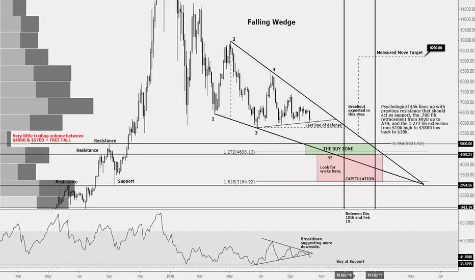
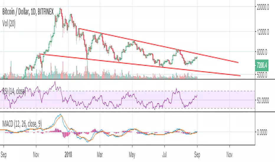
BTC in a Falling Wedge - One final leg down for capitulation?Falling Wedge pattern usually breaks to the upside between 55-80% of the pattern. I've narrowed it down to between 62-77% on the chart to try to hone in on the date. If the pattern plays out, we would expect a break out between December 18th and February 19th. I would expect us to break to the upside to at least a measured move of $9200. Pattern could also fail and break to the downside. If we take a measured move to the downside, it would equate to 0. Failed falling wedges sometimes break down and curls around the entire pattern before it goes back up.
As mentioned, I expect us to go up due to the pattern at play.
Multiple factors signaling a bottom of $4400-$5000.
Falling wedge pattern lines up with support and resistance from 2017.
Fib Retracement from beginning of bull run in 2017 of $920 all the way up to ATH has the 0.786 level, which is the last level on the fib chart at $5,000
Fib Extension from High of $10k down to previous low of $5800 back to $10k, puts the 1.272 level right at $4600, in between support and resistance. The 1.272 level would play out an ABCD bull pattern, with C being the high at $8500 which is the 0.618 level of previous high.
Trading volume between $4900 - $5700 is nonexistent which if the $5700 low fails as support, we could end up in free fall down to $5k.
Could expect wicks and perhaps capitulation below $4400 all the way down to next support where trading volume is high and confluence on the fib extension level 1.618 is.
RSI symmetrical triangle broke to the downside suggesting further downside. A touch of support on the RSI as shown could signal an excellent buying opportunity.
Lastly, we'd be looking for a 5th touch of the pattern (3 touches on one side and 2 touches on the other) for us to break out. For a bullish pattern, it helps that the 3 touches are on the bottom of the pattern.
I hope you all find value in this chart! Feedback is welcomed and thanks for checking it out!
XRP in a bullsh falling wedge vs bear break from sym triangleThough XRP has been consolidating well inside the falling wedge(which tend to break bullishly) we must still keep in mind that since we broke down from the 4hr symmetrical triangle pattern not too long ago, we may still have more room to dip seeing as how even though we reached our head and shoulder breakdown target, we didn't hit the drop target of the symmetrical triangle pattern just yet. That's not to say every pattern that breaks down reaches its exact price target, in fact, many fall short, many end up over too, but most are always pretty close to the exact target give or take a pip. To put it more simply. There is a good bull case here but also still a case for the bears. Being an optimist, I'm goin long and the longer we skirt along this current support line the greater the odds of it inverse barting upwards. Shown here on the chart are the bullish and bearish price target from each pattern. Also in blue and orange, the 1day chart 50(orange), and 200(blue simple moving averages and the current trajectory for their golden cross. Still a chance we could dip down to the next fib line under our current supprot before the ultimate bounce therefore finding away to still fulfill the bear target drop and trigger the bull falling wedge at the same time. All outcomes worth considering even though financial advice they are not. Thanks for reading!

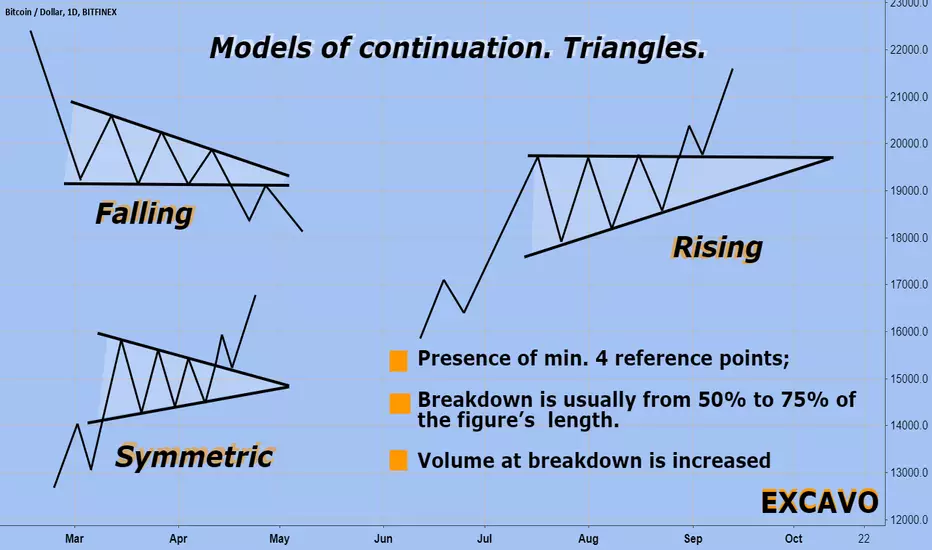
BTCUSD Models of continuation. Triangles.BASIC MODELS OF THE CONTINUATION OF THE TREND’S MOVE
Graphic configurations which will be studies in this chapter are called the models of the trends continuation. These models usually mean that the period of the price stagnation indicated on the graph is just a pause in the main trend development and that the direction of the trend will be the same after they end.
The second criterion between the fracture and continuation models is the duration of their formation. The construction of the first ones, which display serious changes on the price dynamics, require more time. The second ones are shorter. It is better to call them short-term and intermediate.
Note how often we use the word “usually”.
This is due to the fact that the interpretation of graphic models is subject, rather, to general patterns than to rigid rules. There are always exceptions in it. Even the elementary classification of price models is sometimes difficult.
There are always exceptions in it. Even the elementary classification of price models is sometimes difficult. Typically, triangles are models of continuation of the trend, but at times they show a fracture of the trend. Although triangles are usually considered intermediate models, they sometimes appear on long-term graphs reflecting the development of the main trend. A variation of the triangle - an inverted triangle - usually means a fracture of the main upward trend. At times, even the "head and shoulders" - the most famous basic model of a fracture - may indicate a phase of consolidation
TRIANGLES
We will begin a discussion of patterns of continuation of the trend with consideration of triangles. There are three types of triangles - symmetrical, ascending and descending (sometimes called the fourth kind, known as the "expanding triangle" or "broadening formation," but it will be considered below). All triangles differ in shape and have different prognostic functions.
SYMMETRICAL TRIANGLE
A symmetrical triangle or "spiral" is, usually, a continuation of the trend. It marks a pause in the already existing trend, after which the latter resumes.
An example of a bullish symmetrical triangle. Note the two converging lines. The model ends when the closing price is fixed on the market outside of any of the two trend lines. The vertical line on the left is the base of the model, and the point on the right where the two lines meet is the vertex.
The minimum requirement for each triangle is the presence of four control points. To hold the trend line, as we remember, two points are always needed. Thus, in order to draw two converging trend lines, each of them must pass through at least two points.
The completion of the triangle model takes some time, which is determined by the point of convergence of the two lines that is the top of the model. Usually, the price breakout should be in the direction of the previous trend, at a distance of half to 3/4 of the width of the triangle horizontally.
The ASCENDING AND DISCENDING TRIANGLE
Ascending and descending triangles are a kind of symmetric but have different prognostic functions. The figure below shows an example of an ascending triangle. Note that the top line of the trend is horizontal, and the bottom line is up. This model means that buyers are more active than sellers. Such a model is considered to be a bullish one and usually ends with a price breakout beyond the upper line.
This model is completed when the closing price goes beyond the upper trend line significantly. A breakthrough must be accompanied by a sharp increase in volume. The upper resistance line turns into a support level with subsequent price drops.
The minimum price benchmark is determined by measuring the height of the triangle (AB) and projecting this distance up from the breakout point C.
The descending triangle model is a mirror reflection of the ascending triangle and is often considered a bearish model. Have a look at the downward upper line and horizontal bottom line on the picture below. This configuration which indicates that the more active the sellers are than the buyers usually ends with the future price drop.
Completion of the model usually occurs with the closing price going beyond the lower trend line crucially and is accompanied by an increase in volume. Sometimes this is followed by a price return which meets resistance on the lower trend line. The measurement procedure for this model is exactly the same as for the ascending triangle. You should measure the height at the bottom on the left side of the model, and then project the distance down from the breakout point.
BTC its clear for me nowI have found something very intresting in the BTC pattern. It seems that we retrace after every uptrend back to the 0.718 zone (blue zone) of the fibonnaci levels.
Using this I have predicted the further trend of BTC.
If I use this trend, it seems we are forming a rising wedge, wich is bearish.
The target after breakdown of the wedge would be at the start of the wedge, between the two brown lines.
AGAINST the feelings of sell - nearest broken trendin nearest time (1-2 weeks- maybe first day of oct.) we may to see a another trend- market falling by 30% or go to the 8000$ in long term to the dec
if GREEN lines will be broken - that may be a sign for buy = end of long term Bear trend
BLUE lines is a resistance and support lines
RED line is a strong support line , when red line will be broken we falling to the other support lines
STAR and CAMERA - is a shoting time of action (22-25sept- 5 okt)
70 to 30 for Bear to the my previous predict- 4.8$ for BTC
in shirt time predict(to the end of sept- first days of oct)- we will to see slow bull run to the ~6,5$

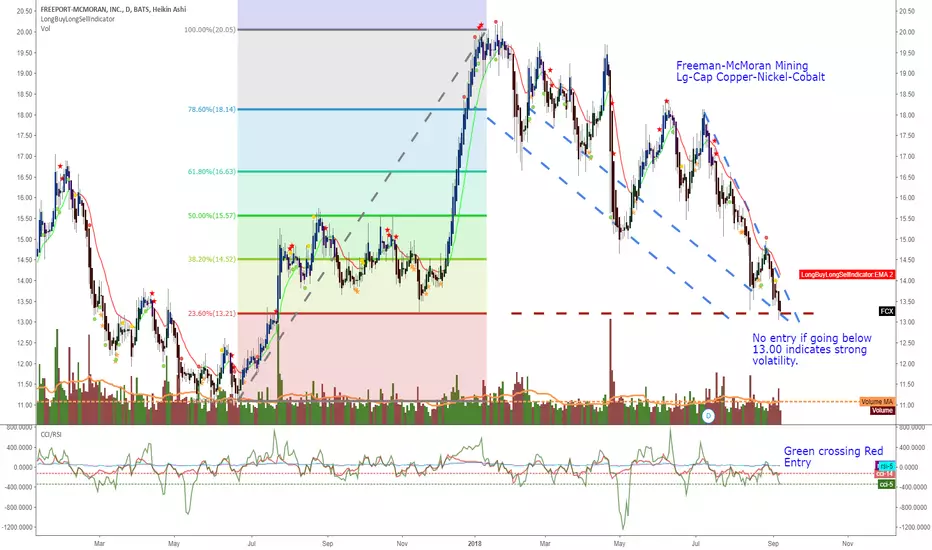
Freeport-McCoran MiningFCX
* Freeport-McCoran Mining LG CAP $19B hurt by copper imports to China and copper prices being low.
* FCX also mines Nickel and Cobalt along with copper and both are needed for EV.
* HG
* LRN
* Cobalt value increasing but larger play still copper
* VIX
For own use and reference for entry.

ETHBTC showing bullish potentialDuring the selloff in crypto the last 24h, ETH have been one of the biggest bleeders.
All year, we have all been waiting for the triangle bounce, BUT something happened yesterday. ETHBTC broke the triangle trend most people have been watching for the last year almost without caring. With ETH crashing down I started to adjust the lines a little, and I found a new trendline which is a tiny bit different from the original we was watching. This line seems to be holding well, but it's not sitting there alone!
In Yellow on the chart we got the triangle with the bottom triangle trend I was talking about. In Purple we got the falling wedge (bullish), and in Cyan we have the strong horizontal trend we have been testing several times in the past. You see the thing they have in common? They intersect at the same spot, the spot ETHBTC bounced.
MACD is showing it's own triangle breakout in bullish direction, RSI haven't been this oversold in ages and the RSI bounced at the exact same spot as last time we went this low. See the horizontal line drawn on the RSI.
I'm hoping as people see all these trends, bullish momentum will return.
Feel free to share this with everyone you think could find this interesting. Votes and comments is much appreciated.
Take care and don't force trades.

SYK- WedgeSYK- Falling wedge
Second occurrence this year, first broke out pretty early. Second one is following the pattern much closer. Take a look and let me know.

BTC Falling Wedge Looking for a reversal in the near short term within 1-2 months. Looking to break through that top of the falling wedge trend line. Could be the perfect falling wedge breakout.
XBT - 3th SEP Time Of Pamp, maybe 7k retestBitcoin gone straight-bottomed falling triangle wedge (white lines) & ready to not drop hard anymore it seems.
Maybe retesting 7k, then pamping 3th of SEP
Bigger Picture:
#heyheyheyyy

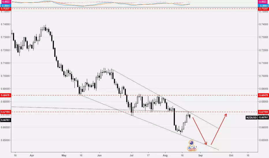
NZDUSD: potential falling wedgePotential falling wedge on NZDUSD indicating trend should reverse soon but bearish trend still has something to say
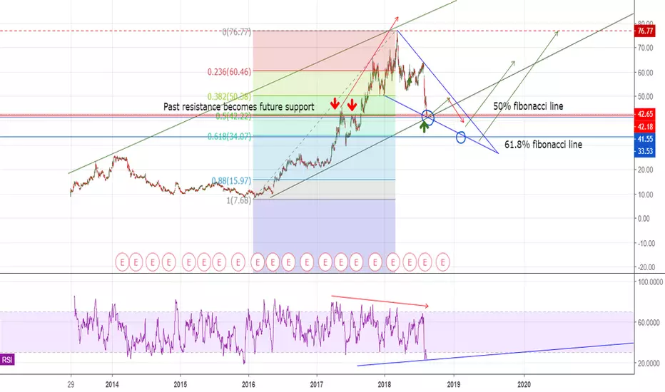
MZOR - Falling Wedge / Fibonacci support linesThis trade has reached its low target level I previously charted a while back, and the 50% fibonacci level all at once. This may not be the last stop on the way down, as it reached it very fast with some high volume. However, this area was a major point of resistance upwards previously, we should see resistance turned support. Expect a battle at this level of $42, and more than likely a short bounce upwards.
Notice the falling wedge pattern that is potentially forming in the short term. I do not expect this downtrend to last very long, I expect it to stay within the falling wedge.
I look to 2 major points on the fibonacci chart. the 50% between $40-$42, and the 61.8% lines ($33.00). With strong enough volume, we could see price reversals around either of these two lines. I do not recommend buying until trend lines are broken.
Remember, this chart is charted with a very long timeframe, 1D. Therefor, the patterns do take longer to take fruition, than if I was charting on a 15 minute chart, or 1 hour chart even. I am assuming this will remain volatile, but long term should stick to the trendlines, and until broken, we should not make moves. Watch RSI over next couple of weeks, and wait for a breakout!
This was a continuation of a previous chart:
Falling Wedge Short Squeeze - $800 eoyshorts at ATH again.
you know what that means.
Falling wedge target ~ $800

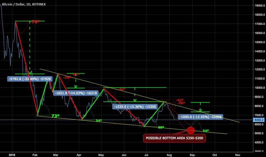
Trend angle analysisJust playing with angles and potential trend lines. Nothing serious. I don't trade it and I made it only for fun/research purposes. It would be fun if it plays out ;-)
Potential bottom according to this scheme is 5200-5350 on 2018-08-25 to 2018-09-04 and bounce back to 7400.
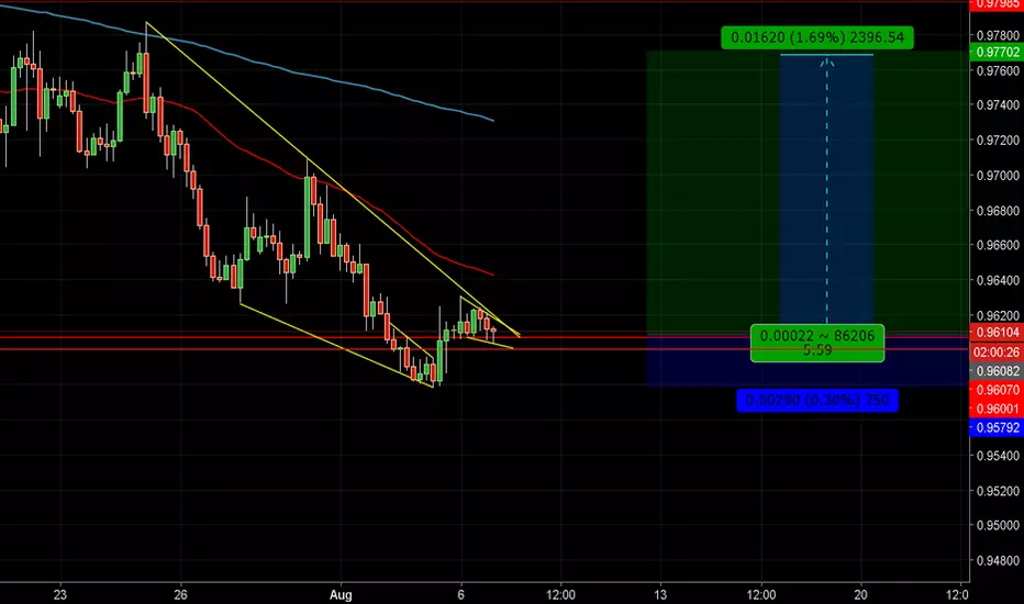
AUDCAD long OppHey traders. Displayed clearly is a descending Wedge with a risk/reward of 1:5 as Audcad rests just above weekly support at 0.96000. Corrective structure seems to be near completion pressing upwards nearing the Descending Resistence Trendline. There seems to be more conluence as the bullish flag becomes more clear, I will be anticipating this to be a scale opportunity as corrective structures appear. A retest of support could give buyers a better price to long with a greater Risk/reward. Good Luck
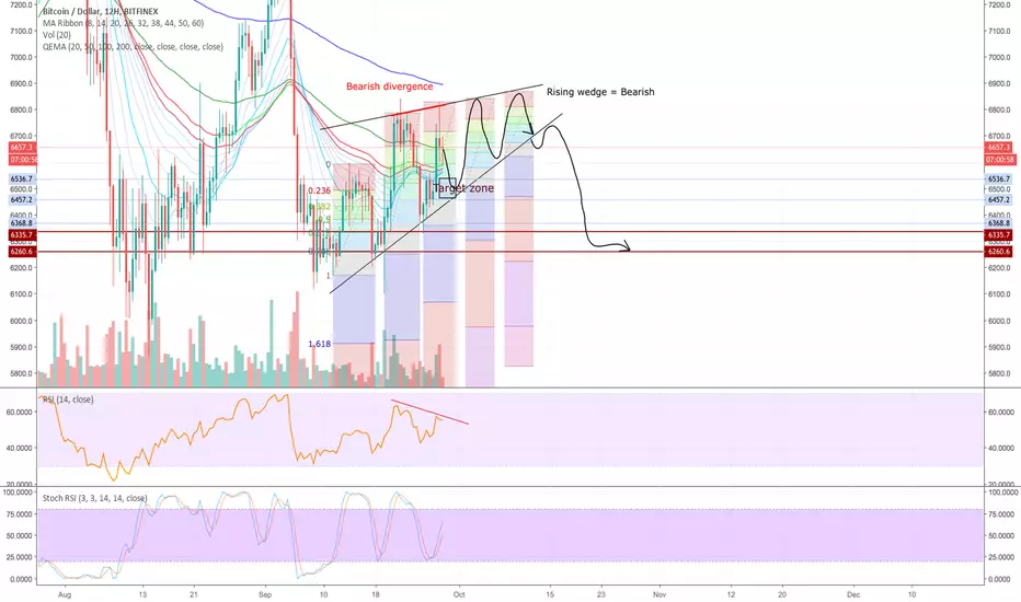
Bitcoin Update. Is it not the end for bears yet?As we predicted it earlier Bitcoin's uptrend faces some barriers around the 8.4 k USD area and is now in correction. As we can see on the chart an uptrend reversal movement is already on. But still there is no a 100% confirmation for it and we might see some other downtrend move depending on the strength of the bears and their dominance over the bulls. A rising wedge is already broken and a downward correction is on progress. The main question in which even many high level proffessional traders and analysts couldn't answer this time is Bitcoin's next direction in the short to mid term investment duration. As a crypto enthusiast our team is still positive on the "Very" bullish potential on Bitcoin. But since there are many intraday traders and who wants to make money in the shorter period the question holds a logical approach. Anyways as we can see it the fundamental reasons raised last week especially the ETF situation related to the Winklevoss twins ETF rejection by the SEC is one of the main reasons for this correction and its actually a normal and healthy correction so far unless it needs some time to rebound and continue its big upward trend. Again as last time we are facing with 2 scenario's on hand next.
1. To correct and touch the support level around 7446.26 USD. If it can rebound and get some bull hand on success it will be a very high probable bullish trend to happen.
2. Since we see a rising wedge break scenario we might see some more downward movement. Mostly this chart pattern is known for its downward bias for such correctional times. By this we might see a downward correction for the following 1 to 2 weeks if the case continue in such ways and might even further go down first to support area 6808 USD which is the most probable outcome or further to the strongest support area around 6355.03 USD.
We will update you on further coming scenarios. Stay Tuned. Team TWA.