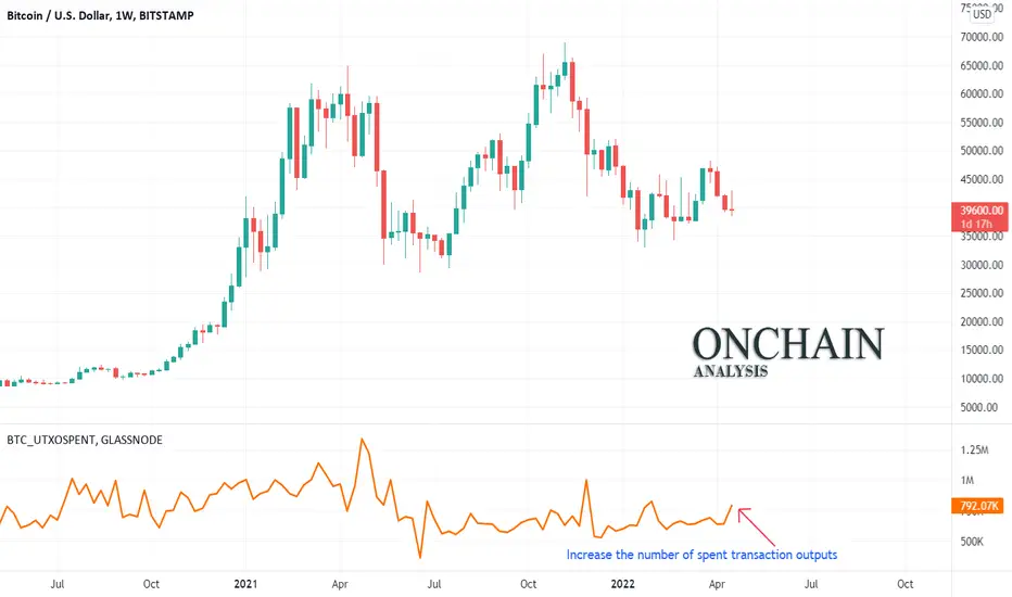
Onchain: Increase the number of spent transaction outputsthe number of spent transaction outputs is increasing. This could be due to increased sales last week, which led to lower prices. Simultaneously with this event, we see an increase in the sales ratio in the indicator of Taker Buy Sell Ratio chain, which indicates an increase in the number of sellers compared to buyers.
Onchain
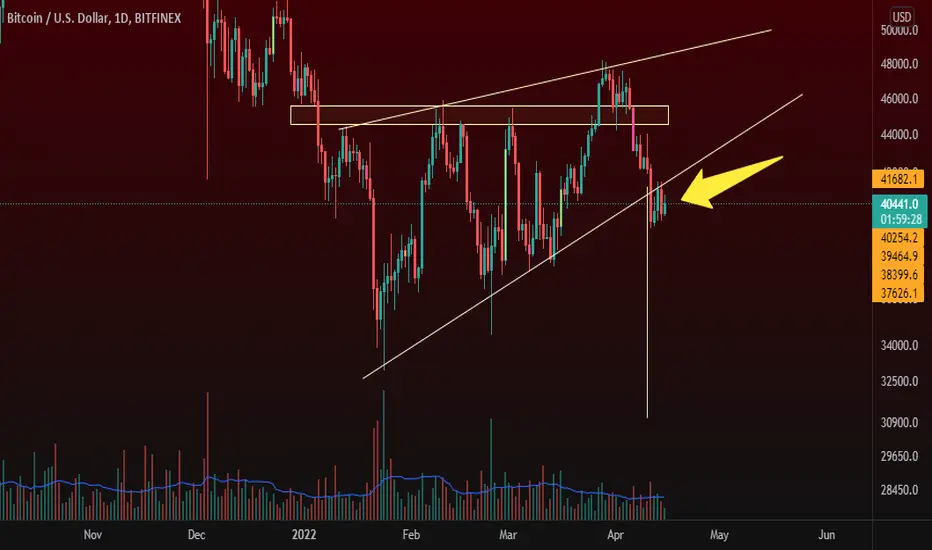
Bitcoin AnalysisHi, I'm going to get to the point very quickly
Today's analysis is a combination of Price Action and Ichimoku and on-chain data
Bitcoin reacted to the price of $ 42,500
The volume of the market is gradually increasing
The number of wallets with 1000 bitcoins is increasing rapidly
And every time we crossed the Ichimoku cloud price in the 4-hour candle, we saw a price increase
Possible scenario drawn

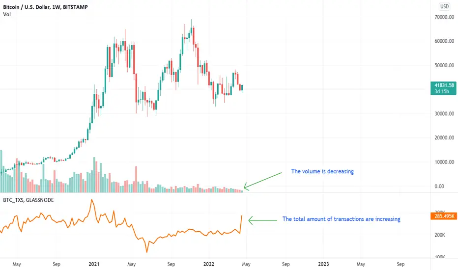
BTC:Divergence between the count of transactions and the volume The oscillator shows the number of successful trades in the weekly time frame. However, contrary to what is expected, we are seeing a decrease in volume This could be due to the involvement of small and short-term traders. This may be a reason to create a local top in the coming weeks.
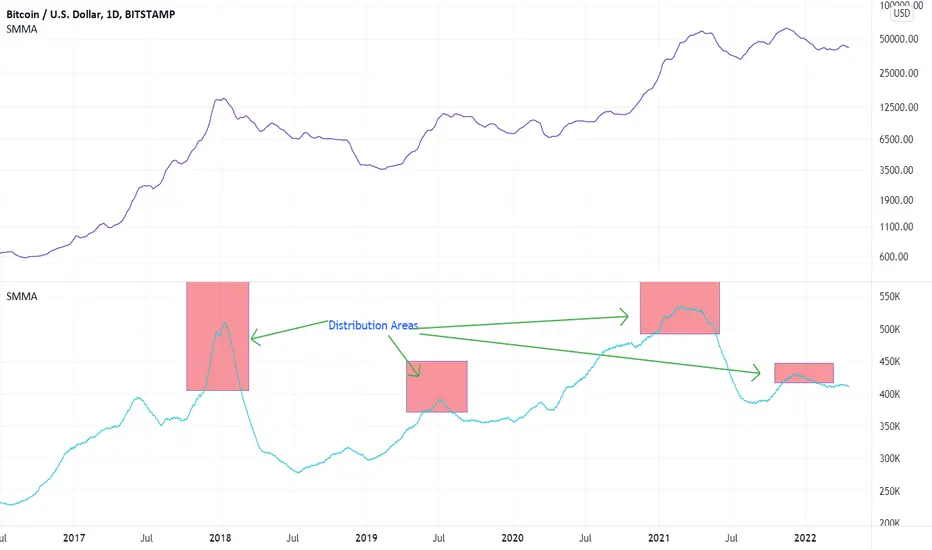
use the count of new addresses to identify distributionThis indicator is the number of unique addresses that appeared for the first time in the bitcoin transactions.
We can use it to identify distribution areas. According to Wyckoff in distribution areas, long-term holders sell their stocks (coins) to newcomer investors. Accordingly, in the distribution area, we should see a peak increase in the number of new addresses. As marked in the chart, by suddenly increasing the new addresses and identifying the peaks in the chart, we can identify potential distribution areas.
Onchain: BTC Hashrate is decreasingThe hash rate drop oscillator shows the hash rate decrease. Although the drop is not large enough for the oscillator to enter the over-low zone, it indicates that some miners have stopped mining. If this decline continues, a reduction in supply could push up prices.

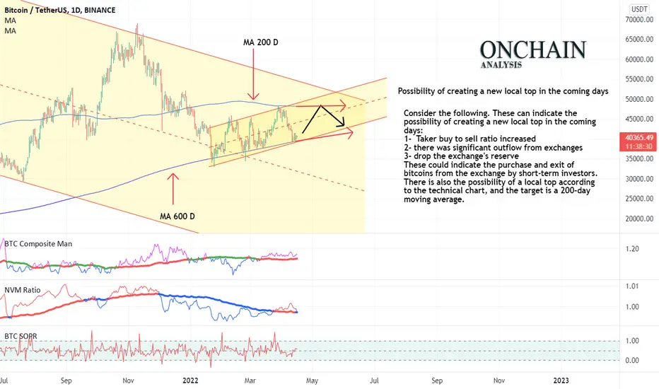
Possibility of creating a new local top in the coming daysConsider the following. These can indicate the possibility of creating a new local top in the coming days:
1- Taker buy to sell ratio increased
2- there was significant outflow from exchanges
3- drop the exchange's reserve
These could indicate the purchase and exit of bitcoins from the exchange by short-term investors. There is also the possibility of a local top according to the technical chart, and the target is a 200-day moving average.
Rising Wedge!!!Another bearish pattern is in the charts right now which already broken down and currently retesting it so it does make a confluence that we might see some more downside action in the price of Bitcoin, however recently the onchain data shows that 2billion dollars worth of BTC just took off from exchanges, So for that reason it does seems like we might see a relief rally type of scenario, Although if this pattern plays out perfectly the target would be $31,110.
Active addresses are decreasingThe oscillators show smoothed moving average of active addresses and the RSI of it
Active bitcoin addresses are decreasing. This indicates a decrease in investor participation in the market and the continuation of the downtrend.
To start the uptrend, we need to increase investor participation in the market, which will be accompanied by an increase in active addresses

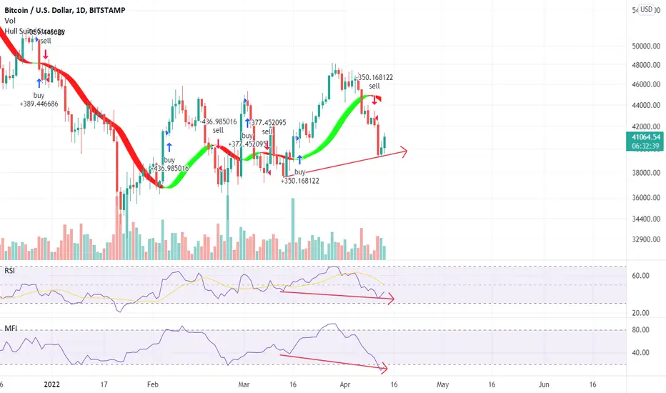
Negative divergence in RSI and MFIwe can see Negative divergence in RSI and MFI oscillator in daily rime frame
On the other hand, Estimated Leverage Ratio is at its All-time High.
A high Value of "Estimated Leverage Ratio" indicates the possibility of high Volatility in the future
We have a strong downtrendBy Combining technical analysis, price action, and onchain analysis, it seems BTC is facing a strong downtrend
Consider the following:
After the 200-day moving average break-down, Bitcoin retested it, but failed to break it up and finally respected it.
At the bottom of the short-term channel, a pin bar has formed, indicating a reduction in higher prices
In the onchain analysis, the evidence shows the strength of the sellers:
-The composite man oscillator shows that the power of the sellers is still strong
- Exchange Reserve is increasing relatively
- Taker Buy Sell Ratio indicates the dominance of sellers in the market
- Exchanges Netflow: is increasing
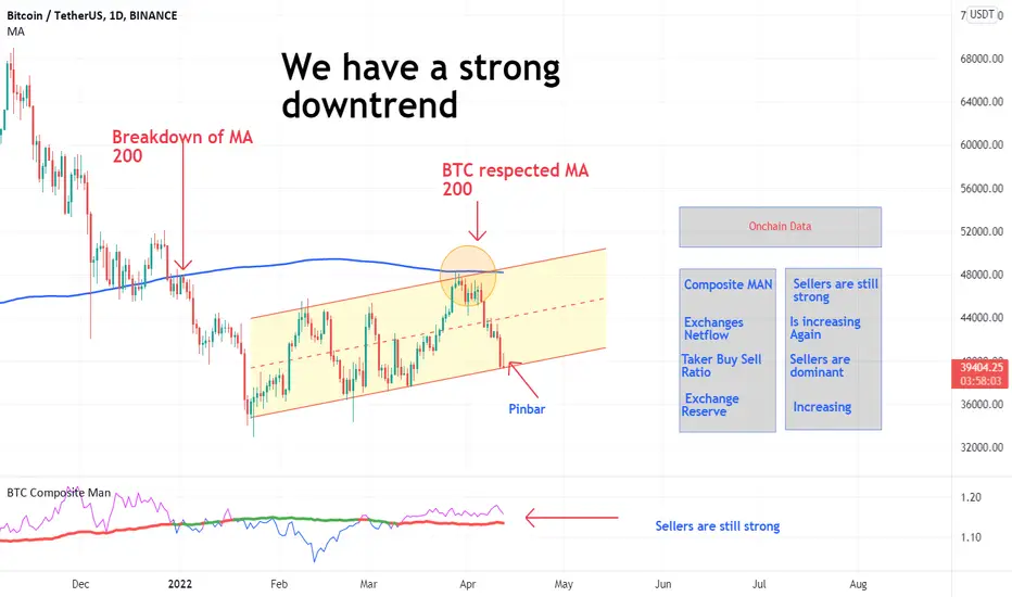
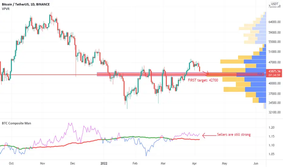
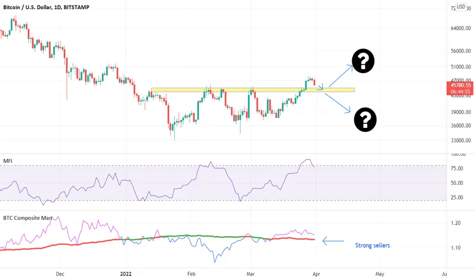
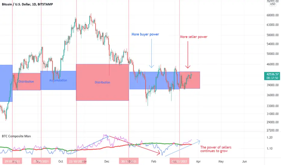
Sellers are still strongBased on the composite man indicator, sellers are still strong.
If the breakdown is confirmed, the first bitcoin target will be 42700 (POC).
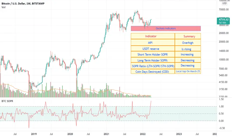
The summary of Onchain dataThe chart shows the summary of Onchain data:
Based on MPI and Miner Outflow, miners are still in the selling position
Based on Exchange Whale Ratio, The top 10 inflows to the total inflows are in a high position.
Exchange Reserve has increased slightly
Funding Rate indicates that we are in the local high position
BTC 1Y CDD increased and shows that some holders have been holding for more than a year, moving their bitcoins
Adjusted SOPR has a general downward trend
Taker Buy Sell Ratio and Composite Man show the dominance and power of sellers in the market.
In short, these cases indicate the possibility of a further decline in the price of coins. We are probably in a local high

The Total Amount of coins transferred Onchain is increasingThe Total Amount of coins transferred Onchain is rapidly increasing. This coincides with the relative decline in the price of bitcoin. It could be a sign of bulls and bears struggling to determine the direction of the market

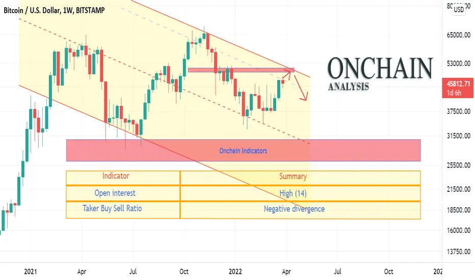
Divergence between price and Taker Buy Sell RatioIn recent days, we are witnessing an increase in Open Interest (one of the Onchain indicators).
Open Interest is defined as the number of open positions (including both long and short positions) currently on a derivative exchange's trading pairs.
As Open Interest (OI) increases, it indicates more liquidity, volatility , and attention are coming into the derivative market.
At the same time, At the same time, after an increase (which led to the current local top), a downward trend began Taker Buy Sell Ratio" (another Onchain indicator). (The ratio of buy volume divided by sell volume of takers in perpetual swap trades.)
"Taker Buy Sell Ratio" indicates a divergence between the price and its 30-day moving average. Despite the price increase in recent days, the Taker Buy Sell Ratio is declining. This divergence could be a signal that prices may fall in the coming days
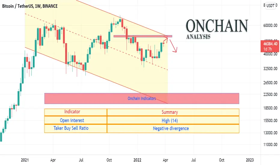
Divergence between price and Taker Buy Sell RatioIn recent days, we are witnessing an increase in Open Interest (one of the Onchain indicators).
Open Interest is defined as the number of open positions (including both long and short positions) currently on a derivative exchange's trading pairs.
As Open Interest (OI) increases, it indicates more liquidity, volatility, and attention are coming into the derivative market.
At the same time, At the same time, after an increase (which led to the current local top), a downward trend began Taker Buy Sell Ratio" (another Onchain indicator). (The ratio of buy volume divided by sell volume of takers in perpetual swap trades.)
"Taker Buy Sell Ratio" indicates a divergence between the price and its 30-day moving average. Despite the price increase in recent days, the Taker Buy Sell Ratio is declining. This divergence could be a signal that prices may fall in the coming days
bitcoin is shaping a local bottomAs I predicted before, Bitcoin is shaping a local bottom (see links below)
In the composite man indicator, the power of sellers is still high. But what is decisive is what will be the level of this local low? If Bitcoin breaks the $ 45,000 support/resistance level, the previous high level ($ 48160) was probably an UPTHRUST (trap), otherwise, we would face an approved breakup.
Onchain Indicators: Miners soldOnchain Indicators show an increase in bitcoin sales by miners and short-term investors
A summary of the onchain indicators is written on the chart.
These indicators confirm what the technical indicators show. This sale will reduce the price of Bitcoin and create a local bottom. The value of this local baton will determine the next trend of BTC (see the idea below)
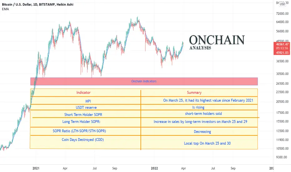
BTC Onchain indicators: Btc needs another large negative netflowMPI: Miners' Position Index (MPI) is the ratio of total miner outflow (USD) to its one-year moving average of total miner outflow (USD): the value of this indicator is in its highest value Since March 2021 MPI= 4.22 Higher value shows that miners are sending more coins than usual which indicates possible selling.
USDT reserve is climbing: in general, when the usdt reserves reach their peak, and the price of Bitcoin is in high level, it means that the smart money is in sell position.
SOPR RATIOS:
Short Term Holder SOPR (SMA 7): increasing:
Long Term Holder SOPR (SMA 7): decreasing
SOPR Ratio (LTH-SOPR/STH-SOPR): decreasing
These show that long-term holders did not play a role in the recent price increase, but it is the short-term holders that caused this price increase. Based on this, what is created is probably a local top.
NET Flow: On March 22, the Netflow balance was significantly negative. This means that a significant amount of bitcoins were withdrawn from exchanges on March 22. This is almost equal to the amount that was withdrawn from the exchanges on March 21, 2021, and then the ATH happened on November 8. Now the netflow is positive again, and I think the continuation of the uptrend will require another large negative netflow to buy the sales that occur at this level by miners and short-term holders.
Coin Days Destroyed (CDD):It has four top values from January 22, when Bitcoin is in the range area. This index had its highest value on February 22 , 2022, since 2019 / This shows that some long-term investors have started selling their bitcoins.
Summary:
Bitcoin needs another large negative netflow to continue the uptrend , Otherwise we are faced with a local top
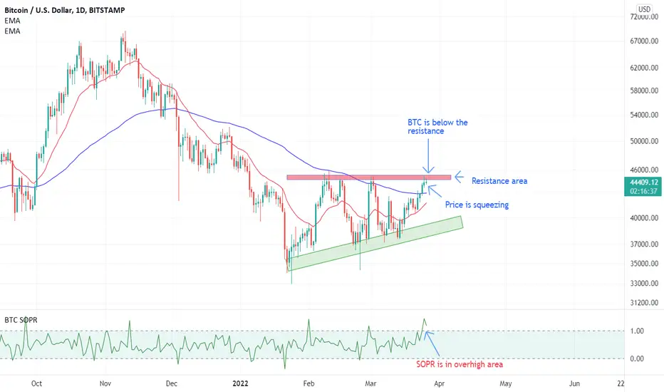
SOPR Short-term traders in profitSOPR has entered the profit zone below the resistance level. This suggests that short-term traders may have made a profit and are likely to sell below the support level. This can lead to bitcoin being respected at the support level
BTC is not at the bottom of the market the chart shows the NVM ratio. This oscillator works to compare the current value of the Bitcoin with its true value based on the Metcalfe Ratio
Necessary explanations about this oscillator are given in the following link.
In the analysis that has been observed in recent days in Trading View, some analysts consider the current situation as a range of accumulation at the bottom of the market. According to this oscillator, we are not yet at the bottom of the market. Although there is a possibility of the local top in the market, it seems that we will experience lower prices.
(Use this oscillator at the weekly timeframe. This oscillator is for bitcoin and uses onchain data)

The power of sellers continues to growIn previous posts, buyer and seller power was discussed (links below). This led to the design of a composite male oscillator based on data on the chain.
Now, based on what can see from the power of the buyer to the seller in this oscillator, the power of the sellers is increasing. This issue, if continued, can lead to the breakdown of the Range area.
It is emphasized that the continuation of this issue will be a sign of a breakdown
$9.6 Billion Worth of BTC Left Cryptocurrency Exchanges in MarchA massive volume of BTC left centralized exchanges tracked by Glassnode in March. According to the on-chain data provided, traders and investors removed approximately 211,000 BTC from trading platforms to their private wallets or exchanged the cryptocurrency for fiat.
