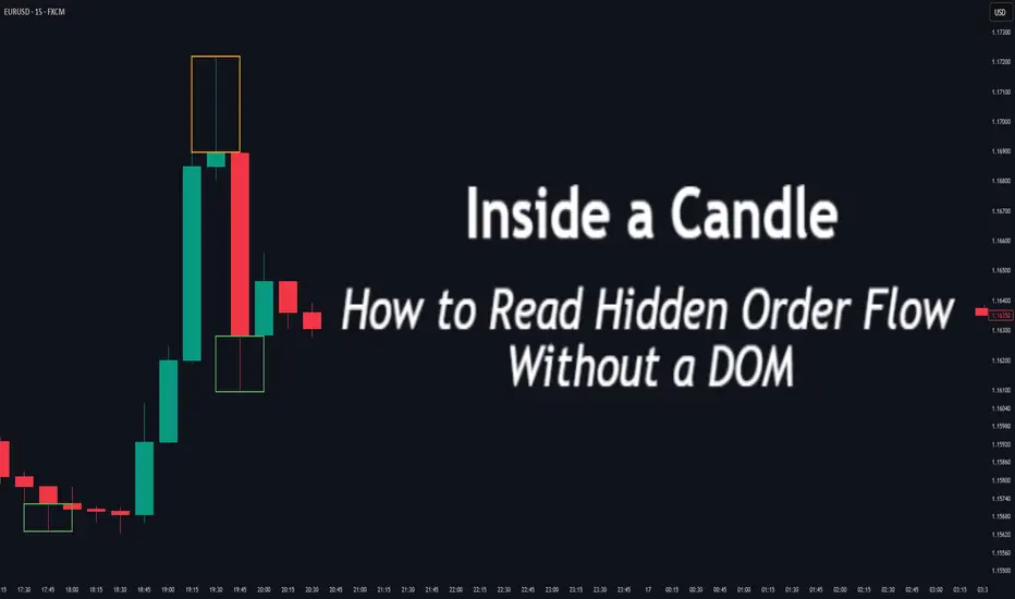
Inside a Candle: How to Read Hidden Order Flow Without a DOM
Difficulty: 🐳🐳🐳🐋🐋 (Intermediate+)
This article is for traders who want to understand the “story” behind a candle’s shape — and learn to spot aggressive buying/selling, absorption, and traps without needing footprint or order book tools.
🔵 INTRODUCTION
Most traders see candles as static shapes — green or red, big or small. But each candle is a battlefield of orders . Even without access to a DOM or volume footprint, you can still extract valuable information from just the candle's body, wick, and context .
🔵 ORIGINS: WHERE CANDLESTICKS COME FROM
Candlestick charts trace back to 18th-century Japan, where rice traders needed a way to visualize price movements over time. A legendary trader named Munehisa Homma , who traded rice futures in Osaka, is credited with developing the earliest form of candlestick analysis.
Homma discovered that price wasn’t just driven by supply and demand — but also by trader psychology . He created visual representations of market sentiment by tracking:
The opening and closing price of rice
The highest and lowest price reached during the session
This system became known as the “Sakata rules,” and it laid the foundation for many patterns still used today — such as Doji, Engulfing, and Marubozu.
Western traders only began using candlesticks widely in the 1990s, when analyst Steve Nison introduced them to the broader financial world through his book Japanese Candlestick Charting Techniques.
Today, candlesticks remain one of the most powerful and intuitive ways to visualize order flow, momentum, and market psychology — even without a Depth of Market (DOM) or depth of book.
In this article, you’ll learn how to read hidden order flow by analyzing:
Wick length and positioning
Body-to-range ratios
Candle clustering and sequences
🔵 HOW A CANDLE FORMS
Before you can read a candle, you need to understand how it comes to life . A single candle represents the full auction process during its time window.
Here’s how it builds, step by step:
Candle opens — this is the open price .
As price moves up during the session → the high] updates.
As price moves down → the low] updates.
The final traded price when the time closes → this becomes the close price .
The wick = price areas that were tested but rejected
The body = where the majority of aggressive trades occurred
If buyers push price up quickly but sellers slam it down before the close — the candle will have a long upper wick and close near the open, revealing seller absorption.
Understanding this flow helps you recognize traps, fakeouts, and reversals in real time.
🔵 CANDLE BODY: WHO'S IN CONTROL
The body of the candle reflects the result of the battle between buyers and sellers. A wide body with minimal wicks means dominance and commitment.
Big body, small wick → clear conviction
In an uptrend: buyer aggression
In a downtrend: panic or aggressive selling
Small body, long wicks → indecision, absorption, or trap
Often appears near tops/bottoms
Indicates both sides were active but neither won clearly
tradingview.sweetlogin.com
🔵 WICKS: THE SHADOWS OF REJECTION
Wicks are not just “leftovers” — they show where price was rejected after being tested.
Long upper wick = seller presence or absorption at highs
Long lower wick = buyer defense or trap spring
Double wick = liquidity sweep / false breakout
Use wick direction to spot:
Failed breakouts
Smart money traps
Exhaustion candles
🔵 HIDDEN ORDER FLOW PATTERNS
1️⃣ Absorption Candle
A large wick with little movement afterward — shows that big orders absorbed market pressure.
2️⃣ Trap Candle
A candle that sweeps above/below a key high/low and closes opposite — classic smart money fakeout.
3️⃣ Imbalance Candle
Large-bodied candle that closes near the high/low with no wick on the other end — implies one-sided aggression (and often leaves an imbalance).
🔵 CLUSTERING & SEQUENCES MATTER
Never read a candle alone. The sequence of candles tells the full story:
3+ rejection wicks near resistance? Liquidity building before breakout or trap
Bearish engulfing after long upper wick = smart money selling into retail buying
Tight-range dojis + volume spike = compression before expansion
Context + volume + structure = hidden flow decoded.
🔵 PUTTING IT TOGETHER: A REAL EXAMPLE
Price breaks above previous high
Candle closes with long upper wick and smaller body
Next candle opens, dumps fast, leaving imbalance behind
Buyers trapped — move likely to continue down
This is how you read order flow from candle anatomy .
🔵 TIPS FOR MASTERY
Use a lower timeframe (1M–5M) to see microstructure
Watch how wicks behave near S/R or OBs
Confirm with volume spikes or delta-style indicators
Use replay mode to slow down the story and study cause/effect
🔵 CONCLUSION
Every candle is a message. You don’t need expensive tools to read order flow — just your eyes, context, and curiosity.
Learn to see candles not as symbols, but as evidence of behavior . Absorption, imbalance, and traps are all visible if you look closely.
Pressure
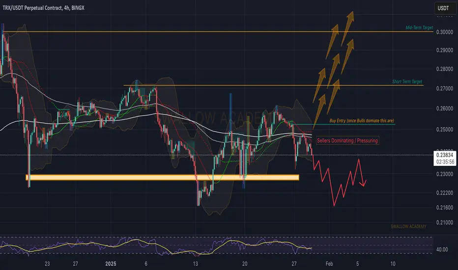
Tron (TRX): Sellers Sending Price Back To The Roots of $0.21Despite a steep downward movement on bigger timeframes, sellers are not showing any remorse here as well, where they keep on pushing and pushing price back down.
If this kind of pressure continues, our next point of interest is going to be the $0.21 area, but if we see a proper recovery, not just some liq move, then we have also placed a possible target zone for upward movement once a certain zone is secured!
Swallow Team
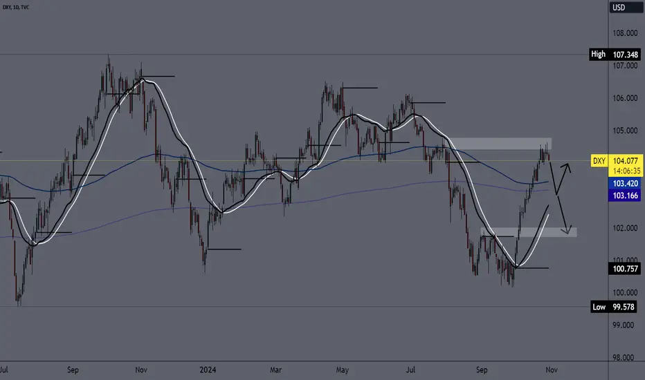
Dollar index remains under 105.00The dollar index has been losing its previous bullish momentum for a couple of days now, encountering resistance in the 104.50-104.70 zone. This resistance coincides with the resistance from the end of July.
From this morning, we see a pullback to the 104.00 level and a hint of a turn to the bearish side. The first target is the EMA 200 daily at 103.40. If the support is not enough, the index could continue up to 102.00.
Maybe this pullback will be short-lived, and we will see a return to the bullish side again. We will be looking at a jump from 105.00 to a new four-month high.
Building Success In PineScript - The Ment Pressure SystemAfter more than two weeks of playing around with Pinescript, I've managed to put together some really cool tools for my followers/subscribers.
The idea of price pressure intrigued me, so I decided to create something based on it.
Ideally, I planned to build something that helped traders find and execute better trades. It is difficult to identify chop vs. trending in any market/interval. My goal was to create a small suite of tools to help traders identify better trade setups.
I still believe I have more work to do with these pressure tools, but I'm very happy with how they work.
I did learn some "tricks" with Pinescript related to how variables and processes work (of course, by trial and error).
Watching the code run in real-time has been fun (watching a 2 min ES chart).
I can't wait to see how my followers use these tools and develop new ways to deploy them efficiently.
What are your thoughts? Anything I can do to improve?
Get some.
#trading #research #investing #tradingalgos #tradingsignals #cycles #fibonacci #elliotwave #modelingsystems #stocks #bitcoin #btcusd #cryptos #spy #es #nq #gold

Time in a bottleCrypto markets will break the surface of levels you are not currently considering. When the SEC approves Bitcoin & Ethereum chain ETF's, NFT's will become the most used word on the planet in every marketing campaign across every industry pillar. History will change.

Fundamental Shifting of USDJPY's Risk Sentiment Pressures PriceGreetings, Fellow Traders,
Technicals and Chart Explanation
Indicators
Trendline: A trendline is a diagonal line connecting at least two price points, typically peaks or troughs, to determine the overall direction of a trend. In this case, the downward trendline suggests a prevailing bearish trend in USDJPY.
Resistance: Resistance is a price level where upward momentum is likely to stall or reverse. In the USDJPY chart, the identified resistance level could act as a barrier for the price to break through, supporting the bearish outlook.
Downward Pressure: Downward pressure refers to the selling force driving the price lower. In the USDJPY chart, the repeated instances of price retracing toward the trendline and resistance level indicate ongoing downward pressure from bears.
Double Top Pattern: A double top pattern is a bearish reversal pattern formed when the price attempts to break upward twice but fails to surpass a previous resistance level. The double-top pattern observed in the USDJPY chart suggests a potential reversal of the upward trend and a continuation of the bearish trend.
Target Zone: A target zone is a price range that a trend is expected to reach based on technical analysis. In this case, the lower target price at $145.16 represents a potential area where the bearish trend could find support.
Forecast: A forecast is a prediction about the future movement of a price based on technical analysis and market sentiment. In this instance, the forecast suggests a potential continuation of the bearish trend in USDJPY, with the price potentially reaching the lower target zone.
Chart
As a discerning observer of market tendencies, I've identified a potential double top pattern on the USDJPY chart, preceding the recent bearish price action that gathered momentum and drove prices towards lower targets. This observable pattern, depicted above the candle formations, harmonizes with the prevailing downward trendline. Repeated instances of downward pressure exerted by bears, symbolized by the red circles, have guided the USD's descent toward this trendline. Currently, I discern a price range confined between resistance and the lower target price of $145.16. Therefore, I anticipate the potential continuation of this bearish trend.
News and Fundamental Analytics
Japan's Economy Stagnates as Yen Rebounds: Japan's economy, the third-largest in the world, grew at a mere 0.2% annualized rate in the third quarter of 2023, falling short of expectations and indicating signs of stagnation. This subdued economic growth could weigh on the Japanese yen, potentially further weakening USDJPY.
US Economy Faces Recession Fears: The US economy has exhibited signs of slowing growth, raising concerns about a potential recession. If economic conditions in the US deteriorate, the dollar could lose its appeal, contributing to a further decline in USDJPY.
Geopolitical Tensions Weigh on Risk Sentiment: Geopolitical tensions surrounding the war in Ukraine and other global conflicts have dampened risk appetite among investors. This risk-averse sentiment could drive investors towards safe-haven assets like the yen, further weakening USDJPY.
Technical Indicators Signal Bearish Momentum: Technical indicators on the USDJPY chart, such as the Relative Strength Index (RSI) and Moving Average Convergence Divergence (MACD), suggest ongoing bearish momentum. These indicators could provide further confirmation of the downward trend in USDJPY.
Please note that these observations are intended for entertainment purposes only and should not be construed as investment advice. It is crucial to conduct thorough research and make informed decisions when managing your investments.
Warm regards,
Ely

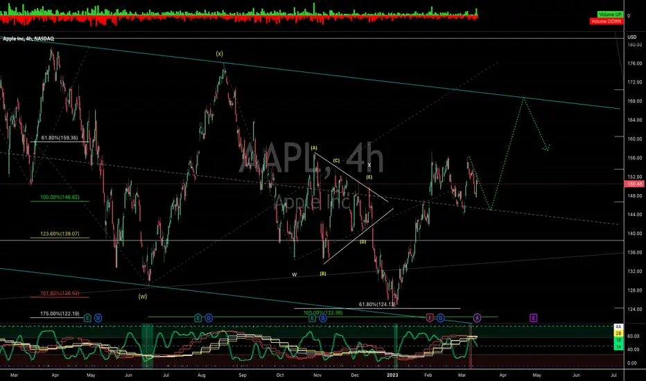
AAPL has some pressureOnce upon a time, there was a guy named Jack who was obsessed with trading in the stock market. He spent every waking moment analyzing charts and studying market trends. His favorite company to trade was AAPL, and he had been eyeing it for weeks, waiting for the perfect moment to buy.
Jack had set a goal for himself to ride AAPL up to about $168, but unfortunately, the time hadn't come yet. He was patiently waiting for the price to dip a bit more so that he could pounce on it and make a fortune. He spent hours each day checking his charts and watching the news, hoping for a sign that the time was right.
One day, while Jack was staring intently at his computer screen, his roommate walked in and asked what he was doing. Jack excitedly explained that he was waiting for AAPL to retreat so that he could buy in and ride it to $168.
His roommate looked at him skeptically and asked, "Why are you waiting for it to go down? Isn't the goal to buy low and sell high?"
Jack chuckled and replied, "Yes, but I have a secret weapon, the wave master indicator! It's showing some downside pressure, so I'm exercising patience and waiting for the right moment."
Be like Jack. Use your indicators. Check the chart and you can see when a buy has triggered, it resulted in a big move down. We haven't see a 4h sell signal since 2021 and we just got one. Wait for the green wave to reset.
ETH bearish today AGAIN!!!The most recent update to the price analysis of Ethereum is negative.
The price dropped to $1,271 today, but the $1,268 support level is still in place.
Due to increased selling pressure from the negative side, the price analysis of Ethereum is bearish. The currency saw tremendous value growth over the last two days as the market followed the bullish trend, but a correction was necessary to allow for the subsequent continued rise. As a result of the bears resisting further upward rises today, the situation has altered, and the cryptocurrency pair has begun to fix itself. The team is currently looking for support just below the $1,268 level. Resistance to the move-up was noted at $1,336.
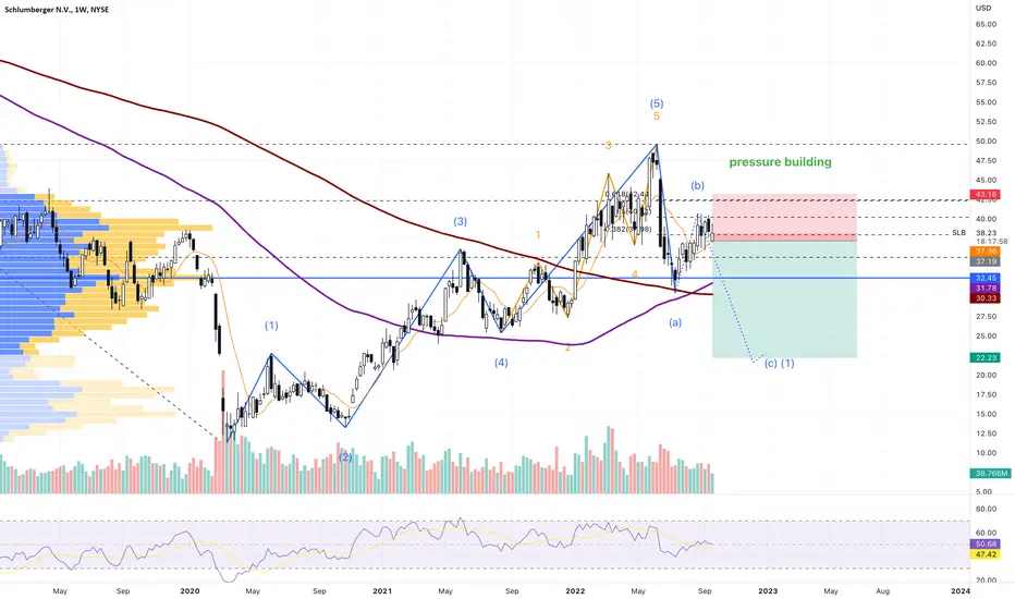
SLB weekly indecision candleSLB weekly indecision candle pressure building nice and bearish volume exceeds bullish all the time. Had to take that one. Stop loss above local highs.
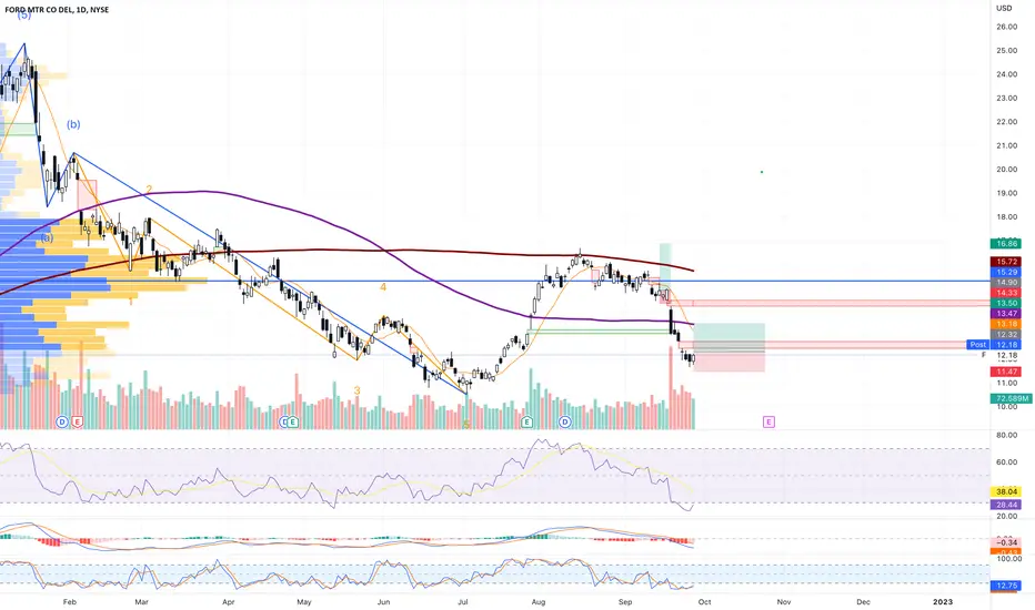
F daily hammers pressure buildingF daily hammers pressure building wave 4 of downtrend gotta be quick.
Buy Stop 12.32 LMT 12.32 GTC
Sell Limit 13.50 GTC
Sell Stop 11.47 GTC
CHK daily indecision pressure building bearish inside candleCHK daily indecision pressure building bearish inside candle
Sell Stop 90.24 LMT 90.24 GTC
Buy Limit 81.20 GTC
Buy Stop 94.76 GTC

GBPJPY - Bearish reversal expectedHere is a new SELL Scenario, i expect a bearish reversal, this pair will loose momentum
There is a bearish pressure, data is ignored for now and markets are focused on geopolitics.
JamdeJam will not accept any liability for loss or damage as a result of
reliance on the information contained within this channel including
data, quotes, charts and buy/sell signals

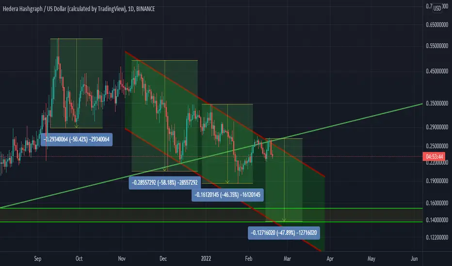
HBAR sort term downside?Will HBAR continue this downward trend on this descending channel? We have seen a sell-off between 50% to 48% once top hit. Could we see a possible price at bottom of this channel between $0.15 and $0.13? Let's see what happens in conventional markets.
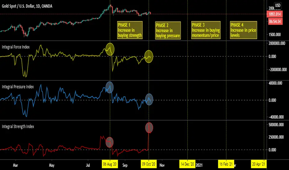
Cyclical Characteristics of Market Performance IndicatorsFrom "Cyclical Characteristics of Performance Indicators", IFTA Journal 2020.
"Linear Momentum and Performance Indicators", IFTA Journal 2019.
Indicators
Integral Force Index (Linear Momentum Index)
Integral Pressure Index
Integral Strength Index
Phase 4
It is not necessary that price levels increase till the end of the phase.
* This technique blends the market adjusted momentum, market pressure, market strength and time cycles.
Akram
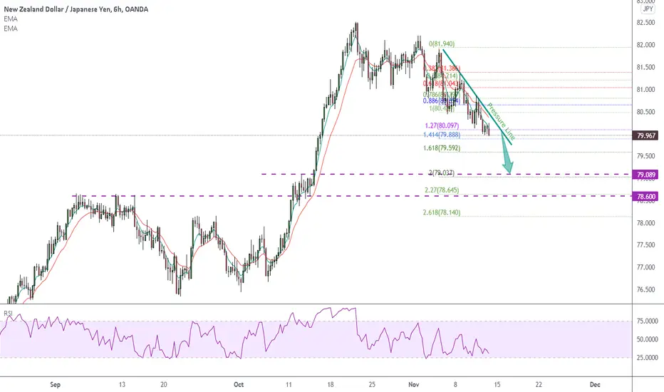
1211 Trend Continue NZDJPY down to 79.00Hello traders,
NZDJPY is on a strong bearish trend under pressure line and EMAS.
Setup a plan to sell today TO 78.5-79.00
RISK LOWER THAN YOUR TOLERANCE:
Suggested Risk <5%
Your Real Entry Position Will Make Different RR for Your Trade.
GOOD LUCK!!!
LESS IS MORE!
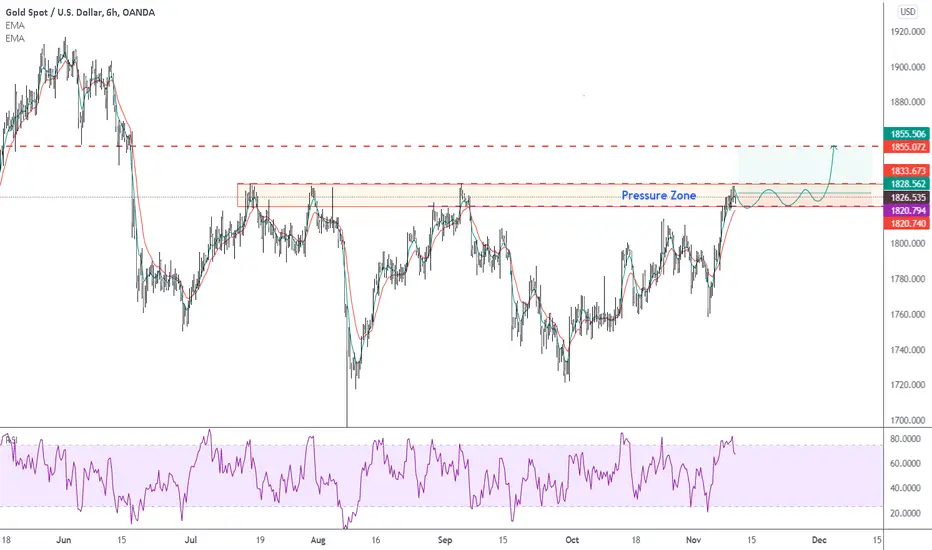
1011 Trend continue after sideways for gold, 1855 wont take longHello traders,
Wed again. Gold now meeting pressure zone and possible sideways price action range higher than our last idea's expectation.
Breakingout will send gold up to new high, 1855 for another 30 dollars.
Setup your trade after getting your confirming signal on the pressure zone.
Good luck!!!
LESS IS MORE!
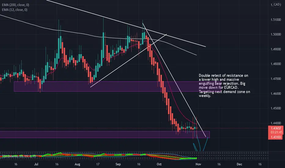
EURCAD Short (Daily)Big shorts coming - double rejection of resistance on lower high with an engulfing bear candle. Easy short down to weekly demand!
TRADING IDEA --- NOT AN INVESTMENT OPPORTUNITY!
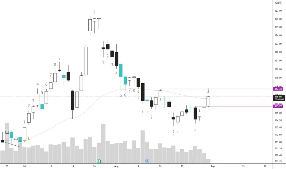
$SBUX longGood buy when we close above $115.77
Weekly last bear candle high is $117.73. Would be an add if closes above.
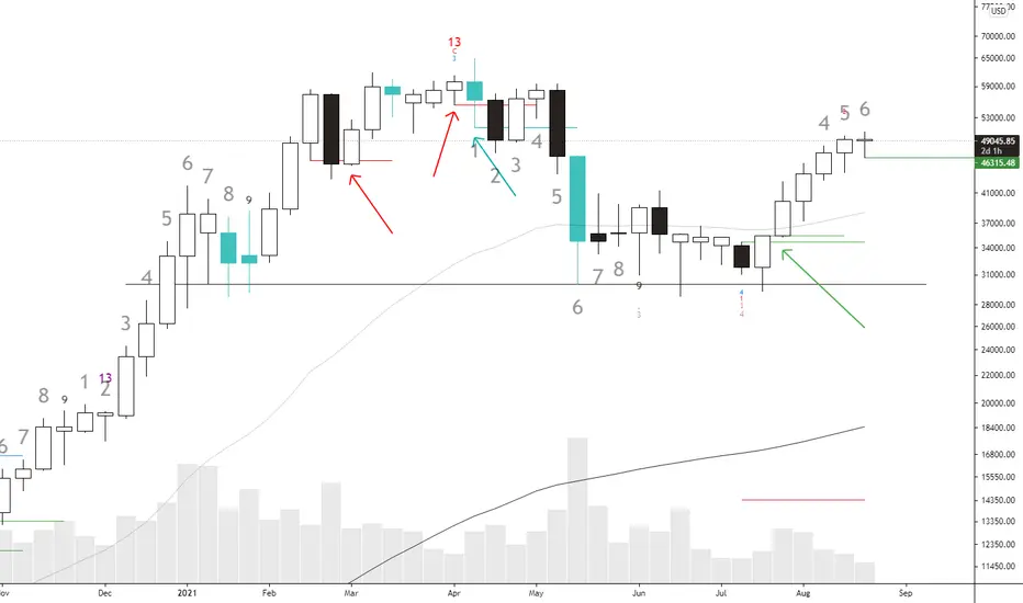
$BTC weekly pressure chart. No signs of selling yetThe $BTC daily swings have been wild! In order to navigate this mess we just have to look at a higher time frame. According to the pressure chart, a proud indicator of my own, this week still indicates more buying pressure than selling pressure. As per pressure rule: you initiate half a position upon the event of a bull candle (white color) closing above the high of the last bear candle (black color), add the other half on the high break of that bull candle. Using this entry rule on the weekly $BTC chart you can see the adding points there.
You hold the position until seeing a bear candle closing below the low of the last bull candle -> exit half. Then upon the low break of that bear candle you exit fully. If that doesn't happen just wait until the next low of bull candle broke by a close of bear candle, also indicated on the chart.
Of course you can see there is a third color on the chart, the blue candles! They indicate that on such period (weekly in this case), buying and selling pressure are pretty much the same, or specifically, they ratio between them don't exceed the golden ratio! Blue candle week tends to have the close somewhere in the middle between the true high and true low of the week. Those are the essence of the pressure chart, true high, true low and close.
The holder of the underlying can hold their position through blue period, or indecision period. Conservative traders can also exit their long position if on a series of bull candles, an indecision candle appears, followed by a bear candle that breaks below the low of it, since as usual, indecision candle do notify and swift in pressure strength, kind of like the doji!
Going back to $BTC, if you trade the weekly chart, there is no rush in exiting your position yet. If the week ends with the candle coloring white, we are still in a bull move, although the candle size is starting to shrink, and the trigger for selling has been raised, $46315.48 to be exact.
If the week ends up being an indecision week the plan is the same, wait for next week close. Those who are very strict with their profit can immediately exit their longs when the low of the following week breaks down $46315.48
$AMD bullishweekly $AMD candle if closes above the last selling pressure week, which was last week, is bullish per pressure chart signal.
The selling week (last week) did not close below the buying week before it, so buyer from July should still be in a position. Bulls can choose to add on this signal once confirmed. Remember there is still a change we don't close above the high of last week thus no confirmation.
watching $JMIAAn overhyped stock, dubbed to be one of the "$AMZN wannabes" cohort. We see absence of buying pressure on the daily and weekly chart (no green bars). This implies no interest in buying dip, the last green bar seen had its low broken --> dip buyers got hurt.
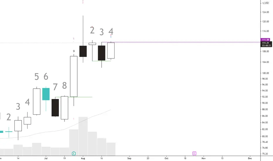
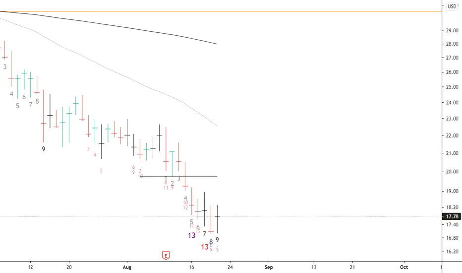
However we see it printing the daily 9 and sequential 13 and potentially a weekly 9 next week. Demark indicators are great at signaling selling exhaustion TIMING, although needs to be confirmed by price movement. I use these High-Low-Close bar and a coloring rule based on percent change and golden ratio to be my confirmations.
I want to see green bar daily printed and have its high broken. Ideally by more green bars.
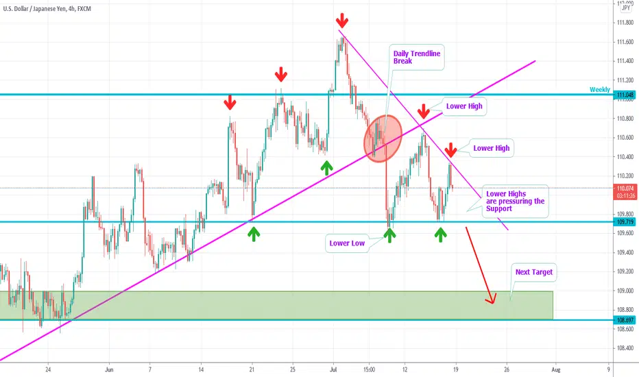
USDJPY - Daily Trendline Break - Lower Highs into SupportHi Traders,
the market was moving in an Uptrend.
As you can see, we here have a strong daily
Trendline which was respected frequently and
since a long time.
Recently, it got broken, which indicates
bearish power and the weakness of the bulls.
It seems like the Trendline is over now.
Now, the market made one lower Low and
two lower Highs.
That's why a descending Triangle is visible now.
As the lower Highs are pressuring towards the Support,
a bearish Breakout is expected.
The target is the next Resistance.
Take care: Sometimes, the price breaks the Trendline bullish,
just to immediatly fall down.
We recommend to keep different scenarios in mind.
Thanks and successful Trading :-)!