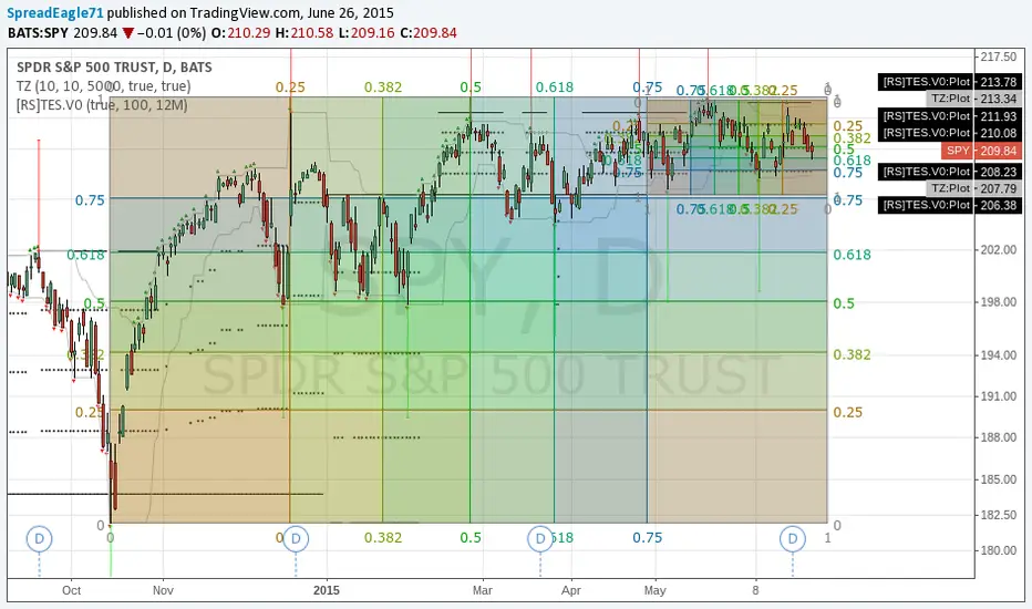
Great Way to draw Fibonacci levels using Gann,TZ, and TES Fibonacci levels can become powerful ways to find almost EXACT support and resistance levels and also time your trades. I have used them to predict turning points in markets on short time periods but they also are predictive in larger time frames.
How to Align Fibonacci Levels:
A very good and objective way to draw your Fibonacci levels is to use Gann Boxes, Transient Zones and the Temporal Extreme Spitter. All of these indicators are in the Public Library.
First start with the Temporal Extreme Splitter (TES) by Richard Santos. The extreme splitter will give you exact high and low places to place your gann boxes.
The Gann Boxes provide fibonacci in two dimensions- price and time. You can align the box ends with the TES. However, I have found one of the best ways is to align the Gann boxes is to set the 50% level on a long/strong TES line.
Next when you align the extremes up with either the center or one or both of the ends of TES lines; then you are ready to start aligning the Fib levels for time.
There is no exact science for doing this but a good way to do it is to try to match the highs and lows using Transient Zones. Transient Zones themselves give highs and lows and are also great places to align the boxes.
However, since TZ's can occur more often than the TES lines (if you use default settings), its good to align them with the Fibonacci time levels of the Gann box.
When watching your entry and exit points, it is also useful to include the concept of Divergence into them for even higher probability trades.
One of the best ways to see divergence is to use a stochastics oscillator. The 14,3,1 default setting is fine. There are also some other ones in the Public Library. I am really into fibonacci, so I will sometimes use a stochastic 55 or 21.
To see divergence, look at the highs and lows on the price chart and compare them to the highs and lows of the stochastic oscillator. If you do this correctly, you can sometimes see where the market is slowing down and turning.
The key word here is slowing down .
Divergence can be used as a confirmatory signal or a way to get out of a trade when it starts to go the other direction.
Good Luck in Your Trading
- Spread Eagle 71
Price Channels
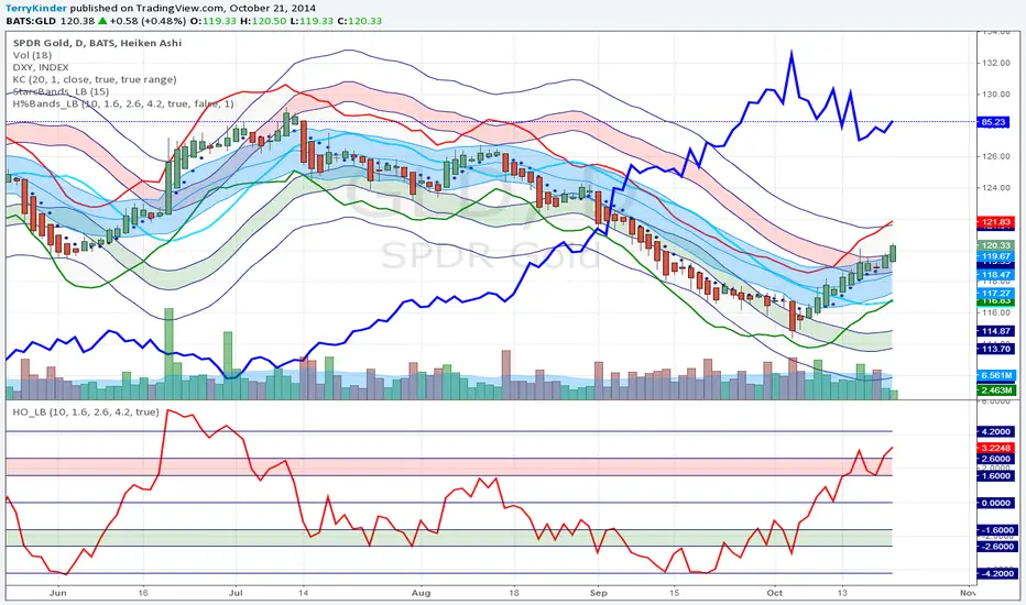
GLD Overbought, but Could Become More SoGLD has become overbought as shown by the Hurst Bands. Price could possibly exceed the overbought Hurst Band (pink colored band).
The Starc - (minus) Band has crossed over the middle (light bluw) line of the Hurst Bands. This is typical when price action begins to become extreme. It does not mean that the extreme price action cannot or will not continue for a while longer. I'm thinking it probably will.
Price is approaching the top of the Keltner Channels (blue bands) which indicates strong price momentum to the upside.
Of note is the dark blue plot of the U.S. Dollar Index (DXY) price. As the dollar price has moved down from $86.74, the GLD price has recovered. As the dollar is at extreme overbought levels (not plotted on this chart) I expect it will continue to move lower giving GLD room to move up a little more.
At the bottom is plotted the Hurst Oscillator. It is the same information plotted by the Hurst Bands in a little easier to read form.
Overall, expect GLD to continue to move higher.