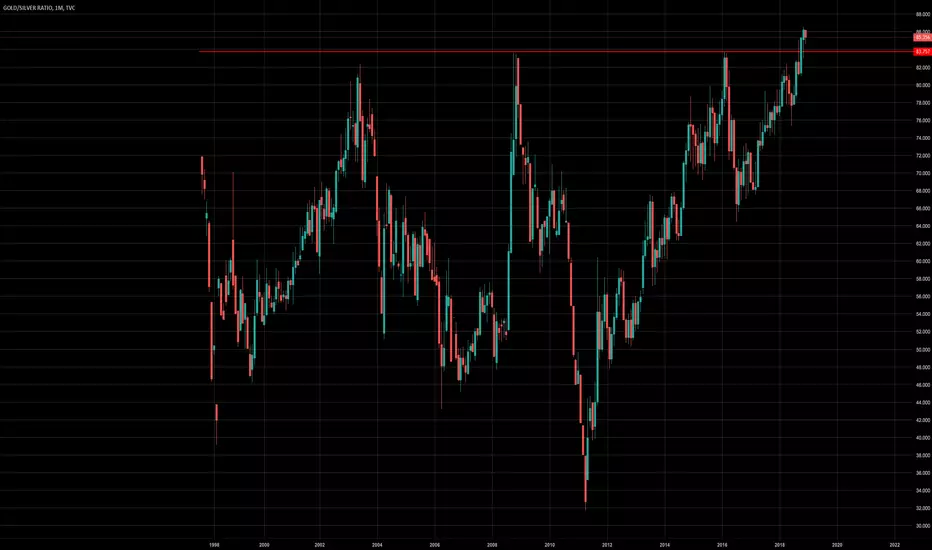
Silver Has Some Catching Up to DoGold/Silver spread is still strong with a Gold/Silver ratio around 83, indicating strong bias to gold. With incoming panic in the markets, debasement of the dollar, or both, we can expect the bullish move in gold and silver to continue in the long-term despite all attempts at suppression within the futures exchange. Silver has some serious catching up to do post price fixing in the futures exchange.
"Bet against the debt, become your own central bank." - Gregory Mannarino
Ratio

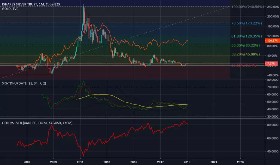
Silver : Negative Interest Rates, QE4, End of PetrodollarAll long-looking indicators point to silver being undervalued vs gold . Top chart shows silver candlesticks vs gold red line as percentage returns since 2006 in the case of these investment trusts. Middle indicator is the Trader's Dynamic Index ( TDI ) which holds a combination of moving average, volatility and momentum trends. Bottom indicator is the infamous Gold:Silver ratio.
Silver is sitting on top of the .382 fib level support shown in the chart, which is where the current cost of production resides around $14.75/oz. Low risk, high reward - this is a perfect setup for those interested in making an inflation play going toward negative rates, QE4 and the end of the petrodollar agreement.
% Returns Analysis: Silver below Gold -> Silver undervalued
Fibonacci Level: Strong support at cost of production near $14.75/oz
TDI: Bullish divergence in formation
Gold/Silver ratio: 83:1 -> Silver undervalued
Note: SLV is not equivalent to owning physical silver. Trade SLV at the risk of fund insolvency and loss of investment - most holdings are suggested to be physical.
Silver is a Screaming BuyAll long-looking indicators point to silver being undervalued vs gold. Top chart shows silver candlesticks vs gold red line as percentage returns since 1998. Middle indicator is the Trader's Dynamic Index (TDI) which holds a combination of moving average, volatility and momentum trends. Bottom indicator is the infamous Gold:Silver ratio.
Silver is sitting on top of the .382 fib level support shown in the chart, which is where the current cost of production resides around $14.75/oz. Low risk, high reward - this is a perfect setup for those interested in making an inflation play going toward negative rates, QE4 and the end of the petrodollar.
% Returns Analysis: Silver below Gold -> Silver undervalued
Fibonacci Level: Strong support at cost of production near $14.75/oz
TDI: Bullish divergence in formation
Gold/Silver ratio: 83:1 -> Silver undervalued

SPY Pattern Analysis - The Magic Ratio 1.865, Plus or Minus .01"My problem is that I have been persecuted by a (ratio). For the last few months this (ratio) has followed me around, has intruded in my most private data, and has assaulted me from the pages of our most public journals. This (ratio) assumes a variety of disguises, being sometimes a little larger and sometimes a little smaller than usual, but never changing so much as to be unrecognizable. The persistence with which this (ratio) plagues me is far more than a random accident. There is, to quote a famous senator, a design behind it, some pattern governing its appearances. Either there really is something unusual about the (ratio) or else I am suffering from delusions of persecution."
Dry humor aside - in comparing various inflection points and critical resistance boundaries of the SPY during the 2008-2009 recession and today's 2018-2019 "correction", I've identified one particular ratio that haunts my analysis. To be precise, 1.865 +/- .01 has appeared, without fail, at seemingly each and every corner - at every major toss and turn - of the present market. By simply dividing the daily lows or highs of the matched "reference points", such as 22 Jan 2008 and 26 Dec 2018, a ratio could be found - in this instance, ~1.8552381. When applied to the reference points shown in the chart above, we end up with a list of similar numbers:
293.94 157.52 ~1.8660487
280.40 149.68 ~1.8733298
233.76 126.00 ~1.8552381
260.70 139.61 ~1.8673447
Very interesting, isn't it? A tad off our usual fib 1.618, but nothing too difficult to work with.
By averaging the four reference points we have gathered, we can then determine a "working estimate" of ~1.8654903.
Apply this ratio to the next potential turning point in the market - for example, a local bottom at 131.73 on 07 Feb 2008 - and voila: a target estimate of ~245.74.
A range could be estimated as well, using 1.865 +/- .01 as the upper and lower boundaries. For the same example, the estimate target range would be 244.42~247.06, presenting a gap of 2.64.
Will this work to pinpoint exact dates or price targets? Probably not. Is this a potential fractal of human nature? Possibly. Either way, it presents itself as something potentially significant.
I recommend you to trade like you drive - safe and steady in a Benz or wild and out in a convertible roadster. Regardless, the wheel is in your hands, not mine.

Gold / Silver ratio suggests SPX reversal?Multiplying SPX by the gold/silver ratio produces, what appears to be, clear cut levels. In the past, when the measure has bounced off a level, the SPX (below) has reversed.
GOLD/SILVER Ratio at extreme levels.GOLD/SILVER Ratio at extreme levels.
Silver more bullish than Gold going forward.
SILVER to overpeform GOLD in next econmic cycle ?Hope this idea will inspire some of you !
Don't forget to hit the like/follow button if you feel like this post deserves it ;)
That's the best way to support me and help pushing this content to other users.
Kindly,
Phil

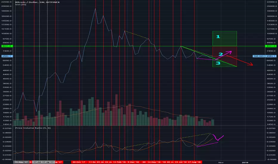
Bitcoin Price Volume Ratio Analysis Update Oct 21st 2018Well a peak has formed on the price volume ratio which is looking like the hidden bear div will play out. I'm leaning toward this playing out and possibly creating a new bullish divergence if the price falls to test $6k again.
1. Level price had to have reached to invalidate hidden bear div by creating a peak in price above the ~$8200 level.
2. Peak in price occurring in this region will validate the hidden bear div.
3. a) This region could have previously invalidated the hidden bear div, if the last dip had been deeper and price hadn't climbed back to current levels.
b) If the hidden bear div plays out and the price falls below the previous price dip at ~$6350, the formation of a bullish divergence is a strong possibility. In other words a dip that doesn't breach $6k and is below that threshold most likely will form a PVR bull div. A dip breaching $6k most likely will have a large effect on PVR and most likely will invalidate the potential bull div.
TLDR Another dip to test $6k again could signal a good reversal.
ETH/BTC ... Uncanny 5ths ?When venturing over from the default use of logarithmic charts, to linear ..
I noticed (please tell me otherwise) what seems to be, significant , inflection points in the BITTREX:ETHBTC pairing chart.
Each inflection point, takes place on / around the 5th of each month. Whether to the upside, downside, fall/upside ( once ) , chop/fall ( twice ).
What could possibly be the reasoning or staging behind these major inflection points, that seem to take place on . around the 5th of each of each month?
Any thoughts /observations / perspective welcomed.. otherwise, please don't hesitate to call me crazy.

Gold/silver ratioRobbyP, Private Client Trader Unum Capital, sent me a Bloomberg chart analysisng the Gold/silver ratio.
I thought I would take a closer look.
The current ratio is similar to that of 2016 and 2009. The move mid 2011 was on the back of massive short-term silver strength.
If you believe the current ratio will hold, then you SHORT Gold and BUY silver around these levels.
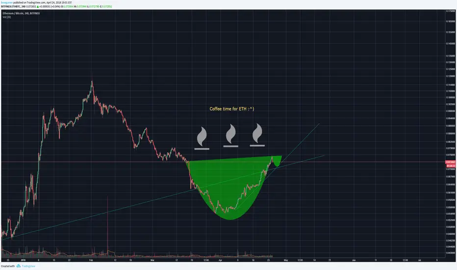
Falling wedge and hidden bullish divergence on ETHBTC?Running this idea to test an observation.
If this is right, an ETHBTC trend reversal is stirring up, might be aligned with bullish rumours on ETH futures and the block reward reduction from 3 to 2 ETH. Target for the falling wedge should be the level at the end of the arrow.
Let's see if it does the thing.

DOW JONES : GOLD ratioPretty self explanatory.
I don't believe in a major (greater than 20%) stock market crash this year, but soon, maybe Q4 2019 / Q1 2020. As you see the dow:gold ratio has broken up above 10 year pivot signalling further moves to the upside.
I guess stocks still bullish for now.

Dow:Bitcoin ratio vs. Dow:Gold ratioMore chart wank from me... sorry.
It's interesting Dow:Gold has been a thing for a while now I read. It makes sense I suppose if you think of gold as the safe haven asset and the Dow as the premiere global money machine. Unfortunately trading view only has gold charts going back to the late 60s, so here is a link to a chart dating back to the late 1800s: undervaluedequity.com
Actually the 6month candle on the Dow:Gold looks like it might close as hanging man (weak I'd say), so that ratio might move sideways as happened in the mid 1990s. The Dow:Bitcoin is weekly. I think it's more difficult to say. Maybe an arch as in 2014/15/16? Maybe are shorter retrace as in 2011/13? Maybe something completely different?
The general trend is interesting. Gold is losing to the DJI but Bitcoin has been crushing it. Hope it continues.

Risk on/Risk off, XLY:XLP ratios, THE Real money flow indicator.Was recently shown this little gem of a ratio chart that will help gauge strength to certain markets such as the stocks and other financial instruments as the S&P, Dow Jones etc
So what does it all mean??
The ratio of two diametrically opposed asset classes often provides insightful clues about what investors are doing.
The XLY:XLP ratio is a perfect example. Its not a hypothetical as it uses real money data based on what investors are DOING and NOT what they maybe thinking or projecting...
XLY represents the Consumer Discretionary Select Sector SPDR ETF.
XLP represents the Consumer Staples Select Sector SPDR ETF.
XLY is the ETF which tracks the consumer
discretionary sector XLY’s top 5 holdings are...
Comcast (CMCSK),
Walt Disney (DIS),
Amazon.com (AMZN),
Home Depot (HD),
McDonald’s (MCD).
XLP tracks the consumer staples sector, with
top holdings of...
Procter & Gamble (PG),
Coca-Cola (KO),
Philip Morris (PM),
Wal-Mart (WMT),
CVS Caremark (CVS).
So how does this affect markets?
When the chart value rises its a clear indicator that people are happy to spend freely and without caution, investors will look to increase risk, where as if the value starts to go down and decline, people are spending more on everyday essential items and thus stock markets are in shrinkage, decline and investors are taking LESS risk.
we can clearly see how this chart reflects current highs on the stock indices if we compare to the current S&P500, Russel, Dow Jones and so on
If this article has helped or you have any further questions, please leave them in the comments below.....

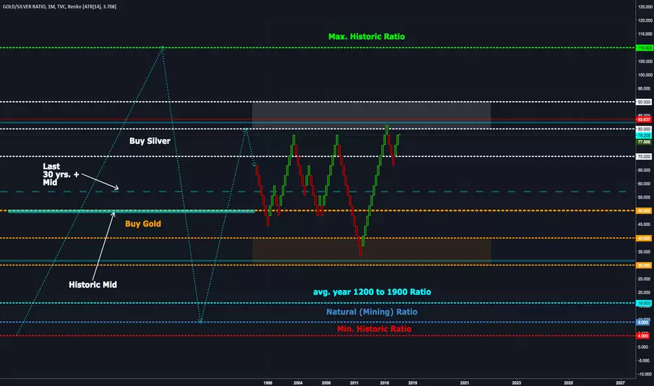
Historic Gold Silver Ratios VisualizationAfter studying $gold and $silver History, decided to graph the Ratios ($GOLDSILVER). and this is the final result for an easy view
HYPERBITCOINIZATION: Shiller 10Yr Price/Earnings Ratio (S&P500)Similar to dividend yield price:earnings (P/E) looks at the profitability of stock shares. A high P/E ratio means that stocks are becoming less profitable which indicates that they are overvalued.
When the market becomes overvalued it is a sign to attentive investors to stop buying and think about closing positions. The more a market heats up, the more the proportion of cautious investors gives way to reckless investors and day trading / speculation. Such a runaway process does not carry on indefinitely. it will correct.
The Shiller P/E is therefore a warning to investors of an impending crash.
Shiller calculates the ratio for a given year over the proceeding 10 year period (adjusted for inflation). This approach helps to dampen short-term, intra-year "noise". It allows us to visualise risk and make direct comparison with market history.
Shiller calculates Price/Earnings as follows:
1) For any given date, take the yearly earnings of the S&P500 -0.24% -0.24% for the previous ten years.
2) Adjust for inflation based on Consumer Price Index
3) Take the average
4) Divide current price of S&P500 -0.24% -0.24% by the average calculated above.
5) Repeat for every year in the chart
Data provided by Quandl.


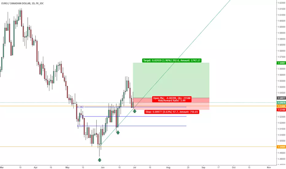
EUR/CAD LONG EUR/CAD has pulled back in an uptrend to a resistance level of 1.5340 which is also a 0.382 fib level
We have seen deceleration in price of this pair at this level and are looking for a leg higher.
See image for 3;1 risk reward ratio.
I will update as we go...
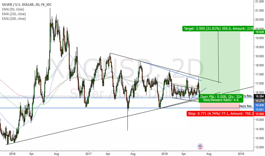
Silver might get a strong support here
Just my opinion on the chart. Silver for a long
May the markets be with us
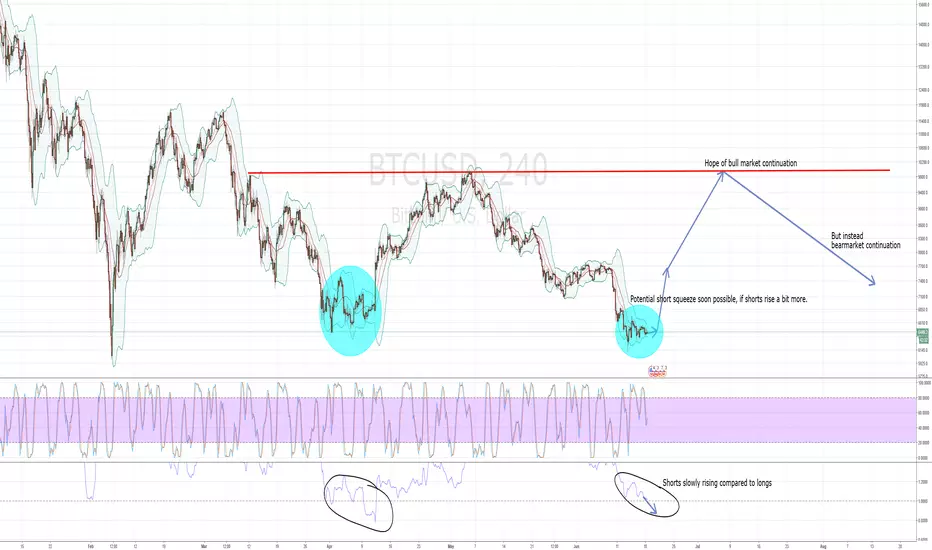
BTC: short squeeze soon possibleHi,
a quick update, since BTC is doint it's boring thing again.
However, interestingly, we have now a similar situation as in early April. The shorts are rising more and more, and will soon be higher than the longs.
In this case, I think we'll see a nice short squeeze, as in April.
I'll keep a close eye on the long/short ratio at Bitfinex. The indicators are otherwise oversold on one week and three days, which coould indeed mean that we'll see short term pumps up to 10k.
And then when everyone is hoping for the bullmarket again, and longs are high again, BTC will probably brutally destroy all hopes and dreams and continue with the bearmarket till 2019, hehe.
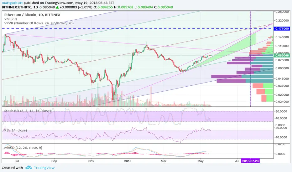
Another ETHBTC testMight have a rising wedge here, maybe also some exponential support on the current trend.
Logscale 1 day chart to track progress.
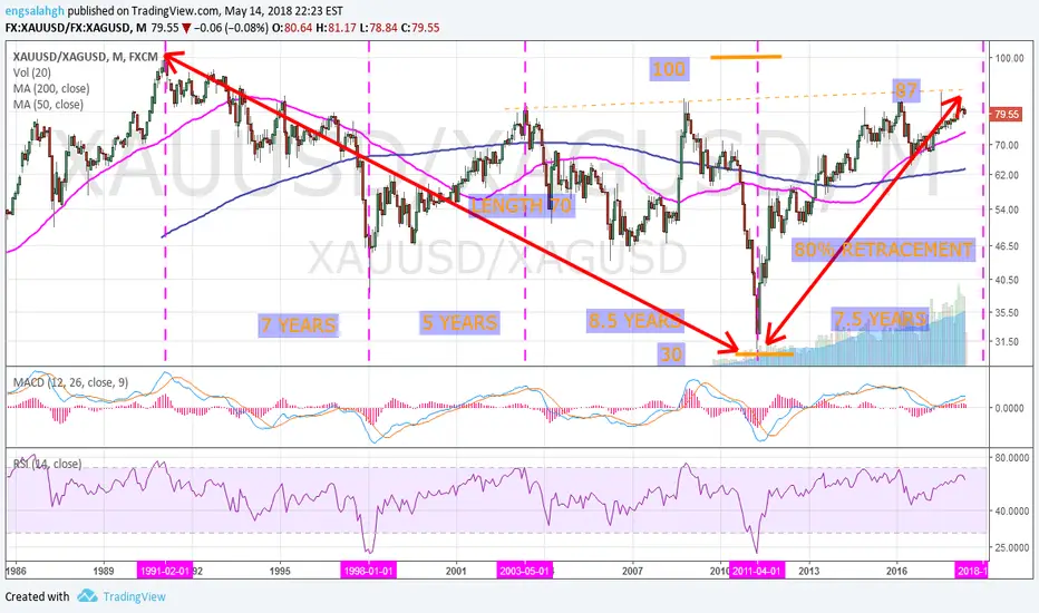
GOLD SILVER RATIO TOWARD 16Gold / Silver ratio went from 100 to 30 in twenty years, a length of 70.
Then, retraced back 80% up to 87 in 7.5 years.
If next leg down to become as length as first leg (of length 70,) we'll reach Gold/Silver ratio 17.