VIX: From “Calm Tension” to a ReboundWhy does a small uptick matter today… if we’ve already seen 60+ readings four times in the past 17 years?
The first week of August 2025 brought back a familiar market force: volatility.
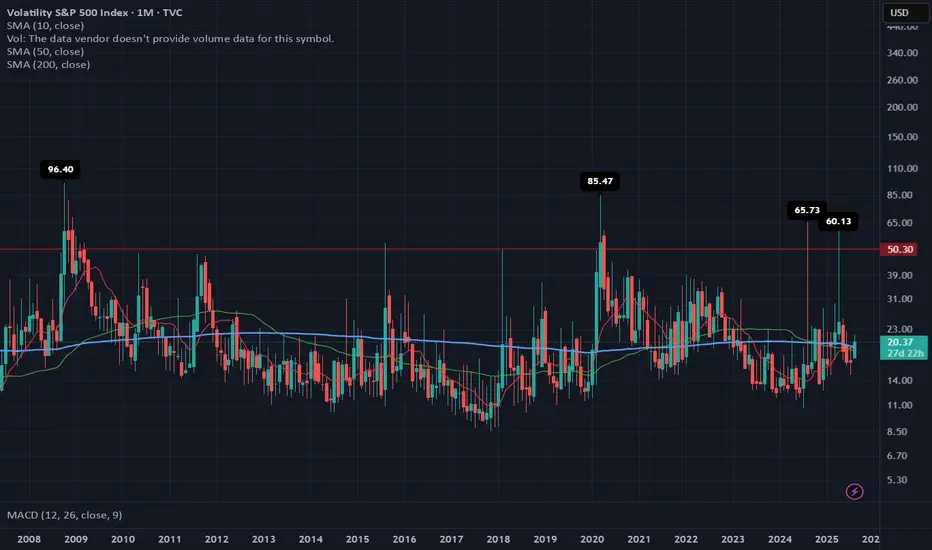
The VIX, which tracks expected fluctuations in the S&P 500, jumped 21% in just a few days, rising from 17.4 to 20.37, with an intraday high of 21.9 on August 1.
At first glance, the move may seem minor. But it broke through key long-term moving averages (SMA 50 and 200) and exited its recent comfort zone (14–19 pts). That alone is enough to make portfolio managers and traders pay attention again.
🔙 Historical context: when the VIX truly spiked
📅 Date 🔺 VIX intraday 🧨 Trigger
Oct 1, 2008 96.40 Subprime mortgage crisis, Lehman collapse, AIG bailout
Mar 2, 2020 85.47 COVID-19 global spread, border shutdowns
Aug 5, 2024 65.73 Surprise Fed rate hike + overheated jobs data
Apr 7, 2025 60.13 Panic over new U.S. tariffs on global partners
Compared to those moments, today's VIX levels look “mild.” But the technical and macroeconomic signals suggest that volatility may be establishing a new baseline.
1. 📊 Breakdown: First week of August 2025
Weekly increase: from 17.4 → 20.37 (+21%).
Technical breakout: monthly close above both the 50-day and 200-day simple moving averages (SMA 19.25 and 19.45).
MACD on the monthly chart has flipped positive for the first time since March 2023.
Key drivers:
🏛️ The Fed left interest rates unchanged on July 30, but two dissenting votes favored a rate cut.
👷♂️ Softening jobs data: July NFP came in at only +73,000 jobs (vs. +110,000 expected).
🧾 New U.S. tariffs, announced on August 1, reignited inflation concerns.
2. ⚖️ Comparing August 2025 to the August 2024 storm
Factor August 2024 August 2025 (Week 1)
🔺 VIX peak 65.73 21.9
🏛️ Fed stance Surprise 25 bp rate hike Rates unchanged, internal division
👷 Labor market Hot, wage pressures Cooling down
📉 S&P 500 reaction −12% in 3 weeks Approx. −3% decline underway
💧 Market liquidity Very low (pre-market) Normal
Conclusion:
2024 was a systemic shock.
2025 is more of a volatility warning sign—but one that matters for risk management.
3. 📍 Technical signals to monitor
The monthly MACD just turned positive, which historically precedes sustained volatility spikes.
Key short-term range: 18–22 pts. A sustained close above 22 could trigger heavy selling in high-beta stocks.
Options expiration (OPEX, Aug 16) may amplify moves via gamma flows.
4. 🔮 What could move the VIX next?
📅 Date 📌 Event ⚠️ Volatility Risk
Aug 14 Core CPI (July) Reading above 0.3% m/m could reignite hawkish Fed bets
Aug 22–23 Jackson Hole Symposium Powell’s speech could reset the policy outlook
End of Aug Q2 GDP revision Confirm whether slowdown = soft landing or stagflation
📌 Note: The VIX cannot be traded directly. Exposure is typically obtained through futures, options, or ETNs—each with specific risks like contango, low liquidity, and roll decay.
📌 Final thoughts
The VIX doesn’t need to hit 60 to send a message.
The fact that it’s breaking above long-term averages, reacting sharply to macro data, and threatening key levels is enough to suggest that the era of ultra-low volatility may be ending.
History shows us that major VIX spikes come fast and unannounced.
If you remember 2008, 2020, or even April 2025—you know that preparation beats prediction.
Volatilityindicator
$BTC Daily OutlookDaily Chart
Today’s close printed a small bearish doji; visually bearish but still another inside-day that keeps BTC boxed between the High-Volume Node / v-Level cluster at $116 860-$123 300.
Holding $116 860 remains critical; lose it on a daily close and price can easily slide to the weekly breakout shelf near $111 960. We are now 16 days inside this balance. Per Auction-Market-Theory rule #5, the longer price churns at the edge, the more resting liquidity is absorbed, eventually a decisive push will follow. If buyers defend $116 860 again, the path opens toward range high $123 300 and the prior ATH; if they fail, expect a fast flush to the weekly V-Level.
Footprint Read
Value Area High and Low span the full candle, with the POC parked mid-range, classic two-sided trade. Delta finished negative and the heaviest prints sit at session lows: sellers hit the bid hard, yet could not follow through. That absorption leaves shorts vulnerable to a squeeze if new selling momentum doesn’t appear quickly.
Fundamental Pulse – Week Ahead
ETF Flows: Spot-Bitcoin ETFs booked three consecutive inflow days to close last week (+$180 M net). Sustained demand under the range supports the bullish case.
Macro Data: U.S. FOMC & Federal Fund Rates prints for this week; expect more volatility starting from tomorrow.
Game Plan
Primary bias stays long while daily candles close above $116 860; upside trigger is a clean for now or shorts squeeze toward $123 300.
If $116 860 breaks with volume, prepare for a quick liquidity hunt into the weekly shelf at $111 960, where we reassess for swing longs.
Intraday: I’ll monitor the Intraday Chart on tomorrow's High impact events and look for best opportunities across the board. Alt window: a fresh downtick in BTC Dominance could spark rotation; watch high-Open Interest majors if BTC ranges.

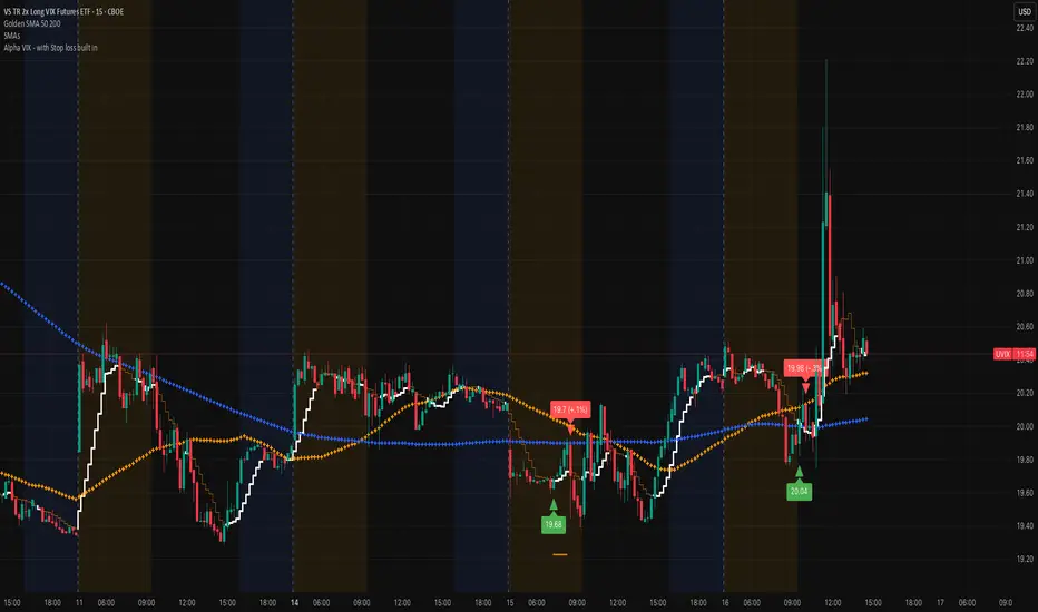
UVIX marching on (VIX proxy)Very nice spike this morning, that's typically a sign that there's more volatility in the works. Remember that we are at record lows on the VIX and that doesn't stay in this region for a long time. Add the Alpha VIX indicator to help you get an entry. The economy is brittle and staying focused on the VIX is a very nice play!
Best of luck and DM if you have any questions.....
Best Free Volatility Indicator on TradingView for Gold Forex
This free technical indicator will help you easily measure the market volatility on Forex, Gold or any other market.
It will show you when the market is quiet , when it's active and when it's dangerous .
We will go through the settings of this indicator, and you will learn how to set it up on TradingView.
Historical Volatility Indicator
This technical indicator is called Historical Volatility.
It is absolutely free and available on TradingView, MetaTrader 4/5 and other popular trading terminals.
TradingView Setup
Let me show you how to find it on TradingView and add it to your price chart.
Open a technical price chart on TradingView and open the "Indicators" menu (you will find it at the top of the screen).
Search "Historical Volatility" and click on it.
It will automatically appear on your chart.
"Length" parameter will define how many candles the indicator will take for measuring the average volatility. (I recommend keeping the default number, but if you need longer/shorter-term volatility, you can play with that)
Timeframe drop-down list defines what time frame the indicator takes for measuring the volatility. (I recommend choosing a daily timeframe)
And keep the checkboxes unchanged .
How to Use the Indicator
Now, let me show you how to use it properly.
Wider the indicator and analyse its movement at least for the last 4 months.
Find the volatility range - its low levels will be based on the lower boundary of the range, high levels will be based on its upper boundary.
This is an example of such a range on USDCAD pair.
When the volatility stays within the range, it is your safe time to trade.
When volatility approaches its lows, it may indicate that the market might be slow .
Highs of the range imply that the market is very active
In-between will mean a healthy market.
The Extremes
The violation of a volatility range to the downside is the signal that the market is very slow . This would be the recommended period to not trade because of high chance of occurrence of fakeouts.
An upward breakout of a voliatlity range is the signal of the extreme volatility . It will signify that the market is unstable , and it will be better to let it calm down before placing any trade.
Volatility Analysis
That is how a complete volatility analysis should look.
At the moment, volatility reached extreme levels on CADJPY pair.
The best strategy will be to wait till it returns within the range.
Remember This
With the current geopolitical uncertainty and trade wars, market volatility reaches the extreme levels.
Such a volatility is very dangerous , especially for newbie traders.
Historical volatility technical indicator will help you to easily spot the best period for trading and the moment when it is better to stay away.
❤️Please, support my work with like, thank you!❤️
I am part of Trade Nation's Influencer program and receive a monthly fee for using their TradingView charts in my analysis.

HIGH Volatility Alert! Everything You Need to Know
Have you ever wondered why the certain trading instruments are very rapid while some our extremely slow and boring?
In this educational article, we will discuss the market volatility , how is it measured and how can it be applied for making smart trading and investing decisions.
📚 First, let's start with the definition. Market volatility is a degree of a fluctuation of the price of a financial instrument over a certain period of time.
High volatility reflects quick and significant rises and falls on the market, while low volatility implies that the price moves slowly and steadily.
High volatility makes it harder for the traders and investors to predict the future direction of the market, but also may bring substantial gains.
On the other hand, a low volatility market is much easier to predict, but the potential returns are more modest.
The chart on the left is the perfect example of a volatile market.
While the chart on the right is a low volatility market.
📰 The main causes of volatility are economic and geopolitical events.
Political and economic instability, wars and natural disasters can affect the behavior of the market participants, causing the chaotic, irrational market movements.
On the other hand, the absence of the news and the relative stability are the main sources of a low volatility.
Here is the example, how the Covid pandemic affected GBPUSD pair.
The market was falling in a very rapid face in untypical manner, being driven by the panic and fear.
But how the newbie trader can measure the volatility of the market?
The main stream way is to apply ATR indicator , but, working with hundreds of struggling traders from different parts of the globe, I realized that for them such a method is complicated.
📏 The simplest way to assess the volatility of the market is to analyze the price action and candlesticks.
The main element of the volatile market is occasional appearance of large candlestick bars - the ones that have at least 4 times bigger range than the average candles.
Sudden price moves up and down are one more indicator of high volatility. They signify important shifts in the supply and demand of a particular asset.
Take a look at a price action and candlesticks on Bitcoin.
The market moves in zigzags, forming high momentum bullish and bearish candles. These are the indicators of high volatility.
🛑 For traders who just started their trading journey, high volatility is the red flag.
Acting rapidly, such instruments require constant monitoring and attention. Moreover, such markets require a high level of experience in stop loss placement because one single high momentum candle can easily hit the stop loss and then return to entry level.
Alternatively, trading a low volatility market can be extremely boring because most of the time it barely moves.
The best solution is to look for the market where the volatility is average , where the market moves but on a reasonable scale.
Volatility assessment plays a critical role in your success in trading. Know in advance, the degree of a volatility that you can tolerate and the one that you should avoid.
❤️Please, support my work with like, thank you!❤️
I am part of Trade Nation's Influencer program and receive a monthly fee for using their TradingView charts in my analysis.

How to Build a Forex Trading Indicator How to Build a Forex Trading Indicator
In the dynamic world of financial trading, understanding how to build a trading indicator is a valuable skill. This article is designed to navigate you through the essential steps of creating your own trading indicators, offering a blend of technical and practical insights to potentially enhance your market analysis and trading decisions.
Understanding Trading Indicators
Trading indicators are essential tools in analysing financial markets, offering traders valuable insights into market trends and potential trading opportunities. These mathematical calculations are applied to various market data points like price, volume, and sometimes open interest. In forex trading, indicators play a crucial role in analysing currency pair movements.
There are several types of indicators, each serving a specific purpose:
- Trend indicators help identify the direction of market movements.
- Momentum indicators gauge the speed of these movements.
- Volume indicators look at trading volumes to understand market strength.
- Volatility indicators provide insight into the stability or instability of currency prices.
While there are hundreds of indicators to choose from, some traders choose to develop their own based on their unique market observations.
Basic Components of a Trading Indicator
The core components of a trading indicator are price, volume, and time. These elements are fundamental in analysing market data and building various tools.
- Price: The most critical component, price, is used in almost every trading indicator. It includes open, high, low, and close prices of trading instruments. Price data is essential for constructing trend-following tools like moving averages and oscillators like the Stochastic RSI.
- Volume: Volume indicates the number of contracts traded in a given period. It provides insights into the strength or weakness of a market move. Volume-based tools, like the Volume Oscillator or On-Balance Volume (OBV), help traders understand the intensity behind price movements.
- Time: Indicators use time periods to analyse market trends. This could be short-term (minutes, hours), medium-term (days, weeks), or long-term (months, years). Time frames influence the sensitivity of an indicator, with shorter periods typically offering more signals.
Choosing the Right Data and Tools
Selecting appropriate data and tools is a critical step in building effective trading indicators. For data, accuracy and relevance are paramount. Traders typically use historical price data alongside volume data.
For tools, traders consider user-friendly platforms that offer robust functionality for creating and testing tools. Platforms like TradingView and MetaTrader offer extensive libraries and community support, facilitating the development of customised indicators.
Additionally, programming languages like Python, C# and R, known for their data analysis capabilities, can be powerful tools for creating more complex indicators. FXOpen’s TickTrader, for instance, supports custom C#-based indicators and offers powerful backtesting tools.
How to Build a Trading Indicator: A Step-by-Step Walkthrough
Developing an indicator involves several key steps, each crucial to ensure the final tool is effective and aligns with your trading strategy.
1. Define the Objective
Begin by clearly defining what you want your tool to achieve. Is it to identify trends, pinpoint entry and exit points, or gauge market volatility? Your objective will guide the type of indicator you develop, such as trend-following, momentum, or volatility-based.
2. Select the Formula
Choose or develop a mathematical formula that your tool will use. This could be a simple moving average, a complex algorithm involving multiple data points, or something entirely unique. The formula should reflect the market phenomena you aim to capture.
3. Coding the Indicator
Translate your formula into code. If using platforms like TradingView, MetaTrader or TickTrader, their scripting languages (Pine Script for TradingView, MQL4/5 for MetaTrader, C# for TickTrader) are designed for this purpose. Ensure the code is clean, well-documented, and easily adjustable.
4. Incorporate Visualisation
Decide how the indicator will visually appear on the chart or in a separate window. This could be in the form of lines, bars, dots, or other graphical representations. The visual aspect should make it easy to interpret signals at a glance.
5. Backtesting
Before applying your indicator in live trading, it’s crucial to backtest it using historical data. This topic is expanded on below.
Testing and Refining Your Indicator
Testing and refining your trading indicator is a critical phase in its development, ensuring its potential effectiveness and reliability in real market conditions.
- Backtesting: This is the process of testing your indicator against historical data. Backtesting helps evaluate how it would’ve performed in different market scenarios, revealing its strengths and weaknesses. It's essential to test over various time frames and market conditions to ensure robustness.
- Analysing Results: Assess the indicator's accuracy, consistency, and responsiveness to market changes. Look for patterns in its performance, such as frequent false signals or lag in response to price movements.
- Refinement: Based on the backtesting results, refine your indicator. This could involve tweaking the formula, adjusting parameters like time periods or thresholds, or enhancing the visualisation for clearer signals.
- Forward Testing: After adjustments, conduct forward testing in a simulated or live trading environment with real-time data. This helps verify its performance in current market conditions.
Remember, no indicator is perfect; the goal is to develop a tool that consistently aids in your trading outcomes.
The Bottom Line
The journey of building an indicator is both challenging and rewarding. From selecting the right data and tools to carefully coding and testing your creation, each step plays a vital role in crafting an effective aid for trading decisions. For those looking to integrate their custom indicators into a professional trading environment, opening an FXOpen account offers the opportunity to leverage your unique tools in the dynamic TickTrader platform.
This article represents the opinion of the Companies operating under the FXOpen brand only. It is not to be construed as an offer, solicitation, or recommendation with respect to products and services provided by the Companies operating under the FXOpen brand, nor is it to be considered financial advice.

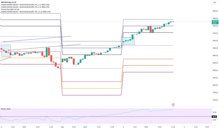
Bouhmidi-Bands and Overnight Session - Name of the Game The overnight range was the name of the game today. As mentioned earlier, we were looking for a potential break in either direction. After establishing the initial balance, we saw a test of the overnight session low (5019), which was successfully defended. Subsequently, buyers entered the market, leading to a push higher in $ES. This move broke the high of the overnight session (5036), confirming bullish momentum and surpassing the previous day high (5058) & upper #BouhmidiBand, reaching a peak at 1.3s BB (5074). In the last 1.5 hours, NYSE:ES retraced back within the Bouhmidi-Bands.
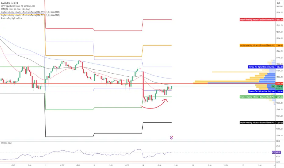
DAX - Bouhmidi-Reversal next targets After a nervous start and breaking through the previous day's low (17716) and the lower Bouhmidi bands (17678), a relaxation in the form of a reversal towards the range of the previous day is emerging around noon. This is initially a positive sign! The next intraday targets are:
If defending the previous day's low: 17761/17863/17996
If falling below the previous day's low: 17678/17598/17519..
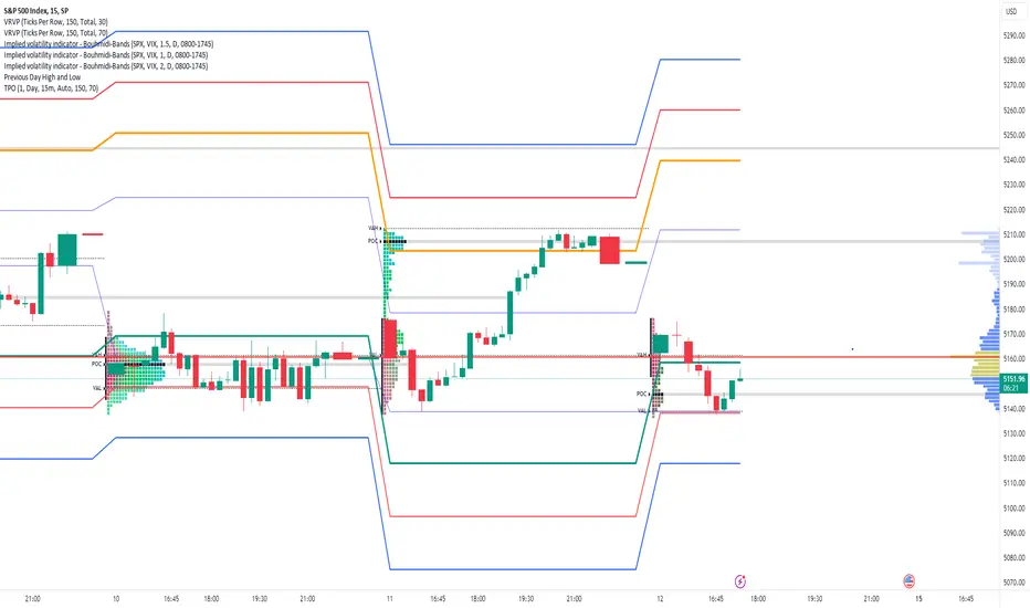
S&P 500: Bouhmidi-Reversal now with TPOAfter the initial balance, we see that the index continues its weakness and has broken through the 1 Bouhmidi-Bands and the point of control (POC) of Wednesday . Today, the previous day's low and the 1.5 Bouhmidi-Band converge at 5138. A test of 5138 is possible with even a reversal towards the BB range. I also now include TPO charts
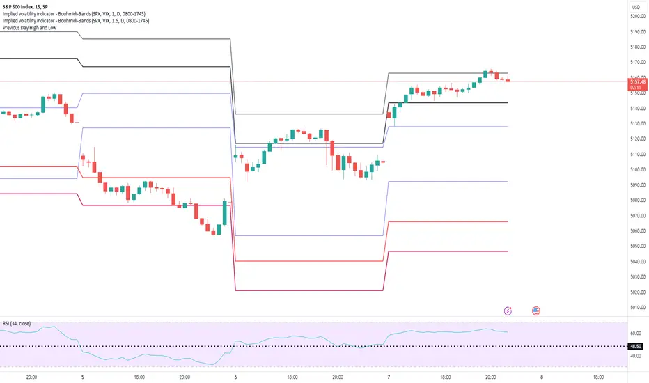
S&P 500 - Recovery at Bouhmidi-BandsS&P 500 fell below the important level of 5200 and below the lower BB as well as the previous day's low after higher inflation data then expected. Now right after initial balance, we see a reversal towards the bandwidth. If the level is not reclaimed, the downward trend could continue today. The next targets would then be at BB (5148/5128).

VTYX- Buy the Pullback after a massive Bullish Surge LONGVTYX is an illustrative case in the trend is your friend. VTTX warmed up on Frbruary 20th and
went parabolic on the next day and then faded while the moving averages and VWAP lines
caught up. This is a buyable dip. It has now printed a couple of engulfing bullish candles. VTYX
did less than a full 0.5 retracement as a sign of strength. I will take a long trade here targeting
16% upside to the top pivot of the recent price action. If the price can reach the target I will
take half screening for higher-than-normal volatility. At present the volatility has mildly popped
over the running mean telling me the continuation is on the ready. The plus here is earnings
will report on March 24th so there is one month for traders to run the price up on this
stock in that anticipation. Options are avaiable for call contracts expiring March 15th.

SPX: Bouhmidi-ReversalSPX starts with a gap-up and initially fails at the upper #BouhmidiBands. After the initial balance we have seen a breakout above upper Bouhmidi-Bands and now reverting back to bandwidth.
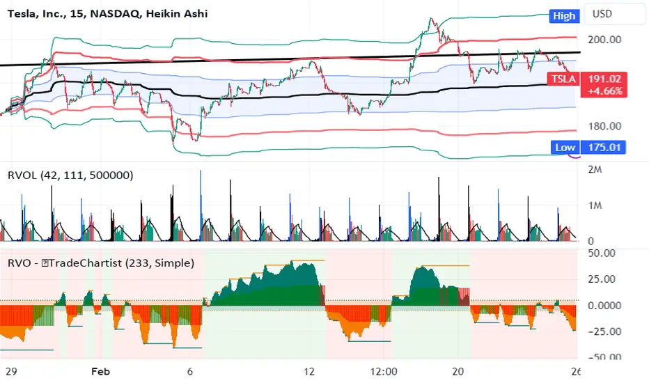
TSLA moves yield volatility and trader profit LONGTSLA is shown here on a 15 minute chart with a set of anchored VWAP bands. A relative volume
indicator shows spiking volumes each and every morning and fades as the trading session wears
on. Overall, TSLA trends between the upper and higher VWAP bands and their counterparts
below the mean VWAP. Like most other stocks, TSLA has periods of ranging and other periods
where it trends. Day traders can capture intraday volatility while swing traders can sometimes
get a 10% move over 2-3 days. In the past month TSLA moved 5% up overall. However, in that
move price fluctuated widely which has been exploited by traders. The high trading volumes
keep spreads very low while the volatility makes options trading very challenging. Que sera,
sera.
Beating the S&P500 (SPX) Buy&Hold strategy by 16 timesS&P500 (SPX) strategy using Stochastic RSI Min-Max, normalized Volatility and Trailing Stop signals, beats the Buy&Hold strategy by 16 times
Embarking on the quest to time the market accurately, the 'Holy Grail' of strategies, led me to create a script to approach this goal. Unlike other strategies that I tested, this one not only surpasses the long-term S&P500 Buy&Hold approach but does so by a remarkable 16.38 times!
Initially, I employed an A.I. program based on an LSTM Neural Network using TensorFlow. Despite achieving a 55% next-day prediction accuracy for short/long positions, I sought improvement using a heuristic pine-scripting approach, incorporating stochastic RSI oscillators, moving averages, and volatility signals.
With default parameters, this strategy, freely available as "XPloRR S&P500 Stock Market Crash Detection Strategy v2" delivered a staggering 2,663,001% profit since February 1871. In the same period, the Buy&Hold strategy "only" generated 162,599% profit. Picture this: a $1,000 investment in 1871 would now be worth $26,630,014 by February 2024. Check it out for yourself loading this strategy.
The script operates as a Stochastic RSI Min-Max script, automatically generating buy and sell alerts on the S&P500 SPX. What sets it apart? The strategy detects "corrections," minimizes losses using Trailing Stop and Moving Average parameters, and strategically re-enters the market after detecting bottoms using tuned Stochastic RSI signals and normalized Volatility thresholds.
Tailor its parameters to your preference, use it for strategic exits and entries, or stick to the Buy&Hold strategy and start new buy trades at regular intervals using buy signals only. In the pursuit of minimizing losses, the script has learned the effectiveness of a 9% trailing stop on trades. As you can clearly see on the upper graph (revolving around 100), the average overall green surfaces (profits) of all trades are much bigger than the average red surfaces (losses). This follows Warren Buffets first rule of trading to "Never lose money" and thus minimizing losses.
Update: Advanced S&P500 Stochastic RSI Min-Max Buy/Sell Alert Generator
I have also created an Alerter script based on the same engine as this script, which auto-generates buy and sell alert signals (via e-mail, in-app push-notifications, pop-ups etc.).
The script is currently fine-tuned for the S&P500 SPX tracker, but parameters can be fine-tuned upon request for other trackers or stocks.
If you are interested in this alerter-version script or fine-tuning other trackers, please drop me a message or mail xplorr at live dot com.
How to use this Strategy?
Select the SPX (S&P500) graph and set the value to "Day" values (top) and set "Auto Fit Data To Screen" (bottom-right).
Select in the Indicators the "XPloRR S&P500 Stock Market Crash Detection Strategy v2" script and set "Auto Fit Data To Screen" (bottom-right)
Look in the strategy tester overview to optimize the values "Percent Profitable" and "Net Profit" (using the strategy settings icon, you can increase/decrease the parameters).
How to interpret the graphical information?
In the SPX graph, you will see the Buy(Blue) and Sell(Purple) labels created by the strategy.
The green/red graph below shows the accumulated profit/loss in % of to the initial buy value of the trade (it revolves around 100%, 110 means 10% profit, 95 means 5% loss)
The small purple blocks indicate out-of-trade periods
The green graph below the zero line is the stochastic RSI buy signal. You can set a threshold (green horizontal line). The vertical green lines show minima below that threshold and indicate possible buy signals.
The blue graph above the zero line is the normalized volatility signal. You can set a threshold (blue horizontal line) affecting buy signals.
The red graph above the zero line is the slower stochastic RSI sell signal. You can set a threshold (red horizontal line). The red areas indicate values above that threshold.
However real exits are triggered if close values are crossing below the trailing stop value or optionally when the fast moving average crosses under the slow one. The red areas above the threshold are rather indicative to show that the SPX is expensive and not ideal to enter. Please note that in bullish periods the red line and areas can stay at a permanent high value, so it is not ideal to use as a strict sell signal. However, when it drops below zero and the green vertical lines appear, these are strong buy signals together with a high volatility.
These Parameters can be changed
Buy Stochastic Lookback
Buy Stochastic Smoother
Buy Threshold
Buy Only After Fall
Minimum % Fall
Sell Stochastic Lookback
Sell Stochastic Smoother
Sell Threshold
Sell Only With Profit
Minimum % Profit
Use Sell MA
Fast MA Sell
Slow MA Sell
MA Sell Threshold
Use Buy Volatility
Volatility Smoother
Volatility Threshold
Use Trailing Stop
Use ATR (iso of a fixed percentage for the trailing stop)
ATR Lookback
Trailing Stop Factor(or fixed percentage if "use ATR" is false)
Trailing Stop Smoother
Important : optimizing and using these parameters is no guarantee for future winning trades!

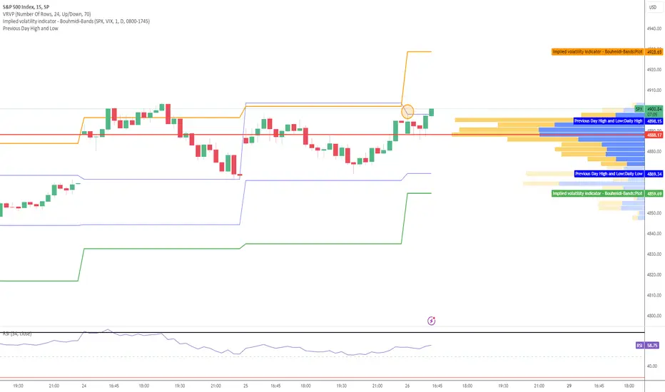
S&P 500: Bouhmidi-Bands show new ATHsstarted around previous day high and is still trending sideways an hour after opening. A break above could continue the uptrend heading to new ATHs. Next target ist then upper #BouhmidiBands at 5028.

DAX - Gap close intraday XETR:DAX - The gap-up at the beginning was immediately closed again. Yesterday's previous day's range was almost completely filled. A fall below the previous day's low at 16859 could accelerate the downtrend intraday and target the lower #BouhmidiBand at 16784 next.

SPX starts sideways within previous day range and Bouhmidi-BandsS&P 500 starts sideways into initial balance. Levels I keep an eye on for today:
Previous Day High: 4975,29
Previous Day Low: 4907,99
Upper BB (1): 4994
Lower BB (1): 4922
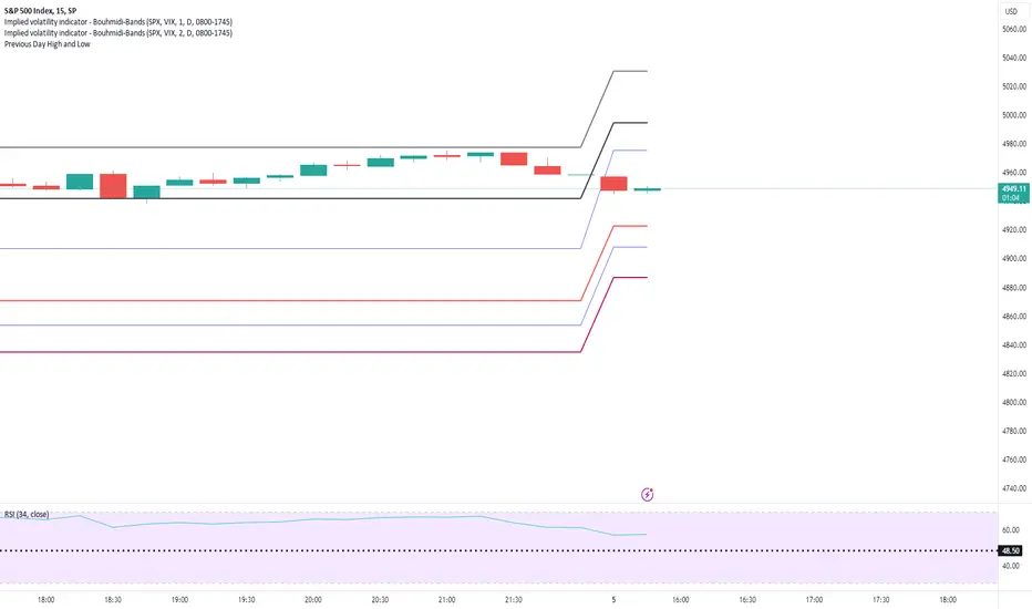
S&P 500 new all time highsS&P 500 one hour to go. New all-time-high in the pocket but as mentioned agressive bulls out there today. Trend was confirmed through couple of indications:
-starting above previous day high
-Break of upper Bouhmidi-Bands (1 & 1.5)
Currently we are close to 2nd upper BB - Here is where the party ends today.
SPX starts sideways below Bouhmidi-Band One hour after opening we trade sideways above previous day high 4906 which acts as intraday support and below upper #BouhmidiBands at 4941 which acts resistance for now
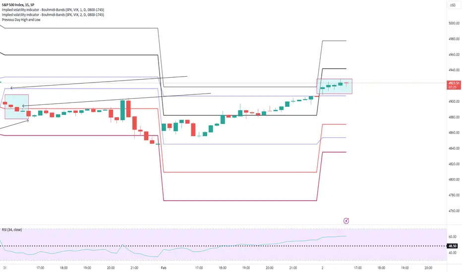
SPX - A day in a life of a short trader Even if we had the FED meeting today - It was a clear and visible that selling pressure will lead the way. SPX started with a gap down and showed no attempt to close the gap at open or within first hour (initial balance). Right after intial balance we broke wit lower Bouhmidi-Band indicating more selling pressure to come. After two attempts to regain the first lower BB we saw in the last 30 minutes of trading more sell orders coming in and confirmation for trend continuation. At the end we close below of 2 sigma Bouhmidi-Band. SPX lost 1,6% at the end.
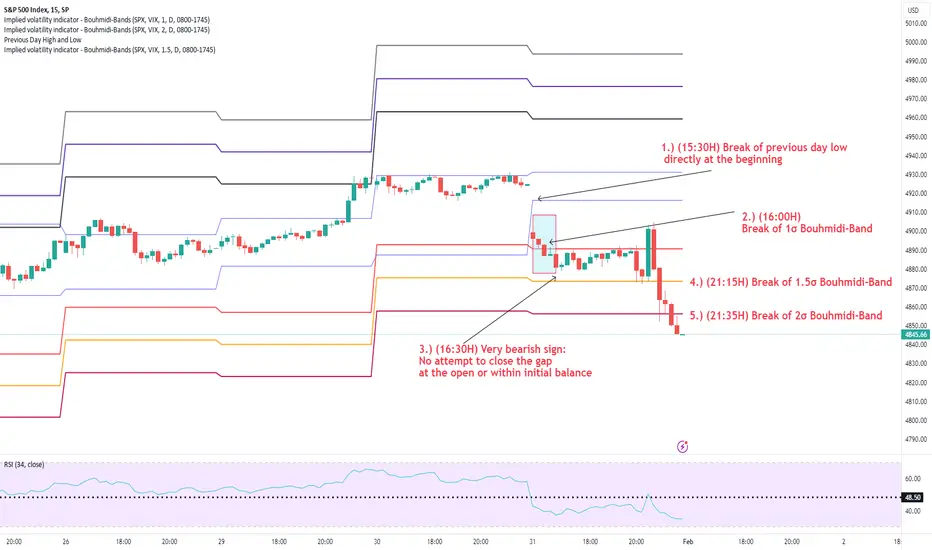
SPX - Test of previous days high Adding the previous day's high and low (blue line) to the intraday #BouhmidiBands can provide further clues. At the beginning of the session we tested the previous day's high and did not overcome it. We wait for the initial balance until 16.30H.
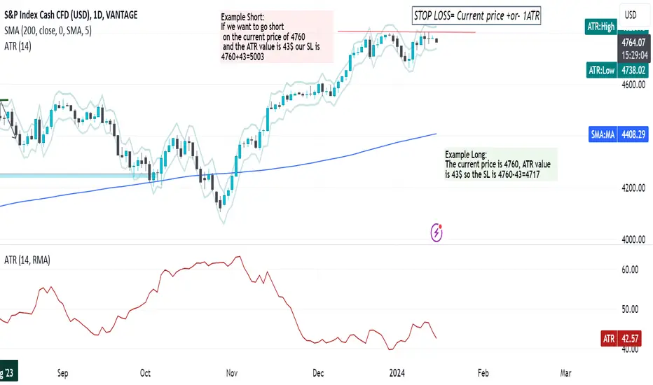
Mastering Stop-Loss with ATR IndicatorMastering Stop-Loss and Take-Profit with ATR Indicator
What is the ATR Indicator?
The Average True Range (ATR) indicator is a nifty tool that helps traders gauge the market's volatility. Simply, it tells you how much an asset typically moves in a given timeframe.
Placing Stop Loss to Avoid Getting Stopped Out
Step 1: Identify ATR Value
Look at the ATR indicator on your chart; it's usually at the bottom or top of your screen.
Note the ATR value; the higher it is, the more volatile the market.
Step 2: Setting Stop Loss
Set your stop loss beyond the ATR value to avoid getting prematurely stopped due to regular market fluctuations.
For instance, if the ATR is 50, consider placing your stop loss at least 60 points away to give your trade room to breathe.
Understand ATR's Role
ATR not only helps with stopping losses but also guides in setting realistic take-profit levels.
It gives you an idea of how much the asset can move in a given time, assisting you in capturing profits before a potential reversal.
Final Tips for Beginners
Adapt to Market Changes: ATR values change as market conditions shift. Stay adaptable and reassess your stop-loss and take-profit levels accordingly.
Practice on Demo Accounts: Before diving into live trading, practice using the ATR indicator on demo accounts. Gain confidence and refine your strategy without risking real money.
In essence, the ATR indicator is your ally in navigating market volatility. By using it wisely, you can enhance your risk management, safeguarding your trades from unnecessary stop-outs while optimizing your profit potential. Happy trading! 📈✨