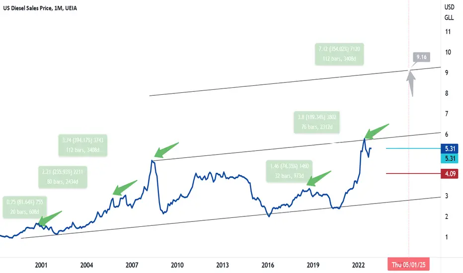
Diesel prices Retail Diesel – Monthly: Currently resting at monthly support of 5.31. (Ichimoku indicator not shown) Daily and weekly swings above and below the blue Tenkan line should be expected. A monthly close below could open the door to the red Kijun line at 4.09. This would be very strong support on a monthly scale.
There was a 5 leg event from the 02’ low to the 08’ high. Leg 1 climbed 80% in under 2 years. The 3rd leg high climbed 230% higher in over 6.5 years. The 5th leg high climbed 390% off the 02 lows in just over 9 years.
The 16’ low to the 18’ high (Leg 1) climbed 75% in under 3 years. The current (3rd leg) high climbed 190% off the 16’ lows in under 6.5 years. If Diesel can break the trendline above $6.00, historically speaking $9.00+ diesel is not out of the equation…
Price risk on higher diesel is warranted. What broke the last strong run higher was the great 08’ recession…
Economy
⚡️ INFLATION IN THE US WILL GO TO THE SKY 🚀🚀🚀📣 Hello!
I believe that inflation in the US will not go anywhere and the 2% target that the Fed has set for itself will not be achievable anymore. Here is a 100-year triangle on the CPI chart and I believe that already in this decade, that is, until 2030, it will be broken up and the Fed will have very big problems. After the triangle breaks up, inflation will soon exceed the peak of the 80th year and soar to 18-20%, then after the correction we will see a new ATH, it will be just inevitable. We can hope, of course, that everything will be fine – no one forbids this to you or me. But we have to be ready for the worst times right now, that's my opinion.
⚠️ Please analyze the information received from me and always think first of all with your own head. I wish you good luck in making your own trading decisions and profit ✊ Bye!

$JPIRYY -CPI (YoY)ECONOMICS:JPIRYY Japan Inflation Rate Lowest in A Year
The annual inflation rate in Japan fell to 3.0% in September 2023 from 3.2% in August, pointing to the lowest reading since September 2022.
Meantime, core inflation rate dropped to a 13-month low of 2.8%,
slightly above market consensus of 2.7% while staying outside the Bank of Japan's 2% target for the 18th month.
Core inflation rate dropped to a 13-month low of 2.8%, slightly above consensus of 2.7% while staying outside the Bank of Japan's 2% target for the 18th month. On a monthly basis, consumer prices rose 0.3% in September, after a 0.2% gain in August. source: Ministry of Internal Affairs & Communications
source:
Ministry of Internal Affairs & Communications
Macro Monday 34 ~ S&P PMI Composite FlashMacro Monday 34
S&P PMI Composite Flash
This S&P PMI “Flash” Composite is a very useful and relatively new data set made available since Nov 2013 that is particularly useful at providing an advance indication of the ISM Purchasing Managers Index (ISM PMI Index) which is released a week later.
We are aware from prior Macro Mondays that the ISM PMI index is based on data collected through surveys of over 800 companies in the U.S. and covers variables such as sales, new orders, employment, inventories and prices, all of which give us an indication of trends in the economy.
S&P Flash Composite Main Benefits
1. The term "Flash" in the name refers to the fact that it is a preliminary or early quick estimate of the ISM Purchasing Managers' Index (PMI) which is released later in the month. For example this month the S&P Flash Composite is released this week on Thursday 22nd Feb whilst the final ISM PMI reading is released Friday 1st March (both readings are for the month of Feb).
2. The S&P PMI Composite Flash is a “composite” insofar as it combines both the manufacturing and services sectors PMI’s into a single index. This provides a more comprehensive overview of economic activity compared to looking at either sector in isolation (however you can also view the flash PMI for Services and Manufacturing separately, these are released on the same day).
So the S&P PMI Composite Flash consists of two main components:
1. Manufacturing PMI: Measures economic activity in manufacturing.
2. Services PMI: Measures economic activity in the services sector.
Both components are based on surveys of purchasing managers and provide insights into factors like new orders, production, and employment. The Composite PMI combines these components to offer an overall picture of economic health, with readings above 50 indicating expansion and below 50 indicating contraction.
How do we get an advance “FLASH” PMI reading and how reliable is it?
The main difference between the data used in the S&P PMI Composite Flash and the final PMI figures lies in the sample size(smaller) and timing (earlier release with most recent data exclusion).
According to Investopedia and a report from S&P Global Flash (Jan 2023), the Flash Composite PMI release is based on about 85% of total PMI survey responses each month. Clearly, a significant portion of survey responses are included in the Flash PMI which would lead you to believe that its reliable early indicator but how reliable has it been historically?
In the aforementioned S&P Global Report it also provided the historical average difference between the flash and final PMI index values (final minus flash) since comparisons were first available, which are;
Composite Difference = 0.1
Manufacturing Difference = 0.0
Services Difference = 0.2
We can see that the Manufacturing Flash PMI release readings are the most reliable and that the Services Flash PMI is less reliable. Whilst both are not far off the mark, it’s a notable difference for services considering that services represents over 80% of Gross Domestic Product (GDP), thus small differences in services hold more weight. Regardless, we can be relatively satisfied that the S&P PMI Composite Flash Index is a very good and reliable early indicator of the Final ISM PMI. I will certainly be looking at this metric going forward so that I can have a great early indication of the ISM PMI.
When you review the chart of the Flash PMI with the Final PMI, you'll see that the difference appears greater than the marginal difference discussed above. This highlights, how on a chart, the difference a week or a weeks worth of data can make to how a chart appears (with the absent or included 15% of data). You will also notice that the Flash PMI is more volatile with higher and lower swings. It reminds me a little of the CPI headline vs CPI core chart in this respect, as both ultimately move in the same direction but one oscillates less than the other.
I hope the next Flash PMI released this Thursday 22nd Feb will help arm you with what is very reliable early indication of the ISM PMI (released a week later on the 1st March).
Thanks for coming along
PUKA

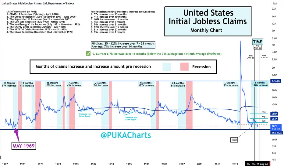
U.S. Initial Jobless Claims (Updated Chart with todays release)U.S Initial Jobless Claims
Rep: 187k ✅ Lower Than Expected ✅
Exp: 207k
Prev: 203k (revised up from 202k)
A positive release today with initial claims coming in much lower than expected.
Chart Trend
We are very close to taking out the lows from Oct 2022 at 180k claims on the chart. Importantly these charts do not update with revised figures and factoring in revised data the low was 167k in April 2022 (a little earlier and a little lower).
In any event these sorts of lows in Initial Claims have not been seen since May 1969.
Recession Watch
The chart below has min, avg and max levels on the bottom left to illustrate the levels we would need to hit for increased recession risk. Right now this chart has not demonstrated increased risk. We need be careful and watch for the average increase of 71k pre recession as illustrated on the chart. Lets see what next months reading informs.
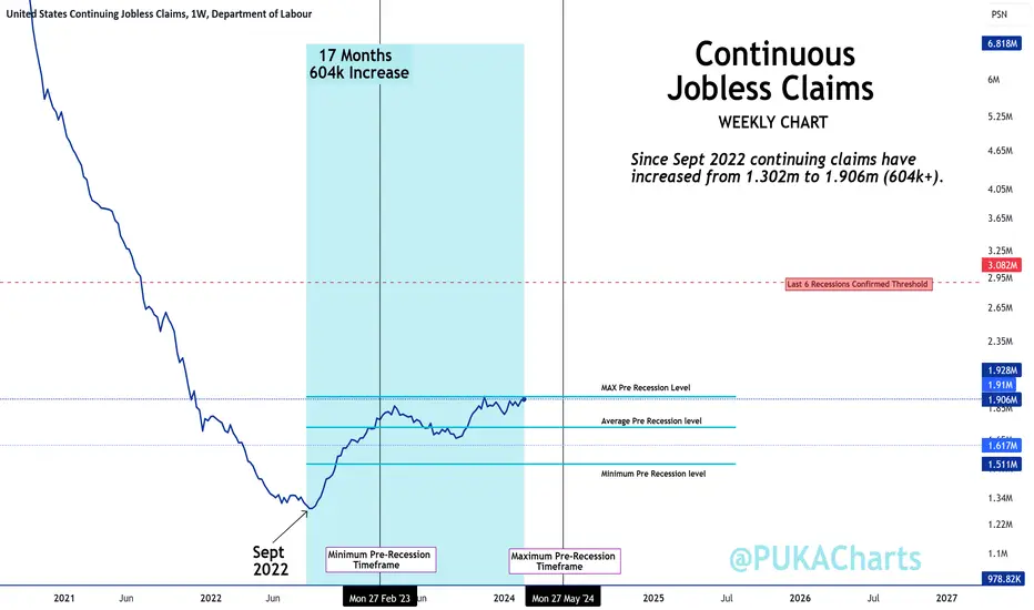
Continuous Claims up Next 💪🏻
Continuous Jobless Claims in High Risk Territory U.S. Continuous Jobless Claims
Rep: 1,906k 🚨Higher than Expected 🚨
Exp: 1,889K
Prev: 1,898k (revised down from 1,905k)
Continuous claims came at 1,906k which is 8,000 higher than last weeks revised 1,898k.
The Trend
Since Sept 2022 continuing claims have increased from 1.302m to 1.906m (604k+).
This is significantly concerning trend & suggests that an increasing number of people that have become unemployed are remaining unemployed for longer.
Short Term Trend ~ Weekly Chart - FEATURED CHART
Long Term Chart Trend ~ Monthly Chart - SEE BELOW LINK
Recession Watch
Both charts above have min, avg and max levels on the bottom right to illustrate the levels we would need to hit for increased recession risk.
Right now this chart demonstrates we are at max timeframe and close to max levels for an advance recession warning.
PUKA
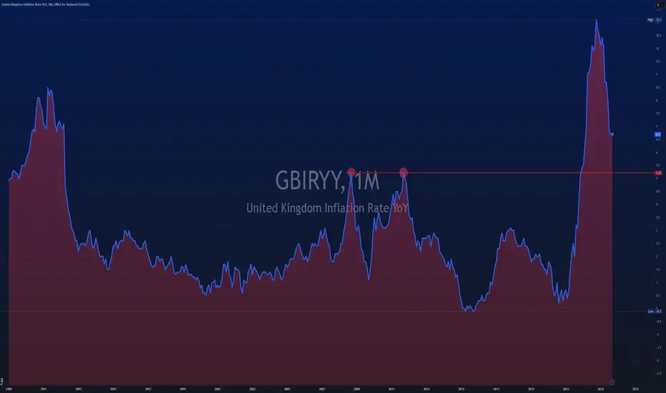
$GBIRYY -CPI (YoY)The inflation rate in the United Kingdom remained stable at 6.7% in September 2023,
holding at August's 18-month low and defying market expectations of a slight decrease to 6.6%.
Softer price increases in food and non-alcoholic beverages (12.1% vs 13.6% in August) and furniture and household goods (3.7% vs 5.1%) were offset by a smaller decline in energy costs (-0.2% vs -3.2%) on the back of a monthly rise in motor fuel costs.
Moreover, the core inflation rate,
which excludes volatile items such as energy and food,
dropped to 6.1%, reaching its lowest point since January but slightly exceeding forecasts of 6%.
Both of these figures have remained significantly above the Bank of England's 2% target,
further emphasizing the mounting inflationary pressures in the country and complicating further the task for policymakers who are expected to keep interest rates unchanged at the upcoming meeting.
On a monthly basis, the CPI rose by 0.5% in September, the most substantial increase since May.
source: Office for National Statistics
purchasing powerPurchasing power DESTRUCTION has been the game plan for a very long time.
Expecting another wave of ACCELERATED destruction...
#crudeoil #gold #usdollar #purchasingpower

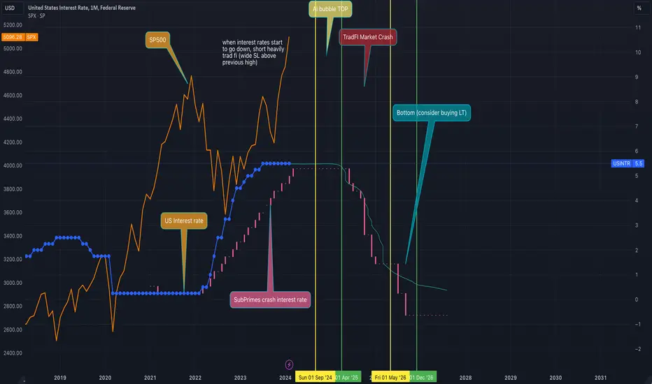
AI Bubble market top forecastThis forecast study the dot com bubble and the subprime bubble (2000 and 2008) as referenced for the current AI bubble. The US interest rate serves as reference for forecasting the market top (between sep 2024 and april 2025), and the market bottom (end of 2026). DYOR, NFA.
Macro Monday 24~New York Empire State Manufacturing Index MACRO MONDAY 24
The New York Empire State Manufacturing Index
Trading View Ticker: $USNYESM
The New York Empire State Manufacturing Index (NYESM Index) is a month to month economic indicator that measures the general business conditions in the manufacturing sector of New York State. It is published by the Federal Reserve Bank of New York and is based on a survey of 200 executives from the largest manufacturing firms in the state of New York.
The top six manufacturing states in the U.S. are California, Texas, Ohio, Illinois, Michigan, Pennsylvania and then New York. Whilst New York is only ranked the 7th largest state in terms of manufacturing jobs, the state is strong in pharmaceutical manufacturing, printing and publishing, and electronics, with some of the top tier manufacturing companies including big names such as Pfizer, IBM, Lockheed Martin and L3Harris Technologies. Total output from manufacturing in New York was $75.24 billion in 2021. In comparison total output from manufacturing by the largest manufacturing state in the US - California was $394.83 billion in 2021, magnitudes larger than New York. So whilst the New York Manufacturing Index holds some weight in terms of its reputation, location and large well known firms, it is a smaller index and it should be considered in combination with other indexes/metrics to assess the broader economic picture.
How to Read the Index
As with many of the survey led indexes, it is a diffusion index that oscillates above and below the 0 level. Above 0 suggests manufacturing activity is expanding, below zero means manufacturing activity is contracting.
The Chart
In today’s chart will also attempt to see how good the NYESM Index has been at predicting general market performance/direction using the S&P500 CBOE:SPX as a market gauge:
1. One of the main findings on the chart is that 7 out of the 8 times the NYESI fell below 0 for longer than 2 months (shaded areas) the S&P500 moved lower or did not increase in price.
- This suggests that in the event the NYESM Index falls below 0 for greater than 2 months there is a higher probability that market performance will be impaired.
2. The one time the S&P500 increased whilst the NYESM Index was below 0 for greater than 2 months was from July 2022 to present.
- The index during this period was very volatile jumping briefly above the 0 level before falling under it again (see the red box). It is the only time in history that this occurred on the index. One could compare it to a sector gasping for air above the 0 level over that period, however the S&P500 was rallying hard as the index gasped for air. This highlights the need to review other indexes and charts, and not rely solely on the NYESM Index in isolation.
One such additional index that might shed some light on the S&P500 rally during point 2 above is the relative strength of the ISM Services PMI which has remained in expansionary territory throughout the same period. The Services Index is designed to measure the economic activity and health of the services sector in the United States some of which are professional services (accounting, legal, etc.), healthcare (hospitals, clinics & other practitioners), accommodation, leisure and food services. One could imagine with everyone cooped up during COVID-19, the resilience in the services metric could help explain the resilience in the market with people enjoying more experience orientated activities.
We covered ISM Services Vs ISM Manufacturing on Macro Monday 22 which you can check below in the attaching links. The ISM metrics cover all areas of the U.S. and are considered a more all-encompassing measure of manufacturing and services in the U.S. Regardless looking at individual states such as California, Texas and New York can provide clues and insights into the overall trend.
Current Readings & Expectations
The New York Empire State Manufacturing Index increased from Sept to Oct 2023 demonstrating a sharp rise from -4.6% to +9.1% pushing the Index into expansionary territory. Expectations for this Fridays release is a reduction of 7.1% resulting in a reading of 2 for the month of Nov 2023. This would still be expansionary for manufacturing in NY State but a reduction all the same, demonstrating less manufacturing to the prior month.
Lets see how the Index performs this Friday.
PUKA

Inequality.Now when we look at the old saying 'the rich get richer, the poor get poorer' most shrug it off as a pun or a joke in time of self reflection about a current financial situation ect. But the reality is its becoming a major problem in our modern societies.
So what does this mean for the average person, now we have all just lived through one of the largest ever increases in inequality during covid, now when we delve into the statistics behind where the furlough and stimulus ended up we can see how much inequality increased, what we saw is a debt passed on to every tax payer, in the UK I believe it was around £7000 a tax payer and in US towards FWB:12K , this wealth was then transferred to the rich, and saw staggering wealth increases in the 'rich' category, either through stock owners or landlords ect, rising interest rates.
In the UK we saw interest rates rises, but the usual correlation to house prices in which typically we see rate risers lowering the house prices didnt occur! I work in the building business and have contracts with wealthy clients, These guys are currently buying elderly peoples property in a nice seafront location local to me, they then destroy the house and rebuild modern second home £5m mansions! whilst UK house prices to salary is the same as it was in 1876! Is this not a serious issue to the working man!
What we are seeing is living standards drop generation to generation as well as asset purchasing becoming harder and harder to youngsters.
Inequality has been a trending issue since 2008 when the interest rates were kept low due to the broken economies world wide, during this time we have seen the price off XAU rise staggering amounts.
The problem we face is the constant lowering of wages due to inflation, since 2008 the UK government has pretty much been flat broke, we see it currently in the poor state of roads, NHS ect.
The real question is where is this money?
Part 2 coming soon

🚨 Bitcoin NOT at all-time high yet! 🚨🚨 Bitcoin NOT at all-time high yet! 🚨
I developed this formula a long time ago and have been observing it. When the founder of ADA (Charles Hoskinson) said that the previous Bitcoin all time high was $69,000 based on the value of the dollar in 2021, I remembered my formula.
The essence is quite simple: multiply the sum of the Fed's liabilities, the US budget balance, and the debt-to-GDP ratio by the dollar index and divide by the price of Bitcoin.
From an economic point of view, this formula attempts to correlate US monetary and fiscal indicators, as well as the strength of the dollar, with the price of Bitcoin. It is my attempt to measure the "fundamental value" of Bitcoin relative to the indicators of the US economy and the strength of the dollar.

CORE CPI PRINTS HOT U.S Core CPI
Rep: 3.9% 🚨HIGHER THAN EXPECTED🚨
Exp: 3.7%
Prev: 3.9%
U.S. Headline CPI
Rep: 3.1% ✅In line with Expectations✅
Exp: 3.1%
Prev: 3.4%
Breaching below 3% is proving a difficult task for Headline CPI .
In 25 years of inflation history above and headline CPI cant seem to breach down below into the moderate <3% level
Since Oct 2023 Core CPI has only declined 0.1%.
PUKA

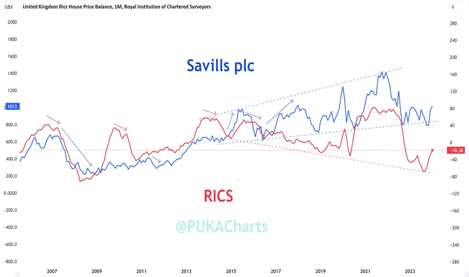
Macro Monday 37 Continued - The RICS & Savills Plc Chart Comparison ~ The RICS & Savills Plc
(extension to this mornings Macro Monday 37)
After sharing todays Macro Monday I couldn’t help be notice some similarities in between these charts.
RICS
The Royal Institute of Chartered Surveyors (RICS) House Price Balance is a monthly survey that indicates whether more or less surveyors expect housing prices to rise or fall in the U.K. housing market. For more on the RICS see the below Macro Monday Post shared earlier today.
Savills plc
Savills plc primarily operates as a global real estate advisory firm, offering a wide range of services including property sales, leasing, valuation, advisory, and investment management. While it does include auction services as part of its portfolio, auctions may not be the primary focus of its business compared to specialized auction houses.
Before we review the chart its important to recognize that Savills operates globally and provides real estate services in various countries and regions around the world, including the United Kingdom. While the company may generate a significant portion of its revenue from the UK market, the exact percentage of house sales in the UK versus other regions would vary depending on factors such as market conditions, business strategies, and client demand.
The below slide from their July 2023 report gives a nice overview of their types of business transactions and geographical spread
All of the above is important because if we are going to compare these charts we need to be aware that there are a lot of nuances to the Savills price and whilst it is a good indicator of the UK Property market and the performance of the UK segment of the company itself, its business and operations are far more broadly spread and have a corporate & services edge. One could argue that the defensive aspects of the business are consumer needs based (property management), thus not necessarily discretionary or market price driven. The riskier end of business actually seems to be in residential sales and holds a much smaller weighting, likely meaning it impacts the stock price a lot less (which the chart later appears to confirm).
This is very different to the likes of the data from the RICS survey which is a direct representation of the UK housing market prices in isolation. Also, Savills plc is a stock thus investor sentiment and many other variables like business performance and business structural changes impact the price on the chart.
RICS vs Savills plc
First lets look at the Savills plc chart in isolation. We can see that there is a long term diagonal parallel channel (blue) and the recently price fell out of this channel suggesting that this could be the beginning of a long term trend change.
We appear to be moving through a parallel horizonal channel at present and typically, when you break out of such a box or channel there is an increased probability to continue in the direction of the break up or down. This could also be considered a Darvas Box, it that were the case, Darvas box price movements typically move in the same direction from entry which in this case would be down.
In support of this chart not breaking down we are above the 200 day SMA at present (red line) and we have strong historic price support and volume support (red box) under price at present. This area would be hard to break through but if it was it would be confirmation of a trend change.
RICS vs Savills plc Chart
You can clearly see that the RICS and Savills plc on the chart have moved in unison in the past.
Lower highs on the RICS (red arrows) were a great indicators in 2007 and 2010 of a subsequent declines in the Savills plc stock (and the UK housing market).
However in 2013 a deviation appears, where by lower lows on the RICS did not impact Savills plc like it previously had in the past. From 2013 a large divergence into a megaphone pattern emerges as the RICS makes a series of lower lows and Savills makes a series of higher lows and higher highs.
Why this is happening is open to interpretation but one would imagine that Savills plc have found ways to diversify their business and based on the RICS downward volatile trend, the performance of Savills plc is very impressive. The UK housing market has clearly been volatile in recent years however the company has weathered this volatility and is deviating away from it in an upward trajectory. The companies focus on real estate services means money during market swings and their management fee business can act as a float throughout
When I first started this comparison I presumed the RICS and Savills plc combined could really help inform us of what is happening in the UK Property, however having dug a little deeper, it is clear to me that the business model and the price of Savills is not directly correlated to the UK property market prices, rather it is a diversified business model which leans on property management transactions, Corporate Real Estate (CRE), property services and has a wider geographic reach. Savills plc may be better suited as a general chart to review for the general global CRE market, property services and management market.
RICS on the other hand can continue to help us interpret housing market prices in the UK in a more direct way. I have to admire the progression of the Savills Company away from the market volatility on the RICS and towards sustainable growth, purely from a chart observation standpoint.
Unfortunately I cannot complete a comparison of large residential auctioneers in then UK like Alsop's, Auction House UK and SDL Auctions as they are not public.
I will keep a look out for any charts that could use to help guide us in the UK property market.
PUKA
Global Net Liquidity dashboardHere is an approximation for Global Net Liquidity:
FRED:WALCL+FRED:JPNASSETS*FX_IDC:JPYUSD+ECONOMICS:CNCBBS*FX_IDC:CNYUSD+FRED:ECBASSETSW*FX:EURUSD-FRED:RRPONTSYD-FRED:WTREGEN
This dashboard shows each of these components.

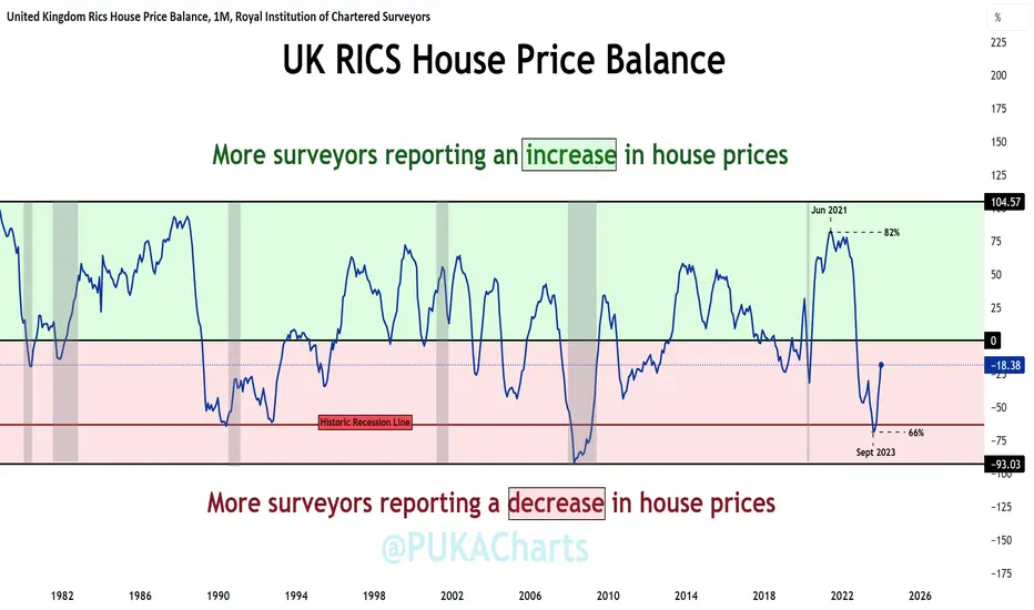
The RICS UK House Price Balance - Trending Up For Now The RICS UK House Price Balance
(Released this Thursday 14th Mar 2024 for Feb month)
The Royal Institute of Chartered Surveyors (RICS) House Price Balance is a monthly survey that indicates whether more or less surveyors expect housing prices to rise or fall in the U.K. housing market. A positive net balance suggests house price increases, while a negative net balance implies price decreases.
The RICS provides valuable insight into the UK housing markets trend and helps gauge the direction of house price movements whilst also offering insight into consumer spending.
The Chart
The RICS House Price Balance is calculated as the proportion of surveyors reporting a rise in housing prices minus the proportion reporting a fall in prices.
It reflects the expected monthly change in national house prices.
Positive vs. Negative Net Balance:
A positive net balance indicates that more surveyors expect price increases, signaling a robust housing market. A negative net balance implies that more surveyors anticipate housing price decreases, indicating a fragile housing market.
Green Area 🟢 = More Surveyors Reporting an Increase in House Prices
Red Area 🔴 = More Surveyors Reporting an decrease House Prices
Grey Areas ⚫️= Recessions
▫️ The RICS fell sharply from April 2022 down to the 0% level in Oct 2022. This was a leading indication of a downward trend UK House market prices (falling from 78% in Apr 2022 to 0% in Oct 2022).
▫️ The RICS fell into the red zone from Oct 2022 forward indicating that houses prices from this date were in net decline (per surveyors responses).
▫️ Almost 12 months later the RICS reached a low of -66% in Sept 2023. Since this date we have started to trend upwards sharply recovering from -66% to -18.4% today. However we remain in net negative territory indicating house prices are still in declining but not as much as before, a change of trend may forming indicating a move to house price appreciation (not confirmed until we move above the 0% level into + territory).
▫️ The Historic Recession Line on the chart illustrates the -63% level which crossed by the RICS at the onset of the 1990 and 2007 recessions (grey areas on chart). We recently penetrated this level moving to -66% in Sept 2023 which historically does not bode well.
This weeks RICS release will be very revealing and could tell us if we have a continuation of the upward trend for UK House prices or if we we remain firmly in negative territory.
Lets see what Thursday brings, a fascinating little metric to help us keep an eye on the property market in the UK and the to get an idea of UK consumer behavior.
PUKA
Unemployment vs SPXHow long do we have before the unemployment rate truly starts rising? A couple of months in my opinion.
Every time it starts going up, the SPX starts crashing.
June 2024 could be the market top?
As the FED starts reducing interest rates.
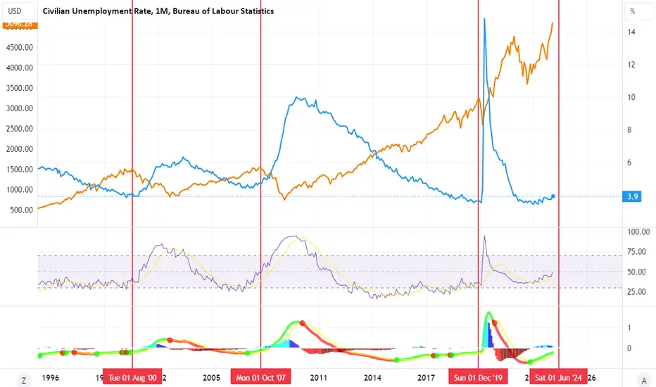
Massive US Unemployment Move Inbound
On the FRED:UNRATE dataset, we can see that since 1953, every time the unemployment rate make a significant move above the 24 months SMA, with the sole exception of October '67, we saw a large spike in unemployment allong with a recession.
Currently, FRED:UNRATE rose above the 24 months SMA in August 2023 and has been stochastically moving higher ever since. Historically, this means that we can expect an aggressive move in unemployment in the following months.

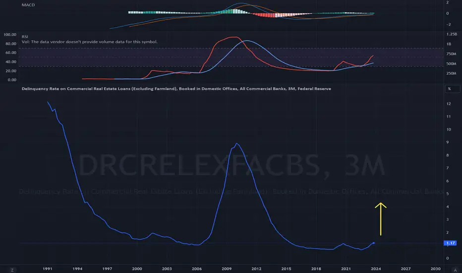
Two weeks to flatten the curvePowell warns on bank closures 3/9
Federal Reserve Chair Jerome Powell told a House panel "there will be bank failures" due to losses from commercial real estate loans, but they don't pose a risk to the entire system and it won't be the big banks.
USINTRUSINTR vs Giá Vàng
Dong tien mat gia (Lai xuat giam) thi Vang se tang
Trong chien tranh thi Vang luon tang

JOLTS - Job Openings come in lower than expectedJOLTS - Job Openings
Rep: 8.863m 🚨Lower than Expected 🚨
Exp: 8.900m
Prev: 8.889m
Long Term Trend (DOWN)
Since May 2022 we have remained in a downward sloping channel reducing from 11.85m to current day 8.863m in job openings (see channel on chart).
Shorter Term Trend (Turning Down)
The number of job openings went down by 26,000 from the previous month to 8,863 million in January 2024, the lowest in past three months and below the market consensus of 8.9 million.
Recent Months Movements
OCT - 8.690m (Local Low)
NOV - 8.930m (Local High) ~240,000 Increase
DEC - 8.889m (Lower) ~ 41,000 decrease
JAN - 8.863m (Lower) ~ 26,000 decrease
The hardest hit sector in the JOLTS Job Openings report was Retail with 170,000 less job openings than in Dec 2023 👀
Could this be staff let go in January 2024 after the Christmas retail rush?
Interestingly, on Monday the Johnson Redbook Index noted an increase from 2.7% to 3.1% in retail sales suggesting that sales from retail stores increased slightly last week.
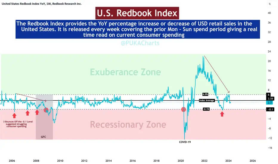
The Redbook Index provides the YoY percentage increase or decrease of USD in retail sales in the United States (it is released weekly for the week that just past).
Currently the Redbook Index is oscillating around the average 3.59% level on the chart for retail sales. The Index currently illustrates that we are in moderate retail sales channel and this might reinforce that the 170,000 reduction in retail Job offerings may be seasonal.
Please review Macro Monday from this week for a full review of the Redbook Index and its chart history.
Thanks folks
PUKA

Macro Monday 36~U.S. Johnson Redbook Index (U.S Retail Sales)Macro Monday 36
The Redbook Index – U.S Physical Retail Store Sales
(Released Tomorrow Tuesday 4th March 2024)
This Johnson Redbook Index is very useful at providing the most current insights into consumer spending habits in the U.S. It is released every week covering the prior Mon – Sun consumer spend period in physical outlets around the U.S.
The index is compiled by Johnson Redbook Service by surveying a sample of 9000 retailers, and tracks year-over-year changes in sales of stores that have been opened for at least one year.
The Redbook Index historically tracks sales information from physical stores (Brick and Mortar Stores). Their website describes that they monitor "retail sales" and "same-store sales" which typically refers to physical locations, however some stores also now have an additional online presence, thus in recent years efforts have been made to incorporate some of the online sales data into the index, however this is a secondary and marginal.
The Chart
The Redbook Index provides the YoY percentage increase or decrease of USD in retail sales in the United States. It is released every week covering the prior Mon – Sun spend period giving a real time read on current consumer spending
It being a YoY data release means the percentage change in the Redbook Index is typically measured by comparing the current week's retail sales to those of the same week in the previous year. This calculation is expressed as a percentage to show the increase or decrease in sales over that time period.
Example: If retail sales for the current week are $110,000 and sales for the same week last year were $100,000, the percentage change would be * 100, resulting in a 10% increase.
The chart above illustrates the following:
▫️ The average % from 2005 to 2024 is 3.59% (black line in middle). We shall use this as our average midline barometer of retail sales.
▫️ Moderate levels of retail sales appear to fluctuate between +6% and -0.1% (white area in the middle).
▫️ We have an Exuberance Zone (Green) for when retail sales were over extended to the upside and a Recessionary Zone (Red) which was penetrated during the last two recessions.
▫️ You can see that in the mid 2000's we bounced off the Recessionary -0.1% zone three times as the index also made a series of lower highs (see arrow). This could be perceived as waning or struggling retail spending ahead of the crash. At present we have a series of lower highs and we have bounced off the Recessionary Level (-0.1%) once, if we see continued lower highs and more bounces from the red zone, this could be a concerning repeating pattern.
You will be able to press play on my TradingView page at any stage over coming months to see where this index has moved on this chart.
Lets see how this index performs over coming weeks and months.
PUKA