OPEN-SOURCE SCRIPT
Updated Yelober - Intraday ETF Dashboard
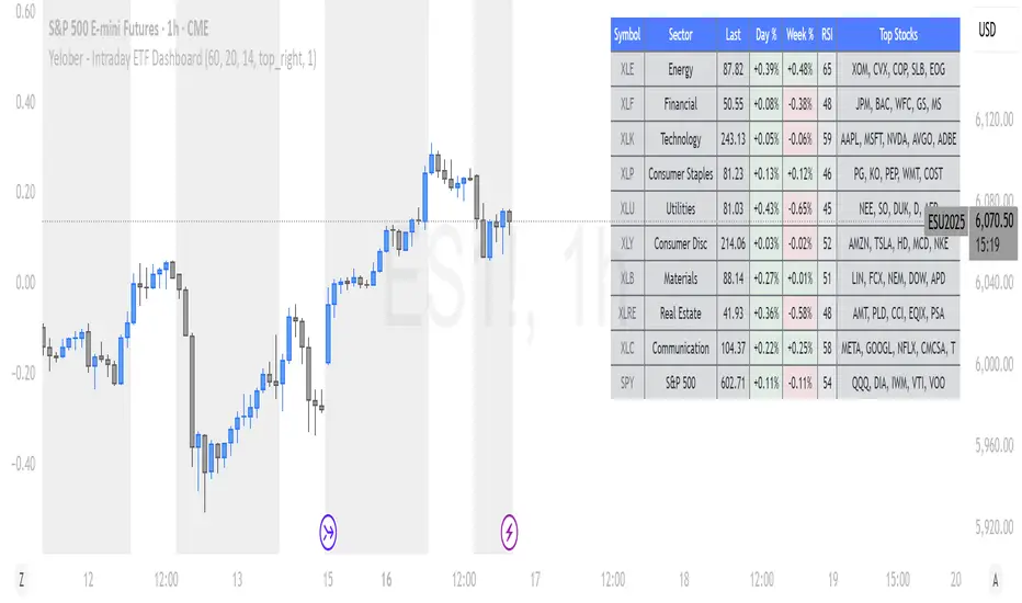
# How to Read the Yelober Intraday ETF Dashboard
The Intraday ETF Dashboard provides a powerful at-a-glance view of sector performance and trading opportunities. Here's how to interpret and use the information:
## Basic Dashboard Reading
### Color-Coding System
- **Green values**: Positive performance or bullish signals
- **Red values**: Negative performance or bearish signals
- **Symbol colors**: Green = buy signal, Red = sell signal, Gray = neutral
### Example 1: Identifying Strong Sectors
If you see XLF (Financials) with:
- Day % showing +2.65% (green background)
- Symbol in green color
- RSI of 58 (not overbought)
**Interpretation**: Financial sector is showing strength and momentum without being overextended. Consider long positions in top financial stocks like JPM or BAC.
### Example 2: Spotting Weakness
If you see XLK (Technology) with:
- Day % showing -1.20% (red background)
- Week % showing -3.50% (red background)
- Symbol in red color
- RSI of 35 (approaching oversold)
**Interpretation**: Technology sector is showing weakness across multiple timeframes. Consider avoiding tech stocks or taking short positions in names like MSFT or AAPL, but be cautious as the low RSI suggests a bounce may be coming.
## Advanced Interpretations
### Example 3: Sector Rotation Detection
If you observe:
- XLE (Energy) showing +2.10% while XLK (Technology) showing -1.50%
- Both sectors' Week % values showing the opposite trend
**Interpretation**: This suggests money is rotating out of technology into energy stocks. This rotation pattern is actionable - consider reducing tech exposure and increasing energy positions (look at XOM, CVX in the Top Stocks column).
### Example 4: RSI Divergences
If you see XLU (Utilities) with:
- Day % showing +0.50% (small positive)
- RSI showing 72 (overbought, red background)
**Interpretation**: Despite positive performance, the high RSI suggests the sector is overextended. This divergence between price and indicator suggests caution - the rally in utilities may be running out of steam.
### Example 5: Relative Strength in Weak Markets
If SPY shows -1.20% but XLP (Consumer Staples) shows +0.30%:
**Interpretation**: Consumer staples are showing defensive strength during market weakness. This is typical risk-off behavior. Consider defensive positions in stocks like PG, KO, or PEP for protection.
## Practical Application Scenarios
### Day Trading Setup
1. **Morning Market Assessment**:
- Check which sectors are green pre-market
- Focus on sectors with Day % > 1% and RSI between 40-70
- Identify 2-3 stocks from the Top Stocks column of the strongest sector
2. **Midday Reversal Hunting**:
- Look for sectors with symbol color changing from red to green
- Confirm with RSI moving away from extremes
- Trade stocks from that sector showing similar pattern changes
### Swing Trading Application
1. **Trend Following**:
- Identify sectors with positive Day % and Week %
- Look for RSI values in uptrend but not overbought (45-65)
- Enter positions in top stocks from these sectors, using daily charts for confirmation
2. **Contrarian Setups**:
- Find sectors with deeply negative Day % but RSI < 30
- Look for divergence (price making new lows but RSI rising)
- Consider counter-trend positions in the stronger stocks within these oversold sectors
## Reading Special Conditions
### Example 6: Risk-Off Environment
If you observe:
- XLP (Consumer Staples) and XLU (Utilities) both green
- XLK (Technology) and XLY (Consumer Disc) both red
- SPY slightly negative
**Interpretation**: Classic risk-off rotation. Investors are moving to safety. Consider defensive positioning and reducing exposure to growth sectors.
### Example 7: Market Breadth Analysis
Count the number of sectors in green vs. red:
- If 7+ sectors are green: Strong bullish breadth, consider aggressive long positioning
- If 7+ sectors are red: Weak market breadth, consider defensive positioning or shorts
- If evenly split: Market is indecisive, focus on specific sector strength instead of broad market exposure
Remember that this dashboard is most effective when combined with broader market analysis and appropriate risk management strategies.
Release Notes
Intraday Sector Momentum DashboardGuideOverview
The Intraday Sector Momentum Dashboard is a powerful tool for tracking sector performance and identifying relative strength across major market sectors. This PineScript indicator displays real-time data for sector ETFs, helping traders identify potential opportunities based on momentum, relative strength, and technical indicators.
Input ParametersTimeframe:
Choose from 60-minute, 4-hour, daily, or weekly dataLookback Period: Number of bars used for certain calculations (default: 20)RSI Period: Period for RSI calculation (default: 14)Table Position: Where the table appears on your chartClick + to refresh data: Counter that refreshes data when incrementedHide refresh instructions: Option to hide the refresh rows for a cleaner lookReading the DashboardColumns ExplainedSymbolThe ticker symbols for major sector ETFs:XLE: Energy SectorXLF: Financial SectorXLK: Technology SectorXLP: Consumer Staples SectorXLU: Utilities SectorXLY: Consumer Discretionary SectorXLB: Materials SectorXLRE: Real Estate SectorXLC: Communication Services SectorSPY: S&P 500 (benchmark)LastThe most recent price of the ETF. This value provides a reference point but has limited analytical value on its own.Day %The percentage change for the current trading day.Color coding: Green for positive, red for negativeExample: XLE +0.60% indicates the energy sector is up 0.6% todayInterpretation: Shows immediate market sentiment toward the sectorWeek %The percentage change over the past week (5 trading days).Color coding: Green for positive, red for negativeExample: XLK -1.15% indicates technology has fallen 1.15% over the past weekInterpretation: Reveals medium-term momentum and potential developing trendsRSIThe Relative Strength Index (0-100), a momentum oscillator.Color coding: Red when above 70 (potentially overbought), green when below 30 (potentially oversold)Example: RSI of 62 for XLE indicates moderate bullish momentum without being overboughtInterpretation:Above 70: Potentially overbought conditionsBelow 30: Potentially oversold conditions40-60: Neutral momentumRel Str (Relative Strength)Measures a sector’s performance relative to the market (SPY).Color coding: Green for outperforming, red for underperformingExample: XLP at +0.93 means consumer staples is outperforming SPY by 0.93%Interpretation: Positive values indicate sector outperformance, negative values indicate underperformanceSignalAlgorithmic trading signal based on multiple factors.Icons: ↗️ (bullish), ↘️ (bearish), — (neutral)Calculation: Combines RSI and relative strength indicatorsInterpretation:Bullish: Combined factors suggest favorable conditions for buyingBearish: Combined factors suggest favorable conditions for sellingNeutral: No clear directionHow to Use the DashboardRefreshing DataTo get the latest data:Click the settings/gear icon for the indicatorFind the “Click + to refresh data” counterIncrease it by clicking the “+” buttonClick “OK” to applyEach time you increment the counter, the dashboard pulls fresh data for all sectors.Trading Applications1. Sector Rotation StrategyIdentify which sectors are showing the strongest relative strength and allocate capital accordingly.Example:Energy (XLE) shows +0.60% day change, +3.21% week change, and positive relative strengthTechnology (XLK) shows -0.74% day change, -1.15% week change, and negative relative strengthAction: Consider overweighting energy and underweighting technology in your portfolio2. Mean Reversion OpportunitiesLook for sectors with extreme RSI readings that might be due for a reversal.Example:Materials (XLB) has an RSI of 28 (oversold) with improving relative strengthAction: Consider a mean reversion trade expecting XLB to bounce back3. Trend FollowingIdentify sectors with strong positive momentum in both day and week columns.Example:Industrials (XLI) shows positive day change, positive week change, RSI above 50, and positive relative strengthAction: Consider trend-following trades in the industrial sector4. Market Breadth AnalysisAssess overall market health by counting how many sectors are positive vs. negative.Example:7/10 sectors showing positive week change suggests broad market strengthOnly 3/10 sectors positive suggests narrow market leadership (potential warning sign)Interpreting Real-World ScenariosStrong Bull MarketMost sectors show positive day and week percentagesMultiple sectors have RSI values above 50Many sectors have positive relative strengthSeveral bullish signals (↗️)Weak/Correcting MarketMost sectors show negative day percentagesSeveral sectors have negative week percentagesMany sectors have RSI values below 50Multiple bearish signals (↘️)Sector RotationMixed performance across sectorsSome sectors strongly positive while others negativeWide dispersion in relative strength valuesDefensive sectors (XLP, XLU) outperforming during market weaknessMarket BottomingMost sectors showing negative week percentagesSeveral sectors with RSI below 30 (oversold)Improving day percentagesRelative strength starting to turn positive in cyclical sectorsTechnical Implementation NotesThe script uses several advanced PineScript techniques:Data arrays to store and manage sector metricsSecurity function to fetch data for multiple symbolsRequest handling to ensure fresh data on refreshTable rendering with conditional formattingSignal calculation combining multiple technical factorsThe dashboard’s refresh mechanism uses a counter that, when changed, forces new data fetches with request.security() calls that bypass the normal caching behavior.
Open-source script
In true TradingView spirit, the creator of this script has made it open-source, so that traders can review and verify its functionality. Kudos to the author! While you can use it for free, remember that republishing the code is subject to our House Rules.
Disclaimer
The information and publications are not meant to be, and do not constitute, financial, investment, trading, or other types of advice or recommendations supplied or endorsed by TradingView. Read more in the Terms of Use.