OPEN-SOURCE SCRIPT
Updated NYSE Advance/Decline Line 1.0

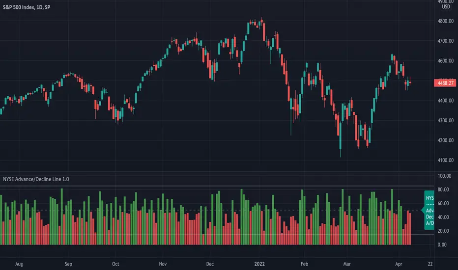
NYSE Advance/Decline Line is a Market Breath indicator.
Brought to you by IQ-trading (Andrei Bogdan) via Trading View Pine script. If you find this helpful in anyway, please leave a like!
A/D line calculates a ratio between total number of NYSE stocks advancing and total number of NYSE stocks declining in one day, providing another way to grasp the market breath at any moment.
Green columns mean more than 50% of NYSE stocks are advancing, red columns mean more than 50% of NYSE stocks are declining.
Green values above the top band mean correlation to the upside, red values bellow the low band mean correlation to the downside.
Correlation means rising probability of capitulation (to the upside or to the downside).
For a better interpretation, NYSE Advance/Decline Line should be used in conjunction with other indicators (volatility, volume, etc.).
Release Notes
NYSE Advance/Decline Line is a Market Breath indicator.Brought to you by IQ-trading (Andrei Bogdan) via Trading View Pine script. If you find this helpful in anyway, please leave a like!
A/D line calculates a ratio between total number of NYSE stocks advancing and total number of NYSE stocks in one day, providing another way to grasp the market breath at any moment
Green columns mean more than 50% of NYSE stocks are advancing, red columns mean more than 50% of NYSE stocks are declining.
Green values above the top band mean correlation to the upside, red values bellow the low band mean correlation to the downside.
Correlation means rising probability of capitulation (to the upside or to the downside).
For a better interpretation, NYSE Advance/Decline Line should be used in conjunction with other indicators (volatility, volume, etc.).
Open-source script
In true TradingView spirit, the creator of this script has made it open-source, so that traders can review and verify its functionality. Kudos to the author! While you can use it for free, remember that republishing the code is subject to our House Rules.
Disclaimer
The information and publications are not meant to be, and do not constitute, financial, investment, trading, or other types of advice or recommendations supplied or endorsed by TradingView. Read more in the Terms of Use.