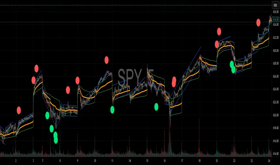
Reversal Signal avec TICK + RSIThis indicator is a potential reversal indicator for SCALPING, don't use it for swing. It's base on TICK and on an overbrought/oversold condition of the RSI. You can play with the setting, typicaly I like my TICK to be over reacting an 800/-800 and my rsi over 20 and 80, but it give not enough signal. So I set the TICK signal at 651/-651 and the RSI at 25/75. This indicator is made for SP500 and Nasdaq, so SPY/QQQ/SPX/ES/NQ should work well. It's the first version of it, so maybe I'll add so more data to it to increase signal and lower false one. For now I've test it on live market yet(26/7/25).
The RSI is Fast(5 period), I like to use it on the 1 or 5 min chart.
Please not that it only work during 9h30am to 4pm EST.(Because of the TICK)
Feel free to try and even comment. Don't be harsh on me, it's my first try!
(Sorry for my 'english' it's not my first language)
FAUCON
Breadth Indicators
تلوين الشموع حسب الحجم (يومي أو متوسط)📊 Indicator Name:
Candle Coloring Based on Volume Change (Flexible Comparison)
🎯 Purpose of the Indicator:
This indicator colors candlesticks based solely on changes in volume, regardless of price direction. It helps traders visualize unusual volume activity and potential accumulation or distribution zones.
It also displays the percentage change in volume above each candle — based on a comparison method chosen by the user.
⚙️ User Inputs:
Comparison Method (Mode):
"Compare with Previous Day":
The volume of the current candle is compared with the volume of the previous candle.
"Compare with Average of N Days":
The volume is compared with a moving average of volume over a number of past days (e.g., 10 days).
Average Length (for mode 2):
Used only when "Compare with Average" is selected.
Defines the number of days over which to calculate the volume average.
Minimum % Change to Show Label:
A threshold that controls when the percentage label appears.
Prevents label clutter for insignificant volume changes.
🎨 Candle Coloring Logic:
Condition Meaning Candle Color
Current volume > reference volume High activity 🟢 Green
Current volume < reference volume Low activity 🔴 Red
Nearly equal volumes Normal ⚪ Gray
🏷️ Volume Change Label:
The indicator displays a percentage change label above the candle.
For example:
If volume increased by 45% → label shows +45.00%.
If the change exceeds ±50%, the label turns yellow to indicate a significant spike.
✅ Key Benefits:
Quickly detects unusual volume activity (e.g., spikes, drops).
Enhances classic price-action analysis with volume context.
Flexible comparison:
Day-to-day for short-term traders.
Moving average for swing and position traders.
Clean, minimalist design with conditional labels.
🔍 Use Case Examples:
🔴 Red candle on price rise → weak rally (low participation).
🟢 Green candle on price drop → potential distribution.
⚪ Gray candles → sideways or stable behavior.
👤 Who Should Use It?
Day traders and scalpers monitoring volume strength.
Technical analysts who focus on volume-price behavior.
Traders who track accumulation/distribution patterns.

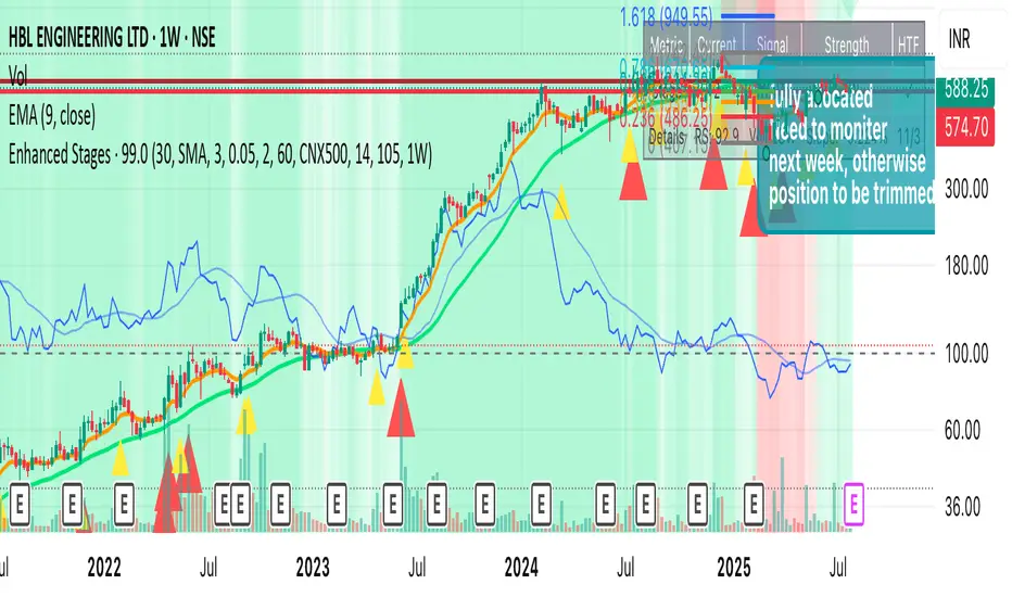
Improved Weinstein Stage AnalysisThe code provides an actionable, disciplined, and visually informative implementation of the “Stage Analysis” approach pioneered by Stan Weinstein, with enhancements to modernize, automate, and clarify the methodology for today’s traders using TradingView. It faithfully follows the workflow recommended: identify long-term cycles, confirm with volume and relative strength, and only engage aggressively with the market during the advancing (bullish) stage with all “clues” aligned.
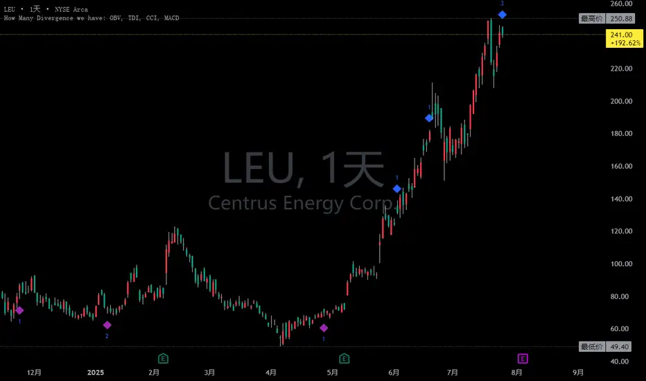
Combined and Count of Bull Bear Alerts for OBV, TDI, CCI, MACDCombined and Count of Bull Bear Alerts for OBV, TDI, CCI, MACD
Description
This powerful indicator combines four popular technical analysis tools (On-Balance Volume, Traders Dynamic Index, Commodity Channel Index, and MACD) into a single comprehensive divergence detection system. It monitors all four indicators simultaneously and provides real-time alerts when bullish or bearish divergences occur across multiple indicators, helping traders identify high-probability reversal opportunities.
Key Features
Multi-Indicator Divergence Detection: Simultaneously tracks divergences in OBV, TDI, CCI, and MACD
Comprehensive Signal Counting: Displays real-time count of bullish (1-4) and bearish (1-4) divergences
Four Customizable Alert Conditions:
Alert 1: 1-4 indicators showing bullish divergence
Alert 2: 3-4 indicators showing strong bullish divergence
Alert 3: 1-2 indicators showing bearish divergence
Alert 4: 3-4 indicators showing strong bearish divergence
Visual Signal Display: Clear numerical indicators showing how many tools are signaling divergence
Customizable Parameters: Adjustable settings for each indicator's sensitivity and display preferences
Overlay Display: All signals shown directly on the price chart for easy analysis
How It Works
The indicator continuously monitors each technical tool for both regular and hidden divergences using pivot point analysis. When a divergence pattern is detected, it increments the appropriate counter (bullish or bearish). The system then displays the total count as colored numbers on the chart and can trigger alerts based on your preferred signal strength thresholds.
Trading Applications
Strong Reversal Signals: Look for 3-4 indicator confirmations for high-probability trades
Early Trend Detection: Use 1-2 indicator signals for early entry opportunities
Confirmation Tool: Validate your trading signals with multi-indicator divergence confirmation
Risk Management: Avoid trading against multiple indicator divergences
Customization Options
Adjustable lookback periods for each indicator
Toggle visibility of bullish/bearish counters
Customizable colors, positions, and display styles
Option to show individual indicator signals
Configurable divergence detection parameters
This indicator is particularly valuable for traders who want to combine multiple technical analysis approaches into a single, easy-to-monitor system that highlights confluence opportunities across different market perspectives (volume, momentum, cycle, and trend).
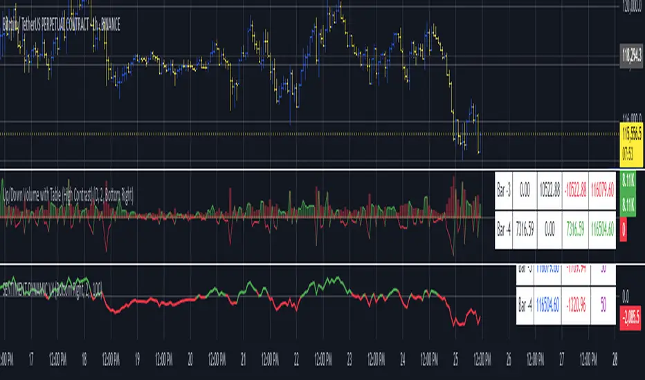
Up/Down Volume with Table (High Contrast)Up/Down Volume with Table (High Contrast) — Script Summary & User Guide
Purpose of the Script
This TradingView indicator, Up/Down Volume with Table (High Contrast), visually separates and quantifies up-volume and down-volume for each bar, providing both a color-coded histogram and a dynamic table summarizing the last five bars. The indicator helps traders quickly assess buying and selling pressure, recent volume shifts, and their relationship to price changes, all in a highly readable format.
Key Features
Up/Down Volume Columns:
Green columns represent volume on bars where price closed higher than the previous bar (up volume).
Red columns represent volume on bars where price closed lower than the previous bar (down volume).
Delta Line:
Plots the net difference between up and down volume for each bar.
Green when up-volume exceeds down-volume; red when down-volume dominates.
Interactive Table:
Displays the last five bars, showing up-volume, down-volume, delta, and close price.
Color-coding for quick interpretation.
Table position, decimal places, and timeframe are all user-configurable.
Custom Timeframe Support:
Calculate all values on the chart’s timeframe or a custom timeframe of your choice (e.g., daily, hourly).
High-Contrast Design:
Table and plot colors are chosen for maximum clarity and accessibility.
User Inputs & Configuration
Use custom timeframe:
Toggle between the chart’s timeframe and a user-specified timeframe.
Custom timeframe:
Set the timeframe for calculations if custom mode is enabled (e.g., "D" for daily, "60" for 60 minutes).
Decimal Places:
Choose how many decimal places to display in the table.
Table Location:
Select where the table appears on your chart (e.g., Bottom Right, Top Left, etc.).
How to Use
Add the Script to Your Chart:
Copy and paste the code into a new Pine Script indicator on TradingView.
Add the indicator to your chart.
Configure Inputs:
Open the indicator settings.
Adjust the timeframe, decimal places, and table location as desired.
Read the Table:
The table appears on your chart (location is user-selectable) and displays the following for the last five bars:
Bar: "Now" for the current bar, then "Bar -1", "Bar -2", etc. for previous bars.
Up Vol: Volume on bars where price closed higher than previous bar, shown in black text.
Down Vol: Volume on bars where price closed lower than previous bar, shown in black text.
Delta: Up Vol minus Down Vol, colored green for positive, red for negative, black for zero.
Close: Closing price for each bar, colored green if price increased from previous bar, red if decreased, black if unchanged.
Interpret the Histogram and Lines:
Green Columns:
Represent up-volume. Tall columns indicate strong buying volume.
Red Columns:
Represent down-volume. Tall columns indicate strong selling volume.
Delta Line:
Plotted as a line (not a column), colored green for positive values (more up-volume), red for negative (more down-volume).
Large positive or negative spikes may indicate strong buying or selling pressure, respectively.
How to Interpret the Table
Column Meaning Color Coding
Bar "Now" (current bar), "Bar -1" (previous bar), etc. Black text
Up Vol Volume for bars with higher closes than previous bar Black text
Down Vol Volume for bars with lower closes than previous bar Black text
Delta Up Vol - Down Vol. Green if positive, red if negative, black if zero Green/Red/Black
Close Closing price for the bar. Green if price increased, red if decreased, black if unchanged Green/Red/Black
Green Delta: Indicates net buying pressure for that bar.
Red Delta: Indicates net selling pressure for that bar.
Close Price Color:
Green: Price increased from previous bar.
Red: Price decreased.
Black: No change.
Practical Trading Insights
Consistently Green Delta (Histogram & Table):
Sustained buying pressure; may indicate bullish sentiment or accumulation.
Consistently Red Delta:
Sustained selling pressure; may indicate bearish sentiment or distribution.
Large Up/Down Volume Spikes:
Big green or red columns can signal strong market activity or potential reversals if they occur at trend extremes.
Delta Flipping Colors:
Rapid alternation between green and red deltas may indicate a choppy or indecisive market.
Close Price Color in Table:
Use as a quick confirmation of whether volume surges are pushing price in the expected direction.
Troubleshooting & Notes
No Volume Data Error:
If your symbol doesn’t provide volume data (e.g., some indices or synthetic assets), the script will display an error.
Custom Timeframe:
If using a custom timeframe, ensure your chart supports it and that there is enough data for meaningful calculations.
High-Contrast Table:
Designed for clarity and accessibility, but you can adjust colors in the code if needed for your personal preferences.
Summary Table Legend
Bar Up Vol Down Vol Delta Close
Now ... ... ... ...
Bar-1 ... ... ... ...
... ... ... ... ...
Colors reflect the meaning as described above.
In Summary
This indicator visually and numerically breaks down buying and selling volume, helping you spot shifts in market sentiment, volume surges, and price/volume divergences at a glance.
Use the table for precise recent data, the histogram for overall flow, and the color cues for instant market context.
Gold Grid Lines (Fixed)Indicator function details: Gold Grid Lines (Fixed)
🧭 Purpose:
The indexer is designed to help structure the price of a horizontal line (Grid) on a graph of gold or any asset.
To use as a psychological reference, round-trip trading, or watch price fluctuations at equal levels.
⸻
🧩 Key Script Functions
1. 🔲 Draw horizontal lines in a grid (Grid Lines) style
• Use the Base Price that you specify, e.g. 2000.0.
• Draw a line up and down from the middle price with the same distance (Stepper Line).
• The number of lines on each side is set (Lines Up/Down).
• The line draws only one time when the graph is opened, so that the graph does not slow down.
✏️ Example:
• Base Price = 2000.0
• Stepper Line = 1.0 → means 100 gold dots.
• Lines = 5 → Draw 5 upper and 5 lower lines
→ get a price tag of 1995, 1996, … , 2005
⸻
2. 📉 Draw the day's open price line (Daily Open Line)
• When entering a new day, the system records the open price of the first bar of the day.
• Draw a horizontal line as "Daily Open Line" to help traders see how prices opened that day.
• Ideal for analysis of "over-open/under-open" behavior (e.g. trend, selling/buying force)

SENTIMENTSENTIMENT Indicator – User Guide
Summary
The SENTIMENT indicator provides a quick visual reference for current and recent market sentiment. It compares the closing price to a custom sentiment value, which is the average of the 100-period (default) simple moving averages (SMA) of the high and low prices. The indicator displays this information in a color-coded table and plots the difference between price and sentiment as a line on your chart.
How to Use
1. Table Overview
The table appears on your chart in your chosen position.
It displays four rows: the current bar (“Now”) and the previous three bars (“Bar -1”, “Bar -2”, “Bar -3”).
Each row shows:
The bar label (The current bar is live and active, constantly changing)
The closing price for that bar
The difference between the closing price and the sentiment value for that bar
The sentiment difference is color-coded:
Green: Price is above sentiment (bullish)
Red: Price is below sentiment (bearish)
2. Chart Plot
The indicator plots a line showing the difference between the current price and the sentiment value.
When the line is above zero: price is above sentiment (bullish).
When the line is below zero: price is below sentiment (bearish).
3. Settings
Number of Lookback Bars: Adjusts the SMA period for sentiment calculation (default is 100).
Table Position: Choose where to display the table on your chart (e.g., Top Left, Bottom Right).
How to Interpret
Green values in the table or a plot above zero suggest bullish sentiment.
Red values in the table or a plot below zero suggest bearish sentiment.
Use this indicator to quickly assess if the market is trading above or below its recent average sentiment level.
Tips
You can combine the SENTIMENT indicator with other tools or signals for more robust trading decisions.
Adjust the lookback period to suit your trading timeframe and style.

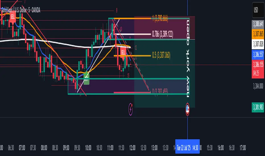
SMC BOS Strategy for XAUUSDThis is a custom-built TradingView strategy that uses Smart Money Concept (SMC) logic to identify high-probability trend continuation and reversal entries based on Break of Structure (BOS) on XAUUSD. It is designed for traders looking to test institutional-style structure breaks with dynamic entry and risk-managed exits.
The strategy detects BOS using swing highs and lows, then enters trades based on price momentum (bullish or bearish candle confirmation). Each trade is automatically managed using a fixed stop loss in pips and a customizable risk-to-reward (RR) ratio. The goal is to backtest how BOS alone can drive clean directional entries, simulating Smart Money precision without repainting or false signals.
🔑 Key Features:
BOS-Based Entry Logic: Enters trades only after a valid break of structure (new higher high or lower low), signaling continuation from a Smart Money shift.
Momentum Filtered Entry: Requires candle confirmation to validate direction (e.g., bullish close after bullish BOS).
Full Backtest Engine: Built using strategy() functions, allowing you to test SL/TP performance and adjust position sizing.
Custom Risk Control: Adjust Stop Loss (in pips) and Target Profit using a flexible RR ratio (e.g. 1:2 or 1:3 setups).
Works Across Timeframes: Optimized for 15m, 1H, and 4H on XAUUSD, but works on any asset that respects structure.
⚙️ Settings:
Swing Sensitivity – Controls how strict pivot highs/lows are
Minimum Bar Spacing – Prevents overtrading after recent BOS
Stop Loss (in pips) – Fixed distance from entry
Risk/Reward Ratio – Multiplies SL for dynamic take-profit
Trade Direction – Supports both long and short with momentum
📊 How It Works:
Detects new structure break (BOS)
Confirms momentum with candle direction (close > open for long, close < open for short)
Triggers entry and sets TP/SL automatically
Logs results in the Strategy Tester for full backtest evaluation
📌 Optimized For:
XAUUSD (Gold)
Smart Money / SMC / ICT traders
Trend continuation + reversal structures
Backtest-focused strategy building
Institutional-level analysis
📎 Release Notes:
v1.0 – Initial release of BOS-only SMC strategy with full entry/exit simulation and strategy tester support.
⚠️ Disclaimer:
This strategy is built for educational and research purposes only. It is not a signal provider or financial advice. Always combine with your personal confirmation, confluence tools, and risk management.

SMC Structure Levels – BOS & CHoCH for XAUUSDThis is a custom-made TradingView indicator designed to visualize high-confidence market structure shifts based on Smart Money Concepts (SMC), focusing on Break of Structure (BOS) and Change of Character (CHoCH) points. The tool is optimized for XAUUSD but works across all major forex, crypto, and index markets.
It identifies key pivot points and filters them using both price distance and bar spacing, helping traders focus only on meaningful structural changes — not noisy signals. This makes it ideal for traders looking to track institutional-style price behavior with clarity.
🔑 Key Features:
Clean BOS & CHoCH Labels: The indicator plots “BOS” above candles when a structural break occurs in the trend direction, and “CHoCH” below candles when early signs of a reversal appear.
Spaced Signals: Only plots structure shifts that meet both time and price distance filters, preventing clutter and overplotting on the chart.
Swing-Based Logic: Built on pivot high/low analysis with adjustable sensitivity, ensuring flexible structure detection on any timeframe.
Fully Customizable: Modify:
Swing Sensitivity (number of bars before/after pivot)
Minimum bar spacing between BOS/CHoCH signals
Minimum price movement (in pips) between labels
Toggle BOS or CHoCH visibility individually
No Repainting: Once confirmed, signals remain fixed on the chart for historical review.
Zero Clutter: Unlike typical SMC tools that flood the chart, this indicator prioritizes clarity and signal quality.
🧠 What is BOS & CHoCH?
Break of Structure (BOS): Indicates continuation of the current market trend.
Change of Character (CHoCH): Suggests a potential early trend reversal or shift in momentum.
These tools are often used by Smart Money traders to mark significant turning points and trend confirmations.
⚙️ Use Cases:
Structural tracking in Smart Money Concepts (SMC)
Identifying trend continuation or early reversal
XAUUSD (Gold) swing and intraday analysis
Support for Order Blocks, Liquidity Grabs, and FVG confluence
Backtesting market structure break behavior
📌 Best Pairs:
XAUUSD (Gold)
Any asset where structure-based analysis is relevant
📎 Release Notes:
v1.0 – Initial release of BOS/CHoCH structure tool with spacing and pip-distance filtering for XAUUSD analysis.
⚠️ Disclaimer:
This indicator is built for educational and analytical purposes only. It does not constitute trading advice or guarantee profitable signals. Always use with a proper risk management strategy and confirm signals with additional confluence.
✅ This matches the exact quality and structure of the description you showed earlier.
Just copy this into your TradingView script page when publishing. If you'd like the next version with Order Blocks or FVG, say the word.

High-Mid-Low 200 Day and Buy Levels and labels
Volume-Scaled PVR with Dynamic Buy Levels (ETF investing Visual Aid)
Description
This indicator is designed primarily for exchange-traded fund (ETF) traders and investors who seek a broad, visual tool to assist in identifying favorable buy and sell regions based on key price levels in relation to High and Lows of the ETF.
Key Features
Lookback Reference Levels:
Automatically identifies and plots key price levels within a user-defined lookback period:
Period High: Highest price in the lookback window.
Period Low: Lowest price in the lookback window.
Mid-Line: Midpoint between the period high and low.
Detailed Percentage Labels:
Displays percentage distances from the current price to the period high, period low, and their respective most recent occurrences, along with bar-counts for context, allowing quick assessment of price positioning relative to significant recent highs and lows.
Dynamic Buy-Level Lines for Multiple ETFs:
Supports a configurable list of ETF tickers with predefined buy price levels. When charting one of these ETFs, a horizontal line and label mark the specified buy price level, serving as a visual reminder or guide for entries.
Lightweight and Visual:
Designed to overlay directly on price charts with minimal clutter, providing clean and insightful visual references to inform buy-low and sell-high decisions.
How It Helps You
Offers broad, contextual cues to guide "buy low, sell high" strategies on ETFs by visualizing:
Where price currently stands within recent high/low ranges.
Specific buy price levels personalized for tracked ETFs as a check before committing.
Flexible lookback parameters allow tuning sensitivity to your preferred timeframes and trading style.
Usage Notes
Customize the list of ETFs and associated buy prices within the script via arrays to suit your watchlist. (Make a working copy to update Arrays, ensure pair matching).
Best applied on daily or higher timeframes for clearer trend dynamics.
This is a visual aid and should be combined with your own analysis and risk management techniques and other standard/established indicators.

MA Crossover with Dots📘 Strategy Description – Moving Average Crossover with Dot Signals
This indicator is based on a Simple Moving Average (SMA) crossover strategy, which is a classic method to identify trend changes and potential buy/sell signals in the market.
📊 Core Logic:
It calculates two SMAs:
Fast SMA: 20-period moving average (short-term trend)
Slow SMA: 50-period moving average (longer-term trend)
✅ Buy Signal (Green Dot):
When the Fast SMA crosses above the Slow SMA, a Buy signal is generated.
This suggests bullish momentum or the start of an uptrend.
❌ Sell Signal (Red Dot):
When the Fast SMA crosses below the Slow SMA, a Sell signal is generated.
This suggests bearish momentum or the start of a downtrend.
📍 Visual Representation:
The Buy and Sell signals are plotted as colored dots at different levels:
Green dot = Buy
Red dot = Sell
The dots are plotted at fixed vertical positions in a separate panel below the chart for better clarity and to avoid overlap.

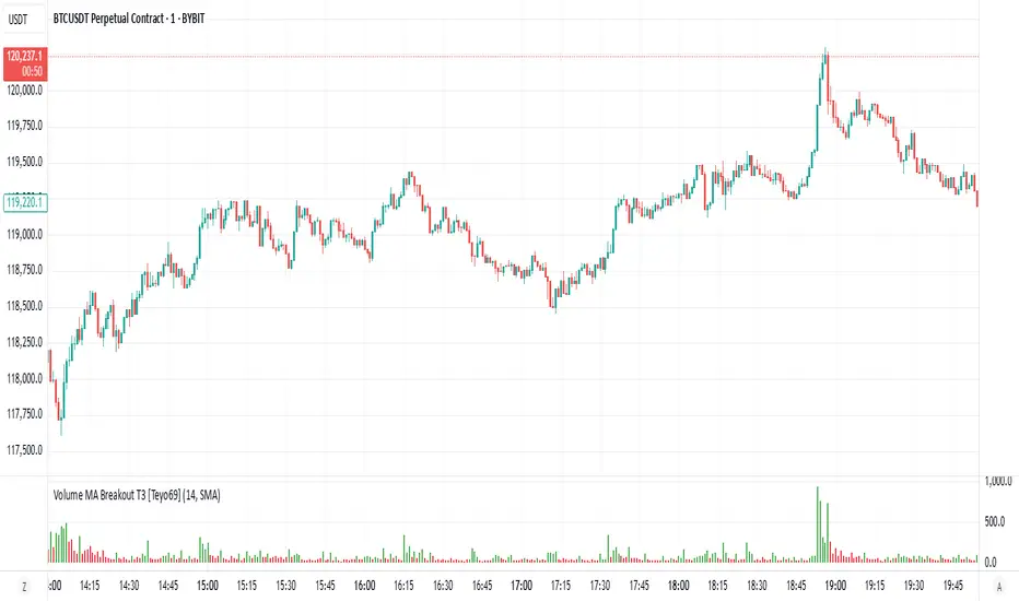
Volume MA Breakout T3 [Teyo69]🧭 Overview
Volume MA Breakout T3 highlights volume bars that exceed a dynamic moving average threshold. It helps traders visually identify volume breakouts—periods of significant buying or selling pressure—based on user-selected MA methods (SMA, EMA, DEMA).
🔍 Features
Volume Highlighting: Green bars indicate volume breakout above the MA; red bars otherwise.
Custom MA Options: Choose between SMA, EMA, or Double EMA for volume smoothing.
Dynamic Threshold: The moving average line adjusts based on user-defined length and method.
⚙️ Configuration
Length: Number of bars used for the moving average calculation (default: 14).
Method: Type of moving average to use:
"SMA" - Simple Moving Average
"EMA" - Exponential Moving Average
"Double EMA" - Double Exponential Moving Average
📈 How to Use
Apply to any chart to visualize volume behavior relative to its MA.
Look for green bars: These suggest volume is breaking out above its recent average—potential signal of momentum.
Red bars indicate normal/subdued volume.
⚠️ Limitations
Does not provide directional bias—use with price action or trend confirmation tools.
Works best with additional context (e.g., support/resistance, candle formations).
🧠 Advanced Tips
Use shorter MAs (e.g., 5–10) in volatile markets for more responsive signals.
Combine with OBV, MFI, or accumulation indicators for confluence.
📌 Notes
This is a volume-based filter, not a signal generator.
Useful for breakout traders and volume profile enthusiasts.
📜 Disclaimer
This script is for educational purposes only. Always test in a simulated environment before live trading. Not financial advice.
لعلي بابا على ساعة Moving averages indicator for the 10 and 20 averages, relative strength index, and Bollinger Bands Moving averages indicator for the 10 and 20 averages, relative strength index, and Bollinger Bands
Horizontal Grid from Base PriceSupport & Resistance Indicator function
This inductor is designed to analyze the "resistance line" according to the principle of mother fish technique, with the main purpose of:
• Measure the price swing cycle (Price Swing Cycle)
• analyze the standings of a candle to catch the tempo of the trade
• Used as a decision sponsor in conjunction with Price Action and key zones.
⸻
🛠️ Main features
1. Create Automatic Resistance Boundary
• Based on the open price level of the Day (Initial Session Open) bar.
• It's the main reference point for building a price framework.
2. Set the distance around the resistance line.
• like 100 dots/200 dots/custom
• Provides systematic price tracking (Cycle).
3. Number of lines can be set.
• For example, show 3 lines or more of the top-bottom lines as needed.
4. Customize the color and style of the line.
• The line color can be changed, the line will be in dotted line format according to the user's style.
• Day/night support (Dark/Light Theme)
5. Support for use in conjunction with mother fish techniques.
• Use the line as a base to observe whether the "candle stand above or below the line".
• It is used to help see the behavior of "standing", "loosing", or "flow" of prices on the defensive/resistance line.
6. The default is available immediately.
• The default is based on the current Day bar opening price.
• Round distance, e.g. 200 points, top and bottom, with 3 levels of performance
Supply/Demand Zones - Fixed v3 (Cross YES Only)This Pine Script indicator creates Supply/Demand Zones with specific filtering criteria for TradingView. Here's a comprehensive description:
Supply/Demand Zones -(Cross YES Only)
Core Functionality
Session-Based Analysis: Identifies and visualizes price ranges during user-defined time sessions
Cross Validation Filter: Only displays zones when the "Cross" condition is met (Open and Close prices cross the mid-range level)
Real-Time Monitoring: Tracks price action during active sessions and creates zones after session completion
Key Features
Time Range Configuration
Customizable session hours (start/end time with minute precision)
Timezone support (default: Europe/Bucharest)
Flexible scheduling for different trading sessions
Visual Elements
Range Border: Dotted outline showing the full session range (High to Low)
Key Levels: Horizontal lines for High, Low, and Mid-range levels
Sub-Range Zones: Shaded areas showing Open and Close price zones
Percentage Labels: Display the percentage of range occupied by Open/Close zones
Active Session Background: Blue background highlighting during active sessions
Smart Filtering System
Cross Condition: Only creates zones when:
Open < Mid AND Close > Mid (bullish cross), OR
Open > Mid AND Close < Mid (bearish cross)
This filter ensures only significant price movements that cross the session's midpoint are highlighted
Customization Options
Display Controls: Toggle visibility for borders, lines, zones, and labels
Color Schemes: Full color customization for all elements
Transparency Settings: Adjustable transparency for zone fills
Text Styling: Configurable label colors and information display
Technical Specifications
Maximum capacity: 500 boxes, 500 lines, 200 labels
Overlay indicator (draws directly on price chart)
Bar-time based positioning for accurate historical placement
Use Cases
Supply/Demand Trading: Identify key price levels where institutions may have interest
Session Analysis: Understand price behavior during specific trading hours
Breakout Detection: Focus on sessions where price crosses significant levels
Support/Resistance: Use range levels for future trade planning
What Makes It Unique
The "Cross YES Only" filter ensures that only meaningful price sessions are highlighted - those where the market shows directional bias by crossing from one side of the range to the other, indicating potential institutional interest or significant market sentiment shifts.
Custom MA Crossover with Labels/*
This indicator displays two customizable moving averages (Fast and Slow),
defaulting to 10-period and 100-period respectively.
Key Features:
- You can choose between Simple Moving Average (SMA) or Exponential Moving Average (EMA).
- When the Fast MA crosses above the Slow MA, a green "BUY" label appears below the candle.
- When the Fast MA crosses below the Slow MA, a red "SELL" label appears above the candle.
- Alerts are available for both Buy and Sell crossovers.
Usage:
- Helps identify trend direction and potential entry/exit points.
- Commonly used in trend-following strategies and crossover systems.
- Suitable for all timeframes and assets.
Tip:
- You can adjust the Fast and Slow MA periods to fit your trading strategy.
- Try using this with volume or momentum indicators for confirmation.
*/
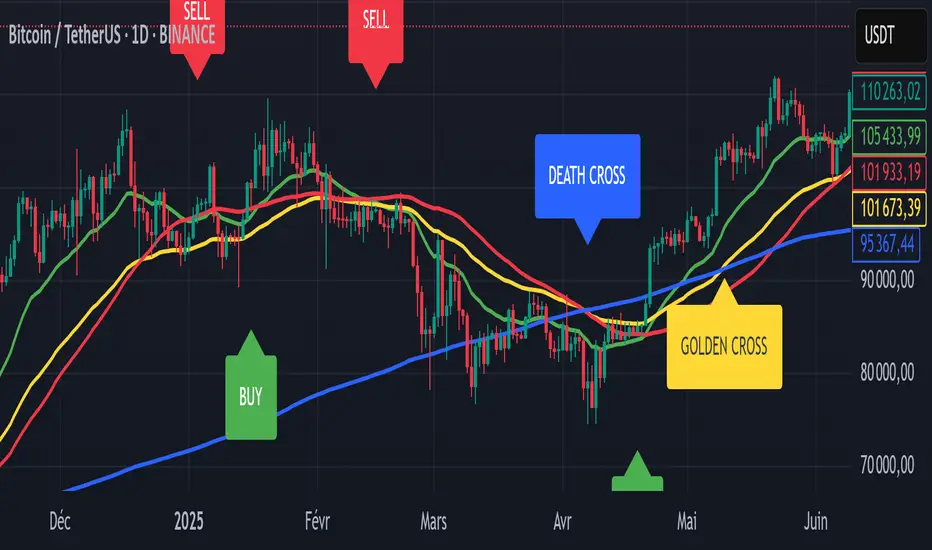
THF Buy/Sell Signal Crossover and Trend Signals Golden CrossIndicator Explanation:
The "THF Buy/Sell and Golden Cross/Death Cross" indicator is designed to provide trend signals using EMA (Exponential Moving Averages) and SMA (Simple Moving Averages), with a focus on Golden Cross and Death Cross patterns. It also includes Buy and Sell signals based on crossovers of these moving averages. This indicator aims to assist traders in identifying trend changes, potential entry/exit points, and overall market momentum.
Key Features:
1. Exponential Moving Averages (EMA):
EMA 21 (Green): A short-term moving average that responds more quickly to price changes.
EMA 50 (Yellow): A medium-term moving average used to capture intermediate trends.
2. Simple Moving Averages (SMA):
SMA 50 (Red): A longer-term moving average, often used to identify the overall market trend.
SMA 200 (Blue): A key long-term moving average, helping identify major trend shifts in the market.
3. Buy and Sell Signals:
Buy Signal: Triggered when the EMA 21 crosses above the SMA 50 (bullish crossover). This indicates potential buying opportunities.
Sell Signal: Triggered when the EMA 21 crosses below the SMA 50 (bearish crossover), suggesting potential selling opportunities.
4. Golden Cross (Bullish Trend Reversal):
Occurs when EMA 50 crosses above SMA 200. It signals a potential long-term bullish market trend.
Golden Cross is highlighted on the chart with a yellow label to indicate the event.
5. Death Cross (Bearish Trend Reversal):
Occurs when EMA 50 crosses below SMA 200. It suggests a potential bearish market trend.
Death Cross is highlighted with a blue label on the chart to indicate the event.
6. Volume Moving Average:
The volume moving average (based on a 20-period default) is plotted to show the average trading volume.
Volume bars are color-coded (green for high volume, red for low volume) to show when the volume is increasing or decreasing compared to the moving average.
How to Use:
Buy Signal: Look for green labels marked "BUY" when the EMA 21 crosses above the SMA 50.
Sell Signal: Watch for red labels marked "SELL" when the EMA 21 crosses below the SMA 50.
Golden Cross: A yellow label will indicate when the EMA 50 crosses above the SMA 200, signaling potential long-term upward momentum.
Death Cross: A blue label appears when the EMA 50 crosses below the SMA 200, suggesting potential long-term downward pressure.
Volume: Pay attention to the volume bars. High volume (green bars) suggests strong momentum, while low volume (red bars) might indicate weak trends.
Ideal for:
Trend-following traders: This indicator helps identify trend reversals and provide buy/sell signals.
Traders focusing on major trend changes: The Golden and Death Cross signals can help spot long-term bullish or bearish trends.
Volume traders: The volume bars and volume moving average help validate price moves and momentum.
Benefits:
Clear visual signals for buy, sell, golden cross, and death cross events.
Color-coded volume to indicate strong or weak market momentum.
Helps identify trend changes using both short-term and long-term moving averages.
THF Crossover and Trend Signals Golden & Death Cross with VolumeScript Overview:
This Pine Script is designed to assist traders in identifying key buy/sell signals and major trend changes on the chart using Exponential Moving Averages (EMA) and Simple Moving Averages (SMA), as well as visualizing Golden Cross and Death Cross events. The script also includes a volume indicator to highlight the volume trading activity in relation to the price movements.
Key Features:
1. Moving Averages:
EMA 21: Exponential Moving Average over a 21-period, shown in green.
EMA 50: Exponential Moving Average over a 50-period, shown in yellow.
SMA 50: Simple Moving Average over a 50-period, shown in red.
SMA 200: Simple Moving Average over a 200-period, shown in blue.
2. Signals:
Buy Signal: Generated when EMA 21 crosses above SMA 50, indicating a potential upward trend. Displayed with a green label below the price bar.
Sell Signal: Generated when EMA 21 crosses below SMA 50, indicating a potential downward trend. Displayed with a red label above the price bar.
3. Golden Cross (Bullish Trend):
A Golden Cross occurs when EMA 50 crosses above SMA 200, which often signals the start of a long-term upward trend. The signal is displayed with a yellow label below the price bar.
4. Death Cross (Bearish Trend):
A Death Cross occurs when EMA 50 crosses below SMA 200, which often signals the start of a long-term downward trend. The signal is displayed with a blue label above the price bar.
5. Volume Indicator:
The volume is plotted as colored columns. Green indicates higher volume than the 20-period moving average, and red indicates lower volume.
A Volume Moving Average (SMA 20) is also plotted to compare volume changes over time.
How the Script Works:
1. The EMA and SMA lines are plotted on the chart, providing a visual representation of the short- and long-term trends.
2. Buy/Sell signals are triggered based on the crossover between EMA 21 and SMA 50, helping to identify potential entry and exit points.
3. The Golden Cross and Death Cross indicators highlight major trend reversals based on the crossover between EMA 50 and SMA 200, providing clear visual cues for long-term trend changes.
4. Volume is displayed alongside price movements, offering insight into the strength or weakness of a trend.
Key Customizations:
Moving Average Periods: Users can modify the lengths of the EMAs and SMAs for customized analysis.
Volume Moving Average Period: The script allows for adjustment of the volume moving average period to suit different market conditions.
Signal Visibility: The size and color of the buy, sell, Golden Cross, and Death Cross signals can be easily customized to make them more prominent on the chart.
Conclusion:
This script is ideal for traders looking to combine price action with volume analysis, using key technical indicators such as EMA, SMA, Golden Cross, and Death Cross to make informed decisions in trending markets.
---
This explanation covers all aspects of the script and provides a clear understanding of its functionality, which is helpful for sharing the script or using it as an educational resource.

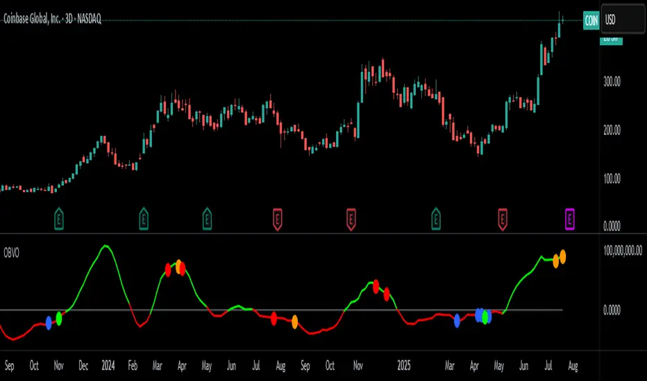
OBV Oscillator with Divergence CirclesCredit to original code from the 'PPO Divergence alerts' by Scarf and OBV Oscillator by LazyBear is used as the input.
Replication of Lunndi 'OBV Divergence Alerts (BETA)' script with additional divergence logic implemented.
OBV-based divergence logic adapted from RSI divergence logic added in addition to existing divergence logic.
Modify length and smoothing to suit your trading style. Open source free for use.
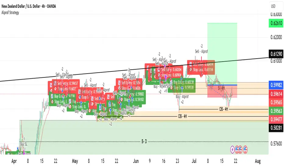
Alprof Strategyyou can get strategy by TS this strategy you can get a entry point
you can get strategy by TS this strategy you can get a entry point
you can get strategy by TS this strategy you can get a entry point
you can get strategy by TS this strategy you can get a entry point
you can get strategy by TS this strategy you can get a entry point
you can get strategy by TS this strategy you can get a entry point
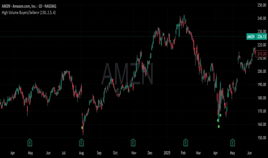
High Volume Buyers/Sellers+High Volume Buyers/Sellers+
This indicator helps traders spot bars where unusually high or extreme volume occurs, indicating strong buying or selling pressure.
How it works:
Calculates a volume moving average (SMA) over a user-defined period.
Marks bars where the current volume exceeds:
High Volume Multiplier → small green circle (bullish) or red circle (bearish).
Extreme Volume Multiplier → small green up-triangle (bullish) or red down-triangle (bearish).
Settings:
Volume MA Period → Number of bars used to calculate the average volume.
High Volume Multiplier → Threshold to define high volume.
Extreme Volume Multiplier → Threshold to define extreme volume.
Show Extreme Volume Signals → Option to enable or disable extreme volume markers.
Usage tips:
Apply this indicator on a clean chart to visually highlight momentum bursts or exhaustion points.
It works well for both intraday and swing trading strategies where volume confirmation matters.
⚠ Note: This script only displays on-chart markers and does not plot any lines or indicators.
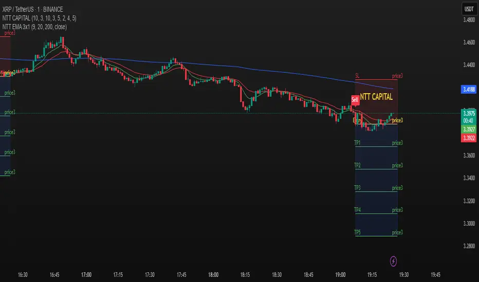
3 EMA trong 1 NTT CAPITALThe 3 EMA in 1 NTT CAPITAL indicator provides an overview of the market trend with three EMAs of different periods, helping to identify entry and exit points more accurately, thus supporting traders in making quick and effective decisions.
combo EMAS Session [Indexprofx]🧠 Description:
This indicator highlights the New York and London trading sessions directly on the chart, offering a clear visual reference for intraday trading.
It is a complementary tool designed to work seamlessly with our main system: Intraday Signal.
✔️ Displays the most active market hours.
✔️ Enhances precision in entry and exit decisions.
✔️ Perfect for XAUUSD (Gold) traders and other high-volatility instruments.
🧠 Description:
This indicator plots three key Exponential Moving Averages (EMAs) to help traders identify market trends and potential entry/exit points with precision:
EMA 8 (Green) – Fast trend, useful for scalping or short-term signals
EMA 50 (Blue) – Mid-term trend filter
EMA 150 (Red) – Long-term bias and trend direction
It is part of the IndexProFX toolkit and integrates smoothly with other tools like Intraday Signal and Session Zones for enhanced confluence trading.
✔️ Clean structure
✔️ Easy-to-read color-coded EMAs
✔️ Supports scalping, day trading, and swing trading strategies
