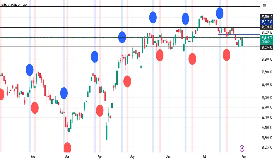
MTF Clean Panelsit is bigger model of a earlier model then i have made earlier it helps you see multiple timeframes together and includes more daily timeframe and have also been introduced a new 4 hours candle structure
Cycles

SmartMind2The MACD (Moving Average Convergence Divergence) is a popular technical indicator in trading, primarily used to detect trends and possible reversal points.
How is the MACD structured?
The MACD indicator consists of three components:
MACD Line:
Calculated as the difference between two exponential moving averages (EMAs), commonly 12 and 26 periods.
Formula:
MACD Line
=
𝐸
𝑀
𝐴
12
(
Price
)
−
𝐸
𝑀
𝐴
26
(
Price
)
MACD Line=EMA
12
(Price)−EMA
26
(Price)
Signal Line:
An exponential moving average (usually 9 periods) of the MACD line.
Formula:
Signal Line
=
𝐸
𝑀
𝐴
9
(
MACD Line
)
Signal Line=EMA
9
(MACD Line)
Histogram:
Graphically represents the difference between the MACD line and the Signal line.
Formula:
Histogram
=
MACD Line
−
Signal Line
Histogram=MACD Line−Signal Line
Interpretation of MACD:
Buy Signal: Occurs when the MACD line crosses above the signal line (bullish signal).
Sell Signal: Occurs when the MACD line crosses below the signal line (bearish signal).
Trend Reversal: A divergence between price movements and the MACD indicates a potential reversal (e.g., rising prices with a falling MACD).
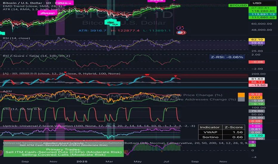
RSI Z‑Score + TableRSI Z-Score + Table
This script calculates the Z-Score of the RSI (Relative Strength Index), which standardizes RSI based on its own recent history.
What It Shows:
RSI Z-Score = (Current RSI - Mean RSI) / Standard Deviation
This tells you how extreme the current RSI is compared to its historical values.
A table displays:
Current RSI
Rolling Mean
RSI Z-Score
How to Use:
Z-Score > +2 = Statistically overbought
Z-Score < -2 = Statistically oversold
Use it to time reversals or overextension in RSI behavior.
🔒 Based on rolling lookback window — fully customizable.
Author:
Tags: #RSI #ZScore #Momentum #StatisticalEdge #MeanReversion #Crypto
Ghost Month HighlighterThe term "Ghost Month" refers to the seventh lunar month in the Chinese calendar, a period considered inauspicious for major activities like trading or investing in some cultures, due to superstitions about spirits influencing events
Night Session Highlight with Timezone (Valehson)Highlights this time range from 21:00 to 09:00 with a gray background with 90% transparency.
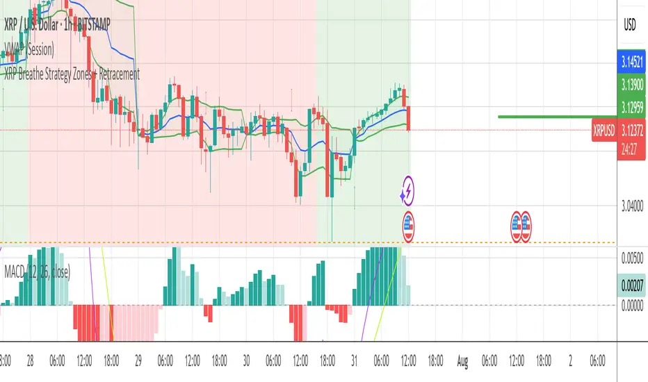
XRP Breathe Strategy Zones + RetracementGreen/red backgrounds = Inhale/Exhale phase timing
Horizontal lines at $3.65 / $3.00 / $2.60 for reference
MACD arrows = entry/exit hints within phase context
New yellow/purple retracement lines:
Inhale → yellow line = pullback buy zone
Exhale → purple line = potential rally target or short zone
Night Session Highlight (Valehson)Highlights time range from 21:00 to 09:00 with a gray background with 90% transparency.
ALPHA 999This indicator is designed to provide traders with clear and reliable signals by combining essential technical tools into one simplified framework. Whether you’re trading crypto, stocks, or forex, this tool helps identify potential entry and exit points using . It is well-suited for both intraday and swing traders, offering customizable inputs, multi-timeframe compatibility, and real-time alerts. The indicator displays intuitive visual cues directly on the chart, making it easy to interpret market conditions and respond quickly. Ideal for traders who prefer clean charts with actionable signals, this tool enhances decision-making without overwhelming complexity. While powerful on its own, it can be paired with other indicators for greater confirmation and accuracy. Please note: this indicator is for educational purposes only and should be used with proper risk management and backtesting before applying to live trades.
ALPHA 999This script is a custom-built indicator designed to enhance your trading strategy by providing . It is optimized for and suitable for both intraday and swing traders.

Dynamic Gap Probability Tool with N-Bar Decay📌 How It Works
1. Moving Average (MA) Reference
o The indicator plots a moving average (SMA, EMA, WMA, etc.) on the chart.
o Price can be above or below this moving average.
2. Probability Tracking
o Every time a bar closes, the script records:
Whether the next candle closed up (green) or down (red).
Whether within the next N bars (e.g., 3 bars ahead) the price moved higher or lower than the current close.
3. N Bar Lookahead
o Instead of only caring about the very next candle, it looks forward several bars to see if the market eventually moves in your favor.
o Example: If N = 3, it answers:
"Within the next 3 bars, what’s the chance price will go higher/lower from here?"
4. Results Table
o At the edge of your chart, the table shows:
✅ Next Green % – Probability next candle is bullish.
❌ Next Red % – Probability next candle is bearish.
📈 N Bar Bull % – Probability that within N bars, price goes higher.
📉 N Bar Bear % – Probability that within N bars, price goes lower.
💡 Why It’s Useful for Traders
• Removes Guesswork – Instead of relying on “gut feeling,” you see historical probabilities for how price reacts when above/below the MA.
• Better Trade Timing – If N Bar Bullish Probability is high, it suggests waiting for confirmation and holding longer than just 1 candle.
• Adapts to Style –
o Scalpers: Use N = 1 to see immediate probabilities.
o Swing Traders: Use N = 3, 5, or 10 to see longer-term reaction probabilities.
• Trend Awareness – Works differently above and below the moving average, giving you a bias toward long or short trades.
• Confidence in Decisions – Probabilities are based on real past data from the chart’s history.

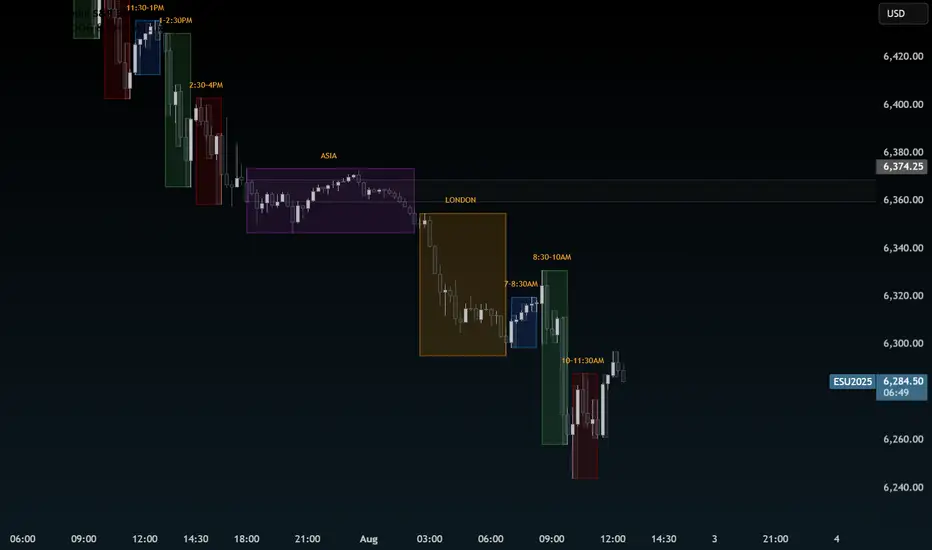
Time CyclesUses Zeussy's time and price cycles. This shows the Asia and London sessions, and has the PM session broken into 90 minute cycles with the option of toggling 30m cycles within them.
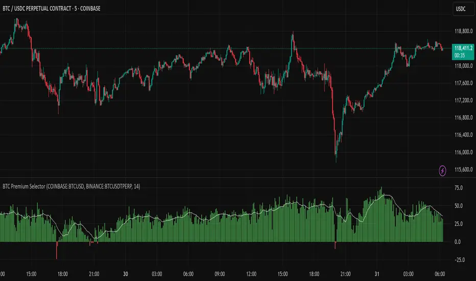
Multi CEX BTC Spot vs Perpetual PremiumThis Indicator shows the BTC Spot vs Perpetual premium across different CEX.
Combined Time and Price IndicatorCammjayyy THis is a time frame indicator that changes the colors based on day highs and lows. really good for swings and hedging

Square Root Candles Its just a squareroot candles of Main chart the major support and resistance levels at 0.1, 0.45 and 0.75 levels

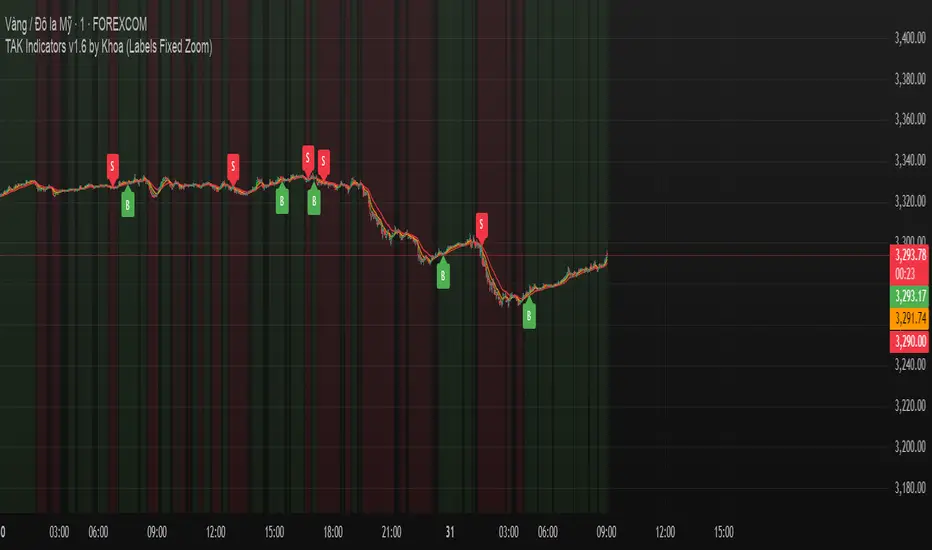
TAK Indicators by Khoa //@version=6
indicator("TAK Indicators by Khoa ", overlay=true)
// === EMA ===
ema10 = ta.ema(close, 10)
ema21 = ta.ema(close, 21)
ema50 = ta.ema(close, 50)
plot(ema10, "EMA 10", color=color.green)
plot(ema21, "EMA 21", color=color.orange)
plot(ema50, "EMA 50", color=color.red)
// === Trend check
isUpTrend = ema10 > ema21 and ema21 > ema50
isDownTrend = ema10 < ema21 and ema21 < ema50
// === RSI
rsi = ta.rsi(close, 14)
rsiBull = ta.crossover(rsi, 50)
rsiBear = ta.crossunder(rsi, 50)
// === Confirmation candle
bullCandle = close > open
bearCandle = close < open
priceConfirmBuy = close > ema10 and close > ema21 and bullCandle
priceConfirmSell = close < ema10 and close < ema21 and bearCandle
// === State machine
var bool inLong = false
var bool inShort = false
buySignal = false
sellSignal = false
if isUpTrend and rsiBull and priceConfirmBuy and not inLong
buySignal := true
inLong := true
inShort := false
else
buySignal := false
if isDownTrend and rsiBear and priceConfirmSell and not inShort
sellSignal := true
inShort := true
inLong := false
else
sellSignal := false
// === DÍNH LABEL DỰA THEO GIÁ (KHÔNG BỊ TRƯỢT ZOOM DỌC)
if buySignal
label.new(bar_index, low - (syminfo.mintick * 10), "B", style=label.style_label_up, color=color.green, textcolor=color.white, size=size.small)
if sellSignal
label.new(bar_index, high + (syminfo.mintick * 10), "S", style=label.style_label_down, color=color.red, textcolor=color.white, size=size.small)
// === Nền trend
bgcolor(isUpTrend ? color.new(color.green, 90) : na)
bgcolor(isDownTrend ? color.new(color.red, 90) : na)
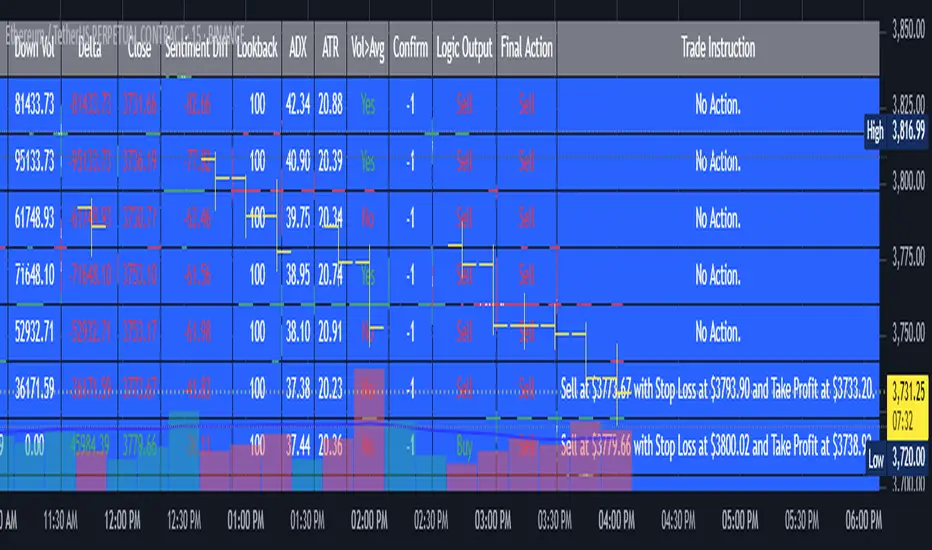
AI's Opinion Trading System V21. Complete Summary of the Indicator Script
AI’s Opinion Trading System V2 is an advanced, multi-factor trading tool designed for the TradingView platform. It combines several technical indicators (moving averages, RSI, MACD, ADX, ATR, and volume analysis) to generate buy, sell, and hold signals. The script features a customizable AI “consensus” engine that weighs multiple indicator signals, applies user-defined filters, and outputs actionable trade instructions with clear stop loss and take profit levels. The indicator also tracks sentiment, volume delta, and allows for advanced features like pyramiding (adding to positions), custom stop loss/take profit prices, and flexible signal confirmation logic. All key data and signals are displayed in a dynamic, color-coded table on the chart for easy review.
2. Full Explanation of the Table
The table is a real-time dashboard summarizing the indicator’s logic and recommendations for the most recent bars. It is color-coded for clarity and designed to help traders quickly understand market conditions and AI-driven trade signals.
Columns (from left to right):
Column Name What it Shows
Bar The time context: “Now” for the current bar, then “Bar -1”, “Bar -2”, etc. for previous bars.
Raw Consensus The raw AI consensus for each bar: “Buy”, “Sell”, or “-” (neutral).
Up Vol The amount of volume on up (rising) bars.
Down Vol The amount of volume on down (falling) bars.
Delta The difference between up and down volume. Green if positive, red if negative, gray if neutral.
Close The closing price for each bar, color-coded by price change.
Sentiment Diff The difference between the close and average sentiment price (a custom sentiment calculation).
Lookback The number of bars used for sentiment calculation (if enabled).
ADX The ADX value (trend strength).
ATR The ATR value (volatility measure).
Vol>Avg “Yes” (green) if volume is above average, “No” (red) otherwise.
Confirm Whether the AI signal is confirmed over the required bars.
Logic Output The AI’s interpreted signal after applying user-selected logic: “Buy”, “Sell”, or “-”.
Final Action The final signal after all filters: “Buy”, “Sell”, or “-”.
Trade Instruction A plain-English instruction: Buy/Sell/Add/Hold/No Action, with price, stop loss, and take profit.
Color Coding:
Green: Positive/bullish values or signals
Red: Negative/bearish values or signals
Gray: Neutral or inactive
Blue background: For all table cells, for visual clarity
White text: Default, except for color-coded cells
3. Full User Instructions for Every Input/Style Option
Below are plain-language instructions for every user-adjustable option in the indicator’s input and style pages:
Inputs
Table Location
What it does: Sets where the summary table appears on your chart.
How to use: Choose from 9 positions (Top Left, Top Center, Top Right, etc.) to avoid overlapping with other chart elements.
Decimal Places
What it does: Controls how many decimal places prices and values are displayed with.
How to use: Increase for assets with very small prices (e.g., SHIB), decrease for stocks or forex.
Show Sentiment Lookback?
What it does: Shows or hides the “Lookback” column in the table, which displays how many bars are used in the sentiment calculation.
How to use: Turn off if you want a simpler table.
AI View Mode
What it does: Selects the logic for how the AI combines signals from different indicators.
Majority: Follows the most common signal among all indicators.
Weighted: Uses custom weights for each type of signal.
Custom: Lets you define your own logic (see below).
How to use: Pick the logic style that matches your trading philosophy.
AI Consensus Weight / Vol Delta Weight / Sentiment Weight
What they do: When using “Weighted” AI View Mode, these let you set how much influence each factor (indicator consensus, volume delta, sentiment) has on the final signal.
How to use: Increase a weight to make that factor more important in the AI’s decision.
Custom AI View Logic
What it does: Lets advanced users write their own logic for when the AI should signal a trade (e.g., “ai==1 and delta>0 and sentiment>0”).
How to use: Only use if you understand basic boolean logic.
Use Custom Stop Loss/Take Profit Prices?
What it does: If enabled, you can enter your own fixed stop loss and take profit prices for buys and sells.
How to use: Turn on to override the auto-calculated SL/TP and enter your desired prices below.
Custom Buy/Sell Stop Loss/Take Profit Price
What they do: If custom SL/TP is enabled, these fields let you set exact prices for stop loss and take profit on both buy and sell trades.
How to use: Enter your preferred price, or leave at 0 for auto-calculation.
Sentiment Lookback
What it does: Sets how many bars the sentiment calculation should look back.
How to use: Increase to smooth out sentiment, decrease for faster reaction.
Max Pyramid Adds
What it does: Limits how many times you can add to an existing position (pyramiding).
How to use: Set to 1 for no adds, higher for more aggressive scaling in trends.
Signal Preset
What it does: Quick-sets a group of signal parameters (see below) for “Robust”, “Standard”, “Freedom”, or “Custom”.
How to use: Pick a preset, or select “Custom” to adjust everything manually.
Min Bars for Signal Confirmation
What it does: Sets how many bars a signal must persist before it’s considered valid.
How to use: Increase for more robust, less frequent signals; decrease for faster, but possibly less reliable, signals.
ADX Length
What it does: Sets the period for the ADX (trend strength) calculation.
How to use: Longer = smoother, shorter = more sensitive.
ADX Trend Threshold
What it does: Sets the minimum ADX value to consider a trend “strong.”
How to use: Raise for stricter trend confirmation, lower for more trades.
ATR Length
What it does: Sets the period for the ATR (volatility) calculation.
How to use: Longer = smoother volatility, shorter = more reactive.
Volume Confirmation Lookback
What it does: Sets how many bars are used to calculate the average volume.
How to use: Longer = more stable volume baseline, shorter = more sensitive.
Volume Confirmation Multiplier
What it does: Sets how much current volume must exceed average volume to be considered “high.”
How to use: Increase for stricter volume filter.
RSI Flat Min / RSI Flat Max
What they do: Define the RSI range considered “flat” (i.e., not trending).
How to use: Widen to be stricter about requiring a trend, narrow for more trades.
Style Page
Most style settings (such as plot colors, label sizes, and shapes) are preset in the script for visual clarity.
You can adjust plot visibility and colors (for signals, stop loss, take profit) in the TradingView “Style” tab as with any indicator.
Buy Signal: Shows as a green triangle below the bar when a buy is triggered.
Sell Signal: Shows as a red triangle above the bar when a sell is triggered.
Stop Loss/Take Profit Lines: Red and green lines for SL/TP, visible when a trade is active.
SL/TP Labels: Small colored markers at the SL/TP levels for each trade.
How to use:
Toggle visibility or change colors in the Style tab if you wish to match your chart theme or preferences.
In Summary
This indicator is highly customizable—you can tune every aspect of the AI logic, risk management, signal filtering, and table display to suit your trading style.
The table gives you a real-time, comprehensive view of all relevant signals, filters, and trade instructions.
All inputs are designed to be intuitive—hover over them in TradingView for tooltips, or refer to the explanations above for details.
BTC vs MSTR PerformanceBTC vs MSTR Performance - BULL
• Green: MSTR has outperformed BTC over the selected time period.
• Red: BTC has outperformed MSTR during the same time period.
• Horizontal line at 0: Separates positive from negative outperformance.


2% Averaging Buy-Sell Strategy📘 Strategy Description: 2% Averaging Buy-Sell Strategy
This strategy is designed to simulate an averaging-down and scaling-out approach based on percentage-based price movements.
Entry Logic (Buy):
Initial buy of 1 lot is triggered at the start of the strategy.
Every time the price drops by 2% from the last executed buy level, the strategy adds 2 more lots.
Exit Logic (Sell):
When the price rises 2% from the last buy level, the strategy sells 2 lots.
Selling continues in batches of 2 lots as long as the upward movement continues and lots are available.
Core Idea:
This is a dynamic averaging system that increases exposure during drawdowns and reduces it during rallies, aiming to capture mean reversion or trend reversals.
Customizable Inputs:
Initial lot size
Additional lot size
Percentage threshold (default 2%)
⚠️ Note: This strategy is for simulation/backtesting purposes. It does not account for slippage, fees, or real-world order execution conditions.