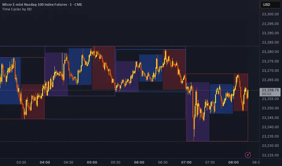
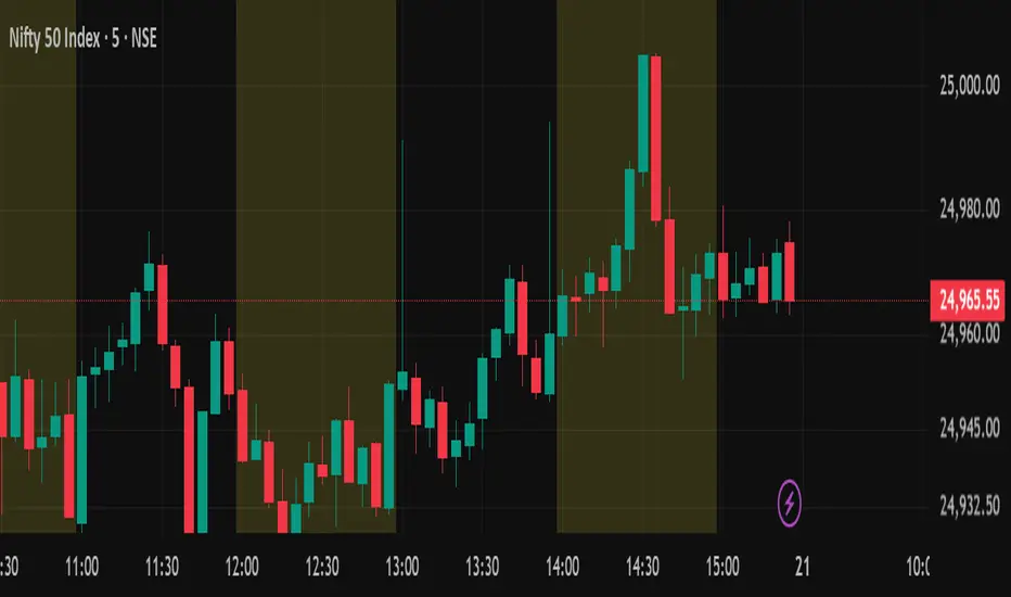
Time CyclesThese are ICT market time cycles based on the idea that London starts at 3:30am (EST) and continues until 7am. NYAM is then from 7am-11:30am. NYPM from 11:30-4pm. Each of these sessions is broken into 90minute cycles which are also broken into 30minute cycles.
Cycles
US Macro Indicators (CPI YoY, PPI YoY, Interest Rate)US Macro Indicators (CPI YoY, PPI YoY, Interest Rate)
This indicator overlays the most important US macroeconomic trends for professional traders and analysts:
CPI YoY (%): Tracks year-over-year change in the Consumer Price Index, the main measure of consumer inflation, and a core focus for Federal Reserve policy.
PPI YoY (%): Shows year-over-year change in the Producer Price Index, often a leading indicator for future consumer inflation and margin pressures.
Fed Funds Rate (%): Plots the US benchmark interest rate, reflecting the real-time stance of US monetary policy.
Additional Features:
Key policy thresholds highlighted:
2% (Fed’s formal inflation target)
1.5% (comfort floor)
3% and 4% (upper risk/watch zones for inflation)
Transparent background shading signals elevated inflation zones for quick visual risk assessment.
Works on all asset charts and timeframes (macro data is monthly).
Why use it?
This tool lets you instantly visualize inflation trends versus policy and spot key macro inflection points for equities, FX, and rates. Perfect for anyone applying macro fundamentals to tactical trading and investment decisions.

SessionsSession 10-12 12-16 1630-1830
Including HOD/LOD for different sessions.
Session 10:00 - 12: 00
Session 12:00 - 16:00
Session 16:30 - 18:30

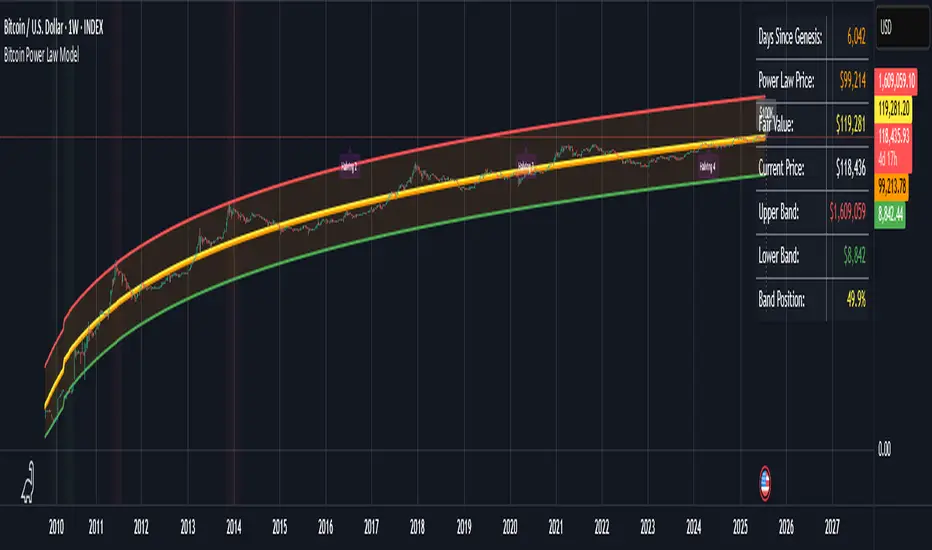
Bitcoin Power Law ModelBitcoin Power Law Model with Cycle Predictions
Scientific Price Modeling for Bitcoin
This indicator implements **Dr. Giovanni Santostasi's Bitcoin Power Law Theory** - a discovery that Bitcoin's price follows mathematical laws similar to natural phenomena. Unlike traditional financial models, this treats Bitcoin as a scale-invariant system that grows predictably over time.
What Makes This Special
Dr. Santostasi, an astrophysicist who studied gravitational waves, discovered that Bitcoin's price forms a perfect straight line when plotted on a log-log scale over its entire 15-year history. This isn't just another technical indicator - it's a fundamental law that has held true through multiple 80%+ crashes and recoveries.
Core Features
Power Law Model
- Orange Line: The power law trajectory showing Bitcoin's long-term growth path
- Yellow Line: Fair value (geometric mean between support and resistance)
- Green/Red Bands: Support and resistance levels that have historically contained price movements
- Band Position %: Shows exactly where price sits within the power law channel (0-100%)
How to Use It
For Long-term Investors
1. Accumulate when price is near the green support line (band position < 20%)
2. Hold when price is between the bands
3. Consider profits when approaching red resistance (band position > 80%)
4. Never panic - the model shows $30K+ is now the permanent floor
Key Metrics to Watch
- **Band Position: <20% = Oversold, >80% = Overbought
- Fair Value: Price above = Overvalued, below = Undervalued
- Support Line: Breaking below suggests model invalidation
Current Cycle Projections
Based on the November 2022 bottom at ~$15,500:
- Cycle Peak: ~$155,000-$230,000 (October 2025)
- Next Bottom: ~$70,000-$100,000 (October 2026)
- Long-term: $1 million by 2033 (power law projection)
Customizable Settings
Model Parameters
- Intercept & Slope: Fine-tune the power law formula
- Band Offsets: Adjust support/resistance distances
Display Options
- Toggle each visual element on/off
- Show/hide future projections
- Enable/disable cycle analysis
- Customize halving markers
Understanding the Math
The model uses the formula: **Price = 10^(A + B × log10(days since genesis))**
Where:
- A = -17.01 (intercept)
- B = 5.82 (slope)
- Days counted from Bitcoin's genesis block (Jan 3, 2009)
This creates parallel support/resistance lines in log-log space that have contained Bitcoin's price for 15+ years.
Important
1.Not Financial Advice: This is a mathematical model, not a guarantee
2. Long-term Focus: Best suited for macro analysis, not day trading
3. Model Limitations: Past performance doesn't ensure future results
4. Volatility Expected: 50-80% drawdowns are normal within the model
Background
Dr. Giovanni Santostasi discovered this model while analyzing Bitcoin through the lens of physics. He found that Bitcoin behaves more like a city or organism than a financial asset, growing according to universal power laws found throughout
9:30 AM Candle MarkerEach day at 9:30 AM, on the 15-minute chart, you’ll see a red vertical line appear exactly on that candle. This makes it super easy to:
Track reactions to market open (if using US stocks).
Anchor your strategy to a consistent time point.
Build routines around a known time.

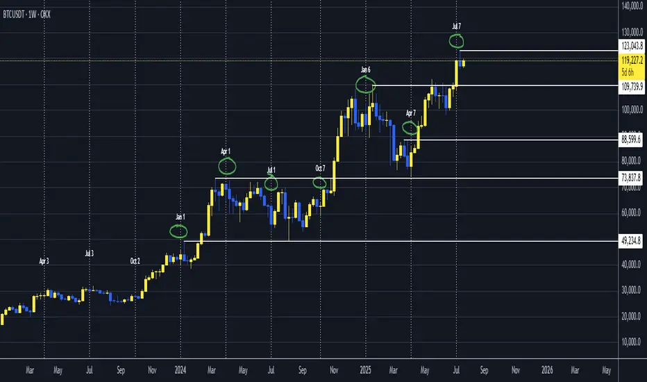
Bitcoin Stock-to-Flow Model Price Bands# Bitcoin Stock-to-Flow Model Price Bands
Overview
This indicator implements the famous Stock-to-Flow (S2F) model created by PlanB (@100trillionUSD), which uses Bitcoin's scarcity to predict its long-term value. The S2F model has gained significant attention for its historical accuracy in capturing Bitcoin's price movements across multiple market cycles.
What is Stock-to-Flow?
Stock-to-Flow is a ratio that measures scarcity by dividing the current supply (stock) by the annual production (flow). The model suggests that as Bitcoin becomes scarcer through halving events, its value should increase proportionally.
This indicator features:
Dynamic S2F Calculation
- Automatically calculates Bitcoin's current supply based on block height
- Adjusts for halving events (every 210,000 blocks)
- Updates the S2F ratio in real-time
Visual Elements
- Orange Line: S2F model price based on the formula: Price = 0.4 × S2F³
- Confidence Bands: Upper (red) and lower (green) bands showing expected price ranges
- Colored Candles: Green when above model price, red when below
- Info Table: Displays current S2F ratio, model price, actual price, and price multiple
Customizable Parameters
- Model Coefficient: Adjust the multiplier (default: 0.4)
- Model Exponent: Modify the power factor (default: 3.0)
- Band Width: Control confidence band spread (1-5 standard deviations)
- Display Options: Toggle individual elements on/off
Built-in Alerts
- Price crossing above/below S2F model price
- Price exceeding upper/lower confidence bands
How to Use
1. Trend Identification: When price is above the orange S2F line, Bitcoin may be overvalued; below suggests undervaluation
2. Cycle Analysis: The model steps up at each halving, creating distinct price "floors"
3. Risk Management: Use confidence bands to identify extreme deviations from the model
4. Long-term Perspective: Best suited for macro analysis rather than short-term trading
Important to understand:
This is a model, not a guarantee. The S2F model:
- Assumes scarcity is the primary driver of value
- Doesn't account for demand-side factors
- Has shown deviations during certain market conditions
- Should be used alongside other analysis methods
Model Performance
Historically, the S2F model has captured major Bitcoin price movements:
- 2013 Bull Run: Price followed model predictions
- 2017 Peak: Reached model targets
- 2021 Cycle: Initially tracked, then deviated
- 2024-2025: Model suggests $500k-$1M potential
Technical Details
- Uses logarithmic regression similar to the original S2F model
- Accounts for "lost" coins (est. 1M BTC from early mining)
- Implements dynamic supply calculation through halving cycles
- Confidence bands use log-normal distribution
Best Timeframes
- Weekly/Monthly: Ideal for long-term trend analysis
Credits
Based on the Stock-to-Flow model by PlanB (@100trillionUSD)
Original article: "Modeling Bitcoin's Value with Scarcity" (2019)

Period Separator with DatesSimple period separator with dates. You can customize lines and colours. Feel free to customize and share your thoughts in the comment section. Remember time is the only thing you need to master the markets. Keep your charts clean and enjoy trading! ;)
Goldbach Swing Points [z3nius]This script checks if the swing point's time (hour + minute) is a Goldbach number. Only works on CME futures charts.
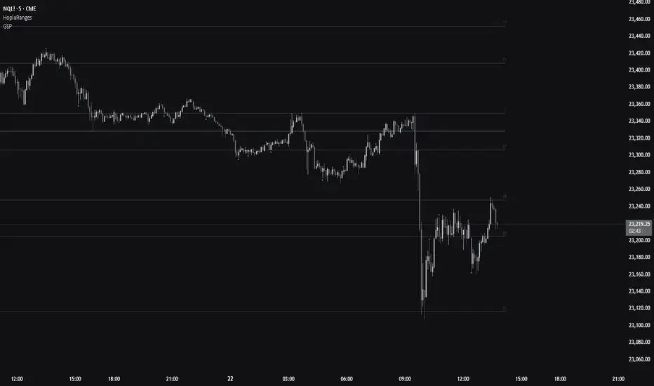
Horizontal Grid from Base PriceSupport & Resistance Indicator function
This inductor is designed to analyze the "resistance line" according to the principle of mother fish technique, with the main purpose of:
• Measure the price swing cycle (Price Swing Cycle)
• analyze the standings of a candle to catch the tempo of the trade
• Used as a decision sponsor in conjunction with Price Action and key zones.
⸻
🛠️ Main features
1. Create Automatic Resistance Boundary
• Based on the open price level of the Day (Initial Session Open) bar.
• It's the main reference point for building a price framework.
2. Set the distance around the resistance line.
• like 100 dots/200 dots/custom
• Provides systematic price tracking (Cycle).
3. Number of lines can be set.
• For example, show 3 lines or more of the top-bottom lines as needed.
4. Customize the color and style of the line.
• The line color can be changed, the line will be in dotted line format according to the user's style.
• Day/night support (Dark/Light Theme)
5. Support for use in conjunction with mother fish techniques.
• Use the line as a base to observe whether the "candle stand above or below the line".
• It is used to help see the behavior of "standing", "loosing", or "flow" of prices on the defensive/resistance line.
6. The default is available immediately.
• The default is based on the current Day bar opening price.
• Round distance, e.g. 200 points, top and bottom, with 3 levels of performance
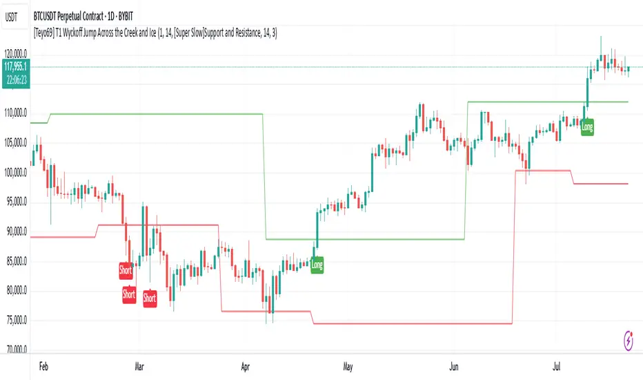
[Teyo69] T1 Wyckoff Jump Across the Creek and Ice📌 Overview
This indicator captures Wyckoff-style breakouts :
JAC (Jump Across the Creek) for bullish structure breakouts
JAI (Jump Across the Ice) for bearish breakdowns
It blends support/resistance logic, volume behavior, and slope/momentum from selected trend-following methods.
🧩 Features
Detects JAC (bullish breakout) and JAI (bearish breakdown) based on trend breakouts confirmed by volume.
Supports multiple trend logic modes:
📈 Super Trend
📉 EMA
🪨 Support & Resistance
📊 Linear Regression
Dynamically plots Creek (resistance) and Ice (support)
Incorporates volume spike and rising volume conditions for high-confidence signals
⚙️ How to Use
Select your preferred trend method from the dropdown.
Wait for:
A breakout in direction (up or down)
Rising volume and volume spike confirmation
Follow "Long" (JAC) or "Short" (JAI) labels for potential entries.
🎛️ Configuration
Indicator Leniency - Signal tolerance range after breakout
S&R Length - Pivot detection length for S/R method
Trend Method - Choose how trend is calculated
Volume SMA - Baseline for volume spike detection
Volume Length - Lookback for volume rising check
🧪 Signal Conditions
JAC Direction flips bullish + volume rising + spike
JAI Direction flips bearish + volume rising + spike
⚠️ Limitations
False signals possible during sideways/choppy markets.
Volume behavior depends on exchange feed accuracy.
S/R mode is slower but more stable; EMA & Linear Regression react faster but can whipsaw.
🔧 Advanced Tips
Use this with Wyckoff Accumulation/Distribution zones for better context.
Combine with RSI/OBV or higher timeframe trend filters.
Adjust leniency_lookback if signals feel too early/late.
If you're using Support and Resistance - Price action moves inside S & R it means that price is ranging.
📝 Notes
Volume conditions must confirm breakout, not just direction shift.
Built using native Pine Script switch and plotshape() for clarity.
"Creek" and "Ice" lines are color-coded trend / Support and Resistance zones.
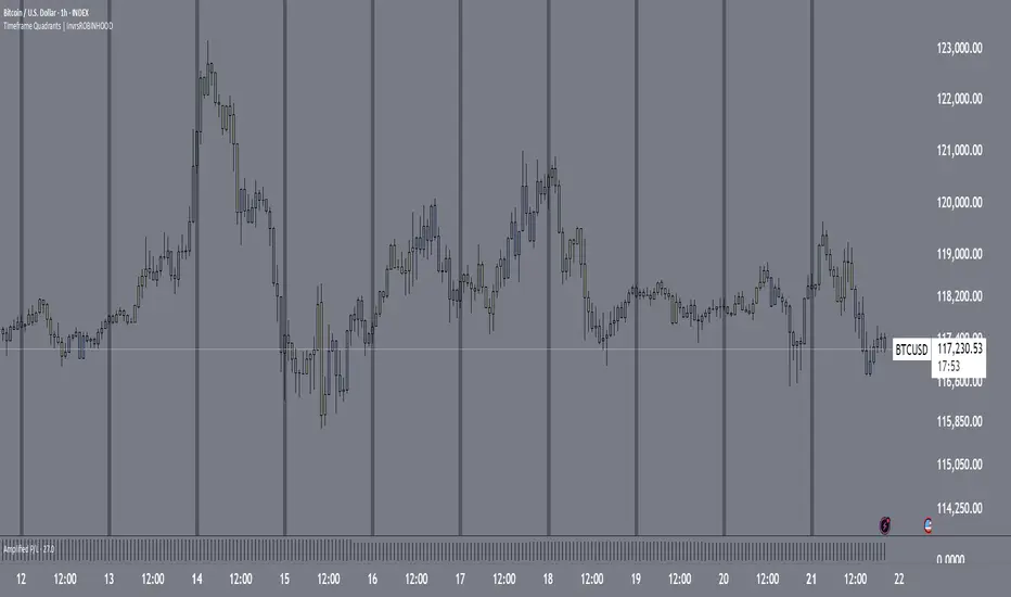
Timeframe Quadrants | InvrsROBINHOODTimeframe Quadrant Visualizer
Summary
This indicator is a powerful visualization tool designed to help traders analyze price action by dividing various timeframes into four distinct, color-coded quadrants. By breaking down periods from a full year to a single minute, it offers a unique perspective on market cycles and intraday patterns. The script includes fully customizable colors and display styles, allowing you to tailor the visual output to your specific charting needs.
Key Features
Multiple Timeframe Divisions: Choose to divide a Year, Month, Week, Day, Hour, or Minute into four parts.
Customizable Quadrant Logic:
Year: Divided into calendar quarters (Jan-Mar, Apr-Jun, Jul-Sep, Oct-Dec).
Month: Divided into four approximate weeks (Days 1-7, 8-14, 15-21, 22-end).
Week: Divided into four 42-hour blocks, starting from Sunday at 00:00.
Day: Divided into four 6-hour blocks.
Hour: Divided into four 15-minute blocks.
Minute: Divided into four 15-second blocks.
Flexible Display Options: Visualize the quadrants as either a full Background Color overlay or a Bar Overlay that colors the price bars directly.
Timeframe Separators: A vertical line is automatically drawn at the beginning of each selected timeframe (e.g., at the start of each new day when "Day" is selected), making it easy to see where each period begins.
Full Color Customization: All four quadrant colors are user-definable, along with a global transparency setting to ensure the indicator complements your chart without obscuring price action.
Timezone-Aware: All calculations are performed based on a user-selected timezone from a dropdown menu, ensuring accuracy and consistency across different markets and trading sessions. As an added option, there is a manual input if the timezone is not available.
How to Use
Add to Chart: Add the "Timeframe Quadrants" indicator to your chart.
Open Settings: Hover over the indicator's name on your chart and click the Settings (gear) icon.
Configure the Indicator:
Timeframe: Select the primary time period you want to divide (e.g., "Day", "Week", "Hour").
Display Method: Choose whether you want the quadrants to appear as a Background Color or a Bar Overlay.
Timezone: Select the desired timezone from the dropdown menu. This is crucial for aligning the quadrants with specific market sessions (e.g., "America/New_York" for the NYSE session).
Quadrant Colors: Customize the color for each of the four quadrants.
Transparency %: Adjust the transparency of the colors to your preference.
Underlying Concepts
This script operates by using Pine Script's built-in time and date variables. It identifies the current bar's position within the user-selected timeframe (timeframe_choice) and assigns it to one of four quadrants based on pre-defined logic. For example, when "Day" is selected, it uses the hour() function to determine which 6-hour block the current bar falls into. The vertical separator lines are generated by detecting a change in the relevant time unit (e.g., ta.change(dayofmonth)), which marks the first bar of a new period.
Disclaimer: This tool is intended for visual analysis and pattern recognition. It does not generate buy or sell signals and should be used in conjunction with your own trading strategy and risk management. Past performance is not indicative of future results.
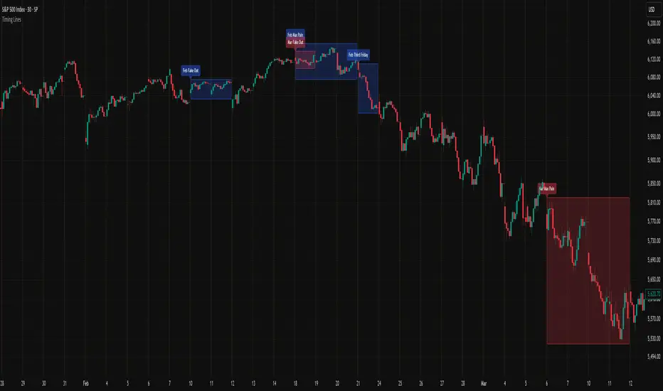
Timing LinesSmall indicator to show third Friday of each month and triple witching events when monthly, weekly and quarterly contracts expire together.
There is also a period of max pain highlighted, when market makers try to balance options with equities before monthly option contracts expiry.
Fakeout marks events when market MAY be very turbulent
Analisis Perubahan Persentase Blok v2(Part 1: Summary)
The Block Percentage Change Analysis Indicator (APP Block) is a visual tool designed to detect significant price movements within a specific time period. Instead of analyzing each candle individually, this indicator identifies a group (block) of candles and provides a visual signal if the total price change from the first candle to the last candle in the block exceeds the percentage you specify.
The goal is to help traders quickly recognize strong momentum, potential reversals, or breakouts from consolidation phases.
(Part 2: Key Features)
Block Visualization: Automatically colors the entire block of candles that meet the criteria, making it easy to see periods of significant price movement.
Direction Detection: Uses different colors (customizable) for upward (Bullish) and downward (Bearish) movements, providing instant insight into the direction of momentum.
Full Customization: You can easily adjust the main parameters according to your trading style, asset, and timeframe:
Number of candles in one block.
Minimum percentage price change required.
Price source being analyzed (Open, High, Low, Close).
Colors for upward and downward blocks.
Alert System: Equipped with built-in alert conditions that you can set to receive notifications whenever a signal block forms.
(Section 3: How It Works)
This indicator works in a simple way:
It looks back at the number of candles you specify (e.g., 20 candles).
Then, it calculates the price change in percentage between the price on the first candle and the price on the last candle in that block.
If the change (whether up or down) exceeds the threshold you set (e.g., 2%), the entire candle block will be colored according to its direction of movement.
(Section 4: How to Use in Trading)
This indicator is flexible and can be used in various ways:
Momentum Confirmation: After a breakout from a pattern, the appearance of a green block (upward) can serve as strong confirmation that a bullish momentum is underway. The opposite applies for red blocks.
Market Exhaustion Identification: In a prolonged upward trend, the first appearance of a red block can signal the initial entry of significant selling pressure, indicating a potential reversal or correction.
Signal Filter: Use as a filter for other indicators. Example: “I will only take a buy signal from RSI if the price has just formed a green block,” to avoid false signals when the market is sideways.
(Section 5: Settings)
Number of Candles in Block: Set the length of the block being analyzed. Smaller values will be more sensitive, while larger values will indicate long-term trends.
Minimum Percentage Change (%): The threshold to trigger a signal. Adjust this value based on asset volatility (e.g., stocks may require 5%, while forex may need 1%).
Price Source: Select which price (Open, High, Low, Close) best suits your strategy. Close is the default option.
Block Color (Up/Down): Adjust the background color to match your chart theme.
(Section 6: Conclusion and Disclaimer)
We hope this indicator is useful for your analysis and trading strategies.
Remember, no indicator is 100% accurate. Always use the APP Block as part of your larger trading system, combine it with other analyses (such as market structure, support/resistance, etc.), and most importantly, always apply proper risk management.
Suggestions and feedback for further development are greatly appreciated! Happy trading!
Translated with D
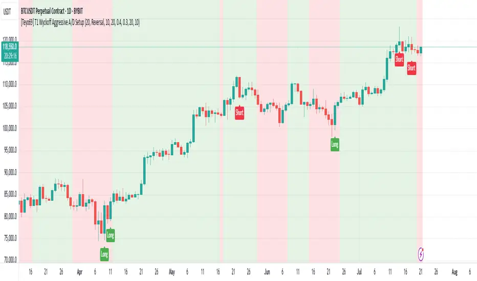
[Teyo69] T1 Wyckoff Aggressive A/D Setup📘 Overview
The T1 Wyckoff Aggressive A/D Setup is a dual-mode indicator that detects bullish accumulations and bearish distributions using core principles from the Wyckoff Method. It identifies price/volume behavior during Selling/Buying Climaxes, ARs, SOS/SOW, and triggers based on trend structure.
🔍 Features
✅ Automatic detection of:
Automatic Rally (AR)
Automatic Reaction (AR)
Sign of Strength (SOS) or Sign of Weakness (SOW)
🧠 Trend-sensitive logic with linear regression slope filters
⚙️ Configurable options for Reversal vs Trend Following mode
🎯 Smart structure timing filters using barssince() logic
🔊 Volume spike and wide-range candle detection
📊 Visual cues for bullish (green) and bearish (red) backgrounds
🛠 How to Use
Reversal Mode
Triggers early signals after a Climax + AR
Ideal for catching turning points during consolidations
Trend Following Mode
Requires Climax, AR, and confirmation (SOS or SOW)
Waits for structure confirmation before signaling
Use this when you want higher probability trades
⚙️ Configuration
Volume MA Length - Determines baseline volume to detect spikes
Wick % of Candle - Filters candles with long tails for SC/BC
Close Near Threshold - Ensures candles close near high/low
Breakout Lookback - Sets structure breakout level
Structure Threshold - Controls timing window for setups
Signal Option - Switch between Reversal or Trend Following mode
⚠️ Limitations
Doesn't confirm macro structure like full Wyckoff phase labeling (A–E)
May repaint on lower timeframes during volatile candles
Works best when combined with visual range recognition and market context
🧠 Advanced Tips
Use in confluence with:
Volume Profile ranges
Trendlines and supply/demand areas
Ideal timeframes: 8H to 1D for crypto and forex markets
Combine this with LPS/UTAD patterns for refined entries
📝 Notes
SC/AR/SOS = Bullish
BC/AR/SOW = Bearish
Trend coloring adapts background (green = rising slope, red = falling slope)
🛡️ Disclaimer
This tool is a market structure guide, not financial advice. Past behavior does not guarantee future performance. Always use proper risk management.
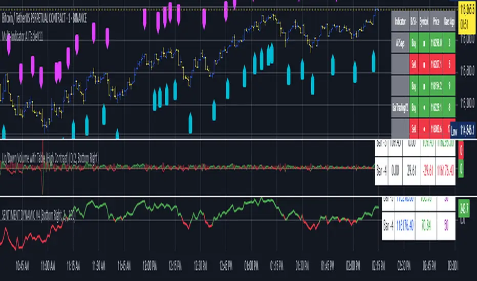
Multi-Indicator AI TableV10Multiple signal generator with table. Exclusive formularies make up the signals generated and shown in the table. Some are long term signals, and some are short term signals. "Ai Says" is a collaboration of all signals within the script. In the settings menu, you can eliminate the charting of any of the signals, but the table will always show the signals. The freshest signal is always the top signal in the indicator group. You know the newest signal by the number in the bar column. This can be used on Cryptocurrencies, Currencies, Stocks and Efts (and other investments). It is a tool and not trading advice. It is a guide to assist your trading decisions.
Alternate Hourly HighlightAlternate Hourly Highlight
This indicator automatically highlights every alternate one-hour window on your chart, making it easy to visually identify and separate each trading hour. The background alternates color every hour, helping traders spot hourly cycles, session changes, or develop time-based trading strategies.
Works on any timeframe.
No inputs required—just add to your chart and go!
Especially useful for intraday traders who analyze price action, volatility, or volume by the hour.
For custom colors or session windows, feel free to modify the script!
Sma-vwap @AnlATAbiliyormuyumThis indicator uses a simple moving average (SMA). When the price moves above the average, it can be considered as a buy signal, and when it falls below, as a sell signal. In addition, weekly, monthly, 3-month, 6-month, and yearly VWAPs have been added. The price's movements above and below these VWAPs can also be evaluated accordingly. Stay in peace and enjoy.
Period Separator with Dates & PriceSimple period separator with dates and h/l price. Easy to analyze market structure, and thats all you need. Enjoy trading!

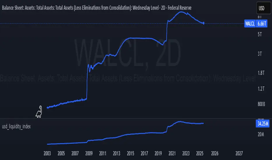
💧 USD Liquidity Index (Fed + M2 + Base)This custom indicator tracks USD liquidity by combining the Federal Reserve’s total assets (WALCL), M2 money supply (M2SL), and the monetary base (BASE) — all sourced from FRED (Federal Reserve Economic Data).
It's designed to provide a macro-level view of liquidity conditions in the U.S. financial system. This index can be used to help gauge the risk-on vs risk-off environment for assets like Bitcoin, equities, and commodities.
Higher values typically indicate liquidity expansion (bullish for risk assets).
Declining values indicate liquidity contraction or quantitative tightening (bearish for risk assets).
📊 Data Sources:
FRED:WALCL – Fed Balance Sheet
FRED:M2SL – M2 Money Supply
FRED:BASE – Monetary Base
⚠️ Weekly timeframe only. Designed for macro swing traders, crypto investors, and liquidity-driven strategists.
Lunar Sentiment BandsThe Lunar Sentiment Bands indicator is designed to combine simple price volatility analysis with the timing of moon phases. It's based on a moving average and two bands above and below it—similar to Bollinger Bands. But unlike regular bands, the width of these adjusts dynamically depending on two key conditions: the moon phase and market volume.
Around Full Moons, markets often show emotional or volatile behavior. If there's also a surge in trading volume during that time, the indicator automatically expands the bands. This tells you the market might be gearing up for a breakout or high-energy move.
Around New Moons, things are typically quieter. If there’s no significant volume, the indicator contracts the bands. This reflects a calmer environment or a potential “coil” where price is building up energy.
Traders can use this shifting bandwidth to guide decisions. Wide bands suggest breakout potential—either to join the move or to stand back until direction becomes clearer. Narrow bands suggest you may want to trade reversals, or simply wait for volatility to return before entering a position.
This approach doesn't try to predict direction. Instead, it gives you a sense of when the market is most likely to become active or stay quiet, using the rhythm of the moon and real-time volume to shape that view.

Multi Vertical Timeline V3English Description
Multi Vertical Timeline V3 + 3 Time Blocks
A professional trading indicator for precise time marking and session highlighting on your charts.
Key Features:
📍 6 Vertical Time Lines:
Individually configurable times (hour/minute)
Customizable colors, line widths, and styles (solid, dashed, dotted)
Enable/disable toggle for each timeline
Optional time labels
🎨 3 Trading Session Blocks:
Colored background highlights for important trading hours
Pre-configured for NY, London, and Tokyo sessions
Fully customizable start and end times
Transparent coloring for optimal chart readability
⏰ Smart Time Control:
Precise timezone offset setting (-12 to +12 hours)
Automatic adjustment for daylight saving time
Worldwide timezone support
Special handling for time blocks crossing midnight
🛠️ User-Friendly Design:
Clear grouping of all settings
Global on/off control for all labels
No performance impact through optimized code
Instant visual feedback
Use Cases:
Forex Trading (mark session overlaps)
Futures Trading (market opening hours)
Intraday Strategies (entry/exit times)
Multi-timeframe Analysis
Backtesting with time-based rules
Perfect for traders who need precise time markings and session highlights for their strategies!

Indicator Sessions @indexprofx🧠 Description:
This indicator plots three key Exponential Moving Averages (EMAs) to help traders identify market trends and potential entry/exit points with precision:
EMA 8 (Green) – Fast trend, useful for scalping or short-term signals
EMA 50 (Blue) – Mid-term trend filter
EMA 150 (Red) – Long-term bias and trend direction
It is part of the IndexProFX toolkit and integrates smoothly with other tools like Intraday Signal and Session Zones for enhanced confluence trading.
✔️ Clean structure
✔️ Easy-to-read color-coded EMAs
✔️ Supports scalping, day trading, and swing trading strategies

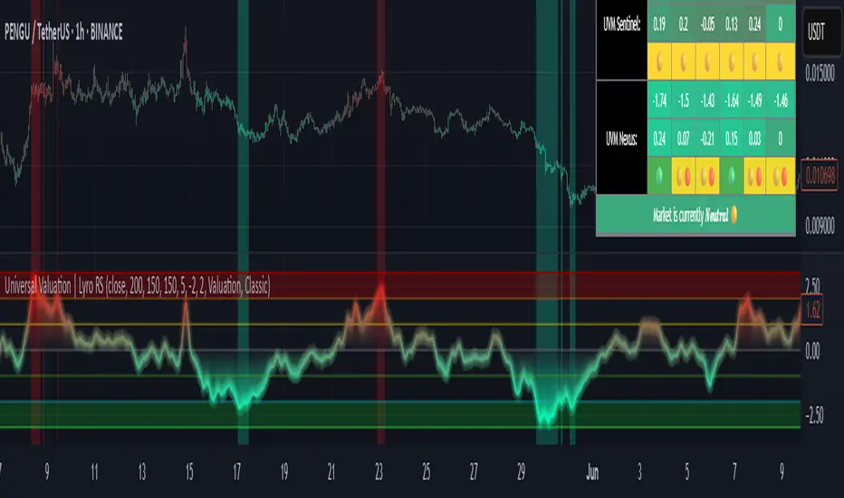
Universal Valuation | Lyro RSUniversal Valuation
⚠️Disclaimer: This indicator is a tool for technical analysis and does not provide guaranteed results. It should be used in conjunction with other analysis methods and proper risk management practices. The creators of this indicator are not responsible for any financial decisions made based on its signals.
Overview
The Universal Valuation indicator helps identify whether the market is undervalued/cheap or overvalued/expensive. And another mode this indicator offers is This cutting-edge tool works flawlessly ACROSS ALL TIMEFRAMES & TICKERS/CHARTS.
By combining regular TradingView indicators & some of our valuation indicators basic/simple with advanced statistical functions, this indicator offers a powerful, universal valuation tool.
Key Features
INPUTS: The Universal Valuation indicator offers flexibility through its customizable input sections. The "Indicator Settings" let you adjust lengths for the raw indicators and statistical functions. The "Signals" section defines thresholds for background color changes, helping you visually spot key market moments. The "Colors" section allows you to pick from pre-defined schemes or personalize colors for better clarity. Lastly, the "Tables" section gives you full control over the UV table’s size and positioning, including options to overlay it on the chart or place it in the allocated space.
A DEEPER INSIGHT: This indicator is built around three distinct categories: "UVM Andromeda," "UVM Sentinel," and "UVM Nexus." Each category has three different drivers. The statistical function powering this indicator is the Z-score. The Z-score is an incredibly powerful tool that helps determine if the market is overvalued/expensive or undervalued/cheap, offering critical insights for traders."
Plotting: The plotted value represents the average of all the drivers. In other words, it is the combined average of all 9 Z-scored indicators, providing a balanced and comprehensive market valuation.
What is Z-score? & Why does this system use it?
Z-score is an advanced statistical function used to measure how far a value deviates from the average in a data set. The formula for Z-score is: (x - h) / o, where x is the observed value, h is the average (mean) of the data set, and o is the standard deviation.
This system uses the Z-score because it helps determine whether the market is overvalued or undervalued based on historical data and how we apply the calculation. By measuring how far a value deviates from the average, the Z-score provides a clearer and more objective valuation of market conditions. In our case, a Z-score of -3 indicates an undervalued market, while a Z-score of 3 signals an overvalued market.
UVM Andromeda:
UVM stands for Universal Valuation Model, which is the core of this indicator. Andromeda, one of the most stunning galaxies in the universe, inspired by its name. We chose this name because a powerful indicator should not only be effective but also visually appealing.
You might be wondering what drives UVM Andromeda. The three key drivers are Price, RSI, and ROC. These indicators are pre-defined, while the "Indicator Settings" allow you to adjust the length of the Z-score calculation, refining how the model analyzes market conditions.
UVM Sentinel:
Sentinel, refers to a guard or watchman, someone or something that keeps watch and provides protection. In our case this name refers to a model that actively observes market conditions, acting as a vigilant tool that signals important shifts in valuation.
Wondering what drives UVM Sentinel? The three key drivers are BB%, CCI, and Crosby. While these indicators are simple on their own, applying our Z-score function elevates them to a whole new level, enhancing their ability to detect market conditions with greater accuracy.
UVM Nexus:
We chose the name Nexus simply because it sounds cool—there’s no deeper meaning behind it for us. However, the word itself does have a meaning; it refers to a connection or link between multiple things.
The three key drivers for UVM Nexus are the Sharpe, Sortino, and Omega ratios. These are all asset performance metrics, but by applying the Z-score, we transform them into powerful valuation indicators/drivers, giving you a deeper insight into market conditions.
Why do we use 9 different indicators instead of 1?
That's a great question, and the answer is quite simple. Think of it like this: if you have one super soldier, and they miss a shot, it’s game over. But if you have many soldiers, even if one misses, the others can step in and take the shot. The strength of using multiple indicators lies in their collective power – if one misses, the others still provide valuable insights, making the overall system more reliable.
Final Thoughts:
In our Universal Valuation indicator, you have the flexibility to customize it however you like using our inputs. The system is divided into three distinct categories, with each category containing three indicators. The value plotted on the chart is the average of all nine indicators. We apply the Z-score, an advanced statistical function, to each of these nine indicators. The final plotted average is the average of all the Z-scores, giving you a comprehensive and refined market valuation. This indicator can work on any timeframe & chart ticker.