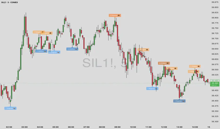
RSI + TSV Kombi📊 RSI + TSV Combo Indicator (Intraday Reversal Tool)
This custom TradingView indicator is designed for intraday traders who want to combine price momentum (via RSI) with volume-based confirmation (via TSV). It’s particularly powerful for spotting short-term reversals around key market zones like VWAP, support/resistance, or options levels.
🧠 What does the Indicator show?
The indicator contains two elements in one pane:
🔹 Top Line – RSI (Relative Strength Index)
Type: RSI(7) – a short-term version of the classic RSI
Color-coded:
🟢 Green when RSI < 30 → potential oversold → bullish bias
🔴 Red when RSI > 70 → potential overbought → bearish bias
⚪ Gray in between → neutral
🔎 Purpose: Identifies overextended price moves — early warning for possible reversal zones.
🔸 Bottom Bars – TSV (Time Segmented Volume)
Formula: EMA(change(close) * volume, 9)
Color-coded histogram:
🟢 Green when TSV > 0 → bullish volume momentum
🔴 Red when TSV < 0 → bearish volume momentum
🔎 Purpose: Confirms whether price moves are supported by actual volume — helps filter false signals from RSI.
⚖️ How to Interpret the Indicator
✅ Long Setup
RSI is below 30 (green line)
TSV bars turn green or cross above 0
Ideally at a support level or near VWAP
➡️ Buy signal confirmed by volume
❌ Short Setup
RSI above 70 (red line)
TSV bars are red or turning red
Ideally at a resistance zone or VWAP deviation
➡️ Sell signal confirmed by selling pressure
⚠️ Avoid trades when...
RSI is oversold/overbought, but TSV disagrees
(e.g. RSI < 30 but TSV is red → weak confirmation)
🧭 Practical Usage in Intraday Trading (e.g. 5-minute chart)
Step What to look for
Setup Zone RSI hits extreme level (under 30 or above 70)
Volume Confirmation TSV bars flip color (red → green or vice versa)
Entry Price breaks candle high/low with volume support
Exit VWAP, volume node, or next support/resistance zone
🔧 Options for Expansion
This script is already running cleanly, but you could easily extend it with:
📍 Buy/Sell Arrows on chart when both RSI + TSV align
🔔 Alerts for instant trade triggers
💡 Overlay version that places symbols directly on the price chart
🔒 Filter to only show signals above/below VWAP
Let me know — I can build any of these for you.
✅ Summary
This RSI + TSV Combo is a simple yet powerful tool to:
Spot momentum reversals
Confirm trades with volume
Stay disciplined and rule-based in fast-moving intraday setups
It’s especially useful when combined with:
VWAP
Volume Profile Zones (HVNs/LVNs)
Key psychological or options levels
Oscillators

RSI with Two BenchmarksRSI with Two Benchmark
Usage: To check Relative Momentum
Any Stock Chart With 2 Different Banchmarks ( It can be Nifty , Banknifty of any Index or Sector Index )
RSI Shift Zone [ChartPrime]OVERVIEW
RSI Shift Zone is a sentiment-shift detection tool that bridges momentum and price action. It plots dynamic channel zones directly on the price chart whenever the RSI crosses above or below critical thresholds (default: 70 for overbought, 30 for oversold). These plotted zones reveal where market sentiment likely flipped, helping traders pinpoint powerful support/resistance clusters and breakout opportunities in real time.
⯁ HOW IT WORKS
When the RSI crosses either the upper or lower level:
A new Shift Zone channel is instantly formed.
The channel’s boundaries anchor to the high and low of the candle at the moment of crossing.
A mid-line (average of high and low) is plotted for easy visual reference.
The channel remains visible on the chart for at least a user-defined minimum number of bars (default: 15) to ensure only meaningful shifts are highlighted.
The channel is color-coded to reflect bullish or bearish sentiment, adapting dynamically based on whether the RSI breached the upper or lower level. Labels with actual RSI values can also be shown inside the zone for added context.
⯁ KEY TECHNICAL DETAILS
Uses a standard RSI calculation (default length: 14).
Detects crossovers above the upper level (trend strength) and crossunders below the lower level (oversold exhaustion).
Applies the channel visually on the main chart , rather than only in the indicator pane — giving traders a precise map of where sentiment shifts have historically triggered price reactions.
Auto-clears the zone when the minimum bar length is satisfied and a new shift is detected.
⯁ USAGE
Traders can use these RSI Shift Zones as powerful tactical levels:
Treat the channel’s high/low boundaries as dynamic breakout lines — watch for candles closing beyond them to confirm fresh trend continuation.
Use the midline as an equilibrium reference for pullbacks within the zone.
Visual RSI value labels offer quick checks on whether the zone formed due to extreme overbought or oversold conditions.
CONCLUSION
RSI Shift Zone transforms a simple RSI threshold crossing into a meaningful structural tool by projecting sentiment flips directly onto the price chart. This empowers traders to see where momentum-based turning points occur and leverage those levels for breakout plays, reversals, or high-confidence support/resistance zones — all in one glance.

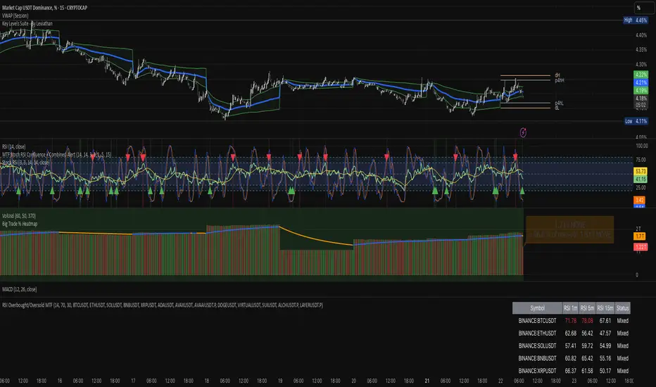
RSI Overbought/Oversold MTFRSI Overbought / Oversold MTF — Dashboard & Alerts
What it does
This script scans up to 13 symbols at once and shows their RSI readings on three lower‑time‑frames (1 min, 5 min, 15 min).
If all three RSIs for a symbol are simultaneously above the overbought threshold or below the oversold threshold, the script:
Prints the condition (“Overbought” / “Oversold”) in a color‑coded dashboard table.
Fires a one‑per‑bar alert so you never miss the move.
Key features
Feature Details
Multi‑symbol Default list includes BTC, ETH, SOL, BNB, XRP, ADA, AVAX, AVAAI, DOGE, VIRTUAL, SUI, ALCH, LAYER (all Binance pairs). Replace or reorder in the inputs.
Triple‑time‑frame check RSI is calculated on 1 m, 5 m, 15 m for each symbol.
Customizable thresholds Set your own RSI Period, Overbought and Oversold levels. Defaults: 14 / 70 / 30.
Color‑coded dashboard Top‑right table shows:
• Symbol name
• RSI 1 m / 5 m / 15 m (red = overbought, green = oversold, white = neutral)
• Overall Status column (“Overbought”, “Oversold”, “Mixed”).
Alerts built in Triggers once per bar whenever a symbol is overbought or oversold on all three time‑frames simultaneously.
Typical use cases
Scalp alignment — Enter when all short TFs agree on overbought/oversold extremes.
Mean‑reversion spotting — Identify stretched conditions across multiple coins without switching charts.
Quick sentiment scan — Glance at the dashboard to see where momentum is heating up or cooling down.
How to use
Add to chart (overlay = false; it sits in its own pane).
Adjust symbols & thresholds in the Settings panel.
Create alerts → choose “RSI Overbought/Oversold MTF” → “Any Alert() Function Call” to receive push, email, or webhook notifications.
Note: The script queries many symbols each bar; use on lower time‑frames only if your data limits allow.
For educational purposes only — not financial advice. Always test on paper before trading live.
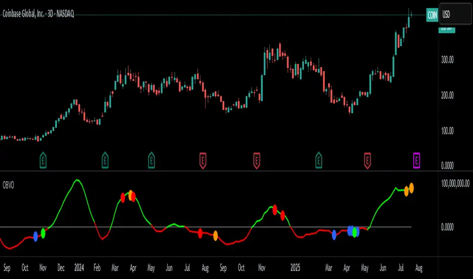
OBV Oscillator with Divergence CirclesCredit to original code from the 'PPO Divergence alerts' by Scarf and OBV Oscillator by LazyBear is used as the input.
Replication of Lunndi 'OBV Divergence Alerts (BETA)' script with additional divergence logic implemented.
OBV-based divergence logic adapted from RSI divergence logic added in addition to existing divergence logic.
Modify length and smoothing to suit your trading style. Open source free for use.
TheDevashishratio-MomentumThis custom momentum indicator is inspired by Fibonacci principles but builds a unique sequence with steps of 0.5 (i.e., 0, 0.5, 1, 1.5, 2, ...). Instead of traditional Fibonacci numbers, each step functions as a dynamic lookback period for a momentum calculation. By cycling through these fractional steps, you capture a layered view of price momentum over varying intervals.
The "Fibonacci" Series Used
Sequence:
0, 0.5, 1, 1.5, 2, … up to a user-defined maximum
For trading indicators, lag values (lookback) must be integers, so each step is rounded to the nearest integer and duplicates are removed, resulting in lookbacks:
1, 2, 3, 4, ... N
Indicator Logic
For each selected lookback, the indicator calculates momentum as:
Momentum
n
=
close
−
close
Momentum
n
=close−close
Where:
close = current price
n = integer from your series of
You can combine these momenta for an averaged or weighted momentum profile, displaying the composite as an oscillator.
How To Use
Bullish: Oscillator above zero indicates positive composite momentum.
Bearish: Oscillator below zero indicates negative composite momentum.
Crosses: A cross from below to above zero may signal emerging bullish momentum, and vice versa.
Customization
Adjust max_step to control how many interval lags you want in your composite.
This oscillator averages across many short and mid-term momenta, reducing noise while still being sensitive to changes.
Summary
TheDevashishratio-Momentum offers a fresh momentum oscillator, blending a "Fibonacci-like" progression with technical analysis, and can be easily copy-pasted into TradingView to experiment and refine your edge.
For more on momentum indicator logic or how to use arrays and series in Pine Script, explore TradingView's official documentation and open-source scripts

Overheat Oscillator with DivergenceIndicator Description
The Overheat Oscillator with Divergence is an advanced technical indicator designed for the TradingView platform, assisting traders in identifying potential market reversal points by analyzing price momentum and volume, as well as detecting divergences. The indicator combines trend strength assessment with signal smoothing to provide clear indications of market overheat or oversold conditions. An optional divergence detection feature allows for the identification of discrepancies between price movement and the oscillator's value, which may signal upcoming trend changes.
The indicator is displayed in a separate panel below the price chart and offers visual cues through a color gradient, horizontal reference lines, and a dynamic market sentiment table. Users can customize numerous parameters, such as calculation periods, sentiment thresholds, line colors, and visualization styles, making the indicator a versatile tool for various trading strategies.
How the Indicator Works
The indicator is based on the following key components:
Oscillator Calculations
The indicator analyzes price candles, assigning a score based on their nature. A bullish candle (when the closing price is higher than the opening price) receives a score of +1.0, while a bearish candle (when the closing price is lower than the opening price) receives a score of -1.0. This scoring reflects the strength of price movement over a given period.
The score is modified by a volume multiplier (default: 2.0) if the candle's volume exceeds the volume's simple moving average (SMA, default: calculated over 20 candles). This ensures that candles with higher volume have a greater impact on the oscillator's value, better capturing significant market movements driven by increased trading activity. For example, a bullish candle with high volume may receive a score of +2.0 instead of +1.0, amplifying the bullish signal.
The scores are summed over a specified number of candles (default: 20), normalized to a 0–100 range, and then smoothed using a simple moving average (SMA, default: 5 periods) to reduce noise and improve signal clarity.
Color Gradient
The oscillator's values are visualized using a color gradient that changes based on the oscillator's level:
Green: Market cooldown (values below the Gradient Min threshold).
Yellow: Neutral sentiment (values between Gradient Min and Gradient Yellow).
Orange: Elevated activity (values between Gradient Yellow and Gradient Orange).
Red: Market overheat (values above Gradient Orange).
The color gradient is applied as the background in the oscillator panel, facilitating quick assessment of market sentiment.
Reference Levels
The indicator displays customizable horizontal lines for key thresholds (e.g., Overheat Threshold, Oversold Threshold, Gradient Min, Yellow, Orange, Max). These lines are visible only at the height of the last few oscillator candles, preventing chart clutter and helping users focus on current values.
Users can also define three custom horizontal lines with selectable styles (solid, dotted, dashed) and colors. These lines serve as auxiliary tools, e.g., for marking personal support/resistance levels, but do not affect the oscillator's signals or background colors.
Market Sentiment
The indicator displays sentiment labels in a table located in the top-right corner of the panel, dynamically updating based on the oscillator's value:
Cooled: Values below Gradient Yellow (default: 35).
Neutral: Values between Gradient Yellow and Gradient Orange (default: 60).
Excited: Values between Gradient Orange and Overheat Threshold (default: 70).
Overheated: Values above Overheat Threshold (default: 70).
The Overheat Threshold and Oversold Threshold are critical for displaying the "Overheated" and "Cooled" labels in the sentiment table, enabling users to quickly identify extreme market conditions. The labels update when key thresholds are crossed, and their colors match the oscillator's gradient.
Divergence Detection
The indicator offers optional detection of regular bullish and bearish divergences:
Bullish Divergence: Occurs when the price forms a lower low, but the oscillator forms a higher low, suggesting a weakening downtrend.
Bearish Divergence: Occurs when the price forms a higher high, but the oscillator forms a lower high, suggesting a weakening uptrend.
Divergences are marked on the chart with labels ("Bull" for bullish, "Bear" for bearish) and lines indicating pivot points. They are calculated with a delay equal to the Lookback Right setting (default: 5 candles), meaning signals appear after pivot confirmation in the specified lookback period. The indicator also generates alerts for users when a divergence is detected.
Indicator Settings
Main Settings (SETTINGS)
Period Length: Specifies the number of candles used for oscillator calculations (default: 20).
Volume SMA Period: The period for the volume's simple moving average (default: 20).
Volume Multiplier: Multiplier applied to candle scores when volume exceeds the average (default: 2.0).
SMA Length: The period for smoothing the oscillator with a simple moving average (default: 5).
Thresholds (THRESHOLDS)
Overheat Threshold: Level indicating market overheat (default: 70). This value determines when the sentiment table displays the "Overheated" label, signaling a potential peak in an uptrend.
Oversold Threshold: Level indicating market cooldown (default: 30). This value determines when the sentiment table displays the "Cooled" label, signaling a potential bottom in a downtrend.
Gradient Min (Green): Lower threshold for the green gradient (default: 20).
Gradient Yellow Threshold: Threshold for the yellow gradient (default: 35).
Gradient Orange Threshold: Threshold for the orange gradient (default: 60).
Gradient Max (Red): Upper threshold for the red gradient (default: 70).
Visualization (VISUALIZATION)
Signal Line Color: Color of the oscillator line (default: dark red, RGB(5, 0, 0)).
Show Reference Lines: Enables/disables the display of threshold lines (default: enabled).
Divergence Settings (DIVERGENCE SETTINGS)
Calculate Divergence: Enables/disables divergence detection (default: disabled).
Lookback Right: Number of candles back for pivot analysis (default: 5).
Lookback Left: Number of candles to the left for pivot analysis (default: 5).
Line Style (STYLE)
Custom Line 1, 2, 3 Value: Levels for custom horizontal lines (default: 70, 50, 30).
Custom Line 1, 2, 3 Color: Colors for custom lines (default: black, RGB(0, 0, 0)).
Custom Line 1, 2, 3 Style: Line styles (solid, dotted, dashed; default: dashed, dotted, dashed).
How to Use the Indicator
Adding to the Chart
Add the indicator to your TradingView chart by searching for "Overheat Oscillator with Divergence."
Configure the settings according to your trading strategy.
Signal Interpretation
Overheated: Values above the Overheat Threshold (default: 70) in the sentiment table may indicate a potential uptrend peak.
Cooled: Values below the Oversold Threshold (default: 30) in the sentiment table may suggest a potential downtrend bottom.
Divergences:
Bullish: Look for "Bull" labels on the chart, indicating potential upward reversals (calculated with a Lookback Right delay).
Bearish: Look for "Bear" labels, indicating potential downward reversals (calculated with a Lookback Right delay).
Customization
Experiment with settings such as period length, volume multiplier, or gradient thresholds to tailor the indicator to your trading style (e.g., scalping, medium-term trading).
Usage Examples
Scalping: Set a shorter period (e.g., Period Length = 10, SMA Length = 3) and monitor rapid sentiment changes and divergences on lower timeframes (e.g., 5-minute charts).
Medium-Term Trading: Use default settings or increase Period Length (e.g., 30) and SMA Length (e.g., 7) for more stable signals on hourly or daily charts.
Reversal Detection: Enable divergence detection and observe "Bull" or "Bear" labels in conjunction with overheat/cooled levels in the sentiment table.
Notes
The indicator performs best when used in conjunction with other technical analysis tools, such as support/resistance lines, moving averages, or Fibonacci levels.
Divergences may serve as early signals but do not always guarantee immediate trend reversals—confirmation with other indicators is recommended.
Test different settings on historical data to find the optimal configuration for your chosen market and timeframe.

Stochastic with Z-Score📊 Stochastic with Z-Score
This custom indicator enhances the classic Stochastic Oscillator by applying Z-Score normalization to both %K and %D lines, helping traders identify statistically significant overbought and oversold conditions based on historical behavior.
🔍 Key Features:
Z-Score Normalization of %K and %D:
Detects deviations from the mean using standard deviation, offering a more dynamic and statistically grounded way to interpret momentum.
Signal Confirmation Filters:
✅ Trend Filter using 200 EMA: Only trade in the direction of the prevailing trend.
✅ Volume Filter: Confirms signals only when volume exceeds the moving average, reducing noise.
Buy & Sell Signals:
📈 Buy: Triggered when the Z-score of %K crosses above a negative threshold, %D is still below that threshold, and the candle is bullish.
📉 Sell: Triggered when the Z-score of %K crosses below a positive threshold, %D is still above that threshold, and the candle is bearish.
Signals are further filtered by trend and volume if enabled.
Customizable Thresholds & Settings:
Control Z-score length, thresholds, Stochastic lengths, and filter settings.
Visual Enhancements:
Colored histogram based on Z-score levels.
Shaded background in overbought/oversold zones.
Clear “Buy” and “Sell” labels plotted directly on the chart.
Alerts Included:
Set alerts on confirmed buy and sell signals for real-time notifications.
📘 How to Use:
Use this indicator on any timeframe or asset.
Enable or disable trend and volume filters depending on your strategy.
Use signals in confluence with price action or other indicators.
Adjust Z-score thresholds for more or fewer signals based on your risk profile.
⚠️ Note: This is an indicator, not a strategy. Always test signals on historical data and in simulation before live trading.

Debit Spread POMDP‑Inspired StrategyComprehensive Strategy for TradingView-Based Call and Put Debit Spread Options Using POMDP for Signal Generation
Debit spreads limit risk to the net premium paid while capping potential profit, ideal for moderate price predictions.
Pine Script in TradingView enables custom indicator integration and strategy automation for options trading.
Partially Observable Markov Decision Processes (POMDPs) optimize decision-making under market uncertainty by modeling states, actions, and observations.
Training a POMDP policy involves defining market states, actions, and observations from technical indicators, then simulating and refining the policy.
Automating the strategy via agents or TradingView alerts can execute trades when conditions align with the POMDP-generated signals.
Panel Pro+ Quantum SmartPromptPanel Pro+ Check 2.0
*It's a panel with integrated artificial intelligence in offline mode.
*It provides live chart prompts.
*It recognizes market types, such as bullish, bearish, box, sideways, volatile, etc.
*It performs a comprehensive evaluation and takes buy or sell actions, with the corresponding profit-taking.
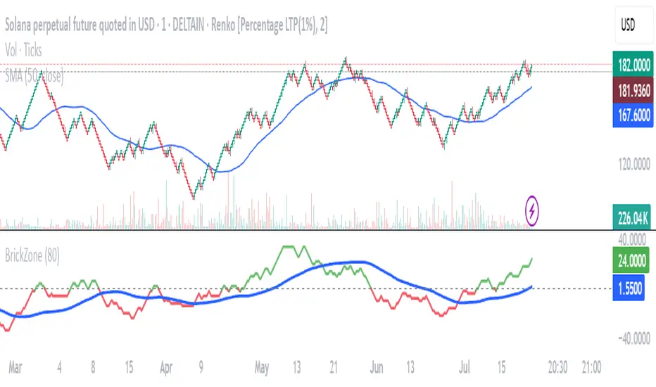
Renko Brick Zone NeelBrick indicator is a brick zone indicator, plotted not in histogram style but instead with a moving average plotted along with it.
40 period is count of same color brick difference between green and red is always 40
40-period brick indicator line and 40-period moving average line of the brick indicator.
Pivot Squeeze IndicatorThe Pivot Squeeze Indicator is an oscillator that identifies when markets are "squeezed" between recent pivot highs and lows, then signals when they're ready to make their next big move.
How it Works
The indicator calculates the percentage distance between the current price and the most recent pivot high vs. pivot low. When this distance gets compressed (small), the market is "squeezed" and building energy. When it expands rapidly, you get your breakout signal.
The indicator adapts to current market volatility using four different modes:
- ATR-Based
- Bollinger Bands
- Keltner Channels
- Fixed %
What to Look For
🟠 Orange Background = Squeeze Zone
Market is compressed between recent pivots
Low volatility, building pressure
🟢 Green Breakout = Bullish Signal
Price breaking out above recent highs
Momentum shifting upward
Time to look for long opportunities
🔴 Red Breakout = Bearish Signal
Price breaking down below recent lows
Momentum shifting downward
Time to look for short opportunities
Using Histogram Colors:
Green bars = Bullish territory (closer to recent highs)
Red bars = Bearish territory (closer to recent lows)
Orange bars = Squeeze conditions (compressed between pivots)
Using MA Line:
When Histogram bars cross below or above MA Line in opposite direction, it might be good time to exit.
Default Settings: ATR-based thresholds with 14-period lookback - works great out of the box, but feel free to experiment with the different threshold modes to find what works best for your trading style! Recommended to use with other indicators to confirm signals
rEMAExpColor Moving Average Indicator This indicator can intuitively show the current state of market power
Suitable for price action traders
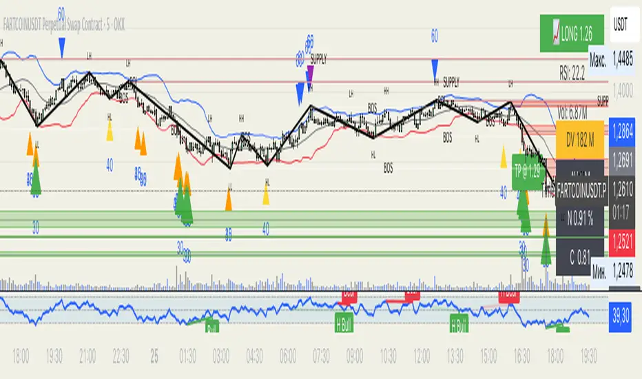
[Top] Unified Divergence DetectorThe Unified Divergence Detector (UDD) is a powerful tool designed to identify both regular and hidden divergences across multiple oscillators—RSI, CCI, and Stochastic—in a single unified indicator.
Unlike other divergence tools that focus on one source at a time, this script cross-checks multiple indicators simultaneously and consolidates the results into a single signal. Labels appear only when at least one divergence is detected, with optional color-coding to distinguish the number and type of divergences:
🐂 Bullish Divergence: Signals a potential reversal or continuation to the upside.
🐻 Bearish Divergence: Signals a potential reversal or continuation to the downside.
The script lets users configure:
Whether to detect regular, hidden, or both types of divergence.
Pivot lookback parameters and divergence detection range.
Separate label colors for 1, 2, or 3+ confirmations from different indicators.
Tooltips are dynamically generated and offer guidance on interpreting each signal based on the oscillator sources involved and the divergence type. Labels are intelligently placed to avoid clutter and display only the strongest, most relevant signals.
⸻
Potential Uses
Trend Reversals: Spot early signs of exhaustion and prepare for a trend change.
Trend Continuations: Confirm existing trends via hidden divergence signals.
Multi-Timeframe Confirmation: Combine this indicator with higher timeframe trend tools to validate entries or exits.
Custom Strategy Building: Integrate into more complex strategies involving price action or volume filters.
⸻
This indicator is ideal for traders who value confirmation from multiple sources and prefer clear, high-confidence signals over constant alerts. It works well across all timeframes and asset classes.
Volatility Breakout Strategy W15_T2.0# How to Use This Indicator
## **Setup Instructions:**
**Adjust parameters** as needed:
- **Volatility Window**: 15 (default) for 15-period volatility calculation
- **Volatility Threshold**: 2.0 (default) for 2x volatility spike trigger
- **Price Direction Periods**: 5 (default) for trend direction detection
### **What You'll See:**
- **🟢 Green UP arrows**: BUY signals (high volatility + upward price movement)
- **🔴 Red DOWN arrows**: SELL signals (high volatility + downward price movement)
- **🟠 Orange circles**: EXIT signals (volatility cooled down)
- **🟨 Yellow background**: High volatility periods (above threshold)
- **📊 Info table**: Real-time volatility metrics (top-right corner)
### **Signal Logic:**
- **Entry**: When volatility ratio ≥ 2.0x AND price direction is clear
- **Exit**: When volatility ratio drops below 1.4x (70% of threshold)
- **Direction**: Based on 5-period price change
### **Best Timeframes:**
- **1-minute**: Very sensitive, many signals
- **5-minute**: Balanced (matches your original analysis)
- **15-minute**: Less frequent but higher quality signals
### **Alert Setup:**
The indicator includes built-in alerts for:
- Buy signals
- Sell signals
- Exit signals

Iambuoyant High Win Rate TraderIambuoyant High Win Rate Trader (Debug Signals) - Indicator Description
Introduction
The "Iambuoyant High Win Rate Trader" is a comprehensive Pine Script indicator designed to identify high-probability trading opportunities across various market conditions. Built with a multi-faceted approach, it integrates several key technical analysis concepts to provide robust buy and sell signals, aiming to maximize potential returns while managing risk. This indicator is particularly useful for traders looking for confirmed entries based on a confluence of factors rather than relying on a single signal.
Strategies Used
This indicator employs a sophisticated combination of strategies, each contributing to a stronger signal when aligned:
Trend Analysis:
Multiple EMAs: It utilizes three Exponential Moving Averages (EMAs) – a fast, slow, and a longer-term trend EMA – to establish the prevailing market direction. Signals are filtered to align with this identified trend, enhancing their probability of success.
Trend Alignment: Confirms that price action is consistent with the established EMA trend, ensuring trades are taken in the direction of momentum.
Oscillator Confirmation:
Relative Strength Index (RSI): Employs RSI to identify overbought and oversold conditions, with a specific focus on the RSI turning away from extreme levels, suggesting a potential reversal or continuation point.
Stochastic Oscillator: Similar to RSI, the Stochastic Oscillator is used to pinpoint overbought and oversold zones, with additional confirmation from the %K and %D lines crossing or turning.
Momentum and Divergence (MACD):
Moving Average Convergence Divergence (MACD): The indicator analyzes MACD line and signal line crossovers, alongside histogram movement, to gauge momentum shifts and potential trade entries.
Volume Analysis:
Volume Confirmation: Integrates volume analysis by comparing current volume to a Volume Moving Average. Higher-than-average volume during a signal can confirm conviction behind the price move.
Market Structure and Volatility:
Support and Resistance (S/R) Levels: Dynamic support and resistance levels are identified using pivot points. These levels are used to inform potential stop-loss placements and to ensure trades aren't initiated directly into strong opposing S/R zones.
Average True Range (ATR): ATR is used to measure market volatility, which helps in adjusting trade sizing and stop-loss distances. A volatility filter is included to prevent trades in excessively choppy or illiquid conditions.
Risk Management:
Dynamic Stop Loss: The indicator attempts to identify logical stop-loss levels based on recent price action or nearby support/resistance.
Risk:Reward Ratio Filtering: A configurable minimum Risk:Reward ratio ensures that only trades with a favorable potential return relative to the risk are considered, promoting disciplined trading.
Signal Confirmation:
Confirmation Bars: An optional confirmBars input allows for signals to be confirmed over a specified number of bars, reducing false positives by waiting for price action to sustain the initial signal. (Note: For debugging, this is often set to 0 for immediate signals.)
How to Use the Indicator
Add to Chart: Apply the "Iambuoyant High Win Rate Trader (Debug Signals)" indicator to your desired chart in TradingView. It's an overlay indicator, meaning it will plot directly on your price chart.
Understand the Signals:
Buy Signals (Green Triangles/Labels): Appear below the price bars, indicating a potential long entry.
Sell Signals (Red Triangles/Labels): Appear above the price bars, indicating a potential short entry.
"Flash" Signals: Smaller, colored triangles indicate the immediate bar where the signal conditions are first met.
"Confirmed" Signals: Larger, shaded triangles with labels indicate that the signal has passed the confirmBars criteria (if confirmBars is set to greater than 0).
Utilize Debugging Features (Crucial for Optimization):
Access Inputs: Open the indicator's settings by clicking the gear icon next to its name on the chart.
"Signal Components (Debugging)" Section: This is the most powerful feature for tailoring the indicator to your needs.
Initial Setup: When first applying the indicator or if signals are too rare, start by setting most "Enable X Condition" toggles to false, potentially leaving only one or two simple conditions (e.g., "Enable RSI Condition" or "Enable Trend Alignment") as true. This will force signals to appear, allowing you to confirm the plotting mechanism works.
Gradual Re-enabling: Once you see signals, gradually re-enable one "Enable X Condition" at a time.
Observe Debug Plots (Lower Pane): Below your main chart, the indicator plots colored columns (e.g., "Debug: RSI Bull", "Debug: MACD Bear"). These show when each individual component of the long/short signal is true (1 or 2) or false (0 or na). The "Debug: Final Long Signal" and "Debug: Final Short Signal" plots show when the combined signal conditions are met.
Identify Bottlenecks: If signals disappear after enabling a new condition, observe its corresponding debug plot. If it's frequently 0 when other conditions are 1, you've found a bottleneck.
Adjust Parameters: For bottlenecks, go back to the relevant input section (e.g., "Oscillators," "Market Structure," "Signal Quality") and adjust parameters (e.g., rsiOB/rsiOS, stochOB/stochOS, volatilityFilter, minRRRatio) to be less strict until signals appear at your desired frequency. Alternatively, you may decide to leave that specific condition disabled if it's too restrictive for your strategy.
Configure Display Options: Use the "Display" group in the inputs to toggle the visibility of labels, support/resistance lines, and EMA trend lines on your chart.
Set Up Alerts: The indicator includes built-in alert conditions for "Confirmed Buy Signal" and "Confirmed Sell Signal." You can set up alerts in TradingView to be notified instantly when these signals occur, allowing you to monitor the market without constant chart watching.
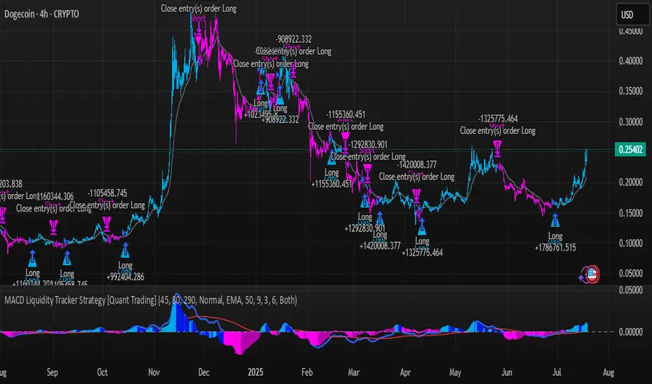
MACD Liquidity Tracker Strategy [Quant Trading]MACD Liquidity Tracker Strategy
Overview
The MACD Liquidity Tracker Strategy is an enhanced trading system that transforms the traditional MACD indicator into a comprehensive momentum-based strategy with advanced visual signals and risk management. This strategy builds upon the original MACD Liquidity Tracker System indicator by TheNeWSystemLqtyTrckr , converting it into a fully automated trading strategy with improved parameters and additional features.
What Makes This Strategy Original
This strategy significantly enhances the basic MACD approach by introducing:
Four distinct system types for different market conditions and trading styles
Advanced color-coded histogram visualization with four dynamic colors showing momentum strength and direction
Integrated trend filtering using 9 different moving average types
Comprehensive risk management with customizable stop-loss and take-profit levels
Multiple alert systems for entry signals, exits, and trend conditions
Flexible signal display options with customizable entry markers
How It Works
Core MACD Calculation
The strategy uses a fully customizable MACD configuration with traditional default parameters:
Fast MA : 12 periods (customizable, minimum 1, no maximum limit)
Slow MA : 26 periods (customizable, minimum 1, no maximum limit)
Signal Line : 9 periods (customizable, now properly implemented and used)
Cryptocurrency Optimization : The strategy's flexible parameter system allows for significant optimization across different crypto assets. Traditional MACD settings (12/26/9) often generate excessive noise and false signals in volatile crypto markets. By using slower, more smoothed parameters, traders can capture meaningful momentum shifts while filtering out market noise.
Example - DOGE Optimization (45/80/290 settings) :
• Performance : Optimized parameters yielding exceptional backtesting results with 29,800% PnL
• Why it works : DOGE's high volatility and social sentiment-driven price action benefits from heavily smoothed indicators
• Timeframes : Particularly effective on 30-minute and 4-hour charts for swing trading
• Logic : The very slow parameters filter out noise and capture only the most significant trend changes
Other Optimizable Cryptocurrencies : This parameter flexibility makes the strategy highly effective for major altcoins including SUI, SEI, LINK, Solana (SOL) , and many others. Each crypto asset can benefit from custom parameter tuning based on its unique volatility profile and trading characteristics.
Four Trading System Types
1. Normal System (Default)
Long signals : When MACD line is above the signal line
Short signals : When MACD line is below the signal line
Best for : Swing trading and capturing longer-term trends in stable markets
Logic : Traditional MACD crossover approach using the signal line
2. Fast System
Long signals : Bright Blue OR Dark Magenta (transparent) histogram colors
Short signals : Dark Blue (transparent) OR Bright Magenta histogram colors
Best for : Scalping and high-volatility markets (crypto, forex)
Logic : Leverages early momentum shifts based on histogram color changes
3. Safe System
Long signals : Only Bright Blue histogram color (strongest bullish momentum)
Short signals : All other colors (Dark Blue, Bright Magenta, Dark Magenta)
Best for : Risk-averse traders and choppy markets
Logic : Prioritizes only the strongest bullish signals while treating everything else as bearish
4. Crossover System
Long signals : MACD line crosses above signal line
Short signals : MACD line crosses below signal line
Best for : Precise timing entries with traditional MACD methodology
Logic : Pure crossover signals for more precise entry timing
Color-Coded Histogram Logic
The strategy uses four distinct colors to visualize momentum:
🔹 Bright Blue : MACD > 0 and rising (strong bullish momentum)
🔹 Dark Blue (Transparent) : MACD > 0 but falling (weakening bullish momentum)
🔹 Bright Magenta : MACD < 0 and falling (strong bearish momentum)
🔹 Dark Magenta (Transparent) : MACD < 0 but rising (weakening bearish momentum)
Trend Filter Integration
The strategy includes an advanced trend filter using 9 different moving average types:
SMA (Simple Moving Average)
EMA (Exponential Moving Average) - Default
WMA (Weighted Moving Average)
HMA (Hull Moving Average)
RMA (Running Moving Average)
LSMA (Least Squares Moving Average)
DEMA (Double Exponential Moving Average)
TEMA (Triple Exponential Moving Average)
VIDYA (Variable Index Dynamic Average)
Default Settings : 50-period EMA for trend identification
Visual Signal System
Entry Markers : Blue triangles (▲) below candles for long entries, Magenta triangles (▼) above candles for short entries
Candle Coloring : Price candles change color based on active signals (Blue = Long, Magenta = Short)
Signal Text : Optional "Long" or "Short" text inside entry triangles (toggleable)
Trend MA : Gray line plotted on main chart for trend reference
Parameter Optimization Examples
DOGE Trading Success (Optimized Parameters) :
Using 45/80/290 MACD settings with 50-period EMA trend filter has shown exceptional results on DOGE:
Performance : Backtesting results showing 29,800% PnL demonstrate the power of proper parameter optimization
Reasoning : DOGE's meme-driven volatility and social sentiment spikes create significant noise with traditional MACD settings
Solution : Very slow parameters (45/80/290) filter out social media-driven price spikes while capturing only major momentum shifts
Optimal Timeframes : 30-minute and 4-hour charts for swing trading opportunities
Result : Exceptionally clean signals with minimal false entries during DOGE's characteristic pump-and-dump cycles
Multi-Crypto Adaptability :
The same optimization principles apply to other major cryptocurrencies:
SUI : Benefits from smoothed parameters due to newer coin volatility patterns
SEI : Requires adjustment for its unique DeFi-related price movements
LINK : Oracle news events create price spikes that benefit from noise filtering
Solana (SOL) : Network congestion events and ecosystem developments need smoothed detection
General Rule : Higher volatility coins typically benefit from very slow MACD parameters (40-50 / 70-90 / 250-300 ranges)
Key Input Parameters
System Type : Choose between Fast, Normal, Safe, or Crossover (Default: Normal)
MACD Fast MA : 12 periods default (no maximum limit, consider 40-50 for crypto optimization)
MACD Slow MA : 26 periods default (no maximum limit, consider 70-90 for crypto optimization)
MACD Signal MA : 9 periods default (now properly utilized, consider 250-300 for crypto optimization)
Trend MA Type : EMA default (9 options available)
Trend MA Length : 50 periods default (no maximum limit)
Signal Display : Both, Long Only, Short Only, or None
Show Signal Text : True/False toggle for entry marker text
Trading Applications
Recommended Use Cases
Momentum Trading : Capitalize on strong directional moves using the color-coded system
Trend Following : Combine MACD signals with trend MA filter for higher probability trades
Scalping : Use "Fast" system type for quick entries in volatile markets
Swing Trading : Use "Normal" or "Safe" system types for longer-term positions
Cryptocurrency Trading : Optimize parameters for individual crypto assets (e.g., 45/80/290 for DOGE, custom settings for SUI, SEI, LINK, SOL)
Market Suitability
Volatile Markets : Forex, crypto, indices (recommend "Fast" system or smoothed parameters)
Stable Markets : Stocks, ETFs (recommend "Normal" or "Safe" system)
All Timeframes : Effective from 1-minute charts to daily charts
Crypto Optimization : Each major cryptocurrency (DOGE, SUI, SEI, LINK, SOL, etc.) can benefit from custom parameter tuning. Consider slower MACD parameters for noise reduction in volatile crypto markets
Alert System
The strategy provides comprehensive alerts for:
Entry Signals : Long and short entry triangle appearances
Exit Signals : Position exit notifications
Color Changes : Individual histogram color alerts
Trend Conditions : Price above/below trend MA alerts
Strategy Parameters
Default Settings
Initial Capital : $1,000
Position Size : 100% of equity
Commission : 0.1%
Slippage : 3 points
Date Range : January 1, 2018 to December 31, 2069
Risk Management (Optional)
Stop Loss : Disabled by default (customizable percentage-based)
Take Profit : Disabled by default (customizable percentage-based)
Short Trades : Disabled by default (can be enabled)
Important Notes and Limitations
Backtesting Considerations
Uses realistic commission (0.1%) and slippage (3 points)
Default position sizing uses 100% equity - adjust based on risk tolerance
Stop-loss and take-profit are disabled by default to show raw strategy performance
Strategy does not use lookahead bias or future data
Risk Warnings
Past performance does not guarantee future results
MACD-based strategies may produce false signals in ranging markets
Consider combining with additional confluences like support/resistance levels
Test thoroughly on demo accounts before live trading
Adjust position sizing based on your risk management requirements
Technical Limitations
Strategy does not work on non-standard chart types (Heikin Ashi, Renko, etc.)
Signals are based on close prices and may not reflect intraday price action
Multiple rapid signals in volatile conditions may result in overtrading
Credits and Attribution
This strategy is based on the original "MACD Liquidity Tracker System" indicator created by TheNeWSystemLqtyTrckr . This strategy version includes significant enhancements:
Complete strategy implementation with entry/exit logic
Addition of the "Crossover" system type
Proper implementation and utilization of the MACD signal line
Enhanced risk management features
Improved parameter flexibility with no artificial maximum limits
Additional alert systems for comprehensive trade management
The original indicator's core color logic and visual system have been preserved while expanding functionality for automated trading applications.
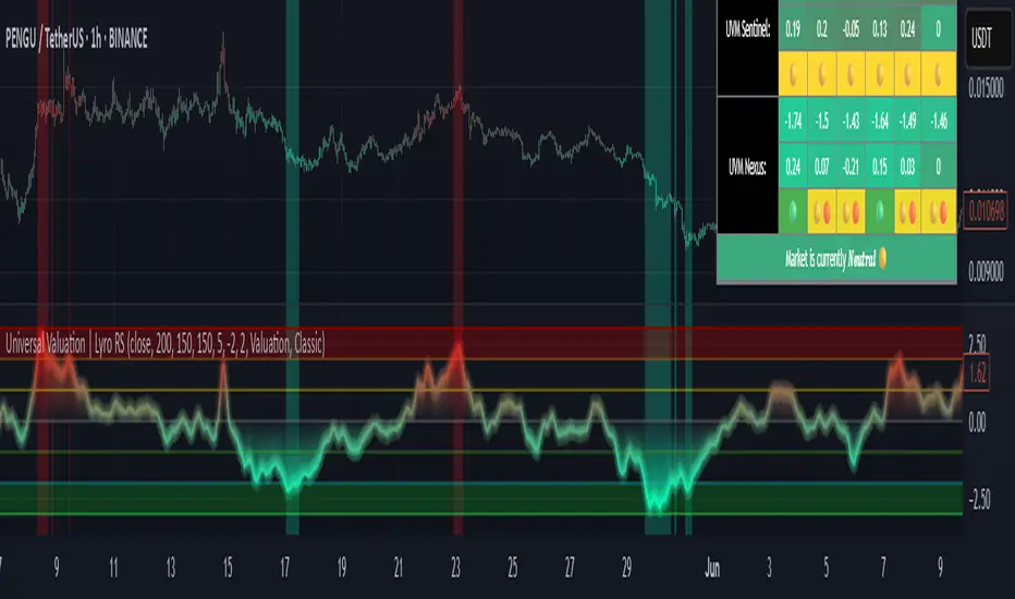
Universal Valuation | Lyro RSUniversal Valuation
⚠️Disclaimer: This indicator is a tool for technical analysis and does not provide guaranteed results. It should be used in conjunction with other analysis methods and proper risk management practices. The creators of this indicator are not responsible for any financial decisions made based on its signals.
Overview
The Universal Valuation indicator helps identify whether the market is undervalued/cheap or overvalued/expensive. And another mode this indicator offers is This cutting-edge tool works flawlessly ACROSS ALL TIMEFRAMES & TICKERS/CHARTS.
By combining regular TradingView indicators & some of our valuation indicators basic/simple with advanced statistical functions, this indicator offers a powerful, universal valuation tool.
Key Features
INPUTS: The Universal Valuation indicator offers flexibility through its customizable input sections. The "Indicator Settings" let you adjust lengths for the raw indicators and statistical functions. The "Signals" section defines thresholds for background color changes, helping you visually spot key market moments. The "Colors" section allows you to pick from pre-defined schemes or personalize colors for better clarity. Lastly, the "Tables" section gives you full control over the UV table’s size and positioning, including options to overlay it on the chart or place it in the allocated space.
A DEEPER INSIGHT: This indicator is built around three distinct categories: "UVM Andromeda," "UVM Sentinel," and "UVM Nexus." Each category has three different drivers. The statistical function powering this indicator is the Z-score. The Z-score is an incredibly powerful tool that helps determine if the market is overvalued/expensive or undervalued/cheap, offering critical insights for traders."
Plotting: The plotted value represents the average of all the drivers. In other words, it is the combined average of all 9 Z-scored indicators, providing a balanced and comprehensive market valuation.
What is Z-score? & Why does this system use it?
Z-score is an advanced statistical function used to measure how far a value deviates from the average in a data set. The formula for Z-score is: (x - h) / o, where x is the observed value, h is the average (mean) of the data set, and o is the standard deviation.
This system uses the Z-score because it helps determine whether the market is overvalued or undervalued based on historical data and how we apply the calculation. By measuring how far a value deviates from the average, the Z-score provides a clearer and more objective valuation of market conditions. In our case, a Z-score of -3 indicates an undervalued market, while a Z-score of 3 signals an overvalued market.
UVM Andromeda:
UVM stands for Universal Valuation Model, which is the core of this indicator. Andromeda, one of the most stunning galaxies in the universe, inspired by its name. We chose this name because a powerful indicator should not only be effective but also visually appealing.
You might be wondering what drives UVM Andromeda. The three key drivers are Price, RSI, and ROC. These indicators are pre-defined, while the "Indicator Settings" allow you to adjust the length of the Z-score calculation, refining how the model analyzes market conditions.
UVM Sentinel:
Sentinel, refers to a guard or watchman, someone or something that keeps watch and provides protection. In our case this name refers to a model that actively observes market conditions, acting as a vigilant tool that signals important shifts in valuation.
Wondering what drives UVM Sentinel? The three key drivers are BB%, CCI, and Crosby. While these indicators are simple on their own, applying our Z-score function elevates them to a whole new level, enhancing their ability to detect market conditions with greater accuracy.
UVM Nexus:
We chose the name Nexus simply because it sounds cool—there’s no deeper meaning behind it for us. However, the word itself does have a meaning; it refers to a connection or link between multiple things.
The three key drivers for UVM Nexus are the Sharpe, Sortino, and Omega ratios. These are all asset performance metrics, but by applying the Z-score, we transform them into powerful valuation indicators/drivers, giving you a deeper insight into market conditions.
Why do we use 9 different indicators instead of 1?
That's a great question, and the answer is quite simple. Think of it like this: if you have one super soldier, and they miss a shot, it’s game over. But if you have many soldiers, even if one misses, the others can step in and take the shot. The strength of using multiple indicators lies in their collective power – if one misses, the others still provide valuable insights, making the overall system more reliable.
Final Thoughts:
In our Universal Valuation indicator, you have the flexibility to customize it however you like using our inputs. The system is divided into three distinct categories, with each category containing three indicators. The value plotted on the chart is the average of all nine indicators. We apply the Z-score, an advanced statistical function, to each of these nine indicators. The final plotted average is the average of all the Z-scores, giving you a comprehensive and refined market valuation. This indicator can work on any timeframe & chart ticker.
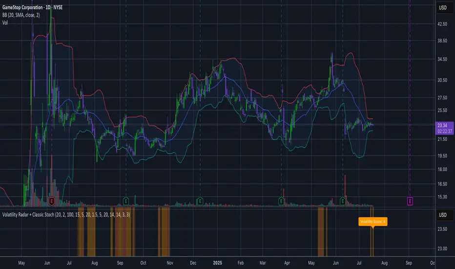
Volatility Radar + Classic StochVolatility Radar + Classic Stoch
This indicator detects volatility squeezes by measuring Bollinger Bands tightness relative to recent history and confirms potential breakout strength using multiple factors:
Bollinger Bands bandwidth percentile to identify tight and super-tight squeezes
TTM Squeeze confirmation via Keltner Channels
Volume spikes indicating rising market interest
ADX trend strength to gauge directional momentum
Classic Stochastic oscillator to signal overbought/oversold conditions
A composite volatility score ranks the overall setup strength with intuitive color-coded background and a real-time label.
Use this tool to anticipate volatility expansions and improve timing for breakout trades.
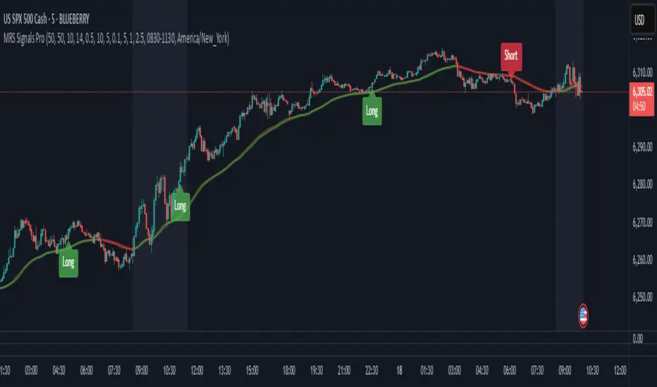
Momentum-Reversal System Signals Pro
Momentum-Reversal System Signals Pro
Overview
A sophisticated signaling system designed to identify high-probability trend-following entries after a price pullback. This indicator is optimized for index futures like the S&P 500 (ES/SPX) on a 5-minute timeframe .
It performs best during periods of established trends and lower volatility. To aid in this, the indicator includes a customizable "No-Trade Zone" highlighter, which is pre-set to the often volatile 8:30 AM - 11:30 AM EST market open. While the default settings are robust and effective in most conditions, the indicator is fully customizable to suit your specific trading style.
How It Works
The core logic is based on a three-step process to filter for high-quality setups:
Trend Confirmation: The script first establishes the overall market direction using an EMA on a higher timeframe (15-minute by default). This ensures you are only looking for trades that align with the dominant trend.
Pullback Detection: Once the trend is confirmed, the script waits for the price to pull back to a dynamic area of value on the main chart (5-minute by default). This "pullback zone" is defined by the 5m EMA and an ATR-based channel around it, which adapts to current market volatility.
Momentum Entry: After a valid pullback occurs, the script waits for a clear sign that momentum is returning in the direction of the primary trend. This is confirmed by a combination of a MACD crossover and a strong RSI reading, signaling that the pullback has likely ended and the trend is ready to resume.
Advanced Quality Filters
What makes this indicator powerful is its multi-layered filtering system designed to weed out low-probability signals and avoid choppy market conditions.
Trend Strength: It doesn't just check the trend direction; it measures the slope of the 15m EMA to ensure the trend has sufficient strength. This is a key filter for avoiding flat, sideways markets.
Momentum Confirmation: An RSI "Dead Zone" around the 50-level ensures that the RSI shows decisive momentum before a signal is generated.
Signal Cooldown: A built-in timer ( Min Bars Between Signals ) prevents the same signal from firing repeatedly in a short period, reducing noise and over-trading.
RSI Volatility: The script checks that the RSI itself is not flat, which is often a sign of market indecision and a precursor to chop.
Pullback Quality: An optional filter ensures that by the time the signal fires, the price has already moved back to the "correct" side of the 5m EMA, confirming the reversal's strength.
Volatility Filter: A crucial risk management filter that blocks signals on abnormally large, high-risk "gasoline" bars that could lead to immediate stops.
How To Use
For Long Signals (Green 'Long' Tag):
Look for the 15m EMA to be green and trending upwards.
Wait for price to pull back towards the orange 5m EMA.
A "Long" signal appears when momentum indicators confirm a reversal back in the direction of the trend.
For Short Signals (Red 'Short' Tag):
Look for the 15m EMA to be red and trending downwards.
Wait for price to pull back towards the orange 5m EMA.
A "Short" signal appears when momentum indicators confirm a reversal back in the direction of the trend.
This tool provides high-probability signals, not guarantees. It is designed to be a core component of a complete trading plan. Always use proper risk management and confluence from your own analysis.
Fine-Tuning & Customization
All settings are fully adjustable in the script's "Inputs" tab to match your risk tolerance and market conditions.
Timeframe & EMA Settings: Adjust the core moving averages that define the trend and pullback zones.
Pullback Settings: Define what constitutes a valid pullback by adjusting the lookback period and the size of the ATR-based "near" zone.
Quality Filters: This is the most important section for tailoring the script's strictness. Increase the EMA Slope, RSI Dead Zone, or Signal Cooldown to receive fewer but potentially higher-quality signals.
Advanced Filters: Enable or disable the Pullback Quality and Volatility filters for an extra layer of confirmation or risk management.
No-Trade Zone Highlighter: Adjust the session and timezone to highlight periods you wish to avoid, such as news events or low-liquidity hours.
Happy trading, and please use this tool responsibly.
LBB + RSI Multi-Level + Compact TableBB and RSI scalping script for daily or scalp zone with signals
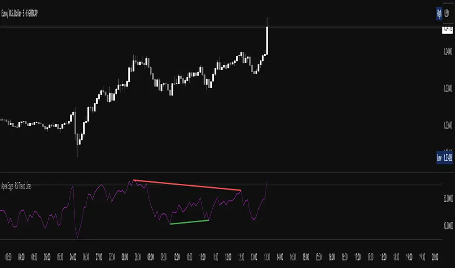
Apex Edge - RSI Trend LinesThe Apex Edge - RSI Trend Lines indicator is a precision tool that automatically draws real-time trendlines on the RSI oscillator using confirmed pivot highs and lows. These dynamic trendlines track RSI structure in motion, helping you anticipate breakout zones, reversals, and hidden divergences.
Every time a new pivot forms, the indicator automatically re-draws the RSI trendline between the two most recent pivots — giving you an always-current view of momentum structure. You’ll instantly see when RSI begins compressing or expanding, long before price reacts.
Key Features: • Dynamic RSI trendlines drawn from the last 2 pivots
• Auto re-draws in real-time as new pivots form
• Optional "Full Extend" or "Pivot Only" modes
• Slope color-coded: green = support, red = resistance
• Built-in dotted RSI levels (30/70 default)
• Alert conditions for RSI trendline breakout signals
• Ideal for spotting divergence, compression, and early SMC confluence
This is not your average RSI — it’s a fully reactive momentum edge overlay designed to give you clarity, structure, and timing from within the oscillator itself. Perfect for traders using Smart Money Concepts, divergence setups, or algorithmic trend tracking.
⚔️ Built for precision. Built for edge. Built for Apex.
Strategy with DI+/DI-, ADX, RSI, MACD, EMA + Time Stop [EXP. 1]Strategy Overview
This is an experimental trend-following strategy combining directional movement indicators, momentum filters, and time-based exits. Built for low timeframes like BTCUSDT 5m, it aims to detect clean directional setups while managing risk tightly.
Indicator Components
• DI+/DI- + ADX – Confirms trend direction and strength
• RSI (14) – Momentum filter (entries only if RSI > 55 or < 45)
• MACD Histogram – Confirms momentum shift in signal direction
• Candle Body % Filter – Screens for strong price commitment bars
• EMA 600 & EMA 2400 – Defines long-term trend alignment
• Time-Based Stop – Closes trade if it doesn’t move 0.75% in 85 bars
• Reward:Risk – 1% stop-loss, 7.5:1 reward-to-risk
• One Trade per EMA Cross – Only trades first valid signal per trend shift
Entry Logic
Long Entry:
• DI+ crosses above DI−
• RSI > 55
• MACD histogram > 0
• Strong bullish candle
• EMA600 > EMA2400
• Occurs within 25 bars of an EMA crossover
Short Entry:
• DI+ crosses below DI−
• RSI < 45
• MACD histogram < 0
• Strong bearish candle
• EMA2400 > EMA600
• Occurs within 25 bars of an EMA crossover
Exit Logic
• Stop-loss: 1% from entry
• Take-profit: 7.5x risk
• Time-stop: Trade closed if price doesn’t move 0.75% in 85 bars
Testing Parameters
• Initial Capital: $10,000
• Commission: 0.04% per trade
• Timeframe: 5-minute
• Tested on: BTCUSDT
• ⚠️ Early-stage strategy — trade count may be low depending on market context. This is shared for educational use and community feedback.
Notes
• This script is experimental and educational
• Please forward-test in a demo environment before using it live
• Open-source for learning and improvement — contributions welcome!
