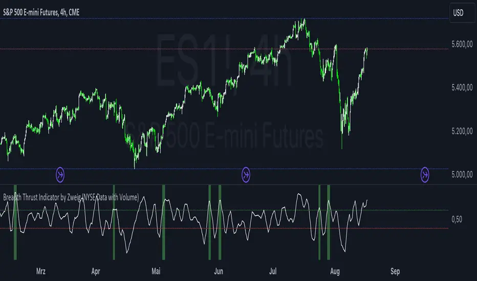
Breadth Thrust Indicator by Zweig (NYSE Data with Volume)The Breadth Thrust Indicator, based on Zweig's methodology, is used to gauge the strength of market breadth and potential bullish signals. This indicator evaluates the breadth of the market by analyzing the ratio of advancing to declining stocks and their associated volumes.
Usage:
Smoothing Length: Adjusts the smoothing period for the combined ratio of breadth and volume.
Low Threshold: Defines the threshold below which the smoothed combined ratio should fall to consider a bullish signal.
High Threshold: Sets the upper threshold that the smoothed combined ratio must exceed to confirm a bullish Breadth Thrust signal.
Signal Interpretation:
Bullish Signal: A background color change to green indicates that the Breadth Thrust condition has been met. This occurs when the smoothed combined ratio crosses above the high threshold after being below the low threshold. This signal suggests strong market breadth and potential bullish momentum.
By using this indicator, traders can identify periods of strong market participation and potential upward price movement, helping them make informed trading decisions.
Oscillators
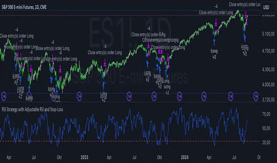
RSI Strategy with Adjustable RSI and Stop-LossThis trading strategy uses the Relative Strength Index (RSI) and a Stop-Loss mechanism to make trading decisions. Here’s a breakdown of how it works:
RSI Calculation:
The RSI is calculated based on the user-defined length (rsi_length). This is a momentum oscillator that measures the speed and change of price movements.
Buy Condition:
The strategy generates a buy signal when the RSI value is below a user-defined threshold (rsi_threshold). This condition indicates that the asset might be oversold and potentially due for a rebound.
Stop-Loss Mechanism:
Upon triggering a buy signal, the strategy calculates the Stop-Loss level. The Stop-Loss level is set to a percentage below the entry price, as specified by the user (stop_loss_percent). This level is used to limit potential losses if the price moves against the trade.
Sell Condition:
A sell signal is generated when the current closing price is higher than the highest high of the previous day. This condition suggests that the price has reached a new high, and the strategy decides to exit the trade.
Plotting:
The RSI values are plotted on the chart for visual reference. A horizontal line is drawn at the RSI threshold level to help visualize the oversold condition.
Summary
Buying Strategy: When RSI is below the specified threshold, indicating potential oversold conditions.
Stop-Loss: Set based on a percentage of the entry price to limit potential losses.
Selling Strategy: When the price surpasses the highest high of the previous day, signaling a potential exit point.
This strategy aims to capture potential rebounds from oversold conditions and manage risk using a Stop-Loss mechanism. As with any trading strategy, it’s essential to test and optimize it under various market conditions to ensure its effectiveness.
RSI-based MACDThe RSI is one of the most popular indicators available. This indicator, which represents the strength of market momentum based on the gains and losses over the past 14 candlesticks, is rational and is mainly used as an oscillator to determine overbought or oversold conditions. However, because the RSI is an older indicator, its very simple design—displaying only a single line on the graph—may feel somewhat lacking in functionality to modern traders. The main issue is that there is no objective measure to determine whether the RSI is currently rising or falling.
That’s when I came up with the idea of calculating the MACD based on the smoothed values of the RSI. As is well known, the MACD is an indicator that represents the distance between moving averages, designed to show when the moving averages cross as the value falls below zero. By observing the golden crosses and death crosses of the MACD and signal line, one can anticipate the golden and death crosses of the moving averages. Applying the same logic, I thought that calculating the MACD based on RSI values would allow us to predict the rise and fall of the RSI by observing these golden and death crosses.
Currently, the RSI is often used as a contrarian indicator to determine overbought and oversold conditions, but with this approach, I believe the RSI can instead function extremely well as a trend-following indicator. Whenever an uptrend occurs, the RSI inevitably rises, and when a downtrend occurs, the RSI inevitably falls. Therefore, by predicting the rise and fall of the RSI, it becomes possible to forecast what kind of trend is likely to develop.
In this indicator, the MACD calculated from the RSI is displayed, with the original RSI line plotted above it. Since the scales of the RSI and MACD are different, I originally wanted to provide a separate scale for the RSI on the left side. However, due to TradingView’s limitations, it seems quite difficult to display more than one scale in a single panel, so I had to give up on that. Instead, I ask that you mentally multiply the RSI values displayed on the right by 10—for example, 2.11 indicates 21.1%.
Additionally, as a bonus, I’ve included a feature that detects divergences. With these features, I believe this has become the most useful indicator when compared to existing RSI-based indicators. I hope you find it helpful in your trading.
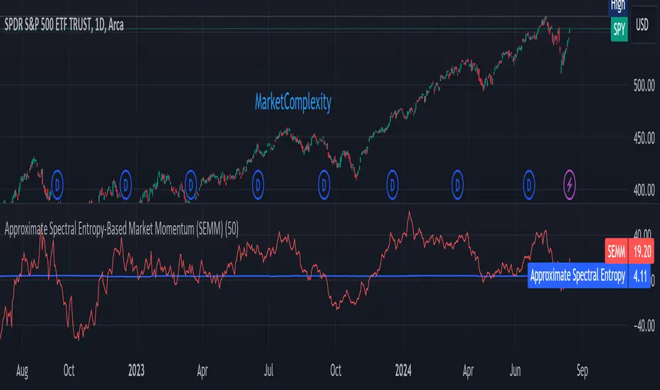
Approximate Spectral Entropy-Based Market Momentum (SEMM)Overview
The Approximate Spectral Entropy-Based Market Momentum (SEMM) indicator combines the concepts of spectral entropy and traditional momentum to provide traders with insights into both the strength and the complexity of market movements. By measuring the randomness or predictability of price changes, SEMM helps traders understand whether the market is in a trending or consolidating state and how strong that trend or consolidation might be.
Key Features
Entropy Measurement: Calculates the approximate spectral entropy of price movements to quantify market randomness.
Momentum Analysis: Integrates entropy with rate-of-change (ROC) to highlight periods of strong or weak momentum.
Dynamic Market Insight: Provides a dual perspective on market behavior—both the trend strength and the underlying complexity.
Customizable Parameters: Adjustable window length for entropy calculation, allowing for fine-tuning to suit different market conditions.
Concepts Underlying the Calculations
The indicator utilizes Shannon entropy, a concept from information theory, to approximate the spectral entropy of price returns. Spectral entropy traditionally involves a Fourier Transform to analyze the frequency components of a signal, but due to Pine Script limitations, this indicator uses a simplified approach. It calculates log returns over a rolling window, normalizes them, and then computes the Shannon entropy. This entropy value represents the level of disorder or complexity in the market, which is then multiplied by traditional momentum measures like the rate of change (ROC).
How It Works
Price Returns Calculation: The indicator first computes the log returns of price data over a specified window length.
Entropy Calculation: These log returns are normalized and used to calculate the Shannon entropy, representing market complexity.
Momentum Integration: The calculated entropy is then multiplied by the rate of change (ROC) of prices to generate the SEMM value.
Signal Generation: High SEMM values indicate strong momentum with higher randomness, while low SEMM values indicate lower momentum with more predictable trends.
How Traders Can Use It
Trend Identification: Use SEMM to identify strong trends or potential trend reversals. Low entropy values can indicate a trending market, whereas high entropy suggests choppy or consolidating conditions.
Market State Analysis: Combine SEMM with other indicators or chart patterns to confirm the market's state—whether it's trending, ranging, or transitioning between states.
Risk Management: Consider high SEMM values as a signal to be cautious, as they suggest increased market unpredictability.
Example Usage Instructions
Add the Indicator: Apply the "Approximate Spectral Entropy-Based Market Momentum (SEMM)" indicator to your chart.
Adjust Parameters: Modify the length parameter to suit your trading timeframe. Shorter lengths are more responsive, while longer lengths smooth out the signal.
Analyze the Output: Observe the blue line for entropy and the red line for SEMM. Look for divergences or confirmations with price action to guide your trades.
Combine with Other Tools: Use SEMM alongside moving averages, support/resistance levels, or other indicators to build a comprehensive trading strategy.
RSI - ARIEIVhe RSI MAPPING - ARIEIV is a powerful technical indicator based on the Relative Strength Index (RSI) combined with moving averages and divergence detection. This indicator is designed to provide a clear view of overbought and oversold conditions, as well as identifying potential reversals and signals for market entries and exits.
Key Features:
Customizable RSI:
The indicator offers flexibility in adjusting the RSI length and data source (closing price, open price, etc.).
The overbought and oversold lines can be customized, allowing the RSI to signal critical market zones according to the trader’s strategy.
RSI-Based Moving Averages (MA):
Users can enable a moving average based on the RSI with support for multiple types such as SMA, EMA, WMA, VWMA, and SMMA (RMA).
For those who prefer Bollinger Bands, there’s an option to use the moving average with standard deviation to detect market volatility.
Divergence Detection:
Detects both regular and hidden divergences (bullish and bearish) between price and RSI, which can indicate potential market reversals.
These divergences can be customized with specific colors for easy identification on the chart, allowing traders to quickly spot significant market shifts.
Zone Mapping:
The script maps zones of buying and selling strength, filling the areas between the overbought and oversold levels with specific colors, highlighting when the market is in extreme conditions.
Strength Tables:
At the end of each session, a table appears on the right side of the chart, displaying the "Buying Strength" and "Selling Strength" based on calculated RSI levels. This allows for quick analysis of the dominant pressure in the market.
Flexible Settings:
Many customization options are available, from adjusting the number of decimal places to the choice of colors and the ability to toggle elements on or off within the chart.
RSI Slope Filtered Signals [UAlgo]The "RSI Slope Filtered Signals " is a technical analysis tool designed to enhance the accuracy of RSI (Relative Strength Index) signals by incorporating slope analysis. This indicator not only considers the RSI value but also analyzes the slope of the RSI over a specified number of bars, providing a more refined signal that accounts for the momentum and trend strength. By utilizing both positive and negative slope arrays, the indicator dynamically adjusts its thresholds, ensuring that signals are responsive to changing market conditions. This tool is particularly useful for traders looking to identify overbought and oversold conditions with a higher degree of precision, filtering out noise and providing clear visual cues for potential market reversals.
🔶 Key Features
Dynamic Slope Analysis: Measures the slope of RSI over a customizable number of bars, offering insights into the momentum and trend direction.
Adaptive Thresholds: Uses historical slope data to calculate dynamic thresholds, adjusting signal sensitivity based on market conditions.
Normalized Slope Calculation: Normalizes the slope values to provide a consistent measure across different market conditions, making the indicator more versatile.
Clear Signal Visualization: The indicator plots both positive and negative normalized slopes with color gradients, visually representing the strength of the trend.
Overbought and Oversold Signals: Plots overbought and oversold signals directly on the chart when the calculated value reaches the user-specified threshold, helping traders identify potential reversal points.
Customizable Settings: Allows users to adjust the RSI length, slope measurement bars, and lookback periods, providing flexibility to tailor the indicator to different trading strategies.
🔶 Interpreting the Indicator
The "RSI Slope Filtered Signals " indicator is designed to be easy to interpret. Here's how you can use it:
Normalized Slope: The indicator plots the normalized slope of the RSI, with values above zero indicating positive momentum and values below zero indicating negative momentum. A higher positive slope suggests a strong upward trend, while a deeper negative slope indicates a strong downward trend.
Reversal Signals: The indicator plots several horizontal lines at different thresholds (+3, +2, +1, 0, -1, -2, -3). These levels are used to gauge the strength of the momentum based on the normalized slope. For example, a normalized slope crossing above the +2 threshold may indicate a strong bullish trend, while crossing below the -2 threshold may suggest a strong bearish trend. These thresholds help in understanding the intensity of the current trend and provide context for interpreting the indicator's signals.
This indicator generates overbought and oversold signals not solely based on the RSI entering extreme levels (above 70 for overbought and below 30 for oversold), but also by considering the behavior of the normalized slope relative to specific thresholds. Specifically, the Overbought Signal (🔽) is triggered when the RSI is above 70 and the normalized slope from the previous bar is greater than or equal to the upper threshold, with the current slope being lower than the previous slope, indicating a potential bearish reversal as momentum may be slowing down.
Similarly, the Oversold Signal (🔼) is generated when the RSI is below 30 and the normalized slope from the previous bar is less than or equal to the lower threshold, with the current slope being higher than the previous slope, signaling a potential bullish reversal as the downward momentum may be weakening.
Area Plots: The indicator also plots the positive and negative slopes as filled areas, providing a quick visual cue for the strength and direction of the trend. Green areas represent positive slopes (upward momentum), while red areas represent negative slopes (downward momentum).
By combining these elements, the "RSI Slope Filtered Signals " provides a comprehensive view of the market's momentum, helping traders make more informed decisions by filtering out false signals and focusing on the significant trends.
🔶 Disclaimer
Use with Caution: This indicator is provided for educational and informational purposes only and should not be considered as financial advice. Users should exercise caution and perform their own analysis before making trading decisions based on the indicator's signals.
Not Financial Advice: The information provided by this indicator does not constitute financial advice, and the creator (UAlgo) shall not be held responsible for any trading losses incurred as a result of using this indicator.
Backtesting Recommended: Traders are encouraged to backtest the indicator thoroughly on historical data before using it in live trading to assess its performance and suitability for their trading strategies.
Risk Management: Trading involves inherent risks, and users should implement proper risk management strategies, including but not limited to stop-loss orders and position sizing, to mitigate potential losses.
No Guarantees: The accuracy and reliability of the indicator's signals cannot be guaranteed, as they are based on historical price data and past performance may not be indicative of future results.

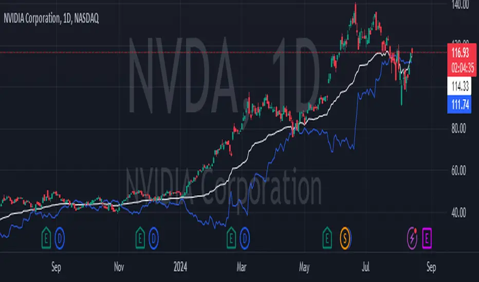
Support line based on RSIThis indicator builds a support line using the stock price and RSI.
Inputs:
1. Time window for the RSI:
the time window the RSI is calculated with, usually it's 14 but in here I recommend 30.
2. offset by percentage:
just adding or subtructing some percentage of the result, some stocks need a bit of offset to work
3. stability:
the higher it is the less the RSI effects the graph. for realy high stability the indicator the the stock price will be realy close.
formula: (close*(100-newRSI)/50)*(100+offset)/100
when:
newRSI = (RSI + (50 * stability1))/(stability+1)
recommended usage:
Usually, if the indicator becomes higher than the price, (the price lowers). the stock will go up again to around the last price where they met.
so, for example, if the stock price was 20 and going down. while the indicator was 18 and going up, then they met at 19 and later the indicator became 20 while the stock fell to 18. most chances are that the stock will come back to 19 where they met and at the same time the indicator will also get to 19.
In stocks that are unstable, like NVDA. this indicator can be used to see the trend and avoid the unstability of the stock.
Average of CBO and CBO divergence histogramShort Description:
This indicator combines a Custom Bias Oscillator (CBO) with its Divergence Histogram and computes their average for use to assess the market's bias based on candlestick analysis, from the aforementioned CBO indicator.
Full Description:
Overview:
This indicator integrates two powerful analytical tools into a single script: a Custom Bias Oscillator (CBO) and its Divergence Histogram. This indicator provides traders with a comprehensive view of market bias and divergence between price movements and volume, enhanced by an optional signal line derived from the combined average of these metrics.
Key Features:
Custom Bias Oscillator (CBO):
The CBO is calculated based on the body and wick biases of candlesticks, normalized by the Average True Range (ATR) to account for market volatility.
The CBO is scaled by the divergence between the Rate of Change (ROC) of volume and the ROC of the adjusted bias, ensuring it reflects potential reversals or continuations in the market.
Divergence Histogram:
The Divergence Histogram is derived from the difference between the CBO and its signal line.
This difference is normalized and plotted to provide visual cues for potential divergences, which may indicate trend exhaustion or the beginning of a new trend.
Combined Average with Signal Line:
The indicator calculates the average of the CBO and the normalized divergence, creating a combined signal that offers a more rounded perspective on market conditions.
A signal line, generated by smoothing the combined average, is plotted to help traders identify potential buy or sell signals based on crossovers.
Customization:
The indicator includes customizable parameters for the periods of the oscillator, signal line, ATR, ROC, and the combined signal line, allowing traders to tailor the indicator to different market conditions and timeframes.
How to Use:
Buy Signal: Consider a long position when the combined average crosses above the signal line, indicating potential bullish momentum.
Sell Signal: Consider a short position when the combined average crosses below the signal line, indicating potential bearish momentum.
Divergence Analysis: Use the Divergence Histogram to identify areas where price movements may be diverging from volume, signaling potential reversals or corrections.
Disclaimer:
This indicator is designed for educational and informational purposes only. It is not financial advice. Always perform your own analysis before making any investment decisions. Past performance is not indicative of future results.
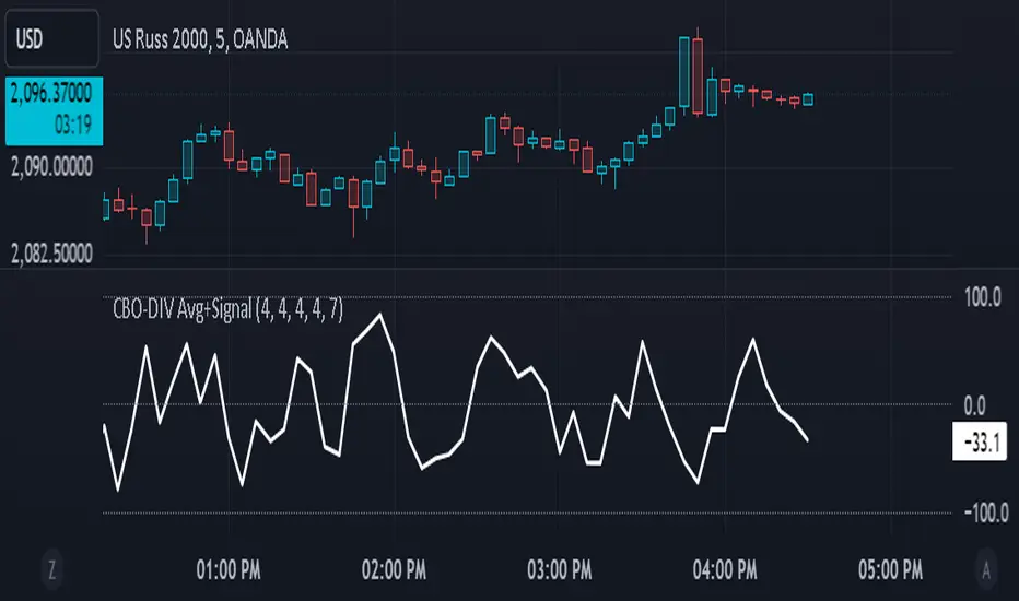
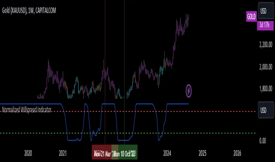
Normalized Willspread IndicatorNot sure to call it as willspread or not, because i take this idea from Larry William's original willspread indicator and did some modifications which found out to be more effective in my opinion, which is by subtracting 21 and 3 ma, this indicator is found on Trade_Stocks_and_Commodities_With_the_Insiders page155. Feel free to find out.
Here's what I modified, instead of using the subtraction between two ma, I use one ma only, I find more accurate in spotting oversold and overbought value. This indicator is useful for metals. It basically compares the value between two assets, let's say u are watching gold, u can select compare it to dxy, us30Y or gold, let's say u choose to compare to dxy, and the indicator shows the the index is overvalued which is above 80 levels, then it is suggesting that gold is overvalued, the same logic apply to undervalued as well which is 20 levels. This is not a entry or exit tool but as additional confluence, u can use any entry method u want like supply and demand and use this indicator to validate your idea, not sure whether it works on forex or not, so far i think it works well on metals.
The bar colour corresponding to the index when it is overbought or oversold. U can switch off it if you dont need it. Do note that this is a repainting indicator, so u must refer to previous week close.
EMA Crossover Buy/Sell IndicatorScript Overview
This script is a trading indicator designed to identify potential buy and sell signals based on the crossover of two Exponential Moving Averages (EMAs):
Indicator Title and Setup:
The script is named "EMA Crossover Buy/Sell Indicator" and is plotted directly on the price chart.
EMAs Calculation:
It calculates two EMAs: a 20-period EMA and a 50-period EMA. These are used to analyze the market trends over different time frames.
Plotting EMAs:
The 20-period EMA is shown on the chart in blue.
The 50-period EMA is shown in orange.
These lines help visualize the current trend and potential points of interest where the moving averages intersect.
Generating Signals:
A buy signal is triggered when the 20-period EMA crosses above the 50-period EMA.
A sell signal is triggered when the 20-period EMA crosses below the 50-period EMA.
These signals suggest potential buying or selling opportunities based on the crossover of the EMAs.
Displaying Signals:
Buy signals are marked with green labels below the bars on the chart.
Sell signals are marked with red labels above the bars on the chart.
This visual representation helps traders quickly identify potential trading opportunities.
Alerts:
Alerts are set up to notify the trader when a buy or sell signal occurs.
The alert messages specify whether the signal is a buying opportunity or a selling opportunity based on the EMA crossovers.
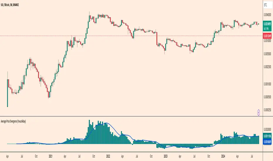
Altcoin Total Average Divergence (YavuzAkbay)The "Average Price and Divergence" indicator is a strong tool built exclusively for cryptocurrency traders who understand the significance of comparing altcoins to Bitcoin (BTC). While traditional research frequently focusses on the value of cryptocurrencies against fiat currencies such as the US dollar, this indicator switches the focus to the value of altcoins against Bitcoin itself, allowing you to detect potential market opportunities and divergences.
The indicator allows you to compare the price of an altcoin to Bitcoin (e.g., ETHBTC, SOLBTC), which is critical for determining how well an altcoin performs against the main cryptocurrency. This is especially important for investors who expect Bitcoin's price will continue to rise logarithmically and want to ensure that their altcoin holdings retain or expand in market capitalisation compared to Bitcoin.
The indicator computes the average price of the chosen cryptocurrency relative to Bitcoin over the viewable portion of the chart. This average acts as a benchmark, indicating the normal value around which the altcoin's price moves.
The primary objective of this indicator is to calculate and plot the divergence, which is the difference between the altcoin's current price relative to Bitcoin and its average value. This divergence can reveal probable overbought or oversold conditions, allowing traders to make better decisions about entry and exit points.
The divergence is represented as a histogram, with bars representing the magnitude of the difference between the current and average prices. Positive values indicate that the altcoin is trading above its average value in comparison to Bitcoin, whereas negative values indicate that it is trading below its average.
The indicator automatically adjusts to the chart's visible range, ensuring that the average price and divergence are always calculated using the most relevant data. This makes the indicator extremely sensitive to changes in the chart view and market conditions.
How to Use:
A significant positive divergence may imply that the cryptocurrency is overbought in comparison to Bitcoin and is headed for a correction. A significant negative divergence, on the other hand, may indicate that the cryptocurrency has been oversold and is cheap in comparison to Bitcoin.
Tracking how an altcoin's price deviates from its average relative to Bitcoin can provide insights about the market's opinion towards that altcoin. Persistent positive divergence may suggest high market confidence, whilst constant negative divergence may imply a lack of interest or eroding fundamentals.
Use divergence data to better time your trades, either by entering when a cryptocurrency is discounted in comparison to its average (negative divergence) or departing when it is overpriced (positive divergence). This allows you to capture value as the price returns to its mean.
Ideal For:
Cryptocurrency Traders who want to understand how altcoins are performing relative to Bitcoin rather than just against fiat currencies.
Long-term Investors looking to ensure their altcoin investments are maintaining or growing their value relative to Bitcoin.
Market Analysts interested in identifying potential reversals or continuations in altcoin prices based on divergence from their average value relative to Bitcoin.
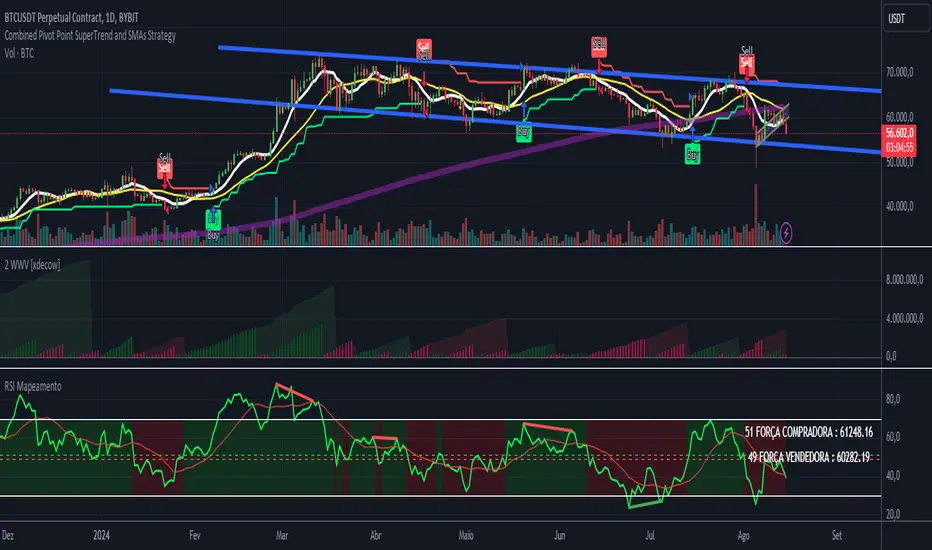
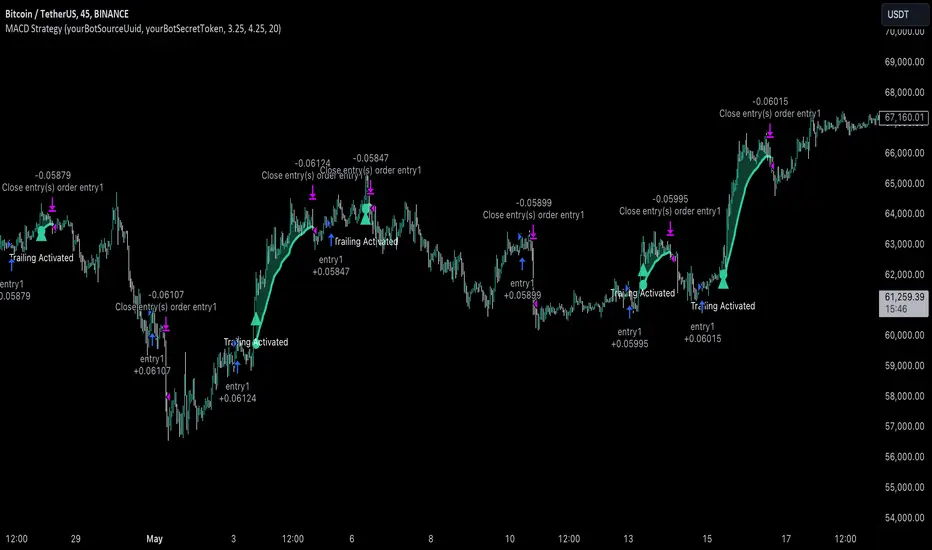
MACD with 1D Stochastic Confirmation Reversal StrategyOverview
The MACD with 1D Stochastic Confirmation Reversal Strategy utilizes MACD indicator in conjunction with 1 day timeframe Stochastic indicators to obtain the high probability short-term trend reversal signals. The main idea is to wait until MACD line crosses up it’s signal line, at the same time Stochastic indicator on 1D time frame shall show the uptrend (will be discussed in methodology) and not to be in the oversold territory. Strategy works on time frames from 30 min to 4 hours and opens only long trades.
Unique Features
Dynamic stop-loss system: Instead of fixed stop-loss level strategy utilizes average true range (ATR) multiplied by user given number subtracted from the position entry price as a dynamic stop loss level.
Configurable Trading Periods: Users can tailor the strategy to specific market windows, adapting to different market conditions.
Higher time frame confirmation: Strategy utilizes 1D Stochastic to establish the major trend and confirm the local reversals with the higher probability.
Trailing take profit level: After reaching the trailing profit activation level scrip activate the trailing of long trade using EMA. More information in methodology.
Methodology
The strategy opens long trade when the following price met the conditions:
MACD line of MACD indicator shall cross over the signal line of MACD indicator.
1D time frame Stochastic’s K line shall be above the D line.
1D time frame Stochastic’s K line value shall be below 80 (not overbought)
When long trade is executed, strategy set the stop-loss level at the price ATR multiplied by user-given value below the entry price. This level is recalculated on every next candle close, adjusting to the current market volatility.
At the same time strategy set up the trailing stop validation level. When the price crosses the level equals entry price plus ATR multiplied by user-given value script starts to trail the price with EMA. If price closes below EMA long trade is closed. When the trailing starts, script prints the label “Trailing Activated”.
Strategy settings
In the inputs window user can setup the following strategy settings:
ATR Stop Loss (by default = 3.25, value multiplied by ATR to be subtracted from position entry price to setup stop loss)
ATR Trailing Profit Activation Level (by default = 4.25, value multiplied by ATR to be added to position entry price to setup trailing profit activation level)
Trailing EMA Length (by default = 20, period for EMA, when price reached trailing profit activation level EMA will stop out of position if price closes below it)
User can choose the optimal parameters during backtesting on certain price chart, in our example we use default settings.
Justification of Methodology
This strategy leverages 2 time frames analysis to have the high probability reversal setups on lower time frame in the direction of the 1D time frame trend. That’s why it’s recommended to use this strategy on 30 min – 4 hours time frames.
To have an approximation of 1D time frame trend strategy utilizes classical Stochastic indicator. The Stochastic Indicator is a momentum oscillator that compares a security's closing price to its price range over a specific period. It's used to identify overbought and oversold conditions. The indicator ranges from 0 to 100, with readings above 80 indicating overbought conditions and readings below 20 indicating oversold conditions.
It consists of two lines:
%K: The main line, calculated using the formula (CurrentClose−LowestLow)/(HighestHigh−LowestLow)×100 . Highest and lowest price taken for 14 periods.
%D: A smoothed moving average of %K, often used as a signal line.
Strategy logic assumes that on 1D time frame it’s uptrend in %K line is above the %D line. Moreover, we can consider long trade only in %K line is below 80. It means that in overbought state the long trade will not be opened due to higher probability of pullback or even major trend reversal. If these conditions are met we are going to our working (lower) time frame.
On the chosen time frame, we remind you that for correct work of this strategy you shall use 30min – 4h time frames, MACD line shall cross over it’s signal line. The MACD (Moving Average Convergence Divergence) is a popular momentum and trend-following indicator used in technical analysis. It helps traders identify changes in the strength, direction, momentum, and duration of a trend in a stock's price.
The MACD consists of three components:
MACD Line: This is the difference between a short-term Exponential Moving Average (EMA) and a long-term EMA, typically calculated as: MACD Line=12-period EMA−26-period
Signal Line: This is a 9-period EMA of the MACD Line, which helps to identify buy or sell signals. When the MACD Line crosses above the Signal Line, it can be a bullish signal (suggesting a buy); when it crosses below, it can be a bearish signal (suggesting a sell).
Histogram: The histogram shows the difference between the MACD Line and the Signal Line, visually representing the momentum of the trend. Positive histogram values indicate increasing bullish momentum, while negative values indicate increasing bearish momentum.
In our script we are interested in only MACD and signal lines. When MACD line crosses signal line there is a high chance that short-term trend reversed to the upside. We use this strategy on 45 min time frame.
ATR is used to adjust the strategy risk management to the current market volatility. If volatility is low, we don’t need the large stop loss to understand the there is a high probability that we made a mistake opening the trade. User can setup the settings ATR Stop Loss and ATR Trailing Profit Activation Level to realize his own risk to reward preferences, but the unique feature of a strategy is that after reaching trailing profit activation level strategy is trying to follow the trend until it is likely to be finished instead of using fixed risk management settings. It allows sometimes to be involved in the large movements.
Backtest Results
Operating window: Date range of backtests is 2023.01.01 - 2024.08.01. It is chosen to let the strategy to close all opened positions.
Commission and Slippage: Includes a standard Binance commission of 0.1% and accounts for possible slippage over 5 ticks.
Initial capital: 10000 USDT
Percent of capital used in every trade: 30%
Maximum Single Position Loss: -4.79%
Maximum Single Profit: +20.14%
Net Profit: +2361.33 USDT (+44.72%)
Total Trades: 123 (44.72% win rate)
Profit Factor: 1.623
Maximum Accumulated Loss: 695.80 USDT (-5.48%)
Average Profit per Trade: 19.20 USDT (+0.59%)
Average Trade Duration: 30 hours
These results are obtained with realistic parameters representing trading conditions observed at major exchanges such as Binance and with realistic trading portfolio usage parameters.
How to Use
Add the script to favorites for easy access.
Apply to the desired timeframe between 30 min and 4 hours and chart (optimal performance observed on 45 min BTC/USDT).
Configure settings using the dropdown choice list in the built-in menu.
Set up alerts to automate strategy positions through web hook with the text: {{strategy.order.alert_message}}
Disclaimer:
Educational and informational tool reflecting Skyrex commitment to informed trading. Past performance does not guarantee future results. Test strategies in a simulated environment before live implementation
Price Oscillator TR### Summary: How to Use the Price Oscillator with EMA Indicator
The **Price Oscillator with EMA** is a custom technical analysis tool designed to help traders identify potential buying and selling opportunities based on price momentum. Here's how to use it:
1. **Understanding the Oscillator**:
- The oscillator is calculated by normalizing the current price relative to the highest high and lowest low over a specified lookback period. It fluctuates between -70 and +70.
- When the oscillator is near +70, the price is close to the recent highs, indicating potential overbought conditions. Conversely, when it’s near -100, the price is close to recent lows, indicating potential oversold conditions.
2. **Exponential Moving Average (EMA)**:
- The indicator includes an EMA of the oscillator to smooth out price fluctuations and provide a clearer signal.
- The EMA helps to filter out noise and confirm trends.
3. **Trading Signals**:
- **Bullish Signal**: A potential buying opportunity is signaled when the oscillator crosses above its EMA. This suggests increasing upward momentum.
- **Bearish Signal**: A potential selling opportunity is signaled when the oscillator crosses below its EMA. This indicates increasing downward momentum.
4. **Visual Aids**:
- The indicator includes horizontal lines at +70, 0, and -70 to help you quickly assess overbought, neutral, and oversold conditions.
- The blue line represents the oscillator, while the orange line represents the EMA of the oscillator.
### How to Use:
- **Set your parameters**: Adjust the lookback period and EMA length to fit your trading strategy and time frame.
- **Watch for Crossovers**: Monitor when the oscillator crosses the EMA. A crossover from below to above suggests a buy, while a crossunder from above to below suggests a sell.
- **Confirm with Other Indicators**: For more reliable signals, consider using this indicator alongside other technical tools like volume analysis, trend lines, or support/resistance levels.
This indicator is ideal for traders looking to capture momentum-based trades in various market conditions.
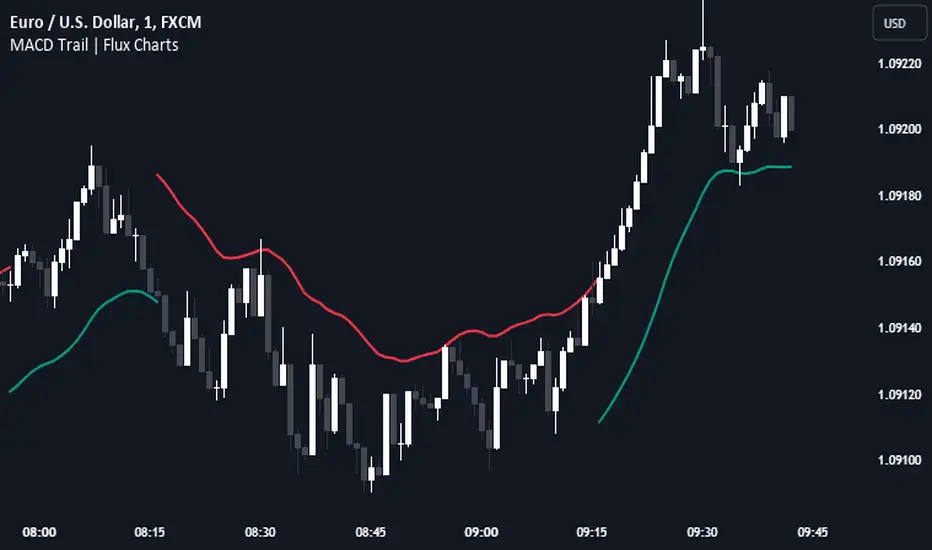
MACD Trail | Flux Charts💎 GENERAL OVERVIEW
Introducing our new MACD Trail indicator! Moving average convergence/divergence (MACD) is a well-known indicator among traders. It's a trend-following indicator that uses the relationship between two exponential moving averages (EMAs). This indicator aims to use MACD to generate a trail that follows the current price of the ticker, which can act as a support / resistance zone. More info about the process in the "How Does It Work" section.
Features of the new MACD Trail Indicator :
A Trail Generated Using MACD Calculation
Customizable Algorithm
Customizable Styling
📌 HOW DOES IT WORK ?
First of all, this indicator calculates the current MACD of the ticker using the user's input as settings. Let X = MACD Length setting ;
MACD ~= X Period EMA - (X * 2) Period EMA
Then, two MACD Trails are generated, one being bullish and other being bearish. Let ATR = 30 period ATR (Average True Range)
Bullish MACD Trail = Current Price + MACD - (ATR * 1.75)
Bearish MACD Trail = Current Price + MACD + (ATR * 1.75)
The indicator starts by rendering only the Bullish MACD Trail. Then if it's invalidated (candlestick closes below the trail) it switches to Bearish MACD Trail. The MACD trail switches between bullish & bearish as they get invalidated.
The trail type may give a hint about the current trend of the price action. The trail itself also can act as a support / resistance zone, here is an example :
🚩 UNIQUENESS
While MACD is one of the most used indicators among traders, this indicator aims to add another functionality to it by rendering a trail based on it. This trail may act as a support / resistance zone as described above, and gives a glimpse about the current trend. The indicator also has custom MACD Length and smoothing options, as well as various style options.
⚙️ SETTINGS
1. General Configuration
MACD Length -> This setting adjusts the EMA periods used in MACD calculation. Increasing this setting will make MACD more responseive to longer trends, while decreasing it may help with detection of shorter trends.
Smoothing -> The smoothing of the MACD Trail. Increasing this setting will help smoothen out the MACD Trail line, but it can also make it less responsive to the latest changes.
Moments Functions
This script is a TradingView Pine Script (version 5) for calculating and plotting statistical moments of a financial series. Here's a breakdown of what it does:
Script Overview
Purpose:
The script calculates and visualizes moments such as Mean, Variance, Skewness, and Kurtosis of a price series.
It also provides the option to display log returns and various statistical bands.
Inputs:
Moments Selection: Choose from Mean, Variance, Skewness, or Excess Kurtosis.
Source Settings: Define the lookback period and source data (e.g., closing price or log returns).
Plot Settings: Control visibility and styling of plots, bands, and information panels.
Colors Settings: Customize colors for different plot elements.
Functions:
f_va(): Computes sample variance.
f_sd(): Computes sample standard deviation.
f_skew(): Computes sample skewness.
f_kurt(): Computes sample kurtosis.
seskew(): Calculates the standard error of skewness.
sekurt(): Calculates the standard error of kurtosis.
skewcv(): Computes critical values for skewness.
kurtcv(): Computes critical values for kurtosis.
Outputs:
Plots:
Moment values (Mean, Variance, Skewness, Kurtosis).
Log Returns (if selected).
Standard Deviation Bands (if selected).
Critical Values for Skewness and Kurtosis (if selected).
Information Panel: Displays current statistical values and their significance.
Customization:
Users can customize appearance and behavior of the script through various input options, including colors, line thickness, and background settings.
Key Variables and Constants
Constants:
zscoreS and zscoreL: Z-scores for confidence intervals based on sample size.
skewrv and kurtrv: Reference values for skewness and excess kurtosis.
Sample Functions:
f_va() and f_sd(): Custom functions to calculate sample variance and standard deviation.
f_skew() and f_kurt(): Custom functions to calculate skewness and kurtosis.
Critical Values:
Functions skewcv() and kurtcv() calculate critical values used to assess statistical significance of skewness and kurtosis.
Plotting
Plot Types:
Mean, variance, skewness, and excess kurtosis are plotted based on user selection.
Log returns are plotted if enabled.
Standard deviation bands and critical values are plotted if enabled.
Labels:
Information panel labels display mean, variance/standard deviation, skewness, and kurtosis values along with their significance.
Example Usage
To use this script:
Add it to a TradingView chart.
Adjust inputs to configure which statistical moments to display, the source data, and the appearance of the plots.
Review the plotted data and labels to analyze the statistical properties of the selected price series.
This script is useful for traders and analysts looking to perform advanced statistical analysis on financial data directly within TradingView.
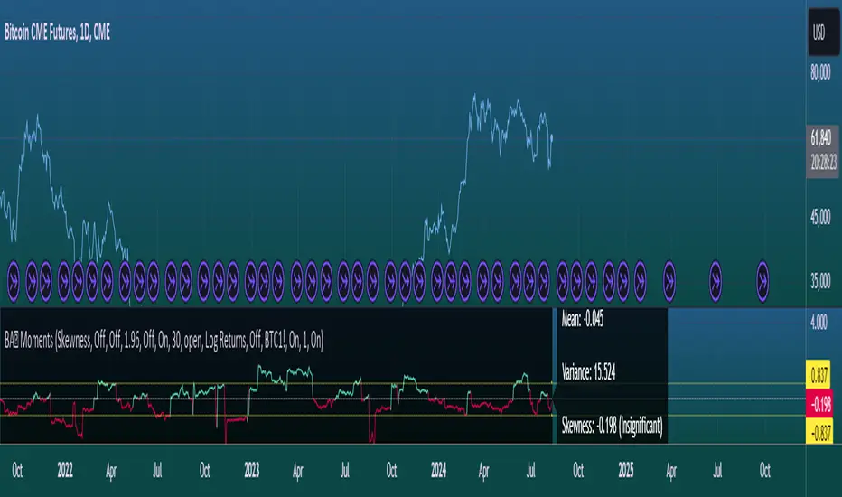
When comparing two stock prices over a period of time, the statistical moments—mean, variance, skewness, and kurtosis—can provide a deep insight into the behavior of the stock prices and their distributions. Here’s what each moment signifies in this context:
1. Mean
Definition: The mean (or average) is the sum of the stock prices over the period divided by the number of data points. It represents the central value of the price series.
Interpretation: When comparing two stocks, the mean tells you the average price level of each stock over the period. A higher mean indicates that, on average, the stock price is higher compared to another stock with a lower mean.
Comparison Insight: If Stock A has a higher mean price than Stock B, it implies that Stock A's prices are generally higher than those of Stock B over the given period.
2. Variance
Definition: Variance measures the dispersion or spread of the stock prices around the mean. It is the average of the squared differences from the mean.
Interpretation: A higher variance indicates that the stock prices fluctuate more widely from the mean, implying greater volatility. Conversely, a lower variance indicates more stable and predictable prices.
Comparison Insight: Comparing the variances of two stocks helps in assessing which stock has more price volatility. If Stock A has a higher variance than Stock B, it means Stock A's prices are more volatile and less predictable compared to Stock B.
3. Skewness
Definition: Skewness measures the asymmetry of the distribution of stock prices around the mean. It can be positive, negative, or zero:
Positive Skewness: The distribution has a long right tail, with more frequent small returns and fewer large positive returns.
Negative Skewness: The distribution has a long left tail, with more frequent small returns and fewer large negative returns.
Zero Skewness: The distribution is symmetric around the mean.
Interpretation: Skewness tells you about the direction of outliers in the stock price distribution. Positive skewness means a higher probability of large positive returns, while negative skewness means a higher probability of large negative returns.
Comparison Insight: By comparing skewness, you can understand the nature of extreme returns for two stocks. For example, if Stock A has positive skewness and Stock B has negative skewness, Stock A might have more frequent large gains, whereas Stock B might have more frequent large losses.
4. Kurtosis
Definition: Kurtosis measures the "tailedness" of the distribution of stock prices. It indicates how much of the distribution is in the tails versus the center. High kurtosis means more outliers (extreme returns), while low kurtosis means fewer outliers.
Interpretation:
High Kurtosis: Indicates a higher likelihood of extreme price movements (both high and low) compared to a normal distribution.
Low Kurtosis: Indicates that extreme price movements are less common.
Comparison Insight: Comparing kurtosis between two stocks shows which stock has more extreme returns. If Stock A has higher kurtosis than Stock B, it means Stock A has more frequent extreme price changes, suggesting more risk or opportunities for large gains or losses.
Summary
Mean: Compares average price levels.
Variance: Compares price volatility.
Skewness: Compares the asymmetry of price movements.
Kurtosis: Compares the likelihood of extreme price changes.
By analyzing these statistical moments, you can gain a comprehensive view of how the two stocks behave relative to each other, which can inform investment decisions based on risk, return expectations, and the nature of price movements.
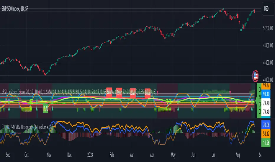
Gabriel's Relative Unrealized Profit with Dynamic MVRV Histogram
Certainly! Here’s an enhanced description of the Gabriel's Relative Unrealized Profit with Dynamic MVRV Histogram indicator with detailed usage instructions and explanations of why it's effective:
Gabriel's Relative Unrealized Profit with Dynamic MVRV Histogram
Description:
The Gabriel's Relative Unrealized Profit with Dynamic MVRV Histogram is an advanced trading indicator designed to offer in-depth insights into asset profitability and market valuation. By integrating Relative Unrealized Profit (RUP) and the Market Value to Realized Value (MVRV) Ratio, this indicator provides a nuanced view of an asset's performance and potential trading signals.
Key Components:
SMA Length and Volume Indicator:
SMA Length: Defines the period for the Simple Moving Average (SMA) used to calculate the entry price, defaulted to 14 periods. This smoothing technique helps estimate the average historical price at which the asset was acquired.
Volume Indicator: Allows selection between "volume" and "vwap" (Volume-Weighted Average Price) for calculating entry volume. The choice impacts the calculation of entry volume, either based on standard trading volume or a weighted average price.
Realized Price Calculation:
Computes the average price over a specified period (default of 30 periods) to establish the realized price. This serves as a benchmark for evaluating the cost basis of the asset.
MVRV Calculation:
Current Price: The most recent closing price of the asset, representing its market value.
Total Cost: Calculated as the product of the entry price and entry volume, reflecting the total investment made.
Unrealized Profit: The difference between the current price and the entry price, multiplied by entry volume, indicating profit or loss that has yet to be realized.
Relative Unrealized Profit: Expressed as a percentage of the total cost, showing how much profit or loss exists relative to the initial investment.
Market Value and Realized Value: Market Value is the current price multiplied by entry volume, while Realized Value is the realized price multiplied by entry volume. The MVRV Ratio is obtained by dividing Market Value by Realized Value.
Normalization:
Normalizes both Relative Unrealized Profit and MVRV Ratio to a standardized range of -100 to 100. This involves calculating the minimum and maximum values over a 100-period window to ensure comparability and relevance.
Histogram Calculation:
The histogram is derived from the difference between the normalized Relative Unrealized Profit and the normalized MVRV Ratio. It visually represents the disparity between the two metrics, highlighting potential trading signals.
Plotting and Alerts:
Plots:
Normalized Relative Unrealized Profit (Blue Line): Plotted in blue, this line shows the scaled measure of unrealized profit. Positive values indicate potential gains, while negative values suggest potential losses.
Normalized MVRV Ratio (Red Line): Plotted in red, this line represents the scaled MVRV Ratio. Higher values suggest that the asset’s market value significantly exceeds its realized value, indicating potential overvaluation, while lower values suggest potential undervaluation.
Histogram (Green Bars): Plotted in green, this histogram displays the difference between the normalized Relative Unrealized Profit and the normalized MVRV Ratio. Positive bars indicate that the asset’s profitability is exceeding its market valuation, while negative bars suggest the opposite.
Alerts:
High Histogram Alert: Activated when the histogram value exceeds 50. This condition signals a strong positive divergence, indicating that the asset's profitability is outperforming its market valuation. It may suggest a buying opportunity or indicate that the asset is undervalued relative to its potential profitability.
Low Histogram Alert: Triggered when the histogram value falls below -50. This condition signals a strong negative divergence, indicating that the asset's profitability is lagging behind its market valuation. It may suggest a selling opportunity or indicate that the asset is overvalued relative to its profitability.
How to Use the Indicator:
Setup: Customize the SMA Length, Volume Indicator, and Realized Price Length based on your trading strategy and asset volatility. These parameters allow you to tailor the indicator to different market conditions and asset types.
Interpretation:
Blue Line (Normalized Relative Unrealized Profit): Monitor this line to gauge the profitability of holding the asset. Significant positive values suggest that the asset is currently in a profitable position relative to its purchase price.
Red Line (Normalized MVRV Ratio): Use this line to assess whether the asset is trading at a premium or discount relative to its cost basis. Higher values may indicate overvaluation, while lower values suggest undervaluation.
Green Bars (Histogram): Observe the histogram for deviations between RUP and MVRV Ratio. Large positive bars indicate that the asset's profitability is strong relative to its valuation, signaling potential buying opportunities. Large negative bars suggest that the asset's profitability is weak relative to its valuation, signaling potential selling opportunities.
Trading Strategy:
Bullish Conditions: When the histogram shows large positive values, it suggests that the asset’s profitability is strong compared to its valuation. Consider this as a potential buying signal, especially if the histogram remains consistently positive.
Bearish Conditions: When the histogram displays large negative values, it indicates that the asset’s profitability is weak compared to its valuation. This may signal a potential selling opportunity or caution, particularly if the histogram remains consistently negative.
Why This Indicator is Effective:
Integrated Metrics: Combining Relative Unrealized Profit and MVRV Ratio provides a comprehensive view of asset performance. This integration allows traders to evaluate both profitability and market valuation in one cohesive tool.