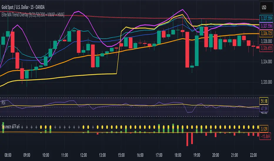
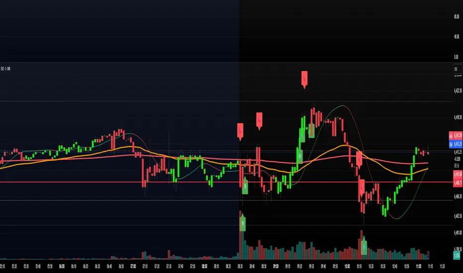
Elite MA Trend Overlay [9/21/50/200 + VWAP + HMA]🔍 What It Is:
The Elite MA Trend Overlay is a professional-grade moving average system built for day traders, scalpers, and swing traders who need clear, visual trend confirmation and precise entry zones across all timeframes.
This overlay combines 5 industry-proven tools into one compact indicator for sniper-level decision making:
EMA 9 – Entry momentum
EMA 21 – Microstructure guide
EMA 50 – Trend bias filter
EMA 200 – Institutional macro direction
VWAP – Intraday fair value (used by pros)
Hull MA (HMA) – Early shift detector
It also features auto-detected trend zones using color-coded background shading to help you instantly know if the market is in a bullish or bearish regime.
🧠 How It Works:
The script dynamically plots the short-term to long-term moving averages to reflect real-time market structure. When all EMAs are aligned in one direction, a colored background highlights the dominant trend:
✅ Green background = Bullish trend (9 > 21 > 50 > 200)
🔻 Red background = Bearish trend (9 < 21 < 50 < 200)
The VWAP line acts as a magnet and decision zone—traders use it for intraday entries or exits. The Hull Moving Average adapts quickly to price shifts, making it perfect for spotting early reversals before the EMAs cross.
🎯 Why It Helps Traders Succeed:
This indicator:
Removes guesswork: Know instantly if you’re in a strong trend or chop zone.
Filters bad trades: Avoid entering against structure or into volatility traps.
Improves timing: Use pullbacks to EMAs or Hull MA flips for sniper entries.
Works across timeframes: From scalping 1-minute to swing trading daily charts.
Whether you're trading gold, forex, stocks, or crypto — this overlay gives you clean, professional structure that keeps you disciplined and sharp.
⚙️ Features:
On/off toggles for VWAP & Hull MA
Minimalist, clutter-free plotting
Auto background color zones
Supports Pine Script v6 (latest version)
👑 Recommended Use:
Confirm trend with background + EMA alignment
Enter on pullbacks to EMA 21 or 50
Use Hull MA or RSI for early reversal detection
Exit at VWAP reversion or trend exhaustion
💬 “Structure is everything. Trade with the flow, not against it.”
Indicators and strategies
WT_CROSS Dip Buy Signal(ozkan)This script identifies potential buy opportunities based on WaveTrend (WT_CROSS) momentum crossing below the -60 level — often indicating oversold conditions.
Additional filters include price being above the Kaufman Adaptive Moving Average (KAMA) and volume below the 5-period average, which helps isolate pullbacks within an uptrend.
Buy Signal Conditions:
WT1 < -60
Price > KAMA
Volume < 5-period SMA of volume
Purpose:
To capture early entries at possible local bottoms during bullish trends while avoiding high-volume breakdown traps.
🔔 You can also set an alert based on this condition.
STC1This code is a position control indicator based on ATR (Average True Range). Its main function is to determine a reasonable stop - loss level and the corresponding position size by calculating market volatility, helping traders manage risks.

Order Block Finder (5-min Demand Zones)This highlights potential bullish order blocks on a 5-min chart when:
Candle is bullish
Small body (suggesting accumulation or absorption)
Lowest low in last X bars

SuperBody CandlesInspired by the original script by Gautam_Dixit.
Updated to the latest Pine Script v6, now featuring fully customizable color settings so users can tailor hues to their preference.
Description:
The Momentum Candle indicator highlights bars whose real body significantly exceeds the 15-period average. 'Super' bullish and bearish candles (body ≥ 1.5× avg) receive standout colors, while above-average and below-average bars are tinted differently to reflect momentum strength.

Heikin Ashi VolumeHeikin Ashi candles decrease market noise so that broader trends can be more easily visualized. In a typical chart utilizing Heikin Ashi candles, volume bars are colored in such a way that they also allow for the visualization of trends during a bullish/bearish move.
The Heikin Ashi Volume indicator allows the trader to continue to use the same volume bar coloring technique to visualize trends without having to utilize the Heikin Ashi candles, since a Heikin Ashi candle’s OHLC values are not true prices but instead based on calculations in order to provide the ‘denoising’ effect they are known for.
In addition to providing the Heikin Ashi Volume coloring effects, the Heikin Ashi Volume indicator also allows the user to set a volume threshold level where the bar colors will be darker unless volume is beyond that threshold, helping traders quickly determine if there is enough participation in the market at that time to justify taking risk in a trade when the market isn’t very active. The user has the option to show or hide the threshold line, change the colors of the bullish/bearish colors (for both above and below threshold volumes) and the option for the indicator to gradually brighten the bar colors are they approach the threshold instead of having a clear line of demarcation showing volume above or below the set threshold.

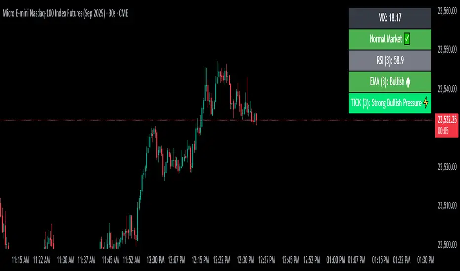
VIX Filter/RSI/EMA Bias/Cum-TICK w/ Exhaustion Zone DashboardThis all-in-one dashboard gives intraday traders a real-time visual read of market conditions, combining volatility regime, trend bias, momentum exhaustion, and internal strength — all in a fully customizable overlay that won’t clutter your chart.
📉 VIX Market Regime Detector
Identifies "Weak", "Normal", "Volatile", or "Danger" market states based on customizable VIX ranges and symbol (e.g., VXN or VIX).
📊 RSI Momentum Readout
Displays real-time RSI from any selected timeframe or symbol, with adjustable length, OB/OS thresholds, and color-coded exhaustion alerts.
📈 EMA Trend Bias Scanner
Compares fast and slow EMAs to define bullish or bearish bias, using your preferred timeframe, symbol, and EMA lengths — ideal for multi-timeframe setups.
🧠 Cumulative TICK Pressure & Exhaustion Engine
Analyzes internal market strength using cumulative TICK data to classify conditions as:
-Strong / Mild Bullish or Bearish Pressure
-Choppy / No Edge
-⚠️ Exhaustion Zones — when raw TICK values hit extreme highs/lows, a separate highlight box appears in the dashboard, warning of potential turning points
All logic is customizable, including TICK symbol, timeframes, thresholds, and lookback periods.
Scalpers and day traders who want fast, visual insight into market internals, exhaustion, and trend bias.
ZigZag Based RSIDescription
ZigZag Trend RSI (ZZ-RSI) is an advanced momentum indicator that combines ZigZag-based trend detection with a trend-adjusted RSI to deliver smarter overbought and oversold signals. Unlike traditional RSI that reacts purely to price movement, this indicator adapts its sensitivity based on the prevailing trend structure identified via the ZigZag pattern.
By dynamically adjusting RSI thresholds according to market direction, ZZ-RSI helps filter out false signals and aligns RSI readings with broader trend context—crucial for trend-following strategies, counter-trend entries, and volatility-based timing.
Core Components
ZigZag Pattern Recognition:
Identifies significant swing highs and lows based on price deviation (%) and pivot sensitivity (length). The most recent pivot determines the prevailing trend direction:
🟢 Bullish: last swing is a higher high
🔴 Bearish: last swing is a lower low
⚪ Neutral: no recent significant movement
Trend-Weighted RSI:
Modifies traditional RSI input by emphasizing price changes in the direction of the trend:
In bull trends, upside moves are magnified.
In bear trends, downside moves are emphasized.
Dynamic RSI Zones:
Overbought and Oversold thresholds adapt to the trend:
In uptrends: higher OB and slightly raised OS → tolerate stronger rallies
In downtrends: lower OS and slightly reduced OB → accommodate stronger sell-offs
In neutral: default OB/OS values apply
How to Use
✅ Entries (Reversal or Mean Reversion Traders):
Look for oversold signals (green triangle) in downtrends or neutrals to catch potential reversals.
Look for overbought signals (red triangle) in uptrends or neutrals to fade momentum.
Confirm with price action or volume for higher conviction.
📈 Trend Continuation (Momentum or Trend-Followers):
Use the trend direction label (Bullish / Bearish / Neutral) to align your trades with the broader move.
Combine with moving averages or price structure for entry timing.
Avoid counter-trend signals unless confirmed by divergence or exhaustion.
🧠 Signal Interpretation Table (top right of chart):
Trend: Indicates the current market direction.
RSI: Real-time trend-adjusted RSI value.
Signal: OB/OS/Neutral classification.
Customization Options
ZigZag Length / Deviation %:
Adjust pivot sensitivity and filter out minor noise.
RSI Length:
Controls how fast RSI responds to trend-adjusted price.
Color Settings:
Personalize visual cues for trend direction and OB/OS backgrounds.
Alerts Included
📢 Overbought/oversold conditions
🔄 Trend reversals (bullish or bearish shift)
These alerts are ideal for automated strategies, mobile notifications, or algorithmic workflows.
Ideal For
Traders seeking smarter RSI signals filtered by market structure
Trend-followers and swing traders looking for reliable reversals
Those frustrated with false OB/OS signals in volatile or trending markets
Best Practices
Use in confluence with price structure, trendlines, or S/R levels.
For intraday: consider lowering ZigZag Length and RSI Length.
For higher timeframes: use higher deviation % and smoother RSI to reduce noise.


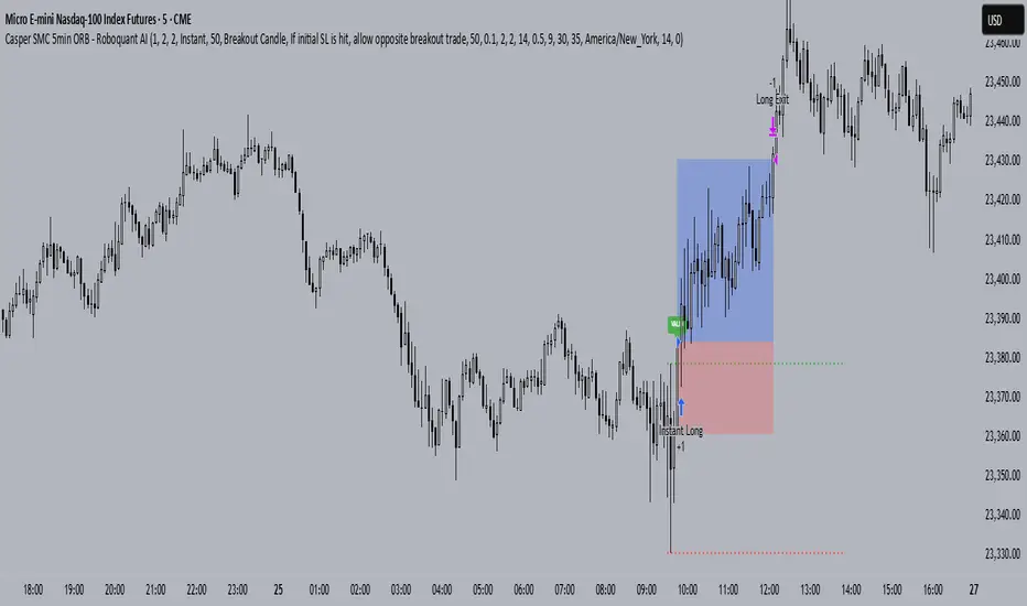
Casper SMC 5min ORB - Roboquant AI🚀 Key Features:
Opening Range (09:30–09:35 EST) breakout detection
Configurable entry type: Instant or Retracement
Adjustable Risk:Reward multiplier and contract sizing
Optional Trailing Stop Loss using ATR
Second-Chance trades if the first breakout fails
Visual markers for entries, SL/TP, trade status, and breakout validation
Day filter: Trade only on selected weekdays
Session management with configurable close time
Breakout validation using:
Wick percentage filters
Distance filters based on OR range size
🧠 AI-Style Logic Enhancements:
Smart filters for avoiding overextended or noisy breakouts
Full support for lookahead-safe logic via barstate.isconfirmed
Clean box-style trade visualization (entry, SL, TP zones)
Custom alerts for long and short entries
⚙️ Recommended Settings:
Use on 5-minute chart
Best for US indices/ Futures
📌 Note:
This script is for educational purposes only.
Performance preview on Tradingview is not accurate
Yoou need to adjust the settings and run a 1 year report
Always backtest thoroughly and consult your financial advisor before live trading.
Bracket PreviewThe Bracket Preview indicator allows the user to set their intended bracket order distance (distance, in ticks, to take-profit and stop-loss) from the current live price so that a preview is generated and updated in real-time as price moves. This gives the trader a quick reference of where the bracket orders would be placed if a position were entered at that specific moment in time. This can be helpful by making it more obvious to the trader before a trade is placed exactly where these levels would be in relation to previous price action or if it would be better to wait for price to move to a more favorable level or accept a different Risk-Reward (RR) from this specific trade.
• “If I entered a long position now, would my target be in front of or beyond a recent consolidation area where it is likely to run into resistance and potentially reverse before hitting my take-profit?”
• “Would this bracket order place my stop-loss above or below a previous pivot or would I need to move it after entering the trade and potentially increase the risk on this trade to have it in a more logical level?”
• “If price is in a range and I enter now, would my stop be in the middle of the range while my target is outside the top of the range? Maybe I should wait for price to move to an area where my target would be inside but near the top of the range while my stop loss is below the range so that I’m not taking unnecessary risk or being forced to take an unfavorable RR.”

Universal Adaptive Psychological Levels 1.1This simple indicator is somewhat working around an inability to see big accumulations of limit orders in Tradingview.
It just marks the levels of round psychological prices (e.g. 1000, 1100, 1110) and adjusts to the range of prices of the current ticker.
These psychological levels work as resistance and support levels, especially if the price didn't visit it already lately.

openig price +- .13%This is opening price indicator with levels .13% .26 .50 .1 .1.5 .2 simillary for -ve sides .
it is easy to know levels from top to bottom

Multiple Ema's This indicator plots five customizable Exponential Moving Averages (EMAs) directly on your chart, helping you analyze price trends and identify potential support/resistance zones more effectively.
Features:
Five EMAs with adjustable lengths: Quickly set the periods for each EMA (default: 10, 20, 50, 100, 200).
Clear, color-coded lines: Each EMA is plotted with a distinct color for easy visualization:
EMA 1 (Green)
EMA 2 (Orange)
EMA 3 (Blue)
EMA 4 (Purple)
EMA 5 (Brown)
Overlay on price chart: All curves are shown directly on your main chart for seamless trend analysis.
How to Use:
Use this indicator to:
Identify short-, medium-, and long-term trends by observing the relationships and crossovers between the EMAs.
Spot momentum shifts and potential entry/exit opportunities when price crosses above or below multiple EMAs.
Fine-tune EMA periods to your own trading strategy using the input settings.
Ideal for:
Traders and investors seeking a flexible, multi-timeframe EMA solution for stocks, forex, crypto, or any market.
Tip: Experiment with EMA lengths to match your trading style or combine with other indicators for even stronger signals!
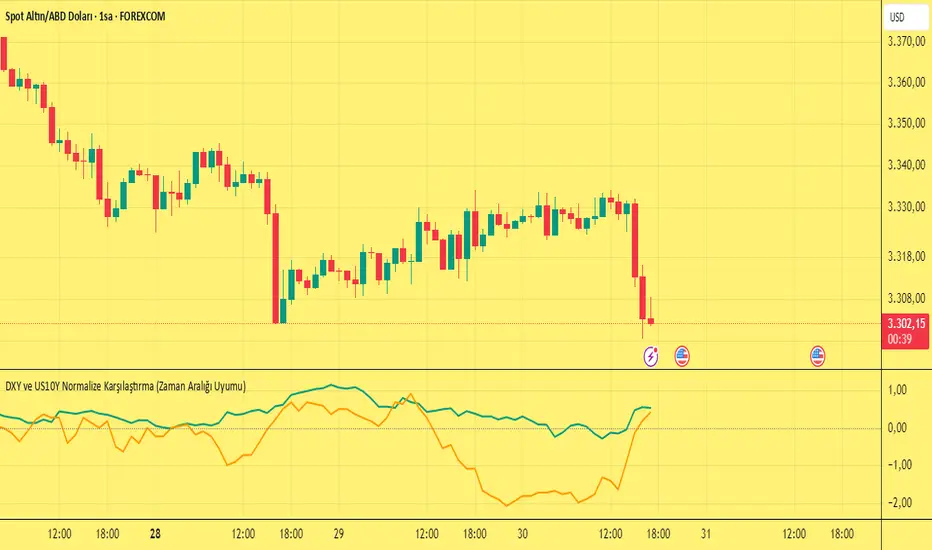
DXY ve US10Y Normalize Karşılaştırma (Zaman Aralığı Uyumu)Yes, it's possible to combine the US 10-year Treasury yield (TVC:US10Y) and DXY (TVC:DXY) data on TradingView and display it on the same chart. We can do this with Pine Script. Below is an example of Pine Script code that displays the percentage change, or normalized values, of the two assets on the same scale:
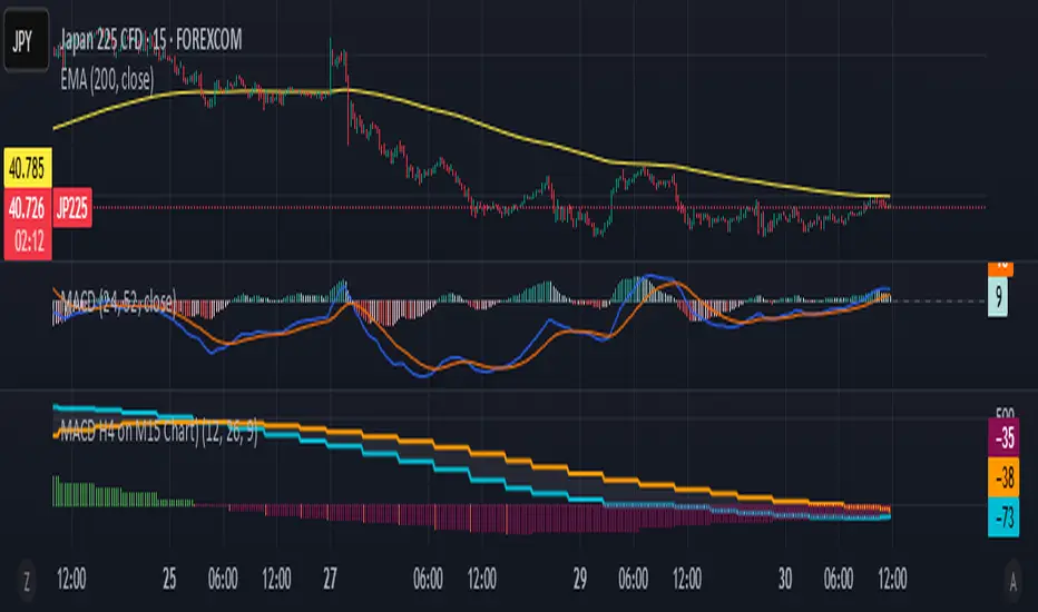
MACD H4 on M15 ChartThis script displays the MACD from the H4 (4-hour) timeframe while viewing the chart in M15 (15-minute). It shows the H4 MACD line, signal line, and histogram for multi-timeframe (MTF) analysis. Use it to anticipate trend shifts on lower timeframes with confirmation from the higher timeframe MACD structure.
BTC vs MSTR PerformanceBTC vs MSTR Performance - BULL
• Green: MSTR has outperformed BTC over the selected time period.
• Red: BTC has outperformed MSTR during the same time period.
• Horizontal line at 0: Separates positive from negative outperformance.

Combo 2/20 EMA & Bandpass Filter by TamarokDescription:
This strategy combines a 2/20 exponential moving average (EMA) crossover with a custom bandpass filter to generate buy and sell signals.
Use the Fast EMA and Slow EMA inputs to adjust trend sensitivity, and the Bandpass Filter Length, Delta, and Zones to fine-tune momentum turns.
Signals occur when both EMA and BPF agree in direction, with optional reversal and time filters.
How to use:
1. Add the script to your chart in TradingView.
2. Adjust the EMA and BP Filter parameters to match your asset’s volatility.
3. Enable ‘Reverse Signals’ to trade counter-trend, or use the time filter to limit sessions.
4. Set alerts on Long Alert and Short Alert for automated notifications.
Inspiration:
Based on HPotter’s original combo strategy (Stocks & Commodities Mar 2010).
Updated to Pine Script v6 with streamlined code and alerts.
WARNING:
For purpose educate only

Double MACD StrategyDouble MACD Strategy (Default Settings)
This automated strategy uses two independent MACD indicators to flip between long and short positions.
How It Works
• Fast MACD (MACD 1) captures rapid micro-trends
• Slow MACD (MACD 2) confirms broader momentum
• Long Entry when both MACD lines cross above their signal lines
• Short Entry when both MACD lines cross below their signal lines
• Existing opposing trades are closed before opening new ones
Default Input Settings
• Fast MACD (MACD 1)
• Fast Length 1: 12
• Slow Length 1: 26
• Signal Length 1: 9
• MA Type 1: EMA
• Slow MACD (MACD 2)
• Fast Length 2: 24
• Slow Length 2: 52
• Signal Length 2: 9
• MA Type 2: EMA
• Position Sizing: 100 % of equity
• Pyramiding: 1 concurrent entry per direction
Usage
1. Apply to any chart on your desired timeframe.
2. Monitor background shading (green for bullish, red for bearish bias).
3. Manage risk with your own stop loss, take profit, and position-sizing rules.
Disclaimer
This script is provided for educational purposes only. It is not financial advice or a recommendation to buy or sell any instrument. All trading involves risk, and any losses incurred are the sole responsibility of the trader.


Projection Dynamiques (CPD-V) - By Sese04 (XAUUSD)Key Concept of the Indicator: DPC-V FOR GOLD
Absolutely! Creating a relevant projection indicator for Gold (XAU/USD) requires combining several concepts: trend, volatility, and market structure (price action). A simple indicator that extends a straight line is not sufficient for an asset as complex as gold.
I will propose an advanced indicator concept, which we'll call the "Dynamic Projection Channels based on Volatility" (DPC-V). This indicator does not predict an exact price at an exact date, but rather projects probability zones where the price is likely to react, based on its recent historical behavior.
Key Concept of the Indicator: DPC-V
The idea is to create channels around a central trend line. Unlike Bollinger Bands which use standard deviation, we will use the Average True Range (ATR), which is a much more direct and relevant measure of the market's true volatility.
Indicator Components:
The Centerline (The "Center of Gravity"): An Exponential Moving Average (EMA). It represents the underlying mid-term trend. An EMA-50 is an excellent starting point for Gold on Daily or 4H charts.
The Projection Engine (The Volatility): The Average True Range (ATR) over 14 periods. The ATR measures the average "distance" that the price of Gold travels on each candle. This is the core of our projection.
The Projection Channels (The "Target Zones"): We will project several levels above and below the centerline, using multiples of the ATR.
Normal Reaction Zone (± 1x ATR): The zone where the price moves most of the time in a healthy trend.
Extension Zone (± 2x ATR): The price reaches this zone during strong moves. It is considered "stretched" or "over-extended," and a pause or reversal becomes probable.
Excess / Climax Zone (± 3x ATR): A rarely reached zone, often signaling a major market top or bottom, or trend exhaustion.
Why is this indicator relevant for Gold?
Adaptive: Gold experiences phases of low volatility (ranging) and phases of high volatility (explosive trends). The ATR adjusts automatically: the channels widen during high volatility periods and tighten during calm periods, making the projections always relevant to the current context.
Based on "Price Action": The ATR is calculated directly from the highs, lows, and closes. It therefore directly reflects the price action.
Provides Concrete Targets: It doesn't give a vague direction, but objective price zones that can serve as targets for taking profits or as potential entry points.
------------------------------USER GUIDE------------------------------------------
How to Use the Indicator with Historical Data (Strategy)
Open a chart of Gold (XAU/USD), for example, on the Daily timeframe. Apply the indicator. You will immediately observe its historical behavior.
1. Identifying the Underlying Trend:
If the price is above the yellow centerline (EMA 50) and the line is sloping up, the underlying trend is bullish.
If the price is below the yellow centerline and the line is sloping down, the underlying trend is bearish.
2. Buy Scenario (Bullish Trend):
Potential Entry Point: Look for price pullbacks towards the centerline (EMA 50) or, even better, towards the lower band of the reaction zone (Inf 1). A bounce off this zone, confirmed by a bullish candle (e.g., hammer, bullish engulfing), is a strong buy signal.
Take Profit (Target):
Target 1: The upper band of the reaction zone (Sup 1).
Target 2 (in case of strong momentum): The extension band (Sup 2). Reaching this zone is a good signal to take some or all of your profits.
Stop Loss: Place your stop loss below the last significant low, or more conservatively, below the lower extension band (Inf 2).
Historical Example (Buy):
Look at the gold rally from late 2022 to early 2023. You will see that the price regularly bounced on or near the EMA 50 centerline and the Inf 1 band before resuming its upward move to touch the Sup 1 and Sup 2 bands.
3. Sell Scenario (Bearish Trend):
Potential Entry Point: Look for price rallies towards the centerline (EMA 50) or the upper band of the reaction zone (Sup 1). A rejection from this zone, confirmed by a bearish candle, is a sell signal.
Take Profit (Target):
Target 1: The lower band of the reaction zone (Inf 1).
Target 2: The lower extension band (Inf 2).
Stop Loss: Place it above the last significant high or the upper extension band (Sup 2).
4. Using the Excess Zones (Level 3):
When the price touches the Sup 3 or Inf 3 band, you should NOT enter in the direction of the trend. This is a signal of exhaustion.
It is an aggressive profit-taking zone for existing positions.
For experienced counter-trend traders, it may signal a reversal opportunity, but this must be confirmed by other signals (RSI divergence, reversal patterns, etc.).
Conclusion and Warning
This DPC-V indicator is a powerful tool because it is dynamic and visual. It structures the apparent chaos of the market into clear probability zones. By analyzing it on gold's historical data, you can identify its relevance and build confidence in the signals it generates.
Important Reminder: No indicator is a crystal ball. The DPC-V should be used as a decision-support tool, in conjunction with fundamental analysis (economic announcements, interest rates, geopolitics) and rigorous risk management (Stop Loss).
