Synthetic VX3! & VX4! continuous /VX futuresTradingView is missing continuous 3rd and 4th month VIX (/VX) futures, so I decided to try to make a synthetic one that emulates what continuous maturity futures would look like. This is useful for backtesting/historical purposes as it enables traders to see how their further out VX contracts would've performed vs the front month contract.
The indicator pulls actual realtime data (if you subscribe to the CBOE data package) or 15 minute delayed data for the VIX spot (the actual non-tradeable VIX index), the continuous front month (VX1!), and the continuous second month (VX2!) continually rolled contracts. Then the indicator's script applies a formula to fairly closely estimate how 3rd and 4th month continuous contracts would've moved.
It uses an exponential mean‑reversion to a long‑run level formula using:
σ(T) = θ+(σ0−θ)e−kT
You can expect it to be off by ~5% or so (in times of backwardation it might be less accurate).
Indicators and strategies

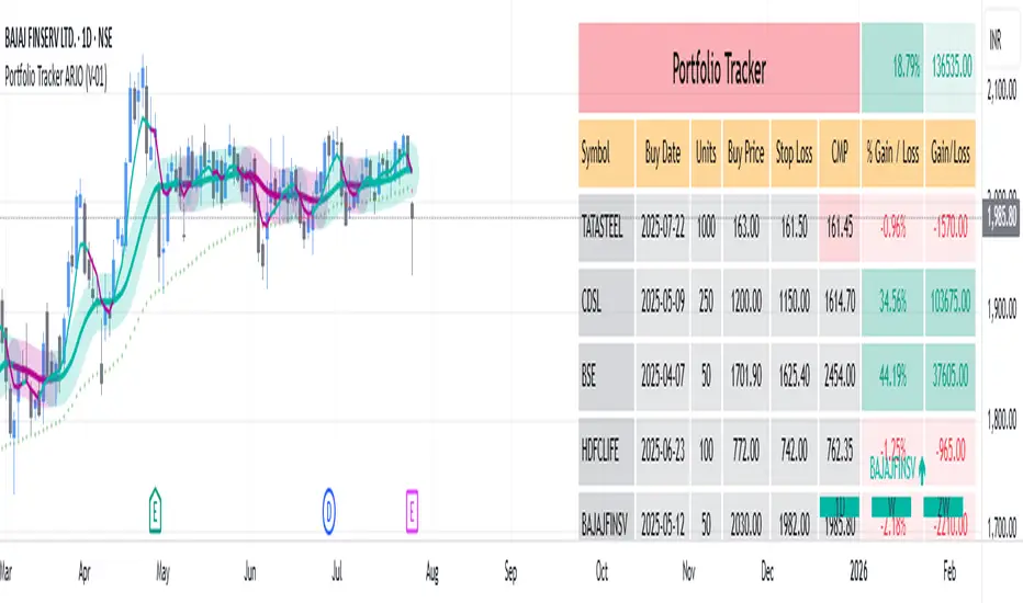
Portfolio Tracker ARJO (V-01)Portfolio Tracker ARJO (V-01)
This indicator is a user-friendly portfolio tracking tool designed for TradingView charts. It overlays a customizable table on your chart to monitor up to 15 stocks or symbols in your portfolio. It calculates real-time metrics like current market price (CMP), gains/losses, and stoploss breaches, helping you stay on top of your investments without switching between multiple charts. The table uses color-coding for quick visual insights: green for profits, red for losses, and highlights breached stoplosses in red for alerts. It also shows portfolio-wide totals for overall performance.
Key Features
Supports up to 15 Symbols: Enter stock tickers (e.g., NSE:RELIANCE or BSE:TCS) with details like buy price, date, units, and stoploss.
Symbol: The stock ticker and description.
Buy Date: When you purchased it.
Units: Number of shares/units held.
Buy Price: Your entry price.
Stop Loss: Your set stoploss level (highlighted in red if breached by CMP).
CMP: Current market price (fetched from the chart's timeframe).
% Gain/Loss: Percentage change from buy price (color-coded: green for positive, red for negative).
Gain/Loss: Total monetary gain/loss based on units.
Optional Timeframe Columns: Toggle to show % change over 1 Week (1W), 1 Month (1M), 3 Months (3M), and 6 Months (6M) for historical performance.
Portfolio Summary: At the top of the table, see total % gain/loss and absolute gain/loss for your entire portfolio.
Visual Customizations: Adjust table position (e.g., Top Right), size, colors for positive/negative values, and intensity cutoff for gradients.
Benchmark Index-Based Header: The title row's background color reflects NIFTY's weekly trend (green if above 10-week SMA, red if below) for market context.
Benchmark Index-Based Header: The title row's background color reflects NIFTY's weekly trend (green if above 10-week SMA, red if below) for market context.
How to Use It: Step-by-Step Guide
Add the Indicator to Your Chart: Search for "Portfolio Tracker ARJO (V-01)" in TradingView's indicator library and add it to any chart (preferably Daily timeframe for accuracy).
Input Your Portfolio Symbols:
Open the indicator settings (gear icon).
In the "Symbol 1" to "Symbol 15" groups, fill in:
Symbol: Enter the ticker (e.g., NSE:INFY).
Year/Month/Day: Select your buy date (e.g., 2024-07-01).
Buy Price: Your purchase price per unit.
Stoploss: Your exit price if things go south.
Units: How many shares you own.
Only fill what you need—leave extras blank. The table auto-adjusts to show only entered symbols.
Customize the Table (Optional):
In "Table settings":
Choose position (e.g., Top Right) and size (% of chart).
Toggle "Show Timeframe Columns" to add 1W/1M/3M/6M performance.
In "Color settings":
Pick colors for positive (green) and negative (red) cells.
Set "Color intensity cutoff (%)" to control how strong the colors get (e.g., 10% means changes above 10% max out the color).
Interpret the Table on Your Chart:
The table appears overlaid—scan rows for each symbol's stats.
Look at colors: Greener = better gains; redder = bigger losses.
Check CMP cell: Red means stoploss breached—consider selling!
Portfolio Gain/Loss at the top gives a quick overall health check.
For Best Results:
Use on a Daily chart to avoid CMP errors (the script will warn if on Weekly/Monthly).
Refresh the chart or wait for a new bar if data doesn't update immediately.
For Indian stocks, prefix with NSE: or BSE: (e.g., BSE:RELIANCE).
This is for tracking only—not trading signals. Combine with your strategy.
If no symbols show, ensure inputs are valid (e.g., buy price > 0, valid date).
Finally, this tool makes it quite easy for beginners to track their portfolios, while also giving advanced traders powerful and customizable insights. I'd love to hear your feedback—happy trading!
EMA Trend ScreenerEMA Trend Screener" instantly shows whether 40+ crypto pairs are bullish (green) or bearish (red) based on their position relative to a customizable EMA. The compact table display saves time by eliminating chart switching, while adjustable settings adapt to any trading style. Perfect for quick market analysis, it helps spot trading opportunities at a glance
SPX Levels Adjusted to ES1!This indicator allows you to plot custom SPX levels directly on the ES1! (E-mini S&P 500 Futures) chart, automatically adjusting for the spread between SPX and ES1!. This is particularly useful for traders who perform technical analysis on SPX but execute trades on ES1!.
Features:
Input up to three SPX key levels to track (e.g., 5000, 4950, 4900)
The script adjusts these levels in real-time based on the current spread between SPX and ES1!
Displays the spread in the chart header for quick reference
Plots updated horizontal lines that move with the spread
Includes optional labels showing the spread periodically to reduce clutter
Ideal for futures traders who want SPX context while trading ES1!.
Make sure to apply this indicator on the ES1! chart, not SPX.

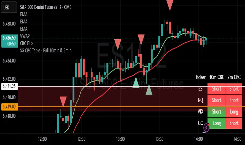
SG CBC Table - Full 10min & 2minBased on SG CBC Table has 10 min and 2 min CBC status and GC. Also customizable table colors of the background can be changed or made transparent. Indicator Updates every 10 minutes on a 10 minute chart and every 2 minutes on a 2 minute chart
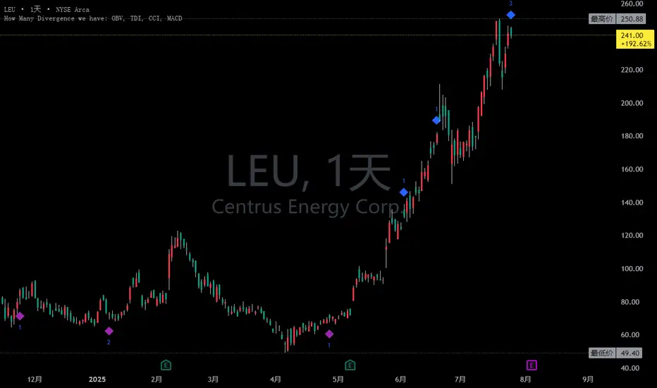
Combined and Count of Bull Bear Alerts for OBV, TDI, CCI, MACDCombined and Count of Bull Bear Alerts for OBV, TDI, CCI, MACD
Description
This powerful indicator combines four popular technical analysis tools (On-Balance Volume, Traders Dynamic Index, Commodity Channel Index, and MACD) into a single comprehensive divergence detection system. It monitors all four indicators simultaneously and provides real-time alerts when bullish or bearish divergences occur across multiple indicators, helping traders identify high-probability reversal opportunities.
Key Features
Multi-Indicator Divergence Detection: Simultaneously tracks divergences in OBV, TDI, CCI, and MACD
Comprehensive Signal Counting: Displays real-time count of bullish (1-4) and bearish (1-4) divergences
Four Customizable Alert Conditions:
Alert 1: 1-4 indicators showing bullish divergence
Alert 2: 3-4 indicators showing strong bullish divergence
Alert 3: 1-2 indicators showing bearish divergence
Alert 4: 3-4 indicators showing strong bearish divergence
Visual Signal Display: Clear numerical indicators showing how many tools are signaling divergence
Customizable Parameters: Adjustable settings for each indicator's sensitivity and display preferences
Overlay Display: All signals shown directly on the price chart for easy analysis
How It Works
The indicator continuously monitors each technical tool for both regular and hidden divergences using pivot point analysis. When a divergence pattern is detected, it increments the appropriate counter (bullish or bearish). The system then displays the total count as colored numbers on the chart and can trigger alerts based on your preferred signal strength thresholds.
Trading Applications
Strong Reversal Signals: Look for 3-4 indicator confirmations for high-probability trades
Early Trend Detection: Use 1-2 indicator signals for early entry opportunities
Confirmation Tool: Validate your trading signals with multi-indicator divergence confirmation
Risk Management: Avoid trading against multiple indicator divergences
Customization Options
Adjustable lookback periods for each indicator
Toggle visibility of bullish/bearish counters
Customizable colors, positions, and display styles
Option to show individual indicator signals
Configurable divergence detection parameters
This indicator is particularly valuable for traders who want to combine multiple technical analysis approaches into a single, easy-to-monitor system that highlights confluence opportunities across different market perspectives (volume, momentum, cycle, and trend).
FVGLibrary "FVG"
The library is searching the FVG
find_bull_fvg(provided_fvgs, monthly_low_1, monthly_high_3, monthly_time_3, monthly_bar_closed, monthly_high_1)
Parameters:
provided_fvgs (array type from maksym_hayovets/POITypes/1)
monthly_low_1 (float)
monthly_high_3 (float)
monthly_time_3 (int)
monthly_bar_closed (bool)
monthly_high_1 (float)
find_bear_fvg(provided_fvgs, monthly_low_3, monthly_high_1, monthly_time_3, monthly_bar_closed, monthly_low_1)
Parameters:
provided_fvgs (array type from maksym_hayovets/POITypes/1)
monthly_low_3 (float)
monthly_high_1 (float)
monthly_time_3 (int)
monthly_bar_closed (bool)
monthly_low_1 (float)

POITypesLibrary "POITypes"
TODO: add library description here
ZonePOI
Fields:
right (series int)
top (series float)
left (series int)
bottom (series float)
is_tested (series bool)
start_time_test_4H (series int)
end_time_test_4H (series int)
is_covered (series bool)
is_drawn (series bool)

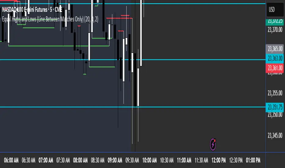
Equal Highs and Lows (Line Between Matches Only)marks out equal highs and lows with a solid red line and solid green line. Only marks out till the next candle
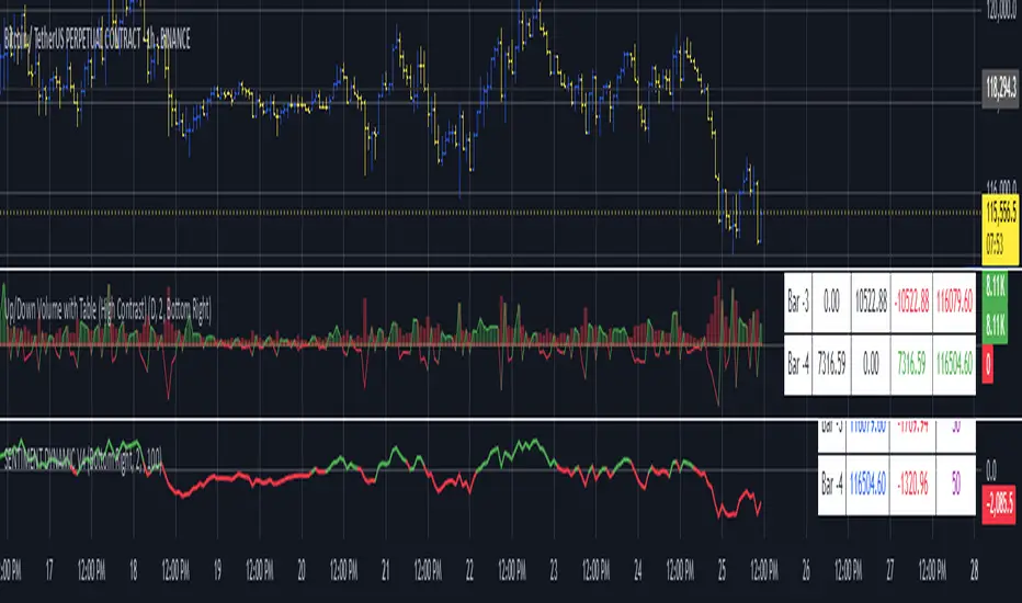
Up/Down Volume with Table (High Contrast)Up/Down Volume with Table (High Contrast) — Script Summary & User Guide
Purpose of the Script
This TradingView indicator, Up/Down Volume with Table (High Contrast), visually separates and quantifies up-volume and down-volume for each bar, providing both a color-coded histogram and a dynamic table summarizing the last five bars. The indicator helps traders quickly assess buying and selling pressure, recent volume shifts, and their relationship to price changes, all in a highly readable format.
Key Features
Up/Down Volume Columns:
Green columns represent volume on bars where price closed higher than the previous bar (up volume).
Red columns represent volume on bars where price closed lower than the previous bar (down volume).
Delta Line:
Plots the net difference between up and down volume for each bar.
Green when up-volume exceeds down-volume; red when down-volume dominates.
Interactive Table:
Displays the last five bars, showing up-volume, down-volume, delta, and close price.
Color-coding for quick interpretation.
Table position, decimal places, and timeframe are all user-configurable.
Custom Timeframe Support:
Calculate all values on the chart’s timeframe or a custom timeframe of your choice (e.g., daily, hourly).
High-Contrast Design:
Table and plot colors are chosen for maximum clarity and accessibility.
User Inputs & Configuration
Use custom timeframe:
Toggle between the chart’s timeframe and a user-specified timeframe.
Custom timeframe:
Set the timeframe for calculations if custom mode is enabled (e.g., "D" for daily, "60" for 60 minutes).
Decimal Places:
Choose how many decimal places to display in the table.
Table Location:
Select where the table appears on your chart (e.g., Bottom Right, Top Left, etc.).
How to Use
Add the Script to Your Chart:
Copy and paste the code into a new Pine Script indicator on TradingView.
Add the indicator to your chart.
Configure Inputs:
Open the indicator settings.
Adjust the timeframe, decimal places, and table location as desired.
Read the Table:
The table appears on your chart (location is user-selectable) and displays the following for the last five bars:
Bar: "Now" for the current bar, then "Bar -1", "Bar -2", etc. for previous bars.
Up Vol: Volume on bars where price closed higher than previous bar, shown in black text.
Down Vol: Volume on bars where price closed lower than previous bar, shown in black text.
Delta: Up Vol minus Down Vol, colored green for positive, red for negative, black for zero.
Close: Closing price for each bar, colored green if price increased from previous bar, red if decreased, black if unchanged.
Interpret the Histogram and Lines:
Green Columns:
Represent up-volume. Tall columns indicate strong buying volume.
Red Columns:
Represent down-volume. Tall columns indicate strong selling volume.
Delta Line:
Plotted as a line (not a column), colored green for positive values (more up-volume), red for negative (more down-volume).
Large positive or negative spikes may indicate strong buying or selling pressure, respectively.
How to Interpret the Table
Column Meaning Color Coding
Bar "Now" (current bar), "Bar -1" (previous bar), etc. Black text
Up Vol Volume for bars with higher closes than previous bar Black text
Down Vol Volume for bars with lower closes than previous bar Black text
Delta Up Vol - Down Vol. Green if positive, red if negative, black if zero Green/Red/Black
Close Closing price for the bar. Green if price increased, red if decreased, black if unchanged Green/Red/Black
Green Delta: Indicates net buying pressure for that bar.
Red Delta: Indicates net selling pressure for that bar.
Close Price Color:
Green: Price increased from previous bar.
Red: Price decreased.
Black: No change.
Practical Trading Insights
Consistently Green Delta (Histogram & Table):
Sustained buying pressure; may indicate bullish sentiment or accumulation.
Consistently Red Delta:
Sustained selling pressure; may indicate bearish sentiment or distribution.
Large Up/Down Volume Spikes:
Big green or red columns can signal strong market activity or potential reversals if they occur at trend extremes.
Delta Flipping Colors:
Rapid alternation between green and red deltas may indicate a choppy or indecisive market.
Close Price Color in Table:
Use as a quick confirmation of whether volume surges are pushing price in the expected direction.
Troubleshooting & Notes
No Volume Data Error:
If your symbol doesn’t provide volume data (e.g., some indices or synthetic assets), the script will display an error.
Custom Timeframe:
If using a custom timeframe, ensure your chart supports it and that there is enough data for meaningful calculations.
High-Contrast Table:
Designed for clarity and accessibility, but you can adjust colors in the code if needed for your personal preferences.
Summary Table Legend
Bar Up Vol Down Vol Delta Close
Now ... ... ... ...
Bar-1 ... ... ... ...
... ... ... ... ...
Colors reflect the meaning as described above.
In Summary
This indicator visually and numerically breaks down buying and selling volume, helping you spot shifts in market sentiment, volume surges, and price/volume divergences at a glance.
Use the table for precise recent data, the histogram for overall flow, and the color cues for instant market context.
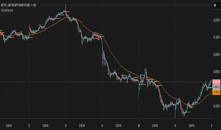
Flexi MA Reversal🔹 FlexiMA Reversal – Customizable MA-Based Reversal Indicator
FlexiMA Reversal is a real-time, moving average-based reversal indicator designed to highlight potential market turning points using signal and alert lines. It provides visual cues for both early alerts and confirmed entry signals on candle close.
🔧 Key Features:
Customizable Moving Average Type: Choose from EMA, SMA, WMA, or VWMA (default is EMA).
Flexible MA Inputs: Configure up to three MAs (commonly used 5, 50, and 200).
Toggle Visibility: Enable or disable each MA line as needed.
Real-Time Alert System:
Thin alert lines appear when a potential reversal is detected.
Thicker signal lines confirm the reversal when price closes beyond the alert level.
Optional Visual Styling:
Choose custom colors for each MA, signal, and alert line.
Alert candles are automatically colored to match the corresponding alert line.
Option to show only signal lines for cleaner charts.
Customizable projection length for both alert and signal lines.
📈 Strategy Logic:
This indicator is designed to detect reversal opportunities based on the relationship between price and a selected short-term moving average.
Bullish Setup:
Price closes below the selected MA (e.g., EMA 5).
A bullish alert line is drawn at the high.
If a subsequent candle closes above the alert line and the MA, a bullish signal line is plotted.
Bearish Setup:
Price closes above the selected MA.
A bearish alert line is drawn at the low.
If a subsequent candle closes below the alert line and the MA, a bearish signal line is plotted.
This approach attempts to capture quick market shifts where short-term momentum reverses direction near key MA levels.
🎯 How to Use:
Although originally developed using the 5 EMA strategy, through testing it was found that using 6, 7, or 8 EMA offers even better signal quality.
To add broader trend context, 50 MA and 200 MA lines are included and can be toggled on/off based on your strategy preference.
🔍 Trend Filtering & Re-Entry Tips:
Due to the nature of shorter moving averages, reversal signals may appear frequently. For better trend alignment:
Use the 50 MA as a trend filter:
❌ Ignore bearish signals when price is above 50 MA
❌ Ignore bullish signals when price is below 50 MA
Alternatively, filtered-out signals can be used for re-entry within the trend:
For example, if you receive a bearish alert and signal above the 50 MA, and the next candle closes back above the bearish alert line, this may be interpreted as a bullish re-entry opportunity into the prevailing uptrend.
🛠️ Styling Tips:
You can disable alert candle coloring in the Style tab of the indicator settings.
Use the "Show Only Signal Lines" checkbox to keep the chart minimalistic while still tracking confirmed entries.
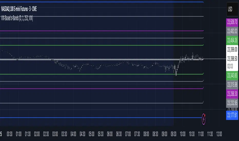
VIX‑Based σ‑BandsThis Pine Script v5 indicator builds a volatility‑based envelope around yesterday’s close using CBOE’s volatility indices. It dynamically pulls VIX, VXN, VXD or RVX—depending on whether you’re charting ES, NQ, YM or RTY—and converts annualized volatility into dollar‑move bands at ±¼ σ, ±½ σ, ±1 σ, and ±2 σ. Optional “mid‑lines” fill in the gaps between each band for even finer precision.
📊 Visual MTF VMA Dashboard🔄️📊 Visual MTF VMA Dashboard🔄️
This powerful multi-timeframe indicator provides a clean, emoji-enhanced dashboard that helps you quickly identify the Variable Moving Average (VMA) trend direction across multiple key timeframes — all in real-time.
🔍 What It Does:
The Visual MTF VMA Dashboard calculates the LazyBear-style VMA on the following timeframes:
📆 Daily
🕰 195 Minutes
🕒 65 Minutes
⏳ 39 Minutes
⏱ 15 Minutes
Each cell in the table shows the current trend:
📈 BULLISH – VMA rising
📉 BEARISH – VMA falling
⚪ NEUTRAL – No change
🎨 Visual Boost:
This feature can be toggled on/off for cleaner visuals.
📌 Customization:
Adjustable VMA Length
Selectable table position: Top Left, Top Right, Bottom Left, Bottom Right
✅ Ideal For:
Multi-timeframe traders
Trend confirmation
Quick-glance analysis without cluttering your chart
Use this dashboard as a high-level trend confirmation tool — designed for simplicity, speed, and visual clarity.

Triple Momentum Core v1🧠 Technical Structure:
Triple Momentum Core analyzes the underlying wave of price movement through a three-stage system:
1. 🔵 Follow Line – The First Spark of Momentum:
Constructed using Bollinger Bands and ATR, this line detects the very first signs of directional price expansion. It gently whispers when the market begins stretching with force in one direction.
2. 🟢 SuperTrend – Confirmation and Directional Validation:
After the initial move, SuperTrend acts as the second checkpoint — validating whether the price action is evolving into a genuine trend or fading out. It confirms whether the impulse has the strength to sustain.
3. 🔴 PMax – Core Trend & Structural Anchor:
Based on Moving Average and ATR logic, PMax tracks the heartbeat of the trend. It serves as a dynamic structural boundary — critical for identifying trend continuation and managing risk.
4. 🟡 PMax MA Line – Smooth Trend Pulse & Adaptive Guide:
This yellow moving average line within the PMax system softly follows the overall trend flow, without reacting to sharp price noise. It acts as a balanced, stable guide to gauge the solidity of the trend’s body structure.
(If you prefer a cleaner view without any moving average lines, you can disable it from the settings.)
🧠 Technical Structure:
Triple Momentum Core analyzes the underlying wave of price movement through a three-stage system:
1. 🔵 Follow Line – The First Spark of Momentum:
Constructed using Bollinger Bands and ATR, this line detects the very first signs of directional price expansion. It gently whispers when the market begins stretching with force in one direction.
2. 🟢 SuperTrend – Confirmation and Directional Validation:
After the initial move, SuperTrend acts as the second checkpoint — validating whether the price action is evolving into a genuine trend or fading out. It confirms whether the impulse has the strength to sustain.
3. 🔴 PMax – Core Trend & Structural Anchor:
Based on Moving Average and ATR logic, PMax tracks the heartbeat of the trend. It serves as a dynamic structural boundary — critical for identifying trend continuation and managing risk.
4. 🟡 PMax MA Line – Smooth Trend Pulse & Adaptive Guide:
This yellow moving average line within the PMax system softly follows the overall trend flow, without reacting to sharp price noise. It acts as a balanced, stable guide to gauge the solidity of the trend’s body structure.
(If you prefer a cleaner view without any moving average lines, you can disable it from the settings.)
💡 Why “Triple Momentum Core”?
Because this indicator doesn’t just detect movement — it breaks it down into its essential phases:
Ignition, validation, and confirmation.
Each layer captures a unique and essential part of price behavior:
The first reaction (Follow Line) ignites the initial spark.
The second reaction (SuperTrend) confirms whether that spark will become a real trend.
The third and final layer (PMax) structurally anchors and follows that trend.
That’s why we call it Triple Momentum Core:
A synchronized 3-engine momentum system working in harmony to capture the lifecycle of a trend — from spark to structure.

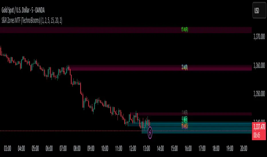
S&R Zones MTF (TechnoBlooms)S&R Zones MTF – Multi-Timeframe Support & Resistance Boxes
🔍 Overview
S&R Zones MTF is a professional-grade yet beginner-friendly indicator that dynamically plots Support & Resistance zones across multiple timeframes, helping traders recognize high-probability reversal areas, entry confirmations, and price reaction points.
This tool visualizes structured zones as colored boxes, allowing both new and experienced traders to analyze multi-timeframe confluence with ease and clarity.
🧠 What Is This Indicator?
S&R Zones MTF automatically detects the most significant support and resistance levels from up to four custom timeframes, using a configurable lookback period. These zones are displayed as colored horizontal boxes directly on the chart, making it easy to:
Spot where price has historically reacted
Identify potential reversal or breakout zones
Confirm entries with institutional-style precision
🛠️ Key Features
✅ Multi-Timeframe Zone Detection (up to 4 timeframes)
📦 Auto Plotted Boxes for Support (Blue) & Resistance (Pink)
🧱 Dynamic Height based on average price range or fixed input
🏷️ Timeframe Labels to instantly identify zone origin
🎛️ Customizable inputs: Lookback length, box color, height style
🔁 Real-time updates as price structure changes
🎓 Educational & Easy to Use
Whether you’re a new trader learning about price structure, or a professional applying institutional concepts, this tool offers an educational layout to understand:
How price respects historic zones
Why multi-timeframe zones offer stronger confluence
How to use zones for entry, exit, or risk placement
📈 How to Use (Multi-Timeframe Strategy)
Select Your Timeframes – Customize up to 4 higher timeframes (e.g., 1m, 5m, 15m, 1h).
Observe Overlapping Zones – When multiple timeframes agree, those zones are more significant.
Entry Confirmation – Wait for price to reach a zone, then look for reversal patterns (engulfing candle, pin bar, etc.)
Combine with Other Tools – Use alongside indicators like RSI, MACD, or Order Blocks for added confidence.
💡 Pro Tips
Zones from higher timeframes (1H, 4H) are often more powerful and reliable.
Confluence matters: If a 15m support zone aligns with a 1H support zone — that's a high-probability reaction area.
Use break-and-retest strategies with zone rejections for sniper entries.
Enable "Auto Height" for a more adaptive, volatility-based zone display.
🌟 Summary
S&R Zones MTF blends precision, clarity, and professional analysis into a visual structure that’s easy to understand. Whether you're learning support & resistance or optimizing your MTF edge — this tool will bring clarity to your charts and confidence to your trades.
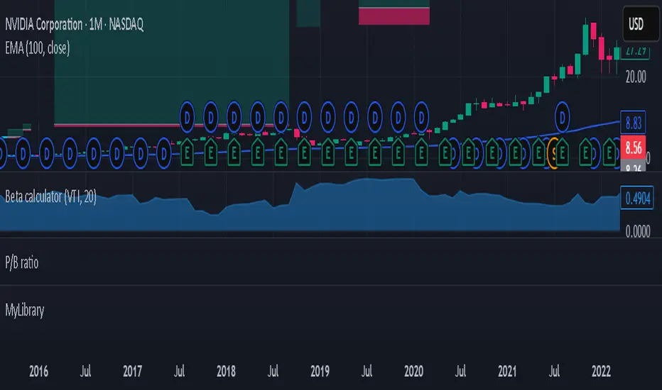
Beta calculatorCalculates the market beta for the stock that is on your screen. You may change the parameters by changing the symbol you are using as benchmark to calculate market beta in the settings. This will affect the market beta you get. VTI is used since it has a theoretical market beta of 1.
Current Hourly Open Line with Sweep DetectionThis indicator marks out the high and low of the current hourly open candle.
Stats show, if the current hourly candle takes the high or low of the previous 1H candle there is a chance price returns to the hourly open depending on the time the sweep on the high or low occurred.
There is a high chance >75% price returns to hourly open of current candle if the sweep happens in the first 20 minutes.
There is a medium chance 50% price returns to hourly open of current candle if the sweep happens in the 20-40 minute range of the current candle.
There is a low 25% chance if sweep happens from :40-:59 minutes of the hour.
We use this to spot manipulation on the hourly timeframe, we only want to target hourly open if it happens in the first 20 minutes. We then want to trade in opposite direction of the first move of the hourly, w/ context of course.
The indicator / line will change colors based on the time the first sweep occurred. You can change them to how you want. For default, blue is just the hourly open with no sweep yet.
Green means go, and the sweep happens within the first 20 minutes, Yellow is medium chance, and Red is small chance.
Choch Pattern Levels [BigBeluga]🔵 OVERVIEW
The Choch Pattern Levels indicator automatically detects Change of Character (CHoCH) shifts in market structure — crucial moments that often signal early trend reversals or major directional transitions. It plots the structural break level, visualizes the pattern zone with triangle overlays, and tracks delta volume to help traders assess the strength behind each move.
🔵 CONCEPTS
CHoCH Pattern: A bullish CHoCH forms when price breaks a previous swing high after a swing low, while a bearish CHoCH appears when price breaks a swing low after a prior swing high.
Break Level Mapping: The indicator identifies the highest or lowest point between the pivot and the breakout, marking it with a clean horizontal level where price often reacts.
Delta Volume Tracking: Net bullish or bearish volume is accumulated between the pivot and the breakout, revealing the momentum and conviction behind each CHoCH.
Chart Clean-Up: If price later closes through the CHoCH level, the zone is automatically removed to maintain clarity and focus on active setups only.
🔵 FEATURES
Automatic CHoCH pattern detection using pivot-based logic.
Triangle shapes show structure break: pivot → breakout → internal high/low.
Horizontal level marks the structural zone with a ◯ symbol.
Optional delta volume label with directional sign (+/−).
Green visuals for bullish CHoCHs, red for bearish.
Fully auto-cleaning invalidated levels to reduce clutter.
Clean organization of all lines, labels, and overlays.
User-defined Length input to adjust pivot sensitivity.
🔵 HOW TO USE
Use CHoCH levels as early trend reversal zones or confirmation signals.
Treat bullish CHoCHs as support zones, bearish CHoCHs as resistance.
Look for high delta volume to validate the strength behind each CHoCH.
Combine with other BigBeluga tools like supply/demand, FVGs, or liquidity maps for confluence.
Adjust pivot Length based on your strategy — shorter for intraday, longer for swing trading.
🔵 CONCLUSION
Choch Pattern Levels highlights key structural breaks that can mark the start of new trends. By combining precise break detection with volume analytics and automatic cleanup, it provides actionable insights into the true intent behind price moves — giving traders a clean edge in spotting early reversals and key reaction zones.

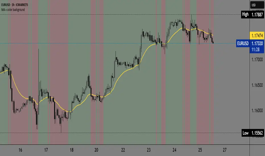
(MA with colored trend background)MA with colored trend background is a versatile trend-detection indicator that allows users to choose between three types of moving averages:
EMA (Exponential Moving Average)
KAMA (Kaufman Adaptive Moving Average)
Kijun-sen (from the Ichimoku system)
The indicator automatically detects trend shifts based on candlestick interactions with the selected MA line, and visually reflects the current trend direction using dynamic background coloring. Its goal is to help traders quickly interpret trend strength and direction—without relying on multiple indicators.
How it works
The indicator follows this logic to detect bullish and bearish conditions:
Bullish signal (green trend):
When the candle closes above the selected MA and both the open and close are above the MA, a bullish trend is signaled and the chart background turns green.
Bearish signal (red trend):
When the candle closes below the MA and both the open and close are below it, a bearish trend is triggered and the background turns red.
The background color remains until an opposite signal appears, ensuring a consistent visual representation of the current trend phase.
What it does and why it’s useful
Unlike standard moving average indicators that only plot lines, KINSKI Flexi Trend MA provides:
Flexibility to switch between different MA types (EMA, KAMA, or Kijun), allowing users to adapt it to various market environments.
Visual context via background color that enhances clarity—even when scanning multiple charts or working across timeframes.
KAMA uses fixed internal parameters (fast=2, slow=30) to provide a responsive, noise-filtering MA line.
Kijun-sen is calculated as the midpoint between the highest high and lowest low over a user-defined period, similar to its role in Ichimoku.
This combination of visual clarity and analytical flexibility makes the indicator highly suitable for:
Trend-following strategies
Breakout confirmation
Scalping (on lower timeframes)
Swing trading
How to use it
Select the MA type from the dropdown:
EMA (standard exponential moving average)
KAMA (adaptive smoothing)
Kijun-sen (Ichimoku mid-line)
Adjust the MA length depending on your trading style or timeframe:
e.g., EMA 50 for medium-term trend, Kijun 9 for faster signals.
Observe the background color:
Green → bullish trend in progress.
Red → bearish trend in progress.
Background color change may serve as an entry or exit confirmation.
Additional explanation for tracking this indicator:
When we're in a bullish trend, the background is green. We can see a narrow red background appearing when there is a certain pullback. The narrow sections of the colored background indicate that a pullback is active, and we can expect a return to the bullish side. We then return to the green zone. This is also a good indicator during consolidations because it visually shows us that the color changes in the background, as well as their same width, are consistent. This indicates that we should avoid trading during this period.
🗓️ Day Separator🗓️ Day Separator – Visual Day Markers for Your Chart
This script adds automatic vertical lines to visually separate each trading day on your chart. It helps you quickly identify where each day starts and ends — especially useful for intraday and scalping strategies.
✅ Features:
Distinct colored lines for each weekday (Monday to Friday)
Optional day-of-week labels (toggle on/off)
Custom label position (top or bottom of the chart)
Works on any timeframe
Whether you're tracking market sessions or reviewing daily price action, this tool gives you a clean structure to navigate your charts with more clarity.

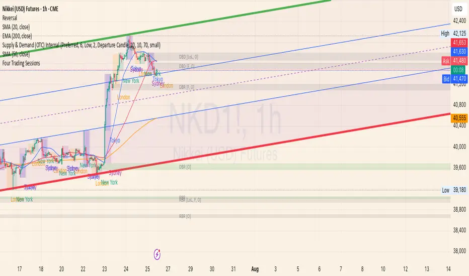
Four Trading SessionsIve adapted this from someone else's script to include 4 sessions instead of 3
TradingView Indicator Description: Trading Sessions
Overview:
The "Trading Sessions" indicator, written in Pine Script v5, visually highlights major forex trading sessions (Tokyo, London, New York, and Sydney) on intraday charts. It displays session ranges as colored boxes, with optional open/close lines, average price lines, and labels showing session names, tick ranges, and average prices. Users can customize session times, time zones, colors, and display options.
Key Features:
Customizable Sessions: Supports up to four trading sessions (Tokyo, London, New York, Sydney) with user-defined names, time ranges, and time zones (e.g., "Asia/Tokyo", "America/New_York").
Visual Elements:
Draws semi-transparent boxes to mark session price ranges (high/low).
Optional dashed lines for session open and close prices.
Optional dotted line for the session's average price.
Labels displaying session name, tick range, and/or average price (configurable).
Time Zone Support: Specify time zones using IANA database names (e.g., "Australia/Sydney") or GMT notation, with a recommendation for IANA to handle daylight savings.
Display Options: Toggle session names, open/close lines, tick range, and average price visibility.
Intraday Restriction: Works only on intraday timeframes, with an error for daily/weekly/monthly charts.
Performance Optimized: Limits boxes, lines, and labels to 500 each to ensure smooth performance.
Inputs:
General Settings:
Show session names, open/close lines, tick range, and average price (all enabled by default).
Per Session (Tokyo, London, New York, Sydney):
Enable/disable session display.
Custom session name (e.g., "Tokyo").
Session time range (e.g., "0900-1500" for Tokyo).
Time zone (e.g., "Asia/Tokyo").
Session color (semi-transparent blue, orange, green, purple by default).
How It Works:
The script checks if the current bar falls within a session’s time range (adjusted for the specified time zone).
For each active session, it creates a box spanning the session’s high/low and updates it bar-by-bar.
Optional open/close lines and an average price line are drawn and updated dynamically.
Labels display user-selected metrics (name, range, average price) at the bottom of each session box.
Sessions reset daily, ensuring accurate representation across days.
Use Case:
Ideal for forex traders who want to analyze price action during specific trading sessions. The indicator helps identify session-specific volatility, key price levels, and trends, with clear visual cues and customizable settings.
Limitations:
Only works on intraday timeframes.
Limited to 500 boxes, lines, and labels to prevent performance issues.
Requires accurate time zone settings for proper session alignment.
Example:
Enable the Tokyo and New York sessions, set their respective time zones, and toggle on all display options to see colored boxes, open/close lines, average price lines, and labels with tick ranges and averages for each session.
Squeeze Pro Momentum BAR color - KLTDescription:
The Squeeze Pro Momentum indicator is a powerful tool designed to detect volatility compression ("squeeze" zones) and visualize momentum shifts using a refined color-based system. This script blends the well-known concepts of Bollinger Bands and Keltner Channels with an optimized momentum engine that uses dynamic color gradients to reflect trend strength, direction, and volatility.
It’s built for traders who want early warning of potential breakouts and clearer insight into underlying market momentum.
🔍 How It Works:
📉 Squeeze Detection:
This indicator identifies "squeeze" conditions by comparing Bollinger Bands and Keltner Channels:
When Bollinger Bands are inside Keltner Channels → Squeeze is ON
When Bollinger Bands expand outside Keltner Channels → Squeeze is OFF
You’ll see squeeze zones classified as:
Wide
Normal
Narrow
Each represents varying levels of compression and breakout potential.
⚡ Momentum Engine:
Momentum is calculated using linear regression of the price's deviation from a dynamic average of highs, lows, and closes. This gives a more accurate representation of directional pressure in the market.
🧠 Smart Candle Coloring (Optimized):
The momentum color logic is inspired by machine learning principles (no hardcoded thresholds):
EMA smoothing and rate of change (ROC) are used to detect momentum acceleration.
ATR-based filters help remove noise and false signals.
Colors are dynamically assigned based on both direction and trend strength.
🧪 How to Use It:
Look for Squeeze Conditions — especially narrow squeezes, which tend to precede high-momentum breakouts.
Confirm with Momentum Color — strong colors often indicate trend continuation; fading colors may signal exhaustion.
Combine with Price Action — use this tool with support/resistance or patterns for higher probability setups.
Recommended For:
Trend Traders
Breakout Traders
Volatility Strategy Users
Anyone who wants visual clarity on trend strength
📌 Tip: This indicator works great when layered with volume and price action patterns. It is fully non-repainting and supports overlay on price charts.

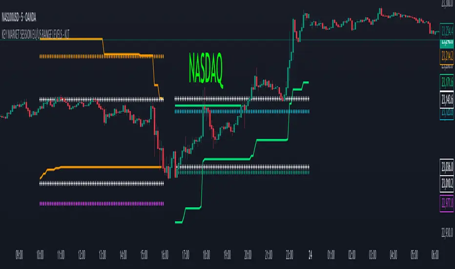
KEY MARKET SESSION EU/US RANGE LEVELS - KLT🔹 KEY MARKET SESSION EU/US RANGE LEVELS - KLT
This indicator highlights critical trading levels during the European and U.S. sessions, with Overbought (OB) and Oversold (OS) markers derived from each session's price range.
It’s designed to support traders in identifying key zones of interest and historical price reactions across sessions.
✳️ Features
🕒 Session Recognition
European Session (EU): 08:00 to 14:00 UTC
United States Session (US): 14:30 to 21:00 UTC
The indicator automatically detects the current session and updates levels in real time.
📈 Overbought / Oversold (OB/OS) Levels
Helps identify potential reversal or reaction zones.
🔁 Previous Session OB/OS Crosses
OB/OS levels from the previous session are plotted as white crosses during the opposite session:
EU OB/OS shown during the US session
US OB/OS shown during the EU session
These levels act as potential price targets or reaction areas based on prior session behavior.
🎨 Session-Based Color Coding
EU Session
High/Low: Orange / Fuchsia
OB/OS: Orange / Lime
Previous OB/OS: White crosses during the US session
US Session
High/Low: Aqua / Teal
OB/OS: Aqua / Lime
Previous OB/OS: White crosses during the EU session
🧠 How to Use
Use the OB/OS levels to gauge potential turning points or extended moves.
Watch for previous session crosses to spot historically relevant zones that may attract price.
Monitor extended High/Low lines as potential magnets for price continuation.
🛠 Additional Notes
No repainting; levels are session-locked and tracked in real time.
Optimized for intraday strategies, scalping, and session-based planning.
Works best on assets with clear session behavior (e.g., forex, indices, major commodities).