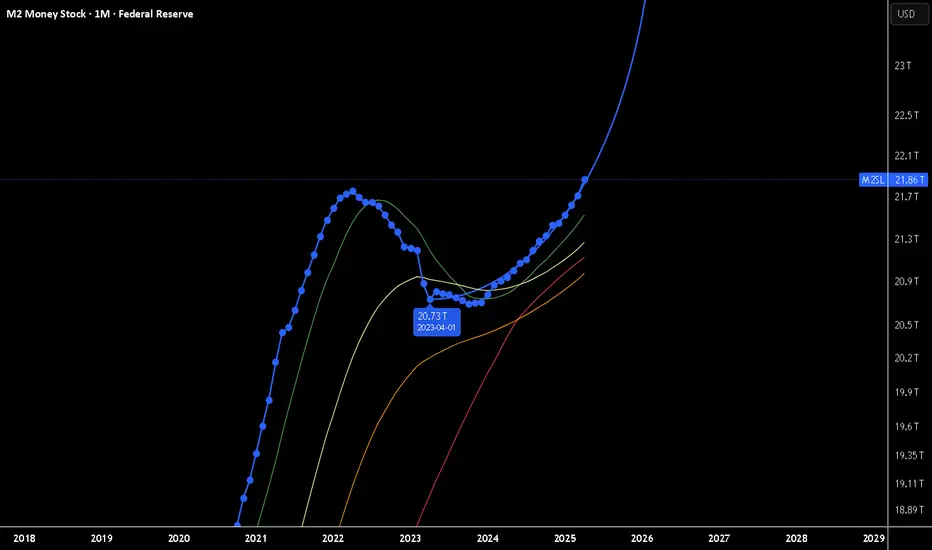
Forever new all time HighsThe Race to $25 Trillion: Why M2 Money Supply is My Key Market Indicator
In what seems like a relentless march, the US M2 money supply is closing in on the $25 trillion mark. While many focus on daily market noise, I believe this high-level metric is one of the most critical indicators for understanding the long-term picture for asset prices and currency risk.
The Logic is Simple:
If the economy is flooded with newly created US dollars, that capital has to go somewhere. Assuming the velocity of money (M2V) doesn't collapse, this liquidity injection naturally pushes up the prices of scarce assets like stocks, real estate, and cryptocurrencies.
The long-term risk of significant USD currency debasement and severe inflation keeps growing.
I'm not predicting hyperinflation tomorrow, but I am watching the train on the tracks. Direction is what matters most. This reminds me of how people view empires—they often focus on past strength and never expect a collapse until it's too late. The same is true for emerging powers, which are consistently underestimated. It's the direction of travel that matters most.
The key isn't to wait for a reason to panic, but to adjust your strategy to the changes as they happen.
Playing with the forecast tool I get this. I am not looking at it for anything other then pure amusement.
Disclaimer:
The information provided in this post is for educational and informational purposes only. It does not constitute financial advice, investment recommendations, or a solicitation to buy or sell any financial instruments. All investments involve risk, and the past performance of a security, market, or trading strategy does not guarantee future results. I am not a financial advisor. Please conduct your own thorough research and consult with a qualified financial professional before making any investment decisions. You are solely responsible for any investment decisions you make.
M2SL trade ideas
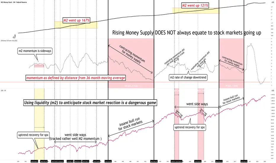
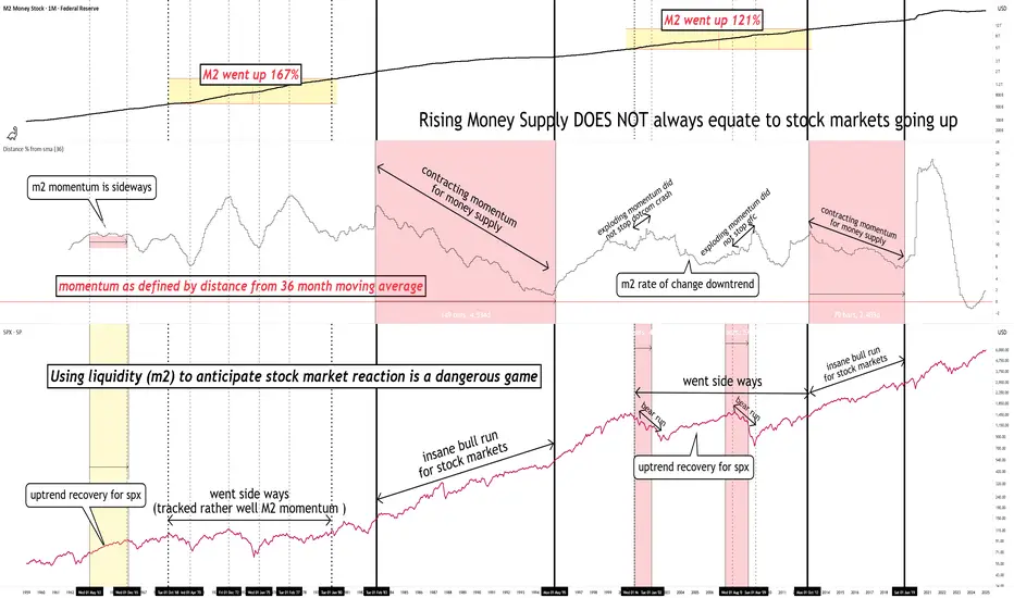
Rising M2 does not always equate markets going upHistory has shown us that using liquidity (m2) to anticipate stock market reaction is a dangerous game.
It can work, until it doesn't.
What always works is analyzing the price chart based on its own merits.
one of the most underrated charts : M2(money supply)When it comes to forex and macro trading, it's easy to get lost in charts, indicators, and economic calendars. But one of the most overlooked—and incredibly powerful—macro indicators is the M2 Money Supply. In this post, we’ll break down what M2 really is, why it matters, and how traders like you can use it to get an edge.
💰 What Is M2 Money Supply?
M2 represents the total amount of money in circulation in an economy, including:
M1 (physical cash + checking deposits)
Savings deposits
Money market securities
Time deposits (under $100,000)
In simple terms: M2 tracks how much money is sloshing around in the system.
🧠 Why Traders Should Care About M2
When M2 goes up significantly, it often signals that a central bank is easing monetary policy—i.e., printing more money, keeping interest rates low, or using QE (quantitative easing). Conversely, when M2 contracts or slows, it suggests tightening, and could signal reduced liquidity, higher rates, or a slower economy.
M2 = Macro Liquidity Meter
And liquidity drives markets—especially currencies.
⚙️ How to Use M2 in Your Trading Strategy
Here are 3 ways you can incorporate M2 into your macro trading toolkit:
1. Gauge Inflation & Currency Value
When a country expands its money supply rapidly (like the U.S. did during COVID), the purchasing power of its currency often declines, especially against currencies with tighter monetary policy.
✅ Watch for divergences: If M2 is growing fast in one country and flat in another, that’s a potential FX opportunity.
📉 Example: USD weakened sharply post-COVID when M2 surged.
2. Confirm Trends in Interest Rates
M2 often leads or confirms central bank policy.
Shrinking M2 → Tighter conditions → Rising rates → Currency bullish
Expanding M2 → Easier policy → Lower rates → Currency bearish
Use it alongside yield curve analysis and central bank projections.
3. Identify Risk-On/Risk-Off Regimes
A rising M2 usually supports risk assets like equities and EM currencies. Falling M2 can trigger liquidity squeezes, flight to safety, and stronger demand for USD or JPY.
Use M2 as a macro filter for your risk appetite.
Watch for turning points in M2 to anticipate market regime shifts.
🔎 How to Track M2 on @TradingView
Open a new chart and search for:
🔍 FRED:M2SL – U.S. M2 Money Stock (seasonally adjusted)
You can also compare this against:
DXY (US Dollar Index)
USDJPY, EURUSD, or other major FX pairs
U.S. 10-Year Yields (US10Y) or Fed Funds Rate (FEDFUNDS)
Add M2 as an overlay or sub-chart for macro context.
Use the "Compare" tool to visualize divergences with currency pairs.
📌 Final Thoughts
M2 might not give you minute-by-minute trade signals like an RSI or MACD, but it offers something far more powerful: macro context. When used with other indicators, it can help traders:
Anticipate currency trends
Understand shifts in monetary policy
Position for regime changes in risk appetite
Remember: the smartest traders aren’t just charting price—they’re charting liquidity. And M2 is the ultimate liquidity map.
put together by : @currencynerd
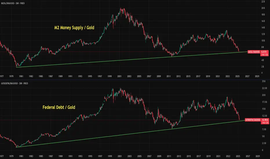
Gold Skyrockets Like It's 2011: Are We There Yet?Gold has been on a powerful run since breaking above the 2100 resistance level in March 2024. After just one year of relentless gains and a return of over 60%, it has become one of the top-performing assets. But the big question now is: how far can this rally go? To the moon?
It's difficult to predict how far prices can climb during these kinds of parabolic moves. In 2011, the final green monthly bar alone rose 17% from open to high. These FOMO-fueled surges often lead to euphoric tops followed by painful bear markets. So, are we there yet?
Since Richard Nixon ended the dollar's gold backing and introduced the modern fiat system, gold's status as a safe haven has become even more prominent. Whenever there are heightened risks, whether geopolitical, fiscal, or related to the fiat money system, investors tend to flock to gold. The 2011 rally was a clear example of this. After the 2008 financial crisis and the quantitative easing that followed, gold became the go-to asset for both preserving value and speculative opportunity.
A similar pattern has unfolded following the COVID-19 shock. The Federal Reserve returned to aggressive quantitative easing, while both the Trump and Biden administrations increased fiscal spending, including direct payments to households. This surge in money supply and concerns about fiat stability, along with rising government debt, helped trigger another major gold rally. With the added risk of a trade war, the rally has accelerated further, pushing gold beyond 3300 and creating a situation that closely mirrors 2011.
Looking at the money supply-to-gold ratio and the US federal debt-to-gold ratio, gold now appears to be testing trendline levels. Its recent surge has made metrics like M2 and federal debt seem relatively smaller, which may be a sign that the rally is approaching exhaustion.
Still, history shows that final euphoric moves can stretch even higher before a true top is formed. Rather than trying to predict the peak, it's often better to wait for signs of price stabilization. Gold typically offers a second opportunity, often forming two peaks with the second lower than the first, before entering a bear phase.
In 1980, gold fell more than 60% within two years. After the 2011 top, it declined nearly 40%. Even if the retreat expected to be milder this time, gold could still offer a 20% or greater downside opportunity once the top is in.
Smart money has already started to take profits gradually. Net managed money positions in the COT report have decreased by 40% since January, as we discussed in our earlier post:
Rising money supply DOESN'T always equate to stock markets riseRising money supply DOES NOT always equate to stock markets going up.
Includes Bitcoin & Crypto.
Using liquidity (m2) to anticipate stock market reaction is a dangerous game
Money and StocksDon't fall for the narrative that money supply will save stock markets (or bitcoin) from entering vicious bear runs.
Rising Money Supply Will NOT save stocks markets from a bear market

Global Liquidity: A Turning PointLooking at the state of global liquidity, I believe we're in a solid position for some longer trades. The chart reflects a potential inflection point, suggesting that liquidity could increase over the next six months. This aligns well with my base case that we may see a gradual rise in liquidity, supported by macroeconomic tailwinds.
From a strategy perspective, this appears to be a prime opportunity for longer-term spot positions in miners, Bitcoin, and metals. These assets are historically well-positioned to benefit from rising liquidity conditions, and current levels offer an attractive entry point for patient investors.
While short-term volatility is always a possibility, the broader trend signals that this could be a pivotal moment for accumulation in these sectors. Patience and conviction will be key in riding this next wave.

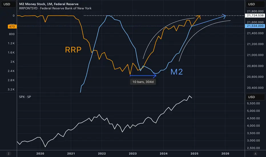
M2 Peaking as Reverse Repo Drains to ZeroThe reverse repo balance at the Fed represents trapped liquidity. When this balance comes down it means liquidity is released into the economy and markets. The M2 level lags the change in reverse repo by about 300 days. Because reverse repo changes have been steady for some time, it is possible to draw a trajectory for reverse repo going to zero, and then M2 peaking out. This would coincide with a potential topping process for SPX as shown in the lower pane of the chart.
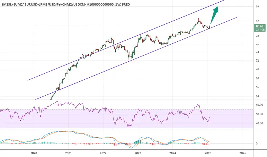
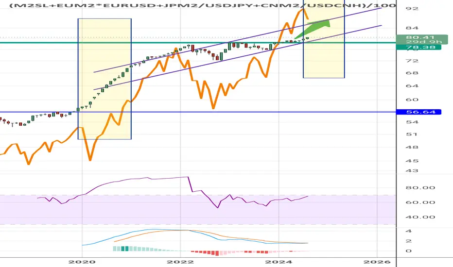
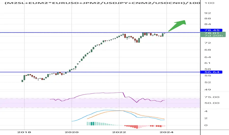
Global Money Supply going up!This is the chart for the Global Money Supply.
It's clearly bouncing on the channel. BULLISH !!
Here's the formula to put in TradingView:
(FRED:M2SL+ECONOMICS:EUM2*FX:EURUSD+LSE:JPM2/FX:USDJPY+ECONOMICS:CNM2/FX:USDCNH)/1000000000000
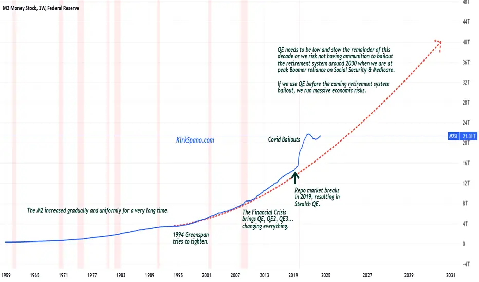
M2 needs to move to historic trend to avoid massive risks.The United States has the capacity to bailout the retirement system for Boomers and Millennials if we do not blow the "dry powder" of American Exceptionalism on pumping up the economy and markets for political and 1%er gains.
America will be at peak Boomer dependence on Social Security & Medicare around 2030 and will not see a reduction of that dependence until more Boomers have crossed the Rainbow Bridge than Xers retiring. During the 2040s there will be a reprieve for the retirement system, but then in the 2050s the Millennials retire putting strain back on.
The United States needs a sustained period of 3%+ GDP growth, moderate to low energy prices and productivity gains driven by technology. America should probably also merge & standardize Medicare & Medicaid to eliminate waste and fraud (Trumpcare?), as well as, start putting about 20-25% of Social Security payroll taxes into the S&P 500, 600 & 400 indexes with the rest in special 3% rate UST in the "lockbox" that Al Gore talked about 25 years ago. That will require seed money in the form of $10-20 trillion of QE, aka, the dry powder we can't waste.
Top 5 M2 vs SPXThis shows the relationship between the top M2 of the top 5 financial areas and the price of SPX.

M2 Money Supply!!! THEY ARE NOT PRINTING MONEY FAST ENOUGH !!!
#recession #disinflation #moneysupply #yields #rates
But the 10 year rate of change is telling a more nuanced story...
10 year yields track money supply rate of change

Will the Global Money Supply break the trendline?When the Global Money Supply goes up, markets go up.
Will the money supply break down the trendline?
Hopefully, we get a nice bounce from here!

Nasdaq 100 (QQQ) due for a correction ?US M2 Money stock / Nasdaq 100 (QQQ)
has reached its March's 2000 low.
Bullish divergence on both the RSI and MACD.
The Nasdaq 100 seems due for a correction which
would imply a rebound on this ratio of M2/QQQ

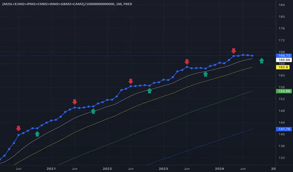
M2 supply seasonality - sell in may & go away until OctoberUsing this formula:
(FRED:M2SL+ECONOMICS:EUM2+ECONOMICS:JPM2+ECONOMICS:CNM2+ECONOMICS:INM2+ECONOMICS:GBM2+ECONOMICS:CAM2)/100000000000000
This formula includes US, EU, GB, CAN, JP, In & CN M2 money supply.
You can clearly see M2 money supply seasonality changes, rounding consolidation from June1st & going up starting from October. Every time - for the last 5 years very clearly.
More global liquidity should drive the markets up.
Global money supply increasing! Same as during pandemic When the money supply started rising in 2020, the SPX started by crashing before going on one of its biggest bull runs.
Maybe the same thing is happening now. We crash now for another couple days or weeks before having one last explosion upwards.
The most important chart in your trading career.Merry Christmas to all, I hope you and yours are well.
My present to you this year is the one chart you should ALL be watching. SPX/GOLD
Risk On (Equities), Risk Off (Gold). It will save you a TON of time/headaches, if you follow this chart.
In this video I go over why you should use it. How your portfolio would have been managed the last 50yr, and at the end give a quick method for managing your ratio between Risk On/Off.
As always, good luck in your trading, have fun, and practice solid risk management.

Global money supply ready to popThis is the global money supply.
The pattern looks the same as 2018-2020. When it broke out, we got a nice bull run in all markets!
M2 landingOh, that's news.
Usually M2 always flew over the indicator lines.
For decades.
Now there's a good reason to keep folding.

Inflation SupercycleOn the afternoon of October 3rd, 2023 something unprecedented happened in the U.S. Treasury market. For the first time ever, bear steepening caused the 20-year U.S. Treasury yield and the 2-year U.S. Treasury yield to uninvert.
Bear steepening refers to a scenario in which long-duration bond yields rise faster than short-duration bond yields, as bond yields rise across the term structure. In all past instances, inverted yield curves have normalized due to bull steepening . The probability that bear steepening would cause an inverted yield curve to normalize is so low that, until now, most term structure models excluded the possibility of it ever happening. In this post, I'll explain why this anomalous event is a major stagflation warning.
The chart above shows that the 10-year Treasury yield has been rising much faster than the 3-month Treasury yield throughout 2023, narrowing the once-deep yield curve inversion.
Since a yield curve inversion indicates that a recession is coming, and bear steepening indicates that the market is pricing in higher inflation for the short term, and even more so, for the long term, then bear steepening during a yield curve inversion indicates that high inflation may persist even during the recessionary phase. High inflation during the recessionary period is what defines stagflation . Since very strong bear steepening is normalizing a deeply inverted yield curve, the combination of these events is a warning that severe stagflation is likely coming.
High inflation has caused Treasury yields to surge at an astronomical rate of change. Bond prices, which move in the opposite direction as yields, have sharply declined causing destabilizing losses. The effects of these massive bond losses are not even close to being fully realized by the broad economy.
The image above shows a bond ETF heatmap with year-to-date returns. Large losses have been mounting across numerous bond ETFs. Long-duration Treasury ETF NASDAQ:TLT has declined by more than 18% this year. Click here to interact with the bond ETF heatmap
Despite the extreme pace of monetary tightening, many central banks are still struggling to contain inflation. Inflationary fiscal spending and ballooning debt-to-GDP levels are confounding central bank monetary policy efforts. In Argentina, for example, inflation continues to spiral higher despite the central bank raising interest rates to 133%.
The chart above shows that the central bank of Argentina has hiked interest rates to 133%. Despite this extreme interest rate, the country's inflation rate continues to spiral higher. In an inflationary spiral, there is no upper limit to how high interest rates can go.
As the Federal Reserve tightens the supply of the U.S. dollar -- the predominant global reserve currency -- all other countries (with less demanded fiat currency) generally must tighten their monetary supply by a greater degree in order to contain inflation. If a country fails to maintain tighter monetary conditions than the Federal Reserve, then the supply of that country's (lesser demanded) fiat currency will grow against the supply of the (greater demanded, and scarcer) U.S. dollar, causing devaluation of the former against the latter. In effect, by controlling the global reserve currency, the Federal Reserve is able to export inflation to other countries. This phenomenon is explained by the Dollar Milkshake Theory .
The forex chart above shows FX:USDJPY pushing up against 150 yen to the dollar. The longer the Bank of Japan continues to maintain significantly looser monetary conditions than the Fed, the longer the yen will continue to devalue against the U.S. dollar.
The meteoric rise in bond yields is particularly concerning because it has broken the long-term downtrend, signaling the start of a new supercycle. After hitting the zero lower bound in 2020, yields have rebounded and pierced through long-term resistance levels.
The chart above shows that the 10-year U.S. Treasury yield broke above long-term resistance, ending the period of declining interest rates that characterized the monetary easing supercycle.
We've entered into a new supercycle, one in which lower interest rates over time are a thing of the past. The new supercycle will be characterized by persistently high inflation. It will start off insidiously, with brief periods of disinflation, but over the long term it will accelerate higher and higher, ultimately causing today's fiat currencies to meet the same fate that every fiat currency in history has met: hyperinflation.
* * *
Important Disclaimer
Nothing in this post should be considered financial advice. Trading and investing always involve risks and one should carefully review all such risks before making a trade or investment decision. Do not buy or sell any security based on anything in this post. Please consult with a financial advisor before making any financial decisions. This post is for educational purposes only.

M2 inflationUse rate of change on instruments that generally trend in only one direction over long periods.
Markets react and price-in accelerations or decelerations in that change.
#inflation #moneysupply #gold #spx
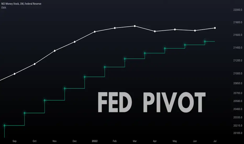
The Fed Must Pivot When This Happens...We can try to predict when the Federal Reserve may pivot to a less hawkish stance by using charts. Below are some helpful charts.
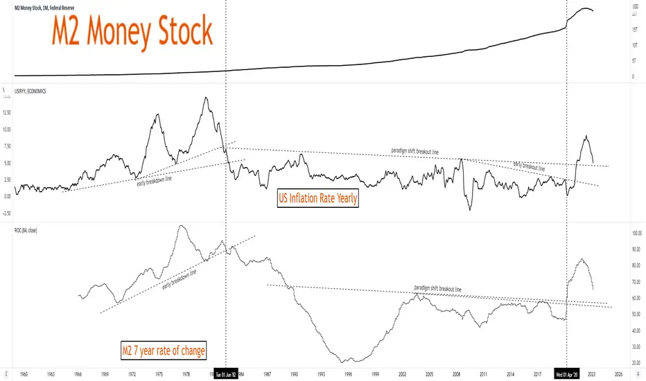
1. Money Supply
The chart shown above is a monthly chart of the U.S. money supply (M2SL).
The white line shows the money supply over time. Below the white line is a stepped moving average (9 period), which I consider the 'steps of a debt-based economy'.
In order for our debt-based economy to persist, the money supply must continue moving up these steps endlessly. For reasons beyond the scope of this post, if the money supply falls much below this level a financial crisis is likely to ensue due to credit and liquidity issues.
Below are some examples in which money supply came down to the stepped moving average before climbing higher.
Not even during periods of higher inflation did the Federal Reserve let the money supply fall below this level. Therefore, the closer the money supply comes to this stepped-moving average, the more likely we are to see the Fed pivot to a less hawkish stance. Since money supply is largely negatively correlated to the value of all assets priced in U.S. dollar, reaching this level may also be somewhat of a buy signal for these assets (e.g. stocks, Bitcoin). Indeed, the fact that money supply always goes up is a large part of the reason why the stock market always goes up, too.
Whereas if inflation becomes so severe that it forces the Fed to take the unprecedented step of dropping the money supply below this critical level, then a financial crisis will likely ensue. Indeed, under the surface a crisis is already brewing. (You can see my posts linked below for more charts on this).
2. Eurodollar Futures
It is generally accepted that the Eurodollar Futures chart is one of the best leading indicators for the Fed Funds Rate. (Don't know what Eurodollar Futures are? See the link at the bottom of this post.)
Therefore, when Eurodollar Futures plateau or begin dropping, we can expect a Fed pivot. However, this assumes that the Fed Funds rate has actually reached the terminal rate implied by Eurodollar Futures, which has not yet happen because the Fed is so far behind the curve with hiking.
Keep an eye on how markets react to quad witching on September 16th, the time at which stock-index futures, options on stock-index futures, single-stock options and index options simultaneously expire. This period has been known to generate significant volatility. See the bottom of this post for more information about quad witching if you're unfamiliar with it.
3. Yield Curve Inversion
Usually around the time or shortly after the yield curve inverts, the Fed pivots to a less hawkish stance. Right now the 10-year and 2-year yields on treasuries are inverted. Below is a chart of the US10Y/US02Y ratio.
In the below chart, I marked the points at which the Fed pivoted in the past (pivots were measured by marking the last date the Fed raised rates). The values that you see labeled on the bottom right are the values of the US10Y/US02Y ratio at the time the Fed pivoted in past hiking cycles.
In the chart below, I zoomed into the current time. As you can see, the US10Y/US02Y ratio is currently below all the levels at which the Fed previously pivoted. Green is the highest ratio at which the Fed pivoted and red is the lowest ratio at which the Fed pivoted.
The chart above shows that we are in uncharted territory in the scope of yield curve inversion that the Fed has created. The fact that the Fed has forced the yield curve invert to this extreme degree and has still not pivoted is likely reflective of one or both of the following hypotheses:
(1) The Fed started hiking rates too late.
(2) The factors of inflation from the demand side and/or supply side are worse than we experienced in the past (since at least 1988 -- the period covered by the data in the chart).
Nonetheless, the Fed must pivot soon or risk causing a financial crisis. My hypothesis is that an inverted yield curve can have the effect, among others, of destroying money. Since some banks borrow at short term rates and lend at long term rates, an inverted yield curve makes this less profitable or even unprofitable. Therefore some banks will lend less. Since bank lending creates the most money, an inverted yield curve can decrease the money supply substantially. The Fed cannot let this monetary phenomenon continue for long without causing significant issues.
4. Inflation
Of course the biggest consideration for the Fed is the rate of inflation. The next CPI report is not scheduled to be released until the morning of September 13, 2022, but we can use chart analysis to, with a high degree of certainty, predict the rate of inflation.
The above chart is a chart of the price of gold (GOLD) multiplied by the Commodity Index Tracking Fund (DBC). This chart allows us to extrapolate both the supply and demand side of inflation to a high degree of certainty. It is a statistically valid leading indicator for the inflation rate. You can see how drastically it has fallen recently. You can also see how closely it matches the chart of the inflation rate on a lagging basis.
For those interested in the statistics GOLD*DBC correlates to USIRYY as follows: r = 0.904, r-squared = 0.8844, p = 0
In the chart above I provide an even better correlation to the rate of inflation. In this chart I provide the total securities sold by the Federal Reserve as part of their overnight reverse repurchase facility, I then attempted to improve the correlation values by adjusting the value by using the price of gold as a multiplier. Although this may sound complex to those who are not familiar with the repo facility, in short it just represents the amount of dollars that the Fed is pulling out of the banking system. To diminish the effect of any non-inflationary factors that would cause the Fed to do this, I adjusted the value using the price of gold.
Recently, the Fed has been pulling less dollars out of the system and on some days it has actually been putting more dollars back into the system. The Fed would not be putting more dollars into the system if inflation were still spiraling out of control. While anything can happen in the future, and additional inflationary shocks can occur, this equation gives us a tool to predict the rate of inflation before the CPI report is published.
For those interested in the statistics, GOLD*RRPONTTLD correlates to USIRYY as follows: r = 0.954, r-squared = 0.94, p = 0
In the chart above, I've adjusted the values to match the inflation numbers as best as I could (I simply used a divisor that equates the peak values in both charts). It is far from perfect and it is definitely not something that you should use to trade on. The number that is actually reported by the government could be way different. The best that we, as traders, can ever do is use charts to try to predict what may happen, which is what I've done here.
More information about Eurodollar Futures: www.investopedia.com
More information about Quad Witching: www.investopedia.com
Liquidity crack downM2 year on year % change is dropped to negative territory in US
This is effect from 2022 FED Hawkish causing to Banking crisis
also impact to Risk assets around the world thru 2022
What should happen next must be policy U-Turn!!!
