This is not the first time I use the fractals of the previous Cycles under a certain rules of parameters in order to make a projection. This is by far the best methodology to make long-term projections on Bitcoin (BTCUSD) as its cyclical behavior has been extremely consistent over the years.
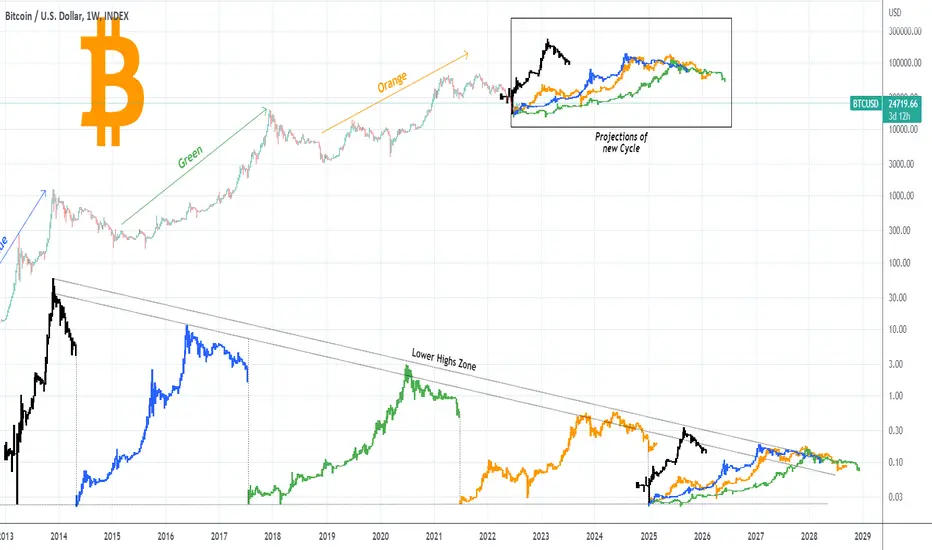
This time is no different and the dynamic under which I compare the Cycles is a Lower Highs zone. As you see if we start all Cycles from their market Bottom on the same straight (Support) line, they all make their Top on the same Lower Highs zone. As a result I've used all past Cycle models (July 2010 - October 2011 = Black, November 2011 - January 2015 = Blue, February 2015 - December 2018 = Green, January 2019 - June 2022 = Orange), and fit them under this Lower Highs zone to expand the model with an average projection. If we then take all those new projections and start them on the actual price action (time-frame on 1W) starting from the June 2022 Low, we can get a fair estimation.
It is interesting to see that with the expection of the first (black) Cycle which was the most aggressive, the remaining three all give an estimated top within 115 - 140k! The first Cycle (black), being quicker, rising to the Lower Highs zone much higher, gives the next Top around 230k but it is unlikely to get that aggressive price action again.
Again, those are just projections based on Bitcoin's 10+ year price action and a certain set of parameters. The future trend doesn't have to follow any of those but all of them bundled together do make a fair average projection indeed.
So where do you personally have the next Cycle Top at? Do you think this model can offer a good projection? Feel free to share your work and let me know in the comments section below!
P.S. Because the chart has these bar projections (different colors) plotted and not constant, it may appear distorted based on your screen's/ browser dimensions. The original looks like this below, so if yours doesn't, adjust the vertical/ horizontal axis in order to make it look like this and better understand what is illustrated:

--------------------------------------------------------------------------------------------------------
Please like, subscribe and share your ideas and charts with the community!
--------------------------------------------------------------------------------------------------------
This time is no different and the dynamic under which I compare the Cycles is a Lower Highs zone. As you see if we start all Cycles from their market Bottom on the same straight (Support) line, they all make their Top on the same Lower Highs zone. As a result I've used all past Cycle models (July 2010 - October 2011 = Black, November 2011 - January 2015 = Blue, February 2015 - December 2018 = Green, January 2019 - June 2022 = Orange), and fit them under this Lower Highs zone to expand the model with an average projection. If we then take all those new projections and start them on the actual price action (time-frame on 1W) starting from the June 2022 Low, we can get a fair estimation.
It is interesting to see that with the expection of the first (black) Cycle which was the most aggressive, the remaining three all give an estimated top within 115 - 140k! The first Cycle (black), being quicker, rising to the Lower Highs zone much higher, gives the next Top around 230k but it is unlikely to get that aggressive price action again.
Again, those are just projections based on Bitcoin's 10+ year price action and a certain set of parameters. The future trend doesn't have to follow any of those but all of them bundled together do make a fair average projection indeed.
So where do you personally have the next Cycle Top at? Do you think this model can offer a good projection? Feel free to share your work and let me know in the comments section below!
P.S. Because the chart has these bar projections (different colors) plotted and not constant, it may appear distorted based on your screen's/ browser dimensions. The original looks like this below, so if yours doesn't, adjust the vertical/ horizontal axis in order to make it look like this and better understand what is illustrated:
--------------------------------------------------------------------------------------------------------
Please like, subscribe and share your ideas and charts with the community!
--------------------------------------------------------------------------------------------------------
👑Best Signals (Forex/Crypto+70% accuracy) & Account Management (+20% profit/month on 10k accounts)
💰Free Channel t.me/tradingshotglobal
🤵Contact info@tradingshot.com t.me/tradingshot
🔥New service: next X100 crypto GEMS!
💰Free Channel t.me/tradingshotglobal
🤵Contact info@tradingshot.com t.me/tradingshot
🔥New service: next X100 crypto GEMS!
Disclaimer
The information and publications are not meant to be, and do not constitute, financial, investment, trading, or other types of advice or recommendations supplied or endorsed by TradingView. Read more in the Terms of Use.