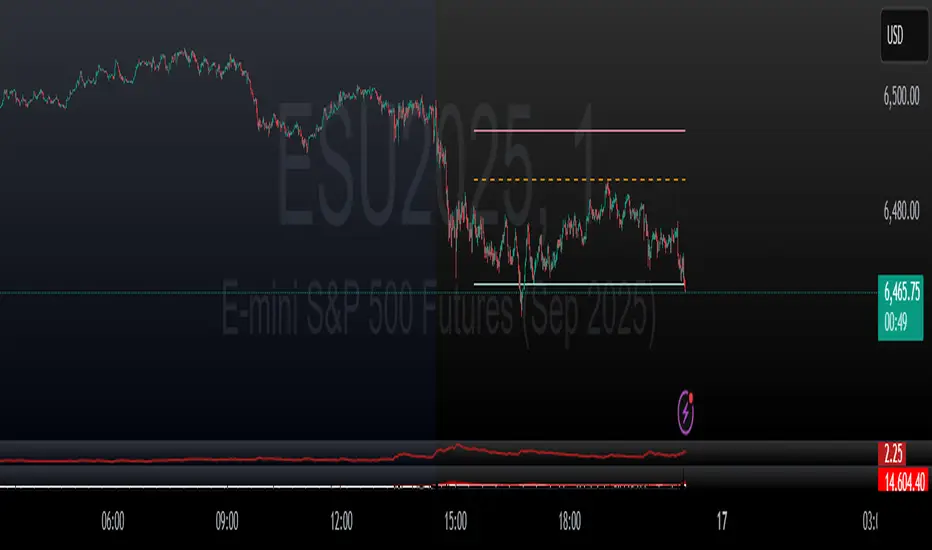
liquidity reversalThis script detects liquidity sweeps and confirms reversals based on price action. It looks for:
- A sweep of a recent high or low
- A reversal candle closing back inside range
- (Optional) Confirmation via market structure break (MSB)
When confirmed, it plots:
- BUY signals after low sweep + bullish break
- SELL signals after high sweep + bearish break
Works on any timeframe. Designed for MNQ scalping during NY open.
Indicators and strategies
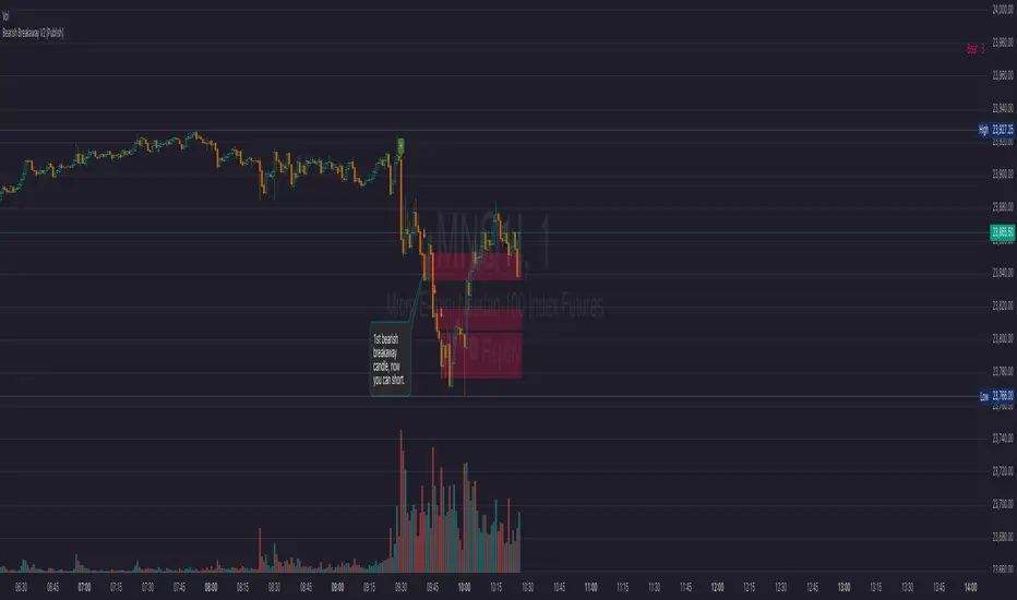
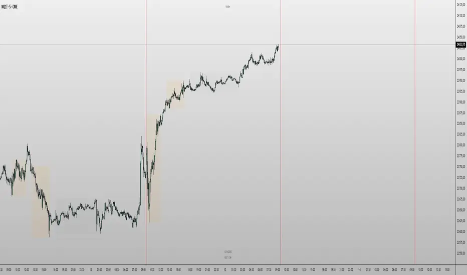
Bearish Breakaway V2 (Publish) FVG concept This is the version 2 of bearish breakaway indicator. This is the bearish version. Please also use the bullish v2 version in my page.
Here is an example, 8-15-2025, NQ,
you see the 1st 1m bearish breakaway candle formed at 941am, then you are looking for short entry, if you enter at the low of this breakaway candle, you still have enough room for a profitable trade in the short direction.
By no means, this indicator is telling to short the moment you see a bearish breakaway candle at anytime.
However, if you don't see the formation yet, it is better to not to enter the trade. It takes a lot of skills to execute the trade, how do you enter the trade based on the indicator , that will be your edge, and the indicator can only give you a visual signal.
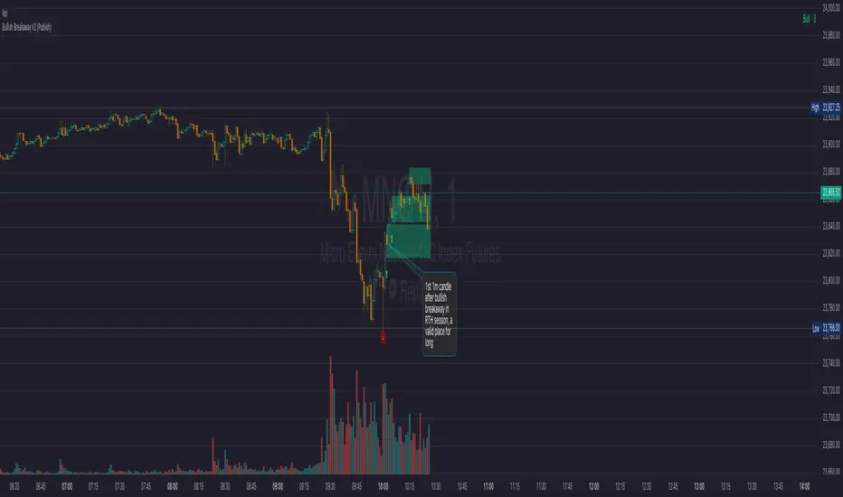
Bullish Breakaway V2 (Publish)-FVG conceptThis is my Version 2 of the breakaway indicator based o the FVP concept.
In this version 2, I have session pre-set, ETH vs RTH, and your own session of choice ( The default setting is only for CME future product in New York timezone ).
ETH session is from 1800 to 1645.
RTH session is from 930 to 1645.
I have to end at 1645, so the data will reset at each day.
If you don't see anything on the screen, that is because you are not in an active session, so you should use replay to see the indicator.
This indicator will only work best at 1m, 5m, and 15m, if you use end time at 1645.
You may have to adjust the session time for stock product RTH vs ETH. I have not tried stock yet.
Version 2 has advanced display feature using shade, and a counter to count how many breakaway candle are in the chart.
There are several ways to use this indicator to help you trade.
In this chart 8-15-2025 NQ, you can see the 1st breakaway bullish direction formed at 1002am, if you long at 1003, you have enough space for a profitable trade in the long direction.
Notice if you even enter the low of the 2nd breakaway bullish candle, you still have room for profit in the long direction. You need to get comfortable about this trading experience. Basically you want to wait for the 1st bullish breakaway candle to form before you go for a long trade.
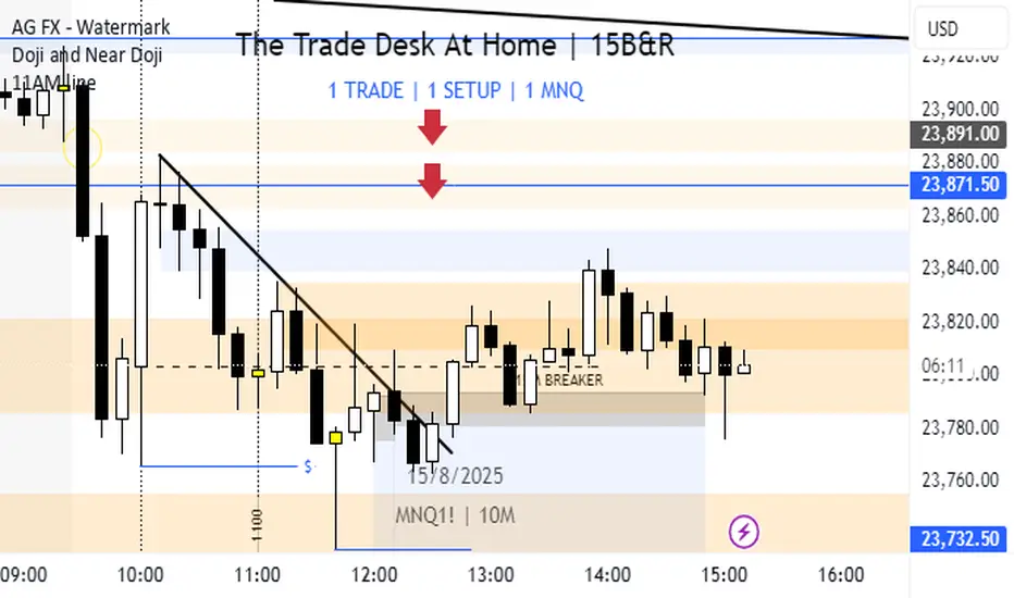
Vertical line at 11AMPlaces a vertical line at 11AM on your chart.
Only way to edit the time is by editing the script itself.
Feel free to do so.
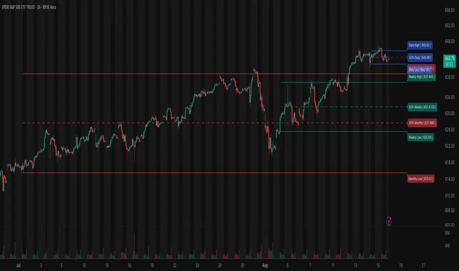
Previous High/Low Range (D,W,M)Previous High/Low Range (D,W,M)
This indicator displays the previous period’s High, Low, and 50% Midpoint levels for the Day, Week, and Month. It visually extends these levels into the future for easy reference, helping traders identify key support and resistance zones. Users can customize the visibility, colors, and line styles for each timeframe, and optionally show labels and a dashed midpoint line for clearer analysis. Ideal for trend analysis and spotting potential reversal points.
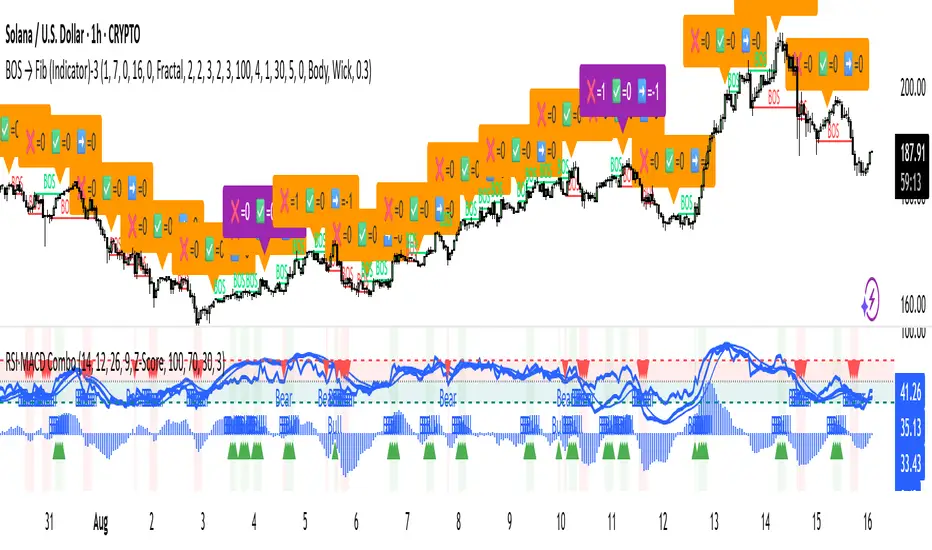
RSI + MACD Combo (sajadbagheri)The "RSI+MACD Persian Combo" integrates two classic oscillators with smart normalization. It detects overbought/oversold zones, MACD/RSI convergences, and highlights high-probability reversals using Z-Score scaling. Customizable alerts provide trade-ready signals.
Created by: Sajad Bagheri
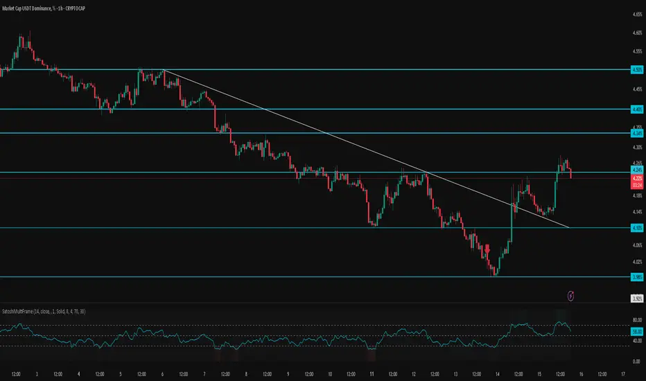
SatoshiMultiFrame RSI SatoshiMultiFrame 📈
SatoshiMultiFrame is an advanced, multi-timeframe version of the RSI indicator, designed to look and feel like the built-in TradingView RSI — but with more customization options and professional visual enhancements.
🎯 Features
Multi-Timeframe (MTF) Support – choose any timeframe for RSI calculation.
Customizable RSI Line – change color, thickness, and style (Solid / Dashed / Dotted).
Editable 30 / 50 / 70 Bands – fully customizable in the Style tab.
Smooth Gradient Fill for OB/OS Zones:
🟢 Green shading above Overbought (70)
🔴 Red shading below Oversold (30)
Customizable background for the entire panel.
No repainting – stable and reliable data.
⚙️ Inputs
RSI Length – default 14.
Source – select the price source (Close, Open, etc.).
RSI Timeframe – pick a higher or lower timeframe.
RSI Line Style – choose between Solid / Dashed / Dotted.
Dash Period & Dash Length – adjust the look of dashed lines.
🎨 Style Tab :
Change RSI line color, thickness, and optional MA line.
Edit colors and styles of 30 / 50 / 70 bands.
Enable/disable and recolor OB/OS gradient fills.
Adjust background color and transparency.
📌 How to Use :
Add the indicator to your chart.
In Inputs, set your preferred timeframe, RSI length, and line style.
In Style, adjust colors, thickness, and gradient effects to your preference.
Use the 50 line as a trend reference and monitor RSI behavior in OB/OS zones.
⚠️ Disclaimer: This tool is for educational purposes only and should not be considered financial advice. Always practice proper risk management.
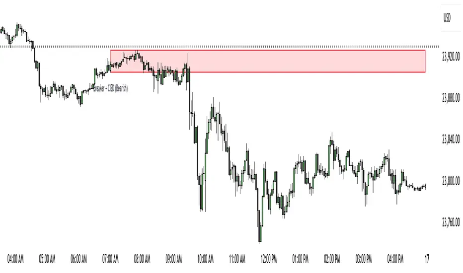
Monster Market Modelthis script identifies a market maker buy or sell model by displaying on the chart when a change in the state of delivey (CISD) overlapse a breaker. If a FVG or IFVG is in the same area it too shall be displayed. this indicator is great after a key level sweep or if price enters a POI. go on the smaller time and wait for a print for confirmation and entry. this can be used for reversals or trend contituation. Pairs well with FIB retracements for confluence. This has adjustable HTF time as well.
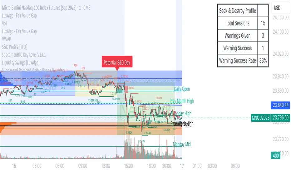
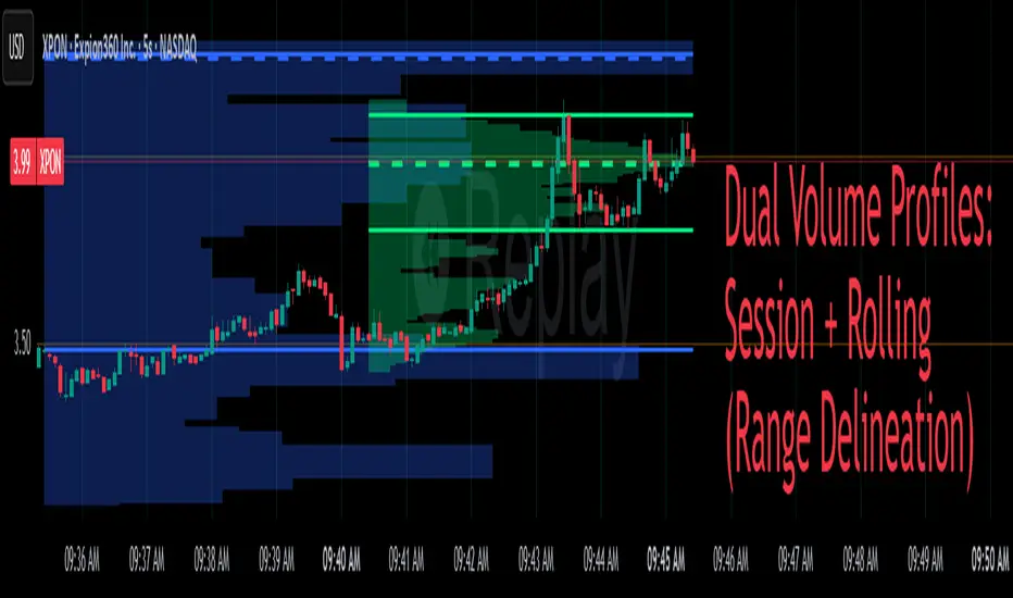
Dual Volume Profiles: Session + Rolling (Range Delineation)Dual Volume Profiles: Session + Rolling (Range Delineation)
INTRO
This is a probability-centric take on volume profile. I treat the volume histogram as an empirical PDF over price, updated in real time, which makes multi-modality (multiple acceptance basins) explicit rather than assumed away. The immediate benefit is operational: if we can read the shape of the distribution, we can infer likely reversion levels (POC), acceptance boundaries (VAH/VAL), and low-friction corridors (LVNs).
My working hypothesis is that what traders often label “fat tails” or “power-law behavior” at short horizons is frequently a tail-conditioned view of a higher-level Gaussian regime. In other words, child distributions (shorter periodicities) sit within parent distributions (longer periodicities); when price operates in the parent’s tail, the child regime looks heavy-tailed without being fundamentally non-Gaussian. This is consistent with a hierarchical/mixture view and with the spirit of the central limit theorem—Gaussian structure emerges at aggregate scales, while local scales can look non-Gaussian due to nesting and conditioning.
This indicator operationalizes that view by plotting two nested empirical PDFs: a rolling (local) profile and a session-anchored profile. Their confluence makes ranges explicit and turns “regime” into something you can see. For additional nesting, run multiple instances with different lookbacks. When using the default settings combined with a separate daily VP, you effectively get three nested distributions (local → session → daily) on the chart.
This indicator plots two nested distributions side-by-side:
Rolling (Local) Profile — short-window, prorated histogram that “breathes” with price and maps the immediate auction.
Session Anchored Profile — cumulative distribution since the current session start (Premkt → RTH → AH anchoring), revealing the parent regime.
Use their confluence to identify range floors/ceilings, mean-reversion magnets, and low-volume “air pockets” for fast traverses.
What it shows
POC (dashed): central tendency / “magnet” (highest-volume bin).
VAH & VAL (solid): acceptance boundaries enclosing an exact Value Area % around each profile’s POC.
Volume histograms:
Rolling can auto-color by buy/sell dominance over the lookback (green = buying ≥ selling, red = selling > buying).
Session uses a fixed style (blue by default).
Session anchoring (exchange timezone):
Premarket → anchors at 00:00 (midnight).
RTH → anchors at 09:30.
After-hours → anchors at 16:00.
Session display span:
Session Max Span (bars) = 0 → draw from session start → now (anchored).
> 0 → draw a rolling window N bars back → now, while still measuring all volume since session start.
Why it’s useful
Think in terms of nested probability distributions: the rolling node is your local Gaussian; the session node is its parent.
VA↔VA overlap ≈ strong range boundary.
POC↔POC alignment ≈ reliable mean-reversion target.
LVNs (gaps) ≈ low-friction corridors—expect quick moves to the next node.
Quick start
Add to chart (great on 5–10s, 15–60s, 1–5m).
Start with: bins = 240, vaPct = 0.68, barsBack = 60.
Watch for:
First test & rejection at overlapping VALs/VAHs → fade back toward POC.
Acceptance beyond VA (several closes + growing outer-bin mass) → traverse to the next node.
Inputs (detailed)
General
Lookback Bars (Rolling)
Count of most-recent bars for the rolling/local histogram. Larger = smoother node that shifts slower; smaller = more reactive, “breathing” profile.
• Typical: 40–80 on 5–10s charts; 60–120 on 1–5m.
• If you increase this but keep Number of Bins fixed, each bin aggregates more volume (coarser bins).
Number of Bins
Vertical resolution (price buckets) for both rolling and session histograms. Higher = finer detail and crisper LVNs, but more line objects (closer to platform limits).
• Typical: 120–240 on 5–10s; 80–160 on 1–5m.
• If you hit performance or object limits, reduce this first.
Value Area %
Exact central coverage for VAH/VAL around POC. Computed empirically from the histogram (no Gaussian assumption): the algorithm expands from POC outward until the chosen % is enclosed.
• Common: 0.68 (≈“1σ-like”), 0.70 for slightly wider core.
• Smaller = tighter VA (more breakout flags). Larger = wider VA (more reversion bias).
Max Local Profile Width (px)
Horizontal length (in pixels) of the rolling bars/lines and its VA/POC overlays. Visual only (does not affect calculations).
Session Settings
RTH Start/End (exchange tz)
Defines the current session anchor (Premkt=00:00, RTH=your start, AH=your end). The session histogram always measures from the most recent session start and resets at each boundary.
Session Max Span (bars, 0 = full session)
Display window for session drawings (POC/VA/Histogram).
• 0 → draw from session start → now (anchored).
• > 0 → draw N bars back → now (rolling look), while still measuring all volume since session start.
This keeps the “parent” distribution measurable while letting the display track current action.
Local (Rolling) — Visibility
Show Local Profile Bars / POC / VAH & VAL
Toggle each overlay independently. If you approach object limits, disable bars first (POC/VA lines are lighter).
Local (Rolling) — Colors & Widths
Color by Buy/Sell Dominance
Fast uptick/downtick proxy over the rolling window (close vs open):
• Buying ≥ Selling → Bullish Color (default lime).
• Selling > Buying → Bearish Color (default red).
This color drives local bars, local POC, and local VA lines.
• Disable to use fixed Bars Color / POC Color / VA Lines Color.
Bars Transparency (0–100) — alpha for the local histogram (higher = lighter).
Bars Line Width (thickness) — draw thin-line profiles or chunky blocks.
POC Line Width / VA Lines Width — overlay thickness. POC is dashed, VAH/VAL solid by design.
Session — Visibility
Show Session Profile Bars / POC / VAH & VAL
Independent toggles for the session layer.
Session — Colors & Widths
Bars/POC/VA Colors & Line Widths
Fixed palette by design (default blue). These do not change with buy/sell dominance.
• Use transparency and width to make the parent profile prominent or subtle.
• Prefer minimal? Hide session bars; keep only session VA/POC.
Reading the signals (detailed playbook)
Core definitions
POC — highest-volume bin (fair price “magnet”).
VAH/VAL — upper/lower bounds enclosing your Value Area % around POC.
Node — contiguous block of high-volume bins (acceptance).
LVN — low-volume gap between nodes (low friction path).
Rejection vs Acceptance (practical rule)
Rejection at VA edge: 0–1 closes beyond VA and no persistent growth in outer bins.
Acceptance beyond VA: ≥3 closes beyond VA and outer-bin mass grows (e.g., added volume beyond the VA edge ≥ 5–10% of node volume over the last N bars). Treat acceptance as regime change.
Confluence scores (make boundary/target quality objective)
VA overlap strength (range boundary):
C_VA = 1 − |VA_edge_local − VA_edge_session| / ATR(n)
Values near 1.0 = tight overlap (stronger boundary).
Use: if C_VA ≥ 0.6–0.8, treat as high-quality fade zone.
POC alignment (magnet quality):
C_POC = 1 − |POC_local − POC_session| / ATR(n)
Higher C_POC = greater chance a rotation completes to that fair price.
(You can estimate these by eye.)
Setups
1) Range Fade at VA Confluence (mean reversion)
Context: Local VAL/VAH near Session VAL/VAH (tight overlap), clear node, local color not screaming trend (or flips to your side).
Entry: First test & rejection at the overlapped band (wick through ok; prefer close back inside).
Stop: A tick/pip beyond the wider of the two VA edges or beyond the nearest LVN, a small buffer zone can be used to judge whether price is truly rejecting a VAL/VAH or simply probing.
Targets: T1 node mid; T2 POC (size up when C_POC is high).
Flip: If acceptance (rule above) prints, flip bias or stand down.
2) LVN Traverse (continuation)
Context: Price exits VA and enters an LVN with acceptance and growing outer-bin volume.
Entry: Aggressive—first close into LVN; Conservative—retest of the VA edge from the far side (“kiss goodbye”).
Stop: Back inside the prior VA.
Targets: Next node’s VA edge or POC (edge = faster exits; POC = fuller rotations).
Note: Flatter VA edge (shallower curvature) tends to breach more easily.
3) POC→POC Magnet Trade (rotation completion)
Context: Local POC ≈ Session POC (high C_POC).
Entry: Fade a VA touch or pullback inside node, aiming toward the shared POC.
Stop: Past the opposite VA edge or LVN beyond.
Target: The shared POC; optional runner to opposite VA if the node is broad and time-of-day is supportive.
4) Failed Break (Reversion Snap-back)
Context: Push beyond VA fails acceptance (re-enters VA, outer-bin growth stalls/shrinks).
Entry: On the re-entry close, back toward POC.
Stop/Target: Stop just beyond the failed VA; target POC, then opposite VA if momentum persists.
How to read color & shape
Local color = most recent sentiment:
Green = buying ≥ selling; Red = selling > buying (over the rolling window). Treat as context, not a standalone signal. A green local node under a blue session VAH can still be a fade if the parent says “over-valued.”
Shape tells friction:
Fat nodes → rotation-friendly (fade edges).
Sharp LVN gaps → traversal-friendly (momentum continuation).
Time-of-day intuition
Right after session anchor (e.g., RTH 09:30): Session profile is young and moves quickly—treat confluence cautiously.
Mid-session: Cleanest behavior for rotations.
Close / news: Expect more traverses and POC migrations; tighten risk or switch playbooks.
Risk & execution guidance
Use tight, mechanical stops at/just beyond VA or LVN. If you need wide stops to survive noise, your entry is late or the node is unstable.
On micro-timeframes, account for fees & slippage—aim for targets paying ≥2–3× average cost.
If acceptance prints, don’t fight it—flip, reduce size, or stand aside.
Suggested presets
Scalp (5–10s): bins 120–240, barsBack 40–80, vaPct 0.68–0.70, local bars thin (small bar width).
Intraday (1–5m): bins 80–160, barsBack 60–120, vaPct 0.68–0.75, session bars more visible for parent context.
Performance & limits
Reuses line objects to stay under TradingView’s max_lines_count.
Very large bins × multiple overlays can still hit limits—use visibility toggles (hide bars first).
Session drawings use time-based coordinates to avoid “bar index too far” errors.
Known nuances
Rolling buy/sell dominance uses a simple uptick/downtick proxy (close vs open). It’s fast and practical, but it’s not a full tape classifier.
VA boundaries are computed from the empirical histogram—no Gaussian assumption.
This script does not calculate the full daily volume profile. Several other tools already provide that, including TradingView’s built-in Volume Profile indicators. Instead, this indicator focuses on pairing a rolling, short-term volume distribution with a session-wide distribution to make ranges more explicit. It is designed to supplement your use of standard or periodic volume profiles, not replace them. Think of it as a magnifying lens that helps you see where local structure aligns with the broader session.
How to trade it (TL;DR)
Fade overlapping VA bands on first rejection → target POC.
Continue through LVN on acceptance beyond VA → target next node’s VA/POC.
Respect acceptance: ≥3 closes beyond VA + growing outer-bin volume = regime change.
FAQ
Q: Why 68% Value Area?
A: It mirrors the “~1σ” idea, but we compute it exactly from empirical volume, not by assuming a normal distribution.
Q: Why are my profiles thin lines?
A: Increase Bars Line Width for chunkier blocks; reduce for fine, thin-line profiles.
Q: Session bars don’t reach session start—why?
A: Set Session Max Span (bars) = 0 for full anchoring; any positive value draws a rolling window while still measuring from session start.
Changelog (v1.0)
Dual profiles: Rolling + Session with independent POC/VA lines.
Session anchoring (Premkt/RTH/AH) with optional rolling display span.
Dynamic coloring for the rolling profile (buying vs selling).
Fully modular toggles + per-feature colors/widths.
Thin-line rendering via bar line width.
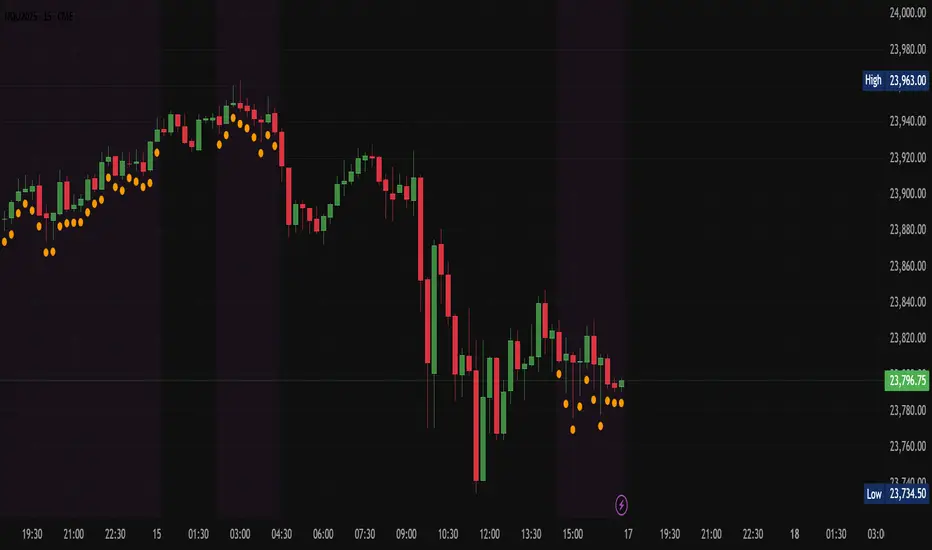
BlackDelta : Consolidation DetectorVisuals :
Purple background → whole chart section is in consolidation.
Small orange circle under the bar → that specific bar is meeting all conditions. (Consolidation)
So visually:
Purple shaded region = "market is coiling here"
You can track price action in that shaded zone, then look for a breakout beyond the range for trades.
This tool basically filters out fake quiet periods and only highlights the real compression zones that often lead to a breakout.
Enjoy :)
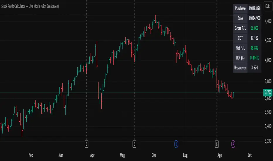
Stock Profit Calculator — Live Mode
## Overview
This Pine Script indicator calculates, in real time, the financial impact of a stock trade, including purchase/sale commissions, capital gains tax (CGT), and return on investment (ROI). It displays a compact table with key values and also calculates the breakeven price to see at what level the net P/L returns to zero.
---
## Inputs and customization
- **Number of shares:** `shares` defines the purchased quantity.
- **Purchase price:** `buyPrice` is the unit cost; the total purchase is calculated from this.
- **Live selling price:** `sellPrice = close` uses the last bar’s price for live valuation.
- **Fixed or percentage commissions:** `useFixedComm` selects the model.
- **Fixed:** `buyCommFixed`, `sellCommFixed`.
- **Percentage:** `buyCommPct`, `sellCommPct` (applied to notional value).
- **CGT rate:** `cgtRate` is the percentage rate, applied only in case of profit.
- **Table position:** `tablePosition` with predefined options.
- **Visual style:** `colTxt`, `colPos`, `colNeg`, `colBg`, `colHdr`, `colFrame` for text color, positive/negative P/L, background, header, and borders.
> Tip: if your broker uses minimum fees or composite fees, turn on “Use fixed commissions?” and enter the two fixed fees; otherwise, use the percentage model.
---
## Calculation logic
#### Purchase costs
- **Total purchase:**
\
- **Purchase commission:**
\
- **Net entry cost:**
\
#### Sale revenues
- **Total sale (with live price):**
\
- **Sale commission:**
\
- **Net exit revenue:**
\
#### P/L and taxes
- **Gross P/L:**
\
- **CGT (only on positive P/L):**
\
- **Net P/L:**
\
#### ROI
- **Percentage ROI on invested capital:**
\
#### Breakeven
- **Gross breakeven** shown in the table: the unit price that makes the net P/L exactly zero, including purchase cost and an estimate of the sale commission.
\
In the script, if commissions are fixed it adds the fixed sale fee; if percentage-based, the sale component is not included in this row (conservative approximation).
- **Breakeven with tax** (calculated but not shown):
\
Useful when you want the post-CGT result to be exactly zero. Not displayed in the table but ready for use.
> Note: CGT applies only on positive profits; near breakeven, the tax effect is null or only kicks in beyond a threshold. That’s why the script distinguishes between the “gross” and “with tax” versions.
---
## On-screen table
- **Displayed rows:**
- **Purchase:** total net entry cost (with commissions).
- **Sale:** total net exit revenue (with commissions).
- **Gross P/L:** difference between netSell and netBuy.
- **CGT:** estimated tax only if there’s a gain.
- **Net P/L:** P/L after taxes.
- **ROI (%):** percentage return on netBuy.
- **Breakeven:** gross unit breakeven price.
- **Conditional colors:**
- **P/L and ROI:** green for ≥ 0, red for < 0.
- **Headers and cells:** customizable via the color inputs.
- **Efficient refresh:** the table updates only on the last bar via `barstate.islast` to avoid unnecessary redraws.
---
## Behavior and performance
- **Overlay:** displayed on the price chart.
- **Persistent variable:** table is created once with `var table`.
- **Live price:** `sellPrice` follows the current `close`, making P/L, ROI, and breakeven dynamic.
---
## Limitations and suggestions
- **Commission model:** when using percentage commissions, the breakeven in the table doesn’t add the sale percentage fee in the “breakevenPrice” formula. For more precision, you could solve the equation including the percentage fee on exit.
- **Breakeven with tax:** `breakevenWithTax` is a linear estimate; near zero profit, tax may be null. You might choose to display it instead of, or alongside, the gross breakeven.
- **Precision and formatting:** values are shown with `format.mintick`. If the symbol has very small ticks, consider a custom format for better readability.
- **Edge cases:** ROI is undefined if `netBuy = 0` (unlikely in practice but good to note).
> Pro tip: if you want to show the breakeven with tax, add a “Breakeven (post-CGT)” row printing `breakevenWithTax`. If you prefer a single row, replace the shown value with the post-CGT one.
---
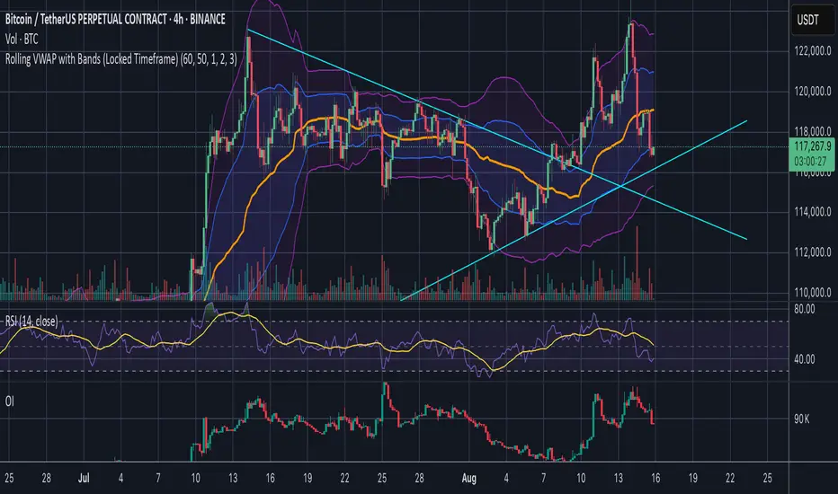
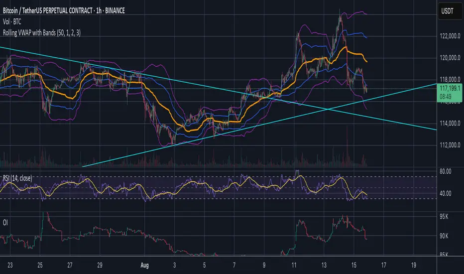
Rolling VWAP with Bands (Locked Timeframe)Rolling VWAP with Customizable Bands — Locked Timeframe
This indicator plots a rolling Volume Weighted Average Price (VWAP) over a fixed, user-selected timeframe — so it stays consistent no matter what chart timeframe you’re viewing. Unlike the standard anchored VWAP, this one works like a moving average weighted by volume, providing a smoother, more adaptive central price line that doesn’t reset each session.
It also includes up to three optional deviation bands, each with its own toggle and multiplier setting. The bands are based on standard deviation, helping you quickly identify when price is stretched above or below its mean.
Features:
Locked-timeframe VWAP — calculation stays fixed to your chosen resolution (e.g., 1H, 4H, Daily)
Adjustable lookback length for VWAP calculation
Up to 3 standard deviation bands, each with:
On/Off toggle
Independent multiplier control
Works on any chart timeframe without changing shape
Optional filled shading between bands for clarity
Uses:
Spot overbought/oversold conditions relative to VWAP
Identify dynamic support & resistance
Confirm trend strength or mean reversion setups
Keep a consistent reference line across multiple chart timeframes
Inicator open NYSEИндикатор отображает линией время открытие биржи NYSE в 9:30 по UTC-(New York).
Дополнительно он отображает в будущих днях.
----
The indicator displays a line at the opening of the NYSE at 9:30 UTC-(New York).
Additionally, it is displayed on subsequent days.
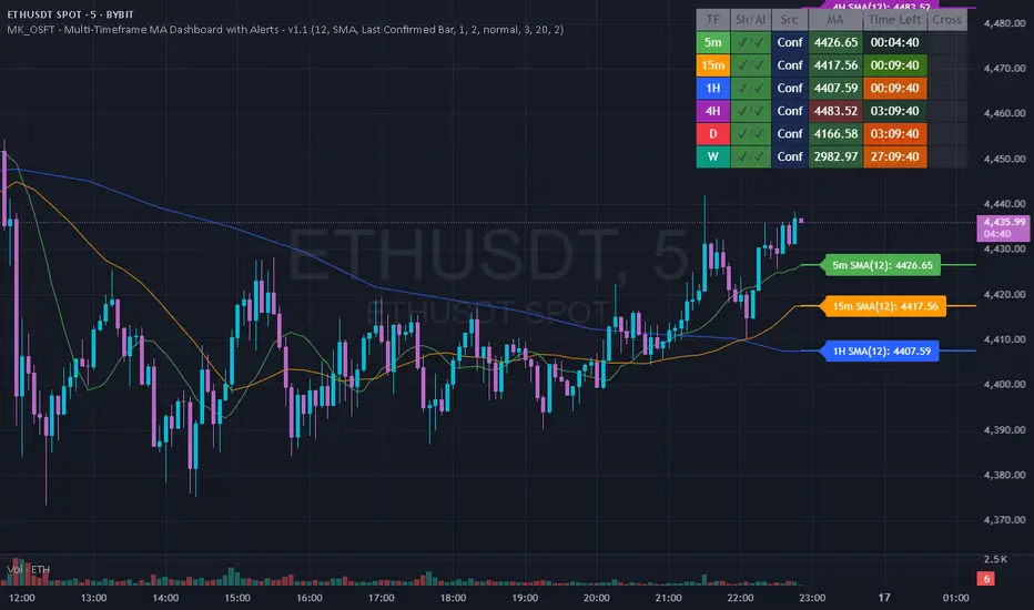
MK_OSFT - Multi-Timeframe MA Dashboard with Alerts - v1.0Multi-Timeframe Moving Average Dashboard with Advanced Alerts
A comprehensive multi-timeframe moving average indicator that displays MA levels from 6 different timeframes simultaneously on your chart, complete with intelligent labeling, customizable alerts, and performance-optimized plotting.
*** Key Features ***
Multi-Timeframe Analysis
Monitor MA levels from 6 timeframes: 5m, 15m, 1H, 4H, Daily, and Weekly
Clean visual separation with customizable colors for each timeframe
Smart label positioning prevents overlapping and ensures readability
Intelligent Alert System
Individual alert toggles for each timeframe
Cross-above and cross-below MA alerts with once-per-bar frequency
Alerts only trigger on confirmed timeframe closes (no false signals)
Works across all trading pairs on your current chart
Flexible Display Options
Toggle individual timeframe visibility
Choose between SMA and EMA calculations
Adjustable MA length (default: 12 periods)
Two source options: Current Bar or Last Confirmed Bar
Customizable line widths, label sizes, and colors
Advanced Plotting System
Optional plot lines that don't clutter your Style tab
Performance-optimized line drawing with historical data support
"Wait till close" behavior for smooth higher timeframe representation
Clean horizontal segments that update only on timeframe closes
Real-Time Information Table
Live countdown timers showing time remaining until each timeframe closes
Visual indicators for current price position relative to each MA
Cross direction indicators (↑/↓) for quick trend assessment
Show/Alert status display for easy configuration verification
*** Settings Overview ***
Moving Average Settings
MA Length: Adjustable period (default: 12)
MA Type: SMA or EMA
Source: Current bar vs Last confirmed bar
Individual Timeframe Controls
Show/Hide toggles for each timeframe
Individual alert enable/disable
Optional plot line with custom width
Color customization per timeframe
Visual Customization
Label size options (tiny, small, normal, large)
Label offset positioning
Minimum gap between labels to prevent overlap
Drawing order preference (larger timeframes first/last)
Smart Features
Automatic label collision detection and adjustment
Real-time countdown timers (only on live bars)
Debug table with comprehensive timeframe information
Built-in alert setup instructions
Perfect For
Swing traders monitoring multiple timeframe confluences
Day traders seeking higher timeframe bias confirmation
Anyone wanting clean, organized multi-timeframe MA analysis
Traders who need reliable alerts without false signals
Performance Optimized
Efficient line drawing system (no Style tab clutter)
Smart historical data handling
Minimal resource usage with intelligent update cycles
Works smoothly on all timeframes and symbols
Transform your chart into a comprehensive multi-timeframe analysis dashboard with this professional-grade moving average indicator.
Jose's Rolling VWAP with BandsRolling VWAP with Customizable Deviation Bands
This indicator plots a rolling Volume Weighted Average Price (VWAP) over a user-defined lookback period, rather than resetting each day or from a fixed anchor point. The rolling calculation makes it act more like a moving average — but weighted by volume — providing a smoother, more adaptive central price line.
It also includes up to three optional deviation bands, which can be independently toggled on/off and assigned their own multipliers. These bands are calculated using the chosen lookback’s standard deviation, giving traders a quick visual of price dispersion around VWAP.
Features:
Adjustable rolling VWAP lookback length
Up to 3 customizable standard deviation bands
Individual checkboxes for enabling/disabling each band
Independent multiplier control for each band
Works on any timeframe and symbol
Uses:
Identify overextended price moves relative to VWAP
Spot dynamic support/resistance zones
Gauge mean reversion opportunities
Confirm trend strength when price hugs or breaks away from VWAP
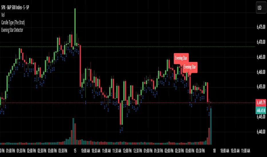
Evening Star Detector (VDS)This is a great indicator for a reversal. After the close of the previous Evening star candle, expect a position for the next fifteen minutes in the opposite direction. This is a method that was discovered by @VicDamoneSean on twitter. Created by @dani_spx7 and @yan_dondotta on twitter. This indicator has been back tested.
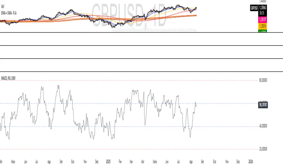
MACD, RSI, OBV - R.A TraderRudá Alves Trader - Custom Indicator
This indicator was developed for the students of Rudá Alves trader. It combines the OBV, RSI, and MACD oscillators into a single tool.
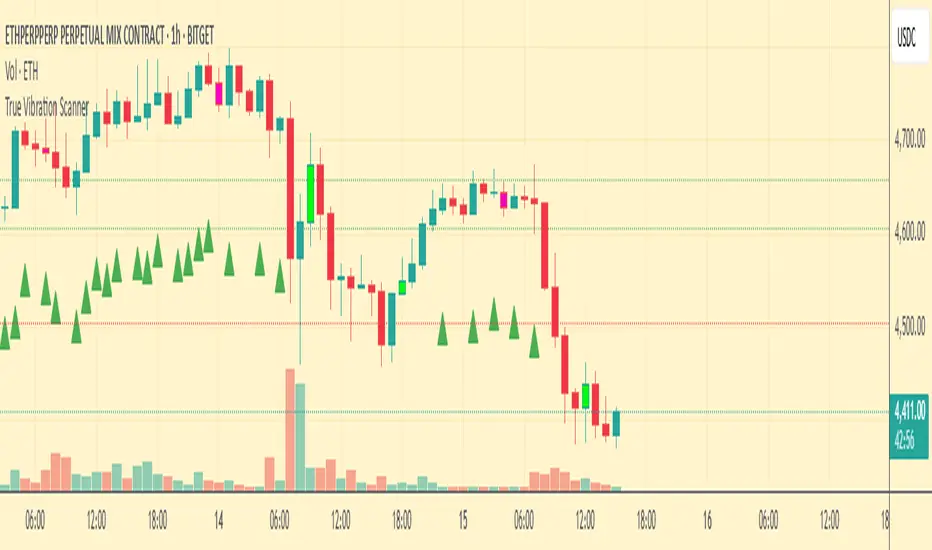
True Vibration ScannerLog signals in a spreadsheet: timestamp, symbol, timeframe, direction, entry, stop-loss, TP1, TP2, outcome.
Prioritize high-confidence setups (all rules met: pivot/yellow line, trend confluence, volume, no counter-signals).
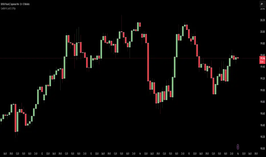
Candle H-L and C-O PipsPip Value Indicator
Displays whole-number pip distances for forex candles
What it shows:
H-L: The High-Low range in pips
C-O: The Close-Open difference in pips (direction shown via +/-)
Key features:
Auto-detects JPY pairs (uses 0.01 pip size)
All other forex pairs use 0.0001 pip size
Displays only whole numbers (no decimals)
Shows values when hovering over candles
Clean white markers above each bar
Piman2077: Previous Day Volume Profile levelsPrevious Day Volume Profile Indicator
Description:
Previous Day Volume Profile Indicator plots the previous trading session’s Volume Profile key levels directly on your chart, providing clear reference points for intraday trading. This indicator calculates the Value Area High (VAH), Value Area Low (VAL), and Point of Control (POC) from the prior session and projects them across the current trading day, helping traders identify potential support, resistance, and high-volume zones.
Features:
Calculates previous day VAH, VAL, and POC based on a user-defined session (default 09:30–16:00).
Uses Volume Profile bins for precise distribution calculation.
Fully customizable line colors for VAH, VAL, and POC.
Lines extend across the current session for easy intraday reference.
Works on any timeframe, optimized for 1-minute charts for precision.
Optional toggles to show/hide VAH, VAL, and POC individually.
Inputs:
Session Time: Define the trading session for which the volume profile is calculated.
Profile Bins: Number of price intervals used to divide the session range.
Value Area %: Percentage of volume to include in the value area (default 68%).
Show POC / VAH & VAL: Toggle visibility of each level.
Line Colors: Customize VAH, VAL, and POC colors.
Use Cases:
Identify previous session support and resistance levels for intraday trading.
Gauge areas of high liquidity and potential market reaction zones.
Combine with other indicators or price action strategies for improved entries and exits.
Recommended Timeframe:
Works on all timeframes; best used on 1-minute or 5-minute charts for precise intraday analysis.
Volume Imbalance Heatmap + Delta Cluster [@darshakssc]🔥 Volume Imbalance Heatmap + Delta Cluster
Created by: @darshakssc
This indicator is designed to visually reveal institutional pressure zones using a combination of:
🔺 Delta Cluster Detection: Highlights candles with strong body ratios and volume spikes, helping identify aggressive buying or selling activity.
🌡️ Real-Time Heatmap Overlay: Background color dynamically adjusts based on volume imbalance relative to its moving average.
🧠 Adaptive Dashboard: Displays live insights into current market imbalance and directional flow (Buy/Sell clusters).
📈 How It Works:
A candle is marked as a Buy Cluster if it closes bullish, has a strong body, and exhibits a volume spike above average.
A Sell Cluster triggers under the inverse conditions.
The heatmap shades the chart background to reflect areas of high or low imbalance using a color gradient.
⚙️ Inputs You Can Adjust:
Volume MA Length
Minimum Body Ratio
Imbalance Multiplier Sensitivity
Dashboard Location
🚫 Note: This is not a buy/sell signal tool, but a visual aid to support institutional flow tracking and confluence with your existing system.
For educational use only. Not financial advice.
BitLogic - Kalman CompositeBitLogic Kalman Composite (BL-KC)
What it is
A momentum/condition oscillator that filters price with a multi-stage Kalman and blends two normalized branches into one composite line with a compact score histogram. Built for cleaner flips and fewer whipsaws.
How it works
Kalman filter (5-stage) on your chosen price source; selectable output (Stage1/Stage5/Average).
Branch A : RSI on Kalman price → normalized to ~ .
Branch B (selectable) :
- Residual Z: z-score of the Kalman residual (observation − predicted state), squashed for
stability (distinct vs classic KSO)
- Williams %R on Kalman price (normalized).
Gain-weighted blend : the composite weights Branch B by the average Kalman gain (when the filter trusts new info more, residual matters more).
Zero-line hysteresis : small band around 0 to reduce flip noise.
Score (columns) : quadrant logic → 1, 0.5, −0.5, −1 for quick read of bias + slope.
No repainting : updates/alerts on bar close.
Inputs you’ll care about
Q/R (process/measurement noise) : responsiveness vs smoothness.
Blend : base weight + gain weighting.
Residual Z : lookback & squash scale (controls sensitivity).
Hysteresis band and optional EMA smoothing of the composite.
Reading it
Line (ci) : above 0 → bullish zone; below 0 → bearish zone.
Columns (KC_score) : show strength/weakness inside each zone (green ≥ 0, orange < 0).
Alerts : bullish/bearish flip fire on close when the composite crosses the band edges.
Tips
For faster markets: raise Q, lower smoothing, keep a small hysteresis (e.g., 0.03–0.05).
For trend following: use Stage5/Average Kalman output and a slightly wider band (0.06–0.10).
Want “classic” feel? Switch Branch B to Williams %R.
Credits
Inspired by the community idea behind the Kalman Synergy Oscillator (Kalman + RSI + %R). This is an independent, from-scratch implementation with a residual z-score branch and gain-weighted blending for distinct behavior.
Disclaimer
For educational purposes only. Not financial advice. Past performance does not guarantee future results.
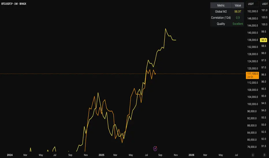
[c3s] CWS - M2 Global Liquidity Index & BTC Correlation CWS - M2 Global Liquidity Index with Offset BTC Correlation
This custom indicator visualizes and analyzes the relationship between the global M2 money supply and Bitcoin (BTC) price movements. It calculates the correlation between these two variables to provide insights into how changes in global liquidity may impact Bitcoin’s price over time.
Key Features:
Global M2 Liquidity Index Calculation:
Fetches M2 money supply data from multiple economies (China, US, EU, Japan, UK) and normalizes using currency exchange rates (e.g., CNY/USD, EUR/USD).
Combines all M2 data points and normalizes by dividing by 1 trillion (1e12) for easier visualization.
Offset for M2 Data:
The offset parameter allows users to shift the M2 data by a specified number of days, helping track the influence of past global liquidity on Bitcoin.
BTC Price Correlation:
Computes the correlation between shifted global M2 liquidity and Bitcoin (BTC) price, using a 52-day lookback period by default.
Correlation Quality Display:
Categorizes correlation quality as:
Excellent : Correlation >= 0.8
Good : Correlation >= 0.6 and < 0.8
Weak : Correlation >= 0.4 and < 0.6
Very Weak : Correlation < 0.4
Displays correlation quality as a label on the chart for easy assessment.
Visual Enhancements:
Labels : Displays dynamic labels on the chart with metrics like M2 value and correlation.
Plot Shapes : Uses shapes to indicate data availability for global M2 and correlation.
Data Table : Optionally shows a data table in the top-right corner summarizing:
Global M2 value (in trillions)
The correlation between global M2 and BTC
The correlation quality
Optional Debugging:
Debug plots help identify when data is missing for M2 or correlation, ensuring transparency and accurate functionality.
Inputs:
Offset: Shift the M2 data (in days) to see past liquidity effects on Bitcoin.
Lookback Period: Number of periods (default 52) used to calculate the correlation.
Show Labels: Toggle to show or hide labels for M2 and correlation values.
Show Table: Toggle to show or hide the data table in the top-right corner.
Usage:
Ideal for traders and analysts seeking to understand the relationship between global liquidity and Bitcoin price. The offset and lookback period can be adjusted to explore different timeframes and correlation strengths, aiding more informed trading decisions.
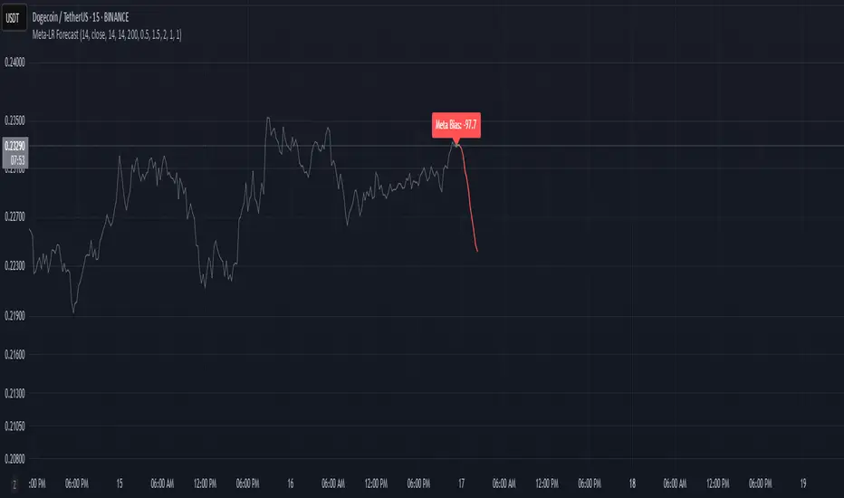
Meta-LR ForecastThis indicator builds a forward-looking projection from the current bar by combining twelve time-compressed “mini forecasts.” Each forecast is a linear-regression-based outlook whose contribution is adaptively scaled by trend strength (via ADX) and normalized to each timeframe’s own volatility (via that timeframe’s ATR). The result is a 12-segment polyline that starts at the current price and extends one bar at a time into the future (1× through 12× the chart’s timeframe). Alongside the plotted path, the script computes two summary measures:
* Per-TF Bias% — a directional efficiency × R² score for each micro-forecast, expressed as a percent.
* Meta Bias% — the same score, but applied to the final, accumulated 12-step path. It summarizes how coherent and directional the combined projection is.
This tool is an indicator, not a strategy. It does not place orders. Nothing here is trade advice; it is a visual, quantitative framework to help you assess directional bias and trend context across a ladder of timeframe multiples.
The core engine fits a simple least-squares line on a normalized price series for each small forecast horizon and extrapolates one bar forward. That “trend” forecast is paired with its mirror, an “anti-trend” forecast, constructed around the current normalized price. The model then blends between these two wings according to current trend strength as measured by ADX.
ADX is transformed into a weight (w) in using an adaptive band centered on the rolling mean (μ) with width derived from the standard deviation (σ) of ADX over a configurable lookback. When ADX is deeply below the lower band, the weight approaches -1, favoring anti-trend behavior. Inside the flat band, the weight is near zero, producing neutral behavior. Clearly above the upper band, the weight approaches +1, favoring a trend-following stance. The transitions between these regions are linear so the regime shift is smooth rather than abrupt.
You can shape how quickly the model commits to either wing using two exponents. One exponent controls how aggressively positive weights lean into the trend forecast; the other controls how aggressively negative weights lean into the anti-trend forecast. Raising these exponents makes the response more gradual; lowering them makes the shift more decisive. An optional switch can force full anti-trend behavior when ADX registers a deep-low condition far below the lower tail, if you prefer a categorical stance in very flat markets.
A key design choice is volatility normalization. Every micro-forecast is computed in ATR units of its own timeframe. The script fetches that timeframe’s ATR inside each security call and converts normalized outputs back to price with that exact ATR. This avoids scaling higher-timeframe effects by the chart ATR or by square-root time approximations. Using “ATR-true” for each timeframe keeps the cross-timeframe accumulation consistent and dimensionally correct.
Bias% is defined as directional efficiency multiplied by R², expressed as a percent. Directional efficiency captures how much net progress occurred relative to the total path length; R² captures how well the path aligns with a straight line. If price meanders without net progress, efficiency drops; if the variation is well-explained by a line, R² rises. Multiplying the two penalizes choppy, low-signal paths and rewards sustained, coherent motion.
The forward path is built by converting each per-timeframe Bias% into a small ATR-sized delta, then cumulatively adding those deltas to form a 12-step projection. This produces a polyline anchored at the current close and stepping forward one bar per timeframe multiple. Segment color flips by slope, allowing a quick read of the path’s direction and inflection.
Inputs you can tune include:
* Max Regression Length. Upper bound for each micro-forecast’s regression window. Larger values smooth the trend estimate at the cost of responsiveness; smaller values react faster but can add noise.
* Price Source. The price series analyzed (for example, close or typical price).
* ADX Length. Period used for the DMI/ADX calculation.
* ATR Length (normalization). Window used for ATR; this is applied per timeframe inside each security call.
* Band Lookback (for μ, σ). Lookback used to compute the adaptive ADX band statistics. Larger values stabilize the band; smaller values react more quickly.
* Flat half-width (σ). Width of the neutral band on both sides of μ. Wider flats spend more time neutral; narrower flats switch regimes more readily.
* Tail width beyond flat (σ). Distance from the flat band edge to the extreme trend/anti-trend zone. Larger tails create a longer ramp; smaller tails reach extremes sooner.
* Polyline Width. Visual thickness of the plotted segments.
* Negative Wing Aggression (anti-trend). Exponent shaping for negative weights; higher values soften the tilt into mean reversion.
* Positive Wing Aggression (trend). Exponent shaping for positive weights; lower values make trend commitment stronger and sooner.
* Force FULL Anti-Trend at Deep-Low ADX. Optional hard switch for extremely low ADX conditions.
On the chart you will see:
* A 12-segment forward polyline starting from the current close to bar\_index + 1 … +12, with green segments for up-steps and red for down-steps.
* A small label at the latest bar showing Meta Bias% when available, or “n/a” when insufficient data exists.
Interpreting the readouts:
* Trend-following contexts are characterized by ADX above the adaptive upper band, pushing w toward +1. The blended forecast leans toward the regression extrapolation. A strongly positive Meta Bias% in this environment suggests directional alignment across the ladder of timeframes.
* Mean-reversion contexts occur when ADX is well below the lower tail, pushing w toward -1 (or forcing anti-trend if enabled). After a sharp advance, a negative Meta Bias% may indicate the model projects pullback tendencies.
* Neutral contexts occur when ADX sits inside the flat band; w is near zero, the blended forecast remains close to current price, and Meta Bias% tends to hover near zero.
These are analytical cues, not rules. Always corroborate with your broader process, including market structure, time-of-day behavior, liquidity conditions, and risk limits.
Practical usage patterns include:
* Momentum confirmation. Combine a rising Meta Bias% with higher-timeframe structure (such as higher highs and higher lows) to validate continuation setups. Treat the 12th step’s distance as a coarse sense of potential room rather than as a target.
* Fade filtering. If you prefer fading extremes, require ADX to be near or below the lower ramp before acting on counter-moves, and avoid fades when ADX is decisively above the upper band.
* Position planning. Because per-step deltas are ATR-scaled, the path’s vertical extent can be mentally mapped to typical noise for the instrument, informing stop distance choices. The script itself does not compute orders or size.
* Multi-timeframe alignment. Each step corresponds to a clean multiple of your chart timeframe, so the polyline visualizes how successively larger windows bias price, all referenced to the current bar.
House-rules and repainting disclosures:
* Indicator, not strategy. The script does not execute, manage, or suggest orders. It displays computed paths and bias scores for analysis only.
* No performance claims. Past behavior of any measure, including Meta Bias%, does not guarantee future results. There are no assurances of profitability.
* Higher-timeframe updates. Values obtained via security for higher-timeframe series can update intrabar until the higher-timeframe bar closes. The forward path and Meta Bias% may change during formation of a higher-timeframe candle. If you need confirmed higher-timeframe inputs, consider reading the prior higher-timeframe value or acting only after the higher-timeframe close.
* Data sufficiency. The model requires enough history to compute ATR, ADX statistics, and regression windows. On very young charts or illiquid symbols, parts of the readout can be unavailable until sufficient data accumulates.
* Volatility regimes. ATR normalization helps compare across timeframes, but unusual volatility regimes can make the path look deceptively flat or exaggerated. Judge the vertical scale relative to your instrument’s typical ATR.
Tuning tips:
* Stability versus responsiveness. Increase Max Regression Length to steady the micro-forecasts but accept slower response. If you lower it, consider slightly increasing Band Lookback so regime boundaries are not too jumpy.
* Regime bands. Widen the flat half-width to spend more time neutral, which can reduce over-trading tendencies in chop. Shrink the tail width if you want the model to commit to extremes sooner, at the cost of more false swings.
* Wing shaping. If anti-trend behavior feels too abrupt at low ADX, raise the negative wing exponent. If you want trend bias to kick in more decisively at high ADX, lower the positive wing exponent. Small changes have large effects.
* Forced anti-trend. Enable the deep-low option only if you explicitly want a categorical “markets are flat, fade moves” policy. Many users prefer leaving it off to keep regime decisions continuous.
Troubleshooting:
* Nothing plots or the label shows “n/a.” Ensure the chart has enough history for the ADX band statistics, ATR, and the regression windows. Exotic or illiquid symbols with missing data may starve the higher-timeframe computations. Try a more liquid market or a higher timeframe.
* Path flickers or shifts during the bar. This is expected when any higher-timeframe input is still forming. Wait for the higher-timeframe close for fully confirmed behavior, or modify the code to read prior values from the higher timeframe.
* Polyline looks too flat or too steep. Check the chart’s vertical scale and recent ATR regime. Adjust Max Regression Length, the wing exponents, or the band widths to suit the instrument.
Integration ideas for manual workflows:
* Confluence checklist. Use Meta Bias% as one of several independent checks, alongside structure, session context, and event risk. Act only when multiple cues align.
* Stop and target thinking. Because deltas are ATR-scaled at each timeframe, benchmark your proposed stops and targets against the forward steps’ magnitude. Stops that are much tighter than the prevailing ATR often sit inside normal noise.
* Session context. Consider session hours and microstructure. The same ADX value can imply different tradeability in different sessions, particularly in index futures and FX.
This indicator deliberately avoids:
* Fixed thresholds for buy or sell decisions. Markets vary and fixed numbers invite overfitting. Decide what constitutes “high enough” Meta Bias% for your market and timeframe.
* Automatic risk sizing. Proper sizing depends on account parameters, instrument specifications, and personal risk tolerance. Keep that decision in your risk plan, not in a visual bias tool.
* Claims of edge. These measures summarize path geometry and trend context; they do not ensure a tradable edge on their own.
Summary of how to think about the output:
* The script builds a 12-step forward path by stacking linear-regression micro-forecasts across increasing multiples of the chart timeframe.
* Each micro-forecast is blended between trend and anti-trend using an adaptive ADX band with separate aggression controls for positive and negative regimes.
* All computations are done in ATR-true units for each timeframe before reconversion to price, ensuring dimensional consistency when accumulating steps.
* Bias% (per-timeframe and Meta) condenses directional efficiency and trend fidelity into a compact score.
* The output is designed to serve as an analytical overlay that helps assess whether conditions look trend-friendly, fade-friendly, or neutral, while acknowledging higher-timeframe update behavior and avoiding prescriptive trade rules.
Use this tool as one component within a disciplined process that includes independent confirmation, event awareness, and robust risk management.