Pine Screener - Powerful tool for building programmable screenerHello Everyone,
In this video, we have discussed on how to use pine screener utility of tradingview. We are making use of the indicator Divergence Screener for this demonstration and screen stocks undergoing bullish divergence.
In a nutshell, here are the steps:
🎯 Use Stock Screener to build watchlist of less than 1000 symbols
🎯 Add the indicator you want to use in the pine screener to your favorites.
🎯 Pine screener can be accessed from the tradingview screener menu or you can simply click on the link tradingview.sweetlogin.com
🎯 Add the watchlist and indicator to the pine screener and adjust the timeframe and indicator settings
🎯 Select the criteria to be scanned and press scan
Community ideas

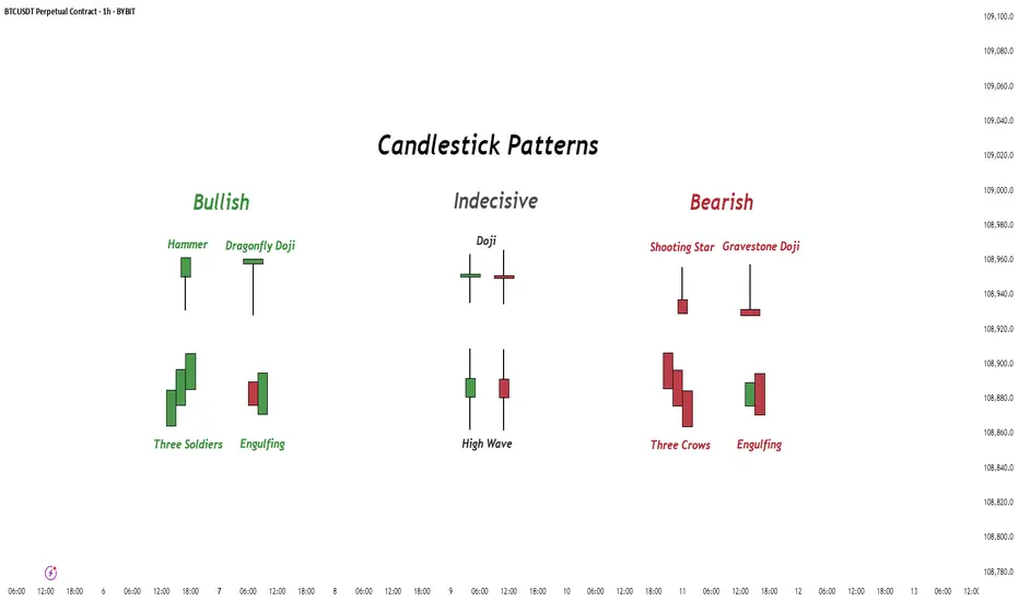
Candlestick Patterns - How to read them like a ProOverview
Candlestick charts serve as a cornerstone in technical analysis, presenting price activity in a visually digestible format. By examining how prices move over a given timeframe, traders gain key insights into potential market direction, sentiment shifts, and trend strength.
Mastering candlestick interpretation is essential for identifying bullish or bearish sentiment, as well as for spotting possible trend reversals or continuations. Still, candlesticks alone don’t paint the full picture—using them without broader context increases the risk of false signals.
---
What You'll Learn
What are candlestick charts?
Common bearish candlestick patterns
Common bullish candlestick patterns
How to apply candlestick analysis in trading
---
What is a Candlestick Chart?
A candlestick provides a snapshot of an asset’s price behavior during a specific time interval, whether it's one minute, one hour, or one day. This format allows traders to quickly assess how the price has moved within that period.
Each candle reveals four price points:
* Open – the price at the beginning of the interval
* Close – the price at the end of the interval
* High – the highest price reached
* Low – the lowest price during that time
Anatomy of a Candlestick:
* Body: The thick section between the open and close. A green (or white) body means the close was higher than the open (bullish), while red (or black) means the opposite (bearish).
* Wicks (or Shadows): Thin lines extending from the body to indicate the high and low.
* Upper wick: Marks the highest traded price
* Lower wick: Marks the lowest traded price
---
Bearish Candlestick Patterns
Understanding bearish candlestick patterns helps traders identify moments when buying momentum might be running out—setting the stage for a potential downward shift.
Evening Star
A three-candle formation that signals a shift from buying pressure to selling dominance. It starts with a strong bullish candle, followed by a small-bodied candle of indecision, and concludes with a large bearish candle that cuts deep into the first. This pattern often appears at the end of an uptrend.
Bearish Engulfing
This setup includes a small bullish candle followed by a large bearish candle that completely swallows the previous one. It indicates that sellers have seized control, potentially marking the beginning of a downward trend.
Shooting Star
With a small real body near the low and a long upper wick, this pattern reflects strong early buying that is ultimately rejected by the close—suggesting fading bullish momentum.
Gravestone Doji
This candle opens, closes, and hits its low all around the same price, leaving a long upper wick. It suggests that bulls pushed higher during the session but were overpowered by bears by the close.
Three Crows
Three consecutive bearish candles, all approximately the same size. These indicate that a sell off is coming soon.
---
Bullish Candlestick Patterns
Bullish patterns can alert traders to possible reversals after a downtrend or strengthen conviction during an uptrend.
Morning Star
This three-candle formation marks a potential turning point from bearish to bullish. It begins with a strong bearish candle, followed by a smaller candle showing indecision, and ends with a large bullish candle breaking upward—signaling buying strength is returning.
Bullish Engulfing
This two-candle pattern begins with a bearish candle, then a larger bullish candle that completely envelops the previous body. It reflects a sharp transition in sentiment, suggesting renewed buying pressure.
Dragonfly Doji
A single candle where the open, close, and high are all very close, with a long lower wick. It shows sellers pushed prices lower but buyers stepped in and brought them back up—an early sign of possible reversal.
Hammer
A classic bullish reversal signal that features a small real body near the top and a long lower shadow. It indicates a battle where sellers initially dominated, but buyers managed to close near the open price.
Three soldiers
Three consecutive bullish candles, all approximately the same size. These indicate that a big buy is coming soon.
---
Trading with Candlestick Patterns
Candlestick patterns become more meaningful when they align with major chart areas—such as previous support or resistance, trendlines, or retracement zones. A bullish signal at a support level can hint that the downward pressure is fading, while a bearish pattern at resistance may warn of an upcoming decline.
To increase the reliability of your trades, combine candlestick patterns with other forms of technical analysis:
* Support & Resistance Zones: These are price levels where the market has historically reacted. Candlestick patterns forming near these zones have stronger potential implications.
* Fibonacci Levels : These help identify likely retracement areas. When a candlestick pattern forms near a key Fibonacci level like 61.8%, it adds strength to a potential reversal setup.
* Liquidity Areas: Clusters of orders (buy or sell) tend to create strong reactions. When patterns appear in these zones, they often precede more decisive moves.
* Technical Indicators : RSI, MACD, Moving Averages, and Stochastic RSI can provide confirmation. For instance, a bullish reversal pattern that appears when RSI is oversold strengthens the signal.
💡 Tip: Don’t rush into trades based on one candlestick alone. Always wait for the next candle or price confirmation (e.g., a break of a previous high/low) to validate your signal.
---
Thanks for Reading!
✨ If you found this helpful, show some love by liking or commenting!
🔔 Don’t forget to follow for more technical breakdowns and trading insights coming soon!
Why You Still Lose Money Even With Perfect AnalysisYour setup was on point, your entry was clean, your stop-loss was tight.
Everything looked perfect.
And yet, you still lost.
Maybe the real issue isn’t in your chart, maybe it’s in your head.
Hello✌
Spend 3 minutes ⏰ reading this educational material.
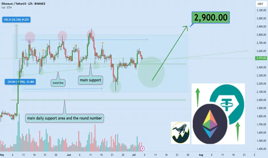
🎯 Analytical Insight on Ethereum:
BINANCE:ETHUSDT is currently trading inside a well-defined parallel channel 📈. It is approaching a key daily support level that coincides with an important ascending trendline. A breakout above this channel could lead to a bullish move, targeting at least a 16% gain with a primary resistance zone near $2900 🚀. Monitoring how price reacts around this area will be critical for confirming the next leg up.
Now , let's dive into the educational section,
🧠 Analysis Is Half the Game
Having a clean technical analysis doesn’t guarantee anything if your behavior ruins it.
Most traders change their minds mid-trade because of fear, hope, or noise from other sources.
Market psychology doesn’t always respect your Fibonacci retracement. You might be right and still lose because you couldn’t hold on to the plan.
🕒 Don’t Enter Before the Market Does
Timing is underrated. Many traders get in too early. Your analysis may predict a breakout, but price isn’t ready yet.
Zoom out. A solid setup on the 1-hour chart might need confirmation from the 4-hour or daily.
A great trade is not just where you enter, but when.
😤 It’s Not the Chart — It’s Your Mind
Many times, the chart setup is perfect. But when price wobbles a bit, you lose confidence.
Imagine this: a clean uptrend, higher highs forming, but a small retracement hits and you close the trade. Why? Fear. Not logic.
You lost not because of analysis, but because you couldn’t handle being right under pressure.
📊 TradingView Tools: More Than Just Indicators
If all you're using in TradingView are the typical RSI or MACD indicators, you're barely scratching the surface.
Tools like Bar Replay can simulate real-time reactions to past price action, not just for backtesting, but for testing your discipline under real psychological pressure.
Try this: pick a point where you lost money despite solid analysis. Use Bar Replay and “re-live” the chart without knowing what happens next. Was your entry early? Did you panic exit? Or did your stop-loss placement ignore structure zones?
Also, use the Long/Short Position Tool to visually plan your risk/reward, and adjust your bias if the chart structure doesn’t validate it.
For those wanting a deeper layer, add Volume Profile Fixed Range to identify value zones, where whales are active, and overlay it with your own trade setup.
TradingView isn’t just a charting platform. It’s a behavioral mirror. You don’t just look at the chart, it shows how you act when money’s on the line.
🎯 Your Stop-Loss is for the Chart, Not Your Emotions
If your stop-loss is placed based on what feels safe rather than key market structure, you’re not trading the chart. You’re managing anxiety.
Let structure dictate where your risk lies, not your nerves.
😬 Not Executing = Not Trading
If you don’t follow through with your own trade plan, your analysis is meaningless.
Did you cut early just because a big red candle scared you? Or because someone tweeted a bearish take?
That’s not discipline, that’s reactive trading. It has nothing to do with your original logic.
📉 Losses Are Part of Trading… But Not These Ones
There’s a difference between calculated losses and emotional mistakes.
The first is expected, even professional. The second will drain your account and confidence.
Take losses when the plan fails, not when your emotions freak out.
🔍 Reverse-Engineer Your Entry Logic
Next time you trade, take a screenshot and write down your full reasoning.
Why this entry? What did you see? How will you exit?
Later, go back and compare it to what actually happened.
This habit alone can fix more issues than a dozen trading books.
💡 Perfect Analysis ≠ Profitable Trading
Analysis opens the door, but execution and consistency keep you in the room.
Most traders think the problem is their indicator, but it’s usually the part of themselves that doesn’t listen to the indicator at the critical moment.
🧠 The Power of “Logged Experience”
The real difference between amateurs and veterans isn’t screen time. It’s tracked behavior.
Use TradingView’s built-in Note feature, place icons or comments on every trade setup, and keep a record of your actual thought process.
That feedback loop is gold. It builds self-awareness, the rarest edge in trading.
📺 Make It Visual to Make It Stick
Don't rely solely on indicators.
Use Chart Pattern Drawing Tools, head and shoulders, flags, triangles, and reinforce visual memory.
Also, by managing Visibility Settings, you can keep your charts clean while viewing different structures across timeframes.
The result? You start to see the story behind price, not just numbers.
🔚 Final Thought
If you're still losing money with accurate analysis, maybe it’s time to analyze your reactions instead.
TradingView gives you the tools, but the real upgrade is learning to trust your system under stress.
✨ Need a little love!
We put so much love and time into bringing you useful content & your support truly keeps us going. don’t be shy—drop a comment below. We’d love to hear from you! 💛
Big thanks , Mad Whale 🐋
📜Please remember to do your own research before making any investment decisions. Also, don’t forget to check the disclaimer at the bottom of each post for more details.
9 Essential TIPS For Newbie Traders (Learn from my Mistakes!)
In the today's article, I will reveal trading secrets I wish I knew when I started trading.
1️⃣ Forget about becoming a pro quickly
Most of the traders believe, that you can learn how to trade easily and that it takes a very short period of time in order to master a profitable trading strategy.
The truth is, however, that trading is a long journey.
I spent more than 3 years, trying different strategies and looking for a profitable technique to trade. Once I found that, it took more than a year to polish a trading strategy and to learn how to apply that properly.
Be prepared to spend YEARS before you find a way to trade profitably.
2️⃣ Focus on One Strategy
While you are learning how to trade you will try different techniques, tools and strategies. And the thing is that newbies are trying multiple things simultaneously. The more strategies you try at once, the more setups you have on your chart. The more setups you have on your chart, the more complex and difficult is your trading.
Remember that in this game, your attention is the key.
You should meticulously study each and every trading setup.
For that reason, I highly recommend you to focus on one strategy, one approach, one technique. Test it, try it and look for a new one only when you realize that it doesn't work.
Here is the example how the same price chart can provide absolutely different trading opportunities depending on a trading strategy.
Price action pattern trader would recognize a lot of a patterns, while indicator based trader could spot absolutely different bullish and bearish signals.
Now, try to imagine how hard it would be to follow both strategies simultaneously.
3️⃣ Start with small capital that you can afford to lose
You will lose your first trading deposit and, probably, the second one and potentially the third one as well.
Losses are the only way to learn real trading. While you are on a demo account, you feel like a king, but once you start risking your savings, the perspective completely changes .
For that reason, make sure that you trade with an account that you can afford to lose. The fact of blowing such an account should be unpleasant, but that should not affect your daily life.
4️⃣ Use stop loss
I am doing trading coaching for more than 4 years.
What pisses me off is that the main reason of the substantial losses of my mentees is the absence of stop loss. Why can it be if naturally everyone: from your broker to Instagram trading gurus repeat that day after day.
Set stop loss, know in advance how much you risk per trade, and know the exact level on a price chart where you become wrong.
Imagine what could be your loss, if you shorted USDJPY and hold the trade while the market kept going against you.
5️⃣ Forget about getting rich quick
That is the iconic fallacy. I believe that around 90% of people who come in this game want to get rich quick , want easy money.
And no surprise, when I share a trading setup in my free telegram channel, and it loses I receive dozens of messages that I am a scammer.
People truly believe that professional trading implies 100% win rate and quick and easy money.
The truth is, traders, that trading is a very tough game. And with a good trading strategy, you have just a little statistical edge that will give you the profits that would slightly overcome your losses.
6️⃣ Train your eyes
Professional trading implies pattern recognition: it can be some technical indicators pattern, the price action or candlestick formation, etc.
Your main goal as a trader is to learn to identify these patterns.
Pattern recognition is a hard skill to acquire.
You should spend dozens of hours in front of the screen in order to train your eyes to identify certain patterns.
Here is how many patterns you would spot on GBPUSD chart, paying close attention.
7️⃣ Track and analyze your trades
Study all the trades that you take, especially the losing ones.
Look for mistakes, look for the reasons why a certain setup played out and why a certain one didn't. Journal your trades and make notes.
8️⃣ Don't use technical indicators
Newbies believe that technical indicators should do the work for them.
They are constantly looking for one or a bunch that will accurately show where the market will go.
However, I always say to my mentees that technical indicators make the chart messy and distract.
If you just started trading, focus on a naked chart, learn to analyze the market trend, key levels, classic price action patterns.
Learn to make accurate predictions relying on a price chart alone.
Only then add some technical indicators on your chart.
They won't do the work for you, but will help you to slightly increase the accuracy of a certain setup.
Above is the classic chart of a newbie trader.
A lot of indicators and a complete mess
The same chart would look much better without technical indicators.
9️⃣ Find a Mentor
There are hundreds of trading mentors on Instagram, YouTube, TradingView. Find the one with a trading style that you like.
Follow him, learn from his trading experience, listen to his trading recommendations.
11 years ago I found a guy on YouTube, his name was Jason.
I really liked his free teachings, and they were meaningful to me.
I decided to purchase his premium coaching program.
It was 200$ monthly - a huge amount of money for me at that time.
However, with his knowledge I saved a lot, I learned a lot of profitable techniques and tricks that helped me to become a professional forex trader.
Of course, this list could be much bigger.
The more I think about different subjects in trading, the more important tips come to my mind. However, I believe that the tips above are essential and I truly wish I knew all that before I started.
I hope that info will help you in your trading journey!
Good luck to you.
❤️Please, support my work with like, thank you!❤️
I am part of Trade Nation's Influencer program and receive a monthly fee for using their TradingView charts in my analysis.
All Binance Coins Watchlist 2025 JULY If you want to create a full list of all coins from the exchange you use, you can:
1. Go to Screeners
2. Set these filters:
a. Exchange (eg. Binance)
b. Quote currency - USDT
c. Symbol type - Perpetual
3. Keep Scrolling till the end of the list so that all coins are populated. There should be about 400+ coins.
4. Select one of the coins, then click Ctrl A to select all.
5. Right click > Add to an existing Watchlist or Create a new watchlist.
Here's my list i created on 4th July 2025. You can import it if you want.
tradingview.sweetlogin.com
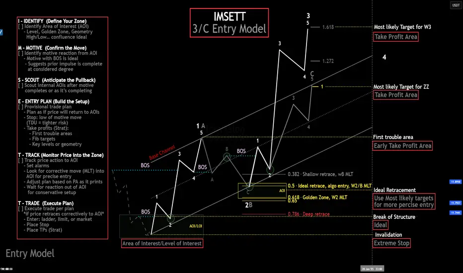
My Ideal Elliott Wave Entry ModelThe IMSETT 3/C Entry Model.
Every trader wants to catch the big moves the ones that pay quickly and decisively. In Elliott Wave, those moves often come during Wave 3. It's the strongest part of the trend, and when you're positioned early, the risk-to-reward is unmatched.
But not every opportunity hands you a clean Wave 3 on a silver platter. Sometimes you’re looking at a Wave C instead. That’s where the 3/C Entry Model comes in. It’s designed to get you aligned with high-conviction moves—whether the market is in a trend or a zig zag.
Here’s the edge: both Wave 3 and Wave C often start the same way—a strong, motive push off an AOI (area of interest), followed by a retracement. That shared structure gives us an anchor. Whether we’re labeling it a 3 or a C doesn’t change the fact that the initial impulse gives us clarity, direction, and a place to manage risk.
That’s what the IMSETT Model is built around:
Identify
Motive
Scout
Entry Plan
Track
Trade
Each step is focused, actionable, and repeatable. You're not trying to outguess the market—you’re reacting to structure, preparing for common behavior, and executing with intent.
I do have a video with a walk through.
This just the way I look for clarity in setups. As with everything in trading, nothing will work every time so do your own research this is not financial advice.
Cheers!
Trade Safe, Trade Clarity.
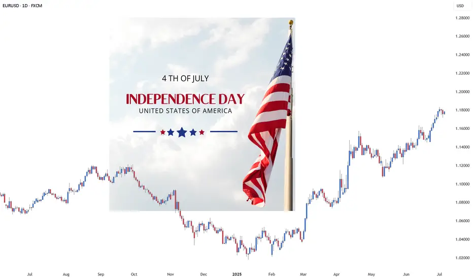
How to Trade the Forex Market on Memorial & Independence days?Trading the foreign exchange (Forex) market on major U.S. holidays like Memorial Day (May 29th) and Independence Day (July 4th) presents a unique set of challenges and requires a strategic shift from typical trading days. While the global Forex market remains technically open 24/5, the closure of U.S. banks and financial institutions leads to significantly reduced liquidity and trading volume, altering the market landscape.
Here’s a comprehensive guide on how to approach Forex trading on these holidays:
Understanding the Market Conditions: The "Quiet" Danger
The primary characteristic of Forex trading on U.S. holidays is a sharp drop in liquidity, especially in currency pairs involving the U.S. dollar (USD). With American traders and institutions away from their desks, the volume of transactions plummets. This "quiet" market environment can be deceptive and carries specific risks:
Wider Spreads: With fewer market participants, the difference between the bid and ask prices for currency pairs tends to increase. This makes it more expensive to enter and exit trades, eating into potential profits.
Increased Volatility and Spikes: Don't mistake low volume for a flat market. With a thin order book, even moderately sized orders can cause sharp, sudden price movements or "spikes." These moves can be unpredictable and may not follow typical technical patterns.
Price Gaps and Slippage: The reduced liquidity can lead to price gaps, where the market jumps from one price to another without trading at the levels in between. This increases the risk of slippage, where your order is executed at a less favorable price than intended.
Ineffectiveness of Some Strategies: Strategies that rely on high volume and momentum, such as breakout trading, are more likely to fail. A perceived breakout may lack the follow-through to become a sustained trend.
Strategic Approaches for Trading on Memorial Day and July 4th
Given the unique market conditions, traders should adopt a cautious and well-considered approach. Here are several strategies to consider:
1. The Prudent Approach: Step Aside
For many traders, particularly novices, the most sensible strategy is to avoid trading altogether on these holidays. The increased risks and unpredictable market behavior can easily lead to unnecessary losses. Consider these days as an opportunity to study the markets, refine your overall trading plan, or simply take a break.
2. Trade with Reduced Size and Realistic Expectations
If you do choose to trade, it is crucial to adjust your risk management:
Lower Your Position Sizes: This is the most critical adjustment. Trading with smaller lots will mitigate the potential impact of sudden price spikes and wider spreads.
Adjust Profit Targets and Stop-Losses: Be realistic about potential gains. The market may not have the momentum for large moves. Consider setting smaller profit targets. At the same time, be mindful that tighter stop-losses can be easily triggered by short-term volatility.
3. Focus on Non-USD Currency Pairs
Since the holidays are U.S.-based, currency pairs that do not involve the U.S. dollar may be less affected, although a general decrease in global liquidity is still expected. Cross-currency pairs such as EUR/JPY, GBP/JPY, or AUD/NZD might exhibit more "normal" behavior than majors like EUR/USD or USD/JPY. However, remain vigilant for lower-than-usual volume across the board.
4. Employ Range-Bound Strategies
In low-liquidity environments, currencies often trade within a defined range. Strategies that capitalize on this behavior can be more effective than trend-following approaches. Look for well-established support and resistance levels and consider trading the bounces off these levels.
5. Be Wary of News from Other Regions
While the U.S. market is quiet, significant economic data or geopolitical news from other regions (Europe, Asia) can still impact the market. With low liquidity, the reaction to such news can be exaggerated. Stay informed about the global economic calendar.
A Day-by-Day Look
Memorial Day (Last Monday of May): This is a major U.S. holiday, and its impact will be felt throughout the 24-hour trading period. Expect very thin liquidity during the Asian and European sessions, which will worsen significantly during what would typically be the busy New York session.
Independence Day (July 4th): The impact of July 4th can sometimes extend beyond the day itself. Often, the trading day before (July 3rd) will also see reduced volume as traders close positions ahead of the holiday. On July 4th, expect market conditions similar to Memorial Day, with a significant drop in activity and the associated risks.
In conclusion, while the allure of a 24-hour market is a key feature of Forex, wisdom lies in recognizing when not to trade with your usual strategy and size. Approaching U.S. holidays like Memorial Day and Independence Day with caution, a revised strategy, and a keen awareness of the risks is paramount for preserving your trading capital. For most, these are days best spent on the sidelines.
Navid Jafarian
War news are actually good news for Crypto & GoldI Love Global Peace and hope all Wars end soon.
Here are my thoughts about Crypto when war Starts between two countries or more.
i think After wars so many reasons will help Crypto to see gain specially for Bitcoin which is the King of this market.
Some of the major Reasons in my view are:
A. Countries currency or Markets start to fall :
Usually with starting of war, we have two countries that are involved and due to negative effects of war on different Economic parameters cause weaker country or both currencies lose the power of Their currencies and it start To dump.
weak countries Bank can get hacked or worst scenario a countries currency can get 0 by the time.
most of the times Their stock markets also Face with huge losses.
B. People start to Buy more Gold or Bitcoin and ...
with things mentioned above and other reasons their People start to Buy more Crypto usually and Metals like Gold.
C. People start to migrate to other countries with their Crypto Wallets Only
Some start to leave their countries and Sell their Cars homes and ... and turn them to BTC or... and transfer their money and life to a peaceful country.
D. Spies and bribery gets more in those countries which all is done with Crypto usually
Corruption & Spy jobs and ... increases in those countries usually and the money on this Fields usually transfer Via Crypto or Gold and Silver which is harder to track.
And with these reasons which mentioned Above usually in the past all the Attention comes to Metal like Gold and the Value of it increase in Wars, but now Days Bitcoin(&Crypto Tokens) also gets more value and attention in war in my personal View and See gain in price too.
DISCLAIMER: ((trade based on your own decision))
<<press like👍 if you enjoy💚
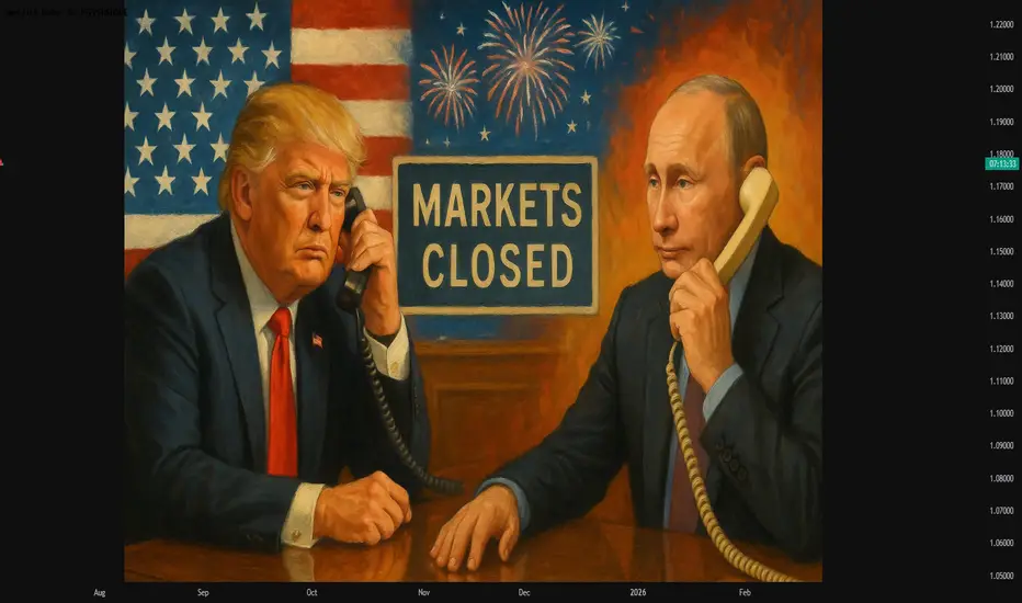
#AN015: TRUMP-PUTIN Phone Call and July 4th, Markets Closed
In an unexpected phone call on the sidelines of the American Independence Day, Vladimir Putin and Donald Trump – in the midst of the campaign for his potential re-election – had a confidential conversation that quickly captured the attention of global markets, even on a day when Wall Street was closed.
Hello, I am Trader Andrea Russo and today I want to talk to you about the latest news of these hours. I would like to thank in advance our Official Broker Partner PEPPERSTONE for the support in creating this article.
📉 Wall Street closed, but Forex is always open
While the US stock markets remain closed for the July 4th holiday, the currency market – by its nature decentralized and global – never stops completely. And it is precisely in these moments of low liquidity that geopolitical moves can have an amplified impact.
☎️ What did Putin and Trump say to each other?
Official sources speak of a “cordial discussion” on global security issues, Ukraine, and the future of US-Russia energy relations. However, according to leaks from Moscow, Putin has expressed openness to a new energy negotiation in the event of Trump’s return to the White House.
Translated into Forex language? This could mean:
Lower geopolitical risk on USD in the long term (Trump is seen as more in favor of dialogue with Moscow)
Pressure on Euro if negotiations with Russia are diverted to a Washington-Moscow axis
Temporary strength of RUB in case of glimmers of easing of energy sanctions
📊 Impact on key currency crosses
Comparing the post-news movements on some crosses:
USD/RUB: flat for now, but ready to jump over the weekend if confirmations arrive
EUR/USD: latent weakness, also due to the decline in ISM and the resilience of European inflation
USD/JPY: stable, but with pro-dollar sentiment in the background (Trump is perceived as economically dovish)
⏱️ What to expect in the next 24 hours?
With liquidity recovering already since tonight (Tokyo), markets could start to price in the geopolitical narrative of Trump's return. This scenario favors:
USD slightly stronger in the short term
Watch out for false breakouts on low volatility (typical of July 4th)
Trending Tokens Are Traps they Destroy your Portfolios🚨 Why Everyone Falls for Trending Projects That End in Disaster
Have you ever bought a token just because everyone was talking about it?
And the moment you jumped in, it started crashing?
This isn’t a rare story; it’s a repeating trap. But why does our brain love buying at the worst possible moment?
Hello✌
Spend 3 minutes ⏰ reading this educational material.
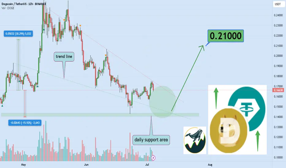
🎯 Analytical Insight on Dogecoin:
BINANCE:DOGEUSDT is currently forming a tight price structure, resembling a compressed spring just below a key daily resistance and trendline. A clean breakout above this area, supported by volume, could trigger a strong bullish continuation, with a projected upside of approximately 30 percent toward the 0.21 level. Traders should monitor this setup closely for confirmation before entering any positions. 📈🐶
Now , let's dive into the educational section,
💸 Trend Equals Triggering Your Greed
Trending coins don’t just pump prices; they pump emotions. One word: FOMO. Fear of missing out makes us ditch logic, ignore risk, and buy because it feels like everyone else is making money. That’s when the trap is set.
🧠 The Market Forgets, But You Shouldn’t
The crypto space is littered with the graves of hyped-up tokens. The cycle is always the same: quick pump, viral noise, massive retail entry, then a violent crash. The names may change, but the pattern doesn’t.
📊 Practical TradingView Tools to Spot Sketchy Trends
Before you click that “Buy” button just because something is trending, take a breath and open your charting tools. Here's a shortlist of powerful features you can use on TradingView that’ll help you filter out dangerous pump tokens:
Volume Profile: Shows where real smart money sits. If most volume spikes near the top, chances are whales are exiting.
RSI (14) : If RSI is above 70 and climbing with no pullback, odds are you're catching it too late.
Anchored VWAP: Anchor it at the start of the trend and see how far price has stretched from rational levels.
Stochastic RSI: Sharp crosses in overbought zones equal major risk signals.
Make it a habit to cross-check multiple timeframes with these tools. Blindly following trends without analysis? That’s how portfolios get burned.
🧪 Pre-Entry Checklist That Could Save You
If something feels “too hot to miss,” ask yourself:
Is the chart readable, or just a straight line up?
Are there healthy pullbacks or just blind momentum?
Is volume spiking only at the top?
Does the project show signs of organic market interest?
Do your TradingView tools confirm a smart entry?
Stick to this list, and you’ll avoid being just another exit-liquidity victim.
🕵️ Spotting Fake Pumps Before It’s Too Late
Here are the red flags no one talks about but every rug has them:
Massive vertical candles in low timeframes
Chaotic candlestick structures with no rhythm
Sharp volatility without any legit updates
Sudden spikes in follower hype and buzz
Real analysts don’t get excited when everyone else is; they start questioning why.
💥 Even Pro Traders Get Caught
Yes, even experienced traders can fall for a perfectly staged hype cycle. Why? Because human brains are wired to chase the crowd. That’s why having a pre-built system is critical. If you rely on gut feelings in a FOMO storm, you’re gambling.
✨ Need a little love!
We put so much love and time into bringing you useful content & your support truly keeps us going. don’t be shy—drop a comment below. We’d love to hear from you! 💛
Big thanks , Mad Whale 🐋
📜Please remember to do your own research before making any investment decisions. Also, don’t forget to check the disclaimer at the bottom of each post for more details.
From Congestion to Collapse: Understanding Distribution and H&S A Simple Lesson: How to Identify Congestion Zones in the Market — Schabacker’s Approach and the Head and Shoulders Pattern
⸻
👤 Who Was Schabacker?
🔹 Richard Schabacker was one of the pioneers who authored seminal works on technical analysis.
🔹 He lived over 90 years ago and served as Editor-in-Chief of Financial World magazine.
🔹 His most notable book is:
Technical Analysis and Stock Market Profits
🔹 Published around 1932 in the United States.
🔹 Schabacker is often considered the “grandfather” of technical analysis, and much of the methodology traders use today can be traced back to his insights.
⸻
🟢 What Did He Teach?
🔹 Schabacker introduced a critical concept:
✅ The Congestion Zone
🌟 What Does It Mean?
When the market makes a strong move—either a sharp rally or a steep decline—price often becomes trapped in a range:
• Buyers at higher levels wait for further gains.
• Sellers at lower levels expect more downside.
But in reality, retail traders aren’t moving the market. Large institutions and funds—the so-called smart money—are in control.
👈 When these big players want to exit positions, they avoid selling everything at once to prevent a sudden collapse in price and to avoid revealing their hand.
✅ Their Playbook:
• Keep price contained within a narrow band between support and resistance.
• Gradually increase volume over time.
• Attract new buyers who believe the trend is still intact.
• Quietly distribute their holdings without alarming the market.
🌟 Why Do They Do This?
If they were to dump all at once:
• Price would drop rapidly.
• Everyone would realize a large seller was active.
• Institutions would get stuck, unable to exit at favorable prices.
🔻 So They Create Congestion and Distribution:
1️⃣ Sell discreetly over time.
2️⃣ Maintain the illusion that the trend is healthy.
3️⃣ Trap latecomers who buy into the range.
⸻
🟢 How Do You Recognize This on a Chart?
🎯 A Simple Example:
• Price climbs steadily from 3,000 to 3,300.
• Suddenly, it surges to 3,450.
✅ Most traders think the rally will continue.
🌟 What happens next:
• Price stalls between 3,380 and 3,450.
• Numerous candles form in this area.
• Volume remains elevated.
🔥 Inside this range:
1️⃣ Institutions sell into every upward move.
2️⃣ Early buyers remain committed, hoping for new highs.
3️⃣ New participants enter, unaware of the distribution.
🔻 What Do You See?
• Repeated candles oscillating within the same band.
• Failed breakouts above resistance.
• Sustained high volume.
✅ This is the classic Congestion Zone.
⸻
💡 How Can You Tell If It’s Distribution, Not Accumulation?
• Persistent high volume indicates steady selling.
• Price struggles to make fresh highs.
• Long upper wicks signal selling pressure.
• A Head and Shoulders pattern may start forming.
⸻
🎯 What Happens After Congestion?
• Institutions complete their distribution.
✅ Price breaks sharply below the range.
✅ The market drops quickly.
✅ Late buyers are forced to sell at losses.
⸻
🟢 Practical Illustration:
Visualize the range like this:
| |
| The Range |
| |
3380 ————> Resistance
| Multiple Candles |
| Multiple Candles |
| Multiple Candles |
3300 ————> Support and Neckline
✅ If price breaks below 3,300 on heavy volume:
• The distribution is complete.
• Price declines rapidly.
⸻
📌 Key Takeaway:
After any strong move, expect congestion as large players exit. Once they’re done, the trend often reverses.
⸻
🎯 Quick Tips:
✅ Never rush to buy inside congestion after a big rally.
✅ Watch volume—if it’s high, it’s likely distribution.
✅ Wait for a clear breakdown before shorting.
✅ Your target should at least match the size of the preceding move.
⸻
🔥 Let’s Cover the Head and Shoulders Pattern:
✅ What Is It?
A reversal pattern appearing after a strong uptrend, signaling the end of bullish momentum.
⸻
✅ Pattern Components:
1️⃣ Left Shoulder:
• Price makes a high.
• Pulls back.
2️⃣ Head:
• Rallies to a higher high.
• Declines again.
3️⃣ Right Shoulder:
• Attempts to rise but fails to exceed the head’s high.
4️⃣ Neckline:
• Connects the lows between the shoulders and the head.
🔻 When the Neckline Breaks Down:
It’s a strong sell signal. The market often drops decisively.
⸻
💡 Example in Numbers:
• Price moves from 3,200:
1️⃣ Up to 3,350 (Left Shoulder)
2️⃣ Down to 3,300
3️⃣ Up to 3,400 (Head)
4️⃣ Down to 3,300
5️⃣ Up to 3,350 (Right Shoulder)
6️⃣ Down to 3,300
✅ If price closes below 3,300 on strong volume, the pattern is confirmed.
🎯 Target Calculation:
• Head = 3,400
• Neckline = 3,300
• Distance = 100 points
• Target = 3,200
⸻
🟢 How To Trade It:
1️⃣ Don’t preemptively sell during the right shoulder.
2️⃣ Wait for a confirmed breakdown.
3️⃣ Enter a short position targeting 3,200.
4️⃣ Set your stop loss above the right shoulder.
⸻
🟢 Final Advice:
✅ The Head and Shoulders is powerful if confirmed by volume.
✅ Always wait for the neckline break—otherwise, it could be a false signal.
✅ Keep monitoring volume for confirmation.
⸻
🔥 Be disciplined in your analysis and decisive in your execution.
🔥 As Warren Buffett said:
“The stock market is a device for transferring money from the impatient to the patient.”
⸻
If you found this valuable, let me know—I’d be glad to prepare more lessons. 🌟
Debugging Pine Script with log.info()log.info() is one of the most powerful tools in Pine Script that no one knows about. Whenever you code, you want to be able to debug, or find out why something isn’t working. The log.info() command will help you do that. Without it, creating more complex Pine Scripts becomes exponentially more difficult.
The first thing to note is that log.info() only displays strings. So, if you have a variable that is not a string, you must turn it into a string in order for log.info() to work. The way you do that is with the str.tostring() command. And remember, it's all lower case! You can throw in any numeric value (float, int, timestamp) into str.string() and it should work.
Next, in order to make your output intelligible, you may want to identify whatever value you are logging. For example, if an RSI value is 50, you don’t want a bunch of lines that just say “50”. You may want it to say “RSI = 50”.
To do that, you’ll have to use the concatenation operator. For example, if you have a variable called “rsi”, and its value is 50, then you would use the “+” concatenation symbol.
EXAMPLE 1
━━━━━━━━━━━━━━━━━━━━━━━━━━━━━━━━━
//@version=6
indicator("log.info()")
rsi = ta.rsi(close,14)
log.info(“RSI= ” + str.tostring(rsi))
Example Output =>
RSI= 50
Here, we use double quotes to create a string that contains the name of the variable, in this case “RSI = “, then we concatenate it with a stringified version of the variable, rsi.
Now that you know how to write a log, where do you view them? There isn’t a lot of documentation on it, and the link is not conveniently located.
Open up the “Pine Editor” tab at the bottom of any chart view, and you’ll see a “3 dot” button at the top right of the pane. Click that, and right above the “Help” menu item you’ll see “Pine logs”. Clicking that will open that to open a pane on the right of your browser - replacing whatever was in the right pane area before. This is where your log output will show up.
But, because you’re dealing with time series data, using the log.info() command without some type of condition will give you a fast moving stream of numbers that will be difficult to interpret. So, you may only want the output to show up once per bar, or only under specific conditions.
To have the output show up only after all computations have completed, you’ll need to use the barState.islast command. Remember, barState is camelCase, but islast is not!
EXAMPLE 2
━━━━━━━━━━━━━━━━━━━━━━━━━━━━━━━━━
//@version=6
indicator("log.info()")
rsi = ta.rsi(close,14)
if barState.islast
log.info("RSI=" + str.tostring(rsi))
plot(rsi)
However, this can be less than ideal, because you may want the value of the rsi variable on a particular bar, at a particular time, or under a specific chart condition. Let’s hit these one at a time.
In each of these cases, the built-in bar_index variable will come in handy. When debugging, I typically like to assign a variable “bix” to represent bar_index, and include it in the output.
So, if I want to see the rsi value when RSI crosses above 0.5, then I would have something like:
EXAMPLE 3
━━━━━━━━━━━━━━━━━━━━━━━━━━━━━━━━━
//@version=6
indicator("log.info()")
rsi = ta.rsi(close,14)
bix = bar_index
rsiCrossedOver = ta.crossover(rsi,0.5)
if rsiCrossedOver
log.info("bix=" + str.tostring(bix) + " - RSI=" + str.tostring(rsi))
plot(rsi)
Example Output =>
bix=19964 - RSI=51.8449459867
bix=19972 - RSI=50.0975830828
bix=19983 - RSI=53.3529808079
bix=19985 - RSI=53.1595745146
bix=19999 - RSI=66.6466337654
bix=20001 - RSI=52.2191767466
Here, we see that the output only appears when the condition is met.
A useful thing to know is that if you want to limit the number of decimal places, then you would use the command str.tostring(rsi,”#.##”), which tells the interpreter that the format of the number should only be 2 decimal places. Or you could round the rsi variable with a command like rsi2 = math.round(rsi*100)/100 . In either case you’re output would look like:
bix=19964 - RSI=51.84
bix=19972 - RSI=50.1
bix=19983 - RSI=53.35
bix=19985 - RSI=53.16
bix=19999 - RSI=66.65
bix=20001 - RSI=52.22
This would decrease the amount of memory that’s being used to display your variable’s values, which can become a limitation for the log.info() command. It only allows 4096 characters per line, so when you get to trying to output arrays (which is another cool feature), you’ll have to keep that in mind.
Another thing to note is that log output is always preceded by a timestamp, but for the sake of brevity, I’m not including those in the output examples.
If you wanted to only output a value after the chart was fully loaded, that’s when barState.islast command comes in. Under this condition, only one line of output is created per tick update — AFTER the chart has finished loading. For example, if you only want to see what the the current bar_index and rsi values are, without filling up your log window with everything that happens before, then you could use the following code:
EXAMPLE 4
━━━━━━━━━━━━━━━━━━━━━━━━━━━━━━━━━
//@version=6
indicator("log.info()")
rsi = ta.rsi(close,14)
bix = bar_index
if barstate.islast
log.info("bix=" + str.tostring(bix) + " - RSI=" + str.tostring(rsi))
Example Output =>
bix=20203 - RSI=53.1103309071
This value would keep updating after every new bar tick.
The log.info() command is a huge help in creating new scripts, however, it does have its limitations. As mentioned earlier, only 4096 characters are allowed per line. So, although you can use log.info() to output arrays, you have to be aware of how many characters that array will use.
The following code DOES NOT WORK! And, the only way you can find out why will be the red exclamation point next to the name of the indicator. That, and nothing will show up on the chart, or in the logs.
// CODE DOESN’T WORK
//@version=6
indicator("MW - log.info()")
var array rsi_arr = array.new()
rsi = ta.rsi(close,14)
bix = bar_index
rsiCrossedOver = ta.crossover(rsi,50)
if rsiCrossedOver
array.push(rsi_arr, rsi)
if barstate.islast
log.info("rsi_arr:" + str.tostring(rsi_arr))
log.info("bix=" + str.tostring(bix) + " - RSI=" + str.tostring(rsi))
plot(rsi)
// No code errors, but will not compile because too much is being written to the logs.
However, after putting some time restrictions in with the i_startTime and i_endTime user input variables, and creating a dateFilter variable to use in the conditions, I can limit the size of the final array. So, the following code does work.
EXAMPLE 5
━━━━━━━━━━━━━━━━━━━━━━━━━━━━━━━━━
// CODE DOES WORK
//@version=6
indicator("MW - log.info()")
i_startTime = input.time(title="Start", defval=timestamp("01 Jan 2025 13:30 +0000"))
i_endTime = input.time(title="End", defval=timestamp("1 Jan 2099 19:30 +0000"))
var array rsi_arr = array.new()
dateFilter = time >= i_startTime and time <= i_endTime
rsi = ta.rsi(close,14)
bix = bar_index
rsiCrossedOver = ta.crossover(rsi,50) and dateFilter // <== The dateFilter condition keeps the array from getting too big
if rsiCrossedOver
array.push(rsi_arr, rsi)
if barstate.islast
log.info("rsi_arr:" + str.tostring(rsi_arr))
log.info("bix=" + str.tostring(bix) + " - RSI=" + str.tostring(rsi))
plot(rsi)
Example Output =>
rsi_arr:
bix=20210 - RSI=56.9030578034
Of course, if you restrict the decimal places by using the rounding the rsi value with something like rsiRounded = math.round(rsi * 100) / 100 , then you can further reduce the size of your array. In this case the output may look something like:
Example Output =>
rsi_arr:
bix=20210 - RSI=55.6947486019
This will give your code a little breathing room.
In a nutshell, I was coding for over a year trying to debug by pushing output to labels, tables, and using libraries that cluttered up my code. Once I was able to debug with log.info() it was a game changer. I was able to start building much more advanced scripts. Hopefully, this will help you on your journey as well.

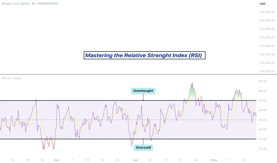
Mastering the RSI - How to use it in trading?What will be discussed?
- What is the RSI?
- RSI overbought
- RSI oversold
- RSI divergences
- How to use the RSI
- How to trade with the RSI
What is the RSI?
The Relative Strength Index (RSI) is a popular momentum oscillator used in technical analysis to measure the speed and change of price movements. Developed by J. Welles Wilder Jr., it ranges from 0 to 100 and helps traders evaluate whether a security is overbought or oversold. The RSI typically uses a 14-period timeframe and is calculated based on the average gains and losses over that period. A rising RSI suggests increasing buying momentum, while a falling RSI indicates growing selling pressure.
RSI overbought
When the RSI rises above 70, the asset is generally considered overbought. This condition indicates that the price may have risen too quickly and could be due for a correction or pullback. However, being overbought doesn't automatically mean a reversal will occur, it signals that bullish momentum is strong, and traders should be cautious of potential trend exhaustion.
RSI oversold
Conversely, an RSI reading below 30 is typically seen as a sign that the asset is oversold. This condition suggests the price may have fallen too sharply and could be primed for a rebound. Just like with the overbought condition, an oversold RSI doesn’t guarantee an immediate reversal but serves as a warning that bearish momentum may be overextended.
RSI divergences
Divergences occur when the RSI and the price of the asset move in opposite directions. A bullish divergence happens when the price makes a lower low, but the RSI forms a higher low, potentially signaling a reversal to the upside. A bearish divergence occurs when the price makes a higher high, but the RSI creates a lower high, possibly indicating a downward reversal. Divergences are often used to spot early signs of trend changes.
How to use the RSI?
To use the RSI effectively, traders typically look for overbought and oversold conditions to time entries and exits, combine it with other technical indicators for confirmation, and watch for divergences as a sign of potential reversals. RSI can also be adapted for different timeframes or strategies, depending on whether the trader is looking for short-term swings or long-term trend analysis. While it’s a powerful tool, RSI should not be used in isolation, it works best as part of a broader trading plan that considers market context and risk management.
How to trade with the RSI?
The RSI can be a powerful tool for identifying potential trade setups. When the price approaches a key support zone while the RSI remains in overbought territory, this may signal an early warning of a possible market reversal. However, rather than acting immediately, it's wise to wait for confirmation. A clear candlestick reversal pattern, such as a bullish engulfing candle or a pin bar, a provide stronger evidence that momentum is shifting. By combining RSI readings with price action and support levels, traders can improve the accuracy and timing of their entries.
Disclosure: I am part of Trade Nation's Influencer program and receive a monthly fee for using their TradingView charts in my analysis.
Thanks for your support.
- Make sure to follow me so you don't miss out on the next analysis!
- Drop a like and leave a comment!
Is Bitcoin Still a Hedge? What the Iran Israel Conflict RevealsAs geopolitical tension between Iran and Israel escalates, markets are once again gripped by fear. Oil prices have surged, gold has rallied, and investors are rebalancing portfolios in anticipation of further instability. Amidst this backdrop, Bitcoin's behavior is raising fresh questions about its role as a geopolitical hedge.
Bitcoin’s Initial Reaction: A Spike and a Slip
When the first reports of conflict broke, Bitcoin spiked alongside gold. Many hailed this as proof that BTC was becoming a reliable safe haven. However, just days later, prices retraced by roughly 6 to 7 percent as volatility intensified.
As usual, Bitcoin is still highly sentiment driven. While gold held its gains, BTC mirrored risk on assets with intraday volatility, undermining its hedge narrative.
BTC vs. Traditional Safe Havens
Let’s compare Bitcoin’s performance to:
• Gold: Continued upward trend, record ETF inflows
• Oil: Strong rally due to supply shock fears
• USD: Moderate gains as a traditional reserve asset
Bitcoin’s pullback during peak uncertainty suggests that in times of extreme stress, traditional assets still dominate flight to safety behavior.
What the On Chain Data Shows
Interestingly, on chain activity also hints at caution. Exchange inflows increased slightly after the conflict news, suggesting profit taking or reduced conviction among holders.
Moreover, stablecoin volume spiked in Middle Eastern regions — a signal that users may prefer capital preservation over speculation during geopolitical risk.
The Takeaway: Not There Yet
Bitcoin is maturing, and its response to global events is evolving. But this conflict reveals it is not yet a full fledged hedge like gold or the dollar.
For investors, the lesson is clear: BTC can act as a partial hedge in medium term macro trends, but during sharp geopolitical escalations, traditional assets still lead.
What Do You Think?
Is Bitcoin still on track to become a true safe haven asset? Or will it remain a risk sensitive speculative instrument?
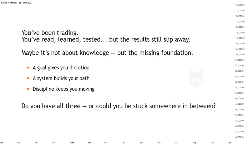
You trade. You learn. You test. But results still slip. Why? Sometimes you feel like you know it all. You've tried dozens of strategies. Studied with the best. But in your head — there’s no clarity, in your trades — chaos, and in the end — you’re stuck in the same place. I’ve been there too. If this sounds familiar — keep reading.
Every day, thousands of traders enter the market and do everything "by the book": they open their terminal, draw levels, learn from the pros, read the analysis. Yet years later, they’re still in the same spot. Their results are random, unstable, or negative. Why?
🔹 Not because you didn’t study enough.
🔹 Not because you can’t read a chart.
💡 Most likely, your system isn’t fully built — or your goal is still unclear.
A goal is not a wish. "I want to make money" is not a goal. A real goal sounds like: to consistently earn $1,000 a month, spending 3 hours a day on trading. Or: to live off trading income and leave my job.
Different goals require different systems: daily routines, trade evaluation criteria, analysis frequency, and risk approaches.
Here are some examples of goals and the systems they require:
Goal: Consistent side income $1,000 a month with 3 hours of trading a day → You need a system with a clear schedule, ready-made analysis templates, minimal manual effort, asset/time priorities, clear trade filters, trade logging, and weekly/monthly feedback loops (what works, what doesn’t).
Goal: Passive income through investments (e.g. 15% annual return on capital) → You need a system that includes regular fundamental analysis, long-term trend evaluation, clear rules for portfolio formation and rebalancing, risk limits per asset, profit/loss realization strategies, trade logging, and quarterly feedback reviews.
Goal: Full-time trading income, consistently earning $10,000 per month → You need a system with strict risk control, a daily trading rhythm, emotional stability support, trade tracking, and daily/weekly feedback (what’s working, what’s not).
What happens without a goal and system?
The trader opens a chart and starts "looking for an opportunity." Today it’s scalping, tomorrow swing, the next day — "I’m just observing."
📉 They don’t know what to focus on.
📉 They lose concentration.
📉 They jump into trades because "something must be done."
📉 They burn out. Because there’s no sense of progress.
Without a goal, you can’t build the system you need. A goal sets the direction and evaluation criteria.
Without a system, you can’t reach the goal: you might have knowledge, actions, and effort — but they don’t add up to results. Just noise, fatigue, and the feeling of being out of sync with the market.
A system is what connects your goal and actions. It gives you stability, filters out distractions, keeps you focused, and reduces impulsive behavior.
If this feels familiar — it’s a signal. Your system and goal need an upgrade. Many start with a random mix of actions hoping for results. Few take the step toward clarifying their goal and building their system. You can be one of them — if you have a map and a direction.
Everything starts with a clear personal goal — not a generic one, but truly yours.
You can use 3 practices to help you:
Goal — what you truly want from trading, specifically in numbers and timelines.
Sub-goals — how to break the path into clear steps based on your resources.
Hypothesis — what exactly you’re testing right now to stay focused.
Each of these is a practical step that brings clarity and direction.
📌 Define your goal — and keep it.
It’s your starting point. It marks the transition from reactive trader to conscious professional.
See you in Part Two — where we’ll build the system that brings you to that goal.
Let your chosen goal inspire and support you on the journey.
Value every step and your own effort.
Take care — and trust your path.
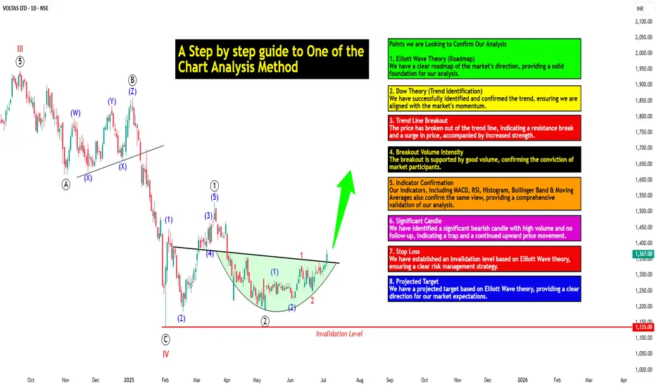
A Step-by-step Guide to One of the Chart Analysis Method: VOLTASHello Friends,
Welcome to RK_Chaarts,
Today we're going to learn step-by-step guide to one of the chart analysis Method by analyzing a chart of " VOLTAS LTD. " to identify a trend change opportunity.(Educational Post).
Let's get started!
Applying Elliott Wave Theory
According to Elliott Wave theory, we can see that the high of September 20, 2024, marked the end of the wave III of the cycle degree in Red. After that, a corrective wave unfolded, which reached its low on February 1, 2025. This was the wave IV of the cycle degree in Red, with a low of 1135.
The approximately 6 months correction ended here, and now the wave V of the cycle degree in Red has begun. Within this, there will be five sub-divisions of primary degree in black, which we can label as waves ((1)) to ((5)). Of these, waves ((1)) and ((2)) are complete, and we are possibly now in wave ((3)) of the Primary degree in Black.
Within wave ((3)), there will be five sub-divisions of intermediate degree in blue, of which waves (1) and (2) are complete, and the (3)rd intermediate degree in Blue is underway. Within this, there will be five sub-divisions waves of minor degree in red, of which 1 and 2 are complete, and today we saw the breakout of the 3 of the (3).
Possibly, this is a momentum move according to Elliott Wave theory, which we can call the third of the third of the third.
Now that we have this low of wave IV at ₹1135, it should not go below this level according to Elliott Wave theory. If it does, our current wave count will be invalidated. That's why we have an invalidation level within Elliott Wave, which according to this chart is at ₹1135. This low should not be breached. If it is breached for any reason, we'll have to re-analyze our entire count, and the counts could be different.
However, if this low holds, then the minimum target for wave V, based on the projection of wave theory, would be at least 100% to 123% of the fall from top III to bottom IV, which could take it to around ₹2000 to ₹2100. Shown in chart image below
Possible Elliott Wave Counts on Daily Time Frame Along with Invalidation level & Target levels.
Dow Theory Suggests now Up Trend
After forming the top of wave III, we can see that the price has moved downwards in a pattern of lower highs and lower lows. However, after completing the bottom of wave IV, the price has started forming a pattern of higher highs and higher lows, indicating that an uptrend has begun.
This is a clear signal that supports our wave counts moving upwards, i.e., towards an impulse move, based on Dow theory. The successful completion of wave IV and the initiation of the higher highs and higher lows pattern suggest a strong bullish trend, and we can expect the price to continue moving upwards. Shown in chart image below
Breakout with good intensity of Volumes
In this chart, we've observed a rounding bottom type chart pattern, and today, we've seen a breakout above the upper resistance trend line. Today's candle volume is also significantly higher than the average. Shown in chart images below
Chart Pattern: Rounding Bottom
Resistance Trendline Breakout with Good Intensity of Volumes
Supporting Indicators & Moving Averages
Also we can see that the current price has closed above the 50-day EMA and 100-day EMA. Additionally, indicators like RSI is above 60 and showing momentum, MACD is positive and above the zero line, and the histogram is also showing a breakout. Shown in chart images below
Breakout above 50DEMA & 100DEMA
RSI Breakout above 60+ on Daily Time Frame
Bullish side Breakout in Histogram on Daily Time Frame
MACD running Positive & above zero line on Daily Time Frame
Bollinger Band on Weekly
If we look at the weekly time frame, the current week's candle is above the middle Bollinger Band, indicating that the price is above the 20-period simple moving average on the weekly time frame. which is very good sign. Shown in chart image below
Price Trading above 20 SMA on Weekly Time Frame (Mid.Bollinger Band)
Significant Observation in Price Action & Volumes
Before the breakout, the rounding bottom chart pattern that was forming at the bottom can be interpreted as accumulation, as a red bearish candle with high volume appeared, marking the highest volume. Notably, no candle has closed below the low of that candle since then.
Although a gap-down candle occurred, it opened and closed bullish, indicating no selling pressure below that level. The absence of bearish follow-up and the subsequent breakout today are significant observations, combining price action and volume. This is a positive sign suggesting the price may move upwards. Shown in chart image below
This is how chart analysis is done for investment purposes. We've seen many signs in our favor, and yet we still use a stop loss to prevent significant losses in case the stock or market moves unexpectedly. This is what stop loss is all about - minimizing potential losses.
We've also discussed the target projection based on Wave theory, 123.6% level, which we explained through an image. So, friends, I hope you've understood the entire conclusion and learned how to analyze charts using different methods, one of which we shared with you today.
I am not Sebi registered analyst.
My studies are for educational purpose only.
Please Consult your financial advisor before trading or investing.
I am not responsible for any kinds of your profits and your losses.
Most investors treat trading as a hobby because they have a full-time job doing something else.
However, If you treat trading like a business, it will pay you like a business.
If you treat like a hobby, hobbies don't pay, they cost you...!
Hope this post is helpful to community
Thanks
RK💕
Disclaimer and Risk Warning.
The analysis and discussion provided on in.tradingview.com/u/RK_Chaarts/ is intended for educational purposes only and should not be relied upon for trading decisions. RK_Chaarts is not an investment adviser and the information provided here should not be taken as professional investment advice. Before buying or selling any investments, securities, or precious metals, it is recommended that you conduct your own due diligence. RK_Chaarts does not share in your profits and will not take responsibility for any losses you may incur. So Please Consult your financial advisor before trading or investing.
Direct Access Trading SystemsDirect Access Trading Systems
Direct access trading systems (DATS) offer traders a direct line to financial markets. By bypassing traditional brokerage routes, DATS enable swift, precise trading, essential for strategies reliant on speed and accuracy. This FXOpen article delves into the workings, benefits, and considerations of DATS, providing valuable insights for both seasoned and aspiring traders navigating the fast-paced world of modern trading.
Understanding Direct Access Trading Systems
Direct access trading systems (DATS) revolutionise how traders interact with financial markets, typically in the realm of stock trading. Unlike traditional brokerage platforms, these systems offer direct market access trading, a method allowing traders to place orders directly into the market's electronic order book. Such immediate access is crucial for those who require precision and speed in their trading decisions.
Traditionally, orders placed through brokers are processed internally before reaching the market, potentially causing delays. However, brokers with direct market access provide a conduit for traders to bypass these intermediate steps. These systems typically appeal to day traders and other short-term investors who value the ability to respond swiftly to market movements.
Usually, direct access brokers list Level 2 quotes, where bid and ask prices alongside order sizes are given for the asset, providing an additional layer of valuable information. By offering a more direct link to financial markets, these systems may provide an enhanced trading experience that aligns with the needs of active traders.
Selecting the best direct access broker for day trading involves considering several key factors. Traders look for platforms that offer high reliability and uptime, as any downtime can significantly impact outcomes. Speed of order execution is crucial in capturing market opportunities. Additionally, traders assess the fee and commission structure to ensure it aligns with their trading volume and strategy.
How Direct Access Trading Systems Work
DATS offer a sophisticated network that connects traders directly to financial markets. These systems use specialised software platforms, helping traders make efficient and swift operations:
- Order Entry: Traders use the DATS platform to enter their orders. These platforms are equipped with various order types, such as market, limit, or stop orders, giving traders flexibility in how they execute trades.
- Order Routing: After order placement, DATS route these orders directly to the market instead of through a broker. The process often involves Electronic Communication Networks (ECNs), which play a critical role. ECNs are automated systems that match buy and sell orders for assets, eliminating the need for intermediaries like traditional stock exchanges. They also provide a venue for trading outside traditional hours, offering greater liquidity and potential efficiency.
- Execution: Orders are executed via these ECNs or other market venues. The rapid execution capability is a defining feature of DATS, enabling traders to capitalise on fleeting market opportunities.
- Feedback and Reporting: Following execution, the system promptly provides feedback. Traders receive immediate trade confirmations, including execution price and time, essential in maintaining transparency and control over trading activities.
Through this streamlined process, DATS offer a high-efficiency trading environment. Such a setup is particularly advantageous for strategies that require quick decision-making and execution, such as day trading or scalping.
Advantages of Direct Access Trading Systems
DATS offer several compelling advantages over traditional brokerage platforms, particularly for those who engage in frequent trading. These benefits cater to the needs of active traders seeking efficiency and control in their strategies.
- Speed of Execution: DATS enable traders to execute orders almost instantaneously. Rapid processing is crucial in fast-paced markets where prices can fluctuate within seconds.
- Enhanced Control: Traders have greater control over their orders, including the timing, price, and order type. This level of control is especially crucial in volatile market conditions.
- Access to Real-Time Market Data: DATS provide real-time data, allowing traders to make informed decisions based on the latest market movements.
- Lower Transaction Costs: By eliminating the middleman, DATS often result in lower transaction costs, a significant advantage for high-volume traders.
- Customisation and Flexibility: Many direct access trading platforms come with advanced charting and analysis tools. These tools can be customised to fit individual strategies and preferences.
- Direct Market Interaction: Traders can interact directly with market liquidity providers, potentially leading to better pricing and execution quality.
Risks and Considerations
While these systems offer several advantages, they also come with inherent risks and considerations:
- Increased Complexity: DATS are typically more complex than traditional brokerage platforms. They require a sophisticated understanding of market dynamics and trading strategies, making them better suited for experienced traders. The complexity also extends to the technological infrastructure needed to use these systems, which may involve higher setup and maintenance costs.
- Higher Costs: Using DATS may be more expensive than traditional online brokers. The costs go beyond technology requirements; for example, the price of direct access trading systems and the commissions for trades can be higher. This aspect makes it vital for traders to evaluate the cost-benefit ratio of using DATS compared to other trading methods.
- Stricter Trading Rules: Direct market access often comes with more stringent rules. This could include tighter regulations around repeat dealing, deal rejections if trading outside normal market sizes, and potential penalty fees for inactive accounts.
The Bottom Line
In summary, direct access trading systems may enhance efficiency, offering speed, control, and direct market insights. However, they require a careful approach due to their complexity and cost.
This article represents the opinion of the Companies operating under the FXOpen brand only. It is not to be construed as an offer, solicitation, or recommendation with respect to products and services provided by the Companies operating under the FXOpen brand, nor is it to be considered financial advice.
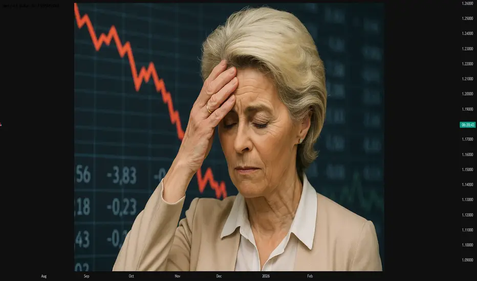
#AN014: Ursula von der Leyen No Confidence Motion, Market Crisis
Hello, I am Andrea Russo, a Forex trader and today I want to focus on an explosive news that has hit Brussels in the last 24 hours: the motion of no confidence against the President of the European Commission Ursula von der Leyen. I thank in advance the Official Broker Partner PEPPERSTONE for the support in carrying out this analysis.
The fact: Motion of No Confidence in the European Parliament
On July 1st, several MEPs from both conservative right and far left groups formally presented a motion of no confidence against Ursula von der Leyen, accusing her of: Non-transparent agreements with Emmanuel Macron, Opaque management of the new “Pact for Europe”, Conditioning of key appointments within the Commission and the Council and above all the violation of the democratic principle of balance of powers.
Although the motion does not seem to have the numbers to pass, it represents a direct attack on the political legitimacy of the outgoing president, just when she is trying to obtain a second term.
The suspicion is that this move is not so much to bring down von der Leyen, but to: Weaken her negotiating position, Force her to make political concessions and reopen the game on the strategic EU appointments 2024–2029.
This internal crisis comes at the worst possible time. A crisis of internal legitimacy in this context can undermine institutional stability and slow down all the economic reforms expected by the markets.
Impact on Forex
1. EUR under pressure
European political risk is back in the spotlight. Even if there was no immediate shock to the euro, institutional trading rooms are already pricing in more internal instability. This translates into:
Downward pressure on EUR/USD, especially if the motion receives more votes than expected (even if it does not pass).
EUR/CHF at risk of retracement, as the Swiss franc is seen as a safe haven currency in the event of EU institutional crises.
EUR/GBP with potential loss of strength, especially if London takes advantage of the crisis to relaunch bilateral agreements.
2. Push for safe haven currencies
JPY, USD and CHF have shown anomalous movements in the last few hours: political uncertainty is pushing traders to seek safe havens. The EUR/USD futures curve also shows a slight downward revaluation.
3. Upcoming events to monitor
The real threat will be if the number of votes in favor of the no-confidence motion exceeds 30–35% of Parliament → in that case, even if the motion does not pass, von der Leyen will be delegitimized.
The euro, in this case, could undergo a technical correction extended up to 1.0650, especially if accompanied by weak macro data.
Follow me, if you like, for other updates.
Biggest What-Ifs in Stocks (or How Investors Live with Regret)You think you’ve got regrets because you didn’t buy Nvidia NASDAQ:NVDA at $50 or sold Tesla NASDAQ:TSLA at $420? Join the club.
The stock market’s history is littered with “almost” trades, missed deals, and facepalm-worthy decisions that turned out to be trillion-dollar pivots.
This is the hall of fame for what didn’t happen — and what those stories teach us about how markets (and human nature) actually work. Call it a free masterclass in greed, fear, FOMO, and the priceless value of just sitting tight sometimes.
Take it easy today, grab your cold brew and read up on the biggest what-ifs in stock market history.
🍏 Ronald Wayne: The Patron Saint of “Oops”
Our first inductee needs no introduction. But let’s do it anyway. Ronald Wayne, the third Apple NASDAQ:AAPL co-founder, sold his 10% stake back in 1976 for the princely sum of $800. He wanted to avoid any debts if things went south. Sensible, right?
That $800 stake today would be worth more than $300 billion. That’s more than the GDP of Finland — and about 1.2 million new iPhones every single day for pretty much the rest of his life. Wayne has since said he doesn’t regret it. Which is probably the biggest lie he’s ever told.
🍿 Blockbuster’s Netflix “Pass”
In 2000, Netflix NASDAQ:NFLX was a DVD-by-mail startup with spotty profits. Reed Hastings, Netflix’s founder, knocked on Blockbuster’s door and offered to sell the whole thing for $50 million — about the price of a Hollywood production.
Blockbuster’s execs reportedly laughed him out of the room. “People will always want to drive to a store to rent a VHS,” they said, basically. Fast forward: Netflix is worth around $560 billion, and Blockbuster is down to one store that’s mostly a selfie museum for millennials who miss rewinding tapes.
💻 Microsoft’s Lifeline That Saved Apple
In 1997, Apple NASDAQ:AAPL was broke. Steve Jobs had returned but was days away from the company flat-lining for good. Enter Bill Gates.
Microsoft NASDAQ:MSFT wrote Apple a $150 million check, partly to keep antitrust regulators off its back. Jobs even appeared on stage with Gates beaming in on a giant screen like Big Brother — a moment that made every Apple fan cringe.
But that deal saved Apple’s hide. The iMac was born. The iPod followed. Then the iPhone. That $150 million is now a rounding error on Apple’s $3 trillion valuation. Sometimes your greatest rival is also your best frenemy.
🔍 Google: The $750K “Meh”
Before “Google it” became a verb, Larry Page and Sergey Brin tried to sell their little search engine to Excite — the Yahoo-lite portal that dominated the ‘90s web. The price? $750,000.
Excite’s CEO said search “wasn’t that important” — one of the worst calls in tech history. Today, Alphabet NASDAQ:GOOGL is worth over $2.1 trillion and always flashing bright on the Stock Heatmap , and Excite is a footnote in a forgotten Web 1.0 graveyard.
The lesson? Never dismiss a side project just because it doesn’t fit the spreadsheet.
💸 Masayoshi Son’s $200 Billion Slip
SoftBank’s Masayoshi Son is known for his giant, risky bets . And in 2017, he made a pretty good one: his Vision Fund scooped up a 5% chunk of Nvidia stock worth about $4 billion. He called GPUs the backbone of the AI revolution. He was right.
But by 2019, SoftBank was under pressure to tidy up its books. So Son sold the whole position for a tidy short-term profit. That stake today would be worth nearly $200 billion, given Nvidia’s rocket-fuel AI rally .
“We can cry together,” CEO Jensen Huang told Masa Son at an AI Summit in Tokyo last year. Early doesn’t always mean patient. And being “kind of right” can be the most painful lesson of all.
📊 Berkshire Hathaway: A Textile Mill’s Rebirth
Think of Berkshire Hathaway NYSE:BRK.A now — a $1 trillion behemoth. Insurance, utilities, railroads, huge piles of Apple shares . But back when Warren Buffett bought it, Berkshire was a dying textile business in New England.
Buffett only bought control because he was annoyed at the CEO’s lowball tender offer. It turned into his permanent holding company. The textile side eventually went extinct — but the insurance side became the cash-printing machine Buffett used to buy everything else.
Sometimes your best trade starts with pure pettiness.
🚀 Tesla: The Short Sellers’ Pain Cave
Here’s a more recent tale. Tesla was not long ago the most shorted stock on Earth. Everyone from hedge funds to your uncle at Thanksgiving was betting on Elon’s dream to fail.
Every now and then, the short-sellers get slapped with billions of dollars in losses, because the stock shoots up out of nowhere. The most recent example? November 12, when those naysayers nursed $7 billion in wiped out cash . Bears have been torched so many times, they might as well switch sides and sell Tesla hoodies instead.
🌌 Yahoo’s Double Miss: Google and Facebook
If you think blowing one chance is bad, try blowing two. Yahoo turned down the chance to buy Google for less than a million bucks. Then years later, they offered $1 billion for Facebook (now META NASDAQ:META ) — but bungled the negotiations and tried to lower the price. Zuck said “nope.”
But back to Google, because the story didn’t end there. In 2002, Yahoo said it wanted to buy Google for $3 billion. Brin and Page said $5 billion and Yahoo said no. Then Microsoft was ready to pay $40 billion to acquire Yahoo in 2008. But Yahoo said no.
Today, Google, Microsoft, and Meta are trillion-dollar titans. Yahoo? Sold itself for $4.5 billion, mostly for its patents, in 2016 to Verizon. Talk about slipping on the same banana peel more than once.
🧃 Apple: The Splits that Keep Giving
Want a reason to love boring old “buy and hold”? Apple NASDAQ:AAPL has split its stock five times since its 1980 IPO. If you’d bought 100 shares back then, you’d now have over 56,000 shares, plus mountains of dividends.
Next time you want to swing trade every squiggle, remember: sometimes the slowest route is the sweetest.
📝 Regret: The Only Universal Asset Class
Every trader has a “coulda, shoulda, woulda.” It’s the cost of doing business in a market that only makes sense in hindsight. Even the pros — billionaires, boards, hedge funds — have stories that make yours look tame.
Ronald Wayne reminds you that selling too soon can cost you your own island. Masayoshi Son proves being right but impatient is still being wrong. Yahoo shows that “almost” is worth exactly zero on a balance sheet.
What these stories prove is that the market’s biggest edge isn’t necessarily timing, genius, or inside scoops — it’s discipline, resilience, and sometimes a stubborn refusal to touch the sell button.
🤗 Bonus Story: Ballmer Regrets Nothing
But not every story has to be a regret story. Just look at Steve Ballmer, Microsoft ‘s former CEO. Since the early 2000s, he’s been holding his 4% stake in the software maker and that’s now worth more than $130 billion. No regrets found.
👉 What’s Your “One That Got Away”?
Now your turn : What’s your personal what-if story? Which ticker haunts you in your sleep? Drop your best missed trade or worst sell in the comments — we promise to laugh with you, not at you. Probably. Stay sharp. Stay patient!
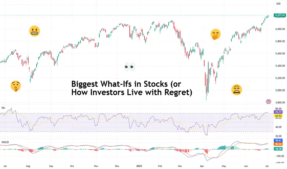
Top fundamentals that will shape the S&P 500 this summer 2025The summer of 2025 is characterized by a combination of macroeconomic and microeconomic factors that will shape the trajectory of the US equity market. While the S&P 500 is trading close to its all-time highs and at a valuation comparable to that at the end of 2021, the strength of the upward momentum will depend on the conjunction of several key variables. Understanding these fundamentals is crucial to grasping the potential and risks awaiting investors over the coming months.
1) The trade war and economic diplomacy, the main source of uncertainty
The trade issue remains the most unpredictable at the start of the summer. The July 9 deadline for the conclusion or failure of tariff negotiations is crystallizing tensions between the United States and its main partners. The prospect of a new wave of tariffs could have a direct impact on production costs, inflation and business confidence. Trade diplomacy is thus the variable most likely to provoke volatility jolts and challenge positive earnings growth expectations. If trade agreements are signed, then this will help to sustain the S&P 500's uptrend.
2) US fiscal policy: the “One Big, Beautiful Bill”
The Trump administration's major tax bill is another hotspot. This piece of legislation calls for an extension of the tax cuts initiated in 2017 and a dramatic increase in the public debt ceiling, to the tune of $5,000 billion. While these measures potentially support consumption and private investment, their medium-term impact on public finances is uncertain. The real issue for the equity market is to assess whether these decisions will lead to a surge in long-term US bond yields. A slippage in US Treasury yields would increase corporate financing costs and undermine currently high valuation multiples. Conversely, if yields remain contained, the equity market's upward momentum could continue.
3) Inflation and the Fed's monetary policy: a delicate balance
The trajectory of inflation, in particular that of the PCE index, will be a major determinant. US inflation is currently slightly below the Fed's target. Several components, notably the services sector, which accounts for almost two-thirds of the PCE basket, are proving relatively stable. Inflationary risks are more likely to come from commodities, particularly if trade tensions reignite. Oil, which accounts for around 11% of the PCE basket, is currently showing no major warning signs, benefiting from a geopolitical calm. Real estate and healthcare are also showing reassuring indicators. Against this backdrop, the Federal Reserve is adopting a cautious stance: while several major Western central banks are moving towards a neutral rate, the Fed is stalling and conditioning its monetary pivot on visibility regarding tariffs and corporate behavior.
The timing of rate cuts is one of the biggest sticking points. According to recent signals, the first rate cut could take place as early as September. However, influential members of the FOMC, appointed by the Trump administration, are arguing for earlier easing. The political pressure is strong: Trump is calling for immediate cuts, but Chairman Powell remains in control of the agenda, taking care to preserve a consensus within the committee.
4) The job market and the likelihood of a recession
The US employment situation is an advanced barometer of the economic cycle. Weekly jobless claims and the aggregate unemployment rate are closely monitored. Historically, a significant rise in unemployment signals that the economic slowdown is already underway. For the time being, the labor market is proving resilient, but the slightest deterioration could alter investors' central scenario and reinforce recessionary expectations. This risk is one of the potential dampeners to the prevailing optimism, unless it were to accelerate the timetable for resuming the cut in the federal funds rate.
5) Second-quarter results and earnings outlook
The second-quarter earnings season is of particular importance. US companies must demonstrate their ability to deliver earnings growth in line with forecasts, even as valuation multiples remain stretched. Maintaining high price levels on the S&P 500 assumes robust earnings growth and confident guidance from management. Failing this, the risk of a correction would be high, especially as the market has already incorporated many positive factors. The weakness of the US dollar and the price of oil, as well as the current momentum in AI, could hold out some pleasant surprises for second-quarter results.
6) Geopolitics and oil, potential sources of volatility
Finally, global geopolitics is a second-order variable, but one that could suddenly become a priority. A rapid deterioration in the international situation, particularly in the Middle East or the China Sea, could affect trade flows and oil prices, fuelling renewed inflation and financial volatility.
Conclusion :
The summer of 2025 promises to be a period of strategic transition for the US equity market. Between trade diplomacy, fiscal policy, inflation, the trajectory of interest rates and earnings momentum, investors will have to deal with an accumulation of uncertain factors. If these uncertainties gradually dissipate, the uptrend could continue. Conversely, the combination of a geopolitical shock, a rebound in inflation and a political stalemate over the federal budget would have the potential to weaken the current rally.
DISCLAIMER:
This content is intended for individuals who are familiar with financial markets and instruments and is for information purposes only. The presented idea (including market commentary, market data and observations) is not a work product of any research department of Swissquote or its affiliates. This material is intended to highlight market action and does not constitute investment, legal or tax advice. If you are a retail investor or lack experience in trading complex financial products, it is advisable to seek professional advice from licensed advisor before making any financial decisions.
This content is not intended to manipulate the market or encourage any specific financial behavior.
Swissquote makes no representation or warranty as to the quality, completeness, accuracy, comprehensiveness or non-infringement of such content. The views expressed are those of the consultant and are provided for educational purposes only. Any information provided relating to a product or market should not be construed as recommending an investment strategy or transaction. Past performance is not a guarantee of future results.
Swissquote and its employees and representatives shall in no event be held liable for any damages or losses arising directly or indirectly from decisions made on the basis of this content.
The use of any third-party brands or trademarks is for information only and does not imply endorsement by Swissquote, or that the trademark owner has authorised Swissquote to promote its products or services.
Swissquote is the marketing brand for the activities of Swissquote Bank Ltd (Switzerland) regulated by FINMA, Swissquote Capital Markets Limited regulated by CySEC (Cyprus), Swissquote Bank Europe SA (Luxembourg) regulated by the CSSF, Swissquote Ltd (UK) regulated by the FCA, Swissquote Financial Services (Malta) Ltd regulated by the Malta Financial Services Authority, Swissquote MEA Ltd. (UAE) regulated by the Dubai Financial Services Authority, Swissquote Pte Ltd (Singapore) regulated by the Monetary Authority of Singapore, Swissquote Asia Limited (Hong Kong) licensed by the Hong Kong Securities and Futures Commission (SFC) and Swissquote South Africa (Pty) Ltd supervised by the FSCA.
Products and services of Swissquote are only intended for those permitted to receive them under local law.
All investments carry a degree of risk. The risk of loss in trading or holding financial instruments can be substantial. The value of financial instruments, including but not limited to stocks, bonds, cryptocurrencies, and other assets, can fluctuate both upwards and downwards. There is a significant risk of financial loss when buying, selling, holding, staking, or investing in these instruments. SQBE makes no recommendations regarding any specific investment, transaction, or the use of any particular investment strategy.
CFDs are complex instruments and come with a high risk of losing money rapidly due to leverage. The vast majority of retail client accounts suffer capital losses when trading in CFDs. You should consider whether you understand how CFDs work and whether you can afford to take the high risk of losing your money.
Digital Assets are unregulated in most countries and consumer protection rules may not apply. As highly volatile speculative investments, Digital Assets are not suitable for investors without a high-risk tolerance. Make sure you understand each Digital Asset before you trade.
Cryptocurrencies are not considered legal tender in some jurisdictions and are subject to regulatory uncertainties.
The use of Internet-based systems can involve high risks, including, but not limited to, fraud, cyber-attacks, network and communication failures, as well as identity theft and phishing attacks related to crypto-assets.
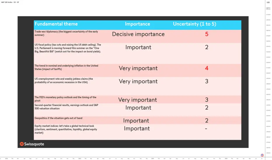
Do You Have a Trading Edge?A Practical Guide to Figuring Out if What You’re Doing Is Actually Working
There comes a point in every trader’s journey when you stop asking “what indicator should I use” and start asking something much more important.
Is what I’m doing actually working?
It’s an honest question. When the P&L has been chopping sideways or dipping red for weeks, it’s easy to feel stuck. Maybe you’ve been grinding for months, jumping from one setup to another, but still not seeing consistent progress. Before you give up or double down, it’s worth stepping back and looking at the one thing that matters most.
Do you have an edge?
What Is a Trading Edge, Really?
A trading edge isn’t about being right all the time. It isn’t some secret indicator or a feeling in your gut. It’s a cold, hard number.
Your edge is the amount of money you can expect to make or lose on average every time you place a trade. If the number is positive, you’re on the right side of probability. If it’s negative, then no amount of motivation or mindset work will stop the account from bleeding over time.
Thankfully, there’s a simple formula that tells you exactly where you stand.
The Formula: No Hype, Just Maths
Edge per trade = (Average Win × Win Rate) − (Average Loss × Loss Rate)
Or more simply:
Edge = W × R – L × (1−R)
Where:
• W is your average winning trade in pounds
• L is your average losing trade (as a positive number)
• R is your win rate, written as a decimal (so 55% becomes 0.55)
This is your trading edge. It’s not a concept. It’s a number. And it either works or it doesn’t.
Let’s Put It Into Practice
Say you win 45% of the time. Your average winning trade makes £180. Your average losing trade costs £120. Plug the numbers in.
Edge = £180 × 0.45 minus £120 × 0.55
Edge = £81 minus £66
Edge = £15
That £15 is your expected value per trade. So if you take 100 trades following that same pattern, you’d expect to make £1,500 before costs. That’s the kind of maths you want working in your favour. It’s not glamorous. It’s not loud. But it’s sustainable.
What if the Edge Is Negative?
This is where a lot of traders lose heart. But it’s actually good news. If the formula tells you the edge isn’t there, you can stop guessing. It means you’ve identified the problem.
A negative edge just tells you that, on balance, either:
• you’re winning too infrequently
• your losses are too large
• your winners aren’t big enough
And every one of those can be adjusted. This isn’t about tearing down your whole system. Often, a small shift in one variable is all it takes to turn a negative edge into a positive one.
Three Ways to Nudge the Numbers in Your Favour
1. Improve the win rate slightly
Look for trades with more confluence. Stick to clearer trends. Avoid taking marginal setups during unpredictable conditions. You don’t need a huge jump, even going from 40% to 47% can have a big impact.
2. Increase the size of your winners
Let trades run a little longer when the conditions are right. Take partials if it helps your mindset, but keep a portion on to capture the extended move. Most traders cut profits too early and let losers drift too far.
3. Tighten up the losses
Use hard stops. Respect them. Review your biggest losing trades and ask yourself if they really had to be that big. Often they didn’t. The goal is to keep losses small and repeatable, not devastating and unpredictable.
A Note on Sample Size
Five or ten trades won’t give you a reliable read on your edge. You need a bigger pool. Ideally 50 to 100 trades minimum. Patterns emerge over time, not in the heat of one session.
A strong edge can go through losing streaks. A poor strategy can get lucky for a while. But when you track your numbers over enough trades, the truth becomes very clear.
You’re Probably Closer Than You Think
If you’ve never done this calculation before, don’t feel behind. Most retail traders never actually work out their edge. They focus on indicators, entry techniques, or mindset work without ever stopping to ask if the numbers stack up.
But once you do the maths, things start to change. You stop judging yourself by your last trade and start thinking in averages. You stop chasing every setup and start focusing on quality. You stop worrying about being right, and start focusing on being consistent.
That’s what separates hobbyists from professionals. The numbers are the difference.
Summary:
If your edge is negative, you now know where to look. If it’s positive, even just slightly, you’ve got something worth building on. Either way, the path forward is clearer.
Trading is hard, no question. But it’s not magic. It’s probability, risk control and discipline applied consistently. And it all starts with understanding the maths behind what you’re doing.
So next time you’re questioning whether your system is any good, don’t ask how it feels. Run the numbers.
Do you have a trading edge?
If yes, protect it. If not, now you know what to fix.
Disclaimer: This is for information and learning purposes only. The information provided does not constitute investment advice nor take into account the individual financial circumstances or objectives of any investor. Any information that may be provided relating to past performance is not a reliable indicator of future results or performance. Social media channels are not relevant for UK residents.
Spread bets and CFDs are complex instruments and come with a high risk of losing money rapidly due to leverage. 85.24% of retail investor accounts lose money when trading spread bets and CFDs with this provider. You should consider whether you understand how spread bets and CFDs work and whether you can afford to take the high risk of losing your money.
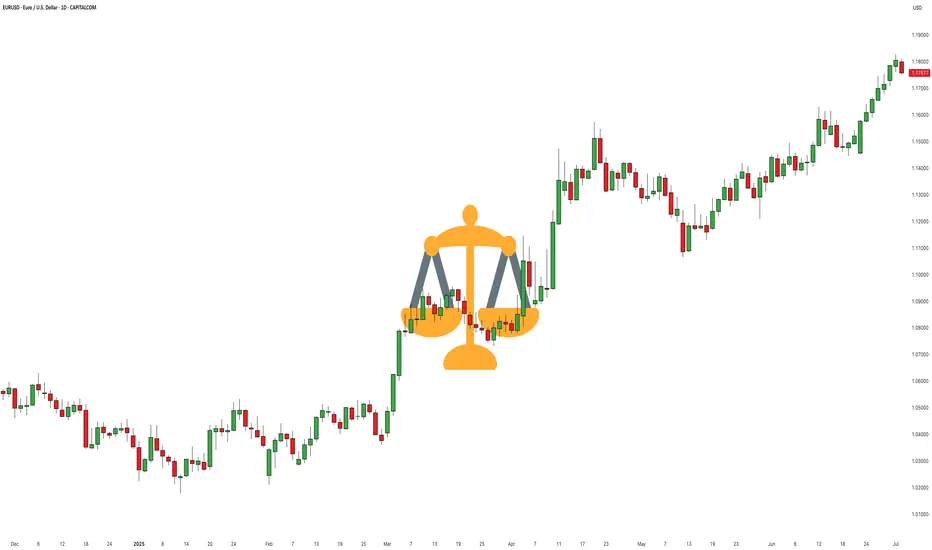
Wait for your EDGE...
Discipline is what separates professionals from amateurs.
Stay patient. Wait for your edge. Let the probabilities work in your favor.
👉 “Agree with this? Hit Boost to spread the message.”
#TradingPsychology #Discipline #BTC #Bitcoin #Forex
#TradingMindset #AlBrooks #TradingDiscipline #PriceAction #ForexTrading #CryptoTrading #StockMarket #MJTrading #TradingQuotes #TraderLife #MindOverMarkets
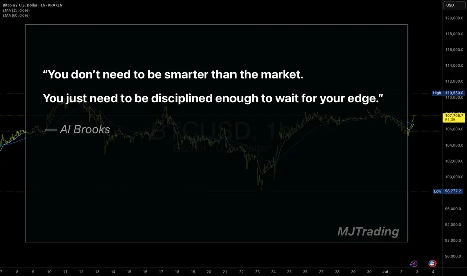
Compounders: 5 Simple Rules to Build Long-Term WealthImagine this:
…it’s 18 years ago. The very first iPhone has just hit the market.
Meanwhile, Nokia’s legendary “Snake” game, once the height of mobile fun, was starting to feel… dated.
⚡ And you can sense it: something big is coming. You don’t know exactly what, but something is about to shake the system.
So, you invest €1,000 into Apple stock. No fancy moves, no day trading. You don’t check the price every morning, you don’t sell at the first dip. You just hold and go about your life, using their products as always.
----------------------------------
Fast forward to today: the iPhone has evolved quite a bit, and so has your bank account, “a bit”.
That modest €1,000 investment would now be worth roughly €70,000. For context, if you had simply invested in the S&P 500 instead, your total profit would be €3,300.
This is what happens when you hold a real compounder. Apple: +6,942%. S&P 500: +334%. Time doesn’t just pass, it compounds!
Big difference, right?
And the craziest part? You didn’t need a crystal ball. Looking back, everything makes perfect sense.
The real question is:
Can you spot the next one before it becomes obvious?
---------------------------------------
📈 Compounders: The slow, steady, and surprisingly effective path to wealth
A compounder is a company that steadily grows your investment over time, powered by a strong business model and consistent value creation.
These stocks don’t need to chase headlines. They don’t create drama, and they certainly don’t swing wildly every week on the stock exchange. They simply keep building value.
Strong financials, good products, and a clear direction—like a snowball quietly rolling downhill, gathering momentum with every meter.
As Warren Buffett once said:
That’s exactly what compounders allow you to do. While you rest, they keep working.
It’s definitely not a get-rich-quick strategy. It’s more like a slow, somewhat boring, and failry a “safer” route. But in return, it might just give you something far more valuable than fast gains: financial peace of mind, and perhaps even financial freedom.
🔍 So how do you spot one?
Now, let’s be clear: compounders are not bulletproof. Market crashes, disruptive competitors, and economic shocks can still shake them.But when the foundation is solid, these companies tend to stand strong, even in a storm.
Here are five key traits that define a true compounder. From consistent growth to an unshakable competitive edge.
---------------------------------------
📈 1. Steady Growth
What you want to see is a steady upward trend in both revenue and earnings per share (EPS). Not a rollercoaster. A clean, reliable trend.
A strong compounder doesn’t explode one year and crash the next. It grows year after year. It grows calmly, consistently, and predictably…
Microsoft EPS Q Source: TradingView
That’s usually a sign of solid management and sticky customer demand.
Let’s look at a key metric here:
EPS CAGR (5-year) – the compound annual growth rate of earnings per share.
5% = solid → reliable and steady progress
10% = good → suggests a strong business model and real market demand
15%+ = great → this is where the snowball effect really kicks in, fast and orderly
📌 The higher the CAGR, the faster your investment compounds. But it’s not just about speed, it’s about repeatability. If that growth is not random but repeatable and sustainable, you don’t just have a growth stock → you’ve got a true compounder.
⚠️ Always consider the sector: A 15% CAGR might be normal in tech, but in a consumer brand or industrial company, that’s an exceptionally strong result.
---------------------------------------
💡 2. Efficient Capital Allocation
A good compounder doesn’t just grow a lot—it grows wisely.
That means every dollar the company reinvests into its business generates more than a dollar in return.
Think of it like a business where every $1 invested turns into $1.20 or more in profit. The more efficiently it can put capital to work, the faster it compounds over time.
🎯 ROIC (Return on Invested Capital) tells you how effectively a company is using all its invested capital—including both equity and debt.
ROIC shows how much profit the company earns after taxes and costs for every dollar it has invested, regardless of where that money came from.It’s broader than ROE, which only considers shareholder equity.
>10% = solid
>15% = good
>20% = great
🎯 ROE (Return on Equity) measures how well the company generates returns specifically on shareholder money:
>15% = solid
>20% = good
>25% = great
📌 In most cases, ROIC is more important than ROE , since it doesn’t get distorted by how much debt the company is using. But when both numbers are high, you’ve got something that creates a lot of value - a true compounding engine.
Just imagine you give a chef $10 to make a dish. If they can turn that into a $15 meal, their ROIC is 50%. That’s the kind of capital efficiency we want to see in companies too, where every dollar invested pulls serious weight.
---------------------------------------
💰 3. High Profit Margins
Selling stuff isn’t hard. Any company can sell something, even at a loss.
A true compounder doesn’t just generate revenue, it earns real profit from it.
That’s where operating margins come into play. They show how much money is actually left over after covering everything: salaries, logistics, rent, office coffee, stolen toilet paper, and all the other lovely overhead costs.
⚙️ Operating Margin – the percentage of revenue that turns into operating profit:
10% = solid → stable profitability, usually driven by volume or efficiency
20%+ = great → often signals strong pricing power, lean cost structure, or a dominant brand
📌 Why does this matter?
Because the more profit a company retains after expenses, the more it can:
- reinvest in new products or markets
- pay dividends to shareholders
- or buy back shares (which automatically increases your ownership per share)
All of these create real, recurring value for you as an investor—not just once, but year after year.
⚠️ One important note: What qualifies as a “high” margin depends on the industry. A software company might easily run at 30% margins, while a retail chain or car manufacturer might be thrilled with 5%.
So don’t judge the number in isolation. Always consider the type of business—in some sectors, profits come from volume, not margin.
---------------------------------------
🧱 4. Debt Matters
Even if a company is growing fast and making money, it still doesn’t qualify as a true compounder if it’s drowning in debt.
A real compounder moves forward mostly(!) under its own power, not thanks to borrowed money.
Financially strong companies have a healthy buffer, so they’re not in trouble the moment the economy slows down or credit tightens.
📉 Debt-to-Equity (D/E) – how much of the company is financed with debt versus equity:
Under 1 = solid → reasonable leverage
Under 0.5 = great → very strong and conservative balance sheet
📈 Interest Coverage Ratio – how easily the company can pay its interest expenses:
5× = solid
10×+ = great → very safe, meaning debt costs won’t threaten profitability
📌 The lower the debt and the higher the buffer, the lower the risk.A company with a strong balance sheet doesn’t need to refinance debt in a panic or rely on costly tricks to survive downturns.
Think of it like the foundation of a house. Without it, even the most beautiful structure can collapse.
⚠️ Some industries (like real estate or utilities) naturally operate with higher debt levels. But even in those cases, you want to see a business that controls its debt, rather than living “one day at a time.”
---------------------------------------
🏰 5. Durable Competitive Advantage (a.k.a. Moat)
Back in the Middle Ages, a moat was a water-filled trench that protected a castle.Today, in investing, a “moat” is what protects great businesses from competition.
It’s a business that others can’t easily reach or replicate.
💪 When a company has a wide moat, it can:
- Defend its market share even when others try to attack
- Command higher prices—because customers stay loyal
- And if a competitor starts gaining ground, it often has enough capital to... just buy them out
Here are some classic moat types with examples:
- Brand Loyalty – People pay more for something familiarExample: Coca-Cola. There are hundreds of alternatives, but the taste, logo, and brand feel... irreplaceable.
- Network Effects – Every new user strengthens the product or platformExample: Visa, Mastercard. The more they’re used, the harder it is for any new player to break in.
- Technological Edge – The company is simply too far aheadExample: Nvidia, ASML. You can throw money at the problem, but patents and experience aren’t things you copy overnight.
- Ecosystem Lock-in / Habitual Consumption – Customers get “stuck,” and switching feels like a hassleExample: Apple. Once you have the iPhone, AirPods, and MacBook… switching to Android just sounds like a lot of work.Or take Procter & Gamble. If your baby’s used to Pampers, you’re not going back to cloth diapers anytime soon. (To be fair—Huggies might actually be better 😄 That’s Kimberly-Clark, ticker KMB.)
📌 A strong moat allows a company to maintain both profitability and growth for the next 10+ years—because no one else can get close enough to steal it.It’s not fighting tooth and nail for every dollar. It rules its niche quietly and efficiently.
---------------------------------------
Now that we’ve covered what makes a business a compounder, the next question naturally follows:
“Okay, but if it’s such a great company... is it still a great price?”
That’s where valuation comes in.P/E ratio: how to know whether you’re paying a fair price or just a premium for the brand.
---------------------------------------
👉 In my April article, I clearly broke down P/E along with eight other key fundamental metrics: straightforward, real-world explanations designed to help you actually use them…
---------------------------------------
💵 P/E (Price-to-Earnings Ratio)
The P/E ratio tells you how much you’re paying for every $1 of a company’s earnings.
Think of it like this: are you buying solid value for $20… or paying $70 just because the brand sounds familiar?
Now, for compounders, a high P/E (say, 25–40) can actually be fine, IF(!) the company is growing fast and has a strong moat.
Here’s a quick cheat sheet:
* Under 15 → generally cheap (might be a bargain… or a trap)
* 15–25 → fair price for a traditional business
* 25–35 → reasonable if the company is growing consistently
* 35–45 → starting to look expensive, must be justified by fundamentals
* 45+ → expensive, and the market expects big things. One slip-up and the stock could drop fast.
⚠️ A P/E over 40–45 means the market expects strong, sustainable growth.If that growth doesn’t show up, the stock won’t just stumble—it could crash.
But here’s the key: P/E doesn’t work well in isolation. Context is everything.
Before judging the number, always ask:
- What sector is this company in?
- What’s the sector average?
- How fast is the company growing?
- Are the profits stable and sustainable?
---------------------------------------
Real-World Examples:
✅ Visa – P/E around 37The average for financial stocks? Usually 10–15.But Visa grows quickly, is highly profitable, and has an ironclad moat.Is it expensive? Yes. But in this case, justifiably so.
✅ Microsoft – P/E around 35Tech-sector average tends to sit between 25–35.Microsoft has consistent growth, high margins, and clear market leadership.A P/E of 35 is absolutely reasonable—as long as the growth story continues.
🤔 But what if Microsoft trades at P/E 50+?
Then you have to ask:Is earnings growth truly supporting that price?Or are you just paying for the brand... and a bit of FOMO?
-----------------
Leave a comment:
What’s the highest P/E you’ve ever paid, and was it worth it?
-----------------
📘 Compounder Cheat Sheet
Don’t just stare at absolute numbers. Always compare within the sector, consider the company’s growth pace and business model. Ask yourself:
“How much am I paying today for what this company will earn tomorrow?”
---------------------------------------
🧩 Summary
Compounders are like good wine, they get better with time.
Find companies that grow steadily, generate profits, keep debt low, and dominate their niche. Hold tight. Stay patient. Let the snowball roll.
Thanks for reading!
If this article was helpful or resonated with you, feel free to like, comment, or share it with a friend! It motivates me more than you’d think. 🙏
And if you’re new here:
🍷 Like good wine, this channel only gets better with time. Follow and let the ideas compound slowly, steadily, and deliciously.
Cheers
Vaido