Learn What Time Frame to Trade. Gold Forex Trading Basics
If you just started trading, you are probably wondering how to choose a trading time frame.
In the today's post, I will go through the common time frames, and explain when to apply them.
1m; 5m, 15m Time Frames
These 4 t.f's are very rapid and are primarily applied by scalpers .
If your goal is to catch quick ebbs and flows within a trading session, that is a perfect selection for you.
30m, 1H Time Frame
These 2 are perfectly suited for day traders.
Executing the analysis and opening the trades on these time frames,
you will be able to catch the moves within a trading day.
4h, Daily Time Frames
These time frames are relatively slow .
They are mostly applied by swing traders, who aim to trade the moves that last from several days to several weeks.
Weekly, Monthly Time Frames
These time frames reveal long-term historical perspective and are mostly used by investors and position traders.
If your goal is to look for buy & hold assets, these time frames will help you to make a reasonable decision.
📝When you are choosing a time frame to trade, consider the following factors :
1️⃣ - Time Availability
How much time daily/weekly are you able to sacrifice on trading?
Remember a simple rule: lower is the time frame, more time it requires for management.
2️⃣ - Risk Tolerance
Smaller time frames usually involve higher risk,
while longer-term time frames are considered to be more conservative and stable.
3️⃣ - Your Trading Goals
If you are planning to benefit from short term price fluctuations you should concentrate your attention on lower time frames,
while investing and long-term capital accumulation suite for higher time frames.
Time frame selection is nuanced and a complex topic. However, I believe that these simple rules and factors will help you to correctly choose the one for you.
❤️Please, support my work with like, thank you!❤️
I am part of Trade Nation's Influencer program and receive a monthly fee for using their TradingView charts in my analysis.
Community ideas
How To Read Trading ChartsIn this video, I discuss how to read and interpret the bars/candles on a chart so you can begin to learn price action.

THE CONCEPT OF SUPPORT BECOMING RESISTANCE In the context of forex trading, the concept of "support becoming resistance" refers to a phenomenon that occurs when a price level that previously acted as a support level for an asset's price now switches roles and becomes a resistance level after it has been broken.
Here's a more detailed explanation:
Support Level: In forex trading, a support level is a price level at which a currency pair or any other financial instrument tends to find buying interest. This buying interest is strong enough to halt or reverse a downtrend in the price. Traders believe that the asset's price is likely to "bounce" off this support level and move higher, making it an essential point on the price chart.
Resistance Level: On the other hand, a resistance level is a price level where selling interest is significant enough to prevent the price from rising further. It acts as a barrier that tends to halt or reverse an uptrend in the price. Traders expect the price to "bounce" off this resistance level and move lower.
Support Becoming Resistance: The interesting concept comes into play when the price breaks below a previously established support level. When a support level is breached and the price continues to decline, it signifies a shift in market sentiment. The level that was once a support now becomes a resistance level for the price. If the price attempts to rally back up and reach that previous support level, it often faces selling pressure from traders who missed the initial breakdown and now see it as an opportunity to sell at a better price. As a result, the price might struggle to move beyond that level, and it starts acting as a resistance zone.
Understanding Market StructureIn this video, I break down market structure in a simple and easy-to-digest way, helping you understand how to identify whether the market is in an uptrend or downtrend.
Recognizing market direction is a key skill for any trader, it allows you to trade in alignment with price action and make more confident, higher-probability decisions.
✅ If you're new to trading or want to sharpen your edge, this video will give you the insights needed to read market trends more clearly.
📈 Hope you find value in this breakdown!
👉 Don’t forget to like, comment, and subscribe to support the channel and stay tuned for more educational content.

How to Read Market Depth in TradingViewThis tutorial video covers what Depth of Market (Market Depth) is, how to read it, and how traders might use it.
Learn more about trading futures with Optimus Futures using the TradingView platform here: optimusfutures.com/Platforms/TradingView.php
Disclaimer: There is a substantial risk of loss in futures trading. Past performance is not indicative of future results. Please trade only with risk capital. We are not responsible for any third-party links, comments, or content shared on TradingView. Any opinions, links, or messages posted by users on TradingView do not represent our views or recommendations. Please exercise your own judgment and due diligence when engaging with any external content or user commentary.
Order flow and DOM data reflect market participant activity but do not guarantee future price movement or execution certainty. These tools are best used as part of a broader trading strategy that includes risk management and market understanding.

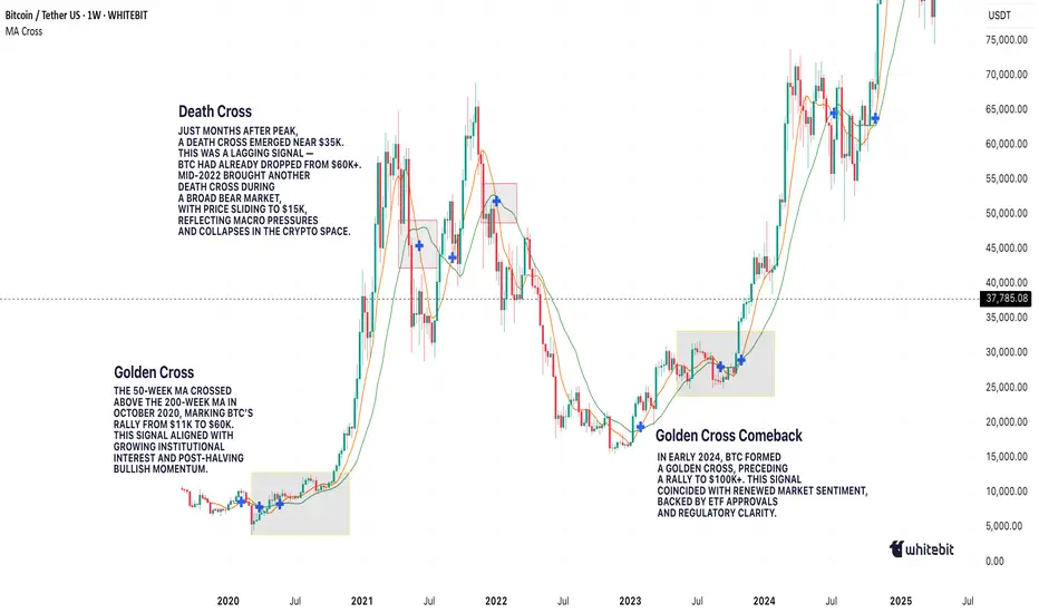
Golden Cross vs. Death Cross: What Do They Really Tell Us?Hello, traders! 🤝🏻
It’s hard to scroll through a crypto newsfeed without spotting a headline screaming about a “Golden Cross” forming on Bitcoin or warning of an ominous “Death Cross” approaching. But what do these classic MA signals can really mean? Are they as prophetic as they sound, or is there more nuance to the story? Let’s break it down.
📈 The Basics: What Are Golden and Death Crosses?
At their core, both patterns are simple moving average crossovers. They occur when two moving averages — typically the 50-day and the 200-day — cross paths on a chart.
Golden Cross: When the 50-day MA crosses above the 200-day MA, signaling a potential shift from a bearish phase to a bullish trend. It's often seen as a sign of renewed strength and a long-term uptrend.
Death Cross: When the 50-day MA crosses below the 200-day MA, suggesting a possible transition from bullish to bearish, hinting at extended downside pressure.
📊 Why They Work (and When They Don't)
In theory, the idea is simple: The 50-day MA represents shorter-term sentiment, while the 200-day MA captures longer-term momentum. When short-term price action overtakes long-term averages, it’s seen as a bullish signal (golden cross). When it drops below, it’s bearish (death cross).
This highlights a key point: moving average crossover signals are inherently delayed. They’re based on historical data, so they can’t predict future price moves in real time.
🔹 October 2020: Golden Cross
On the weekly BTC/USDT chart, we can clearly see a Golden Cross forming in October 2020. The 50-week MA (short-term) crossed above the 200-week MA (long-term), marking the start of Bitcoin's explosive rally from around $11,000 to its then all-time high above $60,000 in 2021. This signal aligned with growing institutional interest and the post-halving narrative, reinforcing the bull case.
🔹 June 2021: Death Cross
Just months after Bitcoin’s peak, a Death Cross emerged around June 2021, near the $35,000 mark. However, this was more of a lagging signal: by the time it appeared, the sharp pullback from $60K+ had already taken place. Interestingly, the market stabilized not long after, with a recovery above $50K later that year, showing that Death Cross signals aren’t always the end of the story.
🔹 Mid-2022: Another Death Cross
In mid-2022, BTC formed another Death Cross during its prolonged bear market. This one aligned better with the broader trend, as price continued to slide towards $15,000, reflecting macro pressures like tightening monetary policies and the collapse of major players in the crypto space.
🔹 Early 2024: Golden Cross Comeback
The most recent Golden Cross appeared in early 2024, signaling renewed bullish momentum. This crossover preceded a significant rally, pushing Bitcoin above $100,000 by mid-2025, as seen in your chart. While macro factors (like ETF approvals or regulatory clarity) also played a role, this MA signal coincided with a notable shift in sentiment.
⚙️ Golden Cross ≠ Guaranteed Rally, Death Cross ≠ Doom
While these MA crossovers are clean and appealing, they’re not foolproof. Their lagging nature means they often confirm trends rather than predict them. For example, in June 2021, the Death Cross appeared after much of the selling pressure had already played out. Conversely, in October 2020 and early 2024, the Golden Crosses aligned with genuine upward shifts.
🔍 Why Care About These Signals?
Because they help us contextualize market sentiment. The golden cross and death cross reflect collective trader psychology — optimism and fear. But to truly understand them, we need to combine them with volume, market structure, and macro narratives.
So, are golden crosses and death crosses reliable signals, or just eye-catching headlines?
Your chart tells us both stories: sometimes they work, sometimes they mislead. What’s your take? Do you use these MA signals in your trading, or do you prefer other methods? Let’s discuss below!
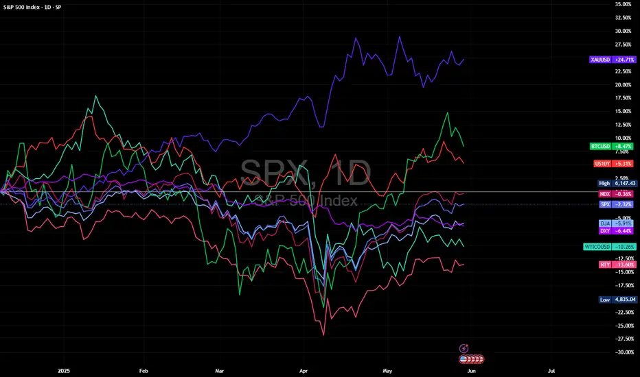
Structure Over Sentiment: Multi-Asset View into Month-End📊 Structure Over Sentiment: Multi-Asset View into Month-End | May 30, 2025
This isn’t a crash. This isn’t a rally. This is digestion.
The multi-asset view tells the real story — and it's not as chaotic as it looks.
🔍 What the Chart Shows:
This correlation lens plots key macro and market drivers YTD:
🟣 Gold (XAUUSD): Leading with +24.71% — this is the quiet macro bid no one’s talking about
🟢 Bitcoin (BTCUSD): Holding +8.47% — volatile, but still showing risk appetite
🔴 10Y Yield (US10Y): Up +5.31% — signalling rates peaking
🟠 Nasdaq (NDX): Nearly flat, -0.36% — NVDA strength masking internal rotation
🔵 S&P 500 (SPX): -2.32% — structurally fine, just not euphoric
🔵 Dow (DJA): -5.91% — lagging, cyclical drag
🔵 Russell 2000 (RTY): -13.60% — small caps under pressure, risk-on caution flag
🟣 Dollar Index (DXY): -6.44% — fading after a strong Q1
🟢 Oil (WTIUSD): -10.26% — no inflation panic here
🧠 Key Insight:
Despite the tariff headlines, sticky PCE, and conflicting narratives — the market remains internally consistent.
Gold is leading
Yields are rising but not sharply
Bitcoin is positive
Equities are flat-to-negative
Oil is weak
Dollar is fading
This is classic late-cycle digestion, not a crisis.
🛡️ Titan Mindset Check-In:
Don’t get lost in single headlines
Follow structure, not speculation
Let leaders lead (NVDA, Gold, BTC)
Protect equity when breath narrows
Zoom out, reduce noise, trade the curve — not the chaos
📍“Volatility isn’t risk. Misinterpretation is.”
Take Profits, Not Chances.
#MultiAssetView #StructureOverShock #TitanProtect #SPX #NDX #BTC #Gold #DXY #WTI #US10Y #MacroFlow #MarketMindset #LateCycleSignals #DigestDontPanic
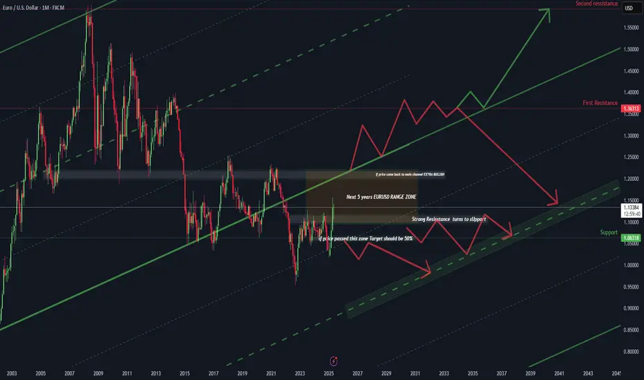
EUR/USD – The 20-Year Gameplan | How to Think Like a Macro TradWelcome to the most important EUR/USD chart you'll see this decade.
This isn't just technical analysis. This is a macro roadmap stretching from 2003 to 2045 — built for serious traders who think beyond the next candle.
@TradeWithMky #Miracle
📚 What This Chart Teaches You:
✅ Long-Term Channeling: How to map 40-year channels that actually hold.
✅ Key Reaction Zones: Learn where multi-year reversals are most likely.
✅ "Range of a Generation": Why EUR/USD could stay trapped for 5+ years.
✅ Two Futures – One Decision Point: Reclaiming the main channel = Ultra Bullish. Rejection = Controlled Descent.
🎯 Trade Plan Logic (Educational Focus)
📌 If price breaks above the range zone, target is a 50% Fibonacci expansion — with 1.36 and 1.55 as the macro resistances.
📌 If price rejects, the pair could drift within a multi-year compression channel targeting the 1.06–0.95 zone over the next decade.
📌 This model blends technical geometry, historical behavior, and trend integrity — skills every pro trader should master.
👁️ Why This Matters
This is not about predicting next week’s move.
This is about training your eyes to see structure where others see noise.
And if you can see the macro structure, you can outperform 99% of traders who zoom in too much, too soon.
⚡ Bonus Wisdom:
"Amateurs react. Professionals anticipate. Masters build maps."
– TradeWithMky
🔔 Follow me for more deep-dive macro education.
This is where Forex meets vision.
📌 TradeWithMky – where altcoins speak louder than Bitcoin... but Forex whispers the truth.
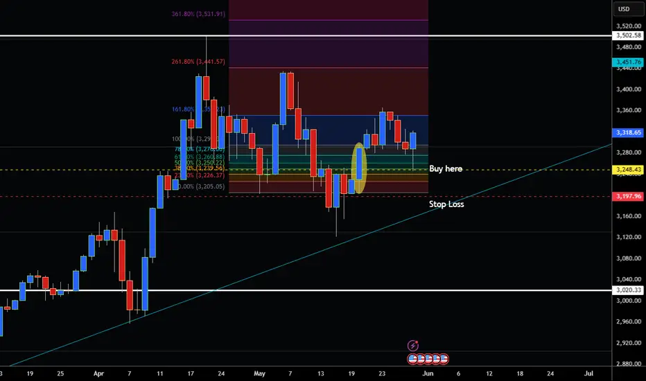
How to Trade Gold Market with the 50% Retracement CandleHey Traders so today wanted to show why you don't really need indicators to trade. Price action is the best way to trade imo because it's easier. For the most part indicators lag and can give you false signals. So if you are looking for a way to trade that does not involve indicators check this out.
So we can see that Gold is in a strong uptrend the strategy is wait until market pulls back to trendline and buy but what if you miss that pullback?
So you can still get in the uptrend look for a strong bullish candle like the one I highlighted on May 20. Then place an order to buy when the market pulls back to 50% of that candle. Measure it with the Fibonacci tool. Place your stop below the low of the candle or under support so that way you most likely won't get stopped out. Now this trade was textbook but not all of them are check out how as soon as it hit the 50% retracement of that candle market rocketed higher!
There you go simple way to trade and no need for complex indicators! This strategy works in all markets!
Always use Risk Management!
(Just in case your wrong in your analysis most experts recommend never to risk more than 2% of your account equity on any given trade.)
Hope This Helps Your Trading 😃
Clifford
#AN003 News of the Week and Impact on Forex
Hello, I am Forex trader Andrea Russo, and today I present to you a detailed analysis of the most important news of the week (26–29 May 2025) and their real impact on the Forex market, with strategic observations to immediately include in your trading plan.
In this article we will examine the 7 most significant macroeconomic and geopolitical events that have affected the main currency pairs, evaluating the effect on USD, EUR, GBP, JPY, CAD, AUD and emerging currencies. Everything is filtered according to the SwipeUP v9 Elite FX model, based on institutional data, real sentiment and candle-by-candle simulations.
📌 1. USA: Court stops Trump Tariffs
One of the most relevant news of the week comes from the United States: a federal court has blocked the application of Donald Trump's trade tariffs, declaring them illegitimate. This event has caused an immediate reaction in the currency markets.
🔍 Forex Impact:
The US Dollar (USD) had an initial technical bounce, but then lost strength in the European session.
Pairs such as EUR/USD and USD/JPY showed strong reactivity. EUR/USD was rejected from 1.1250, while USD/JPY found support.
📊 Strategic Implications:
Risk perceptions on the greenback are rising.
Interest in alternative safe haven currencies such as gold and the Swiss franc is growing.
📌 2. US Q1 GDP Downward
US Q1 GDP was revised down from -0.1% to -0.2%, confirming a mild economic contraction.
🔍 Forex Impact:
The dollar lost momentum, reinforcing the narrative of a possible rate cut.
EUR/USD could consolidate above 1.1200 ahead of stronger EU PMI data.
📊 Key Pairs:
EUR/USD long on confirmation of 1.1200 support.
Possible breakout on AUD/USD if US data continues to disappoint.
📌 3. US Inventories and Oil Rebound: CAD on the Boost
US crude inventories fell more than expected, and WTI price is back above $79.
🔍 FX Impact:
CAD strengthens on fundamental and intermarket basis.
Potential short on USD/CAD with target area 1.3550.
📌 4. UK: Very Strong Data and Resilient GBP
UK macro data surprised to the upside: services PMI and core inflation stable, supporting the British pound.
🔍 Forex Impact:
GBP/USD above 1.2700 with room for expansion.
EUR/GBP rejected by 0.8600: potential for bearish continuation.
📌 5. Forex Options Expirations and Expected Volatility
Thursday and Friday are crowded with large option expirations, which can act as price magnets.
📍 Levels to Watch:
EUR/USD: 1.1200 and 1.1250 → potential for spikes or rejections.
USD/JPY: 145.00 → technical and options confluence.
AUD/USD: 0.6650 key zone with volumes in compression.
📊 Trading advice: avoid new entries near option levels without confirmation of real breakout.
📌 6. Nvidia and US Tech Rally: Anti-Yen Effect
Nvidia’s results have boosted the entire US tech sector, causing a wave of risk-on.
🔍 Impact on FX:
JPY and CHF weak on low interest in safe-haven assets.
Great setups on AUD/JPY, CAD/JPY, EUR/CHF long.
📌 7. China: PMI Above 50, Support for AUD/NZD
Chinese manufacturing PMI data has returned above 50, signaling expansion.
🔍 Impact on FX:
AUD and NZD find technical and macro support.
Watch out for AUD/CHF, where macro divergences could generate a bearish reversal.
🧠 Forex Trading Strategy for the Next Week
✅ Strong Currencies:
CAD (oil + risk-on sentiment)
GBP (macro data + technical momentum)
EUR (resilience on USD and supports held)
❌ Weak Currencies:
USD (negative GDP, political uncertainty)
JPY (no safe haven demand)
AUD (potentially vulnerable on risk-on downside)
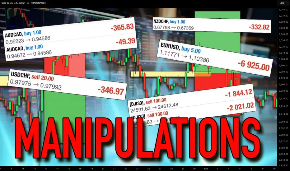
How Forex Brokers Manipulate Your Trading. Real Examples
Your Forex broker could be manipulating your trades right now - and you would not even know it.
They can rig your charts, trap you in losing trades and steal your money.
In this article, I will expose how they do it, I will show you a real example how broker's manipulations can lead to bad trading decisions and significant losses.
What I’m about to show you will change the way you trade forever, and you’ll never look at your trading charts the same way again.
The story started with a trading live stream in my academy with my students.
We spotted a nice setup to trade.
We found a strong 4H support on Silver with a confirmed liquidity grab after its test.
As a confirmation, we identified a cup & handle pattern on an hourly time frame and a breakout of its neckline with a bullish imbalance.
When I got my entry signal, I opened my trading terminal to execute the trade.
And the way I trade is very specific: I use TradingView for chart analysis BUT I have a separate trading terminal for trade execution.
When I opened the same setup in my trading terminal, I saw a completely different picture and a strong bearish signal.
The broker that I use for technical chart analysis is OANDA , while my trading terminal uses ICMarkets quotes.
On the right is the price chart of SILVER with IC.
There we can see a valid breakout and a candle close below the support with its consequent retest.
From a price action perspective, it is a strong signal to sell .
I got a strong feeling that some kind of manipulation is going on here, so I decided to check Silver charts of other brokers.
Only the broker that I used for market analysis on TradingView provided a bullish signal, while other brokers had very bearish charts on Silver.
It looked very suspicious and felt like OANDA broker was inducing me to buy, knowing that the price is going to drop. So I made a decision not to take a trade.
Look what happened then.
After a retest of a broken support, Silver dropped sharply.
Checking the same trading setup on different brokers' charts can help you to avoid the manipulation.
My simple decision to examine more charts helped to avoid a losing trade.
I strictly recommend you doing the same thing before you place a trade.
IF you see a strong deviation of your charts from other brokers, stay alert and vigilant. Probably it is not a good idea to open the trade.
❤️Please, support my work with like, thank you!❤️
I am part of Trade Nation's Influencer program and receive a monthly fee for using their TradingView charts in my analysis.
Strategies to Save Capital and Thrive in Bear MarketsEver felt stuck in a downtrend, unsure how to protect your capital?
Most traders burn their portfolios in bear markets just because they lack a real escape plan.
In this analysis, you'll uncover little-known strategies that could literally rescue your investments.
Hello✌
Spend 3 minutes ⏰ reading this educational material.
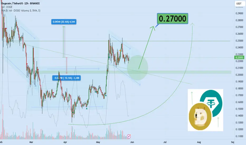
🎯 Analytical Insight on Dogecoin:
If Dogecoin fails to gain at least 20% in the next two weeks—while Bitcoin continues to rally—this divergence could signal a broader market weakness. When BTC outperforms and altcoins lag, it often reflects declining risk appetite and potential capital rotation out of speculative assets. A move toward the $0.27 target is key for confirming bullish continuation across the altcoin sector. 📉
Now , let's dive into the educational section,
🔧 TradingView Tools to Hunt Opportunities in Bear Markets
In bearish conditions, most traders only stare at price movements. But smart ones go deeper. With the right TradingView tools, you don’t just survive a bear market—you exploit it. Here are some must-use tools that can change your game:
Volume Profile: This helps highlight where trading activity is concentrated. These zones often act as hidden support in bearish phases.
Fixed Range Volume Profile: Use this to scan specific chart segments to understand volume-based zones of control. Perfect for pinpointing possible rebounds.
Auto Fib Retracement: TradingView’s automated Fibonacci retracement tool helps identify pullback levels. A critical asset when timing entries during downtrends.
Divergence Detector: Combine RSI or MACD to catch bullish divergences—these subtle signs often come before a trend reversal.
Multi-Timeframe S/R Indicator: This reveals support and resistance levels across different timeframes. Knowing where multiple levels align helps predict strong reactions.
For practical use, open a BTC or ETH chart, apply these tools, and look for volume clusters, divergences, and Fibonacci confluences. The more layers you add, the stronger your edge becomes. TradingView isn’t just a charting platform—it’s your bear market radar .
📉 Understanding Bear Market Psychology
Bear markets are all about fear and exhaustion. But that doesn’t mean opportunity is gone. If you learn to read the crowd’s psychology, you’ll see it’s just a phase—one you can use to your advantage.
🛡️ Capital Protection Comes First
Rule one in bear phases: protect, not profit. Logical stop-losses, reducing position sizes, using stablecoins, and cutting emotional trades are your survival kit.
🧲 Catching Opportunities in Pullbacks
Even bearish trends have bounces. These are golden moments to take short-term trades or exit from poor positions. The 4H chart with Fib retracement is your best friend here.
🔄 Range Trading = Consistent Gains
Sideways movement = scalping zone. Once price enters a range, clearly marked support/resistance levels from your indicators give sniper-level entries and exits.
🔮 Reverse Market Sentiment Like a Pro
In bear markets, everyone’s scared. Which means smart money starts buying. Flip your emotional lens. Fear on the street = quiet opportunity for the patient.
📊 Indicator Fusion for Early Signals
RSI + MACD + Volume = market whisperers. If RSI bottoms while volume spikes, you’re probably seeing the quiet before a bullish storm. Most won’t notice. You will.
🧬 Learn From the Past Market Cycles
History repeats. Mark previous bear market lows on your chart. Compare price action. Similar structure = similar outcome. Patterns from BTC 2018 or COVID crash are still valid today.
🧠 Your Mindset Is Your Strongest Tool
More than any tool or strategy, it’s your mental control that saves capital. If you can master your thoughts, you can master your trades. Bear markets punish the weak-minded—not just the unskilled.
🧭 Final Thoughts:
If you take away just one insight, let it be this: in bear markets, survival is the goal, and hidden opportunities are born from fear. No trend lasts forever. But the prepared trader lasts through every trend.
always conduct your own research before making investment decisions. That being said, please take note of the disclaimer section at the bottom of each post for further details 📜✅.
Give me some energy !!
✨We invest countless hours researching opportunities and crafting valuable ideas. Your support means the world to us! If you have any questions, feel free to drop them in the comment box.
Cheers, Mad Whale. 🐋
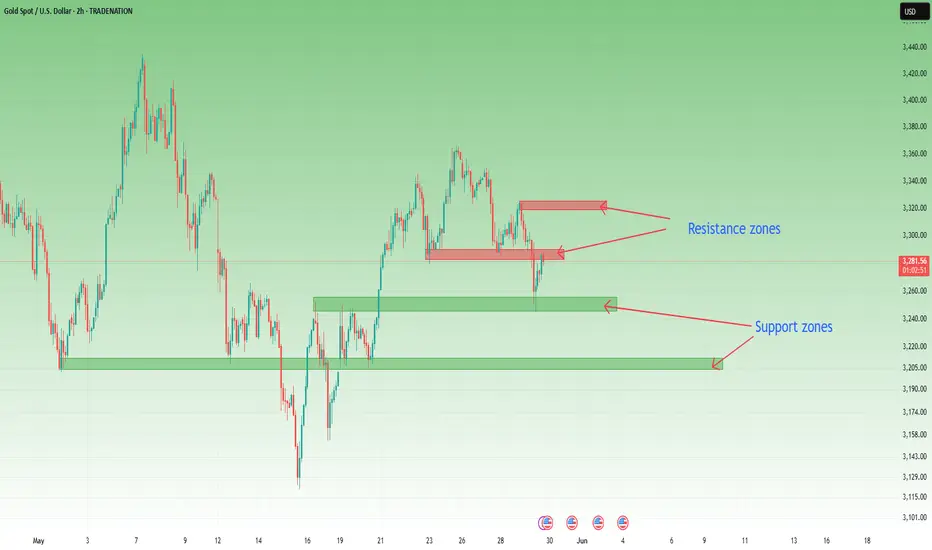
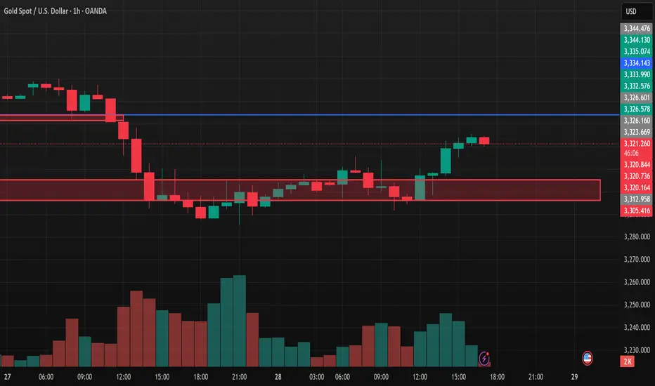
Why You Should Trade Zones, Not Points – Especially on XAUUSDIf you've been trading Gold (XAUUSD) for a while, you’ve likely noticed something strange in many analyses online. Support at 3256.73? Resistance at 3352.14?
Really? That precise?
This kind of fixed-point trading might look good on a chart, but it doesn't work in a real, volatile market — especially not in 2025.
I've been trading Gold as my primary asset for over a decade, and if there's one thing experience — and logic — have consistently shown me, it's this: you should trade price zones, not fixed points. Let me explain you why.
________________________________________
🔍 1. Gold Is Not a Low-Volatility Asset
Gold isn't EURUSD. It doesn't move in clean 20-30-pip increments. It's volatile, reactive, and sensitive to everything from Fed rate rumors to random tweets and global conflicts.
Over the past months, volatility has spiked — and not just because of economic data. We’re seeing:
• Geopolitical uncertainty that escalates and de-escalates overnight
• Macro shifts in interest rate expectations almost weekly
• Market sentiment changing faster than ever
In this environment, the idea that price will reverse exactly at 3352.14 is pure fantasy.
________________________________________
📏 2. Percentages Matter More Than Pips Now
Back when Gold was around $2000, a 200-pip move meant a 1% change in price.
Now, with Gold trading above $3300, the same 1% move is 330 pips.
So, if you're still treating 30–50 pips like a serious target on Gold, you're not adjusting to reality. You're chasing crumbs in a storm.
I’ve written before about why you shouldn't trade Gold for small 30–50 pip moves. It’s no longer a high-probability game — the math doesn’t work. You’re either over-leveraging or underperforming.
________________________________________
📈 3. Price Zones Are Where the Smart Money Trades
Markets aren’t binary. They don’t care about your exact number.
They care about liquidity zones — where enough buyers and sellers are willing to transact in volume.
Here’s how professionals approach it:
• Support isn’t a number — it’s a range.
• Resistance isn’t a line — it’s a battle zone.
When you analyze Gold, think in ranges like 3280–3290 or 3320–3330. This is where price breathes, traps traders, and makes real moves.
Fixed points create unrealistic expectations and false confidence.
________________________________________
🧠 4. Emotion Kills Precision in Real Time
In live trading, you’re not a machine. You’re a human reacting to candles, tweets, and news.
Waiting for an entry at exactly 3352.14 often means:
• You miss the move entirely
• Or you force a bad entry when price front-runs your level
But when you use zones, you give yourself the flexibility to act within context, not dogma.
You can read the candle behavior inside that zone, you can spot exhaustion, you can scale in or out — you become tactical, not rigid.
________________________________________
✅ Final Thoughts: Adapt or Stay Frustrated
If you want to trade Gold successfully in this current market, you must adapt:
• Use zones instead of pin-point levels
• Adjust your expectations to the new pip-to-percentage dynamics
• Respect the volatility and macro backdrop
The traders who will survive are not the ones with the cleanest lines on their charts. They’re the ones who know how to handle chaos with structure, using zones as flexible tools, not false certainties.
🎯 Start thinking in ranges, not numbers. That’s where the edge is.
Disclosure: I am part of TradeNation's Influencer program and receive a monthly fee for using their TradingView charts in my analyses and educational articles.
What Is Naked Forex Trading, and How Do Traders Use It?What Is Naked Forex Trading, and How Do Traders Use It?
Traders rely on various tools and techniques to trade the forex market. Naked forex trading is one of the oldest and most popular trading approaches among currency traders. This article delves into the details of naked trading, providing insights into its implementation and distinguishing features that set it apart from other analysis techniques.
Understanding Naked Forex Trading
Naked trading is a trading style that involves analysing markets using a clean price chart, meaning one without technical indicators. Traders who use this method make decisions based on real-time price movements and their trading instincts.
Naked trading has its roots in the early days of trading, long before the advent of sophisticated technical analysis tools and indicators. Early traders relied solely on price action and market behaviour to make trading decisions. By stripping away the complexity of modern trading tools, naked trading aims to return to the fundamental principles of trading, emphasising the importance of understanding market psychology and price dynamics.
Core Principles of Naked Forex Trading
Naked forex trading is based on the following principles:
- Price action analysis is the foundation of naked trading, focusing on the examination of asset price movements without the help of technical indicators. Traders rely on bar, line, or Japanese candlestick charts to identify patterns, trends, and key support and resistance levels. By concentrating on real-time price movements, traders aim to make their trading decisions based on how prices behave at specific levels.
- Naked trading emphasises simplicity and clarity as it removes the clutter of numerous trading tools. This approach helps traders maintain a clear view of the market, making it potentially easier to identify trading opportunities. The simplification also reduces cognitive load, enabling traders to focus on the most critical market movements.
- Trader instinct, often referred to as "gut feeling" or "trader's intuition," plays a significant role in naked trading. This instinct is honed over time through experience and the extensive observation of price movements and market behaviour.
Key Techniques and Tools
Mastering price action analysis is crucial in naked trading. These are the four key tools for those who use naked trading.
Candlestick Patterns
Candlestick patterns play a crucial role in naked trading strategy by providing visual representations of price movements over a specified period. Traders look for different price formations to analyse potential market reversals, continuations, or indecisions. Common candlestick patterns include doji, engulfing patterns, hammer, shooting star, and spinning top. Each offers insights into market sentiment and potential future price movements.
Chart Patterns
Chart patterns on price charts indicate potential trend reversals or continuations. Traders using naked trading techniques rely on chart patterns like flags, rounding top/bottom, diamonds, and rectangles to identify key levels where the price is likely to react. These patterns help traders anticipate market movements and plan entry and exit points accordingly.
Support and Resistance Levels
Support and resistance levels are fundamental concepts in naked trading, representing levels the price struggled to break above (resistance) or hold above (support). Traders identify these levels on price charts to anticipate potential price reversals or breakouts. Support and resistance levels are crucial for setting profit targets, placing stop-loss orders, and managing risk.
Trendlines and Channels
Trendlines and channels are used by naked traders to visualise the direction and strength of a trend. Trendlines connect successive higher lows (uptrend) or lower highs (downtrend) on a price chart, helping traders identify trend reversals or confirm trend continuations. Channels are formed by drawing parallel lines to connect highs and lows, creating a channel in which the price typically moves.
Advantages of Naked Forex Trading
Naked trading has many advantages; therefore, it’s still used by traders around the globe. Here are the key benefits of naked forex trading:
- Enhanced Focus and Simplicity: This approach removes market clutter as it offers enhanced focus by eliminating complex technical indicators. Without the distraction of multiple indicators that provide lagging signals, traders may respond more effectively to changes in price movements.
- Improved Market Understanding: By relying on naked trading tools, traders may better understand market behaviour and psychology. Observing price action directly on charts potentially enhances traders' ability to interpret market sentiment, identify key support and resistance levels, and anticipate potential trend reversals or continuations. This hands-on approach fosters a deeper understanding of the nuances of the market and improves trading skills over time.
- Flexibility and Adaptability: Traders are not constrained by specific indicator signals or rigid trading rules. Instead, they can adjust their approach based on real-time price action and evolving market dynamics. This flexibility allows them to take advantage of emerging opportunities and adapt their strategies to potentially mitigate risks.
Challenges and Limitations
Although naked trading can be effective, it has limitations that a trader considers before relying on this approach.
- Learning Curve: As naked forex trading relies heavily on interpreting price action without the assistance of technical indicators, traders may need to dedicate considerable time and effort to mastering candlestick patterns, chart analysis, and understanding market psychology. Developing the skill to interpret price movements accurately demands persistence and consistent practice.
- Emotional Discipline: A notable challenge of naked trading is the absence of clear buy or sell signals provided by indicators, which can lead to heightened emotional responses to market fluctuations. Traders must maintain discipline by adhering to their trading plans, implementing risk management strategies, and avoiding impulsive decisions.
- Market Noise: Navigating market noise is another hurdle in naked trading. Market noise refers to random price fluctuations that obscure meaningful price patterns. Traders need the patience and experience to distinguish between significant price movements and temporary fluctuations.
Practical Application of Naked Forex Trading
Setting up a trading plan is essential for implementing naked forex trading. Traders might use the following rules:
- Define Your Trading Goals: Determine your financial objectives, risk tolerance, and period of trading.
- Select Currency Pairs: Choose currency pairs that align with your trading strategy and offer sufficient liquidity.
- Identify Key Trading Times: Determine optimal times to trade based on market volatility and your availability.
- Establish Entry and Exit Rules: Define criteria for entering trades based on price action signals, such as candlestick patterns or support/resistance levels. Similarly, rules for exiting trades should be established to potentially lock in returns or cut losses.
- Risk Management: Implement risk management strategies, including setting stop-loss orders and calculating position sizes based on your risk tolerance and account size.
- Review and Adapt: Regularly review your plan to assess its effectiveness and make necessary adjustments based on evolving market conditions and personal trading performance.
Real-Life Examples and Case Studies
Real-life examples and case studies illustrate how naked forex trading principles are applied in practice:
Example 1: Trading Support and Resistance
A trader identifies a currency pair approaching a key support level on the daily chart. They wait for a bullish reversal candlestick pattern, such as dragonfly doji, to form near the support level. They enter a long trade with a stop-loss below the support level and a profit target at the next resistance level.
Example 2: Trend Confirmation
A trader observes a currency pair in a strong downtrend on the hourly chart. They wait for a pullback to a trendline and look for a bearish engulfing pattern to confirm the continuation of the downtrend. They enter a sell trade with a tight stop-loss above the trendline. However, it is difficult to determine the profit target as there are no swing lows nearby.
The Bottom Line
When they understand the naked trading forex strategy, traders may use it in other markets, including stocks and cryptocurrencies*. However, it's important to note that any analysis does not guarantee effective trading, and other factors should be considered alongside chart analysis. Risk management and a proper mindset are essential for long-term consistency.
FAQs
What Is Naked Trading in Forex?
Naked, or price action trading, is a forex trading approach that involves analysing the market using a clean price chart without any technical indicators. Traders relying on this method make decisions based on real-time price movements and their trading instincts rather than past performance. The strategy emphasises identifying key support and resistance levels, trend reversals, and price corrections purely through the observation of bar, line, or candlestick charts.
Can I Trade Without Chart Patterns?
Yes, trading without chart patterns may be possible using alternative methods such as indicator-based strategies, quantitative models, fundamental analysis, or sentiment analysis. These approaches allow traders to analyse the markets based on technical indicators, mathematical algorithms, economic data, or market sentiment.
What Is a Chart Pattern in a Price Action Strategy?
A chart pattern in a price action strategy refers to the specific formations and shapes created by the price movements of an asset, which traders use to analyse future market behaviour. These patterns emerge due to the collective actions of buyers and sellers and can indicate potential trend reversals or continuations. Some common chart patterns include triangles suggesting a consolidation before a breakout, Quasimodo indicating a potential trend reversal, and flags signalling the continuation of an existing trend.
What Is the 5-3-1 Trading Strategy?
The 5-3-1 trading strategy is a disciplined approach designed to help traders focus and improve their trading skills. It involves trading just five currency pairs to reduce complexity and enhance expertise in those markets. Traders then use only three specific strategies to master and consistently apply. Finally, they select one trading timeframe to maintain consistency and avoid confusion.
*Important: At FXOpen UK, Cryptocurrency trading via CFDs is only available to our Professional clients. They are not available for trading by Retail clients. To find out more information about how this may affect you, please get in touch with our team.
This article represents the opinion of the Companies operating under the FXOpen brand only. It is not to be construed as an offer, solicitation, or recommendation with respect to products and services provided by the Companies operating under the FXOpen brand, nor is it to be considered financial advice.
Price Patterns Every Trader Should KnowLearn how to trade using price patterns! In this video, we cover continuation, reversal, and bi-directional patterns, including flags, wedges, triangles, and more. You'll see schematics, real chart examples, and learn how to combine them with confluence for better setups.
#PriceAction #ChartPatterns #TechnicalAnalysis #TradingStrategy #ForexTrading #CryptoTrading

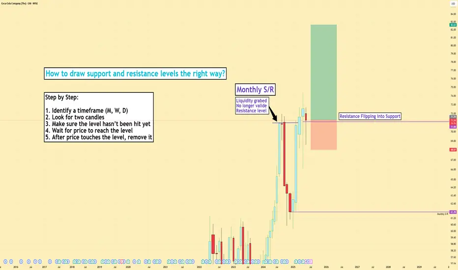
How to draw support and resistance levels the right way?
1️⃣ Why Are Support and Resistance Levels So Important?
Support and resistance levels show where price has reacted strongly in the past. These are zones where many traders including large players have placed buy or sell orders.
Support = where buyers step in and push price up
Resistance = where sellers step in and push price down
These levels are important because they act like decision zones:
- Price might bounce from these levels
- Or break through and start a new move
- Or even fake out traders before reversing again
Knowing where these levels are gives you an edge:
- You can better time your entries and exits
- You avoid chasing price in the middle of nowhere
- You prepare for market reactions not random guesses
Think of them like traffic lights for the market when price hits them, something important usually happens.
2️⃣ Three Main Types of Support and Resistance
There are 3 key types of support and resistance levels traders commonly use:
- Level-Based: Horizontal zones drawn from key highs and lows
- Pattern-Based: Support/resistance found in chart patterns like triangles, flags, etc.
- Channel-Based: Diagonal trendlines showing support and resistance in a channel
Today, we focus on level-based support and resistance horizontal lines drawn on key price zones.
3️⃣ How to Draw Support and Resistance Levels
Use daily, weekly, or monthly timeframes to find major zones. These higher timeframes give you stronger, more respected levels.
Look for:
- Candle bodies that close and open around the same price
- Strong wicks rejecting a certain level
- Zones where price has bounced multiple times in the past
I often pick:
- The close of a red candle
- The open of the next green candle
These spots usually show where sellers lost control and buyers stepped in — or vice versa.
4️⃣ Timeframes and Their Strength
The higher the timeframe, the stronger the level:
- Monthly = very strong, long-term zones
- Weekly = strong and reliable
- Daily = useful for swing trading
- Lower timeframes (15m, 5m) = more noise, less reliable unless you're day trading or scalping
Pick levels based on your strategy:
- Swing traders = use daily/weekly/monthly
- Scalpers = lower timeframes with extra confluence (volume, structure)
5️⃣ Don’t Use Support/Resistance Alone
Support and resistance are helpful — but not enough by themselves. Always combine them with:
- Market structure (higher highs/lows)
- Volume confirmation
- Indicators or price action signals
You want to watch how price reacts at your levels. Wait for confirmation before making decisions.
6️⃣ Common Mistakes Traders Make
Mistake 1: Drawing too many levels clutters your chart and creates confusion.
Mistake 2: Keeping old levels that have already been broken or invalidated.
Mistake 3: Ignoring volume. Just because price hits a level doesn’t mean it will reverse. You need volume to back the move.
Also:
Don’t enter blindly on breakout, breakouts can fail. Wait for confirmation.
Don’t assume a level is strong just because it’s touched once — look for multiple rejections.
7️⃣ Example: How I Draw Support/Resistance
Let’s say I’m looking at a daily chart.
- I find a red candle that closes at 42,000
- Then a green candle opens at 42,000 and pushes higher
That tells me buyers stepped in at 42,000 — this is a potential support.
I draw my horizontal line across that level.
Then I zoom into 30m or 15m charts to watch price behavior when it comes back to that level.
If price respects it again, I may enter a trade based on the reaction.
This technique gives me more confidence and clarity.
I know where liquidity might be waiting.
I can combine it with indicators or volume tools.
I avoid random trades.
🔄 Summary
Identify a timeframe – Use the monthly, weekly, or daily chart.
Look for two candles – Draw your support or resistance line at the point where one candle closes and the next one opens.
Make sure the level hasn’t been hit yet – This helps you spot areas where liquidity grabs might happen.
Wait for price to reach the level – Once price touches the support or resistance zone, watch how it reacts.
After price touches the level, remove it – Once tested, that level is no longer fresh and should be cleared from your chart.
Support and resistance isn’t magic — but used with confluence, it becomes a powerful guide.
Please LIKE 👍, FOLLOW ✅, SHARE 🙌 and COMMENT ✍ if you enjoy this idea! Also share your ideas and charts in the comments section below! This is best way to keep it relevant, support us, keep the content here free and allow the idea to reach as many people as possible.
Disclaimer: This is not financial advice. Always do your own research. This content may include enhancements made using AI.
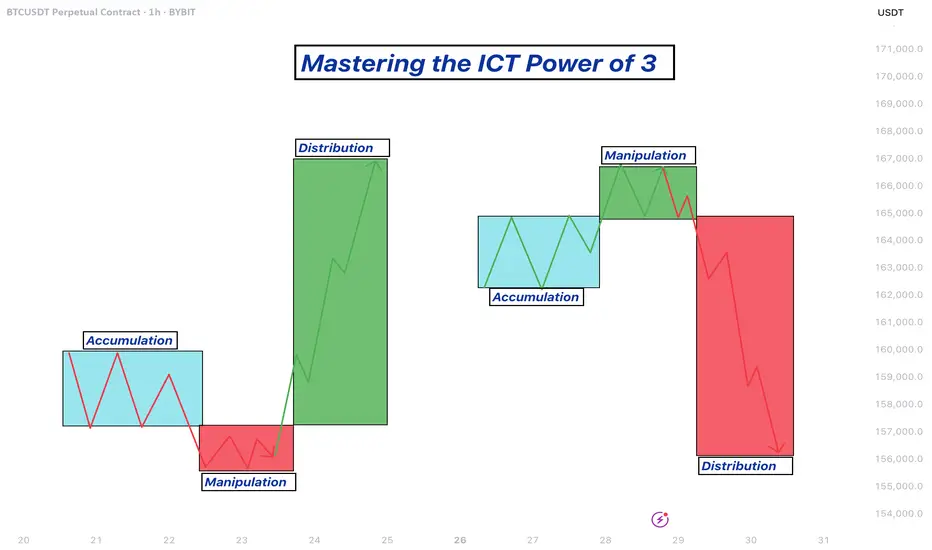
Mastering the ICT Power of 3 concept - How to use it in trading!The financial markets often appear chaotic and unpredictable, but behind the scenes, institutional players operate with clear strategies that shape price action. One such strategy is the ICT (Inner Circle Trader) "Power of 3" model, a framework used to understand and anticipate market cycles through three key phases: accumulation, manipulation, and distribution. This guide will break down each of these phases in detail, explaining how smart money operates and how retail traders can align themselves with the true direction of the market.
What will be discussed?
- The 3 phases
- Examples of the PO3
- How to trade the PO3
- Tips for trading the PO3
The 3 phases
Accumulation
The Accumulation Phase in the ICT "Power of 3" model refers to the initial stage of a market cycle where institutional or "smart money" participants quietly build their positions. During this time, price typically moves sideways within a tight range, often showing little to no clear direction. This is intentional. The market appears quiet or indecisive, which is designed to confuse retail traders and keep them out of alignment with the real intentions of the market's larger players.
In this phase, smart money is not looking to move the market dramatically. Instead, they are focused on accumulating long or short positions without drawing attention. They do this by keeping price contained within a consolidation zone. The idea is to gather enough liquidity, often from unsuspecting retail traders entering early breakout trades or trying to trade the range, before making a more aggressive move.
Manipulation
The Manipulation Phase in the ICT "Power of 3" model is the second stage that follows accumulation. This phase is where smart money deliberately moves the market in the opposite direction of their intended move to trigger retail stop losses, induce emotional decisions, and create liquidity.
After price has consolidated during accumulation, many retail traders are either already positioned or have orders waiting just outside the range, either stop losses from those trading the range or breakout orders from those anticipating a directional move. The manipulation phase exploits this positioning. Price will often break out of the accumulation range in one direction, appearing to confirm a new trend. This move is designed to look convincing, it might even come with a spike in volume or momentum to draw traders in.
However, this breakout is a false move. It doesn’t represent the true intention of smart money. Instead, it's meant to sweep liquidity, triggering stop losses above or below the range, and then reverse sharply. This stop run provides the liquidity needed for large players to finalize their positions at optimal prices. Once enough liquidity is collected, and retail traders are caught offside, the real move begins.
Distribution
The Distribution Phase in the ICT "Power of 3" model is the final stage of the cycle, following accumulation and manipulation. This is where the true intention of smart money is revealed, and the market makes a sustained, directional move, either bullish or bearish. Unlike the earlier phases, distribution is marked by clear price expansion, increased volatility, and decisive momentum.
After smart money has accumulated positions and shaken out retail traders through manipulation, they have the liquidity and positioning needed to drive the market in their desired direction. The distribution phase is where these positions are "distributed" into the broader market, meaning, institutions begin to offload their positions into the retail flow that is now chasing the move. Retail traders, seeing the strong trend, often jump in late, providing the liquidity for smart money to exit profitably.
This phase is typically what retail traders perceive as the real trend, and in a sense, it is. However, by the time the trend is obvious, smart money has already entered during accumulation and profited from the manipulation. What appears to be a breakout or trend continuation to most retail participants is actually the final leg of the smart money’s strategy. They are now unloading their positions while price continues to expand.
Examples of the Power of 3
How to trade the PO3?
Start by identifying a clear accumulation range. This typically happens during the Asian session or the early part of the London session. Price moves sideways, forming a consolidation zone. Your job here isn’t to trade, but to observe. Draw horizontal lines marking the high and low of the range. These become your key liquidity zones.
Next, anticipate the manipulation phase, which usually occurs during the London session or at the NY open. Price will often break out of the range, triggering stop losses above the high or below the low of the accumulation zone. This move is deceptive, it is not the real trend. Do not chase it. Instead, wait for signs of rejection, such as a sharp reversal after the liquidity grab, imbalance filling, or a shift in market structure on a lower timeframe (like a 1- or 5-minute chart).
Once manipulation has swept liquidity and price starts showing signs of reversing back inside the range or beyond, you now look for a confirmation of the true move, this begins the distribution phase. You enter in the direction opposite of the manipulation move, ideally once price breaks a structure level confirming that smart money has taken control.
For example, if price consolidates overnight, fakes a move to the downside (running sell stops), and then quickly reverses and breaks above a key swing high, that's your signal that the true move is likely up. Enter after the break and retest of structure, using a tight stop loss below the recent low. Your target should be based on liquidity pools, fair value gaps, or higher-timeframe imbalances.
The key to trading the Power of 3 is patience and precision. You're not trying to catch every move, but to wait for the market to complete its cycle of deception and then ride the clean expansion. Ideally, your entry comes just after manipulation, and you hold through the distribution/expansion phase, taking partials at key liquidity levels along the way.
Tips for trading the PO3
1. Learn price movements
Before you can effectively apply the ICT Power of 3 strategy, it’s crucial to have a deep understanding of how price behaves. This means being comfortable identifying market structure, recognizing trend direction, and interpreting candlestick dynamics. Since the Power of 3 is deeply rooted in how price moves in real time, a strong grasp of these basics will give you the confidence to read the market correctly as each phase develops.
2. Analyse multiple timeframes
Although the Power of 3 pattern shows up on lower timeframes, relying on just one can lead to misreads. You’ll gain a clearer picture when you align the short-term view with higher timeframe structure. For example, what appears to be accumulation on the 15-minute chart may simply be a retracement in a larger trend on the 1-hour or daily. By examining multiple timeframes together, you can better identify the true setup and avoid being tricked by noise.
3. Exercise patience
A key part of trading the Power of 3 is knowing when to act, and more importantly, when not to. It’s easy to get impatient during the accumulation or manipulation phases, but entering too early often leads to frustration or losses. True discipline comes from waiting for the expansion or distribution phase, when the market reveals its real direction. This is where the most favorable risk-to-reward setups occur.
Thanks for your support.
- Make sure to follow me so you don't miss out on the next analysis!
- Drop a like and leave a comment!
Candle PatternsLesson 2: Candle patterns for the home task
Time Frame 4H
1.Bullish Engulfing (4 instances)
2.Bearish Engulfing (4 instances)
3.Bearish Reversal (4 instances)
4.Bullish Reversal (4 instances)
5.Hammer (4 instances)
6.Hanging Man (4 instances)
7.Morning Star (4 instances)
8.Evening Star (4 instances)
9.Bullish Inverted Hammer (4 instances)
10.Bearish Inverted Hammer (4 instances)
Retro Editors' picks 2020As we move forward through time, we occasionally must look backward to evaluate our progress and address our shortcomings.
For years, PineCoders has voluntarily analyzed numerous published scripts, selecting the most exceptional among them as Editors' picks . To enhance our process and spotlight more high-quality work from our community, we've conducted a comprehensive review of script publications from the past five years. Through this effort, we've identified several additional scripts that deserve greater recognition than they initially received.
Below is a collection of additional scripts from 2020 that have earned a spot in our Editors' picks. These retrospective selections reflect our continued commitment to honoring outstanding contributions in our community, regardless of when they were published. To the authors of these highlighted scripts: our sincere thanks, on behalf of all TradingViewers. Congrats!
Support Resistance Channels - LonesomeTheBlue
BERLIN Candles - lejmer
Delta Volume Columns Pro - LucF
Range Filter - DonovanWall
Over the next four months, in the last week of each month, we will share retro Editors' picks for subsequent years:
June: retro EPs for 2021
July: retro EPs for 2022
August: retro EPs for 2023
September: retro EPs for 2024
They will be visible in the Editors' picks feed .
█ What are Editors' picks ?
The Editors' picks showcase the best open-source script publications selected by our PineCoders team. Many of these scripts are original and only available on TradingView. These picks are not recommendations to buy or sell anything or use a specific indicator. We aim to highlight the most interesting publications to encourage learning and sharing in our community.
Any open-source script publication in the Community Scripts can be picked if it is original, provides good potential value to traders, includes a helpful description, and complies with the House Rules.
— The PineCoders team
A Brief Overview of Price Patterns in TradingPrice patterns are technical analysis tools that help identify price behavior on charts to predict future trends.
Common patterns include continuation and reversal formations. Continuation patterns such as flags, triangles, and rectangles often appear during strong trends and indicate the likelihood of the trend continuing after a period of consolidation. Reversal patterns like head and shoulders, double tops and bottoms, and wedges signal potential changes in trend direction. Recognizing these patterns allows traders to optimize entry points, stop-loss levels, and take-profit targets. The clearer the pattern and the higher the timeframe it appears on, the more reliable it tends to be. However, no pattern guarantees success, so it's important to combine them with other factors like volume, support and resistance zones, and confirmation signals before making trading decisions. Each pattern has its own identifying characteristics such as shape, length, and breakout zones, so consistent observation and practice are essential. Price patterns not only assist in technical analysis but also reflect market psychology and crowd behavior. For best results, traders should combine pattern recognition with risk management and patiently wait for clear signals instead of reacting emotionally. A deep understanding of price patterns can increase the probability of success and reduce risk in the trading process.
Wishing you effective trading and strong discipline!
Whales Wrote the Rules stop your imagination and Lose more Is it true that whales control the charts, or is it just another trading myth?
Why does everything look perfect—until the exact opposite happens?
This analysis reveals how smart money traps retail traders in plain sight.
Hello✌
Spend 3 minutes ⏰ reading this educational material.
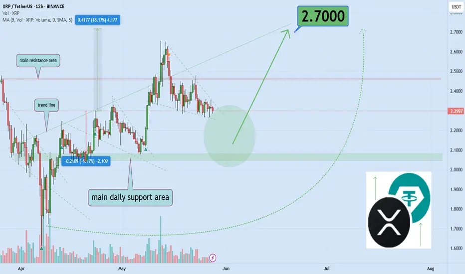
🎯 Analytical Insight on XRP:
XRP is showing classic signs of compression, resembling a tightly wound spring ready to release. Momentum is building, and a breakout appears imminent based on current price structure and volume behavior 📈. While my long-term outlook remains significantly bullish, this setup suggests a conservative upside of at least 18%, with a key target in focus at $2.70 🚀.
Now , let's dive into the educational section,
📊 TradingView Tools to Track Whale Behavior
One of the most powerful truths in trading is this:
Smart money always leaves a trace—you just need to know where and how to look. TradingView provides some powerful tools to help you identify those footprints.
Volume Profile (Fixed Range / Session Volume): Use this tool to spot where the most volume was traded in specific ranges. These high-volume areas often signal zones where whales have entered or exited positions.
Smart Money Concepts / Order Blocks : Now natively available in TradingView for Pro+ and Premium plans, these highlight potential manipulation zones, institutional footprints, and key support/resistance levels.
Liquidity Zones: Use custom indicators like Liquidity Pools Detector or combine ATR with price structure to visualize high-risk/high-reward zones—whales love ambushing retail here.
Practical Tip:
Open the Bitcoin chart. Apply the Volume Profile Fixed Range tool across a two-week range. Look for areas with the highest volume concentration—these are likely whale action zones. Now overlay the Order Block indicator. You’ll often find those zones overlap.
🧠 Understanding Whale Behavior
Whales typically act when the crowd is at extreme fear or greed.
They move against the market’s emotional wave—and to do that, they need to mislead the herd. They create setups that look obvious but are designed to trap.
🐟 How Retail Traders Get Hunted
Here’s the classic trap:
The market makes a fake drop → panic selling → retail goes short.
Then whales step in, absorb liquidity, push price up → retail goes long too late.
Finally, whales dump at the top, and price collapses again.
🔄 Whale Playbook: The Four Phases
Silent Accumulation
Fake Breakout Pump
Distribution During Peak Greed
Dump + Liquidity Grab
You’ll find this playbook hidden in plain sight—if you stop chasing noise and start tracking volume, liquidity, and sentiment.
⚠️ Why Retail Always Ends Up on the Wrong Side
Because they’re looking for confirmation, not truth.
Whales exploit this—chart patterns, indicators, and fake breakouts are all part of the trap.
You need more than candles—you need context.
🔍 Chart Patterns or Psychological Traps?
Patterns like Head & Shoulders, Wyckoff Phases, or Triangles?
Whales know you’re watching them. They use these patterns as bait.
Unless combined with volume confirmation and liquidity context, most patterns are psychological illusions.
🧭 How to Follow the Smart Money
Study candle behavior with volume (Volume Spread Analysis)
Drop to lower timeframes to confirm liquidity zones
Use Anchored VWAP from major pivot highs/lows
Watch for divergence between price and volume—especially at highs/lows
💡 Conclusion:
There’s no holy grail in trading—but if you start thinking like a whale instead of chasing them, you’ll stop being the bait.
Use TradingView’s institutional-level tools to decode real market intentions.
Next time you spot a "perfect breakout," ask: who's on the other side of this trade—and why?
always conduct your own research before making investment decisions. That being said, please take note of the disclaimer section at the bottom of each post for further details 📜✅.
Give me some energy !!
✨We invest countless hours researching opportunities and crafting valuable ideas. Your support means the world to us! If you have any questions, feel free to drop them in the comment box.
Cheers, Mad Whale. 🐋
The Ultra Idea : d-MR96nBa's Ultimate Market Journal🌌The Ultra Idea : d-MR96nBa's🌠Ultimate Market Journal🎨
Hello Fellow Travelers
It's been some time since I've posted a Fresh Idea, though I've remained actively trading.
What better way to mark my TradView return, than to start an Ultimate Market Journal.
Financial Markets have taken my deep interest again recently, especially as we seem to be at a time of accelerating change and shifting regimes.
I believe many opportunities abound to those with open, flexible and creative minds.
A bit more about myself.
I've been involved with financial markets in one form or fashion for 18 years now.
I started out like most of us, approaching the game with fundamental analysis, only to later incorporate and then fully graduate to T/A.
I'm a natural Contrarian.
My brand of technical analysis is as much about aesthetics, creative expression, discovering hidden truths and applying Universal Principles as it is running the numbers.
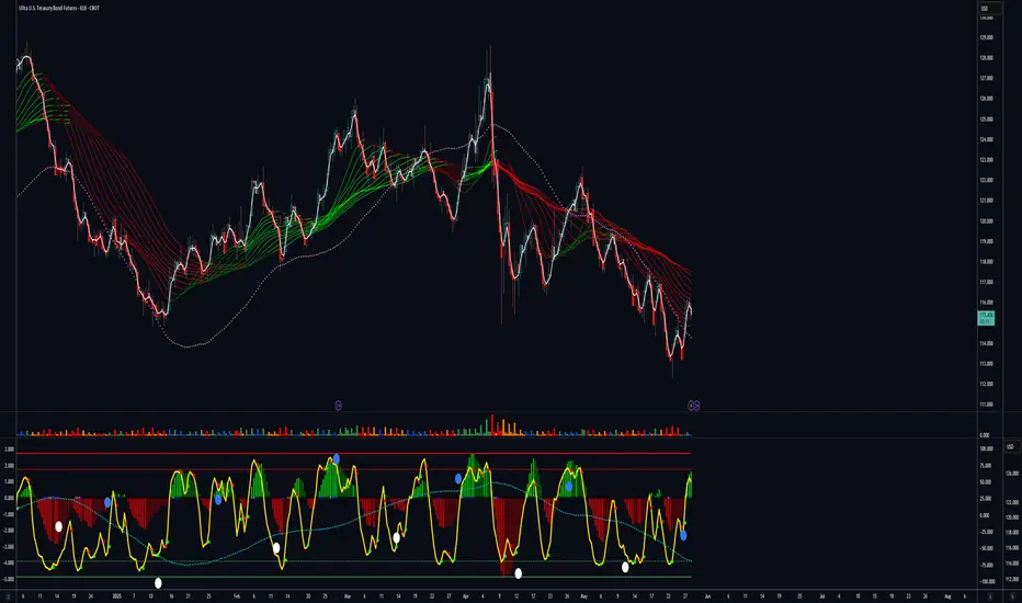
I'm starting this off with Ultra Bond Futures, as UB's are the trading instrument I've come to specialise in, having had the most ongoing consistent success trading.
This by no means is going to be a "I bought here and sold there" type of Journal, as that's not my style.
Nor am I going to focus on a single market instrument, observation or style of analysis.
I'd like this to become a repository of accumulated wisdom and unique market perceptives.
I've just begun contemplating what this may evolve into in time, and I invite you to join me in taking this Leap
d-MR96nBa🌌
Concept
Inversion📈📉
Seek out and analyse whatever moves exactly inverse to what you intend to trade.
If you're having trouble discerning trend or observing price patterns, check the inverse.
This can be an excellent technique for exposing Bias.
This can work particularly well for currency traders, though can be Universally applied.
For US Ultra Bonds, the inverse is the US 30 Year Yield
Ultra Bond Futures
US 30 Year Yield
Currency traders, say you're about to trade AUD/CHF
Check out the CHF/AUD chart first, if they both appear Bullish or Bearish, you've got a Bias.
AUD/CHF
CHF/AUD
GBP/JPY
JPY/GBP
EUR/USD
USD/EUR
Are there any examples of Inversion in Trading you'd like to share ?
What else is on my🧠
Well just casually, I believe we're currently witnessing Peak Bitcoin in it's entire Life-cycle.
Have we Bull Trapped & Breakaway Gapped on Berkshire Hathaway
BRK.B
It's in the Detail
Forex Trading Time Zones: Market Hours and OverlapsForex Trading Time Zones: Market Hours and Overlaps
In the world of forex trading, understanding the dynamics of different time zones is paramount. This article delves into the intricate web of currency trading time zones, exploring the 24-hour cycle, major trading hours, and the nuanced opportunities each presents.
The 24-Hour Cycle of Forex Market Time Zones
The forex market's distinctive feature of being open 24 hours a day, five days a week, is a testament to its unparalleled accessibility, dynamics, and decentralised nature. Unlike traditional financial markets constrained by fixed trading hours, the forex market operates continuously, commencing in Asia on Monday and concluding in North America on Friday.
Major financial centres in different time zones steer the dynamics of the forex market, acting as the primary drivers of market activity during their respective business hours. That complex interplay creates distinct trading periods, each characterised by unique market conditions and opportunities.
Key Forex Session Time Zones
Knowing the trading hours of the major forex trading hours is fundamental for any trader aiming to capitalise on the dynamic nature of the market.
Winter time:
- London Session: From 8:00 AM to 5:00 PM UTC
- New York Session: From 1:00 PM to 10:00 PM UTC
- Sydney Session: From 09:00 PM to 6:00 AM UTC
- Tokyo Session: From 11:00 PM to 8:00 AM UTC
Summer time:
- London Session: From 7:00 AM to 4:00 PM UTC
- New York Session: From 12:00 PM to 9:00 PM UTC
- Sydney Session: From 10:00 PM to 7:00 AM UTC
- Tokyo Session: From 11:00 PM to 8:00 AM UTC
Different Time Zones in Forex Trading Create Opportunities
The diverse forex trading time zones offer a rich tapestry of opportunities, each session presenting distinct characteristics that traders can strategically exploit.
London Session
The London session time provides opportunities for traders to engage in high-liquidity markets. Currency pairs involving the euro (EUR) or the British pound (GBP), such as EUR/USD and GBP/USD, tend to be particularly active during this period. The early morning volatility during the London session trading time can be harnessed for quick trades or trend-establishing moves.
New York Session
As the New York session time kicks in, currency pairs involving the US dollar (USD) or other currencies of countries in the same time zone take centre stage. Pairs like USD/MXN and USD/CAD experience heightened volatility and amplified market activity.
Sydney Session
While the Sydney session may exhibit lower volatility, it sets the stage for the day's trading. Currency pairs tied to the Australian dollar (AUD) and the New Zealand dollar (NZD), like AUD/USD and NZD/USD, can witness initial movements during this period, creating opportunities for strategic positioning.
Tokyo Session
The Tokyo session focuses on the Japanese yen (JPY) pairs, offering traders the chance to tap into the unique characteristics of this market. Currency pairs like USD/JPY and EUR/JPY may see increased activity, presenting opportunities for trend-following or counter-trend strategies.
Session Trading Strategies
The convergence of major financial hubs during specific currency trading time zones creates a unique environment that can be exploited strategically. Let’s examine three strategies for each major forex time zone.
London Session Breakout Strategy
The London Session Breakout strategy is based on the significant increase in trading volume and volatility when the London market opens, specifically between 7:00 AM and 10:00 AM UTC (summer time) or 8:00 AM and 11:00 AM UTC (winter time). However, most focus is often placed on the range between 8:00 AM and 9:00 AM summer time or 9:00 AM and 10:00 AM winter time. This surge during the London trading session often leads to notable price movements, particularly in forex pairs like GBP/USD and EUR/USD, making it an ideal time for breakout strategies.
Entry
- Traders monitor the early London trading hours. The idea is to look for a specific range with clear high and low boundaries during this time.
- They set buy stop orders slightly above the high of this range and sell stop orders slightly below the low, aiming to capture the breakout direction.
Stop Loss
- Stop losses are strategically placed slightly below the most recent swing low for buy positions and vice versa, offering potential protection against false breakouts.
Take Profit
- Some traders may prefer to close the position as the New York session begins, as reversals are common during this session overlap.
- Alternatively, trailing stops might be employed to take advantage of extended price movements if the trend continues strongly after the breakout.
New York Reversal Strategy
The New York Reversal strategy exploits the heightened volatility and liquidity that occur at the start of the New York session. While there isn’t a perfect correlation, it’s common to see the initial London trend extended early into the New York session before a reversal, usually between 12:30 PM and 2:00 PM UTC summer time and 1:30 PM and 2 PM UTC winter time. This strategy is particularly effective due to the influx of trading activity and market orders when the US markets open.
Entry
- Traders often monitor the market around the first couple of hours of the New York forex session time, looking for signs of reversal. This may be a divergence between a price and a momentum indicator, a reaction from a significant support or resistance level, a candlestick or chart pattern, and so on.
- Once the trader has confirmation that the London trend may be reversing, they enter a position.
Stop Loss
- Stop losses are generally placed just beyond the nearest swing high or low. This helps potentially protect against losses if the anticipated reversal does not occur.
Take Profit
- Traders frequently set profit targets at significant support or resistance levels established during the London session.
- Alternatively, traders might trail their stop loss to follow the market movement and maximise potential gains.
Tokyo Volatility Breakout Strategy
The Tokyo Volatility Breakout strategy leverages the increased trading activity and liquidity at the start of the Tokyo session time. This strategy is best suited to JPY pairs like USD/JPY, EUR/JPY, and GBP/JPY, which often see significant price movements due to the influx of market participants at Japan’s forex market open time.
Between 9:00 PM and 10:00 PM UTC summer time (8:00 PM and 9:00 PM UTC winter time), volume and liquidity dry up significantly as the New York session closes. 10:00 PM and 11:00 PM UTC summer time (9:00 PM and 10:00 PM winter time) sees some activity as Sydney session time begins, but the start of the Tokyo session forex time, between 11:00 PM and 12:00 AM, can kickstart a new trend and break out from the typical ranging conditions from the previous few hours.
Entry
- Traders often monitor the market and look for breakouts as the Tokyo session begins.
- Bollinger Bands can be used to identify these breakouts, typically characterised by the bands squeezing together before the price closes strongly outside the upper or lower band, potentially indicating the start of a trend.
Stop Loss
- Stop losses are generally placed beyond the nearest swing high or low or beyond the opposite side of the Bollinger Band. This helps potentially protect against losses if the breakout does not result in a sustained trend.
Take Profit
- Profit targets are often set at significant support or resistance levels established in previous sessions.
- Alternatively, positions might be closed at the start of the London session (around 7:00 AM - 8:00 AM UTC) to avoid potential reversals that occur with the increased liquidity and trading volume as European markets open.
Tailoring Your Trading Schedule to Forex Currency Time Zones
Crafting an effective trading schedule involves a personalised approach, taking into account a trader's individual location and trading style objectives.
Different Trading Styles: Maximising Opportunities
Forex time zones often determine specific forex rate behaviours. For day traders, the volatility and liquidity during overlapping activity can provide ideal conditions for executing rapid trades. The heightened volatility and liquidity are even more advantageous for scalpers seeking to capitalise on rapid price movements by executing trades with precision.
Overlapping sessions also often mark key points where trends may continue or reverse. Traders employing trend-following or breakout-based strategies can capitalise on that momentum.
Swing traders, on the other hand, who aim to capture trends over a slightly longer timeframe, may take advantage of the distinct characteristics of individual sessions, such as the so-called stability of the Sydney session or the high volatility of the London session.
Economic Events and News Releases
Traders also consider the timing of major data releases and align that with their specific geographic location. During the London session, major European economic indicators and policy announcements can set the tone. Then, the market may respond to data from the United States that can significantly influence USD pairs, followed by economic reports from the Asia-Pacific region. The interconnectedness of the world economy can have cascading effects on currency values across the globe.
Currency Market Correlations
Currency pair correlations exhibit dynamic shifts depending on the timing and may lead to specific patterns. For example, the correlation between USD/JPY and EUR/USD can shift throughout the trading day, starting from positive during the Tokyo session and then shifting into negative during European and New York trading hours. Traders can leverage correlation analysis as a powerful tool for making informed trading decisions.
Final Thoughts
Navigating the dynamic world of forex trading requires a multifaceted understanding of the market's 24-hour cycle, the overlapping of major trading sessions, and the intricate interplay of economic events and currency correlations.
FAQ
What Are the 4 Forex Sessions?
The forex market operates 24 hours a day, divided into four main sessions based on key financial centres: the Sydney session forex time (10:00 PM to 7:00 AM UTC in the summer and 9:00 PM to 6:00 AM UTC in the winter), the Tokyo session forex time (11:00 PM to 8:00 AM UTC in the summer and winter), the London session forex time (7:00 AM to 4:00 PM UTC in the summer and 8:00 AM to 5:00 PM UTC in the winter), and the New York session forex time (12:00 PM to 9:00 PM UTC in the summer and 1:00 PM to 10:00 PM UTC in the winter).
When Does the London Session Start?
The London session starts at 7:00 AM UTC during summer and at 8:00 AM UTC during winter due to daylight saving time adjustments. This session is crucial for its high liquidity and significant overlap with other major sessions.
What Time Is the New York-London Session Overlap?
The overlap between the New York trading session time and the London session occurs from 12:00 PM to 4:00 PM UTC in summer and from 1:00 PM to 5:00 PM UTC in winter.
Do Tokyo and London Sessions Overlap?
The Tokyo and London sessions do not overlap significantly. The Tokyo session ends at 8:00 AM UTC, while the London session starts at 7:00 AM UTC in the summer. The minimal overlap from 7:00 AM to 8:00 AM UTC sees limited trading activity. In winter, sessions don’t overlap.
This article represents the opinion of the Companies operating under the FXOpen brand only. It is not to be construed as an offer, solicitation, or recommendation with respect to products and services provided by the Companies operating under the FXOpen brand, nor is it to be considered financial advice.