Not All Pin Bars Are Created EqualA Two-Step Filter to Find the Ones That Actually Matter
We’ve all seen them. Long wicks, tight bodies, price rejecting a level. The classic pin bar. Textbook stuff, right?
But here’s the problem. Pin bars show up all over the chart. Some lead to clean reversals. Most do absolutely nothing. The trick isn’t spotting them. It’s knowing which ones to trust.
This is where a simple two-step filter can help. By asking two key questions, you immediately improve the quality of your trades and cut down on the false positives.
Step One: Where Did It Happen?
Before you look at shape or size, ask yourself one thing.
Did this pin bar form at a meaningful level?
Context is everything. A pin bar that forms into thin air, mid-range or in the middle of chop might look good, but it’s rarely reliable. What you’re looking for is reaction from structure. That could mean:
• A clean horizontal support or resistance level
• A prior swing high or low
• A daily VWAP or anchored VWAP from a key event
• The edge of a range or value area
• A trendline tested multiple times
In short, the level gives the pin bar a reason to exist. It becomes a reaction, not a random candle.
Mark the level before the candle forms. This stops you from retrofitting significance where there isn’t any.
Example:
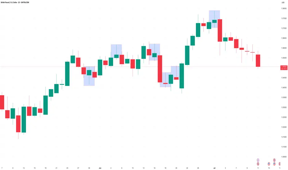
Here we can see how the volume weighted average price (VWAP) can add meaningful context to a pin-bar setup. In this case, USD/CAD retraced against the prevailing downtrend and tested the VWAP anchored to the recent swing highs. At that point, price formed a clear pin-bar reversal, signalling rejection and potential continuation with the broader trend.
USD/CAD Daily Candle Chart
Past performance is not a reliable indicator of future results
Step Two: What’s Happening Under the Hood?
Once you’ve got a pin bar at a meaningful level, it’s time to look deeper. One of the best ways to do that is by dropping down to a lower timeframe, like the 5-minute chart, and replaying the session that created the candle.
Why?
Because daily candles can hide a lot. A clean pin bar might look like a strong rejection, but on the intraday chart, it might just be a low-volume fakeout or one impulsive move during quiet hours. On the other hand, a pin bar backed by real market structure is far more likely to hold.
Here’s what to look for on the lower timeframe:
• Was there a liquidity grab or stop run into the level?
• Did price pause, base or reverse with intent?
• Were there multiple attempts to push beyond the level that failed?
• Did volume spike during the rejection?
When a pin bar reflects a genuine intraday battle, not just a random wick, it often tells you more about the intentions of real participants.
Example:
In this example, GBP/USD forms a bearish pin-bar at a key area of swing resistance on the daily chart. Dropping down to the 5-minute timeframe helps reveal what actually happened inside that candle.
On this lower timeframe we can see that price initially pushed above resistance but failed to hold, triggering a steady wave of intraday selling pressure. This move was followed by a mild pullback during the latter half of the US session and into the New York close, reinforcing the idea of rejection and offering insight into the mechanics behind the pin-bar.
GBP/USD Daily Candle Chart
Past performance is not a reliable indicator of future results
GBP/USD 5min Candle Chart: How the Daily Pin-bar Formed
Past performance is not a reliable indicator of future results
Bonus Filter: What’s the Trend Context?
You could also add a third layer if you want to refine even further. Is the pin bar counter-trend, or is it a pullback within trend?
Counter-trend pin bars at key levels can work, but they’re lower probability and often take more time to play out. Pin bars that form as part of a pullback to structure in the direction of the prevailing trend tend to move more cleanly.
This is where using something like a 20 EMA or anchored VWAP can help frame the setup.
Putting It All Together
Next time you see a pin bar, pause. Don’t rush in. Ask yourself:
• Did this happen at a level that matters?
• Does the intraday story back up the candle?
If the answer is yes to both, now you’ve got something worth trading. Not just another wick in the wind.
Pin bars can be strong signals, but only when they reflect real intent. This two-step filter helps you cut through the clutter and focus on the ones that do.
Disclaimer: This is for information and learning purposes only. The information provided does not constitute investment advice nor take into account the individual financial circumstances or objectives of any investor. Any information that may be provided relating to past performance is not a reliable indicator of future results or performance. Social media channels are not relevant for UK residents.
Spread bets and CFDs are complex instruments and come with a high risk of losing money rapidly due to leverage. 85.24% of retail investor accounts lose money when trading spread bets and CFDs with this provider. You should consider whether you understand how spread bets and CFDs work and whether you can afford to take the high risk of losing your money.
Community ideas
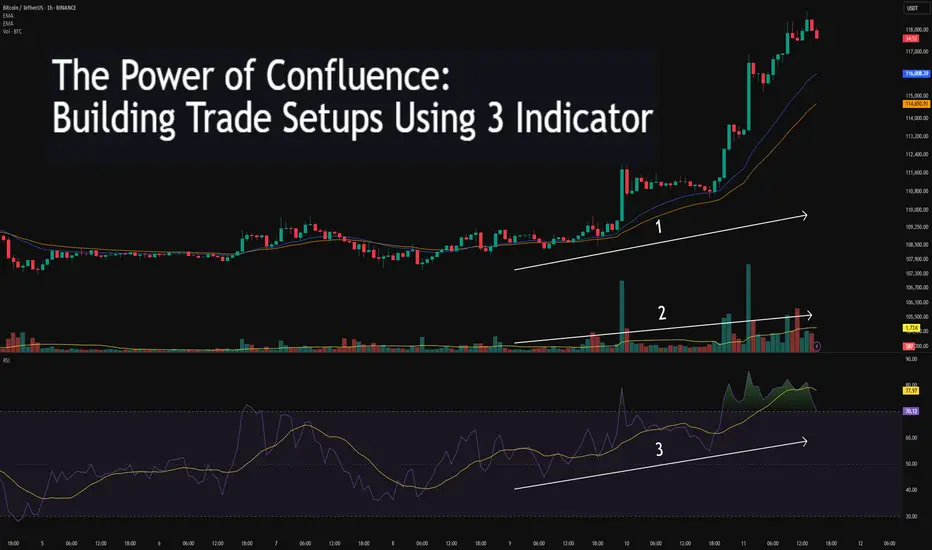
The Power of Confluence: Building Trade Setups Using 3 Indicator🔵 INTRODUCTION
Many traders fall into the trap of relying on a single indicator to make trading decisions. While one tool might work occasionally, it often leads to inconsistent results. The key to consistency lies in confluence — the strategic combination of multiple indicators that confirm each other.
In this article, you'll learn how to build high-probability trade setups by combining three essential components: trend , momentum , and volume .
🔵 WHY CONFLUENCE MATTERS
Confluence refers to multiple signals pointing in the same direction. When different indicators agree, your trade idea becomes much stronger. It helps reduce noise, avoid false signals, and increase confidence in your entries.
Think of it like crossing a busy road: you wait for the green light, check both sides, and make sure no cars are coming. The more confirmations you have, the safer your move.
🔵 WHAT IS CONFLUENCE IN TRADING?
Confluence means agreement. In trading, it’s when different methods, indicators, or tools all point toward the same outcome.
Think of it like this:
One green light? Maybe.
Two green lights? Worth watching.
Three green lights? That’s a trade worth considering.
Imagine you're planning a road trip. You check the weather forecast (trend), Google Maps traffic (momentum), and ask a local for advice (volume). If all three say “go,” you’re more confident in your decision. Trading works the same way — using multiple tools to validate a setup reduces risk and removes guesswork.
Important: Confluence is NOT about cramming 10 indicators onto your chart. It’s about using a few that each offer different types of information — and only acting when they align.
🔵 THE 3-STEP CONFLUENCE SETUP
1️⃣ Identify the Trend (Using EMAs)
Before entering any trade, you need to know the market direction. You can use:
Moving Averages (e.g., 21 EMA and 50 EMA crossover)
Structure-based analysis (e.g., higher highs = uptrend)
Trade only in the direction of the prevailing trend.
2️⃣ Check Momentum (Using RSI, MACD, or Stochastic)
Momentum tells you whether the market supports the current trend or if it's weakening.
RSI above 50 → Bullish momentum
MACD histogram rising → Acceleration
Stochastic crossing above 20 or 80 → Momentum shifts
Avoid entering when momentum is fading or diverging from price.
3️⃣ Confirm with Volume (To Validate Participation)
Volume reveals the strength behind the move. A breakout or trend continuation is more reliable when it's backed by volume.
Look for:
Volume spikes at breakout points
Increasing volume in the direction of the trend
Volume confirmation after pullbacks or retests
No volume = no conviction. Watch how the market "votes" with actual participation.
🔵 EXAMPLE TRADE SETUP
Let’s say you spot a bullish trend with 21 EMA above 50 EMA. RSI is above 50 and rising. A pullback forms, and volume picks up as price starts to push higher again.
That’s trend + momentum + volume lining up = a confluence-based opportunity.
🔵 BONUS: HOW TO ENHANCE CONFLUENCE
Add price action patterns (flags, wedges, breakouts)
Use support/resistance zones for cleaner entries
Combine with higher timeframe confirmation
Wait for retests after breakouts instead of chasing
Confluence doesn't mean complexity — it means clarity.
🔵 CONCLUSION
The best traders don’t guess. They wait for the market to align. By combining trend, momentum, and volume, you filter out weak setups and focus only on the highest-probability trades.
Start testing confluence-based setups in your strategy. You’ll likely find more consistency, fewer fakeouts, and greater confidence in your execution.
Do you trade with confluence? What’s your favorite trio of indicators? Let’s talk in the comments.
Institutional Trading Process 1. Investment Idea Generation
This is where it all begins.
Institutions generate trading ideas based on:
Fundamental research (company earnings, macroeconomic data)
Quantitative models (statistical or algorithmic strategies)
Technical analysis (price action, trends, volume)
Sentiment analysis (news flow, social media, market psychology)
Often, the research team, quant team, or portfolio managers work together to develop high-conviction trade ideas backed by data and analysis.
2. Pre-Trade Analysis and Risk Assessment
Before placing a trade, institutions perform:
Risk/reward analysis
Scenario testing (How does the trade perform in different market conditions?)
Volatility analysis
Position sizing based on portfolio risk budget
Forex Market Depth Analysis and Trading StrategiesForex Market Depth Analysis and Trading Strategies
Forex market depth analysis offers traders a deeper understanding of currency market dynamics. It reveals the real-time volume of buy and sell orders at different prices, which is crucial for assessing liquidity and trader sentiment. This article explores how to analyse and use market depth for trading, discussing various strategies and their limitations.
Forex Market Depth Explained
Market depth meaning is the volume of buy and sell orders at different price levels. It's a real-time snapshot of the pair’s liquidity and depth of supply (sell orders) and demand (buy orders). Traders use this information to gauge the strength and direction of a currency pair.
This depth is typically represented through an order book, displaying a currency pair’s existing orders at various price points. This book lists the number of units being bid or offered at each point, giving us insight into potential support and resistance levels. For instance, a large number of buy orders at a certain price level may indicate a strong support area, suggesting that many traders are willing to purchase the currency pair at this price.
Understanding market depth is crucial in assessing the likelihood of trades being executed at desired prices, especially in fast-moving currencies or when trading large volumes. It may help in identifying short-term price movements, offering a more nuanced view of an asset beyond just candlestick charts.
How to Analyse Market Depth
Analysing order flow is a fundamental aspect of market depth trading, providing traders with valuable insights into the supply and demand dynamics of forex pairs. Forex market depth can be assessed using various tools and indicators.
One key tool is the Depth of Market (DOM), which shows the number of buy and sell orders pending at different prices. DOM offers a visual representation of the currency pair’s order book, highlighting potential areas where large orders are placed. We can use such information to identify significant support and resistance levels where the pair might experience a turnaround.
Another essential tool is Level II quotes. These quotes provide detailed information about the price, volume, and direction of every trade executed in real-time. By analysing Level II quotes, traders may be able to identify the pair’s momentum and potential trend shifts. For example, if there is a sudden increase in sell orders at a particular price, it may indicate a potential downward movement, prompting us to adjust our positions accordingly.
Strategies Using Market Depth Analysis
In forex trading, market depth analysis is a crucial tool for understanding and executing a depth of market strategy. Here's how traders can leverage this type of analysis in their strategies:
Scalping Strategy
By closely observing the DOM, scalpers can identify minor price movements and liquidity gaps. For instance, if the DOM shows a large number of sell orders at a slightly higher price, a scalper might open a short position, anticipating a quick downturn. This strategy relies on fast, short-term trades, capitalising on small price changes.
Momentum Trading
Momentum traders use the order book to gauge the strength of a trend. By analysing the order flow and volume, they can determine if a trend is likely to continue or reverse. For example, a surge in buy orders at increasing prices may signal a strong upward momentum, prompting a trader to enter a long position. Conversely, a build-up of sell orders might indicate a potential downward trend.
Support and Resistance Trading
Depth analysis is invaluable for identifying key support and resistance levels. Clusters of orders often act as barriers, influencing price movements. Traders may use these levels to set entry and exit points. For example, a large number of buy orders at a specific price may indicate a strong support zone, reflecting a potentially good entry point for a long position.
Breakout Trading
Traders seeking breakout opportunities can use market depth to spot potential breakout points. A significant accumulation of orders just beyond a known resistance or support level may indicate a potential breakout. If the pair moves past these areas with high volume, it could signal the start of a new trend, potentially offering a lucrative trading opportunity.
Integrating Market Depth with Technical Analysis
Integrating a depth chart trading strategy with technical analysis may enhance decision-making, combining the real-time insights of depth charts with the power of technical indicators. For instance, we can use market depth to confirm signals from technical analysis tools.
If a moving average crossover suggests a bullish trend, a corresponding increase in buy orders in the depth chart may reinforce the signal. Similarly, a significant resistance level identified through technical analysis, such as a Fibonacci retracement level, might be substantiated if there’s a large accumulation of sell orders at that price point.
Risks and Limitations of Market Depth Analysis
While market depth analysis is a valuable tool in forex trading, it comes with certain risks and limitations:
- Dynamic and Fast-Changing Data: Order book data is highly dynamic, often changing within seconds, making it challenging to base long-term strategies solely on such information.
- Lack of Centralisation in Forex: Unlike stock exchanges, the forex market lacks a centralised exchange. This decentralisation means depth data might not represent the entire marketplace accurately.
- Susceptibility to 'Spoofing': Large players might place and quickly withdraw large orders to manipulate market depth perception, misleading other traders. It’s worth noting that spoofing is illegal in many jurisdictions.
- Limited Usefulness in Highly Liquid Markets: In highly liquid pairs, the depth of market data may become less relevant, as large orders are quickly absorbed without significantly impacting prices.
- Dependency on Broker's Data: The reliability of order book data depends on the broker's technology and the size of their client base, which can vary widely.
The Bottom Line
Market depth analysis provides critical insights for forex traders, though it's vital to recognise its dynamic nature and limitations. Integrating it with technical analysis may create robust trading strategies.
This article represents the opinion of the Companies operating under the FXOpen brand only. It is not to be construed as an offer, solicitation, or recommendation with respect to products and services provided by the Companies operating under the FXOpen brand, nor is it to be considered financial advice.
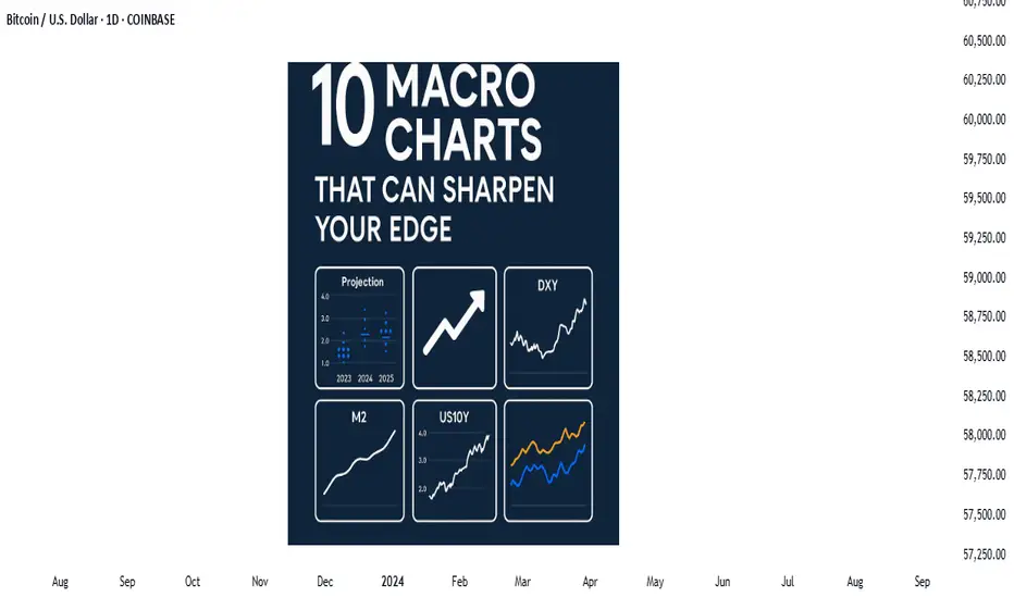
Price action is the vehicle—but these charts show the road aheadIn the world of trading, technical analysis often gets the spotlight—candlesticks, moving averages, and indicators. But beneath every price movement lies a deeper current: macroeconomic forces. These forces shape the environment in which all trades happen.
Great traders don’t just react to price—they understand the context behind it. That context is found in macro charts: the financial “weather maps” of markets. These charts reveal whether capital is flowing toward risk or safety, whether inflation is heating up or cooling down, and whether liquidity is expanding or shrinking.
In this post, we’ll explore 10 macro charts that can elevate your edge, backed by proven examples of how they’ve helped traders stay on the right side of the market. These aren't just charts—they’re market truths in visual form.
1️⃣ DXY – U.S. Dollar Index
Why it matters:
The U.S. dollar affects everything: commodities, stocks, global trade, and especially forex. The DXY measures its strength against major currencies.
📉 Chart Reference:
In 2022, DXY surged past 110 due to aggressive Fed rate hikes. This crushed EURUSD, pressured gold, and triggered a global risk-off move. Traders who tracked DXY rode USD strength across the board.
💡 Use it to: Confirm trends in FX and commodities. Strong DXY = bearish pressure on gold and risk assets.
2️⃣ US10Y – 10-Year Treasury Yield
Why it matters:
This is the benchmark for interest rates and inflation expectations. It guides borrowing costs, equity valuations, and safe-haven flows.
📉 Chart Reference:
In 2023, the 10Y spiked from 3.5% to nearly 5%, leading to weakness in growth stocks and boosting USD/JPY. Bond traders saw it first—equities followed.
💡 Use it to: Anticipate moves in growth vs. value stocks, and confirm macro themes like inflation or deflation.
3️⃣ Fed Dot Plot
Why it matters:
This is the Fed’s forward guidance in visual form. Each dot shows where a policymaker expects interest rates to be in the future.
📉 Chart Reference:
In Dec 2021, the dot plot signaled a faster pace of hikes than the market expected. Those who caught the shift front-ran the USD rally and equity correction in early 2022.
💡 Use it to: Predict future rate policy and align your macro bias with the Fed's path.
4️⃣ M2 Money Supply (US)
Why it matters:
This chart tracks the amount of money in the system. More liquidity = fuel for risk. Less = tightening conditions.
📉 Chart Reference:
After COVID hit, M2 exploded, leading to a major bull run in stocks and crypto. When M2 began contracting in 2022, asset prices peaked and reversed.
💡 Use it to: Gauge macro liquidity conditions. Expansion is bullish; contraction is dangerous.
5️⃣ Copper/Gold Ratio
Why it matters:
Copper is a growth metal; gold is a fear hedge. Their ratio acts as a risk-on/risk-off indicator.
📉 Chart Reference:
In 2021, the copper/gold ratio surged—signaling growth and optimism. This preceded strong gains in cyclical equities and commodity currencies like AUD and CAD.
💡 Use it to: Confirm risk sentiment and lead equity or FX trends.
6️⃣ VIX – Volatility Index
Why it matters:
VIX tracks expected volatility in the S&P 500. It's often called the "fear index."
📉Chart Reference :
In March 2020, VIX spiked to nearly 90 as COVID panic set in. This extreme fear was followed by one of the greatest buying opportunities of the decade.
💡 Use it to: Time entries and exits. High VIX = fear = possible reversal. Low VIX = complacency = caution.
7️⃣ Real Yields (10Y TIPS - CPI)
Why it matters:
Shows the inflation-adjusted return on bonds. Real yields affect gold, tech, and risk appetite.
📉Chart Reference :
In 2022, real yields went from deeply negative to positive—crushing gold and high-growth stocks.
💡 Use it to: Confirm direction in gold, NASDAQ, and broad macro trends.
8️⃣ Oil Prices (WTI or Brent)
Why it matters:
Oil is both a growth and inflation input. Rising prices mean higher costs and often precede policy tightening.
📉Chart Reference :
Oil’s rally in early 2022 foreshadowed CPI spikes and led central banks to turn hawkish. Traders who tracked it saw inflation risks building early.
💡 Use it to: Forecast inflation, assess energy-related equities, and understand global demand.
9️⃣ Global PMIs (Purchasing Managers’ Indexes)
Why it matters:
Leading indicator of economic health. PMIs above 50 = expansion. Below 50 = contraction.
📉 Chart Reference:
In 2023, China’s PMI consistently printed below 50—signaling manufacturing weakness and global demand concerns. This helped traders avoid overexposure to emerging markets.
💡 Use it to: Gauge growth momentum globally and regionally.
🔟 SPX vs. Equal-Weighted SPX (Breadth Divergence)
Why it matters:
Shows whether the S&P 500 rally is broad-based or just driven by a few megacaps.
📉Chart Reference :
In early 2024, the index made new highs—but the equal-weighted version lagged badly. That divergence warned traders of a fragile rally.
💡 Use it to: Detect weakness beneath the surface and avoid false confidence in rallies.
🧠 Nerdy Tip: Macro Is the Invisible Hand
These charts don’t give you trade entries—but they give you conviction, timing, and perspective.
When you combine macro context with technical setups, you trade in sync with the market’s deeper rhythm.
So before you place your next trade, ask yourself:
What are yields doing?
Is liquidity expanding or drying up?
Is risk appetite rising or falling?
put together by : @currencynerd as Pako Phutietsile
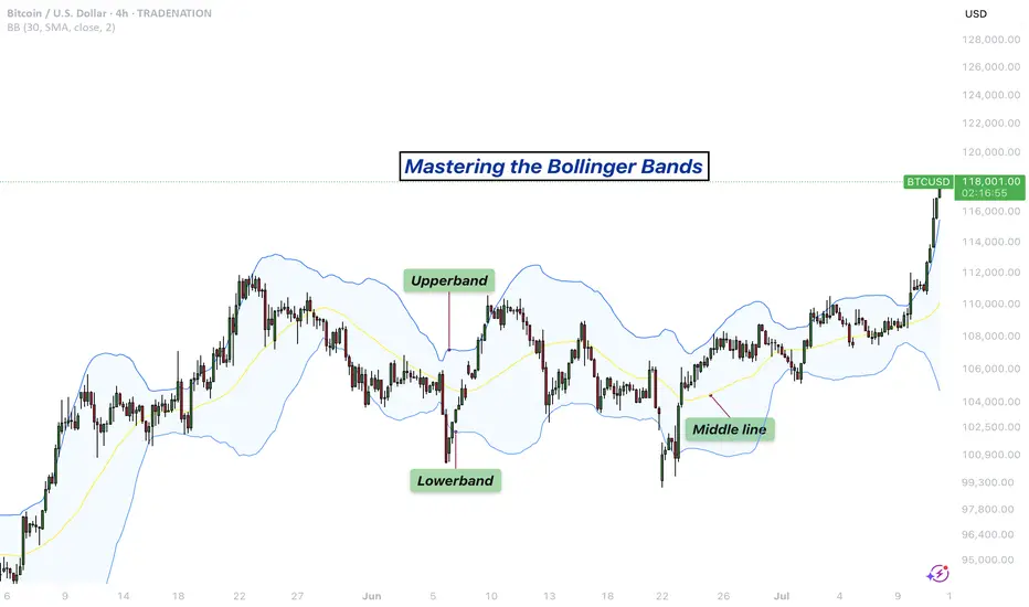
Mastering the Bollinger Bands- How to use it in trading?What is the Bollinger Bands
Bollinger Bands is a popular technical analysis tool developed by John Bollinger in the 1980s. It is designed to measure market volatility and provide signals for potential price reversals or trend continuations. The Bollinger Bands consist of three lines: a simple moving average in the middle, usually calculated over 20 periods, and two outer bands that are placed a set number of standard deviations above and below the moving average. These outer bands automatically adjust to market conditions, expanding and contracting based on price volatility. The indicator is widely used by traders to understand the relative highs and lows of a financial instrument in relation to recent price action.
What will be discussed?
- How does it work with the lower band and upper band?
- What does the narrowing mean?
- What does the widening mean?
- How to trade with the Bollingers Bands?
-------------------------
How does it work with the lower band and upper band?
The upper band and the lower band serve as dynamic levels of resistance and support. When the price of an asset touches or exceeds the upper band, it may be considered overbought, suggesting that a reversal or pullback could be near. Conversely, when the price approaches or breaks below the lower band, the asset may be viewed as oversold, indicating a potential rebound. These bands do not generate definitive buy or sell signals on their own but instead help traders assess market conditions. The interaction of price with the upper and lower bands often provides visual cues about the momentum and direction of the market, allowing for more informed decision-making.
-------------------------
What does the narrowing mean?
The narrowing of the Bollinger Bands occurs when the price becomes less volatile over time. This contraction indicates a period of consolidation or low market activity, where the price is trading in a tighter range. Narrowing bands are often interpreted as a signal that a significant price movement may be coming soon, as low volatility tends to precede high volatility. This phase is sometimes referred to as the "squeeze," and traders closely monitor it to anticipate breakout opportunities. The direction of the breakout, whether upward or downward, is not predicted by the narrowing itself but usually follows shortly after the bands have contracted.
-------------------------
What does the widening mean?
The widening of the Bollinger Bands reflects increasing market volatility. When the price starts to move rapidly either up or down, the bands spread further apart to accommodate this movement. This expansion typically confirms that a new trend is underway or that a breakout has occurred. The wider the bands become, the greater the degree of price fluctuation. During these times, traders may observe stronger momentum in the market, and the continuation of the move may be supported by the growing distance between the bands. However, extremely wide bands may also suggest that a reversal could be nearing, as the market can become overstretched in either direction.
-------------------------
How to trade with the Bollinger Bands?
Trading with Bollinger Bands involves using the bands to identify entry and exit points based on the behavior of price in relation to the upper and lower bands. One common approach is to buy when the price touches or breaks below the lower band and shows signs of bouncing back, and to sell when the price reaches or moves above the upper band and begins to retreat. Another strategy involves waiting for the bands to narrow significantly and then entering a trade in the direction of the breakout that follows. Traders often use Bollinger Bands in combination with other indicators such as RSI, MACD, or volume to confirm signals and reduce the risk of false breakouts. It is important to remember that Bollinger Bands are not predictive on their own but are most effective when used as part of a broader technical analysis framework.
-------------------------
Disclosure: I am part of Trade Nation's Influencer program and receive a monthly fee for using their TradingView charts in my analysis.
Thanks for your support.
- Make sure to follow me so you don't miss out on the next analysis!
- Drop a like and leave a comment!
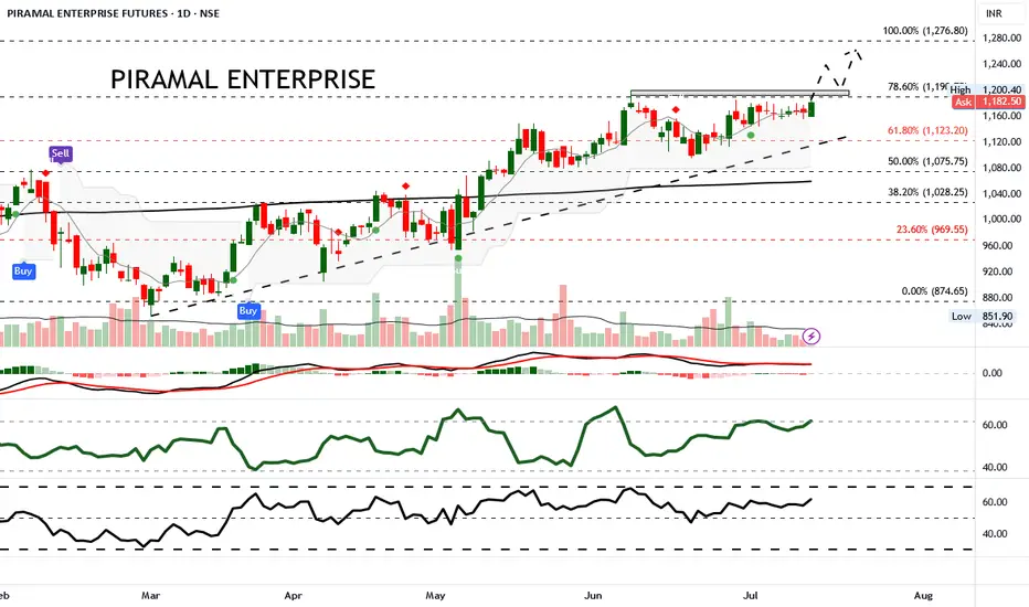
Ascending triangle signals breakout potential above ₹1,185.Piramal Enterprise Futures has shown steady upward momentum recently, gaining 1.60% in the latest session to close at ₹1,184.90. The price continues to trade within an ascending channel, nearing a key resistance zone. Price action is consolidating beneath the 78.6% Fibonacci retracement level at ₹1,191, with low volatility as indicated by tight candle spreads and moderate ATR levels.
Trade Recommendation: Buy above ₹1,185 with Target ₹1,250 and Stop-Loss at ₹1,140.
This trade setup is based on the bullish triangle formation and positive momentum indicators. Entry is placed just above resistance to catch a breakout, while the target aligns with the 100% Fibonacci extension at ₹1,276 but is capped at ₹1,250 for a conservative approach.
#AN018: Summer shock, tariffs, Fed delays, and the dollar's shif
In recent days, the forex world has experienced a sequence of key events that could redefine the global currency landscape in the coming months. Risk to the dollar has become structural, the threat of tariffs is multiplying again, and the combination of geopolitical uncertainty and monetary policy creates an extremely risky mix for exchange rates.
Let's start with the Fed minutes: Jerome Powell attributed tariff risk to the main reason for postponing possible rate cuts. Market expectations are realigning toward a longer rate cycle, fueling a climate of global uncertainty. At the same time, Goldman Sachs warns that the dollar is increasingly moving as a "risky" currency, correlated with equity markets—an emerging market rather than a safe haven.
On the geopolitical front, President Trump has relaunched the trade war: announcements of tariffs of up to 35% on Canada, up to 20% on Europe, and 50% on copper from Brazil have caused futures volatility to soar and sent the dollar into a short-term rally. But Deutsche Bank is sounding the alarm: the summer period of low liquidity and rising trade tensions represents a potential trigger for prolonged currency turbulence.
The Financial Times envisions a scenario in which the dollar loses ground as the dominant currency, ushering in a multipolar currency world in which the euro, renminbi, gold, and even cryptocurrencies could gain ground.
The impact on Forex:
USD: The narrative is changing: no longer a net safe haven, but an asset correlated with political and risk cycles. The weakness of the DXY index in the first half of 2025 (-10%) reflects this transition.
EUR/USD: Potentially favored if the dollar continues its consolidation. However, new tariffs and US-EU uncertainty could provide temporary support for the greenback.
USD/JPY and USD/CHF: These crosses will be subject to greater volatility, with the next catalyst being the Fed minutes and the timing of tariffs. Safe-haven currencies strengthen during periods of uncertainty.
CAD, AUD, NZD: penalized by tariffs on Canada and Brazil and a weak dollar. OPEC+ and geopolitical tensions could boost commodities, but data confirmation is needed.
Commodity cross-correlation: USD/CAD could rebound if oil loses momentum, while AUD/JPY is sensitive to both the RBA and increased global risk.
Conclusion:
The current currency environment appears unstable and sensitive to political and trade developments. Summer volatility could persist, and those who can read the macro and institutional signals (Fed, tariffs, geopolitics) will have the opportunity to enter accurately. Until a stable direction emerges, EUR/USD looks like the most interesting cross to capture a potential structural correction in the dollar.

AMP Futures - How to export data from your Trading PanelIn this idea, we will demonstrate how to export data from your Trading Panel using the TradingView platform.
Unfortunately, the recording did not show the demonstration of the exported CSV files; however, as long as you follow the steps provided, you will be able to export the proper data.

Understanding Elliott Wave Theory with BTC/USDIntroduction to Elliott Wave Theory:
Elliott Wave Theory is a popular method of technical analysis that seeks to predict the future price movement of financial markets. Developed by Ralph Nelson Elliott in the 1930s, the theory is based on the idea that market movements follow a repetitive pattern, driven by investor psychology.
At the core of Elliott’s theory is the idea that markets move in a 5-wave pattern in the direction of the trend, followed by a 3-wave corrective pattern. These waves can be seen on all timeframes and help traders identify potential entry and exit points in the market.
Key Concepts of Elliott Wave Theory:
1. Impulse Waves (The Trend)
2. These are the waves that move in the direction of the overall trend. They are labeled 1, 2, 3, 4, 5 and represent the price movement in the main direction of the market.
* Wave 1: The initial move up (or down in a bearish market). I like to mark up the first wave how I do my Fibs, from the point where price showed a major impulse.
* Wave 2: A correction of Wave 1 (it doesn’t go lower than the starting point of Wave 1).
* Wave 3: The longest and most powerful wave in the trend.
* Wave 4: A smaller correction in the direction of the trend.
* Wave 5: The final push in the direction of the trend, which can be shorter and weaker than Wave 3.
3. Corrective Waves (The Pullbacks)
4. After the five-wave impulse, the market enters a corrective phase, moving against the trend. This corrective phase is generally a 3-wave pattern, labeled A, B, C:
* Wave A: The initial correction, typically smaller than Wave 3.
* Wave B: A temporary move against the correction (it often confuses traders who think the trend has resumed).
* Wave C: The final move against the trend, usually the strongest and most aggressive.
How to Implement Elliott Wave on BTC/USD:
Let’s break down how you can apply the Elliott Wave Theory to BTC/USD using a simple example.
1. Identify the Trend
2. Start by identifying the current market trend for BTC/USD. Are we in an uptrend or downtrend? This will determine whether you’re looking for a 5-wave impulse up (bullish) or down (bearish).
3. Locate the Waves
4. Look for the five-wave structure in the trend direction. Once you identify a potential impulse move, label the waves accordingly:
* Wave 1: A new uptrend starts.
* Wave 2: A small pullback (usually less than the size of Wave 1).
* Wave 3: A significant surge in price, often the most volatile.
* Wave 4: A smaller pullback or consolidation.
* Wave 5: The final push higher, which might show signs of exhaustion.
5. Corrective Phase
6. After completing the 5-wave impulse, expect a corrective 3-wave pattern (A, B, C). These corrections typically last longer than expected and can often confuse traders.
* Wave A: Price starts to reverse.
* Wave B: A retracement that may confuse traders into thinking the trend is resuming.
* Wave C: A strong pullback that brings the price even lower.
7. Use Fibonacci Levels as confluence
8. One of the most powerful tools in Elliott Wave analysis is Fibonacci retracement levels. You can use these to predict potential levels where Wave 2 and Wave 4 could end, or where Wave C might complete the correction. Common retracement levels are 38.2%-50% for Wave 4, and 50-61.8% For Waves 2 and B but keep in mind, these wave can retrace up to 100% before the wave analysis becomes invalid. But ideally these points are where you look to make an entry.
Wave 2 Example:
This one hit the golden spot (0.5-0.618) perfectly and continued to push upward.
Wave B and C Example:
This example hit closer to the 0.786 level which is also a key level for retracement.
Wave 4 Example:
This one hit the golden spot (0.382-0.5) for Wave 4 perfectly before continue the bullish momentum.
I try to use the RED levels below (1.1 and 1.2) as my invalidation (Stop Loss) levels and the GREEN levels (-0.27 and -0.618) as my Take Profit levels. Depending on your goals you can also use Fib Levels 0.236 and 0 as partial Take Profit levels.
9. Confirm with Indicators
10. To validate your Elliott Wave counts, use other indicators like the RSI (Relative Strength Index), MACD, or Moving Averages. For example, a Wave 3 might occur when the RSI is above 50, indicating strength in the trend.
In this example you can see the RSI cross the 50 threshold and the 3rd Wave form.
Continuation after the Wave is complete:
Tips for Trading with Elliott Wave Theory:
* Stay Flexible: Elliott Wave Theory is not set in stone. If the market doesn’t follow the expected pattern, adjust your wave counts accordingly.
* Don’t Rely on One Timeframe: A 5-wave structure on one timeframe may be part of a larger wave pattern on a higher timeframe. Always analyze multiple timeframes.
* Wave Personality: Waves don’t always look the same as stated earlier. Wave 2 can retrace up to 100% of Wave 1 and Wave 4 should generally not overlap Wave 1 or this may invalidate the Wave structure.
* Risk Management: Always use proper risk management techniques. No theory is perfect, so make sure you have a stop-loss in place to manage your risk.
Conclusion: Using Elliott Wave Theory on BTC/USD:
The Elliott Wave Theory can be a powerful tool for analyzing and forecasting price movements. By identifying the 5-wave impulse and 3-wave corrective patterns, you can gain insights into potential market direction. Just remember to use it alongside other tools and indicators for confirmation, and don’t forget to manage your risk.
As you apply it to BTC/USD or any other asset, remember that the market doesn’t always follow the "ideal" patterns, and flexibility is key. Practice on different timeframes, refine your skills, and use the theory as a part of your overall trading strategy.
Final Thoughts:
If you're just starting, don't get discouraged if you miss a wave or two. Trading is a journey, and with patience and practice, you'll begin to spot these patterns more naturally. Whether you’re analyzing Bitcoin's price action or any other asset, Elliott Wave Theory can give you a deeper understanding of market psychology.
Good Luck and Happy Trading!

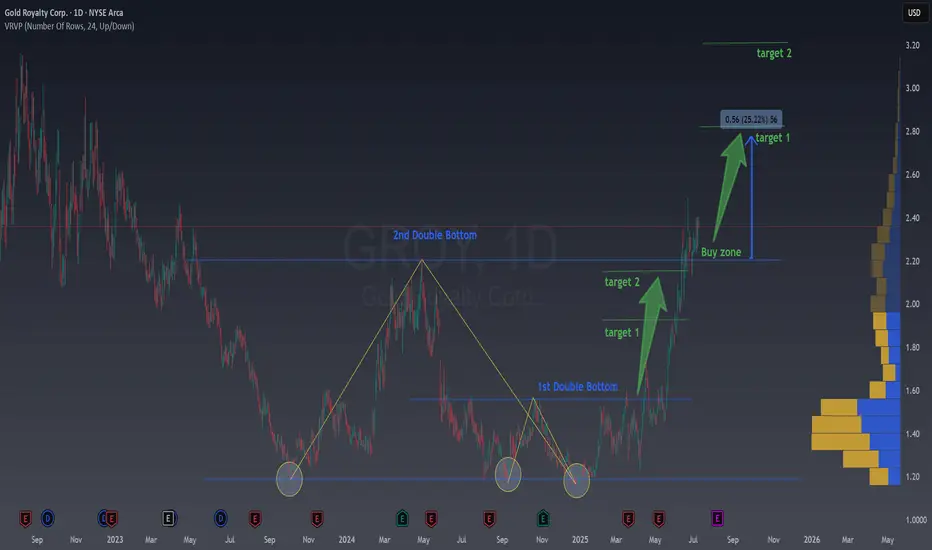
A way to find Historical BottomsWhen it comes to trading stocks, one of the most powerful skills you can develop is the ability to spot historical bottoms , those rare moments when a stock finishes its downtrend and starts a new upward journey. Catching these bottoms means entering trades with low risk and high reward potential , riding the wave of a new trend from the very beginning.
The Power of Double Bottoms
One of the most reliable chart patterns for identifying market bottoms is the Double Bottom. This pattern acts like a springboard for price, signaling that sellers are losing control and buyers are stepping in, showing a clear floor
Here’s how it works:
First Bottom : The stock drops to a new low, but then buyers push it up.
Second Bottom: After a short rally, the price falls again, often to a similar level as the first bottom , but this time, it doesn’t go lower. Buyers step in once more.
Breakout : When the price rises above the high point between the two bottoms, it confirms the pattern and suggests a new uptrend is beginning.
This structure creates a clear “floor” in the market, showing where demand outweighs supply. Traders love this setup because it gives a logical place to set stop-losses, keeping risk low.
Learning from the Chart
Let’s look at the provided chart of Gold Royalty Corp. (GROY) to see this in action. The chart highlights two Double Bottom patterns that formed over several months.
1st Double Bottom: Notice how the price hits a low, bounces, and then returns to the same area before bouncing again. This repeated support signals a strong bottom.
2nd Double Bottom: The pattern repeats, confirming even more buyers are entering at this level.
After these patterns form, the price breaks out above the resistance level (the high between the two bottoms). This breakout is often the ideal buy zone, the moment when a new trend is likely starting, and risk is minimized because your stop can be placed just below the recent lows.
Why Double Bottoms Work
Double Bottoms are powerful because they reflect real market psychology:
Capitulation : Sellers exhaust themselves on the first dip.
Testing : The second dip tests the market’s conviction, if buyers step in again, it’s a strong sign of a bottom.
Confirmation : The breakout above resistance confirms that demand is back in control.
How to Trade Double Bottoms
Here’s a simple, actionable approach:
Identify the Pattern : Look for two distinct lows at roughly the same price level, separated by a moderate rally.
Wait for Confirmation : Only enter when the price breaks above the high between the two bottoms.
Set Your Stop : Place your stop-loss just below some important local low or some fibo levels that we always share in our newsletter.
Target the Move: Use previous resistance levels or Fibo levels.
Example from the Chart
In the GROY chart, after the second Double Bottom, the price broke out and rallied strongly, hitting both target levels marked on the chart. Traders who entered at the breakout enjoyed a substantial move with limited downside.
Take away
Spotting Double Bottoms isn’t about predicting the future—it’s about reading the market’s story. By focusing on these patterns, you can find historical bottoms with confidence, enter trades with low risk, and position yourself to ride the next big trend. The best part? You don’t need to catch every bottom, just the clear, confirmed ones. That’s how you build consistency and success in trading.
If you’re new to chart patterns, start by looking for Double Bottoms on historical charts. Practice spotting them, and you’ll soon see how they can transform your trading approach.
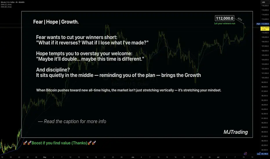
Let your winners run🧠 Fear | Hope | Growth – When Trading Meets Emotion
The message on the chart isn't just poetic — it's real psychology.
🔹 Fear wants to cut your winners short.
It sneaks in after a small move in your favor.
"What if it reverses? I better lock this in."
And just like that, a great trade turns into a missed opportunity.
🔹 Hope drags you into holding too long.
It dreams: "Maybe it doubles... maybe this time it'll be massive."
But it's not guided by data — it's driven by fantasy.
🔹 Discipline is what sits in the middle.
Quiet. Neutral.
It doesn’t scream or seduce — it just follows the plan.
And that’s where Growth lives — not just on the PnL, but in your psychology.
When Bitcoin pushes toward new ATHs, these emotions get amplified.
The real question becomes: Can you manage yourself, not just your trade?
📌 A Real Example from My Desk
In my earlier BTCUSD idea — “Another Edge – Decision Time” (shared above) —
I sent that setup to one of my managed clients.
He entered long exactly at the edge of the channel — a clean, strategic buy.
Price moved beautifully in our favor…
But he manually closed the trade at 106,600 — long before the move matured.
Why?
Because fear of giving back profit overwhelmed the original plan.
The chart was right. The timing was right.
But the exit was emotional, not tactical.
✅ The trade made money.
❌ But the lesson is clear: a profitable trade doesn’t always mean a disciplined one.
🎯 Final Takeaway:
“Fear kills your winners. Hope kills your timing. Discipline grows your equity and your character.”
🗣 What would you have done in that position?
Held longer? Closed at resistance? Let it run toward ATH?
Let’s talk psychology — drop your thoughts 👇
#MJTrading
#TradingPsychology #BTCUSD #FearHopeDiscipline #LetYourWinnersRun #PriceAction #BTCATH #ForexMindset #CryptoStrategy
#AN017: Dirty Levels in Forex: How Banks Think
In the world of Forex, many retail traders are accustomed to seeking surgical precision in technical levels. Clear lines, pinpoint support, geometric resistance. But the truth is that the market doesn't move in such an orderly fashion.
I'm Forex Trader Andrea Russo, and I thank my Official Broker Partner in advance for supporting us in writing this article.
Institutions—banks, macro funds, hedge funds—don't operate to confirm textbook patterns. Instead, they work to manipulate, accumulate, and distribute positions as efficiently as possible. And often, they do so precisely at the so-called "dirty levels."
But what are these dirty levels?
They are price zones, not individual lines. They are areas where many traders place stop losses, pending orders, or breakout entries, making them an ideal target for institutional players. The concept of a dirty level arises from the fact that the price fails to respect the "perfect" level, but breaks it slightly and then retraces its steps: a false breakout, a trap, a hunt for stops.
Banks are very familiar with the behavior of retail traders. They have access to much more extensive information: aggregated positioning data, open interest in options, key levels monitored by algorithms. When they see concentrations of orders around a zone, they design actual liquidity triggers. They push the price just beyond the key level to "clean" the market, generate panic or euphoria, and then initiate their actual trade.
How are these levels identified?
A trader who wants to operate like an institution must stop drawing sharp lines and start thinking in trading bands. A dirty level is, on average, a zone 10 to 15 pips wide, around a psychological level, a previous high/low, or a breakout area. But technical structure alone is not enough. It's important to observe:
Volume density (volume profile or book visibility)
Aggregate retail sentiment (to understand where stops are placed)
Key option levels (especially gamma and maximum pain)
Rising open interest (as confirmation of institutional interest)
When a price approaches a dirty level, you shouldn't enter. You should wait for manipulation. The price often briefly breaks above that range, with a spike, and only then does it retrace its steps in the opposite direction. That's when banks enter: when retail has unloaded its positions or been forced into trading too late. The truly expert trader enters after the level has been "cleaned," not before.
This type of reading leads you to trade in the opposite way to the crowd. It forces you to think ahead: where they want you to enter... and where they actually enter. And only when you begin to recognize these invisible patterns, when you understand that the market is not linear but designed to deceive you, do you truly begin to become a professional trader.
Conclusion?
Trading isn't about predicting the price, but predicting the intentions of those who actually move the market. Dirty levels are key. Those who know how to read manipulation can enter profitably, before the real acceleration. And from that moment, they'll never look back.
You all Panic and Sell While Whales Buy Ever sold at the exact bottom, just before the bounce?
Mass fear always becomes the perfect entry for whales, while regular traders are running away.
In this post, I’ll break down how their mindset beats ours, and how to flip the script on your own fear.
Hello✌
Spend 3 minutes ⏰ reading this educational material.
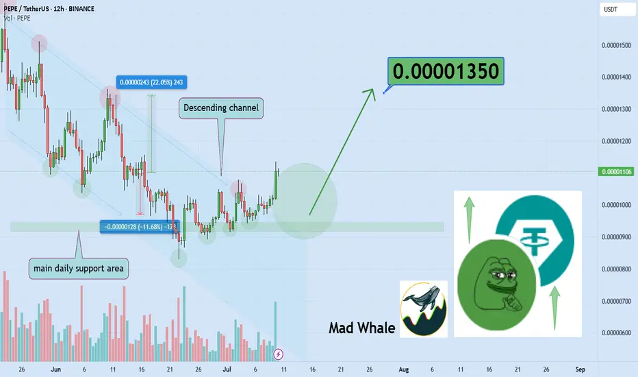
🎯 Analytical Insight on PEPEcoin:
BINANCE:PEPEUSDT has broken above the descending channel resistance as well as a significant daily resistance level, supported by a solid increase in trading volume 📈. This confirms genuine buying interest and momentum in the market. Based on this breakout, I expect at least a 22% upside, with a target near 0.0000135 🚀.
Now , let's dive into the educational section,
🧠 Emotions Lie. The Chart Doesn’t.
In crypto markets, our first reaction is rarely logical. When prices dump, fear kicks in, not analysis.
That’s exactly when the big players step in. They know retail won’t buy the bottom; they chase green candles, not red opportunities.
🐋 What Whales Think That Retail Doesn’t
Whales wait for emotional exhaustion, full-on fear or full-on greed.
They don't enter with the crowd. They enter when the crowd wants out. That’s not coincidence. It’s a setup.
🧨 Self-Sabotage: The Retail Playbook
Retail traders usually:
Sell in panic on the dump
Buy in FOMO on the pump
Quit after liquidation
Whales don’t react to price, they react to opportunity.
📉 Why Real Bottoms Never Feel Safe
When a real bottom forms, it feels terrible. News is negative. Social media screams "SELL."
No one trusts the recovery. That’s why most miss it. Comfort does not equal opportunity.
⏳ Silence and Patience: Whale Superpowers
In sideways markets, retail gets bored and walks away.
Whales? They accumulate silently. They don’t seek confirmation. They seek positioning.
📊 TradingView Tools That Reveal Whale Moves
TradingView isn't just a charting site, it’s a weapon if you know what to look for:
Volume Profile shows zones where the most trading occurred. If price drops but volume remains dense, that’s hidden buying.
OBV (On-Balance Volume) tracks if smart money is loading while price moves slowly.
Combine RSI + MA to spot where sentiment diverges from logic.
Set up your own TradingView layout with these indicators. Use the data, not your gut.
🧲 Is This Crash A Hidden Invitation?
Every major dip asks one quiet question: “Do you still know the game?”
The smart money listens while the rest scream. The market has rhythm, if you hear it, you win.
🛡 Recap
Next time the market’s bleeding red and everyone’s afraid, zoom out.
Don’t listen to your fear, listen to the chart. Let TradingView’s tools be your edge, not just your screen.
✅ Final Thought:
Whales feed on our fear. So next time you're scared, don’t run, observe.
That fear might be your best entry, not your worst exit.
✨ Need a little love!
We pour love into every post your support keeps us inspired! 💛 Don’t be shy, we’d love to hear from you on comments. Big thanks , Mad Whale 🐋
📜Please make sure to do your own research before investing, and review the disclaimer provided at the end of each post.
Using the New 2025 TradingView Screener to find Golden CrossesIn this video, I show you how to use the new TradingView 2025 screener to quickly find stocks forming a golden cross and how to add the 50 and 200 simple moving averages to your charts for clear visual confirmation. A golden cross happens when the 50 moving average crosses up through the 200 moving average. Many traders (both fundamental and technical) watch for this pattern as a sign that a stock (or even whole market) may be shifting from a downtrend to a new uptrend.
Using the TradingView Screener we can quickly find Golden crosses to help filter for potential momentum setups without having to scan hundreds of charts manually. They are not magic signals, but when combined with your own analysis, they can help you spot bigger picture trends that are gaining strength. I walk through step-by-step how to set up your screener to catch these crossovers and add them to your watchlist.
If you want to keep your trading process simple while still catching moves early, this is a practical tool worth adding to your workflow. I also show a few quick tips on how to clean up your filters to reduce the number of stocks you have to go through.
Hope you find this useful. Please like and follow if you do :)

How to Use TradingView Alerts to Catch Momentum Shifts Here’s a quick video on setting alerts in TradingView.
I use alerts for stocks I’m interested in but want to give more time to set up. Instead of using a basic price alert, I prefer setting alerts on MACD crossovers to signal when momentum is shifting back in my favor. As a rule of thumb, the deeper the crossover, the better the value and potential momentum. Crossovers below the MACD zero line are particularly useful, especially for stocks that had strong momentum and were making new highs before pulling back.
This approach helps confirm that the stock has had time to build a solid base before I enter. TradingView will then send me an email alert or play a chime if I have it open, letting me track multiple stocks and setups without constantly checking charts. It’s also great for monitoring take-profit and stop-loss levels.
You can apply the same strategy with nearly any indicator on TradingView to time your entries and exits with more confidence.

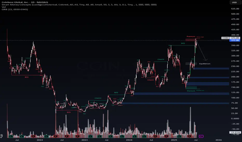
$COIN Options Trade Blunder | AI vs. Flow — Who Wins?NASDAQ:COIN – When LSTM Confidence Misfires at the Top
This week I entered puts on NASDAQ:COIN off a 95% confidence signal from my LSTM model, anticipating a bearish reversal near the premium zone.
It looked clean:
🔺 Price had tapped a weak high
📈 Extended rally from discount to premium
🧠 LSTM model flagged a local exhaustion top
But I ignored the bullish options flow.
Institutions were loading calls.
Volatility structure showed strength.
I chose the model. The market chose pain.
📉 Trade Setup:
Short thesis: Rejection from premium + weak high
Entry: $370 zone
Target: $325 (mid EQ)
Invalidation: Break above $380
Actual Result:
Price consolidated, then held bullish structure.
Implied volatility stayed elevated. No follow-through on the short.
Loss: ~50% on puts.
💡 Lesson:
Chart logic aligned
AI signal was compelling
But real-time flow > model output
LSTM is 70% of my AI trading system, and I’m now integrating options flow override filters to prevent this kind of mismatch in future signals.
📌 I’m currently risk-off, rotating capital into 5Y Treasury futures ($Z) to cool down, refine logic, and reassess volatility pricing models.
🧠 This phase is experimental. If you’re watching my trades – don’t follow. Observe. Learn from the debug phase.
—
Prabhawa Koirala (Pravo)
Founder – WaverVanir International LLC
#COIN #TradingView #SmartMoneyConcepts #LSTM #AITrading #OptionsFlow #WaverVanir #PremiumZone #QuantTrading #VolanX
AMP Futures | OCO Bracket orders with Chart Trading.In this idea we will demonstrate how to apply an OCO bracket order on the Chart trader using TradingView.

In forty years of trading, I have tried a lot of methods....In forty years of trading, I have tried a lot of methods. Over the years, things have changed. Right now, I swing trade S & P 500 Index ETFs through a commission free broker off this chart
GLOBEX FUTURES and this one single indicator. I always enter after the daily close, in the aftermarket. Trade at a price, a limit order "all or none". NOTE: You must chart FUTURES to get the signal at 6:00 PM NYC time in order to have it to position in the aftermarket. if you, chart SPX cash market, the TradingView "runtime" won't show the signal until the RTH opening "tomorrow". NO GOOD ...because overnight trading can gap the cash market. Try 5 minute chart for DAY trading Futures: use only RTH ! try configuring 3, 7, and 13, "swing" values. Happy trades! P.S. I am long right now SPX ETF.
How to Spot Flag Patterns on TradingViewLearn to identify and trade flag patterns in TradingView with this step-by-step tutorial from Optimus Futures. Flag patterns are continuation formations that help traders join existing trends by buying high and selling higher, or selling low and buying back lower.
What You'll Learn:
• How to identify bullish and bearish flag patterns on any timeframe
• Breaking down flag patterns into two parts: the flagpole and the flag
• Finding strong flagpole formations with fast, obvious price moves
• Spotting flag consolidation areas that form tight ranges
• Why flag patterns work: buyer and seller psychology explained
• Real chart examples showing how flag patterns develop and play out
This tutorial may help futures traders and technical analysts who want to trade with market trends rather than against them. The concepts covered could assist you in identifying opportunities to join strong price movements when they pause before continuing.
Learn more about futures trading with Tradingview: optimusfutures.com
Disclaimer:
There is a substantial risk of loss in futures trading. Past performance is not indicative of future results. Please trade only with risk capital. We are not responsible for any third-party links, comments, or content shared on TradingView. Any opinions, links, or messages posted by users on TradingView do not represent our views or recommendations. Please exercise your own judgment and due diligence when engaging with any external content or user commentary.
This video represents the opinion of Optimus Futures and is intended for educational purposes only. Chart interpretations are presented solely to illustrate objective technical concepts and should not be viewed as predictive of future market behavior. In our opinion, charts are analytical tools—not forecasting instruments. Market conditions are constantly evolving, and all trading decisions should be made independently, with careful consideration of individual risk tolerance and financial objectives.

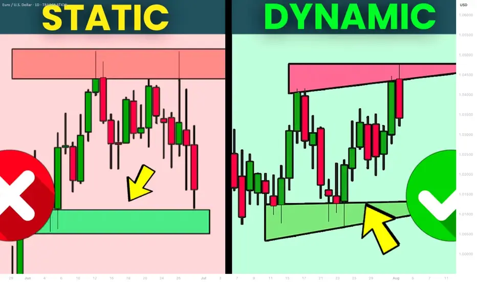
What is Dynamic Support and Resistance Levels & Zones in Forex
Dynamic supports and resistances play a crucial role in technical analysis.
Unlike classic supports and resistances, these zones change and adapt to a market price action in real time.
Learn what is dynamic support and resistance in Forex, Gold trading and how to find it easily.
Discover its main types and real market examples.
Let's start with the basics.
There are 2 major types of supports and resistances in technical analysis.
The first type is called static .
Such supports and resistances are fixed and don't change with time.
It should be strictly horizontal key levels or the zones.
Market price action and momentum beyond them do not affect these supports and resistances.
In the example above, you can find static supports and resistances on Gold. The market may return to one of those levels or the zones today, tomorrow or in a month, but it will not move.
In comparison to static supports and resistances, the dynamic ones shift with time. They constantly change and adjust as the time flies.
One of the obvious types of dynamic supports and resistances is a trend line.
Above is the example of a dynamic rising support based on trend line.
As the time goes, a support shifts and becomes higher and higher.
I found a great example of a dynamic resistance on Dollar Index.
Depending on the moment when the price tests that, the resistance will be on different levels.
The later the price tests the trend line, the lower is the resistance.
When newbie traders learn dynamic supports and resistances, they usually stop on trend lines.
But it is just a beginning.
Really significant dynamic supports are resistances will be the zones .
The areas based on static horizontal supports and resistances and trend lines.
Examine a price action on GBPCHF forex pair.
We have a static horizontal support area and a dynamic rising trend line.
Two supports intersect, composing a contracting dynamic support zone.
With time, it will become narrower, accumulating buy orders within.
On NZDCAD forex pair, I underlined a contracting dynamic resistance zone that is based on an intersection of a static horizontal resistance area and a falling trend line.
Selling orders will be distributed within.
The 2 dynamic support and resistance zones that we discussed are narrowing , but that is not always the case.
A dynamic support zone that I found on GBPNZD is expanding and broaden with time.
It is based on a dynamic falling trend line and a static horizontal support.
With time its boundaries will be wider and a bullish reaction may initiate from any level within that.
A dynamic resistance area that I spotted on EURCAD forex pair is a great example of an expanding resistance.
It is based on a static horizontal resistance and a rising trend line.
We can easily recognize how it grows with time.
Of course, another types of dynamic supports and resistances exist. But they are more nuanced and rare.
As soon as you learn to recognize the clusters that we discussed in this article, you will be able to recognize the less obvious ones as well.
Next time, when you execute a support and resistance analysis, try to find a dynamic zone. You can find it on any time frame, and forex pair and gold, and it will completely change your perspective on the market.
❤️Please, support my work with like, thank you!❤️
I am part of Trade Nation's Influencer program and receive a monthly fee for using their TradingView charts in my analysis.
Trading at the market topHello,
The stock market is back at an all-time high. This often brings excitement for existing investors—and a sense of anxiety or even FOMO (fear of missing out) for those who stayed on the sidelines when prices were lower.
It’s tempting to jump in, especially with headlines filled with optimism and portfolios showing green across the board. But this is also a time for caution and patience.
After a sustained rally, price levels often outpace fundamentals like earnings growth, economic stability, or interest rate trends. In such moments, valuations can become stretched, and investor sentiment overly euphoric conditions that typically precede short-term pullbacks or corrections.
Buying at the top locks in risk, not value.
If you're feeling late to the party, remember that good investors don’t chase prices—they wait for prices to come to them.
The best opportunities often come in moments of fear, not euphoria. And while this market high may go higher still, history shows that eventually, corrections come—and those prepared for them are the ones who win in the end.
Disclosure: I am part of Trade Nation's Influencer program and receive a monthly fee for using their TradingView charts in my analysis.
A Very Basic Explanation Of The Trading ProcessIn this video, I make it as simple as possible to explain to future students what the process of trading could look like.
