Happy Holidays and Merry ChristmasHappy holidays and merry Christmas, traders.
With only a few days remaining in 2023, now is the time to rejuvenate, reflect on all the things markets threw at us, and plan for the start of a new year.
Do your research, study up, and be ready.
We've also got a few things to show you next year, so stay tuned 💪
Look first, then leap.
Community ideas
Live stream - Daily Pitch Int. with Darius Anucauskas Ep. 182Nikkei225,China50,ASX200,DJIA,S&P500,Nasdaq100,DAX40,FTSE100,DXY,Gold,Silver,Copper,WTIOil,NatGas,Cotton,Sugar,Bitcoin,BitcoinCash,Ethereum,Litecoin,Dogecoin,AUDUSD,AUDNZD,AUDCAD,NZDCHF,USDJPY,USDCAD,USDCHF,USDMXN,GBPUSD,GBPCHF,EURCHF,EURNZD,EURUSD.

Live stream - 2024: Where the Money FlowsWorlds collide in this special bonanza of The Trade Off! For the first time ever, we have Westy and Blake joind by TTO UK's Michael Brown (as well as special guest Tamas Szabo, our CEO!) for a quick retrospective of 2023 and a crystal ball gaze into 2024!

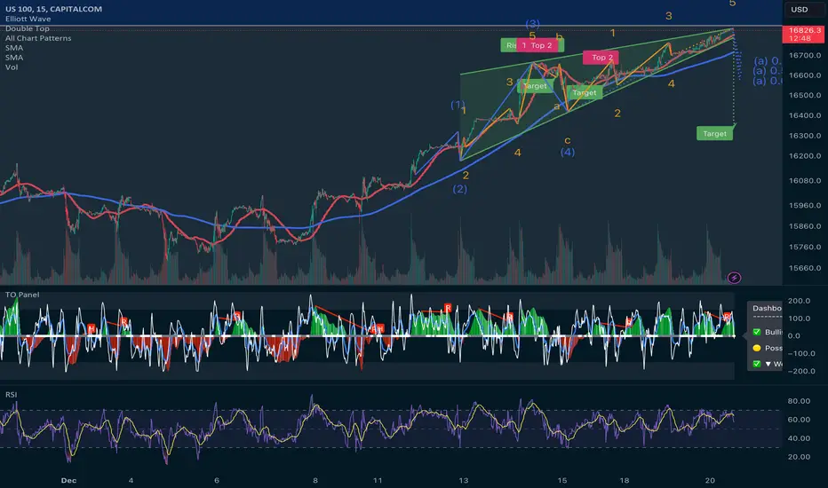
Nasdaq100: Analyzing the Potential Impact of a Rising Wedge The Nasdaq100, a benchmark index comprised of 100 of the largest non-financial companies listed on the Nasdaq stock exchange, has long been a key indicator of the tech-heavy segment of the market. However, recent market trends and technical analysis have sparked concerns about a potential downturn, largely attributed to the formation of a rising wedge pattern that commenced on December 7th.
A rising wedge is a technical chart pattern characterized by a series of higher highs and higher lows, converging in a manner that resembles a triangle with a rising slope. Despite its name, this pattern often signals a potential reversal in the market's upward trajectory, suggesting an imminent downturn.
Since its inception on December 7th, the Nasdaq100 has exhibited this distinct pattern, with successive higher highs and higher lows gradually converging. While such formations are not definitive predictors of future market movements, they serve as cautionary indicators, prompting investors and analysts to scrutinize the market's behavior more closely.
Historically, rising wedges have been associated with bearish implications for the markets. The narrowing price range within this pattern indicates a loss of momentum and an impending decrease in buying interest. As a result, investors tend to grow cautious and may start reducing their positions, leading to a potential selloff.
Several factors may exacerbate the impact of this pattern on the Nasdaq100's performance. Firstly, the ongoing concern about inflationary pressures, supply chain disruptions, and potential interest rate hikes by central banks may contribute to market volatility. Moreover, uncertainties surrounding geopolitical tensions and global economic recovery post-pandemic continue to cast a shadow on investor sentiment.
Tech stocks, which heavily populate the Nasdaq100, are particularly sensitive to market shifts and sentiment changes. The rising wedge pattern's presence within this index raises concerns about the sustainability of the rally that propelled many technology companies to soaring heights.
However, it's crucial to note that technical patterns are just one aspect of market analysis and not foolproof predictors. Fundamental analysis, including a company's financial health, earnings reports, and industry trends, plays a significant role in determining stock performance.
Investors and traders are closely monitoring key support and resistance levels within the rising wedge pattern. A breach below the lower trendline could signal confirmation of a potential downturn, prompting increased selling pressure and a bearish outlook for the Nasdaq100.
In conclusion, the Nasdaq100's formation of a rising wedge pattern since December 7th has raised concerns among market participants. While technical analysis suggests a potential downturn, it's imperative to consider broader market dynamics and fundamental factors that could influence the index's future performance. As investors navigate these uncertainties, a cautious approach with a diversified portfolio and strategic risk management may prove prudent in navigating potential market volatility ahead.
Live stream - Weekly Fundamental Market Outlook with David Song:Join Strategist David Song to cover the key event risk that could influence financial markets in the week ahead. Discuss major fundamental themes along with current market developments.

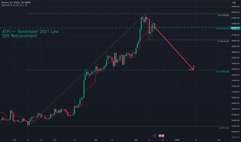
My 2023 Bitcoin ShortSince September 2023 Bitcoin has been in a rally predicated on the Bitcoin ETF launch. The chart has setup in accordance with my technical rules to finally short (bet against) the price action. I am also going to use this post to expand upon my broader bearish outlook on Bitcoin at present and into the future.
I was definitively Bullish on Bitcoin in Q1 if 2023 (see linked past Bitcoin posts here on Tradingview) but I am now of the opinion this rally has stalled and will reverse.
-The Trade:-
Bitcoin has hit a MAJOR Resistance of the 50% Retracement from the All Time High to the November 2021 low at 42235 (see chart below) which I have been noting in my Weekly Livestream all year. Price overshot the level but as we go into this weekend price will close above or below it to reject or confirm it as Resistance. This Sunday night Weekly bar close will affect my outlook.
Within the "impulse" move off the recent high the 50% level is 42457 and is remarkably aligned with the wider 50% level. The first profit objective of my short it the 50% of the September onward bullish trend at 34800 but will be a partial take profit with some left on for more bearish action.
If price closes back above the 50% Retracements this weekend and/or a new recent high is made then it is likely I will close my short and re-evaluate.
To express this trade I am not "shorting Bitcoin" proper but rather buying Puts on AMEX:BITO with expirations in June 2024.
Weekly 50% Retracement view:
-Bitcoin ETF: "Buy the Rumor, Sell the News"-
I remain of the opinion that the Bitcoin ETF Launch will be a "Buy the Rumor, Sell the News" type event.
Much optimistic speculation has been placed upon the prospect of "Boomers Buying Bitcoin" because now they (retirees and institutions) can purchase Bitcoin in their retirement accounts. As I noted, I am expressing my trade using BITO which is a Bitcoin Trust instrument. There are already plenty of Bitcoin derivative products available for typical investors to use. Ergo, it is not obvious to me how an ETF launching will change the landscape significantly.
Furthermore, I am reminded of a similar event in the past; the launching of CBOE Bitcoin Futures. Futures on Bitcoin launched on December 17th, 2017 literally marking that high and the end of that rally.
-Price Outlook: Things are Different Now?-
The bullish case for Bitcoin now even after the ETF launches is the coming Halving Cycle. Everyone note that it has created loosely bullish price action 3 out of 3 past times and will likely do so again. First, I do not thins 3/3 is statistically significant. Second, causation or correlation? Was it the Halving Cycle that made Bitcoin bullish or just the fact that it has been going up all this time anyway?
One must acknowledge that Bitcoin was born and grew in a 0% interest rate environment which no longer exists. That fundamentally changes the amount of capital that is being infused into Bitcoin which created the 2021 rally.
People like to share historical charts and then superimpose them to current price action. Most social media posts you will see are bullish because those are the ones that get the most engagement. No where else have I seen this glaringly obvious (to me) comparison of the current rally in context of the 2019 price action (below). I recall distinctly at that time that everyone was convinced the months prior were just a small hiccup and the new ATH rally was underway. Instead, we had a major economic event (COVID) to come that would push Bitcoin back down to close to the bear market lows again.
2019 versus 2023
-Future Outlook: What is Bitcoin?-
The question, "what is Bitcoin?" has been asked for over a decade. I myself became interested in Bitcoin as a "tool for human freedom" that made sense to me from my Information Technology background and Libertarian political leanings. However, I have sadly watched as Bitcoin has been "normalized" in favor of "mainstream adoption" to the point we have reached now where large institutions buying Bitcoin is heralded as an accomplishment. That was never the point... as I see it nor as Satoshi's whitepaper wrote.
Over the last few months I have consumed the mainstream (of Bitcoin Maximalist) social media posts and derived that the opinion of Bitcoin is NOT one of replacing the fiat dollar nor disrupting the traditional financial system. Instead the memes have been centered around some flavor or "Buy it now before the price goes higher!" Lost are the memes of yesteryear about Bitcoin combating inflation (due in part likely to the fact that the Fed's actions are actually yielding desired results).
The memes around Bitcoin during this rally are frankly reminiscent of Dogecoin COINBASE:DOGEUSD TO THE MOON!!!
When I attended the first Bitcoin conference in New York in 2011, we were all excited to do something never done before: buy lunch with Bitcoin. A shop down the street from the hotel venue (which at that time could only hold about 250 people) had setup a terminal to accept Bitcoin as payment. This was revolutionary at the time (there were no online payment apps such as Venmo, Zelle, or Apple pay yet invented).
Two things happened:
Confirmations were slow. A long queue began to develop as people waited for payments to go through. We got hungry.
I sat at a table with Jesse Powell, the hitherto future founder of Kraken, who I estimated was sitting on 10s of thousands of Bitcoin... who paid for his lunch with US Dollars.
What I learned in 2011 about Bitcoin was:
The technology is slow and cumbersome for transaction volume
People that own Bitcoin will not spend it
Nothing has fundamentally changed on those points in 12 years despite the smartest of technical and economic experts' best efforts. If we look at the average confirmation time for Bitcoin it stands at 64 minutes and the average transaction fee is $25.11. That latter number has been increasing dramatically since the start of November. It is not because of the bullish rally (which began in September). It is because of the failure of Lightning Network.
Lightning network was supposed to fix these technical limitations of speed and fees with Bitcoin by adding a layer on top of Bitcoin. Unfortunately, in late October experts discovered a major vulnerability in Lightning Network's programming that would allow nefarious actors to steal Lightning Network Bitcoin. Since then, over half a decade of work and hopes put into Lightning Network have been dashed as the developers now begin to look at a new implementation.
The failure of Lightning Network in no way means "Bitcoin is dead." The Layer 1 Bitcoin network is robust as ever. Bitcoin just remains terribly unsuited to be the replacement for global currency. But as I noted above, it was never going to be because no will spend money today that they believe can buy more stuff tomorrow. It is great for the buyer to wait and buy two hamburgers next week for the price today... but bad for businesses that make hamburgers who will go out of business next week if no one buys hamburgers this week.
So what is the "use case" of Bitcoin? If we cite that Al Gore invented the Internet in 1985, when the Internet was 13 years old (like Bitcoin) people were using it to send email, host databases, and order goods and services. We were unaware of the true future use cases of the Internet but many of these uses were already underway and people and businesses were using it to save money and/or sell more goods and services. The Internet was a wealth generation machine: it created value.
So it pains me to acknowledge now that Bitcoin has settled on a single use case: "personal wealth generation" and rather than generate new wealth it instead acts as a vacuum of capital.
TL;DR: The ETF launch will be a "Sell the News" event. I am now of the opinion that Bitcoin has lost its way to being a disruptive technology. I am of the opinion that this rally will not make a new All Time High.
CIBR: Cybersecurity Stocks Surge Into Year EndIt has been a record year... for cyber extortion. Orange Cyberdefense data, detailed in a Bloomberg article this week, reveal that there have been four straight quarters of increased corporate victims of hacks and financial blackmails. Major recent cyberattacks include those on MGM Grand, Clorox, Boeing, and China’s ICBC just this year alone. It is all good news for companies engaged in protecting against the increasing threat of large-scale ransomware attacks, among other tech-based crimes.
While shares of CrowdStrike and Palo Alto Networks have been strong lately, investors can play the trend at a higher level through the First Trust NASDAQ Cybersecurity ETF (CIBR). The $5.9 billion fund has a moderate 0.60% expense ratio, and it pays a modest 0.3% dividend yield. The issuer notes that the portfolio’s price-to-earnings ratio is lofty at 27.7x, but Morningstar reports that the ETF’s long-term earnings growth rate is respectable near 10%. To boot, you also get some semiconductor chip exposure, too.
For traders, CIBR’s momentum has been off the charts lately. Up seven weeks in a row, the basket of cybersecurity names has risen from the low $40s to the mid- FWB:50S as we head into 2024. A key thematic play, with fundamental strength (see CrowdStrike’s earnings late last month), I see the potential for CIBR to continue to rally, though shares have historically consolidated over the first 10 weeks of the year. As it stands, I see support between $47 and $48 with another layer of potential buying activity coming into play at $43. On the upside, keep your eye on the November 2021 all-time high just shy of $57.
The ETF successfully held its rising 200-day moving average earlier this quarter, and the breakout through $47 projects a measured move price objective to $58 based on the rounded bottom formation from Q2 this year to the December near-term breakout. With a daily RSI north of 86, we could see CIBR cool off, but the broader trend remains constructive in my view, and new all-time highs are certainly in play over the coming weeks.

Is AI a Bubble?As artificial intelligence (AI) weaves into the fabric of global industries, it sparks a crucial inquiry: Is the soaring valuation of AI stocks a sign of a robust future or a bubble waiting to burst? This article delves into the financial phenomenon, dissecting the realities behind the AI market's ascent.
What Is a Bubble?
A financial bubble represents a market condition where asset prices surge to levels far beyond their intrinsic value, propelled by investor enthusiasm rather than fundamental factors. These bubbles typically follow a pattern: a period of steep growth in asset prices, the peak of the bubble, and an eventual crash that leaves prices more aligned with the asset’s fundamental value.
A classic historical example is the Tulip Mania in the 17th century, where tulip prices soared extraordinarily before collapsing. Another more recent example is the dot-com bubble of the late 1990s, characterised by the steep rise and subsequent fall of internet company stocks.
Indicators of a Bubble
Recognising a bubble often hinges on observing telltale indicators such as extreme price-to-earnings ratios, widespread speculative investment, and rapid price escalation without commensurate growth in underlying fundamentals. Other red flags include high levels of market leverage, disproportionately bullish investor sentiment, and an influx of novice investors driven by fear of missing out. With that in mind, we can begin to consider whether AI-related stocks are truly in a bubble.
The Rise of AI Technology
The ascent of artificial intelligence has marked a significant shift in the technological paradigm, reflected clearly in the financial markets. AI stocks in 2023 have witnessed substantial growth as investors bank on the technology's vast potential to revolutionise various sectors. Nvidia, a leading manufacturer of graphics processing units vital in powering AI solutions, has seen a 200%+ return in 2023; Symbiotic, a robotics and AI company, climbed over 400% this year.
This interest isn't just speculative; it's anchored in the real-world applications and performance enhancements AI promises. AI-based stocks encapsulate a broad range of companies, from those developing autonomous systems to businesses integrating AI for data analysis and customer service enhancement. For many, it’s expected to be a revolution on par with the internet itself. And within trading, artificial intelligence trading software has emerged, offering sophisticated tools for market analysis, predictive modelling, and automated decision-making.
Arguments for AI as a Bubble
In the financial markets, speculative fervour around AI technology stocks has fueled a debate reminiscent of past market bubbles. Here, the arguments for the bubble perspective are unpacked:
High Valuations: AI stocks, like Nvidia, are trading at multiples that soar past traditional valuation metrics. Nvidia is trading at 38 times its sales as of November 2 —a stark contrast to the S&P 500's 2.4 times sales—raises eyebrows among market veterans wary of inflated prices.
High Market Concentration: The S&P 500’s rally in 2023 has primarily been driven by seven mega-cap stocks—Apple, Google, Meta, Nvidia, Amazon, and Tesla. Each company has benefited from or aimed to capitalise on the AI boom. This market concentration echoes patterns from the dot-com era, raising concerns that the wider index's performance may be overly reliant on a handful of players in the AI space.
Overheated Market: Two of the market’s AI leaders—Nvidia and Microsoft—both show bearish RSI divergences on their monthly charts, often a precursor to a correction. Discover which other companies may be ripe for reversal with real-time charts from FXOpen’s free TickTrader platform.
Effect of Rate Hikes: As of the current writing, the full repercussions of elevated interest rates have not yet made a significant impact on stock markets. However, historical patterns indicate that the eventual reduction of market enthusiasm may cast a shadow over the ongoing AI-driven stock rally.
FOMO Influences: The market rally is partly driven by investor FOMO—a harbinger of bubble-like behaviour where prices are propelled more by sentiment than substance. There’s also a belief that others are investing in AI disruption stocks and that this will fuel prices higher, creating an unsustainable dynamic.
Arguments Against AI as a Bubble
Within the fervent debate around AI's market dynamics, substantial arguments stand against the idea that AI represents a speculative bubble:
Robust Financials: The most promising AI stocks exhibit strong financials. Nvidia, for example, trades at a price-to-sales ratio below the peaks of many companies in historical tech bubbles, potentially indicating more grounded valuations.
Solid Growth: Some AI companies have demonstrated potent sales growth. Nvidia reported revenue growth of 101% year-over-year (YoY) in Q2 2023. Even Microsoft, one of the world’s largest companies, benefited from 13% revenue growth YoY in the first fiscal quarter of 2024.
Technological Foundation: AI’s transformative potential is widely acknowledged, reinforcing its status as a mainstay in technological progress rather than a temporary stock craze, like cannabis, green hydrogen, and SPACs.
Historical Parallels: Compared to previous bubbles, the companies at the forefront of the AI surge have sturdy balance sheets—a sign of financial health and resilience. This foundation provides a buffer against market volatility and speculative downturns.
Wider Adoption: The increasing adoption of AI across industries bolsters confidence in the sector’s long-term prospects, diverging from bubble scenarios where growth is unsupported by actual market use.
Preparing for the Future
Investors navigating the AI market landscape are urged to prioritise rigorous due diligence. The key lies in identifying companies that not only ride the AI wave but also demonstrate sustainable business models, robust revenue growth, and sound financial strategies. As the sector matures, it's crucial to discern between those that are fundamentally strong and those inflated by transient hype.
Diversification remains essential; a well-rounded portfolio may include AI-focused firms with the potential to lead and innovate while mitigating risk through exposure to various industries and asset classes. Such strategic positioning can offer protection against potential market corrections and potentially capitalise on AI's long-term growth trajectory.
The Bottom Line
In conclusion, the AI market's surge reflects both innovation's promise and the market's fervour. For traders seeking to navigate this dynamic sector judiciously, opening an FXOpen account offers a gateway to the diverse world of trading, where informed strategies and judicious investment decisions may potentially turn the potential of AI into realised gains amidst the ongoing debate about its future.
This article represents the opinion of the Companies operating under the FXOpen brand only. It is not to be construed as an offer, solicitation, or recommendation with respect to products and services provided by the Companies operating under the FXOpen brand, nor is it to be considered financial advice.
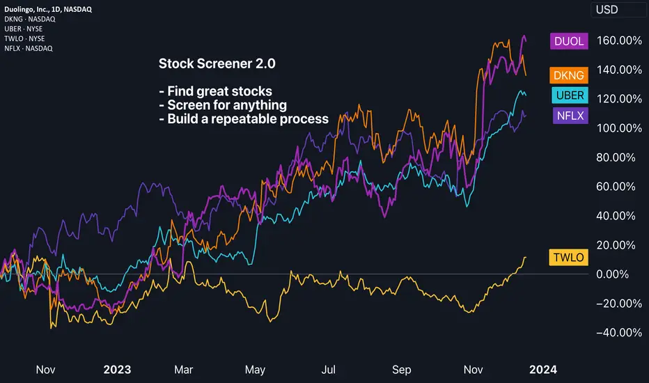
Find great stocks to trade with our Stock Screener 2.0Our new Stock Screener 2.0 gives you the capability to scan, screen, and discover over 75,000 stocks from all around the world.
How do you open the Stock Screener 2.0?
Here's a link that'll get you directly to the Stock Screener 2.0. You may want to bookmark this link so that you always land directly on the screener tool, whenever needed.
If you're on our website and desktop app, go to the top toolbar of TradingView and move your mouse over 'Products'. Then go to 'Screeners' and click on 'Stock 2.0'.
Why should you use the screener?
Our Stock Screener 2.0 empowers traders to sift through equity markets efficiently, and quickly. Our Stock Screener 2.0 was created to give traders a tool that'll enhance decision-making and improve time management. With the ability to quickly narrow down the multitude of available equities, globally, our Stock Screener 2.0 will support traders in their journey, encouraging research, process, and risk management.
How does our Stock Screener 2.0 work?
All the possibilities are in your hands. If you can envision it, it most likely can be done. You set the parameters and then our screener will display the results – for example:
- Want to see all the stocks with a PE ratio under 10? You can do that.
- Want to see all the stocks trading above their 200-day moving average? Yep, also that.
- Looking to find all stocks that hitting all-time highs and have no debt? You can create a custom screen for that, too.
Stock Screener 2.0 Features
Our Stock 2.0 screener is fully customizable. This means traders can create, save, rename and delete screens until they've created a perfect list for all the screens they need. In addition, traders can quickly access popular screens based on different factors such as the following:
- Highest net income stocks
- Strong performance small caps
- Dividend kings
- And many more pre-made options
To access these features (save, load, rename, and access pre-built screens) click on the 'Stock Screener 2.0' text in the upper left corner of the screen:
Tip: Remember to save your screens by clicking the "Save" button in the upper left corner. You'll also want to master your filters and columns as these buttons will allow you to create a screen that's perfect for your needs. Like this:
Now, let’s create a custom screen. We'll show you how it's done...
The tabs at the top of the screener give you the capability to begin narrowing down your screen based on specific criteria. For example, click the Market tab located in the upper left corner of the screen to adjust the countries that you want to screen in. You can screen globally or by country. As you go about creating your first screen, remember that it's possible to access advanced features. Specifically, in the country example we just mentioned, you can select multiple markets that you're interested in. To do this, first make sure that the 'Multi-Select' option is enabled:
Filter Section: Here you can choose from hundreds of fundamental and technical analysis elements to find stocks according to what you select. The most common ones are shown in this section:
- Index
- Price
- Change %
- Market capitalization
- P/E
- EPS diluted growth
- Dividend Yield %
- Sector
- Analyst Rating
- Performance %
If you want to add more, click on the "+" icon and browse through the available categories. The key here is that these are parameters that can be set by you, the trader. For example, click on "Change %" and select "Custom". Then select the 1-month time frame and enter an Above Value of 10%. By doing this, you will only see the stocks that up 10% or more in the last month. You can also combine different parameters at the same time, so the possibilities of filtering stocks are endless.
Setups: Here you can select the type of information you want to analyze, divided into different categories from performance to technicals and fundamentals. You can sort the list of stocks by clicking on the "Sort by" icon at the top right of the screen.
Columns: The columns you see are related to the type of screen that you're creating, but they can also be right clicked, dragged and dropped, and you can create a new column by clicking on the "+" icon located at the far right side of the column section. Columns give you a visual idea of what's happening with the stocks that you're screening for. There are over 100 indicators at your disposal to add as columns. Create your screen, and then customize your columns, so that you can browse your screen efficiently.
We're excited to see everyone get started with our Stock Screener 2.0! We also want to hear your feedback and commentary. Let us know if the comments below what you think about our Stock Screener 2.0.
TradingView Team 💙
Is the Santa Claus Rally on Its Way Again?The lights, carols and the last FOMC of the year, you know the drill by now, Christmas is here soon!
As we head into the year's end, it's the perfect time to revisit an old idea we had last Christmas. In our piece last December titled “ Is the Santa Claus rally real? ” we explored the concept of the Santa Claus rally, discussing why and how a modified version might work.
To recap, last year we proposed examining the Santa Claus rally through a spread between the S&P500 and the Nikkei, rather than focusing solely on either the S&P or Nikkei alone. This approach was based on several reasons:
1) Holiday Impact: The Christmas holiday holds greater cultural importance in the US, likely resulting in more holiday observance in the US compared to Japan.
2) Diverging Monetary Policies: The Bank of Japan is set to meet next week, and while no change in the policy rate is expected, we're looking for any hints on the timing of an exit from negative interest rates. Conversely, the Federal Reserve has just signalled expectations of up to 75bps rate cuts in 2024, marking a policy shift. These differing policies could influence equities in their respective markets differently.
3) Difference in Accounting/Financial Years: Different accounting practices and book closure dates mean that institutional traders in each market will have varying flows as they prepare to close positions for the financial year.
4) January Effect Front-Running: Investors re-establishing positions after December's tax loss harvesting.
With policy directions now swapping, optimism for this strategy's success is higher this year. The Federal Reserve signalling an end to hikes, has resulted in the S&P500 surging closer to previous all-time highs.
Meanwhile, the USDJPY has collapsed from its high of 152, as views grow that the BOJ might end its negative interest rate policy sooner than expected, as alluded to by BOJ Governor Ueda.
This Christmas, we'll compare what happened last Christmas to see if a similar pattern emerges this year.
A review of last year's Christmas effect shows that the spread rose roughly 12% from mid-December to mid-February.
This result adds to the current streak of a 60%-win rate since 2013, now improving to 63% with a simple average return of about 33%.
Examining each index individually, we find that periods where the S&P 500’s RSI is above 75 and the Nikkei 225’s RSI is around 50 have generally preceded critical junctures where the S&P 500 continues to rise while the Nikkei remains rangebound or falls.
Additionally, observing the S&P500 and Nikkei 225 spread, we notice an ascending triangle pattern, with current price action breaking above. An ascending triangle is typically associated with bullish continuation.
Considering the broad macro factors, such as changing monetary policy stances aligning with the historical behavior of the Santa Claus rally, along with a bullish technical setup, we lean bullish on this spread. To express this bullish view, one could go long on the E-mini S&P 500 Futures and short on the Nikkei/USD Futures. At the current price levels, the notional value of one S&P 500 Futures contract is 4771*50 = 238550 and the notional for the Nikkei futures is 33010*5 = 165050, hence to match the notional we can trade 2 S&P 500 Futures contracts against 3 Nikkei Futures contract with the intent of holding the position from now till the middle of February.
The charts above were generated using CME’s Real-Time data available on TradingView. Inspirante Trading Solutions is subscribed to both TradingView Premium and CME Real-time Market Data which allows us to identify trading set-ups in real-time and express our market opinions. If you have futures in your trading portfolio, you can check out on CME Group data plans available that suit your trading needs tradingview.sweetlogin.com
Disclaimer:
The contents in this Idea are intended for information purpose only and do not constitute investment recommendation or advice. Nor are they used to promote any specific products or services. They serve as an integral part of a case study to demonstrate fundamental concepts in risk management under given market scenarios. A full version of the disclaimer is available in our profile description.
Reference:
www.cmegroup.com
www.cmegroup.com
www.fool.com
www.jstor.org

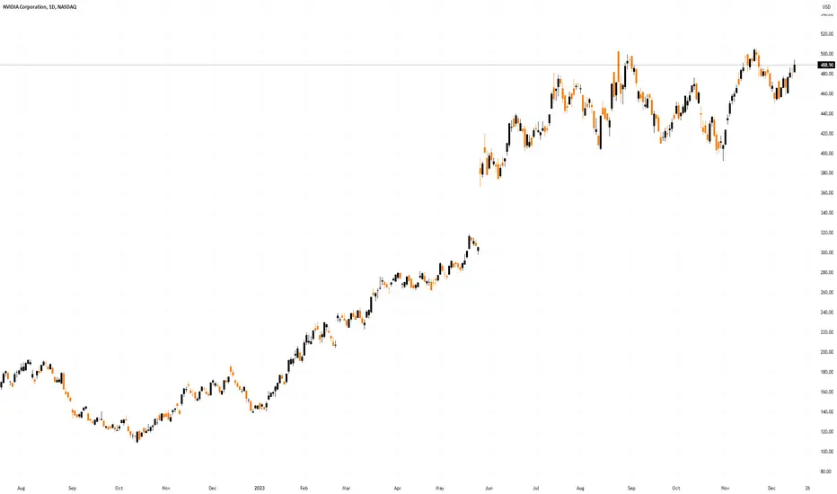
NVDA: Beware of these Support / Resistance Levels (H & D charts)NVDA shares are losing momentum after a powerful upward reaction this morning. It seems that as it approaches its resistance area, it is becoming difficult for NVDA to maintain its upward trajectory.
We had a good reaction near the Fibonacci retracements, which, as we warned in our last public study, was our main area of support. Now the price is trying to recover, but there are still some challenges ahead. The link to our previous analysis is below this post, as usual.
It's interesting to note that despite losing momentum, the price could still seek out the $487.61 region, a secondary resistance and previous top that can be seen on the hourly chart:
At the moment, there is no clear sign of a bearish reversal, but we should remain vigilant as the price is finding it difficult to break through the resistance of its Ascending Channel, as evidenced by the purple lines.
A correction down to the 21 EMA is plausible, but if the price loses this support, then we could see NVDA near the support of its channel again.
So, in the short term, it's all about the Ascending Channel, and in which direction there will be a breakout, as well as the 21 EMA. In the medium term, we should focus on the Fibonacci retracements, and the resistance at $487.
I must admit that I would like to see the price at $487 again, since that point has been a personal target for me since the first buy signal at $469: Ignition Bar + above the support of the ascending channel + breaking a pivot point + breaking the 21 ema on the 1h chart = Clear buy signal (to me, at least). However, depending on how the price reacts today, maybe the bullish thesis will be thwarted.
I’ll keep you updated on this, so remember to like this idea, and follow me for more analysis like this.
All the best,
Nathan,

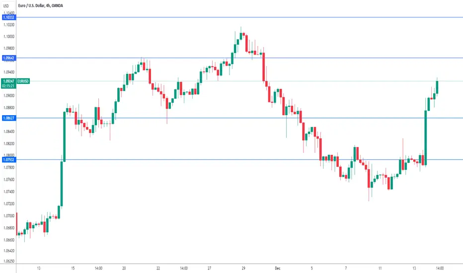
Euro climbs to two-week high as ECB meeting loomsThe euro has extended its gains in Thursday trading. In the European session, EUR/USD is trading at 1.0925, up 0.45%. It has been a good week for the euro, which has climbed 1.5% against the US dollar.
The European Central Bank meets later on Wednesday and is widely expected to hold rates at 4.0% for a second straight time. The markets will be focusing on the rate statement and ECB President Lagarde's post-meeting remarks. Lagarde has been hawkish, stressing the need to maintain rates in restrictive territory for a prolonged period - "higher for longer".
The markets are more dovish and have priced in six rate cuts for 2024, with a first cut as early as the spring. The economic landscape in the eurozone could support the market's view. Inflation has fallen sharply and is at 2.4%, within striking distance of the Bank's 2% target. The economy has cooled due to high interest rates and a recession remains a possibility.
Will Lagarde push back against market expectations of rate cuts? Or will she set a more dovish stance and avoid ruling out rate cuts? The tone of the rate statement and Lagarde's comments could have a strong effect on the movement of the euro today.
The Federal Reserve maintained the benchmark rate at a target range of 5.25%- 5.50% for a third straight time. That was not a surprise but Fed Chair Powell provided plenty of drama as he pivoted from his usual hawkish rhetoric. There had been expectations that Powell would push back against growing speculation that the Fed would trim rates in 2024. Powell not only failed to push back, he signalled that the Fed expected to cut rates three times next year.
Powell's dovish message sent equities flying higher and the US dollar tumbling. Just two weeks ago, Powell said it would be "premature" to speculate about the timing of rate cuts and that the door was still open to further hikes. There is still a deep disconnect between the markets and the Fed, as the markets have now priced in six rate cuts in 2024.
There is resistance at 1.0964 and 1.1033
1.0862 and 1.0793 are providing support
Live stream - The Pivot is Upon UsWesty and Blake are back with a massive episode of The Trade Off you won't want to miss! They're talking macro (FOMC, other CBs, Risk On & Holiday Trading), charts (USDJPY, EURCHF, US2K & ETH) and trade ideas (US500 & Crude). See you there!

Live stream - This Year's Biggest Breakouts: Technical Trends wiJoin TradingView's general manager Pierce Crosby to dive into the most significant technical breakouts of 2023 and explore some of the major technical trends looking forward to the new year.

Rate Cut 1930 - Pattern Recognition: 30s vs Today In 1930, when the Fed cut interest rates, the market crashed further. In today's tutorial, we will be comparing the 30s and today’s market to identify some of their similarities.
Where exactly are interest rates’ direction pointing us?
As we may have read, many analysts are forecasting that there will be a few rate cuts in 2024. Is this the best option?
My work in this channel, as always, is to study behavioral science in finance, discover correlations between different markets, and uncover potential opportunities.
Micro Treasury Yields & Its Minimum Fluctuation
Micro 2-Year Yield Futures
Ticker: 2YY
0.001 Index points (1/10th basis point per annum) = $1.00
Micro 5-Year Yield Futures
Ticker: 5YY
0.001 Index points (1/10th basis point per annum) = $1.00
Micro 10-Year Yield Futures
Ticker: 10Y
0.001 Index points (1/10th basis point per annum) = $1.00
Micro 30-Year Yield Futures
Ticker: 30Y
0.01 Index points (1/10th basis point per annum) = $1.00
Disclaimer:
• What presented here is not a recommendation, please consult your licensed broker.
• Our mission is to create lateral thinking skills for every investor and trader, knowing when to take a calculated risk with market uncertainty and a bolder risk when opportunity arises.
CME Real-time Market Data help identify trading set-ups in real-time and express my market views. If you have futures in your trading portfolio, you can check out on CME Group data plans available that suit your trading needs tradingview.sweetlogin.com

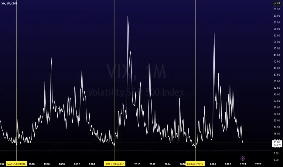
VIX Index at Lowest Levels Since 2017OVERVIEW
As of 12/12/2023, CBOE:VIX is at 11.82.
There have only been a handful of periods over the last 30 years where stock market volatility is at a similar level, including 2007 and 1994.
Some would argue it implies an increasing level of volatility will be due in 2024.
What is the VIX?
The CBOE Volatility Index, is a real-time market index representing the market's expectations for volatility over the coming 30 days. Investors often refer to the VIX as the "fear index" or "fear gauge" because it is one of the most recognized measures of market volatility.
Here's a breakdown of what the VIX represents:
Volatility Measurement:
The VIX measures the stock market's expectation of volatility based on S&P 500 index options. It is calculated using the bid and ask prices of S&P 500 index options.
Forward-Looking: Unlike many market metrics that look at past performance, the VIX is forward-looking. It provides a 30-day forward projection of volatility.
Market Sentiment Indicator: A high VIX value indicates that traders expect significant changes (volatility) in stock prices, which is often associated with market uncertainty or fear. Conversely, a low VIX suggests low expected volatility and is often associated with market stability.
Not a Direct Stock Market Indicator : It's important to note that the VIX does not measure the direction of stock market movements. Instead, it measures how much the market is expected to fluctuate, regardless of the direction.
Use in Investment Strategies: Some investors use the VIX to help in making decisions about market timing. For example, a high VIX might suggest a market turning point, leading some to consider it a good time to buy, while others might see it as a signal to sell.
VIX Derivatives: There are various financial products, such as VIX futures and options, that allow investors to trade based on their views of future market volatility.
Risk Management Tool: For portfolio managers and sophisticated investors, the VIX can be a tool to hedge against market volatility or to take a position on future volatility.
In summary, the VIX is a key measure of market expectations of near-term volatility conveyed by S&P 500 stock index option prices. It has become a crucial tool in financial markets for hedging, trading, and investment strategy formulation
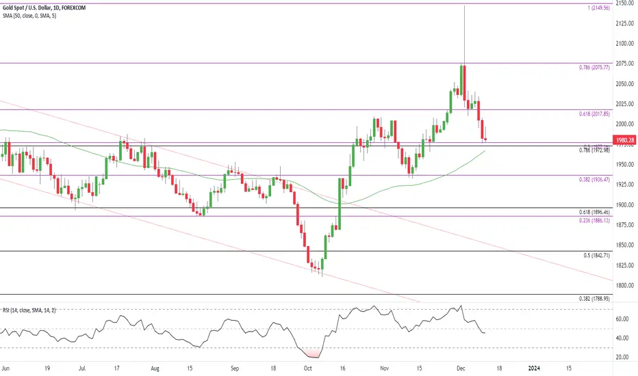
Gold Price Susceptible to Test of 50-Day SMAThe price of gold remains under pressure after spiking to a fresh yearly high ($2147), with the weakness in bullion pulling the Relative Strength Index (RSI) from overbought territory.
Gold Price Outlook
The price of gold sits near the monthly low ($1976) as it weakens for the third consecutive day, with a break/close below the $1973 (78.6% Fibonacci retracement) to $1977 (50% Fibonacci extension) region raising the scope for a move towards $1937 (38.2% Fibonacci extension).
Failure to defend the November low ($1932) opens up the $1886 (23.6% Fibonacci extension) to $1897 (61.8% Fibonacci retracement), but the price of gold may track the positive slope in the 50-Day ($1967) should it continue to hold above the moving average.
Need a break/close above $2018 (61.8% Fibonacci extension) to bring $2076 (78.6% Fibonacci extension) back on the radar, with the next area of interest coming in around the yearly high ($2147).
Live stream - Fed, US Dollar Majors, Gold, Oil, Bitcoin, S&P 500Join Sr Technical Strategist Michael Boutros live for key technical levels and setups he’s tracking into the start of the week. Discuss upcoming major events and its impact on currencies, commodities and major equity indices.

Is Nasdaq 100 Ready For A Move Towards It’s All-Time High?From the beginning of November till today, indices experienced a strong rally, where some made double digit gains. EASYMARKETS:NDQUSD has been one of those, which added around 12% to its value. But that’s, basically, what the index lost in the period between the mid-July and end of October. We can see that the index is now getting a hold near the previous highest point of this year, at around 16062. Although we saw a few breakouts above that hurdle, still, the price remains below it. Although there is a good chance to see further declines, we would prefer to wait for the body of the weekly candle to stay above that hurdle first.
If that happens, EASYMARKETS:NDQUSD may travel further north, possibly targeting the area near the all-time high. First, it may be the level at 16659, which might come into play. That level marks the high of 27th of December 2021. Slightly above it lies the current all-time high, at 16767. That is the highest point of 2021.
To consider a move lower, at least in the near term, a drop below the 15719 zone would be required. That zone is marked by the highest point of September and by the current lowest point of December. If that drop happens, this may clear the path towards a larger correction lower towards the medium-term tentative upside support line drawn from the lowest point of January.
Disclaimer:
easyMarkets Account on TradingView allows you to combine easyMarkets industry leading conditions, regulated trading and tight fixed spreads with TradingView's powerful social network for traders, advanced charting and analytics. Access no slippage on limit orders, tight fixed spreads, negative balance protection, no hidden fees or commission, and seamless integration.
Any opinions, news, research, analyses, prices, other information, or links to third-party sites contained on this website are provided on an "as-is" basis, are intended only to be informative, is not an advice nor a recommendation, nor research, or a record of our trading prices, or an offer of, or solicitation for a transaction in any financial instrument and thus should not be treated as such. The information provided does not involve any specific investment objectives, financial situation and needs of any specific person who may receive it. Please be aware, that past performance is not a reliable indicator of future performance and/or results. Past Performance or Forward-looking scenarios based upon the reasonable beliefs of the third-party provider are not a guarantee of future performance. Actual results may differ materially from those anticipated in forward-looking or past performance statements. easyMarkets makes no representation or warranty and assumes no liability as to the accuracy or completeness of the information provided, nor any loss arising from any investment based on a recommendation, forecast or any information supplied by any third-party.

AMD Surges After Launching AI chip that Could Challenge NvidiaAMD unveiled its MI300X chip, an AI-centered semiconductor designed to challenge Nvidia's global market dominance.
Advanced Micro Devices (NASDAQ: AMD) shares jumped in early Thursday trading after the semiconductor group unveiled an AI-focused chip for the data-center market, which it says could be valued at as much as $45 billion over the coming years.
AMD, which in June pegged the total addressable market for data-center chips at around $30 billion, launched the MI300X chip, designed to support generative-artificial-intelligence technologies. And it unveiled a next-generation semiconductor focused on supercomputing, the Instinct M1300A.
The MI300X, analysts say, could challenge Nvidia's NVDA dominant H100 graphics-processing-unit chip in the large-language-model AI market. Last month, AMD said the new chip could generate $400 million in fourth-quarter sales while the broader family of MI300 semis are expected to see sales of more than $2 billion over the whole of 2024.
Large language models "continue to increase in size and complexity, requiring massive amounts of memory and compute,” CEO Lisa Su said during last night's launch event at the company's Santa Clara, Calif., headquarters. “And we know the availability of GPUs is the single most important driver of AI adoption.”
Advanced Micro Devices shares were marked 2% higher in premarket trading to indicate an opening bell price of $119.12 each. Such a move would nudge the stock into positive territory for the past six months.
AMD last forecast fourth-quarter sales in the region of $6.1 billion, plus or minus $300 million, with gross margins of around 51.5%. That outlook following a mixed third-quarter-earnings report that showed big gains in PC revenue had partly offset the ongoing decline in gaming.
"While AMD acknowledged that its software can be further improved, it has reached the point of being 'good enough' for volume deployment," said KeyBanc Capital Markets analyst John Vinh. He reiterated his overweight rating on the stock following last night's launch event.
"We're encouraged that AMD has released a competitive AI GPU within a massively fast-growing (total addressable market), with endorsements by many high-profile customers," he added.
Technical Analysis
The RSI (14) is at 56.52, indicating a bullish momentum. The MACD (12,26) is at 0.68, suggesting a positive trend. AMD is trading near the top of its 52-week range and above its 200-day simple moving average.
Investors have been pushing the share price higher, and the stock still appears to have upward momentum. This is a positive sign for the stock's future value.

What Leveraged Bitcoin Is Doing In This MoveA derivative indicator I have used for many years to analyze Bitcoin is the BITFINEX:BTCUSDLONGS symbol on Tradingview which displays the number of Bitcoins held in Leveraged Long positions on the Bitfinex platform. This is an indicator of the aggregate long positions held on margin on the platform. It can be used to see what speculative position holders are doing.
Recently, during this run up in the price of INDEX:BTCUSD it seems that the Leveraged positions have begun to unwind by taking profit. They are down -23.5% as of today from the start of November 2023.
Analyzing this chart is different to On-Chain Analysis because the Bitcoin involved are all stored internally at Bitfinex. No new Bitcoin are created (because they cannot be) by taking these positions. Rather the Bitcoin that are custodied on Bitfinex and put up for the ability for other traders to borrow and the owners to earn interest are involved in the count.
A few takeaways:
After months of holding leveraged long positions these traders are taking their profits into this move.
By having less exposure on margin the risk of a liquidation event (and liquidation candle) is diminished.
Leveraged Long positions are net negative meaning that leveraged positions are not the cause of this upward move.

Live stream - 12/08/2023 pm - Stocks & Crypto TA - Trading & Inv12/08/2023, 07:00PM EST Livestream.
Stocks, Crypto, Indexes, Commodities, Forex, TA Charts, Requests.
Technical Analysis & Educational Charts livestream.
All content is Not financial advice.

Who are PineCoders?People often ask us who PineCoders are. Simply put, we are a group of Pine programmers who aim to contribute to the TradingView ecosystem. Many of the Pine Wizards are PineCoders, yet many PineCoders are not Wizards. We are a relatively small group of just about 40. Our group of programmers contributes to the ever-growing community in many ways. Some may create script publications for users to benefit from, while other members are Pine experts contributing in different, often anonymous, ways. We don't publish a list of PineCoders members because many are happy avoiding the limelight; they do what they do for the love of Pine and our community.
PineCoders strive to represent, in a balanced way, the interests of Pine programmers, script publishers and vendors, and the traders who use scripts on TradingView. Oh, and we have lots of fun together.
█ WHAT DO PINECODERS DO?
Many of you recognize us as the script moderators who operate this account. However, script moderation is only one manifestation of our activities. In the Pine realm, we also:
• Help maintain and evolve the Script Publishing Rules and Vendor Requirements .
• Answer questions in the Q&A forums we support: the Q&A chat on TradingView, the Telegram Q&A group , and Stack Overflow .
• Moderate the Telegram Q&A group and the Q&A chat on TradingView.
• Manage the private spaces where our top programmers share and help improve Pine.
• Design solutions to improve the Pine-related aspects of TradingView.
• Help define Pine-related development priorities.
• Tally suggestions for improvement from Pine users.
• Answer Pine-related support tickets.
• Test new features and changes to Pine.
• Report bugs.
• Publish content from the PineCoders and TradingView accounts.
• Publish a monthly script in TASC and from the PineCodersTASC account.
• Publish Pine-related news in our broadcast channels.
• Select and support our Trusted Pine Programmers for Hire .
• Select the Editors' Picks for Community Scripts .
• Select the yearly Pine Wizards nominees.
• Organize Pinefests , the Pine programming contests .
• Collaborate on the technical documentation of Pine.
█ HOW ARE PINECODERS CHOSEN?
Any member of PineCoders can propose a candidacy. When our management team approves it, they submit the nomination to our members to cast their votes. If the majority of our group agrees, we send an invitation to the user. We select people who are agile in Pine and interested in contributing to our ever-growing community. We keep our group relatively small but diverse, as we believe it fosters a dynamic conducive to productive exchanges and efficient decision making.
█ WHAT'S YOUR RELATIONSHIP WITH TRADINGVIEW?
A handful of users launched PineCoders in 2019 with the support of a TradingView co-founder who recognized the potential of uniting power users with good ideas to improve Pine. The official support from this visionary and our daily collaboration with key TradingView teams are some of the main reasons we can successfully realize our projects.
We founded PineCoders as a volunteer group, and to this day, the vast majority of PineCoders activities are made possible because of volunteer contributions. As our projects evolved and some work required a few of us to commit to internal TradingView activities, those few also added contract work for TradingView to their volunteer activities within PineCoders.
█ WE ARE NOT ALONE
Our group does not hold a monopoly on good deeds. Many other Pine programmers also contribute to the strength and liveliness of our unique community.
With TradingView being so popular, a constant influx of newcomers to Pine want to learn how to enhance their trading practice by programming indicators and strategies. It would be impossible for PineCoders to support them alone, and it's comforting to see that even today, some people still find purpose in volunteering their time and knowledge to help others.
Thank you to all those who help our fantastic community in one way or another.