Do Not Overwhelm Your Price Chart!
In this article, we will discuss a very important term in trading psychology - paralysis by analysis in trading.
Paralysis by analysis occurs when the trader is overwhelmed by a complexity of the data that he is working with. Most of the time, it happens when one is relying on wide spectra of non correlated metrics. That can be various trading indicators, different news outlets and analytical articles and multiple technical tools.
Relying on such a mixed basket, one will inevitably be stuck with the contradictory data.
For example, the technical indicators may show very bearish clues while the fundamental data is very bullish. Or it can be even worse, when the traders have dozens of indicators on his chart and half of them dictates to open a long position, while another half dictates to sell.
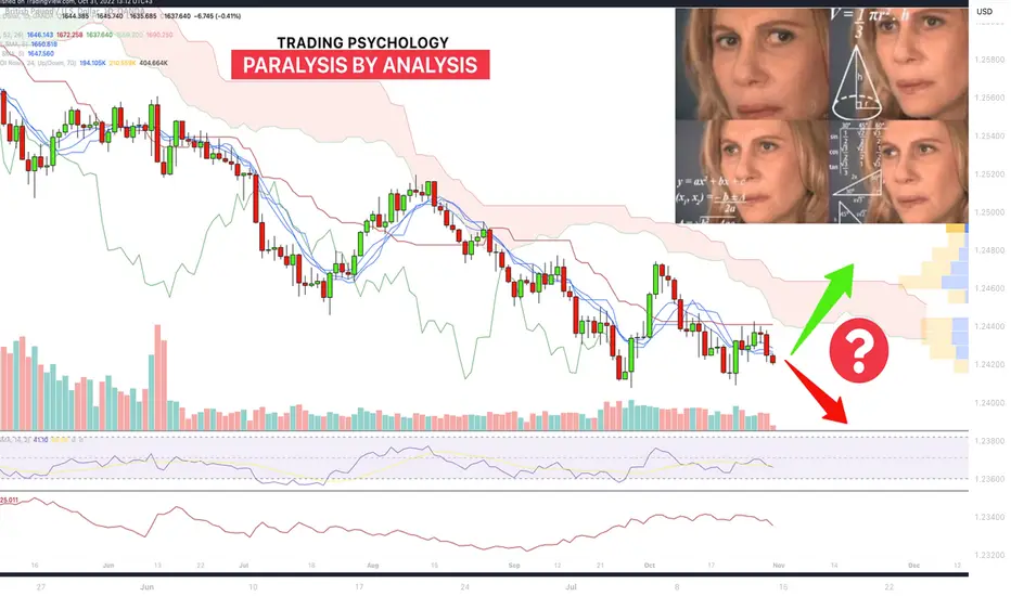
Above, you can see an example of a EURUSD price chart that is overwhelmed by
various technical indicators: Ichimoku, MA, Volume, ATR
support and resistance levels
fundamental data
As a result, the one becomes paralyzed , not being able to make a decision. Moreover, each attempt to comprehend the data leads to deeper and deeper overthinking, driving into a vicious circle.
The paralysis breeds the inaction that necessarily means the missed trading opportunities and profits.
How to deal with that?
The best option is to limit the number of data sources used for a decision-making. The rule here is simple - the fewer indicators you use, the easier it is to make a decision.
EURUSD chart that we discussed earlier can look much better. Removing a bunch of tools will make the analysis easier and more accurate.
There is a common fallacy among traders, that complexity breeds the profit. With so many years of trading, I realized, however, that the opposite is true...
Keep the things simple, and you will be impressed how accurate your predictions will become.
❤️Please, support my work with like, thank you!❤️
Community ideas
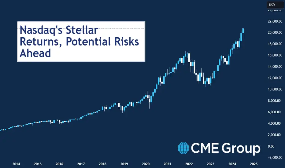
Nasdaq's Stellar Returns, Potential Risks AheadThe Nasdaq-100 has been a stellar performer since its debut in 1985, rising 22,900% (with dividends reinvested) for a 14.8% compounded annual total rate of return. By comparison, the S&P 500 returned 7,200% over the same period with dividends reinvested, an 11.5% compounded return (Figure 1).
Figure 1: Since the inception of the Nasdaq-100 index in 1985, it has outperformed the S&P
Source: Bloomberg Professional (XNDX and SPXT)
However, the Nasdaq’s outperformance can partly be attributed to higher risk levels. It has been consistently more volatile than the S&P 500 (Figure 2) and has been subject to much greater drawdowns. On March 28, 2000, Nasdaq began a drawdown that reached -81.76% on August 5, 2002 (Figure 3). The total return index didn’t hit a new high-water mark until February 12, 2015. It also had a sharper drawdown during the 2022 bear market.
Figure 2: The Nasdaq-100 has nearly always been more volatile than the S&P 500
Source: Bloomberg Professional (XNDX and SPXT), CME Economic Research Calculations
Figure 3: From 2000 to 2002, the Nasdaq-100 fell by nearly 82% and didn’t recover until 2015.
Source: Bloomberg Professional (XNDX and SPXT), CME Economic Research Calculations
A large part of the reason for the Nasdaq’s greater overall return, higher volatility and its heightened susceptibility to deep and long drawdowns is its dependence on one sector: information technology. Since at least the 1990s, Nasdaq has been nearly synonymous with the tech sector.
While nearly every sector has at least some presence in the Nasdaq, since its launch in 1999 it has always had a near-perfect correlation with the S&P 500 Information Technology Index (the basis for the S&P E-Mini Technology Select Sector futures launched in 2011). That correlation has never fallen below +0.9 and has sometimes been as high as +0.98. In the past 12 months the correlation has been +0.95 (Figure 4).
Figure 4: The Nasdaq-100 has always had extremely high correlations with the tech sector
Source: Bloomberg Professional (NDX, S5INFT, S5UTIL, S5ENRS, S5FINL, S5HLTH, S5CONS, S5COND, S5MATR, S5INDU, S5TELS)
The preponderance of technology stocks in the Nasdaq is largely a function of history. Nasdaq was founded in 1971 as the world’s first electronic stock market and it began to attract technology companies, in part, because it had more flexible listing requirements regarding revenue and profitability than other venues. Over time the technology ecosystem settled largely on this market and came to dominate the Nasdaq-100 Index.
Those who need to minimize tracking risks with respect to the S&P 500 Information Technology Index can do so with the Select Sector futures. However, those who wish to increase or decrease exposure to the technology sector more generally, and for whom tracking risks is a less of a concern can easily increase or reduce their exposure with the Nasdaq-100 futures.
Also launched in June 1999 were E-mini Nasdaq-100 futures, which are now turning 25 years old. The contracts caught on quickly, and today trade at more than 668K contracts or $60 billion in notional value each day.
E-mini Nasdaq-100 futures offer capital-efficient exposure to the Nasdaq-100 index, and allow investors to trade and track one NQ futures contract versus 100 stocks to achieve nearly identical exposure. These futures also help mitigate risk against the top-heavy nature of the Nasdaq-100 index, where the so-called Magnificent Seven companies—Microsoft, Apple, Nvidia, Amazon.com, Meta Platforms, Google-parent Alphabet and Tesla—have dominated recently. Broad exposure to this index acts as a hedge if the Magnificent Seven stocks decline.
The Nasdaq has also correlated highly in recent years with consumer discretionary stocks as well as telecoms. By contrast, it has typically low correlations with traditional high-dividend sectors such as consumer staples, energy and utilities which tend to be listed on other exchanges. The exception to this rule is during down markets, when stocks tend to become more highly correlated.
The Nasdaq also has very different interest rate sensitivities than its peers. For starters, high short-term interest rates seem to benefit the Nasdaq-100 companies as many of them have large reserves of cash that are earning high rates of return by sitting in T-Bills and other short-term maturities. This is a sharp contrast to the Russell 2000 index, which has suffered as Federal Reserve (Fed) rate hikes have increased the cost of financing for smaller and mid-sized firms, which borrow from banks rather than bond holders and don’t usually have substantial cash reserves.
By contrast, the Nasdaq has shown a very negative sensitivity to higher long-term bond yields. Many of the technology stocks in the Nasdaq-100 are trading at high earnings multiples. Some have market capitalization exceeding $1 trillion. Higher long-term bond yields are a potential threat because much the value of these corporations is what equity analysts might refer to as their “value in perpetuity,” meaning beyond any reasonable forecast horizon. Typically, such earnings are discounted using long-term bond yields and the higher those yields go, the lower the net present value of those future earnings. Additionally, higher long-term bond yields can also induce investors to switch out of highly volatile and expensive equity portfolios into the relatively less volatile, fixed- income securities.
The Nasdaq’s high sensitivity to long-term bond yields may explain why the index sold off so sharply in 2022 alongside a steep fall in the price of long-dated U.S. Treasuries, whose yields were rising in anticipation of Fed tightening and due to concerns about the persistence of inflation. By contrast, the Nasdaq has done well since October 2022 despite the Fed continuing to raise short-term rates through July 2023 and subsequently keeping those rates high. On the one hand, many of the cash-rich Nasdaq companies are benefitting from higher returns on their holdings of short-term securities. On the other hand, they are also benefitting from the fact that higher short-term rates have steadied long-term bond yields by making it clear that the Fed is taking inflation seriously.
This isn’t to suggest that the Nasdaq is immune from downside risks. History shows that the risks are very real, especially in the event of an economic downturn. In the 2001 tech wreck recession, the Fed cut short-term rates from 6.5% to 1% but long-term bond yields remained relatively high, which was not a helpful combination for the tech sector. In addition to its 82% decline during the tech wreck recession, it also fell sharply during the global financial crisis, though not as badly as the S&P 500, which had a far larger weighting to bank stocks.
This time around, potential threats to the Nasdaq include:
The possibility of an economic downturn which could crimp corporate profits.
Rate cuts which would reduce the return on cash positions.
Large budget deficits and quantitative tightening which could push up long-term bond yields.
Possibly tighter regulation of the tech sector in the U.S. and abroad.
If you have futures in your trading portfolio, you can check out on CME Group data plans available that suit your trading needs tradingview.sweetlogin.com
By Erik Norland, Executive Director and Senior Economist, CME Group
*CME Group futures are not suitable for all investors and involve the risk of loss. Copyright © 2023 CME Group Inc.
**All examples in this report are hypothetical interpretations of situations and are used for explanation purposes only. The views in this report reflect solely those of the author and not necessarily those of CME Group or its affiliated institutions. This report and the information herein should not be considered investment advice or the results of actual market experience.
How to Trade a Break of a TrendlineHow to Trade a Break of a Trendline
Trading broken trendlines is a critical aspect of technical analysis. Understanding how to interpret and act upon the break of trendlines can make a significant difference to a trader's performance. This FXOpen article delves into the intricacies of trading broken trendlines, providing insights, strategies, and risk management techniques to help traders navigate this essential aspect of market analysis.
Understanding Trendlines
Although you know what trendlines are, let’s briefly go over the subject. Trendlines are foundational tools used in technical analysis to visualise the direction of price movements. Drawing accurate trendlines involves selecting the appropriate highs and lows to connect, so they provide a clear representation of the prevailing trend. According to the established rules, there should be at least two highs/lows to draw a strong trendline. The more points you connect, the more solid the line is supposed to be.
There are trendlines in forex, stock, commodity, index, and cryptocurrency* charts. Still, it may be easier to find trendlines on charts of assets experiencing less price volatility.
The three primary types of trendlines are:
1. Uptrend lines connect higher lows and act as support levels. They represent bullish market conditions.
2. Downtrend lines connect lower highs and serve as resistance levels. They depict bearish market conditions.
3. Sideways or Range-Bound lines connect comparable highs and lows, indicating a range-bound or consolidating market.
Significance of Broken Trendlines
Broken trendlines create trading opportunities for traders with different trading styles and risk tolerances. Traders can employ various strategies based on trendlines with breaks, including trend continuation, trend reversal, and breakout strategies. These opportunities can provide traders with entry and exit points to take advantage of changing market dynamics.
Identification of Trend Reversals
Perhaps the key value of broken trendlines is their role in identifying potential trend reversals. When an established trendline is decisively broken, it often signifies a shift in market sentiment. This break indicates that the previous trend's momentum has weakened or reversed, which can be a vital turning point for traders.
In an uptrend, the break of an uptrend line can suggest a potential reversal to a downtrend, and conversely, the break of a downtrend line in a downtrend may signal a potential reversal to an uptrend. If the price breaks the sideways trendline, it usually reflects the end of consolidation and the formation of a new trend, either upward or downward.
In the chart above, the price broke above the downward trendline, after which a new uptrend was formed.
Confirmation of Price Movements
Broken trendlines can act as confirmation signals for other technical analysis tools and patterns. For example, when a trendline break aligns with the formation of chart patterns like head and shoulders or double top and double bottom, it may reinforce the validity of these patterns and their associated price projections.
Market Sentiment
Broken trendlines can also provide insights into market sentiment and psychology. Traders' reactions to trendline breaks can reveal their beliefs and expectations regarding future price movements, which can impact market dynamics and create trading opportunities.
False Trendline Breakout
A false trendline breakout, also known as a fakeout or failed breakout, occurs when the price of an asset appears to break a trendline but then reverses direction, often moving back within the trendline's boundaries. False breakouts can mislead traders and can result in losses for those who initiate trades based on the initial breakout signal.
Here's a breakdown of the key characteristics of a false trendline breakout:
- Initial Breakout. Initially, the price of the asset appears to break above or below a trendline. This break may even be accompanied by increased trading volume, which can provide confirmation of the breakout.
- Traders' Reactions. Many traders may interpret the breakout as a significant move and initiate trades in that direction. For example, if a downtrend line is seemingly broken to the upside, traders may start buying, expecting a trend reversal.
- Reversal. However, instead of continuing in the direction of the breakout, the price reverses course and moves back within the boundaries of the trendline. This reversal negates the initial breakout signal and can catch traders off guard.
Look at the chart above. The price broke above the falling trendline, but the uptrend didn’t form, so the downtrend resumed.
There are several reasons for false trendline breakouts, including:
- Market Manipulation: In some cases, market participants with substantial resources may deliberately manipulate prices to trigger breakouts and then reverse the market's direction to take advantage of the price swings.
- Lack of Confirmation: Fakeouts often occur when there is a lack of confirmation from other technical indicators or factors. Therefore, experienced traders look for multiple signals aligning to increase the validity of a breakout.
- Whipsawing Markets: In volatile or indecisive markets, prices can frequently whipsaw above and below trendlines, making it challenging to distinguish between genuine and fakeouts.
Factors to Consider When Trading Broken Trendlines
To reduce the risk of falling victim to false trendline breakouts, traders often use additional technical analysis tools and confirmation signals. These may include waiting for reversal signals from other indicators, monitoring price action after the breakout, and setting stop-loss orders to potentially reduce losses in case of a reversal.
Confirmation Signals
Confirmation signals can come from various technical indicators and patterns, including but not limited to:
- Candlestick Patterns. Traders look for candlestick patterns that support the direction of the breakout, such as bullish engulfing patterns for an upside breakout and bearish engulfing patterns for a downside breakout.
- Oscillators. Oscillators like the Relative Strength Index (RSI) or the Stochastic can provide overbought or oversold conditions, which may help traders confirm the strength of the move.
- Chart Patterns. Aside from candlestick patterns, chart formations, such as flags, triangles, or pennants, that coincide with the trendline break may provide additional confirmation.
Volume Analysis
Analysing trading volume is a crucial component of evaluating broken trendlines. Volume can provide insights into the significance of the breakout and whether it is more likely to be genuine or a false signal.
A breakout with increasing volume is generally seen as more reliable. It suggests that market participants are actively involved in the move, increasing the chances of a sustained trend.
Conversely, a breakout with decreasing volume may be less reliable, as it indicates a lack of enthusiasm among traders and raises the possibility of a false breakout.
Timeframes
Considering multiple timeframes is essential when trading broken trendlines. Different periods may provide different perspectives on the trendline break, and using a combination of them may enhance decision-making. Here's how traders approach timeframes:
- Higher Timeframes. They start by analysing higher timeframes (e.g., daily or weekly) to identify the primary trend direction. This provides context for the trendline break observed on shorter timeframes.
- Lower Timeframes. Market participants use lower timeframes (e.g., hourly or 15-minute charts) for finer entry and exit points. These shorter timeframes may help pinpoint optimal trade execution levels after the trendline break.
- Confluence. Traders seek confluence between different timeframes. When a trendline break aligns with a breakout on higher timeframes, it adds strength to the trade signal.
Support and Resistance Levels
When trading broken trendlines, it's crucial to consider nearby support and resistance levels. These levels can influence price movements and provide valuable context for trade management.
Fibonacci Retracement and Extension Tools
Fibonacci retracement and extension levels can complement trendline analysis. If the price breaks the Fibo level after a trendline breakout, this may confirm the strength of the newly forming trend.
Risk Management and Position Sizing when Trading Trendline Breakouts
Effective risk management is paramount when trading trendline breakouts. When trading with trendlines, potential profits and losses can be determined via these techniques:
- Setting Stop Losses. Setting appropriate stop-loss orders is a crucial component of risk management strategies.
- Proper Position Sizing. Position sizing is a critical aspect of risk management, especially when trading trendline breakouts. It determines the amount of capital allocated to each trade and helps control exposure to potential losses.
- Risk-Reward Ratios. Risk-reward ratios are essential for evaluating the potential effectiveness of a trade relative to the risk taken.
Common Mistakes to Avoid when Trading Trendline Breakouts
Common mistakes when trading trendline breakouts include making decisions based on insufficient confirmation signals, ignoring fundamental factors, and being guided by emotions. By implementing a disciplined approach and being aware of these pitfalls, traders may increase their chances of making informed trading decisions.
Ignoring Confirmation Signals
One of the most common mistakes traders make when trading trendline breakouts is ignoring confirmation signals. Relying solely on the trendline break itself can lead to premature or misguided trades.
Overlooking Fundamentals
While technical analysis plays a significant role in trading trendline breakouts, overlooking fundamental factors can be a costly mistake. Traders consider the broader market context and macroeconomic factors that may impact the assets they trade. Fundamental events like economic releases, earnings reports, or geopolitical developments can influence market sentiment and override technical signals.
Emotional Trading
Emotional trading is a common pitfall for traders, and it becomes particularly pronounced when trading trendline breakouts. Emotions such as fear and greed can lead to impulsive decisions and erode trading discipline.
Final Thoughts
The ability to trade broken trendlines is a valuable skill for market analysts and traders. Understanding the basics of trendlines, recognising their significance, and implementing effective trendline strategies and risk management techniques may lead to more sound trading outcomes. It's essential to approach broken trendline trading with discipline, patience, and continuous learning to navigate the complexities of financial markets effectively.
*At FXOpen UK and FXOpen AU, Cryptocurrency CFDs are only available for trading by those clients categorised as Professional clients under FCA Rules and Professional clients under ASIC Rules, respectively. They are not available for trading by Retail clients.
This article represents the opinion of the Companies operating under the FXOpen brand only. It is not to be construed as an offer, solicitation, or recommendation with respect to products and services provided by the Companies operating under the FXOpen brand, nor is it to be considered financial advice.
How to Plot Head & Shoulders Pattern on TradingViewWelcome back, Traders!
We’re excited to have you here on TradingView where we share valuable trading insights and educational posts to help you succeed in the markets. Today, we’re diving into one of the most reliable chart patterns in technical analysis: the Head and Shoulders pattern. Understanding and identifying this pattern can significantly improve your trading strategy, whether you’re dealing with forex, stocks, or commodities.
What is the Head and Shoulders Pattern?
The Head and Shoulders pattern is a bearish reversal pattern that indicates a potential end to an uptrend and the beginning of a downtrend. It consists of three peaks:
Left Shoulder: The first peak followed by a decline.
Head: The highest peak followed by a decline.
Right Shoulder: A peak similar in height to the left shoulder, followed by a decline.
The neckline is the support line that connects the lows after the left shoulder and the head.
How to Trade the Head and Shoulders Pattern:
Identify the Pattern: Look for the three distinct peaks with the head being the highest.
Draw the Neckline: Connect the lows after the left shoulder and the head to form the neckline.
Entry Point: Enter a short position when the price breaks below the neckline.
Target: Measure the distance from the head to the neckline and subtract this distance from the breakout point to set your target.
Stop Loss: Place a stop loss above the right shoulder to manage your risk.
Inverse Head and Shoulders Pattern
Conversely, the Inverse Head and Shoulders is a bullish reversal pattern signaling the end of a downtrend and the start of an uptrend. It consists of three troughs:
Left Shoulder: The first trough followed by a rise.
Head: The lowest trough followed by a rise.
Right Shoulder: A trough similar in depth to the left shoulder, followed by a rise.
The neckline is the resistance line connecting the highs after the left shoulder and the head.
How to Trade the Inverse Head and Shoulders Pattern:
Identify the Pattern: Look for the three distinct troughs with the head being the lowest.
Draw the Neckline: Connect the highs after the left shoulder and the head to form the neckline.
Entry Point: Enter a long position when the price breaks above the neckline.
Target: Measure the distance from the head to the neckline and add this distance to the breakout point to set your target.
Stop Loss: Place a stop loss below the right shoulder to manage your risk.
Follow us on TradingView for more helpful ideas and educational posts!
Stay tuned as we continue to share insights that will help you on your trading journey. Happy trading! - BK Trading Academy

How to Trade on Support and Resistance ReversalsHow to Trade on Support and Resistance Reversals
Trading in the financial markets can be a complex endeavour, but it may become more manageable when traders have a solid grasp of support and resistance levels. Recognising support and resistance reversals is a crucial skill that may enhance one's trading performance. In this FXOpen article, we will learn the types of support and resistance and consider some trading strategies based on market reversals.
Recognising Support and Resistance Reversals
It’s unlikely you will need to ask, “What are support and resistance lines?” Still, let’s refresh your memory.
A support line is a level at which an asset's price tends to find buying interest, preventing it from falling further. In other words, it's where demand for the asset is strong enough to counteract selling pressure. Traders often identify support as a potential point when going long or a take-profit target when selling. It can be formed at various price points on a chart and can be horizontal and diagonal (trendlines).
A resistance line is a level at which an asset's price tends to encounter selling pressure, preventing it from rising further. It represents a point where supply exceeds demand, leading to potential reversals or pullbacks. Traders often identify resistance as a potential point when going short or a take-profit target when buying. Like support, resistance levels can also be horizontal, diagonal, or coincide with round numbers.
Support and Resistance: Types
There are various types of support and resistance, including trendlines, round numbers, Fibonacci retracements and extensions, pivot points, and dynamic lines.
Trendlines
Trendlines are one of the most fundamental tools in technical analysis. They are lines drawn on a price chart to connect consecutive lows and consecutive highs to identify the direction of the market. Trendlines act as support and resistance, helping traders identify potential reversal points and trend continuations. The intersection of price movements with trendlines often signifies significant market sentiment shifts.
There are three fundamental types of trendlines:
- Uptrend Lines: Uptrend lines connect a series of higher lows and function as support levels on a price chart. These lines are indicative of bullish market conditions, signifying a consistent upward trajectory in asset value. Traders often use uptrend lines to identify potential entry points for long positions.
- Downtrend Lines: Downtrend lines link lower highs and act as resistance in technical analysis. They reflect bearish market conditions, suggesting a persistent downward trend in asset value. Downtrend lines are valuable for traders looking to establish potential entry points for short positions.
- Sideways or Range-Bound Lines: Sideways or range-bound lines connect comparable highs and lows, illustrating a market in a state of consolidation or trading within a defined range. These lines indicate the lack of strong trends in either direction and are essential for traders to recognise when markets are moving sideways.
Closest Swing Points
Traders can draw support and resistance through the most recent swing point.
- Support: To find a support level based on the closest swing point, traders identify a recent swing low. This low point is where buying interest emerged previously.
- Resistance: To determine a resistance level based on the closest swing point, traders look for the recent swing high. This high point is where selling pressure halted a previous uptrend.
Round Numbers
Round numbers are psychological levels that often serve as support or resistance. They tend to attract the attention of traders and investors due to their simplicity and significance. For example, in a currency pair like EUR/USD, a round number might be 1.2000. These levels can act as barriers where traders make decisions to buy or sell, making them essential reference points in technical analysis.
Fibonacci Retracements and Extensions
Fibonacci retracement and extension levels are based on the Fibonacci sequence and are used to identify potential support and resistance zones. The most commonly used Fibonacci retracements are 23.6%, 38.2%, 50%, and 61.8%. Traders apply these levels to charts to determine where price reversals or corrections may occur. Fibonacci extensions are key tools in technical analysis used to project potential price targets beyond the original trend. The most commonly used levels are 161.8%, 261.8%, and 423.6%.
Pivot Points
Pivot points are calculated levels that help traders identify critical support and resistance points. They are used to determine potential price reversals or breakouts. Traders often look at multiple pivot point levels, including support 1 (S1), support 2 (S2), resistance 1 (R1), and resistance 2 (R2), to gauge the market's sentiment and make trading decisions accordingly.
Dynamic Lines
Dynamic support and resistance are not fixed on the chart but change with market conditions. Common examples include moving averages and Bollinger Bands. Moving averages can act as dynamic support or resistance depending on their positioning relative to the current price: if the price is above the MA, the moving average serves as a support, while if the price is below the MA, the moving average can be used as a resistance. Bollinger Bands consist of a middle band (the moving average) and upper and lower bands that represent dynamic support and resistance zones based on price volatility.
Trading Strategies for Support and Resistance Reversals
Below, you will find two of the most straightforward strategies you can apply to various markets and timeframes.
Bounce Trading Strategy
Objective: To capitalise on confirmed support or resistance by entering positions when the price bounces off these levels.
Entry Point:
- Long Trade (Support Bounce): Traders may wait for the market to approach a strong support level. They always look for a confirmation signal, including a bullish candlestick pattern, such as a hammer or engulfing pattern, or a technical indicator. You may enter the trade at the opening of the next candle after the bullish confirmation signal.
- Short Trade (Resistance Bounce): The trader may wait for the market to approach a robust resistance level. They always look for confirmation with a bearish candlestick pattern, such as a shooting star or bearish engulfing pattern, near the resistance level or a technical indicator. You may enter the trade at the opening of the next candle after the bearish confirmation signal.
Exit Point:
- Take Profit: Traders might set a take-profit order at a reasonable distance from their entry point, aiming for a risk-reward ratio of at least 1:2.
- Stop-Loss: One common practice you may consider is to place a stop-loss order just below (for long trades) or above (for short trades) the support or resistance level you are trading. This may help protect against significant losses if the market moves against your trade.
Look at the chart above. A trader could initiate two trades on the support level. In the first one, they could get confirmation from consecutive candles with small or non-existing lower shadows and rising bullish volumes. In the second trade, they may get confirmation from the Bollinger Bands as the lower band is aligned with the support level.
Pullback and Retest Strategy
Objective: To enter trades on pullbacks to previously broken support or resistance levels, which may now act as new support or resistance.
Entry Point:
- Long Trade (Resistance Turned Support): Traders wait for the price to break significant resistance and retrace to retest it as new support. To confirm a successful retest, you may look for reduced volume and bullish candlestick patterns. To enter a trade, you may wait for the next candle after the retest confirmation to open.
- Short Trade (Support Turned Resistance): Traders wait for the price to break substantial support and retrace to retest it as new resistance. You may ask, “If the price is dancing above the support zone but hasn't broken below it, what should we do?” To make the strategy work, you will need to wait for a breakout and confirm the retest. To get a confirmation signal, you may look for reduced volume and bearish candlestick patterns. An entry point may be initiated when the next candle after the retest confirmation opens.
Exit Point:
- Take Profit: You may set a take-profit order based on your desired risk-reward ratio, considering the potential price target based on the recent significant swing point.
- Stop-Loss: Traders usually place a stop-loss order just below (for long trades) or above (for short trades) the retested support or resistance level to manage risk.
In the chart above, a trader could enter a trade on a retest of a broken resistance level that turned into support. Rising bullish volumes on a support point could serve as a confirmation signal.
Common Pitfalls to Avoid
Trading on support and resistance reversals may be a rewarding strategy, but it's essential to steer clear of common pitfalls that may lead to losses. Here are three significant pitfalls to avoid:
- Overtrading. As the support and resistance reversal strategies are straightforward and conditions for them can be found on almost any market and any timeframe, traders may fall into an overtrading trap. Overtrading occurs when traders execute an excessive number of trades, often driven by the fear of missing out or the desire for quick profits.
- Ignoring Fundamental Analysis. While technical analysis plays a crucial role in trading support and resistance reversals, ignoring fundamental analysis can be a significant pitfall. Economic data releases, geopolitical events, or company news can lead to unexpected market moves.
- Neglecting Risk Management. Neglecting risk management is a critical mistake that traders should avoid, regardless of their strategies. Failing to implement proper risk management can result in substantial losses that outweigh gains.
Final Thoughts
Understanding the various types of support and resistance, including trendlines, round numbers, Fibonacci retracements and extensions, pivot points, and dynamic levels, is essential for traders and analysts to make informed decisions in the financial markets. These tools offer valuable insights into potential market reversals and overall market sentiment. Support vs resistance trading strategies are straightforward and may be applied to almost any market. If you want to test them, open an FXOpen account and enjoy trading in over 600 markets on the TickTrader platform!
This article represents the opinion of the Companies operating under the FXOpen brand only. It is not to be construed as an offer, solicitation, or recommendation with respect to products and services provided by the Companies operating under the FXOpen brand, nor is it to be considered financial advice.
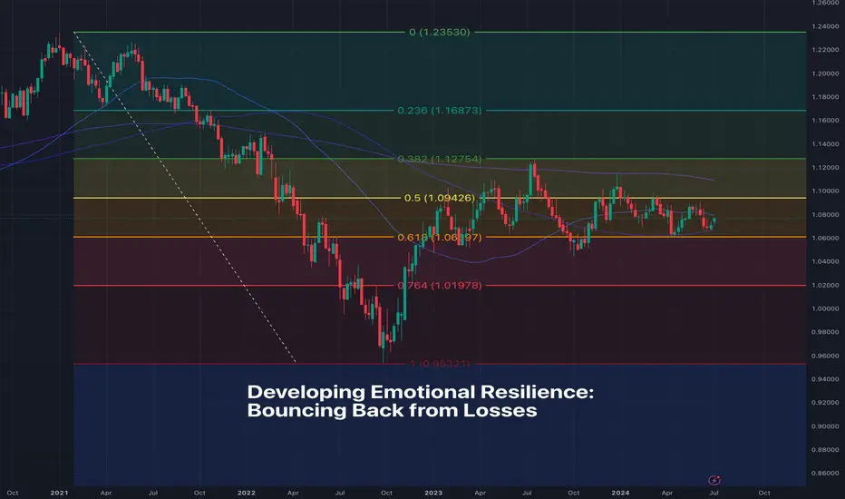
Developing Emotional Resilience: Bouncing Back from LossesOkay, fellow TradingViewers, it’s time we tackle a topic that may make you a bit uncomfortable. But, rest assured — it’s for your own good! Today, we explore the realm of emotional resilience and, more precisely, how to bounce back from losses.
Losses are inevitable. Ask anyone — even the big dogs in the industry have gone through painful losses (as you’ll see at the end of this write-up). Drawdowns so severe that they’ve nearly put hedge funds out of business (just ask Ray Dalio). And yet, bouncing back from losses is what has helped these one-time losers to develop emotional resilience and make the best out of the experience.
Acknowledge the loss, but don’t overblow it
Accept that losses happen and they’re a natural part of the trading journey. No matter how skilled or successful you are, you will have losing positions every once in a while. First, make sure you find out what went wrong. And second, don’t dwell on the losses too much and don’t let them cloud your prospects of becoming a better trader.
Size your positions according to risk tolerance
Never let a single position wipe out your entire account if it turned against you. We know how attractive it is to bet big on currencies swings spanning European countries . But keep in mind that, in such case, the old market adage "You're as good as your last trade" will hold true and it may not be pretty.
There are two main ways to prevent the wipeout of your account with a single trade — don’t bet too big (or use too much leverage). If you do bet big, make sure you have a tight stop loss that won’t let your balance get washed out and drawn underwater. Always think about defense before you think about offense.
Let your strategy take care of your trading
You won’t have to be emotional if you let your strategy take care of your trading. Having the right trading plan will eliminate the need to react on the spot and make rushed decisions out of emotion. A solid strategy can empower you to withstand even the harshest market conditions with your chin up and trading account unscathed.
Embrace the power of habit and routine
In trading, consistency is key. Create for yourself a nice and easy-to-follow trading routine. This may include making your cup of coffee before you sit to do some chart reading. Or get a workout in before you read the daily news. Whatever will help you stay disciplined and emotionally balanced — do more of that.
Invest in yourself and then trade the markets
Your most valuable asset isn’t your trading account — it’s you. Invest time in learning, reading, watching interviews of successful traders and financiers. Read books on finance and trading, study the economic calendar , or sign up for a paper-trading account to test your trading skills risk-free. The more knowledge and practice you soak up, the more resilient and prepared you will become.
Know when to step back and get a break
Sometimes, the best thing to do after a loss is do nothing at all. It’s understandable if you feel emotionally unstable, off-kilter and overwhelmed when the markets gives you a slap in the face. Especially if you’re just starting out in the volatile trading space. What to do then? Unplug, unwind, recharge. The market will still be there tomorrow — go touch grass and come back with a refreshed perspective.
Celebrate the wins — no matter how small
Trading has to be about more than just coping with losses. Give yourself a nice pat on the back for every little victory. Made a successful trade? Or even got out at breakeven thanks to your stop loss? Perfect. Recognize and celebrate these moments. They’re little milestones to remind you that you’re on the right path to success.
Loss advice from the big dogs in trading
Let’s wrap up some with loss advice from the world’s best traders and see how they dealt with the blows of Mr. Market.
Paul Tudor Jones , hedge fund manager: “Losses are not your problem. It's how you react to them. Ignore losses with no plan, or try to double down on your losses to recoup, and those losses will come back like a Mack truck to run over your account.”
Ray Dalio , founder of the world’s largest hedge fund Bridgewater, on how he viewed a near-bankruptcy experience: “I needed to balance my aggressiveness and shift my mindset from thinking ‘I’m right’ to asking myself, ‘How do I know I’m right?’ It was very, very painful, yet it changed my way of thinking. It was one of the best things that ever happened to me.”
George Soros , pioneer of the hedge fund industry: “It’s not whether you’re right or wrong, but how much money you make when you’re right and how much you lose when you’re wrong.”
Let’s hear from you
How do you usually deal with a trading loss? What’s the best thing a loss has taught you? Comment below and let’s spin up a nice discussion!
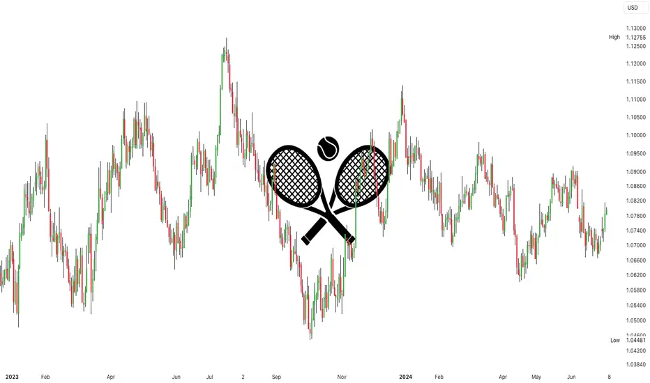
Applying a Champions Mindset to TradingWith the Wimbledon tennis championships starting this week, it seems only appropriate that we take inspiration from tennis GOAT Roger Federer, whose wisdom extends far beyond the court.
It’s Only a Point
In a recent speech at Dartmouth College in the US, Roger Federer, a 20-time major winner, shared insights from his tennis career that resonate deeply with those pursuing success in day trading:
“In the 1,526 singles matches I played in my career, I won almost 80% of those matches. Now, I have a question for you, what percentage of points do you think I won in those matches? Only 54%. In other words, only top-ranked tennis players win barely half of the points they play.”
These words, while referring to tennis, hold a mirror to the experience of highly successful day traders, who can finish profitable on 80% of trading days but manage win/loss ratios hovering around 50%. Losing frequently is a reality they manage with resilience and strategy.
“When you lose every second point on average, you learn not to dwell on every shot… When you play a point, it has to be the most important thing in the world, but when it’s behind you, it’s behind you. This mindset is crucial because it frees you to fully commit to the next point and the next point after that with intensity, clarity, and focus.”
The Psychology of Champions
Elements of Federer’s tennis speech touches the core of elite trading psychology. Mastering each trade with intensity, clarity, and focus, while maintaining detachment from individual outcomes, forms a clear pathway to success.
“You want to become a master at overcoming hard moments… The best in the world are not the best because they win every point; it’s because they know they will lose again and again and have learned how to deal with it.”
Practical Applications of Federer’s Mentality
Here are practical tips on applying a champion’s mindset to your trading:
• Focus on Process Over Outcome: Emphasise executing your trading plan flawlessly rather than fixating on individual trade results. This approach aims to cultivate discipline and consistency, enabling you to make decisions based on logic and strategy rather than emotions.
• Learn from Losses: Traders applying this mindset can look to use losses as opportunities to refine their strategy and improve decision-making.
• Maintain Emotional Balance: Try to avoid letting wins or losses dictate your emotional state. Developing techniques such as mindfulness or journaling can help to manage stress and keep your emotions in check.
• Commit to Continuous Improvement: Just as Federer constantly evolved his tennis game, traders could embrace continuous learning and adaptation in trading.
• Resilience in Hard Times: Developing mental toughness to navigate challenges takes time. Traders could look to build a support system, whether through mentors, trading communities, or personal networks, to help you stay motivated and resilient.
Conclusion
While the parallels between trading and tennis can only go so far, the psychological insights of a true champion should not be underestimated. By adopting a mindset that prioritises process, resilience, and continual improvement, traders are better placed to navigate the complexities of the market with confidence and clarity.
As Wimbledon unfolds, let Federer’s wisdom inspire you to approach your trading with the same intensity, focus, and strategic clarity that defines a champion.
Disclaimer: This is for information and learning purposes only. The information provided does not constitute investment advice nor take into account the individual financial circumstances or objectives of any investor. Any information that may be provided relating to past performance is not a reliable indicator of future results or performance. Social media channels are not relevant for UK residents.
10-Year T-Note vs. 10-Year Yield Futures: Which One To Trade?Introduction:
The 10-Year T-Note Futures and 10-Year Yield Futures are two prominent instruments in the financial markets, offering traders unique opportunities to capitalize on interest rate movements. This video compares these two products, focusing on their key characteristics, liquidity, and the differences in point and tick values, ultimately helping you decide which one to trade.
Key Characteristics:
10-Year T-Note Futures represent a contract based on the value of U.S. Treasury notes with a 10-year maturity, while 10-Year Yield Futures are based on the yield of these notes. The T-Note Futures contract size is $100,000, while the 10-Year Yield Futures contract size is based on $1,000 per index point, reflecting a $10 DV01 (dollar value of a one basis point move).
Liquidity Comparison:
Both 10-Year T-Note Futures and 10-Year Yield Futures are highly liquid, with substantial daily trading volumes and open interest. This high liquidity ensures tight spreads and efficient trade execution, providing traders with confidence in entering and exiting positions in both markets.
Point and Tick Values:
Understanding the point and tick values is crucial for effective trading. For 10-Year T-Note Futures, each tick is 1/32nd of a point, worth $31.25 per contract. The 10-Year Yield Futures have a tick value of 0.001 percent, worth $1.00 per contract. These values influence trading costs and profit potential differently and are essential for precise strategy formulation.
Margin Information:
The initial margin requirement for 10-Year T-Note Futures typically ranges around $1,500 per contract, while the maintenance margin is slightly lower. For 10-Year Yield Futures, the initial margin is approximately $500 per contract, reflecting its lower notional value and DV01. Maintenance margins for yield futures are also marginally lower, providing traders with flexible capital management options.
Trade Execution:
We demonstrate planning and placing a bracket order for both products. Using TradingView charts, we set up entry and exit points, showcasing how the different tick values and liquidity levels impact trade execution and potential outcomes.
Risk Management:
Effective risk management is vital when trading futures. Utilizing stop-loss orders and hedging techniques can mitigate potential losses. Avoiding undefined risk exposure and ensuring precise entries and exits help maintain a balanced risk-reward ratio, which is essential for long-term trading success.
Conclusion:
Both 10-Year T-Note Futures and 10-Year Yield Futures offer unique advantages. The choice depends on your trading strategy, risk tolerance, and market outlook. Watch the full video for a detailed analysis and insights on leveraging these products in your trading endeavors.
When charting futures, the data provided could be delayed. Traders working with the ticker symbols discussed in this idea may prefer to use CME Group real-time data plan on TradingView: tradingview.sweetlogin.com This consideration is particularly important for shorter-term traders, whereas it may be less critical for those focused on longer-term trading strategies.
General Disclaimer:
The trade ideas presented herein are solely for illustrative purposes forming a part of a case study intended to demonstrate key principles in risk management within the context of the specific market scenarios discussed. These ideas are not to be interpreted as investment recommendations or financial advice. They do not endorse or promote any specific trading strategies, financial products, or services. The information provided is based on data believed to be reliable; however, its accuracy or completeness cannot be guaranteed. Trading in financial markets involves risks, including the potential loss of principal. Each individual should conduct their own research and consult with professional financial advisors before making any investment decisions. The author or publisher of this content bears no responsibility for any actions taken based on the information provided or for any resultant financial or other losses.

Price Action Fluency As A Second LanguageThis is the most important educational video I have shared.
Reading price action is akin to acquiring a second or foreign language. Just as fluency in a new language provides fluency and articulation, mastering price action offers traders a nuanced understanding of market dynamics. One would not expect to learn a new language in a short amount of time. It often takes years while keeping up the practice for the rest of ones life. Price action is no different.
There are literally hundreds of subtleties revealing their secrets to the ones who 𓁼 . Indicators obstructing the view of plain truth is most often a useless distraction. It's not just about recognizing patterns; it's about developing a foundational understanding that allows for intuitive and informed trading decisions.
Building this skill set enables traders to interpret market 'sentiments' and react more adeptly to volatility, much like a fluent speaker picks up on subtle nuances in conversation. Thus, learning to 'speak' the language of price action is essential for anyone serious about trading, as it equips them with the tools to navigate and succeed in the complex world of financial markets.

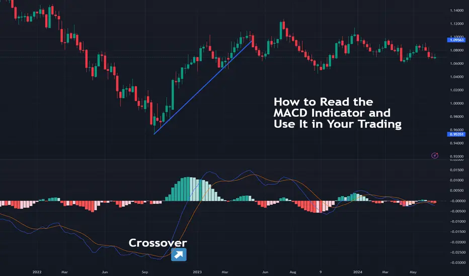
How to Read the MACD Indicator and Use It in Your TradingTechnical analysis is a vast field with thousands of indicators, which may be confusing to those among us who are just starting out. In this Idea, we look at one of the most popular indicators and also one of the easiest ones to fire up and start using from Day 1.
MACD (Moving Average Convergence Divergence)
MACD is arguably the most widely used indicator that can get slapped on virtually every chart out there. The indicator’s full name is Moving Average Convergence Divergence, but you don’t need to remember that.
If you need to take away one thing, it’s this: MACD is easy to read. Here’s how to do it.
Technical Side of Things
Add the MACD in your chart of choice — any chart, any time frame.
You’ll see three default numbers used to set it up — 12, 26, 9.
The 12 is the moving average of the previous 12 bars (also called faster moving average).
The 26 is the moving average of the previous 26 bars (also called slower moving average).
The 9 is the moving average of the difference between the two averages in play.
Next, you see that there are two lines that move up and down and cross each other occasionally. The two lines are:
The MACD line: the difference between the two moving averages and the “faster line”.
The Signal line: the moving average of the MACD line and the “slower line”.
Because the two lines measure price changes at different speeds, the faster one (MACD) will always run ahead and react before the slower one (Signal) catches up.
How to Trade with MACD
If all that sounds a bit complex, here’s the gist of it:
Faster line leads, slower line follows.
Faster line crosses slower line to the downside — a downward trend may be forming.
Faster line crosses slower line to the upside — an upward trend may be forming.
Technically, whenever a new trend is shaping up, the slower line should confirm it by following the faster line. And that happens when the two cross over. The way to potentially spot new trading opportunities is to look for the crossover.
This, in a nutshell, is how to read the MACD indicator and use it to help you become a more profitable trader. There's a whole plethora of MACD examples in action — dive right in !
Let us know your thoughts and experience with the MACD in the comments below!
EBS Base Breakout SetupHey everybody got my camera working for this trade idea. Here we have the ebs stock setting up for a breakout in an uptrend and we're hoping for a bullish continuation here. I describe my entry points my stop loss and my profit target one and the logic behind them and how to position your share count so you can manage your risk and prepare to lose as much or as little money that you want if the trade goes against you every decision in this trade has meaning and logic to it that pertains to the particular stock and the setup therefore you know why you are doing everything that you're doing when trading. Let me know if you have any questions or if this is new to you or if you need help setting it up or calculating how much money you should win or lose. The only issue with this stock is that it's not in the technology sector and it's not in the communication sector so it is not in the most high performing sector right now although the healthcare sector is performing pretty decently with financials as well.

Trade the TREND with 4 Trend Indicators4 Trend Indicators you can use to identify the current MACRO Trend.
It's always important to know where your market is currently trading. Is it bullish, bearish, or range trading? If you have established the trend, you can trade with the trend instead of against it. Trading against the trend ( for example shorting during a bullish cycle ) adds unnecessary risk to an already risky trade (leverage).
1) Bollinger Bands
2) Logarithmic View
3) Super Trend
4) Moving Averages + RSI
Let me know how YOU determine the macro trend!
_________________________
BINANCE:DOGEUSDT MEXC:ETHUSDT KRAKEN:BTCUSD COINBASE:SOLUSD

Is It Possible to Define the Probability of an Effective Trade?Is It Possible to Define the Probability of an Effective Trade?
Traders are constantly trying to figure out the secret of effective trading. However, the inherent unpredictability of markets minimises the ability to accurately determine the probability of an effective trade. This FXOpen article focuses on the many variables that contribute to the dynamism and uncertainty of financial markets. Let’s consider why it is impossible to estimate the chance of lucky trade and what can be done instead.
Why Is Defining Trading Outcomes Difficult?
Trading involves a multitude of variables, which make it challenging to define the probability of an effective trade. Economic indicators, earnings reports, news releases, and geopolitical events all contribute to trading results.
Economic indicators that reflect the state of the economy are subject to revisions and unexpected changes. Geopolitical events, from political tensions to trade agreements, can quickly change the market trajectory. Market sentiment, influenced by news, social media, and psychological factors, introduces a human element that cannot be accurately quantified. That’s why it’s a challenge to define probability in trading.
Factors Influencing Trading Outcomes
Trading the odds is not an effective approach. This implies an attempt to determine market movements intuitively and believing in the best. However, by relying solely on the illusion of predicting the odds, traders gain a false sense of security and overlook other influential factors.
Still, there are several factors that surely influence the results of trading, including market conditions, risk management, and trader psychology. For instance, volatility and liquidity significantly impact trading. Then, building a risk management strategy and using stop-loss orders may help mitigate potential losses. Lastly, understanding trader psychology, including emotional regulation and discipline, plays a vital role in making objective and consistent decisions.
The Role of Market Analysis
It’s unlikely that someone will be able to fully explain how lucky trades work. But it’s definitely possible to identify how trades built on analysis work and why they’re smarter. Market analysis, such as technical, fundamental, and sentiment analysis, provides insights into market movements.
Technical analysis examines historical price patterns and indicators, while fundamental analysis delves into economic factors. Sentiment analysis gauges the mood of market participants through various indicators, such as social media trends. Trades based on an understanding of charts, fundamentals, and reasons for price movements are much more reliable and more likely to be effective than guessing.
However, traders should not forget about the complexity of defining trading outcomes. Even using advanced indicators, one cannot analyse future price movements with 100% precision. Markets are not static entities, and adaptability and risk management are key.
Risk-Reward Ratio and Win Rate
The risk-reward ratio is a critical tool for improving trading performance. The R/R ratio is a mathematical calculation used to measure the expected gains for every unit of risk undertaken. However, it’s important to note that this is a risk management tool rather than a measure of probability.
Traders often fall into the trap of solely focusing on historical high win rates, believing this guarantees success in the future. However, the efficacy of a trade doesn’t solely hinge on the win rate. A high win rate may be effective when paired with favourable risk-reward ratios, potentially creating a sustainable trading strategy.
Historical Performance
Historical performance analysis involves scrutinising past market data, price movements, and trading patterns to identify trends, correlations, and potential signals. Traders use this analysis to make informed decisions about future market movements based on the belief that historical patterns can repeat themselves.
Analysing historical performance gives traders a valuable perspective on potential future movements. Chart patterns, support and resistance levels, and key technical indicators become tools for analysing market behaviour based on past events.
However, retrieving information from past market behaviour comes with limitations. Relying on historical data without considering current market dynamics may lead to misguided conclusions. Additionally, the occurrence of black swan events can disrupt established patterns.
The Influence of Trader Skill
Trader skill — a combination of experience and knowledge — plays a key role in overcoming uncertainty in trading. Experienced traders can interpret market signals with higher precision. Through exposure to diverse market conditions, traders develop a nuanced understanding of when to adhere to strategies and when to adapt.
However, even the most seasoned traders are not immune to market unpredictability. While trader skill empowers individuals to make informed decisions, it does not ensure infallibility.
Final Thoughts
Ultimately, no one can determine the lucky trade chance. But while there are no guarantees, managing risk and maintaining a long-term perspective are crucial elements for traders.
Analysing charts that can be found on the TickTrader trading platform, relying on indicators, adaptation, and getting as much practice as possible may improve performance in the market. In any case, one should not rely on luck alone. To continue gaining experience, you can open an FXOpen account and enjoy the exciting trading conditions available in the market.
This article represents the opinion of the Companies operating under the FXOpen brand only. It is not to be construed as an offer, solicitation, or recommendation with respect to products and services provided by the Companies operating under the FXOpen brand, nor is it to be considered financial advice.
Why you need to have rules in your trading careerHello,
The importance of rules cannot be underestimated in any business. This must not be different in trading/investing since it must be viewed at all times as a business.
Below are my rules as a wave trader. Wave trading is a trading strategy that combines technical analysis with Elliott Wave Theory to identify and predict future market movements. This approach involves analyzing market price patterns to understand the cyclical nature of market trends and capitalize on these patterns for trading opportunities. Below is an example of how markets move in waves
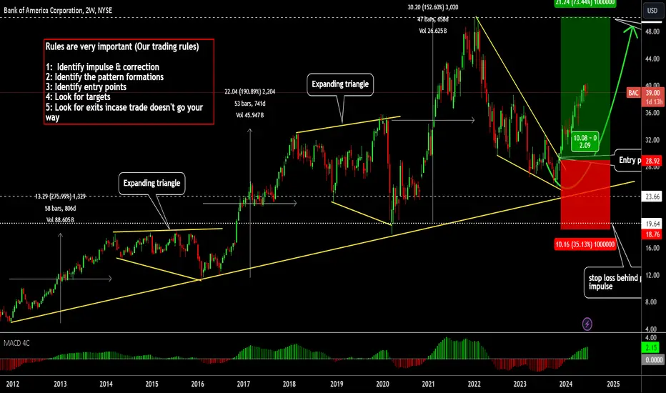
Rules are very important (Our trading rules)
Identify Impulse & Correction
The first step in trading is to identify the impulse and correction phases in the market. An impulse phase is characterized by strong, directional price movement, indicating a clear trend. Corrections, on the other hand, are smaller, counter-trend movements that typically follow an impulse. By recognizing these phases, you can better understand the market's structure and prepare for potential trading opportunities. Below is an example of impulses & corrections identified
Identify the Pattern Formations
Once you have identified the impulse and correction, the next step is to look for specific pattern formations. These patterns, such as head and shoulders, double tops, or triangles, provide clues about future price movements. Understanding and recognizing these formations can significantly enhance your ability to predict market direction and make informed trading decisions. Below are patterns identified that can be tradeable
Most of these patterns can nowadays be identified for you using Tradingview under indicators, metrics & strategies.
Identify Entry Points
After identifying the patterns, the next crucial step is to pinpoint entry points. This involves determining the optimal moment to enter a trade based on your analysis of the market. Entry points should be chosen carefully to maximize potential gains while minimizing risk. Look for confirmations, such as breakouts from patterns or specific technical indicators, to ensure a higher probability of success. Below is an example with a risk free entry
We shall be looking in another post on different types of entries.
Look for Targets
Setting targets is essential for effective trading. Targets help you establish your profit goals for each trade and ensure that you remain disciplined in your approach. These targets can be based on various factors, such as previous support and resistance levels, Fibonacci extensions, or measured moves from the identified patterns. Clear targets allow you to exit trades strategically and lock in profits.
Below is our clear target for the entry we made with a clear stop loss as well
Look for Exits in Case the Trade Doesn't Go Your Way
Not all trades will go as planned, so it's vital to have exit strategies in place for unfavorable scenarios. This involves setting stop-loss levels to limit potential losses and protect your capital. By defining these exits beforehand, you can remove emotional decision-making from your trading process and adhere to a systematic approach, ensuring long-term success and sustainability in your trading business.
I trust that these rules can help you in your trading journey. You can think of having them written somewhere. That way you can look at them & follow them for each trade you make.
All the best
Premium & Discount Price Delivery in Institutional TradingGreetings Traders!
In today's educational video, we will delve into the concepts of premium and discount price delivery. The objective is to provide you with a comprehensive understanding of institutional-level market mechanics. Before we proceed, it is crucial to define what we mean by "institutional level" and "smart money," as these terms are often misunderstood. We will also address the common misconceptions about who the liquidity providers are in the market.
By grasping these foundational concepts, you will gain a new perspective on the market, realizing that its movements are not random but calculated and precise, orchestrated by well-informed entities often referred to as smart money.
If you have any questions, please leave them in the comment section below.
Best Regards,
The_Architect

AMP Futures - How to create chart templatesIn this video we will demonstrate how to save all your custom settings for your chart as a "Template".

43 lessons about forex trading at 43 that I wish I’d known at 23I turned 43 last week. I’ve been working for global brokerages and trading for 16 years. Here’s 43 things I wish I knew back then when I first started trading:
1. Start with your objectives first. I once asked a hedge fund manager what his advice for new traders is, and he said ‘get your objectives clear first.’ Set your goals first, and then create a plan to achieve them.’
2. Risk/reward is everything. As a trader, your job is to place trades with an asymmetrical risk/reward profile – i.e. trades where you can make more than you can lose. That’s what good trading is all about.
3. You are a risk manager first, and a trader second. Your top priority as a trader is to protect your trading capital. Then, secondly, it is to make money. Not the other way around.
4. Cut your losses short and let your profits run. After working in brokerages for 16 years, if I know one thing about retail traders, it is they let their losses run and take their profits too quickly. Don’t be like them.
5. Be properly capitalised. The main reason I’ve seen traders lose is they have too small accounts and use too much leverage. Keep your risks small compared to the size of your account.
6. Use a rules-based approach to trading. Write a plan that contains rules for every decision you need to make as a trader…and then follow it.
7. Be clear and specific. Be clear about your goals, your objectives for each trade, and when you will enter and exit the market. If you are not clear, then keep planning until you are.
8. Mistakes kill trading systems. Errors – for example, not following your rules (or even worse, trading without rules) can make the difference between hitting your goals, or having a losing month.
9. Trade your best idea. Keep it simple and focus on your best idea at the time. Don’t trade too many strategies or systems all at one time.
10. Trade the correct strategy for the market type. Sell in bear markets, buy in bull markets. Range trade or stay out of sideways markets. If the market forms a tight range, trade the breakout. Pick the right approach for the current market conditions.
11. You will not win all the time… and that’s ok. Even the best traders have losing weeks, months and years. Go easy on yourself when things are not working out. Keep trying to improve.
12. Trade less, not more. I made 3% a month over 3 years, taking one trade a day. You don’t need to trade often to hit your objectives.
13. You only need one good trade. One good trade a week or month is all you need to achieve your objectives.
14. You achieve your goals through position-sizing. Controlling the size of your position is more important than getting the trade direction correct.
15. It’s not how often you win, but how much you make when you do. It does not matter if you take lots of small losses, as long as you make large gains when you win.
16. Play the probabilities, not what you think is going to happen. Don’t try to ‘make a trade work’ by taking profit early or not taking a trade, rather trust in the probabilities and your plan.
17. Time of day matters. The forex markets often change direction when the Tokyo, London and New York markets open. Be prepared.
18. Don’t trade on Monday mornings. Funny things happen on Monday mornings when most traders are asleep and the markets are illiquid. It’s best to avoid trading at this time...oh and stay away from New York Friday afternoon too.
19. Keep your entries simple…Don’t over-complicate your entries. A simple breakout or pull-back during a trend will work. Keep your entries simple so you can act decisively.
20. …and your exits complex. Many things happen after you enter a trade, so you need a toolbox of exit strategies.
21. Take some profit when the market gets overbought or oversold. I used to hold on to every trade, hoping it would be a massive winner, only to see it reverse and my profit disappear. Now, I’m happy to take profit as soon as the market signals it’s about to reverse.
22. Trail your stop-loss, but not too close. A trailing stop will allow you to keep your gains. Don’t put it so tight that it will knock you out of the big winners.
23. Move your stop to breakeven, but not too early. Having a trade that you’ve made risk-free by moving the stop loss point is a great feeling. But don’t do it so early that you get whipsawed.
24. News events will be the greatest source of profits and losses . Pay close attention to news events, as they have the power to wipe out your hard-earned gains or generate windfall profits - in the blink of an eye.
25. Record your trades. Keep track of all the trades you make so you can review your performance and…
26. Do more of what works, and less of what doesn't. Doing this over and over again is the secret to success.
27. Know your macros. I’m not talking about calorie-counting. Learning macro analysis of the forex markets will prove valuable in the long run as you will understand what is behind the movements on the charts.
28. Scale-in to high-conviction trades. If you have a high-conviction winner, backed by the fundamentals, then maximise it by adding to the trade as it goes your way.
29. Practice mental rehearsal. Like an elite athlete before their big event, practice executing your trades perfectly in your mind's eye. And take deep breaths while you’re rehearsing.
30. Trading is a game. View trading as a game, where you make the rules and your profits are your winning score.
31. Develop personal discipline. The key to consistent trading is developing the discipline to trade your tested rules, even when you have a series of losses.
32. Keep your thinking flexible. Don’t hold onto a view too tightly, and be prepared to do a u-turn and go the other way.
33. Trade for yourself, not what others will think of you. Do you for you. Not for what others will think of you, or because of what you’ve seen another trader do on social media.
34. Know yourself, before you trust others. Don’t give your money to someone else to trade, until you at least understand how to manage risk yourself. Then you can tell if they are any good at it.
35. Your broker is (probably) not your enemy… in my 16 years of experience, major regulated brokers are not trading against you. They want you to have a good trading experience.
36. …but they are not your mate. They are not always going to call you if you lose money to assist you. That’s not their priority.
37. Costs add up. Costs compound negatively, just like returns compound positively. Keep your transaction costs and fees as low as you can.
38. There is always a marketmaker. If your broker is not the marketmaker, then their liquidity provider is. In the forex market, there is always a marketmaker somewhere down the line.
39. Grind it out. Show up each day, follow your processes, and the results will come. Get used to the grind, and don’t chase the fast win.
40. Don’t tie your self-worth to the markets. The markets are a fickle, challenging beast and your success as a trader is not something to base your personal self-esteem on.
41. Spend your time being happy. Good traders are relaxed and happy. Remain calm and have a positive expectation.
42. Fight the good fight. Author Paulho Coelho said: “The Good Fight is the one that we fight in the name of our dreams.” If you are passionate about trading, keep up the fight. Keep trading, learning and growing and you’ll get there.
43. Enjoy the journey. Trading is a journey through the Himalayas. The highs are high and the lows are lows. The key is to enjoy every step.
Thanks for listening.
Sam
RSI Indicator LIES! Untold Truth About RSI!
The Relative Strength Index (RSI) is a classic technical indicator that is applied to identify the overbought and oversold states of the market.
While the RSI looks simple to use, there is one important element in it that many traders forget about: it's a lagging indicator.
This means it reacts to past price movements rather than predicting future ones. This inherent lag can sometimes mislead traders, particularly when the markets are volatile or trade in a strong bullish/bearish trend.
In this article, we will discuss the situations when RSI indicator will lie to you. We will go through the instances when the indicator should not be relied and not used on, and I will explain to you the best strategy to apply RSI.
Relative Strength Index analyzes the price movements over a specific time period and displays a score between 0 and 100.
Generally, an RSI above 70 suggests an overbought condition, while an RSI below 30 suggests an oversold condition.
By itself, the overbought and overbought conditions give poor signals, simply because the market may remain in these conditions for a substantial period of time.
Take a look at a price action on GBPCHF. After the indicator showed the oversold condition, the pair dropped 150 pips lower before the reversal initiated.
So as an extra confirmation , traders prefer to look for RSI divergence - the situation when the price action and indicator move in the opposite direction.
Above is the example of RSI divergence: Crude Oil formed a sequence of higher highs, while the indicator formed a higher high with a consequent lower high. That confirmed the overbought state of the market, and a bearish reversal followed.
However, only few knows that even a divergence will provide accurate signals only in some particular instances.
When you identified RSI divergence, make sure that it happened after a test of an important key level.
Historical structures increase the probability that the RSI divergence will accurately indicate the reversal.
Above is the example how RSI divergence gave a false signal on USDCAD.
However, the divergence that followed after a test of a key level, gave a strong bearish signal.
There are much better situations when RSI can be applied, but we will discuss later on, for now, the main conclusion is that
RSI Divergence beyond key levels most of the time will provide low accuracy signals.
But there is one particular case, when RSI divergence will give the worst, the most terrible signal.
In very rare situations, the market may trade in a strong bullish trend, in the uncharted territory, where there are no historical price levels.
In such cases, RSI bullish divergence will constantly lie , making retail traders short constantly and lose their money.
Here is what happens with Gold on a daily.
The market is trading in the uncharted territory, updated the All-Time Highs daily.
Even though there is a clear overbought state and a divergence,
the market keeps growing.
Only few knows, however, that even though RSI is considered to be a reversal, counter trend indicator, it can be applied for trend following trading.
On a daily time frame, after the price sets a new high, wait for a pullback to a key horizontal support.
Your bullish signal, will be a bearish divergence on an hourly time frame.
Here is how the price retested a support based on a previous ATH on Gold. After it approached a broken structure, we see a confirmed bearish divergence.
That gives a perfect trend-following signal to buy the market.
A strong bullish rally followed then.
RSI indicator is a very powerful tool, that many traders apply incorrectly.
When the market is trading in a strong trend, this indicator can be perfectly applied for following the trend, not going against that.
I hope that the cases that I described will help you not lose money, trading with Relative Strength Index.
❤️Please, support my work with like, thank you!❤️
Economic Calendar: Top Market Events You Should Watch Out forMarkets tend to get especially volatile whenever there’s an economic report or some data dump that takes investors by surprise. That’s why we’re spinning up this Idea where we highlight all the major market-moving events you should watch out for when you do your trading.
Today, we look at the Economic Calendar .
🏦 Central Bank Meetings and Announcements
• Federal Reserve (Fed) Meetings
The US Federal Reserve holds Federal Open Market Committee (FOMC) meetings roughly every six weeks,or ( eight times a year ), to talk about monetary policy, including interest rates. Setting interest rates is arguably the most significant event with long-lasting consequences for markets.
Each of these meeting takes two days and wraps up with a speech by the gentleman who moves markets with a simple “Good afternoon” — Fed boss Jay Powell.
• European Central Bank (ECB) Meetings
Similar to the Fed, the ECB holds regular meetings to decide on monetary policy and borrowing costs for the Eurozone.
ECB officials’ decisions sway financial markets, especially those based in the old continent. Indexes such as the Stoxx 600 Europe (ticker: SXXP ) and the European currency tend to fluctuate wildly during ECB events.
• Bank of England (BoE) Meetings
The BoE's Monetary Policy Committee (MPC) frequently meets to discuss and set interest rates and other monetary matters.
Decisions made by BoE policymakers mainly affect the UK corner of the financial markets. That means elevated volatility in the British pound sterling and the broad-based UK index, the FTSE 100, among other UK-based trading instruments .
• Bank of Japan (BoJ) Meetings
The BoJ holds policy meetings to decide on interest rates and monetary stimulus, among other central-bank topics.
Until recently, the Japanese central bank was the only one to sport a negative interest rate regime .
📝 Economic Data Releases
• Nonfarm Payrolls
In the US, the Bureau of Labor Statistics releases the Employment Situation Summary on the first Friday of every month. The data package includes the non-farm payroll print , which tracks how many new hires joined the workforce, the unemployment rate, and average hourly earnings.
• Consumer Price Index (CPI)
Monthly CPI measures the rate of inflation at the consumer level. The reading is closely monitored by the Fed in order to gauge the temperature of the economy. A reading too hot indicates an expanding economy, and vice versa.
• Producer Price Index (PPI)
Similar to CPI, PPI measures inflation at the wholesale level and can provide signals about inflation trends.
• Gross Domestic Product (GDP)
Quarterly GDP churns out a comprehensive measure of a country's economic activity and growth.
• Retail Sales
Monthly retail sales indicate consumer spending patterns, which are a critical component of economic activity. The data shows whether consumers pulled back from spending or splurged like there’s no tomorrow.
• Purchasing Managers' Index (PMI)
PMI reports for manufacturing and services sectors lay out insights into business activity and economic health.
🏢 Corporate Earnings Reports
Publicly traded companies around the world release earnings reports every quarter. The hottest ones are America’s corporate giants, such as tech stocks , banking stocks , and more.
The quarterly earnings figures include financial performance for the most recent three months and forward-looking guidance, which comprises earnings and revenue expectations.
🌐 Geopolitical Events
Political developments, such as Presidential elections, and geopolitical tensions can have immediate and significant impacts on financial markets. These events are less predictable but are closely monitored by market participants and can quickly fuel volatility across asset classes, prompting investors to shuffle their portfolio holdings.
Final Considerations
Pay attention to these reports, events, and economic data and you’ll get to understand what moves markets. Anytime you witness a sharp reaction in gold ( XAU/USD ) or a quick reversal in the US dollar ( DXY ), it’s likely that the underlying factor is an economic report you didn’t know about.
If you do track them — which one is your favorite market report or economic news release? Let us know in the comments below!
Four Factors Driving Gold Prices Relative to Silver2600 years ago, the Anatolian Kingdom of Lydia minted the world’s first gold and silver coins. In doing so, the Lydian King Alyattes and his successor Croesus introduced the world’s first exchange rate: the gold-silver cross. Like any cross rate, the amount of silver that can be purchased with an ounce of gold is driven by both demand and supply-side factors, and the cross rate is anything other than stable. Sadly, we don’t have the time series of the gold-silver ratio dating back to ancient times, but we do have data going back to the launch of gold futures on December 31, 1974. Since the mid-1970s, one ounce of gold bought anywhere from 17 ounces to as many as 123 ounces of silver (Figure 1).
Figure 1: The amount of silver an ounce of gold can buy has been highly variable
In addition to the impact of monetary policy, which we have covered here, the gold-silver ratio appears to be governed by four other factors:
Relative volatility and the silver beta
Fabrication demand and technological change
Gold’s use as a monetary asset
Supply-side dynamics
Relative volatility and beta
To borrow an expression from the equity markets, silver is the high-beta version of gold. First, silver and gold prices usually have a strong positive correlation. Since 2004 the one-year rolling correlation of their daily price moves has hovered around +0.8 (Figure 2). Second, silver is more volatile than gold. As such, when gold prices move up, silver tends to move up more, thereby lowering the gold-silver price ratio. By contrast, during bear markets, the gold-silver ratio tends to rise.
Figure 2: The correlation of gold and silver price changes has hugged +0.8 since 2004.
For example, when gold and silver prices peaked in September 2011, one ounce of gold bought fewer than 32 ounces of silver (Figure 3). In the ensuing bear market, the ratio rose to as high as 124 ounces of silver per ounce of gold. The ratio snapped back to 64 in 2020 as gold and silver rallied early in the pandemic. In 2024, as both metals have rallied, silver has outperformed, rising 23% in the first five months of the year compared to 12% for the yellow metal.
Figure 3: Positive correlation plus much higher volatility give silver a high beta to gold
Fabrication Demand and the Impact of Technological Change
What is curious is that while gold and silver have rallied thus far in 2024, gold broke to new record highs of nearly $2,500 per ounce whereas silver prices remain 40% below their twin 1980 and 2011 peaks despite having outperformed gold since 2020 (Figure 4). The reason may lie in technological advances.
Figure 4: Gold has hit records in 2024 while silver is still 40% below its 1980 and 2011 record highs
Even before the Lydians minted the first gold and silver coins around 600 BCE, both metals had been used to make jewellery: silver since around 2500 BCE and gold since 4500 BCE. Some things don’t change. Even today, the primary use of both metals is to make jewellery. Yet, thus far this century, silver has been buffeted by two sets of technological developments: the digital revolution and the energy transition. Both have impacted the relative gold-silver ratio.
In 1999, photography used 267.7 million troy ounces of silver which accounted for 36.6% of that year’s total silver supply. By 2023 photography used only 23.2 million ounces of silver or about 2.3% of 2023’s total supply due to the rise of digital photography. Meanwhile, silver’s use in electronics and batteries grew from 90 million ounces to 227.4 million ounces or from 12.3% to 22.7% of silver’s total annual supply, partially offsetting the decline in traditional photography, which may partially explain why silver has struggled to hit new highs in recent years even as gold has set records.
The good news for silver, however, is that it is finding new use in the energy transition. Over the past few years silver has seen strong growth coming from solar panels, which accounted for 20% of 2023 silver demand, up from essentially nothing in 1999 (Figure 5). Solar panels may explain in part why silver has recovered relative to gold since 2020.
Figure 5: Battery and solar panel demand have grown as photography demand has shrunk
If you have futures in your trading portfolio, you can check out on CME Group data plans available that suit your trading needs tradingview.sweetlogin.com
By contrast, gold fabrication demand has shown itself to be immune from recent technological developments and is still overwhelmingly dominated by jewellery demand, with electronics, dental and other uses absorbing just 17% of annual gold mining supply (Figure 6). The differences in silver and gold fabrication demand underscores that gold is considered the purer of the two precious metals.
Figure 6: Gold fabrication demand has remained little changed
Gold and global monetary policy
Indeed, central banks around the world treat gold as money while they largely ignore silver (Figure 7). They hold a combined 36,700 metric tons of gold, the equivalent of 1.2 billion troy ounces or 13 years of global mining output. Moreover, central banks have been net buyers of gold every year since the global financial crisis.
Figure 7: Central banks have been net buyers of gold since the global financial crisis
Central bank buying of gold since 2009 contrasts sharply with their tendency to be net sellers from 1982 to 2007. Central banks’ accumulation of gold suggests that they want a hard asset to complement their foreign exchange reserves of dollars, euros, yen and other fiat currencies, a view that appears to have been reinforced by on-and-off quantitative easing since 2009 and increased use of financial sanctions. Central bank buying impacts gold prices directly, but only boosts silver prices indirectly via the gold market.
The supply side of the equation
Central bank gold buying reduces the amount of gold available to the public. Over the past decade, central bank buying has removed the equivalent of 8%-20% of new mining supply from the gold market each year (Figure 8) which may also explain why the gold-silver ratio rose significantly from 2011 to 2020 and why, even today, it remains at 2x its 2011 level.
Figure 8: Net of central bank buying, gold supply has stagnated since 2003
Total gold supply net of official purchases has stagnated since 2003. Meanwhile, silver mining supply peaked in 2016 and gold mining supply peaked the next year (Figure 9). The fact that new supply is arriving on the market more slowly than in the past may be bullish for both gold and silver.
Figure 9: Gold and silver respond negative to changes in each other’s mining supply.
Our econometric analysis shows that gold and silver prices are negatively correlated with changes to one another’s mining supply. A 1% decrease in gold mining supply, on balance, boosted gold prices by 1.9% and silver by 3.0% from 1974 to 2023. A 1% decease in silver mining supply boosted the prices of the metals by 1.3%-1.6% (Figure 10). Secondary supply appears to respond to price rather than drive it. Higher prices incentivize more recycling, but recycled metal doesn’t appear to depress prices as it doesn’t bring any new metal onto the market.
Figure 10: Secondary supply responds to price rather than drives it
What connects the two markets is jewellery. Because gold is 70x as costlier than silver, when prices rise, demand for gold jewellery falls while silver’s jewellery demand is relatively unresponsive to price because it costs much less. Gold and silver can be seen as a sort of binary star system where the two stars orbit a common center of gravity or barycenter. Gold is the larger, more stable and more influential of the two, but it is by no means immune from silver’s pull.
If you have futures in your trading portfolio, you can check out on CME Group data plans available that suit your trading needs tradingview.sweetlogin.com
By Erik Norland, Executive Director and Senior Economist, CME Group
*CME Group futures are not suitable for all investors and involve the risk of loss. Copyright © 2023 CME Group Inc.
**All examples in this report are hypothetical interpretations of situations and are used for explanation purposes only. The views in this report reflect solely those of the author and not necessarily those of CME Group or its affiliated institutions. This report and the information herein should not be considered investment advice or the results of actual market experience.
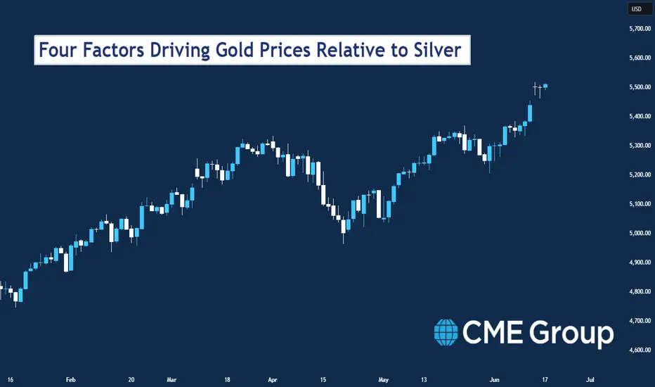
Options Blueprint Series: Swap Strategies for High VolatilityIntroduction
CME Group Gold Futures have always been a cornerstone in the commodities market, offering investors and traders a way to hedge against economic uncertainties and inflation. With the current market environment exhibiting heightened volatility, traders are looking for strategies to capitalize on these fluctuations. One such strategy is the Straddle Swap, which is particularly effective in high volatility scenarios.
By utilizing the Straddle Swap strategy on Gold Futures, traders can potentially benefit from price swings driven by news events, economic data releases, and other market-moving occurrences.
Strategy Explanation
The Straddle Swap strategy is designed to capitalize on high volatility by leveraging options with different expirations. Here’s a detailed breakdown of how this strategy works:
Components of the Straddle Swap:
1. Buy one call option (longer expiration)
This long call option benefits from upward price movements in Gold Futures.
2. Sell one call option (shorter expiration)
This short call option generates premium income, which offsets the cost of the long call option. As it has a shorter expiration, it benefits from faster time decay.
3. Buy one put option (longer expiration)
This long put option benefits from downward price movements in Gold Futures.
4. Sell one put option (shorter expiration)
This short put option generates premium income, which offsets the cost of the long put option. It also benefits from faster time decay due to its shorter expiration.
Rationale for Different Expirations:
Longer Expirations: The options with more days to expiration provide a longer timeframe to capture significant price movements, whether upward or downward.
Shorter Expirations: The options with less days to expiration decay more quickly, providing premium income that reduces the overall cost of the strategy. This helps mitigate the effects of time decay on the longer-dated options.
Market Analysis Using TradingView Charts:
To effectively implement the Straddle Swap strategy, it’s crucial to analyze the current market conditions of Gold Futures using TradingView charts. This analysis will help identify optimal entry and exit points based on volatility and price trends.
The current price action of Gold Futures along with key volatility indicators. Recent data shows that the 1-month, 2-month, and 3-month Historical Volatilities have all been on the rise, confirming a high volatility scenario.
Application to Gold Futures
Let’s apply the Straddle Swap strategy to Gold Futures given the current market conditions.
Identifying Optimal Entry Points:
Call Options: Buy one call option with a 100-day expiration (Sep-25 2024) at a strike price of 2370 @ 64.5. Sell one call option with a 71-day expiration (Aug-27 2024) at the same strike price of 2370 @ 53.4.
Put Options: Buy one put option with a 100-day expiration (Sep-25 2024) at a strike price of 2350 @ 63.4. Sell one put option with a 71-day expiration (Aug-27 2024) at the same strike price of $2350 @ 52.5.
Target Prices:
Based on the relevant UFO support and resistance levels, set target prices for potential profit scenarios:
Upper side, target price: 2455.
For put options, target price: 2260.
Potential Profit and Loss Scenarios:
Scenario 1: Significant Upward Movement
If Gold Futures rise sharply above 2370 within 100 days, the long call option will generate a potentially substantial profit. The short call option will expire in 71 days, limiting potential losses.
Scenario 2: Significant Downward Movement
If Gold Futures fall sharply below 2350 within 100 days, the long put option will generate a potentially substantial profit. The short put option will expire in 71 days, limiting potential losses.
Scenario 3: Minimal Movement
If Gold Futures remain relatively stable, the premiums collected from the short options (71-day expiration) will offset some of the cost of the long options (100-day expiration), minimizing overall losses. Further options could be sold against the long 2350 call and long 2350 put once the shorter expiration options have expired.
Specific Action Plan:
1. Initiate the Straddle Swap Strategy:
Enter the positions as outlined above following your trading plan, ensuring to buy and sell the options at the desired strike prices and expirations.
2. Monitor Market Conditions:
Continuously monitor Gold Futures prices and volatility indicators.
Adjust or close the strategy if necessary based on significant market changes.
3. Manage Positions:
Use stop-loss orders to limit potential losses.
If the market moves favorably, consider exiting the positions at the target prices to lock in profits.
4. Reevaluate Periodically:
Periodically reevaluate the positions as the options approach their expiration dates.
Make any necessary adjustments to the strategy based on updated market conditions and volatility.
By following this type of trade plan, traders can effectively implement the Straddle Swap strategy, taking advantage of high volatility in Gold Futures while managing risk through careful monitoring and the use of stop-loss orders.
Risk Management
Effective risk management is crucial for success in options trading, particularly when employing strategies like the Straddle Swap. Here, we will discuss the importance of risk management, key techniques, and best practices to ensure that traders can mitigate potential losses and protect their capital.
Importance of Risk Management:
Minimizing Losses: Trading inherently involves risk. Effective risk management helps minimize potential losses, ensuring that a single adverse move does not significantly impact the trader’s overall portfolio.
Preserving Capital: By managing risk, traders can preserve their capital, allowing them to stay in the market longer and capitalize on future opportunities.
Enhancing Profitability: Proper risk management allows traders to optimize their strategies, potentially increasing profitability by avoiding unnecessary losses.
Key Risk Management Techniques:
1. Stop-Loss Orders:
Implementing stop-loss orders helps limit potential losses by automatically closing a position if the market moves against it.
For the Straddle Swap strategy, set stop-loss orders for the long call and put options to exit positions if prices reach predetermined levels where losses would exceed the desired trade risk set by the trader.
2. Hedging:
Use hedging techniques to protect positions from adverse market movements. This can involve purchasing protective options or futures contracts.
Hedging provides an additional layer of security, ensuring that losses in one position are offset by gains in another.
3. Avoiding Undefined Risk Exposure:
Ensure that all positions have defined risk parameters. Avoid strategies that can result in unlimited losses.
The Straddle Swap strategy inherently has limited risk due to the offsetting nature of the long and short options.
4. Precision in Entries and Exits:
Timing is crucial in options trading. Ensure precise entry and exit points to maximize potential gains and minimize losses.
Use technical analysis key price levels such as UFO support and resistance prices, and volatility indicators to identify optimal entry and exit points.
5. Regular Monitoring and Adjustment:
Continuously monitor market conditions and the performance of open positions.
Be prepared to adjust the strategy based on changing market dynamics, such as shifts in volatility or unexpected news events.
Additional Risk Management Practices:
Diversification: Spread risk across multiple positions and asset classes to reduce the impact of any single trade. Other liquid options markets could be WTI Crude Oil Futures; Agricultural products such as Wheat Futures, Corn Futures, or Soybean Futures; Index Futures such as the E-mini S&P 500 Futures; and even Bond and Treasury Futures such as the 10-Year Note or the 30-Year Bond Futures.
Position Sizing: Carefully determine the size of each position based on the trader’s overall portfolio and risk tolerance.
Education and Research: Stay informed about market conditions, economic indicators, and trading strategies to make well-informed decisions.
By incorporating these risk management techniques, traders can effectively navigate the complexities of options trading and protect their investments. Ensuring more precision with entries and exits, using stop-loss orders, and implementing hedging strategies are essential practices that contribute to long-term trading success.
When charting futures, the data provided could be delayed. Traders working with the ticker symbols discussed in this idea may prefer to use CME Group real-time data plan on TradingView: tradingview.sweetlogin.com This consideration is particularly important for shorter-term traders, whereas it may be less critical for those focused on longer-term trading strategies.
General Disclaimer:
The trade ideas presented herein are solely for illustrative purposes forming a part of a case study intended to demonstrate key principles in risk management within the context of the specific market scenarios discussed. These ideas are not to be interpreted as investment recommendations or financial advice. They do not endorse or promote any specific trading strategies, financial products, or services. The information provided is based on data believed to be reliable; however, its accuracy or completeness cannot be guaranteed. Trading in financial markets involves risks, including the potential loss of principal. Each individual should conduct their own research and consult with professional financial advisors before making any investment decisions. The author or publisher of this content bears no responsibility for any actions taken based on the information provided or for any resultant financial or other losses.
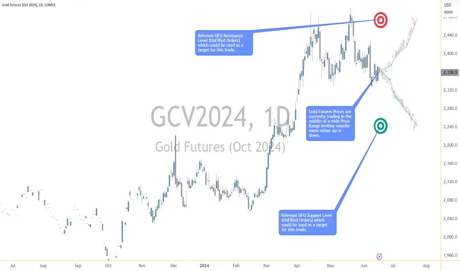
Forex Market Liquidity: Analysis and Implications for TradersForex Market Liquidity: Analysis and Implications for Traders
The foreign exchange market is renowned for its dynamic and fast-paced nature. As traders navigate this landscape, understanding the concept of liquidity becomes crucial. In this article, we analyse its components, explore factors that influence it, measure and analyse its impact, discuss potential risks for traders, and present real-life examples to illustrate its implications.
What Is Liquidity in the Forex Market?
Liquidity in the forex market refers to the ease with which a currency pair can be bought or sold without causing a significant change in its price. Highly liquid assets are usually easily tradable, while less liquid assets may experience more considerable price fluctuations during transactions and bear higher spreads.
Liquidity Components
The liquidity of a currency pair is influenced by several factors, which traders need to consider when constructing a liquidity-proof trading strategy. These include the market depth, the bid-ask spread, and the trading volume.
- Market depth represents the number of buy and sell orders at different price levels in the order book. A deep market with many orders at different price levels typically suggests higher liquidity.
- The bid-ask spread is the difference between the highest price a buyer agrees to pay and the lowest price a seller agrees to accept. A narrower spread typically indicates higher liquidity, while a wider spread reflects lower liquidity. Traders often monitor the spread to gauge current conditions.
- Trading volume refers to the total number of currency units traded within a specified period. Higher trading volume generally indicates greater liquidity, signalling a robust trend. Low trading volume could indicate liquidity issues.
Risks for Traders Arising From Liquidity Levels in Forex
Liquidity is a crucial consideration for traders as it directly affects transaction costs and the ease of entering or exiting positions. High levels generally result in lower transaction costs and less slippage, providing traders with potentially more exciting conditions. Additionally, liquidity may contribute to price stability, reducing the impact of large trades on prices.
Low levels, on the other hand, can pose certain risks that traders must be aware of. In illiquid markets, larger trades can have a more pronounced impact on prices, potentially resulting in random price movements and unfavourable execution prices. Forex market liquidity implications suggest that low liquidity can lead to increased volatility, making it challenging to analyse price movements accurately. In low liquidity conditions, traders may also experience slippage and delays in order execution, impacting the efficiency of trades.
Factors Influencing Liquidity in Forex Trading
Various factors influence current market liquidity in the forex market, and understanding these dynamics is essential for traders:
- Market Participants: The presence of a diverse range of participants, including retail traders, institutional investors, and central banks, contributes to liquidity. A balanced mix of participants often leads to a more liquid market.
- Economic Indicators: Economic releases, such as employment data, GDP figures, and interest rate decisions, can significantly impact a currency’s trading activity. Traders often witness increased volatility before and after such data is released, affecting market liquidity.
- Time of Day: Forex operates 24 hours a day, five days a week. Volume varies depending on the time of day, with peak liquidity during the overlap of major trading sessions.
Forex Market Liquidity Indicators and Measures
Assessing quantitative metrics is a fundamental initial step in a profound forex market liquidity analysis. Let’s discuss some popular indicators which can help evaluate the liquidity level using the trading volume:
- On-Balance Volume (OBV): OBV assesses the strength of a price trend by evaluating the relationship between volume flow and price movements. Higher liquidity often accompanies stronger and more sustained price trends.
- Volume Oscillator: When the volume oscillator is positive or above a specific threshold, it indicates that the recent trading volume has been relatively high. This may suggest that there is more liquidity in the asset.
- Money Flow Index (MFI): The MFI considers trading volume as a component of its calculation. A high trading volume, when combined with significant price movements, can result in a higher MFI reading, indicating strong market participation and potentially higher liquidity. A low trading volume during price movements may result in a lower MFI reading, suggesting reduced liquidity and potentially less market interest.
Price Gaps: In illiquid markets, there are fewer participants and lower trading volumes. In such conditions, price gaps are more likely to happen and can be more substantial. With fewer participants, it becomes challenging to match buyers and sellers efficiently. As a result, a significant order or news event can lead to a notable price gap when the market reopens.
You can visit FXOpen and explore new trading opportunities for some of the most liquid currency pairs through the free TickTrader trading platform.
Real-Life Examples of FX Liquidity
To illustrate the importance of considering liquidity in a forex strategy and how it can impact trader behaviour, let’s consider some real-life examples:
The 2015 Swiss Franc Depegging
In 2015, the sudden decision by the Swiss National Bank (SNB) to remove the Swiss Franc (CHF) peg against the euro had a profound impact on the forex. The depegging in January 2015 led to a sudden drop in value, causing not only an unprecedented shift in trading dynamics but also triggering a significant price gap. The market experienced a reduction in trading volume, highlighting the challenges of liquidity in the face of unexpected events.
High Volumes During Trading Session Overlaps
The EUR/USD currency pair experiences varying trading volumes throughout different global sessions, primarily influenced by the overlap of major trading hours. The chart below depicts the significant volume spikes occurring during the overlap between the European (UTC 08:00 - 17:00) and North American (UTC 13:00 - 22:00) sessions, commonly known as the "London-New York overlap." This period witnesses peak trading volumes, providing traders with optimal conditions for executing trades.
Takeaway
Understanding liquidity is paramount for traders navigating the complexities of the financial markets. By comprehending the components of trading activity and analysing influencing factors and their impact on real-life trading, traders may make more informed decisions to potentially reduce risks and optimise their trading strategies. You trade forex and commodity, stock, and index CFDs today by opening an FXOpen account!
This article represents the opinion of the Companies operating under the FXOpen brand only. It is not to be construed as an offer, solicitation, or recommendation with respect to products and services provided by the Companies operating under the FXOpen brand, nor is it to be considered financial advice.
Crypto Coins Heatmap: The Ultimate Guide for Beginners (2024)Discover the easiest way to track, group and sort your favorite tokens in one place — the TradingView Crypto Coins Heatmap.
Everyone — from the aspiring crypto enthusiast to the professional digital asset fund manager — needs it. Meet the ultimate cryptocurrency tracking and monitoring tool, the TradingView Crypto Coins Heatmap.
What Is Crypto Coins Heatmap?
Slick-looking, feature-rich, and aesthetically pleasing, the Crypto Coins Heatmap is a visual tool developed by TradingView. It displays the performance of crypto coins plastered over a single interface that allows users to keep tabs on price movements through color coding and percentage performance.
Key Features
Let’s start off with the basic features of the Crypto Coins Heatmap.
1. Color-Coded Performance Indicators
Green indicates positive performance (coin go up — good.)
Red indicates negative performance (bad coin — goes down.)
Grey indicates slim to no price movement, typical for stablecoins.
2. Real-Time Price Data
The heatmap is updated in real-time and shows the most current information so crypto geeks could know the price of everything all the time.
3. Market-Cap-to-Size Ratio
The size of each crypto coin corresponds to its market capitalization, i.e. the more room it takes on the screen, the bigger the market value. Bitcoin ( BTCUSD ), the original cryptocurrency , takes up over half the entire screen because its dominance is over 50% of the total market’s worth.
Key Functionalities
What can you actually do with that data and can you customize it? Yes — let’s find out how.
1. Select Source
At the top left, select “Crypto coins” and choose your preferred grouping.
Crypto coins
Crypto coins (Excluding Bitcoin)
Crypto coins (Excluding Stablecoins)
Coins DeFi
2. Size By
Next up, hit the “Market cap” menu to arrange the digital assets by various sizes and parameters. Also, for a more detailed look, make sure to check the dedicated crypto market cap corner on the TradingView website.
Market cap
FD market cap
Volume in USD 24h
Total value locked
Volume 24h / Market cap
Market cap / TVL (total value locked)
3. Color By
The third option from the top bar menu — “Performance” — shows you the tokens’ percentage return on various time frames.
Performance from 1-hour to 1-year time frame.
24-hour volume change, measured in %.
Daily volatility, measured in %.
Gap, measured in % (previous day’s closing price to today’s opening price).
4. Toggle Mono Size
The grid icon allows you to display all tokens in the same size.
5. Filter
The filter icon is where it gets really precise — fine-tune your results by various size and performance metrics.
6. Settings
The gear icon displays the layout settings and allows you to add or remove certain visual elements.
Add or remove Title (by Description or Symbol).
Add or remove Logo.
Add or remove First value, measured in %.
Add or remove Second value, measured in price or market cap.
Color scheme: Classic, Color blind, Monochrome.
7. Share Icon
Tell your crypto friends or cool uncle about this nifty interface by clicking on the Share icon to:
Save image
Copy link
Share on Facebook
Share on Twitter (X)
8. Heat Multiplier
The x1 (by default) icon is the Heat Multiplier, which narrows down your search based on the percentage return on a given time frame. Play around with it to find out the biggest losers and winners in the crypto world.
Why You Need the TradingView Crypto Coins Heatmap
Interactive Charting
Click on any token on the screen to bring up a detailed chart with all the key data you could want. Here’s an example of Ethereum’s ( ETHUSD ) interactive chart:
Quickly grasp market conditions, sentiment, and trends with the intuitive interface.
Comprehensive Market Overview
Make precise comparisons between different cryptocurrencies to see how price performances stack up against each other.
Final Considerations
The TradingView Crypto Coins Heatmap is your gateway to current price data spanning all over cryptoland. Be sure to check it whenever you need a glimpse into the digital asset market and its volatile prices.
And finally, maximize the heatmap’s potential by transferring the insights into your trading plan .
Let us know if you use the Crypto Coins Heatmap — leave your comments below!
