Predict 3 Pairs!!!Using the Dollar Index, you can predict at least 3 different asset's direction of their price. EURUSD, AUDUSD, GBPUSD are pairs that oppose the direction of the DXY!
Community ideas

How to Manage Slippage on TradingViewThis tutorial explains what slippage is and how it relates to market and limit orders as well as times when you might expect higher than normal slippage.
Disclaimer:
There is a substantial risk of loss in futures trading. Past performance is not indicative of future results. Please trade only with risk capital. We are not responsible for any third-party links, comments, or content shared on TradingView. Any opinions, links, or messages posted by users on TradingView do not represent our views or recommendations. Please exercise your own judgment and due diligence when engaging with any external content or user commentary.
Stop-loss orders are submitted as market orders and may be executed at prices significantly different from the intended stop level, particularly during periods of high volatility or limited liquidity. Stop-limit orders carry the risk of not being executed at all if the market does not reach the limit price. It is important to understand that neither type of order guarantees execution at a specific price. Market conditions can change rapidly due to scheduled or unexpected news events, and even quiet markets may experience sudden disruptions. These factors can affect trade execution in ways that may not be predictable or controllable.

the markets are a very emotional cry babyIf you've ever asked, “Why is the market going up on bad news?” or “Why did it dump after great earnings?”, you're not alone.
Markets may seem logical—economic data in, price action out—but in reality, they’re driven by human emotion, crowd psychology, and reflexive feedback loops. The charts don’t lie, but the reasons behind the moves? Often irrational.
Let’s break down why markets are emotional—and how traders can use that to their advantage.
🧠 1. Markets Are Made of People (and People Aren’t Rational)
Even in the age of algorithms, human behaviour sets the tone. Fear, greed, FOMO, panic—all of it shows up on charts.
Fear leads to irrational selling
Greed fuels bubbles and euphoria
Uncertainty causes volatility spikes—even with no new information
📉 Example: The 2020 COVID crash saw massive capitulation. Then came one of the fastest bull markets ever—driven by stimulus and FOMO.
another example
📊 S&P 500 in 2020 with VIX, the S&P 500 crashed and the VIX went up, When the VIX (CBOE Volatility Index) goes up, it means that traders/investors expect a greater likelihood of price fluctuations in the S&P 500 over the next 30 days. This generally indicates increased fear as shown on the chart below
📈 2. Price Doesn’t Reflect Facts—It Reflects Belief
The market is not a thermometer. It’s a barometer of expectations.
When traders believe something will happen—whether true or not—price adjusts. If the Fed is expected to cut rates, assets may rally before it actually happens.
💡 Nerd Tip: Reality matters less than consensus expectations.
Chart Idea to visit:
💬 USD Index vs. Fed rate expectations (2Y yield or futures pricing)
🪞 3. Reflexivity: Belief Becomes Reality
Coined by George Soros, reflexivity explains how beliefs can influence the system itself.
Traders bid up assets, creating bullish momentum
That momentum attracts more buyers, reinforcing the trend
Eventually, fundamentals “catch up” (or the bubble bursts)
📌 Insight: The market creates its own logic—until it doesn’t.
😬 4. Emotional Extremes Create Opportunity
When markets overreact, they offer setups for rational traders.
Capitulation = Bottom Fishing
Euphoria = Caution
Disbelief = Strongest rallies
🧠 Pro Tip: Watch sentiment indicators, not just price. Fear & Greed Index, put/call ratios, or COT data reveal what the crowd is feeling.
Chart Example:
📊 Bitcoin 2022 bottom vs. Fear & Greed Index.. on the chart above the index score close to zero (RED) indicating extreme fear this was because in november 2022 crypto cybercrimes grew new level and investors lost confidence, these cyber crimes included the bankruptcy of FTX as the owners were allegedly misusing customer funds.
💡 5. How to Trade Rationally in an Irrational Market
a. Have a plan. Pre-define entries, exits, and invalidation levels.
b. Expect overreaction. Markets often go further than they “should.”
c. Use sentiment tools. Divergences between price and emotion are gold.
d. Don’t fight the crowd—until it peaks. Fade extremes, not momentum.
e. Zoom out. 5-minute panic means nothing on a weekly trendline.
🎯Nerd Takeaway:
Markets aren’t efficient—they’re emotional.
But that emotion creates mispricing, and mispricing = opportunity.
You don’t need to predict emotion—you just need to recognize it, and trade on the reversion to reason.
💬 Have you ever traded against the crowd and nailed it? Or got caught up in the hype? Drop your chart and your story—let’s learn from each other.
put together by : @currencynerd as Pako Phutietsile
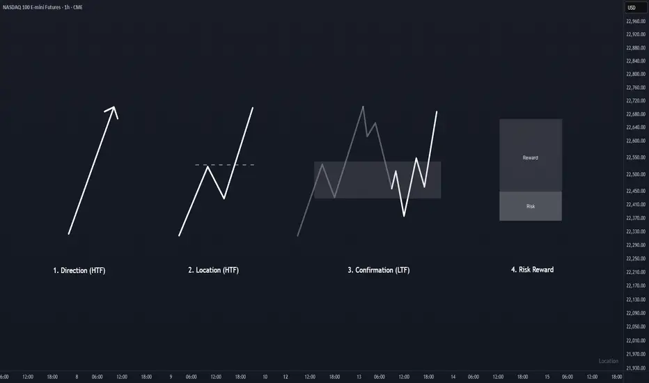
KISS Trading SystemOverview :
Trading process should be as simple as possible. One of the simple method to trade is primarily identify direction, find a good location to entry, wait for confirmation in the location, and finally execute the trade when the risk reward ratio is good.
1. Direction
To identify direction, follow the market structure. Higher high and higher low indicates price is in a bullish trend (uptrend), while lower high and lower low indicates the price is in a bearish trend (downtrend). If there is no clear structure higher high and higher low or lower and high lower low, price is in sideways mode. Best is to avoid trade under this condition until clear trend is formed.
2. Location
Every time price create a new breakout structure, mark the the structure as our potential location for entry. There are some occasion where price does not pullback to the location and continuing the trend by creating a new breakout structure. Do not FOMO, just wait for the next location and confirmation within the location to entry and minimize your risk.
3. Confirmation
Patience is the key. Wait for price to pullback at higher time frame location, and focus for confirmation in lower time frame to entry and reduce risk. Time is fractal, the structure pattern is same on all timeframes. Choosing the right timeframe pair is crucial. Refer to table in the notes below for timeframe pairing.
4. Risk Reward
This is the main essence in trading, controlling risk and preserving capital. Entry without doubt when the risk reward are good. Execute, and trust your setup.
AMP Futures - How to set a date range for charts.In this idea we will demonstrate how to set a date range for your Tradingview Charts.

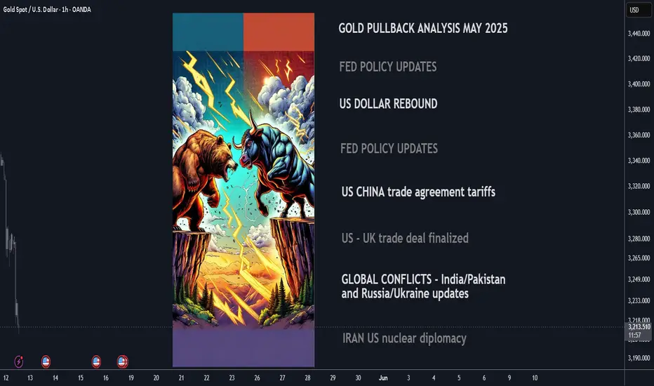
Why Gold Is Pulling Back Now – May 2025 Update⚡️After surging above $3,500/oz in late April, gold has since declined over 8%, recently breaking below key levels and now trading near $3,210. The retracement reflects fading panic buying and growing attention to fundamental drivers: U.S. monetary policy, the strong dollar, easing geopolitical risks, and completed trade agreements. Here’s a breakdown of the leading catalysts and their current impact (ranked 0–10).
1. Fed “Higher for Longer” Bias Strength: 9/10 The Fed kept interest rates at 4.25–4.50% at its June policy meeting and reiterated its cautious stance. The absence of cuts combined with persistent inflation pressure is lifting real yields and undercutting gold’s appeal as a non-yielding asset.
2. U.S. Dollar Resurgence Strength: 8/10The U.S. Dollar Index (DXY) has climbed above 101 as investors digest the Fed’s hawkish tone. A stronger dollar reduces global gold demand, especially from non-USD buyers.
3. U.S.–China Trade Agreement Reached in Switzerland Strength: 7.5/10 A formal trade deal was announced in Geneva in May, easing longstanding tariff tensions. While specific tariff rollback details are pending, markets welcomed the de-escalation, pushing investors away from gold and into risk assets.
4. U.S.–U.K. Trade Deal Signed Strength: 7/10 The U.S. and U.K. finalized a bilateral trade agreement in early May, boosting global sentiment and further reducing the geopolitical premium priced into gold.
5. India–Pakistan Border De-escalation Strength: 6.5/10 After brief clashes in Kashmir in mid-May, both sides have since released statements of restraint. The calm has helped cap gold’s safe-haven bids.
6. Iran–U.S. Nuclear Talks Update Strength: 6/10 Talks resumed in Vienna in May with cautious optimism. While no concrete deal has been signed, progress and diplomatic language from both sides have eased fears of escalation.
7. Russia–Ukraine Ceasefire Developments Strength: 5.5/10 Localized ceasefires in eastern Ukraine, brokered by Turkey and the UN, have lowered near-term geopolitical risk. However, skepticism remains around long-term stability.
8. ETF Inflows & Institutional Demand Strength: 5/10 ETF inflows slowed in May (up just 48.2 tonnes), reflecting waning retail momentum. Still, central bank buying—especially from China—offers a medium-term cushion.
Catalyst Strength Rankings (May 2025)
🔸Fed “higher for longer” bias 9
🔸U.S. dollar rebound 8
🔸U.S.–China trade agreement 5.5
🔸U.S.–U.K. trade deal signed 5
🔸India–Pakistan border easing 6.5
🔸Iran–U.S. nuclear diplomacy 6
🔸Russia–Ukraine ceasefire 5.5
🔸Global gold ETF & central-bank inflows 5
Where Next for Gold?
⚡️Current price: ~$3,210/oz
📉Recent support levels broken: $3,300 and $3,250
🎯Next technical floor: $3,150/oz
✨Upside triggers: Renewed dollar weakness, inflation surprise, or geopolitical flare-up
Gold’s recent drop reflects the market's rotation out of fear-driven trades into yield-bearing and risk assets. While the Fed and the dollar remain dominant forces, any shock—whether geopolitical or inflationary—could quickly reignite interest in gold as a hedge.
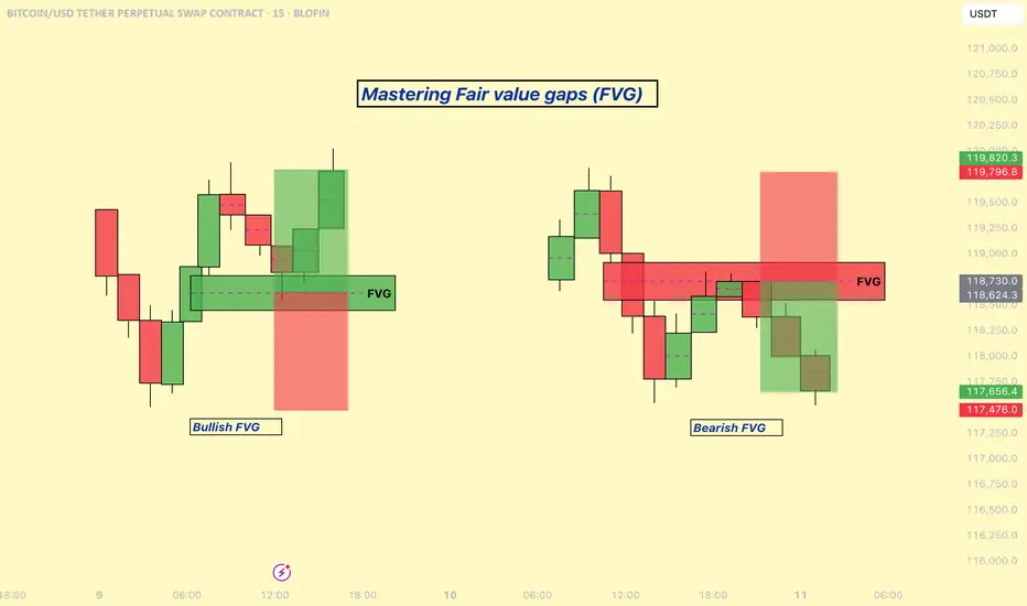
Mastering Fair Value Gaps (FVG) - How to use them in trading?In this guide, I’ll explain the concept of the Fair Value Gap (FVG), how it forms, and how you can use it to identify high-probability trading opportunities. You'll learn how to spot FVGs on a chart, understand their significance in price action, and apply a simple strategy to trade them effectively.
What will be explained:
- What is a FVG?
- How can a FVG occur?
- What is a bullish FVG?
- What is a bearish FVG?
- How to trade a FVG?
-------------------------------
What is a FVG?
A FVG is a technical concept used by traders to identify inefficiencies in price movement on a chart. The idea behind a fair value gap is that during periods of strong momentum, price can move so quickly that it leaves behind a "gap" where not all buy and sell orders were able to be executed efficiently. This gap creates an imbalance in the market, which price may later revisit in an attempt to rebalance supply and demand.
A fair value gap is typically observed within a sequence of three candles (or bars). The first candle marks the beginning of a strong move. The second candle shows a significant directional push, either bullish or bearish, often with a long body indicating strong momentum. The third candle continues in the direction of the move, opening and closing beyond the range of the first candle. The fair value gap itself is defined by the price range between the high of the first candle and the low of the third candle (in the case of a bullish move), or between the low of the first candle and the high of the third (in a bearish move). This range represents the area of imbalance or inefficiency.
-------------------------------
How can a FVG occur?
There are several factors that can trigger a fair value gap
- Economic news and announcements
- Earnings reports
- Market sentiment
- Supply and demand imbalances
-------------------------------
What is a bullish FVG?
A bullish FVG is a specific type of price imbalance that occurs during a strong upward move in the market. It represents a zone where the price moved so aggressively to the upside that it didn’t spend time trading through a particular range, essentially skipping over it.
This gap usually forms over the course of three candles. First, a bullish candle marks the beginning of upward momentum. The second candle is also bullish and typically has a large body, indicating strong buying pressure. The third candle opens higher and continues moving upward, confirming the strength of the move. The bullish fair value gap is the price range between the high of the first candle and the low of the third candle. This area is considered an imbalance zone because the market moved too quickly for all buyers and sellers to interact at those prices.
-------------------------------
What is a bearish FVG?
A bearish FVG is a price imbalance that forms during a strong downward move in the market. It occurs when price drops so rapidly that it leaves behind a section on the chart where little to no trading activity happened.
This gap is identified using a three-candle formation. The first candle typically closes bearish or neutral, marking the start of the move. The second candle is strongly bearish, with a long body indicating aggressive selling pressure. The third candle opens lower and continues the move down. The bearish fair value gap is the price range between the low of the first candle and the high of the third candle. That range is considered the imbalance zone, where price skipped over potential trade interactions.
-------------------------------
How to trade a FVG?
To trade a FVG effectively, wait for price to retrace back into the gap after it has formed. The ideal entry point is around the 50% fill of the FVG, as this often represents a balanced level where price is likely to react.
During the retracement, it’s helpful to see if the FVG zone aligns with other key technical areas such as support or resistance levels, Fibonacci retracement levels, or dynamic indicators like moving averages. These additional confluences can strengthen the validity of the zone and increase the probability of a successful trade.
Enter the trade at the 50% level of the FVG, and place your stop loss just below the most recent swing low (for a bullish setup) or swing high (for a bearish one). From there, manage the trade according to your risk-to-reward preferences—whether that’s 1:1, 1:2, or a higher ratio depending on your strategy and market conditions.
-------------------------------
Thanks for your support.
- Make sure to follow me so you don't miss out on the next analysis!
- Drop a like and leave a comment!
Impatience Tax in Trading: The Costs of Clicking Too SoonHave you ever thought that maybe some of your losses don’t come from bad trades? Rather, they come from good trades, timed badly?
You see the setup, the signal’s almost there, the MACD is leaning in, the candle is flirting with support — and boom, you click. Early. Too early.
Price dips a bit more and then shoots upward like a rocket. Your stop gets triggered — you just paid the impatience tax.
Welcome to the place where you get taxed for being impatient — a very real, very expensive fee traders pay when their fingers move faster than their reasoning.
🤫 The Impatience Tax — A Silent Killer Dressed as Urgency
The impatience tax doesn’t appear on your statement. You won’t see it listed in your commissions, or under slippage, or labeled in red ink like a realized loss. But rest assured, it’s there — nibbling away at your P&L every time you front-run your own strategy.
And the worst part? It feels productive. You’re taking initiative, showing conviction, being bold. Except what you're really doing is lighting good setups on fire because you couldn’t wait for one more candle to close.
🧬 The Anatomy of an Early Click
Here’s how it usually goes:
You spot a setup.
You get excited.
You skip the checklist.
You enter on the 3rd candle instead of the 5th.
The market fakes out.
You get stopped out.
The market then does exactly what you expected — without you.
Every trader has lived this story. And it hurts more than a loss from a bad trade. Because this wasn’t a bad idea. It was a good idea butchered by bad timing.
🤝 Impatience Loves Company (And Volatility)
Impatience tends to thrive in fast markets. When the price is moving, you feel like you need to act. You notice some breaking news that moves markets, charts start to jiggle and tickers flash — suddenly your FOMO glands kick in.
You’re not waiting for confirmation. You’re reacting — to price, to emotion, to fear of missing out.
It’s not just beginners either. Even seasoned traders occasionally get sucked in. Why? Because the brain is wired to avoid missing opportunities more than it’s wired to avoid losses. We want in. Now. Before it's “too late.”
But here’s a pro secret: the markets tend to always give second chances. You just have to be around to take them.
⏰ Why the Best Traders Wait
Let’s talk about patience. Not the zen-monk, meditate-in-a-cave-for-years kind. The market kind.
The kind that says: “Nope, not yet.”
The kind that closes the platform until the London session starts.
The kind that lets a trade go because it didn’t meet all the criteria — even if it was close.
Top traders aren’t paid for activity. They’re paid for precision. The entry is 90% of the battle. If you win there, the rest is just management.
🧐 How to Identify an Impatience Habit
Want to know if you’re paying the impatience tax regularly? Try this:
Look at your last 10 triggered stop loss orders: How many were within a few ticks of reversal?
Count your trades per day: Are you averaging more than your strategy demands?
Review your entry notes: Did you say things like “close enough” or “looks good”?
If the answer is yes, you’re a tax-paying member of the Impatience Society.
👷♂️ Build a Buffer: Taming the Trigger Finger
So how do you stop paying the Impatience Tax?
Start with structure:
Use time-based confirmations. Wait for the candle to close. A candle halfway formed is a lie detector test mid-question.
Have a rule-based checklist. If a trade doesn’t meet every item, you don’t take it. No exceptions.
Use alerts , not entries. Let the price come to you. Your job is to hunt, not chase.
Trade fewer setups, better. Less is more when each trade has meaning and clarity.
And when in doubt? Wait. The worst that happens is you miss one trade. The best that happens is you finally stop losing money edge by edge.
💵 Impatience Is Expensive. Patience Is Profitable.
The market is designed to reward discipline, not urgency. Speed might help you scalp news reactions, but even that requires planned execution. Unchecked impatience is just impulse with a brokerage account.
It's important to always remember that you’re not trying to win this trade. You’re trying to win this game for the long run.
And winning the game means surviving long enough to let your edge play out — with patience, not panic.
💎 Final Thoughts: Don’t Confuse Action with Progress
The financial markets are a cruel place for dopamine seekers. They offer constant motion, flashing lights, and infinite temptation to click before thinking.
But progress isn’t about how many trades you take — it’s about how many good ones you wait for.
So next time your mouse finger twitches, ask yourself: Is this the plan? Or is this impatience disguised as opportunity seeking instant gratification?
Because every early click is a donation to someone else’s P&L.
👉 Your turn : What’s your best (or worst) story of jumping the gun? How have you built patience into your process — or are you still wrestling with the trigger? Let us know in the comments!
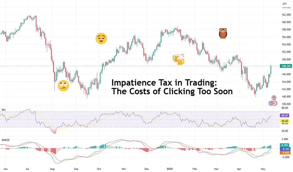
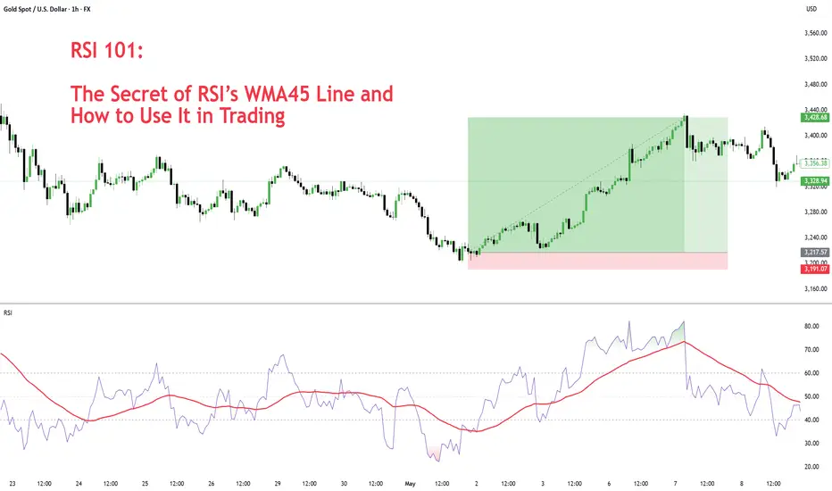
RSI 101: The Secret of RSI’s WMA45 Line and How to Use ItIn my trading method, I use the WMA45 line together with RSI to help spot the trend more clearly.
Today, I’ll share with you how it works and how to apply it — whether you're doing scalping or swing trading.
Why WMA45?
WMA (Weighted Moving Average) is a type of moving average where recent prices are given more importance.
WMA45 simply means it takes the average of the last 45 candles (could be 45 minutes, 45 hours, or 45 days depending on your chart).
Because it moves slower than RSI, it helps reduce the “noise” and gives you a better idea of the real trend.
This idea is not new — many traders have tested RSI strategies also use this line. I just applied and adjusted it in my own way.
👉 How to set it up on TradingView (very simple):
What WMA45 Tells You
Trending
This line shows you the overall direction of the market:
📉 If WMA45 is going down, the price is likely going down.
📈 If WMA45 is going up, the price is likely going up.
Also, the steeper the line, the stronger the trend is:
Looking at the example above, the WMA45 line starts from the same level in two different phases, but the slope is different. The steeper line shows a larger price range.
This happens because the price was more volatile, which caused the RSI to move more sharply, and that, in turn, made the WMA45 slope steeper.
In multi-timeframe analysis, when the trend on the higher timeframe is strong (shown by a steep WMA45 line), the RSI on the lower timeframe will usually move within a tighter range and react more accurately to key levels.
If you’re not sure what these key RSI levels are, check out my previous post here:
For example, in a strong downtrend on H1, RSI on M5 might not even reach 50:
✅ What does this mean for trading?
Use WMA45 on higher timeframes to define trend bias.
On lower timeframes, watch RSI responses at key zones for optimal entries.
When holding positions, WMA45 helps determine whether to stay in the trade.
Moving Sideways
Here’s something important to note: when WMA45 is flat, RSI will keep crossing back and forth over it.
Depending on where WMA45 is flat, RSI tends to move within that range and creates different sideways price patterns. Here are the main types:
Around 50 → price moves in a box: According to RSI theory, the 50 level is the balance between buyers and sellers. RSI fluctuating around this causes price to move sideways in a rectangular box range.
Above 50 → price goes up in a rising channel: Above 50 is where buyers dominate sellers. RSI operating in this zone will continually create bullish candles pushing the price upward.
Below 50 → price goes down in a falling channel: Below 50 is where sellers dominate buyers. RSI in this zone will consistently form lower highs and lower lows, pushing the price downward.
Trend Reversal of WMA45
WMA45 is calculated from the average of 45 candles, so it's almost impossible for it to reverse direction suddenly. When it's sloping (trending), it takes time for RSI to fluctuate enough to "flatten" it before it can reverse.
As shown in the example, after WMA45 slopes up, before it turns downward, RSI must cross back and forth through it to reduce the steepness => flatten it => then reverse.
Does this align with Dow Theory? It represents the phases: Trend > Sideway > Trend. Sideway is when the WMA45 line is flattened.
✅ What does this mean for trading?
After a trend forms, if you want to enter a counter-trend trade, patiently wait for WMA45 to flatten to confirm the previous trend has ended.
Dynamic Support and Resistance
In addition to being a trend indicator for RSI, WMA45 also serves as a dynamic support/resistance level for RSI.
You will often observe RSI reacting when it encounters the WMA45 line.
In an uptrend, WMA45 acts as support for RSI.
In a downtrend, WMA45 acts as resistance for RSI.
Notably, if the reactions occur at higher RSI values, the resulting price support is stronger. Conversely, if reactions happen at lower RSI values, the price is pushed down further.
In the above example, in the first reaction around RSI 60s, RSI dropped by 9.6 points and price dropped by 12 points. In the second reaction at RSI 40s, RSI dropped similarly, but the price dropped by 25 points.
✅ What does this mean for trading?
You can use WMA45 as an entry zone for your trade: Wait for reactions with WMA45 on the higher timeframe, then switch to a lower timeframe to find a trade entry.
Use WMA45 as a take-profit or stop-loss level: For a short trade near WMA45, you can stop out if RSI crosses above it.
When monitoring these reactions, pay attention to the number of reactions—more reactions require more caution in trading.
Some Trade Setups Using WMA45 and RSI
1. Intraday trading
Trend: Follow the trend on the H1 chart.
Entry zone: At WMA45 of H1.
Entry confirmation: 2 methods:
On M5: when WMA45 of RSI is already flattened, and RSI has crossed above WMA45.
On M5: when a divergence appears in RSI.
2. Scalping
With the RSI’s reaction to WMA45, even on smaller timeframes (M1, M5), you can scalp when RSI touches WMA45.
When WMA45 has a slope and RSI returns to touch it, you can enter a trade with SL behind the candle close (10–20 pips to avoid stop hunts and spread), and TP to the nearest peak.
As mentioned, the first touch gives the best reaction.
My trading system is entirely based on RSI, feel free to follow me for technical analysis and discussions using RSI.
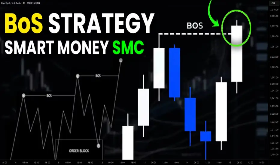
Simple Break of Structure BoS Trading Strategy Explained
One of the best and reliable strategies to trade break of structure BoS is to apply multiple time frame analysis.
In this article, I will teach you my break of structure gold forex trading strategy. You will get a complete step-by-step guide with examples.
Let's start with a quick theory and let me explain to you what is break of structure BoS in Smart Money Concept SMC trading.
In a bullish trend, break of structure BoS is an important event that signifies a continuation of an uptrend. It is based on a violation and a candle close above the level of the last higher high (HH).
After a breakout, the broken level becomes the first strong support for trend-following buying.
Check multiple examples of confirmed breaks of structure BoS on GBPNZD forex pair on a weekly time frame.
In a downtrend, Break of Structure BoS means a bearish trend continuation . Break of Structure is considered to be confirmed when a candle closes below the level of the last lower low (LL).
The broken key level becomes the closest strong support for buying.
That's the example of a healthy downtrend on USDJPY forex pair on a daily. Each break of structure BoS pushed the prices lower, providing a strong signal to sell.
What newbie traders do incorrectly, they trade break of structure without a confirmation strategy, and it leads to substantial losses.
Though GBPCHF is trading in a bullish trend and though each BoS provided a trend-following signal. The price retraced significantly lower below the broken structure before the growth resumed.
When the price retests a broken structure after BoS in a bullish trend, start lower time frame analysis.
If you identified a break of structure on a daily, analyze 4h/1h time frames.
If on a 4H, then 30/15 minutes.
After the price sets a new higher high with BoS in uptrend, it usually starts trading in a minor bearish trend on lower time frames.
With our strategy, your signal to buy will be a retest of a broken structure and a consequent bullish Change of Character CHoCH . That will provide an accurate bullish signal.
In a bearish trend, analyze the lower time frames after a retest of a broken structure. Your signal to sell will be a bearish Change of Character CHoCH.
Look at a price action on EURCHF on a daily.
We see a strong bullish trend and a confirmed Break of Structure BoS.
According to the rules of our trading strategy, we start analyzing 4h/1h time frames after a retest of a broken level of the last Higher High.
Our signal to buy is an intraday bullish CHoCH. We open a long trade after that with the stop loss below the intraday lows and take profit being a current high.
That's how simple this strategy is.
Multiple time frame analysis provides the extra level of security.
Strong lower time frame confirmation substantially increases the win ratio of a trading setup.
❤️Please, support my work with like, thank you!❤️
I am part of Trade Nation's Influencer program and receive a monthly fee for using their TradingView charts in my analysis.
How to Set Up and Use OCO Orders on TradingViewThis tutorial video explains what OCO (Order cancels orders) are, how they work, how to place them in Tradingview, and how they relate to bracket orders.
You'll learn how to add them to new entry orders as well as existing positions.
There is a substantial risk of loss in futures trading. Past performance is not indicative of future results. Please trade only with risk capital. We are not responsible for any third-party links, comments, or content shared on TradingView. Any opinions, links, or messages posted by users on TradingView do not represent our views or recommendations. Please exercise your own judgment and due diligence when engaging with any external content or user commentary.

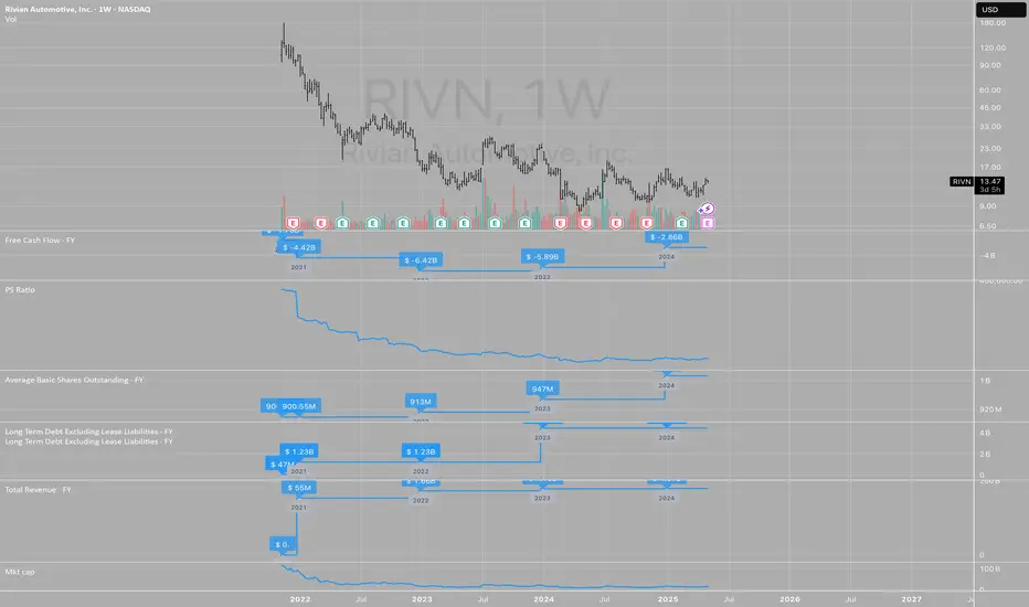
Tim's Fundamental View LayoutHere is the way that I view any stock for an initial analysis to get an idea of what the market is valuing and viewing the company.
I first look at the free cash flow, so that is directly under the price chart. Free cash flow is the life-blood of the company and can be used to pay dividends and to reinvest in the company to grow the top line or to buy back stock.
Next I look at the PSR or Price-To-Sales-Ratio. This ratio is paramount for me since the top line shows up first for companies and is the starting point for analysis. Companies with low or no sales growth get priced very differently from companies with high growth. Start with sales growth in your analysis. There are many great books on the topic written by Kenneth L. Fisher, the creator of the tool.
Next "Avg Basic Shares Outstanding" to see if the company is constantly diluting investors and raising capital or hiding expenses by giving out stock options each year. Old companies in slow growth industries tend to buy back stock and growth companies grow shares outstanding and is a strong headwind for investors.
Next is "Long Term Debt"... which is another extremely important variable to look at with any company. In the long run, debt is the cheapest capital since you can pay it off cheaply but it can also drag down a company when the future is uncertain and unpredictable. Companies with predictable sales and growth often load up on debt which enhances returns for equity owners, but increases the risk long term. Jet Blue NASDAQ:JBLU is case in point for this as in 2000 before the pandemic it had a $5 billion market cap with $1 billion in debt and now it has over $8 billion in debt and the market cap is down to $1.5 billion. It is very difficult to get out from under such a heavy debt load. Debt can be "death" for any company if overused.
Next is "Revenue" graphed annually. Essential to see if inflation impacts sales growth or if it can't keep up with inflation. The last 5 years was between 20%-50% inflation depending on the industry so if a company doesn't have higher revenues by at least 20% since 2019, then this reveals a weakness in their pricing power which is a very competitive market with likely declining or low margins.
Last is "Market Cap". It is always good to know the market capitalization of any stock that you own. It is the foundation for understanding if any investor would ever want to buy the whole company and what would it cost to buy it and what are the "returns" from owning the whole company.
I hope you can copy this layout for your own so you too can have a one-page view of the history of a company to help you get your mind around its valuation and potential along with understanding the risks all in one, easy picture.
Why Volume Bar Colors Can Mislead You█ The Truth Behind Volume Bars — What Do Green and Red Actually Mean?
Most traders learn early on that green volume bars mean bullish activity, and red bars mean bearish pressure. But is it really that simple? What does volume truly reflect, and are we making assumptions that can mislead us?
█ What Volume Actually Is
Volume represents the number of shares/contracts traded during a specific time interval. Every transaction includes both a buyer and a seller. So, volume itself doesn’t distinguish whether a trade was bullish or bearish. Instead, platforms color volume bars based on price movement:
Green: If price closed higher than it opened.
Red: If price closed lower than it opened.
Some platforms, like TradingView, allow you to color volume based on whether the price closed higher or lower than the previous candle’s close.
So YOU, as a trader, have the chance to decide whether to assign volume bars either bullish or bearish! It’s a setting parameter anyone can change. Traders around the globe might look at the same volume bar, but some interpret it as bearish, while others interpret it as bullish. What is the most correct way?
█ The Assumption Behind the Color
This coloring assumes that:
A rising price means buyers were more aggressive (lifting the ask).
A falling price means sellers were more aggressive (hitting the bid).
This is a proxy — an approximation. It simplifies market pressure into a binary outcome: if price goes up, it's bullish volume; if it goes down, it's bearish. But the market isn't always so binary.
However, the assumption is only an approximation of buying vs. selling. In reality, every single trade involves both a buyer and a seller, so volume itself isn’t inherently “buy” or “sell” – what matters is who initiated the trades. As one trading expert explains, talking about “buying volume” vs “selling volume” can be misleading: for every buyer there is a seller, so volume cannot be literally split into purchases and sales. Instead, what traders really mean by “bullish volume” is that buyers were more aggressive (lifting offers) and drove the price up, whereas “bearish volume” means sellers were more aggressive (hitting bids) and drove the price down. The colored volume bar is essentially a proxy for which side won the battle during that bar.
█ Why This Can Mislead You
Price might close higher, not because there were more buyers than sellers (there never are — every trade has both), but because buyers were more urgent. And sometimes price moves due to other forces, like:
Short covering.
Stop-loss runs.
Liquidity vacuums.
This means a green bar might not reflect strong demand, just urgency from the other side closing their positions.
⚪ Example:
Take the well-known GameStop short squeeze as an example. If you looked only at the volume bars during that rally, you’d see a wall of strong green candles and high volume, which might suggest aggressive bullish buying.
However, that interpretation would be misleading.
Under the surface, the surge wasn't driven by fresh bullish conviction — it was massive short covering. Traders who were short were forced to buy back shares to cover their positions, which drove prices even higher. The volume was categorized as bullish, but the true intent behind the move had nothing to do with new buying pressure.
This demonstrates why relying solely on volume color or candle direction can lead to false conclusions about market sentiment.
Does this simple up/down volume labeling truly reflect buying vs. selling pressure? To a degree, yes – it captures the net price outcome, which often corresponds to who was more aggressive. For example, if many buyers are willing to pay higher prices (demand), a bar will likely close up and be colored green, reflecting that buying interest. Conversely, if eager sellers are dumping shares and undercutting each other, price will drop, yielding a red bar that flags selling pressure. Traders often use rising volume on up-moves as confirmation of a bullish trend’s strength, and high volume on down-moves as a warning of distribution, which indeed aligns with traditional analysis
That said, the method has important limitations and nuances, documented both anecdotally and in research:
⚪ Volume is not one-dimensional: Since every trade has both a buyer and seller, one cannot literally count “buy volume” vs “sell volume” without more information. The green/red coloring is a blunt classification based on price direction, not an actual count of buys or sells. It assumes the price change direction is an adequate proxy for the imbalance of buying vs. selling. This is often true in a broad sense, but it’s not a precise measure of order flow.
⚪ Intrabar Dynamics Are Lost: A single bar’s color only tells the end result of that interval, not the story of what happened during the bar. For instance, a 4-hour candle might be red (down) overall, but it could have contained three hours of rally (buying) followed by a steep selloff in the final hour that erased the gains. The volume bar will be colored red due to the net price drop, even though significant buying occurred earlier in the bar. In other words, a large red bar can mask that there were pockets of bullish activity within – the selling just happened to win out by the close of that period. Without looking at smaller time frames or detailed data, one can’t tell from a single color how the buying/selling tug-of-war progressed within the bar.
⚪ Gap Effects and Criteria Choices: The choice of using open vs. close or previous close can alter the interpretation of volume. As discussed, a day with a big gap can be labeled differently under the two methods. Neither is “right” or “wrong” – they just highlight different perspectives (intraday momentum vs. day-over-day change). Traders should be aware that colored volume bars are an approximation. A green volume bar under one method might turn red under the other method for the same bar. This doesn’t mean volume changed – it means the classification scheme changed. For example, a stock that closes below its open but still higher than yesterday will show a red volume bar by the intraday method but would be considered an “up-volume day” in OBV terms (previous close method).
⚪ No Indication of Magnitude or Commitment: A single color also doesn’t convey how much buying or selling pressure there was, only which side won. Two green volume bars might both be green, but one could represent a modest uptick with tepid buying, whereas another could represent an aggressive buying spree – the color alone doesn’t distinguish this (other than one bar likely being taller if volume was higher). Traders often need to consider volume relative to average (e.g. using volume moving averages or looking for volume spikes) to judge the significance of a move, not just the color.
█ Summary
The coloring of volume bars is a visual shortcut, not an exact science. It’s a guess based on price direction — useful, but imperfect. Understanding this helps traders avoid reading too much into what a green or red volume bar actually means.
-----------------
Disclaimer
The content provided in my scripts, indicators, ideas, algorithms, and systems is for educational and informational purposes only. It does not constitute financial advice, investment recommendations, or a solicitation to buy or sell any financial instruments. I will not accept liability for any loss or damage, including without limitation any loss of profit, which may arise directly or indirectly from the use of or reliance on such information.
All investments involve risk, and the past performance of a security, industry, sector, market, financial product, trading strategy, backtest, or individual's trading does not guarantee future results or returns. Investors are fully responsible for any investment decisions they make. Such decisions should be based solely on an evaluation of their financial circumstances, investment objectives, risk tolerance, and liquidity needs.

A 3-Step Process For Analytical SuccessIn this video I go through the 3-step process of implementing a Bias, Narrative, and Model.
This process was a game-changer for me when it came to analysis, as well as taking actual trades. It considered high-probability targets, patience in waiting for traders to coming for me, and the calm of being prepared when it was time to take an entry. It filters out pointless trades, because if I don't have Bias, then I can't have a Narrative, and if I don't have a Narrative, then I don't have a Model.
I use ICT concepts, but this process works equally well for most other methodologies that aren't completely mechanical and algorithmic.
I give a real example of a trade I took yesterday on EURUSD where I utilized this 3-step process to frame a trade.
I hope you find this video insightful and gives you more clarity in your trading!
- R2F Trading

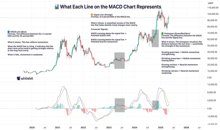
MACD: More Than Just a Crossover ToolHello, traders! 🔥
The MACD (Moving Average Convergence Divergence) indicator is one of the most trusted tools in technical analysis — but often one of the most oversimplified. While many traders focus on signal line crossovers, the real power of MACD lies in its ability to visualize market momentum, subtle shifts in trend strength, and early signs of potential reversals.
Let’s unpack how MACD behaves using the weekly BTC/USDT chart ✍🏻.
🔧 Understanding the Mechanics
At its core, MACD is the difference between two exponential moving averages — typically the 12-period EMA and the 26-period EMA. The result is the MACD line (blue). The orange line represents a 9-period Exponential Moving Average (EMA) of the MACD line, commonly referred to as the signal line. The histogram reflects the distance between them, helping to visualize when momentum is building or fading.
📊 MACD in Action — Weekly BTC Chart Breakdown
Looking at the BTC/USDT weekly chart, several notable MACD behaviors stand out:
1. The Bullish Acceleration in Early 2023
In early 2023, MACD crossed above the signal line, accompanied by a sharp rise in the histogram. This indicated strong positive momentum, as the price began recovering from the 2022 lows. The histogram’s expansion confirmed increasing divergence between the short- and long-term EMAs — a classic sign of trend acceleration.
2. Peak Momentum in Late 2023
Around late 2023, the MACD line peaked while the histogram also reached maximum height. This wasn’t just a confirmation of strength — it also hinted that momentum may have reached a climax. Despite price continuing to rise slightly, the MACD curve started to flatten — an early warning of potential exhaustion in trend strength.
3. Bearish Convergence into Q1 2025
In early 2025, the MACD line turned downward and eventually crossed below the signal line, while the histogram flipped to red. This reflected a cooldown in bullish momentum rather than an immediate reversal. What’s notable is how price didn’t collapse sharply, but moved into a pullback phase — illustrating how MACD can show momentum softening before price visibly reacts.
📌 What This Can Tells Us
The MACD indicator on this weekly BTC chart shows how momentum often shifts before the trend itself breaks. Each crossover, divergence, or histogram change is not a guarantee, but a cue to pay closer attention.
Key takeaways:
Strong Histogram Expansion = Confidence in the Current Move.
Peaks in MACD Without Price Making New Highs = Potential Divergence.
Shrinking Histogram + Converging Lines = Momentum Stalling.
🧠 Final Thought
MACD isn’t just about “buy when it crosses” or “sell on red bars.” It’s a narrative tool, showing how the story of the price develops beneath the surface. On higher timeframes, such as the weekly chart, it can potentially highlight macro momentum shifts long before they become apparent in price action alone.
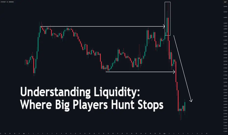
Understanding Liquidity: Where Big Players Hunt Stops
Understanding Liquidity: Where Big Players Hunt Stops
Ever wondered why price suddenly spikes through your stop-loss and reverses moments later? That’s not a coincidence—it’s liquidity at play. This article will teach you how liquidity zones work, why stop hunts happen, and how to avoid getting trapped like the crowd.
🔵 What Is Liquidity in Trading?
Liquidity refers to how easily an asset can be bought or sold without drastically affecting its price. But in practical trading, liquidity is more than just volume—it’s where traders *place* their money.
Large players—institutions, market makers, or big accounts—need liquidity to fill orders.
They target areas where many retail stop-losses or pending orders are stacked.
These areas are often just above resistance or below support—classic stop-loss zones.
To move large positions without slippage, smart money uses stop hunts to trigger retail orders and create the liquidity they need.
🔵 Where Do Liquidity Zones Form?
Liquidity often builds up in predictable areas:
Above resistance: Where shorts place stop-losses.
Below support: Where longs place stop-losses.
Swing highs/lows: Obvious turning points everyone sees.
Round numbers: e.g., 1000, 10,000, 50,000.
Breakout zones: Where breakout traders place entries or stops.
These zones act like magnets. When price approaches them, it accelerates—seeking the liquidity pool behind the level.
🔵 What Is a Stop Hunt?
A stop hunt happens when price moves just far enough to trigger stop-losses before reversing. This isn’t market noise—it’s an intentional move by big players to:
Trigger a flood of stop orders (buy or sell).
Fill their own large positions using that liquidity.
Reverse price back to fair value or the prior trend.
Example: Price breaks above resistance → stops get hit → institutions sell into that liquidity → price drops sharply.
🔵 Signs You’re in a Liquidity Grab
Look for these clues:
Fast spike beyond key levels followed by rejection.
Wick-heavy candles near highs/lows.
Price touches a level, then sharply reverses.
High volume on failed breakouts or fakeouts.
These are signs of a liquidity event—not a real breakout.
🔵 How to Trade Around Liquidity Zones
You can use liquidity traps to your advantage instead of becoming their victim.
Avoid obvious stops: Don’t place stops directly below support or above resistance. Instead, use ATR-based or structure-based stops.
Wait for confirmation: Don’t chase breakouts. Let price break, reject, then re-enter inside the range.
Watch for wick rejections: If price quickly returns after a level is breached, it's often a trap.
Use higher timeframe confluence: Liquidity grabs are more powerful when they align with HTF reversals or zones.
🔵 Real Example: Liquidity Sweep Before Reversal
In this chart, we see a textbook liquidity grab:
Price breaks below support.
Longs get stopped out.
Candle prints a long wick.
Market reverses into an uptrend.
This is where smart traders enter— after the trap is set, not during.
🔵 Final Thoughts
Liquidity is the invisible hand of the market. Stop hunts aren’t personal—they’re structural. Big players simply go where the orders are. As retail traders, the best thing we can do is:
Understand where traps are set.
Avoid being part of the crowd.
Trade the reaction, not the initial breakout.
By thinking like the smart money, you can stop getting hunted—and start hunting for better trades.
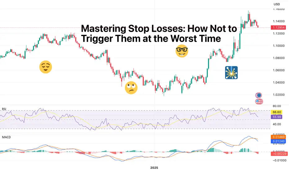
Mastering Stop Losses: How Not to Trigger Them at the Worst TimeThere are few things more humiliating in trading than setting a stop loss… only to have the market tag it by a hair’s breadth before rocketing in the direction you knew it was going to go.
Oftentimes (hopefully not too often), stop losses are the financial equivalent of slipping on a banana peel you placed yourself.
But stop losses aren't the enemy. Their placement, however, could be.
If you’ve ever rage-quit your chart after being wicked out by a fakeout, this one’s for you. Let’s talk about how to master stop losses — without feeling like the market is personally out to get you.
😬 The Necessary Evil: Why Stop Losses Exist
First, let's acknowledge the elephant in the room: stop losses sometimes sting. They're like smoke alarms. Annoying when they chirp over burnt toast, lifesaving when there’s an actual fire.
The purpose of a stop loss isn’t to predict exactly when you’re wrong — it’s to limit how wrong you can be. It's the difference between losing a quick battle and losing the whole war.
Trading without a stop loss is like walking a tightrope without a net — all fine until it’s not.
🤔 The Amateur Mistake: "Where Should I Put My Stop?"
A lot of traders approach stop-loss placement like they're picking lottery numbers: random, emotional, hopeful.
"I’ll just slap it 10 pips below my entry. Seems safe."
But the market doesn’t care about your preferred round numbers. It cares about liquidity, volatility, and structure, regardless if it's the forex market , the crypto space , or the biggest stock gainers out there.
Good stop-loss placement is about logic, not luck. It's about asking:
Where is my trade idea invalidated?
Where does the market prove me wrong?
If you're placing stops based on how much you're "willing to lose" rather than where your setup breaks down, you’re setting yourself up to be triggered — emotionally and financially.
💪 The Art of "Strategic Suffering"
Good stops hurt a little when they’re hit. That’s how you know they were placed properly.
Stops shouldn't be so tight they get hit on routine noise, but they also shouldn't be so far away that you need therapy if it fails. Think of it as strategic suffering: you’re accepting controlled pain now to avoid catastrophic pain later.
Legendary trader Paul Tudor Jones famously said: “The most important rule of trading is to play great defense, not great offense.”
🤓 Where Smart Traders Place Their Stops
Want to know where smart money hides their stops? It's not random. It’s calculated.
Below key swing lows for long trades (how much below depends on the risk-reward ratio they’ve chosen to pursue)
Above key swing highs for shorts (how much above is, again, tied to the risk-reward ratio)
Outside of obvious support/resistance zones (also, risk-reward plays a role)
In other words: start thinking like the market. Where would a big player have to exit because the structure is truly broken? That’s where you want your stop.
👀 Avoiding the Stop-Hunter’s Trap
Is stop-hunting real? Oh yes. And no, it’s not personal. You're just very readable if you park your stops in obvious, lazy places.
The market loves liquidity. Price often pokes below swing lows or above highs because that’s where the money is. Stops create liquidity pockets that big players exploit to enter their trades at better prices.
So how do you avoid becoming easy prey?
Give stops a little breathing room past obvious levels.
Use volatility measures like ATR to set dynamic buffers.
Respect structure, not just random dollar/pip amounts.
A good stop is hidden in plain sight but protected by logic, not hope.
⚖️ Sizing Smarter: Risk per Trade Matters More Than Stop Distance (What’s Risk-Reward Ratio?)
Here’s where many traders mess up: they think tighter stops are always better. Wrong. Your stop distance and your position size are a package deal. If your trade idea requires a wider stop to be valid, your position size should shrink accordingly.
Trying to cram your usual size into a wide stop setup is how small losses turn into account-threatening disasters.
Hedge fund pioneer George Soros once said: “It’s not whether you’re right or wrong that's important, but how much you make when you're right and how much you lose when you're wrong.”
Master your sizing relative to your stop, and you master your survival. In other words, the risk-reward ratio should be playing a key role in placing your stop losses.
🥤 Mental Stops vs Hard Stops: Pick Your Poison
Some traders swear by mental stops: “I'll get out when it hits this level.” Others use hard stops: set-and-forget protective orders baked into the system.
Both have pros and cons:
Mental stops allow flexibility but risk emotional sabotage.
Hard stops guarantee protection but can trigger on sudden, hollow wicks.
Pro tip? Use hard stops if you’re new or undisciplined. You don’t want to be the guy saying “I’ll close it soon...” while watching your unrealized loss grow a second head.
🤯 Stop-Loss Psychology: It’s You, Not the Market
If you find yourself constantly blaming “stop-hunting whales” or “market manipulation” every time you get tagged out... maybe it’s not them. Maybe it's your stop placement.
Discipline in trading isn’t just about clicking buttons at the right time. It’s about planning for the tough times—and sticking to your plan even when it feels bad.
❤️ Final Thought: Love Your Stops (Or at Least Respect Them)
Stop losses aren't your enemy. They're your overprotective friends. Sometimes they’ll throw you out of a trade you "knew" would come back. But more often, they’ll save you from very dangerous outcomes.
Mastering stop losses isn't about never getting stopped out. It’s about getting stopped out properly — with dignity, with minimal damage, and with your account intact.
In trading, pain is inevitable. Wipeouts are optional.
Your move: How do you manage your stops — and have you ever been wicked out so badly you considered quitting trading? Drop your best (or worst) stop-loss stories below.
Unlock Trading Success with Multi-Timeframe MasteryIn trading, particularly in the Forex market, a well-defined strategy is crucial for consistent profitability. One of the most effective techniques used by successful traders is multi-timeframe (MTF) analysis. By examining price action across different timeframes (e.g., daily, 4-hour, 1-hour), traders gain a clearer understanding of market structure, trend direction, and optimal entry/exit points. This article explores how MTF analysis works, its benefits, and practical steps to implement it in your trading.
🔍1. Analyzing a Pair Across Multiple Timeframes for Clearer Trend Direction
The foundation of MTF analysis lies in identifying the major and minor trends. By analyzing at least two timeframes, traders can align their strategies with the broader market direction while fine-tuning entries on shorter timeframes.
⚡The High Wave Cycle (HWC) Approach
To begin, determine your High Wave Cycle (HWC), which depends on your trading strategy and timeframe. For instance:
If you trade on the daily timeframe, your HWC might be the monthly chart.
If you trade on the 1-hour timeframe, your HWC could be the weekly chart.
The HWC helps you identify the major trend. For example, on the daily chart, you might analyze the trend using Dow Theory, pinpoint key support and resistance levels, and identify trendlines or patterns. This gives you a clear picture of the market’s broader direction.
Once the HWC is defined, give it significant weight when analyzing lower timeframes for trade setups. For instance, if the daily chart (HWC) shows a downtrend, you’d prioritize bearish setups on the 1-hour chart, even if a minor uptrend appears.
Example: SOLUSDT Trade Setup
Consider a scenario where the 1-hour chart shows a strong uptrend. The price breaks a key resistance level and a descending trendline, suggesting a potential long position.
However, checking the daily chart..
(HWC) reveals a clear downtrend. According to Dow Theory, a major trend reversal requires a confirmed break above the previous high (e.g., $150). Since this hasn’t occurred, the market remains bearish.
In this case, MTF analysis guides your strategy:
Reduce position size to lower risk, as you’re trading against the major trend.
Take profits early, as the price could reverse at any moment.
Avoid overtrading by limiting the number of positions until the trend change is confirmed.
This approach ensures your trades are aligned with the bigger picture, minimizing losses from false signals.
🎯2. Spotting Entries and Exits by Confirming Trends Across Timeframes
MTF analysis not only enhances risk management but also improves the precision of your entries and exits. By confirming signals across timeframes, you can filter out noise and focus on high-probability trades.
Example: Bitcoin (May 15, 2021)
Let’s rewind to May 15, 2021, during Bitcoin’s post-bull run correction. On the daily chart (HWC), the price formed lower highs and lows, breaking a key support level, signaling a bearish trend and a potential exit for long positions. This indicates that spot traders should sell, and swing traders on lower timeframes should focus exclusively on short positions.
On the 1-hour chart, you might spot a minor pullback, tempting a long trade. However, MTF analysis reminds you to align with the daily downtrend, so you’d only consider short setups. This disciplined approach prevents you from trading against the major trend, improving your win rate.
📊The Medium Wave Cycle (MWC) for Added Clarity
Between the HWC and lower timeframes lies the Medium Wave Cycle (MWC), which provides an intermediate perspective. For example, if your HWC is the daily chart, the MWC might be the 4-hour chart. The MWC helps confirm the major trend’s strength or detect early signs of reversals before zooming into lower timeframes for entries. By checking the MWC, you can filter out noise and ensure your trades align with both the major and intermediate trends.
💡Conclusion
Multi-timeframe analysis is a game-changer for traders seeking consistency and precision. By combining the major trend from your HWC, the intermediate perspective from your MWC, and minor trends on lower timeframes, you can make informed decisions, manage risk effectively, and time your trades with confidence.
Start by defining your HWC and MWC, analyzing the major trend, and aligning your entries and exits with multiple timeframes. Pick a pair, test this strategy on a demo account, and share your results in the comments below! With practice, MTF analysis will give you a tactical edge in navigating the markets.
🤍 btw im Skeptic :) & If you found this article helpful, don’t forget to like, share, and follow for more insights and trading strategies! <3

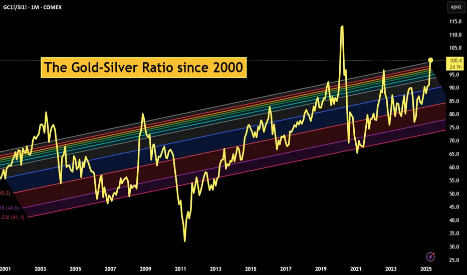
The Gold-Silver Ratio ExplainedCOMEX: Micro Gold Futures ( COMEX_MINI:MGC1! ), Micro Silver Futures ( COMEX_MINI:SIL1! )
The Gold-Silver Ratio is a financial term that measures the relative value of gold to silver. Specifically, how many ounces of silver it takes to buy one ounce of gold.
The Gold-Silver Ratio is an important tool for traders and investors. It has been used to indicate the market sentiment towards these two precious metals. A high ratio suggests that gold is more valued than silver, often seen during economic turmoil or when investors seek safe-haven assets. On the contrary, a lower ratio implies that silver is gaining value relative to gold, which normally occurs during periods of economic growth and strong industrial demand.
The ratio fluctuates over time due to supply and demand dynamics, geopolitical events, and changes in the global economy. By analyzing the ratio, traders can make informed decisions about when to buy or sell. This ratio reflects not only the market’s valuation of these metals but also an instrument for profit-making in the commodities market.
Historical Gold to Silver Ratio
Since 2000, the Gold-Silver Ratio has seen considerable fluctuations, reflecting various economic and market conditions. In the first decade of the 21st century, the ratio hovered around 65:1, meaning it took 65 ounces of silver to buy one ounce of gold.
However, the ratio has spiked during times of economic uncertainty. For example, during the financial crisis of 2008, the ratio reached highs not seen in decades. More recently, in the wake of the COVID-19 pandemic and the ensuing economic turmoil, the ratio surged, at one point exceeding 110:1 in 2020, indicating a strong preference for gold as a safe-haven asset compared to silver.
Over time, the Gold-Silver Ratio has been trending up, meaning gold has gained value at a faster pace compared to silver.
As of last Friday, gold is trading around all-time high at $3,330, while silver is quoted at $33.0. This makes the Gold-Silver Ratio almost exactly at 100.
When to Buy and Sell based on the Gold-Silver Ratio?
The decision to buy or sell the ratio hinges on interpreting its current value in the context of historical trends and market conditions.
When to Buy Silver: A high Gold-Silver Ratio, typically at or above the 90:1 mark, suggests that silver is undervalued relative to gold. This is often interpreted as a buying signal for silver. In such scenarios, silver is cheaper than gold, and investors may see it as an opportunity to purchase silver at a relatively low price. The rationale is that if the ratio decreases, the relative value of silver will increase compared to gold, potentially leading to significant gains.
When to Sell Silver/Buy Gold: Conversely, when the Gold-Silver Ratio is low, say around 50:1, it indicates that silver is relatively expensive, or gold is undervalued. In such situations, investors might consider selling silver and buying gold. The expectation is that the ratio will normalize or increase, meaning that gold’s value could rise relative to silver, offering a favorable return on the gold investment.
The Gold-Silver Ratio can be a valuable indicator of when to buy or sell gold and silver. However, since the ratio is not stable but upward trending over time, we could not use a mean-reversion strategy. The price band for normal, high and low ranges should be updated regularly.
Trade Setup with Micro Gold and Silver
Traders could deploy the Gold-Silver Ratio trading strategy using COMEX Micro Gold Futures ( AMEX:MGC ) and Micro Silver Futures ( AMEX:SIL ). The big advantages of using futures contracts are capital efficiency and leverage.
MGC contracts have a notional value of 10 troy ounces of gold. With Friday settlement price of $3,330.7, each June contract (MGCM5) has a notional value of $33,307. Buying or selling one contract requires an initial margin of $1,500 at the time of writing.
By putting a deposit equivalent to less than 0.5 ounce, traders could gain the full exposure to 10 ounces of gold. If gold prices move up by 5%, a long futures position would double in value (= (33307*0.05) / 1500 = 111%). This futures contract has a built-in leverage of 22:1.
Conversely, Micro Silver (SIL) contracts have a notional value of 1,000 troy ounces of silver. With Friday settlement price of $33.02, each June contract (SILM5) has a notional value of $33,020. Buying or selling one contract requires an initial margin of $3,000 at the time of writing.
By putting a deposit equivalent to 91 ounces, traders could gain the full exposure of 1,000 ounces of silver. If silver prices move up by 5%, a long position in Micro Silver futures would gain 55% (= (33020*0.05) / 3000). This futures contract has a built-in leverage of 11:1.
Micro gold futures (MGC, 10 oz) contracts tap into the deep liquidity of standard-size gold futures contracts (GC, 100 oz). As of last Friday, GC has an open interest (OI) of 447,356 contracts, while the OI for MGC is 44,449, according to data from CME Group.
The OI for standard Silver Futures (SI, 5000 oz) and Micro Silver Futures (SIL, 1000 oz) are 154,276 and 12,345, respectively.
Happy Trading.
Disclaimers
*Trade ideas cited above are for illustration only, as an integral part of a case study to demonstrate the fundamental concepts in risk management under the market scenarios being discussed. They shall not be construed as investment recommendations or advice. Nor are they used to promote any specific products, or services.
CME Real-time Market Data help identify trading set-ups and express my market views. If you have futures in your trading portfolio, you can check out on CME Group data plans available that suit your trading needs tradingview.sweetlogin.com
Russia-Ukraine Peace Agreement what could it mean to forex!A peace agreement between Russia and Ukraine could send ripples through the Forex and Commodities markets. Here's how major assets might react:
📊 Key Market Shifts to Watch:
✅ Risk-On Sentiment Returns
Traders may rotate out of safe havens like USD, JPY, CHF, and Gold.
Risk currencies like AUD, NZD, and emerging market currencies could strengthen.
✅ Euro Strength Likely (EUR ↑)
Europe gains the most relief → energy prices fall, inflation cools, confidence grows.
✅ Oil & Energy Prices May Drop
Peace reduces supply fears → crude oil and gas prices could fall → impacting CAD, NOK, RUB.
🔀 Likely Forex Movements:
🔼 Pairs Likely to Rise 💡 Reason
EUR/USD Euro up on peace; USD weakens as fear fades.
AUD/JPY Aussie rises on risk appetite; Yen weakens.
EUR/JPY Similar to AUD/JPY—EUR gains, JPY loses.
NZD/JPY Risk-on favors NZD; JPY drops.
EUR/CHF Swiss Franc weakens; Euro benefits.
USD/ZAR (falls) Rand strengthens on global optimism.
🔽 Pairs Likely to Fall 💡 Reason
USD/JPY USD and JPY both weaken, but USD may drop more.
USD/CHF Same story—less demand for safe havens.
USD/RUB Ruble recovery if sanctions ease.
CAD/JPY Oil-sensitive CAD may dip slightly
🟡 What About Commodities Like Gold? (XAU/USD)
⬇️ Gold Likely to Fall
As a traditional safe-haven, Gold (XAU/USD) tends to rise during geopolitical turmoil.
Peace = lower fear = investors rotate out of Gold into riskier, yield-bearing assets.
Lower inflation expectations could also reduce demand for Gold as an inflation hedge.
🧠 Key Level Watch:
If peace is confirmed, XAU/USD could drop below key support zones, especially if USD strengthens slightly on rate differentials.
🔍 Final Thoughts:
The magnitude of these moves depends on the terms and credibility of the peace deal.
If it includes sanctions relief and long-term commitments, expect larger market reactions.
Stay alert for central bank policy shifts, especially if inflation drops.
💬 What pairs or commodities are you watching if peace becomes a reality? Drop your insights below!
📌 Follow me for more macro-FX breakdowns, commodities analysis, and trading insights.

Real Success Rates of the Falling Wedge in TradingReal Success Rates of the Falling Wedge in Trading
The falling wedge is a chart pattern highly valued by traders for its potential for bullish reversals after a bearish or consolidation phase. Its effectiveness has been extensively studied and documented by various technical analysts and leading authors.
Key Statistics
Bullish Exit: In 82% of cases, the exit from the falling wedge is upward, making it one of the most reliable patterns for anticipating a positive reversal.
Price Target Achieved: The pattern's theoretical target (calculated by plotting the height of the wedge at the breakout point) is achieved in approximately 63% to 88% of cases, depending on the source, demonstrating a high success rate for profit-taking.
Trend Reversal: In 55% to 68% of cases, the falling wedge acts as a reversal pattern, signaling the end of a downtrend and the beginning of a new bullish phase.
Pullback: After the breakout, a pullback (return to the resistance line) occurs in approximately 53% to 56% of cases, which can provide a second entry opportunity but tends to reduce the pattern's overall performance.
False Breakouts: False exits represent between 10% and 27% of cases. However, a false bullish breakout only results in a true bearish breakout in 3% of cases, making the bullish signal particularly robust.
Performance and Context
Bull Market: The pattern performs particularly well when it appears during a corrective phase of an uptrend, with a profit target reached in 70% of cases within three months.
Gain Potential: The maximum gain potential can reach 32% in half of cases during a bullish breakout, according to statistical studies on equity markets.
Formation Time: The wider the wedge and the steeper the trend lines, the faster and more violent the post-breakout upward movement will be.
Comparative Summary of Success Rates:
Criteria Rate Observed Frequency
Bullish Exit 82%
Price Target Achieved 63% to 88%
Reversal Pattern 55% to 68%
Pullback After Breakout 53% to 56%
False Breakouts (False Exits) 10% to 27%
Bullish False Breakouts Leading to a Downside 3%
Points of Attention
The falling wedge is a rare and difficult pattern to correctly identify, requiring at least five contact points to be valid.
Performance is best when the breakout occurs around 60% of the pattern's length and when volume increases at the time of the breakout.
Pullbacks, although frequent, tend to weaken the initial bullish momentum.
Conclusion
The falling wedge has a remarkable success rate, with more than 8 out of 10 cases resulting in a bullish exit and a price target being reached in the majority of cases. However, it remains essential to validate the pattern with other technical signals (volume, momentum) and to remain vigilant against false breakouts, even if their rate is relatively low. When mastered, this pattern proves to be a valuable tool for traders looking for optimized entry points on bullish reversals.
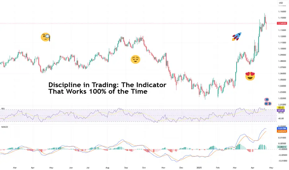
Discipline in Trading: The Indicator That Works 100% of the TimeEvery trader has that one folder — “Winning Indicators,” “Secret Scripts,” or the iconic “Final Strategy v12_REAL_THIS_ONE_WORKS.” It's where we hoard indicators like Pokémon, convinced the next RSI+MACD+SMA combo tweak will finally reveal the holy grail of trading.
Spoiler: it won’t. Because the real indicator that works — actually works — isn’t on your chart. It’s not in a TradingView script. It’s not even on your screen.
But it’s there — etched into your trade history, tattooed into your losses, and reflected in your ability (or inability) to stop yourself from clicking “buy” because Elon Musk tweeted a goat emoji.
It’s called discipline . And it’s the only thing in trading that has a 100% hit rate… if you let it.
Let’s talk about why discipline isn’t just a virtue — it’s the foundation of every successful trader you admire. And why, ironically, it’s forged in the moments you want to throw your monitor out the window.
👋 Everyone’s a Genius — Until the Market Slaps You
When things are going well, discipline feels unnecessary. You enter a trade on a hunch, it flies. You skip the stop loss, and price reverses right where you “felt” it would. You’re up three trades in a row, so clearly you’ve transcended markets and deserve your own hedge fund. Right?
Until you don’t. And the one time you triple down on a loser “because it always bounces”… it doesn’t. And suddenly you're not a genius — you’re Googling how to recover a blown account and wondering if that crypto bro who offered signals still has his DMs open.
The reality is that everyone trades well in good times — bulls make money in rising markets and bears make money in falling markets. But real traders are made in the bad times. That’s where discipline is forged.
🧐 No Pain, No Gain
Here’s the deal: discipline is not something you're born with. It’s built, brick by painful brick, on the smoldering ruins of your worst trades.
The overleveraged EUR/USD short you held through an ECB rate hike? Discipline.
The meme stock you bought at the top because your barista mentioned it? Discipline.
The four back-to-back trades you entered on revenge mode after getting stopped out? Discipline — with a side of therapy.
These moments suck. But they’re also where the learning happens. You don’t develop discipline from your wins. You develop it from losses that leave a mark. The kind of mark you think about while brushing your teeth. The kind that whispers: “maybe follow the plan next time.”
🤝 Success Leaves Clues
You’ve probably heard the phrase “plan your trade and trade your plan” so many times it’s lost all meaning. But it’s the foundation of discipline. Not because rules are fun, but because rules are the only thing that can protect you from… well, yourself.
Let’s be honest — if left to your own devices, you run the risk of:
Entering too early because “it looks like it’s going to move.”
Exiting too late because “it might come back.”
Increasing the leverage because “I’m due for a win.”
Successful traders are those who follow a disciplined, rule-based approach to trading. Discipline says no. It says “this is the plan” and makes you stick to it — even when your ego is telling you to wing it. Discipline doesn’t care about your feelings. It cares about consistency. And that’s what makes it powerful.
🎯 Hedge Fund Bros Who Didn’t Win by Binge-Clicking
Let’s talk about those who actually did launch a fund — and didn’t blow it up in three months. Stanley Druckenmiller, former lead portfolio manager for George Soros’s Quantum Fund who later went on to launch his own Duquesne family office, famously said:
“The key to making money in markets is to have an opinion and to bet it big. But only when the odds are heavily in your favor.”
Notice what he didn’t say: “Click as many buttons as possible and hope it works out.”
Druckenmiller didn’t trade because he was bored. He waited. He watched. And when his setup came, he struck with discipline. Not with fear. Not with greed. With process.
If one of the greatest macro traders of all time had the patience to wait for his edge, maybe you don’t need to scalp every green candle on the 1-minute chart.
Ray Dalio — the one who built Bridgewater into a hedge fund juggernaut — doesn’t sugarcoat it: trading is hard. And mistakes are inevitable. Discipline, Dalio says, is what turns mistakes into evolution. His famous mantra?
“Pain + Reflection = Progress.”
He built a company culture (and a personal philosophy) around radical transparency — writing down every mistake, analyzing every trade, and building systems that override ego.
Most traders experience pain. Very few pause to reflect. Fewer still build processes to avoid making the same mistake twice. So next time you get stopped out for the third time in a row, don’t curse the chart. Open your journal. Write it down. Check what you missed. That’s what turns amateurs into professionals.
👀 Discipline in Trading: How It Actually Looks
Discipline isn’t glamorous. You won’t post it on Instagram (maybe it's good for LinkedIn, though). But here’s what it looks like in the wild:
Passing on a trade that doesn’t check all the boxes — even though you’re “pretty sure it’ll work.”
Taking a small win and moving on, even when your gut says to hold and “let it ride.”
Staying flat on FOMC day because you know news candles have a personal vendetta against your stop-losses.
Journaling a bad trade and owning the mistake. No excuses. Just honesty.
💪 How to Build Discipline
Building discipline isn’t about becoming a robot. It’s about creating a process that works even when your emotions don’t.
Here’s how to start:
Journal everything : Not just your trades, but your thoughts before and after. Discipline grows in awareness.
Have a checklist: Make it stupidly simple. If a trade doesn’t check every box, don’t take it.
Pre-set your risk: Before the trade. Not after. You’re not negotiating with yourself mid-trade.
Set trade limits: Three trades per day. One setup per session. Whatever keeps you from spiraling.
Take breaks: If you’re chasing losses, walk away. The markets will be there tomorrow. Will you?
📌 Final Thought: Why Discipline Works
You can have the best tools, the slickest chart setup, and the strongest trade ideas. But if you can’t follow your own rules, you won’t go far.
Discipline isn’t flashy. It doesn’t promise 1,000% returns or viral content. It just works. Quietly. Relentlessly. Predictably.
And when the market turns — because it always does — discipline is what will keep you standing.
Because it’s not the indicator that matters. It’s the trader using it.
So, be honest—where has discipline made (or broken) your trading? And what’s your best tip for sticking to the plan when your brain wants to do anything but?
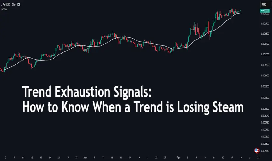
Trend Exhaustion SignalsTrend Exhaustion Signals: How to Know When a Trend is Losing Steam
Every trend eventually runs out of fuel. Knowing when momentum is fading can give you the edge to exit early, avoid late entries, or even prepare for a reversal. This article dives into key signs of trend exhaustion and how to trade around them.
🔵Understanding Trend Exhaustion
Trends can persist far longer than expected, but they don’t last forever. Trend exhaustion occurs when the driving force behind a trend—be it buying or selling pressure—starts to weaken. Recognizing this shift is crucial for:
Protecting profits
Avoiding bad entries
Spotting early reversal opportunities
🔵1. RSI and MACD Divergence
A classic signal of trend exhaustion is divergence between price and momentum indicators like RSI (Relative Strength Index) and MACD (Moving Average Convergence Divergence).
Bearish Divergence: Price makes a higher high, but the indicator makes a lower high.
Bullish Divergence: Price makes a lower low, but the indicator makes a higher low.
This suggests that although price continues in the trend's direction, momentum is lagging—a red flag for potential exhaustion.
🔵2. Volume Dry-Up
Volume is the fuel of trends. When volume starts to shrink during a strong move, it often signals that the crowd is losing interest or that institutions are offloading positions.
In an uptrend, a series of green candles with decreasing volume = caution.
In a downtrend, falling volume can signal seller fatigue.
🔵3. Long-Wick Candles at Extremes
Candlestick patterns offer visual clues of exhaustion. When you start seeing long upper wicks at the top of an uptrend (or long lower wicks at the bottom of a downtrend), it means price is being rejected from continuing further.
Common exhaustion patterns:
Shooting Star (bearish)
Inverted Hammer (bullish)
Doji at highs/lows
These patterns are more reliable when they form near resistance or support zones.
🔵4. Structure Break: CHoCH and BOS
Market structure tells a deeper story than indicators. Two key terms here:
CHoCH (Change of Character): The first sign of reversal—a higher low broken in an uptrend, or a lower high broken in a downtrend.
BOS (Break of Structure): The confirmation—a key swing point is broken, confirming a new trend.
Traders can watch for these breaks to anticipate when the current trend is ending and a reversal is forming.
🔵5. Parabolic Price Action & Overextension
When a trend becomes parabolic—with steep, accelerating price movement—it often signals the final stage of the trend. This is when retail traders usually enter, and smart money begins to exit.
Warning signs:
Sudden vertical moves
Price far above/below moving averages
Lack of consolidation or pullbacks
Parabolic moves are unsustainable. Look for reversion to the mean or a sharp correction.
🔵How to Trade Around Trend Exhaustion
Tighten Stops: If in a winning trend trade, consider locking in profits or trailing your stop.
Avoid Chasing Entries: Late entries into exhausted trends are high-risk, low-reward.
Prepare for Reversal Setups: Watch for confirmation (CHoCH, divergence, candle patterns) before entering counter-trend positions.
Use Multi-Timeframe Analysis: Exhaustion on the 1H chart may just be a pullback on the 4H. Always zoom out for context.
Trend exhaustion is a natural part of market behavior. Recognizing the signs—such as divergence, fading volume, long wicks, structure breaks, and parabolic moves—can help you time exits better and avoid late trades. Instead of reacting after the fact, you’ll be prepared in advance. Add these tools to your trading routine and stay one step ahead of the crowd.