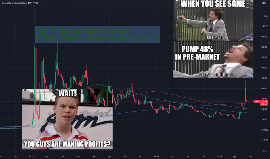
Top 3 Tips on How to Avoid FOMO Trading (Fear of Missing Out)Here you are, casually sipping your coffee and watching the clock go by while you wait for the market to open so you can buy a few shares of your new stock pick. Remember, you chose that one after deep research and careful planning.
And then “ WHAM! ” Twitter notifications start flying. GameStop (ticker: GME ) is once again rocketing to the moon after some livestream on YouTube unleashes a huge buying spree. “MUST. GET. IN.” — you, probably, after you get your emotions shaken and stirred by something called FOMO.
🔔 What’s FOMO?
FOMO is an abbreviation for Fear Of Missing Out. This little four-word phrase can throw your investment rationale, thesis and analysis out the window so it could settle in your prefrontal cortex where your brain goes to make life decisions.
In this blog, we’ll talk about that little gremlin FOMO and what steps you can take to prevent it from overriding your emotions and decisions. And for the sake of your time, we’ll keep it short. Let’s go.
💡 Tip 1: Plan Your Trade
Plan your trade in advance and don’t sink into the moment. Knowing your entry, take profit and stop loss before you move into your position will eliminate the urge to rush in when things get hot.
🔴 Problem: News Releases, Earnings Reports
We all know how intense markets can get when there are news reports coming out. Company data such as earnings reports or some of America's top economic events , such as the widely anticipated nonfarm payrolls , or the Federal Reserve’s market-moving interest rate decisions can spur volatility and cause trading instruments to seesaw and fluctuate in both directions. And because these events are well-known in advance — the Fed only meets eight times a year — these moments can be an attractive invitation to make a profit.
🟢 Solution:
Plan your trade and understand that news reports and earnings releases are a double-edge sword and even if the data supports a certain narrative, i.e. lower inflation = higher gold prices, this isn’t always the case. Take a step back, regulate your breathing and keep your emotions in check. Wait it out until the noise tones down.
💡 Tip 2: Avoid Revenge Trading
Revenge trading is the trading you do when you want to get back at the market after getting smacked in the face with a loss. Next time you stare at a losing position, notice if you feel the urge to jump right back in and make up what you lost. That's revenge trading.
🔴 Problem: Losses and Missed Opportunities
Taking a beating from Mr. Market can be a painful experience. Yet, not taking the loss the right way can lead to even more pain and wiped out funds. Whenever you’re staring at a losing position, you might be tempted to sell out and jump right back in an effort to make back what you lost.
🟢 Solution:
Avoid revenge trading. Recognize that pesky feeling, which — whenever you lose money on a trade — makes you want to pare back your losses with one quick trade. That quick trade could be a) more aggressive (for more potential profit), and b) cost you even more money because you’ve been impatient.
💡 Tip 3: Don’t Chase the Pump
Any pump usually has a strong pull, because it makes gains look easy. All you need to do is catch the speed train (or get onboard the rocket ship) and, boom, you're in profit. Although, it's not as easy as it looks.
🔴 Problem: Pump and Dump Schemes
Quite often we see some little-known stock or a cryptocurrency with a small market capitalization perform some outstanding moves. It may shoot higher by 100% or more and that may trigger some FOMO in you, causing you to panic-buy and then watch your investment evaporate like snow in water.
🟢 Solution:
Don’t chase the pump. It’s simple. A pump can play with your decision-making capabilities and cause you to make irrational choices out of the desire to join the volatility train. But many of those pumps end up as dumps. Pump and dump schemes are real — the gains go as quickly as they came and you don’t want any of that.
Final Considerations
Forming a deep emotional connection with the market isn’t a bad thing. This place is your passion and you’ve chosen to participate in it, together with its ups and down. What you should pay attention to is how you react to its changing moods and whether you behave logically or illogically to get what you want.
Acting illogically can lead you to trip up so you want to distinguish that. Use your emotions to get rational inspiration and excitement about what you want to accomplish.
📣 Your Turn!
Have you ever tripped up over a FOMO trade that hurt your account? What was your trigger and subsequent result? Let us know in the comment section below!
Community ideas
Using the Second Charts on TradingviewThis tutorial goes over the uses of the very low timeframe features that Tradingview offers, namely the 1 second through to the 30 second charts.
The main advantage to these timeframes is that they permit you to clearly see whether your support and/or resistance levels are being held or are being rejected. This allows you to make a determination much quicker than if you are using higher timeframes. This can make or break your profit and setup and is quite an advantageous tool to utilize if you have access to these timeframe periods.
In addition to visualizing support and resistance breaks/holds, the use of these smaller timeframe charts also allows you to apply methods such as the Heikin Ashi strategy much more effectively and quickly. If you are a scalper, it does add an insurmountable amount of value to your analysis.
Thanks for watching and leave your questions and comments below!
Safe trades everyone!

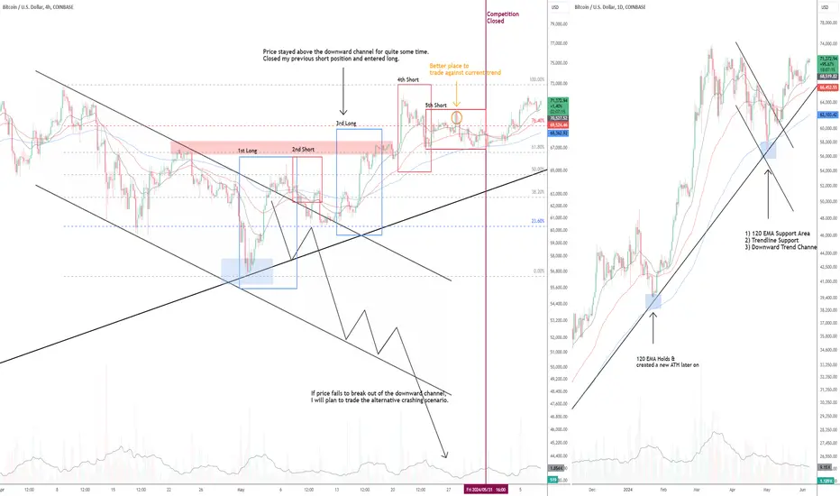
Differences between paper trading & real money tradingMost people (including me sometimes) lack the right mindset, patience, and planning when it comes to trading. There is no magic technical indicators in trading, it all comes down to simple tools, just like my paper trading journey outlined in this BTCUSD chart.
In the chart, I observed that:
BTC was no longer trending as its price was ranging for nearly 50 days after the ATH;
BTC momentum was weakening as it broke previous two horizontal support areas;
Price came to the potential 120 EMA / trendline / downward channel support clusters.
Since most of the time, asset price is ranging rather than trending, all we need to do is plot out the Fib levels in our chart and buy at support sell at resistance. You can see my major trades outlined in the chart. I did the same for other crypto symbols ETH & SOL at the same time.
However, when it comes to real money trading, I would trade slightly differently.
The mentality in paper trading is more aggressive. Usually in real money trading, when major support areas are broken, I would not fade a trend and try to catch the falling knife even you know there is potential support. What I'll most likely do is to wait for price breaks above the descending trendline (shows the strength) and look for opportunities in a potential 1-2-3 or 2B reversal pattern.
In real money trading, I try to follow the trend most of the time (price stands above all the moving average) But in paper trading, you have to be the minority in the market to stand out from the competition, which usually means go against the market. Even though we know this looks like a fib range trading scenario, it's better to enter your fading trade after a lower high or higher low is created.
In reality, make full use of the capital all the time is not recommended, especially when you about to trade against the current trend. Always try a small position first when doing so and build up your position along the way. However, in this competition, the forex pair EURUSD and SPX500 have low volatility, we have to trade maximum allowed quantity of each symbol in the hope of increasing account profits.
Lastly, do not overtrade, which makes sense for both paper and real money trading. It's easier to do so in paper trading as people would worry much less about the profits/losses they have made.
All in all, I'm just lucky enough to get the 2nd place in this competition, always respect the market and the market is always right.


SPY Fibonacci Price Theory And BreakOut BarsThis instructional video teaches you the basics of Fibonacci Price Theory in conjunction with Breakout Bars and how price is the ultimate indicator.
Throughout this video, I try to provide instruction on key elements related to the Fibonacci Price Theory (Unique & Standout Highs/Lows). Additionally, I've also included Breakout Bars and Fibonacci Price Retracement concepts.
What I really hope you learn from this video is to see price as the true ultimate indicator for your trading decisions. Using technical analysis techniques is fine, but use price as the key element when trying to confirm or reject your trading ideas.
I hope this helps you understand that price, action, and reaction through trends, peaks, and troughs are the most important components of the chart. Everything else is peripheral.

AMP Futures - Customizing your ChartIn this video we will demonstrate how to select time frames on a chart, how to access different chart types, indicators, and drawing tools.

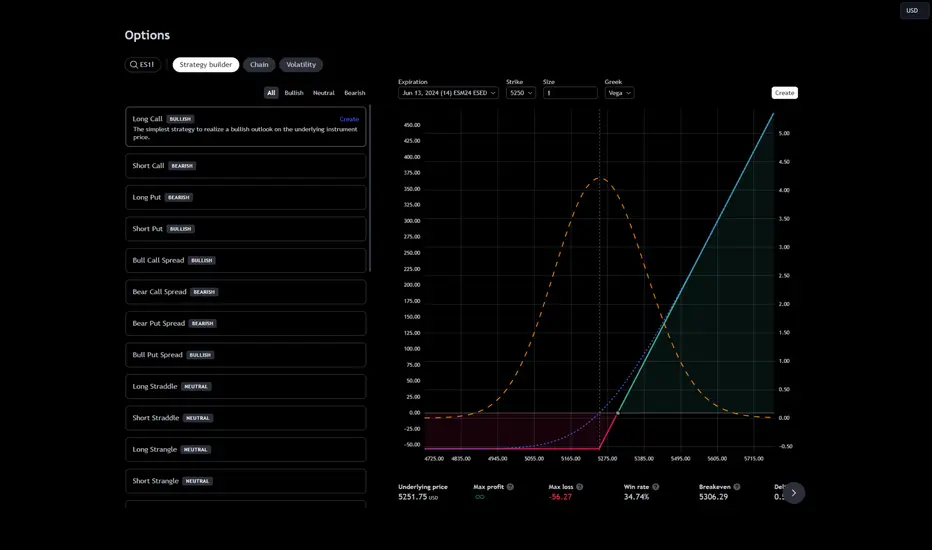
New Product Launch: How to Use TradingView OptionsWe’ve rolled out our newest product and we’re eager to brag about it! It’s an options platform — TradingView Options. More precisely, it’s a powerful set of tools for options traders who want to keep a close eye on every little detail and fine-tune their strategy to perfection.
What Are Options?
Options are financial derivatives that give the buyer the right, but not the obligation, to buy or sell the underlying asset at a set price within a set period.
TradingView Options
TradingView Options is designed to illuminate your options trading strategy from the first step to the last one. Get razor-sharp options strategies on gold futures ( COMEX-GC1! ), oil futures ( NYMEX-CL1! ), and many more.
Let’s break it down and discuss what it's about. For starters, you’ve got three key components — Strategy Builder, Options Chain, and Volatility Analysis.
1. Strategy Builder
Create, test and visualize options strategies with real-time data.
Use pre-built strategies filtered by bullish, bearish, or neutral outlooks.
Customize strategies with adjustable parameters like expiration dates and strike prices.
Get estimates for max profit, max loss, win rate, and more.
Compare multiple strategies on a single chart for performance analysis.
2. Options Chain
Options chains are broken down into two sections — calls and puts.
Strike price is displayed in the center column — it’s where the put or call can be exercised.
Next to Strike is IV, %, which stands for Implied Volatility in percentages.
Measure options risk with the Greeks: Delta, Gamma, Theta, Vega, and Rho.
Easily switch underlying assets with a simple symbol search at the top left.
3. Volatility
Analyze market volatility to understand potential price movements and risks.
Market Coverage
Currently, TradingView Options supports options contracts from major exchanges including CME and its subsidiaries NYMEX, COMEX, and CBOT, alongside NSE , and BSE .
Conclusion
The new options trading tools by TradingView empower traders with the data and analytical capabilities needed to whip up high-probability strategies and explore new opportunities for profit in global markets.
Are you an options trader? What’s your trading style? Let us know in the comments!
Understanding Bearish and Bullish Bat Harmonic Patterns
Understanding Bearish and Bullish Bat Harmonic Patterns: A Professional Guide for Traders
In the dynamic world of trading, identifying potential reversal points is crucial for making informed decisions. Two powerful tools that professional traders often rely on are the Bearish and Bullish Bat Harmonic Patterns. These patterns, grounded in Fibonacci ratios, offer insights into market behavior and help in predicting price movements. This article delves into the intricacies of these patterns, providing a comprehensive guide for traders.
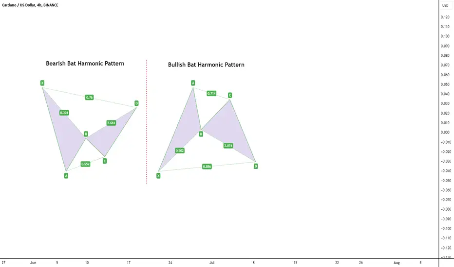
__________________The Bearish Bat Harmonic Pattern_________________________
The Bearish Bat Harmonic Pattern is a reversal pattern that indicates a potential decline in price after an upward correction. Here's how to identify and interpret this pattern:
X-A Leg: The initial move where the price falls from point X to point A.
A-B Leg: The price then retraces upwards from point A to point B, typically reaching 38.2% to 50% of the X-A leg.
B-C Leg: The price falls again from point B to point C, retracing 38.2% to 88.6% of the A-B leg.
C-D Leg: The final leg sees the price rise from point C to point D. Point D is the critical point, expected at the 88.6% retracement level of the X-A leg and coinciding with the 161.8% extension of the B-C leg.
Key Fibonacci Ratios:
A-B: 38.2% to 50% retracement of X-A
B-C: 38.2% to 88.6% retracement of A-B
C-D: 88.6% retracement of X-A and 161.8% extension of B-C
Trading Strategy: Traders should look for selling opportunities around point D, anticipating a downward move following the completion of the pattern.
Entry, Stop-Loss (SL), and Take-Profit (TP) Criteria:
Entry: Enter a short position at or near point D.
Stop-Loss (SL): Place the stop-loss slightly above point X to account for any potential false breakouts.
Take-Profit (TP): Set the first TP at the 61.8% retracement of the C-D leg and the second TP at the 100% retracement of the C-D leg.
_________________________The Bullish Bat Harmonic Pattern_____________________
Conversely, the Bullish Bat Harmonic Pattern signals a potential rise in price after a downward correction. Here are the steps to identify and utilize this pattern:
X-A Leg: The initial move where the price rises from point X to point A.
A-B Leg: The price then retraces downwards from point A to point B, typically reaching 38.2% to 50% of the X-A leg.
B-C Leg: The price rises again from point B to point C, retracing 38.2% to 88.6% of the A-B leg.
C-D Leg: The final leg sees the price fall from point C to point D. Point D is the critical point, expected at the 88.6% retracement level of the X-A leg and coinciding with the 161.8% extension of the B-C leg.
Key Fibonacci Ratios:
A-B: 38.2% to 50% retracement of X-A
B-C: 38.2% to 88.6% retracement of A-B
C-D: 88.6% retracement of X-A and 161.8% extension of B-C
Trading Strategy: Traders should look for buying opportunities around point D, anticipating an upward move following the completion of the pattern.
Entry, Stop-Loss (SL), and Take-Profit (TP) Criteria:
Entry: Enter a long position at or near point D.
Stop-Loss (SL): Place the stop-loss slightly below point X to account for any potential false breakouts.
Take-Profit (TP): Set the first TP at the 61.8% retracement of the C-D leg and the second TP at the 100% retracement of the C-D leg.
______________________Practical Application and Tips_______________________
To effectively utilize these patterns, traders should:
Use Confirmation Indicators: Always combine harmonic patterns with other technical indicators, such as RSI or MACD, to confirm potential reversal points.
Practice Patience: Wait for the pattern to fully develop and reach point D before taking action.
Risk Management: Implement strict risk management strategies, including stop-loss orders, to protect against potential false signals.
Conclusion:
The Bearish and Bullish Bat Harmonic Patterns are powerful tools in a trader's arsenal, providing a structured approach to identifying potential market reversals. By understanding and applying these patterns, traders can enhance their decision-making process and improve their trading performance. Remember, like all technical analysis tools, these patterns are most effective when used in conjunction with other indicators and sound risk management practices. Happy trading!
Brilliant Basics - Part 1: Trendlines"Champions are brilliant at the basics." - John Robert Wooden, legendary basketball coach. In trading, just like in sports, mastering the fundamentals forms the foundations for exceptional performance.
Welcome to the first part of our educational series, Brilliant Basics . In this series, we'll explore how mastering the fundamentals lays the groundwork for achieving high-level performance in trading. Today, we focus on trendlines, a crucial tool for any trader aiming to understand market momentum.
Simple Elegance
Trendlines are so simple in their design that their importance can often be dismissed. A child could map the swings of a market and tell you whether the line was upward or downward sloping. Yet, this simplicity is precisely what gives trendlines their potency.
Past performance is not a reliable indicator of future results
The elegance of trendlines lies in their ability to distil market movements into an easily interpretable format. This simplicity does not mean they lack depth; rather, it means they are accessible to all traders, regardless of experience level. Here’s why their simplicity is so important:
Clarity in Chaos: Markets can be noisy and unpredictable, but trendlines help to bring order to this chaos. If drawn correctly, they provide a clear visual representation of the market’s overall direction and volatility.
Universal Application: Trendlines can be applied to any market, on any timeframe. Whether you are trading stocks, commodities, or forex, trendlines work the same way, making them a universal tool in a trader's toolkit.
Consistent Feedback: Trendlines offer immediate visual feedback on price action. If a trendline is respected by the market, it reinforces your analysis. If it is broken, it signals a potential change in momentum or trend.
How to Draw Trendlines Correctly
Drawing trendlines might seem straightforward, but there are specific guidelines to ensure they are both accurate and useful:
1. Identify Swings: Begin by identifying the swing highs and swing lows on your chart. For an uptrend line, connect at least two higher lows. For a downtrend line, connect at least two lower highs. Ensure these points are significant swings and not minor fluctuations.
Past performance is not a reliable indicator of future results
2. Avoid Cutting Prices: A trendline should not intersect any price action between the points it connects. Drawing a trendline that cuts through price bars undermines its validity and the potential insights it can offer. The line should clearly touch the chosen swing points without cutting through the price action in between. Draw multiple high quality trendlines rather than a ‘line of best fit’.
Past performance is not a reliable indicator of future results
3. Consistency: Maintain a consistent approach when drawing trendlines. Use the same criteria for identifying swing points and avoid forcing a trendline to fit the data. This consistency helps in making objective and reliable trading decisions.
Trendline Fans and Their Insights
A single trendline can offer valuable insights, but using multiple trendlines—forming a trendline fan—can provide a deeper understanding of market momentum and potential changes in trend.
Rising Momentum: In an uptrend, if the subsequent trendlines are steeper, it indicates increasing momentum. Each steeper line shows that buyers are stepping in more aggressively. However, should trendlines increase in steepness exponentially this leaves the trend vulnerable to exhaustion.
Past performance is not a reliable indicator of future results
Ebbing Momentum: Conversely, if the subsequent trendlines in an uptrend are less steep, it indicates decreasing momentum. This situation suggests that while prices are still rising, the strength of the upward movement is waning.
Past performance is not a reliable indicator of future results
Practical Applications
Understanding the simplicity of trendlines enhances their practical application in trading. Here’s how you can leverage their elegance:
Momentum Assessment: As we’ve seen with the trendline fans, the steepness of a trendline or progressive steepness of a trendline fan can give a valuable real-time insight into market momentum.
Support and Resistance: Trendlines act as dynamic support and resistance levels. In an uptrend, the trendline or trendline fan serves as a support levels where price may bounce back up upon testing. In a downtrend, the trendline acts as resistance, where price might reverse downward upon touching.
Past performance is not a reliable indicator of future results
Entry Signals: Trendline breaks can serve as entry signals, especially when used on multiple timeframes. A break above a downtrend line on a lower timeframe, in-line with a bigger picture uptrend could create an attractive buying opportunity. The inverse is true with a break below an ascending trendline on a lower timeframe.
Past performance is not a reliable indicator of future results
Exit Signals: Trendline breaks can serve as exit signals. A break below an uptrend line or multiple uptrend lines in a trendline fan might indicate a potential reversal and an exit point.
Past performance is not a reliable indicator of future results
Summary:
The simple elegance of trendlines makes them an indispensable tool in technical analysis. Their straightforward nature belies the depth of information they can provide, making them accessible yet useful. By mastering the basics of drawing and interpreting trendlines, traders can gain a clearer understanding of market trends and make more informed trading decisions.
As we continue our Brilliant Basics series, stay tuned for Part 2, where we will explore support and resistance levels. Understanding this fundamental concept will further enhance your ability to identify potential reversal zones.
Disclaimer: This is for information and learning purposes only. The information provided does not constitute investment advice nor take into account the individual financial circumstances or objectives of any investor. Any information that may be provided relating to past performance is not a reliable indicator of future results or performance. Social media channels are not relevant for UK residents.
Spread bets and CFDs are complex instruments and come with a high risk of losing money rapidly due to leverage. 80.84% of retail investor accounts lose money when trading spread bets and CFDs with this provider. You should consider whether you understand how spread bets and CFDs work and whether you can afford to take the high risk of losing your money.
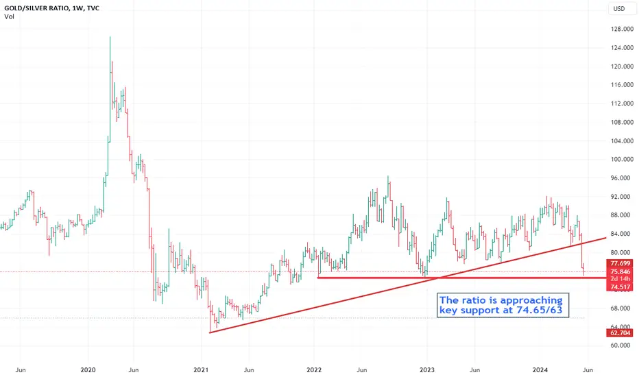
Why longer term charts are importantI took a look at the weekly gold/silver ratio and noticed a few significant patterns. For example, there was a notable acceleration downward following the break of a 3-year uptrend a couple of weeks ago. Additionally, there is support at the 74.65/63 level, which has been in place since January 2022.
This observation reminded me of the importance of examining long-term charts, regardless of your trading time frame. Longer-term charts provide essential context and clarity that short-term charts often lack.
Why everyone should be looking at longer term charts:
1. Identifying Trends
Long-term charts help in identifying significant trends that might not be visible in short-term data.
2. Smoothing Out Volatility
Short-term data is often noisy, with frequent fluctuations that can obscure the underlying pattern. Long-term charts smooth out this volatility, providing a clearer picture of the fundamental movement and reducing the influence of random, short-term events.
3. Contextualizing Current Movements
Long-term charts place current price or economic movements in a broader context. This helps investors and analysts understand whether a recent change is part of a larger trend or not.
4. Historical Comparisons
These charts allow for comparisons with past periods, making it possible to identify cycles, recurring patterns, and historical precedents. This historical perspective can be invaluable for forecasting future movements and making informed predictions.
5. Assessing Risk and Reward
By examining long-term performance, investors can better assess the potential risks and rewards of an investment. Understanding how an asset has performed over various market cycles helps in evaluating its stability and growth potential.
6. Avoiding Emotional Bias
Short-term market movements can evoke strong emotional responses, leading to impulsive decisions. Long-term charts provide a more detached view, helping investors stay focused on long-term objectives and avoid reacting to short-term market noise.
Conclusion
In summary, long-term charts offer a comprehensive view that is critical for understanding trends, reducing noise, contextualizing current events, making historical comparisons, assessing risk, avoiding emotional decisions, developing strategies, and analysing economic cycles. They are an indispensable tool for anyone involved in financial markets or economic analysis, providing the clarity and perspective necessary for informed decision-making.
Disclaimer:
The information posted on Trading View is for informative purposes and is not intended to constitute advice in any form, including but not limited to investment, accounting, tax, legal or regulatory advice. The information therefore has no regard to the specific investment objectives, financial situation or particular needs of any specific recipient. Opinions expressed are our current opinions as of the date appearing on Trading View only. All illustrations, forecasts or hypothetical data are for illustrative purposes only. The Society of Technical Analysts Ltd does not make representation that the information provided is appropriate for use in all jurisdictions or by all Investors or other potential Investors. Parties are therefore responsible for compliance with applicable local laws and regulations. The Society of Technical Analysts will not be held liable for any loss or damage resulting directly or indirectly from the use of any information on this site.
Trapped traders provides a great Short opportunity on DOW The plan for the session was to trade short off resistance on the DOW after an initial opening drive higher. The short side was the play and paid out nicely for patient sellers.
In the video I talk through the key Price Action for the move and prime trade areas on the DOW Index.
ANY QUESTIONS, JUST LEAVE IN THE COMMENTS !!
** If you like the content then take a look at the profile to get more ideas and learning material **
** Any Comments and likes are greatly appreciated **

Want to spot a turning point in trend before it happens?Want to spot a turning point in trend before it happens? Use Elliott wave parallel channel
This chart shows the GBP/JPY currency pair using monthly candlesticks. The advance from Sep 2011 to June 2015 can be labeled as an impulse wave (A). From that high, the pair declined in three waves labeled as wave (B) of a Zigzag A-B-C correction with an expanding diagonal characteristic in the C wave position.
As a rule, in a Zigzag rally, wave B notably terminates above the origin of wave A. When wave (C) advance of a zigzag rally is in operation, we can forecast where wave (C) might end.
We can use Elliott wave channel projection by connecting the origin of wave (A) with the end of wave (B) and then drawing a parallel line from the end of wave (A). As a guideline, the resulting channel gives us a potential target for the wave (C) endpoint.
Moreover, we can also use ratio analysis to improve the odds. As a guideline, in Zigzag formations, wave (C) commonly ends after traveling the same length as wave (A). Observe this level corresponds with the Elliott wave channel projection.
This cluster of evidence hints at wave (C) advance from Mar 2020 is in late stages and that prices are approaching a major top.

Myth Busting: Market Style!I have been very lacking in producing educational content. I know a lot of you follow for my analysis, some others for my indicators and some others for my educational content. While I have been getting back in the groove of posting for the later 2, I have neglected those interested in educational content.
So voila, here we are with an educational post! In this post, I want to dispel and or validate some market conjecture based on actual research and my own observations, from indicators, to chart patterns to different market theories. The post will be formatted in the great MYTH BUSTER format!
Hope you enjoy!
Myth #1: All indicators are interchangeable and one indicator can be used for any type of equity.
You all likely have seen, whether on tradingview or other sites, the magical indicators that “work in all markets!”. And you tell yourself, “oh wow, too good to be true, right?!” And the fact is, it is too good to be true. This is a myth and is absolutely false. No one indicator will be cross compatible for multiple different equity types. No one indicator will be sufficient even within the same equity types (i.e. just because RSI works for MSFT doesn’t mean it will work for NVDA).
You can actually objectively view this for yourself if you apply my ATREE indicator . Just as a quick explanation, the ATREE indicator uses MFI, Stochastics, RSI and Z-Score to determine sentiment. It will also provide you with back-test results as to how effective it is at gauging sentiment based on these individuals technical. If we look at ATREE for NVDA:
Pay attention to the backtest results on the right side of the screen. These provide the raw success rate of its sentiment estimations. For NVDA, we can see that Stochastics can predict sentiment roughly 76% of the time on the daily timeframe. However, if we flip on over to MSFT
We see that Z-Score is actually much more effective at determining sentiment than RSI, Stochastics or MFI. This is just an example, but to show you another one, let’s take the Ichimoku cloud with buy and sell signals and put it on MSFT:
We can see, it nailed the buy but pretty hit or miss for the sell. I wouldn’t say this is a great indicator to use for MSFT shorting. However, if we flip on over to SPY with the same indicator:
Its been a bit more on point.
Understanding unique individual ticker intricacies is my whole shebang. I produce models to predict sentiment. If you are part of my community you know there are 4 commonly used models that we employ, from LSTM, to ARIMA, to Eucledian Distance models to Momentum Technical Models. Not all are equal for all stocks. For example, we will reference momentum for tickers like NVDA, but Eucledian distance is better for tickers like SPY. How do you figure this out? Backtesting! I’ve said it in other educational ideas and I saw it again, you always need to backtest your strategy!
Myth #1 Verdict:
So, are all indicators good for all markets?
NO! This is BUSTED!
Myth #2: Trendlines and chart patterns are helpful and pivotal for trading stocks
There tends to two schools of thought to this. Train 1 is that trendlines are pivotal for trading and making assumptions. Train 2 of thought is that they are not helpful and quite frankly useless. However, in mainstream trading theory and teachings, trendlines are a often cited and often taught method of market determination. But are they useful?
Well, it depends. Trendlines can give us context, without trendlines we would have no context and would just be trading random candles on a blank space. The degree of efficacy of these trendlines can depend on things like:
a) The duration of the trend,
b) The skill of the chartist,
c) The number of tests of the trendline,
d) The overall economic climate that a stock is in.
Obviously, I personally found trendlines problematic, hence my resorting to computer modelling. However, in my years of experience and my maturity in the market, I reapproached the trendline theory as supplemental to modelling and have made some relevant observations, which I will discuss below.
The first point is that not all tickers are created equal. Sound familiar? Yeah this was the basis of Myth #1 about technical indicators. The truth is, it applies to trendlines, too. Let’s take a look at DUO, a small cap stock:
DUO recently did, arguably, a dead cat bounce and produced this pennant you see in the chart above. Now DUO is small cap, low volume stock that barely moves. Suddenly, we have this pennant out of nowhere and with no major catalyst. So what happened?
Nothing, it ended up selling into EOD multiple times.
Let’s take a look at NVDA:
NVDA broke down from a major trendline around April 3rd. This would signal a short. And indeed, it was a short, for a short duration of time. It mostly was rangy and stagnant. But it did sell. This trendline was from January of 2024 and ended in April of 2024, a relatively long and stable trendline. NVDA is also a large cap stock with huge amounts of liquidity and volume, So we can expect follow through on major trendlines.
Trendlines have also been pivotal for intra-day trading. Let’s look back at NVDA (since its my daily go to for day trading):
During open, on the 1 minute chart, we could see NVDA forming a pennant. Based on the modelled data we had two potential price targets, a bull target of 957 and a bear target of 929. What NVDA does with this pennant (breakout or breakdown) can help us ascertain which target price is correct.
What happened?
NVDA broke down, and then it travelled all the way down to that 929 target:
So it would seem that chart patterns are indeed useful. However, they are not overly helpful with indicating target price, As well, they are only useful when the stock has high volume, good liquidity and is heavily traded. The efficacy of trendlines and chart patterns likely comes from volume of traders who are looking at similar trendlines. In order for trendlines to influence a stock movement, you need volume from traders who are paying attention to the same thing in order to move it. This is why penny stocks and low float, small cap stocks do not respect trendlines and patterns in the same way.
Verdict for Myth #2?
CONFIRMED!
Myth #3: Market theories such as Elliot Wave Theory (EWT) and Efficient Market Theory are applicable to all tickers and the market as a whole?
If you are a trader, likely you subscribe to one market theory or another. If you are investor, its likely you subscribe to modern portfolio management theory (which emphasizes diversification). If you are a day or swing trader, perhaps you subscribe to the Efficient Market Hypothesis or EWT.
These all remain “theories” because they have yet to prove valid or invalid in research. However, aside from the investor mindset of diversification, no one theory of the market works for all tickers. In fact, some research has come out about EWT specifically and has indicated that it can be useful in predicting some markets (such as the S&P); however, the results are not generalizable to others (specifically Crypto and some individual tickers).
The same can be said about the efficient market theory/hypothesis and many others that have been researched, disproven in some circumstances and proven in others.
So, what is the verdict here?
This is BUSTED. Market theories, aside from an investor mindsight, are not generalizable to all equities, instruments and markets. This is semi based on my own observations but mostly from academic research I have reviewed on this topic (hence why I have no beautiful charts to display for this myth).
And the last myth I will cover in this post:
Myth #4: Diversification is pivotal for day traders
The wisdom here is that, you need to diversify for day trading. You need to identify setups on whatever stock has those setups and play whichever stock confirms best to your setup. The truth is, this is rarely necessary. In fact, sticking to a handful of routine stocks can be advantageous, as you will grow to learn the intricacies of the particular stocks you are trading routinely.
I go through phases but right now, 99% of the time I am trading NVDA. This works for me because there is usually always a setup available on large cap stocks. Let’s review some of the setups I have taken on NVDA:
You can see NVDA loves its morning triangles, and I love them too!
You can absolutely get back with trading one ticker, provided that it has good volatility and movement. In times of economic stability (i.e. currently), its best to avoid the indices as a day trading candidate as they tend to move slower and more purposefully.
So what is the verdict of Myth #4?
Thanks for reading everyone!
I may do more of these myth buster posts, they’re fun to research and find examples and really reflect on what I have learned as a trader. Feel free to submit any myths you live by in the comments and I can look into them for maybe a future post!
Safe trades as always!

5-Year SPX500 Expectations - Greatest Opportunity Of Your LifeWould you believe me if I told you the US & global markets (some) will rally more than 65% to 125% (or more) over the next 4 to 5+ years?
You would probably call me crazy for even suggesting that will happen in a reasonably short time frame.
But, what if I could show you how structurally (using Elliot Wave concepts and Fibonacci) this incredible rally may already be baked into the markets?
What if I could show you that, barring any major economic destruction event, the US Fed and Global Central banks may have unleashed the inflation beast - which could lead to massive Hyperinflation over the next 5+ years?
Would you be prepared for it? Would you even believe me if I could show you evidence that it may happen much quicker than you can imagine?
And would you believe me if I told you Gold/Silver will rally more than 500% over the next 5+ years while attempting to hedge global debt/inflation risks?
Now is the time to prepare for the greatest opportunity of your life. You must understand the structural mechanics of price related to the current global market dynamics.
Please boost and share this video with your friends. Everyone needs to be aware of what is likely to happen over the next 5+ years so they can prepare for and profit from these exceptional price trends.

Chronicle of a Foretold Pump/DumpPump/Dump schema:
Discrete Share accumulation.
Broadcasted Triggering Event (news, rumors, forums, etc).
Gather the mass of "Bagholders".
Dump all the load.
Pocket the quick profit.
I am not a fan of " meme stocks " because they're very much like penny stocks, prone to pump/dump schemes. How legal or illegal is this practice?, it is not us to decide, there are authorities who are supposed to regulate these behaviors.
Regardless of the morality of a it we can analyze the radiography of the move. Using the volume bars feature, you can see "big fat" candles on the accumulation phase, the "rumor" phase where the "roaring kitty" name was heard in the news, the spike and immediately took the stock to a quick profit of +120% overnight, and the fade phase, where the only thing that remained at the end was the frozen smile of the hopeful bagholders with a fading volume.
#LearnToEarn.
Be careful where you put your money, trading and investing requires knowledge of the company, its balance sheet, fundamentals and/or technical metrics. Don't follow the crowd, else you'll end up in the slaughter house. There's no free lunch in Wall St.
Let's remember this quote: "The game of speculation is the most uniformly fascinating game in the world. But it is not a game for the stupid, the mentally lazy, the person of inferior emotional balance, or the get-rich-quick adventurer. They will die poor." Jesse Livermore.

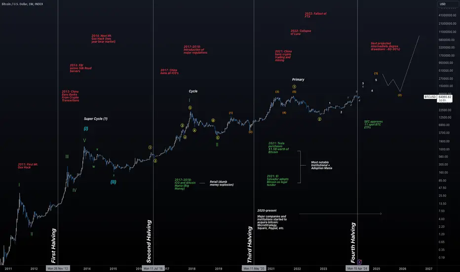
Predicting Bitcoin's Cycle Using the Elliott Wave TheoryGreetings, fellow traders. In this article, we'll be reassessing our annual Elliott Wave counts and going deeper into interpreting Bitcoin's current decade cycle. I'll make sure to segment each part by drawing insights from the previous cycles, also employing the Elliott Wave Theory, and integrating major timeline events to bolster my perspective on Bitcoin's potential trajectory in the upcoming cycle. The wave theory will help neutralize many of the irrational thoughts that other analysts may have that just show straight arrows to the upside. This thesis helps you get a better understanding of where pullbacks and areas of high strength (wave 3 impulses) may occur. Remember, the wave theory will never be perfect in painting the picture, but it will help you be positioned as best as possible with proper invalidation levels.
One of the most significant phenomena witnessed in the current financial market landscape is Bitcoin's adherence to a notably algorithmic parabolic trend, where cycles persist in a compounded manner in terms of percentages. This raises the crucial question: "Can we expect all past cycles to mirror the current one?" Answering this is very challenging. However, Bitcoin has one of the strongest strengths against all other coins, which is price history. Fundamentals attached, Bitcoin has been extremely resilient against major events (with wild swings), but the overall trend has remained in tact for over a decade. This indicates not only strength, but true adoption.
We must discern whether the price action will evolve into something new or continue the pattern of echoing past cycles (fractals). The most effective method for interpreting Bitcoin's price movements is through the logarithmic chart that is presented in the chart above.
When examining past cycles through the lens of only fractals (as that is how it has been for the past decade), the most effective approach to understanding the present cycle is by conceptualizing it as a sequence of nested '1-2' counts. In simpler terms, experiencing a succession of 1-2/1-2/1-2 patterns might lead to either optimistic expectations or impending disappointment. This ambiguity prompts consideration of an alternative bearish perspective, elaborated upon subsequently. Keep in mind, there's always room for firsts, meaning that the failure of the fractal pattern is always a possibility. Again, this idea is further explained in the bearish alternative explanation below.
Bearish Alternative:
For a more rational approach, the Elliott Wave Theory also suggests alternative pathways. One narrowed down scenario would be that the cycle has now matured, suggesting for a more maturing market with more complexity in corrective types (patterns).
The logarithmic chart may indicate a deceleration in the macro timeframe, suggesting that Bitcoin is currently in a maturity phase. Its role as a store of value to say the least. To simply put, the corrections will be far more controlled as investors create larger distribution patterns through the timeline and create demand/sell zones. Price maturity, a concept commonly observed in stock models, implies that markets do not move linearly and eventually reach an endpoint, including in price action. Utilizing the Elliott Wave Theory, we can generate one alternative count that shows the whole cycle is now possibly in a larger 1-2 of some sort:
1. The fact that we have a possible WXYXZ corrective pattern for the 2021-2023 bear market, this may indicate this is part of something larger. Usually, you will see wave 2's have a simple ABC/WXY type patterns.
2. This speculation can then lead us to believe that we could be part of a larger corrective pattern, most likely as a flat pattern now.
3. Consequently, this insight aids in forecasting that we are entering into the new phase of 'market maturity,' or what I like to term as the "flattening of the curve theory."
We could debate endlessly about the next bear market for Bitcoin, but the undeniable truth is that over the past 15 years, the market has proven its resilience against political turmoil, hacking attempts, and regulatory crackdowns.
It's remarkable to realize that aside from halvings, forks, and institutional adoption, there haven't been any significant bullish events/catalysts. This speaks volumes about Bitcoin's strength. There wasn't any single groundbreaking moment or major catalyst for each bull run. Instead, it was a series of interconnected events that sustained that momentum, leaving it to us as investors to identify distribution points.
AMP Futures introduction to TradingView Mobile (Getting Started)In this video, we will help you learn the essential functions of the TradingView mobile application with AMP Futures.

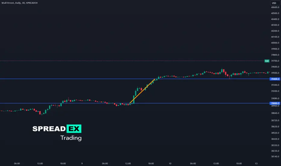
How to trade tax-free: spread bettingCFD trading has a close cousin you may not know about … spread betting.
Just like CFD trading, spread betting allows you to speculate on the future direction of a market's price without owning the underlying asset.
Key advantages include:
Tax efficiency : Profits from spread betting are free from UK Capital Gains Tax*. Similar to CFD trading, there is also no stamp duty to pay. However, it does mean when spread betting, you can’t offset any losses against other capital gains.
Leverage : Spread betting allows you to control larger positions with a smaller amount of capital, amplifying potential profits but also potential losses - necessitating careful risk management.
Wide range of markets : You can go both long and short 1000s of markets, including stocks, commodities, forex, and indices.
Simplicity and clarity : Calculating your P&L from a spread bet is straightforward. Simply multiply the wagered amount by the per point movement in price. This simplicity makes spread betting accessible to traders of all experience levels.
For example, if you buy £1 per point of Wall Street at 39000 and later that day sell it at 39400, then you make 1 x 400 = £400 profit. Conversely, if Wall Street falls 400 points to 38600, you lose £400.
Sound familiar? Spread betting and CFD trading are very similar methods of trading financial markets but, importantly, may be taxed differently.
* Tax laws are subject to change and depend on individual circumstances. Tax law may differ in a jurisdiction other than the UK.
New Volume Footprint option on TradingViewHi all,
This is the first (stream replacement) educational video with a very quick overview of volume. Tradingview just released the new Footprint Beta tool. It's something I asked them for a long time ago, so I am glad it's finally here!
In this video I cover the time-price-opportunity tool as well as visible and fixed range. Leading into footprint.
This is not a deep dive, it's more an intro to and how these things come together. If there is enough interest in this idea I will create a sequence based on trading volume in depth.
Thanks for watching! See you on the next stream/idea.

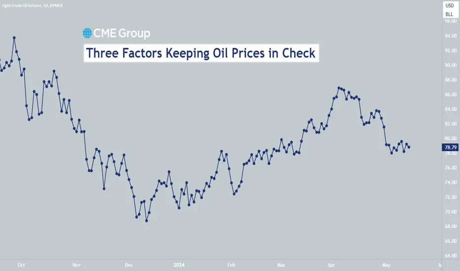
Three Factors Keeping Oil Prices in CheckAT A GLANCE:
Despite ongoing geopolitical conflict, oil prices and volatility are relatively low
A rise in U.S. crude production and weak demand in China are helping oil inventories maintain average levels
Considering many factors like the Russia-Ukraine war, OPEC+ cutting production by 3.6 million barrels per day and conflict in the Middle East, many traders might be surprised to find out that oil prices are only around $82 per barrel and that implied volatility on crude options are trading at relatively low levels below 40%.
Inventories Remain at Average Levels
So why are crude oil prices not higher and more volatile? Part of the answer lies in inventories. Crude and product inventories are right around their seasonally adjusted averages for the past five years. This suggests that at least some cushion exists in the event of a supply disruption.
Given that oil production is about 3.5% lower globally than it would have been without OPEC+ production cuts, how is it possible that oil inventories are still at average levels? There are two reasons. First, a boom in U.S. production has replaced about one third of what OPEC cut.
The second reason is weak demand. China buys about 10 million barrels per day in the international markets, and its economy has been growing much more slowly than it was a few years ago. Slow growth in China often hits oil prices with a lag of about 12 months and may be among the factors preventing a further rise in global crude prices.
Higher Prices Expected?
That said, traders are displaying some signs of nervousness. The skew on CME Group’s WTI CVOL index is quite positive at the moment, suggesting that some traders are buying out of the money call options to protect themselves from the possibility of much higher prices.
If you have futures in your trading portfolio, you can check out on CME Group data plans available that suit your trading needs tradingview.sweetlogin.com
By Erik Norland, Executive Director and Senior Economist, CME Group
*CME Group futures are not suitable for all investors and involve the risk of loss. Copyright © 2023 CME Group Inc.
**All examples in this report are hypothetical interpretations of situations and are used for explanation purposes only. The views in this report reflect solely those of the author and not necessarily those of CME Group or its affiliated institutions. This report and the information herein should not be considered investment advice or the results of actual market experience.
Exploring Auction Market Theory in Forex TradingAuction Market Theory (AMT) is a conceptual framework used to understand the dynamics of financial markets, viewing them as auctions where buyers and sellers interact to determine prices.
Although the AMT was initially developed to understand & analyse price action movements in the stock market, some of its core concepts can also be applied to any market, including forex.
Within the forex market, currency pairs are traded 24/5, with price driven by a multitude of factors such as economic data releases, geopolitical events, and market sentiment. Despite this complexity, AMT provides a framework for understanding market dynamics through the concepts of value, balance, and imbalances .
Value represents the equilibrium price at which buyers and sellers agree on the fair value of an asset. Market balance occurs when supply and demand are roughly equal, resulting in stable price ranges, while imbalances arise from deviations from this equilibrium due to shifts in market sentiment or unexpected events. These imbalances can create trading opportunities for astute traders who can identify them and act accordingly.
Lets now take a look into how this can be visually identified on a line chart using only price action.
Example 1
On the left, we can see an area of market balance. This is usually evident when the market is range bound as we can see in this case.
The midpoint of the range is the point of equilibrium. Value can be interpreted as the equilibrium price at which buyers and sellers agree on the fair value of a currency pair.
This equilibrium is constantly shifting as new information becomes available and market participants reassess their expectations.
When these expectations shift as a result of either economic data releases, geopolitical events, and/or market sentiment, price shifts away from the balanced price range and creates an imbalance within the market.
Identifying value areas are important because these can act as an area of future support/resistance for price. Notice how in this example, after price displaces from the balanced range, it later came back and found support near the fair value within that range.
Practical Application
One practical application of AMT in forex trading is through the analysis of price action and market profile. By observing how price behaves at different levels and how volume interacts with price movements, you can gain insights into market sentiment and potential areas of support and resistance.
For example, if a currency pair consistently fails to break above a certain resistance level despite multiple attempts, it may indicate strong selling pressure at that level, presenting an opportunity for short trades. Conversely, if a currency pair finds strong support at a particular price level, traders may look for buying opportunities as the market reverts to equilibrium.
To conclude, Auction Market Theory offers a valuable framework for understanding the dynamics of the forex market. By analysing price action, volume, and market profile through the lens of AMT, you can gain a deeper understanding of market sentiment and identify potential trading opportunities. While no theory can guarantee success in trading, incorporating Auction Market Theory into your analysis can help you make more informed trading decisions.
Please leave a comment if you've found this post helpful or if you have any questions.
Happy Trading
When Are You READY to Trade with REAL MONEY?Hello hello, R2F here with another discussion.
Today, I'd like to go over the question, 'when do you know you are ready to trade with real money?'
Too many traders rush into trading with real capital before they are ready, and end up losing more money than neccessary on learning journey. People are generally impatient creatures and want to get into actions as soon as possible. Perhaps they want to find out if they are magically a trading savant before wasting time on all the usual work that is required.
However, trading is extremely simple, albeit not easy. The difficult part comes in the form of the investment of time and experience, and refining yourself as a person. Once you had that in the bag, trading offers the potential for generational wealth that comes with the freedom of time.
Without further ado, I share my thoughts on how to approach this burning question.
- R2F
