Diamond Pattern Trading: How to Spot and TradeSome patterns scream for attention, while others sneak up on traders who aren’t looking closely. The diamond pattern is one of those sneaky ones — a formation that hints at a brewing reversal but requires a sharp eye to catch.
Let’s dive into this pattern, how it forms, and the best strategies for effectively trading diamond top and bottom patterns.
What Is a Diamond Pattern?
The diamond pattern is a reversal chart pattern that occurs after a strong trend, indicating a potential shift in market direction. It forms when price action expands and then contracts, creating a diamond-shaped contour. This pattern is rare compared to triangles or head-and-shoulders formations, but it often signals significant price moves when it appears.
There Are Two Types of Diamond Patterns:
Diamond Top Pattern – A 🐻 Reversal Pattern That Appears After an Uptrend.
Diamond Bottom Pattern – A 🐂 Reversal Pattern That Forms After a Downtrend.
These patterns can help traders identify potential turning points and prepare for a change in trend.
How Can You Identify a Diamond Pattern in Trading?
To spot a diamond pattern trading setup, look for the following characteristics:
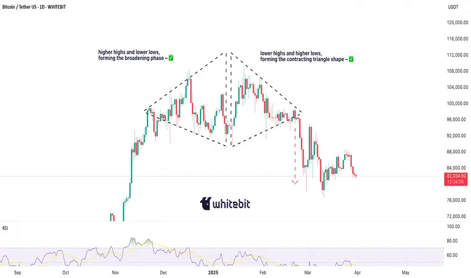
Broadening Formation: The price action initially expands, creating higher highs and lower lows.
Narrowing Structure: After the expansion, the price contracts, creating lower highs and higher lows.
Symmetrical Shape: When trendlines are drawn connecting the highs and lows, they create a diamond shape.
Breakout Point: The pattern is confirmed when the price breaks out of the structure, either to the upside or downside.
While it might resemble a diamond quilt pattern or a diamond tile pattern on the chart, the key difference is its role as a market reversal signal.
Diamond Top Pattern: Bearish Reversal
A diamond top pattern forms at the peak of an uptrend and signals that bullish momentum is weakening. Traders often look for a downside breakout to confirm the reversal.
What Does a Diamond Top Pattern Typically Involve?
Identify the diamond formation after a strong uptrend.
Wait for a breakout below the lower trendline with increased volume.
Enter a short position once the breakout is confirmed.
Set a stop-loss above the recent high.
Target price: Measure the height of the pattern and project it downward.
This pattern suggests buyers are losing control, and a downtrend will likely follow.
📊 Diamond Top in Action
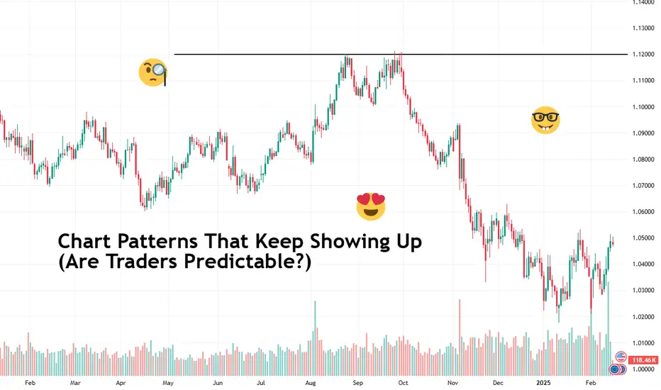
Between late 2024 and early 2025, Bitcoin surged toward $105,000. Following this uptrend, price action began to shift: the candles first spread wider, then started to tighten — ultimately forming what resembled a diamond top on the daily chart.
The pattern formed over several weeks, showing the hallmark structure: broad on the left,
symmetrical tightening on the right, with support and resistance lines converging.
Shortly after the narrowing phase was completed, Bitcoin broke downward — a typical outcome of a diamond top pattern. The price declined sharply over several days, validating the pattern and suggesting a broader correction.
Analysts watching the pattern noted that while it wasn’t perfectly symmetrical (as real-world patterns rarely are), the structure was clear enough to support the reversal thesis. The breakout marked a momentum shift as bullish pressure faded and sellers gained temporary control.
Following the initial drop, Bitcoin stabilized and began consolidating. This sideways movement is common after strong breakouts — reflecting indecision and market recalibration.
Diamond Bottom Pattern: Bullish Reversal
A diamond bottom pattern appears at the end of a downtrend, indicating a potential shift to bullish momentum.
How a Diamond Bottom Pattern Is Typically Interpreted
Identify the diamond shape forming after a downtrend.
Wait for an upside breakout above the upper trendline with substantial volume.
Enter a long position once the breakout is confirmed.
Set a stop-loss below the recent low.
Target price: Measure the pattern’s height and project it upward.
This pattern signals that selling pressure decreases, and buyers may take control.
Why the Diamond Pattern Is Important for Traders
Reliable Reversal Signal. The diamond pattern trading setup strongly indicates trend reversals.
Clear Entry and Exit Points. Well-defined breakout levels make risk management easier.
Works in Different Markets. The diamond pattern remains effective when trading stocks, forex, or crypto.
Final Thoughts
The diamond pattern is a rare but powerful tool that can help traders confidently spot trend reversals. Whether you’re trading a diamond top pattern for bearish setups or a diamond bottom pattern for bullish breakouts, understanding this formation can give you an edge in the market.
So, traders, have you spotted a diamond pattern trading setup recently? Share your experiences and strategies in the comments!
This analysis is performed on historical data, does not relate to current market conditions, is for educational purposes only, and is not a trading recommendation.
Community ideas
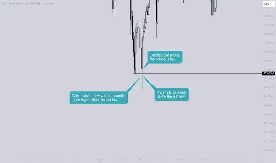
What is a Swing Failure Pattern? - Basic explanation!A Swing Failure Pattern (SFP) is a technical chart pattern often used in price action trading to identify potential reversals in the market. It is typically seen on candlestick or bar charts in the context of trend analysis.
The basic idea behind a Swing Failure Pattern is that the price temporarily breaks above or below a previous swing high or low, but fails to sustain that move and reverses direction quickly. This indicates a potential shift in market sentiment, and it can be a signal for a trend reversal or breakdown.
When is it a SFP?
- In needs to sweep the previous low
- It has to close the candlestick above the previous low. So only a wick down When the price closes the body of a candle below the last low, it will not be considered an SFP. In this case, it is highly likely that the trend will continue in that direction.
The SFP can occur across various timeframes, from lower to higher timeframes.
Example on the daily timeframe
Here, we see two SFPs: one to the upside and one to the downside.
Thanks for your support.
- Make sure to follow me so you don't miss out on the next analysis!
- Drop a like and leave a comment!
How to Actually Do Backtesting?Welcome back guys, I’m Skeptic!
Today, I’m gonna break down one of the most important and fundamental skills every trader needs: Backtesting .
Backtesting is the very first step on your trading journey and probably the most crucial one. It’s all about putting your theoretical knowledge and trading plan to the test by evaluating them against historical market data. The goal? To see whether your strategy actually works — with what win rate, R/R ratio , and more.
But here’s the problem: many traders do it wrong. They end up getting unreliable results, which leads to self-doubt when it comes to forward testing. The real issue is not your strategy but how you conduct your backtest.
Let’s dive into the complete process! 💪
🛠️ Tools You Need
To start backtesting, you’ll need some software that supports the replay feature, allowing you to move through historical data as if it were live.
The best platforms for this are TradingView and MetaTrader . Personally, I use TradingView because it’s super intuitive and has great backtesting capabilities.
Also, make sure to choose appropriate timeframes for backtesting that align with your strategy.
🕰️ Choosing Market Conditions:
You need to backtest your strategy in all types of market conditions:
Uptrend
Downtrend
Range-bound
High Volatility
🚀 Step-by-Step Backtesting
1.Choose the Timeframe:
Make sure your backtesting timeframe matches your strategy’s timeframe. For example, if your strategy works on the 4H chart, don’t backtest on the 1H chart.
2.Select Your Strategy:
Stick to your written trading plan without improvising.
3.Pick the Asset Pair:
Test on at least three different pairs or assets (e.g., EUR/USD, XAU/USD, GBP/NZD) to get diverse results.
4.Define Entry and Exit Rules:
Clearly specify your entry, stop loss, and target levels. Never change these rules mid-backtest, even if it seems illogical. In real trading, you won’t have the luxury of endless contemplation.
🎯 Running the Backtest
Use the Replay Tool to move through historical data.
Never peek at the future price movement. If you accidentally see it, restart from a different point.
Open a minimum of 30 positions for each market condition (e.g., uptrend, downtrend, range).
Record each trade in a spreadsheet (Excel, Google Sheets, etc.) with the following columns:
Date
Time
Entry strategy
Stop loss
Target
Result (profit/loss as R/R ratio)
Exit time
📊 Analyzing Your Results
After completing your backtest, it’s time to analyze the data. Key metrics to focus on include:
R/R Ratio
Win Rate (%)
Drawdown (%)
Losing Streaks
Position Frequency
🚩 Common Mistakes to Avoid
Inconsistent Strategy: Changing your rules during backtesting is a no-go. Stick to the plan.
Incomplete Testing: Don’t cut corners and always aim for a substantial number of trades.
Ignoring Market Conditions: Make sure your strategy is tested in all four market scenarios.
Lack of Patience: Just because the first few trades are losses doesn’t mean the strategy is a failure. Sometimes, a losing streak can be followed by a winning trade that covers it all.
💡 Conclusion
Backtesting is the beating heart of any trader’s skill set. It builds confidence and lays the foundation for a profitable strategy. If you found this tutorial helpful, give it a boost and share it with your fellow traders. Let’s grow together, not alone!
And as Freddie Mercury once said:
We are the champions, my friends! :)🏆
Happy trading, and see you in the next analysis! 💪🔥
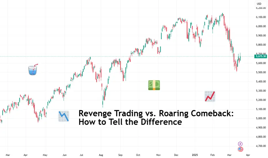
Revenge Trading vs. Roaring Comeback: How to Tell the Difference“I’m going to get even with the market and I’m going to get even today!” We’ve all been there. You take a loss—maybe a small one, maybe an account-crushing one—and something inside you snaps.
Logic leaves the chat, and a new trader takes over: the vengeful, angry version of you who’s out to "get back" at the market.
Welcome to the world of revenge trading, where decisions are fueled by frustration, and the market does what it always does: punishes impatient and emotional traders.
But what if there’s a better way? What if instead of spiraling into self-destruction, you could channel that energy into a thoughtful and strategic comeback? That’s the difference between revenge trading and a true trader’s rebound. Grab your hot coffee and let’s talk about it.
💥 Revenge Trading: The Fastest Way to Financial Self-Sabotage
Revenge trading isn’t a trading strategy—it’s an emotional response masquerading as a quick-witted reaction. The thought process goes like this: "I just lost money. I need to make it back—fast."
So you double down, size up, stretch out the leverage ratio and ignore your usual risk management rules. Maybe you trade assets you don’t even understand because the price looks juicy. Maybe you jump into a leveraged position without a stop loss because, hey, you’re in it to win it. What could go wrong?
Everything. Everything can go wrong.
Revenge trading is the financial equivalent of trying to punch the ocean. The market doesn’t care that you’re mad. It doesn’t owe you a winning trade. And when you start making impulsive decisions, the only thing that may get hurt is your trading mindset.
📢 Signs You’re Revenge Trading
You’re taking trades you wouldn’t normally take.
You’re increasing position sizes irrationally.
You’re ditching risk management (stop losses, position sizing, logic, etc.).
You feel desperate to "make it back"—right now.
You’re ignoring your trading plan, assuming you had one to begin with.
Recognizing these signs is the first step to stopping the cycle. But avoiding revenge trading is only half of the battle—you need to know how to stage a real comeback.
🦁 Staging the Roaring Comeback
A roaring comeback isn’t about making back your losses in one dramatic trade. It’s about recalibrating, reassessing, and regaining control. Here’s how traders who actually recover from losses do it:
📌 Recognize the Signs Early
If your heart rate spikes and your fingers are itching to “fix” a bad trade immediately, stop. That’s not a setup. That’s an emotional reaction.
📌 Set Daily Loss Limits
If you hit your max loss for the day, you’re done. No exceptions. Your best decision at that point is to fight another day with a clear head.
📌 Step Away from the Screens
Revenge trading thrives on impulsivity, and the best way to kill that impulse is to take a break. Go outside. Breathe. The market isn’t going anywhere. Now touch that grass.
📌 Post-Loss Review: What Actually Happened?
Was the loss due to a bad strategy, poor execution, or just market randomness? Pull up your trading journal ( you do keep one, right ?) and break it down.
📌 Reaffirm Your Strategy (Tweak if Necessary)
If your loss came from a solid trade setup that just didn’t work, then there’s nothing to change. If it came from a mistake, figure out how to prevent that mistake from repeating.
📌 Reduce Risk for the Next Trades
After a loss, the worst thing you can do is over-leverage. Instead, cut your position size and take smaller, high-probability trades to rebuild confidence. Howard Marks, a firm believer in market psychology, always reminds investors that the biggest risk is emotional overreaction. Stay disciplined.
📌 Trust the Process
The best traders understand that one trade does not define them. They trust their system, stick to their edge, and take losses as part of the game. Trading is a long-term play, not a single battle to be won or lost.
💚 Turning Losses into Lessons
Losses are tuition fees for the market’s greatest lessons. Every great trader has taken hits—what separates them from the rest is how they respond. The thing is this can happen anywhere—from an ill-fated trade in the crypto market (it’s wild out there) to an account-battering reaction to anything that pops out of the earnings calendar .
How do you deal with a trading loss? And when’s the last time you had to stiffen that upper lip and make your comeback? Share your experience in the comments!
Trading Is Not Gambling : Become A Better Trade Part IOver the last few weeks/months, I've tried to help hundreds of traders learn the difference between trading and gambling.
Trading is where you take measured (risk-restricted) attempts to profit from market moves.
Gambling is where you let your emotions and GREED overtake your risk management decisions - going to BIG WINS on every trade.
I think of gambling in the stock market as a person who continually looks for the big 50% to 150%++ gains on options every day. Someone who will pass up the 20%, 30%, and 40% profits and "let it ride to HERO or ZERO" on most trades.
That's not trading. That's flat-out GAMBLING.
I'm going to start a new series of training videos to try to help you understand how trading operates and how you need to learn to protect capital while taking strategic opportunities for profits and growth.
This is not going to be some dumbed-down example of how to trade. I'm going to try to explain the DOs and DO N'Ts of trading vs. gambling.
If you want to be a gambler - then get used to being broke most of the time.
I'll work on this video's subsequent parts later today and this week.
I hope this helps. At least it is a starting point for what I want to teach all of you.
Get some.
#trading #research #investing #tradingalgos #tradingsignals #cycles #fibonacci #elliotwave #modelingsystems #stocks #bitcoin #btcusd #cryptos #spy #gold #nq #investing #trading #spytrading #spymarket #tradingmarket #stockmarket #silver

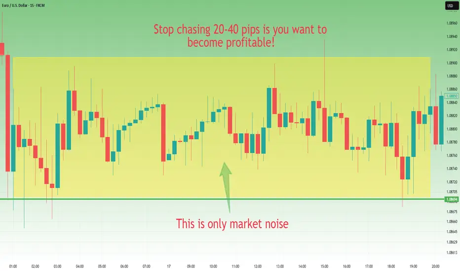
Stop chasing 20-30 pips if you want to become profitableOne of the biggest obstacles for traders who want to become consistently profitable is the mindset of chasing small 20-30 pip moves.
While it may seem appealing to enter and exit trades quickly for immediate profits, this strategy is often inefficient, risky, and unsustainable in the long run. Here’s why you should change your approach if you want to succeed in trading.
________________________________________
1. Trading Costs Eat Into Your Profits
When you target small moves, you need to open and close many trades. This means that spreads and commissions will eat up a significant portion of your profits. If you have a spread of 2-3 pips (depending on the pair) and you’re only aiming for 20-30 pips per trade, a consistent percentage of your potential gains is lost to execution costs.
________________________________________
2. High Risk Compared to Reward
A smart trader focuses on a favorable risk-reward ratio, such as 1:2, 1:3 or even 1:4. When you chase just 20-30 pips, your stop-loss has to be very tight, making you highly vulnerable to the normal volatility of the market. An unexpected news release or a liquidity spike can stop you out before the price even reaches your target.
________________________________________
3. You Miss Big Moves and Real Opportunities
Professional traders focus on larger trends and significant price movements of hundreds of pips. The market doesn’t move in a straight line; it goes through consolidations, pullbacks, and major trends. If you’re busy trading short-term 20-30 pip moves, you’ll likely miss the big trends that offer more sustainable profits and better risk management.
________________________________________
4. Increased Stress and Emotional Trading
Short-term trading requires constant monitoring and quick decision-making. This increases your level of stress and negative emotions like fear and greed, leading to costly mistakes. In the long run, this trading style is mentally exhausting and difficult to sustain.
________________________________________
How to Change Your Approach to Become Profitable
✅ Think in terms of larger trends – Focus on 200-300+ pip moves instead of small fluctuations.
✅ Aim for a strong risk-reward ratio – Look for setups with at least 1:2 risk-reward to maximize your profits.
✅ Use higher timeframes – Charts like 4H or daily provide clearer signals and reduce market noise.
✅ Be patient and wait for the best setups – Don’t enter trades just for the sake of activity; wait for high-probability opportunities.
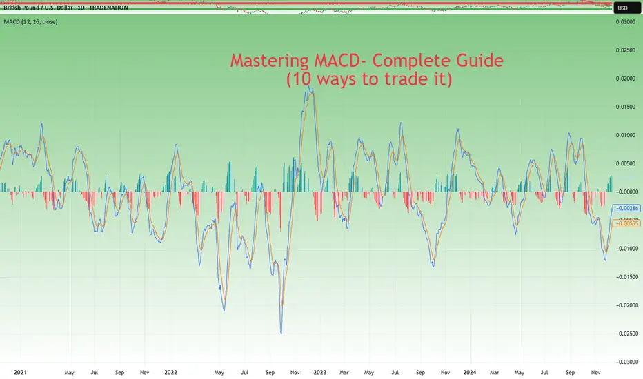
Mastering MACD- Complete Guide- 10 ways to trade itThe Moving Average Convergence Divergence (MACD) is a versatile indicator that can help traders navigate the markets with precision. From trend identification to momentum assessment, the MACD provides multiple actionable insights. In this educational post, we’ll explore the key ways to use MACD effectively, with an example illustration accompanying each strategy.
________________________________________
1. Signal Line Crossovers
The most common use of MACD is the signal line crossover, which identifies potential shifts in market momentum:
• Bullish Signal: When the MACD line (fast-moving) crosses above the signal line (slow-moving), it suggests upward momentum is increasing. This can be an entry signal for a long trade. Bullish crossovers often occur after a period of consolidation or a downtrend, signaling a reversal in market sentiment.
• Bearish Signal: When the MACD line crosses below the signal line, it signals downward momentum, often triggering a short-selling opportunity. Bearish crossovers can occur during retracements in an uptrend or at the start of a bearish reversal.
How to Use: Look for confirmation from price action or other indicators, such as a breakout above a resistance level for a bullish signal or a breakdown below support for a bearish signal. It's essential to avoid acting solely on a crossover; consider volume (stocks, crypto), candle stick formations and other market conditions.
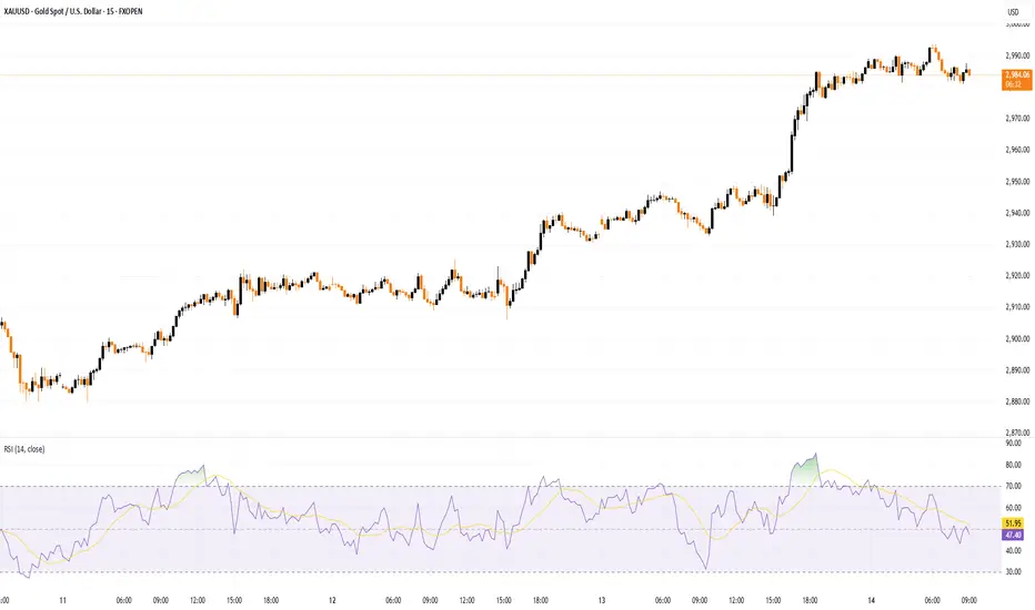
Example: A bullish crossover on the daily chart on TRADENATION:XAUUSD indicates a potential buying opportunity as the price begins to rise. Add a stop-loss below recent lows to manage risk and look for a 1:2 risk:r eward in the next resistance.
________________________________________
2. Zero Line Crossovers
The MACD’s zero line acts as a boundary between bullish and bearish momentum, making it a valuable trend confirmation tool:
• Above Zero: When the MACD line moves above the zero line, it confirms an uptrend, as the fast-moving average is above the slow-moving average. Sustained movement above zero often indicates a strong bullish trend.
• Below Zero: A MACD line below zero reflects a downtrend, indicating bearish market conditions. Persistent movement below zero confirms bearish momentum.
How to Use: Use the zero line crossover to validate trades based on other signals, such as candlestick patterns or trendline breaks. The crossover can act as a second layer of confirmation for existing trade setups.
Example: MACD on a crypto pair crosses above the zero line, confirming the start of a new bullish trend. Traders can combine this with volume analysis to ensure strong market participation.
________________________________________
3. Histogram Analysis
The histogram represents the distance between the MACD line and the signal line, offering insights into momentum:
• Expanding Histogram: Indicates strengthening momentum in the direction of the trend. Larger bars show increasing dominance of bulls or bears.
• Contracting Histogram: Suggests weakening momentum, signaling a possible reversal or consolidation. Smaller bars indicate a loss of trend strength.
How to Use: Monitor the histogram for early signs of momentum shifts before a crossover occurs. The histogram can act as a leading indicator, providing advanced warning of potential changes in price direction.
Example: A shrinking histogram in a forex pair signals that the bullish momentum is losing steam, warning traders of a possible retracement. This can be a cue to tighten stop-loss levels or take partial profits. Conversely, an expanding histogram during a breakout confirms the strength of the move.
________________________________________
4. Identifying Divergences
MACD divergences are powerful tools for spotting potential reversals:
• Bullish Divergence: Occurs when the price makes a lower low, but the MACD forms a higher low, signaling weakening bearish momentum. This often precedes a trend reversal to the upside.
• Bearish Divergence: Happens when the price makes a higher high, but the MACD forms a lower high, indicating diminishing bullish strength. This suggests a potential reversal to the downside.
How to Use: Combine divergence signals with support or resistance levels to enhance reliability. Divergences are most effective when spotted at major turning points in the market.
Example: On a TRADENATION:EURUSD chart, a bearish divergence signals an upcoming price reversal from an up trend to a down trend.
________________________________________
5. Trend Confirmation
MACD confirms trends by staying consistently above or below the zero line:
• Above Zero: Indicates a strong uptrend. Look for pullbacks to enter long trades. The longer the MACD remains above zero, the stronger the trend.
• Below Zero: Reflects a persistent downtrend. Use rallies as opportunities to short. A sustained period below zero reinforces bearish dominance.
How to Use: Use MACD’s trend confirmation alongside other trend-following tools like moving averages or Ichimoku clouds. Ensure that market conditions align with the broader trend.
Example: Combining MACD trend confirmation with moving averages helps traders stay on the right side of the trend in a stock market index. For example, buy when both MACD and a 50-day moving average indicate an uptrend. Exit trades when the MACD begins to cross below zero or shows a divergence.
________________________________________
6. Overbought and Oversold Conditions
Although MACD is not traditionally an overbought/oversold indicator, extreme deviations between the MACD line and the signal line can hint at stretched market conditions:
• Overbought: When the MACD line is significantly above the signal line, it may indicate a price correction is imminent. This often occurs after an extended rally.
• Oversold: When the MACD line is well below the signal line, it suggests a potential rebound. Such conditions are common following sharp sell-offs.
How to Use: Monitor extreme readings in conjunction with oscillators like RSI for added confidence. Look for reversals near key support or resistance levels.
Example: An extended bearish move with a large MACD-signal line gap warns traders of a potential price correction. This can signal an opportunity to exit. Pair this observation with a bullish candlestick pattern to confirm the move (in this example morning star)
________________________________________
7. Combining MACD with Other Indicators
MACD works best when paired with complementary indicators to provide a more comprehensive market analysis:
• RSI (Relative Strength Index): Use RSI to confirm momentum and overbought/oversold conditions.
• Bollinger Bands: Validate price breakouts or consolidations with MACD signals.
• Support and Resistance: Use MACD signals around key levels for confluence.
How to Use: Wait for MACD signals to align with other indicator readings to improve accuracy. Cross-validation reduces false signals and increases confidence in trades.
Example: A bearish MACD crossover near a key resistance level reinforces a short-selling opportunity.
________________________________________
8. Multi-Timeframe Analysis
Using MACD across different timeframes strengthens trade signals and provides context:
• Higher Timeframe: Identify the broader trend to avoid trading against the market. For instance, if the daily chart shows a bullish MACD, focus on long trades in lower timeframes.
• Lower Timeframe: Pinpoint precise entries and exits within the higher timeframe’s trend. The MACD on lower timeframes can help fine-tune timing.
How to Use: Align MACD signals on both higher and lower timeframes to confirm trade setups. This alignment minimizes the risk of false signals.
________________________________________
9. Customizing MACD Settings
Traders can tailor MACD settings to suit different trading styles and timeframes:
• Shorter Periods: Provide more sensitive signals for scalping or day trading. Shorter settings react quickly to price changes but may generate more false signals.
• Longer Periods: Produce smoother signals for swing trading or position trading. Longer settings are less responsive but more reliable.
How to Use: Experiment with different settings on a demo account to find what works best for your strategy. Adjust settings based on the volatility and nature of the asset.
Example: A scalper uses a 5, 13, 6 MACD setting to capture quick momentum shifts in the market, while a swing trader sticks with the standard 12, 26, 9 for broader trends. Compare results across different markets to refine the approach.
________________________________________
10. Crossovers or Divergence at Key Levels
Combining MACD crossovers with price action levels enhances the reliability of trade signals:
• Horizontal Levels: Use MACD signals to confirm reversals or breakouts at support and resistance levels. Crossovers near these levels are often more reliable.
• Fibonacci Retracements: You can combine MACD with retracement levels to validate potential entries or exits. Confluence with retracements adds weight to the signal.
How to Use: Wait for MACD signals to align with key price levels for higher probability trades. Confirmation from candlestick patterns or volume (stock and crypto) adds further credibility.
Example: A bullish MACD divergence aligns with a strong support level, signaling a strong buy setup. Add confirmation with a candlestick reversal pattern, such as a piercing pattern in our case, to enhance precision.
________________________________________
Conclusion:
The MACD indicator’s flexibility makes it a must-have tool for traders of all styles. By mastering these strategies and integrating them in your trading, you can elevate your trading decisions.
Disclosure: I am part of Trade Nation's Influencer program and receive a monthly fee for using their TradingView charts in my analyses and educational articles.
How to Draw Trendlines Like a Pro – Rulers Out, Rules In!Hi everyone!
If you don’t have any rules for drawing a trendline, then this is by far the most subjective technical analysis criterion of all. So, grab your ruler, and let’s dive in! ;)
Without clear guidelines, you can draw it however you want, shaping the narrative to fit your bias. This makes it the perfect tool to talk yourself into a trade or justify staying in a bad one—there’s always a new “support” coming…
If you don't have rules, you can always find some dots to connect, making it look "perfect" for you.
In this post, I'll discuss buying opportunities using trendlines, share key rules for drawing them correctly, and highlight common mistakes to avoid - all with a focus on mid- and long-term investment opportunities.
-------------------------
The Basics: How to Draw a Trendline
The trendline is a highly effective tool for mid- and long-term investors to find an optimal buying zone for their chosen asset. I always take a full view of the chart, analyzing its entire history to find the longest trendline available. The longer the trendline, the stronger it is!
To draw a trendline, we simply connect two points and wait for the third touch to confirm it. Easy, right?
The strongest trendline comes from points that are easily recognizable—you should spot them in a split second.
Maximum view, if possible Monthly chart, connect the dots and wait for a third one.
For me, the third and fourth touches are the most reliable.
If you have to look deeply to find where to draw a trendline, then it's already a first sign that it’s not strong! The best ones appear instantly.
---------------------------
Two Myths About Trendlines
Myth #1: "You cannot draw a trendline without three touching points."
Don’t even remember from where I heard that kind of bs but as you see in the images above, yeah I can. If I have a correct lineup, the third touch is the strongest.
Myth #2: "The more touches, the stronger the trendline."
Yes, a trend appears stronger with more touches, but each additional touch increases the odds of a break or trend change. To buy from, let’s say, the sixth touch, there must be strong confluence factors, and fundamentals should support the investment.
“The trend is your friend, until the end when it bends.” — Ed Seykota
Sure, I’ve had great trades from the fifth or seventh touch, but as said, the area has to be strong, combining multiple criteria. Think of a trendline like 3-5 cm thick ice on a lake. You can’t break it with one hit, or the second, or the third. But after the fourth or fifth, it starts to crack, and by the sixth—boom!
From my psychological perspective, the more touches, the weaker the trendline becomes.
-----------------------
Rule #1: Wick to Wick or Body to Body
If there aren't any anomalies, the trendline should always be drawn from wick to wick (image below) or body to body.
Here was the trendline draw from wick to wick
I mostly use body-to-body when there is a lot of noise on the chart and many large wicks that don’t show the real price behavior—whether from a panic sell-off or other unexpected market moves.
Candlestick chart, the trendline drawn from body-to-body
Tip! Body-to-body means drawing trendlines from closing prices to remove unnecessary noise from the chart. To make the chart even clearer, I often use a line chart (it tracks closing prices), which filters out the noise and gives a cleaner view of the price action.
The same chart as above using line chart.
Mistake to avoid: If you start from the wick but the second point is from the body, it's wrong. This can lead to misleading breakout trades or confusing rejection trades.
If there are no significant large wicks, go from wicks.
If a chart offers a lot of huge panic-sell wicks, use bodies instead to get a cleaner setup.
Quite often, I use a hybrid version as well. We are investors, not traders. We need a price zone, not an exact price!
In these cases, I combine wicks and closing prices to find the optimal trendline, which stays somewhere between them.
Light-blue is the zone
-----------------------
Rule #2: Higher Highs Strengthen the Trendline
A trendline is more reliable if the price makes a new higher high (HH) after the previous rejection, and before it approaches a trendline.
The third and fourth touch came from higher high (HH) levels
This confirms that the recent trend is strong. If it all lines up, we can step in!
-----------------------
Rule #3: Even Timing Between Touches
A trendline rejection works best when the timing between touches is symmetrical. They don’t have to be perfectly equal but they also shouldn’t be wildly different - one touch being very small and another very large can weaken the trendline’s reliability.
A good combinations is when the price comes from higher high levels, the next touch has an equal or fairly similar distance between previous ones.
Yeah, there are quite a lot of touches, but you get the point; market symmetry plays an important role in making decisions.
Warning: If the next touch comes too soon, especially from a lower high (LH) levels, which signals that momentum may be fading, and the touch happens at an uneven distance, it weakens the trendline’s reliability. So, watch out for that.
Two alerts: uneven length between touches & comes from lower highs.
Next red alert: When there are huge uneven gaps between touches, as shown in the picture below.
The first and second touch compared to the second and third touch are out of balance, weakening the trendline's reliability.
------------------------
Trendline Summary: Key Criteria for Mid- to Long-Term Analysis
Open the maximum chart view – analyze all available data for the asset.
The higher the timeframe, the stronger the trendline.
A trendline needs two clean and clear points to be drawn.
The highest probability rejection happens at the third and fourth touch.
If there are large wicks or panic sell-offs, use closing prices (body-to-body).
Remove noise and wicks by using a line chart for a clearer view.
A trendline touch is strongest when the price approaches from a higher high (HH).
A trendline touch is strongest when the distance between touches is symmetrical.
A slight flex in the trendline is ideal; it should be between 20 to 35 degrees, not too steep in its climb. ;)
These are the main criteria for a trendline that I use when analyzing stocks or any asset from a mid-to long-term perspective.
----------------------
Trendlines Alone Are Not Enough
Now, here’s the interesting part. Even if a trendline looks perfect and meets all criteria, I still won’t rush to share an analysis. Why? Because a trendline alone isn’t enough.
A trendline is just one piece of the puzzle. We need multiple confluence factors in a single price zone to make the setup truly strong and reliable. Usually, I need at least 3-7 criteria to align before making a move or recommendation.
So, that's it! A brief overview and hopefully, you found this informative. Feel free to leave a comment with your thoughts!
Before you leave - Like & Boost if you find this useful! 🚀
Trade smart,
Vaido
Why DCA Does Not Work For Short-Term TradersIn this video I go through why DCA (Dollar Cost Averaging) does not work for short-term traders and is more suitable for investors. I go through the pitfalls than come through such techniques, as well as explain how trading should really be approached. Which at it's cost should be based on having a positive edge and using the power of compounding to grow your wealth.
I hope this video was insightful, and gives hope to those trying to make it as a trader. Believe me, it's possible.
- R2F Trading

5 Most Popular Momentum Indicators to Use in Trading in 20255 Most Popular Momentum Indicators to Use in Trading in 2025
Want to master the art of momentum trading? Look no further. In this FXOpen article, we’ll explore how to use momentum indicators, the signals they generate, and five most popular momentum indicators for trading in 2025.
What Is a Momentum Indicator?
Momentum in technical analysis refers to the rate at which an asset's price accelerates or decelerates, helping traders identify potential trend continuations or reversals.
A momentum indicator is a tool used in technical analysis to measure the speed and strength of an asset’s price movements. By analysing changes in price over a specific period, these indicators provide insights into the underlying force driving market trends.
Momentum indicators do not focus on the direction of the price movement itself, but rather the strength behind it. Traders use these tools to gauge whether the market is overbought, oversold, or losing momentum, which helps determine entry or exit points. A stock momentum indicator like the Relative Strength Index (RSI), for instance, may indicate that stocks are currently bought or sold too heavily and their price is due for a reversal.
The Significance of Momentum Technical Indicators
Momentum indicators do not focus on the direction of the price movement, but rather on the strength behind it. They’re able to quantify and represent hidden clues about the future market direction in an easily interpretable way. By learning to read momentum indicators, traders can develop effective trading strategies, identify potential opportunities, and manage risk more efficiently.
Momentum tools produce a range of signals that offer traders an edge over the markets. Let’s take a look at some of the most common momentum signals.
Overbought and Oversold Conditions
These signals indicate when an asset's price has moved too far in one direction without sufficient support from fundamental or technical factors and is likely to reverse. For example, RSI generates overbought signals when the reading rises above 70 and signals oversold conditions when the reading falls below 30.
Divergence
Divergence occurs when the price of an asset moves in the opposite direction of the indicator, suggesting an upcoming reversal. For instance, when the price is making higher highs, but RSI is making lower highs, this indicates a bearish divergence that increases the likelihood of a downward move.
Crossover
These signals are generated when the indicator's lines cross each other or a certain threshold. A common example is the MACD, where traders look for crossovers between the fast MACD line and the slower signal line to spot potential entry and exit points.
Top Five List of Momentum Indicators for Technical Analysis
Now that we understand the types of signals that momentum tools produce, let’s break down five of the most popular with a momentum indicators list.
1. Relative Strength Index (RSI)
The RSI is one of the most popular and well-documented momentum indicators. It measures the speed and change of price movements by comparing the average gain to the average loss over a specified period, usually 14.
RSI is an oscillator, moving between 0 and 100. Values above 70 reflect overbought conditions, while values below 30 indicate oversold conditions. When the RSI moves out of overbought or oversold territory, many traders interpret this as a reversal confirmation. Sustained movements above or below the midpoint (50) can also be used to confirm a bullish or bearish trend, respectively. Moreover, traders look for divergence between the RSI and price to identify weakening trends and possible reversals.
2. Average Directional Index (ADX)
The ADX is a momentum indicator used to determine a trend’s strength. Unlike most other tools, its reading doesn’t move according to the direction of price action, i.e. it doesn’t move up if bullish or down when bearish. Instead, it ranges from 0 to 100, with values above 25 indicating a strong trend and below 25 suggesting a weak or non-trending market.
ADX is commonly used in combination with other tools, as it simply confirms the trendiness of a market. For example, traders might use a leading indicator like RSI to anticipate bullishness and confirm the trend when ADX crosses over 25.
3. Commodity Channel Index (CCI)
The CCI is a versatile momentum indicator. It uses a constant in its calculation to ensure that 75% of values fall between +/- 100, with moves outside of the range generally indicating a trend breakout or continuation. It can also show extreme overbought or oversold conditions when its value exceeds +/- 200.
The CCI requires a more nuanced approach than other tools and is typically used to confirm a trader’s directional bias and to identify potential opportunities. For instance, a visually identifiable bullish trend can be confirmed by looking at the CCI. If its value is skewed toward 100+, traders can be confident in their observation. When the market cools off, CCI will fall below 100. Traders can then confirm a pullback entry with a move back into the +/- 100 range.
4. Moving Average Convergence Divergence (MACD)
The MACD is a highly regarded trend-following momentum indicator that shows the relationship between two moving averages of an asset's price. It’s used in technical analysis to identify the relationship between two moving averages of a security’s price. It helps traders understand the trend’s strength, direction, and duration, as well as possible reversal points.
Traders use crossovers between the MACD and signal lines as potential entry and exit signals. Additionally, when the MACD histogram crosses above or below the zero line, it can indicate bullish or bearish momentum in the market. Lastly, it’s also possible to spot divergences between price and the indicator’s peaks and troughs, similar to how divergences are identified with RSI.
5. Momentum (Mom)
The Momentum indicator is a simple yet potentially effective tool that measures the rate of change in an asset's price over a specific period. The value of the Momentum depends on the market it’s applied to. For example, using the Momentum indicator in stocks will result in a fluctuating value typically between +/- 20, depending on the stock’s price. For forex pairs, its range may look more like +/- 0.02.
The common feature across all markets, however, is the zero line. Generally speaking, positive Momentum values indicate upward price movement, while negative values suggest downward movement. It can also show overbought and oversold conditions, but its lack of defined boundaries means this can be tricky. However, Momentum is especially useful for identifying divergences.
Advantages of Momentum Indicators
Momentum indicators are valuable tools in technical analysis, helping traders assess the strength and speed of price movements. They offer several benefits that enhance trading strategies and decision-making:
- Identify Trends Early: Market momentum indicators can reveal the start of a new trend and the end of the old trend, allowing traders to enter trades at opportune moments.
- Objective Analysis: They provide quantifiable data, reducing reliance on subjective analysis and emotional decision-making.
- Spot Overbought and Oversold Conditions: Momentum tools help traders identify when an asset is overbought or oversold, signalling potential reversals and exit points.
- Confirm Trade Signals: Combining momentum indicators with other technical tools enhances the accuracy of trade signals, providing stronger confirmation for trading decisions.
- Adaptable Across Markets: They can be applied to various assets, including stocks, forex, and commodities, making them versatile tools for traders.
Things to Consider When Trading Momentum Indicators
While momentum indicators can be an effective addition to any trader’s arsenal, there are a few things to be aware of:
- Trade with the Trend: Trends often last longer than you may think, and constantly looking for trend reversals will only end in frustration. Look for bullish signals during an uptrend and bearish signals in a downtrend.
- Use Multiple Indicators: Relying on a single tool can lead to false signals. Many traders combine a lagging indicator, like MACD, with a leading indicator, like RSI. Combining two or three tools can help confirm signals and improve trade accuracy.
- Beware of False Signals: Momentum indicators can sometimes generate false signals, especially in sideways or choppy markets. Being patient and waiting for confirmation before entering a trade is vital.
- Don’t Rely Too Heavily on Indicators: While momentum indicators can be helpful, relying solely on them without considering price action, market structure, or fundamental aspects can lead to poor trading decisions. Use these indicators alongside other tools for a momentum indicator strategy.
Final Thoughts
Now that you have a comprehensive overview of momentum indicators and the signals they produce, it’s time to put your knowledge into practice. After experimenting with a few tools and settling on your favourites, you can open an FXOpen account. You’ll be able to trade over 600+ markets with low costs and ultra-fast execution speeds while partnering with one of the world’s fastest-growing forex brokers. Good luck!
FAQ
How to Use Momentum Indicators?
With momentum indicators, traders monitor the rate of price changes to assess whether it is gaining or losing strength. Traders look for overbought or oversold conditions, divergences, and crossovers to determine potential entry and exit points.
What Is the Best Period for a Momentum Indicator?
If we are talking about the Momentum indicator, the best period depends on your trading style. For short-term traders, 7 and 10 periods are common, while long-term traders may prefer 14 and 21 periods. Testing various periods based on asset volatility can improve results.
What Is the Best Momentum Indicator for Scalping?
There is no best momentum indicator for scalping but the Relative Strength Index (RSI) is often favoured by scalpers due to its ability to quickly identify overbought or oversold conditions. Its responsiveness helps scalpers make rapid decisions in fast-moving markets.
What Is the Difference Between Momentum and Trend Indicators?
Momentum trading indicators measure the speed of price changes, while trend indicators assess the direction and persistence of price movements. To put it simply, momentum focuses on strength, while trend indicators focus on the overall direction.
Is MACD a Momentum Indicator?
Yes, the Moving Average Convergence Divergence (MACD) is one of the most popular momentum indicators, especially in stock trading. It reveals changes in momentum and helps identify potential trend reversals.
This article represents the opinion of the Companies operating under the FXOpen brand only. It is not to be construed as an offer, solicitation, or recommendation with respect to products and services provided by the Companies operating under the FXOpen brand, nor is it to be considered financial advice.
O kurwa! Curvature in Technical Analysis: What Does It Tell Us?Curvature in TA is trading approach where curved lines are used instead of traditional straight trendlines. Curved lines help to visualize how trends evolve and can provide insights into potential reversals or trend continuations.
One of the known methods that utilize curvature is the MIDAS (Market Interpretation/Data Analysis System). This system was developed by physicist Paul Levine in 1995 and uses curved support and resistance lines based on Volume-Weighted Average Price (VWAP). The curves adapt dynamically as price and volume change, helping to identify trend shifts and potential reversals.
💡 Why should we use Curvature?
Dynamic Support and Resistance: Curved lines adapt to price changes, unlike static horizontal lines.
Reversal Signals: They can signal potential trend shifts earlier than traditional methods.
Better Trend Visualization: They are particularly useful for parabolic or exponential price movements.
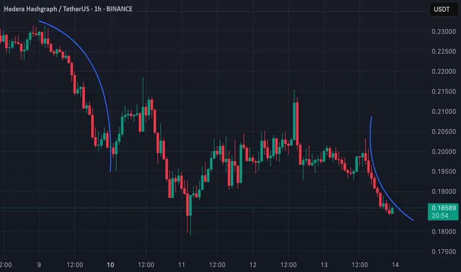
📊 Applying Curvature to HBAR (1H TF)
There are two curves on my chart. Both of them shows a curvature pattern forming on the 1-hour timeframe.
L: The curve on left side indicates a strong downward move, and the price appears to be following this curve closely.
R: On the other hand I have drawn curve on the right side, which is alligned as downward curve as well, but it has different angle.
This post is meant to test my theory on real life example.
🔑 Key Points:
Breaks away from the curvature could indicate a potential trend reversal or consolidation.
Combining this analysis with volume and momentum indicators can improve accuracy when predicting possible bounce or breakdown scenarios. Let's see how it works!
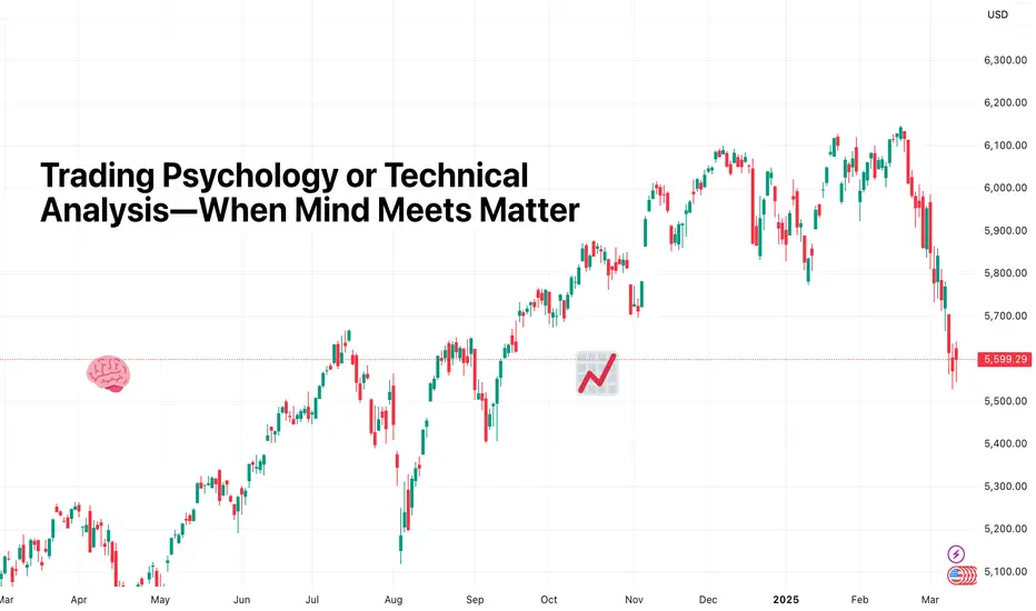
Trading Psychology or Technical Analysis—When Mind Meets MatterThere’s an age-old battle in trading that makes the bull vs. bear debate look like a game of pickleball (no offense, finance bros). It’s the clash between the traders who swear by their charts and the ones who insist it’s all about mindset.
The technicals versus the psychologicals. Fibonacci retracements versus fear and greed. RSI versus your racing heart.
TLDR? Both matter—a lot. But knowing when to trust your indicators, when to trust yourself, and when to blend both is the fine line that separates those who thrive from those who rage-quit.
⚔️ The Cold, Hard Numbers vs. the Soft, Messy Brain
Think of technical analysis as your sometimes inaccurate GPS in trading. It’s structured, predictable, and gives you clear entry and exit points—until it doesn’t. Because markets, much like a GPS in a tunnel, don’t always cooperate.
That’s where psychology creeps in. Your mind is the ultimate trading algorithm, but it’s often running outdated software. Fear of missing out? That’s just your brain throwing a tantrum. Revenge trading? A glitch in emotional processing. Overconfidence after three wins in a row? Well done, you genius.
Technical analysis gives you signals, but trading psychology determines how you act on them.
🤷♂️ When the Chart Says One Thing, and Your Brain Says Another
Picture this: You’ve mapped out the perfect setup. The moving averages align, volume confirms the breakout, and everything screams BUY .
But then your brain whispers, What if it reverses? What if this is a trap? What if I’m about to donate my account balance to the market gods?
You hesitate. The price moves without you. Now, frustration kicks in, and suddenly, you’re clicking BUY at the worst possible moment—just in time for a pullback.
Sometimes, the best trade is the one you don’t take. And sometimes, trusting the chart over your overthinking brain is the only way forward.
🔥 The Big Guys and Their Choices
Legendary investors have picked their sides in this debate. Howard Marks, the co-founder of Oaktree Capital, has long been a big believer in market psychology. He argues that understanding investor sentiment is more valuable than any chart pattern because markets are driven by cycles of greed and fear.
On the other hand, Paul Tudor Jones—one of the greatest traders of all time—leans on technicals, famously saying, “The whole trick in investing is: ‘How do I keep from losing everything?’ If you use the 200-day moving average rule, you get out. You play defense.”
Both approaches work. The question is: Are you the type who deciphers market mood swings, or do you trust that a well-placed moving average will tell you when to cut and run?
🌀 Overtrading: The Technical Trap and the Psychological Spiral
Overtrading usually starts with a good trade, a small win, and a rush of dopamine that convinces you you’ve cracked the code. So, you take another trade. Then another. And before you know it, you’re firing off entries like a caffeinated gamer, except your PnL is the one taking the damage.
Technical traders fall into this trap because they see too many setups. Every candlestick pattern, every little bounce, every “potential” breakout becomes a reason to trade.
Psychological traders, on the other hand, may overtrade out of boredom, frustration, or the need to “make back” losses.
The result? An emotional rollercoaster that ends with an account balance you don’t want to check the next morning.
The fix? Trade selectively. The best setups don’t come every five minutes, and forcing trades is like forcing a bad joke—it just doesn’t land.
💪 Fear, Greed, and the Art of Holding Your Ground
Every trader knows the feeling: You’re in profit, but instead of letting the trade play out, you close early because profit is profit, right?
Wrong.
Fear of losing profits is what keeps traders from maximizing their wins. And greed—the evil twin of fear—is what makes traders hold losing trades, hoping for a miracle. It’s the classic “let winners run, cut losers short” rule in reverse.
Technical traders know where their stops and targets are. The problem? They often ignore them when emotions take over. Psychological traders “feel” the market but get crushed when that gut feeling betrays them.
The best traders find the balance—using technicals to set logical targets and psychology to actually stick to the plan.
🤝 The Solution? A System That Checks Both Boxes
So, what’s the verdict? Do you put matter over mind or mind over matter?
The truth is, great traders do both. They develop strategies based on technicals but manage execution with discipline. They respect risk management rules not just because the chart says so, but because they know how destructive emotions can be.
Here’s what the best do differently:
✅ They journal trades —not just the setups but how they felt during the trade.
✅ They stick to a trading plan so they can trust their system over impulse.
✅ They set rules that help them to properly bounce back from losses .
✅ They know the value of knowledge and never stop learning. (We’ve got you covered here, too. Go check the Top Trading Books if you’re a trader and stop by the Top Books on Investing if you’re an investor).
💚 Final Thoughts: Mind and Market in Harmony
In the end, trading is never just one or the other. It’s not pure math, and it’s not pure mindset. It’s a dance between structure and instinct, strategy and psychology. The ones who get it right aren’t just great at reading charts—they’re great at reading themselves.
Understanding Volume In TradingVolume is one of the most crucial yet often overlooked aspects of trading. It represents the total number of shares, contracts, or lots traded in a given period and provides insight into the strength of price movements. By analyzing volume effectively, traders can identify trends, confirm breakouts, and detect potential reversals before they happen.
Unlike price action alone, volume adds a critical layer of confirmation. A price move supported by high volume is more likely to be sustainable, while a move on low volume may indicate weakness or manipulation. Institutions, hedge funds, and large market players leave footprints through volume, and understanding these patterns can give traders an edge.
Volume Types 🎯
Volume
Buy/Sell Volume
Delta Volume
Cumulative Delta Volume
Relative Volume
Cumulative Relative Volume
Open Interest
Volume Profile
01. Volume 🔥
In trading, volume refers to the total quantity of assets traded during a specific time frame, whether they are stocks, futures contracts, options, or currencies. It measures the activity level of a security and provides insights into the strength or weakness of price movements.
Key aspects:
Market sentiment: High volume often indicates strong interest in a security and can signal the strength of a price move. Conversely, low volume may suggest a lack of interest and can indicate that price movements may not be sustainable.
Liquidity: High volume generally indicates better liquidity, meaning it is easier to enter and exit positions without significantly impacting the asset’s price. Low volume may lead to higher slippage and greater price volatility.
Volume spikes: Extremely high volume after a prolonged trend may signal the end of that trend (blow-off tops or panic selling bottoms).
Market types: Volume can vary by market type. In stock markets, it is usually reported in shares. In futures and options, it is reported in contracts, while in Forex, it is often measured by tick volume (the number of price changes).
Impact on market orders & liquidity
High Volume = Lower Slippage: Large orders can be executed more efficiently in high-volume environments.
Low Volume = Higher Volatility: Thin order books in low-volume markets can lead to erratic price swings and wider bid-ask spreads.
02. Buy/Sell Volume 💹
Buy volume and sell volume are key metrics that indicate the level of buying and selling activity in a market. They help traders assess the strength of price movements and market sentiment.
Buy Volume
Buy volume represents the number of shares, contracts, or lots traded at the ask price (or higher). It occurs when buyers are willing to pay the seller’s asking price, indicating buying pressure and potential bullish sentiment.
How buy volume is measured:
Transactions that execute at the ask price are counted as buy volume.
In some cases, aggressive market orders (where buyers take liquidity) are considered buy volume.
Buy volume is often compared to total volume to determine demand strength.
Sell Volume
Sell volume represents the number of shares, contracts, or lots traded at the bid price (or lower). It occurs when sellers accept the buyer’s bid price, indicating selling pressure and potential bearish sentiment.
How sell volume is measured:
Transactions executed at the bid price are counted as sell volume.
Market sell orders (where sellers take liquidity) contribute to sell volume.
Higher sell volume relative to buy volume suggests downward price pressure.
03. Delta Volume ✨
Delta Volume (often referred to as Volume Delta) is a key order flow metric that measures the difference between buy volume and sell volume over a given period.
Calculation
Delta Volume is defined as: Delta Volume = Buy Volume − Sell Volume
Where:
Buy Volume is the total volume transacted at the ask price (aggressive buying).
Sell Volume is the total volume transacted at the bid price (aggressive selling).
Interpretation
Positive Delta (Buy Volume > Sell Volume): Indicates more aggressive buying, suggesting bullish momentum.
Negative Delta (Sell Volume > Buy Volume): Indicates more aggressive selling, suggesting bearish momentum.
Near Zero Delta: Indicates a balance between buyers and sellers, often seen in range-bound markets.
04. Cumulative Delta Volume ⚡
Cumulative Delta Volume (CVD) is an advanced order flow metric that tracks the cumulative sum of Delta Volume over time.
Calculation
CVD t =CVD t − 1 + (Buy Volume − Sell Volume)
Where:
Buy Volume = Volume transacted at the ask price (aggressive buying).
Sell Volume = Volume transacted at the bid price (aggressive selling).
CVD*t = Current cumulative delta value.
CVD\*{t-1} = Previous cumulative delta value.
Interpretation
Rising CVD (Positive Delta Accumulation): Buyers are dominating, indicating bullish momentum.
Falling CVD (Negative Delta Accumulation): Sellers are in control, signaling bearish momentum.
Flat or Divergent CVD: A divergence between price and CVD can indicate potential reversals or absorption by large traders.
05. Relative Volume 📉
Relative Volume (RVOL) is a key trading metric that measures current trading volume compared to its historical average over a specified period. It helps traders assess whether a security is experiencing unusual trading activity and provides insights into liquidity, volatility, and potential price movements.
Calculation
Relative Volume is typically expressed as a ratio:
RVOL = Current Volume / Average Volume Over A Given Period
Where:
Current Volume = The total shares/contracts traded in the current period (e.g., 1-minute, 5-minute, daily).
Average Volume = The average volume over a past period (e.g., 10-day average, 50-day average).
A higher RVOL (>1) means the security is trading at above-average volume, while a lower RVOL (<1) indicates below-average activity.
Interpretation
RVOL > 2: Indicates significantly higher-than-normal volume, often linked to news events, earnings reports, or breakout trends.
RVOL around 1: Suggests normal trading activity with no unusual volume spikes.
RVOL < 1: Indicates low trading activity, which may lead to weak price movements and lower liquidity.
06. Cumulative Relative Volume 💥
Cumulative Relative Volume (CRVOL) is an advanced volume metric that tracks the total volume traded throughout a session relative to its historical average at the same time of day.
Calculation
Cumulative Relative Volume compares the ongoing total volume at a given point in time to the average cumulative volume at that same time over a historical period.
CRVOL = Cumulative Volume at Time X / Average Cumulative Volume at Time X over N periods
Where:
Cumulative Volume at Time X = The total volume traded from market open up to time X.
Average Cumulative Volume at Time X = The average total volume at that point in time over a selected historical period (e.g., 10 days).
N periods = The number of historical sessions used for comparison.
A CRVOL > 1 indicates higher-than-normal trading activity, while CRVOL < 1 suggests lower-than-average activity.
Interpretation
CRVOL > 1.5: Significantly higher trading activity than usual, often linked to news events, earnings reports, or institutional participation.
CRVOL ≈ 1: Normal trading volume, suggesting typical market conditions.
CRVOL < 0.8: Below-average trading volume, often indicating low liquidity and reduced volatility.
07. Open Interest 📊
Open Interest (OI) is a key metric in derivatives markets (futures and options) that represents the total number of outstanding contracts that have not been settled or closed. It is an important indicator of market activity, liquidity, and trader commitment.
How it works?
Open Interest increases or decreases based on the interaction between buyers and sellers:
OI Increases: When a new buyer and a new seller enter the market, creating a fresh contract.
OI Decreases: When an existing buyer and seller close their positions (either by offsetting trades or expiration).
OI Unchanged: If an existing contract is transferred between traders (one trader closes, another opens an equal position).
Interpretation
Rising OI + Rising Price: Suggests strong buying interest, indicating a bullish trend with conviction.
Rising OI + Falling Price: Indicates strong selling pressure, confirming a bearish trend.
Falling OI + Rising Price: Signals a short-covering rally or weakening trend, as traders close positions.
Falling OI + Falling Price: Suggests a lack of commitment to further declines, indicating potential trend exhaustion.
08. Volume Profile 🎢
Volume Profile is a powerful market analysis tool that plots trading volume at different price levels over a specific period. Unlike traditional volume indicators, which show volume per time interval, Volume Profile reveals where the most buying and selling activity occurred, helping traders identify key support and resistance levels, market structure, and potential price reactions.
Components
Volume Profile is displayed as a histogram on the vertical axis, showing the amount of volume traded at each price level. It is built using tick data or intraday price action and is often calculated for different timeframes (daily, weekly, monthly, or custom sessions).
Key components of Volume Profile include:
Point of Control (POC): The price level where the highest volume was traded, acting as a major support/resistance zone.
High Volume Nodes (HVN): Price areas with heavy trading activity, indicating consolidation zones where price is likely to stabilize.
Low Volume Nodes (LVN): Price areas with little trading activity, often leading to fast price movements as there is little resistance or support.
Value Area (VA): The price range where 70% of the total volume was traded, representing the "fair value" zone of the market.
Value Area High (VAH) & Value Area Low (VAL): The upper and lower boundaries of the Value Area, acting as dynamic support and resistance levels.
Types
Session Volume Profile: Analyzes volume for a single trading session (daily or intraday).
Composite Volume Profile: Covers a longer period (weeks, months, or custom-defined ranges).
Fixed Range Volume Profile: Analyzes volume for a specific price range or custom-selected area.
Developing Volume Profile: Updates dynamically throughout the trading session to show real-time changes in volume distribution.
Interpretation
POC as a Magnet: Price tends to revisit the POC due to high liquidity and market agreement at that level.
Breakouts from Value Area: If price breaks above VAH with strong volume, it signals a bullish trend; if it breaks below VAL, it signals a bearish trend.
Reaction at LVN: Price moves quickly through LVN areas but may reverse or stall when approaching HVN.
Rejections at VAH/VAL: If price rejects VAH, it may return to POC or VAL, and vice versa.
09. Indicators 📦
Volume indicators help traders gauge market strength by analyzing the number of shares or contracts traded.
Volume (Default) – Displays the total volume traded per candle, often color-coded based on price movement.
Volume Profile (Fixed Range, Session, Visible Range) – Shows volume distribution across price levels to identify support and resistance zones.
Volume Weighted Average Price (VWAP) – A dynamic support/resistance line that calculates the average price based on volume.
On-Balance Volume (OBV) – Measures cumulative volume flow to detect price trends and confirm breakouts.
Money Flow Index (MFI) – A volume-weighted RSI-like oscillator that identifies overbought and oversold conditions.
Volume Delta – Measures the difference between buying (ask) and selling (bid) volume.
Cumulative Delta Volume – Tracks the cumulative sum of volume delta over time to assess buying/selling pressure.
Relative Volume (RVOL) – Compares current volume to historical averages to highlight unusual trading activity.
Key Takeaways 📋
Volume is a crucial market indicator that reflects trading activity and liquidity, often preceding price movements.
High volume confirms trends and breakouts, while low volume can signal weak or false moves.
Volume Profile identifies key support and resistance zones, with High Volume Nodes (HVNs) acting as strong barriers and Low Volume Nodes (LVNs) allowing fast price movement.
Relative Volume (RVOL) highlights unusual market activity, while Delta Volume and Cumulative Delta reveal buying and selling pressure.
VWAP serves as a dynamic support/resistance tool commonly used by institutional traders.
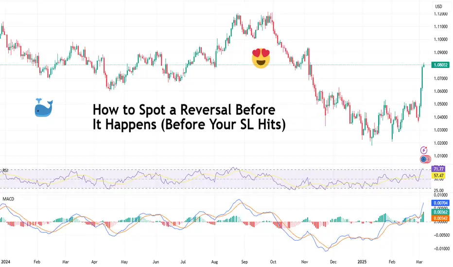
How to Spot a Reversal Before It Happens (Before Your SL Hits)You know the feeling. You’re confidently riding a winning trend, high on the euphoria of green candles, when—BAM—the market flips faster than a politician in an election year. Your once-perfect trade is now a humiliating red mess, and your stop loss is the only thing standing between you and financial pain.
But what if you could see that reversal coming before it smacks you in the face? What if, instead of watching your profits evaporate, you could exit like a pro—or better yet, flip your position and ride the reversal in the other direction?
Reversals don’t happen out of thin air. The signs are always there—you just have to know where to look. In this idea, we break down how to spot reversals before they happen.
😉 Price Action: The Market’s Way of Dropping Hints
Markets don’t just change direction because they feel like it. Reversals happen when sentiment shifts—when buyers and sellers agree, sometimes all at once, that the current trend has run its course.
The first clue? Price action itself.
Look for hesitation. A strong uptrend should be making higher highs and higher lows. A downtrend should be carving out lower lows and lower highs. But what happens when that rhythm starts breaking?
A higher high forms, but the next low dips below the previous one? Warning sign.
Price approaches a key resistance level, but momentum stalls, and candles start looking indecisive? Caution flag.
A massive engulfing candle wipes out the last three sessions? Somebody just hit the eject button.
Before markets reverse, they throw up some red flags first—and depending on your time frame, these red flags can give you a heads up so you can prepare for what’s coming.
🔑 Divergence: When Your Indicators Are Screaming "Lies!"
Indicators might be lagging, but they’re not useless—especially when they start disagreeing with price.
This is where divergence comes in. If the price is making new highs, but your favorite momentum indicator (RSI, MACD, Stochastic—you name it) isn’t? That’s a major warning sign.
Bearish Divergence: Price makes a higher high, but RSI or MACD makes a lower high. Translation? The momentum behind the move is fizzling out.
Bullish Divergence: Price makes a lower low, but RSI or MACD makes a higher low. Translation? Sellers are losing their grip, and a bounce might be coming.
Divergences don’t mean immediate reversals, but they do suggest that something’s off. And when the market starts whispering, it’s best to listen before it starts shouting.
📍 Volume: Who’s Actually Driving the Move?
A trend without volume is like a car running on fumes—it’s only a matter of time before it stalls.
One of the clearest signs of a potential reversal is a divergence between price and volume.
If price is pushing higher, but volume is drying up? Buyers are getting exhausted.
If price is tanking, but selling volume isn’t increasing? The bears might be running out of steam.
If a major support or resistance level gets tested with huge volume and a violent rejection? That’s not a coincidence—it’s a battle, and one side is losing.
Reversals tend to be violent because traders are caught off guard. Watching the volume can help you avoid being one of them.
📊 Key Levels: Where the Market Loves to Reverse
Price doesn’t move in a vacuum. There are levels where reversals love to happen.
Support and Resistance: The most obvious, yet most ignored. When price approaches a level that’s been historically respected, pay attention.
Fibonacci Retracements: Markets are weirdly obsessed with 38.2%, 50%, and 61.8% retracement levels. If a trend starts stalling near these zones, don’t ignore it.
Psychological Numbers: Round numbers (like 1.2000 in Forex , $500 in stocks , or $120,000 in Bitcoin BITSTAMP:BTCUSD act like magnets. The more traders fixate on them, the more likely they become reversal points.
Smart money isn’t chasing prices randomly. They’re watching these levels—and if you’re not, you might consider doing it.
🚨 Candlestick Warnings: When the Market Paints a Picture
Candlesticks aren’t just pretty chart elements that give you a sense of thrill—they tell stories. Some of them hint at “reversal.”
Doji: The ultimate indecision candle. If one pops up after a strong trend, the market is questioning itself.
Engulfing Candles: A single candle that completely erases the previous one? That’s power shifting sides.
Pin Bars (Hammer/Inverted Hammer, Shooting Star): Long wicks show rejection. When they appear at key levels, reversals often follow.
Candlestick patterns alone aren’t enough, but when they show up alongside other reversal signals, they’re hard to ignore.
📰 The News Factor: When Fundamentals Crash the Party
Technical traders like to pretend breaking news doesn’t matter—until it does.
Earnings reports , economic data , interest rate decisions ECONOMICS:USINTR —these events can turn a strong trend into a dumpster fire instantly.
A stock making all-time highs right before earnings? Tread carefully.
A currency pair trending up before an inflation report? One bad number, and it’s lights out.
A crypto rally before a major regulation announcement? That could end badly.
Reversals don’t always come from charts alone. Sometimes, they come from the real world. And the market rarely gives second chances.
✨ The Reversal Cheat Sheet: When Everything Aligns
A single signal doesn’t guarantee a reversal. But when multiple factors line up? That’s when you need to take action.
If you see:
✅ Divergence on indicators
✅ Volume drying up or spiking at a key level
✅ A major support/resistance level getting tested
✅ Reversal candlestick patterns forming
✅ News lurking in the background
Then congratulations—you’ve likely spotted a reversal before your stop loss takes the hit.
✍ Conclusion: Stay Ahead, Not Behind
Catching reversals before they happen isn’t magic—it’s just about knowing where to look. Price action, volume, key levels, indicators, and even the news all leave clues. The problem? Most traders only see them after their account takes the hit.
Don’t be most traders. Pay attention, recognize the signs, and act before the market flips the script on you.
Because the best time to spot a reversal? Before it happens.
Do you use any of these strategies to spot reversals in your trading? What’s the last time you did it and what were you trading—forex, crypto, stocks or something else? Let us know in the comments!
How to pick a benchmark for you portfolio and beat the market What is a benchmark?
A benchmark is an index or a basket of assets used to evaluate the performance of an investment portfolio In the context of portfolio analysis the benchmark serves as a point of comparison to determine whether a fund a strategy or an investment is performing better worse or in line with the reference market.
In the current chart, Bitcoin ( BINANCE:BTCUSDT ) is displayed with a solid and larger blue line in relation to other cryptocurrencies for the current period.
Benchmarks are essential tools for institutional and private investors as they allow measuring the effectiveness of asset allocation choices and risk management Additionally they help determine the added value of an active manager compared to a passive market replication strategy.
Benchmark analysis example: NASDAQ:TSLA - NASDAQ:NDX
Benchmark analysis example: NASDAQ:TSLA - NASDAQ:AAPL - NASDAQ:NDX
What is the purpose of a benchmark
The use of a benchmark in portfolio analysis has several objectives
1) Performance Evaluation: Provides a parameter to compare the portfolio's return against the market or other funds
2) Risk Analysis: Allows comparing the volatility of the portfolio against that of the benchmark offering a measure of risk management
3) Performance Attribution: Helps distinguish between returns derived from asset selection and those linked to market factors
4) Expectation Management: Supports investors and managers in assessing whether a portfolio is meeting expected return objectives
5) Strategy Control: If a portfolio deviates excessively from the benchmark it may signal the need to review the investment strategy
How to select an appropriate benchmark?
The choice of the correct benchmark depends on several factors:
1) Consistency with Portfolio Objective: The benchmark should reflect the market or sector in which the portfolio operates
2) Representativeness of Portfolio Assets: The benchmark should have a composition similar to that of the portfolio to ensure a fair comparison
3) Transparency and Data Availability: It must be easily accessible and calculated with clear and public methodologies
4) Stability Over Time: A good benchmark should not be subject to frequent modifications to ensure reliable historical comparison
5) Compatible Risk and Return: The benchmark should have a risk and return profile similar to that of the portfolio
Most used benchmarks
There are different benchmarks based on asset type and reference market Here are some of the most common.
Equity
FRED:SP500 Representative index of the 500 largest US companies.
NYSE:MSCI World Includes companies from various developed countries ideal for global strategies
FTSE:FTSEMIB Benchmark for the Italian stock market
NASDAQ:NDX Represents the largest technology and growth companies
Bonds
Barclays Global Aggregate Bond Index Broad benchmark for the global bond market
JP Morgan Emerging Market Bond Index EMBI Benchmark for emerging market debt
[* ]BofA Merrill Lynch US High Yield Index Representative of the high-yield bond market junk bonds
Mixed or Balanced
6040 Portfolio Benchmark 60 equities SP 500 and 40 bonds Bloomberg US Aggregate used to evaluate balanced portfolios
Morningstar Moderate Allocation Index Suitable for moderate-risk investment strategies
Alternative
HFRI Fund Weighted Composite Index Benchmark for hedge funds
Goldman Sachs Commodity Index GSCI Used for commodity-related strategies
Bitcoin Index CoinDesk BPI Benchmark for cryptocurrencies
A reference benchmark is essential in portfolio analysis to measure performance manage risk and evaluate investment strategies The selection of an appropriate benchmark must be consistent with the strategy and market of the portfolio to ensure meaningful comparison.
Understanding and correctly selecting the benchmark allows investors to optimize their decisions and improve long-term results.
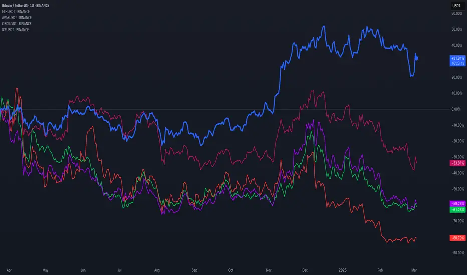
The Power of a Trading Journal: Key to Consistent SuccessHave you ever pondered what distinguishes successful traders from those who struggle for consistent profits? One key tool, often underestimated, is the trading journal. Both research and practical experience demonstrate that traders who diligently track their performance and critically assess their decisions tend to enhance their trading skills and overall results over time. While financial markets can seem erratic, a well-maintained trading journal can provide clarity regarding your trading behavior and highlight areas ripe for improvement.
Understanding the Trading Journal
At its core, a trading journal serves as a comprehensive record of your trades, detailing every decision and its corresponding outcome. However, it goes beyond a mere tally of wins and losses; it acts as a robust instrument for self-reflection and growth. By keeping an organized log, traders can identify recurring patterns, refine their strategies, and cultivate greater discipline in their trading practices. In essence, a trading journal empowers you to track your performance while offering meaningful insights for informed decision-making.
What Constitutes a Trading Journal?
A trading journal is a personalized record of your trading journey designed to document every aspect of your experiences. Unlike a basic transaction log, it encompasses insights into your decisions, emotional states, and strategies, thereby providing an in-depth perspective on your trading habits and performance over time. This journal functions as a roadmap, enabling you to analyze your actions, learn from missteps, and recognize successful patterns to replicate in future trades.
Essential Components of a Trading Journal
1. Trade Details:
Log fundamental information for each trade, including the date, instrument, entry and exit points, position size, and the outcome.
2. Trade Analysis and Rationale:
Capture the reasons behind each trade, such as market analysis, utilized indicators, or significant news events influencing your decision.
3. Emotional Insights:
Document the emotions felt before, during, and after each trade, which will help you identify emotional triggers impacting your decision-making.
4. Results and Lessons Learned:
Reflect on the trade’s outcome and the insights gained. Did it align with your expectations? What could be improved next time?
By consistently maintaining these entries, your trading journal will allow for systematic performance tracking, enabling you to conduct insightful trade analysis and continuously enhance your trading methodology.
The Key Benefits of a Trading Journal
Maintaining a trading journal provides numerous benefits that can significantly elevate your trading performance over time. From honing decision-making skills to fostering emotional discipline, a trading journal is an invaluable asset for anyone committed to enhancing their trading approach.
1. Enhanced Decision-Making:
Analyzing past trades enables you to discern patterns in your decision-making process, both successful and otherwise. You might uncover that certain strategies work better under specific market conditions or that impulsive trades frequently lead to losses. Understanding these patterns grants you valuable insights for making informed, calculated choices in future trades.
2. Improved Emotional Control:
Trading often involves a rollercoaster of emotions, with factors like fear and greed skewing decision-making. Documenting your feelings during trades can help you identify emotional triggers and develop strategies to manage them, maintaining objectivity and preventing emotions from derailing your trading plan. Over time, this fosters emotional control, which is crucial for sustained trading success.
3. Increased Consistency and Discipline:
A trading journal encourages consistency by promoting adherence to your trading plan and strategies. By recording every trade—regardless of its outcome—you cultivate a disciplined mindset that helps you avoid impulsive decisions and maintain a structured approach aligned with your objectives.
How to Establish Your Trading Journal
Creating a trading journal is quite simple; the key lies in selecting the right format and knowing what to document. Follow this guide to set up a journal that effectively tracks your trading performance and identifies growth opportunities.
Selecting Your Format:
1. Digital Applications:
Tools like Evernote, OneNote, or specialized trading journal software offer accessibility, data backup, and automation. Many apps include analytics features for streamlined performance tracking.
2. Spreadsheets:
Utilizing Excel or Google Sheets affords flexibility and customization. You can craft a spreadsheet tailored to your needs, complete with specified fields, formulas, and visualizations.
3. Paper Journals:
For those who prefer a tactile approach, a traditional notebook can suffice. While writing by hand fosters reflection, it lacks digital conveniences like searchable records.
Crucial Information to Record:
To enhance the effectiveness of your trading journal, make sure to include these key data points:
- Entry and Exit Points:
Log the precise times and prices at which trades are entered and exited.
- Position Size and Trade Details:
Note the trade size, instrument, and any pertinent details.
- Motivation for the Trade:
Document the analysis or strategy that influenced your trade decision, whether rooted in technical analysis, fundamental factors, or broader market trends.
- Emotional State:
Record your feelings throughout the trading process to better understand emotional influences.
- Trade Outcome and Lessons:
Reflect on the trade's success and any insights gained, noting what worked well or what didn’t.
Starting a trading journal requires minimal time but can significantly affect your long-term ability to track performance and improve.
Read Also:
Reviewing Your Trading Journal for Growth
A trading journal can only yield benefits if you regularly review and analyze its contents. Consistent reviews enable you to identify patterns, adjust strategies, and enhance your trading acumen.
Setting Review Periods:
Designate time—weekly, biweekly, or monthly—to review your journal. These sessions reinforce your commitment to your goals and reveal areas needing adjustment, ensuring ongoing learning from your trades.
Spotting Patterns and Mistakes:
Analyze your trades for recurring themes. Determine if you consistently act on particular signals or if emotional responses lead to poor decision-making. Acknowledging frequent mistakes marks the first step toward correcting detrimental behaviors.
Implementing Adjustments:
Leverage insights from your journal to modify your trading strategies. If a specific method isn’t yielding results, revise or replace it accordingly. If certain emotional triggers lead to losses, develop coping mechanisms to mitigate their influence.
By committing to regular reviews, you can transform your trading experiences into invaluable lessons that foster better habits and skills.
Read Also:
Maximizing the Benefits of Your Trading Journal
To fully reap the rewards of a trading journal, it's crucial to engage with it effectively. Here are tips to enhance your journaling experience:
1. Maintain Consistency:
Regularly enter details after every trade or at least daily. This practice captures relevant details while they’re recent, building a robust record for analysis.
2. Practice Honesty:
Accurately document both successes and failures. A truthful account allows for clearer insights into areas needing improvement, as self-awareness plays a vital role in progress.
3. Utilize Visuals:
Incorporate charts, graphs, or screenshots to enrich your journal. Visual aids facilitate pattern recognition and provide a more comprehensive understanding of your trading performance.
Read Also:
Conclusion: The Transformative Role of a Trading Journal
A trading journal is an essential tool for any trader pursuing consistent success. By meticulously recording trades, scrutinizing decisions, and learning from both victories and defeats, you can sharpen your skills, master your emotions, and cultivate a disciplined approach to the markets. Beyond merely documenting past trades, a trading journal offers critical insights that can profoundly influence your long-term performance. By consistently utilizing this resource, you can decipher your unique trading habits, refine strategies, and ultimately boost your confidence in decision-making.
✅ Please share your thoughts about this article in the comments section below and HIT LIKE if you appreciate my post. Don't forget to FOLLOW ME; you will help us a lot with this small contribution.
Bollinger Bands: Basics and Breakout Strategy🔵 What are Bollinger Bands?
Bollinger Bands are a popular technical analysis tool developed by John Bollinger in the early 1980s. They help traders analyze price volatility and potential price levels for buying or selling. The indicator consists of three lines plotted over a price chart:
Middle Band: A simple moving average (SMA), typically set to a 20-period average.
Upper Band: The middle band plus two standard deviations.
Lower Band: The middle band minus two standard deviations.
🔵 How Are Bollinger Bands Calculated?
Middle Band (MB): MB = 20-period SMA of the closing price.
Upper Band (UB): UB = MB + (2 × standard deviation of the last 20 periods).
Lower Band (LB): LB = MB - (2 × standard deviation of the last 20 periods).
The bands expand when volatility increases and contract when volatility decreases.
length = 20
basis = ta.sma(src, length)
dev = mult * ta.stdev(src, length)
upper = basis + dev
lower = basis - dev
🔵 How to Use Bollinger Bands in Trading
Bollinger Bands provide insights into market volatility and potential price reversals. Traders often use them to:
Identify overbought (price near the upper band) and oversold (price near the lower band) conditions.
Spot volatility contractions, which often precede significant price moves.
Confirm trend strength and potential reversals.
🔵 Bollinger Bands Breakout Strategy
One effective strategy involves preparing for breakouts when the upper and lower bands contract, indicating low price momentum.
Strategy Steps:
Identify Low Volatility Zones: Look for periods when the bands are close together, signaling a potential breakout.
Prepare for a Breakout: Monitor price action as it approaches either the upper or lower band.
Entry Signal: Enter a trade when the price closes above the upper band (for a long position) or below the lower band (for a short position).
Stop Loss Placement:
For long entries (break above upper band): Set stop loss at the lower band.
For short entries (break below lower band): Set stop loss at the upper band.
Profit Target: Use a risk-reward ratio of at least 1:2 or close the position when price shows signs of reversal.
Example Charts:
🔵 Final Thoughts
This Bollinger Bands breakout strategy is simple yet effective. By recognizing periods of low volatility and preparing for breakouts, traders can capitalize on significant price movements. Always complement this strategy with proper risk management and confirmation indicators for optimal results.
This article is for informational purposes only and should not be considered financial advice. Trading involves risk, and traders are solely responsible for their own decisions and actions.
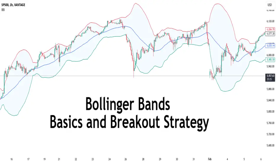
How to Set Multiple TPs...for BeginnersHey Rich Friends,
I wanted to share how I find multiple TPs for my Forex trades using free tools and only 1 technical indicator. This strategy is perfect for beginners because it is easy to follow and has clear confirmations for entering and exiting a trade in profit, even if it hits your Stop Loss.
I keep my charts clean and let price action do the talking. Here's my setup:
✅ Session Breaks & Horizontal Lines – I mark the previous day’s highs, lows, and key levels to identify potential areas of interest.
✅ Stochastic for Entries & Exits – I use the Stochastic indicator to time my trades when the price reacts at my key levels (80 and 20 are very important here!)
✅ Horizontal Lines = Potential TPs – Instead of setting a take profit, I let the market tell me when to exit based on price action around these levels.
Less noise, more precision. Drop a "7" if you made it to the end of the video and let me know if it was helpful!
Peace and Profits,
Cha

The Two Minds of a Trader: Analysis vs. ExecutionTrading is a game of probabilities, discipline, and emotional control. Yet, most traders unknowingly sabotage themselves by letting their analytical mind interfere with their execution. Understanding the distinction between the Analytical Mind (The Analyst) and the Execution Mind (The Trader) can significantly improve your trading performance. I’m Skeptic , and today, I’ll break down how to master these two mental states.
The Analytical Mind vs. The Execution Mind
The Analyst: The Market Forecaster 🔍📊
This is the part of your mind that loves to analyze, predict, and overthink.
It constantly searches for confirmation and the perfect setup.
It’s responsible for drawing support/resistance levels, using indicators, and finding confluence zones.
Often, it falls into the trap of “analysis paralysis,” hesitating to take trades due to over-analysis.
🛑 Biggest Mistake: Letting the Analytical Mind interfere with execution.
The Trader: The Decision Maker 🎯💰
This is the part of your mind that follows a structured, predefined trading plan.
It focuses on executing rather than predicting.
It respects stop-losses, sticks to the plan, and doesn’t chase the market.
It manages risk effectively and understands that losses are part of the game.
✅ Key to Success: Training the Execution Mind to act without emotional interference from the Analytical Mind.
How to Stop Overthinking and Trade with Confidence
1. Create a Clear Trading Plan 📝
A structured plan removes uncertainty. Before you enter a trade, you should already know:
Your entry triggers (specific price action setups, indicators, or fundamental conditions).
Your risk-to-reward ratio (R/R) and stop-loss placement.
Your profit-taking strategy (scaling out, trailing stops, etc.).
💡 Example:
I personally use setups based on support/resistance, RSI divergences, and volume confirmation.
I’ve backtested these setups with 30+ trades per condition, ensuring their viability.
This confidence in my system allows me to execute trades without second-guessing.
2. Separate Learning from Execution 🚧
One of the biggest mistakes traders make is learning while trading.
Before the trade: This is the time for analysis and preparation.
During the trade: This is execution mode—stick to your plan, no second-guessing.
After the trade: Review and learn. This is when you refine your strategy, not during a live trade.
3. Reduce Information Overload 📉
Too much knowledge can be detrimental in trading.
Many traders believe that knowing more = better trading. This is a myth.
The best traders master one or two strategies and refine them instead of constantly searching for new indicators.
Focus on backtesting and forward-testing instead of endlessly consuming content.
🚨 Reality Check: Traders 100 years ago made consistent profits without advanced indicators, algorithms, or AI models. Why? Because they focused on mastering risk management and execution instead of drowning in endless analysis.
Final Thoughts: Train Your Execution Mind
Trust your plan: If you’ve done your homework, your only job is to execute without hesitation.
Less is more: Reduce unnecessary analysis and stick to core principles.
Be patient: The best traders don’t chase trades—they wait for their setup.
📌 Key Takeaways: ✅ Stop over-analyzing and start executing.✅ Confidence comes from backtesting and having a structured plan.✅ The market rewards discipline, not predictions.
Which mindset dominates your trading—Analyst or Trader? Drop a comment below and let’s discuss!
🔹 I’m Skeptic, and my goal is to help traders gain clarity and consistency in their journey. Let’s grow together!
Leap Ahead with a Dynamic Setup: Trading with Andrew’s PitchforkThe Leap Trading Competition: A Chance to Trade Micro Euro Futures
TradingView’s "The Leap" Trading Competition provides an opportunity for traders to apply their futures trading strategies in a competitive environment. Participants can trade select CME Group futures contracts, including Micro Euro Futures (M6E).
This article presents a structured trade setup using Andrew’s Pitchfork, a technical tool that helps define potential trend direction and breakout levels. The setup involves two intersecting pitchforks near a key UFO support level, signaling the possibility of either an uptrend continuation or a confirmation of a new downtrend.
Understanding Andrew’s Pitchfork and Market Structure
Andrew’s Pitchfork is a technical analysis tool used to identify trend channels by plotting three parallel lines from a major price swing. The tool helps traders anticipate support, resistance, and breakout levels based on median lines.
In this setup, two pitchforks define opposing market structures. The green pitchfork represents an uptrend, suggesting that price could continue higher. The red pitchfork represents a developing downtrend, indicating a possible reversal. The intersection of these pitchforks at a key UFO support level marks an important decision point for the market.
The Dynamic Trade Setup: Long and Short Scenarios
In a long trade scenario, entry is confirmed if price breaks above the Upper Median Line (UML) of the red pitchfork. The target for the trade is the Median Line (ML) of the green pitchfork, representing trend continuation. A stop loss is placed below entry at a distance that ensures a minimum 3:1 reward-to-risk ratio.
In a short trade scenario, entry is confirmed if price breaks below the Lower Median Line (LML) of the green pitchfork. The target for the trade is the Median Line (ML) of the red pitchfork, confirming further downside movement. A stop loss is placed above entry at a distance that maintains a minimum 3:1 reward-to-risk ratio.
Because the UML, LML, and ML levels change dynamically with each bar, breakout levels and targets must be adjusted accordingly. If price remains inside the pitchfork structure, the setup remains neutral until confirmation occurs.
Contract Specifications and Margin Requirements
Euro FX Futures (6E) details:
Full contract specs: 6E Contract Specifications – CME Group
Contract size: €125,000
Tick size: 0.00005 per EUR/USD ($6.25 per tick)
Margin requirements depend on broker conditions and market volatility, currently around $2,600 per contract.
Micro EUR/USD Futures (M6E) details:
Full contract specs: M6E Contract Specifications – CME Group
Contract size: €12,500 (1/10th of 6E)
Tick size: 0.0001 per EUR/USD ($1.25 per tick)
Lower margin requirements provide access to traders with smaller accounts, currently around $260 per contract.
M6E offers a lower-cost alternative to 6E, making it a useful instrument for adjusting position sizes and managing risk effectively. Traders should consider market conditions and leverage when determining position sizes.
Execution and Trade Management
Before executing a trade, price must confirm a breakout by fully breaking above UML for long trades or below LML for short trades. Additional confirmation through volume trends, momentum indicators, or candlestick patterns may help validate the move.
If price does not confirm the breakout, the setup remains invalid. If price re-enters the pitchfork channel, traders should reassess market structure before taking a new position. Stop losses should be maintained at levels that align with a structured risk-reward plan.
Conclusion
Andrew’s Pitchfork provides a structured approach for trading trend continuation and reversals. This setup allows for both long and short breakout opportunities, depending on how price reacts at key pitchfork levels.
For traders in The Leap Trading Competition, this setup highlights the importance of disciplined execution, waiting for confirmation, and managing risk effectively when trading futures.
When charting futures, the data provided could be delayed. Traders working with the ticker symbols discussed in this idea may prefer to use CME Group real-time data plan on TradingView: tradingview.sweetlogin.com - This consideration is particularly important for shorter-term traders, whereas it may be less critical for those focused on longer-term trading strategies.
General Disclaimer:
The trade ideas presented herein are solely for illustrative purposes forming a part of a case study intended to demonstrate key principles in risk management within the context of the specific market scenarios discussed. These ideas are not to be interpreted as investment recommendations or financial advice. They do not endorse or promote any specific trading strategies, financial products, or services. The information provided is based on data believed to be reliable; however, its accuracy or completeness cannot be guaranteed. Trading in financial markets involves risks, including the potential loss of principal. Each individual should conduct their own research and consult with professional financial advisors before making any investment decisions. The author or publisher of this content bears no responsibility for any actions taken based on the information provided or for any resultant financial or other losses.
2 Ways to Potentially Gauge a Dip in PriceTrading markets should be simple right? Establish the direction of a price trend, take a position in the direction of that trend and enjoy the ride!
Of course, in practice, we all know trading is never that easy. All traders go through similar anxieties regarding whether the current level is the correct one to trade.
Perhaps one of the hardest challenges if you want to buy an asset, is when a high in price has already been established and prices are selling off. Are you now wrong with your view to buy, or should this sudden weakness be used as an opportunity to take a long position at possibly a better level?
As traders, we face these decisions every day, but fortunately, technical analysis offers several tools to aid us. Today, we want to look at 2 approaches that can assist in gauging how far a correction in price may go, and if we should consider that dip in price as an opportunity to take a position or not.
Previous Highs as a Support:
We all know prices never move in straight lines, be it to the up or the downside. Corrections are often seen as a healthy counter move to the on-going trend. However, being able to anticipate the extent of such weakness and when to make that trade, can be vital.
If we look at the chart of the UK 100 Index above, we can see that between May 15th 2024, when the index traded to a high of 8477 and August 5th 2024, when the 7906 low was posted, a period of sideways price activity materialised.
An upside closing break from this range materialised on January 17th 2025, at which point, traders perhaps began to anticipate a more extended phase of price strength.
However, as we’ve said, prices don’t always move in straight lines, even after such a break higher. Often, a pullback in price develops, offering opportunities to enter the market at potentially a better level than if we’d blindly followed price strength after the initial break higher.
A pullback in price is perfectly normal and doesn’t alter possibilities of a more extended phase of price strength. However, the challenge is anticipating where support may be found again, to hold and resume the advance.
Often, old price highs can be useful, as having previously marked resistance to price strength, once broken they can become support on dips, and may hold future price weakness, even turn it higher once more.
Within the UK 100 index, we might consider 8418 from August 30th and 8477 from May 15th as old price highs, which might then become support, after the January 17th upside break in price.
To highlight this possible support area marked by these previous price highs, where buying opportunities might have been offered in the UK 100 index during the January price setback, we’ve drawn two horizontal lines on the chart below.
Following the January 17th 2025 upside break, having previously been a resistance focus, the 8418 and 8477 highs, might now became potential support to a dip in price, possibly able to hold and reverse the correction back to the upside.
This 8418/8477 range, proved to be support when tested on January 27th 2025, from which price strength developed again, to post new all-time highs.
Importantly, it is possible given that this 8418/8477 range proved to be support in January, it could do so again, so keep that in mind, if price weakness develops, at any point in the future.
Using The 10 Day Moving Average to Act as a Support to Price Dips:
In the example above, the UK 100 index correction in January lasted several days, and in certain cases, this could even last weeks. However, what if price is already within an established uptrend? It’s here that setbacks may be seen over a shorter period of time with shallower price declines.
In this type of set-up, it is often the rising 10 day moving average that marks the extent of a price dip, before turning price activity higher again.
As an example, let’s look at Gold during 2025 so far, focusing on each recent setback in price. During this latest advance, it has been the rising 10 day moving average that has provided support for price dips on each occasion. Subsequent strength then extended the uptrend to new all-time highs.
Within such an advance, as traders, we might focus on the rising 10 day moving average to highlight possible support to short term price dips within an uptrend, and an area we might wish to use to establish long positions, anticipating continuation of the on-going uptrend.
However, it is important to be aware, a break under the 10 day moving average support might reflect a change in price direction and see deeper declines. So the use of a stop loss to potentially protect any positions is important.
With all this in mind, last Friday (February 14th 2025) saw Gold weakness again back to the rising 10 day moving average support. It will be interesting to see if this holds the recent weakness to extend the current uptrend to new all-time highs, or if a closing break lower develops, suggesting risks could turn towards a more extended phase of price weakness.
The material provided here has not been prepared in accordance with legal requirements designed to promote the independence of investment research and as such is considered to be a marketing communication. Whilst it is not subject to any prohibition on dealing ahead of the dissemination of investment research, we will not seek to take any advantage before providing it to our clients.
Pepperstone doesn’t represent that the material provided here is accurate, current or complete, and therefore shouldn’t be relied upon as such. The information, whether from a third party or not, isn’t to be considered as a recommendation; or an offer to buy or sell; or the solicitation of an offer to buy or sell any security, financial product or instrument; or to participate in any particular trading strategy. It does not take into account readers’ financial situation or investment objectives. We advise any readers of this content to seek their own advice. Without the approval of Pepperstone, reproduction or redistribution of this information isn’t permitted.
AMP Futures - Tune bar replay with adjustable intervalsIn this video we will demonstrate how to adjust time intervals using Market replay.

Chart Patterns That Keep Showing Up (Are Traders Predictable?)In the grand theater of financial markets, traders often fancy themselves as rational actors, making decisions based on cold, hard data. Yet, time and again, their collective behavior etches familiar patterns onto price charts, as if choreographed by an unseen hand (the Invisible Hand?)
All across the world economy , markets trade in patterns. The trick is to spot those patterns before they unfold.
These recurring formations, known as chart patterns, are a testament to the predictability of human psychology in trading. Let's rediscover some of these enduring patterns, exploring why they persist and how you can leverage them.
🚿 The Head and Shoulders: More Than a Shampoo Brand
Imagine a market trend as a partygoer who's had one too many. Initially, they're lively (the left shoulder), then they reach peak status of euphoria (the head), but eventually, they slump with one last “let’s go party people” (the right shoulder). This sequence forms the Head and Shoulders pattern, signaling a trend reversal from bullish to bearish.
Traders spot this pattern by identifying three peaks: a central, higher peak flanked by two lower, similar-sized peaks on each side. The neckline, drawn by connecting the lows between these peaks, becomes the critical support level. A break below this line suggests the party's over, and it's time to exit or short the trading instrument.
Conversely, the Inverse Head and Shoulders indicates a reversal from bearish to bullish, resembling a person doing a headstand—a strong sign the market's ready to flip.
Ready to hunt down the charts for some Head and Shoulders? Try out the Head and Shoulders drawing tool .
⛰️ Double Tops and Bottoms: Déjà Vu in Trading
Ever experience déjà vu? The market does too, in the form of Double Tops and Bottoms. A Double Top resembles the letter "M," where the price hits a high, retreats, and then tests that high again before declining. It's the market's way of saying, "I've been here before, and I'm not going higher."
The Double Bottom, shaped like a "W," occurs when the price drops to a low, rebounds, and then retests that low before rising. It's akin to the market finding a sturdy trampoline at support levels, ready to bounce back.
These patterns reflect traders' reluctance to push prices beyond established highs or lows, leading to reversals.
⚠️ Triangles: The Market's Waiting Game
When traders are indecisive, prices often consolidate, forming Triangle patterns. These come in three flavors:
Ascending Triangle : Characterized by a flat upper resistance line and a rising lower support line. Buyers are gaining strength, repeatedly pushing prices up to a resistance level. A breakout above this resistance suggests bullish momentum.
Descending Triangle : Features a flat lower support line and a descending upper resistance line. Sellers are in control, and a break below support signals bearish continuation.
Symmetrical Triangle : Both support and resistance lines converge, indicating a standoff between buyers and sellers. The eventual breakout can go either way, and traders watch closely for directional cues.
Triangles epitomize the market's pause before a storm, as participants gather conviction for the next move.
Feel like looking for some triangles on charts? Jump straight to our easy-to-use Triangle Pattern drawing tool .
🏁 Flags and Pennants: The Market Takes a Breather
After a strong price movement, the market often needs a breather, leading to Flags and Pennants. These are short-term continuation patterns that indicate a brief consolidation before the trend resumes.
Flag : Resembles a parallelogram sloping against the prevailing trend. It's like the market catching its breath before sprinting again.
Pennant : Looks like a small symmetrical triangle that forms after a sharp move. Think of it as the market pitching a tent before continuing its journey.
Recognizing these patterns helps traders position themselves for the next leg of the trend.
🧠 The Psychology Behind Pattern Persistence
Why do these patterns keep appearing? The answer lies in human psychology. Traders, despite access to vast information, are influenced by emotions like fear and greed. This collective sentiment manifests in predictable ways, creating patterns on charts.
For instance, the Head and Shoulders pattern emerges because traders, after pushing prices to a peak, become cautious. Early sellers take profits, causing a dip. A second rally (the head) attracts more participants, but if it fails to sustain, confidence wanes, leading to a sell-off. The final attempt (right shoulder) lacks conviction, and once support breaks, the downtrend ensues.
Understanding the emotional drivers behind these patterns allows traders to anticipate moves and strategize accordingly.
🎯 Using Patterns to Your Advantage
While recognizing patterns is valuable, it's crucial to approach them with a discerning eye:
Confirmation is Key : Don't act on a pattern until it's confirmed. For example, in a Head and Shoulders, wait for a break below the neckline before taking a position.
Volume Matters : Volume often validates a pattern. A genuine breakout is usually accompanied by increased trading volume, indicating strong participation.
Contextual Awareness : Consider the broader market context. Patterns can yield false signals in volatile or news-driven environments.
Risk Management : Always set stop-loss orders to protect against unexpected moves. Patterns suggest probabilities, not certainties.
🧬 The Evolution of Patterns in Modern Markets
In today's algorithm-driven trading landscape, one might wonder if traditional chart patterns still hold relevance. Interestingly, even sophisticated trading algorithms (those used by hedge funds and investment managers) are programmed based on historical patterns and human behavior, perpetuating the cycle.
Moreover, as long as markets are driven by human participants, emotions will influence decisions, and patterns will emerge. The tools may evolve, but the underlying psychology remains constant.
🤗 Conclusion: Embrace the Predictability
In the volatile world of trading, chart patterns serve as a bridge between market psychology and price action. They offer insights into collective behavior, providing traders with a framework to anticipate movements.
By studying these recurring formations, traders can align their strategies with market sentiment, turning the predictability of human nature into a trading edge.
What’s your go-to technical analysis pattern? Are you and H&S trader or maybe you prefer to trade double tops? Share your approach in the comments!