📈Investing vs. Speculating: Understanding the Key Differences📉Navigating the Financial Landscape: Investing vs. Speculating for Smart Financial Growth
In the intricate world of stock trading, distinguishing between an investor and a speculator is vital, despite their mutual interest in market analysis. Each follows distinct approaches and objectives, and understanding these differences is paramount before venturing into the stock market. With diverse individuals seeking to capitalize on opportunities and make profits, this article delves into the contrasting methods and goals of investors and speculators, shedding light on their unique strategies.
Understanding the Distinction: Investor vs. Speculator
At first glance, differentiating between an investor and a speculator might seem challenging. After all, both activities involve buying and selling stocks and require initial market analysis. However, the nature of these two approaches varies significantly.
Before delving into the world of stock markets, grasping the difference between investing and speculation is essential. Each day, the stock exchange witnesses countless transactions, leading to continuous price fluctuations. Behind each trade lies an individual with their own motivations, strategies, and rules, all driven by the common desire to make money. However, their approaches diverge; some choose to invest, while others opt for speculation.
Let's explore the dissimilarities. Who exactly is an investor?
Investing involves purchasing stocks of companies at their intrinsic value, with the expectation of long-term growth and subsequent profitability. As the definition suggests, patience is required, as companies do not experience substantial growth within mere weeks. Investors build portfolios of stocks with a focus on the years ahead. Moreover, investors can generate income through means other than price appreciation alone. By becoming shareholders, stock buyers become co-owners of the company. They can participate in general meetings organized by the company and receive dividends, which are a portion of the company's profits shared with its investors. This way, investors receive periodic returns.
Investing necessitates comprehensive analysis of the company whose stock one intends to acquire. The objective is to enhance the value of the acquired assets over the long term. Evaluating the prospects of a specific sector and the company itself entails reading recommendations, staying informed about market trends, and skillfully combining relevant information. Proficient investors are capable of constructing portfolios that yield consistent profits year after year.
On the other hand, a speculator approaches the stock market differently. Speculation involves buying and selling stocks with the anticipation of profiting from short-term price fluctuations. Speculators typically focus on quick gains and may not be concerned about the company's long-term prospects. Their decisions are often driven by technical analysis and market trends, aiming to capitalize on short-term price movements.
While both investors and speculators participate in the stock market, understanding their differing approaches and objectives is critical for making informed choices and achieving financial growth.
Meet the Speculator: Focused on Profits and Market Swings
Speculators are individuals whose primary focus is on making profits in the stock market. Unlike investors who carefully analyze the specific stocks they buy and the performance of the underlying companies, speculators are more concerned with the high volatility of prices that offers potential for quick gains. They may not be as concerned about the long-term prospects of a company; what matters most to them is the opportunity to capitalize on price movements, whether upward or downward.
Unlike investors who prefer to hold stocks for the long term, speculators aim to quickly buy and resell stocks to profit from short-term price fluctuations. They may even utilize financial instruments such as contracts to benefit from falling prices. For speculators, the direction of price movement becomes inconsequential; they can make gains regardless of whether stock prices rise or fall.
One instance of speculation occurred during the aftermath of the Brexit referendum when stock prices plummeted. Speculators saw an opportunity to acquire stocks at low prices, and many stocks rebounded in the following days. By investing in undervalued companies and taking advantage of people's tendency to overreact, speculators made significant profits within a short period.
Unlike investors who focus on a company's financial performance and long-term growth prospects, speculators rely more on charts and market sentiment. They are sensitive to emotions in the market, such as fear during potential financial crises or uncertainties surrounding elections, which can significantly influence price swings. Speculators thrive on exploiting these rapid price movements, finding ample opportunities for their trading activities.
However, it's important to note that speculating in the stock market involves heightened stress and risks due to the significant price fluctuations. As prices can change rapidly, speculators need to be prepared for the potential downsides and be well-versed in managing risks effectively.
Timing Matters: The Distinct Approach of Traders and Speculators
Distinguishing between traders and speculators becomes evident when considering the time factor in the world of stock trading. Investing in stocks requires patience, relying on a company's future growth, financial results, and potential dividends. Successful investing often involves waiting for several years to achieve substantial growth, surpassing the performance of other instruments like funds.
On the other hand, speculation hinges on understanding short-term market sentiment and making quick decisions. Swift reactions to market changes are necessary as the stock market is prone to significant sell-offs followed by potential reversals. Speculators closely monitor the market and wait patiently for opportune moments to capitalize on rapid price movements.
The paradox of speculation lies in the contrasting time frames involved: speculation itself is brief, but speculators invest considerable time observing charts compared to traders who simply maintain open positions.
Combining Investment and Speculation
In principle, one doesn't have to exclusively choose between investing and speculating. However, effectively combining an equity portfolio with a speculative portfolio demands substantial experience and time. It's essential to bear in mind that speculation carries significantly higher risks compared to investing.
A seasoned investor can gradually construct a small speculative portfolio while allocating the majority of funds to long-term investments in stocks. The stock portfolio consistently builds capital, while the speculative portion can potentially yield an additional "bonus" when favorable market opportunities arise.
Investor Sleeps Well: The Patient Approach of Investors
While speculators engage in the challenging pursuit of profiting from daily price fluctuations, investors adopt a different approach. Investors carefully select stocks for their portfolios and patiently wait, exercising risk control. This approach enables them to focus on their professions or businesses while allowing their savings to grow through capital appreciation.
One notable example of this investment strategy is Warren Buffett. Buffett has dedicated years to constructing portfolios by choosing shares of reliable companies that consistently share profits with their shareholders through dividend payments. This straightforward strategy, employed for decades, surpasses the performance of speculators and aggressive mutual funds.
Success in investing relies on an investor's knowledge and understanding of prevailing market conditions. While the latter remains beyond anyone's control, the former depends solely on the experience gained with each subsequent trade. Investing is a gradual process, and as experience accumulates, positive results are more likely to emerge. Patience, discipline, and a long-term perspective are key traits of successful investors.
The Best Approach: Investment or Speculation?
The question of whether to invest or speculate ultimately depends on your individual goals, risk tolerance, and time horizon. Both strategies have their merits and cater to different types of traders.
Investing is a long-term strategy that involves buying stocks of companies at their intrinsic value with the expectation of long-term growth and profits. Patient investors hold onto their stocks for years, conducting thorough analyses of company prospects and making informed decisions based on research and market information. They can also benefit from dividends as co-owners of the company, providing a steady income stream. Investing requires a disciplined approach to constructing portfolios that generate systematic profits over time.
On the other hand, speculation is a short-term strategy driven by the desire for quick profits. Speculators are primarily motivated by profit and take advantage of high volatility in stock prices. They may not necessarily focus on a company's financial performance or the overall state of the economy. Speculators need to react swiftly to market changes, capitalizing on price swings. However, this approach involves higher stress and risk. Speculators can profit from both rising and falling prices, and their success relies heavily on understanding short-term market sentiment.
While both investment and speculation have their merits, it's essential to note that speculation is generally riskier and requires a deep understanding of market dynamics. Combining an equity portfolio with speculative positions can be challenging and time-consuming. Most investors prioritize investing in stocks for long-term growth and stability while allocating a smaller portion for speculative opportunities.
Ultimately, investors tend to have a more relaxed approach as they carefully choose stocks for their portfolio and patiently wait for their investments to appreciate over time. This approach allows investors to focus on their other commitments while still profiting from capital appreciation. Warren Buffett, a renowned investor, exemplifies this strategy by building portfolios of reliable companies that consistently share profits with shareholders. Investing is a continual learning process, and success depends on the investor's knowledge, experience, and ability to adapt to market conditions. So, the best approach boils down to aligning your trading style with your financial goals and risk tolerance.
In the dynamic world of financial markets, the choice between investing and speculating is deeply personal, guided by individual goals, risk tolerance, and time horizon. Investors embrace a patient, long-term strategy, seeking gradual growth and sustained profits through careful analysis and informed decisions. On the other hand, speculators chase short-term gains, leveraging market volatility to capitalize on rapid price swings. While a combination of both approaches is possible, it demands expertise, time, and experience.
It is crucial to recognize that speculation involves higher risks, making it essential for traders to approach it with caution and a deep understanding of market dynamics. For most investors, allocating a smaller portion of funds to speculative opportunities while predominantly focusing on long-term stock investments offers a balanced approach.
In the end, regardless of the chosen path, success in financial markets requires a thoughtful and disciplined approach. Armed with knowledge, experience, and a clear strategy, traders can navigate the complexities of the market and work towards achieving long-term financial prosperity.
Community ideas

PRICE ACTION: ENGULFING PATTERNIn this post we will analyze the Price Action engulfing pattern, one of the main candlestick patterns, which traders appreciate for its reliability and high percentage of success rate. Confirmed by other factors (key levels, indicator signals, fundamental preconditions), the engulfing pattern can become an effective tool for gaining profit.
✴️ What Does This Pattern Tell Us?
The engulfing pattern (outside bar) is mostly a reversal pattern (although in most cases it can also indicate a trend continuation). It looks like two candles, the first of which is small in size, and the second is a large candle with a body larger than the entire previous candle and directed in the opposite direction.
From the point of view of the crowd movement, this pattern means that the strength of the current trend is running out (as evidenced by the small size of the first candle being engulfed). The crowd does not know in what direction to move and, figuratively speaking, is treading on the spot. The appearance of a powerful candle, which absorbed the previous one and closed in the opposite direction, marks the beginning of a new, strong trend.
The example above shows that the bears, having failed to find support, stopped the downward movement, after which the bulls, having organized an impulse in the price growth, collected stop losses of traders who opened positions on the downside, when the price was still moving downward by inertia at the beginning of the reversal candle formation. After the reversal and knocking these traders out of the market, the bulls finally strengthen and a powerful uptrend is formed.
There are several mandatory conditions that a pattern must meet in order for its signal to provide the maximum probability of working out:
1. There must be a downtrend or uptrend in the market before the pattern itself. The movement can be small, but its presence is necessary.
2. The body of the second candle must be of a different color and direction (bearish after bullish and bullish after bearish). Shadows may not be engulfed, but then the signal is considered weaker.
3. The body of the second candle should have a contrasting color to the body of the first candle. The exception is when the body of the first candle is very small (doji).
In addition to the basic rules of determining the pattern of the outside bar, there are other important nuances, taking into account which traders are more likely to increase the efficiency of their trading. It is worth avoiding trading in flat conditions. In a sideways movement, engulfing patterns are quite common, and if you trade each of them, you can get a lot of losing trades. A reversal pattern implies the presence of a trend. If you open a position on the signal of the outside bar only after a clear movement, the number of false entries into the market will be significantly reduced, respectively, the overall percentage of profitability of trading will increase. It is necessary to take into consideration the overall market situation before opening a trade, it is necessary to evaluate what happened to the price of the asset earlier.
✴️ Trading Engulfing Pattern
If all conditions are met and the signal is strong enough, you can enter the market. Let's consider how exactly trading on the outside bar is conducted. It is better to enter a trade on the engulfing pattern by a pending stop order. It is placed a few points above the maximum of the bullish signal candle, or a few points below the minimum of the bearish candle. The breakout of the signal candle will confirm the market reversal and the validity of the open position.
✴️ Setting Stop Loss
There are two ways of placing stop losses when trading the pattern. At the extreme of the signal candle (a few pips above the high of a bearish candle or below the low of a bullish candle). On the ATR indicator (the indicator value is multiplied by 2 and the stop loss is placed on the received number of points from the pending order). Setting a stop on the ATR is considered optimal, although it often coincides with the extremum of the signal candle.
✴️ Take Profit
There are also several variants of take profit setting:
By the ratio of 3:1 or more to the stop loss;
By key levels. The ratio of 3:1 provides a positive mathematical expectation, but this method has no connection to the real market situation, and therefore is less effective. Taking a take profits at levels is optimal, because in this case the probability of price reaching the target and profit fixation increases. When placing a TP on a key level, a take/stop ratio of less than 3:1, but not less than 1:1 is acceptable.
✴️ Examples of Trading by Engulfing Pattern
For an example, let's consider a trade on the 4-hourly chart of USDCHF. After a bullish trend, engulfing pattern was formed at the confluence level: a bullish candle engulfed the last small bearish candle, and the signal bar itself was larger than the previous ones. On this signal a buy stop order was placed to buy above the maximum of the engulfing candle. Stop Loss was set by ATR indicator (parameter 0.0010) at 20 pips from the order, TP was set near the key level at 30 pips from the order (the R:R ratio is almost 2:1). The pending order was activated by the next candle, and the price went up. A few hours later the trade was closed at take profit.
The next trade was opened to buy EURUSD, also on 4-hourly. All conditions were met: we had bullish trend, a powerful full-body bullish candle that engulfed and closed above previous candles. A pending buy stop order was placed couple of pips above the candles high. Stop Loss was set the candle low, take profit at the nearest psychological level. The R:R ratio turned out to be 2:1, which is good.
✴️ Conclusions
There are several factors to consider when trading Price Action. Candlestick patterns provide a guide to action, but the main trend and price levels should not be overlooked. The pattern itself should always have a support point. Such a comprehensive assessment will help to avoid knowingly false entries, and the habit of a calculated approach is only for the better.

How To Take Advantage of Big Tech Earnings Using FuturesNASDAQ:MSFT & NASDAQ:GOOG reported earnings after the market close today, but there isn't much that most stock or options traders can do about it until the market reopens tomorrow morning.
However, the futures markets, specifically the Micro Nasdaq Futures ( CME_MINI:MNQ1! ), provide opportunities to participate in earnings directional movement hours before stock traders can do anything,
Learn more in this video idea.

How To Customize The Look & Feel Of Your ChartA brief tutorial on how to build out a custom chart here on Tradingview.
In this video we'll take a look at changing your theme, customizing your background & candlesticks along with adding relevant information & removing what's not needed from your trading chart.
If you have any questions or comments about anything mentioned in the video please feel free to leave them below.
Akil

"Uh Oh" Strategies No amount of math, TA or fundamental analysis is sufficient in the world of the market. No matter how much effort, time and energy you put into analyzing charts, doing calculations and reading SEC filings, you are bound to stop out. And unfortunately, if you are a day trader, this can compound pretty quickly in an off-week where the market decides to behave…… let’s say.. interestingly.
When I day trade, I do make best efforts to hold and trail positions to high probability targets. Sometimes this works fantastically, other times it backfires horrendously. As such, I have a few sure and true methods I have and use to offset those times where my plan and targets backfire on me when I am day trading.
I am going to show you 2 of my tried and true emergency strategies. I term them “Uh Oh” strategies because I only ever resort to them when I am in trouble (really red on the day). Before we get into them, I need to set the stage of when they should be used and what they are intended to do. So let’s go over some basic rules on these strategies:
1. They are intended ONLY for choppy days. At least for me, most of my stop outs come from choppy days, so that is why I have them. Using them on trend days won’t work.
2. These can be pretty high risk if not managed appropriately. You need to be careful with your position size and set your stop out VERY tight using these strategies.
3. These aren’t intended to be a “let’s get cute and trail” strategy. The purpose of this strategy is to play only the price action, ignore the bigger picture and provide a quick 1 to 5 minute scalp with a relatively hefty size to offset losses. While you should always let your winners run, if you are using this as a last ditch effort to salvage your day, please don’t get cute with it.
4. If you are using these as a last ditch effort on the day, before resorting to it, you need to step away and consider whether it is really worth it. Overtrading can be even more harmful to your psychology and can block you, despite having the best entries. Always be mindful of how you are feeling and how your feelings and emotions are translating to your trading. As such, I generally will resort to these strategies if I have 2 failed day trades and I keep it at one trade using one of these. If I also have a stop out using this, I just call it quits on the day period.
Alright, on with the strategies!
Strategy: The EMA 21 with Standard Deviation Strategy
Basic Info:
Indicator: EMA 21 that has the EMA 21 standard deviation bands (you can use my ultimate customizable EMA indicator to achieve this, or any other EMA indicator you have that permits the SD bands to be added, I will link my indicator below).
Chart Timeframe: 1 or 5 minute. I use the 1 minute but the 5 minute works actually better. I will show both below.
When to use: NEVER use this strategy in the first 30 minutes of the trading day or the last 30 minutes of the trading day. The volatility makes this strategy pretty unreliable.
Procedure:
The image above shows the ticker AMEX:SPY on the 1 minute timeframe with the EMA 21 and 21 standard deviation bands overlayed. In this example, I am using my own indicator available here .
Step 1: Identify the short term trend on the 1 minute timeframe using Tradingview’s trendline tools (see the example below):
You can confirm the trend by simply looking for higher highs and higher lows:
Step 2: Go with the trend. If its in a short term uptrend, you are looking for longs, if it’s a short term downtrend, you are looking for shorts. What you are waiting for is a pullback below the opposing standard deviation band. Here is the example using our uptrend:
Above is an example of a long entry. Once you have established you are in a short term uptrend, you wait for it to touch and break into the lower SD band on the EMA indicator, then you long it to the top of the bands, as shown in the image above. The candle should start pushing back below the EMA band to confirm that it has not “broken out”. Here are examples of breakouts vs continuation signals:
And for short entries, you do the inverse. See the example below:
If you want to use the 5 minute, here is an example of 5 minute entries and exits, following the same rules:
The green represents entries and red exits.
If you are doing this strategy on the 5 minute, the biggest difference is that you can pay less attention to whether you are in a short term uptrend or downtrend. The moves tend to be better on the 5 minute, the only downside is by using the 5 minute you are extending the duration of the trade from 1 to 5 minutes to an average of 20 to 30 minutes.
Strategy 2: Previous Hour High/Low Average
Basic Info:
Indicator: You need an indicator that can display the previous hourly high and low average. My baseline indicator can achieve this if you don’t already have one, available here .
Optional indicator: EMA 21
Chart Timeframe: Can be 1 through 5, you are using the last hour so timeframe is not all that important.
When to use: ONLY works on choppy days. You will be able to tell if the day is truly choppy using the previous hour average. Choppy days have alternating high and low averages (see the chart below):
In the chart above, you can see that each average alternates between being higher, then lower, then higher again. This is a confirmation of a choppy day and that this strategy is appropriate. Inversely, trend days appear as a “staircase” pattern on the averages (see below):
Step 1: Confirm it is a choppy day. See the example charts above. Once you have confirmed it is indeed a choppy day, then go on to step 2.
Step 2: Identify your setup. In general, on a choppy day, if you open below the previous 1 hour average, the stock will retrace this average. You can use the ema 21 or ema 9/21 to plan your entry on a crossover, or just gauge the PA itself (see below for example):
You can see in each instance the stock retraced its previous average. This strategy is amazing but you have to be EXTREMELY careful that it is in fact a choppy day and not a trend day. Some days may start off choppy and then turn into a trend (see image below):
This is why it can also be helpful to combine the EMA 21 with this strategy.
Conclusion:
And that is it! Those are my 2 "Uh Oh" strategies.
Hopefully you found this informative and helpful. Let me know your questions and comments below!
Safe trades everyone!

SOFR: Farewell to LIBORCME: SOFR ( CME:SR31! )
On June 30th, SEC Chairman Gary Gensler posted a 3-minute short video on Twitter. In this educational piece titled RIP LIBOR, he explains what the London Interbank Offered Rate (LIBOR) is, and why its passing away is actually a good thing for consumers.
As CFTC Chairman in 2009-2014 and SEC Chairman since 2021, Mr. Gensler oversaw the investigation of the 2012 LIBOR scandal and its replacement by the Secured Overnight Financing Rate (SOFR) in 2021 as the benchmark interest rate for US dollar.
Eurodollar and LIBOR
Offshore Dollar, the US currency deposited in banks outside of the United States, is commonly known as Eurodollar. Traditionally, offshore dollars were traded mainly among European banks. The name sticks to these days and applies to funds in non-European banks as well.
A key advantage of trading Eurodollar is the fact that it is subject to fewer regulations by the Fed, being outside of the US jurisdiction. London is the largest trading hub for Eurodollar.
The London Interbank Offered Rate came into being in the 1970s as a reference interest rate in the Eurodollar markets. By 1986, the British Bankers' Association (BBA) began publishing the US Dollar LIBOR daily. The BBA Libor was calculated based on interest rates reported by 17 member banks who together represented the bulk of Eurodollar transactions. Libor has been widely used as a reference rate for many financial instruments, including:
• Forward rate agreements
• Interest rate futures, e.g., CME Eurodollar futures
• Interest rate swaps and swaptions
• Interest rate options, Interest rate cap and floor
• Floating rate notes and Floating rate certificates of deposit
• Syndicated loans
• Variable rate mortgages and Term loans
• Range accrual notes and Step-up callable notes
• Target redemption notes and Hybrid perpetual notes
• Collateralized mortgage obligations and Collateralized debt obligations
How important was Libor? It is a reference rate in the documentation by private trade association International Swaps and Derivatives Association (ISDA), which sets global market standard for OTC derivative transactions.
In 2008, 60% of prime adjustable-rate mortgages and nearly all subprime mortgages were indexed to the USD Libor in the US. Furthermore, American cities borrowed 75% of their money through financial products that were linked to the Libor.
Libor has been the indispensable global benchmark for pricing everything from credit card debt to mortgages, auto loans, corporate loans, and complex derivatives.
CME Eurodollar Futures
In 1981, the Chicago Mercantile Exchange launched Eurodollar futures, the first ever cash-settled futures contract. It quickly became the most liquid contract by CME. At its peak, over 1,500 traders and clerks worked at the Eurodollar pit on CME trading floor.
Not to be confused with the Euro currency, Eurodollar futures contracts are derivatives on the interest rate paid on a notional or "face value" of $1,000,000 time deposit at a bank outside of the United. It uses the 3-month USD Libor rate as its settlement index. The late Fred D. Arditti, CME economist, is credited as the brain behind Eurodollar futures.
Eurodollar futures are priced as a Money Market instrument. The CME IMM index is used to convert a coupon-bearing instrument such as bank deposit, into a discounted instrument that does not make regular interest payments.
For instance, a futures price of 95.00 implies an interest rate of 100.00 - 95.00, or 5%. The settlement price of a Eurodollar futures contract is defined to be 100.00 minus the official BBA fixing of 3-month Libor on the day the contract is settled.
The 2012 LIBOR Scandal
The LIBOR Scandal was a highly publicized scheme in which bankers at major financial institutions colluded with each other to manipulate the Libor rate. As the scandal came to light in 2012, investigators found that the banks had been submitting false information about their borrowing costs to manipulate the Libor rate. This allowed the banks to profit from trades based on the artificially low or high rates.
A dozen big banks were implicated in the scandal. It led to lawsuits and regulatory actions. After the rate-fixing scandal, LIBOR's validity as a credible benchmark was over. As a result, regulators decided that Libor would be phased out and replaced.
If you want to learn more about the LIBOR scandal, feel free to check out the 2017 bestseller by David Enrich: “The Spider Network: The Wild Story of a Math Genius, a Gang of Backstabbing Bankers, and One of the Greatest Scams in Financial History”.
What is the SOFR
In 2017, the Federal Reserve assembled the Alternative Reference Rate Committee to select a Libor replacement. The committee chose the Secured Overnight Financing Rate as the new benchmark for dollar-denominated contracts.
The daily SOFR is based on transactions in the Treasury repurchase market, where firms offer overnight or short-term loans to banks collateralized by their bond assets ,similar to pawn shops.
Unlike LIBOR, there’s extensive trading in the Treasury repo market, estimated at $4.8 trillion in June 2023. This theoretically makes it a more accurate indicator of borrowing costs. Moreover, SOFR is based on data from observable transactions rather than on estimated borrowing rates, as was the case with LIBOR.
The Federal Reserve Bank of New York began publishing the SOFR in April 2018. By 2021, SOFR has replaced most of the LIBOR-linked contracts. The LIBOR committee officially folded up on June 30, 2023. Chairman Gensler apparently chose this day to post his RIP LIBOR video to mark the end of an era.
The difference between Fed Funds Rate and SOFR
Fed Funds Rate is set by the Fed’s FOMC meeting, and SOFR is published by the NY Fed. However, they are very different.
• Fed Funds Rate is considered a risk-free interest rate, and only member banks have access to this ultra-low rate through the Fed’s discount window.
• SOFR is a commercial interest rate where banks charge each other. The NY Fed publishes the rate based on transactions in the US Treasury repurchase market.
SOFR is similar to LIBOR because they are both commercial interest rate benchmarks. On the other hand, Fed Funds Rate is a policy rate set by the US central bank.
CME SOFR Futures and Options
CME Group launched the 3-month SOFR futures and options contracts in May 2018. The contracts were based on the SOFR Index, published daily by the New York Fed.
SOFR futures contracts are notional at $2,500 x contract-grade International Monetary Market (IMM) Index, where the IMM Index = 100 minus SOFR. At a 5.215 IMM, for example, each contract has a notional value of $13,037.50. CME requires a $550 margin per contract. An interest rate move by a minimum tick of 0.25 basis point would result in a gain or loss of $6.25.
At the beginning, SOFR contracts traded side-by-side with the Eurodollar contracts. By 2021, Eurodollar liquidity has transitioned to SOFR contracts. By April 2023, All Eurodollar contracts were delisted, and the transition was completed.
For all intended purposes, you could think of the SOFR futures as the same as the legacy Eurodollar contracts, with the only notable exception being the settlement index switched from LIBOR to SOFR.
On June 30th, the daily trading volume and Open Interest of SOFR contracts were 4,443,245 and 9,310,433 contracts, respectively. On the same date, CME Group total volume and OI were 23,769,103 and 104,221,083, respectively.
On the latest trade day, SOFR accounts for 18.7% of CME Group’s trade volume and 8.9% of its total open interest. Indeed, SOFR has successfully replaced Eurodollar as new No. 1 contract at CME and is arguably the most liquid derivatives contract in the world.
Where We Are at the SOFR Market
On June 30th, the JUN SOFR contract (SR3M3) expired and settled at 94.785. This translates to the JUN SOFR rate of 5.215 (100-94.785).
SEP 2023 (SR3U3) is now the new lead contract. It settled at 94.595 and implied a forward SOFR rate at 5.405 (100-94.595). This shows that the futures market expects a rate increase in the next Fed meeting.
Like Eurodollar futures, rising futures price will confer to declining SOFR rate, as rate is equal to 100 minus futures price. Similarly, a decline in futures price equates to a rising SOFR rate.
Happy Trading.
Disclaimers
*Trade ideas cited above are for illustration only, as an integral part of a case study to demonstrate the fundamental concepts in risk management under the market scenarios being discussed. They shall not be construed as investment recommendations or advice. Nor are they used to promote any specific products, or services.
CME Real-time Market Data help identify trading set-ups and express my market views. If you have futures in your trading portfolio, you can check out on CME Group data plans available that suit your trading needs tradingview.sweetlogin.com
3 Best Market Trading Opportunities to Maximize Profit Potential
Hey traders,
In the today's article, we will discuss 3 types of incredibly accurate setups that you can apply for trading financial markets.
1. Trend Line Breakout and Retest
The first setup is a classic trend line breakout.
Please, note that such a setup will be accurate if the trend line is based on at least 3 consequent bullish or bearish moves.
If the market bounces from a trend line, it is a vertical support.
If the market drops from a trend line, it is a vertical resistance.
The breakout of the trend line - vertical support is a candle close below that. After a breakout, it turns into a safe point to sell the market from.
The breakout of the trend line - vertical resistance is a candle close above that. After a breakout, it turns into a safe point to buy the market from.
Take a look at the example. On GBPJPY, the market was growing steadily, respecting a rising trend line that was a vertical support.
A candle close below that confirmed its bearish violation.
It turned into a vertical resistance.
Its retest was a perfect point to sell the market from.
2. Horizontal Structure Breakout and Retest
The second setup is a breakout of a horizontal key level.
The breakout of a horizontal support and a candle close below that is a strong bearish signal. After a breakout, a support turns into a resistance.
Its retest is a safe point to sell the market from.
The breakout of a horizontal resistance and a candle close above that is a strong bullish signal. After a breakout, a resistance turns into a support.
Its retest if a safe point to buy the market from.
Here is the example. WTI Crude Oil broke a key daily structure resistance. A candle close above confirmed the violation.
After a breakout, the broken resistance turned into a support.
Its test was a perfect point to buy the market from.
3. Buying / Selling the Market After Pullbacks
The third option is to trade the market after pullbacks.
However, remember that the market should be strictly in a trend.
In a bullish trend, the market corrects itself after it sets new higher highs. The higher lows usually respect the rising trend lines.
Buying the market from such a trend line, you open a safe trend-following trade.
In a bearish trend, after the price sets lower lows, the correctional movements initiate. The lower highs quite often respect the falling trend lines.
Selling the market from such a trend line, you open a safe trend-following trade.
On the chart above, we can see EURAUD pair trading in a bullish trend.
After the price sets new highs, it retraces to a rising trend line.
Once the trend line is reached, trend-following movements initiate.
What I like about these 3 setups is the fact that they work on every market and on every time frame. So no matter what you trade and what is your trading style, you can apply them for making nice profits.
Good luck!
Market Direction - Trend StrengthThe strength of a trend can be a key factor in predicting future price movements. This post will specifically cover how to identify trends, how to determine trend strength, and how to use it to your advantage when trading the markets.
Characteristics of a Trending Market
To begin, let us understand how to identify a trending market.
A trending market is a market that is either making higher highs followed by higher lows (UPTREND) or lower lows followed by lower highs (DOWNTREND).
What does this typically look like? Let's see:
Uptrend
Downtrend
Now that we understand how to identify uptrends and downtrends, let's delve further and discuss how to use trend strength to your advantage when trading the markets.
Fibonacci Retracement Tool
The Fibonacci retracement tool is used in trending markets to determine how strong the trend is. It uses natural numbers to determine the high-probability price levels that the market will hit and continue in its initial direction. This method will use four Fibonacci levels: 38.2%, 50%, 61.8%, and 78.6%.
One thing to mention is that in a trending market, the chart is made up of two waves: impulsive and retracement. After an impulsive wave, a retracement wave will usually form; after a retracement wave, the impulsive wave will usually form.
The impulsive wave represents the strong momentum of buyers and sellers. The retracement wave shows the weakness of buyers and sellers.
Therefore, we must look at the retracement wave when it comes to deciding the strength of a trend. For example, in an uptrend, the impulsive wave will be bullish; therefore, the retracement wave will be bearish. In a downtrend, the impulsive wave will be bearish; therefore, the retracement wave will be bullish.
The retracement wave shows the strength of the opposite side of the market. For example, if the impulsive wave is bullish, buyers are stronger. Then, in the retracement wave, sellers will try to dominate the buyers.
Therefore, the deeper the retracement goes, the stronger sellers will be than buyers, and the weaker the bullish trend strength will be.
With the Fibonacci retracement tool, there are three scenarios to determine trend strength:
Strong Trend Strength: 38.2% Fibonacci Retracement
Moderate Trend Strength: 50%–61.8% Fibonacci Retracement
Weak Trend Strength: 78.6% Fibonacci Retracement
The above examples show why the Fibonacci retracement tool can be extremely effective in determining not only how strong a trend is, but also how likely it is to continue past the beginning of the impulsive wave.
Bollinger Bands
Bollinger Bands are very effective in reading trend strength. Bollinger Bands are based on price volatility, which means that they expand when the market is trending and there are big prices, and they contract during sideways consolidations when the market ranges.
Bollinger Bands consist of two outer bands (top and bottom bands) on each side and a moving average in the centre between the outer bands (middle band).
One of the main reasons Bollinger Bands are so effective in reading trend strength is that they do not lag as much as other indicators because they always change automatically with the price.
Three important points to note when using Bollinger Bands to read trend strength:
If price pulls away from the outer band and heads towards the middle band as the trend continues, this is a key indication that the trend strength may be weakening.
During strong trends, prices stay close to the outer band and significantly away from the middle band.
Repeated pushes into the outer bands that do not actually reach the band indicate a lack of trend strength.
Let's see a chart example of Bollinger Bands reading trend strength:
As you can see, using Bollinger Bands can provide traders with very useful information about trend strength and the balance between bulls and bears.
Price Rejection
We do not always need indicators or tools to read trend strength; it is possible to do this just by looking at a naked chart. The way rejected continuations or reversals happen on charts can be a huge indicator of being able to read trend strength. Before understanding the price rejection, it is important to know about the wick or shadow of the candlestick.
Upper wick
The upper shadow shows that the price went up and then came down again. This indicates that buyers wanted to increase the price, but sellers dominated the buyers to push the price back down.
Lower wick
The lower shadow represents that the price went down and then came back up. This indicates that sellers wanted to lower the price, but buyers dominated the sellers to push the price back up.
Identifying price rejection
Traders should first wait for the price to reach a strong support or resistance level. Then, at the support or resistance level, candlesticks will likely make wicks opposite the trend due to the strength of the level. For example, wicks or shadows will form on the upper side at the resistance zone, while at the support zone, wicks or shadows will form on the lower side of the candlesticks.
These wicks or shadows are identified as price rejections in the market.
Price rejections are very important, especially in identifying trend strength, because they accept or reject the identification of key levels in the market. For example, if you are unsure whether a support zone will hold or break, you can see whether price rejection will occur at that level.
Let's see a chart example of price rejection and how you can use it to identify trend strength:
The chart above is proof alone that trend strength can be identified by just looking at the price action of a chart.
Understanding the strength of a trend does not have to be complex. Trend strength can be identified simply by using the three different techniques we have covered in this educational post.
The best thing we can all do as traders is to be simplistic and not overcomplicate things; this becomes especially easier when you accept that nothing in the market is certain.
Each market has its own unique market conditions and will not trade rationally all of the time. Therefore, when a trade does not go your way even though your trend strength signals were high and you followed the market, understand that it is just one trade and that the market is completely neutral. It is neither personally on your side nor personally against you.
Trade safely and responsibly.
BluetonaFX
Trading Breakouts with Donchian ChannelsBreakout trading is a popular strategy among traders seeking to capitalize on significant price moves that occur when the price breaks out of a well-defined range. It involves identifying key levels of support and resistance and entering trades when the price breaks above resistance or below support. By catching these breakout movements early, traders aim to capture potential profits as the price continues to move in the breakout direction.
Donchian Channels are constructed by plotting three lines on a price chart: the upper band, the lower band, and the middle line. The upper band represents the highest high over a specified period, while the lower band represents the lowest low. The middle line, also known as the median line, is the average of the upper and lower bands.
The interpretation of Donchian Channels is relatively straightforward. When the price breaks above the upper band, it signals a potential bullish breakout, suggesting that the price may continue to rise. Conversely, when the price breaks below the lower band, it indicates a potential bearish breakout, suggesting that the price may continue to decline. The width between the upper and lower bands represents the volatility of the asset.
Understanding Donchian Channels
A. Explanation of Donchian Channels and their construction:
Donchian Channels are constructed using historical price data and provide traders with a visual representation of market volatility and potential breakout opportunities. To calculate Donchian Channels, traders select a specific lookback period, which determines the number of bars or candles used in the calculation. This lookback period can be adjusted based on the desired trading timeframe and market conditions.
The upper band of the Donchian Channels represents the highest high over the selected period, while the lower band represents the lowest low. The middle line, also known as the median line, is calculated as the average of the upper and lower bands. By plotting these lines on a price chart, traders can visualize the range within which the price has been oscillating over the selected period.
It is important to note that the choice of the lookback period will impact the sensitivity of the Donchian Channels. A shorter lookback period will result in narrower channels, capturing more recent price movements, while a longer lookback period will yield wider channels, incorporating a broader range of historical price data.
B. Components of Donchian Channels:
– Upper band : The upper band of the Donchian Channels represents the highest high over the selected period. It serves as a potential resistance level and provides traders with a reference point for potential breakout opportunities above this level.
– Lower band : The lower band represents the lowest low over the selected period and acts as a potential support level. Traders monitor the price's behavior in relation to the lower band to identify potential breakout opportunities below this level.
– Middle line : The middle line, often referred to as the median line, is calculated as the average of the upper and lower bands. It serves as a midpoint between the two bands and provides traders with a reference point for the mean or average price within the selected period. The middle line can act as a potential dynamic support or resistance level, depending on the direction of the price movement.
C. Interpretation of Donchian Channels:
Donchian Channels provide valuable insights into market volatility and potential breakout opportunities. Traders can interpret Donchian Channels in the following ways:
– Market volatility : The width of the Donchian Channels reflects the level of market volatility. Wider channels indicate higher volatility, suggesting larger price swings and potentially stronger breakout opportunities. Narrower channels, on the other hand, indicate lower volatility and may suggest a period of consolidation or low trading activity.
– Breakout opportunities : Traders monitor the price's behavior in relation to the upper and lower bands of the Donchian Channels to identify potential breakout opportunities. A breakout occurs when the price breaks above the upper band or below the lower band. A breakout above the upper band suggests a potential bullish opportunity, while a breakout below the lower band indicates a potential bearish opportunity. Traders may consider entering a trade when a breakout occurs, anticipating further price movement in the breakout direction.
– Squeezing Donchian Channels: When the width between the upper and lower bands narrows significantly, it is referred to as a "squeeze." A squeeze indicates low volatility and a potential upcoming breakout. Traders watch for a breakout in either direction when the Donchian Channels squeeze, as it suggests that the market is likely to enter a period of increased volatility and directional movement.
Identifying Breakout Opportunities with Donchian Channels
A. Breakout above the upper band:
A breakout occurs when the price crosses above the upper band of the Donchian Channels, indicating a potential bullish opportunity. Traders can use different entry strategies to capitalize on breakouts above the upper band:
– Buying on the close above the upper band : Traders may choose to enter a long position when the price closes above the upper band. This approach confirms the breakout and provides confirmation that the upward momentum is sustained.
– Percentage deviation from the upper band : Another approach is to wait for a specific percentage deviation from the upper band before entering a trade. For example, a trader might enter a long position if the price moves a certain percentage, such as 1% or 2%, above the upper band. This method allows for a more flexible entry and can help filter out minor price fluctuations.
It is important to consider other technical indicators, such as volume or momentum oscillators, to confirm the strength of the breakout and assess potential price targets or exit points. Traders may also incorporate stop-loss orders to manage risk and protect against potential false breakouts.
B. Breakout below the lower band:
A breakdown occurs when the price crosses below the lower band of the Donchian Channels, signaling a potential bearish opportunity. Traders can use various entry strategies to take advantage of breakouts below the lower band:
Selling on the close below the lower band: Traders may choose to enter a short position when the price closes below the lower band, confirming the breakdown and indicating a potential downtrend.
Percentage deviation from the lower band: Alternatively, traders can wait for a specific percentage deviation from the lower band before entering a trade. For instance, they might enter a short position if the price moves a certain percentage below the lower band. This approach adds a level of confirmation and helps filter out minor price fluctuations.
Similar to breakouts above the upper band, traders should consider additional technical indicators to confirm the breakdown and identify suitable price targets or exit points. Stop-loss orders are essential to manage risk and limit potential losses if the breakout turns out to be a false signal.
It is worth noting that not all breakouts or breakdowns lead to sustained price movements. Traders should exercise caution and conduct thorough analysis, considering market conditions, overall trend, and other relevant factors. Using Donchian Channels as a tool for identifying breakout opportunities provides a structured approach to entering trades and enhances decision-making in breakout trading strategies.
Confirmation Techniques with Volume
Volume plays a crucial role in confirming breakouts and validating the strength of price movements. Higher volume during a breakout suggests greater market participation and increases the likelihood of a sustained move. Traders can use volume indicators in conjunction with Donchian Channels to confirm breakouts:
– On-Balance Volume (OBV) : OBV is a popular volume indicator that measures buying and selling pressure. Traders can compare the OBV trend with the breakout in Donchian Channels to assess whether volume supports the breakout movement. If OBV shows a positive trend alongside a breakout above the upper band or below the lower band, it provides additional confirmation.
– Volume Weighted Average Price (VWAP) : VWAP is another useful volume-based indicator that calculates the average price weighted by trading volume. Traders can compare the current price with the VWAP to determine if volume supports the breakout. If the price moves above the upper band accompanied by a surge in volume and a deviation from the VWAP, it strengthens the breakout signal.
Managing Risk in Donchian Channel Breakout Trading
A. Setting stop-loss orders:
Stop-loss orders serve as a protective mechanism to limit potential losses if the breakout trade fails. By defining a predetermined level at which to exit the trade, traders can control and manage their risk effectively. Traders can use various techniques to determine the placement of stop-loss orders. One approach is to place the stop-loss below the breakout candle or below the lower band of Donchian Channels. This ensures that if the price reverses and breaks back into the channel, the trade is exited to minimize potential losses.
B. Implementing position sizing:
Position sizing is the process of determining the number of contracts or shares to trade based on individual risk tolerance. Traders should consider their risk appetite and financial objectives when determining position size. Common methods for position sizing include the fixed percentage method (risking a certain percentage of capital per trade) or the fixed dollar amount method (risking a specific dollar amount per trade).
Volatility and the characteristics of the breakout can influence position sizing. Traders may opt for smaller position sizes in more volatile markets to manage risk effectively. Additionally, if the breakout signal exhibits higher confidence, such as a wide breakout range or strong confirmation signals, traders may consider increasing their position size to capitalize on potential larger moves.
Fine-tuning Donchian Channel Breakout Strategies
While Donchian Channels provide valuable insights into breakouts, combining them with trend-following indicators can enhance the effectiveness of the strategy. Trend indicators, such as moving averages or trendlines, can help traders identify the direction of the prevailing trend. By aligning the breakout trades with the trend direction, traders can increase the probability of successful trades.
Momentum oscillators can be used alongside Donchian Channels to provide additional confirmation of breakout signals. Indicators like the Relative Strength Index (RSI) or the Stochastic Oscillator can help traders assess overbought or oversold conditions and gauge the strength of the breakout. Combining the signals from these oscillators with Donchian Channel breakouts can offer a more comprehensive view of market dynamics.
Different timeframes can have varying impacts on the frequency and reliability of Donchian Channel breakouts. Shorter timeframes, such as intraday charts, may generate more frequent but potentially smaller breakouts. Conversely, longer timeframes, such as daily or weekly charts, may produce fewer but more significant breakouts. Traders should consider their trading style, available time, and risk tolerance when selecting the timeframe for breakout trading.
Backtesting is a crucial step in fine-tuning Donchian Channel breakout strategies. By applying historical data to the strategy on various timeframes, traders can assess the performance and identify optimal parameters. Through backtesting, traders can refine their entry and exit rules, determine the most suitable lookback periods, and validate the strategy's effectiveness across different market conditions.
Limitations and Considerations
A. False breakouts and whipsaws:
Despite the effectiveness of Donchian Channel breakout strategies, false breakouts can occur, leading to potential losses. False breakouts happen when the price briefly moves beyond the channel but quickly reverses back into the range. Traders must be aware of this possibility and implement risk management techniques to mitigate potential losses. To minimize the impact of false breakouts, traders can employ confirmation techniques, such as volume analysis or candlestick patterns. These tools can provide additional validation before entering a trade, reducing the risk of being caught in false breakout scenarios.
By layering Donchian Channels of varying lengths over each other, range-bound or trending markets can become clearer and reduce the potential for trading a false breakout. Here we have channel lengths of 25, 50, 100, 150, and 200 overlaid to help determine the state of the market and identify take profit and stop loss levels:
B. Market conditions affecting breakout trading:
During periods of low volatility, price movements can become sluggish, resulting in fewer and less significant breakouts. Traders should be mindful of market conditions and adjust their expectations and strategies accordingly. It may be necessary to explore alternative trading approaches or consider other indicators that perform better in low volatility conditions.
Donchian Channel breakout strategies work best in trending markets where price movements exhibit clear directional biases. In ranging markets, where prices oscillate within a defined range, breakouts may be less frequent and less reliable. Traders should exercise caution and consider alternative strategies when faced with prolonged ranging market conditions.
C. Psychology and discipline in breakout trading:
Breakout trading requires discipline and emotional control. Traders must be prepared for periods of drawdowns, missed opportunities, and potential losses. Maintaining a disciplined mindset, sticking to predetermined rules, and avoiding impulsive decisions are essential for long-term success in breakout trading. Successful breakout traders understand the importance of patience and following their predefined rules. It is crucial to wait for confirmed breakouts and not chase every potential trade. Adhering to risk management strategies, position sizing rules, and maintaining a consistent approach are key to managing emotions and maintaining discipline in breakout trading.
Conclusion
Donchian Channel breakout trading strategies hold immense potential for traders. By effectively utilizing Donchian Channels and incorporating appropriate risk management and confirmation techniques, traders can enhance their trading decisions and potentially realize substantial profits. The systematic approach offered by Donchian Channels enables traders to spot breakouts early and participate in significant price moves.
To fully harness the power of Donchian Channels in breakout trading, it is essential for readers to engage in further exploration and practice. Backtesting historical data, paper trading, and implementing real-time trades based on Donchian Channel breakout strategies can provide valuable insights and hands-on experience. Continuous learning and refining of strategies will pave the way for improved trading outcomes.
By understanding the construction and interpretation of Donchian Channels, incorporating confirmation techniques, managing risk effectively, and honing their skills through practice, traders can unlock the potential for consistent profits. Embrace the power of Donchian Channels, continue to explore, and adapt your strategies to evolving market conditions. May your journey with Donchian Channel breakout trading be filled with success and prosperity.
Happy Trading,
Tyler

Four of the Best Strategies for Swing TradingSwing trading is a style employed by many traders looking to combine the intensity of day trading with the strategic planning of long-term investing. In this article, we’ll be taking an in-depth look at four of the best strategies for swing trading, offering information on entry criteria, stop-loss placements, and taking profits.
What Is Swing Trading?
Swing trading is a style of trading that aims to profit from market movements over the course of a few days to several weeks. Unlike day trading, where positions are almost always opened and closed within the same day, swing traders hold positions for more than one day. They can be thought of as a happy medium between short-term day traders and long-term position traders/investors.
Generally speaking, swing traders will attempt to capture the bulk of short-term fluctuations within a broader trend. In other words, they attempt to buy an asset at the bottom of a “swing” and sell at the top, capitalising on temporary changes in price.
One of the main benefits of using swing trading techniques is the potential for significant returns over a relatively short period. The extended holding period, compared to shorter-term styles, allows for larger price movements to play out.
Moreover, because swing traders typically pay the most attention to the 1-hour, 4-hour, daily, and weekly charts, they can manage their trades without needing to constantly monitor the market.
However, swing trading methods aren’t without their disadvantages. The extended holding period exposes swing traders to overnight and weekend market events, which could lead to potential losses or even a “gap” up or down that doesn’t trigger the trader’s stop loss. Additionally, the importance of technical analysis in swing trading can’t be understated; accurately predicting price swings is crucial for success, so there may be a steeper learning curve associated with this form of trading.
Four Simple Swing Trading Strategies
Now that we’ve taken a brief look at the basics of swing trading let’s move on to four swing trading setups you can get started with right away. While we’ve applied these strategies to the commodities and forex markets, they can also be used as stock market swing trading setups.
Want to follow along? You can open up FXOpen’s free TickTrader platform to find each of the following tools ready to help you create your own swing trading stock strategy.
Fibonacci Retracement Pullback
The Fibonacci retracement tool has long been favoured by swing traders for its ability to highlight specific areas of support/resistance where possible reversals might occur. The most significant levels are 38.2%, 50%, and 61.8%.
Swing traders use this tool to anticipate potential pullbacks within a larger trend. In an uptrend, for instance, traders will look for the price to pull back to a Fibonacci level before resuming its upward move. Conversely, in a downtrend, they'll anticipate a bounce back up to a Fibonacci level before the trend continues.
To use this strategy, we need to set up a Fibonacci retracement. First, traders identify the broader trend that exists on their preferred timeframe. Then, they mark the most recent significant high and low in the trend. If they are looking at an uptrend, they apply the first point to the high and the second to the low and do the opposite for a downtrend.
When the price begins to approach the 38.2%, 50%, or 61.8% levels, we wait for signs of a reversal. As a simple swing trading strategy, we’ll just look for the hammer and shooting star candlestick patterns, but you can include whichever reversal patterns you prefer. When the candle closes and confirms the pattern, we can enter.
Stop losses can either be set just beyond the entry level, the next level, or the high/low of the entire tool, depending on the risk tolerance. Traders often begin taking profits at the high/low of the retracement or at the next significant support/resistance level.
Bollinger Bands with an Impulsive Candle
Bollinger Bands are a valuable tool that helps traders identify volatility and areas where the price may be overbought or oversold. They’re composed of three lines: the middle line being a simple moving average (SMA) and the other two representing standard deviations of price.
For this strategy, the default settings of the Bollinger Bands are suitable. For reference, the length of the SMA should be 20, while the multiplier should be 2. The crux of this strategy involves watching for reactions when the price touches or crosses a band, then waiting for an impulse (engulfing) candle through the SMA to confirm a change in direction and likely trend continuation. It’s best to look for this candle to close near its high/low, effectively printing a large, solid candle.
Once we see this impulse candle, we enter as the candle closes. We can set stop losses either above/below the impulse candle or just beyond the Bollinger Bands. Traders typically close the position when the price closes back above/below the SMA.
RSI Divergence
The relative strength index (RSI) is a momentum oscillator that quantifies the speed and change of an asset’s movements. It oscillates between 0 and 100, and traditionally, a level above 70 indicates overbought conditions, while a level below 30 indicates oversold conditions. When RSI moves into these areas, the likelihood of a reversal increases.
Divergences are identified when the price of an asset contrasts with the direction of the RSI. For instance, if the price is making higher highs while the RSI is making lower highs, this is considered a bearish divergence. Conversely, a bullish divergence occurs when the price makes lower lows while the RSI makes higher lows. Candlestick patterns such as the hammer and shooting star can further validate these signals.
For this swing trade system, we will need the RSI indicator with its default setting of 14. We will wait for RSI to move beyond 30 or 70, then watch for a divergence to appear. This will commonly occur in areas of support or resistance. Once we spot the divergence, we will wait for a hammer or shooting star to appear. When the candle closes, we can enter the position.
Unlike the previous two strategies, there’s no defined area to place a stop loss here. However, a stop just beyond the entry candle should suffice. The theory states that profits can be taken at a nearby support/resistance level or when RSI moves into overbought/oversold conditions, depending on the direction of the trade.
Keltner Channel Breakout
The Keltner Channels is a volatility-based indicator that’s closely related to Bollinger Bands. However, instead of plotting standard deviations of price, it uses the average true range (ATR) to measure volatility. It’s made up of three lines: the middle line is an exponential average, while the upper and lower lines are multiples of the price’s ATR.
The Keltner Channels indicator is effective at helping swing traders jump on trends. After identifying a broader trend, we can look for certain signals from the channels to find suitable entry points.
To start, we will initialise the indicator with an ATR length of 20 and a multiplier of 2. Then, we will look for two consecutive closes outside of the channel. Once these closes are observed, we can wait for a retracement back to the EMA and enter as soon as it touches it. In other words, we are identifying a potential breakout and waiting for a pullback to enter.
Stop losses can be placed just beyond the opposing line. Profits may be taken at nearby support/resistance levels, or we can simply trail our stop above/below the opposing line if we’re unsure of a suitable profit target.
Final Thoughts
In conclusion, swing trading offers a balanced approach, sitting between intraday and position trading styles. Short-term swing trading allows traders to take a more active approach, while long-term swing trading enables them to benefit from market trends without getting caught up in daily volatility. Either way, you’re now equipped with four potent strategies that can be used to create your own comprehensive swing trading plan.
Feeling ready to put your newfound knowledge to the test? You can open an FXOpen account to apply these strategies across 600+ markets and benefit from lightning-fast execution, tight spreads, and the advanced TickTrader platform. Good luck!
This article represents the opinion of the Companies operating under the FXOpen brand only. It is not to be construed as an offer, solicitation, or recommendation with respect to products and services provided by the Companies operating under the FXOpen brand, nor is it to be considered financial advice.
Live stream - Eightcap Trade Zone | The Week Ahead with Stuart MPrepare yourself for Stuart McPhee's Trade Zone Week Ahead as he explores the potential technical influence of last week's events on the charts for the new trading week. Join for educational insights on emerging trends.

7 Expert Risk Management Techniques for TradingRisk management refers to the techniques used to identify, evaluate, and mitigate the potential risks associated with trading and investing. Whether you are a day trader, swing trader, or scalper, effective risk management can help you minimize losses and protect your hard earned money all while maximizing potential profits.
Let's take a look at the top 7 risk management techniques for trading! 👌
Have a Trading Plan
Many traders jump into the market without a thorough understanding of how it works and what it takes to be successful. You should have a detailed trading plan in place before making any trades. A well-designed trading plan is an essential tool for effective risk management.
A trading plan acts as a roadmap, laying out a set of guidelines/rules that can help traders avoid impulsive decisions. It is crucial because it requires you to think deeply about your approach before you begin risking real money. Having a plan can help you stay calm under stress as your plan will have specific steps to take for anything the market throws at you.
It is essential to clearly define your trading goals and objectives. Are you aiming for short-term gains or long-term wealth generation? Are you focused on a specific asset class or trading strategy? Setting specific and measurable goals helps you stay focused and evaluate your progress.
Another important part is to describe the trading strategy you will employ to enter and exit trades. This includes the types of analysis you will employ (technical, fundamental, or a combination), indicators or patterns you will rely on, and any specific rules for trade execution. Determine your risk tolerance, set appropriate position sizing rules, and establish stop-loss levels to limit potential losses.
The Risk/reward ratio
When you are planning to open a trade, you should analyze beforehand how much money you are risking in that particular trade and what the expected positive outcome is. Here is a useful chart with some examples to understand this concept:
As you can see from the data above, a trader with a higher RR (risk-reward ratio) and a low win rate can still be profitable.
Let’s examine this a little more by looking at a profitable example with a 20% success rate, a RR ratio of 1:5, and capital of $500. In this example, you would have 1 winning trade with a profit of $500. The losses on the other 4 trades would be a total of $400. So the profit would be $100.
An unprofitable RR ratio would be to risk, for example, $500 with a success rate of 20% and a risk/reward ratio of 1:1. That is, only 1 out of 5 trades would be successful. So you would make $100 in 1 winning trade but in the other 4 you would have lost a total of -$400.
As a trader, you need to find the perfect balance between how much money you’re willing to risk, the profits you’ll attempt to make, and the losses you’ll accept. This is not an easy task, but it is the foundation of risk management and the Long & Short Position Tools are essential.
You can use our 'Long Position' and 'Short Position' drawing tools in the Forecasting and measurement tools to determine this ratio.
Stop Loss/Take Profit orders
Stop Loss and Take Profit work differently depending on whether you are a day trader, swing trader or long term trader and the type of asset. The most important thing is not to deviate from your strategy as long as you have a good trading strategy. For example, one of the biggest mistakes here is to change your stop loss thinking that the losses will recover... and often they never do. The same thing happens with take profits, you may see that the asset is "going to the moon" and you decide to modify your take profit, but the thing about markets is that there are moments of overvaluation and then the price moves sharply against the last trend.
There is an alternative strategy to this, which is to use exit partials, that is closing half of your position in order to reduce the risk of your losses, or to take some profits during an outstanding run. Also remember that each asset has a different volatility, so while a stop loss of -3% is normal for a swing trading move in one asset, in other more volatile assets the stop loss would be -10%. You do not want to get caught in the middle of a regular price movement.
Finally, you can use a trailing stop, which essentially secures some profits while still having the potential to capture better performance.
Trade with TP, SL and Trailing Stop
Selection of Assets and Time intervals
Choosing the right assets involves careful consideration of various factors such as accessibility, liquidity, volatility, correlation, and your preference in terms of time zones and expertise. Each asset possesses distinct characteristics and behaviors, and understanding these nuances is vital. It is essential to conduct thorough research and analysis to identify assets that align with your trading strategy and risk appetite.
Equally important is selecting the appropriate time intervals for your trading. Time intervals refer to the duration of your trades, which can span from short-term intraday trades to long-term investments. Each time interval has its own advantages and disadvantages, depending on your trading style and objectives.
Shorter time intervals, such as minutes or hours, are often associated with more frequent trades and higher volatility. Traders who prefer these intervals are typically looking to capitalize on short-term price fluctuations and execute quick trades. Conversely, longer time intervals, such as days, weeks, or months, prove more suitable for investors and swing traders aiming to capture broader market trends and significant price movements.
Take into account factors such as your time availability for trading, risk tolerance, and preferred analysis methods. Technical traders often utilize shorter time intervals, focusing on charts, indicators, and patterns, while fundamental investors may opt for longer intervals to account for macroeconomic trends and company fundamentals.
For example, If you are a swing trader with a low knack for volatility, then you can trade in assets such as stocks or Gold and ditch highly volatile assets such as crypto.
Remember that there is no one-size-fits-all approach, and your choices should align with your trading style, goals, and risk management strategy.
Here is a chart of Tesla from the perspective of a day trader, a swing trader, and an investor:
Backtesting
Backtesting plays a crucial role in risk management by enabling traders to assess the effectiveness of their trading strategies using historical market data. It involves the application of predefined rules and indicators to past price data, allowing traders to simulate how their trading strategies would have performed in the past.
During the backtesting process, traders analyze various performance metrics of their strategies, such as profitability, risk-adjusted returns, drawdowns, and win rates. This analysis helps identify the strengths and weaknesses of the strategies, allowing traders to refine them and make necessary adjustments based on the insights gained from the backtesting results.
The primary objective of backtesting is to evaluate the profitability and feasibility of a trading strategy before implementing it in live market conditions. By utilizing historical data, traders can gain valuable insights into the potential risks and rewards associated with their strategies, enabling them to manage their risk accordingly.
However, it's important to note the limitations of backtesting. While historical data provides valuable information, it cannot guarantee future performance, as market conditions are subject to change. Market dynamics, liquidity, and unforeseen events can significantly impact the actual performance of a strategy.
There are plenty of ways to backtest a strategy. You can run a manual test using Bar Replay to trade historical market events or Paper Trading to trade real examples. Those with coding skills can create a strategy using Pine Script and run automated tests on TradingView.
Here is an example of the Moving Averages Crossover strategy using Pine Script:
Margin allocation
We are not fortune tellers, so we cannot predict how assets will be affected by sudden major events. If the worst happens to us and we have all of our capital in a particular trade, the game is over. There are classic rules such as the maximum allocation percentage of 1% per trade (e.g. in a $20,000 portfolio this means that it cannot be risked +$200 per trade). This can vary depending on your trading strategy, but it will definitely help you manage the risk in your portfolio.
Diversification and hedging
It is very important not to put all your eggs in one basket. Something you learn over the years in the financial markets is that the unexpected can always happen. Yes, you can make +1000% in one particular trade, but then you can lose everything in the next trade. One way to avoid the cold sweats of panic is to diversify and hedge. Some stock traders buy commodities that are negatively correlated with stocks, others have a portfolio of +30 stocks from different sectors with bonds and hedge their stocks during downtrends, others buy an ETF of the S&P 500 and the top 10 market cap cryptos... There are unlimited possible combinations when diversifying your portfolio. At the end of the day, the most important thing to understand is that you need to protect your capital and using the assets available to you a trader can hedge and/or diversify to avoid letting one trade ruin an entire portfolio.
Thank you for reading this idea on risk management! We hope it helps new traders plan and prepare for the long run. If you're an expert trader, we hope this was a reminder about the basics. Join the conversation and leave your comments below with your favorite risk management technique! 🙌
- TradingView Team

Live stream - Forex Chart Analysis for Beginners | Read Charts LHERE IT IS! 🚀 In the "Forex chart analysis for beginners" lesson I am giving you the exact way how I do market structure mapping and everything you need to read charts like a pro forex trader.

A Bollinger Band Strategy THAT ACTUALLY WORKS (1-Min Timeframe)In this video i'm going to explain you how to use the Bollinger Bands while trading BTC/USD in the 1-Minute and 5-Minute timeframe.
If you have any questions, feel free to leave a comment!
Please Boost this idea if you like it. This will help the algorithm and motivates me to push more educational videos for you :)
Cheers,
Ares

Relative Strength Index StrategyWhat is RSI?
The Relative Strength Index (RSI) is a widely used indicator used by traders in technical analysis that evaluates the strength of a financial instrument’s price movement over a given period. It measures the speed and change of price fluctuation on a scale of 0 to 100, providing insights into overbought or oversold conditions, as well as potential trend reversals.
RSI can be used for trading all markets and asset classes, from stocks to foreign exchange (forex), with a variety of RSI trading strategies to choose from.
Highlights
RSI is a technical analysis tool that measures price movement strength and identifies overbought and oversold conditions in financial markets.
RSI could be applied to different timeframes and customised periods depending on a trading strategy.
RSI trading strategies include (but are not limited to) overbought/oversold identification, 50-crossover, divergence, and failure swings.
Combining RSI with other indicators like moving averages, Bollinger Bands, MACD, Stochastic Oscillators, and Fibonacci retracements may enhance market analysis.
RSI has limitations, such as producing false signals and not predicting the size of price reversals.
RSI indicator explained
The RSI was formulated by mechanical engineer turned trader and technical analyst, J. Welles Wilder Jr., which he first revealed in his 1978 book New Concepts in Technical Trading Systems.
Like most oscillators, RSI is typically plotted underneath a price chart. It can be used on any candlestick or bar chart timeframe, including minutes, hours, days and weeks.
The RSI can also be calculated over different periods. The standard setting is 14 periods, but some traders can use custom RSI indicator settings like two periods, nine periods or 50 periods. For example, to optimise RSI for day trading, traders may adjust the settings to a shorter look back, such as 7 or 10 periods, to increase sensitivity to recent price changes.
By comparing the magnitude of recent gains to recent losses, the RSI generates a value from 0 to 100 that reflects the strength or weakness of the asset’s price momentum.
When the RSI value rises above 70, it is generally considered to be overbought, signalling that the asset may be overvalued and a price correction may be imminent.
When the RSI value falls below 30, it is considered to be oversold, indicating that the asset may be undervalued and a price rebound could be on the horizon.
How is RSI calculated?
It is not necessary to remember the calculation to use RSI trading strategies as the indicator is typically embedded in a trading platform, but it helps to conceptualise what the indicator is showing.
The RSI is calculated by normalising the relative strength factor (RS). RS is measured by average gain divided by average loss.
The average gain is the sum of the upward price changes over the last X periods (typically 14 as recommended by Welles Wilder) divided by the number of periods to attain the average.
The average loss is the sum of downward price changes over the same number of periods, divided by that same number of periods.
The relative strength factor (average gain divided by average loss) is then converted to a Relative Strength Index between 0 and 100, to produce the RSI formula.
What is an RSI trading strategy?
An RSI trading strategy is a set of rules and techniques that utilises the RSI indicator to identify potential trading entries based on overbought and oversold conditions or momentum shifts. There are four key ways to use the RSI indicator in trading.
Overbought and Oversold
As we have already discussed, if the RSI indicator shows an asset has become overbought and then starts to point lower, it suggests the price might follow it downwards. Likewise, if RSI is oversold and then starts to point higher, the price could be about to turn higher too.
Those following this RSI trading strategy may consider waiting until the RSI falls below 70 from an overbought condition level to take a possible short position. Then when the RSI rises above 30 from oversold conditions, the idea is to take a long position.
50-crossover
Traders could use the RSI 50 level (the centreline) to confirm that a price trend is occurring. According to this strategy, a downward trend is confirmed when the RSI crosses from above 50 to below 50. Similarly, an upward trend is confirmed when the RSI crosses above 50.
Divergence
Another way to trade with RSI is to look for divergence between the RSI and the market price. Put simply, traders are looking for situations when momentum moves in the other direction to the price, signalling a possible turning point.
When the price hits a ‘higher high’ but the RSI makes a ‘lower high’ – this is known as bearish divergence.
When the price makes a ‘lower low’ and the RSI forms a ‘higher low’ – this is known as bullish divergence.
When divergence occurs, the theory states that there is a higher probability of price reversing. This could present potential short-term sell-and-buy signals.
RSI failure swings
This is a similar concept to divergence but on a much smaller scale. The ‘swings’ are small highs and lows that a price makes when it is in a trend. The RSI tends to track the highs and lows made in the price.
Uptrends see higher highs and lows. Downtrends see lower highs and lows. If RSI swings lower but the price continues higher, this could be a sign of a short-term trend reversal.
How to trade using RSI and other indicators
Traders may choose to use RSI in conjunction with other indicators to enhance their market analysis and gain a more comprehensive understanding of price movements. Below are some of the popular indicators that may complement an RSI trading strategy.
Moving Averages (MA)
Traders often use moving averages (MA) in conjunction with RSI to identify trends and potential entry or exit points. For example, when the price crosses above a moving average and RSI moves out of oversold territory (above 30), it may signal a potential long entry. Conversely, when the price crosses below the moving average and RSI moves into overbought territory (above 70), it could indicate a short entry point.
Bollinger Bands
By combining Bollinger Bands with RSI, traders could gain additional confirmation of overbought or oversold conditions. When the price touches the upper Bollinger Band and RSI is above 70, it may suggest that the asset is overextended and due for a pullback. Similarly, if the price touches the lower Bollinger Band and RSI is below 30, it might indicate an oversold condition and a potential buying opportunity.
MACD
Using Moving Average Convergence Divergence (MACD) together with RSI could provide further confirmation of trend changes and momentum shifts. For instance, if RSI shows a bullish divergence (price makes lower lows while RSI makes higher lows) and MACD experiences a bullish crossover (the MACD line crosses above the signal line), it may reinforce the likelihood of a potential trend reversal to the upside.
Stochastic Oscillator
The Stochastic Oscillator, like RSI, identifies overbought and oversold conditions. By comparing the two indicators, traders could look for confirmation or divergences to better gauge potential market reversals. For example, if both RSI and Stochastic Oscillator move from oversold to overbought territory, it may strengthen the case for an upward price movement.
Fibonacci Retracements
Combining Fibonacci retracements with RSI could help traders identify potential support and resistance levels during price corrections. If RSI reaches oversold levels near a significant Fibonacci retracement level, it could signal a higher probability of a price rebound at that level, providing a potential entry point for long positions.
RSI limitations
False signals: The RSI is a leading indicator, designed to potentially get you into a profitable trade earlier than lagging indicators. However, leading indicators are less reliable and can often produce false signals. This is because not every change in momentum means the price will change direction.
Size of reversal unknown: The RSI indicator signalled many turning points in the markets over the years, but it does not predict how big or small the following price move will be. The RSI might be signalling a top or bottom or simply a temporary reversal in the direction of a stock’s price.
Conclusion
In conclusion, RSI is a popular technical analysis tool used to measure the strength of price movements for various financial instruments. Developed by J. Welles Wilder Jr., it gauges overbought or oversold conditions and potential trend reversals, providing valuable insights for traders.
The RSI can be applied to different timeframes and periods, with the standard setting being 14 periods, although traders may customise. For example, RSI settings for day trading are typically on a shorter lookback, such as 7 or 10 periods, to increase sensitivity to recent price changes.
RSI strategies include identifying overbought/oversold conditions, 50-crossover, divergence, and failure swings. Traders often use RSI in conjunction with other indicators, such as moving averages, Bollinger Bands, MACD, Stochastic Oscillator, and Fibonacci retracements, to enhance market analysis and support decision-making.
However, RSI does have limitations, including the possibility of producing false signals and not predicting the magnitude of price reversals. Despite these drawbacks, RSI remains a useful indicator for traders seeking to navigate the complexities of financial markets.
Top 4 Strategies for Position TradingPosition trading is a time-tested approach to the financial markets, allowing traders to profit from long-term trends. In this article, we’ll explore the top four strategies for positional trading, discuss the features of successful position traders, and briefly examine three essential indicators that can help with your position trading journey.
What Is Position Trading?
Position trading is a type of trading where a trader holds onto their positions for an extended period, typically ranging from weeks to months or even years. In contrast to day traders, who attempt to profit from intraday price fluctuations, or swing traders, who hold their positions for days or weeks, position traders adopt a more patient approach, allowing their trades to develop over a longer period. This can lead to potentially greater profits, as well as reduced transaction costs and stress associated with constant monitoring of the markets.
The main goal of position trading is to capitalise on long-term trends in a given market, such as stocks, forex, or commodities. Position traders typically rely on a combination of fundamental analysis, technical analysis, and market sentiment to make their trading decisions. They use this analysis to identify and participate in trends on the daily, weekly, and monthly timeframes.
Features of a Position Trader
Successful position traders often exhibit unique characteristics that set them apart from other types of traders. Some of the key features are:
- Patience: Position trading demands patience as traders wait for opportunities to arise and positions to develop over weeks, months, or years. Remaining calm and focused during market uncertainty is essential.
- Discipline: Position traders must maintain discipline in their approach. This includes sticking to their trading plan, managing their risk effectively, and resisting the urge to exit their positions prematurely.
- Long-Term Focus: Successful position traders concentrate on overall market direction, not short-term price movements, enabling them to identify opportunities that short-term traders might overlook.
- Strong Fundamental Analysis Skills: Since fundamental factors often drive long-term trends, exceptional fundamental analysis skills are crucial for gauging where the market may be headed next.
Positional Trading Strategies
Now that we have an overview of position trading let’s examine four effective positional trading strategies.
Support and Resistance Trading
At the heart of many positional trading strategies are support and resistance. Support refers to a price level where buying interest is strong enough to overcome selling pressure, leading to a pause or reversal in a downward movement. Resistance is the opposite: a price level where sellers overtake buyers, prompting a stall or reversal in an upward trend.
Support and resistance can be identified through various methods, including:
- Examining historical turning points in the market
- Identifying broken support/resistance, which may now act as resistance/support, respectively
- Using trendlines
- Using technical indicators, like Fibonacci retracements or moving averages.
Position traders will usually highlight areas of support/resistance on the daily, weekly, or monthly charts in the direction of the broader trend, then enter a position when the price reaches the area. They may take profits at an opposing significant support/resistance level and set their stop losses beyond the area they entered at.
Breakout Trading
Breakout trading, as the name suggests, involves taking positions once these key areas of support or resistance are broken through. This approach can be particularly effective since it allows traders to potentially catch the start of a substantial move.
Position traders will wait for a higher timeframe support/resistance level to break. To confirm breakouts, position traders often look for an increase in volume, which may indicate a surge in market interest and momentum. It’s also best to wait for the candle to close before entering the position, as this helps to confirm the breakout.
Stop losses are usually set beyond a nearby swing point, while profits can be taken at a significant opposing level. As breakouts are generally part of a larger trend continuation, some traders may prefer to trail their stop losses at swing points to maximise profits.
Pullback Trading
Pullback trading is effectively an extension of breakout trading. However, instead of entering when the level is broken, traders wait for a retracement, allowing them to optimise their entry points and risk/reward ratio.
A pullback occurs when the price temporarily moves counter to its broader trend before resuming its original direction. Position traders commonly look for a retracement to a previous area of support in a downtrend (expected to act as resistance) or resistance in an uptrend (expected to act as support). Alternatively, they may use the Fibonacci retracement tool. For confirmation that the area will hold, traders will often look for reversal candlestick patterns like hammers or shooting stars.
For instance, position traders wait for a support/resistance level to be broken. However, they then observe the price action until a retracement occurs, watching for a reversal candlestick pattern. Once the pattern forms, they enter at the close of the candle.
Profits can be taken at the high or low that originated the pullback or at a significant support/resistance level. Conversely, traders may prefer to trail their stop loss as the trend progresses.
Triple Moving Averages
Moving averages (MAs) are technical indicators that smooth out price data to reveal underlying trends. By combining multiple MAs, position traders can better understand where the price may be headed next.
In this position trader’s strategy, we use the exponential moving average (EMA), which is slightly more responsive to recent price action. Simple moving averages (SMAs) are a good alternative. Want to see the difference for yourself? Hop over to FXOpen’s free TickTrader platform to find EMAs, SMAs, and a whole host of versatile trading tools.
There are three components: a short-term EMA (20 periods), an intermediate-term EMA (50 periods), and a long-term EMA (200 periods). Combining the three allows us to account for both recent price changes and long-term trends. They are coloured blue, orange, and red, respectively, on the chart above.
Trades can be taken when the short-term EMA crosses the long-term, but it’s best to wait for both the short-term and intermediate-term EMAs to break through the long-term in the same direction. In doing so, we have confirmation that trend momentum is picking up.
Traders open a long position when the short and intermediate-term EMAs cross above the long-term one and open a short position when they cross below the long-term one. Stop losses can be placed just beyond the long-term EMA. The theory states that a profit can be taken when MAs cross over again.
Position Trading Indicators
Alongside the strategies listed, position traders use a variety of technical indicators to help identify and improve entries. Some of the most popular indicators employed by positional traders include:
- Relative Strength Index (RSI): RSI is a momentum oscillator that shows overbought and oversold areas, helping traders spot potential reversals.
- Bollinger Bands: Bollinger Bands are a volatility-based indicator that plots standard deviations of price. They can be used to identify impending trend reversals and periods of increased volatility.
- On Balance Volume (OBV): OBV is a volume-based indicator that measures buying and selling pressure, allowing traders to confirm potential breakouts and trend reversals by analysing changes in volume.
Final Thoughts
In summary, position trading is a unique approach that removes much of the stress of intraday styles. If you’re ready to find the best positional trading strategy for you, consider opening an FXOpen account. You’ll be able to put these strategies to the test in over 600 markets, safe in the knowledge that you’re partnering with Traders Union’s Most Innovative Broker of 2022. Good luck!
This article represents the opinion of the Companies operating under the FXOpen brand only. It is not to be construed as an offer, solicitation, or recommendation with respect to products and services provided by the Companies operating under the FXOpen brand, nor is it to be considered financial advice.

GLOSSARY Smart Money Concepts – Complete Terms!It’s taking the world by a storm.
Smart Money Concepts is what has become famous lately.
Now I’ve been trading for 20 years and even I have learnt to adapt and adjust SMC to my trading strategy.
I guess we have to evolve and adapt with what there is.
Anyways, today I’ve written a complete Glossary on Smart Money Concepts terms for you.
Enjoy!
SMART MONEY CONCEPTS GLOSSARY
Break Of Structure (BOS) (CONTINUATION)
A BOS is when the price breaks above or below, and continues in the direction of the trend. (CONTINUATION).
Break Of Structure Down
When the price breaks and closes BELOW the wick of the previous LOW in a DOWNTREND.
Break Of Structure Up
When the price breaks and closes ABOVE the wick of the previous HIGH in an UPTREND.
Buy Side Liquidity (Smart Money SELLS)
Where an Order Block forms where Smart Money SELLS into retailers (dumb money) BUYING orders – Pushing the price DOWN.
Change of Character (CHoCH) (REVERSAL)
Refers to a much larger shift in the underlying market trend, dynamic or sentiment.
This is where the price moves to the point where there is a change in the overall trend. (REVERSAL)
Change of Character Down
When the price breaks and closes below the previous uptrend.
Change of Character Up
When the price breaks and closes above the previous downtrend.
Daily bias
Tells us which direction, trend and environment the market is in and what we are looking to trade.
Daily bias Bearish
When the market environment is DOWN and the trend is DOWN – we look for shorts (sells) in the market.
Daily bias Bullish
When the market environment is UP and the trend is UP – we look for long positions (buys) in the market.
Discount market <50%
The market is at a discount when the price trades BELOW the equilibrium level. We say the price is at a discount (low price).
Equilibrium
Equilibrium is a state of the market where the demand and supply are in balance with the price. We say the price of the market is at fair value.
Fair Value Gap (FVG)
A 3 candle structure with an up or down impulse candle that indicates and creates an imbalance or an inefficiency in the market.
Fair Value Gap Bearish
A 3 candle structure with a DOWN impulse candle that indicates and creates an imbalance or an inefficiency in the market.
Between candle 1 and 3, do NOT show common prices. The price needs to move back up to rebalance and fill the gap.
Fair Value Gap Bullish
A 3 candle structure with an UP impulse candle that indicates and creates an imbalance or an inefficiency in the market.
Between candle 1 and 3, do NOT show common prices. The price needs to come back down to rebalance and fill the gap.
Levels of liquidity
The area of prices where smart money players, identify and choose to BUY or SELL large quantities.
E.g. Supports, resistances, highs, lows, key levels, trend lines, volume, indicators, psychological levels.
Liquidity
The degree, rate and ability for an asset or security to be easily bought (flow in) or sold (flow out) in the market at a specific price.
Liquidity sweep (Liquidity grab)
Smart money buys or sells (and sweeps or grabs liquidity) from traders who enter, exit or get stopped.
Market down structure
When the price makes lower lows and lower highs.
Market structure
Indicates what a market is doing, which direction it’s in and where it is more likely to go.
Market Structure Shift (MSS)
MSS shows you when the price is breaking a structure or changing the direction in the market.
Market up structure
When the price makes higher lows and higher highs.
Order block
Large market orders (big block of orders) where smart money buys or sells from different levels of liquidity.
Order Block Bearish
A strong selling or a supply zone for smart money.
Order Block Bullish
A strong buying or a demand zone for smart money.
Order block events
Large market orders where smart money buys or sells from certain events i.e. High volume, supports, resistances, highs, lows, key levels, Break Of Structure, Change of Character, News or economic event.
Point Of Interest (POI)
POI is an area or level in the market where there is expected to be a large amount of buying or selling activity i.e. Order blocks.
Premium market >50%
The market is at a premium when the price trades ABOVE the equilibrium level.
We say the price is at a premium (high price).
Sell Side Liquidity (Smart Money BUYS)
Where an Order Block forms where the Smart Money BUYS into the retail (dumb money traders orders – Pushing the price UP.
Smart Money
These are the smart, informed, and savvy financial institutions that invest (buy and sell) their large capital into different financial markets.
Smart Money Concepts
SMC is a more sophisticated method of price action to spot, identify and locate where smart money is buying and selling their positions
Sweep Buy Side Liquidity (Smart Money SELLS)
Smart Money SELLS into positions (and sweeps liquidity) from retail traders who are short (get stopped) and for long traders who buy and enter their trades.
Sweep Sell Side Liquidity (Smart Money BUYS)
Smart Money BUYS into positions (and sweeps liquidity) from traders who are long (get stopped) and for short traders who enter their trades.
Feel free to print this out and have it as a guide to your Smart Money Concepts trading journey.
All the best!
Educational: MACD, What is it and how to use it 📊 Introduction
You might want to read more about the MACD indicator if you're seeking for a technical indicator that can assist you in spotting market trends and momentum. Moving average convergence/divergence, or MACD, is one of the most well-known and often applied technical analysis indicators. We will define the MACD indicator, describe its operation, and provide trading tips in this publication.
📊 What is the MACD?
The MACD indicator displays the relationship between two exponential moving averages (EMAs) of a security's price and is a trend-following momentum indicator. The 26-period EMA is subtracted from the 12-period EMA to calculate the MACD line. The MACD line is the output of the calculation.
The signal line, which is then drawn on top of the MACD line and can be used as a trigger for buy or sell signals, is a nine-day EMA of the MACD line. When the MACD line crosses above the signal line, traders may buy the asset; when it crosses below, they may sell—or short—the security.
The difference between the MACD line and the signal line is represented as a bar graph on the MACD indicator called the histogram. The histogram can inform traders of the strength of a directional move and forewarn them of a probable price reversal. It can also determine whether an asset is overbought or oversold.
The MACD indicator thus depends on three time parameters, namely the time constants of the three EMAs. The notation "MACD (a,b,c)" usually denotes the indicator where the MACD series is the difference of EMAs with characteristic times a and b, and the average series is an EMA of the MACD series with characteristic time c. These parameters are usually measured in days. The most commonly used values are 12, 26, and 9 days, that is, MACD (12,26,9).
📊 How does the MACD work?
The MACD indicator gauges how much two moving averages of various periods are convergent or divergent from one another. The price trend is revealed by the moving averages, a form of smoothing technique that eliminates noise and oscillations in the price data.
The majority of MACD changes are driven by the shorter (12-day) moving average due to its speed. The 26-day moving average is slower and less responsive to changes in the price of the underlying securities.
There is a strong momentum in that direction when the shorter moving average pulls away from the longer moving average (i.e., when there is a significant difference between the two). According on whether the movement is upward or downward, this indicates that there is an increase in either purchasing pressure or selling pressure.
There is a weak momentum in that direction when the shorter moving average drifts in the direction of the longer moving average (i.e., when there is a minor difference between them). This signals a lessening of buying or selling pressure, as well as a price consolidation or sideways movement.
📊 How to use the MACD
The MACD (Moving Average Convergence Divergence) indicator is designed to be used for several purposes in technical analysis. Its primary function is to identify potential trend reversals, confirm entry and exit points, and assess the strength of a trend. Here are the key applications of the MACD indicator:
🔹Trend Identification: The MACD indicator helps traders identify the direction of the underlying trend in a market. By comparing the MACD line (the difference between two moving averages) and the signal line (a smoothed moving average of the MACD line), traders can determine whether the trend is bullish or bearish. A positive MACD indicates a bullish trend, while a negative MACD suggests a bearish trend.
🔹Momentum Analysis: The MACD indicator provides insights into market momentum. When the MACD line and the signal line move farther apart, it indicates increasing momentum in the prevailing trend. Conversely, when the MACD lines converge or move closer together, it suggests a potential slowdown or loss of momentum. Traders can use this information to assess the strength of a trend and make informed decisions.
🔹Crossover Signals: The MACD indicator generates crossover signals when the MACD line crosses above or below the signal line. A bullish crossover occurs when the MACD line crosses above the signal line, indicating a potential buying opportunity. Conversely, a bearish crossover takes place when the MACD line crosses below the signal line, suggesting a potential selling opportunity. These crossover signals are commonly used to identify entry and exit points for trades.
🔹Divergence Detection: Divergences occur when the price of an asset moves in the opposite direction of the MACD indicator. Bullish divergences can be observed when the price makes lower lows while the MACD forms higher lows. Conversely, bearish divergences occur when the price achieves higher highs while the MACD forms lower highs. Divergences can be early indications of potential trend reversals and can help traders anticipate changes in market direction.
🔹Histogram Analysis: The MACD histogram represents the difference between the MACD line and the signal line, displayed as bars above or below a zero line. The histogram provides visual cues about the strength of a trend. When the histogram bars are above the zero line, it indicates bullish momentum, and when they are below the zero line, it suggests bearish momentum. Additionally, the shape and direction of the histogram bars can provide insights into potential trend reversals or market consolidations.
📊 How to access the MACD.
The MACD can be accessed for free by simply clicking on your indicators tab and seraching MACD where you will find Moving average convergence/divergence.
The MACD indicator is a useful tool, but to make well-rounded trading decisions, it should be utilized in conjunction with other technical indicators, price patterns, and fundamental analysis. To make the best use of the MACD indicator, traders need also take into account the individual market circumstances and periods they are trading in.
Ichimoku Cloud Demystified: A Comprehensive Deep DiveHello TradingView Community, it’s Ben with LeafAlgo! Today we will discuss one of my favorite indicators, the Ichimoku Cloud. The Ichimoku is a versatile trading tool that has captivated traders with its unique visual representation and powerful insights. We will dive deep into understanding the Ichimoku Cloud, explore its history, discuss its parts, highlight real-life examples, and address potential pitfalls. By the end of this article, we believe you will know how to leverage the Ichimoku Cloud effectively in your trading endeavors. Let’s dive in!
Origin of The Ichimoku Cloud
The Ichimoku Cloud, also known as Ichimoku Kinko Hyo, was developed by Goichi Hosoda in the late 1930s but was not published until later in the 1960s. Its name translates to "one glance equilibrium chart," reflecting its ability to provide a holistic view of market dynamics with a single glance. Over time the Ichimoku Cloud has become a popular trading tool among new and seasoned traders.
Components of The Ichimoku Cloud
Some traders believe the Ichimoku cloud is a complex jumble of lines with no rhyme or reason, but this is not necessarily true. The best way to understand the Ichimoku cloud is to break it down into its respective parts. Each element contributes to the overall interpretation of price action, trend direction, support and resistance levels, and potential entry and exit points.
The Ichimoku Cloud has five components: Tenkan-sen, Kijun-sen, Senkou Span A and B, and Chikou Span.
The Tenkan-sen and Kijun-sen, often called the Conversion Line and Base Line, respectively, are essential in identifying trend direction and momentum. Below we can see a bullish signal happens when the Tenkan-sen crosses above the Kijun-sen. Conversely, a bearish signal occurs when the Tenkan-sen crosses below the Kijun-sen. Typical length inputs for the Tenkan-sen and Kijun-sen are 9 and 26.
The Senkou Span A and B form the cloud or "Kumo." These components serve as dynamic support and resistance levels, with Senkou Span A calculated as the average of the Conversion Line and Base Line and Senkou Span B representing the midpoint of the highest high and lowest low over a specified period, typically 52. The cloud's thickness and color provide visual cues for potential market strength and volatility.
The Chikou Span, or the Lagging Span, is the current closing price plotted 26 periods back on the chart. It helps traders gauge the relationship between the current price and historical price action, providing insights into potential trend reversals or continuation.
Putting the parts together gives us a complete picture of the Ichimoku Cloud. Each aspect contributes to the one-glance equilibrium theory, giving traders a more holistic view of price action.
Applying the Ichimoku Cloud in Trading
We now better understand all parts of the Ichimoku cloud, but that means little if we don’t understand how it can be utilized in trading. Let's explore examples that demonstrate the practical application of the Ichimoku Cloud:
Example 1: Trend Following
In an uptrend, we would look for the Tenkan-sen to cross above the Kijun-sen while the price remains above the cloud. When the price retraces to the cloud, a long position opportunity may arise, with the cloud acting as support. The Chikou Span should also be above the historical price action, confirming the bullish sentiment.
Example 2: Trend Reversals and Breakout Opportunities
A potential trend reversal or continuation can be identified when the Tenkan-sen crosses above the Kijun-sen and the price moves above the cloud. A breakout trade can initiate when the price breaks through the cloud's upper boundary, indicating a shift in momentum. For the Ichimoku cloud to give its strongest confirmation of a reversal, some traders will take a fairly conservative approach and wait for a few things to occur. Traders typically wait for a kumo twist, the Tenkan-sen/Kijun-sen cross, and the Chikou Span to break the cloud and be above the price.
The reverse of these signals can be used in the same fashion for a short position.
Example 3: The Kumo Twist
In a trend, a Kumo Twist can signal a potential trend reversal. Look for the Senkou Span A to cross above or below the Senkou Span B within the cloud. This twist can confirm a shift in market sentiment. Traders can enter a position when the twist is confirmed, placing a stop loss above or below the cloud or the recent swing high/low. I think of the Kumo twists and subsequent clouds as a trend filter. Placing longs on the bullish side or shorts on the bearish side, however, some traders use the Ichimoku Cloud in a contrarian fashion. Contrarian trades can be profitable using this method as price tends to pull back to the clouds A or B span where support or resistance may lie.
Pitfalls and Challenges: Avoiding Common Mistakes
While the Ichimoku Cloud is a powerful tool, it is paramount to be aware of potential pitfalls. Here are a few challenges to navigate:
False Signals and Choppy Market Conditions
In ranging or volatile markets, cloud signals may generate false indications. During such periods combine the Ichimoku Cloud with other technical indicators or wait until the market picks a direction.
Moving out to higher time frames can help clear the murkiness of consolidation phases and provide a clearer picture of the trend, in turn, weeding out false signals.
Overcomplicating Analysis
The Ichimoku Cloud provides a wealth of information, but it's crucial to maintain simplicity and focus. Avoid overcrowding the chart with an abundance of indicators, especially other overlays. It is easy to get lost in the sauce or run into redundancies with too much on the chart.
Testing and Adapting
Each market has its characteristics or volatility, and it's essential to backtest the Ichimoku Cloud strategy, experiment with different parameters, and adapt to market conditions over time. Many traders rely on the standard settings, but in my time developing trading algorithms, I have learned that those settings do not hold from market to market or consistently over time. It is critical to regularly revisit your settings or overall trading strategy to make sure you are drawing on the best available information the Ichimoku Cloud can give.
Enhancing the Ichimoku Cloud Strategy
To enhance your understanding and utilization of the Ichimoku Cloud, consider the following:
Incorporating Other Technical Indicators
Combining the Ichimoku Cloud with other indicators, such as oscillators, to confirm signals can be beneficial. I know I said not to over-clutter your chart with other indicators, but that is a rule of thumb more set for overlays.
Timeframe Considerations
Adapt the Ichimoku Cloud to different timeframes based on your trading style. Higher time frames may provide more reliable signals, while lower timeframes may offer shorter-term opportunities. I don’t believe it ever hurts to back out a few time frames to get a clear picture of market dynamics and avoid tunnel vision.
Conclusion
The Ichimoku Cloud is a versatile indicator, and today we scratched the surface of how it can be appropriately used. Remember, practice, patience, and continuous learning are critical for refining your skills and adapting the Ichimoku Cloud strategy to ever-evolving market conditions. If there is anything unclear or you have any questions, please don’t hesitate to comment below. Trading education is our passion, and we are happy to help. Happy trading! :)

Stock Heatmap: The Ultimate Guide for Beginners (2023)How to use the Stock Heatmap on TradingView to find new investment opportunities across global equity markets including US stocks, European stocks, and more.
Step 1 - Open the Stock Heatmap
Click on the "Products" section, located at the top center when you open the platform. Then click on "Screeners" and “Stock” under the Heatmap section. Members who use the TradingView app on PC or Mac can also click on the "+" symbol at the top of the screen and then on "Heatmap - stocks".
Step 2 - Create a Heatmap with specific stocks
Once the Heatmap is open, you have the capabilities to create a Heatmap based on a number of different global equity markets including S&P 500, Nasdaq 100, European Union stocks, and more. To load these indices, you must click on the name of the current selected index, located at the top left corner of the screen. In this example, we have the S&P 500 heatmap loaded, but you can load any index of your choice by opening the search menu and looking for the index of your choice.
Step 3 - Customize the Stock Heatmap
Traders can configure their Heatmap to create highly custom visualizations that’ll help discover new stocks, insights, and data. In this section, we’ll show you how to do that. Keep on reading!
The SIZE BY: Button changes the way companies are sized on the chart. If we click on "Market Cap" in the top left corner of the Heatmap, we can see the different ways to configure the heatmap and how the stocks are sized. By default, "Market Cap" is selected with the companies, which means a company with a larger market capitalization will appear bigger than companies with smaller market capitalizations. Let’s look into the other options available!
Number of employees: It measures the size of the squares based on the number of employees in the company. The larger the square size, the more employees it has relative to the rest of the companies. For example, in the S&P 500, Walmart has the largest size with 2.3 million employees. If we compare it to McDonalds, which has 200,000 employees, we can see that Walmart's square size is 11 times larger than McDonalds. This data is usually updated on an annual basis.
Dividend Yield, %: If you choose this option, you will have the size of the squares arranged according to the annual percentage dividend offered by the companies. The higher the dividend, the larger the size of the square. It is important to note that companies with no dividend will not appear in the heatmap when you have chosen to arrange the size by Dividend Yield, %.
Price to earnings ratio (P/E): It is a calculation that divides the share price with the net profit divided by the number of shares of the company. Normally the P/E of a company is compared with others in its own sector, i.e. its competitors, and is used to find undervalued investment opportunities or, on the contrary, to see companies that are overvalued in the market. Oftentimes a high P/E ratios indicate that the market reflects good future expectations for these companies and, conversely, low P/E ratios indicate low growth expectations. Going back to heatmaps, it will give a larger square size to those companies with higher P/E ratio over the last 12 months. Companies that are in losses will not appear in the heatmap as they have an undetermined P/E.
Price to sale ratio: The P/S compares the price of a company's shares with its revenue. It is an indicator of the value that the financial markets have placed on a company's earnings. It is calculated by dividing the share price by sales per share. A low ratio usually indicates that the company is undervalued, while a high ratio indicates that it is overvalued. This indicator is compared, like the P/E ratio, to companies in the same sector and is also measured over the most recent fiscal year. A high P/S indicates higher earnings expectations for the company and therefore could also be considered overvalued, and vice versa, companies with a lower P/S than their competitors could be considered undervalued.
Price to book ratio: The P/B value measures the stock price divided by the book value of its assets, although it does not count elements such as intellectual property, brand value or patents. A value of 1 indicates that the share price is in line with the value of the company. High values indicate an overvaluation of the company and below, oversold. Again, as in the P/E and P/S Ratio, it is recommended to compare them with companies of the same sector. Regarding the heatmaps, organizing the size of the squares by P/B gives greater size to companies with high values and it is measured by the most recent fiscal year.
Volume (1h, 4h, D, S, M): This measures the number of shares traded according to the chosen time interval. Within the heatmaps comes by default the daily volume, but you can choose another one depending on whether your strategy is intraday, swing trading or long term. It is important to note that companies with a large number of shares outstanding will get a higher trading volume on a regular basis.
Volume*Price (1h, 4h, D, S, M): Volume by price adjusts the volume to the share price, i.e. multiplying its volume by the current share price. It is a more reliable indicator than volume as some small-cap stocks or penny stocks with a large number of shares would not appear in the list among those with the highest traded volume. Also available in 1-hour, 4-hour, daily, weekly and monthly time intervals.
COLOR BY:
In this area we will be able to configure how individual stocks are colored on the Heatmap. If you’re wondering why some stocks are more red or green than others, don’t fret, as we’ll show you how it works. For example, click on the top left of the Heatmap where it says "Performance D, %" and you’ll see the following options:
Performance 1h/4h/D/S/M/3M/6M/YTD/Year (Y), %: This option is the most commonly used, where we choose the intensity of the colors based on the performance change per hour, 4 hours, daily, weekly, monthly, in 3 or 6 months, in the current year, and in the last 12 months (Y). Tip: this feature works in unison with the heat multiplier located at the top right of the Heatmap. By default, x1 comes with 3 intensity levels for both stocks in positive and negative, as well as one in gray for stocks that do not show a significant change in price. This takes as a reference values below -3%/-2%/-1% for stocks in negative or above +1%/+2%/+3% for stocks in positive and each of the levels can be turned on or off independently.
As for how to configure this parameter, you can use the following settings according to the chosen intervals. For 1h/4h intervals, multipliers of: x0.1/x0.2/x0.25/x0.5 are recommended.
For daily heat maps, the default multiplier would be x1. And finally, for weekly, monthly, 3 or 6 months and yearly intervals, it is recommended to increase the multiplier to x2/x3/x5/x10.
Pre-market/post-market change, %: When this option is selected, you can monitor the changes before the market opens and the after hours trading (this feature is not available in all countries). For example, if we select the Nasdaq 100 pre-market session change, we will see the day's movements between 4 a.m. and 9:30 a.m. (EST time zone). Or, if we prefer to analyze the Nasdaq 100 post-market, we will have to choose that option; this would cover the 4 p.m. to 8 p.m. time zone. For heatmaps in after-hours trading we recommend using very low heat multipliers (x0.1; x0.2; x0.25; x0.5).
Relative volume: This indicator measures the current trading volume compared to the trading volume in the past during a given period and it measures the level of activity of a stock. When a stock is traded more than usual, its relative volume increases. Consequently, liquidity increases, spreads are usually reduced, there are usually levels where buyers and sellers are fighting intensely and where an important trend can occur. The possible strategies are diverse. There are traders who prefer to enter the stock at very high relative volume peaks, and others who prefer to enter at low peaks, where movements tend to be less parabolic in the short term. In the stock heatmap, relative volume is identified in blue colors. Heat multipliers of x1, x2 or x3 are usually the most common for analyzing the relative volume of stocks. Let's do an example: Imagine that we want to see the most unusual movements in today's Nasdaq 100 after the market close. We select the color by Relative Volume and apply a default heat multiplier of x1. Then, in order to be able to see only those stocks that stand out the most, we uncheck the numbers 0; 0.5; 1 at the top right of the screen. After this, we will have reduced the number of stocks to a smaller group, where we will be able to see chart by chart what has happened in them and if there is an interesting opportunity for trading.
Volatility D, %: It measures the amount of uncertainty, risk and fluctuation of changes during the day, i.e., the frequency and intensity with which the price of an asset changes. A stock is usually referred to as volatile when it represents a very high volatility compared to the rest of the chosen index. Volatility is usually synonymous with risk, since the price fluctuation is greater. For example, we want to invest in a stock with dividends on the US market, but we are somewhat averse to risk. To do so, we decide to look for a stock with a high dividend yield with low volatility. We select the index source "S&P 500 Index", then size by "Dividend yield, %" and color by "Volatility D, %". Now, we deactivate the heat intensity levels higher than 2%, but higher than 0% (those that do not suffer movement, usually have low liquidity). From the list obtained, we would analyze the charts of the 10 companies that offer us the best dividend.
Gap, %: This option measures the percentage gap between the previous day's closing candle and the current day's opening candle, i.e. the difference in percentage from when the market closes to when it opens again.
GROUP BY:
Here you can enable or disable the group mode. By default all stocks are grouped by sector, but if you select ‘No group’, you will see the whole list of companies in the selected index as if it were a single sector. It is ideal for viewing opportunities at a general level, you can sort directly by dividend percentage and see the companies in the index with the best dividend from highest to lowest or, for example, the best yielding stocks by market capitalization size.
Another important note is that when you have chosen to group stocks by sector, you can zoom in on a specific sector by clicking on the sector name. Doing so, you will be able to analyze the assets of that sector in more depth.
TOGGLE MONO SIZE:
Here you can split all the stocks in the selected index completely equally in size, while still respecting the order of the chosen configuration. That is, if we have toggled the mono size by market cap, all the stocks will have the same square size with the first ones being the ones with the largest capitalization, from largest to smallest.
FILTERS:
One of the most interesting settings, where it allows you to filter certain data to eliminate "noise" and have a selection of interesting stocks according to the chosen criteria. It is important to note that in filters we can see in each of the parameters where most of the stocks are located by vertical lines of blue color. It is especially useful in indexes where all stocks of a certain country are included, for example, the index of all US companies. Making a good filter will help you find companies in a heatmap with very specific criteria. The parameters are the same as those found in the SIZE BY section, i.e. market cap, number of employees, dividend yield, price to earnings ratio, price to sales ratio, price to book ratio, and volume (1h/4h/D/W/M).
Primary listing: When you work on an index with stocks that may be, for example, from another country or not traded within the main market, they will be categorized outside the primary listing.
STYLE SETTINGS:
Here you can change the content of the inner part of the heatmap squares:
Title: The company symbol or ticker (e.g., AAPL - Apple Inc.).
Logo: The company logo.
First value: Shows you the value you have chosen in the COLOR BY section (performance 1h/4h/D/S/3M/6M/YTD/Y, pre-market and post-market change, relative volume, volatility D, and gap).
Second value: You can choose between the current price of the asset or its market cap.
These values are also available when you hover your mouse over one of the stocks and hold it over its square for a few seconds.
SHARE:
On TradingView, we can easily share our trading analysis and our heatmaps! You can download your Heatmap as images or you can copy the link to share it across social networks like Facebook,Twitter, and more.
If you made it this far, thanks for reading! We look forward to seeing how you master the Heatmap and all it has to offer. We also want to hear your feedback!
Leave us your comments below! 👇
- TradingView Team
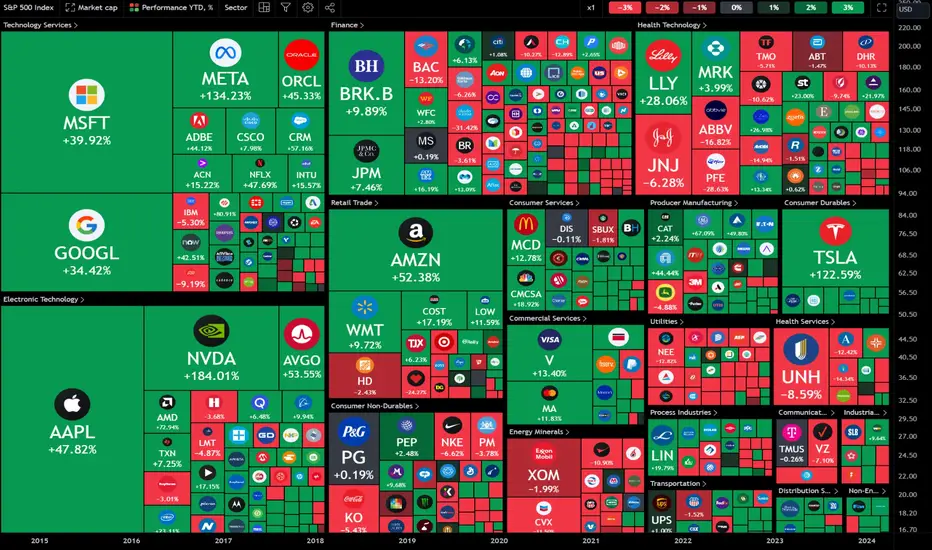
Scalp TradingWhat is scalping?
Scalp trading, also known as scalping, is a popular trading strategy characterised by relatively short time periods between the opening and closing of a trade.
Scalping is the shortest-term style of day trading that specialises in profiting from small changes in the price of assets. Its name derives from the way its goals are achieved – by skimming many small profits off a vast number of trades throughout the day.
The philosophy behind this technique is that small wins can easily morph into large gains. Scalping focuses on larger position sizes for smaller profits in the shortest period of holding time: from a few seconds to minutes. Rarely, it can last up to several hours. The main goal is to open a position at the ask or bid price and then quickly close the position a few points higher or lower for a profit. All positions are closed at the end of the trading day.
Traders who implement this strategy are referred to as scalpers. They believe that it's easier to profit from small moves in prices rather than from large ones. Scalpers can place up to a few hundred trades in a single day, seeking small profits.
You have to take into consideration that scalping trading requires some level of professionalism, as it is known as one of the most challenging trading styles to master. It requires razor-sharp focus and unbelievable discipline due to the fast-paced nature of scalp trading, where decisions should be taken within a few seconds. Therefore, a thought-out exit strategy should be developed by the trader in order to prevent potential large losses.
Scalp trading strategies and techniques
In fact, a scalper has a variety of ways to make money. Scalping can be used as a primary technique or a nice addition to your overall trading strategy.
A successful scalper is trying to work out price patterns, support and resistance, and technical indicator signals. To stay on top of scalping trading, you can focus on the various time frame interval charts, such as the one-minute and five-minute candlestick charts.
Scalping traders also commonly use momentum indicators, such as the stochastic oscillator, relative strength index (RSI) and moving average convergence divergence (MACD) oscillator. Price chart indicators, such as moving averages and Bollinger bands, can be employed too. You can also utilise some other technical analysis indicators as you please.
The most well-known scalping technique is simply using the market's time and sales to decide where and when to make trades. Another frequently used method is to have a defined profit target amount per trade that should be relative to the price of the asset – this can range between 0.1% to 0.25%. You can also track stocks breaking out to new daily highs or lows and employ Level II (the order book) to capture as much profit as possible. Lastly, some traders will follow the news and trade present or upcoming events that can cause increased volatility in some particular asset.
One of the most convenient ways to execute scalp trading, however, is through trading a contract for difference (CFD). CFDs allow you to leverage your money, providing you with the opportunity to take much larger positions with a smaller amount of initial capital. Leverage gives you an opportunity to magnify returns (as well as losses).
CFDs also give you an opportunity to trade an asset without ever taking ownership of it by simply speculating on its price direction. It provides greater liquidity and easier execution. Additionally, when you are scalping with CFDs, you don’t have to pay financing interest, as you don’t hold any positions overnight.
So, to be or not to be a scalper? It all really depends on your personal trading interests and goals. If you prefer quick trades and are eager to learn some new techniques, then, perhaps, scalping is for you. Certainly, this strategy can be quite challenging. If you’re a novice, it might be a good idea to practice with a demo account until you are ready to dive into the real game.
What you need to know about scalping
Just like any other technique used in trading, scalping has several characteristics that should be considered before you decide to add it to your overall strategy.
Firstly, what makes scalping so attractive to traders? One of the ponderable pros of a scalping strategy is that it gives a trader lower exposure to risk due to the relatively smaller position size – something we could all benefit from in today’s unpredictable markets.
Scalping offers a greater number of trading opportunities as smaller price moves are easier to enter. Plus, smaller moves happen more frequently than larger ones: even in relatively calm markets, there are still many small movements from which a scalper can benefit.
Additionally, you can place up to a hundred or more trades per day.
The main disadvantage of a scalping strategy is that not everyone is ready for such fast and demanding trading. It is profitable for some traders, but also brings its own share of risks. When scalping, precise timing and prompt execution are essential. If something in the market goes wrong, and you don't respond quickly, there is a high chance you can sustain some large losses. Think of scalping trading as a sprint, so you have to capitalise quickly on available opportunities.
How scalp trading works
A scalp trade is better described as an assumption that most securities will complete the first stage of a movement in a short span of time. When trading, scalpers want to profit from the changes in an asset's bid-ask spread. So, it is fair to say that scalping takes advantage of market volatility.
The scalp trader buys an asset when the spread between the bid and the ask is narrower than usual, with the ask lower and the bid higher than it normally is.
Conversely, the scalper sells when the spread between the bid and the ask is wider than usual, with the ask higher and the bid lower than it should be.
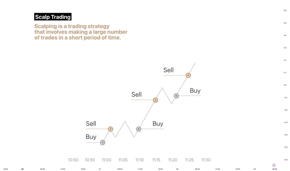
[Education] You Are Dumb For Not Using A Stop LossI always thought that stop losses are useless. Whenever I see price taps me out, and go in my direction. Whenever price comes close to my stop loss, the spread will somehow widen and take me out, and go in my direction. I was always angry about this.
“The broker must be trading against me! I must hide my stop loss!”
I stop using stop losses. For some trades, I won because price couldn’t tap me out and go in my direction. I thought I was a genius by not trading with a stop loss. I became confident. This worked until it didn’t work. It was NFP. It’s 10 seconds away from news release. I was trading a $1,000 account. My trade was in $8 drawdown. I looked at the chart, knowing that I will close the trade if it goes against me. The price became very volatile.
5…4…3…2…1…
Nothing happened. The price feed seemed to have lagged. A few seconds later, I saw an enormous bullish candle, against the direction of my trade. The $8 drawdown became $200 drawdown. I got wrecked. I’m supposed to close the trade at a 1% loss, and it became a 20% loss.
It’s fine. After a strong impulse, the price will retrace, right? I hoped for the price to make a bearish retracement. But every minute passed, and the chart prints more bullish candles.
I closed the trade at a $435 loss. What’s supposed to be a $10 loss turned out to be a $435 loss, 43x more than what I risked.
Types of Broker
When I started trading, I didn’t even know the existence of A-Book Brokers or B-Book Brokers. They do make a lot of difference in trading.
A-Book brokers route your trades directly to the forex liquidity providers, who in turn routes them to the interbank market.
B-Book brokers will trade against you. our profits are their losses, and your losses are their profits. There is a clear conflict of interest here.
The problem here is that you deposit your money into brokers without reputations.
Finding a reputable broker will reduce the probability of them purposely taking out your stop losses. But if you think about it, why would they want to take your $10 stop loss to ruin their reputation?
Your trade must be deep in drawdown often for your broker to manipulate your trades. You should relook into your strategy instead of blaming your brokers.
Impact On Psychology
Trading with a stop loss gives you a peace of mind. Imagine that I had use a stop loss on my NFP trade, I do not need to stalk my trade. I don’t need to worry that the server lagging, which made me unable to close my trade. Without using a stop loss, I can’t close my trade when price hits my stop loss level. This too can happen if your internet connection lagged or is down during that crucial period of time.
Your psychology must be very strong to trade without a stop loss. Believe me. You will wait for a few seconds to close. Hoping that trade will turn in your favor within that few seconds. You will end up losing more.
Trading with a stop loss is good for your trading psychology. You know that whatever happened, you will lose what you’ve risked. You do not need to stress that you might risk too much on a trade.
Trading is a marathon, but many of you have the wrong impression that this is a get-rich-quick hustle.
Consider trailing your stop loss when you’re in profit or set them to breakeven when the price moved.
Remember, anything can happen in the market. You might be in profit now, but the price can shoot past your stop loss the next minute. If you’re not fast enough to react, you will close your trade at an unfavorable price.
Taking Partial Profits
Taking partials is better for you. You don’t need to worry if there are any situation where you cannot close your trade in time.
Taking partials is important if you don’t want to shift your stop loss. Assume that your trade runs 1R in profit, you can close half. This yields 0.5R. You can choose to keep your original stop loss. When price comes back to take you out, your result will be breakeven.
Always remember, a small win is better than a full loss. Consistent small wins will be beneficial in prop firm challenges. Time limit will stress you out. Consistent small wins make you feel like you’re progressing towards passing the challenge.
Risk Management
There are a lot of ways to profitability. You can either have a high win rate, but low risk-to-reward ratio, or a low win rate, but high risk-to-reward ratio. I’m sure you want a high risk-to-reward ratio trading strategy. Before that, you have to understand how your psychology works. Are you able to execute the same trade that fits your trading strategy again and again? You need to follow your plan despite losing 10 or 20 trades in a row. Will you start to doubt your trading strategy? Your account balance going lower and lower every time you take a trade.
Once you’re trading live, you have to accept the risk for each trade you’re taking. You have to accept that you can be wrong more than you’re right. You cannot control the outcome of your trades. You can control the amount of risk you take per trade. I recommend risking 1% or lower for each trade. The goal here is to focus one capital preservation. By limiting your risk to 1% a trade, you are able to keep your account balance safe. Compare this to people who risk 20% or 50% a trade. In a few losing trades, their account balance will be very close to $0. These are the gamblers that do not have the right risk management skills.
News Trading
I always thought that trading news is the same as trading at any time of the day. Price will go to wherever it needs to go. Since my backtest don’t take into consideration of news, I can trade news in live market too. But after the incident where I lost 43x more than what I risked, I stopped trading news.
If I have an open position and in profit, I will close half of my position and shift my stop loss to breakeven.
If my position is in drawdown, I will close all the position. The risk of slippage does not justify the reward. If your normal RRR is 1:3 with a 33% win rate, the risk of slippage can turn your potential RRR to be 1:1 because you can potentially lose 3% instead of 1%.
Rewarding Journey
When I started to focus more on capital preservation, profits comes to me. It’s counterintuitive. It’s normal to think that to be profitable, we need to focus on profits.
Having a strict trade management helps a lot with my psychology. I know how many losses I will need to lose my account. Knowing this, it helps with my psychology as I give myself the room to make errors and take losses.
I know that my trading strategy is profitable in the long run. I know how much drawdown I can expect from my trading strategy.
To be like me, you need a lot of backtest data. I have 1,000 trades logged, which is why I am comfortable trusting my trading strategy.
Following to my trading plan allows me to not focus on the noises and my emotions. I trade mechanically.
This has allow me to pass various prop firm challenges and gotten various payouts. I have another payout that’s coming in this Tuesday.
I’ve always wondered what’s the feeling of constantly getting withdrawals. Now I know how it feels. I’m progressing ahead to leaving my 9 – 5 job. My 2023 goal was to get funded and get 1 payout. It’s not even the end of June 2023 yet, and I’ve achieved my goal.
Right now I’m accumulating more accounts from all my payouts. It will take awhile, but I will reach my next milestone of managing $600,000 soon enough.
Accountability Partner
The hardest part of trading alone is sticking to your own rules. In a day job, you report to your manager and boss. When you’re trading, you’re reporting to yourself. It is hard to be accountable to yourself.
Having an accountability partner or a mentor is the best solution to solve this problem.
Do you know why legends like Oprah Winfrey has a coach? A coach gives guidance and a holistic review on your performance. They act as an accountability partner. They push you and hold you accountable for your actions.
Having someone there for you when you feel down and unmotivated can be motivating.
It’s hard to find a suitable mentor or accountability partner given the nature of the financial market. There are a lot of scammers out there selling course materials which you can find online. You need to know that the person selling the course or mentorship does not rely on sales for a living. But instead, he must be earning most of his income from trading. Look at his content, see if they resonates with you. Look at his track record, are they afraid of showing 3rd party verification? Do they only show you screenshots of trades that have already happened? Do they only show their results on excel sheet?
If you’ve been following me on my journey, you would have seen my progression. I’ve manage to break free of my unprofitable self to a consistent profitable trader now.
Remember, trading is not an easy hustle. It take years of hard work, losses and, breakeven to achieve consistent profitability.
Stay consistent. Stay safe. Success is just around the corner.
If you enjoy such content, feel free to click the like button and subscribe for more.
Let me know what are your thoughts and learning points in the comments below so others can learn from you too!
Please let me know what kind of topic you would like to read next :)
The Power of Volume: Understanding Volume Analysis in TradingIn the dynamic world of financial markets, successful traders know that understanding volume analysis is crucial for making informed trading decisions. Volume, the number of shares or contracts traded during a given period, provides valuable insights into market dynamics and helps identify potential trends, reversals, and the strength of price movements. In this Educational article, we will explore the power of volume and its significance in trading, uncovering the key principles of volume analysis, practical strategies for incorporating it into your trading toolkit.
📊 The Basics of Volume Analysis 📊
Volume analysis is the study of trading activity represented by the volume of shares or contracts traded within a specified time frame. By analyzing volume alongside price movements, traders gain insights into market sentiment, liquidity, and the overall strength of a trend. Here are some fundamental concepts to consider:
Volume and Price Relationship: Volume often accompanies significant price moves. When volume surges during an uptrend or downtrend, it suggests increased participation and conviction from market participants. Conversely, low volume during consolidations or indecisive periods can indicate a lack of interest or involvement.
Volume Patterns: Patterns in volume can reveal important clues about market dynamics. For example, a gradual increase in volume during an uptrend may suggest a healthy and sustainable trend, while a sudden spike in volume near key support or resistance levels could signal potential reversals.
📊 Analyzing Volume in Different Market Scenarios 📊
Volume analysis can be applied across various market scenarios to gain insights into the underlying dynamics. Here are a few examples:
Breakouts: When a stock or asset price breaks out of a key resistance level with high volume, it suggests strong buying interest and potential continuation of the uptrend.
Reversals: A significant increase in volume accompanied by a sharp price reversal may indicate a trend exhaustion and potential reversal. Volume analysis helps validate potential reversal signals.
Divergence: When the price is moving in one direction while volume is moving in the opposite direction, it can indicate a weakening trend. Divergences between volume and price can provide valuable early signals of trend reversals.
Example: FINPIPE _ breakout with huge volume & reversal candle at retest (at support) of breakout with huge volume
📊 Integrating Volume Analysis into Your Trading Strategy 📊
To effectively incorporate volume analysis into your trading strategy, consider the following tips:
Confirmation: Volume analysis can act as a confirmation tool for other technical indicators or chart patterns. For example, if a price breakout occurs with high volume, it confirms the strength of the breakout.
Relative Volume: Compare current volume to historical averages to gauge the intensity of trading activity. Unusually high or low volume relative to average volume can highlight potential trading opportunities.
Multiple Time Frames: Analyzing volume across different time frames can provide a broader perspective on market dynamics. Higher time frames can reveal long-term trends, while lower time frames offer insights into intraday trading activity.
📊 Volume Indicators 📊
To assist traders in analyzing volume effectively, several technical indicators have been developed. These indicators help visualize and interpret volume data in meaningful ways. Here are a few commonly used volume indicators:
Volume: The most basic volume indicator, volume bars represent the volume traded during each price bar or candlestick. By comparing the height of volume bars across different periods, traders can identify anomalies or significant shifts in trading activity.
Moving Average in volume indicator: Moving Average calculates the average volume over a specified period. It smoothens out volume data, making it easier to identify volume spikes.
On-Balance Volume (OBV): OBV measures the cumulative volume by adding or subtracting the volume based on whether prices close higher or lower. It helps identify periods of accumulation or distribution and can provide early signals of trend reversals.
Wave Volume Divergence: A unique addition to volume indicators, this indicator enhances volume analysis by providing wave volume divergence and cumulative volume information. Traders can utilize this indicator to identify potential divergences between volume and price, as well as observe the cumulative volume trends.
If you found this article helpful, please give it a like and feel free to share your observations in the comments section. Your support and feedback are highly appreciated, as they keep me motivated to write consistently.
Thank you for your support, likes, follows, and comments! For more articles and trade setups, don't forget to follow me on TradingView: in.tradingview.com
Keep exploring the power of volume analysis, and remember:
🌟 "Success in trading comes to those who diligently study the market and adapt their strategies." 🌟
📊🚀📈 #TradingView #TechnicalAnalysis #VolumeAnalysis #MarketInsights