Understanding Market Structure. Quick tips and tricksIf you learned something from this please give this video a thumbs up and follow me for more content.
Thank you guys. Happy new year
Multiple Time Frame Analysis

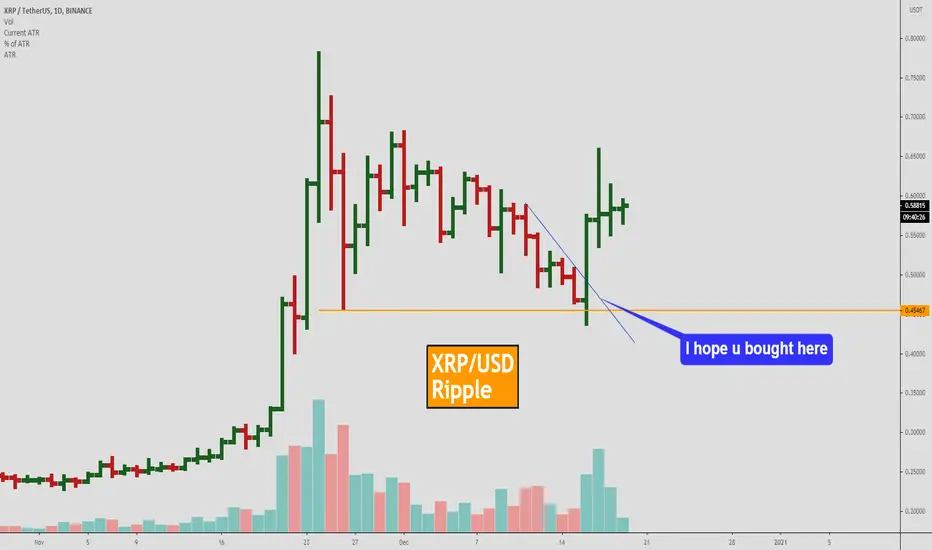
How to trade XRP. 3 Best and simpliest trading strategies. My Friend. Here will be the best patterns that work on Crypto and XRP:
1. False break out of key level
- U should wait for a pullback to a strong key level.
- Better when a false breakout happens after 100% of ATR drop.
example
2. Wage patten
This BNB trade is the best example.
We made 3% within 1 day))
3. Squezeeng to a key level
The best example will be on EUR/USD but it also works on Crypto and XRP.
I just showed you 3 best examples of how can buy XRP. Wait for one of these scenarios.
My Friends, if u want to learn how to trade crypto and make money on it write to us about education. Below this video will be a link which u can use for it. Because we closed the last 2 weeks with 80% of the profit. You also can learn how to do it.
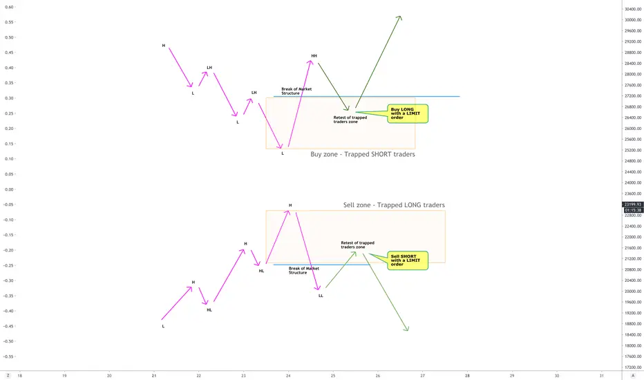
My trading strategies : Trade against the trapped trader!STRAT 11 : Basic premise
As price continues in a trend, more and more traders keep piling into the same direction, hoping that the trend will continue and they will make money. However, at some point, the trend sharply reverses, breaking the market structure in opposite direction and trapping a whole bunch of retail traders in the direction of trend which just got reversed.
We create a zone which identifies these trapped traders and then patiently wait for them to exit, and trade with limit orders in the direction of their exit.
You can add additional confirmation signals from DXY's directions for the instruments which are highly correlated to DXY (EURUSD, USDCHF, etc)
The Ace Spectrum as a Template for Support ProjectionDemonstrating the big idea: That straight lines in log-space form exponential curves.
This property of the log chart is useful for examining assets with exponential growth (like high-growth stocks, cryptos, etc).
Because the log scale asymptotically approaches the absolute scale as y slice decreases, this indicator is really applicable to any time scale.
This indicator samples a distribution of lines from the past and projects them into the future, these projected lines form indicators of prior support.
The idea is longer support at those specific lines is indicative of support strength, which this indicator approximately captures.
My initial goal was to capture this intuition about exponential growth in log spaces by applying a monte-carlo style sampling approach to visualize the latent support lines.
After I had captured that in a slightly more complex version of this indicator, my goal was to distill the concept into the simplest possible implementation.

How to Trade Break of Structure & RetestSo in this video I show you how you could have entered last weeks GBP trades.
Let me know if you have any question and don't forget to like and follow for more content.
Thank you

How to Counter Trend Trade (Divergence)This is a quick tutorial on how to trade against the trend for a possible reversal. I think this might be the best strategy online for counter-trend
Feel free to ask any question and don't forget to like the video and follow me for more set ups and tutorials
Thank you

EDUCATION _Types of Trend. Wavelike trends.The basis of the technical analysis is the trend. It is a price movement in a certain direction.
Upward trend:
Trend down:
Between trends, the price likes to relax in the lateral movement, when the trend itself is absent:
Wavelike trends.
Unfortunately, if the trends were straight as an arrow, your cat would be able to earn. However, trends rarely go straight. Usually, this is a combination of the highest and lowest levels, of which the trend consists. For example, an upward trend can often be broken down into such micro waves:
In reality, the waves, of course, are not as beautiful as on the scheme, and in a smooth beautiful trend price moves rarely (although, sometimes, it happens).
The next post will be about the duration of trends.
Friends, push the like button, write a comment, and share with your mates - that would be the best THANK YOU.

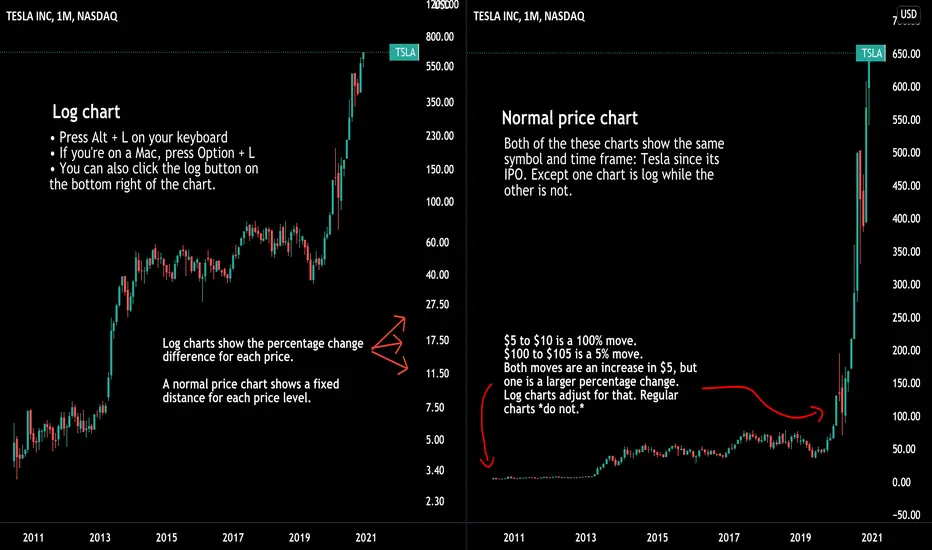
How to use log charts and why they're importantThe two charts in this idea show Tesla's stock price since its IPO. The only difference is one chart is a log chart and the other is a normal linear price chart. That's why they look different. Understanding log charts and normal linear charts is an important skill for all traders and investors. Especially when looking at price changes over long periods of time.
The chart on the left is a log chart of Tesla and the chart on the right is a linear price chart of Tesla. Log charts show the percentage change difference between prices while a normal linear chart shows a fixed distance between prices. Take one more look at both charts above. If you still don't fully understand what they show, don't worry, keep reading. 😁
Let's say Tesla, back in its early days as a publicly traded company, spiked from $5 per share to $10 per share. That is a 100% move. You would have doubled your money. A few years later, Tesla reached $100 per share and then spiked to $105 per share. That is only a 5% move. Both price moves in this example represent an increase of $5 per share, but one is a much larger percentage change. That's where log charts come in handy - they show this percentage change! On a normal chart, however, each price level is shown at a fixed distance. So a move from $5 to $10 is shown in the same way as a move from $100 to $105.
Getting started with log charts is fast and easy:
1. If you're on a PC, press Alt + L on your keyboard. This keyboard combination will quickly adjust your chart to log. You can press that combination again to return to a normal linear price chart.
2. If you're on a Mac, press Option + L. You can quickly switch between log charts with this combination on your Mac.
3. You can also click the log button located near the bottom right of the chart to toggle it on or off.
One more tip: hover your mouse over the price scale, then click, hold, and drag it up or down to compress or decompress the price scale. This simple tip gives you more control over the price scale for both log and normal linear charts.
So how should you use log charts going forward?
The most important thing to know you have the tools to analyze price action in multiple ways. Always compare and contrast by viewing both charts when necessary. New traders and investors are always surprised by how much more information a log chart shows over long periods of time. Additionally, comparing log charts to normal linear price charts can unlock new insights. The two Tesla charts in this example demonstrate that perfectly. One chart looks parabolic, noisy, and slightly messy. The other is spaced out, shows defined trends, and makes trading ranges impossible to miss.
Thanks for reading! As always, please leave questions or comments below. If you have a product request or feature need, please also write that in the comments. Our team will help.
Simple and effective use of Fibonacci correction levels Hello, Traders!
Today I will explain how to use a trading strategy based on correctional Fibonacci levels as simple and rational as possible.
Using the ZIL example, we will highlight the period from November 4 to 25, where the price has entered an uptrend.
Our task is to stretch the Fib retracement from the beginning of $0.01666 until the end of the uptrend of $0.03681.
We place 4 buy orders at correctional Fibonacci levels :
0.382 (0.02911) - 10% of the transaction amount
0.50 (0.02674) - 20% of the transaction amount
0.618 (0.2436) - 30% of the transaction amount
0.786 (0.2097) - 40% of the transaction amount
SL should be placed under the level 0.786. In our case, it is 0.01921 $.
The average price of entering the transaction, in this case, will be $ 0.2396. Thus, the stronger the price is corrected, the less the drop will be relative to the average entry price.
The correction levels of Fibonacci from 0.618 to 0.0 of upward movement will be the targets.
As a rule, after the correction, the price bounces from the levels and we will have an opportunity to close a deal at least without losses, and at best make a good profit.
This is a very simple and effective strategy that has proven itself not only on a daily timeframe, it can also be used on shorter price movements. It can also be used on other price movements like H4 or H1 timeframes.
Leave your feedback below and good luck!

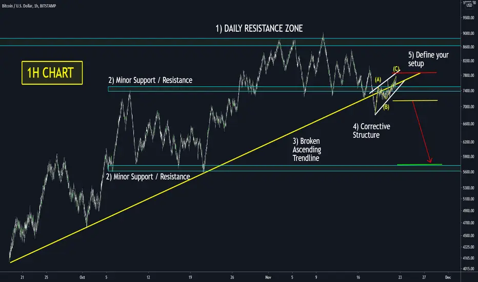
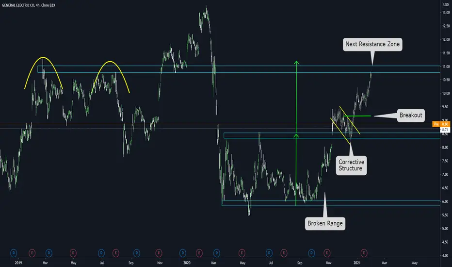
Learn how to create a setup using 5 price action itemsToday we will learn how to create a full setup using 5 Price Action items. This process will be made on the 1H chart and is extremely useful for Swing setups. However, the logic can be applied in any timeframe. This can also be applied to any direction today; we will work with a short setup, but it is the same for a long setup.
1) Daily Resistance zone: If we are working on the 1H chart and the price is about to face a Daily Resistance zone, we should expect a reaction there; WHY? Because The higher the timeframe of a level, the stronger it is, and we should be ready for a reaction there. This should be the first filter to use: The price is about to face a higher degree zone.
2)Define the minor support and resistances of the current trend: If we are waiting for a reaction on the Daily Resistance zone, it is essential to understand the levels we have on the current trend. WHY? Because we will use them to define the next target and the Corrective structure's location to trade.
3)Wait for the breakout of a relevant trendline: In this case, we want to see the price breaking the Ascending trendline; WHY? Because that would be a signal that the Reversal movement on the Daily level is going as expected. The breakout of the Ascending trendline is a key element: Know the conditions are optimal to start thinking on a short setup.
4) Wait for a corrective Structure on the minor Support zone: Corrective Structures are ABC or ABCDE patterns. You should be able to draw edges on that sideways movement. You can define that is ready when you have something like the example you see on the chart.
5) Now, everything is aligned to develop a setup. Your bearish idea is supported with all the previous 4 items; only at that moment you can say I will create a short setup. Define your entry-level below the structure or below "B, set your stop above "C". Define your Target on the next minor support/resistance zone. Pay attention to the risk-reward ratio you have; only take setups with a R/R ratio higher than 1.5
Thanks for reading! We hope this Template can help you with your trading.
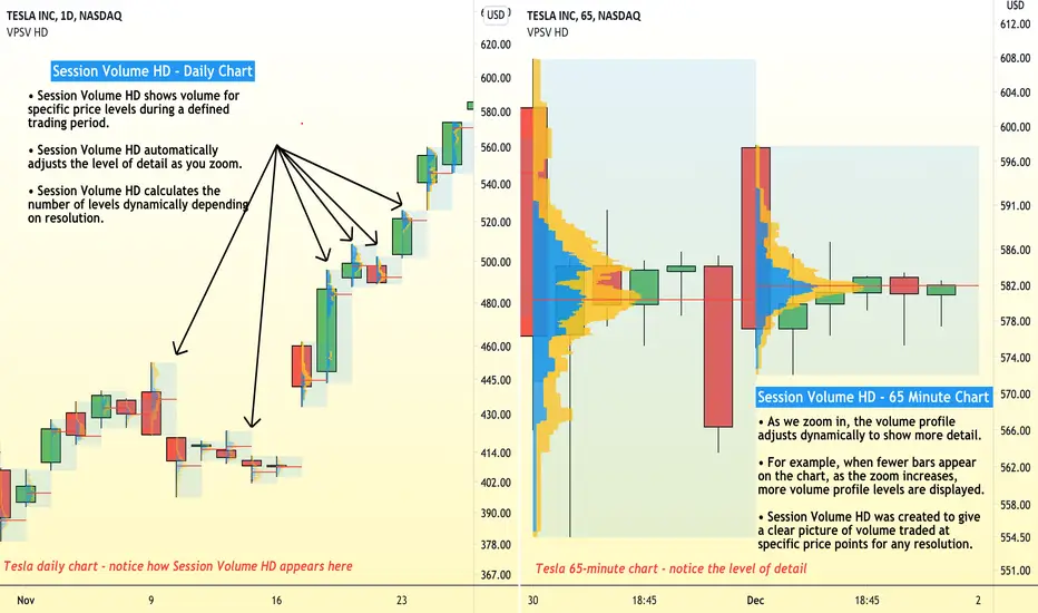
How to use Session Volume HD to study price and volumeSession Volume HD was created to add a new level of detail and precision to studying price and volume for each session of trading. Session Volume HD dynamically adjusts to show you more data as you zoom in and out of the chart.
Think of Session Volume HD like a magnifying glass for studying volume and price. What price levels are attracting the most trading volume? How does that change as we zoom in or out of a specific trading session? With Session Volume HD , the more you zoom, the more detail you will see about price and volume for a specific trading day. It's a perfect tool for traders and investors who quickly zoom in and out and change their chart resolution.
In the example above, we are looking at two charts of Tesla both set to different timeframes and resolutions. Do you see the difference between the Volume Profiles shown on each chart? The chart on the left is a daily chart dating back to November. The chart on the right is a 65-minute chart zoomed in on only the last few days of trading. Both charts are using Session Volume HD to display a Volume Profile analysis, but each chart shows a different level of detail. That's because the Session Volume HD tool is dynamically adjusting as we zoom in or out. In other words, as the zoom increases, more volume profile levels are displayed.
As you begin to understand and use Session Volume HD , it's important to remember that the tool can be customized to your needs and observations. Open its settings to get started. Every trader and investor has their own methodology and these settings will help you create your own unique style of research:
Point of Control ( POC ) – The price level for the time period with the highest traded volume . This the red line shown on both charts within each Volume Profile region.
Up Volume - Determines the color for the Up Volume or points where buying occurred and price increased.
Down Volume - Determines the color for the Down Volume or points where selling occurred and price decreased.
Value Area Up - Determines the color for the Value Area Up or where buying occurred in a high volume zone, say 70% of all tradable volume .
Value Area Down - Determines the color for the Value Area Down or where selling occurred in a high volume zone, say 70% of all tradable volume .
Profile High – The highest reached price level during the specified time period.
Profile Low – The lowest reached price level during the specified time period.
Value Area (VA) – The range of price levels in which a specified percentage of all volume was traded during the time period. Typically, this percentage is set to 70% however it is up to the trader’s discretion.
Value Area High (VAH) – The highest price level within the value area.
Value Area Low ( VAL ) – The lowest price level within the value area.
We hope this tutorial helps you understand the power of Session Volume HD and other Volume Profile tools. More importantly, we hope it helps you understand all of the features, customizations, and functionality that come with them. Session Volume HD is one of the Volume Profile tools available to you and it's particularly helpful when zooming in and out of the chart, changing timeframes, and looking for additional detail as you study a specific session of trading.
Thanks for reading and please leave any feedback or comments below. If you want to see more Volume Profile tools or features - we want to hear about it! We just may build it for you.
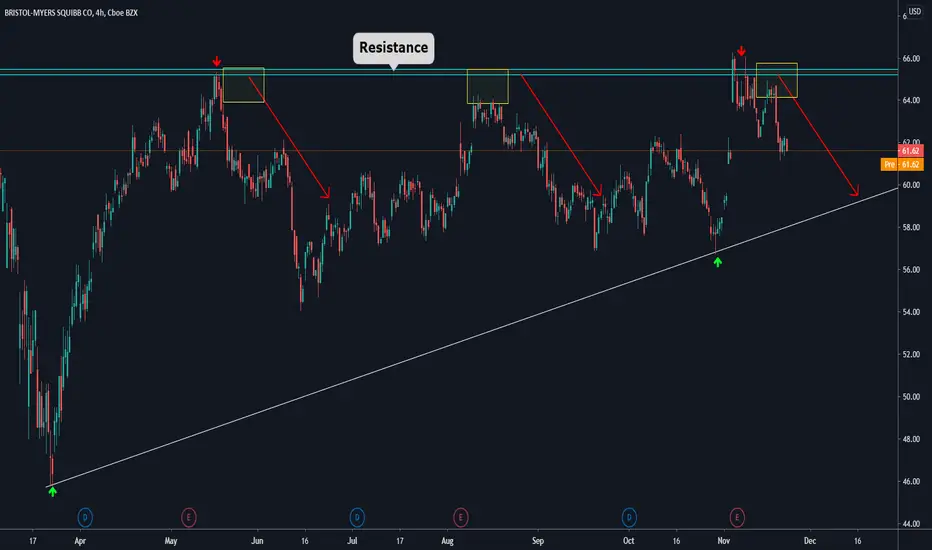
How to Develop a Short Trade using Top-Down AnalysisGood morning traders!
Today we want to show you a practical case of how to apply multiple timeframes for the complete development of a trade. In this case it is BMY stock, and it is a trade that we ourselves will take if what we are expecting happens.
🔸What can we find in this chart?
- First, what we can see is that in the 4H timeframe, the price has been moving in a range of 15-20% since May.
- A few days ago, the price faced the resistance zone that is around $64-66. We consider it a resistance zone since every time the price reaches that level, it encounters a strong supply, which generates its subsequent downward movement.
- Based on this, we decided that once a clear rejection was given, we would look for an opportunity to take a short trade.
🔸Descending to the 15Min chart, we see that after the rejection in the Resistance zone, the price generates a breakout of the Ascending Trendline.
- Added to this behavior, the Support zone is penetrated strongly to the downside, and then the price consolidates forming a corrective structure in a pullback to the Resistance zone (previous support).
- This is our opportunity to look for a short trade.
- The corrective structure offers us a correct and safe R/R ratio.
- The point where we will look for the entry of the trade will be in the breakout of the local low, with a stop loss behind the structure and the resistance zone.
- And finally, the maximum target of the movement is the uptrend line.
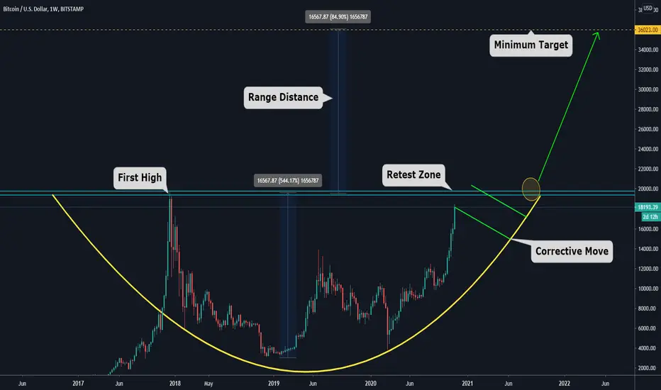
BITCOIN Minimum Target: $36000 - Full ExplanationGood morning traders! We hope you are having a beautiful day.
🔸Today we want to show you our vision of bitcoin in the short-medium term and explain why we see it extremely bullish.
- Speaking a bit of the context and history, we can see that bitcoin hits all-time highs in late 2017, reaching almost $20,000. After this, there came an abrupt decline that found its lows around $ 3000. From there, the upward movement has been resumed.
- During this year, this crypto has made almost a 200% bullish movement.
- Analyzing the behavior of the chart, we see that it has potential to be a Cup and Handle movement pattern.
🔸Now we go with a little of theory:
- The cup and handle pattern implies a movement in the price that makes a high, a decline correcting movement, a consolidation at lows, and then the subsequent upward recovery. You can clearly see the transition from lower lows and highs to higher lows and highs. After this, it needs a retest of the previous highs (double top pattern), and for a bullish corrective move.
🔸Now, does this imply that bitcoin is going to breakout and make an explosive bullish move imminently?
- We do not know, but according to the characteristics of this pattern, no.
- What we should expect is a retest of the Resistance zone (all-time highs), and then a corrective move (flag, triangle, pennant, etc.).
Once formed, the idea is to trade the breakout.
- The MINIMUM target of the movement is calculated by measuring the distance between the minimum of the range and the maximum.
- This calculation gives us a distance of $16500-$16600, which, projecting it upwards, gives us an approximate target of $36000.
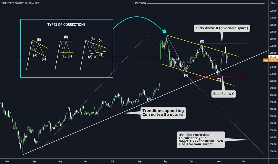
How to use Corrective Structures to develop a SetupGreat day to learn something, today; we will understand how to use corrective structures to develop a setup on any chart.
a) There are 3 types of Corrective Structures, Zig-Zag (first example), Flat (Second Example), Triangles (third example). Use them as an archetype to spot them on a chart.
b) Now that you understand the types of corrective structures is time to look at one on the chart ( you can see a Flag Pattern on the real chart)
c) Should I trade all the corrective structures I see? NO, YOU DONT! You need Context. Your corrective structure must be well-positioned on the chart, it can be a Trendline, or it can be a Support. Never trade isolated patterns.
d) Then you need a clear path in the direction you are expecting. In this case, we are at All-time Highs, so we don't have any Resistance
e) How can I calculate my target? Use Fibonacci Extensions. Draw it from the base of the impulse towards its top (where the corrective structure starts) and then take it back to the impulse's bottom. Pay attention to 2 levels only 1.27 for Break Even, and 1.618 for Target
f) Only take setups with a risk-reward ratio higher than 1.5
Have a Great Day!!!
How to Trade the Breakout of a Range 101In this post, we will learn how to trade the breakout of a clear range. Let's start learning.
a) First of all, we need a clear Range ( we can say that is clear when we have a support and a resistance level and the price in between for a considerable amount of time)
b) From a technical perspective, the expected movement after a range is broken is the extension of it in the broken direction (green arrow)
c) Also, we will see how that projected movement fits in the context of the chart. In this case, we will look for the next resistance zone.
d) The correct way of identifying a resistance zone is by looking for clear reversal movements in the past. Ignore small corrections. Look for reversal movement and define it with a horizontal line ( in this case, we used 2 yellow arcs to show the idea)
e) Now you can see two things. 1) The projected distance of the range is very similar to the distance towards the next resistance zone 2) You have good space to try to catch a wave
f) But how can I trade a situation like this? You need a CONFIRMATION. In this case, we always wait for corrective structures (remember that corrective structures can be Flat, Zig Zag, Triangles, or Irregulars)
g) Wait for a clear corrective structure on the Edge of the broken Range. IF that happens, you need to define its edges, and from now, it's straightforward. (You can also look for a corrective structure on a lower timeframe; for example, if you define the range on the 4HS chart, you can change your timeframe to the 1H chart.)
h) Open positions on the Breakout of the structure, Set stop loss below the structure, Set take profit on the next resistance zone, Define the risk you will take on the trade
i) Use this as an archetype on how to trade this type of structure.
Have a great day!
How I get really good conistent wins in the market SIMPLE WAYPrice above 50 MA its a buyers market, when below it's a sellers market. Pay attention to the risk management and entry rules. Like to let me know if I should share more, comment questions.

What Time Frame is better? - Trading PillThere is no better or worse time frame for trading, we just need to understand that for every time frame we can expect different results and find the one is right for everyone of us.

Managing Risk using the Long and Short ToolThis is a companion video to my "Trade Like a Pirate" article showing how the Long & Short tool can help you manage your "aRRR" - Your Reward-to-Risk Ratio. Whether you are trading a Company, a Currency, or Commodity, you want to Consistently trade your positions in terms of Risk and Reward for consistent results and to not "blow up your account" with a bad trade.

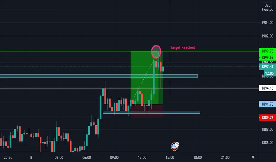
Gold 100 pips Buy Breakdown 1890-1900Gold had formed a clear support during London Session on the 30m and 1h timeframes. We had strong bullish momentum so my bias was bullish in the short term. I then switched down to the 15m timeframe to look for a good entry to minimise drawdown.
When a bullish 15m candle closed starting from support, I waited for the next candle to form bullish and my final confirmation was that it broke the high of the previous bullish 15m candle. Then I entered the trade.
My stops were below the 15m wick rejections and my two targets were 1897 and 1900.
Both targets were smashed within a few hours with very minimal drawdown.
If any candle from 15m upwards closed below support, I would have closed my positions as it was invalidate the setup.
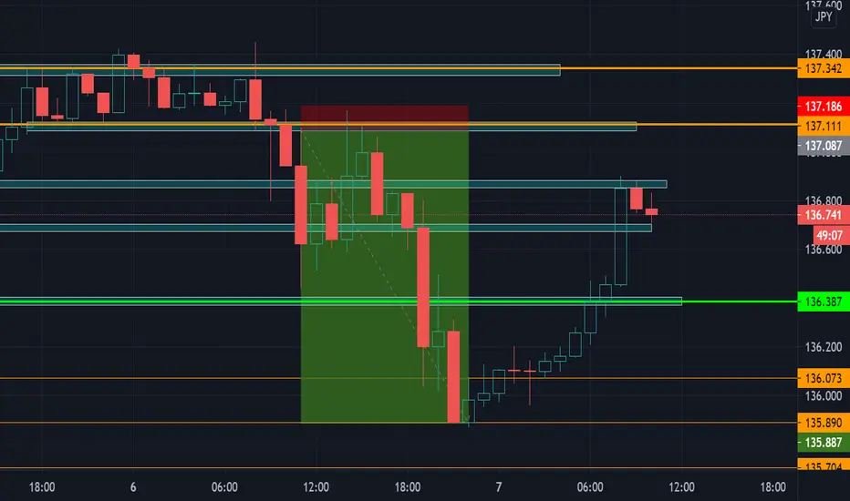
GJ 120 pips Sells BreakdownPrice broke below the support we highlighted, however as there was no lower wick on the 1h breakout candle, price had no clear range to move down, so instead of moving to the lower timeframes to look for selling confirmations, I stayed on the 1h timeframe and decided to look for a break and retest setup, as it was not on a lower timeframe my confidence for this trade was pretty good.
As soon as we tapped into the broken support zone, I took an entry with half of my usual risk, stops were above the previous candle and my TP was highlighted on the chart.
Profits were taken at each of the support zones as we tapped into them, this lowered our risk and secured profits.
When we hit our final target, we removed our TP and let 10% of the trade run, the target for this was 135.887, as this was a possible rejection zone and also 120 pips profit. This target was also hit before price formed support to continue back up.
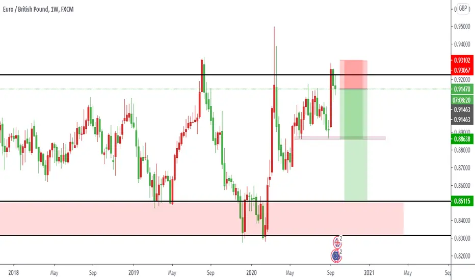
EURGBP rejected at a strong resistanceThe pair EURGBP has been rejected at a strong resistance that was established in October 2016. The other traders will be looking at that important resistance to make portfolio changing decisions.
GBPAUD - Full Analysis BreakdownWelcome traders to a free analysis breakdown.
Today I am highlighting possible trades on GBPAUD, if you any questions on the pair let me know in the comment section below.
I will be looking to take a trade on the pair if our trading rules are met over the next few days.
I would suggest keeping this pair in your watchlist to see if your own rules are met. If you take a trade from the analysis in the video leave a comment in the section below.
If you enjoyed the free analysis break down please like and follow the channel, this will support the creation of more free education.
Once the pair has met one of valid rules for entry I will be sharing the trade with the Alpha community.
Feel free to comment below a topic you would like me to cover in the up and coming videos.
Trade Safe
Alpha Trading Group.

Simple rules to understand Supports and Resistances behaviour The idea of this post is to use this current scenario to provide an idea of how to work with clear Support and Resistances zones.
a) LOOK AT THE PAST: What we mean by this is to look for zones that you can define as reversal areas (support/resistance), this must be Evident if it is not then you should not be paying attention to that chart
b) Once you have found a situation in the past that is clear enough, you can think that similarities may happen to the current scenario, For example, we would say something like: The price will reverse towards a similar level as it happened on the past
c) Be ready to be wrong: We don't know what the price is going to do precisely, BUT we can assume two situations, either will break a level, or it will reverse on a level. Let's take the previous support zone as an example. We had an evident support zone, and the price dint reversed there, BUT the price stop for a while. so we can make a rule like this:
-IF the price breaks a clear support/resistance zone; first, it will tend to stop there and make a sideways movement for a while before continuing
-IF the price reversed on a level, I should see similarities to previous situations, and I can use it as models to follow and wait for triggers or signals that I saw worked before
d)LAST RULE: The price moves between specific Support and Resistance zones following the previous 2 ideas about breaking a level or reversing on a level / Take a look how the price broke the last zone support, making a sideways movement first. After that, the bearish movement continued and now has reached the next support zone, there we should think again that both scenarios can happen, and just react to the more evident one.
