Day Traders (U.S.) Call it a Day!take a look at this video if you want to see how I set up a range based on daily ATR and figure a valid "day trading range"
Multiple Time Frame Analysis

New Month/Week/Day, New Range. How to Determine a Trading Rangethe average true range indicator and a simple trading view tool make it very easy to visualize a price range for (day) trading

DO NOT Day-Trade Forex Without Watching This Video (US traders)This is the biggest misconception I see with (new) U.S. traders - day traders especially - and nobody is talking about this! You need to learn when the daily candle prints!!
If your guru didn't teach you this.. it's probably time to find a new one..

How to Determine a Day Trading Range with ATRWhen I put these two tricks together, entering low time frame positions got way smoother. Give it a try and see if it clicks for you—I'm hope you find this valuable 🚀

Introduction to Trading: Multiple Time Frame AnalysisI'm here to simplify your approach, offering clarity to decipher market movements. Let's demystify multiple timeframe analysis and pave the way for a more straightforward and effective trading journey. Subscribe now, hit the like button, and let's embark on this knowledge-packed exploration!

INTRODUCTION TO TOP-DOWN ANALYSIS
Top-down analysis is a comprehensive strategy that begins with a broad picture of the market and progressively focuses in on details. It incorporates a number of time frames, economic indicators, and analytical tools to give traders a comprehensive grasp of the market environment.
In my few years of trading the financial markets, I have found that trading is one of the most inclusive career of all. When I say inclusive, I am not talking about it's absorption in terms of gender or race. I am talking about the strategies traders use. The strategies I have seen in my life, both profitable and unprofitable, are so many that I almost drowned because I wanted to learn every single one of them.
Now let's dive deeper and get an understanding of what top down analysis encompasses.
1. Weekly and Monthly chart (Long term analysis)
The weekly and monthly charts, which offer a macro view of the market, are at the top of the analysis pyramid. Significant price patterns, important support and resistance levels, and big trends are all easier to spot on these longer time frames for traders.
2. Daily and 4 hr chart (Medium term analysis)
As you proceed down the pyramid, traders examine daily and 4-hour charts in greater detail to learn more about the intermediate-term dynamics of the market. Here, you can spot possible patterns like trend line breaks or head and shoulders formations that could indicate a reversal or continuation.
3. 1 hr to 5 min chart ( Short term analysis)
The last level of top-down analysis looks at charts with shorter time frames, like the one-hour and five-minute charts. Traders can determine exact entry and exit points for their trades with this fine-grained view which helps to increase the accuracy of your entries.
Top-down Analysis and the fractal nature of price
In the context of forex trading, the term "fractals" refers to the recurrence of similar price patterns over different time frames. This fractal nature is articulately shown by top-down analysis, which shows how patterns found on higher time frames repeat themselves on lower ones. A weekly chart showing a double top formation, for example, could also show up as a lower time frame double top on a 4-hour chart and a smaller version on a 5-minute chart.
In conclusion:
Top-down analysis is a great tool which reveals the fractal nature of price movements and offers an in-depth view of the market. Traders can make well-informed decisions that take into account both the short-term dynamics and the broader market trends by integrating insights from weekly to 5-minute charts.
Gaining insight into how these various time frames interact improves a trader's flexibility in the face of shifting market conditions and raises the probability of profitable trades.
N/B: The chart image shows a EUR/USD chart outlining High time frame and Low time frame levels that would be utilized as you branch out/narrow down.
PS: The next release in this series will be out soon.

How to Trade Fibonacci like TRADER9224The golden ratio is everywhere! It's even in the charts.. In this video, I go over how I use price action and Fib levels to get a general sense of the market.
💡 Why Follow?
Gain insights into my Fibonacci approach.
Track the progress of the 100k funded account.
Participate in discussions to enhance our trading knowledge.

TRADER9224, DXY, and Fibonacci :DVOLUME WARNING! My computer's mic is insane and I don't have any recording equipment so I apologize for the lack of video quality. Hopefully, my insights make up for that. Here is a quick video previewing my trading system and what I will be looking for in the next week of trading.
💡 Why Follow?
Gain insights into my Fibonacci approach.
Track the progress of the 100k funded account.
Participate in discussions to enhance our trading knowledge.

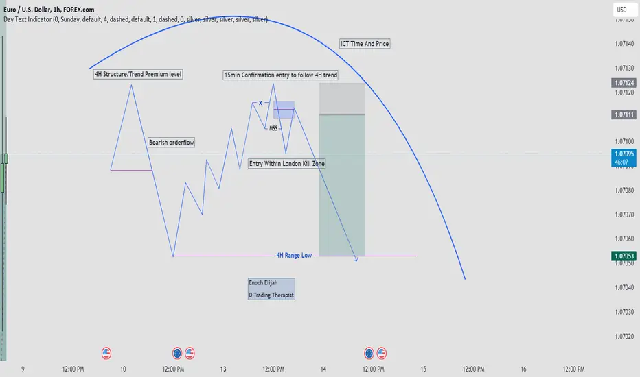
This is My Favourite ICT Day Trading ModelHello traders,
This is the complete breakdown of my favourite ICT Day Trading Model.
This is so easy to replicate on any two time frames. One must be higher, while the second one which is for entry should be lower.
The higher time frame is for market direction, orderflow, trend.
Identify your discount and premium levels on higher time frame.
above 50% of your fib is premium, while below 50% is your discount.
If price is bearish, you are to look for sell opportunities when price retrace back to your premium levels.
Then go to your lower time frame to look for selling opportunities.
Your entry should be taken mostly within London kill zone.
For you to have a quality A+ trade setup, time and price must align together with your trade idea.
Your trade idea have a high probability of working out if you take your entry within London Kill Zone.
Look at my chart diagram to understand the model.
Trade Reversals Successfully - Key Price Action to look forIn the video I talk through the two trades namely trading continuation with Trend and then trading Countertrend Reversals. Both have their own price action points but are very different.
I review a continuation trade and the setups I look for when trading from level to level...but the main focus on the video is trading Reversals which can be very rewarding but also very difficult.
I like to stick to a few key points when looking for reversals, and they are :-
- Trade off an extension into a key level
- Trade off a higher low (for buys) or lower high (for sells)
- M pattern for entry confirmation or a minor lower high
In the video I explain the reasoning and how risk is managed.
** If you like the content then take a look at the profile to get more daily ideas and learning material **
** Comments and likes are greatly appreciated **

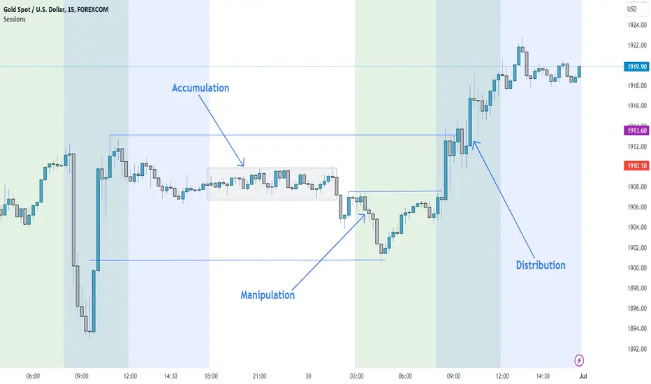
What is ICT Power of 3?Power of 3 at work on Gold producing a 8.6RR move on 30/06/2023
FOREXCOM:XAUUSD
Ict power of 3 is a strategy that reveal the market maker algorithm model for price delivery.
Power of 3 simply means there are 3 things market makers algorithm do with price in ever trading days.
Those 3 things are; Accumulation, Manipulation and Distribution.
AMD:
A: Accumulation
M: Manipulation
D: Distribution
1. Accumulation: They accumulate liquidity through the delivery of a ranging market.
The purpose for delivering a ranging market is to induce both buyers and sellers to enter the market thinking that price will go in their direction.
2. Manipulation: After accumulating both buying and sell orders, they then manipulate the market to further induce another set of traders which are breakout traders.
But, that particular manipulation move is not their intended direction for the day. They only use it to gather liquidity, Which will then lead them to the next action which is to move and distribute price in their real direction for the day.
3. Distribution: After manipulating price to a particular direction different from their plan, they then distribute price to their original intended direction.
e.g to buy, they will first sell the market and then buy at the discount price level.
Example of Power of 3 on Gold
AMD:
A: Accumulation
M: Manipulation
D: Distribution
Accumulation : Price range during Asian session, accumulating liquidity on both sides of long and shorts.
Manipulation : Price broke the low of the accumulation during London session to take out sell side liquidity and then fill the previous day imbalance.
Distribution : Price move away from the FVG leading to a shift in market structure on 5m time frame, plus a short pull back, follow by a massive move to the upside during the New York session to take out buy side liquidity above.
Live Trades and Price Action setups explainedIn the video I review my trades on the DOW Jones Index for the session and talk through the setups, price action and reasoning for the trades. I also talk through the overall bias for the session and the missed opportunity from my sessions plan.
Feel free to join in our live trading room....link in the signature below.
** If you like the content then take a look at the profile to get more daily ideas and learning material **
** Comments and likes are greatly appreciated **

Example of Winning Price Action from a Live Trading SessionPrepping a market and having a defined directional bias coming into a trading session, is the key for a winning day.
In the video I talk through a Live Trading session we had with our group and the reasons why we were bias short.
I talk through the areas our traders hit sell entries and Where and Why I was happy to enter the market short once my ideal Price Action setup gave me all the confirmation that I needed.
** If you like the content then take a look at the profile to get more daily ideas and learning material **
** Comments and likes are greatly appreciated **

Longer Term Trades AnalysisWith BTC or altcoins being a coin that continuously goes up and down at a moments notice; it is always good to remember the trend to trade for a good profit overall over a long period of time. Trading spot is one thing but trading a perpetual contract is another. Going long on the six month chart from the six month chart to the twelve month chart is the best way to profit in the overall market I would say if you open a buy or sell limit contract. All you need to do is edit the take profit point and stop loss of each of your trade to prevent yourself from any loss and so that you can gain more profit if you know the actual trend if it is going to be a buy or sell without actually losing much profit to begin with. Go for placing a buy with a perpetual contract over the longer period of time and you will gain more profit than going with a shorter term spot trade. So in other words you place a buy on the six month if the trend on the twelve month is a strong buy and the six month is a buy as well or if the six month is a little bit of a sell and the twelve month is a buy then you can profit accordingly. Making longer term trades will grow your account size but always be sure to use risk management techniques like betting less than half just to stay safe with minimal drawdown of your account size. Just a word of advice for all you BTC or altcoin traders placing longer term trades. And always remember to use stop loss and take profit accordingly.
I was Right On Gold/XAUUSD,Watch This Video To See How I did itIn this video, I gave the full breakdown of how I could see and accurately predict Gold's bullish move before it happened.
If you enjoy my content, drop a comment, boost this video, and make sure you follow me so you won't miss my future updates.

How to find Key Price Action zones for Daytrading successPrepping a market for daytrading is an important part of my process and understanding and identifying the KEY LEVELS is the major part of that process.
We have to build a Price Action picture of what may happen and what levels may be targeted so we will be ready for a trade. Understanding who (buyers or sellers) is getting caught off side and levels the market is targeting, will set us up for the higher probability trades.
I discuss a few key concepts for Intraday trading and how I identify the important zones. I show some trade examples and high probability trade zones.
** If you like the content then take a look at the profile to get more daily ideas and learning material **
** Comments and likes are greatly appreciated **

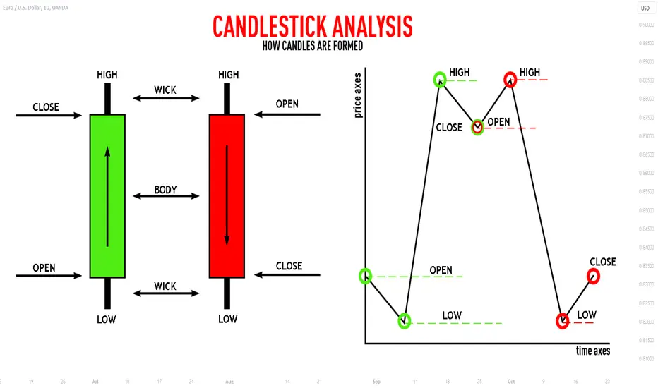
How to Read CANDLESTICK Chart For Beginners
Hey traders,
If you follow me for quite a while you probably noticed that I apply a candlestick chart for the market analysis.
In this post, we will discuss how to read an individual candlestick and we will outline its important elements.
🔰The candlestick reflects the price movement for a selected period of time.
An hourly candle will show you a price action within an hour and a daily candle within a day.
Above, you can see 2 charts. On the left - daily time frame. On the right - 4h time frame. One single daily candle composes the entire price action within 24 hours, while a 4H candle - the price action within 4 hours.
🔰The candlestick pattern has a very specific shape:
it is composed of a body and a wick.
The wick of the candle indicates the range of the price action within the candle. Its upper wick will show you the highest price during that time period and its lower wick will show the lowest price, while the body of the candle indicates its opening and closing price.
🔰From the color of the body of the candle, we identify its direction.
Green signifies a bullish candle while red signifies a bearish one.
A green candle signifies that the price grows, while a red candles signifies a downward movement.
🔰The lower boundary of a body of a bullish candle will show its opening price and its upper boundary its closing price.
🔰The upper boundary of a body of a bearish candle indicates its opening price and its lower boundary its closing price level.
With so many elements within a single candlestick, one can derive a lot of valuable information.
Some candlesticks have a very specific form and are called candlestick patterns. They are applied for predicted the future market behavior.
A proper reading of a candlestick chart may unveil a lot of insights about the market, so it is very important for you to learn to work with that.
Let me know, traders, what do you want to learn in the next educational post?
Learn What Time Frame to Trade
If you just started trading, you are probably wondering how to choose a trading time frame . In the today's post, I will go through the common time frames , and explain when to apply them.
1m; 5m, 15m Time Frames
These 4 t.f's are very rapid and are primarily applied by scalpers.
If your goal is to catch quick ebbs and flows within a trading session, that is a perfect selection for you.
30m, 1H Time Frame
These 2 are perfectly suited for day traders.
Executing the analysis and opening the trades on these time frames,
you will be able to catch the moves within a trading day.
4h, Daily Time Frames
These time frames are relatively slow.
They are mostly applied by swing traders, who aim to trade the moves that last from several days to several weeks.
Weekly, Monthly Time Frames
These time frames reveal long-term historical perspective and are mostly used by investors and position traders.
If your goal is to look for buy & hold assets, these time frames will help you to make a reasonable decision.
📝When you are choosing a time frame to trade, consider the following factors :
1️⃣ - Time Availability
How much time daily/weekly are you able to sacrifice on trading?
Remember a simple rule: lower is the time frame, more time it requires for management.
2️⃣ - Risk Tolerance
Smaller time frames usually involve higher risk,
while longer-term time frames are considered to be more conservative and stable.
3️⃣ - Your Trading Goals
If you are planning to benefit from short term price fluctuations you should concentrate your attention on lower time frames,
while investing and long-term capital accumulation suite for higher time frames.
Time frame selection is nuanced and a complex topic. However, I believe that these simple rules and factors will help you to correctly choose the one for you.
❤️Please, support my work with like, thank you!❤️

TRADING WITH MULTIPLE TIMEFRAME ALIGNMENTHey guys! Hope you're having a blessed day, afternoon, evening wherever you are in the world! I just wanted to come on here and post this simple yet effective principle of having alignment with price across multiple timeframes when trading. This really helped me in my trading and I hope it does for you as well!
I realize that I say "K" A LOT in this video so just try to ignore that as best as possible lol and hope you enjoy!
Cheers!

Using Candle Wicks to refine your daytrading entriesIn the video I discuss the importance of 'Candle Wicks' in price action and how I use them to refine an entry.
I like to use the 1 minute chart for my entries and have certain criteria to trade with the trend (which I discuss in the video). When trying to trade with the predominant trend up/down, I look to trade retracements. One thing I look for is wicks into the EMAs and then a reversal of the previous candle.
I find these greatly help my timing for entries and can greatly reduce my risk.
I hope that you enjoy the video and are able to use in your own trading.
** If you like the content then take a look at the profile to get more daily ideas and learning material **
** Comments and likes are greatly appreciated **

Battle-tested through the ups and downs of Etherium historyA trading strategy that's been battle-tested through the ups and downs of Eth's history. This strategy doesn't blink in the face of market chaos or get swayed by emotions. It's a calculated game plan that knows when to step in and when to step back.
Compare that to emotional investing, where fear and greed call the shots. Imagine making decisions when you're on an emotional rollercoaster—buying high in excitement and selling low in panic. That's a recipe for disaster.
A backtested risk-managed strategy, though, is like a cool-headed coach that sticks to the game plan no matter what. It's about discipline, rules, and consistency. So, do you want to ride the emotional wave or play the long game with a strategy that has been consistently profitable year on year since 2016 (start of Eth - substantiated by backtest data).
Average annual net profit (substantiated by the backtest)
196% (No Leverage) & 661% (3x leverage)
This year (Jan 2023 to Sep/15th/2023) has already generated
45.21% (no leverage) 144.93% (3x leverage) in net profit.
This strategy does Not re-paint, No-look ahead bias. and 100% forward tested. Tradingview has a default caution for strategies that use the multitimeframes data. This does not apply to this strategy as all calculations are based on closed bars.
So how does it work?
Postions are entered based on RSI Divergence on Higher Timeframes and confirmed by the ATR.
Stop Loss and Trailing ATR-based Take Profit:The strategy incorporates a risk management mechanism with a built-in stop loss set at 8%. Additionally, it employs a trailing take profit mechanism based on ATR. This means that as the trade moves in the desired direction, the take profit level adjusts itself based on the current volatility, allowing for gains to be secured as the trend progresses.
SMI-based Re-entry after Stop-out:
Stochastic Momentum Index (SMI) is used as a re-entry signal if the trade is stopped out (i.e., the stop loss is triggered). This re-entry is contingent on higher timeframes and ATR still supporting the original trend, indicating that the initial stop-out may have been a false signal.
Portfolio Reinvestment for Compound Growth:
The strategy allocates 95% of the portfolio's capital to each trade.
This approach maximizes the potential for compound growth, as a significant portion of the available capital is reinvested in each trade, provided that risk management rules are satisfied. This approach is appropriate for this strategy as strict risk management is applied and the winrate is almost 50%
Accounting for Exchange Fees:
Exchange fees, set at 0.1%, are factored into the strategy's calculations.
This ensures that trading decisions take into account the cost of executing trades on the exchange.
Avoiding Lookahead Bias and Repainting:
The strategy is designed to prevent lookahead bias by making calculations based only on closed bars of price data. Lookahead bias occurs when future data is used to make past trading decisions, potentially leading to unrealistic expectations.

The Relative Strength Index Explained [RSI]Hello traders and investors! If you appreciate our charts, give us a quick 💜. Your support matters!
The Relative Strength Index (RSI) is a powerful tool used in technical analysis to gauge the momentum and potential overbought or oversold conditions of an asset. Here's a breakdown of how it works:
Time Period and Calculation:
By default, the RSI measures the price changes of an asset over a set period, which is usually 14 periods.
These periods can represent days on daily charts, hours on hourly charts, or any other timeframe you choose. The formula then calculates two averages: the average gain the price has had over those periods and the average loss it has sustained.
Momentum Indicator:
RSI is categorized as a momentum indicator. It essentially measures how quickly the price or data is changing. When the RSI indicates increasing momentum and the price is rising, it signals active buying in the market. Conversely, if momentum is increasing to the downside, it suggests that selling pressure is intensifying.
Momentum Explained:
Momentum in trading is like measuring how fast a car is speeding up or slowing down. In the case of RSI, it's all about understanding if a cryptocurrency or stock is picking up speed in its price changes or slowing down.
RSI as a Trend Strength Indicator:
Think of RSI as a meter that shows you how strong the current trend is in the world of trading. It's like checking the engine power of a car to see how fast it can go.
Shifting Frame Analogy:
Imagine RSI as a shifting picture frame. This frame covers a certain number of periods, say 14 days, just like a moving window in time. When a day with a significant loss falls out of this frame, and days with substantial gains come into view, it's as if the frame is shifting to reveal a brighter picture. This shift in the frame is reflected in the RSI. If the new days are bringing in more gains than losses, the RSI goes from being low (indicating a weak trend) to high (indicating a strong trend).
RSI and Momentum:
RSI acts like a swinging pendulum, moving back and forth between 0 and 100. It tells you the current speed of price changes in the market.
When RSI is going up, think of it like a rocket taking off – it indicates bullish momentum, meaning prices are likely rising.
Conversely, when RSI is going down, it's like a balloon deflating – this suggests bearish momentum, indicating prices are likely falling.
Overbought and Oversold Conditions:
RSI helps you spot extreme conditions in the market.
If RSI goes above 70, it's like a warning sign that the price might have gone up too fast, and the asset could be overbought. It's a bit like when a stock is in high demand, and everyone's rushing to buy it.
On the flip side, if RSI drops below 30, it's a signal that the price may have fallen too quickly, and the asset could be oversold. It's a bit like when a stock is out of favor, and everyone's selling it.
So, when you see RSI crossing these thresholds, it's like a traffic light for traders. Above 70 is like a red light (be cautious, price may reverse), and below 30 is like a green light (consider buying, price may bounce back). These are handy rules of thumb for making trading decisions!
Price Reversals in Overbought/Oversold Territory:
When a stock or cryptocurrency's price is in the overbought or oversold territory (RSI above 70 or below 30), it's like a warning sign that a reversal might happen.
However, it's important to remember that these levels don't guarantee an immediate reversal. Just because RSI is high doesn't mean you should rush to sell, and vice versa. Prices can remain in these extreme zones for a while before reversing.
RSI as a Tool, Not a Sole Decision Maker:
RSI is a tool in your trading toolbox, not a crystal ball. It's one piece of the puzzle. It's not accurate to say, "RSI < 30 equals an automatic buy signal, and RSI > 70 equals an automatic sell signal." Trading involves more factors and judgment than that.
Consider Multiple Timeframes:
Looking at different timeframes is like zooming in and out on a map. It provides a more complete picture of what's happening. For example, if the daily RSI is showing overbought conditions, but the weekly RSI is still in a healthy range, it suggests a different perspective. The longer-term trend may still be intact.
Oscillating Indicator:
RSI oscillates between 0 and 100, providing traders with a visual representation of an asset's strength or weakness. The scale helps identify potential overbought or oversold market conditions. An RSI score of 30 or lower suggests that the asset is likely nearing its bottom and is considered oversold. Conversely, an RSI measurement above 70 indicates that the asset price is likely nearing its peak and is considered overbought for that period.
Customization:
While the default setting for RSI is 14 periods, traders can adjust this parameter to suit their trading strategies. Shortening the period, such as using a 7-day RSI, makes the indicator more sensitive to recent price movements.
In contrast, using a longer period like 21 days reduces sensitivity. Additionally, some traders adapt the overbought and oversold levels, using 20 and 80 instead of the default 30 and 70, to fine-tune the indicator for specific trading setups and reduce false signals.
Divergences:
Divergences occur when the price of an asset and its RSI are moving in opposite directions. It's like having two friends walking together but going in different directions.
Regular Divergences:
Imagine this like a traffic signal turning red when everyone's used to it being green.
Regular divergences signal a potential trend reversal. For example, if the price is going up (bullish), but RSI is going down (bearish), it could indicate that the bullish trend is losing steam, and a reversal might be on the horizon.
Hidden Divergences:
Hidden divergences are like a green light at a junction where everyone expects red.
They signal a potential trend continuation. For instance, if the price is going down (bearish), but RSI is going up (bullish), it could mean that the bearish trend might continue but with less intensity.
Learn more about divergence:
Practical Use and Timeframes:
Divergences are like big road signs on a highway. They're often easier to spot on higher timeframes, such as daily or weekly charts, where the broader trend becomes more apparent. When you see a divergence, it's like getting a heads-up that something interesting might happen in the market, but it's important to combine this signal with other analysis and indicators to make informed trading decisions.

Channel tradingHow to trade channels after sharp moves, where there is a valid money flow in the market.
During this short video I just described one of very common and useful techniques that is applied for channel trading, which is for this video scalping, but it applies to all time frames.
Here you need to get confirmation and be patient for pull back, it is important to put your stop loss precisely and of course be loyal to it (please do not move it)
Put the stop loss under that shadow but with enough space for breathing
