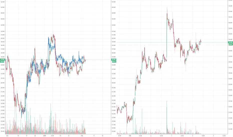
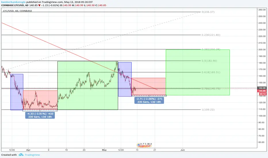
Litecoin 4H Fractal very similar to current 15m fractalUndoubted similarities, I think it's a bot pushing prices in similar pattern, what do you think?
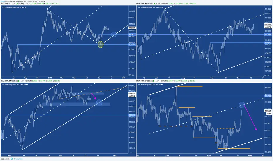
Multiple Time Frame Analysis
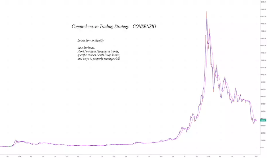
Comprehensive Trading Strategy - ConsensioDisclaimer: If you are primarily interested in copying other people’s trades then this is not for you. However, if you are willing to put in the work that it takes to learn how to trade for yourself then you have found the right place! Nevertheless please be advised that you can give 10 people a profitable trading strategy and only 1-2 of them will be able to succeed long term. If you fall into the majority that tries and fails then I assume no responsibility for your losses. What you do with your $ is your business, what I do with my $ is my business.
Identify Time Horizon
First and most important is identifying the time frame that you want to trade. I primarily trade the daily chart using Tyler Jenks’ Consensio. It was designed to capture long term trends. If followed it will ensure that you do not miss out on a trend and it will also get you out before it fully reverses.
“We want 90% of the cookie” -Tyler Jenks
There will be times when we cost ourselves a small amount of opportunity but that will be peanuts in comparison to the larger trends that will be captured.
Even though it was designed for higher time frames (TFs), specifically the weekly, it can still be used on smaller TFs based on your understanding and time availability. Decisions need to be made each time a candle closes, therefore you need to be available, or out of all positions, every time that happens.
I trade the daily chart because I know that I will be available every day for the candle close. I also like to trade the stock market, commodities, and FOREX as well as crypto because the daily closes are staggered throughout the afternoon and it gives me time to manage my positions.
If you prefer to day trade then this strategy can be used for the 1m - 1h candles. However it doesn’t seem to be too conducive to anything above 1h, if trading 24/7 markets.
For example: if trading the 4h then will not have enough time for position to develop before going to bed.
Regardless of what TF you select you can zoom out to determine longer term trends, however you should only use one TF for making decisions.
For example: I trade the daily chart and will zoom out to the weekly when I am looking for major reversals. However, if the price is signaling entries on the weekly then that is irrelevant because I make decisions based on the daily chart.
Identify Trend
“The purest form of Consensio is three Moving Averages without the price” -Tyler Jenks
Once you know what time frame you are going to trade then you need a reliable way to identify the trend. I have found Consensio to be the single most powerful tool for recognizing trends (as well as signaling entries, exits and reversals).
It is a system that seems very simple on the surface and potentially even unoriginal. However the deeper you dig the more you will uncover.
To start you need to go to the source directly:
Consensio - A New Trading System
Deep Dive Into Consensio
The notes that I have on it span well over 100 pages and I couldn’t possibly sum that all up in this post. Nevertheless I will attempt to cover the most important parts of the puzzle.
Important: Watch the videos above or else below will not make sense.
I have four subcategories for trending markets that are somewhat similar to Elliott Waves.
1) Short, medium and long term trend all in alignment. For bull trend: price > Short MA > Medium MA > Long MA (Strong trend)
2) Minor Correction (Small pullback moves against overall trend)
3) Major Correction (ABC type of correction that forms lower high but finds support at major boundary levels - Long MA, horizontal or trend line)
4) Potential Reversal (Price closes below long term MA and starts turning it over)
The moving averages should be dialed in to your specific time frame to help identify each subcategory above. When the asset is in a strong trend you want to see the Short Term MA act as support / resistance. A close above / below the Short Term MA indicates a minor correction. When there is a minor correction you want the Medium Term MA to act as support / resistance. A close above / below the Medium Term MA indicates a major correction taking place. When there is a major correction that doesn’t quite reverse the trend then you want the Long Term MA to act as support / resistance. A close above or below the Long Term MA indicates a potential reversal. If in a strong trend then expect price to quickly react from the Long Term MA and continue the trend.
For example: in a bull market the long term MA should act as strong support / provide a strong bounce. If it doesn't and the price closes below it instead then that is an indication that the bull market is getting exhausted.
When the Long Term MA starts to show signs of a reversal then I will add a Longer Term MA (default is 200) and / or I will zoom out to the weekly chart. This really helps me to understand if it is just a major correction within a market that is still trending or if a full on reversal is to be expected.
Being able to distinguish major corrections from reversals is the hardest part about consistently beating the market in the long run. Once you are comfortable with that then it mainly comes down to patience, discipline and diligence in regards to acting on signals and managing risk.
Entry & Exit Signals
5% when Price crosses Short Term MA (default is 4)
10% when Price crosses Medium Term MA (default is 9)
15% when Short Term MA crosses Medium Term MA
20% when Medium Term MA turns over (if it was trending down, then watch for it to turn up)
25% Price cross Long Term MA & Long Term MA flattens / turns over
25% Golden Cross with the Medium Term MA & Long Term MA
If multiple happens at once then sum the %’s.
For Example: P close < S & M MA then enter 15% .
If I am not in position then price crossing MA’s would trigger entries. If I am in a position then it would trigger exits. In rare cases I will flip my position by exiting a short and immediately entering a long, or vice-versa.
Entries and exits are done as soon as possible after the candle closes. I trade the daily chart so I will wait for the daily candle to close before making decisions and then I will try to make sure I get filled within 30 minutes (will take a market order if necessary). If you try to front run the candle close then you will make more mistakes than it is worth. It is very important to only make decisions after the candle closes. Everything else is noise and you cannot make decisions based on noise.
I may pass on signals if it would enter me against a longer term trend.
For Example: Price closes above Short Term and Medium Term MA’s and they cross over in a bullish manner. 30% - 50% long entry signaled. May choose to pass if Long Term MA is bearish.
I can completely pass on this entry in favor of waiting for a short if the price is below the Long Term MA and the Long Term MA is in a strong bear trend. In this case I will expect Long Term MA to act as strong resistance and will wait for price to close back below shorter term MA’s to trigger a short entry.
It takes time to reverse a trend. In the above example the Long Term MA is in a strong bear trend while price appears to be rallying through it after 50% long entry is signaled. I would pass on long entries and be very confident that the price isn’t going to blow right through my Long Term MA (due to the downward angle).
It very well might reverse the trend, however that will take time. If the price is above a Long Term MA that is angled down then the MA will act as a magnet for the price until it flattens / turns over.
Passing on the first long entries that are signaled does not mean that I will pass up on it all together, it just means that I think it is too early / risky. I would strongly prefer to wait for a golden cross with the Long Term MA flattened, or angled up, to go ahead and fully enter. In the example above I would wait for a pullback to the Long Term MA. If it supports above and gets a golden cross with the Medium Term MA then I would be much more inclined to take that entry.
It is very important to understand the difference between opportunity cost vs capitalizing on a loss. As traders we need to be completely comfortable with missing out on opportunity and extremely diligent about avoiding / minimizing losses. Therefore it is okay to pass on possible entries that are less than ideal however it is not okay to pass up on exits that feel similar.
Stop Losses & Risk Management
I determine my position size and leverage based on the amount of risk that I would be assuming. If an entry is triggered then I will use the Parabolic SAR or the Bill Williams Fractal to determine my risk.
If SAR is too tight then I will use the Fractal. I use the medium and long term MA’s to determine what is or is not too tight. Prefer stop to be above long term MA but has to be above medium MA.
I am trading Consensio, and it does not allow for stop losses in this manner. Instead it demands that you hold onto a position through the candle close and that you scale out in pieces (see above 'Entries & Exits'). This is best in 99%+ of the time.
However that really limits the leverage that can be used. If trading the daily chart 3X - 5X would be the absolute max. I tend to prefer 5X - 10X leverage for a number of reasons:
-Minimizes exchange risk
-Can minimize slippage
-Still gives me plenty of flexibility to place stop above prior Fractal / SAR
Below shows an example entry triggered and my thought process for where to place the stop along with a risk / leverage calculation.
Once I understand the risk, then I can calculate the position size. You should always think of risk as the amount you stand to lose opposed to exposure amount. I do not care about the exposure amount. I care about how much I stand to lose... how much I am risking. I care about controlling my downside and limiting it to less than 2% of my trading capital.
In the above example the risk is 7.10% and the max leverage is 14.08%. I never use the max leverage because getting liquidating comes with significantly higher fees. In this case I would use 10X or less leverage and I would make sure to set a market stop loss below the liquidation price.
If you get liquidated then it will likely be a ~22% fee. If you take a market stop before the liquidation triggers then it will be a ~2% fee.
I currently like to cap my risk at $500 per trade. $500 (USD I wish to risk) / 0.071 (calculated risk based on wick above Fractal) = $7,042 (exposure)
$7,042 is my maximum exposure. With 10X leverage $704.20 is the most I will need for margin. Once I understand my position size, leverage and margin requirements then the position size can be easily calculated based on the Entry & Exit Signals above.
Trailing Stop Losses
I consider myself 100% entered when I have $500 at risk. If the price moves in my favor then I will trail the stop loss. If I trail it to the point where it is at break even, or better, then I will not consider myself fully entered anymore.
Even though I still have the full original exposure, I am no longer assuming any risk and the latter is all that matters to me. Therefore I would feel comfortable adding to my exposure up until the point where I am risking another $500.
In the example above we get a great entry before a strong trend starts (also happened to follow descending triangle breakdown which provided great confirmation). The price quickly moves in our favor to the point where the stop is adjusted to break even, or very close to it.
With no risk I do not consider myself to be fully exposed anymore and I feel comfortable adding to my position up to an amount that would risk $500. Need to be very careful with this because adding to a profitable position after a big move can completely ruin your trade.
I will use the TD’ Sequential , RSI and Average Directional Index to confirm that the trend still has room to go. I will also check horizontals and trends to make sure I’m not selling support / buying resistance. In the example above I would really like adding because all of the above are in my favor.
This can be thought of as manual unbalancing which is the opposite of how most people approach allocating capital.
Automatic rebalancing will sell the most profitable positions and add to the lesser profitable positions in order to keep the same allocation percentages.
For example: if allocations are 50% Apple and 50% Amazon then Amazon outperforms. It will be something like 45% Apple and 55% Amazon. Rebalancing would sell Amazon and buy Apple so that it is 50:50 again.
I have always thought that is completely backwards. I want to allocate my capital to the best performing assets. If I am in a position that is really moving in my favor then I am thinking about adding to it. I would never take away from a more profitable position to add to a lesser profitable one just for the sake of balancing my portfolio.
Conclusion
What is outlined above is enough to ensure that you do not miss out on a trend and it also ensures that you will get out before it fully reverses. Don’t take me word for it, go do some backtesting yourself. That is when the power of Consensio will really come to life.
When trying out a new strategy I always recommend to start with an extremely small amount of money that is > $0 and I also recommend zooming in.
I think that it is very important to have some skin in the game so that you feel the pain and pleasure of losing and winning. However I think that is should be very nominal. If you have a $10,000 trading roll then I would take $100 and trade the 3m chart. Focus on learning the intricacies and making sound decisions. Also focus on ROI and how long it takes to generate 10%, 50% or 100%+ returns opposed the dollar amount being returned.
Regardless of what time frame you decide to trade I would always start with a very small TF. The reason is that the daily / weekly charts could take years to teach what the 3m and 5m charts can teach in days.
The decision making process should be exactly the same regardless of the TF. There are a ton of variables and intricate situations that you can put yourself into by trading small TF’s. Thinking your way through these situations is how you internalize and gain confidence in the trading system as well as the decision making process.
Facing these situations before you have significant money on the line is what I consider batting practice.
“We don't rise to the level of our expectations, we fall to the level of our training.” -Archilochos
After a couple weeks of trading the shorter TF’s I felt comfortable putting significant money to work on the Daily chart. However, I consider myself a fast learner and that process could take longer for others.
How To Read Structure (Charts) Tutorial- Section: 3 Charts 12-18The highly anticipated release of the How to read structure tutorial is finally here! Thank you for your patience traders, lets get right into it. In Section one and two of the how to read structure tutorial, we spent a lot of time going over the process that I use to identify potential reversals as well as what I consider to be confirmation of a trend reversal. In this section we are going to learn why I use this process & how it helps me identify the difference between a pull back and an actual reversal. We are also going to take our first detailed look into how this process is used to identify trading ranges as they are occurring & we will end with a brief introduction regarding how to properly use multiple timeframes to increase your strategies performance and overall returns.
Section 3 Will Consist of 7 Charts:
Chart 12- Simple Pullbacks Explained.
Chart 13- One Simple Way To Identify A Fake Reversal + Identifying The Complex Pullback.
Chart 14- My Method Of Identifying Trading Ranges Before They Occur.
Chart 15/16- Continuation Of Chart 14 & Why The Complex Pullback Method Is Effective.
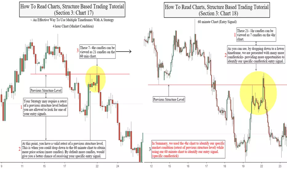
Chart 17/18- An Effective Way To Use Multiple Timeframes With A Strategy.
Chart 12- Simple Pullbacks Explained & Ground Work For Learning The Complex Pullback Method
The majority of people who try their hand at trading, do not have any formal training or education of any kind therefore most of the trading related knowledge they learn is obtained through free sources, books or online courses that never fully go all the way, leaving them with a ton of questions and confused. Proper chart reading and structure analysis is one of the most commonly misunderstood aspects amongst novice traders, and at little to no fault of their own. It is important to understand that not all structure analysis is the performed the same, each trader may have his/her own process for reading structure so if this is a topic you wish to learn, I highly recommend learning one traders specific process to avoid confusion and conflicts with education that you may have learned elsewhere.
Chart 13- One Simple Way To Identify A Fake Reversal & Identifying The Complex Pullback (my process)
It is said and assumed that- "In order to identify a trading range, price must trade in it for an extended period of time". This is true with the traditional method of technical analysis however the Complex Pullback is an advanced structure analysis method that I have used to successfully identify trading ranges as they are occurring for years... With this method, we do not have to wait for a trading range to be established before identifying it as one, which gives us the ability to spot & avoid many false reversals. Incorporating this method into your strategies, can dramatically increase its performance & returns. Please see the chart below to get a better understanding of how this method works.
Chart 14- My Method Of Identifying Trading Ranges Before They Occur
Chart 15/16- Continuation Of Chart 14 & Why The Complex Pullback Method Is Effective
Each 4hr candle represents 4hrs of price action therefore, each 4hr candle can be seen as 4- 1hr candles. Lower timeframes, can be used to obtain more information about price action. For example- If your strategy uses a specific candlestick as an entry signal, dropping down to the 1hr chart would give you an additional 3 candles which would result in 3 more opportunities for your entry signal to appear.
Chart 17/18- An Effective Way To Use Multiple Timeframes With A Strategy
As always, I hope this tutorial was helpful to you. Please leave your feedback in the comments below, & if you got value from this please share & give the tutorial a thumbs up. Your Shares & Likes really help to get these tutorials out to traders who are trying to learn, While your feedback lets me know that these free tutorials are helpful to you. I will continue to share them if they are of value. If you would like to learn more about how to read charts, and structure based trading please see sections 1 & 2 of the "How to read charts, structure based trading tutorials" (linked in the related ideas section below) or head over to TradersNsights:
Courses/Lessons
Forex Coaching
To request a tutorial or topics you would like to see in the future, Fill out a quick request form and enter "Request" in the subject field or simply comment below.
More Free Trading Related Education
HULL Moving Average StrategyThis is my strategy based off the Hull Moving Average, created by Alan Hull.
www.fidelity.com
The HMA is extremely fast and accurate in determining price reversals - I exploit this quality and add the ability to select a granular TimeFrame to use for the HMA calculations (ranging from 1m to 1D). The HMA can be painted on any TimeFrame. When the HMA indicates a price reversal, the strategy waits for the current candle to close before entering a trade.
Target profits and losses can easily be set, as well as: Leverage, % to risk per trade, trailing stop entry point, trailing stop offset, Spread, Commission, and more!
The indicator works on any currency pair (excluding metals) and as low as the 5m timeframe.

How It Paints - Part 2 - ETH/USD Replay Mode on Heffae CloudsSit back, relax, and watch the clouds paint on ETH/USD.
In this video, watch Heffae Clouds paint the Predictive / Adaptive Support and Resistance clouds.
Multiple Timeframes, 3X indicators set to 1Hour, 4Hour, and Daily timeframe.
The Heffae Clouds indicator is a kind of spiritual successor to the Ichimoku Cloud. Read the full description here:
PM SNOW_CITY for evaluation access to the Heffae Clouds Indicator!
All 3x #heffaeclouds indicators in this video use the 1,1 PathFitting Preset for FOREX, which changes the adaptive path-fitting "seed" value as well as the adaptive cloud offset to align better with assets involved in more complex ecosystems. Preset 1,1 relaxes the time-domain and works well on assets with dependencies (erc20 ecosystem).
Please note that these settings were developed far prior to these price movements; the indicator is not tailored to this asset. You can see interactions such as this with a wide variety of stocks, indices, futures, and cryptocurrencies.
This indicator is organic and interpretive, you may see the cloud interactions better than I! Post your analysis and trading ideas in the HeffaeClouds Public Chat:
tradingview.sweetlogin.com
Thanks for watching, please leave a thumbs up if you enjoy these posts or find this interesting!

Visual Lesson ExampleRecognize approximate price moves by acknowledging visual patterns.
Observing 360 (6H) note, and... Accompanied by other time frames such as the 90 min presents the market in an overbought condition, therefore giving away the future move because 50 level then becomes a substitute overbought level as if it were 68 on the particular time frame.
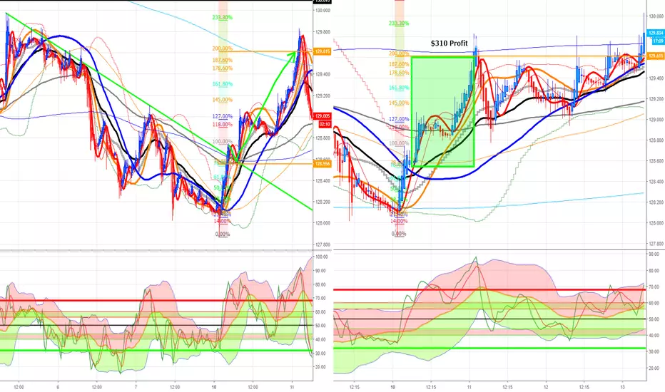
Combining Fibonacci with TDIUsing triple charts, TDI' Complementary Overlay, TDI' PRO and a basic entry rule we can make profitable trades possible.
Based on the condition of using an account with just under $5,000 trading account capital, with 1:500 leverage, with a deposit margin of ~$80, a single trade with lot size of 0.35
~ $310 Profit, 1 trade in one day
Third Chart use example
VIDEO / HOW I SETUP MY WATCHLIST FOR THE WEEKVideo Contents:
How I use the same concepts over and over to setup my watchlist each week (forex, indices, commodities, metals, crypto)
* I focus on finding high-probability trade setups with good risk to reward
* These setups can be either trend reversals or trend continuations. The actual direction of the setup doesn't matter
* What does matter is WHERE on the chart these setups occur
Enjoy :)

HOW TO BUILD YOUR CONFIDENCE AS A TRADER (WIN BIG & LOSE SMALL)** In the video I say EURO / Swiss Pound. I think I meant to say Swiss FRANC ** :)
This video is meant to cover a really important topic that I think holds back most people from being successful in the markets. In this video I cover:
1) There's a difference between being a good analyst and being a good trader
2) How to empower yourself by learning to trust your analysis
3) 3 optimal trading environments and how top-down timeframe analysis lets us identify which environment we are in
If you find this video helpful, please leave a like and a comment!
Good luck out there and remember ALWAYS win BIG and lose SMALL :)

Security - Version 2 vs. Version 3Visualising the difference.
Let's take a look at the security function, the differences between version 3 and version 2, and hopefully help give people a better understanding of how these work. As many will know there are differences in how version 2 and version 3 handle the "security()" function. Confusion around the mechanics of this function can lead to headaches for people testing scripts and trying to intuit how it works. So we’re just going to run through some examples to give a visual along with some explanations.
First, let’s look at 2 instances of the following code, one in version 2, one in version 3.
//@version=2
study("My Script", overlay=false)
num = security(tickerid, "60", n)
bgcolor(num%2==0?orange:na)
plot(num)
This will use the built in variable “n” on the 60 minute timeframe using the security function. The variable “n” assigns each bar a sequential number. We will use a 5 minute resolution for our chart and plot the 60minute bar number and change the background color to orange if the bar number is an even number. Let’s see how that looks.
So there’s 2 important points to mention here.
The first is that the highlighted areas are almost exact opposites to each other. This is because in version 3 the security function uses the value of the previous bar when looking back at historical data. So in our example, at the time that version 2 painted the 14454 bar, that was the correct bar number. In version 3, it was using the previous bar of 14453. So with historical data version 3 essentially has 1 bar of lag. This is to avoid issues of the bar using “future data”, which we will show an example of shortly.
The second thing to note is the time at which the bar begins. Using the above example again, notice that the beginning of the new 60min bar has a 1 bar difference on the current timeframe. In version 2 the new bar starts at exactly 09:00, whereas in version 3 it starts at 08:55. Note that this is because we are using the 5 minute chart, if we were using a 3 minute chart the version 3 bar would begin at 08:57, or a 15 minute chart would begin at 08:45.
Why? Well, perhaps the following chart will help explain. We will use the following simple bit of code that again use a 5min chart and plot the 60min high value. The purple line is the code in version 2, the green line is the code in version 3.
h = security(tickerid, "60", high)
plot(h)
There’s a lot going on here but we’ll go through it step by step. The first thing to notice to make sense of this picture is that the green bar is exactly the same as the purple bar, but just shifted to the right. This is the lag we mentioned, because the green bar (version 3) is using the value from the previous 60 min period.
Now, notice the red circled areas. These areas show the beginning of the new bar for version 3 and the end value of the bar for version 2. **In version 3, the new bar begins as soon as we know the final value of the previous bar.** So using our first chart example, the final closing value of the 08:00 – 09:00 period is the closing value of the 08:55 bar (on 5min chart), so the 08:55 value is where the new version 3 bar begins.
The version 2 bar uses future data as default. You can see examples of this where the orange ellipses are on the chart above. Remember, the purple line is charting the high of the current period, but with version 2 the high of that hour is painted on the chart before that highest value is reached, as highlighted in orange. Using the high value from our security function at any of those highlighted points would give us inaccurate back testing results because our indicator would essentially be looking into the future.
So what are the practical implications of this? Well, it means if you’re using version 2 you’re going to get inaccurate back test results because of the future data issue, which is the main reason this was changed for version 3. If you’re using version 3, however, that’s not a magical fix either. For instance if you’re using an hourly chart and pulling the daily data with the security function, the “daily” value last Wednesday will actually be using the values from last Tuesday. So with our examples of using the period “high”, it will be possible for the current hourly high to be above the security data’s daily high, because it’s using the previous day high.
Difference between real time and historical data
Everything we’ve talked about so far has been dealing with historical data.
Real time data for both version 2 and version 3 work the same way and work correctly. That is to say if you’re using a 5min chart and pull the data from the hourly with security, then the real time data from the security function will match the real time data from an hourly chart.
But how does that work if the version 3 data uses the value from the previous period? Well, as soon as you plot security values in a chart you’ll notice that the newest bar value will change. As soon as new data starts getting painted it will switch from the previous period’s value to the current value.
For example, this is a minute chart plotting the 3 minute high via the security function. Purple values are version 2, green are version 3, and you’ll see as soon as we hit real time data (when we clicked “add to chart”, signified by the pink dotted line) the 2 are identical. The version 3 data switches from lagging by 1 period to real time, and the version 2 line stops using future data.
But this is where repainting comes into play. This is the same chart moments later, after refreshing the indicators. Now they will again show both indicators in their historical form. The version 2 purple line is using future data again, and the version 3 green line is lagging again. Simply using version 3 is not enough to avoid repainting, if that’s what you’re trying to do.
So what do we do?
Well, how you deal with this depends on what you’re trying to do. What I’ve tried to do is explain exactly how it’s behaving and why. How you then use that is up to you. There’s nothing “wrong” about any of this data or behaviour as long as you understand what’s happening.
For those of you trying to match up automation with back testing or just current values with back testing, bear in mind that these discrepancies are due to the differences between how real time and historical data are handled in the security function. If you’re comfortable with only ever using the most recently closed bar from the higher timeframe, use version 3 and you can simply add to the end of your expression within the security function, and all these problems go away; no repainting, no future data used, real time data matches historical data. You just have to embrace the lag.

Easter homework [if bored]You wouldn't think, but I believe there are some friends around here looking for something to do this Easter. For them I compiled 4 challenges to study and use for the month of April. See if you understand each challenge and how each may add pips to your wallet.
BTC Fractal: Testing this pattern in the long termI found this particular pattern recurring in every smaller time frame, including the 1 minute candlesticks. After a major correction, this fractal shape ensues.
I am going to just leave this here.
Obviously, I don't expect this to be accurate one bit. Just a lesson on fractals if it is :)
USDJPY - Give yourself contextCONTEXT
If you are trading off of multi-timeframe chart's, then you should handle each timeframe for itself.
Don't try to fit one into another, just analyse it as if it where the only one you care about.
Further more:
- try to reduce your indicators and oscillators (price is telling you "wasup") ;-)
- stay consistent in your drawings
- dissect major from minor (patterns, bars, structures etc.)
- practice & verify the outcome and keep a note's journal (after 1 year, it's more worth then gold!)
P!
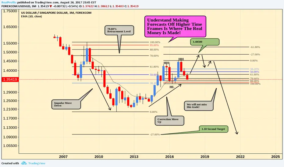
Forecasting Off Higher Time FramesForecasting off higher time frames in my opinion is absolutely necessary if you want to become a successful trader,
The 3 Month Chart is the ultimate time frame in my opinion! generally you make a forecast on the higher time frame and simply work the lower ones with it! I use the 3 Month as my general view of the market, the Weekly to determine the trend! and the daily purely for my entries! If you can combine your trading technique with this, your trading will definitely improve. you do need patience but it trust me some of the trades you get into are outstanding and will boost your trading account. thanks
Spot The Trend & Trade It On Lower Time FramesOne of the strongest setups are the ones that are being formed by the dual time frame momentum. By using multiple time frames you will be able to create a high probability setup. Key rule is: Large/High time frame for trend and Small/Low time frame for your entry. Personally I mostly I like to hold short term positions, so I use the daily time frame for the trend and then the 4 hour for my entry.
For the purpose of this educational post I will use the weekly time frame so that we can spot the long term trend and over the course of the next 2-3 months I will update this post and you will see how very well this strategy works (for the purpose of this guide I will assume it has broken the upper range, so it isn't a trading advice or prediction of what will happen)
Part 1
Spot The Trend
(I use the weekly time frame, but you can apply the same principles to the daily time frame)
Currently the weekly time frame is trading in a nice triangle that is narrowing. At the moment it isn't possible to spot a clear trend due to this. So we have some patience and we will wait till the price has broken out of the triangle. Now it's important to remember that a range is only considered to be broken when the candle has closed outside of it. Since we now use the weekly candle we wait till the market close on Friday, if you use the daily time frame you wait till the daily close of the market which will close the current candle and start a new one.
Lets jump a bit forward in time and assume the upper range has broken when the weekly candle closed. Now we know that the weekly time frame will show a nice wave up as is often the case with a range break out. So there we have had, we had some patience, we waited till the weekly would close outside of the range and now we know that the weekly time frame trend will be up the next weeks.
Now this doesn't mean straight away that on Monday the next trading day the price will jump up. Maybe the lower time frame will have a correction first because it just had a strong wave up. An indication of this on the weekly time frame can be the Stoch Rsi, Rsi or just Stoch indicator. If the price has broken out of the range but one of these indicators is already in the overbought or oversold area a retracement can be very likely. To confirm this we take a look at the lower time frames, because we want to make sure that your buy position wont drown first be a retracement on the 4 hour or daily time frame before going back up and following the weekly trend. This is the next step.
Find Your Entry
To avoid getting caught up in a lower time frame is very simple. You make sure that the lower time frame is pointing up in the same direction as the higher time frame. For example I use the daily for the trend and then I wait till the 4 hour points in the same direction as the daily trend and I have my entry. In our example it goes the same. Except now we use the daily and 4 hour time frames for our entry.
Why not only the daily? If the daily points like the weekly time frame, you can still get caught up in the 4 hour retracement.
Why not skip the daily and jump to the 4 hour Well if the 4 hour points up like the weekly time frame in our example,the daily time frame can still point down. So basically you're trading a retracement of a retracement. Which can make your position go up first based on the 4 hour, but once that retracement is done it will go down first till the retracement on the daily time frame is done.
To avoid getting caught up in all these retracements we wait till the daily and 4 hour time frames will both point in the same direction as the weekly. Which will be up in our example since we assumed that the upper range has been broken.
The following situation can indicate that the daily or 4 hour time frame are going up:
Range has been broken to the upside
Price has touched the lower range and the Stoch Rsi, Rsi, Stoch indicator made a bullish cross over
GOLD / D1-W1-M1 : MultiTimeFrame Analysis with Elliott+SinewaveTook me quite some time to build this up but the result shows a very clean sceanrio here ! Everything tends to correspond between each different timeframe and so the forecast is even more likely to occur.
It shows that on the biggest timeframe, gold has made it's 5 wave impulse and is now retracing in 2 impulses . The first have been completed and we clearly see it confirmed by multiple timeframe sinewave signals. We're now working on the corrective wave of this rectacement ( the A to B wave ) . Which normally plots as ZigZag and tends to be the case here. Looks like we've made the first impulse of our sub ZigZag... working on the corrective wave (that appears to be a barrier triangle on daily chart). The next move should be a 3 wave bullish impulse reaching out to 100-127% extension of the previous wave . Completing this will give us our B point of major count that we will the sell for the second corrective wave of the monthly corrective count. It can seem messy... but hold on, zoom in and take the time to read ! You'll have much clearer sight of what would be about to come ;)
Hope this idea will inspire some of you ! I'm pretty new to TradingView so I'ld appreciate any like/follow if you feel like it deserve it ;)
You can check my indicators via my TradingView's Profile : @PRO_Indicators

FX Trading Strategy for Part Time Traders; Explained Below...I will copy and paste my Multi-Chart with 8 Time Frames (720m, 1 Day, 2 Day, 3 Day, 4 Day, 5 Day, 6 Day and Weekly) in just a moment for an easier view. The chart on the publication cover seems to always get blown up to a lower resolution. You'll see those TF's more clearly if you click the copy of it that I will post below shortly after posting this publication.
I have recently created a publication regarding a "BASIC understanding of HOW to use Godmode Indicator" with MODIFIED inputs and an added LSMA with input set to 32. I give instructions for setup of Godmode with added LSMA within that publication. I will post a link to that publication below the "copied" GBPJPY chart.
If you cannot be home to trade full time every day because of work, you can use Godmode on the higher Time Frames to make your trades. Of course, this will only be a few trades a month but with bigger moves than trading in lower TF's.
Give it a try. You might come to like it.
Here is GBPJPY Multi-Chart Copied for easier viewing:
Here is the link to Godmode Indicator and setting it up:
EDIT: I personally believe I just provided an information gold mine ""IF"" someone is willing to invest the time and effort to learn and understand it.
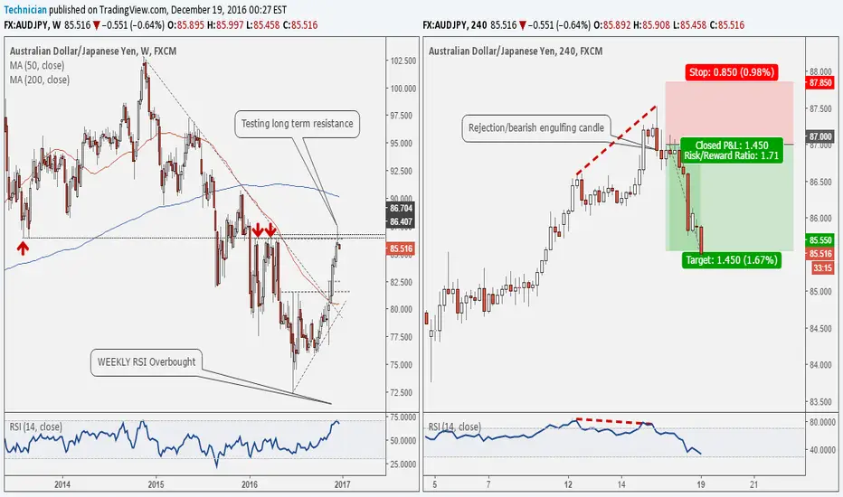
My Latest AUDJPY Short trade explained #forexNOTE: This trade was published last week exclusively and privately to my followers
As you guys requested, i am explaining the rational behind my short audjpy trade,
On the left hand side overall view, on the weekly chart, the price was testing the main long term potential resistance area around 86.50. At that area i was monitoring the price for possible rejection as long term resistance and support levels are reliable. At the same time, the RSI was showing overbought conditions..
I was monitoring the price action on the four-hour chart(right hand side chart) for final trigger confirmation. Indeed, the price formed a bearish engulfing candle at that resistance area, meantime, the RSI on the four-hour chart was showing bearish divergence. Accordingly, i got the confirmation and placed my short order at 87.00. Which just reached target in the past hour as you all know.
Final result was around 145 pip gain nearly 4.5% return on capital.
Hope you enjoyed the ride :D
My latest Short Term Sell Trade Explained #forex In response for your requests guys to explain the rational behind the live trade we took on GBPCHF. Here is the explanation.
On the left hand side daily chart, the price started the bearish behavior on the 78.6 retracement level for the overall bearish wave as shown on chart. As it formed two major bearish shooting star candles.
That was not enough for me to initiate the trade so i moved to the lower time frame(4-hour) for the final confirmation. The price has indeed broken back below the prior high at 1.2868 and below the hanging man candle. That was accompanied by bearish divergence on RSI and that assured that the trade is a high probability one.
If you were following my updates on the channel, you would know that i put a limit short order as shown on chart. The targets was just reached minutes ago for 157 pips gain. Adding to my account 4.37% gain this month.
Best of luck and keep posted.

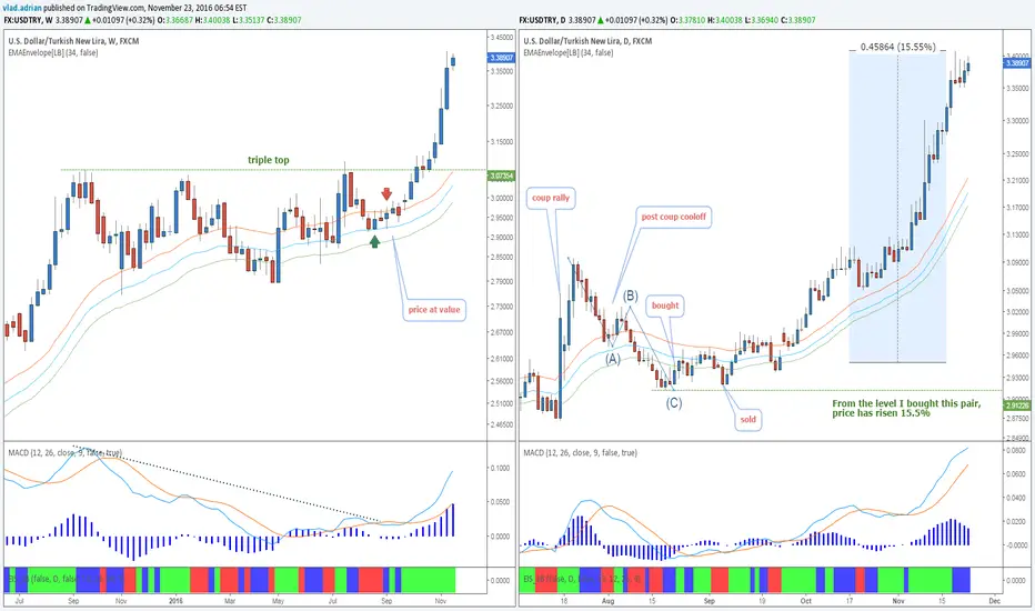
USDTRY - Failed TradeFrom time to time, I like to post my mistakes. Usually I do it with private charts, but if there is something for everybody to learn, I make them public. This is a wonderful trade I took on USDTRY, or better said, didn't take.
On the weekly chart, the green arrow shows where I bought, the red where I sold. Let me explain the trade.
After a strong rise following the coup attempt, USDTRY made a false breakout above 3.07, and formed a triple top with a bearish divergence. If I want to buy after a triple top, hoping for a continuation of the uptrend, I do one of two things : either buy when price reaches weekly value, or buy after a rejection of the 78.6% retracement. In this case, I went for the first option.
Looking at the daily chart, I bought when I saw a bullish candle, while price was still at value on the weekly chart. I had, as always a soft stop. The fundamentals were strongly pointing to more downside for the Turkish Lira.
After a couple weeks of sideways action, I decided to sell my position on a candle accelerating below daily value. This was a stupid emotional decision because :
Price was still at value on the weekly chart(the reason I bought this pair in the first place).
Although the impulse was red on both the daily and weekly charts, the week was far from over (and indeed the impulse closed blue that week, after 4 weeks of red impulse).
Price didn't even reach the swing low at 2.915.
I had a soft stop on this, which by definition implies that I should be able to sustain a bigger fall below the swing low of my trade.
As I said above, fundamentals were in line for further depreciation of the Lira.
It was pretty logical to be long this pair, because after a surge due to the coup, prices slowly corrected in an abc type correction (although I never trade abc corrections, I like to watch out for them because indeed many corrections turn out the exact way this pattern suggests).
A few days later after closing my position, I remember thinking that I've made a mistake. Did I have the courage to get back in? No. What happened? More than 15% to the upside.
An example of how to spot a good trade #forexFriends, I haven't had time to post any of my trades in recent days. So i thought i would post some of the trades I took recently. I know this is after fact, but the aim is just to share the knowledge and experience. I made 4 trades, 3 winners and one loser. I will post them throughout the week as i am taking a small rest from markets during the election week.
This is an example of finding areas of interest on the daily chart then moving to the lower time frame for the trigger.
On the left hand side daily chart, by the end of october the price was testing a a key area where the long term falling trend line meets the 200-days simple moving average. At that stage, i was monitoring the pair for signs of a bearish reversal to confirm a rejection of that resistance area, especially that the daily RSI was showing a bearish divergence as well.
I moved to the four-hour chart awaiting the trigger. In this particular case, the trigger was a three drive pattern that evolved and completed at 80.54. The price was making new highs but the RSI wasn't yet signalling a divergence on the four-hour chart as well.
Afterwards, the price formed a small hanging man candle on the four-hour chart, and accordingly and due to all these signals it was a setup that was worth taking. I initiated a short at the opening of the candle following the hanging man. My target was at the first major daily support level. My stop was above the 1.618 extension for the latest bearish wave(x-y) as shown on chart. That resulted in a 2.7 risk to reward.
I hope this example will help you think and spot better trades in the future
My best regards,
Technician

Using Multiple Timeframes to Enter a TradeHello Traders!
As many of you know, I use the Stoch RSI as my main cycle indicator. As an indicator of an indicator, it normalizes the RSI indicator itself and provides excellent guidance on the price cycles of Gold. And while I base my daily analysis on the Daily time frame, I use 2 shorter time frames to enter my positions. These time frames are 30 minutes and 60 minutes.
Let me give you a real life example from yesterday of how I added to an existing short position.
Last week ended with a beautiful down candle on the daily chart. Long upper wick and a full body that closed just a few points above the bottom of our wedge. With plenty of room left on the Stoch RSI before it crossed the 20 line, I wanted to add another position to my existing short. But I new that I didn't want to jump in at Friday's closing price. So how could I gauge any potential pullback and set an entry price?
The first thing I did was to look at the 30 and 60 min charts, specifically to find where price was on those charts in relation to the overall down cycle.
Here is the 30 min chart on Sunday night at 11 pm PST. It's clear from the Stoch RSI that price was at the bottom of it's cycle. Not an ideal time to enter a trade. And the same was true on the 60 min chart (bottom chart). Therefore, I wanted the Stoch RSI to cycle up to get the best possible entry price. Looking at the BB, I placed a limit order at the inner BB (1.0 Std. Dev) @ 1321, thinking that would give both Stoch RSIs enough time to complete an up cycle. Turns out that was pretty close to the high of the day!
I have had the best entries when I wait for the cycle indicators across multiple time frames to get in sync. Waiting for harmony across multiple time frames is a great way to create a repeatable system for entries and really helps to remove emotions from your trading.
I would love to hear if this technique is helpful!
Safe Trading and Protect Your Profits!
