Donchian Channels + Bollinger BandsIn the beginning of the video I lie, it is not July 27th, it is in fact July 17th ;)
I talk about using Donchian close channels combined with Bollinger Bands and how they compliment each other in trades.
Indicator link at the bottom of this page.
Multiple Time Frame Analysis

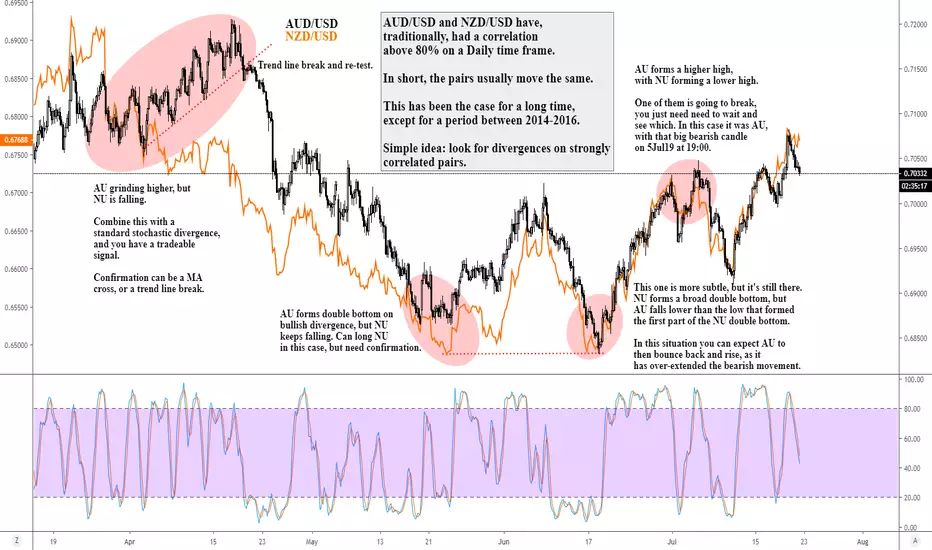
How to Trade Correlations for New Traders - AUD/USD vs NZD/USDWelcome!
Here's a super simple chart, and strategy, which can help you get started in your trading journey.
Trading strongly correlated pairs and looking for divergences is hardly an industry secret. It's a standard technique, and one that is heavily employed by large institutional investors.
Basically, correlation means that certain pairs move in a similar fashion. For AUD/USD (AU) and NZD/USD (NU), they are both based on the USD, and the Australian and New Zealand economies are, broadly speaking, based on similar fundamentals. This means that the factors that impact the price of the AU market, will naturally have similar impacts on the NU market.
The great thing about the AU and NU correlation is that it's long lasting, and strong. For a few decades now, the pairs have had a 80%+ positive correlation (a positive correlation means two markets move in the SAME direction, whereas a negative correlation means that move in the OPPOSITE direction). This strong correlation has held steady through some significant market events. The exception is a period between 2014-2016, where correlation dropped to a low of 15% - but that was due to a variety of factors that are too in-depth to cover here. However, it's worth stating that if the correlation were to drop below 80% in the future, this strategy/technique would no longer be valid.
Hopefully the chart broadly explains things, but in a nutshell:
The pairs should move the same.
If they don't, e.g. if AU forms higher highs, but NU forms lower lows, that's a correlation divergence. Basically, the markets have moved out of synch for some reason. Often, these are simply short-term phenomenon, and we're counting on the correlation to re-establish itself, allowing us to profit from it.
The nature of correlation divergences is that you don't know which pair is going to break first. Therefore, you need a secondary signal in order to make a trade. For example, AU is making higher highs, and NU is making lower highs - which one is going to break? Well, a simple idea is to grab your favourite momentum indicator and look for divergences on either market. On our chart, this plays out in the mid-late April trade. AU is grinding higher, but forming a bearish momentum divergence. Therefore, we're looking for AU to break lower. We can use a moving average, or a trend line break as our confirmation signal to enter the trade. This one worked out wonderfully, but not all of them will.
Positive correlations are, like nearly all trading signals, stronger on higher time frames. on a 5min chart, correlations, like the markets themselves, are far more volatile. This is why I would suggest using H4 as your smallest time frame chart, and look at correlations on a Daily basis.
A great website to measure/track correlations is www.mataf.net
I hope that that all makes sense. I encourage you to try it out for yourself - pick two strongly correlated pairs and start training your brain to look for divergences. And, as with all trading, don't jump on the first correlation divergence you see. You need a secondary confirmation (e.g. momentum divergence, support/resistance), and then a confirmation signal, before making a trade. Trading success is all about how you do things, not what you do.
If you have any questions, feel free to contact me.
DD

FOREX Markets Closed? No Problem, Trade CryptoBTC update, a live trade in LTC, and a few more Crypto ideas

What I'm Watching for the Next Week of Trade + Updateadded a few more pairs to the watch list and I show you how to trade a few pairs

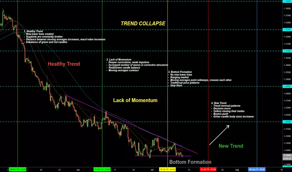
The Story Behind The Trend Collapse ( Educational Post )STORY BEHIND THE TREND COLLAPSE
1. Healthy Trend
- New lower lows created
- Supports are constantly broken
- Distance between moving averages increases, macd value increases
- Imbalance of green and red candles
2. Lack of Momentum
- Deeper corrections, weak impulses
- Increased number of waves in corrective structures
- Red&Green candle balance
- Moving averages contract
3. Bottom Formation
- No new lower lows
- Ranging market
- Moving averages point sideways, crosses each other
- Traditional price patterns
- Stop Hunt
4. New Trend
- Trend reversal patterns
- Decision move
- Sellers closing their trades
- Buyers push
- Green candle body sizes increases
DEFINING MARKET STRUCTUREIN THIS VIDEO WE ARE GOING OVER MARKET STRUCTURE. WHAT MARKET STRUCTURE IS, WHY ITS IMPORTANT AND HOW ITS USED TO FIND A OPTIMAL SETUP IN THE MARKETS! HOPE THIS IS HELPFUL. GIVE US A THUMBS UP AND SHARE THIS VIDEO IF YOUVE FOUND IT HELPFUL

eurchf longFX:EURCHF
Hey all, as you can see i'm trying out methods, i'm trying to see what works for me so apologies if you are wondering "why does he keep changing entry types etc"
I'm by no means an expert trader but I promise you I will get there.
Im using supply demand areas
fib ext
rsi.
Hoping this will work out for me.
Apologies for poor quality of sound my laptop fan is terrible. Maybe when i become profitable I can invest in a new lappy :-)

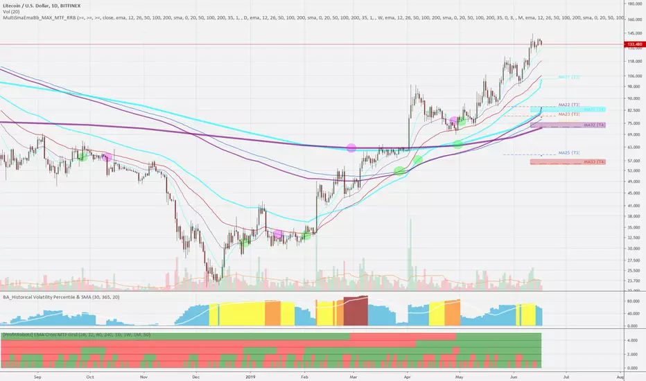
Basics of Trading with EMAs using Multi Timeframes MTF ExplainedThe Basics of Trading with EMAs using Multi Timeframes MTF Explained
To be able to trade successfully you need to understand how timeframes influence price movements.
Here I'm using the Litecoin D1 chart to illustrate.
On a chart you can see 3 sets of EMAs from different timeframes with crosses marked by dots: 12 (aqua), 26 (purple), 50 (red), 200 (blue)
D1, W1, Monthly EMAs use thin, medium, and thick lines respectively.
Note: W1 and Monthly don't have EMAs 50 and 200 because there's not enough history, so there are less lines to watch
There are also 2 indicators: Historical Volatility and EMA Cross MTF Grid
The following relation between EMAs is timeframe specific:
- D1 EMA50 is roughly EMA12 of the W1 higher timeframe
- D1 EMA200 is almost exactly EMA26 of the W1 higher timeframe, but not quite
you can use such EMA approximations to avoid switching timeframes, for example, H1 EMA200 = H4 EMA50 or you can use my Multi SMA EMA MTF indicator.
Choose timeframes wisely: M15, H1, H4, D1, W1, Mo
Some people also use 195 min, 2H, 3H, 6H, 12H, 2D, 3D, 3Mo to watch how price propagates in between.
General Ideas of EMA Trading:
1) Make sure you're in a trend on the current and higher timeframe.
You will be more confident to set higher price targets when both timeframes are going in the same direction, and lower targets when the higher timeframe is in the opposite direction in correction.
When in sideways market:
- no trade high risk zone
- not every EMA cross up means an up trend. you can have a sideways market with multiple crosses negating each other (Litecoin Feb-Mar 2017). EMAs won't help you there.
- this is especially true for faster EMAs: 12,26. But on a Daily/Weekly even a faster EMA becomes relatively slow and therefore more reliable because a lot of effort goes into a single candle.
- use a series of multiple EMA crosses on cur/higher timeframes and EMA slopes to confirm the start of a move in a specific direction
- use Super Guppy/SuperTrend/PVT trend indicators to gauge trend
- use a series of higher highs/higher lows, 5 waves up etc - basic methods to establish that price is trending
- wait for a clear breakout with volume confirmation with 1-2 higher tf bar closes above R level, retest and follow through
- look at historical volatility, buy low (blue), sell high (red)
- use oscillators
- switch/trade higher timeframes that are in a trend
- switch/trade another asset
Keep In mind:
- Trading the trend on higher tfs (D1, H4) is simpler than on lower tfs with lots of noise and indecision, you have less everything: less noise, less outcomes, less lines to watch.
- Sideways trading/Scalping in general is not worth the time/effort - you will most likely lose your money to bots. This is high risk trading that only applies to small positions and requires attention, precision and lots of skill to be profitable.
- Trading large positions and portfolios requires higher liquidity and hedging and can be done using options or margin trading with 2 open positions in opposite directions on several exchanges.
Use margin/short only when you know what you're doing.
Always calculate R/R and fees. You can lose money on fees even when the trade was profitable.
if you trade low liquidity coins for pennies expect flash crashes with huge wicks and stop order execution only at the bottom - use stop limit instead.
Last, but not least: you don't want to become the market. If you buy up the whole asset - the price will go down, as there will be no more buyers (Oil, US History)
2) When in an up trend (Reverse is true for down trend)
You can observe the following price behavior on the chart:
- price is above EMA12 - up trend, likely to bounce at EMA12
=> aggressive: buy the dips with a stop loss
- price is below EMA12, above EMA26 - likely to bounce at EMA26 or next supporting EMA: EMA50 or EMA12 of the higher timeframe
=> conservative: buy the dips with a stop loss
- EMA12,26 cross down - correction/sideways/reversal - start of down trend => exit longs and/or short with a stop loss after the cross or on retest of EMA12
=> expect a sell off and possible retest of the closest EMA12,26,50 with further sell off
=> price tends to go all the way to EMA200, but can be stopped by the next supporting EMA50 or EMA12,26 of the higher timeframe in the same direction
- price is below EMA200 - correction/reversal that can propagate to/cause a correction/reversal on a higher timeframe
=> look for a series of EMA crosses/slopes in the direction of a new trend on both cur/higher timeframes
- further 2x2 crosses down EMA12,26 x EMA50,200 - additional confirmation of the trend change
=> expect a sell off and possible retest of EMA50,200 with further sell off
- further 2x2 crosses down EMA12,26 x EMA12,26 of the higher timeframe - additional confirmation of the trend change
=> expect a sell off and possible retest of the closest EMA50 or EMA12,26 of the higher timeframe with further sell off
- when both cur/higher timeframes have the same direction, expect a bounce at the first touch of the EMA12,26 of the higher timeframe with a move higher
as sloping of EMA12,26 of the higher timeframe starts to decline expect lower bounces/sideways
the price will only break down when the sloping of the higher timeframe changes to down. Even if price breaks before that it will likely be bought up immediately with a huge wick
- when cur/higher timeframes have opposite directions, expect a rejection at the first touch of the EMA12,26 of the higher timeframe, price won't reach EMA200
as sloping of EMA12,26 of the higher timeframe starts to rise expect lower dips/sideways
the price will only break up when the sloping of the higher timeframe changes to up. Even if price breaks sooner it will likely to be sold into immediately
- you can gauge trend direction using sloping of W1 and Monthly high timeframes pretty reliably even without a cross because a lot of time/effort goes into changing it.
entries:
- on a EMA12x26 cross up or after on retest of EMA12
- on a 2nd EMA12x26 cross up after the price dips below and bounces at EMA26 to regain EMA12 support
- after a change of slope up/cross up on a higher timeframe
- on low volatility (blue, zero) - open position in the direction of a trend.
If both cur/higher tf trends are up - long, down - short.
If they have opposite direction use the direction of the cur tf trend and lower targets.
exits:
- agressive exit when EMA12 changes slope to flat/starts declining
- conservative exit on EMA12,26 cross down
- at a major resistance/EMA above: EMA200 or first touch of EMA12 of the higher timeframe
- on high volatility (red)
Notes:
- you don't need EMA50, EMAs 12,26 and EMA200 will be enough, but you can use EMA50,200 golden crosses for additional confirmations
- Monthly EMA12 has just slightly dipped below Monthly EMA26, stayed there for 2 months and broke back up - that's how we averted the 2019 crisis. Bottom's in
- Timeframes on EMA Cross MTF Grid are from top to bottom: Mo, W1, D1, H4, H1. As you can see, Monthly, W1, D1 are smooth green while H4 and H1 are choppy and filled with crosses/noise.
- EMA Cross MTF Grid crosses are lagging 1 bar, Crosses on EMA curves are also lagging due to smoothing enabled
___________________________________________________________
All EMAs are fanning up with corresponding EMA sets above each other - W1 EMA26 is crossing Monthly EMA12 => up trends on all H1,H4,D1,W1,Mo timeframes
Based on all this you can expect for Litecoin:
1. up trend for coming weeks with quick dips to D1 EMA12 (128) or EMA26 (119) that will be bought up immediately
Only after EMA12,26 cross down in a couple of weeks (EMA targets will move higher):
2. a larger drop to W1 EMA12 (105) which is already above the major 100 horizontal support - that will be bought up on the first pass
(after the first cross the price will likely regain support of EMA12, cross back up and go higher)
3. on a major correction at some point a further drop to Mo EMA12 (81) that will again be bought up on the first pass
4. on W1 EMA12 slope change to down - a final drop to EMA200 (77) or possibly below (stop loss wick hunt) that will again be bought up on the first pass
5. a theoretical max possible drop to Mo EMA26 (72) - in a couple of months
Wait for the Easy Set-ups and the purpose of Trading I often have traders ask me, how can I get alot of trades? And my response is that is the wrong question, the purpose of trading is to make Money, Period. It is, imho, to make as much money as you can in as few trades and in as little of time as possible. Although I have several methods of trading, the SS MA method, shown here is my absolute favorite. It has an 87% success rate with a healthy 3-1 RRR.
That said, I often ask those same traders "If you could consistently make 6-12% per week but could only take 2 trades, would you do it?" The answers are surprising as again, imho, anybody that says anything but yes really needs to rethink why they are trading. You should not be trading for the excitement, you should not be trading just to hit buttons. You should be trading so you can sit on a beach with the cocktail of your choice in hand.
to that end, I would implore you to come up with your best trading methodology and trade only that. As I have prominently posted between my monitors, as a reminder to myself "Wait for the easy set-ups and don't do anything stupid in the mean time" :)

GBPAUD Long example of how I tradeWhen looking for trades, my purpose is simple:
I look for High probability trades with good RRR (risk reward ratio)
I consider a trade high probability if it has an 80%, or better, historical success rate.
A good RRR (risk reward ratio) is 3-1 or better. meaning that we are risking $1 to make at least $3
Understand that by maintain a 3-1 RRR, even if I lose over 50% of the time, I will still make money. Combine that with High probability trades and your golden.
That said, there are not a lot of trade opportunities that met this criteria everyday. So I am not the guy who is going to post alot of trades, most days I only take 1 trade. I risk 2% per trade,( because I have earned that right which is a different conversation), to make 6%. Generally, I will net 15-20% per week.
I start with a strength and weakness anylasis from the prior day's trading and rank the currencies
numerically. for example today "S GBP 5" means that GBP was ranked 5th while "W AUD 7" Aud was ranked 7th
obviously GBP was stronger than Aud. So we start the day with a Buy bias. this is confirmed before I start trading, which is generally at the European open (currently 2am est).
I then look at multi-frame analysis using Ichimoku Kinko Hyo concepts. Primarily the Kejun-Sen (KS). I look at the Daily the 60 and the 15 min Tf's.
Ideally, price will be above/below the KS on all 3 tf's, but the Daily as in this example is not necessary. Moreover, we need price above/below the Ichimoku Cloud.
Next is the Asian box, if the market has consolidated during the Asian session, as it often does, I will mark the high and low, creating a box. In the example above, we have the 60 KS (blue line), which is above the cloud at 1.82119. that is the bottom of the box as it is a place that found support during the Asian session. The Daily Senkou B, in this case provides the top of the box. Generally, the Daily Senkou's A and B, provide solid resistance or support.
Putting it all together, in the above example, since price is above the 60 Ks, the 15 Ks and the cloud in the conformity with our directional bias, we have a Type 1 trade, which has an 87% success rate. these trades are Great!!!
We have 2 potential buy entry points:
1st is a pullback to the bottom of the box at he 60 KS
the 2nd is a breakout trade. However because in this example we are using the Daily Senkou B as the top of the box we need a close above it, not just penetration.
As you can see the 2:45 candle closes above the Senkou B and we can enter a long trade. Using a 20 pip stop and a 60 pip profit target. This hits perfectly (what a great example) but seriously you can look back at my other trade idea's and see similar results .
I hope this provides a general idea of what I am trying to do tradewise. feel free to hit me with any questions
AGold 54

Timeframe correlationUnderstanding timeframe correlation can help you better understand where the market flow is heading and how long to hold a trade.

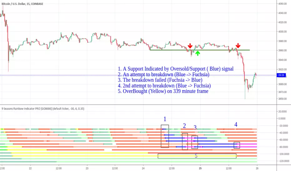
When Trends of Different Time Frames ConflictTrading is complected, because Price is superimposed wave of price activities on different time frames.
When trends on short, medium and long term time frames move in the same direction, price trend is clear, as a whole.
On the other hand, when trends on different time frames against each other, range happens and price trend is hard to predict.
This happened within the past two days on BTCUSD.
On short term to medium term time frames (15 minute -> 2H), there were multiple Oversold/Support (Blue) signals, which indicated strong support.
On long term time frames (169 minute, 4H), there were Bear (Red) signals.
On 339 minute, there was Overbought/Resistance (Yellow) signal.
On 4H, 678 minute, there were Bull Pullback (Light Green) signal.
Blue and light green is for Bull, while Red and Yellow is for Bear. The against-each-other pattern reflects the range situation of the market. Bull and Bear both believe their side will win. Nobody has 100% certainty to say which side will win.
So a good policy to handle this situation is staying away from trading until the range is broken.
A useful signal given by "9 Seasons Rainbow Multiple Time Frames Pattern" is Oversold / Support (Blue) -> Crazy Sold (Fuchsia), which indicates an attempt of break down is going. If it reverses, Fuchsia turns back to Blue, it indicates a failed breakdown.
Yesterday, there were two attempts to breakdown the support, the first one failed, while the second did breakdown.
Sometimes people make judgement by combining all the information they get, including their experience, signals from the indicator, ideas from other traders, news, or even their emotions. In my latest idea "BITCOIN GOT VALID SUPPORT, BULL MAY TEST 4050 RESISTANCE SOON", I assumed the failed breakdown will lead to retesting 4050 resistance, which has been proven to be the opposite of the real price move. It is a lesson for me: it is important to focus on objective facts and ignore all kinds of noise.
GOLD - Daily - Multi-Timeframe Analysis Series 1GOLD has a correlation to the strength of USD, as a risk-off asset investors seek haven in the event of Dollar weakness (USD falls > GOLD rises). I'm sure there's more to it than that, be sure to check it out online for yourself.
Comments
The Daily timeframe is looking very clean when it comes to price action.
Having formed bearish MACD Divergence between 4th January - 20th Feb, we have since seen this break down on the the lower timeframes. What concerns me about shorting this just now though is the Daily 50 EMA which seems to be propping up price at the region of 1300. This is the same region we had a minor rejection on the Weekly timeframe too.
The two red arrows highlight the potential for 2 shoulders, one left and one right, which could be an indication of a bearish Head & Shoulders pattern forming. This adds a lot of confluence to our overall bearish sentiment, and could be the markings of further consolidation which we referred to in the earlier lessons.
A double top on the Daily would be a prime signal for a sell-off cascading up the higher timeframes. This may not happen if we see more selling pressure. Let's see what this next week brings!
Key Note
Head & Shoulders patters can be traded as is or used for overall market sentiment. In their nature, they are consolidation / reversal formations.

GOLD - Weekly - Multi-Timeframe Analysis Series 1GOLD has a correlation to the strength of USD, as a risk-off asset investors seek haven in the event of Dollar weakness (USD falls > GOLD rises). I'm sure there's more to it than that, be sure to check it out online for yourself.
Comments
As anticipated during the breakdown of the Monthly timeframe, looking at the Weekly you can see how we respected the 20/50 EMA wave and bounced to the upside. Considering the amount of deceleration looking left when we previously approached the upper level of the zone, and comparing that current price conditions, I foresee more upwards pressure this week in the form of consolidation. Monthly swings take much longer to develop and turn around than that say on of the Daily time horizon.
If I am to get short on GOLD it will be after a push to the upside into the 1330 region, or below the 1280 level. The only problem with getting short below 1280 is we'd be trading directly into the 20/50 EMA wave (which is a big negative trade confluence). This is an unnecessary risk in my opinion.
Key Note
Taking a short at the top of the range has less risk than shorting closer to the median / Weekly mid-level of the range.

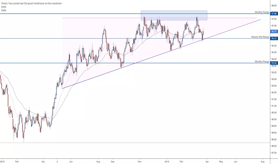
DXY - Daily - Multi-Timeframe Analysis Series 1The DXY being weighted as follows:
EUR - 57.6%
JPY - 13.6 %
GBP - 11.9%
CAD - 9.1%
SEK - 4.2%
CHF - 3.6%
As you may imagine, there's a lot more interest in using the DXY for a correlation / confluence tool when trading the EURUSD . The EURO equates to over half of the overall weight of the index, meaning there's a majority interest in the EUR vs USD.
We can use this to our advantage, alongside the USDOLLAR INDEX, to add positive or negative trade factors when considering positions across USD pairs and commodities .
Comments
I've let the Daily remain zoomed out to show the potential for a consolidation formation. It looks closer matched to an Ascending Triangle (potential to break to the upside or downside) rather than a Rising Wedge (strictly reversal pattern).
If the Monthly is looking prime for a sell-off, I must favour the Ascending Triangle breaking to the downside. Only time will tell, but I won't be counting on massive Dollar Strength beyond 97.50 unless we see a big Weekly close above this key level.
Unless this starts to break down below the 96.00 handle, it's still bullish for me moving into next week.
Key Note
Look at how price isn't respecting the EMA's as well as it has done in the past. This is an indication of consolidation occurring on this timeframe.
DXY - Weekly - Multi-Timeframe Analysis Series 1Continuing with another episode of Multi-Timeframe Analysis Series 1, I'd like to break down the DXY.
The DXY being weighted as follows:
EUR - 57.6%
JPY - 13.6 %
GBP - 11.9%
CAD - 9.1%
SEK - 4.2%
CHF - 3.6%
As you may imagine, there's a lot more interest in using the DXY for a correlation / confluence tool when trading the EURUSD. The EURO equates to over half of the overall weight of the index, meaning there's a majority interest in the EUR vs USD.
We can use this to our advantage, alongside the USDOLLAR INDEX, to add positive or negative trade factors when considering positions across USD pairs and commodities.
Comments
Looking at the Weekly timeframe gives us a different picture to that on the Monthly. We a low-test candle printing into the 20/50 EMA wave, this indicates a possible continuation to the near-term levels of 97.40 region. If we did see this push to the upside, it's change the formation on the current Monthly candle (and potentially the overall outlook shared within the Monthly breakdown). Thinking in terms of the longer time horizon, if we see a break of 97.80 I think it's possible to reach the realms of 100.
Key Note
The Weekly and Monthly are conflicting, which can often be a sign of the overall bias changing from beneath the surface. The smaller timeframes turn quicker, and when they align, this can change the direction gradually on the higher timeframes.
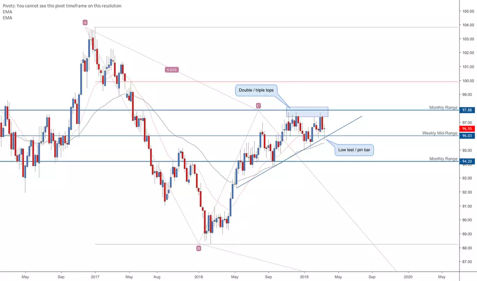
DXY - Monthly - Multi-Timeframe Analysis Series 1Continuing with another episode of Multi-Timeframe Analysis Series 1, I'd like to break down the DXY.
The DXY being weighted as follows:
EUR - 57.6%
JPY - 13.6 %
GBP - 11.9%
CAD - 9.1%
SEK - 4.2%
CHF - 3.6%
As you may imagine, there's a lot more interest in using the DXY for a correlation / confluence tool when trading the EURUSD. The EURO equates to over half of the overall weight of the index, meaning there's a majority interest in the EUR vs USD.
We can use this to our advantage, alongside the USDOLLAR INDEX, to add positive or negative trade factors when considering positions across USD pairs and commodities.
Comments
Looking at the Monthly timeframe we appear to be stalling between the 61.8% retracement of A>B as indicated on the chart. Price is showing high test candles at this level, as well as a potential rolling double top (continuation formation). Given the circumstances of this in its current form, 94.00 could easily be on the cards as we move into the second quarter of 2019.
Key Note
At time of writing this, it's the current monthly candle cannot be considered an indication of direction just yet as it hasn't fully formed (being the 24th of the month).

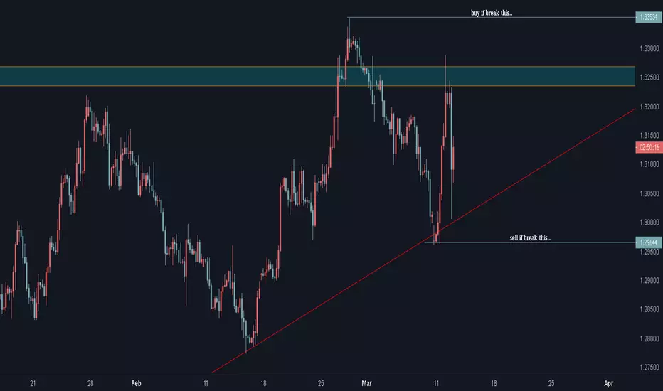
wait and watch////TREND:
MONTHLY;making higher high
weekly; price at last lower high if break this level buy trend at weekly will start and if this level reject price sell trend continue at weekly..
daily; buy trend higher high.
PATTERNS:
double top forming at weekly at resistance level also bearish engulfing candle..
head and shoulder pattern at daily
sell if h & s pattern trendline break
buy if break resistance...
BA: Speculative at New All-time High with Contrarian Long-term POnly 2 of the DJIA components are currently at new all-time highs: BA and PG. Boeing gapped and ran up on earnings news with a boost from HFTs and buybacks. Currently, the number of shares held by institutions is dropping. Vanguard, Blackrock, Price T Rowe, State Street, Capital World Investors, Northern Trust, all giants of the Buy Side, have lowered held inventory in recent months. The stock is at a speculative price as smaller funds buy heavily and buybacks of up to $14 billion move price up. Whether this will be a good strategy for BA this year remains to be seen. The chart is the Long-term Trend Monthly chart showing the severity of the speculative buying. Also you can see the Cycle chart pattern using the DPO indicator with a failure to trough V shape. Volume shows a steady decline as well. These are contrarian indicators to what price is doing.

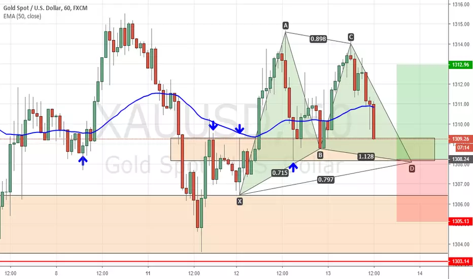
XAUUSD Bullish Gartleythis pair is near short-term support, and a bullish gartley is forming.
check the HTF /H4 for support zone
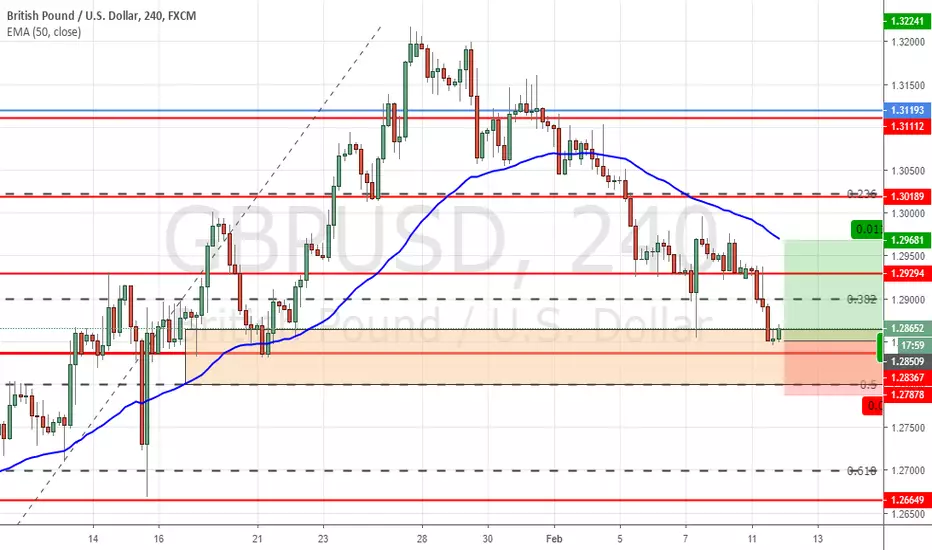
GBPUSD LongThis pair is near important support level (check the D1) 1.2830 area.
May be a good spot to go Long, check for double bottom on lower time frame, or bullish engulfing candle.
Good luck.