Building my algorithms on a weekly chartThis has been a highly requested video and AMD may not have been the best place to start - but it is helpful to see nonetheless.
I will start to do this type of analysis video more in the future if people find it helpful toward building their own algorithms and their own "story".
See you all next time!
Happy Trading :)
- TraderDaddyOG
Multiple Time Frame Analysis

1-Indicator Strategy For Beginners...The Stochastic Hey Rich Friends,
Happy Wednesday!
I wanted to share one of my top 3 favorite indicators with you.... The Stochastic (STOCH). As a leading (vs lagging) indicator, it is perfect for beginners because you can find entry and exit signals with only a few key details.
Adding the STOCH to your chart:
1. Search the indicators for "STOCHASTIC" and click once to add to your chart. The only thing that I modify is the thickness of the lines but feel free to make further changes to your liking.
2. Make sure that the "indicators and financial values" option is ON. Right-click your scales, select labels, and make sure "indicators and financial values" is checkmarked.
Entry signals for a buy:
- The STOCH is facing up
- The fast line (blue) is above the slow line (orange)
- The STOCH has crossed above the 20% level, from oversold, back into the blue-shaded area
Exit the trade or take profit once the STOCH has crossed back below the 80% level, from overbought, into the blue-shaded area.
Entry Signals for a sell:
- The STOCH is facing down
- The slow line (orange) is above the fast line (blue)
- The STOCH has crossed below the 80% level, from overbought, back into the blue shaded area
Exit the trade or take profit once the STOCH has crossed back above the 20% level, from oversold, into the blue-shaded area.
I hope that this video helps someone become a more independent and profitable trader. Let me know in the comments if you try this strategy!
Peace and Profits,
Cha

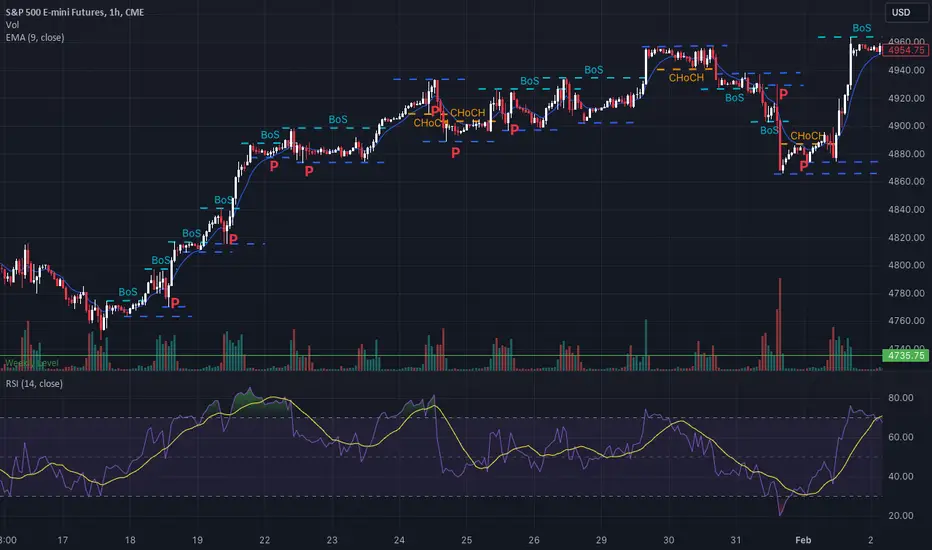
CHoCH, BOS(Break of Structure), and Pullback ExamplesCHoCH, BOS(Break of Structure), and Pullback Examples
Multi Timeframe Analysis
Daily ----> 4H
4H ----> 1H
1H ----> 15 min
30m ----> 5m
Market Structure Simplified
"Ultimate Market Structure Course - Smart Money Concepts" by Smart Money Concepts
1. First Step: Find Valid Pullbacks
- Signal Trends
- Valid Breaks
- Reversals
Pullbacks are defined by when a low of a candle is below previous candle low
2. Identify deepest point of pullback
- That will be the unconfirmed low/high
3. Look for BOS or CHoCH to confirm valid lower/higher high or low
Double EMA Strategy...For Beginners Hey Rich Friends,
Happy Monday! It's a new week which means many new opportunities to get into the market...but it doesn't mean that you have to take all of them.
Make sure you focus on finding the best setups by sticking to your plan and following your confirmation checklist. The best out of 25 will give you a good idea of your win/loss ratio.
If you are still struggling to find a SIMPLE strategy that works for you, try using this Double EMA strategy that I apply to my trades. Let me know what you think and if it works for you!
Today we will cover:
1. How to use EMAs on Tradingview
2. Double EMA Strategy
3. Feel confident taking a buy or sell in Forex trades
4. Trade with the trend
Peace and Profits,
Cha

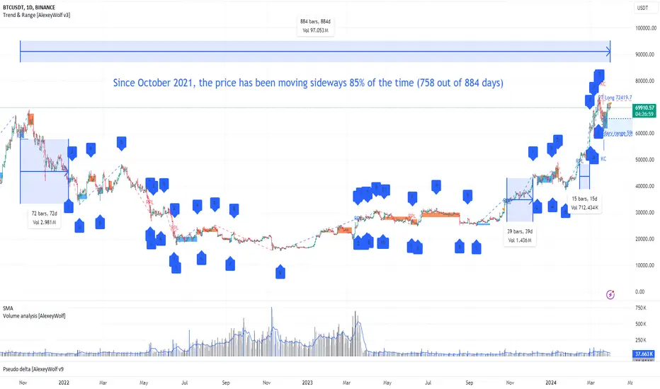
Trade in a sideways marketMain price pattern of financial instruments
So, when we talk about the price of financial stuff, like stocks or crypto, it often moves in specific ranges over different timeframes, right? Whether it's weekly, daily, hourly, or even minute charts, prices tend to hang out in these ranges for a while. Traders call this kind of price movement "consolidation," "range-bound," or simply a "sideways market."
In this article, we'll just call it a sideways market or range. When prices are stuck in this sideways action, they can break out with a sudden burst of momentum, kickstarting a trend, or they might just keep bouncing around, forming a new sideways pattern.
Let's check out the daily chart of BTCUSDT starting from October 2021. On the chart (see above), we've marked those periods where the price was moving sideways with blue markers. Since October 2021, we've spotted 7 of these sideways patterns. We label the first point of each sideways move as "1". Out of 884 trading days, the price was stuck in this sideways action for 758 days (884 - 72 - 39 - 15), which makes up about 85%. This means that throughout this whole period, you could've been looking at trades from one edge of the sideways range to the other.
Based on my estimates, most financial instruments spend more than 75% of their time in this sideways market mode.
So, knowing how to trade in sideways markets is a super important skill for traders. And for investors, understanding these sideways moves can really amp up the profitability of their investments by pinpointing better entry and exit points.
For example, right now, considering buying BABA stocks might be a good idea because the price is chilling at the bottom of a sideways range on the weekly chart.
Example1
Mastering the Skills for Successful Trading in Sideways Market
Being able to effectively trade within trading ranges, between their boundaries, requires not only a certain amount of knowledge but also the development of specific skills. Initially, one must grasp the theoretical foundations and then apply them in practice, gradually honing their skills. Let's look at the necessary skills:
Skill 1: Understanding and applying the Concept of Time Frame (TF) Interconnection: higher TF, lower TF. Grasping the context of the higher TF in relation to the sideways market TF.
Skill 2: Identifying sideways market: determining the absolute and current boundaries of the range, as well as the current direction (vector) of price movement.
Skill 3: Recognizing zones of interest for buyers and sellers.
Skill 4: Determining the presence of buyers at the lower boundary (bottom protection by buyers) and sellers at the upper boundary (top protection by sellers).
Skill 5: Adhering to risk management principles when entering trades (especially crucial for traders).
Each of these skills is based on a vast amount of knowledge that needs to be absorbed first and then applied in practice. The journey can be long and sometimes tedious. Is there a way to hack this system and shorten the time it takes to acquire knowledge, develop skills, and start trading? Well, there are options. For example, you can use technical indicators (such as RSI, Bollinger Bands, ATR, etc.) to make buying or selling decisions. Or you could completely bypass the process of acquiring knowledge and skills and rely on signals from Telegram channels or expert opinions. But what will you find there about trading in sideways market (ranges), where the market spends more than 75% of its time?
This series of articles is written for those who are ready to take control of their financial destiny, who strive to understand how financial markets work, and who want to master the skills of independent trading and making more informed investment decisions. Here you will find the knowledge and tools to start understanding what is happening in the financial markets and how to profit from it. I don't promise any magic pills or "money" buttons:).
So, let's get started.
Skill 1: Applying the Concept of Time Frame Interconnection
The higher time frame (TF) always takes precedence over the lower one. For instance, if we observe on the daily chart that the market is in a seller's zone (which is determined by Skill 3), then on the hourly chart, we need to analyze the seller's actions (Skill 4) and primarily look for selling opportunities. However, there might be a situation where the seller is inactive, and the price starts to rise due to buyer pressure (in this case, Skill 4 comes into play again).
Example2
On the provided chart, areas of seller interest are marked in red, while buyer interest areas are marked in blue. Let's examine the period from March 25th to March 27th, highlighted in yellow on the chart.
On the daily TF, we observe sideways movement since December 22, 2023, with the bearish vector (11-12) being relevant. The first target of the bearish vector, 3.119, was reached on March 19, 2024. The second target (2.822) and the third (2.611) remain valid. On March 25th, the price returned to the seller's zone on the daily chart (the red zone with the lower boundary at 3.680).
On the hourly chart, on March 25th, the price trend reached the daily seller's zone and formed a range with 7 points. The breakout from this range occurred downwards on March 27th. Therefore, in this range, it was advisable to look for selling opportunities from the upper boundary and riskily consider buying from the lower one.
Similarly, you can make investment decisions by analyzing, for example, the weekly and daily TFs.
To be continued...
P.S. This is indeed an interesting point! Despite the fact that the market spends more than 75% of its time in sideways movement, indicators and strategies specifically designed for trading in this mode have not gained as much popularity as other trading approaches. Even on the internet, including TV and trading Telegram channels, signals or analyses based on identifying sideways movement are very rarely encountered. If you have experience or knowledge about trading methods in sideways markets (including indicators), please share them in the comments!
The Hidden Key --> Multi-Timeframe Analysis 🪀I begin by explaining the Video Idea--> Using Multi-Timeframe analysis to put together a trade idea. MTF analysis is absolutely crucial for running a profitable trading business... It's something that takes some experience but once you understand the way in which all timeframes move together it's like an Aha moment. We look at 3 timeframes.. the 1Hr, 4hr and the Daily timeframes. We observe an example from just a few days ago that outlines how it was very possible to catch a 20 pips after the Monday(3/25/24) daily candle closed bullish.. Give and rocket and leave a comment for similar content in the future!

SPG - Trade analysis & Multi-time frame confluenceThis video is more of a tutorial on why I took a short trade on SPG today. We fell out of our strong buying continuation channels with a rejection of HTF tapered channels and selling channels. Confirmation was the support from our more tapered buying algo and rejected of the bottom of our stronger buying algo (in addition to it lining up with our strong magenta selling channel)
Happy Trading :)

XAU - Understanding how to analyze Multiple Time FramesYes - This way of seeing price action works on any time frame and in any market -
Why? - Because it's using basic understanding of how the market works and utilizing these channels as a way to see the strength of buyers and sellers at any given price. In a way, it's a third eye (Price, Volume, Strength). Utilizing this alongside any indicators you'd like to add can lead you to real vision in the crazy and "unpredictable" world of trading.
I personally don't use any additional indicators aside from straight up Volume - and that's what works best for me. But if you can find confluence with any of the thousands of indicators out there, that's amazing and i'm sure you'll be able to find real success.
Hope this was helpful! And as always,
Happy Trading!

ICT Unicorn Model - The powerful ModelThe Unicorn entry model in the ICT method combines the concepts of the Breaker Block and the Fair Value Gap, providing a unique approach to identifying trade opportunities. This combination highlights a future area of support/resistance.
A Bullish Unicorn Pattern consists out of:
A Lower Low (LL), followed by a Higher High (HH)
A Fair Value Gap (FVG), overlapping the established Breaker Block
A successful re-test of the FVG which confirms the pattern.
A Bearish Unicorn Pattern consists of:
A Higher High (HH), followed by a Lower Low (LL)
A Fair Value Gap (FVG), overlapping the established Breaker Block
A successful re-test of the FVG which confirms the pattern
In this trading idea, I would combine the movement of DXY and GU/EU to explain the correlation and divergence (ICT SMT). Futhermore, I want to share how powerful the ICT Unicorn Entry Model is.

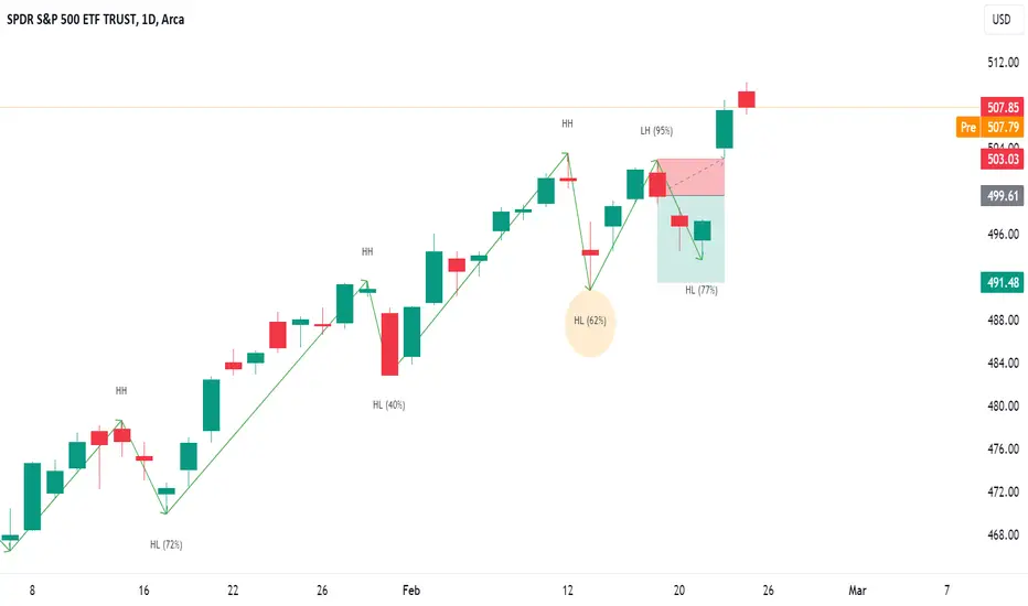
Price overextension: misconceptions and common mistakesPrice overextension remains a widely misunderstood concept in trading, causing both novice and seasoned traders to make errors in their decision-making. This misinterpretation often leads to placing trades in the wrong direction or, equally detrimental, overlooking profitable opportunities.
In essence, price overextension signifies that the market has undergone a rapid and excessive movement in one direction. Such movements are often perceived as unsustainable. Numerous indicators, such as Stochastic, RSI, Bollinger Bands and many other, attempt to identify such "abnormal" price movements so traders could capitalize on them. Despite variations in statistical methods and calculations, their common goal is to detect instances where price went or down too much and is likely to reverse.
In this discussion, I will use Relative-Strength-Index (RSI), a popular indicator, to convey my perspective on price overextension. While some traders argue for customization, the elusive question of "how" often remains unanswered. From my experience, there are no universally perfect settings that consistently yield optimal results.
I’ll draw my examples from the recent SPY bar chart (February 2024).
The first misconception
The first misconception is that if price is overextended it is time to immediately start looking for a trade in the opposite direction. The most important phrase here is “start looking”. Many beginners misinterpret this as an invitation to commence trading, leading to the premature initiation of short positions during perceived market "overextension" and vice versa.
So, the first and foremost important advice is to never try guessing top/bottom based on one indicator or gut feeling. Simple as it seems I remember many times breaking this rule myself because the temptation was too strong. It rarely ended up well.
On the graph, I've highlighted three recent instances where the RSI exceeded 70 (indicating overbought conditions). What stands out is that, following each occurrence, the price surged significantly before consolidation set in, inflicting losses upon short traders.
Even experienced traders, who look for confluence of signals, may fall into this trap. In the first two examples, bearish candlestick patterns failed to prevent subsequent price increases. Most likely, those candles were “created” by weak hands traders, who tried to short market, while it was actually controlled by strong buyers.
These instances could have been avoided by considering the daily graph, revealing a robust bullish context – price was in an uptrend, one-time-framing up on weekly. There were couple of moments when bears gained short term control (Tuesdays 13th and 20th) but they never could take the previous week low; bulls always confirmed their control.
The second advice is to avoid trading against higher level context. While sometimes those trades might work the result is usually mediocre and most of the times you’ll simply lose. If you really wish to trade against context you need to construct a solid dossier of evidence, supporting your trade.
The second misconception
What is the second misconception? It is that when price overextended it is not time to go with the market. In this scenario, traders refrain from initiating long trades after RSI indicates overbought conditions, potentially causing them to miss profitable opportunities. It might not hurt your account but who likes missing good opportunities?
Surprisingly, seizing these trades correctly is not much harder than any other trade. It simply requires prudence and discipline and getting rid-off cognitive biases. For example, in the second example on the graph a trader could win up to 1% if he played off gap-up open after seeing that the new price has found acceptance.
Conclusion
It is possible to build a profitable strategy that relies on “price overextension” concept. However, it demands more than a cursory examination of a single indicator and adherence to textbook candle patterns. Personally, I reached a point where I entirely abandoned the use of RSI and similar tools because, instead of providing clarity, they seemed to cloud my thinking.
Opting for a more effective approach involves keenly observing actual market behavior, which often defies conventional expectations. Study of high-level contexts, understanding key levels, and discerning confluence in price action signals on lower timeframes consistently prove invaluable. This method helps steer clear of common pitfalls and contributes to enhancing overall trading results.

Using Multi-timeframe analysis to make better trading decisionsTrading on multiple timeframes can significantly improve your risk-reward ratio, regardless of what TA technique, you are using. Let’s look at the recent example (SPY ETF)
Third week of February started with a strong sell-off (Monday-Tuesday 13th). Price retraced >50% of the previous move, signaling potential trend reversal. At this point market Bears started scouting for daily low high to enter short trade. They received signal on Friday 16th when price broke previous day low.
A short trader, who trades only daily chart, would enter this trade at Friday close with stop-loss slightly above daily high and 1st profit target near Tuesday low. This setup provides a decent risk-reward ration >2. There is also a chance that previous low will be broken and price will fall even further, adding to profit. So taking this trade makes a lot of sense. On the main graph to this post you can see how it developed.
Price has not reached our profit target, reversed and made new high. Trade got stopped-out. Even if trader was using trailing stop (stop moved slightly above each new day high) this would not have saved him from huge overnight price jump
Could have the trader done better? Yes, if he had zoomed into lower timeframe and monitored price action there.
Here is what we can see on the 15m chart. (boxes show hourly candles, color coding matches hourly wave direction, you can read about how waves are constructed here )
Bearish reversal pattern shaped on Thursday- Friday. It is not an ideal triple top but there was a clear weakening of upthrust. Also, on Friday morning price broke previous day low, a sign of an increased bearish strength.
Basically, at 21.30 (UTC+1) short trader already had enough evidence to enter trade. He could have done it w/o waiting for day closure. This would have already been a better entrance than in the first scenario.
After entering the trade, trader could start monitoring for continuation. Tuesday was clearly bearish but on Wednesday there were multiple signs of shift of control. Firstly, price was able to set hourly higher low. Secondly, bearish wave was progressing very slowly. Finally, there was a 15 m equilibrium (end of Wednesday RTH) that resolved convincingly bullish. At this point a reasonable trader should have closed his trade without hesitation.
This would not be a great trade still, but it will be a profitable one, with risk-reward 1.7 . It is nearly impossible to achieve same results looking just on the daily chart.
Disclaimer
I don't give trading or investing advices, just sharing my thoughts
Understanding Momentum to filter out the Best SetupsIn the video I discuss how I analyse momentum using MACDs and the 5min and 1min charts when daytrading.
Knowing these key concepts helps me filter out the best setups to get on the right side of the market and in the right trading zones.
The basic concepts discussed are :
- Momentum
- Price Action
- Candle Analysis
- Multi-timeframe Analysis
** If you like the content then take a look at the profile to get more ideas and learning material **
** Any Comments and likes are greatly appreciated **

Best Technical Analysis Strategies for Trading Gold
If you want to trade Gold, but you don't know what strategy to trade, I prepared for you the list of 4 simple and profitable gold trading strategies.
Please, note that my list includes the indicator, swing, price action and smart money strategies, so you will certainly find the one that suites you.
Also, all the strategies will be strictly structure based.
It means that no matter which strategy you choose, you should start your analysis with identification of key levels on a daily time frame.
Example of structure analysis on Gold.
1. Breakout trading on a daily time frame
With that approach, we will be aiming to catch swing moves.
Your bearish confirmation will be a bearish breakout - a daily candle close below a key support. A bearish continuation will be anticipated to the next closest daily support then.
Your bullish signal will be a bullish breakout of a key daily resistance.
Then you can buy aggressively or on a retest, expecting a bullish continuation to the next strong resistance.
In the example above, bearish breakout of a key daily support was a strong bearish signal that triggered a massive selloff.
This strategy is based only on a daily time frame analysis,
the next 3 strategies will be more sophisticated and involve multiple time frames analysis.
2. Price action confirmation strategy
With that approach, you should patiently wait for a test of one of the key structures that you spotted on a daily.
After that, you should monitor the reaction of the price to that on 4h/1h time frames.
Your signal to buy will be a formation of a bullish reversal price action pattern on a key support, while your bearish confirmation will be a bearish pattern on a key resistance.
Once you spotted a confirmation, you can anticipate a bullish/bearish movement, at least to the closest 4h structure.
In the example above, Gold tested a key daily support. The price formed a double bottom formation on that. Its neckline breakout was a strong bullish signal.
A bullish movement initiated to the closest 4H resistance then.
3. Moving average confirmation strategy
For that method, you will need 2 moving averages: simple MA with 9 length and exponential MA with 20 length.
Once the market tests a key support, you should look for a crossover.
A simple MA should be above the exponential MA.
It will be your bullish signal.
After a test of a key resistance, look for an opposite crossover.
A simple MA should be below the exponential MA.
It will give you a strong signal to sell.
Here is how the MA crossover would help you to predict a bullish movement on Gold on an hourly time frame.
4. Smart money confirmation strategy
With that approach, you should look for a break of key daily structure on 4h/1h time frames.
After a violation of a key support, you should look for a bullish imbalance so that the price should return above the broken structure. That will be your signal to buy.
After a violation of a key resistance, look for a bearish imbalance. The price should come back below a broken structure. It will be your signal to sell.
After a test and a violation of a key daily resistance, Gold formed a bearish imbalance on a 4H time frame. It was a strong bearish signal.
All these strategies are very efficient. However, they will work after you learn to correctly identify key structures.
Let me know in a comment section which strategy do you prefer.
❤️Please, support my work with like, thank you!❤️

The importance of trading with the trend + Suppy/Demand zonesA trend can be defined with price action or indicators. Understanding that all indicators lag and price behaviour is key I prefer price action to tell me if we are up trending, down trending or trading in a range. Before understanding the basics of market structure it is important to know that its more likely for a trend to keep going on than for the trend to reverse. That is why professional traders look for areas to jump on the trend not areas to go against it. Also, keep in mind what time frame are you using to define the trend, for example, if your trades don't last more than an hour would you jump on the weekly chart trend ? what happens in 1 hour won't affect the weekly chart. So if you are trading the 5 or 15 min chart you can trade with the trend of the 1 or 2 hour chart.
How to define the trend ?
• An up trend is when price is making higher highs and higher lows
• A down trend is when price is making lower highs and lower lows.
• If there is no way to define the trend then you can say it is in a trading range with no clear
direction.
When has the trend changed ?
To explain a trend change we will consider the chart below. First we can notice a clear up trend making higher highs and higher lows (1,2,3) then we create a new lower low (4) where we break below previous higher low (2) then price fails to create a new higher high and instead creates a lower high (5), finally when price breaches the previous lower low at (6) we can consider a change of structure. opposite situation happens in a down trend market.
ABCD CORRECTION PATTERN
There is a very common pattern that pretends to be a change of structure but really it is just a correction pattern to continue the uptrend. Look at the example below. An up trend creates a higher high (A) and a higher low (B). Then creates a lower high (C) and finally a lower low (D) before continuing its up trend.
What did not happen that the trend didn't change ?
If the high after (C) had been also a lower high and then it breaks below (D) and (D) acts further as resistance then the trend had changed.
What is more important here is to understand that trading a continuation of the trend has a higher probability of working, on the example shown the correction ended right at a 4hr demand zone that was valid because the trend was still skewed to the upside.

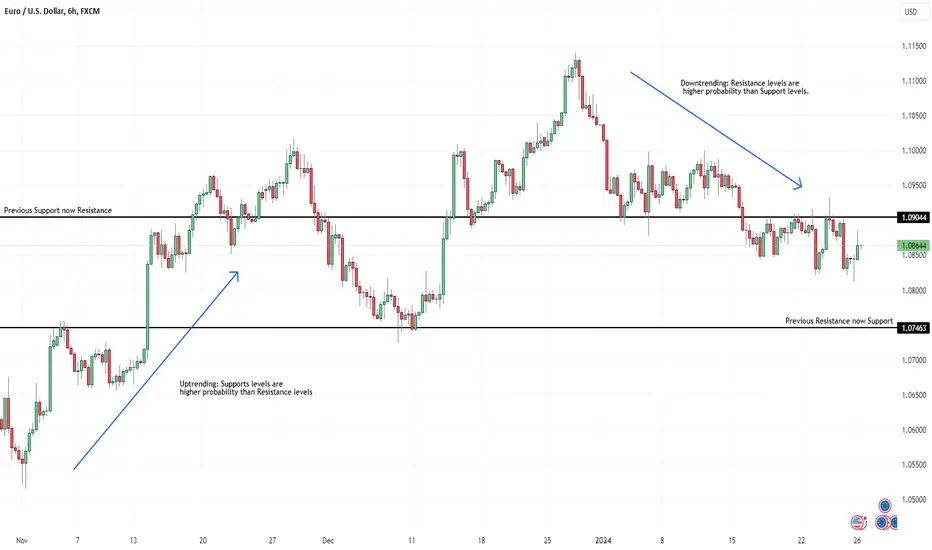
Following the trend with support and resistance• It is always important to understand who is in control at the moment, buyers or sellers, and be aware that the trend can change very quick so its key to adapt and don’t have a bias. After you know what the trend is, then you can mark a high probability support or resistance level in different time frames.
• In an up trending currency, a support will always have a higher probability of holding and the resistance will not be too reliable, the opposite happens in a down trending currency. Also notice that when a resistance level in a uptrending move works, the pullback has low probability of creating new lows (lower lows) meaning it is not a strong move down, it could just be testing lower prices for liquidity and to continue the move up.
• It is common to see that a resistance once broken tends to be support and a support once broken tends to be resistance. This is a good spot to have a continuation of the trend (see example below).
• Support and resistance levels in high time frames like 6hr, daily and weekly that are strong pivot points can be known as key levels. These levels act as historical levels which means that have been relevant since months even years ago. These levels can change the trend.
• Price action around support and resistance levels can be similar to the price action at supply/demand zones (read "How to identify high quality Supply and Demand zones" link below), where price reaches the level with strength and then rejects, volume increases with no follow through and the candle closes with a wick but never below/above the support/resistance level.
• Also it is common to observe that price gets near a support/resistance area and breaks below/above, grabs liquidity and then comes back above/below the area. In this cases, enter the trade after it regains the level.
Best Trading Confirmation. Learn 95% Accurate Entry Signal
I have analyzed 1300 forecasts and signals that I shared on TradingView last year and found 95% accurate trading confirmation.
In this article, we will discuss multiple types of confirmations and their winning rate on Forex, Gold, Indexes, Crypto & Commodities.
First, let me introduce you to the types of analysis that I provided.
1 - Structure based forecast
I have shared more than 55 trading setup with key levels analysis:
Where the price is approaching a key daily horizontal support and resistance.
Here is the example of such a post.
Test of a key horizontal or vertical support/resistance turned out to be a poor trading signal.
Total accuracy of structure based forecasts is 38% .
Please, note that if we consider the market trend in our calculations,
the trend-following structure based setup will be 42% accurate, while a performance of a counter trend setup drops to 35%
2 - Structure breakout based forecast
I analyzed and posted 73 posts with a key structure breakout as a confirmation on a daily.
Above is the example of a such a forecast.
Key levels breakout turned out to be a strong bullish or bearish confirmation with 59% accuracy.
Trend direction did not affect the efficiency of a key structure breakout that much, with a 60% accuracy of a trend following setup versus 57% of counter trend.
3 - Structure based forecast with a single intraday confirmation
I shared more than 500 setups with a test of a key structure on a daily and a single price action based bullish or bearish confirmation on a 4h/1h time frame.
My intraday confirmation is a formation of a price action pattern with a consequent breakout of its neckline/trend line in the projected direction.
Please, check the example of such a signal.
Just a single intraday confirmation dramatically increases the accuracy of a structure based setup.
Average winning rate is 66%.
4 - Structure based forecast with multiple intraday confirmations
I spotted and posted 200+ forecasts with a test of a key structure on a daily and multiple price action based bullish or bearish confirmations on a 4h/1h time frame.
Multiple confirmations imply the formation of multiple price action patterns on 4/1h t.f.
Here is the example of such a setup on EURGBP.
Two or more confirmations on a key structure increase the average winning rate to 72%.
Among multiple confirmations, I found a 95% accurate bearish signal:
The market should be in a bearish trend.
The price should test a key daily structure resistance.
The market should form a rising wedge pattern on a 4h/1h time frames and the highs of the wedge should strictly test the key structure and should not violate them.
After a test of structure, the price should form a bearish price action pattern on the highs of the wedge.
Above is a setup with the best trading confirmation.
A bearish breakout of the neckline of the pattern and a support of the wedge was a 95% accurate trading signal this year.
Of course, there are various confirmations, depending on a trading style. The ones that I shared with you are structure/price action based.
And I am truly impressed by their accuracy.
❤️Please, support my work with like, thank you!❤️

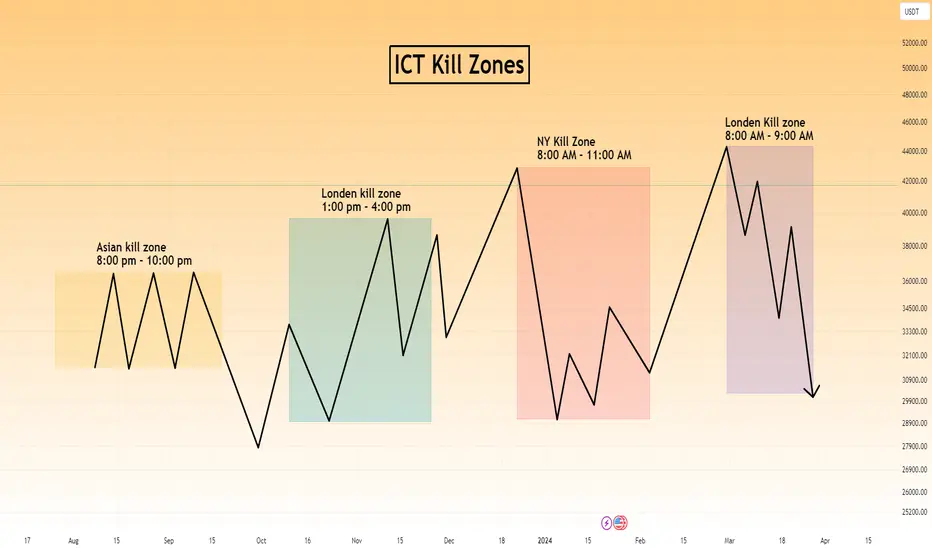
ICT Kill Zones Time Asia London New YorkIn the fast-paced world of forex trading, timing is everything. While the forex market operates 24 hours a day, not all hours offer the same trading opportunities. That’s where ICT Kill Zones Times come into play. Forex kill zones are the time when high probability trading setup formed
These strategic time frames can open up a world of possibilities for traders who know how to leverage them. In this post, we’ll explore the concept of ICT Kill Zones ‘ times and how they can lead to high-probability trade setups and potential profits.
The ICT Asian Kill Zone Times: The Dawn of Opportunities
The Asian Kill Zone is the first of the strategic periods in the forex market. It is particularly relevant for traders dealing with the Australian dollar, New Zealand dollar, and Japanese yen pairs, as these markets are most active during this time.
What makes the Asian Kill Zone special is its volatility, driven by economic news releases that occur during this session. Traders who keep an eye on these news releases and their impact on the market can make the most of this period.
Main Characteristics of Asian Kill Zone
-During the Asian Kill Zone, traders can often find optimal trade entry patterns, offering potential gains of 15 to 20 pips for scalp trades.
-NZD, and JPY pairs are ideal for this time of the day.
-The Asian Open can sometimes set up an Optimal Trade Entry Pattern that can offer a 15 – 20 pip scalp.
-The Higher frame bias is helpful here – but short-term retracements in either Bull or Bear
-Markets can offer similar OTE Setups.
Asian Kill Zone Time
ICT Asian Kill Zone Times lies in between 8:00 PM Eastern to10:00 PM Eastern
ICT London Kill Zone Time
The ICT London Kill Zone takes center stage during the London trading session, witnessing the highest volume of order execution compared to other sessions. It is an opportune time for those trading the EUR and GBP pairs. Notably, the London Open often presents opportunities for traders to enter positions with the potential for gains ranging from 25 to 50 pips.
Main Characteristics of London Kill Zone
One of the distinctive characteristics of the London Kill Zone is its tendency to create the low of the day in bullish markets and the high of the day in bearish markets.
Time of ICT London Kill Zone
London Kill Zone of ICT lies between 2:00 AM to 5:00 AM Eastern Time
Traders should monitor the key times between 2:00 AM to 5:00 AM New York time to capitalize on the price action during the London session.
The New York Kill Zone Time: The Land of Opportunities
For traders dealing with major pairs coupled with the dollar index, the New York Kill Zone is an essential timeframe to watch.
Similar to other Kill Zones, this period often sets up optimal trade entry patterns, providing potential gains of 20 to 30 pips for scalp trades.
Time of New York Kill Zone
The New York Kill Zone occurs between 8:00 AM to 11:00 AM Eastern Time. This time is favorable for major pairs and benefits from the overlap with the London session, making it a golden opportunity for traders.
New York Kill Zone lies between 8:00 AM to 1:00 AM Eastern Time
The London Close Kill Zone: The Final Countdown
The London Close Kill Zone is a specific time frame that can create continuation points for swings that extend well into New York afternoon hours. It’s the last chance for traders to make their moves before the market closes for the day, making accurate predictions during this period potentially profitable.
Between approximately 8:00 AM to 9:00 AM Eastern Time (adjusted for daylight savings) , traders can find optimal trade entry patterns, offering opportunities for 10 to 20 pips of profit on scalp trades. Monitoring the key times from 10:00 AM to Noon NY time can yield valuable insights during the London Close Kill Zone.
ICT Kill Zone on During Daylight Saving Time (DST)
Now, let’s talk about Daylight Saving Time (DST), which starts on the second Sunday in March and ends on the first Sunday in November. During this period, Eastern Time is shifted one hour ahead to Eastern Daylight Time (EDT), which is UTC-4.
For example, let’s consider April 10th, and the time is 11:30 AM in Eastern Time (ET) during Daylight Saving Time. To convert this to Coordinated Universal Time (UTC), you add 4 hours to the local time:
11:30 AM ET (UTC-4) + 4 hours = 3:30 PM UTC
During Daylight Saving Time, the clocks are adjusted forward by one hour, giving us an extra hour of daylight in the evenings. When Daylight Saving Time ends, we set the clocks back by one hour to return to Eastern Standard Time.
ICT Kill Zone Setting on Trading View
On the TradingView chart, you’ll find the time zone option at the bottom right corner. To set the correct time zone, click on it, and choose “UTC-5” during regular days (Standard Time) and “UTC-4” during daylight saving time, which typically occurs from the second Sunday in March to the first Sunday in November.
ICT Kill Zones Indicator Trading view & MT4
A number of indicator are available on the trading view that automatically highlights the ICT kill zones on your chart.
ICT Kill Zone LuxAlgo is one of the best indicators available on trading view.
To Add ICT Kill Zone indicator you adopt the following steps:
Step1:Click on the indicator icon on top of the trading view
Step2 write LuxAlgo ICT Kill Zone
Understanding and effectively utilizing ICT Kill Zones can significantly enhance a trader’s success in the forex market. Each Kill Zone represents a unique opportunity with its own set of potential gains.
Fair Value Gap Trading StrategyFair Value Gap Trading Strategy
To implementing a fair value gap as a trading strategy you need to understand these three basic components of this trading strategy.
Time
Liquidity Hunt
Market Structure Shift
Fair Value Gap
Let’s begin by discussing the importance of time in trading. According to ICT Trader, time is considered to be fractal, meaning that what happens on higher time frames is reflected in lower time frames if studied in the proper context.
In this context, fractal refers to the idea that patterns and behaviors observed on longer time frames, such as daily or weekly charts, can be seen in shorter time frames, like hourly or minute charts.
By studying price action and market behavior across different time frames, traders can gain a deeper understanding of market dynamics and potentially identify profitable trading opportunities.
Time indeed holds significant importance in the fair value gap trading strategy, particularly when it comes to identifying favorable trading setups. Despite the forex market being open 24 hours a day, not all times present ideal conditions for executing fair value gap trades. That’s where the concept of ICT Kill Zones comes into play.
ICT Kill Zones
ICT Kill Zones refer to specific time periods during the day that have been observed to offer higher probability trading opportunities. These zones are associated with the entry of smart money, which are institutional or banks who have the ability to influence market direction.
In short, ICT Kill Zones correspond to specific time periods during the day that are particularly relevant for trading activities. These zones include the London Open, London Close, New York Open, and New York Close.
Traders using the fair value gap trading strategy often focus on these times as they tend to offer higher probability trading setups. The ICT Kill Zones are associated with the entry of smart money and can provide enhanced opportunities for traders to capitalize on market movements. By aligning their trading activities with these specific time periods, traders aim to improve their chances of success.
Liquidity in FVG Trading Strategy
Liquidity in the market often takes the form of buy stops and sell stops.market makers or smart money intentionally trap retail traders by manipulating prices to trigger their stop losses.
The idea is that they move the market in one direction to hunt for stop losses, causing retail traders to place orders in the false direction and set their stop losses at key levels. After the stop loss hunt, the market reverses in the opposite direction, benefiting the smart money.
Let’s analyze the above chart from a retail trader’s perspective. When we observe the chart, we notice that the price levels between 44240 and 44280 have proven to be strong resistance in the past.
Based on this observation, many retail traders might place their selling pending orders to anticipate of a price reversal at these levels. To manage their risk, they would likely set their stop loss orders just above this resistance area.
What is done by market makers or smart money,they could manipulate the market by initially pushing the price upward, deliberately triggering the stop loss orders placed by retail traders. This action would cause some retail traders to think that a breakout is occurring and prompt them to place buying orders while setting their stop losses at levels below the resistance area.
Once the stop loss orders have been hunted and triggered, the market makers or smart money may then reverse the price direction.
Enhancing Trading Success with the Fair Value Gap Entry Strategy
After a liquidity hunt on a higher time frame, you suggest switching to lower time frames such as 15 minutes, 5 minutes, 3 minutes, or even 1 minute to identify certain patterns that may emerge following the stop loss hunt. These patterns include:
1.Sudden or sharp price movements: Following the liquidity hunt, you may observe rapid and significant price fluctuations on the lower time frames.
This sharp movement causing market structure shift and provide an extra confluence.
2. Fair value gap (FVG): Look for gaps between the current price and the fair value of the asset. The fair value represents the equilibrium price based on various factors. Identify instances where the market price deviates significantly from this fair value.
3. Entry position based on the Fair Value Gap strategy: Once you spot a fair value gap pattern after the liquidity hunt, you can consider taking a position in anticipation of the market filling that gap. The expectation is that the market will eventually return to the fair value price.
It’s important to carefully train your eyes to recognize these patterns after a liquidity hunt and patiently wait for the market to come back and fill the identified gap. Once you have identified a suitable entry position, you can place your stop loss order above the first candle to manage your risk.
Please note that implementing such strategies requires careful analysis, experience, and a deep understanding of the specific market you are trading. It’s crucial to conduct thorough research, backtest your strategy, and consider other factors that may influence price movements before making any trading decisions.

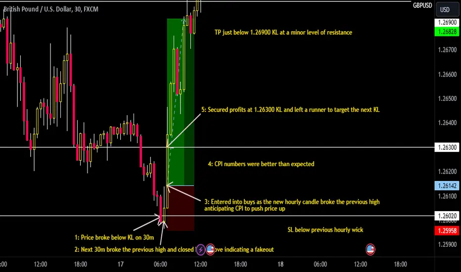
GBPUSD London Session Buy Recap 70+ pipsPrice broke below the KL but the next 30 minute candle closed back above, indicating a small liquidity grab for price to move back up. CPI was to follow and as the next hourly candle broke the previous high, buys were entered with us anticipating CPI to drive price back up to the next KL. Secured some profits there, and left a runner to target the KL at 1.26900.
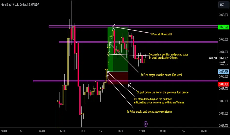
Gold Asian Session Buy Recap 80 pipsTook successful buys on gold after price broke resistance, waited for a pullback and entered anticipating price to move up with Asian volume. Looked to target a 4hr wickfill and stops were placed below the previous 30m candle.
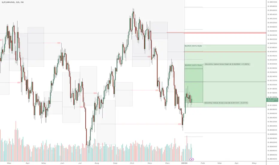
The Most Important Chart For 2024For me it's important to keep a macro picture in mind to set the context around my trading. What is going to drive everything this year is what happens to the USD. Will the FOMC cut rates? Is the economy as strong as it seems? Are things shaky under the surface?
No matter what happens in the US economy, it'll be caught by this chart. You could use the dollar index futures but it's not perfect and lacks a lot of liquidity. In general most "USD baskets" have EUR as the largest holding, which makes this pair a good inverted proxy.
We can see the MarketWebs are showing bullish 80% rules not only for the year but also for the month. The 80% rule means that there is an 80% chance that price will move from one side of value to the other. It's likely that January will end before its 80% rule plays out, but we are more firmly into the 80% rule for 2024 and many months still to go!
Learn Profitable Doji Candle Trading Strategy
In the today's post, I will share my Doji Candle trading strategy.
This strategy combines the elements of multiple time frame analysis, price action and key levels.
Step 1
Analyze key levels on a daily time frame.
Identify vertical and horizontal supports and resistances.
Here are the key structures that I spotted on on AUDUSD.
Step 2
Look for a formation Doji Candle on a key structure.
This rule is crucially important: we will trade only the Doji candles that are formed on key levels.
From key supports, we will look for buying, and we will look for shorting from key resistances.
Look at this Doji Candle that was formed on a key daily support on AUDUSD.
Step 3
Look for a horizontal range on a 4h/1h time frames.
Doji Candle signifies indecision. Quite often, you will notice the horizontal ranges on lower time frames when this candlestick is formed.
Here is a horizontal range that was formed on a 4H time frame on AUDUSD after a formation of Doj i.
Step 4
Look for a breakout of the range.
To sell from a key resistance, we will need a bearish breakout of the support of the range. That will be our bearish confirmation.
To buy from a key support, we will need a bullish breakout of the resistance of the range. It will be our bullish signal.
Here is a confirmed breakout of the resistance of the range with a 4H candle close above. That is our bullish confirmation on AUDUSD.
Step 5
Buy aggressively or on a retest.
After you spotted a confirmed breakout of the range, open a trading position aggressively or on a retest.
Personally, I prefer trading on a retest.
If you sell, a stop loss should be above the high of the range and your target should be the closest key daily support.
If you buy, your stop loss should be below the low of the range and a take profit will be on the closest daily resistance.
On AUDUSD, a long position was opened on a retest. Stop loss is lying below the lows. Take profit is the closest resistance.
Here is how the great strategy works!
Always patiently wait for a confirmation! That is your key to successful trading Doji Candle.
❤️Please, support my work with like, thank you!❤️

My post session analysis. What do you think?London Session EU post session analysis. Things I was out looking for.
