Your ULTIMATE Guide For Time Frames in Trading
If you just started trading, you are probably wondering what time frames to trade. In the today's post, I will reveal the difference between mainstream time frames like daily, 4h, 1h, 15m.
Firstly, you should know that the selection of a time frame primarily depends on your goals in trading.
If you are interested in swing trading strategies, of course, you should concentrate on higher time frames analysis while for scalping the main focus should be on lower time frames.
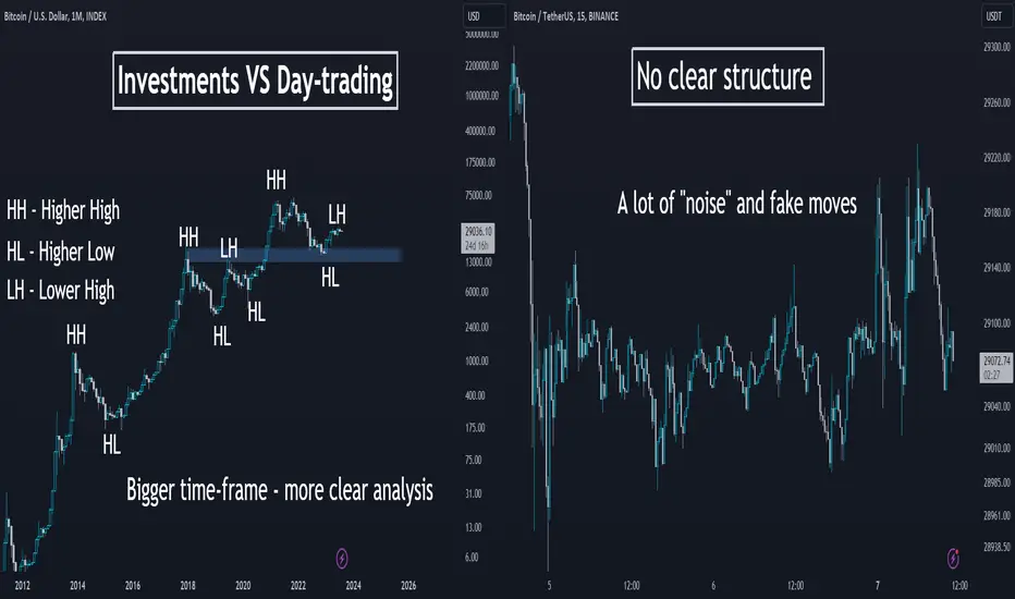
Daily time frame shows a bigger picture.
It can be applied for the analysis of a price action for the last weeks, months, and even years.
It reveals the historical key levels that can be relevant for swing traders, day traders and scalpers.
The patterns that are formed on a daily time frame may predict long-term movements.
In the picture above, you can see how the daily time frame can show the price action for the last years, months and weeks.
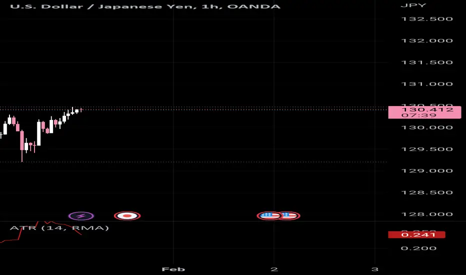
In contrast, hourly time frame reflects intraweek & intraday perspectives.
The patterns and key levels that are spotted there, will be important for day traders and scalpers.
The setups that are spotted on an hourly time frame, will be useful for predicting the intraday moves and occasionally the moves within a trading week.
Take a look at the 2 charts above, the hourly time frame perfectly shows the market moves within a week and within a single day.
4H time frame is somewhere in between. For both swing trader and day trader, it may provide some useful confirmations.
4H t.f shows intraweek and week to week perspectives.
Above, you can see how nicely 4H time frame shows the price action on EURUSD within a week and for the last several weeks.
15 minutes time frame is a scalping time frame.
The setups and levels that are spotted there can be used to predict the market moves within hours or within a trading session.
Check the charts above: 15 minutes time frame shows both the price action within a London session and the price action for the last couple of hours.
It is also critical to mention, that lower is the time frame, lower is the accuracy of the patterns and lower is the strength of key levels that are identified there. It makes higher time frame analysis more simple and reliable.
The thing is that higher is the time frame, more important it is for the market participants.
While lower time frames can help to predict short term moves, higher time frames are aimed for predicting long-term trends.
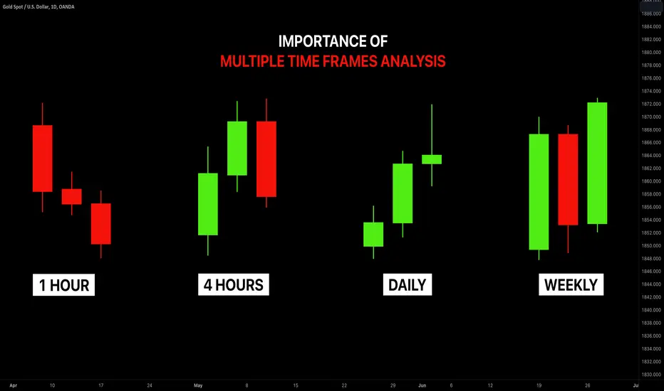
Multiple Time Frame Analysis

Day Trading the Hang Seng IndexDay trading the Hang Seng Index...explanation of the two trades for the day and the price action that led to the setups.
I talk through my approach to Day trading and how I use the indicators along with how to Manage the Risk while in a trade.
** If you like the content then take a look at the profile to get more daily ideas and learning material **
** Comments and likes are greatly appreciated **

Attention Traders. DON'T Make This MISTAKE in Top-Down Analysis
Most of the traders apply multiple time frame analysis completely wrong. In the today's article, we will discuss how to properly use it and how to build the correct thinking process with that trading approach.
The problem is that many traders start their analysis with lower time frames first. They build the opinion and the directional bias analyzing hourly or even lower time frames and look for bullish / bearish signals there.
Once some solid setup is spotted, they start looking for confirmations , analyzing higher time frames. They are trying to find the clues that support their observations.
However, the pro traders do the opposite .
The fact is that higher is the time frame, more significant it is for the analysis. The key structures and the patterns that are spotted on an hourly time frame most of the time will be completely irrelevant on a daily time frame.
In the picture above, I underlined the key levels on USDJPY on an hourly time frame on the left.
On the right, I opened a daily time frame. You can see that on a higher time frame, the structures went completely lost .
BUT the structures that are identified on a daily, will be extremely important on any lower time frame.
In the example above, I have underlined key levels on a daily.
On an hourly time frame, we simply see in detail how important are these structures and how the market reacts to them.
The correct way to apply the top-down approach is to start with the higher time frame first: daily or weekly. Identify the market trend there, spot the important key levels. Make prediction on these time frames and let the analysis on lower time frames be your confirmation.
❤️Please, support my work with like, thank you!❤️

Day Trading vs Mid-term investments Day Trading 🌪️📉📈
Day trading involves buying and selling financial assets within the same trading day. Traders constantly monitor the market, aiming to capitalize on short-term price movements. 🕒⏰
👍 Pros:
Potential for quick profits with multiple trades in a single day.
High adrenaline rush and excitement from rapid decision-making.
👎 Cons:
Requires constant attention, often leading to stress and emotional fatigue. 😓
High risk due to rapid market fluctuations and trading fees.
Mid-Long Term Investments 🚀📈📉
Mid-long term investments, on the other hand, involve holding assets for an extended period, ranging from several months to years. Investors focus on the asset's overall growth potential and fundamental value. 📈💹
👍 Pros:
Lower stress and emotional strain as you have time to analyze and make informed decisions. 🧘♂️📊
Potential for significant returns through long-term market trends. 📈📈
👎 Cons:
Limited excitement in comparison to day trading, as it requires patience and discipline.
Requires a solid understanding of market fundamentals and long-term trends.
Why the Second Option Is Better Emotionally 😌
While day trading can be thrilling, it often comes with high stress and emotional tolls. The constant pressure to make quick decisions and the fear of missing out (FOMO) can lead to impulsive actions and losses. 😫
In contrast, mid-long term investments provide emotional stability. H aving a long-term vision allows you to detach from short-term market fluctuations and focus on the bigger picture. This patience and emotional balance can lead to more thoughtful investment decisions and better overall returns. 😊
Remember, successful investing is not a sprint but a marathon . So, consider the emotional benefits of mid-long term investments, and you'll find yourself on a calmer, more fulfilling financial journey. 🏃♂️🚀
Backtesting GBPNZD WB 07/24Order Block Strategy Overview:
The order block strategy is based on identifying key levels in the price chart. Order blocks are essentially areas on the chart where institutional traders placed significant buy or sell orders. These orders can create strong levels, which are relevant to other market participants. The strategy aims to capitalize on potential market reactions when the price returns to these order block areas.
Step-by-Step Guide to Trading with Order Blocks:
Step 1: Identify Order Blocks
Begin by analyzing the price chart of the asset you want to trade. Look for areas where the price has shown a significant change in direction, forming clear swing highs or lows.
These swing highs and lows may represent potential order blocks where institutional traders executed large orders.
Step 2: Confirm Order Blocks
To validate an order block, look for a price move that shows a strong impulse (sharp price movement) followed by a consolidation or a pullback.
The consolidation or pullback phase indicates the potential presence of buy or sell orders, confirming the order block's relevance.
Step 3: Draw Levels
Once you've identified the order blocks, draw horizontal lines to mark the levels created by them.
These levels act as areas of interest for potential future trades.
Step 4: Analyze Price Action
Observe how the price behaves around the identified levels.
Look for signs of price rejection (pin bars, doji candles, or engulfing patterns) that indicate the market's reluctance to move past those levels.
Step 5: Plan Your Trade
If the price approaches a bullish level, consider going long (buying) if you observe bullish price action, suggesting a potential bounce from that level.
If the price approaches a bearish level, consider going short (selling) if you observe bearish price action, indicating a potential reversal from that level.
Step 6: Set Stop-Loss and Take-Profit Levels
Always use proper risk management to protect your capital in case the market moves against your position.
Set a take-profit order at a reasonable target level based on your analysis. This could be the next level.
Remember:
The order block strategy is not foolproof and carries risks like any other trading approach.
Always practice proper risk management to protect your capital from significant losses.
Never trade with money you cannot afford to lose.
It's important to conduct further research and practice trading with order blocks on historical price data or in a demo trading account before implementing this strategy in live markets. Additionally, consider combining order block analysis with other technical or fundamental indicators to increase the robustness of your trading decisions.

Learn this price action setup for the BIGGEST DAY TRADESI walk through the pre-market prep and the price action that led to a big move on the Nikkei Index.
Learning price action means understanding 'WHO' may be trapped and where they will start to feel the pain and be forced to act and potentially close positions....that is when we want to initial a position to take advantage of the move.
The Nikkei index was a great example of knowing when and where to trade which could have led to a big payouts.
** If you like the content then take a look at my WEBSITE in the profile to get more daily ideas and learning material **
** Comments and likes are greatly appreciated. **

Learn Why You Should Study Multiple Time Frame Analysis
In my daily posts, I quite frequently use multiple time frame analysis.
If you want to enhance your predictions and make more accurate decisions, this is the technique you need to master.
In the today's post, we will discuss the crucial importance of multiple time frames analysis in trading the financial markets.
1️⃣ Trading on a single time frame, you may miss the important key levels that can be recognized on other time frames.
Take a look at the chart above. Analyzing a daily time frame, we can spot a confirmed bullish breakout of a key daily resistance.
That looks like a perfect buying opportunity.
However, a weekly time frame analysis changes the entire picture, just a little bit above the daily resistance, there is a solid weekly resistance.
From such a perspective, buying GBPUSD looks very risky.
2️⃣ The market trend on higher and lower time frames can be absolutely different.
In the example above, Gold is trading in a bullish trend on a 4h time frame. It may appear for a newbie trader that buyers are dominating on the market. While a daily time frame analysis shows a completely different picture: the trend on a daily is bearish, and a bullish movement on a 4H is simply a local correctional move.
3️⃣ It may appear that the market has a big growth potential on one time frame while being heavily over-extended on other time frames.
Take a look at GBPJPY: on a weekly time frame, the market is trading in a strong bullish trend.
Checking a daily time frame, however, we can see that the bullish momentum is weakening: the double top pattern is formed and the market is consolidating.
The sentiment is even changing to a bearish once we analyze a 4H time frame. We can spot a rising wedge pattern there and its support breakout - very bearish signal.
4️⃣ Higher time frame analysis may help you to set a safe stop loss.
In the picture above, you can see that stop loss placement above a key daily resistance could help you to avoid stop hunting shorting the Dollar Index.
Analyzing the market solely on 1H time frame, stop loss would have been placed lower and the position would have closed in a loss.
Always check multiple time frame when you analyze the market.
It is highly recommendable to apply the combination of at least 2 time frames to make your trading safer and more accurate.
❤️Please, support my work with like, thank you!❤️
Daytrade Review on the Hang Seng IndexI small trade today on the Hang Seng Index that turned out to be quick and simple with little to no pressure from the entry. Could have been a better exit but all up it was a good start to the day.
I will explain the price action for the Entry and the reasoning for the trade coming into the start of the session.
** If you like the content then take a look at my WEBSITE in the profile to get more daily ideas and learning material **
** Comments and likes are greatly appreciated. **

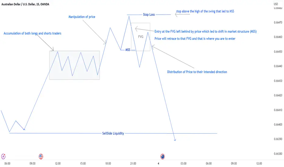
Market Makers Buy And Sell ModelThe market Makers' Buy and Sell Model is a strategy that reveals the market maker algorithm model for price delivery.
Basically, there are 3 things market makers' algorithms do with price in every trading session, day, week, and month
Those 3 things are; Accumulation, Manipulation, and Distribution.
AMD:
A: Accumulation
M: Manipulation
D: Distribution
1. Accumulation: They accumulate liquidity through the delivery of a ranging market.
The purpose of delivering a ranging market is to induce both buyers and sellers to enter the market thinking that price will go in their direction.
How to Identify a Ranging Market: You know price is in a ranging market when you see obvious relative equal highs and lows price range.
In a ranging market, price swing points have relatively equal highs and lows, that is, the price is neither delivering a higher high nor a higher low.
2. Manipulation: After accumulating both buy and sell orders, they then manipulate the market to further induce another set of traders which are breakout traders.
But, that particular manipulation move is not their intended direction for the day. They only use it to gather liquidity, Which will then lead them to the next action which is to move and distribute prices in their real direction for the day.
Usually, when price breaks out of a ranging market, the break-out is a manipulation to further induce a new set of traders to enter the market, further proving liquidity for market makers' real intended direction.
3. Distribution: After manipulating the price to a particular direction different from their plan, they then distribute the price to their original intended direction.
e.g to buy, they will first sell the market and then buy at the discount price level.
You know a price distribution through clean candles that left imbalances behind and then break market structure away from the previous manipulation move structure high or low to form a new structure.
Example of Market Makers Buy and Sell Model as described on the chart.
AMD:
A: Accumulation
M: Manipulation
D: Distribution
Accumulation: Price range for some time, accumulating liquidity on both sides of long and shorts.
Manipulation: Price broke the high of the accumulation to take out Buyside liquidity and then create a new higher high and higher low. But it's a manipulation move.
Distribution: Price moves away from the FVG leading to a shift in market structure, plus a short pullback, follow by a massive move to the downside to take out sell-side liquidity below.
Entry: Your entry should be inside the FVG created by price before the shift in market structure, you can set a limit order inside the fvg and place your stop loss at the high of the swing high created prior to the fvg and shift in market structure.
The same thing applies to a bullish market.
Basically, Marker makers push prices higher so they can sell the market at a premium, while they sell the market to lower prices so they can buy that market at very discount prices
This strategy can be used in any time frame and all markets including forex, crypto, stocks, future etc.
Follow me for more updates.
Feel free to ask me any questions in the comment.
Fair Value Gap Strategy (FVG): GBPUSD 7.32x Reward TradeCheck out this 7.32RR trade I took today on GBPUSD.
OANDA:GBPUSD
Trade Process:
Daily is bullish with FVG serving as draw on liquidity.
1HR: Took out Sellside liquidity left with BuySide liquidity to take out.
15M: London Session open took out 15M sellside liquidity with high probability of taking out Buyside liquidity.
Entry: I used my fib to locate OTE at the FVG which is where i placed my buy limit.
Price retraced to pick my order and fly high to take out the buyide liquidity and the daily FVG.

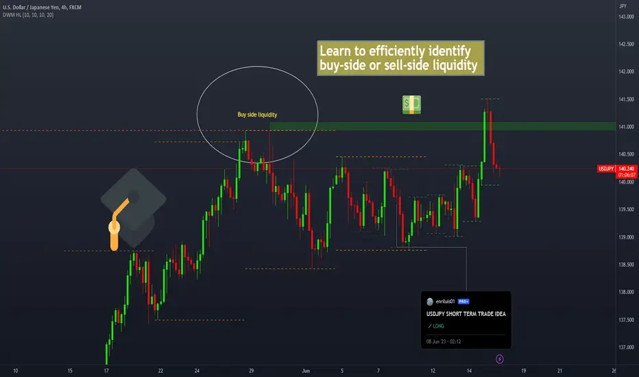
Learn to identify liquidity levels. Before we begin, we need to understand what liquidity is.
A market with high liquidity is one where there is a large number of buyers and sellers willing to trade in that particular asset. This means that there is a high availability of buy and sell orders, allowing transactions to be executed quickly and with minimal impact on prices.
Where are the most liquid points located on a chart?
These points are found at the highs and lows. This is because at these points, many people are waiting for the zone to act as support or resistance, or for the price to break the zone (breakout) to continue its direction. I always use daily, weekly, and monthly timeframes to identify these zones.
Why the liquid points are importante on a chart?
Liquidity is extremely important because it is the direction in which the price moves. The price will always move towards these points to attract liquidity to the market. Without liquidity, financial markets cannot function.
Which indicator can you use to identify liquidity levels?
Previous Days Week Highs & Lows by sbtnc
Certainly, this indicator will facilitate the process of identifying these points, but it will not identify all of them.
-----Remember, like everything in trading, this needs to be combined with other confluences. It won't work by itself.-----
Explanation of the example presented in the chart.
I had some strong confluences indicating that the price was likely to have a bullish move. As seen in the COT report, there was aggressive selling of JPY. One of the things that helped me take this trade with confidence is that, as you can see in the circle, there was a weekly and monthly high together without being cleared. This created a double top pattern. Since this was such a liquid point, it gave me the confidence that the price would move towards this point before changing direction. And it did exactly that after consolidating for several days. These liquidity points can be used as confluence in our analysis, as well as a potential take profit level.
Learn How to Trade Multiple Time Frame Analysis
Hey traders,
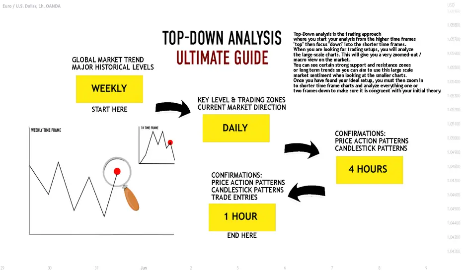
🔝Top-Down analysis is one of the most efficient ways to analyze & trade different financial markets. In this post, we will discuss the time frames to watch and the main steps to go through to execute a Top-Down trading strategy properly.
Being a Top-Down trader your task is to assess the global market perspective and identify the zones, the areas from where it will be relatively safe for you to trade it following the trend or catching the reversals.
➖Weekly time frame shows you the price action during the last couple of years. It unveils the major zones of supply and demand and indicates the long-term direction of the market.
Your task is to spot these zones and underline them.
The strongest market moves most of the time initiate from these zones.
At the same time, you must remember that on a weekly time frame the market is extremely slow. Being beyond the key zones 90% of the time, it takes many weeks, even months for the market to reach them.
➖Once you completed a weekly time frame analysis,
the next on your radar is a daily time frame.
Daily time frame shows you 1-year-long price action.
It indicates a mid-term sentiment.
And again, here your task is to simply identify the market trend and underline major key levels.
*It is highly recommendable to apply different colors for highlighting weekly/daily levels.
Completing weekly/daily time frame analysis, your task is to set the alerts on at least two closest support/resistance clusters. You must patiently wait for the moment when the price reaches one of them.
Once the underlined key level is reached, you start the analysis of intraday time frames.
➖The intraday time frames on focus are 4H/1H.
Your task here is to spot the price action/ candlestick patterns.
With such formations, the market unveils its reaction to the key level that it is approaching.
You are looking for a pattern that confirms the strength of the level.
Spotting the pattern you are looking for a trigger to open a trading position. Most of the time it is a breakout of a trend line or a horizontal neckline.
The breakout confirms the willingness of buyers/sellers to buy/sell from the underlined support/resistance . Only then a trading position is opened.
Here is the example how I analyzed and traded Gold using multiple time frame analysis:
1. I have analyzed weekly chart and spotted a key horizontal resistance
2. On a daily time frame, I found a rising trend line that matched perfectly with the underlined weekly structure.
3. Testing the confluence zone based on a trend line and a horizontal resistance, the price formed a double top pattern on 4H time frame. Its neckline breakout was my confirmation to open a short positing.
Entry point was a retest of a broken neckline.
The market dropped sharply, producing a very nice profit.
Of course, in practice, Top-Down analysis is very complex and many things and concepts must be learned in order to apply that strategy properly. Follow the steps described in this post, learn to identify key levels and recognize the price action patterns and you will see how efficient this strategy is.
Do you apply a Top-Down trading strategy?
Let me know, traders, what do you want to learn in the next educational post?
1,2,3 Confirmation PatternWhat does it consist of?
It consists primarily of 3 candles, and the fourth one is where we will enter the operation. In a bearish scenario the High of 2nd candle must be higher than the high of the 1st candle. The high of the 3er candle must be below the high of the 2nd candle. The 4th candle must re test the point of origin of the 3er candle.
How can you use it?
It is extremely important to complement and use this with a strong idea of where the price is heading. To know where the price will move, we need to understand that it moves towards the most liquid areas. The most liquid areas can be the unfulfilled Daily, Weekly, or Monthly lows and highs.
Where should you place the entry?
You should wait till the 3er candle close and place the entry at the point of origin of the 3er candle.
Where should you place the stop loss?
The stop loss should be above the 3er candle.
Important
I use this technique in D,W and M timeframes. After establishing a bias I look for the pattern. After the 3er candle is complete I move to 1hr or 15minutes to find the point of origin of the 3er candle.Then, I place the order.

Introducing the Responsive Supply and Demand IndicatorIn this comprehensive tutorial, Stock Justice offers an insightful walkthrough of the enhanced Supply and Demand Indicator. We delve into the tool's advanced features, demonstrating its capacity to identify pivot points across multiple timeframes, its customization options, and ways to interpret its outputs. The video provides valuable guidance on how to navigate the settings of this powerful tool, from plotting circles and lines to adjusting the number of ranges to be analyzed. By the end of this tutorial, users will better understand how to utilize the Supply and Demand Indicator to optimize their trading strategy and make more informed decisions.

Trend Channels, One of the best trading strategy 🤓The channel is a powerful chart pattern for trading. Channels combines several forms of technical analysis to provide traders with entry and exiting points as well as risk control.
In this training, I will explain one of the simplest trading strategies called " Trend channel trading strategy ".
Please note, this post is a summary of this strategy and I only mention its main points.
😏
Types of channels and best for this strategy
A channel consists of at least four contact points because we need at least two low points to connect to each other and two high points to connect to each other. In general, there are three types:
Channels that are angled up are called ascending channels.
Channels that are angled down are descending channels.
Channels in which the trendlines are horizontal are called horizontal channels, range channels, trading ranges, rectangle channels.
The channels are also divided into three categories according to the time periods who make the price range :
Macro channels , which are made with 12-Hour time frame, daily time frame and above.
Mini channels , which are made with a time frame from 1-Hour to a maximum of 12-Hour.
Micro channels , which are made with time frames of less than 1-Hour.
**Tips:
1- Macro channels are made of Mini channels, and Mini channels are made of Micro channels, However, it is only an estimate and may not always be accurate, and they are Not the main rules and condition for Identifying channels or drawing them.
2- There is no special formula or law for naming the channels according to their time frames with these names (Macro, Mini and Micro) and you can use any time period for any type of channel.
Trade Reliability
Conformations represent the number of times the price has hits the channels trend lines and rebounded from the top or bottom of the channel. These are the important confirmation levels to remember:
1-2: Weak channel (not tradeable)
3-4: Adequate channel (tradeable)
5-6: Strong channel (reliable)
6+: Very strong channel (more reliable)
**these numbers are just for each one of trend line (up line or down line of channel).
I will write the continuation of this tutorial in the comments of this post. 😎

CURRENCY CORRELATION HEAT MAPCurrency correlation is important to understand in forex trading because it could impact your trading results often without you even knowing it.
In this post, I will share some information about correlations in forex trading and how you are able to use it to your advantage to avoid unnecessary losses. Throughout my journey as a beginner trader, I have bought or sold 2 different currency pairs many times without knowing they are negatively correlated just to let the gains be offset by
the other pair.
My aim in this short post is to bring awareness about the positive and negative correlations between the currencies, specifically the most traded major pairs in the forex market.
What is correlation in forex trading?
A foreign exchange correlation is the connection between 2 different currency pairs. There is a positive correlation when 2 pairs move in the same direction, a negative correlation when they move in opposite direction, and no correlation if the pairs move with no relationship. In order to understand the relationship between 2 currencies, you must know the correlation coefficient and how it relates.
What is correlation coefficient?
A correlation coefficient represents how strong or weak a correlation is between 2 forex pairs. They are expressed in values and range from -100 to 100 or -1 to 1, with the decimal representing the coefficient. The higher the value of the correlation coefficient will largely reflect the movement of the other pair.
See Figure 1. Correlation Heat Map
For example, If the reading is -70 and above 70, it is considered to have strong correlation between the two. Readings anywhere between -70 to 70 means that the pairs are less correlated. With coefficients near the 0 mark, means little or no relationship with one or another. As traders, implementing risk management in our trading plan also reflects to correlations as you may think its a good ides to buy 2 highly correlated pairs thinking you will double your profits when in reality you may lose double the money as both trades could end up in a loss as you're doubling your risk.
Figure 2 . Positive Correlation: EURUSD / AUDUSD
As we can see on this line chart between EURUSD / AUDUSD, both pairs have a strong correlation coefficient as they are moving in almost the same direction. The correlation coefficient is valued at 75 as noted on the heat map. For example, if you place a buy order EURUSD and place a sell order on AUDUSD, expect a win and a loss in most cases.
Figure 3. Negative Correlation: EURGBP / GBPUSD
On this line chart, we can see that both of these parts are moving in opposite directions which are showing a negative correction between the two which in fact is also known as an inverted correction. The correlation coefficient is valued at -90 on the heat map which means if you place a buy order on EURGBP and a place a sell order on GBPUSD you may double your profits, but again you're doubling your risk.
Figure 4. No Correlation: GBPJPY / USDJPY
This line chart shows that both of these pairs move in the same direction with a correlation coefficient of -9 which has almost no correlation. If you place a buy order on GBPJPY and place a sell order on USDJPY, one of these trades will most likely end up in a loss. The pairs that have no correlation usually have different and separate economic conditions therefore coefficient values tend to be lower.
In summary, understanding which pairs are correlated with one another will be able to help build your strategy and improve your trading results. Every trading strategy NEEDS to have Risk Management implemented in it as it is the key to sustainability for the long run.
Trading is a marathon NOT a sprint.
To learn more about forex correlations and their relationships, please see the following links.
References:
tradingview.sweetlogin.com
ca.investing.com
If you felt this information was helpful, and hit the LIKE button and FOLLOW me for more educational
posts and analysis.
Feel free to leave a comment if you have any questions!
I appreciate all the feedback.
Thanks
Trade Safe

🔥WHY ALTCOINS FOLLOW THE BTC PRICE? A FULL GUIDE FOR TRADERS!🔥Hi, friends! I will explain why altcoins are following BTC and how traders can take advantage of this idea.
The first and main crypto is Bitcoin. I am sure that 99% of traders/investors discover crypto through BTC.
📊THE 4 MAIN REASONS WHY ALTCOINS FOLLOW BTC:
🔥 Bitcoin is the most influential cryptocurrency: As the first cryptocurrency and the largest by market capitalization, Bitcoin has a significant impact on the entire cryptocurrency market. The price of Bitcoin often affects the prices of other cryptocurrencies, and it can cause other altcoins to rise or fall in value.
Therefore, it's essential to keep a close eye on Bitcoin's price if you're trading altcoins, as it can indicate market trends and potential opportunities.
🔥 Altcoin prices are correlated with Bitcoin: Many altcoins have a strong correlation with Bitcoin's price movement. This means that if Bitcoin's price is rising, it's likely that the value of altcoins will also increase. However, if Bitcoin's price falls, altcoins are also likely to experience a decline in value.
As such, tracking Bitcoin's price can provide valuable insights into the behavior of other cryptocurrencies in the market .
🔥 Bitcoin can act as a safe haven asset: During times of market volatility or economic uncertainty, Bitcoin has historically acted as a safe haven asset. This means that investors tend to flock to Bitcoin as a way to store value and protect their investments.
As a result, Bitcoin's price can rise during times of crisis, and this can have an impact on altcoin prices as well. By monitoring Bitcoin's price, traders can gain insight into market sentiment and adjust their trading strategies accordingly.
🔥 Bitcoin is a market indicator: Bitcoin's price is often used as an indicator of the overall health of the cryptocurrency market. For instance, if Bitcoin's price is rising, it may indicate that the market is bullish and that investors are optimistic about the future of cryptocurrency.
On the other hand, if Bitcoin's price is falling, it may suggest that the market is bearish and that investors are taking a cautious approach.
By keeping an eye on Bitcoin's price, traders can gain a better understanding of market trends and make more informed decisions when trading altcoins.
✅HOW TRADERS CAN USE THIS BTC-ALTCOIN PATTERN
I made 4 simple comparisons for you to show it. I used Bitcoin (as #1 crypto) and ETH (#1 altcoin). Take a look on the chart and the numbers on it.
🚩 1st case. If BTC falls at the beginning of the bull market = altcoins fall so much.
In the first case BTC fell by -60-65% and ETH fell by -70-75%. It's not too much for ETH, but you can check the other alts. They fell by -85-90%.
🚩 2nd case. After the long consolidations altcoin grow higher than BTC.
BTC made +35%, but ETH made +81%. It's 2 times bigger than BTC.
🚩 3rd case. BTC and altcoins during the rally grow equally. Except for some skyrocketing crypto as AXS, SOL and etc, of course.
+452% for BTC and +480% for ETH.
🚩 4th case. New ATH is a time for altcoins' pumps. This is the time when they grow by 300-400% in a few weeks.
As you see, BTC made +5%, but ETH +157%!
🔥SUMMARY. So, the 2nd case (after the consolidation) and 4th case (at the new ATH) is the best to catch strong altcoins movements for a hundred percent% and 40-50 or even 100RR. Now you can use it in your trading, cause you will know what BTC do now and how it will affect altcoins.
I hope this idea was useful for you. Do you have your own notes? Write your most profitable BTC-atlcoins patterns in the comments!
💻Friends, press the "boost"🚀 button, write comments and share with your friends - it will be the best THANK YOU.
P.S. Personally, I open an entry if the price shows it according to my strategy.
Always do your analysis before making a trade.

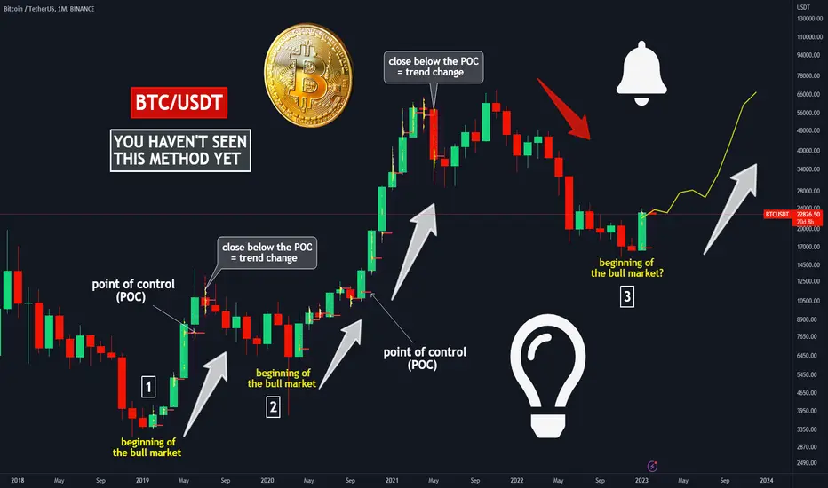
🔥SECRET METHOD TO IDENTIFY LONG TERM TREND:VOLUME PROFILE+POC🚀🔥Hi, friends! Trend is the most important thing in trading, so you have to know how to identify it and be a successful trader.
In this idea, I will explain to you the most easiest and useful method for trend identification. I know that you haven't heard about that.
📊 THE INSTRUMENTS WE USE TO IDENTIFY THE TREND:
🔥 Fixed Range Volume Profile (FRVP)
🔥 Point of control or POC
🔥 Bitcoin monthly candles/bars. They help to identify the long-term trend without local noise
✅ IF YOU WANT TO UNDERSTAND IF THE BULL MARKET BEGINS AND CONTINUES, YOU NEED:
1. Use the Volume Profile. Just pick it at the left side of the TradingView chart at "Prediction and Measurement Tools".
2. Stretch the volume profile on a monthly candle/bar.
3. After this you will see the Point of Control (POC, red line) which shows you where the most liquidity is concentrated.
4. If the price continues to close above the POC each month, this means that we have a healthy bull market.
5*. If you see that the monthly candle is close below the POC, you need to be more careful with your trends. This can indicate about a trend change, but it happens at least 1 time in the middle of the bull market.
Check the precious bull market. Thats work perfectly!
🚩 You can check if it rule works for the BEAR market and write it in the comments.
📊 WHY IT'S IMPORTANT TO UNDERSTAND THE LONG TERM TREND
I know that you guys know the most famous trading quote: "Trend is your friend." . Naive but very useful recommendation.
The understanding of the long term trend helps you to reduce 50-70% of your losing trades and increase your winrate at least to 60-80%:
🔥 you can use only trend following strategy and make much more money (open only long trades on bull market or open only a short trades on bear market)
🔥 reduce the risk when opening a trade against the trend and cut the losses.
🚩 Additionally, if you buy crypto (BTC, ETH or other alts) on spot, you can use this method to buy and hold crypto till BTC not change the trend. This method helps you to make a huge profit.
So friends, this 5 min educational idea helps you to grow your deposit much faster and don't get big losses during the trading.
Traders, was it useful for you? I know I have is a lot of experienced traders. Write your most useful trading tips in the comments to help the newbies.
💻Friends, press the "boost"🚀 button, write comments and share with your friends - it will be the best THANK YOU.
P.S. Personally, I open an entry if the price shows it according to my strategy.
Always do your analysis before making a trade.
“HOW TO” Video Overview “Jerry J8 Scalping Indicators"Hello Investors!!!
This is a detailed video overview of the “Jerry J8 Scalping Indicators” which can be used to scalp when the markets are up, down, or sideways.
I will post the link to the strategies after this video goes live on TradingView in either the Related Ideas, or as a comment below with the link.
Thank you.

trendlines do not workI was with a close friend of mine also a trader a few days ago, he told me that "trendlines do not work" and i am in several social media trading groups and some traders share the same opinion regarding the charting tool.
The reason for this is that some traders rely on the basing's that they have been taught or read without taking the time to backtest and get experience , in the trading world you find that theory is a different playing field compared to practical. A trading book may teach to for example , buy breakout of bearish but when traders use this methodology they experience price false breakout , leading to getting stopped out ,but this does not mean the trendline was invalid. Or in another setup they are taught to sell the touch on bearish trendline , then the price rallies and breaks the bearish trendline , this also does not mean that the trendline was invalid.
I for one do not take trade signals off trendlines unless there is other factors of confluence in line with the trendline.
see , trendlines are used too illustrate prevailing direction of price by connecting highs and lows , so alone they don't give much indepth when analysis apart from mapping out current trend.
from my experience and hours of backtesting there are 2 ways i use trendlines. NB: I NEVER ANALYSE PRICE CHARTS WITHOUT USING TRENDLINE.
I hope my methodology on trendlines can help make your chart work easier.
1. Momentum
Momentum measures the rate of change in prices as opposed to the actual price changes themselves. Momentum is measured by continually taking price differences for a fixed time period , this is why sometime trendlines have to get readjusted to suite current market conditions.
Trendlines can be used as a leading indicator of momentum for example , when price breaks a bullish trendline , it does not mean sell immediately or it is not a sell signal , all that it means is that momentum has shifted from bullish to bearish , meaning that you should look for sell setups that are inline with your criteria or strategy vice versa for break of bearish trendline. These setups are called momentum setups. another type of momentum setup is when for example , price is creating higher highs and higher lows connecting the higher lows gives a bullish trendline , as long as price is trading above the trendline it indicates bullish momentum meaning high probability of valid setups are buy setups given that price is above , vice versa for bearish trendlines
2.Dynamic support and resistance
Dynamic support and resistances levels are levels are not horizontal or static. When price trades above trendline it is more likely to pull back and test the trendline as support indicating bullish momentum , or it can come and break below (false breakout) and react off it as resistance indicating bearish momentum. This methodology is complex and its important to understand the order flow and using top down analysis to get a higher probability of knowing which move is valid.
These methods also are important for traders who prefer trading inline with the current trend , as most time it pays to trade with the trend than against it.
I thank God for my failures , maybe not at the time but surely after reflection. I never feel like a failure just because something i tried failed - Dolly Parton
A THOUGHT EXPERIENCE ON ENTRIESIf you follow your trading plan and then get stopped most of the time ending in loses versus gains and you see the current price still go to the tp you originally thought of, then maybe it is an issue of entry.
Note. If you make good gains and you profit, this advise may not be for you.
Okay here it goes. Put your entry where your stop loss used to be and then use atr to determine your stop loss and take profit.
Start with 1 to 1 win ratio and work your way to more as you adapt this system.
Weird? I know. Test it out and see the difference.
Basics
Trending markets.
D1 and 4h agree.
1h time frame
1. News first to see if you ought to trade
2. No news, check the charts for entry. You see that nice shooting star. Meaning sell. Check the floor and ceiling so you know if chances of your tp is good.
3. Put sell limit order on top of the morning star.
4. Stop loss the atr or average true range
5. The same as your stop loss.
The reverse for buy.
True SMC entry module to pass Funded Accounts!!!Hello traders. In this module we aim to explain how to enter the trades along with market makers for high RR entries. Entering like this will protect your Stoploss since your orders are along with the Market makers and market makers defend their positions. As a result your position in also defended in this case. Please pay attention to the annotations made on the chart.
Happy Trading
Team Lamda!!!

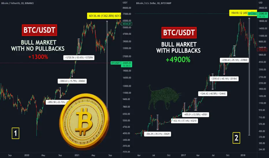
🔥WHAT IS NEEDED FOR BITCOIN TO GROW HIGHER? 1300%vs4900%🚀🔥Hi friends! A lot of newbies consider these things as something bad. These make them very unhappy and disappointed because their position gets the loss. These things are the pullbacks or corrections after significant growth. Everyone is waiting for it now to buy more cheap crypto.
📊 The pullback is the price fall after significant growth. But why is it so good for price growth:
🔥 1. it makes the market (BTC as well) much healthier because it liquidates overleverage traders.
For example, -40% pullback liquidates all traders with 1.5x leverage and coll down the market (as it was in the 2016-2017 bull market).
🔥 2. it gives the opportunity to enter the long traders for the advanced traders. If we have 5-6 pullbacks every time after 100-150% growth, you can use already earned money in new trades (increase the risk per trade).
When the price doesn't make the pullbacks and you enter the trade at the very beginning of the bull market, you have no chance to exit the trade and use the margin from the profit to increase the risk per trade.
✅ COMPARISON OF 2016-2017 AND 2020-2021
🚩 2016-2017 BULL MARKET
The market had made 4900% of profit in just 2 years. I mention 6 huge dumps with 30-40% drawdowns. These dumps cool down the market and liquidate overleveraged traders. Lots of entrance opportunities. Hope the next bull market will be the same.
Of course, you can say that market was not as big as now and I agree with you. But the whole BTC capitalization is equal to 3.5% of the entire gold cap, so it's just the beginning for crypto.
🚩2020-2021 BULL MARKET
This bull market as well as the 2019 local bull market was almost with no pullbacks and entrance possibilities. Bitcoin had made just +1300% in 2 years. Just 3 pullbacks with +16-30%. Almost no liquidations and no cool down of the market. Not the best growth as the result.
In that bull market, the beginners can't even normally use their gaining margin to open new trades.
🔥 WHAT WILL HAPPEN IN THE NEXT BULL MARKET?
I think that this growth will be the same as at the last bull market. Of course, it will be some surprises as at each bull market, but it will grow nonstop.
I make a huge update about this in the last idea. Check it if you want to know what to expect from BTC and the crypto market here👇
🚩Traders, what is your expectation about BTC bull market? Do you agree with me or have another argument? Write it in the comments!
💻Friends, press the "boost"🚀 button, write comments and share with your friends - it will be the best THANK YOU.
P.S. Personally, I open an entry if the price shows it according to my strategy.
Always do your analysis before making a trade.