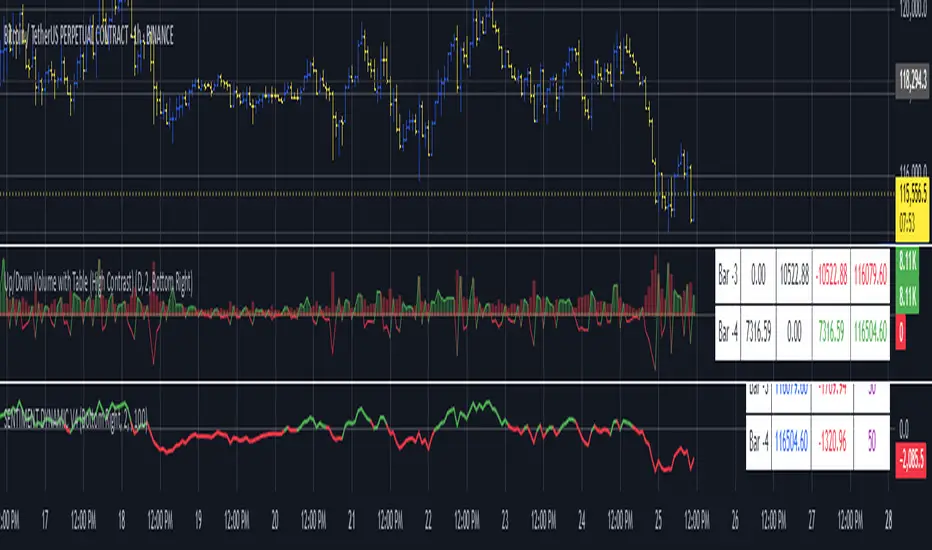
Up/Down Volume with Table (High Contrast)Up/Down Volume with Table (High Contrast) — Script Summary & User Guide
Purpose of the Script
This TradingView indicator, Up/Down Volume with Table (High Contrast), visually separates and quantifies up-volume and down-volume for each bar, providing both a color-coded histogram and a dynamic table summarizing the last five bars. The indicator helps traders quickly assess buying and selling pressure, recent volume shifts, and their relationship to price changes, all in a highly readable format.
Key Features
Up/Down Volume Columns:
Green columns represent volume on bars where price closed higher than the previous bar (up volume).
Red columns represent volume on bars where price closed lower than the previous bar (down volume).
Delta Line:
Plots the net difference between up and down volume for each bar.
Green when up-volume exceeds down-volume; red when down-volume dominates.
Interactive Table:
Displays the last five bars, showing up-volume, down-volume, delta, and close price.
Color-coding for quick interpretation.
Table position, decimal places, and timeframe are all user-configurable.
Custom Timeframe Support:
Calculate all values on the chart’s timeframe or a custom timeframe of your choice (e.g., daily, hourly).
High-Contrast Design:
Table and plot colors are chosen for maximum clarity and accessibility.
User Inputs & Configuration
Use custom timeframe:
Toggle between the chart’s timeframe and a user-specified timeframe.
Custom timeframe:
Set the timeframe for calculations if custom mode is enabled (e.g., "D" for daily, "60" for 60 minutes).
Decimal Places:
Choose how many decimal places to display in the table.
Table Location:
Select where the table appears on your chart (e.g., Bottom Right, Top Left, etc.).
How to Use
Add the Script to Your Chart:
Copy and paste the code into a new Pine Script indicator on TradingView.
Add the indicator to your chart.
Configure Inputs:
Open the indicator settings.
Adjust the timeframe, decimal places, and table location as desired.
Read the Table:
The table appears on your chart (location is user-selectable) and displays the following for the last five bars:
Bar: "Now" for the current bar, then "Bar -1", "Bar -2", etc. for previous bars.
Up Vol: Volume on bars where price closed higher than previous bar, shown in black text.
Down Vol: Volume on bars where price closed lower than previous bar, shown in black text.
Delta: Up Vol minus Down Vol, colored green for positive, red for negative, black for zero.
Close: Closing price for each bar, colored green if price increased from previous bar, red if decreased, black if unchanged.
Interpret the Histogram and Lines:
Green Columns:
Represent up-volume. Tall columns indicate strong buying volume.
Red Columns:
Represent down-volume. Tall columns indicate strong selling volume.
Delta Line:
Plotted as a line (not a column), colored green for positive values (more up-volume), red for negative (more down-volume).
Large positive or negative spikes may indicate strong buying or selling pressure, respectively.
How to Interpret the Table
Column Meaning Color Coding
Bar "Now" (current bar), "Bar -1" (previous bar), etc. Black text
Up Vol Volume for bars with higher closes than previous bar Black text
Down Vol Volume for bars with lower closes than previous bar Black text
Delta Up Vol - Down Vol. Green if positive, red if negative, black if zero Green/Red/Black
Close Closing price for the bar. Green if price increased, red if decreased, black if unchanged Green/Red/Black
Green Delta: Indicates net buying pressure for that bar.
Red Delta: Indicates net selling pressure for that bar.
Close Price Color:
Green: Price increased from previous bar.
Red: Price decreased.
Black: No change.
Practical Trading Insights
Consistently Green Delta (Histogram & Table):
Sustained buying pressure; may indicate bullish sentiment or accumulation.
Consistently Red Delta:
Sustained selling pressure; may indicate bearish sentiment or distribution.
Large Up/Down Volume Spikes:
Big green or red columns can signal strong market activity or potential reversals if they occur at trend extremes.
Delta Flipping Colors:
Rapid alternation between green and red deltas may indicate a choppy or indecisive market.
Close Price Color in Table:
Use as a quick confirmation of whether volume surges are pushing price in the expected direction.
Troubleshooting & Notes
No Volume Data Error:
If your symbol doesn’t provide volume data (e.g., some indices or synthetic assets), the script will display an error.
Custom Timeframe:
If using a custom timeframe, ensure your chart supports it and that there is enough data for meaningful calculations.
High-Contrast Table:
Designed for clarity and accessibility, but you can adjust colors in the code if needed for your personal preferences.
Summary Table Legend
Bar Up Vol Down Vol Delta Close
Now ... ... ... ...
Bar-1 ... ... ... ...
... ... ... ... ...
Colors reflect the meaning as described above.
In Summary
This indicator visually and numerically breaks down buying and selling volume, helping you spot shifts in market sentiment, volume surges, and price/volume divergences at a glance.
Use the table for precise recent data, the histogram for overall flow, and the color cues for instant market context.
Indicators and strategies
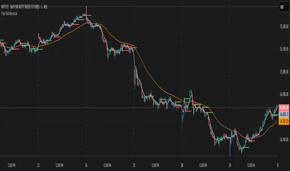
Flexi MA Reversal🔹 FlexiMA Reversal – Customizable MA-Based Reversal Indicator
FlexiMA Reversal is a real-time, moving average-based reversal indicator designed to highlight potential market turning points using signal and alert lines. It provides visual cues for both early alerts and confirmed entry signals on candle close.
🔧 Key Features:
Customizable Moving Average Type: Choose from EMA, SMA, WMA, or VWMA (default is EMA).
Flexible MA Inputs: Configure up to three MAs (commonly used 5, 50, and 200).
Toggle Visibility: Enable or disable each MA line as needed.
Real-Time Alert System:
Thin alert lines appear when a potential reversal is detected.
Thicker signal lines confirm the reversal when price closes beyond the alert level.
Optional Visual Styling:
Choose custom colors for each MA, signal, and alert line.
Alert candles are automatically colored to match the corresponding alert line.
Option to show only signal lines for cleaner charts.
Customizable projection length for both alert and signal lines.
📈 Strategy Logic:
This indicator is designed to detect reversal opportunities based on the relationship between price and a selected short-term moving average.
Bullish Setup:
Price closes below the selected MA (e.g., EMA 5).
A bullish alert line is drawn at the high.
If a subsequent candle closes above the alert line and the MA, a bullish signal line is plotted.
Bearish Setup:
Price closes above the selected MA.
A bearish alert line is drawn at the low.
If a subsequent candle closes below the alert line and the MA, a bearish signal line is plotted.
This approach attempts to capture quick market shifts where short-term momentum reverses direction near key MA levels.
🎯 How to Use:
Although originally developed using the 5 EMA strategy, through testing it was found that using 6, 7, or 8 EMA offers even better signal quality.
To add broader trend context, 50 MA and 200 MA lines are included and can be toggled on/off based on your strategy preference.
🔍 Trend Filtering & Re-Entry Tips:
Due to the nature of shorter moving averages, reversal signals may appear frequently. For better trend alignment:
Use the 50 MA as a trend filter:
❌ Ignore bearish signals when price is above 50 MA
❌ Ignore bullish signals when price is below 50 MA
Alternatively, filtered-out signals can be used for re-entry within the trend:
For example, if you receive a bearish alert and signal above the 50 MA, and the next candle closes back above the bearish alert line, this may be interpreted as a bullish re-entry opportunity into the prevailing uptrend.
🛠️ Styling Tips:
You can disable alert candle coloring in the Style tab of the indicator settings.
Use the "Show Only Signal Lines" checkbox to keep the chart minimalistic while still tracking confirmed entries.
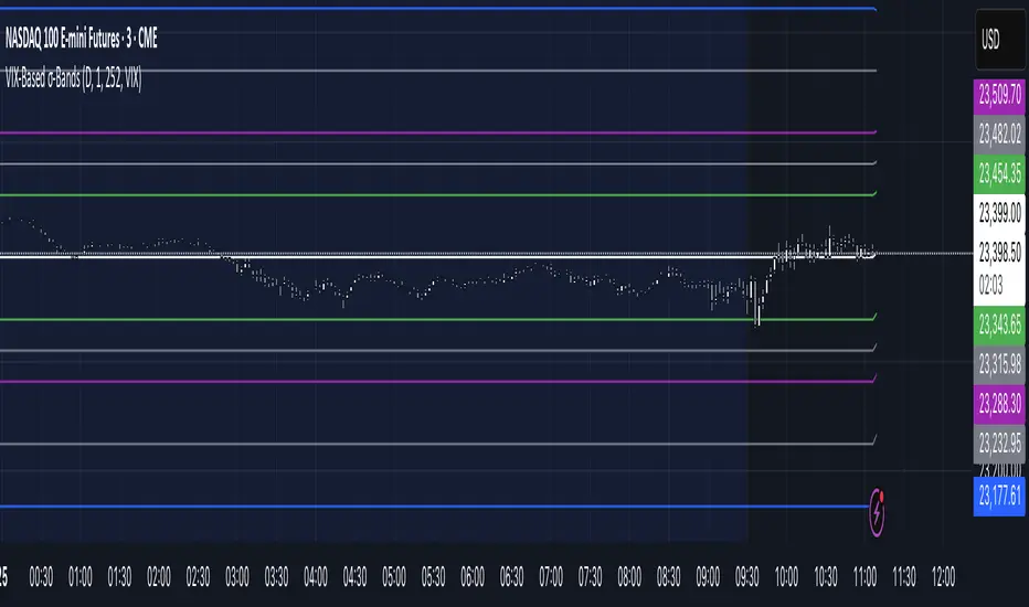
VIX‑Based σ‑BandsThis Pine Script v5 indicator builds a volatility‑based envelope around yesterday’s close using CBOE’s volatility indices. It dynamically pulls VIX, VXN, VXD or RVX—depending on whether you’re charting ES, NQ, YM or RTY—and converts annualized volatility into dollar‑move bands at ±¼ σ, ±½ σ, ±1 σ, and ±2 σ. Optional “mid‑lines” fill in the gaps between each band for even finer precision.
📊 Visual MTF VMA Dashboard🔄️📊 Visual MTF VMA Dashboard🔄️
This powerful multi-timeframe indicator provides a clean, emoji-enhanced dashboard that helps you quickly identify the Variable Moving Average (VMA) trend direction across multiple key timeframes — all in real-time.
🔍 What It Does:
The Visual MTF VMA Dashboard calculates the LazyBear-style VMA on the following timeframes:
📆 Daily
🕰 195 Minutes
🕒 65 Minutes
⏳ 39 Minutes
⏱ 15 Minutes
Each cell in the table shows the current trend:
📈 BULLISH – VMA rising
📉 BEARISH – VMA falling
⚪ NEUTRAL – No change
🎨 Visual Boost:
This feature can be toggled on/off for cleaner visuals.
📌 Customization:
Adjustable VMA Length
Selectable table position: Top Left, Top Right, Bottom Left, Bottom Right
✅ Ideal For:
Multi-timeframe traders
Trend confirmation
Quick-glance analysis without cluttering your chart
Use this dashboard as a high-level trend confirmation tool — designed for simplicity, speed, and visual clarity.

Triple Momentum Core v1🧠 Technical Structure:
Triple Momentum Core analyzes the underlying wave of price movement through a three-stage system:
1. 🔵 Follow Line – The First Spark of Momentum:
Constructed using Bollinger Bands and ATR, this line detects the very first signs of directional price expansion. It gently whispers when the market begins stretching with force in one direction.
2. 🟢 SuperTrend – Confirmation and Directional Validation:
After the initial move, SuperTrend acts as the second checkpoint — validating whether the price action is evolving into a genuine trend or fading out. It confirms whether the impulse has the strength to sustain.
3. 🔴 PMax – Core Trend & Structural Anchor:
Based on Moving Average and ATR logic, PMax tracks the heartbeat of the trend. It serves as a dynamic structural boundary — critical for identifying trend continuation and managing risk.
4. 🟡 PMax MA Line – Smooth Trend Pulse & Adaptive Guide:
This yellow moving average line within the PMax system softly follows the overall trend flow, without reacting to sharp price noise. It acts as a balanced, stable guide to gauge the solidity of the trend’s body structure.
(If you prefer a cleaner view without any moving average lines, you can disable it from the settings.)
🧠 Technical Structure:
Triple Momentum Core analyzes the underlying wave of price movement through a three-stage system:
1. 🔵 Follow Line – The First Spark of Momentum:
Constructed using Bollinger Bands and ATR, this line detects the very first signs of directional price expansion. It gently whispers when the market begins stretching with force in one direction.
2. 🟢 SuperTrend – Confirmation and Directional Validation:
After the initial move, SuperTrend acts as the second checkpoint — validating whether the price action is evolving into a genuine trend or fading out. It confirms whether the impulse has the strength to sustain.
3. 🔴 PMax – Core Trend & Structural Anchor:
Based on Moving Average and ATR logic, PMax tracks the heartbeat of the trend. It serves as a dynamic structural boundary — critical for identifying trend continuation and managing risk.
4. 🟡 PMax MA Line – Smooth Trend Pulse & Adaptive Guide:
This yellow moving average line within the PMax system softly follows the overall trend flow, without reacting to sharp price noise. It acts as a balanced, stable guide to gauge the solidity of the trend’s body structure.
(If you prefer a cleaner view without any moving average lines, you can disable it from the settings.)
💡 Why “Triple Momentum Core”?
Because this indicator doesn’t just detect movement — it breaks it down into its essential phases:
Ignition, validation, and confirmation.
Each layer captures a unique and essential part of price behavior:
The first reaction (Follow Line) ignites the initial spark.
The second reaction (SuperTrend) confirms whether that spark will become a real trend.
The third and final layer (PMax) structurally anchors and follows that trend.
That’s why we call it Triple Momentum Core:
A synchronized 3-engine momentum system working in harmony to capture the lifecycle of a trend — from spark to structure.

S&R Zones MTF (TechnoBlooms)S&R Zones MTF – Multi-Timeframe Support & Resistance Boxes
🔍 Overview
S&R Zones MTF is a professional-grade yet beginner-friendly indicator that dynamically plots Support & Resistance zones across multiple timeframes, helping traders recognize high-probability reversal areas, entry confirmations, and price reaction points.
This tool visualizes structured zones as colored boxes, allowing both new and experienced traders to analyze multi-timeframe confluence with ease and clarity.
🧠 What Is This Indicator?
S&R Zones MTF automatically detects the most significant support and resistance levels from up to four custom timeframes, using a configurable lookback period. These zones are displayed as colored horizontal boxes directly on the chart, making it easy to:
Spot where price has historically reacted
Identify potential reversal or breakout zones
Confirm entries with institutional-style precision
🛠️ Key Features
✅ Multi-Timeframe Zone Detection (up to 4 timeframes)
📦 Auto Plotted Boxes for Support (Blue) & Resistance (Pink)
🧱 Dynamic Height based on average price range or fixed input
🏷️ Timeframe Labels to instantly identify zone origin
🎛️ Customizable inputs: Lookback length, box color, height style
🔁 Real-time updates as price structure changes
🎓 Educational & Easy to Use
Whether you’re a new trader learning about price structure, or a professional applying institutional concepts, this tool offers an educational layout to understand:
How price respects historic zones
Why multi-timeframe zones offer stronger confluence
How to use zones for entry, exit, or risk placement
📈 How to Use (Multi-Timeframe Strategy)
Select Your Timeframes – Customize up to 4 higher timeframes (e.g., 1m, 5m, 15m, 1h).
Observe Overlapping Zones – When multiple timeframes agree, those zones are more significant.
Entry Confirmation – Wait for price to reach a zone, then look for reversal patterns (engulfing candle, pin bar, etc.)
Combine with Other Tools – Use alongside indicators like RSI, MACD, or Order Blocks for added confidence.
💡 Pro Tips
Zones from higher timeframes (1H, 4H) are often more powerful and reliable.
Confluence matters: If a 15m support zone aligns with a 1H support zone — that's a high-probability reaction area.
Use break-and-retest strategies with zone rejections for sniper entries.
Enable "Auto Height" for a more adaptive, volatility-based zone display.
🌟 Summary
S&R Zones MTF blends precision, clarity, and professional analysis into a visual structure that’s easy to understand. Whether you're learning support & resistance or optimizing your MTF edge — this tool will bring clarity to your charts and confidence to your trades.
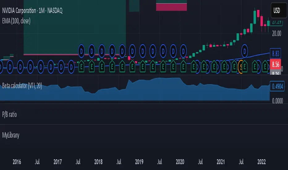
Beta calculatorCalculates the market beta for the stock that is on your screen. You may change the parameters by changing the symbol you are using as benchmark to calculate market beta in the settings. This will affect the market beta you get. VTI is used since it has a theoretical market beta of 1.
Current Hourly Open Line with Sweep DetectionThis indicator marks out the high and low of the current hourly open candle.
Stats show, if the current hourly candle takes the high or low of the previous 1H candle there is a chance price returns to the hourly open depending on the time the sweep on the high or low occurred.
There is a high chance >75% price returns to hourly open of current candle if the sweep happens in the first 20 minutes.
There is a medium chance 50% price returns to hourly open of current candle if the sweep happens in the 20-40 minute range of the current candle.
There is a low 25% chance if sweep happens from :40-:59 minutes of the hour.
We use this to spot manipulation on the hourly timeframe, we only want to target hourly open if it happens in the first 20 minutes. We then want to trade in opposite direction of the first move of the hourly, w/ context of course.
The indicator / line will change colors based on the time the first sweep occurred. You can change them to how you want. For default, blue is just the hourly open with no sweep yet.
Green means go, and the sweep happens within the first 20 minutes, Yellow is medium chance, and Red is small chance.
Choch Pattern Levels [BigBeluga]🔵 OVERVIEW
The Choch Pattern Levels indicator automatically detects Change of Character (CHoCH) shifts in market structure — crucial moments that often signal early trend reversals or major directional transitions. It plots the structural break level, visualizes the pattern zone with triangle overlays, and tracks delta volume to help traders assess the strength behind each move.
🔵 CONCEPTS
CHoCH Pattern: A bullish CHoCH forms when price breaks a previous swing high after a swing low, while a bearish CHoCH appears when price breaks a swing low after a prior swing high.
Break Level Mapping: The indicator identifies the highest or lowest point between the pivot and the breakout, marking it with a clean horizontal level where price often reacts.
Delta Volume Tracking: Net bullish or bearish volume is accumulated between the pivot and the breakout, revealing the momentum and conviction behind each CHoCH.
Chart Clean-Up: If price later closes through the CHoCH level, the zone is automatically removed to maintain clarity and focus on active setups only.
🔵 FEATURES
Automatic CHoCH pattern detection using pivot-based logic.
Triangle shapes show structure break: pivot → breakout → internal high/low.
Horizontal level marks the structural zone with a ◯ symbol.
Optional delta volume label with directional sign (+/−).
Green visuals for bullish CHoCHs, red for bearish.
Fully auto-cleaning invalidated levels to reduce clutter.
Clean organization of all lines, labels, and overlays.
User-defined Length input to adjust pivot sensitivity.
🔵 HOW TO USE
Use CHoCH levels as early trend reversal zones or confirmation signals.
Treat bullish CHoCHs as support zones, bearish CHoCHs as resistance.
Look for high delta volume to validate the strength behind each CHoCH.
Combine with other BigBeluga tools like supply/demand, FVGs, or liquidity maps for confluence.
Adjust pivot Length based on your strategy — shorter for intraday, longer for swing trading.
🔵 CONCLUSION
Choch Pattern Levels highlights key structural breaks that can mark the start of new trends. By combining precise break detection with volume analytics and automatic cleanup, it provides actionable insights into the true intent behind price moves — giving traders a clean edge in spotting early reversals and key reaction zones.

(MA with colored trend background)MA with colored trend background is a versatile trend-detection indicator that allows users to choose between three types of moving averages:
EMA (Exponential Moving Average)
KAMA (Kaufman Adaptive Moving Average)
Kijun-sen (from the Ichimoku system)
The indicator automatically detects trend shifts based on candlestick interactions with the selected MA line, and visually reflects the current trend direction using dynamic background coloring. Its goal is to help traders quickly interpret trend strength and direction—without relying on multiple indicators.
How it works
The indicator follows this logic to detect bullish and bearish conditions:
Bullish signal (green trend):
When the candle closes above the selected MA and both the open and close are above the MA, a bullish trend is signaled and the chart background turns green.
Bearish signal (red trend):
When the candle closes below the MA and both the open and close are below it, a bearish trend is triggered and the background turns red.
The background color remains until an opposite signal appears, ensuring a consistent visual representation of the current trend phase.
What it does and why it’s useful
Unlike standard moving average indicators that only plot lines, KINSKI Flexi Trend MA provides:
Flexibility to switch between different MA types (EMA, KAMA, or Kijun), allowing users to adapt it to various market environments.
Visual context via background color that enhances clarity—even when scanning multiple charts or working across timeframes.
KAMA uses fixed internal parameters (fast=2, slow=30) to provide a responsive, noise-filtering MA line.
Kijun-sen is calculated as the midpoint between the highest high and lowest low over a user-defined period, similar to its role in Ichimoku.
This combination of visual clarity and analytical flexibility makes the indicator highly suitable for:
Trend-following strategies
Breakout confirmation
Scalping (on lower timeframes)
Swing trading
How to use it
Select the MA type from the dropdown:
EMA (standard exponential moving average)
KAMA (adaptive smoothing)
Kijun-sen (Ichimoku mid-line)
Adjust the MA length depending on your trading style or timeframe:
e.g., EMA 50 for medium-term trend, Kijun 9 for faster signals.
Observe the background color:
Green → bullish trend in progress.
Red → bearish trend in progress.
Background color change may serve as an entry or exit confirmation.
Additional explanation for tracking this indicator:
When we're in a bullish trend, the background is green. We can see a narrow red background appearing when there is a certain pullback. The narrow sections of the colored background indicate that a pullback is active, and we can expect a return to the bullish side. We then return to the green zone. This is also a good indicator during consolidations because it visually shows us that the color changes in the background, as well as their same width, are consistent. This indicates that we should avoid trading during this period.
🗓️ Day Separator🗓️ Day Separator – Visual Day Markers for Your Chart
This script adds automatic vertical lines to visually separate each trading day on your chart. It helps you quickly identify where each day starts and ends — especially useful for intraday and scalping strategies.
✅ Features:
Distinct colored lines for each weekday (Monday to Friday)
Optional day-of-week labels (toggle on/off)
Custom label position (top or bottom of the chart)
Works on any timeframe
Whether you're tracking market sessions or reviewing daily price action, this tool gives you a clean structure to navigate your charts with more clarity.

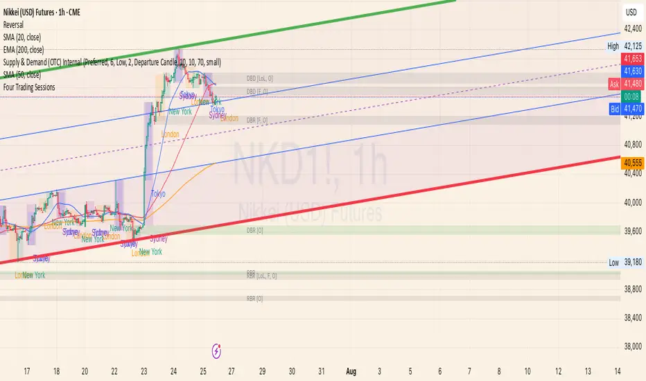
Four Trading SessionsIve adapted this from someone else's script to include 4 sessions instead of 3
TradingView Indicator Description: Trading Sessions
Overview:
The "Trading Sessions" indicator, written in Pine Script v5, visually highlights major forex trading sessions (Tokyo, London, New York, and Sydney) on intraday charts. It displays session ranges as colored boxes, with optional open/close lines, average price lines, and labels showing session names, tick ranges, and average prices. Users can customize session times, time zones, colors, and display options.
Key Features:
Customizable Sessions: Supports up to four trading sessions (Tokyo, London, New York, Sydney) with user-defined names, time ranges, and time zones (e.g., "Asia/Tokyo", "America/New_York").
Visual Elements:
Draws semi-transparent boxes to mark session price ranges (high/low).
Optional dashed lines for session open and close prices.
Optional dotted line for the session's average price.
Labels displaying session name, tick range, and/or average price (configurable).
Time Zone Support: Specify time zones using IANA database names (e.g., "Australia/Sydney") or GMT notation, with a recommendation for IANA to handle daylight savings.
Display Options: Toggle session names, open/close lines, tick range, and average price visibility.
Intraday Restriction: Works only on intraday timeframes, with an error for daily/weekly/monthly charts.
Performance Optimized: Limits boxes, lines, and labels to 500 each to ensure smooth performance.
Inputs:
General Settings:
Show session names, open/close lines, tick range, and average price (all enabled by default).
Per Session (Tokyo, London, New York, Sydney):
Enable/disable session display.
Custom session name (e.g., "Tokyo").
Session time range (e.g., "0900-1500" for Tokyo).
Time zone (e.g., "Asia/Tokyo").
Session color (semi-transparent blue, orange, green, purple by default).
How It Works:
The script checks if the current bar falls within a session’s time range (adjusted for the specified time zone).
For each active session, it creates a box spanning the session’s high/low and updates it bar-by-bar.
Optional open/close lines and an average price line are drawn and updated dynamically.
Labels display user-selected metrics (name, range, average price) at the bottom of each session box.
Sessions reset daily, ensuring accurate representation across days.
Use Case:
Ideal for forex traders who want to analyze price action during specific trading sessions. The indicator helps identify session-specific volatility, key price levels, and trends, with clear visual cues and customizable settings.
Limitations:
Only works on intraday timeframes.
Limited to 500 boxes, lines, and labels to prevent performance issues.
Requires accurate time zone settings for proper session alignment.
Example:
Enable the Tokyo and New York sessions, set their respective time zones, and toggle on all display options to see colored boxes, open/close lines, average price lines, and labels with tick ranges and averages for each session.
Squeeze Pro Momentum BAR color - KLTDescription:
The Squeeze Pro Momentum indicator is a powerful tool designed to detect volatility compression ("squeeze" zones) and visualize momentum shifts using a refined color-based system. This script blends the well-known concepts of Bollinger Bands and Keltner Channels with an optimized momentum engine that uses dynamic color gradients to reflect trend strength, direction, and volatility.
It’s built for traders who want early warning of potential breakouts and clearer insight into underlying market momentum.
🔍 How It Works:
📉 Squeeze Detection:
This indicator identifies "squeeze" conditions by comparing Bollinger Bands and Keltner Channels:
When Bollinger Bands are inside Keltner Channels → Squeeze is ON
When Bollinger Bands expand outside Keltner Channels → Squeeze is OFF
You’ll see squeeze zones classified as:
Wide
Normal
Narrow
Each represents varying levels of compression and breakout potential.
⚡ Momentum Engine:
Momentum is calculated using linear regression of the price's deviation from a dynamic average of highs, lows, and closes. This gives a more accurate representation of directional pressure in the market.
🧠 Smart Candle Coloring (Optimized):
The momentum color logic is inspired by machine learning principles (no hardcoded thresholds):
EMA smoothing and rate of change (ROC) are used to detect momentum acceleration.
ATR-based filters help remove noise and false signals.
Colors are dynamically assigned based on both direction and trend strength.
🧪 How to Use It:
Look for Squeeze Conditions — especially narrow squeezes, which tend to precede high-momentum breakouts.
Confirm with Momentum Color — strong colors often indicate trend continuation; fading colors may signal exhaustion.
Combine with Price Action — use this tool with support/resistance or patterns for higher probability setups.
Recommended For:
Trend Traders
Breakout Traders
Volatility Strategy Users
Anyone who wants visual clarity on trend strength
📌 Tip: This indicator works great when layered with volume and price action patterns. It is fully non-repainting and supports overlay on price charts.

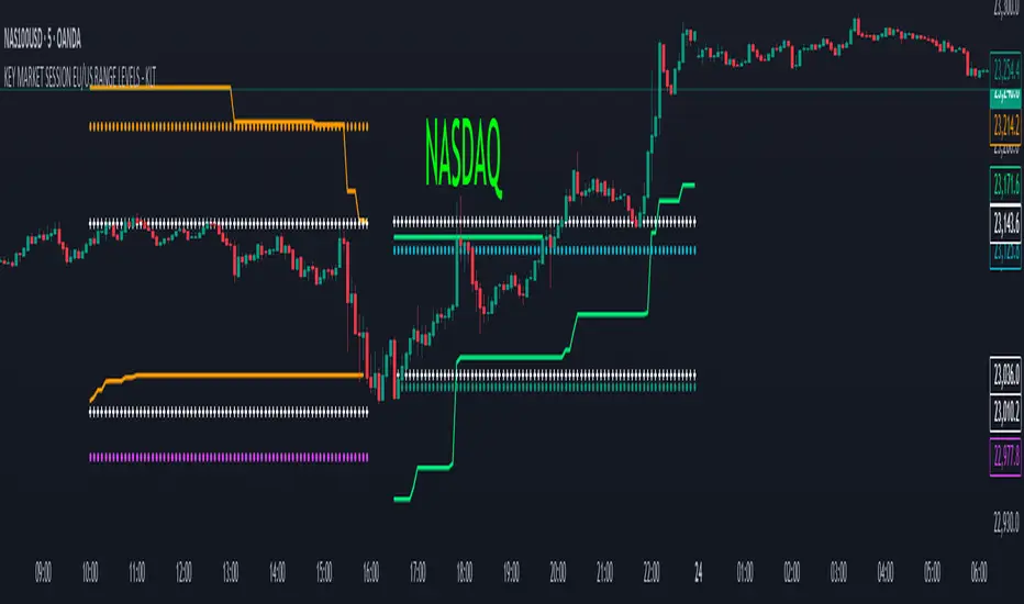
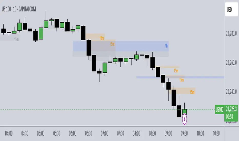
KEY MARKET SESSION EU/US RANGE LEVELS - KLT🔹 KEY MARKET SESSION EU/US RANGE LEVELS - KLT
This indicator highlights critical trading levels during the European and U.S. sessions, with Overbought (OB) and Oversold (OS) markers derived from each session's price range.
It’s designed to support traders in identifying key zones of interest and historical price reactions across sessions.
✳️ Features
🕒 Session Recognition
European Session (EU): 08:00 to 14:00 UTC
United States Session (US): 14:30 to 21:00 UTC
The indicator automatically detects the current session and updates levels in real time.
📈 Overbought / Oversold (OB/OS) Levels
Helps identify potential reversal or reaction zones.
🔁 Previous Session OB/OS Crosses
OB/OS levels from the previous session are plotted as white crosses during the opposite session:
EU OB/OS shown during the US session
US OB/OS shown during the EU session
These levels act as potential price targets or reaction areas based on prior session behavior.
🎨 Session-Based Color Coding
EU Session
High/Low: Orange / Fuchsia
OB/OS: Orange / Lime
Previous OB/OS: White crosses during the US session
US Session
High/Low: Aqua / Teal
OB/OS: Aqua / Lime
Previous OB/OS: White crosses during the EU session
🧠 How to Use
Use the OB/OS levels to gauge potential turning points or extended moves.
Watch for previous session crosses to spot historically relevant zones that may attract price.
Monitor extended High/Low lines as potential magnets for price continuation.
🛠 Additional Notes
No repainting; levels are session-locked and tracked in real time.
Optimized for intraday strategies, scalping, and session-based planning.
Works best on assets with clear session behavior (e.g., forex, indices, major commodities).
Trend Buy/Sell Fibonacci Range - KLTThe Trend Buy/Sell Fibonacci Range – KLT indicator identifies bullish and bearish trends based on where the closing price is located within a Fibonacci range calculated from the last N candles (default is 10). Instead of analyzing individual candles, this tool takes a broader view of price action using Fibonacci retracement levels across a dynamic multi-candle range.
How It Works:
Range Calculation
The indicator calculates the highest high and lowest low over the last N candles to define the active price range (default: 10 bars).
Fibonacci Levels
Within this range, Fibonacci levels (0.236, 0.382, 0.5, 0.618, 0.786) are dynamically computed. These levels act as internal thresholds to evaluate bullish or bearish pressure.
Trend Identification (via Close Position):
If the closing price is above the 0.618 level, it indicates strong buy pressure → the candle turns green and an upward triangle appears.
If the closing price is below the 0.382 level, it suggests strong sell pressure → the candle turns red and a downward triangle is displayed.
If the close lies between 0.382 and 0.618, the market is considered neutral, and the candle is gray.
Visual Elements:
Colored candles to immediately spot trend conditions.
Triangle signals (optional) for clear Buy/Sell markers.
Fibonacci level lines plotted on the chart for full context (can be toggled on/off).
Customization Options:
Lookback period (number of candles to calculate the range)
Fibonacci threshold levels (upper/lower)
Show/hide arrows and Fibonacci lines
Why Use This Indicator?
This tool is perfect for traders who want a simple visual method to assess trend strength based on price structure, not indicators derived from lagging moving averages. It offers:
Cleaner market structure analysis
Objective trend zones
Customizable sensitivity
Recommended Use:
Works well in conjunction with support/resistance zones, volume, or momentum indicators.
Applicable to any asset class or timeframe.
Credits:
Developed by KLT, combining structure-based logic with Fibonacci precision.
Fair Value Gap [Dova Lazarus]Fair Value Gap (FVG) indicator detects and visualizes price inefficiencies between three consecutive candles:
* Bullish FVG: current candle’s low > high of two candles ago
* Bearish FVG: current candle’s high < low of two candles ago
Includes automatic detection of mitigations:
* Partial mitigation: price enters but doesn’t fully fill the gap
* Full mitigation: price completely fills the gap
* Optional **50% mitigation** based on midpoint reach
**Display styles**:
* Box (filled rectangle)
* High & Low lines only
* Midpoint lines (optional, with customizable style and color)
Multi-timeframe support:
* Up to 5 higher timeframes (HTF), each with individual color, label, and visibility settings
* HTF gaps help identify key support/resistance and price magnet zones
Customization options:
* Separate colors for unmitigated and mitigated gaps
* Adjustable width and extension of boxes
* Optional deletion of mitigated gaps
* Label positioning, size, and visibility
All settings are grouped for clarity:
* FVG Appearance
* HTF FVGs
* Mitigation
* General Settings
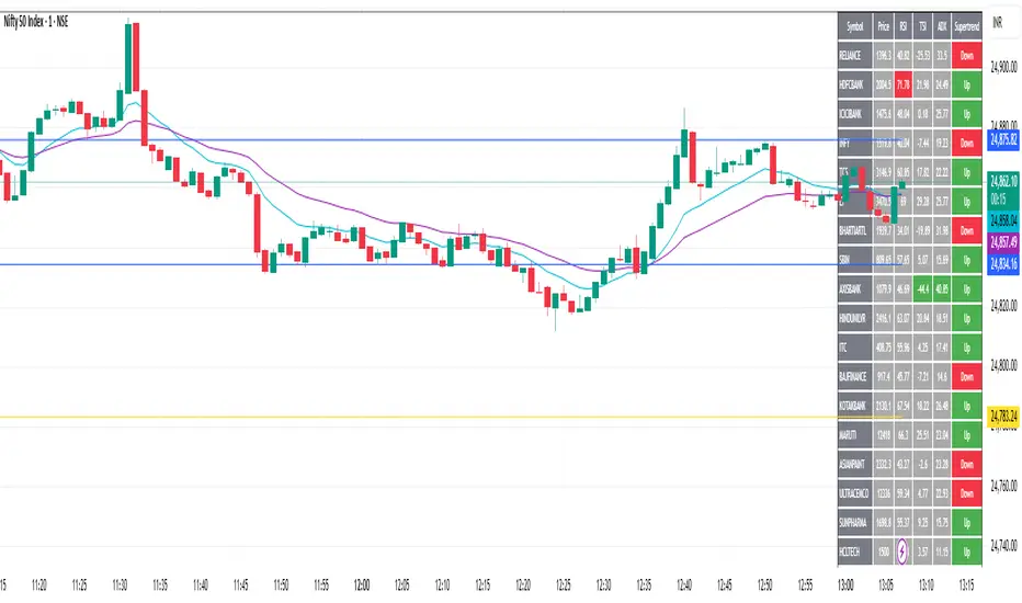
Custom Screener with Alerts @RAMLAKSHMANDASScan the Nifty 50 directly on TradingView!
This script provides a real-time screener for the top 40 Nifty 50 stocks ranked by current index weightage (starting from RELIANCE, HDFCBANK, ICICIBANK, etc.), offering rapid on-chart multi-symbol analysis.
Features
Multi-symbol screener: Monitors the leading 40 Nifty constituents (NSE equities) in one view.
Full indicator table: Get snapshot values for Price, RSI, TSI, ADX, and SuperTrend for every symbol.
Dynamic filtering: Instantly filter results by any indicator value (e.g., highlight all stocks with RSI below 30).
Customizable symbols: Easily edit the symbol list to match updated Nifty composition or your stocks of interest.
Multi-timeframe support: Table values will update for any chosen chart timeframe.
Real-time alerts: Set up alerts for filtered stocks matching your strategy.
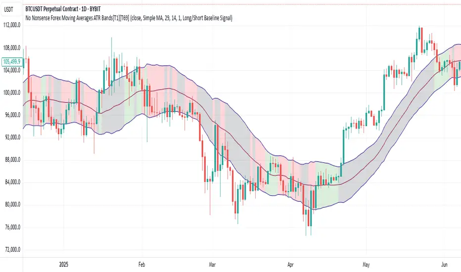
No Nonsense Forex Moving Averages ATR Bands[T1][T69]🔍 Overview
This indicator implements a No Nonsense Forex-style Baseline combined with ATR Bands, built using the moving_averages_library by Teyo69. It plots a configurable moving average and dynamically adjusts upper/lower ATR bands for trade zone detection and baseline confirmation.
✨ Features
30+ Moving Average types
ATR bands to define dynamic trade zones
Visual background highlighting for trade signals
Supports both "Within Range" and "Baseline Bias" display modes
Clean, minimal overlay with effective zone coloring
⚙️ How to Use
Choose MA Type: Select the baseline logic (SMA, EMA, HMA, etc.)
Configure ATR Bands: Adjust the ATR length and multiplier
Select Background Mode:
Within Range: Yellow = price inside band, Gray = outside
Long/Short Baseline Signal: Green = price above baseline, Red = below
Trade Setup:
Use the baseline for trend direction
Wait for confirmation or avoidance when price is outside the band
🛠 Configuration
Source: Price source for MA
MA Type: Any supported MA from the library
MA Length: Number of bars for smoothing
ATR Length: Period for Average True Range
ATR Multiplier: Width of the bands
Background Signal Mode: Choose visual signal type
⚠️ Limitations
Works with one MA at a time
Requires the moving_averages_library imported
Does not include confirmation or exit logic — use with full NNFX stack
💡 Tips
Combine with Volume or Confirmation indicators for NNFX strategy
Use adaptive MAs like KAMA, JMA, or VIDYA for dynamic baselines
Adjust ATR settings based on asset volatility
📘 Credits
Library: Teyo69/moving_averages_library/1
Inspired by: No Nonsense Forex (VP) Baseline + ATR Band methodology & MigthyZinger
High Win Rate Trader by iambuoyant# High Win Rate Trader by iambuoyant - Complete Guide
## Introduction
The "High Win Rate Trader by iambuoyant" is a comprehensive Pine Script indicator designed to identify high-probability trading opportunities across various market conditions. Built with a multi-faceted approach, it integrates several key technical analysis concepts to provide robust buy and sell signals, aiming to maximize potential returns while managing risk. This indicator is particularly useful for traders looking for confirmed entries based on a confluence of factors rather than relying on a single signal.
## Core Philosophy
This indicator operates on the principle that **multiple confirming factors create higher probability trades**. Instead of relying on a single indicator, it combines trend analysis, momentum oscillators, volume confirmation, market structure, and mathematical levels to identify optimal entry points. The more confluence factors that align, the stronger the trading signal.
## Strategies and Confluence Factors
### 1. Trend Analysis
**Purpose**: Establishes the overall market direction to ensure trades align with momentum.
**Components**:
- **Fast EMA (Default: 9)**: Short-term trend detection
- **Slow EMA (Default: 21)**: Medium-term trend confirmation
- **Trend EMA (Default: 50)**: Long-term trend establishment
**How it works**:
- **Bullish Trend**: Fast EMA > Slow EMA > Trend EMA
- **Bearish Trend**: Fast EMA < Slow EMA < Trend EMA
- Signals are filtered to only trigger in the direction of the established trend
**Default Settings**:
- Fast EMA Period: 9
- Slow EMA Period: 21
- Trend EMA Period: 50
### 2. Oscillator Confirmation
**Purpose**: Identifies overbought/oversold conditions and momentum shifts.
#### RSI (Relative Strength Index)
- **Period (Default: 14)**: Standard RSI calculation period
- **Overbought Level (Default: 70)**: RSI level considered overbought
- **Oversold Level (Default: 30)**: RSI level considered oversold
**How it works**:
- **Bullish**: RSI < 40 and turning upward (oversold recovery)
- **Bearish**: RSI > 60 and turning downward (overbought rejection)
#### Stochastic Oscillator
- **K Period (Default: 14)**: Stochastic %K calculation period
- **D Period (Default: 3)**: Stochastic %D smoothing period
- **Overbought Level (Default: 80)**: Stochastic overbought threshold
- **Oversold Level (Default: 20)**: Stochastic oversold threshold
**How it works**:
- **Bullish**: %K < 30 and (%K turning up OR %K > %D)
- **Bearish**: %K > 70 and (%K turning down OR %K < %D)
### 3. MACD (Moving Average Convergence Divergence)
**Purpose**: Confirms momentum shifts and trend changes.
**Components**:
- **Fast Period (Default: 12)**: Fast EMA for MACD calculation
- **Slow Period (Default: 26)**: Slow EMA for MACD calculation
- **Signal Period (Default: 9)**: Signal line smoothing period
**How it works**:
- **Bullish**: MACD line > Signal line OR (MACD rising AND histogram increasing)
- **Bearish**: MACD line < Signal line OR (MACD falling AND histogram decreasing)
### 4. Volume Analysis
**Purpose**: Confirms price moves with volume conviction.
**Components**:
- **Volume MA Period (Default: 20)**: Period for volume moving average
- **Volume Multiplier (Default: 1.5)**: Volume threshold multiplier
**How it works**:
- **Bullish**: Current volume > (Volume MA × 1.5)
- **Bearish**: Current volume > (Volume MA × 1.5)
### 5. Market Structure and Volatility
#### Support and Resistance Levels
- **Pivot Length (Default: 10)**: Period for pivot high/low detection
- **Dynamic Levels**: Automatically identifies recent swing highs and lows
- **Proximity Check**: Ensures trades aren't initiated too close to S/R levels
#### ATR (Average True Range)
- **ATR Period (Default: 14)**: Volatility measurement period
- **ATR Multiplier (Default: 2.0)**: Stop loss distance multiplier
- **Volatility Filter (Default: 50.0%)**: Maximum allowed volatility percentage
**How it works**:
- Calculates market volatility using ATR
- Prevents trades in excessively volatile conditions
- Helps determine dynamic stop loss levels
### 6. Fibonacci Retracements
**Purpose**: Identifies key mathematical support/resistance levels.
**Components**:
- **Lookback Period (Default: 50)**: Period for swing high/low calculation
- **Tolerance (Default: 2.0%)**: Price proximity tolerance to Fib levels
**Key Levels**: 23.6%, 38.2%, 50%, 61.8%, 78.6%
**How it works**:
- **Bullish**: Price near 38.2%, 50%, or 61.8% retracement levels in uptrend
- **Bearish**: Price near 38.2%, 50%, or 61.8% retracement levels in downtrend
### 7. Risk Management
#### Risk:Reward Ratio
- **Minimum RR Ratio (Default: 1.0)**: Minimum acceptable risk:reward ratio
- **Dynamic Calculation**: Based on support/resistance levels and ATR
#### Dynamic Stop Loss
- **ATR-based**: Stop loss = Entry ± (ATR × 1.5)
- **S/R-based**: Uses nearby support/resistance levels when available
### 8. Signal Confirmation
**Confirmation Bars (Default: 0)**:
- **0**: Immediate signals (recommended for testing)
- **1+**: Delayed confirmation for reduced false signals
## How to Use the Indicator
### Step 1: Initial Setup
1. **Add to Chart**: Apply the "High Win Rate Trader by iambuoyant" indicator to your desired chart in TradingView
2. **Verify Display**: Ensure you can see the indicator plots and debug pane below the main chart
### Step 2: Understanding the Signals
#### Visual Elements:
- **Green Triangles (Buy)**: Appear below price bars for long entry signals
- **Red Triangles (Sell)**: Appear above price bars for short entry signals
- **Labels**: Show "BUY" or "SELL" with current RSI value
- **EMA Lines**: Blue (Fast), Orange (Slow), Gray (Trend) - visible when enabled
#### Signal Types:
- **Flash Signals**: Immediate signals when conditions are first met
- **Confirmed Signals**: Signals that have passed confirmation criteria
### Step 3: Debugging and Optimization
#### Access Debug Features:
1. Click the gear icon next to the indicator name
2. Navigate to "Signal Components (Debugging)" section
3. All confluence factors start **disabled** by default
#### Initial Testing Process:
1. **Start Simple**: Keep all "Enable X Condition" toggles **OFF**
2. **Enable Basic**: Turn on "Enable RSI Condition" first
3. **Observe Signals**: Check if buy/sell signals appear
4. **Gradual Addition**: Enable one condition at a time
5. **Monitor Debug Plots**: Watch the colored crosses in the lower pane
#### Debug Plot Interpretation:
- **Green Crosses (Value 1)**: Bullish conditions met
- **Red Crosses (Value 2)**: Bearish conditions met
- **No Cross**: Condition not met
- **"Debug: Final Long/Short Signal"**: Combined signal output
### Step 4: Fine-tuning Parameters
#### If Signals Are Too Rare:
1. **Reduce Thresholds**: Lower RSI overbought/oversold levels
2. **Relax Filters**: Increase volatility filter percentage
3. **Adjust Timeframes**: Modify EMA periods for your trading style
4. **Disable Strict Conditions**: Turn off conditions that are too restrictive
#### If Signals Are Too Frequent:
1. **Increase Thresholds**: Raise RSI levels
2. **Add Filters**: Enable more confluence conditions
3. **Stricter Confirmation**: Increase confirmation bars
4. **Higher RR Ratio**: Increase minimum risk:reward requirement
### Step 5: Display Configuration
#### Display Options:
- **Show Buy/Sell Labels**: Toggle signal labels on/off
- **Show Support/Resistance**: Toggle S/R level lines
- **Show Trend EMAs**: Toggle EMA trend lines
### Step 6: Setting Up Alerts
#### Alert Conditions:
- **"Confirmed Buy Signal"**: Triggers on confirmed long entries
- **"Confirmed Sell Signal"**: Triggers on confirmed short entries
#### Alert Message Format:
- Buy: "BUY - RSI: , Price: "
- Sell: "SELL - RSI: , Price: "
## Recommended Settings by Market Type
### Trending Markets:
- Enable: Trend Alignment, RSI, MACD
- Disable: Volume (optional)
- Confirmation Bars: 1-2
### Ranging Markets:
- Enable: RSI, Stochastic, Support/Resistance
- Disable: Trend Alignment
- Confirmation Bars: 0
### Volatile Markets:
- Enable: Volatility Filter, ATR-based stops
- Reduce: RSI thresholds (60/40 instead of 70/30)
- Increase: Confirmation bars to 2-3
## Troubleshooting
### No Signals Appearing:
1. Check if any "Enable X Condition" is turned ON
2. Verify debug plots show activity
3. Reduce parameter thresholds
4. Check if market conditions match your settings
### Too Many False Signals:
1. Enable more confluence conditions
2. Increase confirmation bars
3. Adjust RSI/Stochastic thresholds
4. Enable volatility filter
### Signals Not Aligning with Price Action:
1. Check trend alignment settings
2. Verify EMA periods match your timeframe
3. Adjust Fibonacci lookback period
4. Review support/resistance proximity settings
## Best Practices
1. **Start Conservative**: Begin with fewer confluence factors and gradually add more
2. **Test Thoroughly**: Use demo accounts to test parameter combinations
3. **Monitor Debug Plots**: Regularly check which conditions are failing
4. **Adapt to Market**: Adjust settings based on current market conditions
5. **Use Multiple Timeframes**: Consider higher timeframe trend direction
6. **Risk Management**: Always use proper position sizing and stop losses
## Default Settings Summary
### Trend Analysis:
- Fast EMA: 9
- Slow EMA: 21
- Trend EMA: 50
### Oscillators:
- RSI Period: 14, Overbought: 70, Oversold: 30
- Stochastic K: 14, D: 3, Overbought: 80, Oversold: 20
### MACD:
- Fast: 12, Slow: 26, Signal: 9
### Volume:
- MA Period: 20, Multiplier: 1.5
### Market Structure:
- ATR Period: 14, Multiplier: 2.0
- Volatility Filter: 50.0%
- Pivot Length: 10
### Fibonacci:
- Lookback: 50, Tolerance: 2.0%
### Signal Quality:
- Confirmation Bars: 0
- Min RR Ratio: 1.0
### Display:
- Show Labels: ON
- Show S/R: ON
- Show Trend: ON
### Debug (All Disabled by Default):
- Enable RSI: OFF
- Enable Stochastic: OFF
- Enable MACD: OFF
- Enable Price Structure: OFF
- Enable Trend Alignment: OFF
- Enable Volume: OFF
- Enable Fibonacci: OFF
- Enable Risk:Reward: OFF
- Enable Volatility: OFF
Daily Weekly Monthly Highs & Lows [Dova Lazarus]Daily Weekly Monthly Highs & Lows
📊 Overview
This Pine Script indicator displays key support and resistance levels by plotting the highs and lows from Daily, Weekly, and Monthly timeframes on your current chart. It's designed as an educational tool to help traders understand multi-timeframe analysis and identify significant price levels.
🎯 Key Features
Multi-Timeframe Support & Resistance
- Daily Levels: Shows previous daily highs and lows
- Weekly Levels: Displays weekly highs and lows
- Monthly Levels: Plots monthly highs and lows
- Smart Display: Only shows relevant timeframes based on your current chart timeframe
Fully Customizable Appearance
- Individual Colors: Set unique colors for each timeframe
- Line Styles: Choose between Solid, Dashed, or Dotted lines
- Line Width: Adjust thickness from 1-4 pixels
- Lookback Periods: Control how many historical levels to display
User-Friendly Options
- Enable/Disable: Toggle any timeframe on/off
- Line Extension: Option to extend lines into the future
- Clean Interface: Organized settings groups for easy configuration
🔧 Settings
Timeframes Group
- Show Daily/Weekly/Monthly Levels: Enable or disable each timeframe
- Lookback Periods: Number of historical levels to display (1-10)
Line Settings Group
- Color: Choose custom colors for each timeframe
- Style: Select line appearance (Solid/Dashed/Dotted)
- Width: Set line thickness (1-4 pixels)
Display Options Group
- Extend Lines Forward: Project lines 20 bars into the future
📈 How to Use
1. Add to Chart: Apply the indicator to any timeframe chart
2. Configure Timeframes: Enable the timeframes you want to see
3. Customize Appearance: Set colors and line styles for easy identification
4. Identify Levels: Use the plotted levels as potential support/resistance zones
5. Plan Trades: Look for price reactions at these key levels
💡 Trading Applications
- Support & Resistance: Identify key price levels where reversals may occur
- Entry Points: Look for bounces or breaks at these levels
- Stop Loss Placement: Use levels to set logical stop losses
- Target Setting: Previous highs/lows can serve as profit targets
- Multi-Timeframe Analysis: Understand the bigger picture context
🎓 Educational Value
This indicator is perfect for:
- Learning Pine Script: Clean, well-commented code structure
- Understanding Multi-Timeframe Analysis: See how different timeframes interact
- Practicing Technical Analysis: Identify key support/resistance concepts
- Code Study: Full variable names and detailed comments for learning
⚙️ Technical Details
- Version: Pine Script v6
- Overlay: True (plots directly on price chart)
- Max Lines: 500 (handles multiple timeframes efficiently)
- Compatibility: Works on all timeframes (shows relevant levels only)
🔍 What Makes This Different
- Educational Focus: Designed for learning with clear code structure
- Simplified Interface: Easy-to-use settings without overwhelming options
- Visual Clarity: Clean line display with customizable appearance
- Practical Application: Real trading tool, not just a demonstration
📋 Requirements
- TradingView account (any plan)
- Basic understanding of support/resistance concepts
- Any chart timeframe (indicator adapts automatically)
🚀 Quick Start
1. Add indicator to your chart
2. Default settings work great out of the box
3. Customize colors if desired (Green=Daily, Orange=Weekly, Red=Monthly)
4. Watch for price reactions at the plotted levels
5. Use as part of your technical analysis toolkit
---
*This indicator is designed as an educational tool and should be used in conjunction with other forms of analysis. Past performance does not guarantee future results.*
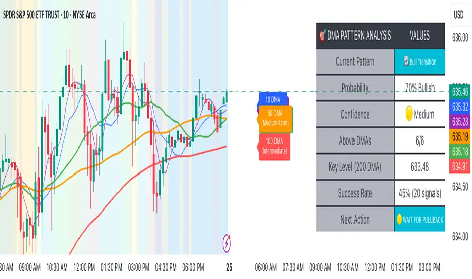
Advanced DMA Pattern Detection SystemAdvanced DMA Pattern Detection System with Smart Intelligence
Professional-grade moving average indicator that combines traditional DMA analysis with advanced pattern recognition and probabilistic forecasting.
Core Features:
6 Key DMAs (5, 10, 20, 50, 100, 200) with descriptive labels showing trading purpose
Advanced Pattern Recognition - Detects Institutional Accumulation, Distribution Phases, Bull/Bear Transitions, and Choppy Markets
Probability Engine - Assigns confidence scores (0-100%) with Low/Medium/High classifications
Historical Validation - Tracks success rate of last 20 pattern signals for real performance data
Smart Alert System - Only triggers on significant pattern changes (20%+ probability shifts)
Dual Display System:
Movable Information Table - Shows current pattern, probability, confidence level, success rate, and recommended action
Chart Alerts & Background Colors - Visual confirmation of high-confidence setups (80%+ patterns)
Traditional DMA Labels - Clear identification of each average's trading significance
Complete Customization:
Master on/off controls for entire system
Individual toggles for all components (DMAs, table, alerts, colors)
Adjustable alert sensitivity (Conservative/Medium/Aggressive)
6 table positions to fit any chart layout
Perfect For: Swing traders, position traders, and anyone wanting systematic trend analysis with quantified probability scores rather than subjective interpretation.
Bottom Line: Transforms basic moving averages into an intelligent trading system that tells you exactly what the market structure means and what to do about it.
BB with Heikin Ashi + Reversal CheckThis indicator combines Bollinger Bands (BB) with Heikin Ashi candles to detect potential reversal points after price breaks the BB boundaries. It works on any symbol and timeframe, retrieving Heikin Ashi data via request.security().
Core Features
Heikin Ashi Candle Plot
Smooths price action by using Heikin Ashi candles instead of regular candles.
Candles are plotted directly on the chart with green (bullish) and red (bearish) colors.
Bollinger Bands (BB)
Calculated from Heikin Ashi close price.
Includes Basis (MA), Upper Band, and Lower Band, with customizable MA type, length, and standard deviation multiplier.
Break & Reversal Detection
The indicator tracks whether the price has broken above the Upper Band (p1) or below the Lower Band (p2).
It remembers the last breakout direction until the opposite breakout occurs (mutually exclusive logic).
Signal Logic
Long Signal (▲):
Price was previously below the Lower Band and then reversed upward (BB Lower rising + Heikin Ashi candle rising).
Short Signal (▼):
Price was previously above the Upper Band and then reversed downward (BB Upper falling + Heikin Ashi candle falling).
Alerts
Custom alert conditions trigger when Long or Short signals occur, allowing automated notifications or bot integration.
Use Cases
✅ Swing Trading / Trend Reversal – Identify potential bottom/top reversals after BB breakouts.
✅ Mean Reversion Strategies – Enter trades when the price reverts to the BB mean after an extreme breakout.
✅ Multi-Timeframe Analysis – Works with any timeframe and symbol via request.security().
Customization
MA Type: SMA, EMA, RMA, WMA, VWMA
BB Length & StdDev Multiplier
Timeframe & Symbol Selection

Common DMAs with LabelsHere's a short description for publishing:
Common Daily Moving Averages (DMA) Indicator with Smart Labels
Displays the most widely-used moving averages that professional traders watch: 5, 10, 20, 50, 100, and 200 DMAs with clear color-coding and descriptive labels.
Key Features:
Smart Labels - Each DMA shows its trading purpose (Day Trading, Swing Trading, Bull/Bear Line, etc.)
Customizable Display - Toggle any DMA on/off individually
Golden/Death Cross Alerts - Optional 50/200 crossover signals
Live Status Table - Shows current DMA values vs price with up/down arrows
Professional Styling - Color-coded lines with appropriate thickness (200 DMA emphasized)
Perfect for:
Multi-timeframe trend analysis
Support/resistance identification
Bull/bear market confirmation
Entry/exit timing
Usage: Add to chart, customize which DMAs to display in settings. Labels appear on the right showing each average's trading significance. Enable the status table for quick price-vs-DMA reference.
Ideal for both beginners learning key moving averages and experienced traders wanting a clean, informative DMA setup.